#you would not BELIEVE the vibrancy + saturation it took to get it to this bland point
Text
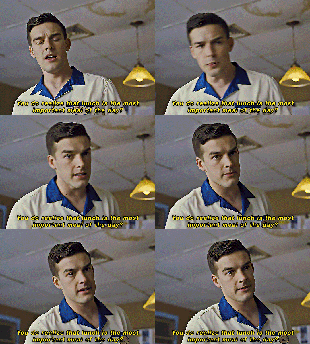
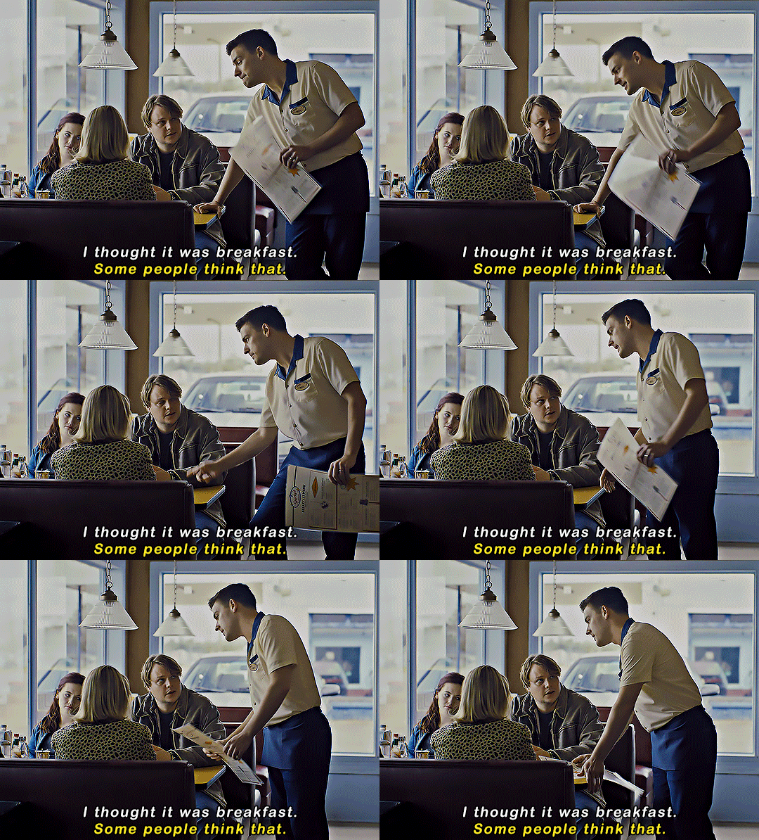
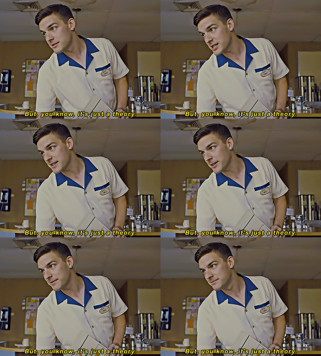
FIVE NIGHTS AT FREDDY'S (2023)
#fnaf#fnafedit#Five Nights at Freddy's#fnaf movie#matpat#fnaf movie spoilers#fnaf spoilers#fyeahmovies#filmedit#gifs*#arsenicpandacreates#this LYING LIAR WHO LIES acted like he WASN'T IN THE MOVIE alskjflskjf#yes I DID stop watching to make this gif set what of it?#also I do not like this coloring but also I'm sick of looking at it and want to sleep soooooo#there is NO COLOR in this scene I SWEAR TO GOD#you would not BELIEVE the vibrancy + saturation it took to get it to this bland point#and any further started causing problems booooooo
32K notes
·
View notes
Text
FMP Evaluation
For this project I was asked to create my own individual final major project using magic as the theme. I had to pick either to use photography, graphic design or TV and film. I was also asked to do primary, secondary, artist and legal research, inspiration, brainstorms, schedules, reflective journals and explain everything I do in full detail.
I chose to use photography and produce 2 magic themed film posters because in past projects I have really enjoyed using Photoshop to create film posters and it has also been my best work I have produced on the course, another reason I chose this idea is because I really enjoy photography as I get to control everything from props to costumes to the atmosphere and I really love using my imagination and then turning it into reality. My initial idea which I wrote in my proposal was to create one poster to do with positive magic and turn my model into a fairy and another poster portraying black magic and making my model look possessed and have dark smoke coming out his mouth. I then changed my black magic idea because I didn’t have the correct resources to create this image so I had to improvise and change my idea to a fallen angel/demon and used black wings to portray this idea. I created multiple brainstorms to show my different ideas and to help me finalise on what I wanted to create, I also brainstormed photography techniques to show that I understand how to use a camera and what settings would be needed to produce the best photograph that I can .The initial research I did was researching what magic was and understanding what other people thought magic is, I also researched about depth of field as it could improve my photography. Schedules played a big part to this project as they helped me to keep organised and made sure I completed each task on time.
I conducted a lot of different types of research the most helpful was my qualitative research using survey monkey which is a survey I created for my family and friends to answer this really helped me to understand my audience and what they portray as magic. I also did some artist research looking at 3 different photographers to give me ideas and inspiration this really helped me to think of some really unique ideas for my project. Another helpful piece of research was legal research this made me understand what plagiarism is and what the outcome could be if you conducted this act. I don’t believe there was any research that wasn’t helpful all my research has helped me in this project because I have learned knew information and also been given a lot of new inspiration. The types of research I did was primary research which is also qualitative and quantitative research, I also carried out secondary research. All my research has impacted my work greatly as it’s made sure my work is all legal and so that I understand the concept of magic and to also make my work even better using new information. My inspiration really helped me in this project such as looking at magic themed books such as harry potter and myths and legends reading these books made me understand what other peoples take on magic and what they think super natural creatures look like by looking at in illustrations. I also looked at magic themed film posters to give me ideas how I can edit my posters to make them look magical and eye catching for my audience.
My demographic audience is 18 and below for any gender, I made one poster for a much younger audience as it had fairy’s in it and another which I wanted to be quiet dark and scary which I made an 18.I knew my audience was 18 and under because the minority of people I asked to complete my survey was around the ages 16-18 as they are the most common ages on my Facebook but for the slightly older people I created another film poster which is for 18+.For the under 18 film poster there is a fairy on it which is more appealing for a younger demographic whereas on the other film poster I have tried to portray a fallen angel which is a much darker and scarier theme which is more suitable for an older age group. This is important because if I didn’t make something for a certain age group some people from my target audience may have no interest at all because my film poster may be too childish or too scary for their age group.
I produced my work by creating ideas using brainstorms, reading books for inspiration and also looking at other photographer’s work which helped me create some unique ideas. I created schedules to keep me on track of all my tasks that I needed to complete and to keep up to date with everything. I did a lot of preproduction work such as prop lists, health and safety, legal research, primary and secondary research, and creating surveys. All my preproduction work helped me to carry out my photoshoot safely and with a final idea. I used my IPhone 7 plus to take my photographs because I had to improvise because I was working from home due to covid-19 which stopped me from being able to use a professional camera. I used the portrait setting on my camera and used the brightness bare to change the lighting. I used a black umbrella as a reflector so that the natural light could bounce off it to make my photographs look even better, I didn’t have any photography lights so I used natural lighting and I also used black and white fairy/angel wings as props. When it came to editing my photographs I used my phone to change the exposer, brilliance, highlights, shadows, brightness, black point, saturation, vibrancy, sharpness and definition. I then was able to get Photoshop using adobe and created a contact sheet of all the pictures that I took. I used Photoshop also to create my 2 film posters which allowed me to use more tools such as the quick selection tool, horizontal type tool, layer style and crop. My work pushed me to improve these skills further because I wanted my final major piece to be the best work I have created and to help me experiment with new tools.
Overall I feel very good about my project and what I have produced I have put a lot of time and effort into it and really hope that it pays off. I couple things didn’t go to plan such as the day I wanted to take my photographs it started raining which created a safety hazard but I overcame this by checking the weather so I can do it on another day and doing extra research while I wasn’t able to take my photographs. Another thing that didn’t go to plan was the props I wanted to use I wanted to use dark makeup and glitter for my pictures but my model wasn’t comfortable wearing makeup and the glitter I ordered for my fairy photo shoot didn’t come on time due to covid-19 so I improvised and still came out with some great photographs. I found working independently much easier as I didn’t have no help to think of an idea which feels really good to know you did everything by yourself, I also liked working independently because its gave me new skills and made me more confident. If I did this project again I would be more precise with my editing and focus on just one poster other than 2.I kept to my schedule and made sure that everything I wrote on my schedule was completed on time to a high standard, my schedule really helped me make sure all my tasks was completed on time and kept me organised on the other hand I didn’t stick to my proposal completely as I had to change some of my ideas due to the lack of resources I had at home, my proposal helped me to have a straight idea of what I wanted to do and gave me something that I needed to follow so I didn’t go off course. Looking back at my schedules I think I have used my time very well and made sure I had something to do every day to assure everything gets do on time and in detail. I could of improved with time management by starting my tasks a bit more early than I did so I could fit more tasks in one day other than just doing one task every day I could of done 2 or 3.I am happy with my final piece and I think I have edited it well and stuck to the magic theme and what I was asked to produce. I am going to present my ‘fallen’ film poster as a movie premiere because I think it will fit great with the movie theme and my ‘fairy's vs incubus’ poster will be presented on a billboard because I see a lot of new movies on billboards in town .
I received some peer feedback on Facebook and I am happy with the comments, I have been told to improve on being more precise on my editing skills which I agree on to make my work look like it hasn’t been edited and more realistic.
1 note
·
View note
Note
Your gifs are beautiful and so clear! Have you ever done a tutorial on how you get them so flawless and well lit? Like esp DS9 and TNG gifsets! I love your work so much!
@maylovelies
Wow! Okay, for starters: Thank you so much! I really, REALLY appreciate the kind words and the time you took to send this! I really enjoy making gif sets and I’m always so glad to hear that people like how I edit mine.
To answer your question, yes, I have made a tutorial post in the past, but the method I used back then I’ve strayed from a bit, recently. Some of it I still use, but in reference to lighting and getting them to look a little more high quality, there are some other techniques I’ve been working with lately and really enjoying the results…
I can walk you through with a new example.
Here’s a quick gif from a scene of DS9:
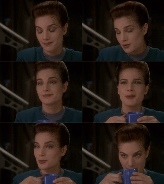
and I’ll do a rundown on how I got it to look like this:
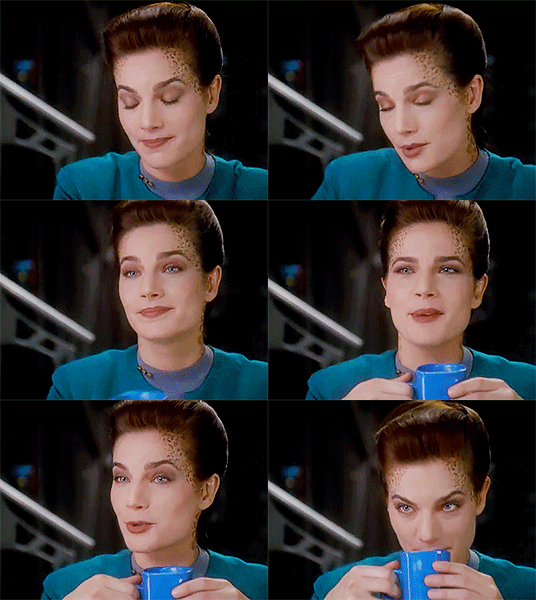
Going to put the rest of this below the cut, though, because it’s significantly longer than my last tutorial-based answer…
So! One trick is to not be afraid to stack up a few adjustment layers of the same variety, sometimes even duplicates of the exact same layer, on top of each other. The reason I do this is because wild adjustments on a single adjustment layer are a lot less controlled and will often effect the wrong parts of the scene’s lighting (by that I mostly mean shadows v highlights).
I edit for light first, personally. Here’s where I am after doing those corrections
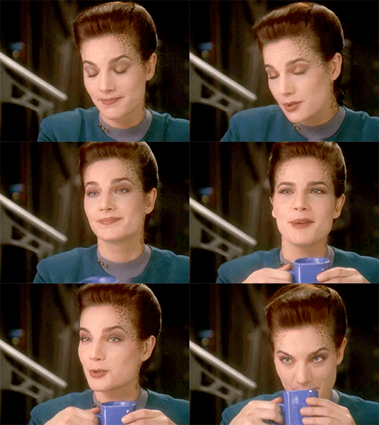
Already looking a lot better and clearer. This was done using three adjustment layers.

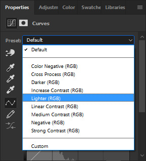
The curves layer is just a basic “lighter” preset that you can find from the drop down menu once you open a new curves layer
The levels layer I start by using the preset “lighten shadows”

at that point the image looks very washed out and grainy
(still image)
so from there i just messed with the layer a bit until I liked it a little more, added some contrast and adjusted the distribution of light, etc.

which got the image looking like this

(still image)
But I still thought that looked kind of washed out and flat, so, lastly, I added a completely custom exposure adjustment layer where I pushed up the gamma correction and exposure settings (you can also push the offset into the negative to get a secondary effect similar to gamma correction, but it’s very harsh and temperamental, at times. I wouldn’t recommend it for first-time use)

that gets us back to this lightness corrected gifset, which I’ll post again now

You can actually get a similar look by using just curves adjustments and their presets. Here’s what happens if you take three (3) layers with the same curves “lighter” preset (see above) and then one (1) curves layer with the “medium contrast” preset.


and the results are pretty similar
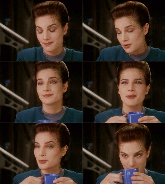
Each technique lends itself better to different scenes. And obviously with either method (or a combination of both as tends to be the case on super dark scenes - cough, mirror-universe episodes, cough) you can customize a lot from these presets to get the desired effect. They just give you a good jumping-off point…
Now the first thing I always notice about adding brightness to these scenes is that the tones get very warm and muddy, so from there I usually like to color correct next.
I like to bump my vibrance and saturation sliders up before color correcting, but I know a lot of people do it after. That’s really just a matter of personal preference.
There are a handful of ways to color correct, and, just like with the lighting methods above, I tend to mix and match the various adjustment layers. I’ll use Color Balance (as illustrated in my previous tutorial) and I’ll also now use Hue/Saturation layers and Selective Colors layers.
Honestly, color correcting / color grading alone could be its own tutorial so I won’t go very in-depth on that here. But just play around with the settings and find a method that works for you. (If you feel like you’d want a specific run through on that, just shoot me an ask and I can cover it some other time in more detail.)
My one recommendation to help you avoid the big rookie mistake I made when I first started doing this is that with the hue/saturation layers, never use the Master slider option; instead, click the drop down menu and work on each color individually.
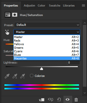
So here’s where we’re at once I bumped up the saturation and then did my color corrected.
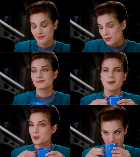
You may notice how sometimes color correction darkens an image and undoes some of the work you did earlier (in my experience, this usually happens when you have to add a lot of blue in the color balance layer) You’ve got two options here. Either go back in to the previous brightness adjustment layers and lighten up some of the contrasts, or put a new layer over top of latest color edits to add brightness back in over top. Again, this comes down to personal preference. Experiment with either version and do whichever works best for you.
Here’s after I brightened it back up a little again.

Subtle difference, but it’s how I prefer it for this scene. Plenty of times scenes don’t end up needing it at all.
So the gif is looking pretty solid from there. In some cases, I’d actually stop right here and just add the quote text to the bottom and call it a day. But if you really want to make it look HQ, there’s a few additional steps…
Firstly, it helps to keep the images smaller (a retread of something I said in that other tutorial too, I believe) but after that, there’s a way to sharpen all the layers and frames at once while also reducing “noise,” both of which improve the quality of a gif.
To do that, take your frames timeline at the bottom of photoshop and click the little icon that looks sort of like a funnel going through a bar graph…
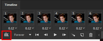
If you have history window open, it’ll say “Convert to Timeline” after you’ve done this, and instead of frames you’ll see a bunch of short purple lines instead of the gif’s individual frames. Don’t panic! That’s supposed to happen.
From this point, go to your layers window and select all of the layers that are frames of your gifs, which you can do by clicking the first layer - holding shift - then scrolling up to click the final layer - then releasing shift. They should all have the little eyeball icon on next to them, indicating that they’re all active. Then, right click the top layer and from the pop-up menu click “convert to smart object”

When you do this, all of the layers compress into one Smart Object with the name of the top layer.

Again, don’t panic!, you didn’t lose the other layers they’re just now all going to be affected by the sharpen filter instead of having to be edited one at a time.
Now, go to the top ribbon in Photoshop and in the drop down menus, go “Filter” > “Sharpen” > “Smart Sharpen…” and click that.

A little window will pop up that gives you a preview of how this filter will impact your image.
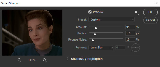
**notice that the smart sharpen preview does not show color and lighting corrections; that’s fine & because we are not applying this smart filter to any of our adjustment layers.
And what you do from here is again a matter of personal preference. Raise the sharpening amount too much and the image starts to look crinkly, have the noise reduction too high and all the detail gets smudged away.
Here’s an example of what happens if youwere to crank both the sharpness and the noise reduction all the way up:

(still image)
And I guess there’s maybe a place and time where something with this aesthetic would work for a particular scene or edit, but generally, I like to keep the settings pretty low. Sometimes, less really is more…
For a 268x200px gif of an 80′s or 90′s Trek show, I keep Reduce Noise at 10% and have the sharpening anywhere from like 85-150, depending on how much I’ve cropped in on the original camera crop. But for this gif, where I didn’t zoom in very much at all and pretty much kept it how the original videography framed her, keeping it around 95-115 works nicely.
When you’re done, click OK.
Now that Smart Object looks like this

And that’s pretty much it! Now, when you export your gif from Photoshop, it’ll look something like this:

The one thing you have to remember about this technique (and this is something that still trips me up from time to time, myself) is that when you export, it doesn’t automatically set the gif to loop forever. Instead, it’s set to “Once.” To fix that, when you click through “Export” > “Save to Web (Legacy)” and the Web window pops up, go to the bottom right corner and above the “Save” button there’s a drop down menu in the “Animation” section. Click there and switch from Once to Forever.
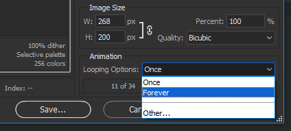
And there you have it! Start to finish, that’s how I make my HQ gif sets!
I know it seems like a ton of work for one lousy gif and super overwhelming at first and hard to remember, but once you get into the swing of things it all becomes very second nature.
So thanks for asking and thanks for reading. Hopefully this was helpful, please let me know if you got anything out of it.
And, of course, feel free to reach out with any other questions or requests. I’ll always try to do the best I can and answer. ♥
#gif tutorial#gif making#photoshop#photoshop tutorial#ds9#tutorial#answer#gif making tutorial#hq gifs tutorial#maylovelies
93 notes
·
View notes
Text
Review: Silverline SR17 Supreme loudspeaker
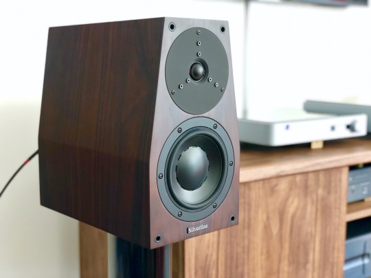
Silverline SR17 Supreme loudspeaker
The Audiophile Weekend Warrior (TAWW)
TAWW Rating: 5 / 5
Combining the body and scale of a larger speaker with traditional mini-monitor virtues, the SR17 Supreme is an exceptional conveyor of musical color and expression.
PROS: Organic midrange tone; top-to-bottom coherence; ample scale and dynamics; superb imaging; unfussy setup.
CONS: Smidge of lower midrange coloration; favors acoustic over electronic music; awkward recessed terminals.
This review has been a long time coming. Back in 2010, @mgd-taww gave the Silverline SR17 Supreme (USD $7,500) a rave review in Bound for Sound magazine, and heartily recommended them to me as an upgrade to my Merlin TSM speakers. It took me 8 years and a move to the West Coast to finally reach out to Silverline for a review pair; then another 15 months of listening to get around to this review. In the meantime, lots of speakers have come and gone in the market, particularly in the 2-way monitor category saturated with offerings at every conceivable price point. And yet, to my ears, the SR17 Supreme endures as one of the most satisfying speakers of its kind. Read on for my take on how it’s withstood the test of time.
History & Design
Silverline is a small speaker manufacturer based out of Walnut Creek, California, a short drive northeast of San Francisco. The SR17 is one of their first models dating back to a couple years after their incorporation in 1996:
1998: The SR17 debuted at the 1998 Stereophile Show in LA, sporting a Dynaudio D28/2 tweeter and Esotec 17WLQ midwoofer.
1999: Updated with an Esotec D260 tweeter and revised crossover.
2004: The SR17.5 was introduced, with increased internal volume via a deeper cabinet for better bass response.
2009: The SR17 Supreme is introduced with an Esotar T330D tweeter and further refinements.
Proprietor/designer/craftsman Alan Yun has continued tweaking the Supreme over the last decade, and though the Dynaudio drivers he prefers are out of production he’s stockpiled enough units for years of production and repairs. The enclosure, recognizable by its trapezoidal shape and depth, is manufactured in China by a shop that does cabinet work for a number of high-end marques, with final assembly performed by Alan’s own hand. He shared a bit more about their production:
California has strict environmental regulations. The paints on cabinets are governed by strict rules, and is why there are fewer and fewer cabinet makers in California. Many manufacturers now find their production overseas.
Actually our cabinets were rawly made in China, painted, and the final detailing is done by me, also putting sonic materials inside the cabinets. This job is pretty tricky for tweaking the sound. The crossovers were handmade by me, matching components, soldering, etc. The drivers were fitted carefully and precisely by my hands with European-made T-15A screws. Final testing and listening are all done by me in my workshop. 😅 Therefore, the SR 17 is rather unique. I am also the original designer of this shape/type of speaker cabinet since 1996. I did research and to the best of my knowledge there were no similar designs then.
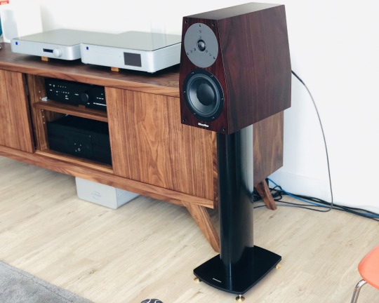
Large, but not ungainly, atop Dynaudio Stand 6′s
The depth of the cabinet - 15 inches, to be exact - gives it a rather top-heavy look on a typical stand, but it’s mitigated by the elegant tapered profile. My pair was impeccably finished on all sides in rosewood veneer. Rapping down the sides revealed it to be very solid, but not as fanatically braced and damped as my old Merlin TSM monitors or the Audiovector SR 1. Each speaker weighs around 26 lbs. The bi-wire terminals are recessed, which made them a bit of a pain, particularly as they have larger rectangular posts that will take 1/4" spades only in certain directions - I recommend banana terminations.
The crossover sports just 4 components, with 1st order high-pass (tweeter) and 2nd order low-pass (woofer) filters. Parts quality - Solen metallized polypropylene capacitors, a generic-looking wirewound resistor and an air-core inductor - is solid but hardly fancy, a deliberate decision by Alan who isn’t much of a believer in expensive boutique parts. Based on the results he’s achieved here, it’s hard to argue.
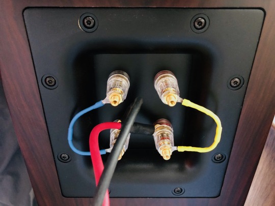
Cardas jumpers sounded better than the stock bridges to my ears. Stick with bananas for the cable termination - spades are awkward.
Setup
The SR17 is fairly efficient (nominally 90.5 dB/watt @ 8 ohms), but more importantly it's easy to drive - my Ayre AX7e, known for being rather limited in the power delivery department, sounded open and effortless. Alan Yun said the Dynaudio drivers love current and will benefit from powerful amplifiers, yet will sing with low-powered tube amps. I can confirm it loved the grunt of the 300wpc Bryston 4B Cubed, yet I never felt lower-power amps like the Ayre or Bryston B60 integrateds were lacking for dynamics. And my favorite pairing by far was with the 55-watt Valvet A4 Mk.II class A monoblocks sporting a single pair of bipolar output devices. (Incidentally, Alan’s favorite amp paring with the SR17 is the 30-watt Pass Labs XA30.5, which @mgd-taww can attest to being a magical combo.)
Similarly, I found the SR17 easy-going when it came to cables. My preferred cable had more to do with the amp used, but I got good results from a single run of Audience Au24 SX [review], Cardas Clear Light and DH Labs Q10 Signature cables. With the Audience, I felt the speaker was the sweetest and most dimensional; the DH Labs brought out more bass power and treble brilliance; while the Cardas brought out more upper midrange presence. With the Bryston 4B3 amp, I settled on the Cardas; with the Ayre and Valvet, the Audience was the clear winner. Unlike with the Audiovector SR 1 Avantgarde Arreté (review forthcoming), I didn't find bi-wiring to lend a noticeable improvement, but I did prefer replacing the stock metal jumpers with nicer Cardas ones from my Merlin TSM's for a little more refinement.
As with any high-quality monitor, stands are important. Something around 24-25” height seems right, though I wouldn’t be afraid to sit them an inch or two lower as the speakers are capable of projecting good image height. A trend these days is to decouple speakers from the stands/floor, but the SR17’s are “old school” in that they prefer tight coupling, meaning heavy suckers with spikes and a judicious amount of BluTack on the top plate. My old Osiris stands, heavy dual-column steel beauties loaded with sand, were a perfect match, but sadly I sold them with my Merlin TSM’s; they were replaced by higher-WAF but inferior-sounding Dynaudio Stand 6’s, which in stock form are quite light and choked the sound of the Silverlines. Fortunately I was able to get them to a better place with some tweaks; not as good as the Osiris, but close. A better choice sonically might be something like the Target Audio MR stand with the four pillars mass-loaded.
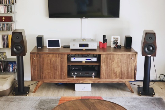
Pulling them out further improves imaging, but they still work well relatively close to the back wall.
Placement was pretty standard for a monitor speaker - keep it at least a couple feet from the back wall, with a 2:3 width-to-listener distance ratio and toed in about halfway. In my room, which has a number of living constraints, I had the back of the speaker about 21” from the wall, tweeters 76” apart and the plane of the speaker 8 ft. from my ears. While many small-box monitors rely (often excessively) on rear ports for low-end boost, the bass tuning on the SR17 is far more subtle and sophisticated - putting my ear to the port, I heard a fairly modest amount of output. I remarked this to Alan, and he described the port as more a method of pressure equalization than bass volume. This means in a pinch I could push the speakers as close as 12" from the wall without fear of low notes booming out of control. All in all, for being such a high-performing design, the SR17 is remarkably easy to live with.
The Sound
The first thing my wife, a professional oboist, noticed about music through the SR17 is how dynamically alive it was. I had just wrapped up my review of the Silverline Minuet Grand, a superb $2k speaker that is no dynamic slouch itself. And even though the SR17 was fresh out of the box and Alan warned me it would take some time to run in, the very first notes from the SR17 sung with expressiveness and vibrance. I think it took all of 15 minutes of listening to Royal Concertgebouw Orchestra streaming radio for her to remark, “I like this speaker.” She’s normally nonchalant about hi-fi, and yet has ears that can pick apart sonic deficiencies in about 90 seconds, so that amounts to a rave! And what made it so immediately engaging wasn't some artificial emphasis or hype; it was a feeling of unimpeded dynamic flow that makes most other speakers sound a bit drab. The SR17 lets music breath freely, carrying you with the ebb and flow of a tune and conveying every turn of a phrase with a sense of ease and conviction.
The next thing we noticed is how natural and palpable everything sounds through the SR17. Tonally, the SR17 is on the very slightly warm side of neutral; it combines reassuring solidity and density from the mid-bass through the midrange with an open, extended top end and fine harmonic resolution. Its ability to paint with a wide palette of tonal colors brings out the distinctive character of instruments and voices, making orchestral music a delight - just put on a Living Stereo recording such as Debussy’s Iberia [Tidal, Qobuz, Spotify] and the front of your room will explode with the virtuosity of the Chicago Symphony Orchestra’s playing. Scale it down to smaller stuff like a Beethoven string quartet, and you’ll savor the finer gradations of timbre between the cello, viola and violin.
What you won’t notice is any discontinuity between the woofer and tweeter. These Dynaudio drivers were made to work together, and the minimal crossover mating them is superbly executed. The upper midrange around the crossover point is seamless, and I can’t remember a single moment over the course of hundreds of hours of listening when I noticed the tweeter sticking out on the face of the speaker, something that ails even the finest, most expensive dynamic speakers from time to time. In this respect the SR17 is up there with the very best and is utterly free of listening fatiguing.
As a violinist, I feel obliged to point out the Silverline’s superb reproduction of the violin G string. If you ever want to test out a speaker’s tonal truthfulness in the lower midrange (right around middle C, 262Hz), put on the 2nd movement of the Glazunov violin concerto performed by Jascha Heifetz [Tidal, Qobuz, Spotify], or the 2nd movement of the Sibelius concerto performed by Lisa Batiashvili [Tidal, Spotify]. This is oh-so-tricky to get right; as the lowest string on the instrument, it’s the richest and deepest; and yet the violin is not a viola or cello - it’s a more subtle and delicate richness. Speakers that lack body will sound thin and washed out and minimize the difference in timbre vs. the D string above; woolly or bloated speakers will thicken it or blow the instrument out of proportion. The SR17 performs this balancing act better than anything I’ve heard in my living room, or in most any system for that matter. It rides the line between warmth and clarity in that register, lending tangible realism to piano, male vocals and low brass instruments as well.
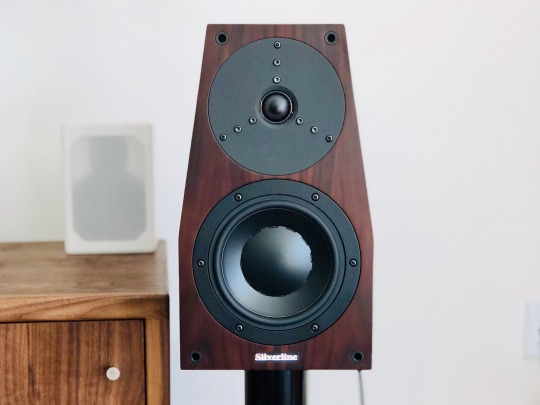
Going down the frequency range, the SR17’s extra cabinet volume vs. a typical mini monitor gives it power and scale more akin to a floorstander. My room is a 17 x 19 x 8.5 ft. open layout living/kitchen area with floor-to-ceiling windows and an offset listening point along the long wall, so while not huge, it presents a bit of an acoustic challenge that smaller speakers have struggled to fill. The SR17 had no trouble projecting a big, bold sonic image, and can cleanly play as loud as you’d reasonably want in such a space. It has sufficient body and power down to 60Hz or so to give music real foundation, with meaningful output down to 40Hz. I think Silverline’s quoted 32Hz bottom limit is a bit optimistic (or perhaps you just need the right room), and I preferred the speaker with my REL T-9 subwoofer providing a little extra oomph. But for a great many listeners in moderately-sized spaces, this will be all the speaker you ever need. Listening to “The Elephant” from Saint-Saëns Carnival of the Animals [Tidal, Qobuz, Spotify], a track I’ve heard on some very full-range speakers (e.g. Focal Grande Utopia EM Evo), the double bass is big and present, lacking a bit of rumble that was easily provided by flipping on the REL sub. Piano left hand similarly has nice weight, never sounding diminished in scale as typically happens on small monitors. Debussy’s Ariettes oubliées song cycle from the album Paysages by soprano Susanna Phillips and pianist Myra Huang [Tidal, Spotify] is a lovely test of colors, with ethereal vocals floating above dark undertones from the piano’s lower register. The Silverline possesses suficient extension and body to bring out these contrasts with depth and balance.
At the opposite end, the old-school Esotar tweeter is still one of the most musical high frequency transducers around. It balances detail with smoothness, extends low enough to mate perfectly with the woofer, and never sounds strained - a substantial upgrade in resolution and realism over the typical metal or silk domes in lesser speakers. In top-end extension and speed it might be bettered by some of the newfangled devices like Focal’s beryllium or B&W’s diamond domes, Scanspeak’s latest Revelator or the fantastic AMT in the Audiovector SR 1, but it’s a relatively small sin of omission and a worthwhile trade off to avoid any hint of unnatural edge or ringing. And it still has plenty of sharpness and sparkle, lending nice bite to trumpets and sheen to triangles and cymbals.
Last but not least, there’s that soundstage - present and tactile, but never in-your-face. Particularly when coupled with gear with sufficient resolution to relay subtle ambient information, e.g. the Pass XP10 preamp, there’s a real sense of the layout and layers of a symphony orchestra. The hi-res LSO Live recording of Mendelssohn’s "Reformation" Symphony with the London Symphony/Gardiner [Tidal, Qobuz, Spotify] paints a vivid picture of the stage of the Barbican, with brass fanfares anchored closer to the back wall of the fan-shaped stage, and the smaller string section sounding up front and intimate. An interesting twist in this performance is Sir Gardiner had the violinists standing to emphasize the virtuosity of Mendelssohn’s writing, and while I can’t say I would have been able to tell this from listening alone, the Silverline does convey a subtle sense of freedom and space to the violin section that I’ve missed when listening to the recording on other systems. And it has no trouble imaging well outside the bounds of the speaker, with percussion and harp on the extreme left of the stage floating eerily behind and beyond the left speaker.
I think my wife put it best when I asked her one day how the system sounded with the Silverlines: “this is what I imagine it sounded like in the concert hall.” While I’ve broken down a bunch of its strengths in audiophile terms above, it’s the way it puts everything together into a musically vivid whole that makes it special. There’s an evenness of tone, a naturalness of perspective, an ease of dynamic expression, a consistency of refinement from top to bottom that gives music a sense of rightness that allows one to forget the hi-fi aspects and focus on the musical performance. In this respect, Alan Yun has crafted something truly masterful in the SR17 Supreme.
Caveats & Comparisons
I’ll nitpick a few things that were relatively minor deficiencies to my ears, but may weigh more heavily for people with different tastes. These were highlighted in my own home by direct comparison with another very fine monitor speaker, the Audiovector SR 1 Avantgarde Arreté ($6,200 in premium finish). I also have my long-term reference, the Merlin TSM-MXe (around $6k several years ago) as a baseline.
First off, I suspect the Silverline’s hint of lower midrange warmth, while sounding natural and consonant with much of my favored acoustic music, may come from a bit of otherwise well-controlled cabinet resonance. It gently highlights the woody quality of acoustic instruments, but with electronic music it comes across as a slight coloration - a bit like wearing orange-tinted sunglasses that make everything look a little less cool. It’s very subtle, and not enough to sound overtly “boxy” or throw voices off, but it’s not transcendentally-clean like the Audiovector or, say, a Magico. My sense is Alan wisely tuned the SR17 cabinet for this response, as additional bracing would just make the resonance peakier and higher in frequency where the ear is more sensitive; as it is, it’s a gentle and diffuse coloration. Part of this may also be the sonic signature of the Esotec woofer’s magnesium silicate polymer cone, which I’ve heard in a number of speakers and to my ears trades better damping for a hair less crispness vs. some of the fancier treated paper or composite cones out there. On the plus side, it never sounds dry as some of those drivers can, but with Erlend Øye’s Unrest [Tidal, Qobuz, Spotify] or Carley Rae Jepsen’s Emotion [Tidal, Qobuz, Spotify] I found the Audiovector conveyed more of hard-wired immediacy and edge suitable for those albums.
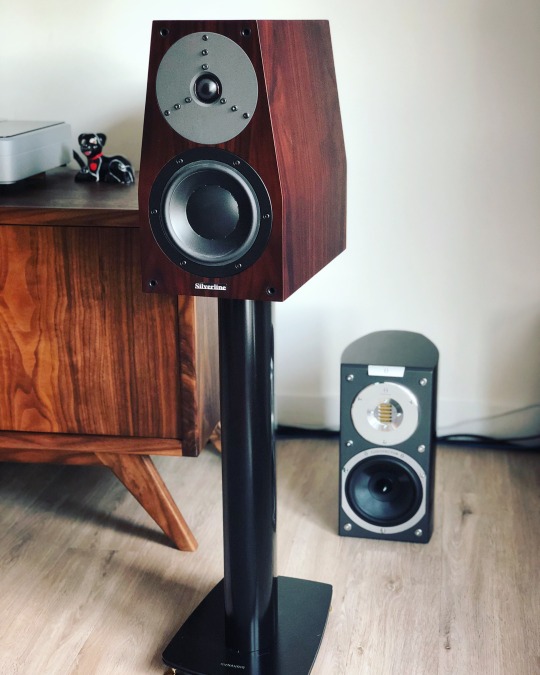
Taking turns with the Audiovector SR 1 Avantgarde Arreté
Another area where the Audiovector came out slightly ahead of the Silverlines was in resolution during loud dynamic peaks. The Audiovector is truly special in this regard, being designed for minimal signal compression and sounding incredibly collected the louder you play them. The Silverline also plays loudly with ease, but vs. the über-clean Audiovector it’s very slightly thicker and more congested. Case in point are the fortissimo climaxes and interruptions in Rossini’s L’italiana in Algeri overture [Tidal, Spotify] - when the orchestra comes crashing in after the pianissimo pizzicato opening, both speakers are clean and explosive, but the Audiovector sorts out the different instruments playing in unison for that brief moment a hair better, while the Silverline has more low-end oomph.
As mentioned prior, the Silverline’s superb Esotar tweeter isn’t the state-of-the-art in extension. It has plenty of resolution, but if you favor extremely extended and airy highs, e.g. the 52kHz-rated AMT tweeter in the Audiovector will give you more of that. I don’t think that ultimately matters so much for musical enjoyment (and many people can’t hear very well above 10kHz anyway), but it does make a subtle difference in realism. It also makes the Silverline’s treble a bit more forgiving of poor recordings and upstream components (silver cables could work) - it’ll never, ever burn your ears off.
The $7,500 price tag of the Silverline puts it squarely above the very crowded $5k-and-under monitor crowd, but short of the $10k+ “super monitor” category. Comparisons with other speakers are more conjecture on my part as I haven’t heard them in my own room... but I’ll mention a few things I’ve gotten a good listen to at shows, dealers, and other people’s systems.
Paradigm’s Persona series seems to be mentioned quite frequently in audio forums these days, and I heard the Persona B monitor ($7,000) briefly at RMAF. I’ve also listened to the floorstanding Persona 3F a bit, and there’s definitely a common house sound - fast, crisp, detailed and dynamic. I’ve never warmed up to either of them - they’ve struck me as rather strident, with instrumental interplays like oboes and clarinets playing in harmony tending to sound compressed. The Silverline by comparison may sound a bit thicker, but it has far more natural instrumental timbre to my ears, is less bright and thus easier to match to more systems, throws a more dimensional and properly-placed soundstage, and is very nearly as “fast” without sounding edgy. I’m honestly at a loss as to why the Personas are garnering so much praise, so maybe it’s just me? A similar argument could be made for the B&W 805 S3 ($6,000) - while I haven’t auditioned them specifically, I’m pretty familiar with the 800-series sound and again, it’s not my cup of tea. The Silverline’s balance and openness just strike me as much more natural than anything I’ve heard from B&W. So if the likes of B&W and Paradigm leave you a bit cold, the SR17 Supreme might be a step in the right direction.
An obvious comparison is to Dynaudio’s own bookshelves, specifically the Contour 20 ($5,000) and Special Forty ($2,995). You can read about them in my quick review from a dealer audition, and while I haven’t heard them head-to-head, I posit that the Silverline a worthwhile step up in coherence and musicality. If you can’t stretch the budget for the Silverline I think the Special Forty would be a good alternative, but it does not have the near-reference level neutrality of the Silverline. In the past Dynaudio had a bit of a reputation for not being as good at implementing their own drivers in complete loudspeakers as other companies were, and while I think their latest efforts are much improved, Alan Yun still seems to be squeezing more out of the old Esotar/Esotec drivers in the SR17... methinks this is a reflection of Alan’s sharp ear and painstaking hand-tuning.
A few more offhandish observations based on extremely limited auditions, so take with a block of salt: I heard the Wilson Audio TuneTot ($9,800) at a dealer shortly after its release. With the caveats that it’s designed for a totally different use case, it was in an unfamiliar setup and this pair wasn’t fully run in, I didn’t find it nearly as compelling or expressive. I got a good listen to the TAD Micro Evolution One ($12,495) with a couple different amps and found its midrange rather dry, upper midrange a bit peaky and its bass lacking fullness and extension vs. the Silverline. The Artist Cloner Rebel Reference ($16k w/stands) wowed me at RMAF - it seemed to have more speed and resolution than the Silverline, though the upper midrange was a hair pronounced. It would be an interesting comparison, even at twice the price. Another interesting monitor at RMAF was the Stenheim Alumine Two ($13k) which was super clean and detailed, but perhaps not as liquid. A more logical competitor/upgrade could be the Sonus faber Electa Amator III ($10k) that I also heard at RMAF. That speaker absolutely blew me away with its expressiveness, natural richness, insane dynamics and huge presentation in the show setup. It’s the speaker that I’m most dying to compare to the Silverline.
And to wrap up the comparison to my Merlins and the Audiovectors - I sold my beloved Merlins shortly after receiving the Silverlines, and wound up purchasing both the Silverlines and the Audiovectors as I just couldn’t decide between the two. That should give you an idea of just how much I like them both; I’ll have more to say about the Audiovector in a forthcoming review.
Verdict
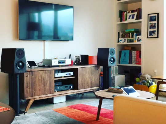
It's been said speakers mirror the personality of their designers, and if you've met the talented and affable Alan Yun no doubt you’ll feel his influence. Much like the man behind it, the SR17 Supreme is sharp, earnest and engaging, yet easy-going, with an unforced warmth and great attention to detail. There’s something grounded and unfussy about the way it allows music to flow forth, feeling like it's taken an expressive limiter off of a recording without hyping it in any way. It checks off many of the audiophile boxes too - imaging, tonal balance, bass power and extension, etc. etc. - but focusing on those mechanical aspects, as excellent as they are, would be selling Alan’s accomplishment short. The SR17 Supreme is first and foremost a faithful and thoroughly enjoyable reproducer of music, one capable of strongly evoking the beauty of the original musical event. There are countless 2-way monitors superficially like this one, but few that I know that are so meticulously and lovingly tuned to such great effect.
I've spent a lot of words espousing this speaker, but I think it's deserving of it, not just because of the obvious quality of the product, but because Silverline is a small manufacturer flying under the radar without a big dealer network or advertising budget. While Alan continues to develop his entry-level Minuet and Prelude lines at a more rapid pace to keep up with market demands, he doesn’t pen up new versions of his reference models every couple years to generate hype. He’s instead chosen his design fundamentals wisely and focused on perfecting their execution through years of painstaking refinement, much as the late Bobby Palkovic @ Merlin Music did. Like Bobby, he has a great ear for music, does a lot of the production work himself, and gains most of his sales through word of mouth. This does make it trickier to find than the big brands at a typical shop, but I strongly encourage seeking out an opportunity to hear it. The SR17 Supreme is a special speaker, and it won't be leaving my living room any time soon.
Silverline Audio
P.O. Box 30574
Walnut Creek, CA 94598
USA
3 notes
·
View notes
Note
this is a genuine question, how can you tell if a gif has been reposted or not? Just so I can know not to reblog it!
There are a few giveaways you can look out for
1. Watermarks. If a gif is watermarked with a URL that is not the blog posting it, it’s probbly reposted. There’s always the chance the blog changed their name but that would probably be obvious for other reasons as well.
2. If you’ve seen the gif before posted by someone else. Either the first instance or the second instance are reposted but it’s usually the second one.
3. This may seem really obvious but if a caption gives a source that’s just another tumblr blog and not, for instance, a video, then it’s reposted. If they didn’t ask permission to post it, adding the source isn’t enough. at least for me. Especially with Tumblr’s feature to just add gifs with built in credit.
4. Also “credit to original posters” is not credit. Neither is putting the URL in the tags. Also this one is just a pet peeve of mine, but there’s a post going around that uses the tumblr adding gif feature but it’s all gifs from the outofcontextstevedangle blog like, just reblog the gifs from the source wtf.
5. Ask the poster. I tend to believe most people will tell the truth in this situation but maybe not. You can just straight up ask them if they reposted it but you can also ask them what the source of the gif is, if they can’t tell you where the video is then it’s probably reposted. Tat’s not to say they have to give you the source, but for instance if i gif something from a live broadcast I can say “it’s from the sportsnet opening for the leafs vs bruins game on dd/mm” even if i don’t have a link to it.
There are also some things to look out for if someone took a bunch of gifs from a bunch of people and made a gifset.
1. They’re all different quality. Quality will get worse if you repost a gif, and different gif-makers will have different standards for quality or just different abilities when it comes to increasing gif quality. But all gifs in one set tend to be the same quality.
2. The color scheme is all different. Color scheme being the balance, vibrance, saturation, etc. Some gif-makers use the same look for every single gif, some change from set to set, but generally every gif in one set will look the same as far as colors.
3. Weird formatting. People who make their own gifs and put them in their own sets, will want them to look aesthetically pelasing every step of the way. Generally they’ll be stakced on top of each other one at a time, or some even square (2x2, 3x3 etc.) sometimes the format will change up and be 2, 1, 2 or something of the sort, but it will generally always have some sort of pattern. Stolen gif sets tend to be autoformatted by tumblr and there’s not a lot of care for making the gifs work together in a set.
4. different sizes. This goes with the formatting thing. But Tumblr cuts off gifs and photos to make them all the same size when you put them next to each other. So gif makers in general keep the dimensions the same. If you see a post with square gifs and rectangle gifs of all different dimensions in one set it’s probably reposted gifs.
Obviously there are exceptions to everything and everyone does it differently but there’s no harm in just ignoring a post that may be stolen. No one needs needs a gif on their blog that much. And that post was made in response to a gif i saw that said “I don’t know who the original poster was, it’s 100% not mine but i need people to see this,” like no. you don’t. If you didn’t make a gif you don’t post it.
But if you’re worried about reblogging it I wouldn’t stress too hard. If it’s not readily noticeable no one will hold it against you.
9 notes
·
View notes
Text
Out of the Dark
Part 8 of Home for the Holidays (Masterlist)
Summary: Sometimes being put in the dark forces you to reach for the light.
Pairings: Gabriel x Reader
Warnings/tags: fluff, slow burn, human Gabriel, cuddling for warmth, bed sharing, secret cuddles, mutual pining
Word Count: 4484
Special thanks to my wonderful beta @sumara62 and for @a-wing-and-a-pen for some thoughts and inspiration that made it into this part (but not THE thought we talked about lol).
***Please do not repost or copy my work to any other site without my written permission. Giving credit does NOT count. Reblogging is ok.***
<<Previous Chapter Out of the Dark Next Chapter>>
This was not how you imagined spending your time with him, huddling in front of a fire, wrapped in blankets, just trying to make it through the night without freezing to death.
Your first instinct when the power had gone out was that something was wrong. After a thorough check of the house (with Gabriel in tow because apparently staying put was not an option for him), you’d finally come to the conclusion it was the heavy snow that was responsible for the lights and not some uninvited guests.
You’d still been tempted to put a line of salt in all the doors and windows, just to be safe. He’d talked you out of that project in lieu of something much more fun involving the old board games you’d found in the basement and a freshly opened bottle of schnapps.
“I can’t believe I’m drinking this straight from the bottle,” you winced, more at the way you could feel your integrity dissolving with each additional swig than from the taste.
“Hang onto that bottle, sweet cakes, because B-8.” He smirked triumphantly as you groaned, your last battleship sunk before you’d managed to even get two of his. This time the face you made had everything to do with the copious amount of liquid you had to force down your throat and the fast approaching inebriation you could feel flooding your veins.
Why again had you thought it was a good idea to play anything strategic against someone who’d had thousands of years on you? He’d probably been at every battle that ever made it into the history books as a tactical innovation.
You would have passed out before dinner if he hadn’t taken mercy on you and switched to the more chance based games, allowing you the opportunity to make him drink, finally. By the time evening came, you landed in the pleasantly buzzed range, making it harder for you to resist those little subtleties of his. The way his eyes would crinkle in the corner when you could get him to laugh or when you teased a real smile out of him. The shy way he’d drop his gaze when you made a particularly bold remark. How he periodically would tuck his hair behind his ears making it curl even more at the ends and jut out in different directions.
You landed in the pleasantly buzzed range, making it harder for you to resist those little subtleties of his. The way his eyes would crinkle in the corner when you could get him to laugh or when you teased a real smile out of him. The shy way he’d drop his gaze when you made a particularly bold remark. How he periodically would tuck his hair behind his ears making it curl even more at the ends and jut out in different directions.
It also made it difficult to detect when exactly the heat stopped working.
That didn’t matter so much as when you could expect it to be fixed. With the way the snow continued to steadily fall, the answer was not anytime soon. The silver lining had been the gas stove and cans of soup you’d found stashed in your friend’s apartment, affording you at least a hot dinner, though the plentiful supply of alcohol certainly hadn’t hurt either.
Gabriel’s eyes perused one of the few full cabinets in the house, and he simply gave you a look.
“What?” You asked, pulling down the spiced rum so you could get the hot apple cider started.
“Don’t take this the wrong way, sweetheart, but I think you might have a problem.”
You stared at him a second, before reaching across his body. The movement brought you nearer, his breath ghosting briefly over your skin. The warmth tickled at your nose, a sharp contrast to the chill that refused to let it go. His eyes dropped curiously down, to what you weren’t sure, as you opened the cabinet next to him revealing a plethora of hot chocolate, candy, and other sweet treats.
“You were saying?” You took a step back, folding your arms over your chest.
He took one look at his stash before casually closing the door. “Forget I said anything.”
You glanced over at him, watching the firelight flicker over his features. Gold became saturated with orange tones, painting it closer to bronze. The shadows that danced in tandem with these lively colors made his profile even more striking than before. You weren’t conscious of the snapshot forming in your mind, or how this moment would become one of many memories that would bring a smile to your face years later, only that, for a brief moment, you felt a sense of awe and appreciation.
You could still see it, that unmistakable infiniteness that had always accompanied his presence. Before, it had only ever been something your instincts had grasped at, something you knew was inherent in him. In this moment, it was tangible, radiating along warmth saturated hues until he almost glowed.
He reminded you of dusky sunlight during a late Indian summer, and you wondered, would he feel just as pleasant on your skin if you reached out and touched him?
That should have been your first clue that maybe now was a good time to stop drinking.
He had grown quiet again, retreating back into this thoughts. You could see him wavering on the edge of staying present and withdrawing fully. You wondered what it was that beckoned to him in his mind. Was it shades of the past that still haunted him? Were there glimmers of light that helped offset the dark? The more present he remained, the more curious you found yourself, though both of those things came with its own set of drawbacks. Like you staring and him actually noticing.
“What?” He glanced sideways at you and you froze.
“I was just - I was wondering...” your sudden loss of mastery over the English language should have been your second sign to put your drink down. The third and most telling indication was how dangerously close you were to blurting out do you have any idea how gorgeous you are?
“...how are you hands?” You finished lamely, earning yourself a high arching sweep of his brow. Your cheeks exploded with heat and you casually tried to hide it behind your mug. It was the wrong move. The large swallow of apple cider delivered another hefty dose of rum to your system, and you could feel your head beginning to swim.
“For starters, they’re down here,” he wiggled his fingers along his cup for emphasis, his eyes twinkling. “But, you tell me, doc.”
He set down his drink before holding out both palms for inspection. You put your cider aside, and as your fingertips touched his, a spark of something leapt out through the contact, making you question whether or not he really did have some residual celestial energy kicking around.
Your heart skipped, its cadence thrown off by the ensuing shockwaves that skittered through you. You swallowed, trying to ignore your body’s response as you looked him over. The rawness was completely healed, but you couldn’t help but notice how dry his skin was. You unconsciously brushed over a spot between his thumb and forefinger that looked cracked, and you resolved to find something to help with that in town tomorrow.
When you felt how cold his fingers were, you couldn’t help but frown.
The whole reason you had taken him here was not to keep him safe, but so he could also be comfortable. He didn’t need to run from motel to motel, never fully rested, living off cheap rooms and even cheaper food. You wanted more for him, better, and you had yet to deliver it.
“I’m sorry it’s been so miserable here,” you told him quietly.
His hands closed around yours, giving them a light squeeze. “Don’t worry about it, kid. I can think of worse places to be.”
You snorted. He was probably used to lavishness and luxuries beyond your wildest imagination. How could this be ok on top of everything else he’d suffered?
His fingers eased out from beneath yours and he hooked one under your chin, forcing you to meet his gaze.
“I mean it. I’d rather be here.” Gold grew bright with something you didn’t understand and a surge of heat and shyness swelled up within you. Your cheeks began to glow, almost as bright as your chill-kissed nose. You couldn’t escape his stare, though you weren’t sure you wanted to as ripples of copper reflected back in your direction, taking on a vibrancy that had been absent since his return.
“You deserve better.” The emotions you tried to contain bled out through your words and the entire world suddenly stilled as you watched amber grow more intense than you’d ever experienced. You could have rationalized it as a trick of the firelight, except when everything lurched back to life there was an additional brightness in his eyes, as if some of the tarnish had been scrubbed away.
“You know what you deserve? To be warm.” He held out his arm, opening up his blanket and offering you a spot inside. You hesitated, mind whirring as you considered his offer. “Come on, Rudolph, I don’t bite. But I do get cold now, so the offer is time-sensitive.”
You had never figured out when the exact shift had happened, but somewhere along the way, you had begun to dream of these moments when you had an excuse to be near him. You looked forward to the next time he might move just a little too close. He rarely ever made contact, the time you used him as a pillow a rare opportunity that never presented itself again. So you made a game of it, seeing just how close you could get without touching him, and for awhile, that had been enough.
When you found yourself preoccupied with the thought up upping the ante, you knew something had changed.
Even your brother had noticed, but you had never allowed yourself to admit it, let alone act on it. Gabriel had always seemed so far out of your league. Now, he was completely on your level, sitting right there, and motioning for you to get your ass in gear and get under his arm already.
“Clock’s ticking…” He shook the blanket for extra emphasis.
Why the hell not.
Little did you know the alcohol had nothing to do with that decision. It simply removed your uncertainties from the equation, giving you a freedom you had never allowed yourself.
You slipped out from beneath your blanket, scooting yourself next to him. As quick as you were to seize the opportunity, you found yourself still unable to fully cross the line. Coward you chided as you left a respectable gap between your bodies.
You expected him to drape his cover around you, leaving your shoulders to touch and nothing more. The flutter of your heart accelerated as his arm wrapped around you, easing you closer.
“Like I said, sweet tart, I don’t bite.” His eyes sparkling as he tucked you against his side. Conflicting warmths spread through his touch. One was born of comfort, a simple feeling of contentment suffusing through you. The second spoke of other basic things, of urges and embers with the potential to burn so hot they might sear through your very being if left uncontained.
In the end, the former won out, combined with the calm from the morning that had never fully receded.
The peace that settled over you was even greater than before, and there was something about Gabriel holding you that made all the difference.
“Better?” His voice was a quiet murmur, as if reluctant to break the silence with even a single word.
“Yeah,” you replied just as softly, resting your head against his as feeling began to return to all the different places the cold had invaded.
***
There was so much he wanted to tell you, he just had no idea where to begin.
“One cluster at a time…” You told Dean, the look on your face suggesting you were full up as it was and this was the last thing you needed.
Did he start by saying he understood just how much of a cluster he was?
He knew now that you hadn’t been talking about him, but it didn’t change the fact he still was one. As an archangel he’d been fierce, and beneath the snark and mischievous antics had lain a dauntless opponent few could match. Without his grace, however, he was just another human. Vulnerable. Weak. Helpless in comparison to what he once was.
How any of you could stand this existence was beyond him.
He was sensitive to everything, the slightest stimulation having the potential to send him into overdrive. He was constantly on the verge of drowning, the basic shift from hot to cold overwhelming in and of itself. Feeling everything acutely through his vessel made him realize, it was no longer just a host. It was him, and the endless questions of how that could even be possible were just as daunting as learning to live with the constant influx of sensory information.
He couldn’t dwell on it, however. He had more important things to worry about. Like the demons that had tracked him almost immediately upon his return, forcing him to seek out the Winchesters, or the fact that he was now one hundred percent, undeniably human.
He was going to have to have a word with his father about that one, though it was usually only the colorful ones came to mind.
You hadn’t batted an eye so far. You hadn’t question his miraculous return. You didn’t seem bothered by his irritating ineptness, and you weren’t the slightest bit ruffled by the danger he posed, not that you had ever considered your personal safety when it came to helping others. If there was a job to be done, you just did it, and it was something he’d always admired in you.
He wanted to tell you how much he appreciated that you even came. There weren’t many beings that would be willing to stick their neck out for him. Mostly, he wanted to thank you for not treating him like a burden you couldn’t wait to be rid of.
“She’ll take him,” Dean clapped. “And she only hung up on me twice this time. A win all around. One ticking time bomb is more than enough for us to deal with.”
“Dean… they’re both human,” Sam reminded, trying to impart something far more within that statement than his brother was capable of receiving.
“Yeah, well, one of them isn’t our problem anymore.”
You had never treated him like a nuisance. He often told himself that’s why he preferred to visit you and your brother, because you didn’t demand to know why he was there or look at him like he had some ulterior motive. True, he often had one, but it was never as nefarious as everyone seemed to think. Entertainment. Gratification. Debauchery. All tied together with the occasional sprinkling of just desserts when the mood struck. Life had been simple.
Then you came along.
He wanted to tell you that, too, but how could he put into words something he barely understood? You were the monkey wrench in my grand design to fuck my way through existence without actually giving any seemed a bit inadequate. How could he explain all the subtleties and complexities it took for you to even convince him to stand up to his family without ever asking him to?
Maybe that was why his father had gifted him with this condition. Because it hadn’t been the greater good that had moved him from inaction, but the thought of one woman (and her annoyingly attached-at-the-hip sibling) and what would become of them should his brothers decide to duke it out with the world as their arena.
He couldn’t admit any of it, but after everything that had happened, there was too much staring him in the face to deny it.
He lay on his back, eyes vacantly staring up into a darkness that didn’t exist, at least not on this plane. Something broke through, snapping him back to reality. He turned his head, blinking, as the sounds of your whimpering finally registered.
“N...n...n…” You mumbled, your body twitching.
He knew you occasionally had nightmares. He’d watched them play out before, fingertips brushing your temple as he short-circuited the way your brain was firing, guiding it toward more pleasant paths. The satisfied sighs and little half-smiles he’d glimpse always made him wonder what exactly it was you dreamt about.
He couldn’t do that anymore, leaving him floundering and flustered. He almost woke you, but rethought that decision when he recalled the time you summoned him to heal your brother’s nose, only to find out you’d been the one to break it when he’d tried to rouse you from a nap.
He watched your fist curl tightly on top of the sheets and swallowed. Maybe there was something he could use. Something that extended. Preferably several feet in length.
He gave up that line of thought when he realized the only thing at his disposal was an iron poker. The grief you would give him if you woke up to that. He could hear you now: Do you poke all the girls in their sleep with your rod, or just the lucky ones?
No, no, he definitely didn’t need that. Not when he had a hard enough time countering your remarks as it was.
Your soft noises turned to cries, his desperation for a solution increasing as you began to struggle.
“N...No!” It was your anguish that finally broke him, forcing him to act. He rolled over, wrapping his arm around you as he settled your back against his chest.
“Shhhhh,” he soothed. “It’s ok. It’s not real.”
Only whatever it was had to be. He could feel you splintering apart, your body succumbing to a series of sobs. Each shudder that rippled through you was another piece that fell away and he held you tighter, hoping to somehow reach you.
“Come back to me, sweet tart. Come back…”
He had felt so conflicted at first, as though what he was doing was somehow wrong because you didn’t know what was happening. On some level, you heard him. Slowly you’d relaxed, but he knew just how easy it was to trick a person’s body against them, especially if the mind was absent.
He didn’t want that to be the case, but he didn’t know how to express his desire to comfort you in ways that went beyond the moment, to erase the emptiness that echoed in your eyes, and he certainly didn’t know how to promise you he would be there when he had no way of controlling that now.
He knew how to hold you, however.
He had an idea what the dreams were about. There were a few different names that you’d call out, but more often than not it was your brother’s. He wanted to tell you he was sorry, that Tony hadn’t deserved it, whatever it was. Unpleasant, he assumed, and he often wondered if it was worse imagining what happened or actually knowing now that he was human and had all these new sensations and feelings to deal with.
Some of which had Gabriel realizing how much he’d liked the kid, even if Tony had been the biggest pain in the ass for never giving him a moment alone with you.
It never seemed to be the right time for any of it. Anytime the words would make it to the tip of his tongue, they always seemed inadequate. So he continued to swallow them, but the more he did, the more he found them vying for release in other ways.
He thought his senses were sharp before, but he was just comprehending how blunted they had been, so much of the world lost because he experienced everything down to the most basic molecules all at once. Now, when he woke up with your scent lingering on him, there was nothing other than that teasing at his senses. The memory of your hair tickling his face had him craving the next time he’d be able to fold himself around you. The heat of your body against him, of it curled around him when his own demons came to visit made it that much colder and emptier when you both returned to your respective side of the bed.
He thought he knew what being hooked was like. Sweets. Sex. Anything that brought pleasure or satisfaction in some form or another. He never seemed to be able to resist any of it. But now he wanted so much more.
He was slowly losing control, unable to resist exploring what other things were like.
He came up behind you, using the simmering cider as an excuse to casually cage you between his arms as he leaned over your shoulder and inhaled.
…
He could feel the intoxication, his exterior melting away to his more basic impulses. Using the bathroom as an excuse, he snuck into the fridge, his hands closing eagerly around his prize as he pulled a can of whip cream out and gave it a good shake. He squirted a steady stream into his mouth, his eyes closing to savor the deliciousness that enveloped his taste buds.
“You know, the great thing about being an adult is not having to make excuses so you can eat whip cream,” you drawled. His eyes opened wide, caught, and you smirked as you took the can from his hand. You, too, were feeling the rum’s effects and you squeaked as you overfilled your mouth, sending some dribbling down the front of your chin.
Without thinking he reached out, his finger wiping it at a slow, seductive pace. He had enough sense to resist offering it to you, although the desire to know how your mouth would feel around anything of his almost overpowered any decency he had. Instead, he popped it between his lips, enjoying the curious blush that rose in response, splashing a subtle shade of pink across your cheeks he hadn’t seen in quite some time.
He made a note to see what other things could make that color appear.
The moment he got a taste of something, he found it hard to resist going back for more. It wasn’t just true of sensory experiences.
This morning when you mentioned growing up in this part of the country, he wished he had the courage to ask you all those questions he never had. What was your life like before? Did you remember your parents? What made you become a hunter?
He noticed you were different, and he found himself wondering what it was about this particular morning that made it so. He needed to know what had woken you from that flat, distant look, as if you were walking around with part of you permanently asleep. He wanted to know how to keep putting the color back into your cheeks and what made you susceptible to smiles, the real kind and not the too thin pull of your lips when you tried to convince him you were fine.
Whatever it was, he hoped it continued.
You looked so different now. Everything seemed faded: from the dullness of your hair to the ghostly pallor of your skin, to the listless eyes that used to hold such radiance within them. It was like someone had snuffed the light right out of your soul.
You didn’t smile as often as you used to, but when you did, it lit up your face in ways that did things to him. Things he hadn’t had to ever worry about, like his heart skipping beats or suddenly forgetting how to breathe. He found his brain less apt to formulate those quick, witty responses you were used to, instead stuttering over his thoughts, especially when it came to any sort of innuendo.
Before, you had intrigued him. Who was this curious little human with the backbone to want to take on the devil and the compassion to never pressure another to do the same? Now, he felt obsessed. He wanted to know everything and anything, starting with what he had missed so he knew what to make up for. He had made so many mistakes across so many millennia, and yet he’d never felt the remorse that he did now when he thought about how he’d left you and your brother alone.
He wanted you to know how much he hated being alone, that it was his worst experience so far. Even the shower was a conflicting mass of comfort and dread. He loved the feel of warm water against his skin, of how it seemed to wash away more than just the sweat and dirt from his body. Only it couldn’t get rid of the voices that intruded in the absence of others.
It was strange, not hearing his family’s chatter in the back of his mind. He might have run from them, but he never completely shut them out. It made him feel even more isolated and empty than before. Their absence gave way to something else. Something he knew wasn’t real. It came from deep inside of him, whispering on the edge of his awareness. Whatever it wanted wasn’t good, and it often triggered his doubts and insecurities, allowing them to worm their way further into his thoughts.
He wanted to tell you how much of a difference you made just being there, how your presence chased that darkness away, and how you made all the difference at night when you held him (and yes, that he knew you were doing it). Your touch was the only thing that seemed to drive that emptiness out completely, making him feel like he was something again. Real.
He didn’t want to just say how much he appreciated the way you took care of him, how you paid attention to the little things so you knew what he liked, or how you could tell he was so chilled he needed a shower. That he wanted to show you. Only he found it much more difficult when he couldn’t simply snap what he needed into existence.
For whatever reason, he had been given a second chance. A twisted and slightly perverse one, , but it was one nonetheless. He wanted to make the most of it, he just didn’t know how.
You shifted against him, a pleased sigh escaping as you resettled yourself within the crook of his arm. He pulled the blanket up around you, the broken heat giving each of you an excuse to abandon your separate sides and take up residency in the middle. Your arm stretched up, palm settling on his chest. His heart skipping slightly as if drawn to it and he wondered if you were even aware of what you were doing.
He placed his hand over yours, listening to your breath even out as you fell back asleep. Contentment flowed through him and the last thought he had before drifting off was he may not know what he was doing, but this seemed like a good place to start.
Next Chapter>>
ALL the tags:
@girl-next-door-writes @sumara62 @fand0maniac @feelmyroarrrr @omgreganlove @jannalionheart @baritonechick, @lucifer-in-leather @stone-met @blondecoffeecake @raspberrypuddle @ourloveisforthelovely @the-moose-of-baskerville @crowley-you-sinnamon-roll @tistai @christinalibertymikaelson @room-with-a-cat @authoressskr @revwinchester @flufy07 @greieba @deaths-maiden @deanxfuckingadorablexwinchester
Gabe Squad:
@theblackenedsky @bloodstained-porcelain-doll @pepperwoodatnight @lacqueluster @samikitten @a-vast-african-plain @kazosa @carryon-wayward-winchester @nobodys-baby-now @dlb1999 @ludwigs-a-monster @archangelgabriellives @a-wing-and-a-pen @tricksterxangel @onlyanothersocialcasualty
Home for the Holidays: @unleashthemidnight @4evergeek @schizonephilim @winchestergirl-13 @keepingcalmisoverratedgoddamnit
#Gabriel x reader#gabriel fluff#gabriel series#supernatural fanfiction#gabriel#fluff#slow burn#human Gabriel#cuddling for warmth#bed sharing#secret cuddles#mutual pining#home for the holidays#rabbit writes
106 notes
·
View notes
Text
Six frames I have chosen
For this project my primary task to obtain six frames to work from and further develop in session and at home with my A3 book.
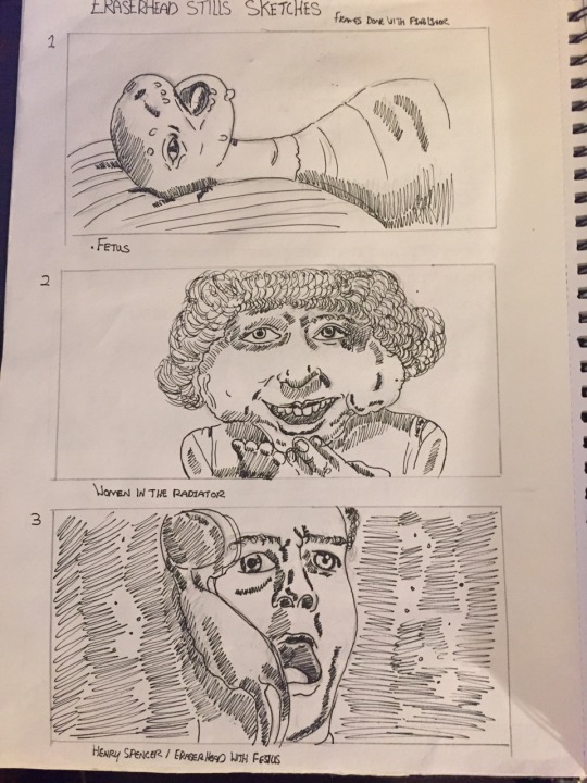

I wanted to select frames that I thought would give a impactful response and evoke confusion. When it comes to the context of the frames I desired to take ones that are from various scenes from the film so their is a flow or story that can be salvaged from it.
With the frames i originally drew them out with basic media such as fine liner pen, pencil, ink and watercolour at first my sketches didn't had enough much vibrancy because of the reason In was only giving myself a starting so I could further develop the drawing with other colourful media.
To further develop my pieces i tried to expand my knowledge to get out of my comfort zone for example I tested out something i wasn't particularly the most effiecient with digital design. But before I use software such as illustrator and photoshop on the macs i felt I needed a guideline to work from so inintergrated my traditional processes like drawing paint etc and transfer those compositions onto photoshop to further manipulate it to see if it would create an effective outcome and I believe it did benefit my development and my art style as well.
What I like about the digital process is that I could add tonal and colour onto the piece i selected and I could undo any mistake something you can't really do with traditional and when completing the piece i could print off with a high quality finish with any size ranging from A5 to A3.
Final six frames
These are the final six frames i created for the end of this project it is obvious i took a jump into the opposite direction when it comes to the vibrancy and strong focus on the backround.
The artstyle is my own but I carried a lot of the elements the 1960s art movement pop art based on consumerism items and beauty simple being saturated in vibrancy.
Each of my frames did share these visual qualities many being produced in traditional mean but I wanted to intergrated the digit process to challenge myself because I don't understand every technique that can be done on a computer using the wide selection mixed with gradient effects and layering an image.
Frames 1 and 2
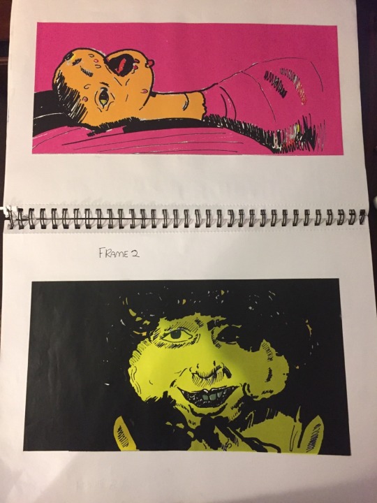
For the first two frames i wanted to test out the effectiveness of the digital outcomes by takings drawing I did traditionallly and transferred it into the computer and tested out the colour effects and gradient effect to see mainly for the first I used only the paint bucket tool to colour it in. The visual presentation of this piece has a pop art quality similar to Roy Lichtenstein art work he relied on heavy black line work, shadows and strong hot and colour all produced and in a illustrated outcome.
The second frame I wanted to see the effectiveness of the gradient on phoshop mixed with the bucket tool and complimented well the colour I used. yellow was my primary colour and contrast with the shadows like night and day complete opposite the spectrum so the they stood out equally and created this creepy tone that movie is know for evoking.
Frames 3 and 4

With the third and fourth frames their quite opposite form each other but reflect that the film is emotionallly trying to convey this fear and dread that main character is expirencing he seems to be the only sane person through whole picture and come across he is trying make sense of it.
The third frame I was going for the pshydelic nature of Basil gogos work where he takes a iconic character from universal horror and paint them against a clashing backround of warm and cold colours. The frame I used this style of colour and imagery i think I made it look like it is in motion instead being a static image. The reason I say it is motion because of all the rough lines that are going horitiotally across the frame mixing with the classes colour makes incredibly active image.
The fourth frame is more connected in a artistic approach with the film with this project I have used juxtaposition to create various outcomes so I could further expand my development work. I used image from my bookend tranferred into the computer and staturated it monochromatic layer to give that vintage look. That give it that look of over exposure that many photos from the earlier 20th century. The image has quite featurless characters that adds the isolation and alienation of the unknown also the fear and doubt that is consistent through the films.
Frames 5 and 6
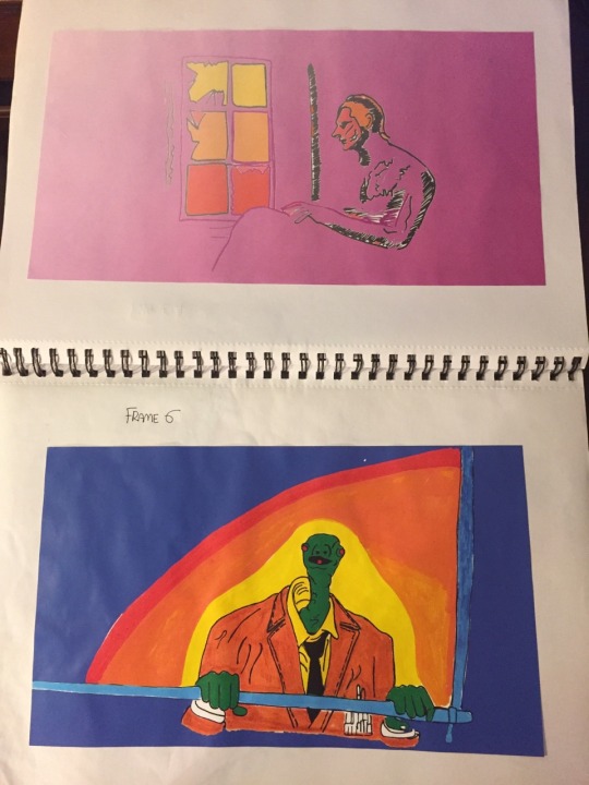
For the final frames I went for my personal artstyle. It does have connections towards pop Art especially Roy Lichtenstein with the thick line work that is consistently done in my art book. I felt I needed to combine the colour of James Rosenquist and add my own quirky linework into the mix to represent my understanding of my contextual research.
The fifth frame is very minimal work and line work that is there is simplistic for reason of letting the emotion being expressed through colour. I still want to implement the pysdelic style in another frame so drew it out originally. On tracing paper to see the image would come clean and not faded. I came up a with strong linework but with all the negative space I wanted to have the addition relavant colour scheme such as blue, red , green and purple.
My six frame was transferred onto photoshop and inused the bucket tool for the negative space on the image. Colour was already on 50% of the drawing because I used paint pens to colour in the character to mix with traditional media. I feel it helps with the odd nature of the movie but the sense of juxtaposition even though I done virtually all my frames but it does compliment the insanity that the film entales. But still wanted to produce a black and white frame to contrast that juxtaposition.
0 notes
Photo

Huawei is a brand that captures headlines, yet struggles to get noticed. How does that happen? Geo-politics tend to cast a long shadow, but that’s neither here nor there when it comes to the technical strides the company is making with its cameras. I covered some of my initial thoughts in a previous hands-on, but in taking the P20 Pro with me on a trip to Asia, B.C. and living in the Toronto area, I’ve come to know what to expect from this shooter.
Pushing aside the notion that this camera is not only more adept, but also “smarter” than its competition, the visual proof suggests an interesting battle ahead. When you market your phone’s camera to be the most advanced and intelligent system available, you best back that up. Out in the field, in varying conditions, it took me some time to warm up to the whole package, but I was left thinking there may something special going on here.
The phone’s most obvious physical trait is its rear triple lens layout. And while they’re integral to the overall picture, it’s the software inside that stood out to me. Huawei eschewed optical image stabilization (OIS) in place of digital image stabilization. It opted not to use the 3x optical zoom telephoto lens to augment its existing Aperture mode for bokeh photos. It did little to nothing in changing the monochrome lens.
The more intriguing physical aspect, at least for me, was going all the way up to 40-megapixel on the main RGB lens, courtesy of an unusually large 1/1.7-inch sensor. With a decent f/1.8 aperture, the company suggested low-light performance would be unmatched by any other smartphone on the market. That’s where the software comes in. Huawei’s new-and-improved Night mode allows the P20 Pro’s camera to capture scenes with incredible light and detail. By reaching ridiculously high ISO levels and slow shutter speeds, one could shoot a handheld night or low-light scene with ease. Under normal circumstances, such a shot would be all but impossible without some hand shake blurring the scene.
With the P20 Pro, I shot night scenes that seemed almost impossible to believe were done without a tripod. After snapping something, I saw it go to work, almost literally breathing life into what was otherwise a decent night photo. The AI-assisted image stabilization keeps everything steady down to a four-second exposure. It works really well, but naturally won’t be able to freeze any movement. It was obvious to me that Huawei leaned heavily on HDR to give these images their vibrancy. Without being able to adjust the extent of the effect, it was hard to gauge how much tinkering I could’ve done. Truth be told, though, the only way I could match the results was to use a tripod in Pro mode and then apply HDR editing after the fact — something that would take much longer than this method.
Huawei is promoting the notion that software can do most of the work in figuring out how to best shoot a scene. For example, the P20 Pro (and P20 as well) recognizes no less than two dozen unique scenes. Whether it’s a sunset, close-up or food on a plate, it adjusts accordingly to enhance the shot. It’s nifty, but needs work. In cases where two scenes are in the same frame, the software was confused as to what to prioritize. If I was looking at a beach with some greenery in front of it, the camera would sometimes focus on the wrong one. I had two options: I could either tap to maintain the focus on what I wanted, or tap the X to remove the AI entirely from the shot. The tendency to ramp up contrast and drive up saturation is hit or miss. At times, it was completely unnecessary, ultimately lending a photo a cartoonish blend of colour. Other times, it was fine, but only for shots that benefitted from extra colour, like a sunset or beautiful dish. Then there’s the sharpening effect after snapping the pic. Huawei includes this by default, and it can be a little aggressive. It does pick and choose, however. I noticed it was less prevalent if the AI knew I was shooting someone’s portrait, but applied it more heavily to any natural scenes.
0 notes
Photo
Montana Shop Advert - Final
Preparation for shoot diary entry No.1
Firstly, we selected a variety of inanimate objects that we believed might be relevant to our clientele, like cameras, stereos, telephones and CD’s. We then spray painted them either blue or pink using spray paint from our client, ensuring to prepare the paint properly by shaking and testing the canister before applying it to the products ensuring the paint was all smooth without bits as well as making sure the spray would be distributed evenly. When painting we made sure the room was well ventilated to avoid fumes, we also used glove and eye protection, spraying against newspaper to avoid damaging other objects in the area that we didn’t want painted. For technique we kept the canister about a meter away from the objects to get a smooth finish and ensure the paint got into all areas of the object, nooks and crannies included.
Set design plays a huge role in this brief and our shoot. WE spent a good half an hour playing around with our objects composition before we even touched the camera. This is to ensure our time in the studio would be efficient and effective. Often working in a studio can be costly if you rent it out as an artist, therefore this was good practise for our photographic careers. Experimenting with composition in groups was helpful as it got multiple people’s opinions thrown into the mix. Everyone sees things in different ways so for an ad campaign that many people are going to see it’s important that you create something that can be liked by the many as opposed to just the artist’s personal preference. Working in groups practically eliminates this issue.
The shoot itself went very well, our planning paid off and we executed our pre planned compositions quick enough to experiment further. Using a professional setup based around capture1 meant that all members of our team had a job to do that we could all focus on and hopefully perfect. For example, one on the mac reviewing images and pressing the shutter button, one behind the camera making alterations to focal length, points and framing the images, one managing the set forming the compositions and finally a fourth man on the lighting systems. This system meant communications was vital which it took a little while to get used to but we got there in the end. The only issue we had was a technical one with the connections from the camera to the computer which stopped us from pressing the shutter. This was a quick fix but it did cost us a few minutes of studio time. If we were to use this system in the studio again I would be interested to see what it would be like with a live subject. It would create more openings in the team like props/costume person and also likely someone in a director’s role instructing the model on the fly, inevitably ramping up the intensity and speed of the shoot.
Finished Product Evaluation:
Do your images successfully reflect the style the brief asked you to create?
My images do indeed fulfil the brief to the maximum, the client asked for an emphasis on their new line of spray paints shown by the bright and enthusiastic colour palette within the image. (used Montana paint to create set). Also I incorporated their slogan into the image but unfortunately one of the cans themselves were unavailable to me.
What are the similarities to the images in the brief and your own?
The two primary constants are, one, they both contain seemingly mandarin objects, and two, they both contain colour that covers everything in the image, resulting in a very tightly constricted and controlled colour palette.
What are the differences?
The objects in the brief coincide with some kind of theme for each individual image, one with golf, one with badminton and a third with exercise/sport related objects. This gives the images a context and purpose, unfortunately for our shoot we had a limited number of objects available to us and so couldn't really adhere to this trend. We attempted to go for objects related to creation and media, tying in with the “Paint & Create” slogan but I believe we could have been far more effective at this if we sourced our objects a little better (that being said we struck gold with the SLR)
Does the logo and slogan fit well in the image? Why this specific typeface? How did you manipulate the typeface in the image?
The logo was relatively easy to get looking right in the image, due to the considerably empty space towards the bottom of the image I went with a large size and central position to match the symmetry of the colours in the image. The slogan took slightly more thinking, I knew with the space I had left it would need to go to the right handside, either above or below the disc, I tried putting one word above and one below but it split the text up too much, I wanted to keep it fairly close together and in a large font to jump out at the audience as well as become a feature of the image in itself. My selected typeface is elegant, relaxed and flowing (like drawing or painting) while also been bold and affirming at the same time, I kept it as close to white as I could get without having the distraction of a pure with against blue and pink while also addition a 3D aspect to ensure its the first thing the clientele sees and for extra character in the image.
Are you happy with the logo and slogan? how could they be improved?
I am pleased with how this mini brief turned out however there are a few improvements I could think of making if i had more time. First I would move the disc slightly down and to the right allowing for space for my typeface to flow into as they are currently too close together. I would also experiment with the logo and present it in a more creative way such as making it look like the the current logo was a stencil, it had been placed on the image and then spray painted over (in matching pink or black). Then the stencil had been removed revealing the blue unpainted print of the logo on the image, tying in with the briefs theme of spray paint.
Did you crop your image?
Thankfully I didn't need to crop any of my images as we got our framing bang on in-camera to save us all time in post production (valuable lesson that has been drilled into us over the past 14 months)
The Edit - Creation Process
Unfortunately my screenshots I captured while editing this final piece have been lost due to a corrupted memory stick, as a result I will try to type out the process I took from the bare image in camera to what you see above.
1) Selected the image I wanted to work with and bought it into photoshop, changed the orientation to portrait.
2) Using either clone stamp, paint brush or spot healing I began to retouch the image, removing any blemishes or places where the paint had chipped off (especially the strap looks on the camera and the bottom of the TV remote.
3) Removed the tramlines in our chipboard base as they were very distracting in the image and didn't adhere to the clean look I wanted to end with.
4) Began to edit the image in camera RAW filter primarily but also using levels and curves adjustment layers as a secondary. Vibrance was important for the image as I needed to bring the colours from being quite muted to really popping, as a result vibrance was increased (not saturation) along with contrast sharpness, and a touch of clarity. After that any other alteration were incredibly minimal in all kinds of areas.
5) Imported the logo from my source, stripped it of its white backdrop using the selection tools and inversing that selection of the layer then pressing DLT. Then sorted its size and positioning.
6) Experimented with typeface and text positioning (ended up with around 120pt). Duplicated my text layers, applied a ‘difference’ blend mode and moved it out and back slightly to create illusion of a shadow / 3D text.
7) Made final alterations, double checked my retouching and applied blending modes to layers to achieve my desired look.
0 notes
Photo

I improved this assignment by focusing more on a minimalist approach, simple but effective,more zoomed in and focused on one thing.to make the viewer focus on the contrast between man made and nature and makes you as the viewer focus directly on the difference between man made vs nature and the meaning/narrative. also i have changed compositionally for example one of my images have frame within a frame
the original didn’t have much composition or meaning/narrative behind the shot compared to this time around.i did this because i didn’t like how it looked as the green was to bright i wanted a abandoned, mold/mossy look.
image one- final; the creative process i followed was kind of a the nature is taking back power from the man made things in everyday life which once took over the nature ruining the natural bright beauty a bit like the image of taken in keelung taiwan at a abandoned building (see previous post) as within that picture the nature (trees) have overgrown the flats and regained control hugely of the abandoned building abit like that image
the planning i did was thinking ahead,thinking of locations which has moss and looks kind of abandoned.i also had to think ahead of how the conditions going to be like eg sunny and washed out colour or high contrast rain.the stylistic decisions i did was close up,cropped high contrast,range of colours; reds,green.blacks,cream.
the post production techniques i used was high contrast and lowering the exposure as this makes the image darker but strong colours so its like it being a dull day with a strong glow of nature.so its like gives nature power as its more vibrant.
the settings used for this image was ISO 3200, aperture of f/4.5, shutter speed of 1/40, setting manual with lens at 34 mm.the composition of this image is cropped and patterned and symmetry.the narrative of this image is the nature (the moss) is regaining strongly control of the environment from the man made products. hence the high contrast on the moss.the lighting of image is fair even with the editing and the dull conditions i had to take the pictures in.slightly dark to create effect i wanted to create.(dull,high contrast to create a negative vibe but give power the the colour [the plants/moss]) the framing of the picture is slightly off but is okay because its just cropped symmetry.i think it brings realism to the image as its not perfect like the situation.
image two-final; the creative process for this image was inspired by the image take by David Gibbeson and lovell d’souza (images from the previous posts) from the dull kind of one thing to focus on but mine is dark instead of b&w or pale.
i had to think how could i use my inspiration and make it my own to portray what i could of the topic within the time given as i dont have the resources to go to nature parks with the time given.i had to think what lens i would need to use i ended up using a kit lens as i didn't need to zoom in massively.
i shot symmetrically as symmetry is usually aesthetically pleasing and that was man made and the nature ‘ruins’ that symmetry but makes the image more interesting as it brings colour instead of dull red/brown and grey.
the post production i used on this image was high contrast and low exposure i dehazed the image and lowered the saturation to replicate the photographers who inspired me to take the image like this/edit the image like this
the settings used for this image was ISO 3200, aperture of f/4.5, shutter speed of 1/40, setting manual with lens at 35mm.the composition of this image is similar to the image before being symmetric,patterned and cropped however the composition is ruined by the nature growing out between the bricks.the narrative of the image nature is regaining control of the modern landscape of man made material.the lighting in this is pretty dark but isn't dimly lit which gives the nature a glow from contrast.the framing is food as it follows the rule of thirds rule.
image three-final;the creative process i followed for this image was again inspired by both david gibbeson for the simplisticity and lovell d’souza for the dull colour as if its black and white but does have colour. had to have a image how roughly i wanted it to look like to be able to achieve which is visually pleasing.the stylistic decision made was frame within a frame. i made the vibrancy really low so the only thing which really has colour is the moss which gives the natural moss power and attention.also changed the contrast higher and lowered the exposure to darken the image. to advance my point/view
the settings used was ISO 400,f.number f/4.5, shutter speed 1/40 with camera setting manual with a zoom of 35mm.the composition is frame within a frame which makes the moss glow like its important.the narrative is nature regaining control and it will fight back if you try to remove it with man made materials.the framing was from within a frame.
image four- review;i tried to do frame in a frame but it had shallow depth of field as i didn't change the aperture to high also it was too bright.my sources of inspiration was man vs nature in general mixing it with compositonal technique frame in a frame. i tried this as i thought it would work and look aesthetically pleasing as it would look like man made is trapping nature/natural however didn't turn out the way i wanted it to turn out.i had to think when capturing this image how it would look and what would look aesthetically appealing to the eye.it didn't get edited as it didn't make my final shots when reviewing them.
the settings on this image was ISO of 400 with aperture of f/4.5 and shutter speed of 1/40 seconds the camera settings in manual with a lens of 35mm.the framing is at a angle.the narrative behind this image is man made is trapping nature/natural behind bars.
my images are about man vs nature and how man(made) is taking over but gets abandoned over the years and nature just takes back the land.i communicated that narrative via my images of places in the local area which have regained nature my theme is high contrast low exposure throughout the set of images i believe i was successful in doing so. as i used compositional techniques such as frame within a frame and rule of thirds and symmetry which makes my set of images aesthetically pleasing and enjoyable to the viewer.
im satisfied with my final piece of work as these compared to before as these images have a theme and better constructed compositional techniques unlike my original attempt.i believe i have told a story as they have a theme of man vs nature and how they was edited.
i am satisfied of my work as they tell a story which originally they didn't. i think now the story has a stronger message than before.
i think my weakness within this was framing as some have a ‘dutch tilt’
however i think my strength within this assignment was my composition as they wasn't a lot of my pictures without a clear composition like from within a frame or symmetry.
if i was to do this again i would work on my framing to make the images/theme more aesthetically pleasing
0 notes