#book history
Text
Ms. Coll. 390, Item 3020, contains the legend of Kālaka, important to the Śvetāmbara Jains and read during the first night of the Paryuṣaṇā, telling of this figure's conversion and initiation to Śvetāmbara Jainism, his overthrow of the wicked king Gardabhilla of Ujjain, as well as his career as guru and renunciant. It contains seven other paintings from events in the monk's life. Written in Sanskrit, circa 1700-1850.
🔗:
28 notes
·
View notes
Text
Dune Frank Herbert
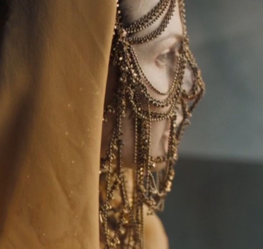

“Dune" is, without exaggeration, an era, a magnitude in literature that is difficult to overestimate. A science fiction saga, with elements of the novel of chronicles and adulthood, space opera and dystopia, metaphorical narrative full of philosophy and mysticism.
The first trilogy of the classic cycle is full of the life and life of a free people, the planetary ecosystem including the giant worms, echoes of courtly strife, the structure of organizations equally ruling the Known Universe but also dependent on the spice that is produced only on Arrakis.
High and intense text full of concentrated substrate based on religion, politics, ecology, legal and cultural issues, immediate survival, while learning about the future.
The plot is fascinating, like standing in the center of a huge temple complex in Kornak, where the desert wind brings the essence of plans within plans.
Compared to the TV series and screen adaptations, the book predetermines the accents in relation to the characters, making them full and vivid, clear in plot twists, meeting the author's intent and the logic of behavior under given conditionsThe story itself I really liked, probably partly because I generally love fiction and somehow have not read something interesting and non-anal of this genre for a long time. A lot of fiction books are based on Christianity, and this is the first book in my memory that is based on Islam.
I also like the way Frank Herbert describes the characters' looks - almost without details, leaving room for imagination. The story is not long, lively enough and colorful enough, and I have experienced this forgotten feeling again and again, when I want to return to the book to find out what is going on.One of the main themes is the opposition between the houses of Atreides and Harkonnen. In these quotes, a clear example of the difference between the houses: the Atreides pay love for loyalty, while the Harkonnens gain submission through hatred. 'How much he talks! - Hawat thought. - This is not Duke Leto, who could speak to me with a wave of the hand, a movement of the eyebrow. What a carcass! The author (maybe the translation) shows Vladimir Harkonnen as a huge carcass, which has accumulated large reserves of precious water. This is the main peculiarity of the desert Arrakis. Arrakis. A desert planet, also known as Dune. There, under the scorching sun, there float huge worms on the sand, from which it is impossible to hide. There’s a free folk out there - Fremen with blue-tinted eyes that cover even squirrels. And, most importantly, Arrakis - the only place where the spice is extracted. Spice or melange - the most important wealth in the universe. If water is commonplace on Kaladan... here, in the desert conditions, its value is high. To show your respect, love, loyalty, you must share water. Whether it's spitting or mourning the dead. One of my favorite characters is the planetologist Kynes, who dreamed of turning the desert into an oasis. His father managed to plant and implement this idea among the Freemen, and his son continued his work ... Freemen are a hardened people of the desert with their own philosophy and way of life...they were told that the work of greening Arrakis is labor-intensive and the results can be fully appreciated only by the eighth generation. Not only that, but the Freemen and the Kynes did not abandon it, but passed it on from generation to generation. Valuable and very much appreciated. Chani is a great representative of the Freemen. Honestly, I didn't really understand why Jessica didn't think she was a good match for her son, even though she thought she was a worthy representative of the Bine Gesaerit school. Chani is wise, intelligent and loving to Paul. She is such a reliable and strong support for him.In general, the novel is a very interesting story, competently combining social problems, political peripetias, religious ascents, life philosophy, many multi-layered mysteries, and I think, even some meditation.And all this cornucopia is doused in beautiful, smooth, syllable with detailed, distinctive style descriptions that include perfectly developed characters. I wholeheartedly recommend the novel, I don't know if I'll be able to experience all six books, but I'm now serious about part two. For anyone interested, I recommend that you be patient and take your time with this story, getting to know it at your own pace.
#aesthetic#light academia#romantic academia#academia aesthetic#chaotic academia#classic academia#dark academia#dead poets society#book review#donna tartt#dune movie#dune#dune books#reading#books#book history#fantasy
25 notes
·
View notes
Text
Do you have any tattoos? ⚓️ I have a bunch, so I was very excited to come across these 19th century tattoo flash books in the Winterthur Library – and they’re digitized! You can see them here 📚
5K notes
·
View notes
Text
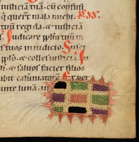
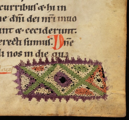
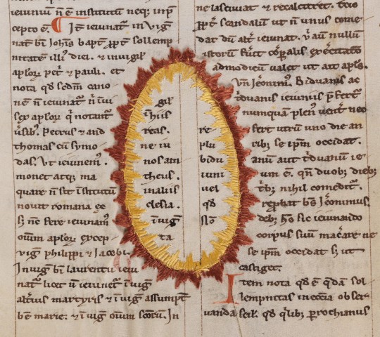
medieval parchment repairs
in a psalter, south-western germany, late 12th/early 13th c.
source: Hermetschwil, Benediktinerinnenkloster, Cod. membr. 37, fol. 19r, 53r, and 110r
#12th century#13th century#repairs#mending#medieval manuscript repairs#sewing#book history#medieval studies#medieval art#psalter
7K notes
·
View notes
Text

fisher rare book library x a manuscript from the 1300-1400s
524 notes
·
View notes
Text
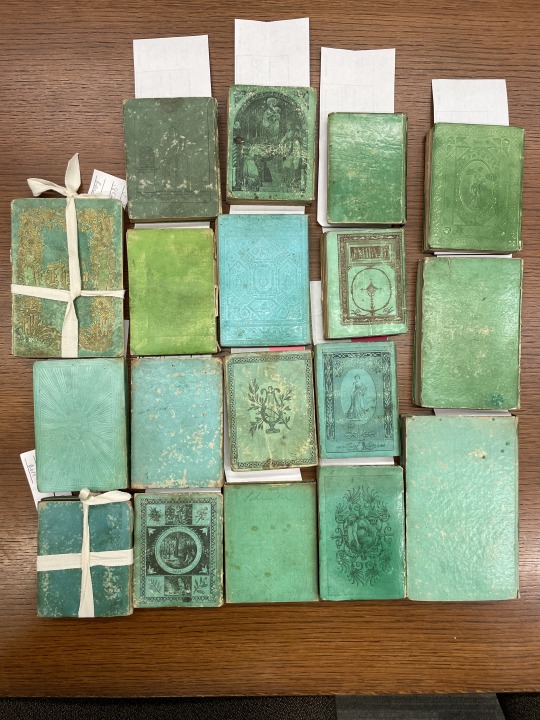

One of these things is not like the other…
The bindings of the books pictured in plastic bags contain arsenic, while the un-bagged books do not.
Copper arsenic compounds were used as a green pigment in textiles and home furnishings during the 19th century. In 2019, Winterthur/University of Delaware Program in Art Conservation embarked on a study of green cloth-covered book bindings from the 19th century and continues to lead the way on research regarding these compounds in library materials. Their current findings suggest that the publication date range for volumes containing arsenic is 1830 to 1880 and that such books are bound in green cloth or green leather. Most green book covers from this period do not contain arsenic. (While books containing arsenic are green, not all green books contain arsenic.) Our best current estimate based on the testing we have done is that less than .03% of the print titles in our collection contain arsenic. As we identify print titles that contain arsenic, we will take measures to provide other options to make the content available wherever possible.
Read more about how the University of Chicago Library is handling these rare green bindings.
447 notes
·
View notes
Text


In the middle ages, people used to "doodle" with an inkless stylus instead of a pen, and new topographical scanning can reveal these marks.
360 notes
·
View notes
Video
The Yellow Book
https://www.gutenberg.org/ebooks/41875
https://www.gutenberg.org/ebooks/41876
The Savoy (periodical)
https://en.wikipedia.org/wiki/The_Savoy_%28periodical%29
https://archive.org/details/savoy01symo/
https://archive.org/details/savoy02symo/
https://archive.org/details/savoy03symo/
#tiktok#book history#books and literature#books and writing#books and libraries#books and authors#books and reading#art#art history#1890s#19th century#the yellow book#the savoy#lit mag#literary history#literature#art magazine#books#project gutenberg#oscar wilde
442 notes
·
View notes
Text
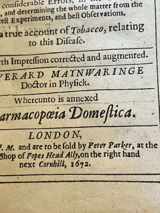
Looks like Peter Parker is both Spiderman and bookseller!
Found in A treatise of the scurvy, examining the different opinions and practice, of the most solid and grave writers... by Everhard Marynwaringe (1672).
#rare books#old books#peter parker#spiderman#booksellers#books#printing press#book history#othmeralia
124 notes
·
View notes
Text
St Gall Abbey Library
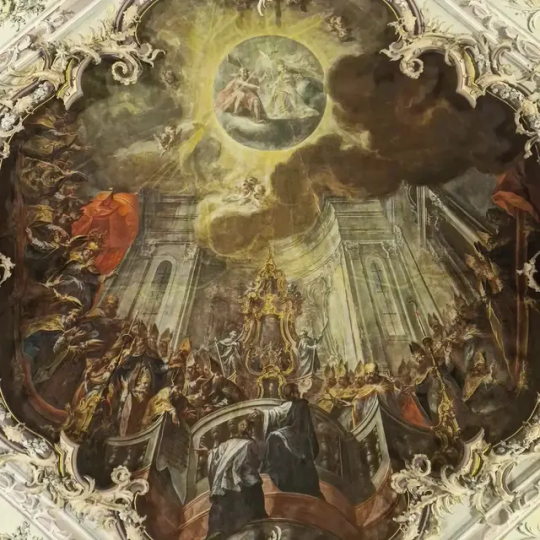


#dark academia#dark academia aesthetic#old library#library#old books#book history#books#manuscript#st gallen#baroque#baroque architecture
77 notes
·
View notes
Text
I'd like to introduce you to LJS 57, a compendium of Astronomical text in Hebrew, written in Spain around 1391. It's an interesting combination of astronomy and astrology, and illustrates how the division between "science" and "not science" was not nearly so clear in the past as it is today. It has some fantastic illustrations of constellations!
🔗:
#medieval#manuscript#medieval manuscript#14th century#hebrew#astronomy#astrology#stars#constellations#illustrations#illuminations#diagrams#history of science#book history#rare books
4K notes
·
View notes
Text
Little Isaac Bawden was quite the calligrapher! 🖌️ This 1763 arithmetic book shows off his flourishing skills. The later 1880s Golden Gems of Penmanship, published during the calligraphy revival of the 19th century, allows us to see how Isaac learned this art! Isaac’s book has been digitized, and you can find it here 📖
(Doc. 743 at the Winterthur Library)
908 notes
·
View notes
Text
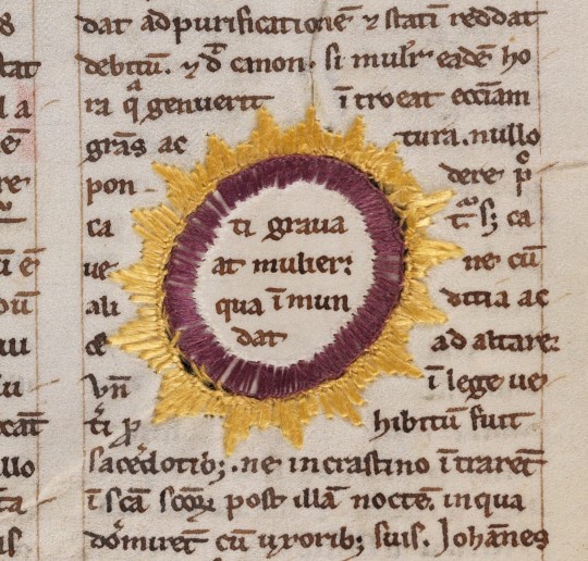

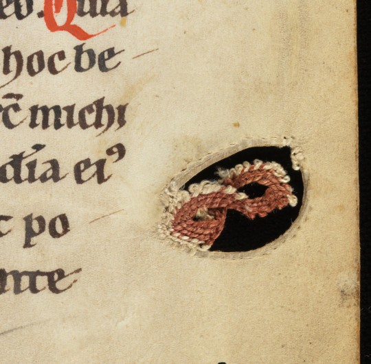
more medieval manuscript repairs
all from a miscellany containg thomas de chabham's "summa poenitentialis", southern germany (?), first half of the 13th c.
source: Basel, Universitätsbibl., B X 1, fol. 56r, 67r, and 71r
#since y'all liked them so much last time :)#here i love how you can tell the mending was done BEFORE the script was added#13th century#medieval manuscript repairs#book history#visible mending#parchment#medieval art#thomas de chabham#summa poenitentialis
3K notes
·
View notes
Photo

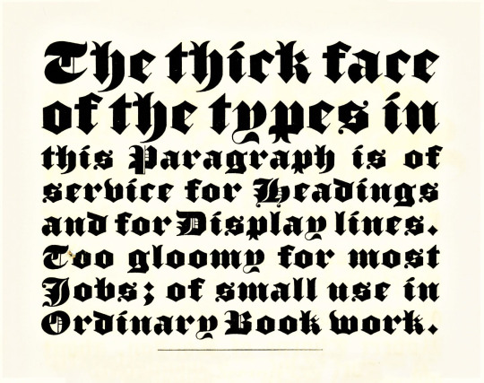
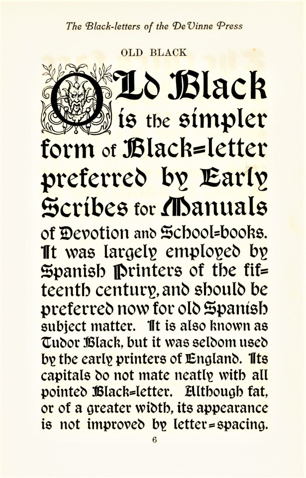
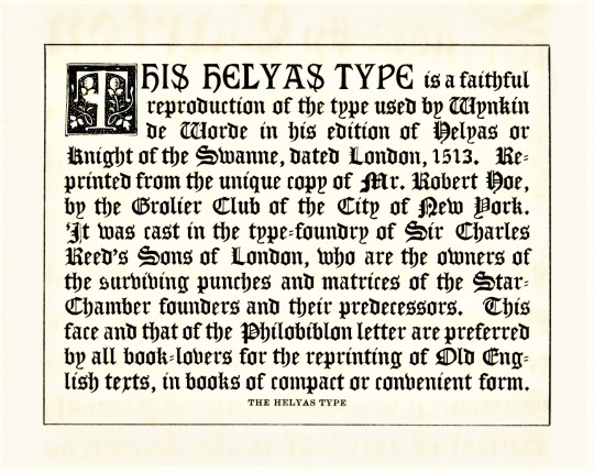
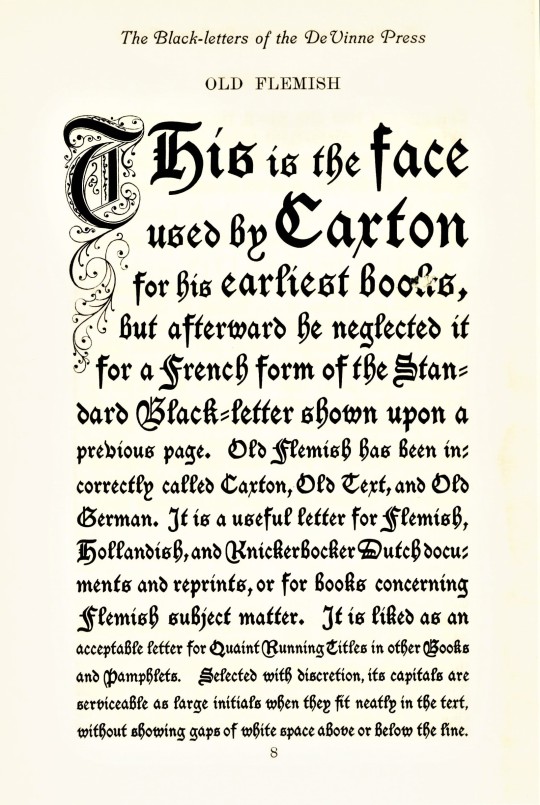
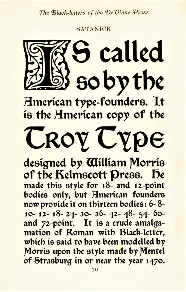
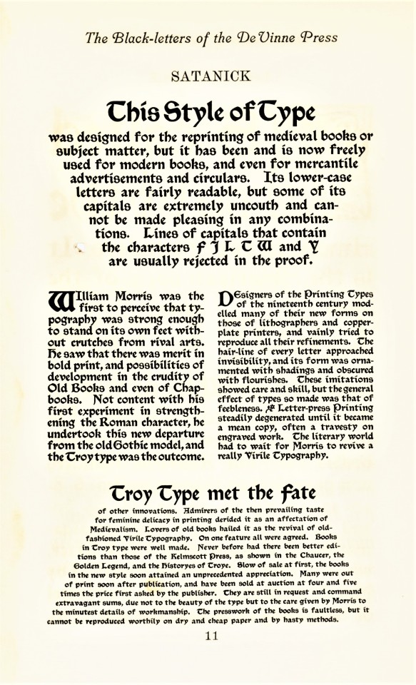


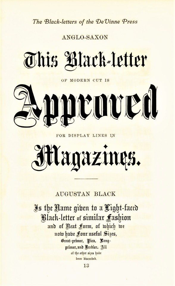
Typography Tuesday
BLACKLETTER
Blackletter, also called Gothic, was the first typographic form to be founded in metal type by Johannes Gutenberg in the mid-fifteenth century. The first book printed in English was in blackletter, as was the first book printed in England (both by William Caxton; the first printed in Bruges in 1473, which was also the very first book printed in Bruges, and the latter in Westminster in 1476). It is called blackletter because its narrow, condensed forms produce a darker appearance on the page than do Roman fonts. By the late 16th century, most Western national printers had dropped blackletter in favor of the arguably more readable Roman-style fonts, except for some Scandinavian countries which held onto blackletter forms until the late 18th century, and Germany being the last holdout until 1941.
Blackletter fonts are still used today, however, as display faces, for ceremonial use, and for certain kinds of emphases. That’s certainly how Theodore Low De Vinne (1828-1914) would have used it at his De Vinne Press in New York. These examples come from Types of the De Vinne Press, published in New York by the De Vinne Press in 1907. Theodore De Vinne founded his press in 1883. He was also a co-founder of the prestigious Grolier Club and one of the leading commercial printers of his day, whose enterprise had a profound influence on American printing and typography. This book was intended as a promotional specimen book “for the use of compositors, proofreaders, and publishers,” to demonstrate the wide variety of typographic possibilities that could be available to their clients.
View more posts from Types of the De Vinne Press.
View more posts on Gothic/Blackletter type faces.
View more Typography Tuesday posts.
#Typography Tuesday#typetuesday#Typography Tuesday#Blackletter#Gothic type#Theodore Low De Vinne#De Vinne Press#Types of the De Vinne Press#book history#20th century type
236 notes
·
View notes
Text
i love book history i can't wait to worry about it for the rest of my life now that im becoming a librarian
33 notes
·
View notes
Video
Gods' Man is a wordless novel by American artist Lynd Ward (1905–1985) published in 1929.
https://en.wikipedia.org/wiki/Gods%27_Man
youtube
Frans Masereel My Book of Hours
https://theanarchistlibrary.org/library/frans-masereel-my-book-of-hours
#books#wordless books#graphic novels#woodcuts#wordless novel#woodblocks#books and literature#books and writing#books and libraries#books and authors#art history#Frans Masereel#Lynd Ward#art book#history#book history
93 notes
·
View notes
Last Seen Blogs

rurarin
Rurarin

ap-kinda-lit
Free Palestine🇵🇸

mimely-manners
Mime time

senisevmeyiagiroduyorum
Yine sensiz..

darklord19
darklord19