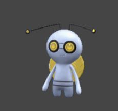
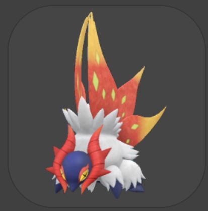
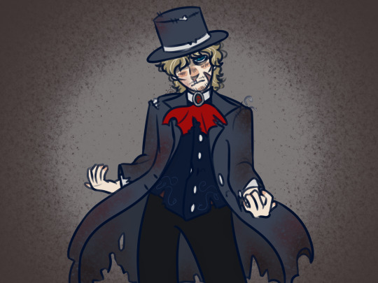
#i like her design and by that i mean the colour pallet
Text
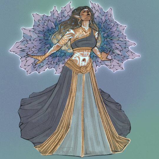
itheliaaa
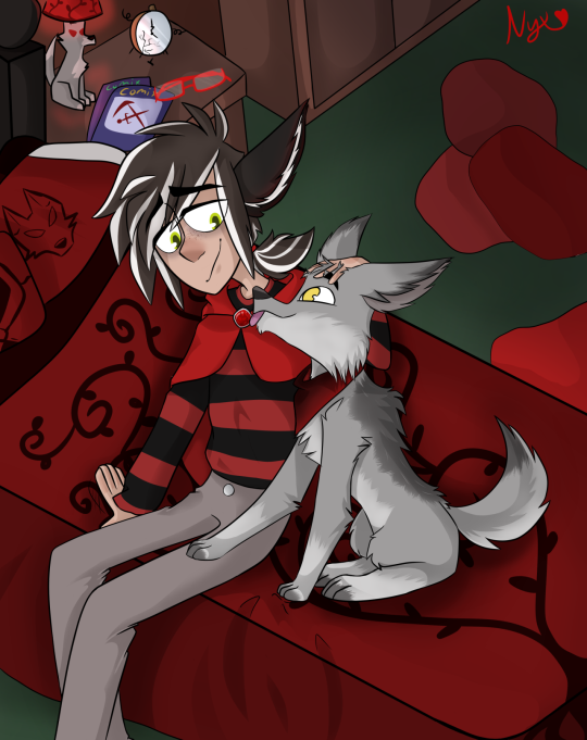
#tes#tesblr#elder scrolls#the elder scrolls#eso#elder scrolls online#ithelia#daedric prince#tes art#tes fanart#gold road#eso spoilers#does it still count as spoiler if she has already been discussed by the whole fandom? ehh i’ll tag it just to be sure#digital art#tiredelart#this looked cooler in my head lol anyways#i like her design and by that i mean the colour pallet#it’s like the zos design team her KNEW the colours/colour combination i liked#and designed her for me to become obsessed over her (it worked partially)#i also gave her silly elf ears bc you can’t stop me#if tes was real ithelia’d be the daedric prince of instagram i think#next time i draw her it will be insta related mark my words
189 notes
·
View notes
Note
the colors reminded me it's port mafia time
about all of the port mafia has black in their palletes, it is very clear to see BUT there are three exceptions
kouyou has black in her character design BUT also pinks and reds. she probably doesn't count but still! you notice the pinks/reds before you notice the black. I think this is to connect her to kyouka but I could be absolutely wrong. small little extra detail: she has spider lillies at the bottom of her kimono(?) which repersent danger and death and abandonment! (they can also represent rebirth but death is the most common meaning for them)
kaji also barely has any black in his pallet. but he's kaji. absolute unhinged creature
and finally tachihara! he has black pants but also green jacket and white shirt. obviously in the beginning he wasn't actually a port mafia member but a hunting dog (that changes but also we don't see him after he gets turned so does he get new mafia swag? the world may never know.) the green of his jacket could repersent his connection to the hunting dogs (green jacket -> green uniforms) but that might be a HUGE stretch so eerrhhree take it with salt.
mori also applies to this halfway since he has two outfits (port mafia boss + his physician outfit) BUT with his physician outfit he wears a purple button down with his white (lab? doctor?) coat over it. purple is associated with corruption and royalty and I think that applies to his position as the mafia boss BUT! BUT the lab coat covers it so ITS LIKE HIM CONCEALING IT!!!! HIDING!!!! GRR DHER I hate mori but I love putting him under a microscope sometimes dude.
anyway!!!!!!! colors!!!!!!!! fun.
ohhhh I LOVE THIS!! lots of little details i didn’t think too far into.
thinking into kouyou, the black in her design is under the pink/red mostly. as if she’s keeping the more extravagant (maybe the wrong word) or passionate part of her external while the darkness she tries to not let out. she’s talked before about how you can’t go back if you thrive in the darkness, so i assume her design reflects that a lot. she expresses beauty despite being in the darkness. pink is also associated with love and care, and she seemed to take on a role in protecting kyouka and likely loved her or deeply cared about her. (i am so here for kyouka and kouyou found family older sibling or mother-like role).
kajii has a couple black stripes on his outfit. not much, but enough to symbolize that he’s with the mafia. what’s interesting though is that they cover his eyes as well. you’d think they’d put more emphasis on his eyes to show that he is corrupted as well but they stay shielded a lot. harukawa said at one point that his eyes are pitch black even if you cannot see them. this is probably a combination of him being a scientist and keeping his face shielded and maybe adding some uncertainty for his character. i also assume the white clothes is to go with the scientist-y look. we don’t know much about him yet but i hope we do soon.
and for tachihara hmmm. i wonder if asagiri had him planned out from the start? or if he decided to add that in to give tachi some depth since he didn’t have much beforehand? either way i love that he has such a cool design, it’s one of my favourite mafia looks actually! i like your idea of the jacket connection a lot, that makes sense! i noted that tachihara also wears black wristbands, tying into the colour theme of the mafia as well. i’m going into heavy speculation here, but maybe the white on his shirt could somehow represent his purity (combined with the green jacket to show his status as an officer)? and the black of his pants could represent the effect the mafia has had on him? as in he is both good and evil. or maybe they just thought the colour contrasts looks cool and i’m looking to deep into things idc tho ily tachihara
i don’t have anything to add to mori’s designs i just really like what you said with that. really cool ideas !!
i always love seeing your ideas on stuff!!
#sorry for taking a few days to respond. i am the ceo of forgetfulness#but i love talking ab colours and design symbolism and everything graahhhhhh this is so fun!!#asks#bsd#bungou stray dogs#bsd port mafia#the port mafia#port mafia#bsd kouyou#bsd kajii#bsd tachihara#ozaki kouyou#tachihara michizou#motojirou kajii
26 notes
·
View notes
Text
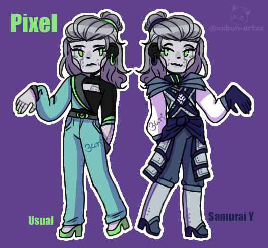
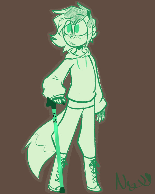
Second character I did please welcome the one and only pixel!
Pixel, they/them
Now unlike cannon nya my feelings on pixel ain't complicated, I don't like her.
S3 is so.....off-ly writen and we all can agree the romance was the worst part (sensi dilfmadon is the best part)
Pixel's biggest issue is that she never felt like a character to me she was just there getting on my nerves. She never shows up enough to stand out and when she does she blends in with white noise. Don't get me started on the wired situation where she left zane in s7 because the dismantled zane didn't respond? Then she disappeared for ages and came back like, u still luv me õwõ👉👈???
I felt nothing when she became samurai x because she almost did nothing with it so that's cool, not.
My rework:
I completely revamed thier design and pallet, in thier casual look her colours are a desaturated cyan with the green of thier eyes. I made them have this cyan to connect them closer to cyrus who's color I always perceived as cyan for some reason which brings me to my second reason to pick the colors, WHY IS SHE PURPLE DID WE FORGET THAT'S THE VILLAINS' COLOR????? It doesn't make sense to me.
Thier hair is changed from a ponytail to this half up half down hair that feels serious yet gentle, and because there us just too many ponytails in the show and I decided to keep skylor's.
Thier casual outfits is inspired by the asymmetry of thier cannon look but less...odd (like her tat is out for some reason)
It's now like business-y futuristic.
Thier samurai x look didn't change much, I changed the pallet to a cooler blue to make them match with zane and I dubed them samurai y to inform that they are now indeed the samurai and I made them smile :D
Lore here, I made them change over time from cold apathetic and having a hard time understanding some people's behaviour to still cold but far more happier with themselves as well as enjoying life and the chaotic family they have.
I do have some rewrite stuff I will do, including redesign the nindroids and thier relationship with zane but thats another story for another day.
Reblog if ya like and tell me watcha think
Bun, out
(Quick note when I use she i mean cannon pixel not my version of pixel, I want to point this out because I got a lil confused myself sometimes)
#ninjago art#ninjago#ninjago fanart#ninjago bun designs#ninjago pixal#ninjago zane#ninjago cole#ninjago lloyd#ninjago nya#ninjago jay#ninjago kai
71 notes
·
View notes
Note
Beta Cashmere omg please???

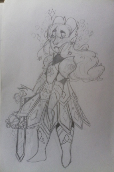
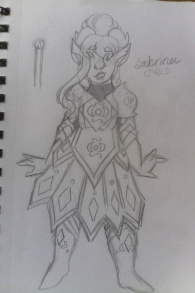
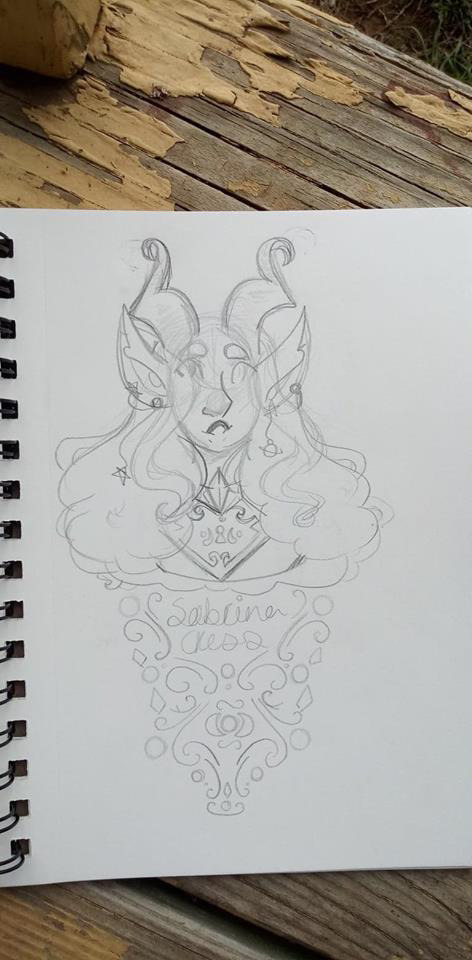
you get beta Cashmere AND art from when I used to do traditional art (it was all I could do) these are from around 2018/2019 back when I had a tiefling named Sabrina Cress (but I wasn’t sold on the last name, i eternally struggle with last names), iirc she was purple and had white hair with a purple tint (a somewhat similar colour pallet to what my oc Lanturn has now!) she was a paladin and neutral good, I never played dnd with her because I #had no friends due to personal life reasons, and would later go on to become my oc Cashmere who has still gone through many design and character changes (I can post about that too, I have a draft on my art blog I’ve been meaning to post of all their character ref sheets since I made them) if y’all would like to see that as well!
7 notes
·
View notes
Note
Hello B!
Do you have any opinions on the character designs within the aphverse?
Example: too many characters have blue eyes, there aren't enough (x) traits, etc etc
OK I WILL GET TO THAT BUT OMG NO ONES EVER CALLED ME B BEFORE ... I LOVE IT
[Keeping this to MYS because thats what I know.]
I mean, I DO think too many characters have blue eyes. Between Dante, Laurance, Garroth, Katelyn, Zane - thats already the majority of the friend group.
I dont mind the blue hair/blue eyes combo, but Dante AND katelyn having it is a bit much 🤷♂️ AND they couldve kept Laurances original colour pallet :( I totally get changing the design bc of the skins, but in MYS theres no lore reason for Laur having blue eyes so at least they shouldve been green right??? Im also devastated hes not ginger but alas <\3
I think overtime the girls in the show have less variety, particularly in the hair. No different lengths or anything. I mean, just take Cadenza! She has longass hair in s1 but it eventually gets cut the same length as Kate, KC and Aph. The girl with THE most variety in character design - and probably one of the best designs imo - is Kim, and i literally couldnt tell you a single one of her character traits other than 'possessed'. Her highlights are different and I like her colour pallet.
The guys all look... kinda similar too. But they did well differing them in little ways, like hair partings and such. I do want Laurance's long hair back tho. Jess dont be a coward give us ling hair ginger laurance
I think its very funny that Laurance has ABSOLUTELY NO fashion sense, but i would like clothes to be more consistent! I like Dante's outfit with the button up/button up/shirt combo, even if it was ridiculous it felt in character - although its a shame that after Aarmau was made canon no other character could wear purple or red, because dante looked good in red!! I love Garroth's hawaiian shirt getup and they should bring that vibe back for him for sure.
I dont think there are enough brown eyes im gonna be real brown eyes are beautiful and like. way too many inbred eyes /lh
this isnt so much an issue with character designs because. minecraft. but there arent many different body types. Like, I think Aphmau and Zane are fat, and then Travis has broad shoulders (according to 1 line of dialogue in s1, and hes still buff). and everyone else is just somewhere on the sims4 slider of skinny and strong.
WHERE ARE MY SHORT KINGS!!!!!!!!!!!!!!!!!!!!!!!! NOT EVERY GUY CAN BE 6"02U392U3837 JUST BECAUSE YOU LIKE THAT JESS. THERES NO WAY TRAVIS IS TALLER THAN KATELYN THERES NO WAY
It wouldve been neat seeing disabilities other than zane's blindness purely because of limited differentiation in design. Like, going forward into s7 I would love to see Travis keep the wheelchair bc im pretty sure he cant. recover from that. unless they pull some aphmau magic bs
All in all im torn abt Luci because I think its cute for her to be the odd one out (as i said in my If-I-Was-Tasked-With-Rewriting-Mystreet post), but thats clearly not the intention and you kinda forget shes a witch at all. Which would be cool if it was brought up? idk. Her black dress + bow was her best outfit i think. The red eyes and the bright ginger hair is a lot on the eyes and the black is a good combo for that.
TBH, the only Aph outfit I liked was the one from Season 3, but her current skin (non-mystreet) is actually very cute. I like it a lot
People have said this a lot, but one BIG issue i have with the mys designs is the colour pallets. Im a big fan of shows where one character is heavily associated with one colour, and though this doesnt HAVE to be the case for Mystreet, Id like then to be consistent. Kate's colour has always been blue, Travis' colour has always been green, Aph/Aaron Purple/red, Kc pink, zane black/grey, and Garroth is usually blue. but Dante, Laurance, Lucinda, Melissa, etc have had some super inconsistent ones.
One character design that I like across the series is actually KC. Once they know how to pair the pinks and black/white well, they do pretty well with it! Its just a lot of pink and easy to get wrong. but they do well
Travis' also isnt that bad, the outfit of his i really remember was fhe green hoodie and black trousers which felt correct.
To go back to the eye colours, Its fun to see Jess' thought process bc like. almost ALL of her love interests have blue eyes except aaron? idk. food for thought.
In conclusion,
#this was so unorganised im sorry fksbskbsmsbddn#this was just a splurge of thoughts mostly on the outfits#ill probably revisit this topic at some point i feel like i need t think abt this more so Ll get back to you anon!@@#mystreet#aphmau#anon#ask#asks#beverly says stuff
29 notes
·
View notes
Text
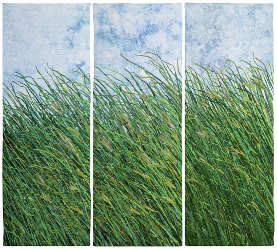
‘Of Meadows and Blue Skies’ by Melody Money
‘Of Meadows and Blue Skies’ by Melody Money was a solo show at Visions Art Museum in San Diego in 2021 that now lives on the form of an online and video exhibition on the Visions website. Melody Money is a mixed media textiles artist who prides herself on attention to detail and is “motivated to take a medium that is traditionally worked on a smaller scale and expand it to a larger version” and that's evident in this show.
After Melody Money received her Fine Art degree from the University of Colorado, she went on to study prismatic colour theory at Rudolph Schaefer school of design, and this schooling in colour theory shines through throughout the show. This works’ colour pallet is almost exclusively bright warm blues, greens and yellows. Few of the pieces from this collection use colour pallets that could be described as realist. Instead, Money opts for the sort of colours that you could imagine a child choosing for a scribbled marker pen landscape that features a buttercup yellow sun in the corner of the page. It’s clear that these colours, maybe even more so them the actual pieces themselves, were designed to invoke a child-like wonder and love for nature.
Money’s piece ‘field studies’ is more reminiscent of a sample board than a fine art piece but that makes me love it even more. The piece itself is a 4 x 10 grid of textiles field studies, these studies are predominantly beaded embroideries of local wildlife like birds, butterflies and various flora. Money clearly prefers creatures that fly as, apart from one solitary fish, all the animals depicted have wings of some variety. I do not find this preference shocking as the sky is a constant reoccurring character in her work, always lovingly decorated with swirling winds. This piece being a series of studies and not one final piece makes the work seem a lot more personal to Money, I feel like I am witness to a before unseen part of her process which is both greatly endearing and gives greater context to the rest of the work in this collection.
Money uses beading throughout these pieces, most significantly in ‘Rain’ but also rather heavily in ‘Field Studies’. All the beads she has chosen have either an iridescent or metallic quality to them, this means that in the bright lights these pieces shine. In ‘Field Studies’ a trio of blue iridescent swallows pull your focus immediately and in ‘Rain’ the whole lower third of the piece is alight, shimmering with silver bead work. These circles of beads and stitch create pools and puddles of rain that reflect both the faux, stitched light in the piece as well as the real, dynamic light of the exhibition space. Melody Money has said that light is the key to making her art sing, and I couldn't agree more, the beading on both these pieces would have been significantly less impactful and appealing had she opted for dull beads; it would have completely lost the magical shifting colours of the swallows and apparent glow and movement of the pooled water. The effect that light has on these pieces and really all of Money’s work make it such a shame I was only able to view this exhibition in the form of consistently lit photos and a lower quality than I would have liked video. I do think her work is lovely but to have seen her work in reality, especially in shifting sun light, would have been something else entirely.
‘Rain’ is an incredibly dynamic work, though the art itself is ever-stationary. Money’s use of layered vertical strips of differing shades of blue draws your eyes up and down the piece. This paired with the influx of cascading, downward-pointing triangles, which colours fade from navy to white, creates a faux sense of gravity, like the fabric rain is really falling. This effect and the way that Money has achieved it is beautiful and, in my opinion, makes ‘Rain’ the most visually stimulating piece in the collection.

By comparison, ‘Chant’ at first glance is a much simpler work; the colour pallet is more muted, and it lacks the flashy beading and intricate forms of some of the other pieces. Instead, most of the piece is made up of layers of silk shaded fields. From a distance this embroidery looks simply like blended colour, but up close the individual threads are evident and reminiscent of thousands of single plants and grasses. Due to the simplicity of the design of this piece, the intensity of the silk shading shines through. The most impressive element is the scale of the piece and volume of stitches - this amount of embroidery is a feat to undertake. But what I can only assume is dozens and dozens of hours of work has absolutely payed off, as all these dense stitches create this sense of never-ending, empty fields. This feeling is accented by the inclusion by seventeen beads of small iridescent birds in flight, up over the fields into the waiting bright blue sky above. These tiny birds seem little and insignificant in scale, compared to the force of nature that surrounds them, to a degree that I can’t help but feel small alongside them.
‘Of Meadows and Blue Skies' is undeniably a love letter in fabric and thread to the ever-changing natural world that surrounds Money’s home in Colorado. Having grown up in an environment similarly surrounded by nature, Money’s work really speaks to me, it reminds me of the importance of enjoying and protecting the wild spaces around us. Money says in her artist statement “I try to shine a light on everyday moments” and for me she does that both completely and beautifully.
#hand embroidery#embroidery art#textiles#textiles art#embroidery#art analysis#critical analysis#artist research
3 notes
·
View notes
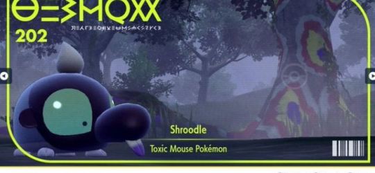
Photo
@neovenatorgirlteeth
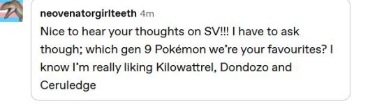
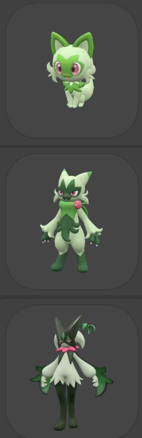
Top fav/east fav pokemon designs in scarlet/violet.
Over more than an hour later this is more ‘crow comments on almost every new pokemon, oops’. I am passionate about cool designs... I didn’t mean to come for bogleech’s throne!
Under spoiler tag because I was lucky to play without having been spoiled on ANY of them and I want to keep that experience, total spoilers ahead.....
I was so annoyed the cute grass kitty immediatly became bipedal, but I really do dig the whole line, even the last one. The base is SO cute I LOVE kitty and being a sort of bandit and then a magician is cool. Especially enjoy how the final form is bipedal but not THAT humanoid- it’s a neutral body rather than being uncomfortably curvy or gendered. Also as I look at it: final form kinda is a lot like how I draw my eye deers in terms of “fluffy pastel body, long skinny darker legs”
hate
I’m so sorry they did this to the duck. I’M SO SORRY. the duck was cute and then the middle is ugly and the final.... in battle usually the tail is extended and it’s obviously a ‘festivale’ thing, but it’s so unsettling. I hate how human it is, it’s dancing.... I hate this creature and for it to be a STARTER feels so unfair. who okay’d it.
I always loved dunspace as a kid playing gold silver, even tho it was useless. It was so mystifying looking and... odd. It was the pokemon that really most felt like a cryptic mystery of a being, you know? Like what the hell IS it? I’ve learned since it’s like... Tsuchinoko, maybe. But for it to FINALLY have an evolution that is almost entirely identical is really funny to me. Yep. That sure is just dunsparce. I mean. Dudunsparce. It’d have been cool for him to suddenly be a giant badass snake monster but this is better
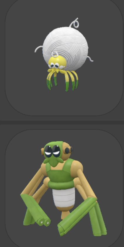
Okay two off: TaROUNtula is adorbs and his evolution sucks. a little yarn ball spider with a kinda dopey face is really cute and then he turns into... way too dude shaped and really unappealing. He doesn’t look much like his pre-form and loses all the charm. A spider with a spindle it uses to make traps is great but why this??
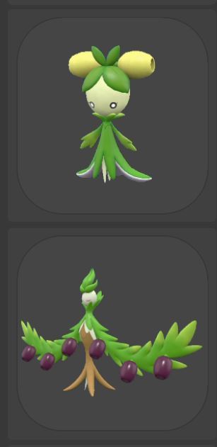
Dolliv is super super cute. I love the many grass and bug pokemon that are just ‘cute girls’. I don’t like humanoid pokemon, but a lot of them are more stylised human than bordering on uncanny, and they look cute and fun. Dolliv works with her theme perfectly and is extremely cute. But man I was really REALLY happy to see Arboliva !! She’s funky and stylish in a different way. Sure, we could have another Tsureena line, where the end is basically a plant ginjinka gal, but while still hhumanoid Arboliva is way funkier. She usually is in a wreath shape too to better show off her design. I love her colour pallete too. She feels like something I’d make....
He..............
how can you not love this little face. His weird metal collar and his funky arms that he usually stows. Those eyes tho. He’s so cute and simple.
I wouldn’t normally like anything about this design. Like, it’s fine, but very very simple and nothing screams pokemon about it. But extra shoutout: they are VERY funny. The names are both great (Maushold is one of the few times I sensibly chuckle at a pun name) and the fact they almost always evolve when you’re not looking- and their evolution is having children- is great. I was worried it was a glitch but I hope (and believe) it’s on purpose. You one day look and OH SHIT! THEY HAD CHILDREN. I thought I’d gone insane for a moment and missed it, 10/10 experience I carried this couple in my bag and they gave birth without telling me
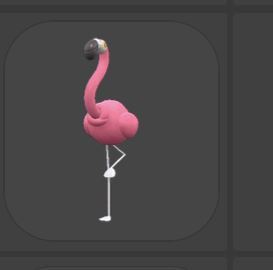
I know birds are... hard. because they’re birds. But what is WRONg with the birds this gen? I don’t despise any of them, but they’re the most Bird Birds I’ve ever seen. The flamingo is litterally a flamingo full stop. The stork is mostly a stork, the weird flesh sack it carries creeps me out and without it it’s. Just A Stork?! Wattrel as a seabird is Fine as a first evolution, but it’s evolve really bores me. And Squawkabilly is a nice pun and most pokemon looking, but still very plain. He has four plumages and yet who will care? He also so clearly needs an evolution to lean harder on the theme.
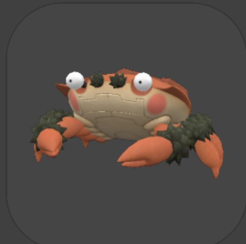
Hehe........ crab. I love giant enemy crab. He’s very charming. Eeriely robotic. The idea of him as an ambush predator is cool, I wish in game he actually WOULD blend in and strike you!
I didn’t like the first evo at all but he’s here for context, because once I evolved him I was enamoured. Just like minecraft......... but really, a blocky, salt construct is cool. I love his colours on the evo while the middle stage looks like a sweet little dude.
his mini pic isn’t the best, so here’s him better. Not normally my type of poke at ALL but she’s just really charming to me. Big blocks. Love the sediment layer ombre.

His little image isn’t very clear. This rock/poison flower.... what is he? A crystal that looks like a flower but isn’t. I really don’t know what is the inspiration beyond just ‘crystal-ish flower’, but he looks both very futuristic and like some prehistoric plant! The strange little eyes and the transparent cone at the front add to the mystery.
I don’t think I LIKE Shroodle but it’s hard to hate those empty eyes. I raised one for ages because I HAD to know what he was. A crocodile of some sort was my bet. Apparently it’s a ‘mouse’ which is then more confusing when it turns into a monkey. I think on reflection he might be designed on a spray paint can... his evo is a grafiti monkey, and he has a long shiny body with a black cap, with a tuft of paintbrush like hair! but he’s def not a monkey.
Grafaiai tho is a very cool design. I hate monkeys and apes but a lemur can stay, it has a cool design and colors and I really enjoy the wide glossy eyes.
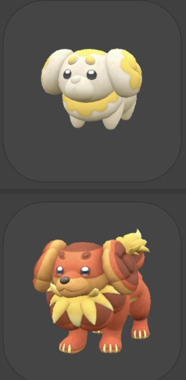
this one was just an insant win for most everyone. Bread dog! And then he gets BAKED! he’s really cute and I definitely called he’d be a dash-bun before he evolved
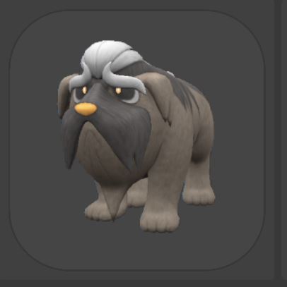
This old ass dog....... it’s not just that he has a very endearing story role but that helps. He’s nothing really too special, but he has such sweet eyes and really captures the feeling of a fking old ass dog....... like this is a dog that was MADE to lay on the living room floor for hours and grumble in his sleep!!
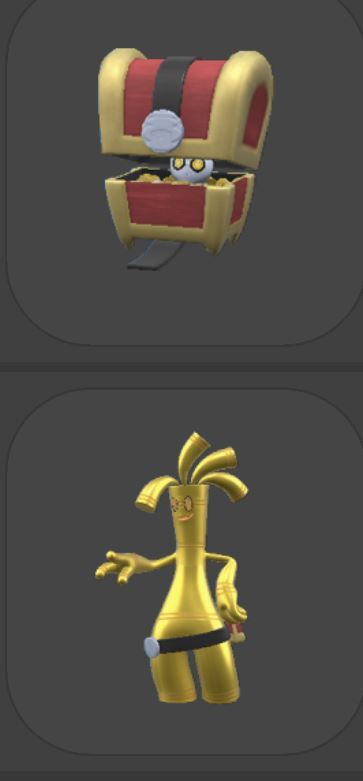
I hate gimmighoul!!!!!! AAA!!! No, seriously, what is up with this guy? Without the chest it looks like... a sentai...? I’ve never been a fan in gen of power rangers or super sentai designs anyways but it’s my best guess for what this bastard is. The base version vaguely also makes me think cockroach, but sadly needs to be 300% more cockroach. The chest version would be fun- pokemon has mimics but not the classic treasure chest!- except... he keeps poking his stupid head out, which doesn’t at all bring to mind a mimic! The chest form is indeed just the bastard in a box, no unique changes.
THEN THE EVOLUTION.... who the hell is this roadside used car lot advertising man and why does he make me look for so many of his stupid children to earn the right to hate him? This design is so confusing for me. What is he? Bad. His pokedex entry tells me he’s 1000 stacked coins but looks more like a bullet.
god he does resemble like a 90s ad campaign to appeal to the youth and get them to stop smoking huh. But really, for the amount of annoying effort and time it takes to get him, he is not worth it at all. Horrendous thing. Stupid thing. AAA. aaa.
Seriously, I never liked gimmeghoul but I definitely imagined a fitting final form would be way bigger on the ‘treasure’ theme. He has a chest form and you collect coins- imagine if he was a riff on a treasure hoard instead! A long serpant busting through a treasure box covered in coins, a mimic who hides as a great hoard barely poking out, a centipede with coins as armor....
Okay, I played violet, so the past pokemon I didn’t get to see. On beating the main story I decided to look finally at the full dex so I could see all the version exclusives. I quite enjoy them, and while I liked violet’s designs old pokemon exclusives/legend more the ancient pokemon are nicer than the robots.. because the robots gimmick is continously the same ‘a pokemon but robot’.
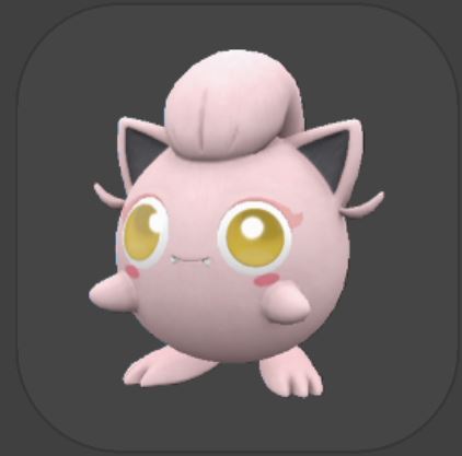
This jigglypuff is very funny to me. She’s kinda just a joke of ‘cute jigglypuff but with little fangs’ but I can’t resist her charms.

Also^ I think pokemon doesn’t know how long ONE BILLION YEARS is.
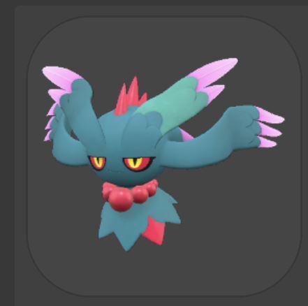
Admittedly she’s a very plain riff on misdreveous, but I’ve always liked misdreaveous and she looks neat. I like her spikes, not sure why she has one green wing arm. It’s nice the pearl necklace evolved early imao

1. what is a PTEROSAUR in the context of pokemon???
2. how could this EVER look like a PTEROSAUR
Volcarona is such a lovely pretty moth, and this version is super cool. I love how they tweaked with her regular features and made her so similar but so new. It’s just a SUPER cool bug and I really really love her

they need to stop doing this to my boy
what is this
So salamance might be my fav pokemon ever by childhood bias: Ruby was a very dear game and I raised a salamance from a bagon up to level 100! Then I kept the same salamance and transferred him between games, up to Platinum. I love that weird, fat dragon.... he’s a popular pokemon, so has had a lot of extra forms, and they all suck
No, seriously!
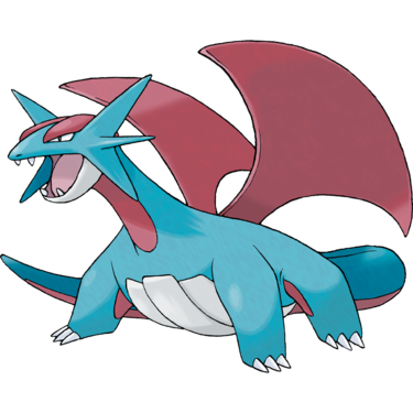
Boy. baby boy.
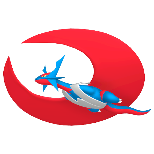
evil.
Salamance is a brightly coloured (but teal and pale red not the godawful tones of his mega) fat dragon. I keep saying fat but someone has to remind Pokemon. He’s a big and solid boy, but mega evo takes away that (and his arms) and makes him this super tacky bizarre monstrocity. Now we have Roaring Moon....
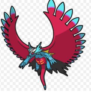
What is this? The idea of a feathery funky salamance is great, I appreciate even it resembles the mega evolution since gimicks are lately just one generation then forgotten. But his body shape and colors are so odd and messy. He looks really thrown together with a few basic good ideas that are completely not working!
TREAT SALAMANCE BETTER

I have really no strong feelings on the robot pokemon, meanwhile. They... look cool enough, ish. They’re robots that look like other pokemon. The designs really don’t do anything crazy interesting though, even tho they make changes it’s nothing radical. I only put Iron Hands here because I want you to know in a lore book you can find, it’s said Iron Hands is maybe a cyborg, not a pokemon, and might have a living person in there somehow. That weirds me out.
I definitely do wish the techno future pokemon did more though! Instead of just being ‘robot very similar to other pokemon’, it feels we’re missing out on ‘more evolved’ versions of pokemon or robot-flesh mixes. My immediate pitch for a more evolved (in IRL biology) pokemon from the future? An extremely fierce magicarp that has finally become strong! Or a bagon that has skipped needing to be salamance and has adapted wings of its own! There’s so much potential to look at odd pokemon and imagine how they might adapt over years of natural evolution. You also could do robo-flesh hybrids as said, where I have no exact ideas but something like... A combee that has adapted to work with nanorobots in a swarm? Hell, put magicarp in a mechasuit and say in the future magicarp has learned to psychically build mecha suits. Why not.
okay, she’s pretty cool tho. I def like to see gardevoir/gallade fusion one, who def makes the most bold changes to the design too (well, I guess iron treads is nothing like donaphan REALLY, but...). Haters gonna hate her nonbinary girl swag. Glad to see in the far future we’ve finally ended gender. Etc etc.

The ruinous legends are super, super cool designs. All of them are some of the TOP creature designs I’ve seen in ages tbh. I haven’t gotten in game to unlocking them or looked if they have lore (I hope there’s a lot of lore, mysterious ruinous beads sealed by ominous swords and giant doors is sick but I want more). Each is based on a cursed object that is so full of a negative emotion it has become tied to a pokemon and sealed away. GREAT STUFF.
Anyways, love this totemic beast and the big ancient cracked blood sacrifice bowl on their head. And yes, it’s totally a blood sacrifice pokemon: it’s linked to fear, as the bowl was said to have been used in ancient rituals and evoked such strong fear it became a horrible creature.
This guy minus the sword would fit in pretty well as a regular pokemon, admittedly. I find her colours really pleasing. The sword adds a bit more of that ‘legendary’ flair but does look a bit awkward impaled like that. But no, I really enjoy him.
OMG OMG OMG! AAA!!!! LOOK!!!!!
I am not a slug person (I am actually terrified of slugs irl) but. I loveeee this design. It’s clever (look at the both eyestalks and the false lead face) and extremely themeatic, with a great colour pallette. This thing screams spooky nature spirit in every way.
Though my least fav I felt I should throw in all four special legends. Plus, nothing about them is bad. I find the eyes rather awkward but they do invoke a bulged eyed goldfish. All four legends are based on cursed objects, so this feels like an okay way to add the beads to the fish... but not my fav. I do enjoy tho his patterns on his body. They’re just very stylish.
The box legends... are okay in their battle forms. I didn’t expect to really like them, but the writing is good and I really loved my robot motorcycle dragon by the end.

they’re far more appealing and charming to me in their ‘low power’ mode, which is what they are for most of the game. It’s nice to go ‘oho! badass battle time!’ but, meh. The more animal funky little guy form who loves sandwiches is better.
She’s a bit funny looking but really nice. She’s a cute little... something. I again am fine with human shaped pokemon when they’re still monsters, not people, not overly sexy people. Her middle stage is really cute to me as a sort of little knight, and then her last stage gives her adorable hair and a giant hammer. Classic design trope, but I love it! She’s cute and small but extremely strong and fun. I enjoy that her pokedex entry tells us she’s a BANDIT, not a blacksmith-knight.
The version exclusive branching knight evolve really feels like it should have been in sword shield, huh? But even tho it’s not normally the type I like... I am not immune to cool cursed knight with violet flames. he’s edgy and cool and fun, and I think perfectly balances between simplicity and very detailed- his design doesn’t look cluttered to me at all despite how complex it is!
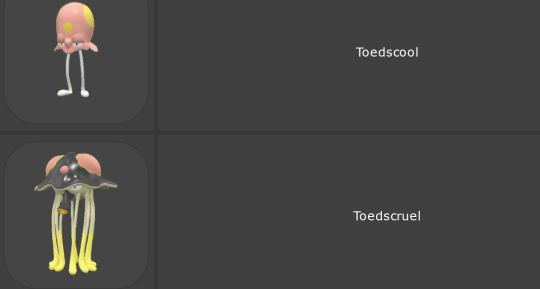
hehe toadscool
I was so psyched to see him on my radar and go ‘is that a fckin tentacool with two silly legs’ and it was. These guys really as just fun to watch move. Toescruel hops! I’m not sure there’s much that exciting about them, but that’s okay. They’re simply and funny
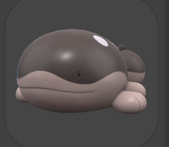
god..... he’s perfect.................................................................
honestly, I was never a wooper fan and I’m still not, but this one is 100% better than quaqsire. he’s better than most things.
----
sorry i wound up talking about like all of them. I really like most of them, even the ones I skipped
22 notes
·
View notes
Note
If "character design" is the only basis for age... does that mean Mimi from YuGiOh Sevens, who has a child and is stated to be 37, is actually just the same age as her kid because she's small and looks like she's 11?
You're bringing up an exception into this. I haven't seen sevens but I'm expecting someone would have brought in show mimi's appearance. That's more of a visual gag.
The same is true of Yugi Muto. He's a high schooler but deliberately designed to be small because he's a shy, meek character. I can't be bothered to start explaining nuances here, especially to someone who wants to start a fight instead of being curious about my opinions and respecting them. Ai's human design is just that: his human design. I'm sure the colour pallet could symbolise something as well as his interesting choice of clothing- he's a super advanced android but he's dressed like some old vampire king?- but unless people were constantly pointing out how tall he was, his design isn't a visual gag. For characters who do have a stated age, their design can look completely out of age as there is no need for the design to tell the viewer that, or it could be to mean something or be a visual gag. In the case of someone who's age isn't stated, the design will reflect the age.
It's why I consider Astral from Zexal to be coded as a child, closer to middle school than high school, because of his facial design and proportions. He has no canon age, but his design of a younger person. Ai has no canon age, but his design is of an adult, and when next to Yusaku he looks clearly older. And yes, I mean Yusaku and not Playmaker because Playmaker in canon doesn't have Yusaku's appearance, that's his virtual avatar.
So yes. I refuse to ship a canon child with someone who clearly looks like an adult. What's your problem with that anyway? At first you seemed genuinely curious about my reasoning so I decided to share it with you, but now you're just looking to pick a fight, and argue my own point against me, rather than respect my opinions and leave it at that. Well, you're giving me unsolicited opinions? I'm gonna give you one too.
If you don't like someone's opinions on the internet, just scroll away and find someone whose opinions you do like
No body is obliged to agree with each other, and especially not to listen to anons bothering them about their own opinions. Part of what makes the internet great is that you can simply leave. Scroll away, or even sign off and do something in the real world. Touch grass. I would suggest read a book but I feel like some people lack the ability to look past words to see the actual meaning and would want to fight the author, so touching grass is safe for them. You have no reason or right to start harassing those who have different opinions, especially on anon, because then we can't just block you and move on. What we say on our blogs and what opinions we have are for us. Yes, even if we are criticising a ship you like, we're allowed to do that on our blog, because no one is being targeted or obliged to read it. It's our blogs and we choose what we put on them. We're not creating content for you, we're sharing our thoughts and art and words for people to engage positively.
And if you don't understand that not everyone on the internet is meant to agree with you, and that they can have their own opinions, you shouldn't even be on the internet.
Go get a hobby.
4 notes
·
View notes
Text

Time for more Purple Man and his Wife and they love each other and the fact they're such different sizes and they like cuddling and are very much in love. Of course, living with a soon-to-be serial killer isn't perfect, but the only reason I can think of someone so evil having three kids that he hates is if he loved his wife. Plus, we know nothing about their actual dynamic, meaning I can ship them however I like. Not to mention that villains in love is one of my favourite tropes <3
We also know nothing about what Wife looks like, so I just drew her with four different colour pallets. TBH I'm leaning towards the yellow, and maybe red hair, but she looked too much like Peppa Madrigal from Encanto. Obviously, the blonde/pink was supposed to look like Elizabeth. I know the common take for Wife is either red or blonde hair, but I wanted to mess around with dark hair for experimentation's sake. Gave her curly hair bc C.C. and Mike have curly hair, and I wanted her to have brighter, softer coloured clothes then Purple Guy.
Speaking of Purple Guy, his shirt is so much lighter in the top left bc he's a bit younger there and I think it'd be cool if he started with a lavender colour an then shifted to a darker, more vibrant violet as he got more corrupted. Dave is in an almost muddy brownish purple to show he's both more violent then his pre-murder self, but also make the similarities in colour less obvious.
IDK why Dave is even there, I just really wanted to draw Dave and have him leaning on her and being awkward. I hc he got grey streaks in his hair after surviving the spring-locks bc the stress of recovery was too much, and I guess I wanted the chance to draw him and his pre-murder self on the same sheet to show how much he changed. I do like drawing William w/ greys (bc he's a dilf lol) but this time I guess I didn't. Maybe this is a timeline where he only goes grey after Wife dies?
IDK I'm just having fun designing them
I also hc that Wife likes to sleep on William bc he's so friend shaped, and he finds it adorable. Unfortunately, he's also evil and has no problem pushing her off when he wants to get up.
#also just a reminder that pre-murder afton was chubby#his wife thinks he's very cute thank you and he appreciates her#purple guy x unnamed wife#what's their ship name?#william afton#clara afton#mrs afton#afton family#fnaf fanart#my art#drawing tag#purple guy#dave miller
15 notes
·
View notes
Text
ARTIST INSPO


WHY
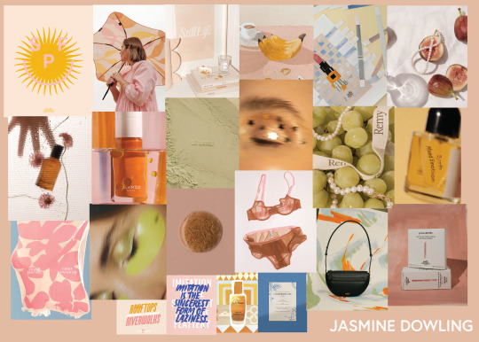
Jasmine Dowling- Jasmine has created an amazing creative studio with herself. She promotes amazing quality companies in a creative way. She is designing and creating art. Her job would honestly be my dream job. She also creates work that I am drawn to with a fun style of photography, colours I love and funky illustrations.
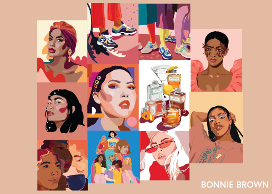
Bonnie Brown- She is someone who I aspire to be like. She is exceptional at illustration and she has done so well she has created her personal studio with work coming in and she is working with brands and good quality companies.
Jean Michel Basquiat - An Abstract Expressionist artist using acrylic, oil paint and pastels and spray paint. He communicated contrasting thoughts through his work. I am inspired by Basquiat's art as he communicates deep ideas and issues in a fun interesting way. I love how he includes doodle-style drawings.
Bonnie Gray- Bonnie expresses feelings and tells stories, fond memories and friendships through her art. She uses oil pastels, Oil paints and symbolism. I am inspired by Bonnie’s her colours, and symbols and how Creativity is a childlike wonder.
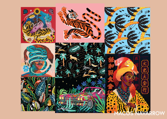
Marcos Navarro- Marcos has been a big inspiration to me in practising my illustration. He has partnered with books, beer, and many other amazing companies. He has created murals. His style is my type of illustration and he uses a similar process to me. He is an amazing source of inspiration and is a great storyteller through his illustrations.
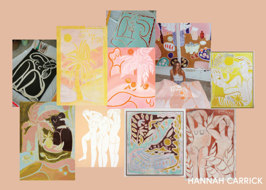
Hannah Carrick - I love her use of oil pastels, she was the first person I saw using oil pastels that really ought my eye. I love her themes and how she uses bodies. She uses beautiful colours and I find her work so stunning and beautiful while she also carries layers of value in her work also.
Joao Incerti - He brings a lot of his cultural heritage into his work by incorporating his personalised patterns throughout his work. He has a strong theme and also is an illustrator and painter., He creates amazing murals and expresses self-identity which then the reader can also relate to and he is telling stories through his work also.
Ben Crase- I love the pink hats! I love his amazing technique of oil painting, he is so talented. He has beautiful colours and I am amazed at the quality. He has a strong theme across all of his work. There is value hidden in self-identity and expression and cultural heritage.
Jakey Pedro- Jakey uses oil pastels, acrylic and oil paints and shows ideas through horses. “Are a metaphor for life’s wild ride. You’re on the horse, it’s bucking, and you’re partly in, and out, of control.” I am inspired by his use of colour and style and how there is a theme and quote behind his works.
Studio of the sun - This company is so coo. I love there atrt and as there is so many stories on a canvas and so much hidden meaning you have to search for. Its showing you a story and you have to connect the dots on why.
Tahnee Kelland - I love Tahnee Kelland's work as I am very much drawn to the colours, the texture and the themes of country and desert.
Jack Kabangu - jack's work is very unique and very abstract but within his work, there is a lot of symbolism and value within it. He incorporates a lot of his cultural heritage in what he creates and includes values he believes in. He has a strong theme throughout all his work and it also has a lot of aspects on self-expressionism.
Mika Cotton - Along with Shane as Mika is his daughter, we grew up and went to the same school so again this reminds me a lot of home as her work is connected to where she is from but she expands and also adds values from her Maori heritage and story tells so many deep values through such beautiful work filled with abstract brushes and warm colour pallet which naturally I am very drawn to.
Shane Cotton - Shane is from Palmerston North which I am also from, He is a well-known artist there so he reminds me of a slice of home. His work has so many layers contributed by his cultural heritage, Christian values which I also align with and where he's from which is also where I am from. I love the colours he uses and the illustration style as well. It is so awesome to see his work in so many places, especially the Britomart mural.
Sadao Wantabe - Her works are very textual and patterned. She recreates aspects of biblical teachings especially the main stories of the bible. I connect with this because the bible is a big part of my life and I live by these principles as well as Sadao.
Danny Fox is also another artist who I find not only inspiring but also includes the value of being childlike. I find his paintings somewhat cheeky. He is a very talented artist and uses lovely colours and included the country theme I seem to really be drawn towards.
Dubuffet - Dubuffet is a. sculptor who mainly uses black and white with accents of blue and red doodles. I love the business and the challenge to create shapes out of his scribbles. He is telling stories in a whole new way and I really love e his theme. I relate to him with the randomness and the boldness of the black in some symbol pieces I have created.
Tyler the creator - Tyler is such a great creative really maximising himself as a brand. He is a musician but he has such a strong art presence with his prints, fashion line, album covers and collaborations and his own store. I love the design style of mixed media of photography, design, illustration, and painting. He is a creative genius with also making music that matches the theme of art.
Brittany Ferns - is another artist who is including the same themes I keep getting drawn to such as warm colours, oil painting, country and horse themes. I think this is stemming from my love for the sun, warmth and feeling warm inside and my family's history of my grandparents growing up on farms and also living rurally myself.
2 notes
·
View notes
Note
my brain is full of clothes so holds out microphone favourite outfit you ever designed for an oc
I have a few answers for this, so lemmie list em off
Ignore the hurried doodle lol
Ares!! His outfit is one of my favourites, not because its particularly fancy or even particularly well done, but because it was one of the first proper outfits I gave one of my characters that wasn't like... a hoodie or a shirt. I used to just straight up not design proper outfits for my characters and I'm still dealing with that. Thanks, 12 year old me (jokes, he couldn't have designed a good outfit if he wanted to).
Carney's. I can't say its the most original or well researched because it isn't but I just enjoy it. I love a long coat and i love a silly hat and I like my pallet for it and the contrasting red. I did a pretty decent job if I do say so myself.

Lavender!!!!!!!!!! Her dress is nothing special, but its gone through a bunch of designs that ranged from bad to over complicated to just having bad colours and I'm happy to have a design I actually like. The original was white with music notes on it and I fucking ANIMATED that. Why did I do that to myself. She never even had any musical connotations.

I mean. Yeah. His outfit (and several of his alts, you've seen em) is one of my favourites. Its just a fit I would wear and I like the colour scheme, it fits his whole deal and my own personal tastes lol.
I also enjoy Dr. Summers' outfit when he's doing pestilence shit but I'm not gonna put an image because a) its literally just a uniform and i didnt strictly design it and b) the copious amounts of gore in his design dslkjdskjl. You've seen it you know what I mean!
#Looking through my guys and man i really need to get on the outfits#they've improved but i can do better since my last batch of redesigns#the ares doodle is a very little redesign but I just made his colours work better#I'm gonna leave his as is aside from that. I'm attached to his jacket#anyways any other OC questions I'll happily answer I love my guys so very much#also nearly put Iblis on here but her most current art has a BIG anatomy issue so i didnt wanna#anyways#ask#giratina-plushie
3 notes
·
View notes
Note
4, 7, 8, 16 and 38 for any OC! 💞
4. which oc can cook? what’s their favorite thing to cook?
Quite a few of them can actually! Margot is resident chef when they're out on expeditions because she knows the best recipes for when they're on the road! Margot's go to thing to cook for everyone is a travel safe version of a veggie casserole! All the scouts love it and its even better when they have access to meat aha!
Asami also loves cooking and has a cooking club on sundays with Sato where they bake cakes - and pastries which are asami's fave! (Bakugo is designated taste tester when no one else is watching - and he sometimes joins in too if its just them in the dorms) Her fave thing to cook with everyone is spicy hot pot, but when its just her she enjoys making cheesy ramen noodles!
Shen is a vegetarian and cooks from time to time, but its usually Katara's job (with Shen's assistance of course) she knows mostly recipes to keep herself going rather than the tastiest, but they're full of nutrition and v well balanced! Her fave thing to cook is roasted veggie and nut skewers! (katara helps to season them tho otherwise they're v bland aha!)
7. which oc has the most cohesive color pallet? the craziest color pallet?
oohhh shit thats a tricky one! I'd probably say Shen and Margot have the most cohesive colour palettes, with the earthy tones and all. They just go with everything!
Craziest colour palette would deffo be Hideko, and Rin cus of the numerous neon colours!! Ophelia has a pretty chaotic one too, but the rest seem pretty reserved. OH Bubbles' palette is quite crazy too actually, lots of random colour
8. which oc prefers flowing clothes? tight clothes?
Ziri and Rin ADORE tight fitting clothes!! Ziri for the practicality of her job, Rin because she loves to show off her bod aha. Una also likes tight fitting/semi revealing clothes but will add a flowy element so she doesn't come across as a total bitch lmao.
For flowy clothes, that would be Asami, Isla, Umetarou and Shen most likely! A lot of my ocs share my style of loving over sized clothes (for a number of reasons) so that counts as flowy right? OH Ophelia deffo wears flowy too! Helps her come across more innocent than she is tehe
16. which oc has the most admirers?
RIN. The gal has SO MANY followers and a lot of them are in love with her aha. Some work for her because of their crush on her, others admire her skills and ambitions so they wanna work for someone deserving yknow?
Una is also v sought after - by men and women - but only the latter are given the time of day aha! Same goes for her brother but he does NOT like the romantic side of things. Many women fawn over Isaac/throw themselves at him but hes genuinely not interested, he would rather sleep in the barn with his horse than sleep with a woman (not meaning he'd fuck his horse btw i mean in a Kristoff and Sven kinda way)
I'll also say Theo. She's v popular and enigmatic so lots of people admire her for being a young business woman etc, as well as liking how hard to get she is. But again, she's not interested in love atm and would rather satisfy her sexual hunger with a rare one night stand than occupy herself with a partner (currently anyway)
38. drop a fun fact about your oc!*
Bubbles and Johnny have held competitions to see who can put the largest and weirdest item in their stretched ear holes without it falling out! Bubbles holds the record by putting one of her largest wrenches through it! Johnny tried to beat her by putting the face of his watch through, but it fell out real easy lmao
OC ASKS
#misc: asks#sstewyhosseini#thank you mika ilysm mika!!!#oc: margot durand#oc: asami enatsu#oc: shen#oc: hideko sugawara#oc: rin kyutoku#oc: ophelia dandythorn#oc: bubbles finley#m.oc: una wattleseed#oc: ziri#oc: isla walsh#oc: umetarou noguchi#oc: isaac wattleseed#oc: theo bainbridge#oc: johnny finley
5 notes
·
View notes
Text
Top seven of Arcaina Project + Tales Untold characters that Give! Me! Life!
You know those bitches that decide to make a top five of a mutual’s characters? Yes you do. Because I am bitches.
I was only going to do 5 but I ended up with 7 because… look, @nyxcharliechaos has a lot of babs and ITS HARD FOR ME TO CHOOSE ALREADY OK??? Also Tumblr started glitching as soon as I got to 7 images… that too.
Also, this is in no real order. It’s already hard to pick favourites, don’t make me rank them!
One more thing- admittedly this will be biased towards characters I know/remember more about. In case you haven’t caught on to how fucking unhinged this is going to be, it’s not going to be judging characters on quality. Anyways, y’all ready to be bitches with me?
1. Lucy
See tall person in picture above
First, I think Lu was the first of Charlie’s characters I ever drew (I drew her looking like a hedgehog slurping noodles), so already some minor nostalgia vibes. I also like the one, emo-scene raccoon stripe hair piece she’s got. She’s actually got some low key late 2000s scene kid hair that’s kind of a vibe. The relationship between her and Nyx is extremely cute, and while I would have maybe made her look more muscular, you could argue that her… less than ideal eating habits would probably make it harder to develop muscle. Also she needs earrings. Don’t ask me why. She just does. I’m getting the vibe she needs earrings.
2. Nyx (shorter character in image above)
Probably the second character I ever tried to draw. Also a character that has appeared in various rps to commit various shenanigans. Given the backstory they’ve got, I do enjoy the puppet motif they’ve got in their design and powers a lot. I also think it’s neat that given how nobody else in the Arcaina Project looks like Nyx, no matter what colour their hair + eyes change to (and they change a lot) you can still tell that yeah, it’s Nyx and not some other bitch. Their deadpan reaction to more exuberant characters is a lot of fun, and overall it seems like they’ve got some pretty cool character arcs planned out
3. Molly
Look, I’m someone who already tends to like characters like Molly, and based on RPs and arts and whatnot, Molly just seems like fun. I also love the clothing choices, and the overall craziness going on personality wise. Not much to say, admittedly, it’s just a case of “yeah, I like em”. Although I think Molly, being the mad hatter’s kid, should have a hat made out of Campbell’s Soup cans. Idk, I just think it’s a good idea.
4. Virgil
Firstly, yes bitch, work that makeup. Now that’s out of the way, I do like the colour pallet of a bunch of dark colours then just one super bright pink that often gets used. Like with Nyx, since nobody else in Arcaina really has that going on with them, you can just slap hot pink next to a black and it’s like “oh yeah, fucking Virgin Creek, let’s go”. I think I like Virgil most based off of RPs he’s been in, and some of the stories he’s been in I’d say have been some of Charlie’s best, so… yeah. Also he eats cardboard. Automatic fav.
5. Odd

Frankly, I think I just relate to Odd in an oddly specific way, pun intended. Like… I get the reason she sleeps a lot is bc health issues, but like…. Listen, if you’ve ever done ballet, you KNOW what it’s like to wake up the next morning feeling like you’ve been hit by a fucking truck. I nearly typed trucking fuck. Whatever. Anyways, I do like the design and this may sound… odd, but I like the eyes. I noticed during an art I did of Odd that her eyes are a neat mix of brown and green. Also she has ice cream hair.
…. I mean… am I wrong???
6. Rowan
I think a lot of my enjoyment of Rowan comes from RPs, what with the shenanigans of them trying to hide that they’re part wolf and all. I also like that they have this kinda fancy, fantasy-ish cloak and hood that has this little red Diamond on it… then just clothes you’d find at the Gap. Idk, I just find it amusing for some reason. Also wolf canines are pretty neat, and I do like the hair… except when I’m doing an art with Rowan in it, and I actually have to draw it. Look, I normally don’t have anything against hair streaks, BUT…
Anyways tldr, I just think Rowan’s neat.
7. Lyric
Ok so probably not best art to use since this is older Lyric but I couldn’t find one of current lyric without wifi going haha no. I know, much tragic. Anyways, I like the hair that’s like “no I’m never behaving what do you mean?”, I like a lot of the outfits Lyric gets drawn in (by Charlie. My wardrobe contributions are very much a hot take), I enjoy their interactions with characters like Nyx, and… yeah I just like them.
————
Was this just a list of me naming characters and being like Yeah I like them? Yes, yes it was.
Also this totally wasn’t based off of characters that I could actually explain why I like them because I like all the babs even if most of them are very sad, what are you talking about?
I don’t know how to end this at all.
….
….
Someone put a Jack o lantern in my bathtub.
Have a nice day.
- Spooky S Skeletons
7 notes
·
View notes
Note
Design question for you! Do you think earth tones can work for Yang at all, or is black ultimately what's gonna pull her look together? And if we start using black, what do you suggest to not end up making her just Blake 2.0 in terms of color?
I don't think earth tones are right for Yang, and really the black just works for the character and aesthetic she's trying to show.
You can easily keep her different from Blake with the use of gold, pale yellow and accent colours. Blake uses monochromatic colouring with cool colours in her purple, with her yellow complimenting it in small amounts if it hasn't been replaced by the silver. Yang uses black and white, but a majority pale yellow with gold accents, and her accent colours in red and purple means that she uses a very warm and fiery pallete.
It's like how Blake and Ruby can use pretty similar colours but come out looking different. Blake is very cold and dark, but Ruby uses very bright red instead.
It's also about the amount used. Black on Yang isn't her primary colour, if you go along the lines of her V2 outfit; that would be the pale yellow. Whereas with Blake, her primary colour is black.
10 notes
·
View notes
Text
Protest
MOVIE DEATH OF A SUPERHERO
COUPLE DONALD X READER
RATING: SMUTTY

I sat drawing comics-making sure to make the characters look as they should making sure their outfits worked, and the light hit them correctly, I glanced over to the other side of my bed where y/n sat in her cute little blue dress kicking her little white sneakers in the air as she worked on colouring for me I smiled a little at her and she looked up at me
"Hi"
"Hi" I smiled back blowing her a kiss
"Hello little duck" she smiled blowing me a kiss too
"You're a sweetie" I smiled getting back to my drawing
"Donald?"
"yes?"
"May I protest"
"Uuuhhh.... about what?"
"Your character designing"
"what about my character design?
"I wish to protest about Mis-fortune's boobs"
".... her boobs are great. there the same size as yours?"
" yes and in her outfit, she has no boob support whatsoever. and she wears her outfit under her everyday clothes so she doesn't have any support all day every day in her normal life, she could not live her life superhero or otherwise with no boob support"
"I guess your right. should we add some like support stuff? maybe give her a bra"
"I think that would be good, maybe add some like straps so she has support for her poor boobs else she is gonna have so many back problems"
"Alright, maybe give her like a cool bralet like thing"
"maybe"
"I'm gonna need to google bralets in her colour pallet"
"Bralets don't support"
"Ohh maybe a cool bra? I'll google a supportive bra"
"why?"
"I don't know what bra's look like"
"how do you not know what bra's look like little duck?"
"I'm not a weird little perv"
"but like when shopping? or like... on the internet?"
"when shopping I am... you know shopping. and I don't know what you're using internet for but bra's don't just appear when I use it"
"what about... sexy videos?"
"A. I do not watch sexy videos. B when I may glance at a sexual image they don't usually have bra's on they have already removed those"
"Dirty little duck"
"whatever. I'm just googling supportive bra's"
"fine but most supportive bra's are ugly as hell"
"are they?"
"Yeah its either support or pretty you can't have both"
"aww that sucks"
"I know"
"Ohh... yeah I see what you mean a lot of just white and grey boring bra's"
"Yeah, sometimes you can find good bra's with support, I get mine of love honey. so technically there sexy but they have so much support with the straps and bones"
"really? so there pretty and supportive"
"somewhat, as much as possible for a bra that looks pretty" she shrugs "Here see" she smiled undoing the buttons on her dress and revealing her little black bra with various straps and bits of lace
"Yep. that uihhhhhh.... that's a pretty bra. looks uhhh supportive."
"Indeed it is" she smiled
"Maybe you uhhhhhhh you could just stay there and I'll copy your bra. you could uhh model it for me"
"You just want me to sit her with my bra exposed don't you little duck"
"Uhhh no. no. in fact if you uhhh take it off that'll be even better"
"dirty little duck" she giggled doing her dress back up and moving closer to give me a kiss "Maybe I'll model my nice bra for you later. once your parents have gone out for there dinner"
"Yeah?"
"If your a good little duck" she smiled
#donald#death of a superhero#tbs#tbs fanfiction#tbs fanfic#tbs smut#tbs sex#tbs smutty#thomas#thomas sangster#thomas brodie sangster#thomassangster#thomasbrodiesangster#thomas sangster imagine#thomas brodie sangster imagine#thomas brodie sangster i#thomas brodie sangster smut#thomas brodie sangster s#thomas sangster smut#thomas sangster x reader#thomas sangser imagine
10 notes
·
View notes
Note
Omg I saw that you haven't had a clue for how Claggor came to be in your Wet Nurse AU and if you don't mind me sharing, I've always thought that Claggor somehow exudes Piltover vibes for some reason.
Like he wears more layer of clothes (plus a make shift vest + hoodie + long sleeves shirts), brighter colours (eg: yellow,egg shell and shades of blue which in my opinion are somewhat Piltover's colour pallets) where as Powder's clothes are colourful but their faded/muted and he has a creamy complexion (healthy instead of pale).
Maybe Claggor was something like a baby born out of wed-locked and dumped at Zaun or something along those lines?
(Please ignore my rant, I just really like Claggor and your fics)
I just want to start this ask by saying I wish the Arcane designers were a little better at colour-storytelling when it came to character design. Like they're good but I wish they were just a bit more prescriptive (also known as: it bugs me that Jayce's tie is dark-red).
Actually looking at Claggor's character design lined up with the other kids his shirt/s seem to be originally one piece.

All the other's clothes have lots of stitch-lines indicating panels of fabric they were made out of (probably off-cuts if Zaun has a textile trade or salvaged bits of larger clothes that got damaged) you can see what I mean by his pants. But his shirt's only has a couple of stitches that look more like patches of tears than it being pieced together. Certainly the blue vest of his was made as one thing, the sleeves themselves are clearly one thing and if they're connected to the shirt they only have the one stitch line on the right, and I'd say the yellow hood was one thing as well.
Which is kind of odd considering he's clearly a kid that's growing fast but that lack of panelling implies that it was purchased as one piece and hasn't had additional panels added to extend it. But again the show is a bit inconsistent when it comes to clothing details like that (another example: everyone in Zaun has the patchwork clothing except for Chembarons (makes sense) and that random couple Vi stole her and Caitlyn's outfits from (less sense)). And we need to stop me before I write a 1000 word deep analysis on someone's clothing.
I will say rounder faces tend to be a bit more common in Piltover (especially Piltover's children) so I can definitively see where you're coming from in terms of him maybe being from Piltover and dumped in Zaun. Although it does raise the question of when for me - because the best time to dump a kid and not have it traced back to you is when they are a baby but if Claggor was taken in by Vander after Vi and Powder than he would be a kid when Vander finds him and does he remember his parents? Or was there someone else who took him in between baby and Vander?
6 notes
·
View notes
Last Seen Blogs
lets-throw-bacchanal
Lab coat is a fashion statement
journey-impeccablebeauty-blog
A Journey to Impeccable Beauty
mangacapsdiary
caps from manga i read
mosalahd
liberté égalité mbappé

wintlink
Untitled