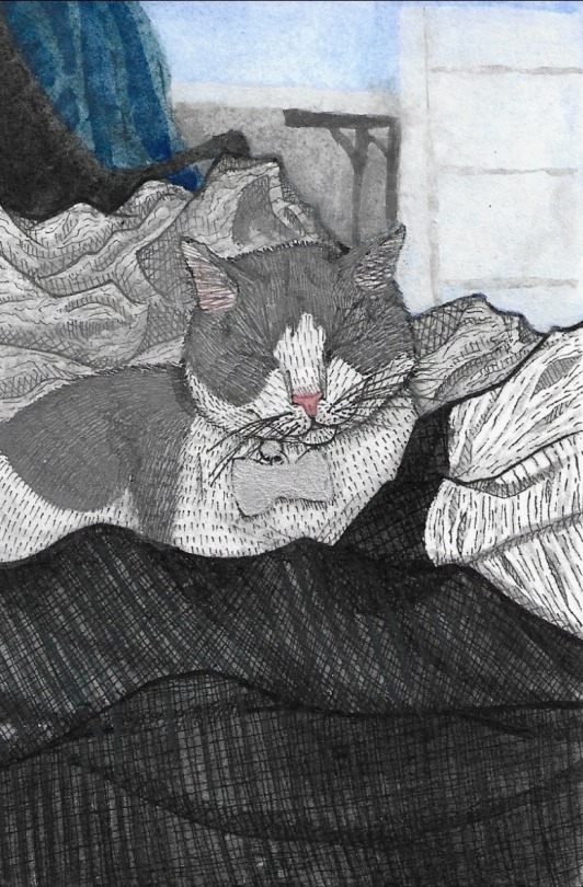
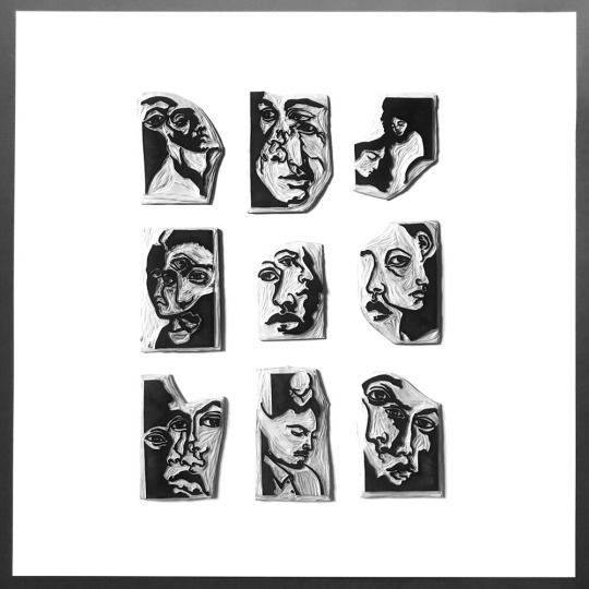
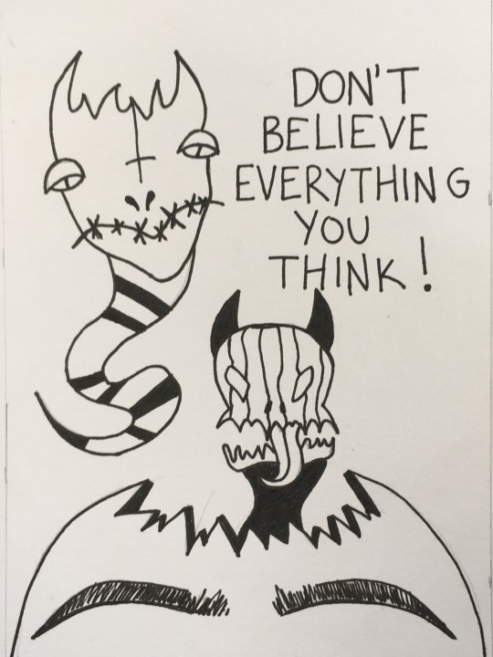
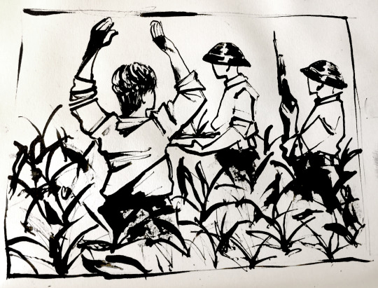
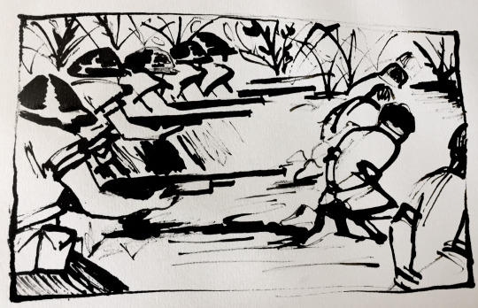
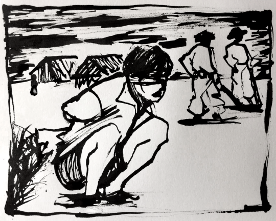
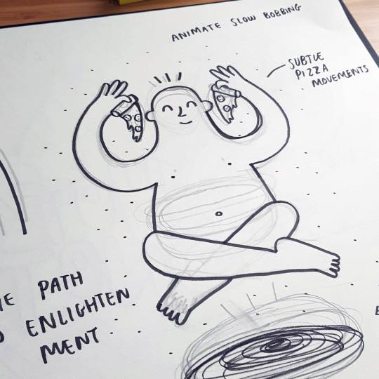
#some art i made for a lino print i did <3 <3
Text
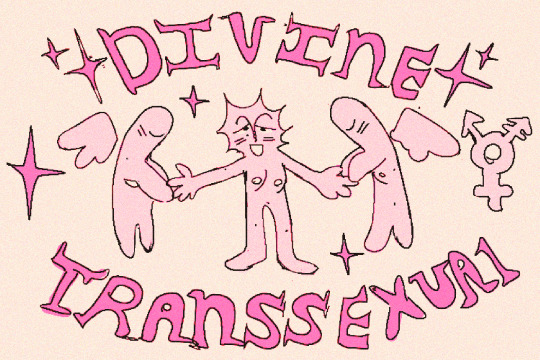
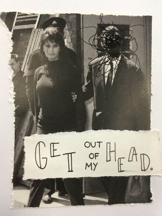
They Kissed Me,
A heat sweat spread through my body
And the whole of space and time lurched forward.
Is this Divination?
What is divine?
#transgender#trans art#queer#queer art#retro.art#some art i made for a lino print i did <3 <3#a little different from my usual art but i hope u guys like the sillys#im out of town so this is all i have rn <333#also the trans symbol is flip flopped cuz i was thinking backwards for lino pritning
2K notes
·
View notes
Text

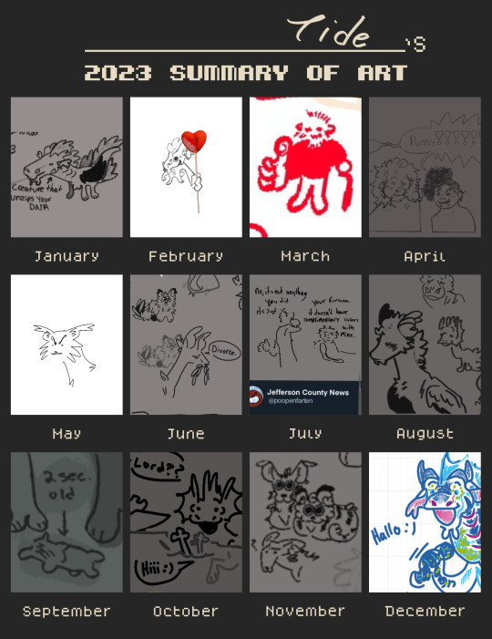
HAPPY NEW YEAR EVERYPONY ! ! Here’s some art summary thangs <3 ! Template is by Mintcokev on DeviantArt !! I did one of full pieces and one of Sillay Doodles
Explanations of every piece & stuff is below read the readmore ! + links to the full work if its posed online !
First Template:
January -> This Sora Piece ! I am honestly still super proud of how it turned out , it was fun to work on and looking at it still gives me that nice vibe I was in while drawing it
February -> This headshot of my OC Elk! I developed and expanded on her story this year and did some headshots for their TH, still super proud of how the shading came out here ,,
March -> lmao nothin , not sure what happened in March but I dont have anything there aside from sillay Doodles
April -> This design of Blaze! One of my fav designs I’ve done recently .. shes just so sillay To Me
May -> This piece of my friend and I’s cat ocs ! Stickpaw & Frostclaw, two silly fellas <3 something possessed me here I’ve never drawn a kibby this well since and Im still super proud of this
June -> This reference of my oc Dee!!!! ITS DEE ! ! EVERYONE SAY HI TO DEE <3 ! ! ! ! ! I was so happy to finally give her a proper ref , shes one of my favorite ocs of all time and this came out so well , it looks so much like her!!!!
July -> This artfight attack! This piece was honestly just a blast to work on, the background and frame design and expression were all fun to illustrate
August -> These refs of my lomp ocs! Lomps are fictional guys made by my good friend and August was just the Month for them. These guys are (bottom to top) Fizz, Roe, and Skipper! They’re . Normal <3
September -> This piece of my fursona Kenny ! ! Just a fun piece to work on again, the colors came together way better than I thought they would
October -> This piece of my oc Houndcall! They’re feeling normal about their leader being possessed! This was like a weird experimental painted piece and ou .. I really loved working on it I wanna do more things with that method
November -> Not posed online! Surprisingly, this is a wip of a self-portrait I’m doing for class! Fathead Minnows and Rainbow Trout !! This canvas is massive (taller than me ,, which aint much but still!!) and I’ve been cracking at it for a while but hammered out the details of the trout in November so! It’s acrylic but I really wish I could’ve done oil instead .. acrylic dont blend well
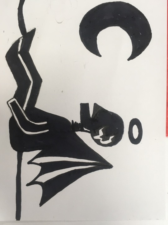
December -> The final fella ! My idiot son ! Also not posed online , this is a linocut printed on hand-made paper! Fun fact, I make my own paper and my own Lino cuts as my main medium, I just cant afford the proper transfer ink, but I got some from school to use so ! My idiot dragon linocut son was born ! I hate him because he wont print proper but this piece ended up working out. Its lino-ink on handmade paper with red micron pen over it
Second Template:
January -> DNA Helicase
February -> Valentine’s Day Gift <3 !
March -> Not (publicly) posted online doodle of my epic oc Anton Bayheart giving his grandson a thumbs up :)
April -> Not (publicly) posted doodles of my ocs Sebastian (left) and Dee (right) (you saw her ref earlier <33) having a normal convo !
May -> A shot from This video of my friends ocs … the one depicted is Quickpaw <3
June -> Not posted doodle of Breezewhipser giving Rippletooth some good advice (it was not good advice) (ripple just learns hes aro)
July -> Not (publicly) posed doodle of my Oc’s Garret (BALD) and Benny (TIRED) . Also just two normal guys (they’re divorced) (and obsessed with eachother)
August -> This doodle of my ocs Savi & Skipper (Skip’s ref is in August first template <3) . Music taste
September -> a small part of this cat sketch page ! Beetlekit getting bullied by his cousins
October -> This doodle of Skipper . I appreciate him
November -> I dont know where this came from actually. Its my friends oc’s Redstone and Bumblebuzz staring kitty-like at my oc Specklestep (she is married to Red and Bumble is their daughter)
December -> Doodle of Tide from this whiteboard ! !
Have a great new year everyone ! ! ! Thanks for reading through all that if you did lmao
#Its new years in Germany so uh . hiiii ! ! ! happy ‘24 !!! thank you to everyone whos been fallowing me despite the lack of art !! ! im#super greatful to have met and interacted with so many amazing artists and people through this account ! ! ! !! hope everyone has a lovely#new year ! !#HAPPY YEAR OF THE DRAGON RAHHHHH#tideart
5 notes
·
View notes
Text
Design Experiments
I created some more experimental fruit work for my Pick, Pack, Sell! project.
Experiment 1
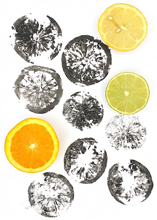
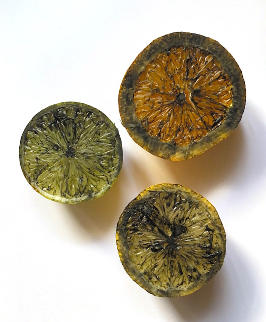
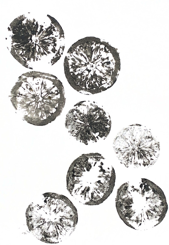
For this first experiment I sliced 3 different citrus fruits in half, I used lemons, oranges and limes to see if they would produce different prints - even though the flavour of bonbons is lemon, I thought it was still worth trying the others incase it made a better design. I dabbed the fruit dry so it didn't make the page wet or the paints wet and then brushed them with black paint and stamped them on the page.
I think it created a really nice result and might look interesting as a background for the poster perhaps? However, I don't think that creating prints with the other fruits would look as good so I don't think I'll be using this method in my final work.
Experiment 2
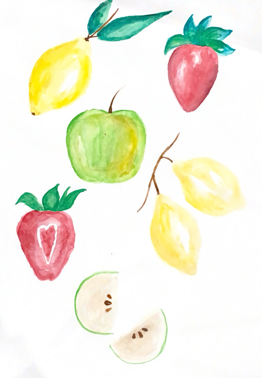
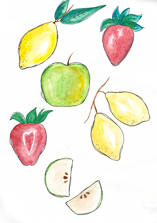
For the next piece of experimental art I did some simple watercolour painting of the 3 flavours of bonbon. I haven't used watercolours in a long time so it was hard to get familiar with them again. I'm not too keen on the result which is why I tried to outline them but I didn't like that either. I won't be using this in my final piece as it is too pale for what I am aiming for.
These were definitely good ways to get out of my comfort zone but I will be going back into my comfort zone and working digitally. I still would like to try Lino printing so this is next on the list.
0 notes
Text
It’s been a while again, but look! I was been busy, there’s more than one drawing this time, wowee.
1. (QPP) A few years ago I was testing out a bunch of colors from my watercolor kit and left it alone because I didn’t really know where to go with it. I’ve finished it so I can give it to my QPP for Christmas, she likes art. I hope she appreciates the stippling of the smoke, it took many hours and my hand and wrist cramped many times.
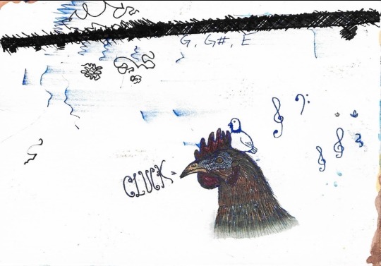
2. (QPP) This is on the back of another watercolor I’ve posted before of the desert oasis. I lost the portrait I was actually wanting to give her, so I’m giving her this one instead. Her favorite animal is chickens so I did a slightly menacing chicken.
3. (QPP) When I made my lino ink block, she had asked for a print from it, so to spice it up I did it on top of some watercolor.
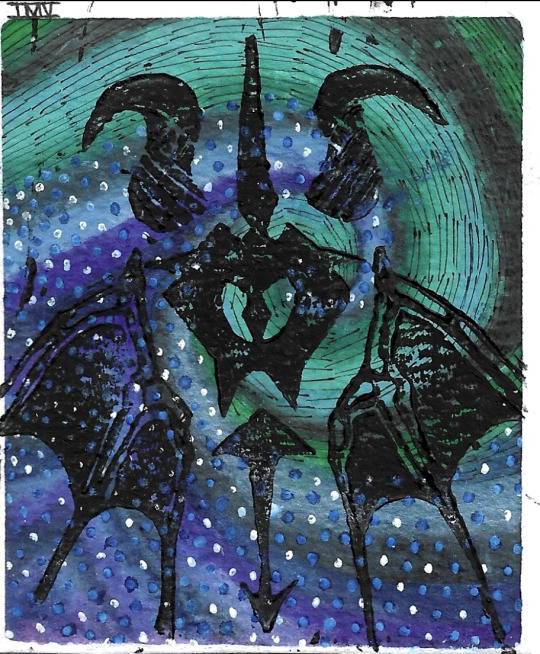
4. (QPP) This is the same story as number 3, but I spent so long on making this one that the thought of covering it up with my stamp made me sad, so the warlock symbol is on the back.
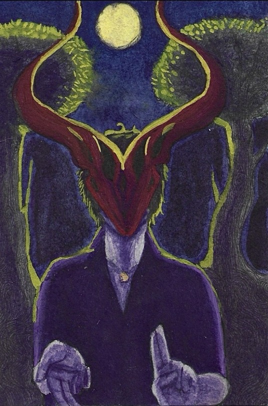
5. I bought a new watercolor kit so this was it’s test run, I’m not a particular fan of it for some reason. I’ve also been told multiple times it looks like Maleficent.
6. (FCP) My QPP gave this friend of mine the unfortunate acronym of FCP, which stands for Friend Crush Person, because she likes bullying me. This is FCP’s cat.
7. (FCP) This is just a drawing of her.
8. (FCP) …And another drawing of her at Halloween.
0 notes
Text
Week 11: Monday - Tutor Group Meeting!! Yaaay!

Diving straight into week 11 because week 10 is a blurr. After last Wednesday I know I did some chores and stuff off my to-do list but it's all a blur now and then I worked over the weekend. So Monday usually hits like a truck.
What I do remember from last week is ordering Tracing Paper and Carbon Paper on Ebay to make the transfer from sketch to Lino plate easier. I also ordered and collected 5 A3 lino boards from lcc at some point last week. It was heavy carrying it all the way back.
Alright so Monday and week 11 have come!
At the beginning of this group meeting we talked through the brief of the major project already, just so we've heard it officially at least once before the winter break. I had already printed and read the brief at the beginning of the year so this was just a nice refresher + some extra notes from Maisie, our group tutor, who has seen multiple years work on the major projects. So she has good tips and insights for us.
After that we were left to work on our projects while 3 people at a time would talk to Maisie about the progress we made with our projects. I was really nervous because with a lot of doctor and dentist visits + covid booster sickness + recent crying at the crit + last weeks crazy Tuesday night....it's just so much. And it left me feeling like a total useless slacker who doesn't even deserve to be here.
So yeah. I was anxious.
Maisie called Mia, myself and another member of our group who I don't know by name up first. Honestly the best thing that could have happened because if I was left alone with my thoughts again I would have probably freaked out again. So, the guy in our little group went first and I remembered him because of the presentation all of us gave a whiiiiile back on our project ideas. He is working on a single player table top game for people with severe social anxiety. I can somewhat relate. He has designed 15 cards already and the illustrations looked super good and the characters were very endearing! I would love to purchase his finished game honestly. You can tell he has spent a lot of time and love in developing every detail of it and it blows my mind he made a whole game by himself for this project! Truly original and amazing.
I also knew about Mia's project. Packaging design that caters to the blind consumer. Again, very original and out of the box thinking. I don't remember her showing any samples of her work but she was talking about doing lino cut instead of screen printing. She is also Route B in CTS which means instead of a loooong dissertation like me, she is working on yet another physical project and a shorter essay.
Then it came to me showing my progress and I was really nervous so I can't even remember half the stuff I said but Maisie was really nice and agreed with my work plan of finishing over winter break and printing first thing in January. She said that for the Lino cut prints I have to figure out how to make the characters stand out and pop. That was good feedback and I'm thinking about it a lot. I told her about thermo powders, Ellen mentioned to me, those could be applied to the ink after printing and give the whole image a nice shimmer.
Maisie also encouraged me to check out the 3D workshop area to make a quick wooden board I could put my lino board on while cutting. A little corner in the top of the board would hold the board in place, making the whole process safer.
After the group session Mia and I showed the guy (I REALLY WITH I KNEW HIS NAME AAAH) where the digital print and print finishing area is. Then I showed Mia our common room because turns out she never went there before. I delivered all zines, posters and post cards for the winter art fair here and Mia and I went to the 3D workshop together. Since we both are doing lino cut each of us needed a wooden board like Maisie suggested.
The technician was really nice and had a very calm demeanor. He cut some scraps for us and let us glue the corners to the boards. It took 30 minutes for the glue to dry during which Mia and I took a little lunch break in the cafeteria. It was nice catching up with her again.
The boards turned out nicely so we thanked the man who helped us and headed back home just as it got dark.
All in all a day full of productive and surprising turns.
Oh and I have bought new planner for 2023 and it's all blue and pretty!!
Things are looking up.
#student life#ual#university of the arts london#london college of communication#studyblr#illustration and visual media#lcc#uni life
0 notes
Text
FMP Evaluation
Disorder/Order
I found myself favouring this theme because I felt so much connection to everything with it. I felt it having the most inside it rather than the other themes, like I could link any and everything through it. Wondering why I chose it, maybe the idea of order or disorder was on my mind at the time, maybe I visualised my project and what it could be, before it was.
Ive always loved something wrong, something without structure from someone else, the idea of distorted art work always was with me. I don’t like realism as much as imagination coming to life with something new, something your unsure of where it comes from. I watched a Joe rogan podcast and he spoke about how when your hammering a nail, you know your hammering it and can recognise that you did it after. But when it came to creativity and more expressive work it’s like you’ve tapped into something else, like your not fully there, that the art is using you to make the work not the other way around. You don’t know where it came from, the work is being sieved through your psychical motion, like it’s someone else who designed it, or a deep self.
Loui Jover very much intrigued and affected my work. His detached forms work really was part of my idea generation.
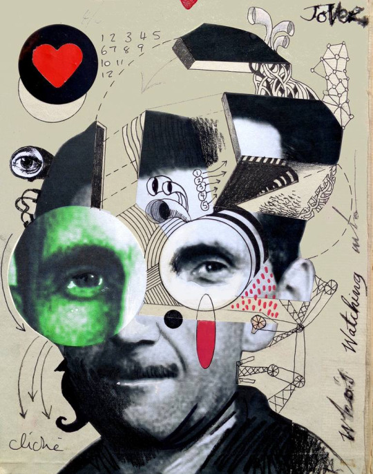
I wanted to do something with distortion, and his work instantly connected to my artistic wants. An artist who I’m unsure of who they are, wether they were an artist we researched in class or a past student who we researched I don’t know. But their work very much was good for my work, it helped me to understand how I wanted my distorted faces to come across and how i wanted them to look, since their work was of the same style.
I believe the movie Joker 2019 starring Joaquin Phoenix affected me a lot with this distortion sort of theme.

Psychological disorders interest me in a weird way. As well as Shutter Island 2010 starring Leanardo Di Caprio also affected me, his character and his story through out. So amazing. Really made me want to express myself through it.
What you see when you look into someone’s eye, what do you see? What do you think about them as a person, without knowing them. Now question why you think that, where did that idea come from? That judgement came from you, but where did you get it from. That concept, that sort of theme. Really. Really intrigues me.
Thecollinson. An artist I found on Instagram. I’ve been following his work for a while, 2 years almost. I would call his paintings slightly distorted, almost like their unfinished. He has a very interesting way of using the paint, using various different colours and shades with a large range of differential amounts of paint.
Mostly working in painting faces, though it may not actually have a face, or at least a normal one. Leaving splurges of paint at different points to represent the features of a face or even just having it all blank. Possibly painting only around the face.
In fact. I contacted him and asked him a few questions. Let’s see what he has to say.
Alfie: Do you have a plan to make this or an idea in your head?
Or does it just come together as you go along
TheCollinson: Something like that I have an idea of just an eye then build around it. That piece was for a client. They just wanted one eye and had some colours they like so I just went with the flow bringing it together. I just love working with thick oil paint. The outcome feels great.
Alfie: Amazing! And would you say their are any other artists that inspire your work or your mark making. What got you into this style? X
TheCollinson: My favourite artist is Van Gogh his use of thick impasto, the way he applied brush strokes and his use of colour is just mind blowing. I always look at Bram bogarts work and the way he Created texture . Also incredible Contemporary artist like Joseph Lee & Elena Gual really inspire me with their subject matter, mark making and use of thick paint.
Alfie: That is great, Van Goghs colour making is incredible! I agree. And if you could describe your paintings or a painting of yours in 4 words, what would they be?
TheCollinson: I’d probably say;
thought-provoking, abstract, colorful and unconventional.
Lino print, woodblock print, plastic board print, fabric painting, spray paint, developing ink photos, Photoshop and more, everything I’ve worked with in the FMP I’m grateful for, I think I’ve definitely enjoyed digital work and spray paint most.
Since I’m going into Graphics Design in the next year of the course I’d say it’s been my best. I’ve learnt how to make frame animation and gifs, understanding the software and how to work all I can on it.
Pushing my creativity through it with outcomes I’ve posted on my tumblr and Instagram pages.
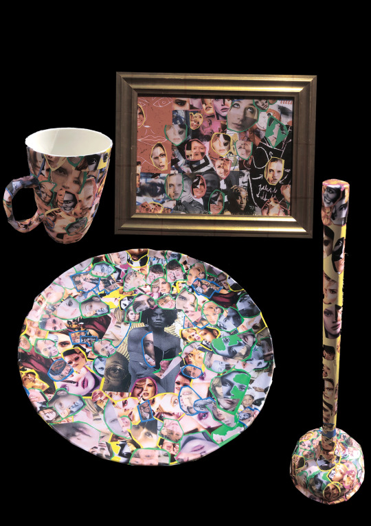
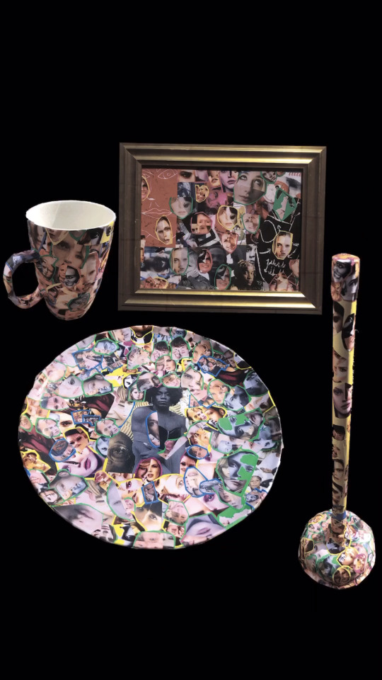
I wanted to test what sort of faces or distortion I wanted to create for my outcomes. Looking at my artists and how they made them, I wanted to make collage a part of my work. So using collaging with faces from magazines and papers was quite perfect. Experimenting with paper collaging on many other occasions got me used it. Making it nice when piecing together the faces and which I wanted to use.
The 12 A5 collages we made on our first week back from lockdown was gorgeous.
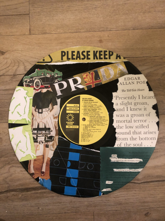
That work definitely made me want to keep collaging as a part of my work. Using my collaging on my vinyl record, CD, and pizza box just pushed me even more to keep wanting to use objects. I find it so much more valuable when it’s on an object or with an object rather than paper or a canvas. All these factors came through to my project naturally from this experimentation.
Presenting my outcomes at the end of year show would be an interesting one. I think I’m going to turn all my outcomes into a single sculpture and would present as so for the show. Sticking them together with very serious super glue. I’d present my outcomes in their habitat.
The plate and mug in a supermarket or China store, alongside regular kitchenware. The golf club would be in a golfing store or course next to regular clubs. Are you seeing a pattern? The frame I’d like in a gallery on the wall. The plunger I’d like in a household. The taps would be on a sink, connected. And the pan finally I’d like to be used to cook with. Though I’m not sure what I want to do with my future sculpture yet so maybe I will be using it.
Ten words to describe my overall outcomes.
Relatable
Empty
Individual
Free
Usual
Full
Useable
Colourful
Comfortable
Warm
Songs In The Key Of Life by Stevie Wonder would be my soundtrack.

I listened to it a lot through this time and listening to it whilst viewing my work just feels right. As well as i was listening to it whilst creating and designing my work. Three hours. Three hours a week I spent working on my project outside of college, wether it was designing final outcomes, sourcing objects or experimenting with medias. It was all enjoyable. My bedroom, living room and garden is where I’ve worked on my project.
I can’t fit in the photos for the four picture descriptions below so! I will number the three words to describe the image then then post the image after this with the corresponding number.
1
New
Pulling
Development
2
Helpful
Relatable
Attaching
3
Personal
Connecting
Mine
4
Thankful
Beautiful
Valuable
0 notes
Text
Gaby : My Place
Introduction :
After thinking and noting down handfuls of options, thinking what does “my place” mean to me, I’ve chosen to base my project on my mind.
In my life i am present in a lot of places physically, for example my room. But a place i constantly find myself is in my mind, thinking. So I’ve decided this will be ‘My Place’ to show over the next few weeks in my work.
Screen print designs
Today i produced 6 A5 designs to come up with a final one to be turned into a screen print.
For all of them i used a variety of cut out magazines, fineliner, collage and sharpie. The key to creating a successful screen print is ensuring there is bold contrast between light and dark to really exaggerate and show the image well.
To start with, i began looking through my source material of secondary sources from online, my own personal art and photos. I then combined a number of elements from each of these to create 6 different designs.
(above) This was my first design attempt, using sharpie and fineliner. I think this is my weakest design as it isn’t composed well and i just don’t really like it. If i was to improve it, i’d try to make bolder shapes with the bugs rather than messy , which was an intentional design but didn’t come out how i planned.
This is my second design, which i find stronger than the first. I like the simplicity of the design, which i used fineliner for, that contrasts with the sentence as it could have many interpretations making it complex. This design links to my them of thinking a lot, and how it’s important to sometimes step back and try level your head.
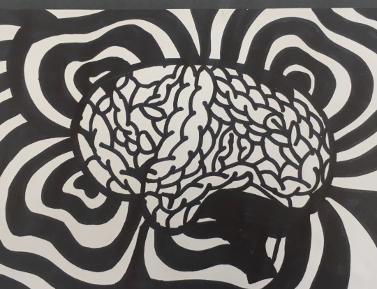
This is my third design that i did using just sharpie. I tried creating thick lines to have a sharper and bolder contrast. I don’t think this design is very strong as the imagine of the brain in the middle gets a bit muddled in the background.
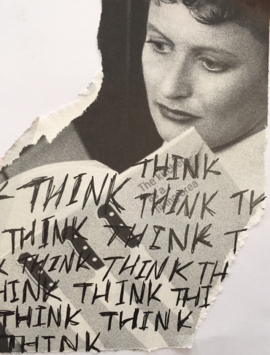
My fourth design is made of a magazine cut out thats written on top with fineliner. The contrast in this design was strong when i did a photo copy, which is a good sign it’ll make a good screen. First of all, i tore the picture and then ripped it a bit more to give rough edges, and then i repeatedly wrote the word “think”. This links to my theme because it shows that some people can think a lot, and when reading the words out you find the repetition quite drilling and potentially stressful, which represents how it feels to overthink.
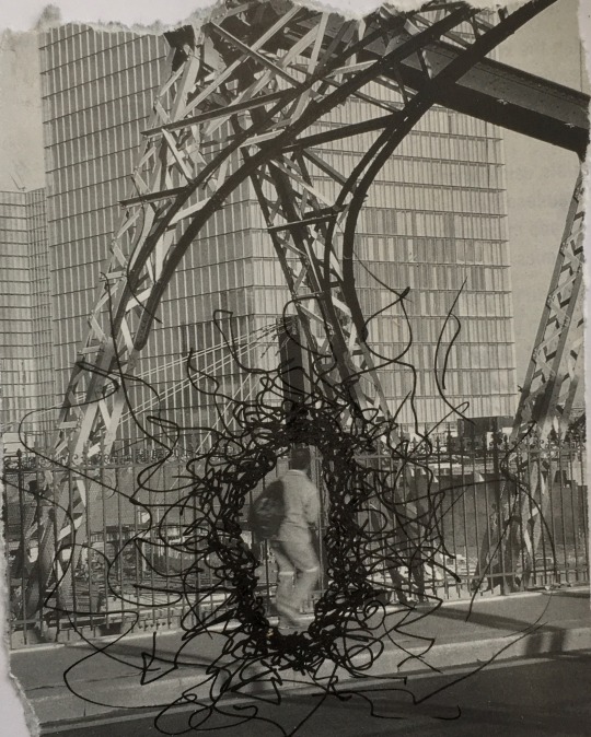
My fifth design is also used with a magazine cut out, with fineliner scribbled around the man in the middle of the image. The fineliner represents negative thoughts, which in real life are obviously invisible. I used this particular image as it seems quite normal and just of an average man walking and going about his day, but the black cloud surrounding him represents what isn’t there to the naked eye , and shows that people can be struggling without you knowing.
I chose this as my final design because i think the composition of the words and the faces is strong. When put through the photo copier, the contrast is also quite strong. I really liked this imagine of the man holding the woman by the arm, because i was able to turn it into a person being almost captured by their negative thoughts, which is represented through the black fineliner on the man’s face. I think the simple scribble over the man’s face creates an ominous feeling because the human features are taken away from the face.
Lino cut designs
I produced 3 A5 designs to help me get a final design to carve into a lino print.
I began by sketching my 3 designs until i was happy with them, and then i used fineliner and sharpie to go over to create the contrast between light and dark, to help my understand what i would need to cut to reach my desired design. For example, the area i cut away, will come out white (or whatever colour the paper is) and the rest of it will be what the ink prints out.
For my first design, i chose to sketch an angel that’s also a skeleton : this represents death. I chose to do this as it links to my theme of ‘my mind’ as i think that death or what comes after is a conversation people sometimes have or just something people will genuinely ponder about. I chose to make the angel expressionless to leave it open to interpretation. For example, some people could see it as sad or ominous where as other people could see it as peaceful or calm as there is no facial expression. I chose to leave the background white as i didn’t want the design to seem overwhelmingly dark and dull as i didn’t want to create a unsettling or depressing tone.
For my second design, i chose to go for a more eerie approach and idea to match my theme. The idea is based around paranoia, so that’s why i chose eyes as sometimes when people are paranoid they feel more watched than usual. I chose to contrast the background as predominantly black to carry on the eerie idea. I used a fineliner to double up the lines of the eye to give the visual affect i’d get when it’s transferred to lino. I then filled in the rest of the background with black sharpie. I don’t think this is my strongest design as it’s messy due to me trying to adjust what areas should be white and black. To neaten it up i could most likely just use a white pen to smooth some of the ares i accidentally got with pen.
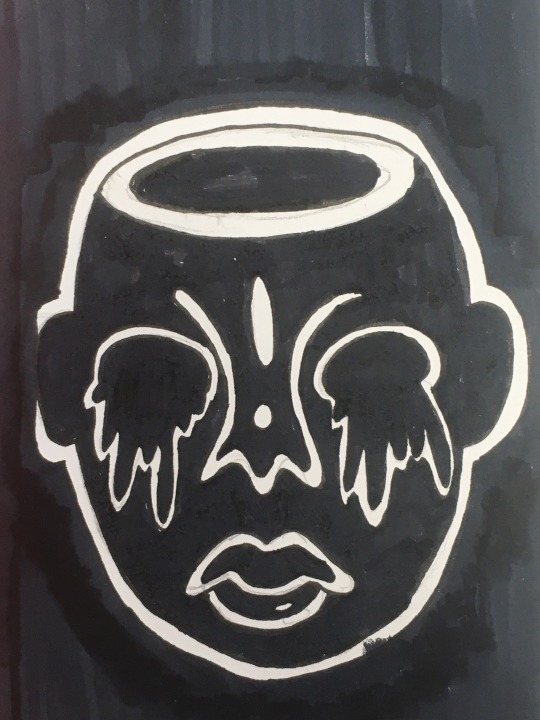
For my final design, i chose to go with a haunting image of a head that appears to be crying. I chose this to represent a feeling of being overwhelmed or ‘pushed to tears’ , as a lot of people (especially in recent pandemic times) find themselves stressed. Like my second design, i used a fineliner to double up the mines then filled in the areas i wanted to be black.
2 notes
·
View notes
Text
Made it into art school and saw some of my friends and Did a lino print (for the first time in 3 years) that I actually really like and I found a working radio on the way home so today hasn’t been bad. One of the better ones. I just made harrissa
6 notes
·
View notes
Text
World War I and Australian Art: Fighting for art in Australia
World War I had a significant impact on Australian society, being the first international war Australia would engage in on its’ own accord. The way in which this affected society’s function and Australia’s relationship with the world was profound. The art world, so inherently intertwined, held a mirror up to society during this time, reflecting this change. Socially, culturally, and economically, Australia had changed and many of these artists at the time were embracing this change, as well as the new influence of Modernism coming from across the world. However, some artists and art critics were hesitant to accept this change due to the nature of the works and the artists creating them. Within this essay, social, cultural, political, and economic influences within the interwar period will be examined to understand how Australian Modernism was shaped during this time.
Post World War I, women had been brought into the forefront of society, entering the workforce and other roles in greater numbers than ever before. With many male artists fighting overseas, women also documented the war from home, painting the strange world that was Australia during WWI. During the period of early modernism in Australian art, women were largely pioneering the movement (Hoorn 1992). The movement was dismissed as frivolous and lacking in talent due to this fact and many male artists neglected to engage in modernist techniques until the mid 1930s. In the words of art historian, Bernard Smith, ‘women played a greater part in forming contemporary taste in Australia than they have before or since’ (Williams 1995). Grace Cossington’s works examine women’s existence within the domestic sphere from a female perspective (Hoorn 1992) Women were central to Australian Modernism and the lack of appreciation of women as artists and proponents of a central art movement somewhat allowed female Modernists to develop in a way male artists could not (Hoorn 1992). Grace Cossington honed her skills in Post-Impressionism during the early 1900s, painting images of Australian life at the time. She gave scenes life, movement, stillness, and emotion, but neglected depth and instead opted for a flat plane existence for the image. The prince (1920) (Figure 1) shows what would be imagined as an extravagant scene, instead opting for the focus to be on the fact is a perspective, a little person in the crowd looking on, out of focus. Cossington did this in stark contrast to the way Australians had painted these scenes prior to Modernism. Cossington’s paintings, along with many other women’s, identified themselves as Modernist while straying from the masculine narrative Modernism is so often imagined as (Hoorn 1992).
Following WWI, Australia and the world’s economy was thriving. Companies had many new inventions and plenty of public interest to back them. Australians were thrilled about the modernisation of domestic life. The new technology and opportunity changed lives and created a sense of excitement. Artists depicted this in their works, this new economic climate, along with development that came with it (Coppel 1995). Many artists had moved to Sydney from Melbourne, the former hub of artistic expression within Australia, and others moved overseas to experience the works of other Modernist painters in Europe (Speck 2014). The development in Sydney became a focus for a lot of artists and The Sydney Harbour Bridge was one of these developments. Dorrit Black’s painting The Bridge (1930) (Figure 2) drew controversy over its unconventional nature. Her somewhat Cubist approach to perspective was unlike any depiction of Australian landscape or cityscape before it. Having moved to London in the 1920s, she had witnessed new ways of depicting landscape and colour (Speck 2014). Another symbol of the new technology emerging was the linocut. Claude Flight, a pioneer of the linocut print, believed modern art should ‘reflect the energy of the modern age’ (Leaper 2016). Those influenced by him included Margaret Preston who famously produced works of Australian flora in linocut print (Figure 3). She was a proponent of the Modernist idea of art for the ‘everyman’, promoting the accessibility of art. Her linocuts were easily printed and reproduced, making them able to be put in homes and used on textiles. She wrote in Art in Australia, ‘The easiest way to understand modern art is to buy an example and live with it. Custom makes consciousness’ (Preston 1929, quoted by AGNSW). The techniques used and the images depicted showed an economic shift in Australian society, changing the way art progressed in the early 1920s.
Modern art had begun flowing into Australia by the 1920s but the climate it entered was not so welcoming. After the horrors of World War I, anything considered too heavily European-influenced was regularly looked upon in a negative light. Modernism proved to be polarising in its nature and had garnered many critics, along with its fans. The warfare between Modernism and Conservative values went on relentlessly. A renewed sense of nationalism could be felt post World War I and this idea of the ‘stoic, hard-working Australian’ was seen to be under threat from Modernism (Underhill 1991). Those that opposed the movement regularly cited the ‘deviant’ nature the works and artists as their reasoning for opposition (Snell 1987). Norman Lindsay was a key proponent of Modernism in Australia and sought to have his works exhibited by the South Australian Society of Artists in 1924 (Snell 1987). However, three of his eleven submissions were rejected for obscenity and he subsequently withdrew his submission entirely, then hiring the gallery next door (Lindsay & Wingrove 1990). Lindsay’s exhibition was highly successful and was a direct rejection of the reactionary Conservative movement at the time. In particular, his works including powerful images of female nudity drew controversy (Figure 3). Sydney Ure Smith, an art publisher and promoter at the time, was quoted to have said ‘it’s not so much what he does, it’s the awful ideas he puts into your head’ (Underhill 1991). From that point onwards, the war between Conservatives and Modernism continued, becoming a political pawn. Robert Menzies supported the opening of the Australian Academy of Art in 1937, run by the conservatives of the art world, while, H.V. Evatt, on the other side, supporting the Contemporary Art Society (Snell 1987). This scandalisation of Modernist art had created a split in the art world and, beyond this, fuel for cultural and political fire in Australia. The works, however, would become integral in the history of Australian art, regardless of the reviews it received from critics at the time.
The Modernist movement within Australia continues to be important in Australian history today. The artists and their works tell a story of a young society and its development in the early 20th century. A number of factors impacted the growth and prevalence of Modernist art in Australia at the time. These included the bringing of women to the forefront as artists, consumers and workers, the new technology being rapidly developed at the time, and the scandalisation of art and modernism, garnering the interest of the public. Modernism thrived in a difficult environment during both wars, but within Australia, the inter-war period created a climate in which it would become a focus of both artists and the public, fixing itself firmly within the history of Australian Art.
REFERENCES
Coppel, Stephen. 1995. Linocuts Of The Machine Age. [Aldershot]: Scolar Press.
Hoorn, Jeanette. 1992. "Misogyny And Modernist Painting In Australia: How Male Critics Made Modernism Their Own". Journal Of Australian Studies 16 (32): 7-18. doi:10.1080/14443059209387082.
Leaper, Hana. 2016. "‘Old-Fashioned Modern’: Claude Flight's Lino-Cuts And Public Taste In The Interwar Period". Modernist Cultures 11 (3): 389-408. doi:10.3366/mod.2016.0147.
Lindsay, Norman, and Keith Wingrove. 1990. Norman Lindsay On Art, Life, And Literature. Lucia, Qld., Australia: University of Queensland Press.
Preston, Margaret, Art in Australia, 1929, quoted in Art Gallery New South Wales, “Margaret Preston, art and life,” http://www.artgallery.nsw.gov.au/sub/preston/artist_1920.html
Snell, T and Curtin University of Technology for the Dept. of Visual Arts (1987). Scandalized : public perceptions of the arrival and emergence of modernism in Australian art. [video] Available at: https://echo360.org.au/media/1b8add4f-f17e-4788-ab71-e2b63454fcc1/public [Accessed 8 Mar. 2019].
Speck, Catherine. 2014. "Dorrit Black: Unseen Forces, Art Gallery Of South Australia, 14 June – 7 September 2014". Australian And New Zealand Journal Of Art 14 (2): 214-216. doi:10.1080/14434318.2014.973009.
Underhill, Nancy D. H. 1991. Making Australian Art 1916-49. Melbourne: Oxford University Press.
Williams, John F. 1995. The Quarantined Culture: Australian Reactions To Modernism, 1913-1939. Cambridge: Cambridge University Press.
1 note
·
View note
Text
July 2018 #463
Me: H?
H: I’m here darlin’. (sitting on a chair on the porch, rolling cigarettes to put in his case) You look a little more collected this morning.
Me: I slept a bit. And I’ve eaten a piece of toast.
H: (wry) Is that how it is?
Me: Mm. Also this morning there was a cockroach in the bottom of yesterday’s coffee cup, which has really put me off coffee.
H: (coughing) Horrible vermin.
Me: What about you - what are you doing today?
H: Riding for a spell I think, the day is a pleasant one. But a fixing on the porch as the kits laze in the sun is not something to pass up upon or hurry. Besides which it seems your allotted hour these days. …What?
Me: A girl can look.
H: Indeed, but why does she in this instance?
Me: I’m glad you’re looking better - you were getting very gaunt. Also you look roguish in your riding get-up. And I like your hat. How are those reasons?
H: (amused) Admirable. What do you intend for the day?
Me: Art commissions. Or at least, letters that lead to art commissions.
H: What are you setting to do?
Me: I want to make things - I have itchy fingers. Sigil spells, lino prints. Feather headdresses…
H: (frowning) You plan to pass them off as Indian?
Me: No! Gods no - headdresses like the one I made for the wedding. Pagan Valkyrie-style, with wing feathers at either side.
H: Ah, I see. That one was rather stunning.
Me: Thank you. …I wish it wasn’t so expensive to rent two rooms here - I want a craft room. Ergh, I’m gonna have to get some kind of bloody income, I really am otherwise this is never gonna work.
H: (coughing) Whistle for it? (I do and manage 3 so-so notes) … Much improved on last time. Should serve you better too.
Me: What can I get you for your birthday?
H: (lighting one of his cigarettes with a scowl) I believe I already answered that.
Me: Hm. Would you like to hear the piano piece?
H: Yes.
Me: (played Divenire by Ludovico Einaudi on my phone) What did you think?
H: The build was slower than it could have been for my taste; but when he got to the point he had something to say. I enjoyed it.
Me: I like listening to it when I want music but need not to be distracted.
H: (gave a smirk which might have translated as ‘told you bits were bland!’)
Me: You prefer Hans Zimmer?
H: What little I’ve heard, yes.
Me: I should play you some more of his kinema scores - they’re always great to listen to on their own.
H: What are you thinking on?
Me: Things I shouldn’t.
H: Care to elaborate?
Me: You and the fact I need a gender-flipped version of ‘Upon Julia’s Clothes’.
H: (looking mischievous) That a fact?
Me: Yes.
H: (smiling) Best come inside then.
2 notes
·
View notes
Text
Final Pieces and Evaluation
Title and Description
Horton, Georgia. Hostage 1969. (2021) “A Vietnamese citizen being held hostage and interrogated close to a village. A part of the phoenix operation lead by the USA, which tortured a murdered over 81,000 Vietnamese National Liberation Front members.”
Title and Description
Horton, Georgia. Phoenix Program. (2021) “A group of National Liberation Front members being rounded up for execution. The CIA executed the Phoenix Program to interrogate, torture and kill members of the National Liberation Front who were fighting to protect their country from a military based coup d'état performed by the US, Australian and South Vietnamese.”
Title and Description
Horton, Georgia. Execution. (2021) “A National Liberation Front member being held prisoner in his own village, awaiting his execution by US Soldiers. This was commonplace during the Vietnam war, where suspected National Liberation Front members would be taken from their homes and executed.”
FINAL EVALUATION
For my final piece, I decided to go on and continued with my India ink piece from before. I liked doing this because I found the line variation and mark making fun as well as making the piece striking to look at. I made these pieces to represent the pain of civilians in socialist countries, who were oppressed and killed by Americans. Everyone in the photo is a real person involved in a real event that happened, I intended to not make a propaganda piece promoting socialism but more a piece that shows the horrors of war, the people that we usually consider the heroes aren’t always that. I also did not want to show any gore, as it would be inappropriate, just body language. I feel that my work is effective and gets the point across.
I feel like I could’ve done more artist research. I feel like the variance I had in research hindered me in the fact that because of the lack of materials I had access to. This is because of COVID restrictions. More research may have helped me in finding original ways to use the most basic of materials, as well as cheap alternatives or even just the use of common household items to create a piece. I also feel like I didn’t use all aspects of my research, despite researching Henry Moore and Paul Nash, I didn’t use many aspects of their work to my advantage such as exploring creating a piece with oil paints or a statue like they did. I could’ve also considered making a piece with digital art that I have access to, as I have explored a number of digital processes such as 3D artwork and digital art.
I feel like I could’ve also explored more initial ideas for my pieces, such as exploring a range of subjects such a landscapes and other things. I went with the first range of ideas I had rather than discovering more options I could have.
I think I could’ve done more work with colour. I did not even attempt a piece in colour, similar to one of the artists I researched. I wasn’t able to do this due to COVID restrictions within the project which stopped me from ordering and getting the materials I needed. I could’ve also worked with more materials, however due to coronavirus and vulnerability in my health, I decided it would be best to use whatever I have access to. I feel like I could’ve spent less time doing preparation work and more time doing final art work. I wish I spent more time on planning out my pieces. I would’ve also liked to have done more final pieces. This is because I don't think with the 3 pieces that I made that I truly encapsulated the horrors of the Vietnam war.
I am also disappointed with several plans I had throughout the project that did not go the way I want or changed last minute. For starters, I planed to have no explanation of my art pieces, however I later changed this as seen above, to have explanations of my pieces. This is because originally I was planning to do my pieces as an etching, however, due to my negligence on researching, I did not have the right tools to properly transfer my trapped ink onto the paper. This means I had to change my final piece materials, and I found my final pieces didn’t come out as clear or as knowledgeable as my original sketches which were made in mind for the etching boards I had. This is why in the end I decided to instead explain the pieces rather than let them be self-explanatory or let the viewer reflect themselves on the pieces.
Despite all the problems I faced in the last 2 or so posts, I still feel I managed to get a Goya feel to them, I specifically wanted to do an etching to mock and copy his style of work however that did not turn out how I wanted. Regardless, the hard and striking lines in the work I made as well as the gestures still managed to copy at least some element of his work while creating some originality in my piece.
Through my process I have learnt a ton of new things, such as new techniques and ways of working. I don’t usually do several tests before doing my final pieces so this project taught me how to do that. I also learnt new art techniques such as lino print, etching and India ink. I used different tools and different materials to play around with this. I also learnt to focus more on using body language to show emotion since most of my figures were blindfolded or faces were hidden. I exaggerated the poses of my subjects to achieve this emotion in my work.
I am happy with several outcomes of the project. I was able to find out that I really enjoy working with India ink and I was also able to discover a passion for design things such as poster and general design planning such as the war memorial task which I found very fun. I also found out things what I don’t like, for example, I did not like the dangerous process of the lino printing. Because of injuring myself several times with that process I quit pursing lino.
The feedback I got from my teachers was strictly positive. I feel this held me back a little because more critique I feel would’ve allowed me to work on different things and done more with my project. There were times during the project where I would feel confused as to why we were doing said task, however, in the end I feel it makes more sense to me.
The pieces will be presented online due to the coronavirus on the Dover Technical College website. I considered doing a voice over for my piece, however instead I made descriptors for my pieces in place of this as I have been recovering from COVID and have a sore voice.
0 notes
Text
Evaluation.
Artists that impacted my art:
Robert Rauschenberg , ericha Oda, Kanye west, Pharrell Williams
Ideas behind my work:
In my work I must admit I very much work on how I'm feeling at the time, this way I feel as if my work is genuine and original not just something that I've forced out, but something that comes from my imagination and heart sounds cringe but its truth, luckily for me I feel as if I can tap in to my imagination at will. In my work I try to reflect my surroundings in my work , surroundings being things that inspire for example , anime and manga (specifically at the moment One piece and Cowboy Bebop) skate boarding and skateboard culture something that has had a huge impact on my life , something I am forever grateful for at the moment, I just love how everyone has their own style and at the the same time it is a universally recognised style to the trained eye , a beautiful contrast. Another inspiration of mine is pain, it sounds a little dark and off putting but i can assure that some of the most incredible pieces of music, art and film etc have been inspired by someones sadness pain suffering whatever it may be. probably one of my biggest inspiration and something that fuels a lot of my ideas is my ego , everyone has one , sometimes mine can be pretty big, everyones ego changes shapes and sizes, essentially your ego is what makes you who are, and for me and my ego I find my self becoming self obsessed, a perfectionist, negative towards myself, but it has a positive side which I have used a lot in my life It sounds boring but probably one of biggest moments of my life (top 50) was when I changed my hair on 3 different occasions , and on each occasion my ego played a big part.
occasion one : I bleached my hair blond.
occasion two : I got short hair for the first time ever and dyed it blonde, people called me Eminem.
occasion three : shaving my hair off.
Now why have I talked about giving myself haircuts, well it all links, on each time I did I stuck out like a soar thumb, and I loved it. Everyone looking at me, no words just glares, wondering why I looked so different to what I used to, it lifted me, I felt like a rockstar, very sad admitting that but its the truth, none of this would have been possible without my ego, without my ego I wouldn't be who I am today. Its probably one the main hubs in my brain where ideas are made.
New techniques I've learnt:
Throughout my time starting from September , I have learnt multiple techniques and which are helping me to better my work to this day. firstly although I already had done a screen print before I had never really fully done it if that makes sense , anyway it was so cool to be able to use on of my own designs which I had never done before , personally was happy with my prints but I definitely will be looking forward to bettering my technique in the future. Another technique which I enjoyed doing was the drypoint printing , I really enjoyed this one because it was very new to me but at the same time I was familiar because I kind of found it similar to Lino prints but regardless I still really enjoyed it. I especially enjoyed the use of the press/roller used in the process, even better I liked how I could use my other work from my book but still give a genuine and original look.
Thursdays drawing sessions, what I've learnt:
Something that I've learnt in the Thursday session is not necessarily the techniques,( although I have learnt various blind portraits being one of my favourite) it was to let things out control. As an artist I find it extremely important that what I'm doing comes out how I like it but thing with the Thursday sessions is that they would put me in a position where I have created something I like, for example the blind portraits , I would like an image that I had created but then have to go over it and make it something else, my first reactions was ‘I'm just ruining something that fine the way it is’ but the more I thought about it, it wasn't about making a perfect image it was about adapting and excepting and most importantly just being more relaxed about my work and letting my brain create with more flow. It might be different for others but that is what I got out of the Thursday sessions.
where why:
Personally I don't know too much about art galleries and things like that I have been too a few, one in Paris I can't remember the name but it really was incredible and the the Tate modern and Tate Britain, both incredible, but back to what I was saying if I was to display my art anywhere in the world it would definitely be in a huge city like London, Tokyo, New York or L.A . What I would do is somehow find a way to project my work on to the clumps of skyscrapers so everyone could see my work where ever they are.
10 words:
Swag
cool
saturation
bold
detailed
expressive
manga
emotion
meaning
free
soundtrack:
To do this is very hard, I love music so much and if I could I would just put about 500+ songs but to sum it up ill choose 5
1.Flashing lights - Kanye west
2.In my room - Frank ocean
3.Ghost town - Kanye west
4.She - Tyler the creator and Frank ocean
5.Is it true - Tame Impala
0 notes
Text
youtube
Watch the American Climate Leadership Awards 2024 now: https://youtu.be/bWiW4Rp8vF0?feature=shared
The American Climate Leadership Awards 2024 broadcast recording is now available on ecoAmerica's YouTube channel for viewers to be inspired by active climate leaders. Watch to find out which finalist received the $50,000 grand prize! Hosted by Vanessa Hauc and featuring Bill McKibben and Katharine Hayhoe!
#ACLA24#ACLA24Leaders#youtube#youtube video#climate leaders#climate solutions#climate action#climate and environment#climate#climate change#climate and health#climate blog#climate justice#climate news#weather and climate#environmental news#environment#environmental awareness#environment and health#environmental#environmental issues#environmental justice#environment protection#environmental health#Youtube
16K notes
·
View notes
Text
𝕮𝖔𝖒𝖎𝖈 𝖇𝖔𝖔𝖐 𝖈𝖔𝖓𝖋𝖎𝖉𝖊𝖓𝖙𝖎𝖆𝖑 - 𝕾𝖙𝖆𝖌𝖊 𝖙𝖍𝖗𝖊𝖊 | 15/06/20
September is shaping up for the students taking the second year (extended diploma), and so far, it seems that we will be around 20 students by Sep. Due to the pandemic, we will most likely be coming into school in groups of 10 as we easy into it; at the same time, our grades are coming up soon, so we are asked to stay tuned for any news regarding this.
We had our third zoom meeting; this time focusing on how we are going to go forward with this project, practically speaking.
Topic: Animation & Illustration Progression - Review of Viewfinder drawings
Time: Jun 15, 2020 11:00 AM London
Hi guys,
Mondays class will review Viewfinder drawings and also we will show and tell progress, asking the question well how do we turn this into a comic.
The aim is 5 pages of at least 3 panels by the time we return in September....I am just checking on progress towards this.
See you Monday,
DD
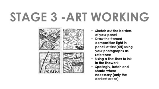
How can we connect what we have done so far with the goal of this brief (making a comic)?
Gutters are important to comics, as they are what differenciate the panels from eachother, allowing us to convey a sense of time and space – essentially becoming a time traveler. Because of the gutter, we get a sense of closure at the end of each panel, which then connects to the context of the next panel.
Something similar to this that we did last year was our post it note sequences; they were made up of seperate frames, but came together to create one image; a story/narrative/meaning/visual. At the same time; the post it note comic brief that we did this year is again, very similar to what we are trying to create with this project, only much more refined.
We are still required to being open to experiment with the medium/mediums we have chosen or planned to use for our comic strips. An example of this could be the artist we study, Sam Elston and his use of ink:
Here he has done some light sketching and then gone over it with a brushline; keeping in simplistic and clean.
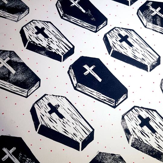
Where as here he has done some lino printing; creating some really interesting textures, also causing irregularity between the pattern of the coffins, engaging the viewers eyes to look at them not only as a whole, but individually.
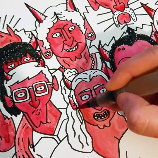
Here he is using coloured ink to make each character pop out between the linework as well as to further convey that they are devils.
This is all the same medium; but used differently- exactly what we are aiming to be doing. - We are not required to use fine-liners and/or ink, but any kind of medium that we would like. All we have to keep in mind is tone and texture; much like last weeks example of Jon McNaught’s work.
- Art can be whatever you want follow basic instructions from Powerpoint link processes back to artists we look at.
- Read pages of book on panelling comics to aid the creation.
- Think about texture and tonality
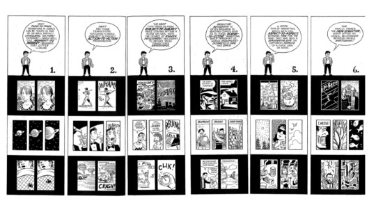
McCloud animation book, on transitions; how we move from one frame to another. This is a crucial element in comic although it seems obvious. There are 6 different ways this can be done, determining how we read and understand a comic.
section 1.
Moment to moment. It is similar to animation and sequences; little changes making it look as if it is moving, creating fluidity; needing very little closure this making it is easy to understand and read.
section 2.
Action to action - similar to the idea of animation - show the frames as the first and last frame of a sequence ? the before and the after. still in the moment.
section 3.
Subject to subject is a little more complex compared to the previous two. getting reader more engaged. you don’t have to look much to understand the previous two, but for this you must work a little harder as a reader. Involving the readers is crucial, and it can be done with this with a dramatic scene, creating a plot/story.
section 4.
Scene to scene. Moving to country to country/time traveling can be a powerful tool for convey time. An example of this could be a a frame of someone in a field with a tree, then jumping to a shot inside your kitchen.
section 5.
Aspect to aspect can jump through time and space easily. We are not worried with time for this as we can jump through it– setting up a place and mood. An example of this could be the example from last week of Jon McNaught’s comic.
section 6.
Non-sequential is when you almost do a jump cut; showing a harsh juxtaposition between subjects (frames).
We are expected to be looking at a range of different mark making, again, to experiment with our chosen medium/mediums; all to create a sense of depth.
I would like to focus on doing most of my comics digitally; since i feel that this, as a medium, is quite misunderstood as being “fake” and not as valued as “traditional” art such as pencil, paint, sculpting etc. -
With this in mind, we must make sure that we aren’t just doing “whatever” “just because”, but for a reason; this being mine.

This project is just for us to have a go at it; to do some research if unsure, but make sure to look at some comic books to reflect upon.
By the end of the meeting, we shared our work with the class; giving feedback to each other on how we now put them into a sequence for our comic strips? We left with the mention of making sure that we keep in mind that this projects is just to test our skills of sequential art, observational art and rendering, giving us an opportunity to experiment.
0 notes
Photo
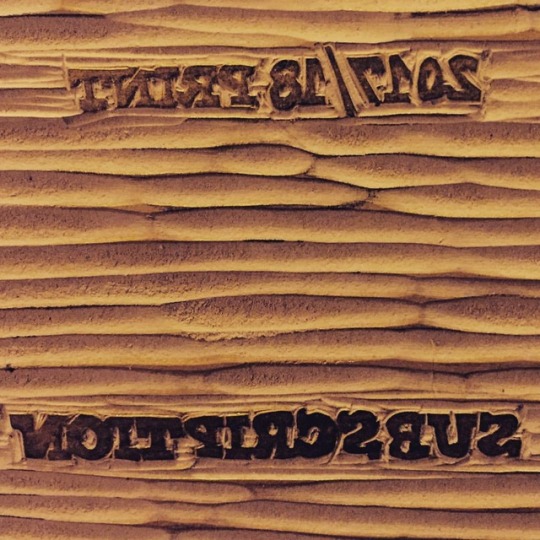
2017/18 winter print subscription sign ups are here!! thank you so dearly to all the people who've helped this process happen over the years. this is my third year of doing it & it's still scary/exciting/weird. couldn't do it without you. **what is a print subscription** if you sign up, you'll pay some amount (see below) and get at least 6 prints over the course of 3 or 4 months. prints are made by me and are mostly linocuts/oil-based ink. maybe some screen prints and other things. prints are about collective movements & liberation, family history, plants, bodies, queerness, connection&stories, and more! **how you will get the prints** by the slow magic of snail mail. give me your address (or any address i can send prints to you at), i'll send prints to you. one very sweet letter/small package once a month, for 3 months. 2 prints once a month for 3 months = 6 prints. along with the prints comes a newsletter of sorts connecting the prints to local projects, organizing, stories, & shares about the process. (hopefully look forward to guest columns this year!) **costs** sliding scale $30-150 for the whole thing. i'm totally open to trades or something else so get in touch with me and propose something that works for you. i do sliding scale because money is wonky and capitalism sucks. i want to live in a world where everyone's basic needs are met and we all get access to art. some of the $ from this subscription gets donated to groups/organizing efforts mentioned in the newsletters sent along w/ the prints. **other details and things** -you can pay in cash, mail me $/checks, online via paypal (paypal.me/andreamarcos) or venmo ([email protected]). for trades, let's talk. -sign up by late November, prints will start coming in December or January. I'll keep in touch about the timeline. -if you sign up late: well...don't! but if you do we can talk about it. -did you participate in previous print subscriptions? have any feedback? let me know! -this is always an experiment. everything will be made with lots of love and learning processes in motion. please keep that in mind. #printmaking #lino #subscription #art #snailmail #linocut #printsforsale #queerartist
2 notes
·
View notes
Text
The Rubaiyat of E.Joyce Francis
The Rubaiyat of E. Joyce Francis
Rubaiyat of Omar Khayyam, The Astronomer–Poet of Persia, Translated into English Verse by Edward FitzGerald with “engraved headpieces by E. Joyce Francis”, was published as no.6 of the Ebenezer Baylis Booklets, in Worcester in 1934 (1). It was a limited edition of 500 copies. Using FitzGerald’s first edition, it contained five headpieces and one tailpiece, these being shown as Figs.1a, 1b, 1c, 1d, 1e & 1f. Mostly the illustrations seem to be generic rather than related to specific verses, though Fig.1a is clearly the dawn associated with the opening verse, and Fig.1f clearly depicts the turning down of an empty glass in the closing verse. Fig.1e, for example, is clearly a generic depiction of Omar and his Beloved, in the booklet somewhat incongruously located towards the end of the Potter’s Shop interlude. Again, Fig.1b could refer either to verse 33 (“Then to the rolling Heav’n itself I cried...”) or to verse 52 (“And that inverted Bowl we call the Sky...”), neither of which is anywhere near the illustration. The colophon of the booklet is shown in Fig.1g. This lists the consultant–typographer as Leonard Jay, whose name we shall encounter later in connection with the Birmingham School of Printing. We shall have more to say about the other books she illustrated in this series below, but meanwhile, who was E. Joyce Francis ?
Biographical
There is little or no information readily available about her and her work. She gets no mention at all in either Brigid Peppin’s and Lucy Micklethwait’s Dictionary of British Book Illustrators: the 20th Century (1983) or in Alan Horne’s Dictionary of 20th Century British Book Illustrators (1994). Nor is she mentioned in Albert Garrett’s book A History of British Wood Engraving (1978). But thanks to some online research of ancestry records, and more particularly, thanks to contacts with her daughter–in–law, Sylvia Goodborn; her niece, Barbara Chisholm; with Joyce’s friend of many years, John Perfect, and his wife Sue; and with Jane Dew, who likewise knew Joyce for many years, we can rectify that.
Eleanor Joyce Francis was born in West Bromwich on 6th June 1904. In the 1911 census we find her, age 6, living with her family at 57 Bayswater Road, Handsworth, Birmingham. Curiously her name is spelt Elinor on the census return (as it is elsewhere, for that matter – see below – though on her birth certificate it is Eleanor.) Her father is Harry Morris Francis, age 38, an Assistant Secretary at the Birmingham and Midland Institute (the BMI still exists today); her mother Charlotte Francis, is also age 38; and she has an older sister, Margery Francis, age 10. The family is prosperous enough to have a general servant or domestic called Rachel Williams, aged 47.
Joyce (for so she was familiarly known) attended Birmingham School of Arts and Crafts between 1921 and 1935, but with a gap in her studies in the year 1924–5 (the academic year ran from September of one year to the end of August the next), and another between 1927 and 1929. (No–one seems to know what she did in the gaps.) Records there show that she studied elementary art in 1921–2; general drawing in 1922–3; book illustration in 1923–4; craft in 1925–6; wood cuts in 1926–7; and drawing & painting in 1933–4. Details for the other years she attended the School are scant, unfortunately, being restricted to enrolment date and such like. As for the somewhat vague heading of crafts, it would appear that it included book–binding, pottery and textiles. Her skills in book illustration and the creation of wood cuts, were, of course, put to good use in the Ebenezer Baylis booklets mentioned above, and of which we shall have more to say below. During the period 1921–1933 she was living with her family at 152 Hamstead Road, Handsworth, Birmingham, but sometime during the academic year 1932–3, the family moved to 82 Hagley Road, Edgbaston, Birmingham, where they were still living in 1935 (2).
In the third quarter of 1938 Joyce married Arthur Thomas Goodborn in Birmingham, and though she was now Eleanor Joyce Goodborn she continued to use Eleanor Joyce Francis as her professional name. In the 1939 electoral roll the couple are recorded as living at 8 Colinette Road, Putney. London SW15, for reasons possibly connected to her husband’s family – he had been born in Lambeth, London in 1905. In the second quarter of 1939 their daughter Marianne was born in Wandsworth. Some time after that they moved to Loughborough, where her husband was the Senior Tutor in the Department of Teacher Training at Loughborough College. It was in Loughborough that their son John was born in November 1943. Some time after that, they moved to Birmingham, where he had been appointed the Arts and Crafts Inspector for Schools in the Birmingham area, and where she was to teach Arts and Crafts in the Education Department of Birmingham University. Of their two children, Marianne was to remain unmarried, dying in 1998, as we shall see, but John, who died in 2016, was to marry twice. Sylvia being his second wife, she only got to know Joyce from 1973, by which time Joyce had left Birmingham to live in Wales, on which more presently.
As for Joyce’s husband, Arthur Thomas Goodborn, he died in Handsworth, Birmingham, in 1952, aged only 46. Probate records give the couple’s address as 35 Wyecliffe Road, Handsworth, his effects of £5425 16s 6d being left to his widow, Elinor (sic) Joyce Goodborn – not a fortune, but quite a lot of money in those days.
A number of photographs of Joyce have survived, and one of particular note is that of Fig.2a. It is undated, but has the feel of the 1960s about it, and shows Joyce teaching a pottery class (presumably at the University.) The photo was supplied by Sylvia Goodborn, who describes it as “absolutely her.” For comparison, the photograph of Joyce in Fig.2b was taken at Jane Dew’s wedding in 1968. The somewhat dark photograph of Joyce shown in Fig.2c, supplied by Barbara Chisholm, was clearly taken much later, probably at Cae Newydd (of which more below.) Barbara also supplied the photo of Joyce as a little girl, shown here as Fig.2d.
In the late 1950s John Perfect met Joyce through the Youth Fellowship of St Michael’s Church, Handsworth, where she often used to give talks about art. He was in his mid–teens at the time with ambitions to go to art school, so they had something in common and struck up a lasting friendship. (Sue Perfect, incidentally, got to know Joyce somewhat later, from about 1968.)
According to John, St Michael’s Church and Joyce’s talks were attended by the professional people that lived in the Handsworth of those days – doctors, journalists, business people and such like.
Handsworth was a safe Tory seat. The MP was Sir Edward Boyle whose idea of electioneering was to cruise round the area, waving from his Rolls Royce.
As for 35 Wyecliffe Road, it was “a large semi–detached house of an art nouveau style, probably built in the twenties or early thirties.” It is still there today.
Jane Dew told me:
I met Joyce and her daughter and son in the late 1950s when my parents moved back to Birmingham from South Devon. Joyce lived in the same road (Wyecliffe Road) and my mother soon made friends with her. I was still at Secondary School but Joyce knew l really wanted to train in the Arts.
She regularly taught me, informally, techniques and history, lending me books and taking me to exhibitions. She knew a wide range of people and her house was regularly full of musicians, actors and artists. I made friends with her daughter, older than me by a decade, and her son, just a few years older than me.
But, John goes on:
Joyce didn’t care for Birmingham and for some time before I knew her she and her husband had rented a cottage on the hilltop behind Aberdovey in Wales. Called Cae Newydd, it is clearly marked on the ordnance survey map for the area.
Jane adds that Joyce and her husband began to rent Cae Newydd in the early years of World War 2, so that if Birmingham was bombed, the family had a safe haven. Come the late 1950s, Jane adds:
Knowing l missed the countryside, she invited me to stay with them during the school holidays.
I stayed with them for many years and grew to love the area. I regularly accompanied Joyce, with her son, to deliver her paintings to galleries, and help with the unpacking/packing. She also allowed me to draw in her studio, sitting away from each other and working in comparative silence!
She was immensely generous and encouraging, especially when l gained a place at Birmingham College of Art & Crafts (now Birmingham City University). My career as an embroiderer was greatly influenced by Joyce, and I remember her showing me how to design a repeat lino/woodcut to produce an effect like that shown here (Fig.3).
Aberdovey (or Aberdyfi as it is known now) is on the west coast of Wales, about 8 miles north of Aberystwyth. After her husband’s death she continued to rent the cottage, and to stay there as often as she could escape from Birmingham. As for getting back and forth between Birmingham and Aberdovey, John tells us:
Transport was a problem and she bought a succession of rather scruffy vans and cars. She’d load her painting gear into them and take off. Amazingly they never let her down, though she did have a man who maintained them for her. By far the nicest was a Ford ten of late 40’s vintage that had a wood–panelled body that used to be described as a shooting–brake or woody style. I remember the bonnet being opened to reveal an engine that appeared to be smaller than the battery; also, it had pre–war pattern, rod–operated brakes, so it was fortunate that it didn’t go very fast.
John’s first trip to Cae Newydd was in one of Joyce’s vans, when he was in his late teens, and he was to visit it many times thereafter. On occasion he even looked after the cottage, when Joyce was away teaching in Birmingham. His picture of the cottage, done from a photograph taken in about 1980, is shown in Fig.4.
His pen–picture of Joyce back then is wonderful and tallies with Figs.2a & 2b:
She was a woman of ample proportions and wore her long grey hair tied in a bun at the back. She wore long, floppy skirts, frilly blouses, often fastened with a cameo brooch, and a man’s wrist–watch that had probably belonged to her husband. All very Margaret Rutherford.
In 1960 Cae Newydd came up for sale and Joyce bought it. It was, shall we say, very basic – there was no running water (that had to be brought in from a nearby stream, and boiled before use), and there was no electricity supply until poles were put up for the farms in the area in the early 1960s. Thus for quite some time there were only oil lamps for lighting, for example, and log fires for heating. As for the toilet, it was a slate–built shed outside the cottage. A mountain stream entered and exited through holes in the walls, and there was a wooden seat by way of luxury. Joyce apparently referred to it as having a “two hole perpetual flush.” But to her the cottage was idyllic and she regarded it is her spiritual home. John goes on:
To get on with Joyce it was necessary to pass the Cae Newydd test. Those who liked the place despite its privations were in. Those who didn’t, and they were many, were regarded rather differently.
But in 1973, finances dictated that if she wanted to keep Cae Newydd, Joyce had to sell her Birmingham home. With her daughter, Marianne, she moved to Aberdovey, and bought a small shop in New Street there which also had living accommodation. There, they opened what we would now call an Arts & Crafts café, in which they sold a variety of home–made goods as well as pictures by Joyce. Sue Perfect told me:
I remember the goods at the tearoom as being mostly the patchwork quilts, the woollen blankets and the occasional rag rug. The material was mainly recycled not the sort of material one can buy on a bale. Ultimately it was a source that would sooner or later outstrip supply but for the while the tweeds were matched and separated from the cottons so that the finished article was colour and weight matched. The rag rug pieces were poked and drawn through individually onto hessian or sacks, not the prepared backs that one can purchase from craft shops today. Joyce and Marianne were incredibly resourceful and would use anything that would bring a creative pleasure to them and others.
To this account of early recycling, Jane Dew added that the blankets were knitted from wool which in part had been collected from the wire fences of nearby farms, having been scratched off the backs of passing sheep!
Joyce also used to run craft workshops there – patchwork and spinning were two popular examples. The café side of things was run by Marianne. The business was very successful, but neither Joyce nor her daughter were temperamentally suited to a 9 to 5 lifestyle, and, at least on the arts and crafts front, demand rapidly outran supply – at one point Joyce sold the quilt off her own bed to one insistent customer. So, having made sufficient money, Joyce decided to sell the shop and spend the proceeds on Cae Newydd. That was when the real problems began.
Cae Newydd was, as already indicated, one of those homes which sounds idyllic, and indeed was so, for a short stay in summer. But in the winter, with wind, rain & snow blowing in from Cardigan Bay, it was cold, damp, and with no running water and only a primitive outside toilet, it was far from idyllic. The stresses and strains eventually had their effect. Joyce suffered a major stroke and was admitted on a permanent basis to Towyn Hospital, where she died in 1985. Marianne stayed on, but she too was “eventually invalided out” (as John puts it), and she died in the same hospital as her mother in 1998.
Joyce was an active member of the Aberdovey / Aberdyfi Art Society, which still exists today. Unfortunately, despite diligent enquiries by Stewart Jones, Kate Coldham and others, none of the current membership approached remembered much if anything about Joyce, which is perhaps not surprising given that she died over thirty years ago.
Books Illustrated: the Birmingham School of Printing
Joyce was closely associated with the Birmingham School of Printing, which was housed in the Birmingham School of Arts and Crafts, in Margaret Street, in the city centre. (In 1971 the School of Arts and Crafts was absorbed into Birmingham Polytechnic and subsequently into Birmingham City University, the Margaret Street building now being BCU’s Department of Fine Art.) Prominent in its history was Leonard Jay.
Jay was born in Bungay, Suffolk in 1888 into a family which had been much involved in printing. His family moved to London in 1893, and by 1905 he had left school and become an apprentice printer. In 1912 he joined the part–time staff of the London County Council School of Arts and Crafts, becoming a full time member of staff in 1924. He was appointed as the first head of the Birmingham School of Printing in 1925, a post he held until he retired in 1953. He died in 1963 (3a). Under Jay’s overall direction, students, guided by their teachers, produced no less than 192 books and pamphlets between 1926 and 1953 (3b), these including three editions of The Rubaiyat (3c).
In the 1930s Joyce produced illustrations for six booklets for the Birmingham School of Printing. Perhaps not surprisingly, three centre on John Baskerville (1706–1775), who is principally known today as the Birmingham–based printer and designer of typefaces.
Baskerville is worthy of an Omarian aside. Despite being a confirmed atheist, in 1763 he printed what was to become one of the classic editions of the Bible. It was, of course, an exercise in Printing, not Devotion – with equal ‘piety’ he had printed an equally classic edition of Horace in 1762. (I can sympathise with that: my own religious views are similar, yet I wrote a book on religious medals.) But of greater interest is the fact that, in accordance with his wishes, when Baskerville died in 1775 he was buried, in an upright position, beneath a conical monument of his own design (formerly a windmill, apparently), deliberately situated in the unconsecrated ground of his own estate. This was, as the epitaph of his own composition made clear, in protest at “the Idle Fears of Superstition and the Wicked Arts of Priesthood.” Alas, in 1821, he turned out to be in the way of an ongoing canal construction: his monument was dismantled, and his body was, to cut a lengthy story short, moved, in defiance of his wishes, to the consecrated ground of the crypt of Christ Church, Birmingham. Arguably Baskerville got his revenge, though, for in 1897 the church had to be demolished. Unfortunately, his revenge was short–lived, for his body was then moved to a vault under the chapel of the Church of England Warstone Lane Cemetery, again in consecrated ground (4a). There matters rested until 1963, in which year a petition was presented to Birmingham City Council arguing that the wishes of one of their most prominent citizens should be respected, and that his remains should be removed to unconsecrated ground. After all, it wasn’t just Baskerville's wishes that had to be respected: it was argued that the devout Christians alongside whom Baskerville had been buried might not like the idea of having an atheist in their midst! Alas, the petition seems to have been signed by only about a dozen people, none of whom was related to the deceased, so the Council decided, in view of the difficultes involved in finding some legally suitable unconsecrated ground, to leave poor Baskerville where he was, atheist or not (4b)
But to return to the publications of the Birmingham School of Printing, the three Baskerville booklets in which Joyce had a hand were, in order of publication date:
Letters of the famous 18th century printer, John Baskerville of Birmingham: together with a bibliography of works printed by him at Birmingham collected, compiled and printed under the direction of Leonard Jay(1932), for which Joyce did the frontispiece portrait of Baskerville (Fig.5a). (The portrait is seemingly based on a 1774 portrait of Baskerville by James Millar in Birmingham City Museum and Art Gallery.) (4c)
Dr Hans H. Bockwitz, Baskerville in Letters, translated by Herbert Woodbine (1933). The cover illustration was as in Fig.5a, but printed in red ink on a pale blue background (Fig.5b).
Dr Hans Bockwitz, John Baskerville in the Judgement of German Contemporaries, translated by A.B. Hill (1937). The cover illustration was as in Fig.5a.
The three other booklets illustrated by Joyce for the Birmingham School of Printing were, again in order of publication date:
William Shakespeare – Venus and Adonis (1934). Its fine front cover is shown in Fig.6a and its four headpieces by Joyce are shown in Fig.6b, 6c, 6d & 6e. These are my personal favourites amongst Joyce’s book illustrations. Curiously this booklet does not appear in either of the bibliographies cited in note (3b).
Benjamin Walker, Saint Philip’s Church Birmingham, and its Groom–Porter Architect (1935), for which Joyce did the frontispiece (Fig.7).
William Bennett, Richard Greene, the Lichfield Apothecary & his Museum of Curiosities (1935), for which Joyce did the cover portrait of Richard Greene (Fig.8). This was one of a series titled Johnsoniana: Dr. Samuel Johnson & his friends, though Joyce only illustrated this one.
Books Illustrated: Ebenezer Baylis & Son, Worcester
Ebenezer Erskine Baylis, the founder of the firm in 1858, was born in Worcester in 1834 and died in London in 1920. In the census return for 1851, living with his family in Worcester; he is recorded as being a printer’s apprentice. In 1856, in the Parish Church of Edgbaston, Birmingham, he married Sarah Elizabeth Lane, also born in Worcester. At the time of the marriage, he was a printer living in Birmingham. Their first child, Marion Jesse Baylis, was born in Birmingham in 1857. Shortly after, in 1858, as noted above, he founded his printing firm. In the 1861 census, he and Sarah were now living in their own house in Worcester. Besides their daughter Marion, they now had a son, Frank Edwin Baylis (born in 1859.) In the Census Return Ebenezer is listed as a Printer Compositor. At the time of the 1871 census, they were still living in Worcester, though at a different address, Ebenezer being recorded as a printer employing three boys. By now, besides Marion and Frank, they had another son Ralph Archibald Baylis (born 1865), plus another daughter, Ruth L. G. Baylis (born in 1866).
It was Frank Edwin Baylis who was to become the “Son” in “Ebenezer Baylis and Son.” By the time of the 1911 census he was a master printer, bookbinder and wholesale stationer in Worcester, married with five children, three of whom seem to have been employed in the family business. As noted above, Ebenezer Baylis died in 1920, and in 1924 the firm, now with Frank Edwin Baylis as its director, was registered as a limited company. He was to die in 1935, after which the business seems to have passed to his son, Frank Russell Baylis, who by the time of the 1911 census, at the age of 22, was already a master printer, and who was listed as the second major shareholder, after his father, in the application for limited company status in 1924. The two other lesser shareholders were two of Frank Edwin’s other children, Clifford Erskine Baylis, Printer, and Marion Dora White Baylis, Cashier.
The firm continued under the name of Ebenezer Baylis and Son Ltd until 2001, after which its history need not concern us.
Our main concern here, of course, is with the series of twelve Ebenezer Baylis Booklets published between 1933 and 1935 (5), years after the death of Ebenezer, as follows:
No.1 – Fine Printing by Leonard Jay (1933)
No.2 – Christmas by Washington Irving (1933)
No.3 – Baskerville in Letters by Dr. Bockwitz (1934)
No.4 – ABC by Geoffrey Chaucer (1934)
No.5 – Parables taken from the Authorised Version of the Holy Bible (1934)
No.6 – Rubaiyat of Omar Khayyam (1934)
No.7 – The Book of Ruth (1934)
No.8 – Gray’s Elegy (1934)
No.9 – Preface to Milton’s Paradise Lost by John Baskerville (1935)
No.10 – Hymn on the Morning of Christ’s Nativity by John Milton (1935)
No.11 – Christ’s Sermon on the Mount (1935)/p
No.12 – The Bible in Type by John Stone (1935)
All of these were published in association with the above-mentioned Leonard Jay of the Birmingham School of Printing, no.3 being essentially a reprint of the booklet published a year earlier by the School, and mentioned in the last section. Joyce contributed illustrations to six of the booklets as follows:
For no.2 she did a woodcut as a headpiece for the first page (Fig.9)
For no.3 she did the front cover illustration (effectively Fig.5b)
For no.4 she did a woodcut for the front cover (Fig.10)
For no.6, as we have seen already, she did six illustrations (Figs.1a, 1b, 1c, 1d, 1e & 1f)
For no.7 she did four woodcuts (Figs.11a, 11b, 11c & 11d)
For no.11 she did the frontispiece (Fig.12)
An interesting aside, relevant to the firm though not to Joyce, is perhaps worth mentioning here. In 1934, the firm of Ebenezer Baylis & Son, who by then had a London office in EC1, were involved in a libel case at the High Court of Justice, Hodgkinson v. Powys and Others. John Cowper Powys was the author of a novel, A Glastonbury Romance, published by John Lane, the Bodley Head Ltd, and printed by Ebenezer Baylis & Son Ltd. Capt. G.W. Hodgkinson thought that the rather dissolute character, Philip Crow, in this ‘saucy novel’, might be unjustifiably identified with him, as indeed he might given the details, though it is clear that any resemblance was purely accidental. Author, publisher and printer readily expressed unintended liability, great regret, and settled out of court (6).
What is not clear at the present time is how the company of Ebenezer Baylis & Son came to be associated with Leonard Jay and the Birmingham School of Printing. By the time Jay took up his post in Birmingham in 1925, Ebenezer Baylis had been dead for some years, and his son Frank Baylis was in charge. As indicated above, Ebenezer spent some time in Birmingham, and presumably had (family ?) connections there. This plus the common involvement in printing, may explain the connection between the firm and Jay. It may well be, too, as Caroline Archer of the Typographic Hub at Birmingham City University has suggested, that the firm, which was apparently a sponsor / supporter of the Birmingham School of Printing, took some of its apprentices from the School. However, at the moment no precise details are available.
Books Illustrated: Other
It is interesting that all of the foregoing works illustrated by Joyce were done in the 1930s. With one exception, to which we will turn later, I know of no work illustrated by her later than the Baskerville booklet, mentioned above, published in 1937. Whether this had anything to do with her marriage in 1938 and the birth of her daughter in 1939, I do not know, but certainly, back then, when women artists married and started a family, art sometimes took something of a back seat, though, as we shall see, Joyce certainly continued to paint.
Besides the illustrated works listed in the last two sections, there are only two other books illustrated by Joyce that I know of.
The first is of a totally different nature to any of the foregoing: Boccaccio’s Decameron, produced in two hefty volumes, printed at the Shakespeare Head Press, Saint Aldates, Oxford, and published for the Press by Basil Blackwell – vol.1 in 1934 and vol.2 in 1935 (again in the 1930s, note.) It was a limited edition of 325 copies (of which 300 were for sale), with another 3 copies printed on vellum. It was a sumptuous and exclusive edition, in other words, which today fetches high prices.
As the colophon at the end of vol.1 tells us:
The text of this first volume of the Decameron has been prepared from that of the first English translation, printed by Isaac Jaggard for Mathew Lownes in 1625, and compared with the first edition of 1620. The wood engravings have been recut by R. J. Beedham and E. Joyce Francis from those in the edition printed by the brothers Gregorii at Venice in 1492.
But we have to turn to “A Note on the Illustrations” at the end of vol.2 (p.267–8) to find out just who re–cut which wood engravings:
The illustrations which add both beauty and interest to the foregoing pages have been copied in facsimile with a very slight reduction from the woodcuts in the edition of the Decameron printed at Venice by the brothers Gregorii in 1492. They have been re–engraved on wood for the present edition – most of them by Mr R.J. Beedham but the engraving of those for the Second and Eighth Days is the work of Miss Joyce Francis.
Vol.1 covers the first five days of The Decameron, and vol.2 the last five, so, in effect, Joyce did one day in each volume, or about a fifth of the engravings. She did eleven engravings for the Second Day, three of which are shown here as Figs.13a, 13b & 13c. She also did eleven engravings for the Eighth Day, three of which are shown here as Figs.14a, 14b & 14c.
An image of vol.1, open at the title–page spread, was used to head the Printing section of British Art in Industry – 1935 (p.82), a souvenir booklet of an exhibition held at the Royal Academy that year. The exhibition, which took two years to set up, was supported not only by the Royal Academy, but also by the Royal Society of Arts. The front cover of the catalogue is shown in Fig.15a and an image of p.82 in Fig.15b.
How Joyce came to be involved in the publication of The Decameron is, alas, unknown at present. It may have been that she had contacts at the Shakespeare Head Press in Oxford, but it would seem more likely that her involvement came via her ‘senior’ co–worker on the project, R. J. Beedham. (7a)
Ralph John Beedham (1879–1975) was a master of the woodcut, his book Wood Engraving, with an Introduction and an Appendix by Eric Gill, having first been published by St. Dominic’s Press, Ditchling, Sussex, in 1921. In fact Beedham wrote the book at Gill’s suggestion (7b), though neither the Introduction nor the Appendix gives any details as to how this came about. Subsequently the book’s publication was taken over by Faber and Faber, though it was still printed at Ditchling, a fifth edition of it appearing in 1938.
Gill was instrumental in founding the Catholic Crafts Guild of St Joseph and St Dominic at Ditchling in 1920, St Dominic’s Press being its publishing arm. Though Beedham was certainly associated with Ditchling, it is not clear how much time he actually spent there. He was born and spent most of his life in London (7c), and indeed earned his living there, teaching at the London County Council School of Arts and Crafts. He had some connection with Ditchling as early as 1917 (7d) and may have spent some time at Ditchling in the early 1920s (7e), but this may well have been in School vacation times, and some of his work there may have been done by commuting from London. (Gill is known to have commuted from Ditchling to London as business dictated.) At any rate, Beedham’s role at Ditchling was not prominent enough for him to feature in Fiona MacCarthy’s detailed biography Eric Gill (1989), though he clearly impressed Gill enough to contribute to and publish his book.
As the book is a practical guide to the techniques of wood engraving, and as it was clearly popular enough to have run to a fifth edition by 1938, it appears highly likely that Joyce owned a copy. Since Beedham was 25 years older than Joyce, and since his teaching career was at the London County Council School of Arts and Crafts, rather than in Birmingham (where, as we saw earlier, Joyce studied Woodcuts in the academic year 1926–7), it would appear she was never a student of his, and so they must have come together via a different route. One possibility, of course, is that she simply wrote to the author of a book which she had found very useful, and he, impressed by her talent and enthusiasm, invited her to help him out with the large number of woodcuts required for the Boccaccio volumes. Another possibility is that she got to know Beedham via Leonard Jay, who, before taking up his post at Birmingham, had taught, like Beedham, at the London County Council School of Arts and Crafts.
[Beedham did have some connections with publishing in Wales (7f), but since these occurred well before Joyce and her husband took to living in Aberdovey, it is highly unlikely that they have any bearing on the Boccaccio.]
The one book (so far as I know!) which was illustrated by Joyce and which dates from well after the 1930s, was S. Malcolm Kirk’s Operation Panpipes published by Peter Nevill Ltd of London and New York in 1949. For it Joyce did a coloured frontispiece (Fig.16a) and ten black and white illustrations, five of which are shown here (Figs.16b–16f.) It is a children’s story set in post–war Britain (rationing is still in force!) and centres on three children, David, Jim and Margaret, who spend their annual holidays at Carrig on the West Coast of Scotland. Unfortunately their freedom to roam is severely restricted when the War Department decides to set up a Military Training Camp there, with artillery ranges and tank manoeuvres. One day, when the children are out playing, they meet the ancient god Pan (Fig.16a), who had fled from Greece to Scotland to escape the war, getting there by riding on the back of the winged horse, Pegasus. When he learns of the Military Training Camp he and the children hatch a plot (code name: Operation Panpipes) to drive the army out and restore the peace. The plot involves Pan enlisting the aid of the forces of Nature. Thus the Naiads (Nymphs of rivers, springs and ponds) flood the camp; the Nereids (Sea Nymphs) disrupt a naval landing exercise and the Hamadryads (Wood Nymphs) entangle the tanks in foliage. When the tanks are cut free and set out on a training exercise, the ground gives way under them because the Gnomes have hollowed out the earth below. At one point in the plot, the children get to ride Pegasus (Fig.16b) and at another, the Brigadier of the Camp gets assaulted in the rear by a Unicorn ridden by Pan (Fig.16c). During a peaceful interlude, the children and the animals of the wood are treated to a performance by Pan on his Pipes (Fig.16d), then it is back to business with the Loch Ness Monster deluging the soldiers with water (Fig.16e). Operation Panpipes works – the Army abandons the Carrig base – and peace is restored. There is a general celebration, this being shown in Fig.16f, probably the most interesting illustration in the book: Pan plays the bagpipes for a change, watched by (in the foreground) the wood nymphs (left), water nymphs (centre) and gnomes (right). The three children are in the audience, of course, along with various woodland creatures, and Mr and Mrs Pegasus are in the background, with their two foals, Black Spot and White Spot. Even the Unicorn is there, though by now the Loch Ness Monster has gone home. Note the EJF monogram in Figs.16a, 16b & 16e. We shall meet it again in the next section.
Why and how Joyce came to illustrate this book twelve years on from her last illustrated work, is not known, and little information is available about the author, Stanley Malcolm Kirk. He was born in Aston, Birmingham, in 1905. In the 1939 register he is listed as “partner in repetition engineer[ing firm?]” in Birmingham, which may explain why he seems to have written nothing else apart from this children’s story: this may well have been a one–off, done more or less as a hobby (8). In 1946 he married Annabella Sheila Cameron in Solihul (ie Birmingham again.) By 1965, though, they were living in Purley (London) and they were still there when Annabella died in 1979. S.M. Kirk himself died in nearby Croydon in 1990 (or at least his death was registered there.) Barbara Chisholm, who first alerted me to the existence of this wonderful little book, thinks that perhaps Joyce got to know the author through her older sister, Margery (Barbara’s mother.) Given the Birmingham connections just mentioned, this is quite possible.
Unpublished Art Work
Though Joyce gets no mention in most of the standard dictionaries of book illustrators and wood–engravers, she does get a brief mention of her paintings in J. Johnson and A. Greutzner’s book The Dictionary of British Artists 1880–1940 (1986). The entry tells us simply that she exhibited between 1928 and 1937; that she lived in Birmingham during this period; and that she exhibited 26 paintings at the Royal Society of Artists, Birmingham, and 5 paintings at the Royal Scottish Academy, no details of which are given. Fortunately, we can expand on that.
In 1928 at the Galleries of the Royal Academy in London there was held the 14th exhibition of the Arts and Crafts Society. It featured a wide range of crafts from ceramics through jewellery to furniture and prints. One of the prints, no.52 in the catalogue (p.32), was by Joyce. It was a colour print titled “Monkey”, though unfortunately no image of it seems to have survived. The front cover of the catalogue is shown in Fig.17a and the page relating to Joyce in Fig.17b. (The latter gives an interesting snapshot of the variety of material on display.) Joyce also featured in the 15th such exhibition in 1931, where an example of her book–binding was on display: a copy of Songs to Our Lady of Silence, bound in blue morocco with gold tooling (p.70 in the catalogue.) This book of devotional poems, by Mary Elise Woellworth, though she is not named in it as the author, was first published by Eric Gill’s St. Dominic’s Press, Ditchling, in 1920, with a second edition appearing in 1921. It contained five wood–engravings by Desmond Macready Chute (though he is not named in the book either.) St. Dominic’s Press was mentioned earlier in connection with R.J. Beedham, though whether this has any relevance to Joyce’s choice of a book on which to demonstrate her book–binding skills is not known.
As regards Joyce’s paintings, Jane Dew writes:
She exhibited widely and regularly submitted pieces for the Merionedd Artists. I know her work sold well and l clearly remember sitting in the back of the van, holding a single painting, often half a dozen, for delivery to a gallery or a purchaser. Her subjects were landscapes, l have one from the Cotswolds (“The White Road between Windrush and Burford” – Fig.18), given to me as a birthday present in 1962, and one from the Derbyshire Dales (“Via Gallia, Cromford” – Fig.19). She also painted floral subjects, frequently cyclamen, tulips, roses and lilac often with patterned pottery, often the one you were drinking from!
Neither of these pictures is signed or dated, but Joyce’s name and address are given on the back. The inscription on the back of the Cotswolds picture tells us that it was painted in her days at Loughborough, so in the early 1940s; that on the back of the Derbyshire Dales picture, that it was painted somewhat later, when she was living at Wyecliffe Road in Birmingham.
Jane also owns two woodcuts by Joyce, one of her garden at Loughborough (Fig.20) and the other of two penguins (Fig.21.) Note the monogrammed initials EJF in the lower left corner of the latter, as already noted in some of the illustrations for Operation Panpipes.
As regards Joyce exhibiting her paintings, Jane still has the catalogue of a County Art Exhibition held in Barmouth in the late summer of 1965. Its title page is shown in Fig.22a and the page listing Joyce’s contributions in Fig.22b.
Another of Joyce’s paintings is owned by John & Sue Perfect and is shown in Fig.23a. Signed on the front, its title, “Erw Pystill” (a farm near Cae Newydd), and a date of 1950, are given on the back (Fig.23b.) The back of the painting is interesting, for it tells us that it was at one point offered for sale at 15 guineas, presumably through a gallery, but that it was then withdrawn from sale for some unknown reason. Note that the back of the painting bears both her Birmingham address (35 Wyecliffe Rd, mentioned above) and the address of Cae Newydd. Interestingly a phone number is given for both addresses, odd in the case of the latter, which was at that time singularly devoid of most modern luxuries!
Another painting, signed and dated 1967, but untitled, is shown in Fig.24. This is owned by Christopher Riggio, of London, who bought it in “a posh junk shop on Lordship Lane, East Dulwich” in 2018, as it reminded him of the paintings done by a friend of his, Gareth Cadwallader.
The next painting (Fig.25) was sold by Monopteros Fine Art some time ago, the gallery listing it as “Welsh Border Landscape” by E. Joyce Francis. But there is a mystery surrounding this picture, for it is unsigned and undated, and there is nothing on the back of the painting to link it to Joyce. On the contrary, on the back of the painting, in pencil, is written: “ St.Georges Comp / Marion C Robison / Farm in the North Riding / 1471.” If anything, then, this suggests that the painting is by Marion C. Robison and depicts a farm in the North Riding. So what is going on here ?
The present owner of the picture is Jeremy Fisher, the son of the gallery owner, and he was able to tell me that the picture had come to the gallery attributed to Joyce and with the title, “Craig with a Smithy” (Elan Valley, Mid–Wales.) Luckily, Sue Perfect was able to throw some light on all this, for Marion C. Robison was a Birmingham–based artist who lived in the same area of the city the whole time that Joyce was there. Sue and her husband (like Jane Dew), are convinced that this painting is indeed by Joyce, and believe that Joyce painted it on a canvas given to her by Marion C. Robison, whom she very probably knew in Birmingham. The Smithy is almost certainly one of two such in the Aberdovey area.
An example of Joyce’s flower paintings, signed and dated 1959, is shown in Fig.26. Titled simply “Vase of Flowers,” the painting was sold by Arcadja Auctions in 2009, and its present whereabouts are not known. Jane Dew believes that this painting’s original title, of which she has a record from when it was previously sold in 1990, was “Gladioli, Carnations and Scabious, in a Vase.”
Our next painting is a still–life by Joyce (Fig.27) now in the possession of artist Tony Sawbridge. He and Joyce were great friends in her Birmingham days. Moving in the same artistic circles – both frequently exhibited at the Royal Birmingham Society of Art – they agreed to swap paintings with each other, which is how this painting came into Tony’s possession. He told me that they rather lost contact with each other when Joyce retired from the Education Department at Birmingham University, and moved to Wales, though he did pay several visits to her Arts & Crafts Café in Aberdovey.
Finally we have two paintings owned by Barbara Chisholm. The first is another landscape (Fig.28), probably in the Cae Newydd area, and painted in about 1965. Joyce gave this picture to Barbara for her eighteenth birthday. The second – altogether different from anything seen so far – is a painting (“Dreams”) of a couple in an armchair (Fig.29). It is signed and dated 1960 in the bottom left hand corner. The young woman is thought to be Joyce’s daughter, Marianne, but it is not clear who the young man was.
It only remains for us to look at some of Joyce’s “lesser works”, a delightful series of Christmas cards which she produced year on year for her friends. Four are shown here as Figs.30a (1962), 30b (1963), 30c (1968) and 30d (1970). Unfortunately, three of these are intended to be displayed folded over, like a tent, so it is difficult to show them effectively here, but the detail in all is clear enough even when flattened out. Cae Newydd and Wycliffe Road put in an appearance, along with Joyce’s famous vans and her pet cats. The double bass, incidentally, is John Goodborn’s (Joyce’s son), shown in Fig.30b in his Land Rover.
Finally, the rather neat little picture shown in Fig.31 was done by Joyce when she and Marianne left Birmingham for Aberdovey for good. It was a farewell from herself, Marianne and their cats to Jane’s parents. What I particularly like about it is Joyce’s skilful caricature of herself – seen also in Fig.30c – both making me smile when I think of Fig.2a & 2b and John Perfect’s description of her as a Margaret Rutherford–ish “woman of ample proportions.”
Notes
Note 1: Jos Coumans, The Rubaiyat of Omar Khayyam: an Updated Bibliography (2010), #76.
Note 2: The Registers of the Birmingham School of Arts & Crafts are now housed in the Arts, Design & Media Archives at Birmingham City University (formerly Birmingham Polytechnic), and my thanks are due to Fiona Waterhouse, Research Assistant there, for giving me a guided tour of them. The Registers, which, oddly enough, mostly spell her name as Elinor, give her address at the time of her attendance. That she was still living with her family throughout is confirmed by the Electoral Registers of 1930 and 1935.
Note 3a: A useful biography of him can be found in Lawrence William Wallis, Leonard Jay: Master Printer–Craftsman, first Head of the Birmingham School of Printing 1925–1953: an Appraisal (London, 1963). Jay’s papers are housed in the Leonard Jay Collection at the Cadbury Research Library at the University of Birmingham, and there is an online catalogue of them, as well as a typed paper version by Christine L. Penney, Catalogue of the Leonard Jay Collection (University of Birmingham Library, 1988.) The collection had been assembled by a good friend of Jay’s, Arnold Yates, with the assistance of Jay himself, and it was bought by the University of Birmingham Library in 1987, with the aid of a grant from the Victoria & Albert Museum.
Note 3b: A list of the earlier publications can be found in Bibliography – City of Birmingham School of Printing, which is a Catalogue of Books produced between 1926 and 1935, with an introduction by Leonard Jay (undated, but presumably published in 1935/36.) It lists 82 works. A full listing of the 192 publications produced between 1926 and 1953 can be found in L.W. Wallis’s book, cited in note (3a) above. There are copies of all 192 in Birmingham University Library.
Note 3c: Rubaiyat of Omar Khayyam of Naishapur, the Astronomer-Poet of Persia: Translated into English Verse by Edward FitzGerald (1928), not decorated / illustrated, (Coumans #94.) The text is from FitzGerald’s first edition.
Rubaiyat of Omar Khayyam: translated into English Verse by Edward FitzGerald (1931), illustrated by Charles Meacham (Coumans #81.) It is “Dedicated to Ambrose George Potter the English Omarian Enthusiast.” The text is again from FitzGerald’s first edition.
Rubaiyat of Omar Khayyam: translated into English Verse by Edward FitzGerald (1937), decorated by Catherine Gebhard (Coumans #71.) This too is “Dedicated to Ambrose George Potter the English Omarian Enthusiast” and the text is again from FitzGerald’s first edition.
Note 4a: A fascinating and detailed account can be found in Benjamin Walker’s booklet The Resting Places of the Buried Remains of John Baskerville, the Thrice–buried Printer (Birmingham School of Printing, 1944). I have omitted here the somewhat gruesome details of the exhibition of Baskerville’s remains between their removal from his grave in 1821 and their subsequent (clandestine!) interment in Christ Church in 1829.
Note 4b: The story of the petition was covered on the front pages of The Birmingham Post on 8th March 1963 and 2nd April 1963, but was also of sufficient national interest to be reported in The Times on the 9th March 1963 (p.6, col.1) and 13th March 1963 (p.5, col.1).
Note 4c: There is a copy of it in the National Portrait Gallery in London, and it is this which is pictured in Walker, as note 4a, facing p.8.
Note 5: Actually, this was the First Series. A Second Series was started, and presumably it too was intended to consist of twelve booklets, but it seems that only two were actually published: no.1. Elizabeth Barrett Browning, A Selection: Sonnets from the Portuguese (1935) and no.2. William Bennett, Doctor Samuel Johnson and the Ladies of the Lichfield Amicable Society 1775 (1935). The latter had originally been published in the previous year by the Birmingham School of Printing as part of their series titled Johnsoniana: Dr. Samuel Johnson & his friends, along with Bennett’s booklet on Richard Greene mentioned above. Why the second series ‘fizzled out’ in 1935 is not clear, but it may have had something to do with the death of Frank Edwin Baylis in that year.
Note 6: See The Times, 28th July 1934, p.4 col.6. The novel being centred on Glastonbury, the case attracted some attention by the local press. A lengthy account can be found on the front page of The Wells Journal, 3rd August 1934, for example.
Note 7a: Albert Garrett, A History of British Wood Engraving (1978), pp.146, 155–8, 232 & 374; James Hamilton, Wood Engraving and the Woodcut in Britain c.1890–1990 (1994), pp.15 & 121–2; Malcolm Yorke, Eric Gill – Man of Flesh and Spirit (2000 ed), pp.167 & 169.
Note 7b: This is stated on the front inside flap of the dust–jacket of the 1938 edition.
Note 7c: Online quarterly birth records & census returns for 1881, 1891, 1901 & 1911 place him in London, as do electoral registers for 1925, 1935, 1936, 1937 & 1939. The 1921 census return is not yet online, unfortunately.
Note 7d: Beedham engraved two of the illustrations (the rest were done by Gill) in God and the Dragon: a Book of Rhymes, by H.D.C.P (Douglas Pepler), self–published at Ditchling in 1917. (St Dominic’s Press was set up in 1921, but Pepler apparently had his own hand–press.)
Note 7e: This information comes from Joe Cribb, whose father, Joseph, worked with Gill from 1906 until the artist’s death in 1940: “In my father’s memoir of the Guild he says that Beedham worked at the Crank (Gill’s home on Ditchling Common) in the early 1920s. But nothing else. It is unclear whether he was an occasional visitor or local resident at the time.” (Personal email.)
Note 7f: Beedham engraved the frontispiece for Letters of a Portuguese Nun, published by Francis Walterson of Talybont Dyffryn, North Wales in 1929. The frontispiece was designed by Joanna Gill, the youngest daughter of Eric Gill.
He also engraved illustrations for two publications of the Gregynog Press, Eros and Psyche (1935) and The History of St Louis (1937). As indicated in note 7c above, Beedham was actually living in London in both 1935 and 1937.
Note 8: It would appear that S. Malcolm Kirk was the joint translator, with G. Prerauer, from French to English, of D.E. Inghelbrecht’s book The Conductor’s World, published, like Operation Panpipes, by Peter Nevill, in 1953. So far as I am aware, this is the only other published work in which Kirk was involved.
Acknowledgements
In addition to thanking the people named in the body of the above article, I must first and foremost thank Sandra Mason and Bill Martin for handling the initial correspondence with the Birmingham and Midland Institute, Birmingham City University Library and the Cadbury Research Library at the University of Birmingham, Edgbaston Campus. It was they, too, who made the initial contacts with Sylvia Goodborn, John & Sue Perfect, and Jane Dew, and they too who did the initial spadework with the Aberdovey / Aberdyfi Art Society. I must also thank the many staff members of the three Birmingham libraries just mentioned, as well as those at the British Library.
0 notes
Text
Professional Practice Blog Week 19
WHAT DO CLIENTS WANT?
(And what do we need?).
This lecture took a look at the basic conduct codes for creative business so we can understand how to present ourselves and our work to maximum effect in the outside world. Although this is in some ways quite daunting, it is raising our awareness and making us begin to take a leap and think like professionals, not students! Louise explained that the relationship between illustrator and client is a bit transient, often intense and brief, but there are sets of expectations from clients, which are constant. We were given lots of advice about the things a client will assume that we can and will do. I have made a comprehensive list of points as I know I will find this useful later. We should be able to:
Read and process a brief.
Offer a selection of thumbnails and ideas with more than one rough, maybe 3 or 4. Adapt to any request for a mix and match of images.
Supply a ‘polished’ rough if appropriate.
Take on feedback and address points.
Observe deadlines meticulously as there are knock-on effects for a whole range of people otherwise.
Produce work that is consistent with work in our portfolio.
Ask where work has been seen and which pieces to give a steer about client requirements.
Adopt a friendly but professional tone. Confident, but not too informal and avoiding too many irrelevant personal details. Similarly, social media presence should be professional and respectful.
Accept and understand that the working week is not a regular one.
Louise also explained to us that we should equally have a clear expectations from a client and gave advice to help us to understand what we should be looking for and how we should handle ourselves.
A clear and specific brief should be given to ensure the end product is the right one.
A contract is always necessary and should list: image dimensions, areas where text should go, fee, usage, roughs, deadline. Contract can be obtained from AOI (MUST JOIN!!).
Chain of command can be complex and not always arty, so ensure all people on the client team are involved and have seen and approved the art work.
Be ready to adapt to changes requested, even if not paid an additional sum
Remember that the client is always right!
Clients only purchase license to reproduce work – not original art work. Agreement is always needed to use work outside contract term
Fees, copyright, usage - may need to help client understanding of this (look at podcast)
Pricing should reflect experience and expertise – not less than minimum wage. Look at the ‘Profit beyond the billable hour’ - BLAIR ENNS.
Communication is important. You need copies of printed work back can use for website and portfolio
Credit for material is important
Workshop task:
Discuss in gps of 3 for 15 mins. Consider: language, content, tone, self-representation
1. To write an Introductory email for bikini lists, or similar organisation. This will accompany 3 images which will be sent out in an email by the company by to 1k editorial/advertising/design.
Consider: Which images and why? How would you put the text together? What would you write about yourself?
2. Email responding to interest shown from client asking to see more work with a view to possible commission
Key considerations that were discussed and agreed upon in our group:
Keep the email clear and make the purpose obvious in the subject line.
Keep it brief. Who (are you)? Why (are you writing)? What (can you offer)?
Make sure your language and tone is professional and doesn’t overstep boundaries and irritate the client.
Choose a sensible font and avoid emojis
Include all relevant contact details.
We then made individual drafts. I felt too shy to read mine out to the group and I found listening to others who were braver than me quite reassuring as I had included similar details. I think I managed to create a good tone – friendly but polite and suitably pointed.
Example 1. Draft email to be sent to a range of potential clients.
Subject line: Versatile Illustrator seeks work opportunities.
Hello.
My name is Ciara Shaw. I am a London based illustrator who has recently graduated from university and I am now keen to work in a professional setting.
Consequently, I have included a link to three images from my portfolio, which I feel reflect my skills, originality and versatility as an illustrator: ADD LINK.
I am enthusiastic, responsive to instruction and have a meticulous eye for small detail, so I feel I could contribute very positively to any brief issued. If you have any questions, please contact me at the email address below.
Many thanks for your time and attention.
Best wishes,
Ciara Shaw
ciarashawart.wordpress.com/
Looking over this, I could alter the first paragraph to omit the ‘recently graduated etc’ and just put:
My name is Ciara Shaw and I am a London based illustrator who is available for work. Etc etc (The rest of the email would stay the same).
I prefer the honesty of the first email - we all have to start somewhere! Maybe someone might like to give a new talent a chance! And it does explain why I don’t have reams of work experience and competition successes to quote.
Alternatively, it could work against me as people might think inexperience is a nuisance and that using someone untried is a bit of a risk. It could possibly mean that someone unscrupulous might be exploitative, but Louise has us well trained on how to manage this, so I don’t think I would be phased by it…..
The images I would probably choose are one from my ‘Inspector Calls’ book cover project as these are quite bold, bright and original, a ‘Midsummer Night’s Dream’ lino print which shows specialist skills, good use of colour and humorous interpretation and finally one from my Lear project, demonstrating good use of fine artistic detail. I was originally going to attach these but having read the material from the links supplied by Louise,
(https://talentegg.ca/incubator/2015/07/10/formal-casual-emails-professionalism-correspondences/ https://folioart.co.uk/illustration-agency-submissions/)
it appears that this is not always a popular approach with companies, so I have included a link instead.
The websites contained useful tips about tone and language, which I have tried to take on board in my email tasks. I also removed the direct suggestion that a potential client might like to view my website, having read advice from: https://doubleyourfreelancing.com/guide-to-writing-client-emails/
Instead I have included a much more selective link in the hope they might be more inclined to click on it, with the website included at the end, carrying an implicit message: please view me!!
I found the second task much harder as we had not discussed it in detail and also – when you don’t know the client to whom you are writing, it means that you are unable to offer tailored comments to fit the company/agency, or show appreciation of what they have/are achieving. But I did my best to adopt the general guidelines we have been given re. self-presentation.
Example 2. Response to enquiry to view more work with a view to possible commission.
Dear X, [Name would be included now as now the email would be more personalised],
Thank you for your response to my previous email. I am delighted to receive your request to view further samples of my work. I admire the way in which your company supports the environment (SUBSTITUTE AS APPROPRIATE DEPENDING ON THE COMPANY) and I was impressed by your recent (ADD RELEVANT POINT).
I specialise in lino-printing, digital art and traditional illustration, and have selected a number of pieces from my portfolio which can be accessed via this link: (ETC ETC ETC). However, I would welcome an opportunity to learn more about your specific requirements and how I might be able to help.
Are you therefore available for a 15-minute chat next Tuesday at 1:30pm?
Kind regards,
Ciara Shaw
I have agonised over this email and read lots of articles on advice to Freelancers on: https://doubleyourfreelancing.com/guide-to-writing-client-emails/
Quite honestly a lot of the advice was completely scary and seemed horribly pushy….
The bits of advice which I have tried to incorporate are:
Still keep it short. People are busy and don’t want to know your life story.
Show admiration for the client/company and what they stand for.
Select pieces from your portfolio which fit with their ‘feel’.
Show that you are productive and proactive – wanting to ‘help’.
Be brave and suggest a time for a call or meeting to take the onus off the client and show self-confidence.
0 notes
Text
youtube
Watch the 2024 American Climate Leadership Awards for High School Students now: https://youtu.be/5C-bb9PoRLc
The recording is now available on ecoAmerica's YouTube channel for viewers to be inspired by student climate leaders! Join Aishah-Nyeta Brown & Jerome Foster II and be inspired by student climate leaders as we recognize the High School Student finalists. Watch now to find out which student received the $25,000 grand prize and top recognition!
#ACLA24#ACLA24HighSchoolStudents#youtube#youtube video#climate leaders#climate solutions#climate action#climate and environment#climate#climate change#climate and health#climate blog#climate justice#climate news#weather and climate#environmental news#environment#environmental awareness#environment and health#environmental#environmental issues#environmental education#environmental justice#environmental protection#environmental health#high school students#high school#youth#youth of america#school
16K notes
·
View notes
Last Seen Blogs

idigsnails
𖥔 ࣪ ᥫ᭡ꗃ⋆࣪.

unapologetic-devil
Untitled

gracefulfluffyteddy-blog
Ms Perfect?

hmbnafy64057-blog
060전화

janner3d
The Den of Delights