
1bjavier
1BJAVIER ART
Character Artist and Designer. Dreamer 🌠
117 posts
Last active 2 hours ago
Don't wanna be here? Send us removal request.
Last Seen Blogs

salvo8016
Salvo
2getheris
Synycja
mischievouschan4
Your resident Prequels enthusiast

powernu
The Power that Works in You
Text
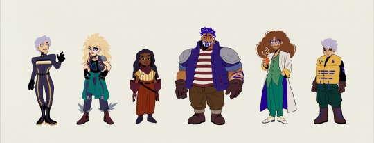
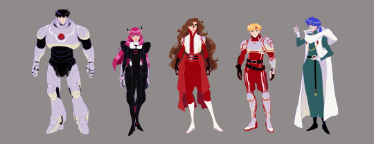
I loved Zoids as a kid. The toys, the shows, the one english gba game. Then I found out that the english patch for fuzors and the ds game was finished so I played them. Then, I ended up rewatching Chaotic Century and New Century. Then I got inspired and just did some stuff for fun hahaha. They’re not part of any specific zoids universe, just the idea of here’s a lineup of people who pilot some zoids, playing zoids tropes, thoughts on talent, prodigies, and found family.
I imagined the indigo guy piloting a shield liger. The Blade Liger is my favourite zoid, but I wish there was a more defense oriented “evolution” of the shield liger to suit him, but I don’t know how to design mechs. So if there was a shield-ier shield liger, that would be his zoid, since he’s more of a tank. Maybe he can pilot an Elephander, but I just love the shield liger-blade liger zoids so much. Plus he’s one of the “main characters”, so he must have a liger! 😂
The little girl pilots a Zaber Fang, because she’s also a main character and the main character usually pilots a liger so I thought hmmm maybe let’s subvert that while also being a callback to Raven, a prodigy.
Also, tbh I don’t know why I made a health bar sketch because if there was to be a health bar of any kind, it would be for the zoid and not for the character. But the idea came to me and I had fun 🤷🏻♂️
Anyways, I hope you guys enjoy it 😊 Maybe I’ll post my Van and other zoids character sketches one of these days (if i get around to scanning them 🤷🏻♂️)
#Character Design#Character Expressions#Character Lineup#Zoids#Original Character#OC#Shield Liger#Found Family#Sketches
12 notes
·
View notes
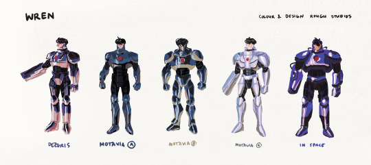
Photo

Phantasy Star IV
Chaz, Rune, Alys studies
More Chaz sketches and Cast
Wren Studies
#Phantasy Star IV#PSIV#Sci-fi#JRPG#Chaz Ashley#Alys Brangwin#Rune Walsh#Rika#Wren#Elsydeon#Illustration#Wallpaper#Digital Art#Fan Art
40 notes
·
View notes
Photo

I'm a little sad that we did not get Swampstat (I also really wanted to see our favourite hoe burn) but it has still been absolutely amazing so far. I am looking forward to hopefully seeing Dumpstat.
#IWTV#Lestat#lestat de lioncourt#swampstat#dumpstat#illustration#idk if there's supposed to be an accent on the e but it feels very lestat for there to be one
38 notes
·
View notes
Photo
More Phantasy Star IV
#character design#character art#Phantasy Star IV#PSIV#Chaz Ashley#Alys Brangwin#Rune Walsh#Rika#Wren#The End of the Millenium#Character Lineup#I still have to do Gryz and Han#Sci-fi
30 notes
·
View notes
Photo

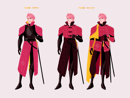
FE3H dump / Pushing my Hilda in Brigandine agenda.
I love drawing Hilda with a wild-ness to her hair, it’s mused from all the fighting. But in a fabulous way. She has accounted for it.
Was already re-designing Henrik a few months ago (To match the whole Leicester designs seem to have lots of cloth on them = Leicester has textiles = Would have Brigandine idea), but only found out about the change in plot/premise of Three Hopes when the demo came out so the other drawings still use his old-new design (the middle of the three variations) 😅
#Fire Emblem#FE3H#Hilda Valentine Goneril#Henrik Goneril#Holst Goneril#What kind of name is Sigiswald#Brigandine#Claude Von Riegan#Fan art#Character Art#Character Design#Sketches#coloured sketches#Golden Deer#Fear the deer#I obviously have a favourite#It's Hilda#Hilda is my favourite#Hilda Hilda Hilda#Lots of exposed skin is my armour pet peeve#But I support having hoe armour options for fun#But if we're going that direction let the men be hoes too#They're laughing at Lorenz#I know Lorenz has good supports but he keeps annoying women
3K notes
·
View notes
Photo


(Bonus Rune) Some Chaz and Alys sketches.
#Phantasy Star IV#Character Design#Alys Brangwin#Chaz Ashley#Sci-fi#Mercenary#Character Art#Studies#Rune Walsh
37 notes
·
View notes
Photo
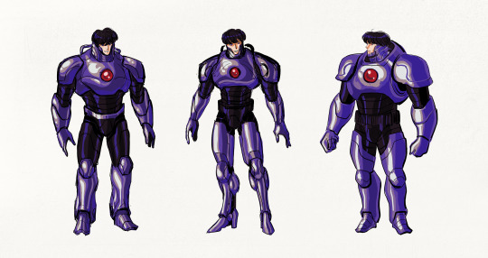
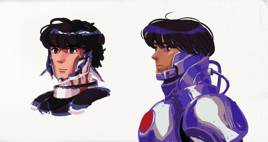
Wren studies.
Will post my Chaz/Rudy sketches at some point I guess 😅
#Phantasy Star IV#Character Design#Sci-fi#Robot#Android#PSIV#Phantasy Star#Wren#Studies#Coloured Studies#Roughs#SEGA#Metal#Character Paint#Character Art
53 notes
·
View notes
Photo

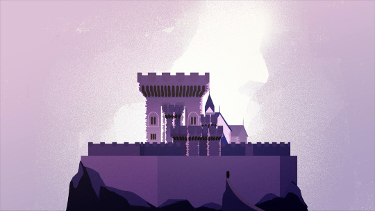


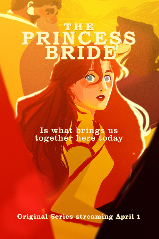
Part 6/6 - The Kingdom of Florin
Part 1 - The Family | 2 - Style | 3 - The Sicilian Assassins | 4 - Buttercup and Westley | 5 - The Prince and the Count
The seat of power for the Kingdom of Florin is a Military Fortress built on top of a seaside cliff.
Instead of elegant Gothic spires which was popular during the 15th and 16th century, Florin Castle is a bulky and imposing fortress reflecting the Military nature of the country, its simple people, Buttercup’s prison-like experience, and its ruler — Prince Humperdinck.
One of the challenges I encountered for the castle design was keeping the colours saturated enough to match the palette of the project while keeping the emotional geography of “prison” in tact. Although a violet palette was explored, the red brick that is common in Northern European architecture gave a more militaristic no frills impression that is more in line with the Kingdom and its Prince.
After many sketches, I realised that a country celebrating its 500th anniversary would probably have a castle built far before the current century. So incorporating a bulkier Romanesque style Keep as the castle’s foundation is what finally made things come together and give it a solid direction. Since Florin is a Militaristic state, it would make sense for them to continually be making Military advances, so one of the Castle’s most recent evolution/natural progression is a towards a very early prototype of a Bastion Fort. This makes Florin castle the most advanced, secure, and fortified structures in the land while upping the stakes for the infiltration during the near end of the series.
Fun Fact! While looking for references of Danish Castles, I came across an old map of Kronborg Castle. (Just google "old map of Kronborg castle", you'll see it right away) I thought it looked super familiar and I realised that it actually looked very similar to the layout of the Map of Florin and Guilder! So I included the bonus map I was required to submit.
#The Princess Bride#visdev#Visual Development#Environment Design#Character Design#Castle#Bastion Fort#Emotional Geography#Physical Geography#Florin#Fortress#Guards
16 notes
·
View notes
Photo

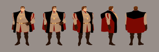


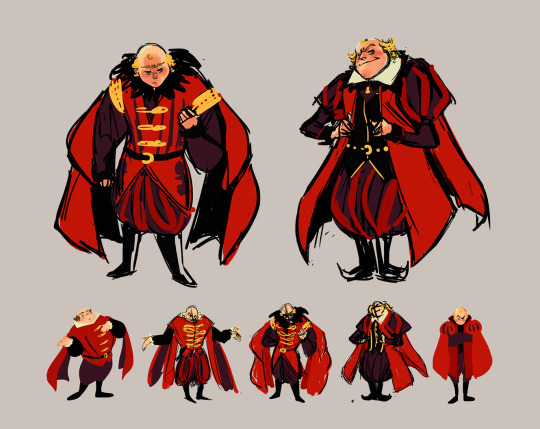
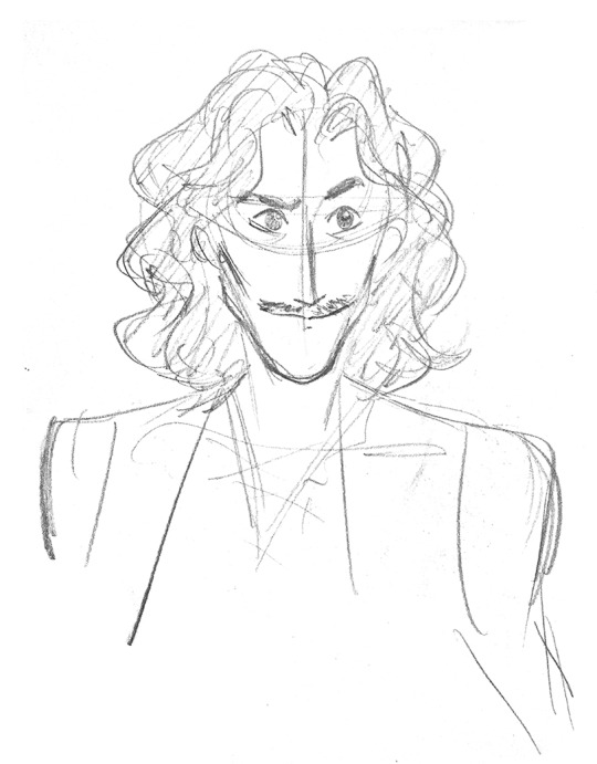
Part 5/6 - Prince Humperdinck and Count Rugen (The Prince and the Count)
Part 1 - The Family | 2 - Style | 3 - The Sicilian Assassins | 4 - Buttercup and Westley | 6 - Florin Castle
I loved Chris Sarandon's curls so although I eventually went in the direction of a shorter cut for Humperdinck, I wanted to keep some sort of waviness to his hair. I also wanted to make sure that it was clear that Humperdinck is a hunter and at the same time have an almost wild and animal-like feeling to him so the wavy hair helped bring it to that direction.
In the books Humperdinck is described as "weighed close to 250 pounds, brick hard". Although in the books he is not tall, I did not want the leading antagonists of both the first and back half of the series to BOTH be short (Vizzini and Humperdinck). Felt like I would be sending a not so good message.
For Count Rugen, I went with black so that there would be a transfer of association from Man-in-Black/Dread Pirate Roberts/Secretly Westley in the first part of the series to Count Rugen later on. Diagonal slashes on clothing was a more northern style plus it makes him look even more like death which is in line with the whole Executioner-Grim Reaper direction I wanted to go with him.
Differentiating him from Inigo was also important. So although I went towards a thin direction for both, everything else about them is a contrast. While Inigo was meant to have a flamboyance and a certain “Fencing is life and my passion” feeling, for Count Rugen the idea was that although he is a master Fencer, his purpose is death and fencing is one of the ways he does it kind of thing.
#The Princess Bride#Visual Development#visdev#Character Design#Studies and Sketches#Turnarounds#Expressions#Humperdinck#Count Rugen#Six fingered man#Executioner#Prince
28 notes
·
View notes
Photo


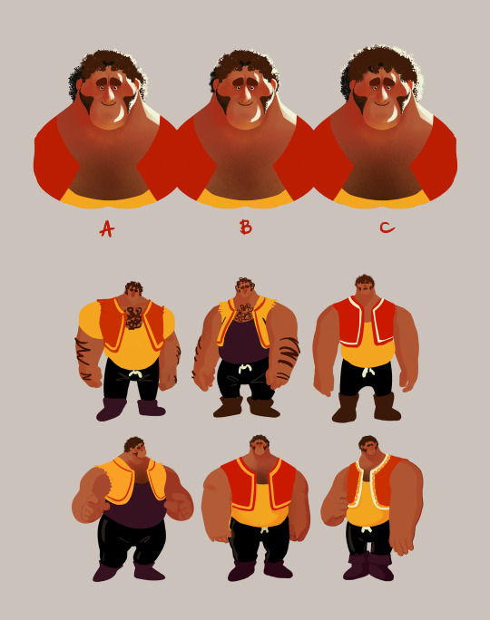
Part 4/6 - Buttercup and Westley
Part 1 - The Family | 2 - Style | 3 - The Sicilian Assassins | 5 - The Prince and the Count | 6 - Florin Castle
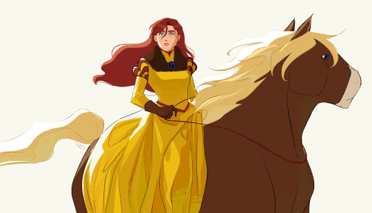
I wanted to make it very clear that the man in black / Westley is a pirate. So I used loose billowy clothes that also made him feel bigger and intimidating.
Horse is a Jutland horse, native to Denmark (which is what’s in between Sweden and Germany). It’s a draft horse, so good for farming, which is where Buttercup grew up, on a farm. I also wanted Horse and Westley’s design to somewhat mirror each other. Since Buttercup grew up on a farm, I did not want her to look dainty.
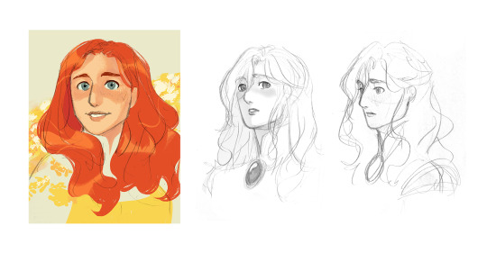
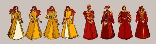
Buttercup’s story is more than just about love, it’s also about freedom. I realised that freedom was the core to her character. Her horse riding, doesn’t care what others think, and wild personality is all about freedom. I wanted her hair to flow with the wind, for her and her hair feel full of life. In the book, Buttercup had red hair. For her to have such a bold hair colour, especially one that in Europe during the medieval period was not considered desirable, felt right. Her hair and her personality is a defiance to the standard of beauty and of how a woman “should” be. That someone as bold as her would be considered the most beautiful woman in the world felt pretty badass. Having red hair (kinda vermillion) also provided opportunity to work with Humperdinck’s more blood red. When wearing her presentation dress as Princess of Hammersmith (despite the title of Princess, it is a title that does not sound dainty), Humperdinck’s red on her dress subdues the boldness of Buttercup’s red hair. Combining this with a restrictive design for her presentation dress and of her hairstyle, her design become reflective of her situation as a prisoner.
But when on her daily ride her dress can flow and her bright, bold, red hair is free.
#The Princess Bride#Character Design#Westley#Buttercup#Horse#Visual Development#Visdev#The Dread Pirate Roberts#The man in black#Princess of Hammersmith#Sketches and Studies#Jutland Horse#Farm Boy#As you wish
76 notes
·
View notes
Photo
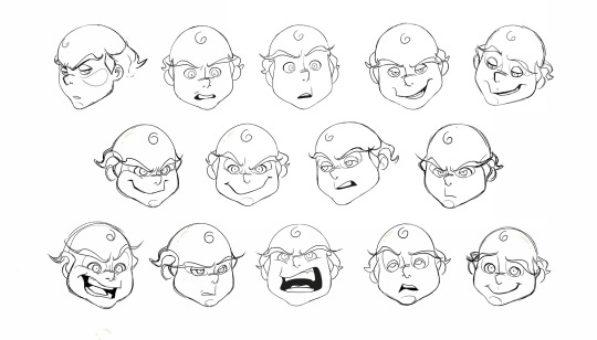


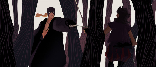
Part 3 - The Sicilian Assassins
Part 1 - The Family | 2 - Style | 4 - Buttercup and Westley | 5 - The Prince and the Count | 6 - Florin Castle
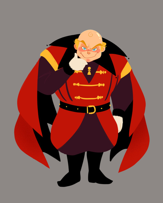
With Vizzini I was trying to combine the feeling of baby angels from old renaissance paintings, sinister-ish expressions, and ringmaster, plus dash of gaudiness. I made Vizzini prominently red so that there would be a transfer of association from Vizzini in the first half to Humperdinck in the latter half. The colour red and the pawns on his design apart from being on theme for his character can also serve as foreshadowing, that he is not the overarching antagonist.
Sometimes due to Fezzik’s backstory of working in Greenland, people mistake him for being Greenlandic but it was clearly stated that Fezzik is a Turkish wrestler. It was important that his design made it very clear that he was not European. In the books, he is described as hairy, large, and gorilla-like in appearance. By dividing his head into three sections (upper head, cheeks, and mouth-chin) keeping the graphic shape of his head across different angles was made easier. To determine the direction of Fezzik’s overall design the emphasis was established (his arms), inspiration was taken from circus strongmen, then combined with a strong but soft and lovable feeling.
The general direction of Inigo’s features was clear early on, but his head shape did undergo many iterations. His final head shape design has a clear and readable graphic iconography even in different angles. Its iconic integrity is easily maintained but can be difficult to draw, because of that a diagram was made to show how the structure of his head.
It was important to make sure Inigo and the man in black's silhouettes were distinguishable from one another. So I tried to pull their designs in opposite directions. Inigo's leaning towards a more slender swish-flick feel and the man in black's to a larger, billowy, and intimidating direction.
#The Princess Bride#Character Design#Vizzini#Fezzik#Inigo#Visual Development#visdev#character paint#expression sheet#sketches and studies#turnarounds#the man in black
33 notes
·
View notes
Photo


Part 2/6 - Adapting a Classic (Style)
Part 1 - The Family | 3 - The Sicilian Assassins | 4 - Buttercup and Westley | 5 - The Prince and the Count | 6 - Florin Castle
One of the ideas behind this project was about bridging the gap between the old and the new. I wanted to express the vibrance and colourful quality of a medieval (nearing renaissance) setting while using contemporary techniques, to appeal to a modern audience, with a nostalgic undertone.
Adding some browns to the palette also helped pushed it towards that slightly nostalgic direction. I shifted the other colours slightly, like using mustard or yellow-orange instead of just yellow, vermillion instead of just orange, and throwing in some violets, all to add that dash of quirky-ness to reflect the fun and witty tone of both the movie and the book.
Another idea is that this version would be a series. This gives us time and opportunity to see and experience the characters' past, like in the book.
I was figuring out how light would interact with the characters while pushing the role of line. I did studies on how to make a line express form, colour, and light. From afar, the line can be reflected light, but up close the "line" expressing reflected light would spread in a stylized manner. This creates the feeling of an increase of detail when we look at something up close all while strengthening the colourful quality of the project throughout.
#The Princess Bride#VisDev#Visual Development#Colour#Line#Graphic Design#Colour studies#Sketches and Studies#Medieval#Inigo#Fezzik#Florin
27 notes
·
View notes
Photo
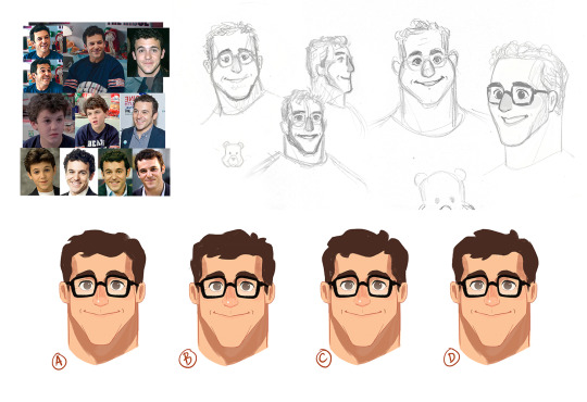

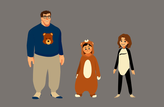
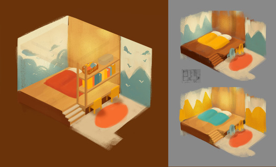

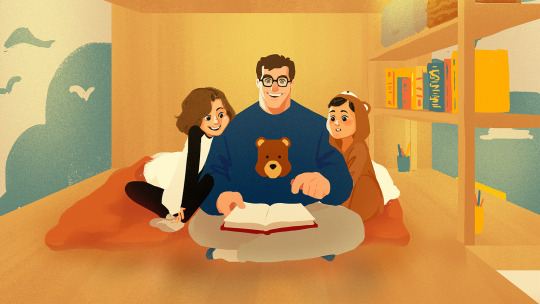
Part 1/6 - The Framing Device (The Family)
Part 2 - Style | 3 - The Sicilian Assassins | 4 - Buttercup and Westley | 5 - The Prince and the Count | 6 - Florin Castle
Around two years ago for my final year of college, I was required to pick an existing story to imagine as an animated adaption. So to make sure it could hold my attention for a whole year, of course I chose The Princess Bride.
Let’s start with the grandson from the movie is all grown up telling the story to his own kids.
The Dad’s design is inspired by Fred Savage, who played the grandson in the movie, combined with a softness and reliably dorky impression that the project calls for. The book talks about the author’s father and his own son while the movie depicts a grandfather and grandson. But the Princess Bride is a story that has something for everyone, it’s not just for little boys. The two children express the idea, further driving it home with their differing personalities — The Princess Bride is for Everyone.
Side note: I needed something to tie their designs together and keep them cohesive, so I thought bears might be a funny way to do it (please get the joke) 🐻🧸🐼
For the kids’ bedroom, I wanted to eliminate the barrier of bed and chair so that a growing closeness between the father and his kids could be literally depicted as the series progresses. I took cues from retro interior design (wood panelling, colours, etc.) and modern design (light wood, shelving/divider, platform, etc.) to create something contemporary but would carry with it a nostalgic undertone.
#The Princess Bride#Visual Development#videv#Character Design#Environment Design#Storytelling#Fred Savage#Character lineup#Bedroom#Family#Bears#is what bwings us togevah today
18 notes
·
View notes
Photo
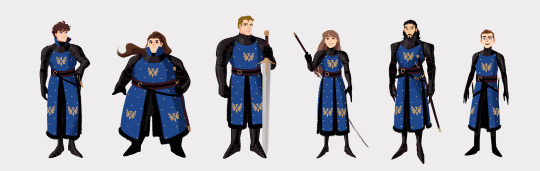
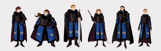
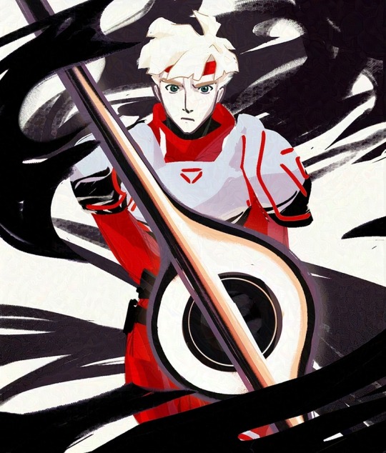
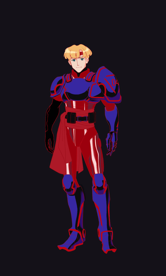
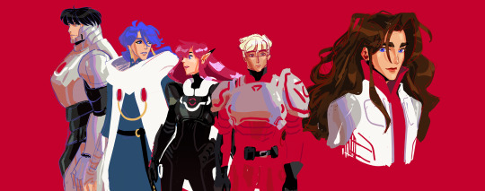
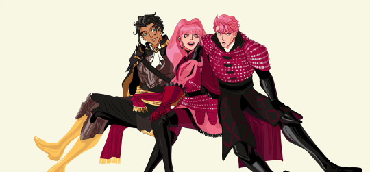
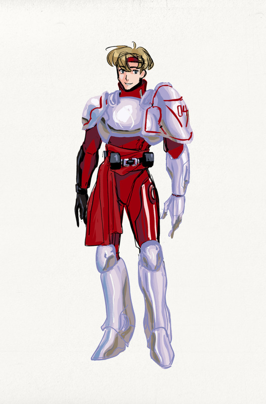
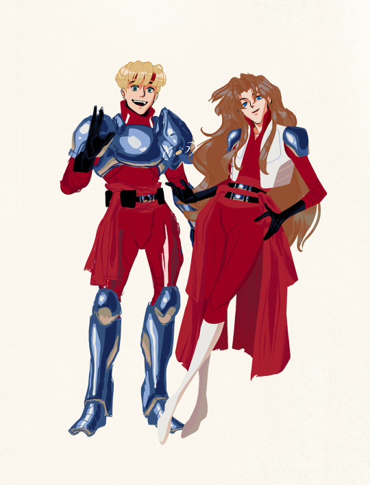
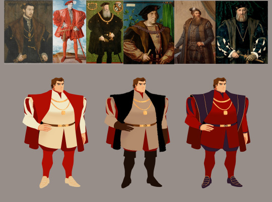
Here's a lineup of les Garde Royale in their everyday on duty armour and their battle armour.
I get why Brigandine isn't used often in animated stuff, but I just wanted to have fun and I love how Brigandine looks 😁
18 notes
·
View notes
Photo
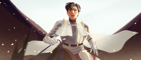
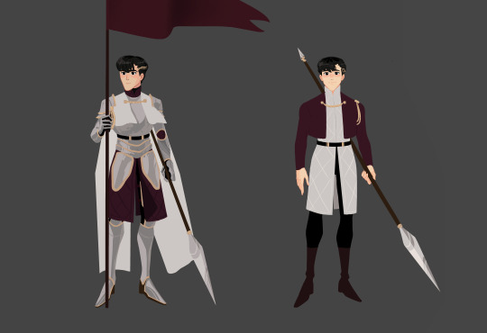

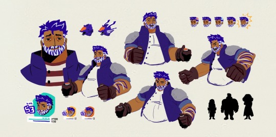
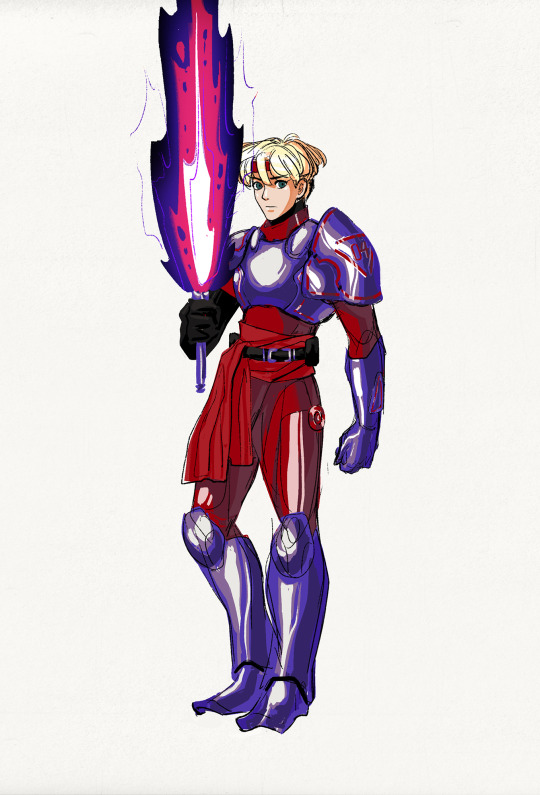
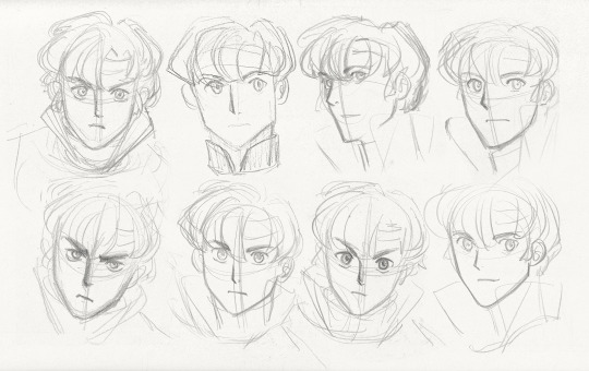
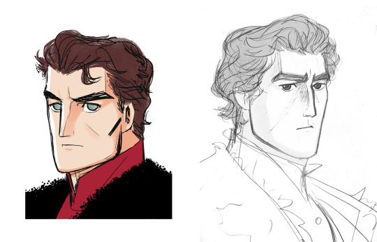
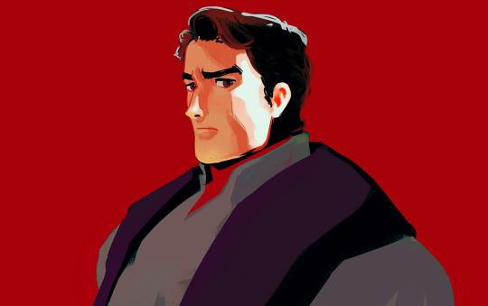
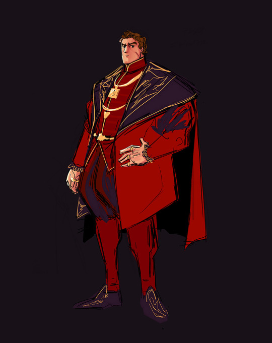
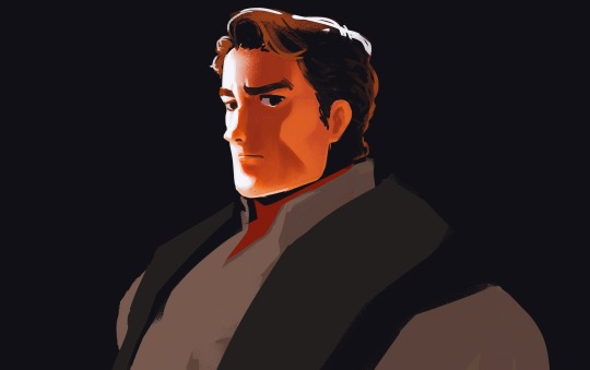
Logan was supposed to be just a single character exercise (he isn't even supposed to be the main character) but ideas came and now there are a few other characters in my head related to him... so here is Logan so far, before what is probably going to be a new direction.
79 notes
·
View notes
Photo

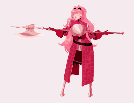
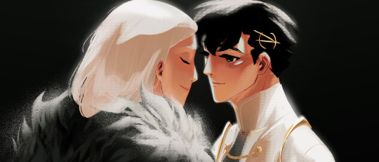
I played fe7 as a kid, and only played fe6 when I was older. The fact that you can't do anything about the fate of the fe7 lords in fe6 was so painful. It felt like you really fail them as a friend and that keeping their kids alive and getting them to their happy endings felt like a personal promise and an apology to old friends.
#Illustration#Fire Emblem#FE6#FE7#Hector#Lyn#Eliwood#Mark#Tactician#Lilina#Roy#I love them so much#character art#i'm not crying you are#Friendship
2K notes
·
View notes
Photo


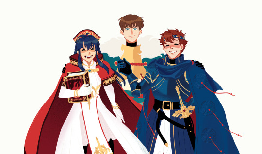
Here’s my version of Mark / the Tactician from FE7.
I know that the devs were just having fun and that there’s no way Morgan from Awakening being Mark from FE7 is ever going to be canon, but it IS a fun idea to just play around with 😁
(Please notice my Easter Eggs.)
209 notes
·
View notes