artbyaine
Aine O'Connor LSAD
First Year Graphic Design Student
109 posts
Don't wanna be here? Send us removal request.
Last Seen Blogs

norris-lando
LN4

loveshroom
Now Howlingbutch
petsfriendy
Pets Friendy

gurkenmusik
gurkenmusique
constance-michaela
Feminine pleasures
Text
For my final display, I printed out both versions of my poster in size A2 and hung them to the wall amongst my classmates' work. I feel that I was overall successful in both versions of my design and that I have gained much knowledge about graphic design for my second year.

7 notes
·
View notes
Text
Since I was not entirely satisfied with the result of my finished poster, I decided to create a second option. To me, the other poster didn't feel right for the festival it is advertising, and I wanted to give the poster another go with a different design.
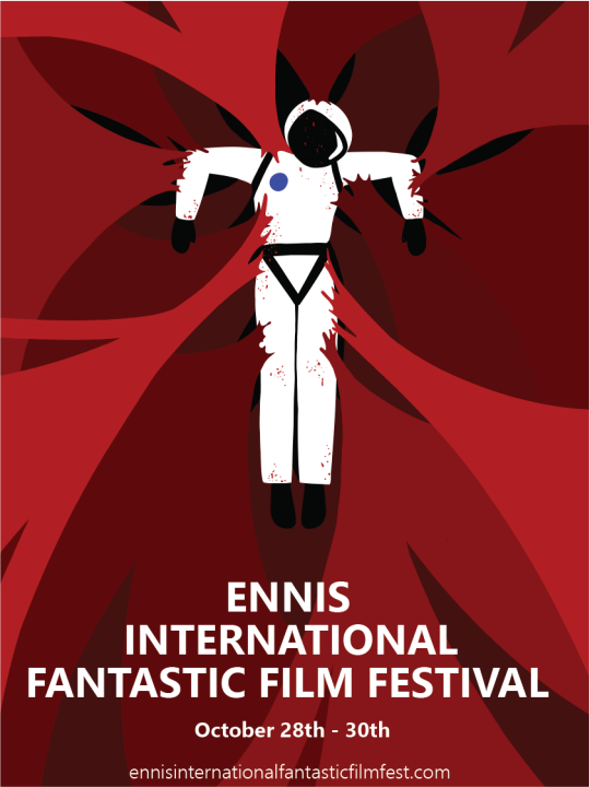
I wanted to create a composition that drew the eye to the figure and led it toward the text. I used triangular shape language when posing the astronaut so that his body points down and leads the viewer to the text, which mirrors the triangular shape. The pose is also reminiscent of a scarecrow that references a character from one of the most famous fantasy films of all time, the wizard of oz.
I trapped astronaut in disgusting red sinew like a fly in a spiderweb as I felt would create a strong horror visual. I also felt that the red of the surroundings would contrast nicely with the white of the suit, making it stand out from a distance.
Taking what I learned from Saul Bass, I kept the design relatively simple with bold choice of colour. I feel that this design works from a level where it is eye-catching from a distance but has more to look at once up close. I also believe that this version of the poster achieves more in terms of telling a narrative, which is something i strive for in all of my work. Overall, I feel that this design is more representative of EIFFF as a festival and more representative of me as an artist.
#art project#art experiment#first year#graphic design#poster design#scifi#horror#fantasy#illustration
2 notes
·
View notes
Text
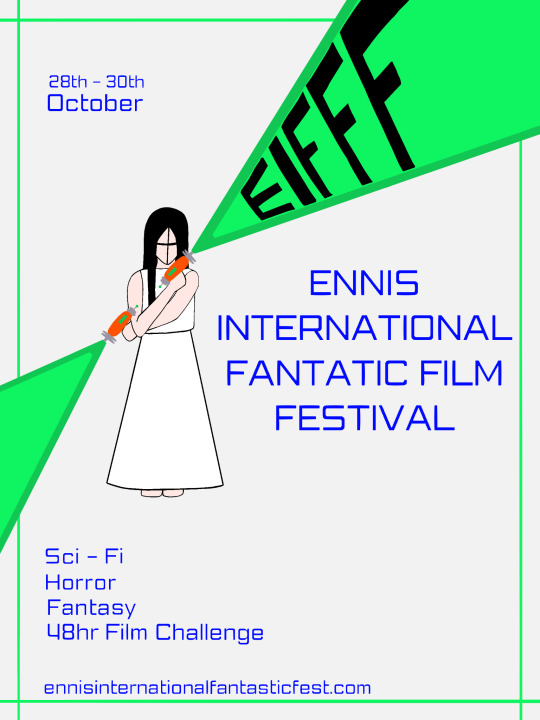
Still unhappy with my poster, I decided to push it further and readjust the writing entirely as it didn't feel like it added anything to the image visually. I rearranged where some of the writing went and changed the colour and the font to feel more sci-fi.
I hand drew the festival initials into the laser and added a green border for some extra detail. I made the background a very light grey colour so that the white dress didn't get washed out in an all white background.
Here is my final design.
0 notes
Text
As I worked on my final poster design, I struggled to find the right balance within the composition. The text felt disjointed from the image and by moving the girl from the centre frame to on the third, resulting in the second laser being cut off in an odd fashion.
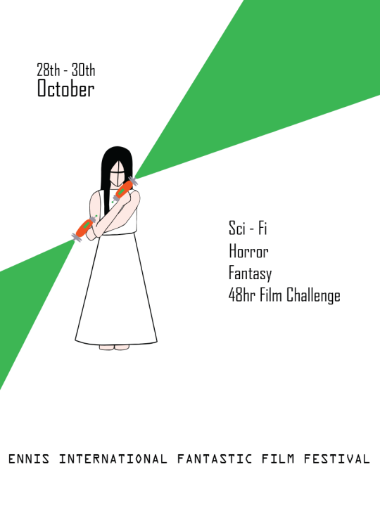
I adjusted the pose slightly so that the laser would be cut of ass strangely and so that there was some visual flow between the top and bottom laser, they now both follow the sam line of action and lead the eye toward the girls face. I debated whether or not to incorporate a face into the girls' design. However, my lecturer enjoyed the simplicity of the lines.
0 notes
Text
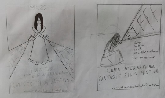
Here is the thumbnail chosen by my lecturers for the final piece, along with the minor tweak to move the girl over to left third.

0 notes
Text
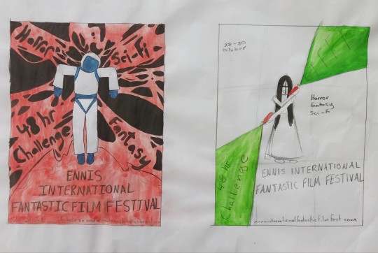
After looking at my most recent illustrations, I was given the go-ahead to work on thumbnails.
I created 6 thumbnails, 3 laser girls, and 3 astronauts in peril. I wanted my compositions to work with the text and attempted to lead the eye toward both the figure and the writing. Some I feel worked better than others.

0 notes
Text
Now that I am beginning to enter the final stages of my project, I compiled a selection of reference posters that I feel match my aesthetic.
I am mainly referencing sci-fi posters as I feel that they tend to have the graphic style and colour schemes that I am leaning toward.
0 notes
Text
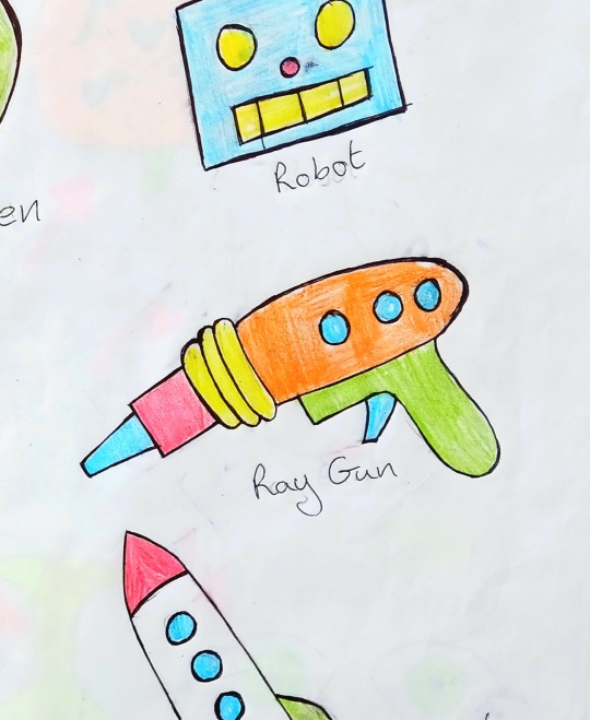
Going off of the Ray gun girl idea, I created another page of illustrations where I explored tieing horror and scifi together.
I was drawn to the idea of an astronaut in peril and exploring different ways to skew the recognisable iconography of an astronaut and add horror elements.
Whilst working on this, my mind, of course, went straight to the most famous horror sci-fi of them all, Alien. I decided to take a note from their book and explored the idea of an alien wreaking havoc with tendrils wrapping around the astronaut. I else explored the idea of a destroyed rocket, a battered helmet, and an astronaut whose tether snapped.

0 notes
Text
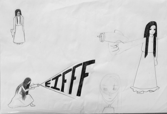
Here is a page of illustrations I made where i attempted to combine the idea of a creepy child from a horror film with a vintage sci-fi Ray gun. The intention behind the drawings is to combine the two genres, and I toyed with the idea of using the ray gun to project the initials of my festival.
I struggled to find ways of combining the two as I feel that the two don't gel together visually. I feel like the imagery of the Ray gun takes away from the girls creepy factor, which, in the end, results in her just looking like a kid with a Ray gun.
0 notes
Text
After reviewing the thumbnails, it was suggested that i take a step back and re review some of my earlier illustrations. My lecturer took a liking to my ghost girl drawing as well as my Ray gun and suggested I experiment with combining the two.

0 notes
Text
Following my moodboard crit, I began thumbnailing some poster design ideas. It was suggested that I step away from my zombie idea as it was overdone. I decided to start fresh to help me think of some other ideas that don't relate to the old one that wasn't working.
It was suggested that I explore the idea of film reels, so I came up with a few design ideas that incorporated this element. I want to find a way to combine all three genres (horror, fantasy, scifi) into my design, so that is what I focused on with these thumbnails.


0 notes
Text
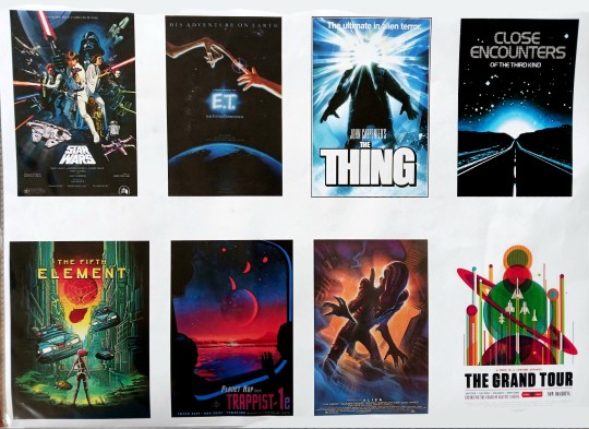
Artist Research - Nasa
For my arist research today, I will be looking at the 2020 poster collection titled Visions of the Future.
Not accredited to any individual artist, the series of posters was designed by a team of visual strategists at Nasa's Jet Propulsion Labratory referred to as "The Studio."
Visions of the future is a collection of parody travel posters created for different planets within our galaxy. The designs take influence from vintage scifi films and comics. Each poster sports a charming and unique tagline such as "Europa - Discover life under the ice".
The lineless illustrative style they use is inviting with full landscape scenes depicting what they would imagine the surface of each planet would look like. The images often take a domestic and ordinary approach to such alien planets, such as adding a white picket fence to Kepler-186f.
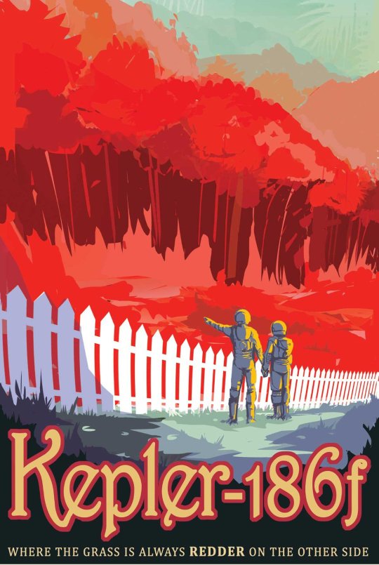
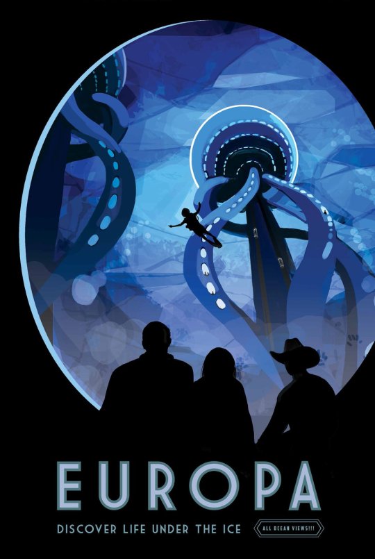


I admire the fully detailed scenes and how they tell visual stories. I also admire their colour schemes, which typically stick to either warm or cool tones. I would like to take inspiration from such aspects of these designs when it comes to my own poster
#art project#lsad#first year#graphic design#nasa jpl#travel poster#illustration#visions of the future#artist research
12 notes
·
View notes
Text
Using my thumbnails I went into adobe illustrate and created my newest moodboard.
I liked the idea of creating a scene in my moodbord, so I created a zombie film set in the middle of my image I incorporated a spooky woodland scene as well as lights a camera man and some zombie actors. I am leaning towards a purple purple and green colour scheme.

I also incorporated some peripheral imagery around the scene, such as a Ray gun for sci-fi, crystals for fantasy as well as a zombie with a colour scheme I enjoyed. I added an image of a girl getting her makeup done as I find the idea of incorporating backstage filmmaking work such as hair and makeup compelling.
1 note
·
View note
Text
I created some quick thumbnail sketches coming up with a layout and ideas for my digital moodboard. I am thinking about exploring the idea of a zombie movie as it seemed popular amongst my peers.

1 note
·
View note
Text
In order to learn how to use Adobe illustrate we were each given a cocktail name and told to create a digital moodboard inspired by the cocktail.
I was given the pisco sour, and through some research, I found that pisco originates from Peru. For my moodboard, I decided to incorporate peruvian imagery. I incorporated an alpaca and a man in a wool hat as alpaca farming is popular in Peru, and woollen garments are often created from their fur. I also added an image of the grapes that pisco is distilled from as well as a Peruvian lily as it felt light and summery, much like the drink.
I also added some lemon imagery as the sour part of a pisco sour is due to the lemon juice and bitters that is added to it.
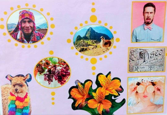
Although a lot of thought went into it, I still feel as though the final moodboard is unsuccessful as to me, it doesn't look like a moodboard and I don't think it captures the essence of the drink. J feel I should have put more emphasis on the sour side of the pisco sour.
0 notes
Text
We created moodboards using magazine clippings to help create ideas and inspire a visual style for our poster designs.
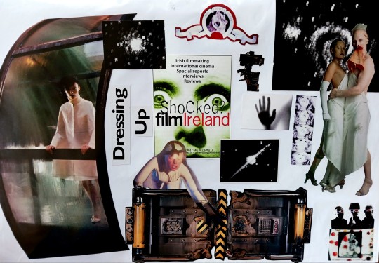
With my moodboard, I found that I was drawn to combining the sci-fi and horror genres. I also found some filmmaking paraphernalia in the magazines that I included, such as a camera and the metro goldwyn mayer production company logo. I think that it could be interesting to explore the idea of depicting an active film set, creating a sci-fi or horror movie in my poster
0 notes
Text
Artist Research - Saul Bass
Saul Bass was an American filmmaker and graphic designer best known for his corporate logos, film title sequences, and poster designs.
Bass worked with many of Hollywood's greatest filmmakers, such as Otto Preminger and Alfred Hitchcock, designing posters for films such as The Anatomy Of A Murder and Vertigo.


His style is incredibly direct. His use of colour is striking and simplistic, using limited colour palettes he typically designs with black, red, and white.
His compositions are bold, often focusing on one central subject with little to no background or added elements to distract from it. He typically depicts the subject in a blocky silhouetted style that is direct and easy to decipher from a distance.
The writing and the subjects are often removed from one another, and he typically gravitates toward a blockier font that is reminiscent of handwritten lettering. This gives his posters the impression of being grungier and more down to earth.
#art project#lsad#first year#graphic design#artist research#saul bass#film poster#vertigo#anatomy of a murder#poster design
3 notes
·
View notes