
kelskordaki
Derivative Design
As a student of design at GSA, I think it's about time I had an opinion on the world of design. I believe that all design is actually derivative, and this is where I hope to share my thoughts on all things design, what makes it good or bad, and how that might relate to it's derivative nature!
Visit http://designtechkkordaki.tumblr.com for some other interesting reads too!
21 posts
Don't wanna be here? Send us removal request.
Last Seen Blogs


anaisperfectsthings
Ana is perfect

fuckyeahpipesofpan
Pipes of Pan

megawebdesignindia
Mega Web Design

myhologramtaco
Untitled
Video
It's working! Jk. Why is science so hard. This is not an experiment for those lacking in perseverance. #magic #spinningtop #levitating
2 notes
·
View notes
Video
Experimentin feat. 1 pencil, 1 magnet and some bobbles. Next step is getting it to float 🤓
5 notes
·
View notes
Text
Decluttered Design

“A room full of unnecessary clutter is not pleasant to sit in, so clear it of everything.
When you fill it again, be ruthlessly selective about what goes back in.
Your quality of life will be much improved.”
—Sir Terence Conran
I wouldn’t go so far as to say I’m a total hoarder, but I’ll admit I do have a lot of “stuff”. Unnecessary clutter you could say. But I found this quite a profound concept as I realised just how much Sir Terence Conran’s challenge permeates through almost everything in life. No, not just the clutter and dust on our shelves, but the relationships we have, the ideas and ambitions we have and the things we don’t have but still want all the same. I find it difficult as a designer to let go of that “first concept”. The concept that became my baby. But in the end would something different have worked a lot better? Maybe. Probably.
I think Conran is giving a lesson in the age old notion of “Less is more”. I believe a truly good design has been meticulously thought through. That means every single tiny detail has been put there for a reason, and it means that every little idea at the beginning of a project has been ruthlessly selected so that the final product is as perfectly simple as possible. This doesn’t mean we can’t design complex things, but it does mean that every complex aspect we add has a special and necessary purpose.
I have definitely not mastered the art of decluttering my life yet, but for now it is something I can at least strive for in my designs.
2 notes
·
View notes
Text
For Lip’s Sake...
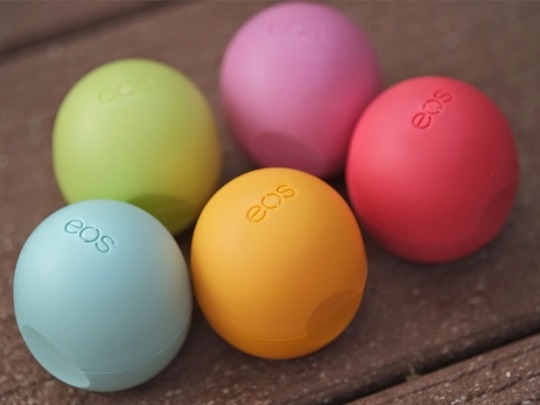
If you have spent any time at all with me, then you probably know I never leave home without one of these strange little spheres of goodness. Evolution of Smooth lip balm has changed my life and I can’t go back. Here’s a couple of reasons why:
1. They keep my lips hydrated and soft all day long. They’re all natural and organic and we know well by now that the functionality of a design is crucial. So in this instance it’s obviously important that a lip balm, balms the lips! The ingredients here are perfectly fit for purpose; Evolution of Smooth weren’t lying when they talk about smooth. Another great functionality is how easy they are to apply, you never have to twist up some more of the stick, or accidentally squeeze out too much from the tube. It’s just a hemisphere, simple and easy, that lasts forever*.
2. Their shape is intriguing and tactile. The unveiling, experiential packaging if you will, of the product is charming and satisfying, an asymmetrical thumb printed panel on the front helps you to open and close with a twist and a click. The variety of bright colours and the unique shape make them hard to lose, unlike your classic lip balms that you accidentally leave in jean pockets, only to have them put through the washer and dryer. Aren’t those delightful surprises? Well it’s not so with EOS! (Although I do wonder what would happen if the sealed ball did actually make it’s way into a tumble dryer...Might it actually pass that test too? I’ll let you be the first one to try.)
3. They’re also great conversation starters. For people who haven’t seen me use it before, there’s always a look of confusion that flashes across their face until they realise it’s just lip balm. A face that says “Why on earth are you touching a weird rubber ball to your lips?! They then usually tell me I’m a classic PDE student using a hipster product no one knows about. I hope to change that. (But I’m just sayin...EOS is already super popular in the States, everyone is just a little behind here in Scotland.)
4. They taste delicious. Step aside Vaseline, Burts Bees and Carmex; EOS has won me over. Please for the love of your lips, do yourself a massive favour and go buy one. (Available at Boots or Urban Outfitters with student discount!)
*Ok, it’s not infinite, but it will certainly outlast anything else you’ve tried!

3 notes
·
View notes
Text
I’ve got a good feeling about this...
Rachael Sleight is a designer who is passionate about materials. She came in to share about her career since leaving GSA and everything she has done has always had a focus on the materials in her designs. Her creative process often starts with a genuine interest in a particular material, and then a curiosity develops. What might become of this? What sort of design would benefit from these specific properties? How could this be used in a new way?
I believe any good designer should devote a lot of time to materials. Materials play a twofold role in every piece of design; Is the material fit for purpose? and is the material fit for the context and environment? Having just taken an engineering exam in Advanced Materials Technology, I’ve got words like fatigue stress, fibre reinforcement, shape memory alloys, adhesive wear and sandwich laminate structures incessantly floating around in my head. A common question we were asked was what are the design considerations/requirements for a material in a specific application? It’s not often you hear the word “design” in the engineering department and all of a sudden a realisation hit home, this might actually be useful! In Product Design Engineering we really do get the best of both worlds (but also maybe the worst of both worlds which isn’t so fun). I say this because the twofold importance of materials comes down to whether the material can withstand the physical demands and requirements of the product and it’s lifetime usage, and whether or not it matches the contextual environment it’s been designed for, so that’s basically if it looks and feels good. In PDE we are taught about both of these things, but for now I’d like to set aside the engineering knowledge and focus on the latter role of material.
The material of a product is often the first point of contact between a person and a design. The main way we interact with objects is by touching them, of course we look at them too, but there’s something a little more intimate about the feel of a product in our hands; the weight, the texture, the shape. Have you ever noticed that you often judge a products worth by how much it weighs? In general, the more weighty something is, the more you feel that it’s a quality product worth your money. It is often the presence of a good quality material that can turn something simple into something beautiful. As an example, take almost anything made out of leather.
I will be the first to admit when it comes to materials, I’m a very curious and tactile person. I wander through shops with my hand out, touching each item of clothing, judging it’s quality, or it’s charm, tapping items in the home section, determining if it’s hollow or not, I’m even known to stop mid-conversation with a friend, in order to feel their cardigan or scarf. Ok it’s a little weird, but I can’t help being curious! The texture of a material is almost as important as the material itself, and I think that you can be tricked (in a good way) into thinking something is worth more than it actually is, if the material has a good texture to it.
There is so much more to be said on material choice, but for now I’ll leave you with this:
“She said the object and colour in the materials around us actually have a physical effect on us, on how we feel.” — Florence Nightingale
“There is a sensuality about fabric. I think all materials should be inviting when they touch the skin. When I watch children stroking their mother’s clothes, I feel that I have succeeded.” — Azzedine Alaia
(A child’s touch is innocent and curious, and that is basically me in every shop.)
2 notes
·
View notes
Text
Experiential Packaging
I believe good design deserves good packaging, much like I believe it deserves a fitting retail experience. After all, first impressions will be made from the packaging of a product as it’s likely the first thing a customer will interact with. It’s important that this experience matches what the product has to offer. And when I say experience I mean the eager anticipation of a new gadget, the satisfying pop or click of a well made lid or the smooth motion of opening that impeccably toleranced box. You’ve all seen the Buzzfeed articles of the most satisfying GIFs for Perfectionists. You know what I’m talking about right? The tiniest details that somehow manage to give you the greatest pleasure since alphabetising your entire DVD collection and colour coordinating every piece of stationary you own (No? Just me? Life’s pleasures are often in the little things, don’t judge). It’s details like this that set apart luxury items from the budget items, and that prove to the customer how much a company cares about your experience with their products. That’s how they manage to get away with daylight robbery with their exorbitant prices, and yet, we willingly give them all of our money when we could buy something that will do the same job, for a lot less, but just doesn’t have that added sparkle.
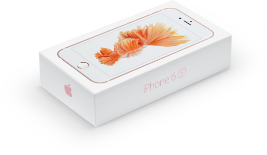
Apple is one of these companies. You might have guessed I own a couple of their products, and I say I “willingly” give away my money, but the truth is I do it begrudgingly and only justify the purchases by telling myself that Apple products have the sparkle that other products just don’t have. But I do believe they have a lot of great designs that are worth having, so even though they are a massive corporation with more than enough money, until someone else can convince me that there is another, more “sparkly” way, I’ll probably continuing endorsing Apple products. (Note: I said their products, not their perhaps, ethically lacking business plans). For all their faults though, they do a lot right, they do care about their customers, and all that to say; they do care about their packaging and the environmental impact it has. At the latest Apple product release event, they announced an initiative they have been working on, where they are going fully paper with their packaging, and that the materials for this are all acquired through economical and environmentally friendly sources. But back to experience now. The iPhone boxes fit together in the most wonderful and perfect way, the top lid slides off with just the right amount of air suction, your iPhone is seamlessly revealed, the excitement is tangible. Experiential packaging.
A few other examples of packaging I have enjoyed first hand that I think are worth mentioning are from a Kindle and a from a heat changing Star Mug from Paperchase. The Kindle packaging was immensely satisfying to open, but unlike the iPhone box, the Kindle experience was meant to be a temporal one, where after smoothly removing from an outer sleeve you pull a tab of perforated card in order to unveil the contents, never to be fully sealed again. The purpose of this, I am sure has something to do with the fact that your Kindle is intended to be used, and not stored in a box on a shelf. (The difference between this intent and an iPhone box probably has something to do with the fact that when selling on your iPhone it will retain a lot more value if an original box is included.) The excitement is different here, ultimately the packaging is disposable, intended for recycling, but that first encounter was an important bridge between you and your eReading experience. The care that Amazon have put into this surely stands out even more when you consider it will most likely be discarded, not long after purchase.
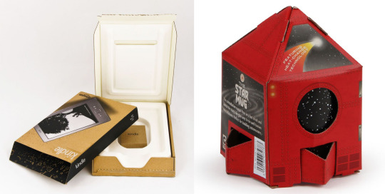
And finally the Star Mug, a more playful and “budget” item that I believe fits into the luxury, yet affordable, philosophy of the products of Paperchase. This mug boasts a quality, weighty feel, and a map of the skies, only revealed when drinking a hot cuppa. It was housed in an apt and artful rocket ship, that cleverly reflects the subject matter on the mug. Back when I was in 1st Year, I designed and hand crafted some cardboard packaging, sans adhesive, for a large piece of broccoli, and ever since I’ve had a special appreciation for innovative ways of folding and slotting cardboard. Only in PDE, right?
To the average consumer, you may never have thought about packaging, you hastily discard it in favour of your anticipated product, or perhaps you only notice the bad packaging? That infuriating impenetrable plastic containing the scissors you need in order to open it. Maybe your apathy is because most packaging you have encountered is so good that it seems obvious and you didn’t even think twice about it. This may all sound like a lot of mumbo jumbo from a raving design student, but life’s pleasures truly are in a lot of little things, so I urge you to take notice of quality experiential packaging.
2 notes
·
View notes
Text
Design w/o function?
When Bob McCaffrey, a designer, came in to speak to us, I initially thought I wasn’t very moved by anything he had to say and his style didn’t particularly appeal to me, but looking back on the notes I took, apparently I was wrong!
A topic I have been thinking a lot on lately is where functionality really fits into design. Is it essential? If so, then what is design without functionality? Is it bad? Or is it art? Is anything truly without function? Just a few of the questions I’ve been wrestling with. And as it turns out, I discovered some enlightenment in the thoughts of Bob McCaffrey!
One of McCaffrey’s inspirations was Charles Rennie Mackintosh. At GSA we often take Mackintosh for granted, but when you actually study his work you find intricate, well thought out, user centred and beautiful designs! He never did anything without a reason. He was never merely interested in aestheticism. On the Garnethill Mackintosh building, the window supports were decorative, but they were also functional, there was specific space left in anticipation of the window cleaners that would be necessary! Some of his iconic dining chairs were also designed to separate the space within a room, they weren’t just needlessly tall for pure aesthetic reasons, but so that when sitting down for dinner you felt as though you were in a private space. The user was always at the heart of Mackintosh’s work.
“A chair is only a chair when you’re sitting in it. It only becomes something when you’re using it… Design is for people. It won’t work if people aren’t engaging with and using your designs” —Bob McCaffrey
In this particular example it does beg the question; how do you define a chair? You may say it’s something you can sit on, but you can’t say it must be comfortable, you also can’t say it must be made out of wood. The absolute is that it must be sat on. Everything else will depend on the function intended for the chair.
I’d like to take a leaf from Mackintosh’s book here and just say that good design must always be well reasoned. Nothing should be done just for the sake of it, but rather, always to fulfil a specific function. The trouble with “function” is that it’s yet another “difficult to define” aspect within design. I would say that everything has a function, whether or not you consciously give it one. Let’s take a piece of art, say a painting. It might not be “used” in the conventional sense of the word, but it still has a function, right? It gives enjoyment and satisfaction to the artist, and in turn enjoyment to the viewers of the art. (But the artist probably didn’t say to himself, I want to design a painting that in 100 years time will give great enjoyment to art connoisseurs all over the world. And yet, many paintings fulfil this function.) So where does the line between art and design exist? It’s certainly a faint and fine one.
There is definitely a difference between art and design, however, and I would say that design must be “used” in a physical way, there should almost always be an element of tactile human interaction (though I’m sure there are exceptions to this rule). This therefore, does not mean that “art” has not been designed, and it’s still perfectly capable of being considered in just as calculating and analytical way as you might think of “design”, but what it does mean is that art and design’s functions are fundamentally different. Perhaps that “art” is to be looked at and “design” is to be used?
Let’s go back to the example of a chair. What happens when a chair has been designed, but no one sits on it? Well based on what I’ve said above, bringing this situation to it’s logical conclusion would suggest that the chair is no longer a chair, but now a piece of art. If you thought you were designing it to be sat on, then I’d say it’s badly designed because it’s not fulfilling it’s function, right? But if you designed it to be looked at and enjoyed, and yet it has the form of a chair, then yes, it is good design because it’s fulfilling it’s function. I would just have one thing to say to you though: Please, stop calling it a chair. (I’m looking at you Newson. You might recall I shared some sassy thoughts on his Lockheed Lounge a couple weeks ago).
I suppose the only conclusion I can make then, is that good design will always be relative to it’s purpose, to it’s individual function and it’s reason for being. Not particularly conclusive if I’m honest, but I suppose it wouldn’t be right to shove all chairs in one tiny restrictive box.
6 notes
·
View notes
Text
The Good, the Bad and the Ethical
A couple of weeks ago I attended a thought provoking lecture concerning the relationship between design and ethics. I’ve been talking about what good design is for a while now, but if you take a step back from that, what actually is good? Good in any context, not just design.
Here on my design blog is perhaps not the place to talk about where our moral compass comes from, nor where the line between good and bad lies (though I will remind you of the basis for “Derivative Design” and I’m sure you could guess where I think the answer to those questions can be found), but anyways, if you’re going to claim you design “good” things, or you endeavour to be a “good” designer, it does beg the question, what really is “good”? This is where ethical design comes in.
There will always be the potential for design, and where there is potentiality, the ethical emerges. If design is a range of possibilities then by definition it must be ethical, right? You make choices without even thinking about it, you are never not making choices, even if you think you are remaining indifferent to something, you have in fact made a choice to say that whatever you are indifferent to, you do not care enough about to have a real opinion on. You still made a choice there. In order for our designs to truly be ethical I think we really need to consider the implications of the choices we make for our designs. Where are the materials coming from? Will this have an effect on the economy of that location? And what about the people? Are they being exploited there?
The Toms One for One scheme is a great example of an ethical design model, they’ve expanded in the past couple of years to include more than just shoes as well, they now offer eye care and clean water schemes. Fairtrade is another great example.
So, the moral of the story? When striving to be a “good” designer, strive to be an ethical one too.
3 notes
·
View notes
Text
Great Design Isn’t For Everyone
Many moons ago now, I took a trip to London to visit the Design Festival with my class. There was a little spotlight on the new Montblanc M Ballpoint Pen designed by Marc Newson (who I just wrote about on my Design and Technology World View blog), and being the diligent young designers in search of inspiration that we were, obviously we needed to take a look. Upon entering this extremely high end store, feeling a little underdressed, we explained we were design students interested in said new pen, and they kindly obliged to take it out of it’s (most likely laser protected) glass case.
The pen had beautiful balance, it looked and felt both sleek and professional, and the best part in my opinion was definitely the magnet concealed within the lead and tip of the pen. The magnet almost pulled together pen and lid autonomously, as if it wanted to protect itself. This is definitely one of those incredibly satisfying little things in life.
There is no doubt in my mind that this pen has been designed incredibly well, I’d even say it’s been engineered very well too, but unfortunately I have a couple of issues. Aside from the magnetised lid mechanism (which is beautiful), I don’t like it! Now perhaps I’m just a little too outspoken when it comes to things like this, (my dual nationality probably showing) but as soon as I tried writing my name with the pen, I instantly disliked it and didn’t hesitate to say in the [very high end and expensive] shop “Well it doesn’t write very smoothly does it...and it’s a bit big don’t you think?”. Maybe not my finest moment, as the shop assistant hesitantly took it away from me and put it back in it’s secure glass case.
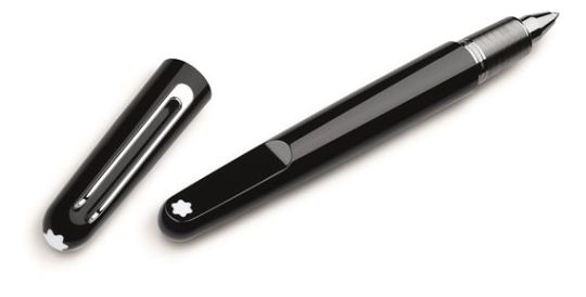
The point I’d like to make here though is that great design is not going to please everyone! The truth is, I’m one of the pickiest people when it comes to choosing the perfect pen to write with for hours a day, but just because it doesn’t meet all of my criteria doesn’t mean it won’t meet someone else’s. Yes, I thought it was too thick around, but maybe my hands are smaller than it was designed for, and it didn’t write very smoothly, but then it was only a ballpoint pen (though on second thought a £270 pen better write pretty seriously smooth). Maybe if I had tried the fountain pen it would have been different? But then, I think fountain pens are too inky and messy so that probably wouldn’t have suited me either. It also comes with a pretty hefty price tag that won’t be accessible to many people within the mass market, but then, I’m quite sure that’s not really where this pen has been marketed for anyway.
Conclusion. Good design? Yes. Is it for me? No.
I think it’s important to remember though that just because it doesn’t appeal to one person doesn’t mean it’s a bad design, it doesn’t mean you have failed as a designer. Besides, that’s what Universal design is supposed to tackle, and that’s a whole ‘nother kettle of fish entirely.
3 notes
·
View notes
Photo

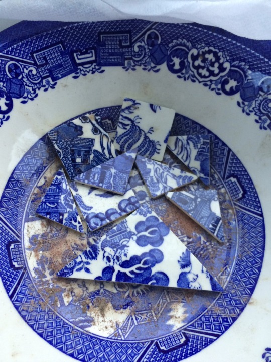


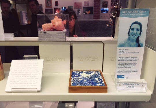
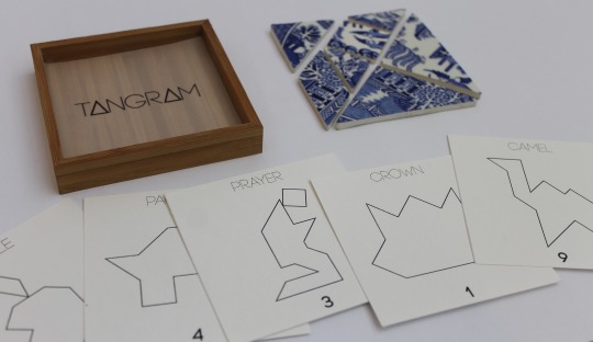
Repurposed Willow China Tangram set, with handmade bamboo display box and packaging.
#Tangram#willow china#willow pattern#repurposed china#bamboo#legend of the tangram#handcrafted#camel#GSA#PDE
2 notes
·
View notes
Text
All Talk or All Tangram?
The halfway point of this academic year has struck and what have I accomplished? Well, so far I’ve briefly mentioned where I think design truly comes from, what makes a design luxury, why great design is timeless, that great designs are also greatly engineered, that the retail environment must be as equally well designed as a product and lastly, that great design should be obvious. So you may be thinking, yeah yeah, those are some great thoughts, but what did you actually do all year?! (Unless you’re not because you’ve already endured me posting endless progress pictures of my project)
My latest project was to produce 5 identical luxury products to be sold in the Glasgow School of Art shop. This project came with a huge amount of challenges and as a result I have learned a great deal about the world of design, manufacture and retail. The research I took from my London trip helped inform my decisions on what would actually be appropriate to produce for the GSA shop, which comes with a certain reputation of quality and uniqueness. I decided to pursue an ancient Chinese puzzle called a Tangram and immediately started exploring how I could make this reflect each aspect of great design I had established in my research.
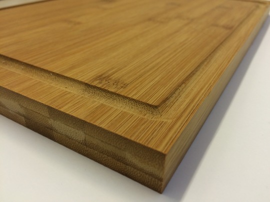
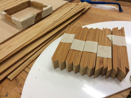
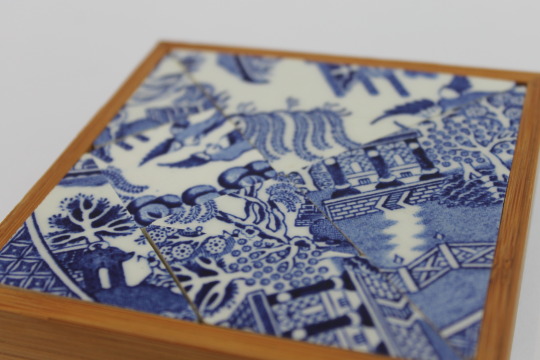
Below is my final product; the puzzle tiles have been cut from vintage Willow China using water jet technology, the bamboo box was made up of slices from a chopping board (the easiest way to get your hands on some bamboo!) and the cards were all designed and printed by me, along with a story that takes you through the Legend of the Tangram.
So, does it exude luxury? This is perhaps the most subjective criteria, but it’s certainly a non-essential item, the materials have been on a journey and also tell a story, it’s precious and also took skill to produce. I’m a perfectionist and as a result pick out all of the fine details I’m unsatisfied with, but overall I think it fits the luxurious criteria.
It’s a classic puzzle that has entertained and challenged people of all ages for years, and bringing a new material to this product that is timeless in itself (the Willow China) adds to how timeless a design I think it could be, though of course only time can really tell.
Has it been greatly engineered? This design doesn’t have a huge amount of engineering involved but that was really more due to the nature of the product itself. The bamboo boxes involved more woodwork and craftsmenship than engineering, the tiles were however cut using a computer generated file sent to a water-jet cutting machine. This proved to be a fairly difficult process as it was questionable whether or not the water-jet would cut the china plates without shattering them, and once it was found to be successful, I had to source enough Willow China and rely on an external company to get them all cut on time. So while my Tangram was perhaps not extensively engineered, it was at least well thought through.
Was it obvious? I tried to think through and link every design decision I made so that nothing was done without a reason. The materials and aesthetics were all chosen to reflect a Chinese background; the bamboo box with the Willow China, the simple clean graphics on the puzzle card and the story written to depict the Chinese legend, all fit together in a way that hopefully creates an obvious final design.
Was it appropriate for it’s retail environment? Considering this was the whole point of the project, I’d like to think it was appropriate, but let’s not just blindly assume. I mentioned the GSA shop came with a reputation of quality and uniqueness, that’s because people from all over the world flock to GSA in search of the iconic designs of Mackintosh. The school is renowned for producing notoriously successful artists and designers and as a result, though I of course have a lot yet to learn, I still have this reputation to live up to.
Considering everything I discussed above I think perhaps I scraped the surface of the quality produced and sold daily in the shop by already established artists and designers with successful careers.
If you’ve made it this far, thanks for taking the time to read about my progress, let me know what you think!
#tangram#willow china#repurposed china#bamboo#prayer#crown#camel#willow pattern#GSA#PDE#luxury#timeless#obvious design
2 notes
·
View notes
Photo
After having just finished a project titled “Retail Therapy” (I’ll explain later), this little stationary set would have been an exceptional design for the project. Great use of materials that contrast and yet compliment one another, great multi-functionality that gives the user 100% flexibility, great style and aesthetic design.
You often can tell a great design by something you can’t put your finger on. It just is. As soon as I saw it I thought “10/10 would buy”. Why? Because it’s designed so well that you didn’t even realise it wasn’t a thing before, or you think “why haven’t we had this kind of thing before?”. Now I don’t want to be stealing ideas or anything but a friend of mine (Josh Ward) quoted Chris Pratley who said,
You know you have a good design when you show it to people and they say, “oh, yeah, of course,” like the solution was obvious.
...and I totally agree! In fact I agreed so much that I couldn’t not quote it here too. This particular example is perhaps not the best example of an obvious design (See the post about Luxury, where this product might fit a little better), but when I saw this stationary set in my head I thought “YES. THAT.” And that kind of immediate and positive response to a design is the kind of response I’d love for other people to eventually have about my own designs.

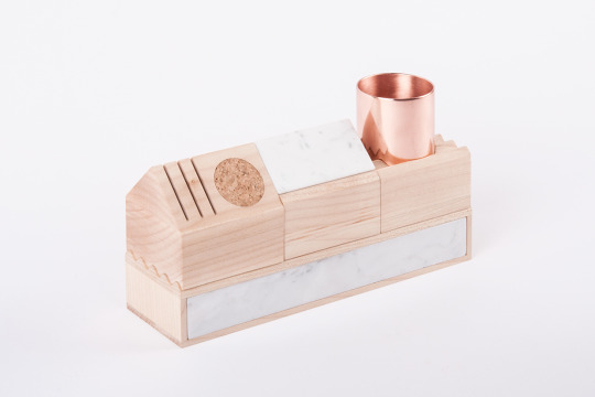


K-1 Stationery Kit Design
K-1 means “Konstruktor-1”. The name was inspired by Soviet construction toys. K-1 is a construction set for a stationery and also It has modular system with a wide range of variations. Every kit part has it’s own unique function and colaborate with each other. For instance a little casket box could transform into phone stand. All kit parts are fitting together, so anyone can build their own stationary system and than modify and playing with it. The main basis element is a pencil case and other elements are adjusted to it. All set made of maple, white marble and copper.
Designed by Maxim Scherbakov
1K notes
·
View notes
Text
Retail Theology
There’s much more thought behind a retail enterprise than you might at first realise. There’s a lot of customer manipulation going on. But it’s not necessarily a bad kind of manipulation! (Now excuse me while I get a little airy fairy mumbo jumbo on y’all.) It should be an emotional experience, and hopefully a positive one. A great user experience is so vital to good retail design! It should be exciting, or inviting, or luxurious, or satisfying or fun or....well anything positive! How does walking into Hollister make you feel? Or what about the Apple store? How about Primark? You might not realise it at first, but every time you walk into a retail store you’re probably reacting in some sort of emotional way, be it good or bad.
(Disclaimer: what I’m about to say does not take into account any opinion I may or may not have on the way this company is branded or how their models can make young women feel.) For me, Hollister is a little too dimly lit. Why? We’ll never know. But as a SoCal native, I do always enjoy the huge wall-size video feeds from the surf at Huntington Beach, it’s nostalgic, kind of makes me feel at home. Kind of. I don’t think they’ve got everything right, but it’s certainly somewhere that will evoke an emotional response for almost anyone who enters.
Ok, so what about the Apple store? A very different experience, but usually always an exciting one for me. It’s exciting because it usually means new technology and I’m a little bit of a tech geek. The store is very clean and open, it’s minimalistic and I think very representative of the style of their products. I like the continuity. They aren’t taking away from what they’re selling, they emphasise the products, they back them up. The Apple store says “We make sleek products, they’re luxury items, and they come with a price, but it’s worth it because we want to help improve people’s lives. We want people to know we are a helpful and friendly place.” Regardless of how you feel about Apple products, whether you’re an Android fan or not, Apple are good at what they do and I don’t think anyone can deny that.
Now Primark. That is a place that legitimately stresses me out at Christmas time. Why? Because of the haphazard organisation, the busyness and overcrowding, there’s too much going on, too much to handle. Does it stop me ever going to shop there? Well at Christmas it does, but in general the design of Primark is for a reason. It’s cheap. There’s an equal focus on every item in the shop (or no focus depending on how you look at it), and that’s because nothing stands out, there’s no high ticket item you’d go to Primark to buy. But there are lots of cheap ones that I’d buy. I think the retail design in Primark could do with some improvement, perhaps some simplifying is all it would need (maybe some emptying?), but then I suppose that would defeat the purpose of the type of store it’s supposed to be, wouldn’t it?
So there’s some emotional manipulation going on. But what other manipulations are the designers of these stores trying to impose on you? Well obviously they want you to buy their products, and they try to make that decision for you. Ikea’s famous floor arrows lead you through the perfect virtual reality you could be living in, before you reach the part where you fill your basket, so that you fill your basket with things in order to recreate something that is likely to never look quite how you want it. Which will keep you coming back for more ideas, and as a result you spend even more money. 1-nil to Ikea.
But retail design doesn’t have to be quite as complex as that in order for it to be effective. One of the most common things they do is decide what they want to sell the most of, and place that product on a shelf at eye level so that it’s the first thing you see. It was love at first sight with that product. Boom. Sold.
Retail Theology. There’s a lot more to it than you think.
5 notes
·
View notes
Text
Such Engineering, Very Design?
“So, what is the difference between design and engineering anyway?” I hear you ask. Well, unfortunately I feel like I’ve barely even brushed the very tip of the iceberg, because I’m not sure I could even tell you a solid definition of either, let alone compare the two! At this stage in my design career I am very much still a student, I am really only just beginning to form my own opinions on the world and branch out from what my parents told me, branch out from what my engineering lecturers tell me and branch out from what my GSA tutors tell me. And yet, it is natural for your mind to be moulded and shaped by the opinions of those you respect isn’t it? So I’m going to take a couple of quotes here and see if they can help make clear the blurred lines between design and engineering in order to help me make up my own mind.
“Design {with a big D} is a funny word. Some people think design means how it looks. But of course, if you dig deeper, it’s really how it works.” - Steve Jobs
I think Design, with a big D, is a big umbrella term that encompasses not only engineering, but encompasses the aesthetics of a design too. I think it encompasses the purpose behind it and also the way a human interacts with it. Design includes every single aspect of the process, all the way from concept and research to the final, physical outcome.
But design, with a little d, that’s a little harder and I don’t think I’m ready to define what that might mean just yet. I will say, however, that in general I think design is a little more conceptual and often focused on the idea of a product rather than the reality.
“Engineering is the art of directing the great sources of power in nature for the use and convenience of man.” - Thomas Tredgold
So where are we with engineering now? I think the key is that engineering is designing in such a way that something actually works! It solves a problem and it helps mankind. There’s always an element of doing, taking action and making things happen.
“Art without engineering is dreaming. Engineering without art is calculating.” - Steven Roberts
The stereotypical difference between stone-cold engineers and artsy-fartsy designers is there for a reason, and usually it’s because neither have been taught the importance of the other.
Engineering and design go hand in hand within Design as a whole, they are each separate entities but neither can be ignored.
“You can design {with a little d} and create, and build the most wonderful place in the world. But it takes people {engineers} to make the dream a reality.” - Walt Disney
#engineering#design#blurred lines#quotes#steve jobs#thomas tredgold#steven roberts#walt disney#GSA#PDE
1 note
·
View note
Photo


4 notes
·
View notes
Text
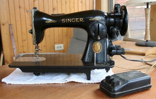
Timeless Design: Take 2
The Singer sewing machine. This was the piece of great engineering I chose for much the same reason as the previous post: timeless design. These have been around for years and yes the current singer sewing machines are a little more…complex, shall we say? But the fundamental sewing mechanism remains the same. The bobbin thread creates a loop, the top thread goes through it, a simple weave, in out in out in out. And yet sewing machines seem magic! Or to me they do anyway... And I’m sure we’re all aware that there’s a mechanism underneath, but it’s so mesmerising and I find it pretty incredible that people figured it out that long ago! It seems we have a trend of naively believing people were sort of stupid that long ago, when in truth, if we really think about it, of course we don’t believe that. (How old would Einstein be now?) But we also probably take for granted the fact that technology these days can be pretty spectacular! Which only emphasises to me that when I find something designed so long ago and that is so mechanically mesmerising as a sewing machine, that a) they were definitely smarter than me and b) they were pretty darn good designers.
(You know what this reminds me of? How God created the heavens and the earth. That was definitely a long time ago. And we’re still using the earth. Timeless design, am I right?)
Anyways, something I skimmed over was the fact that I referred to design and engineering as two separate things. The violin and the sewing machine. As if there was nothing that linked the two together. I do think design and engineering are different, but the lines get extremely fuzzy when trying to define each so I think I’ll need to do some more thinking before I try to tackle that issue!
1 note
·
View note
Photo


4 notes
·
View notes