#Amy Currell
Text
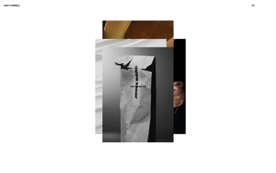
Amy Currell
#Amy Currell#photographer#photography#studio#London#white#portfolio#typography#type#typeface#font#Aeroport#2023#Week 51#website#web design#inspire#inspiration#happywebdesign
24 notes
·
View notes
Text
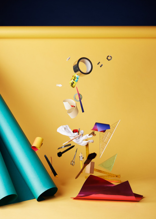
Still Life Photography
I used the website AOP to research three different still life photographers.
The first photographer that stood out to me was David Sykes.
The second photographer I loved was Amy Currell


The last photographer I found was James Day.
5 notes
·
View notes
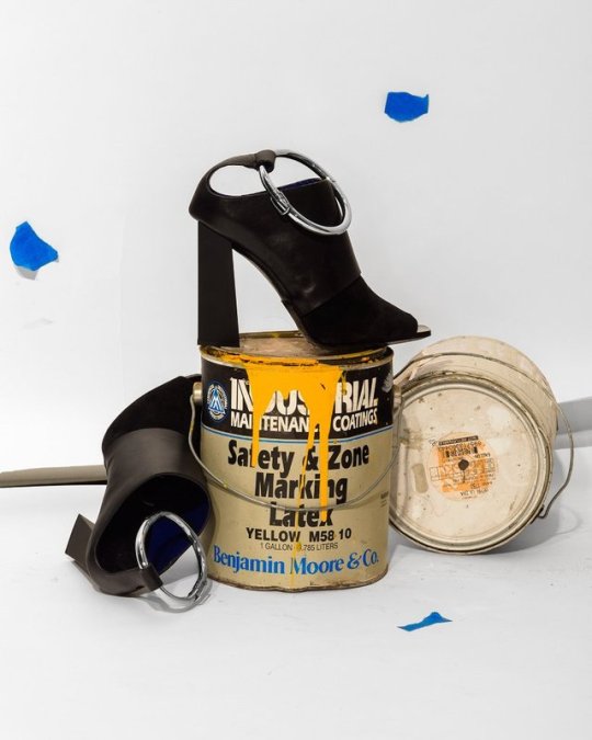
Photo
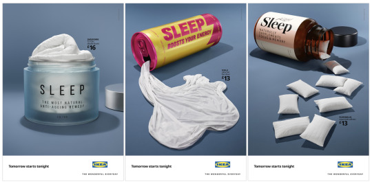
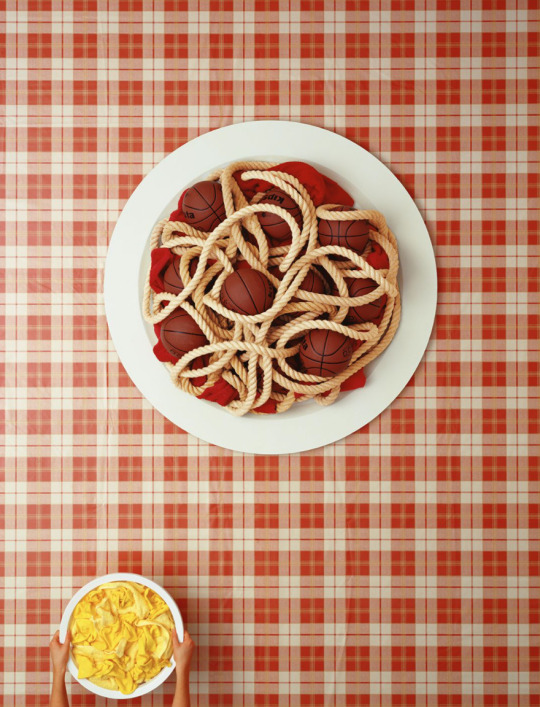
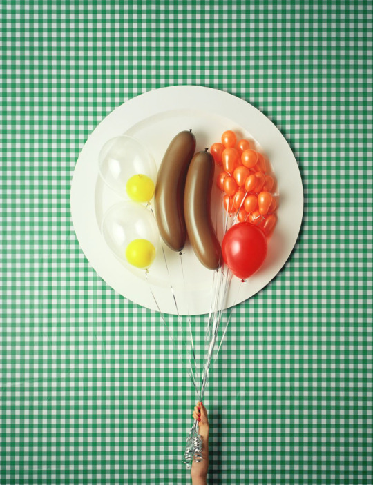
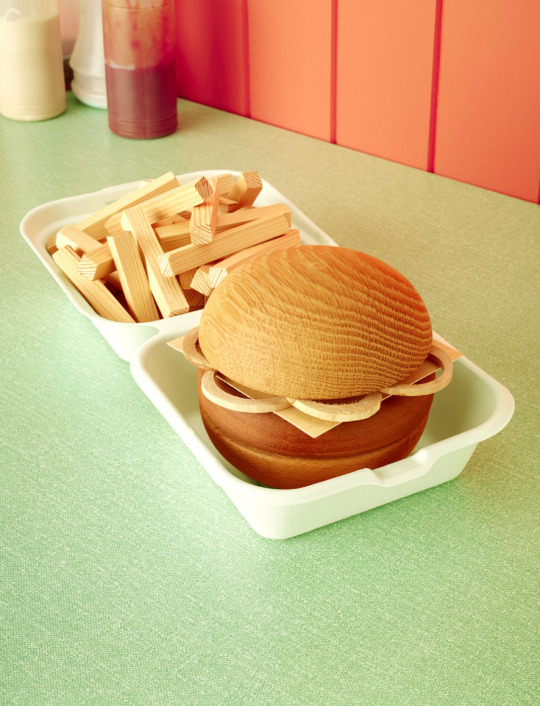
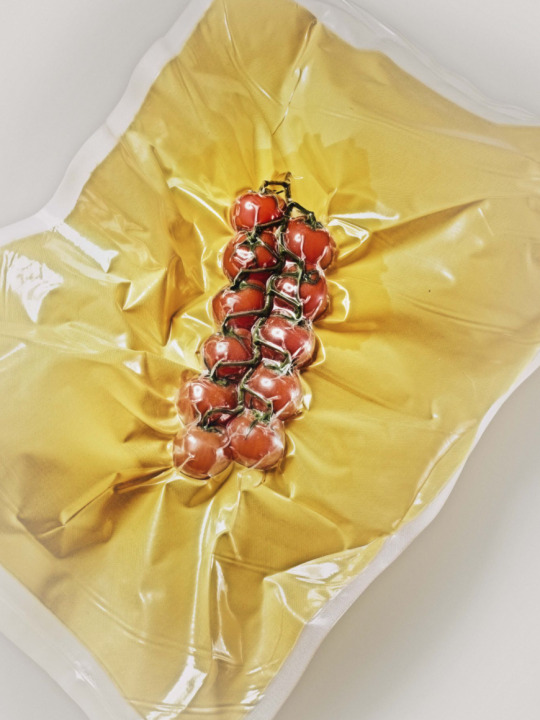
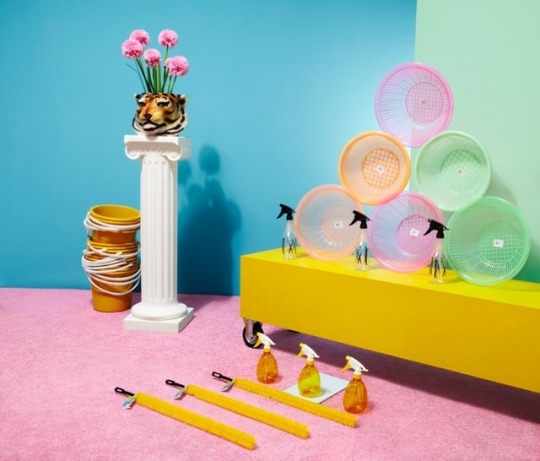
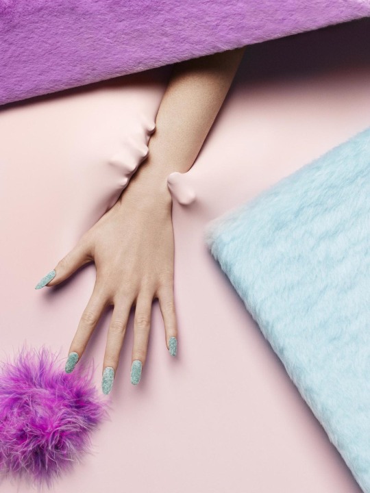
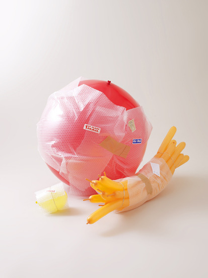
In a series of provocative print ads, IKEA highlights the surprising benefits sleep has by comparing it to fad products that promise the same result but rarely deliver, including energy drinks, anti-ageing creams and vitamin supplements. The striking visuals, were shot in camera by photographer Amy Currell, using large-scale models designed by Andy Knight Ltd to house the IKEA bedding. The second installment of IKEA's 'Tomorrow Starts Tonight' campaign, which continues to position IKEA as sleep experts, will appear in press and OOH across the U.K. and Ireland from 22nd September. It challenges sleep neglect by celebrating the truth that the more you sleep, the more you get out of life.
Advertised brand: IKEA
Ad title(s): 'Anti-ageing Cream', 'Energy Drink', 'Vitamin Supplements'
Media: OOH/Press
Advertising Agency: Mother, London
Executive Creative Directors: Ana Balarin, Hermeti Balarin
Creative Directors: Thom Whitaker, Danielle Outhwaite-Noel
Art Director: Anthony Montagne, Oli Rimoldi
Copywriter: Anthony Montagne, Oli Rimoldi
Designer/Typographer: Gina Balfe
Producer: Bertie Gulliver
Account Director: Lou de Keyzer
Production Director: Giedre Minotaite
Strategy: Scarlett Spence, Imogen Carter
Production Company: The Miss Jones Agency
Photographer: Amy Currell
Stylist: Amy Friend
Model making: Andy Knight Ltd
3 notes
·
View notes
Photo
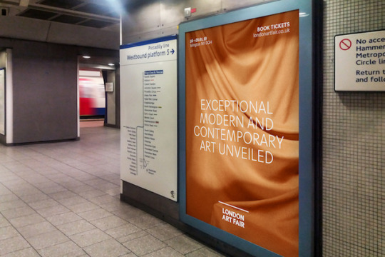
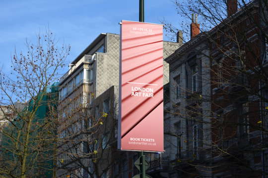
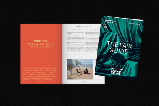
London Art Fair is just around the corner. Coming only a few weeks after the country’s eaten more roast potatoes than logically makes sense, the Fair – which runs between 16–20 January 2019 at the Business Design Centre – showcases globally renowned modern art, as well as putting a focus on championing the work of cutting-edge contemporary practitioners.
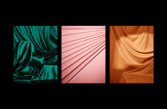
Next year’s show will be the Fair’s 31th anniversary and to celebrate three-and-a-bit decades in the game, it’s decided to enlist Studio Thomas and photographer Amy Currell for a full-on rebranding.
Together they’ve provided a slightly toned-down London Art Fair logo, which they say “creates a device that functions more quietly and confidently to position the fair as a platform for galleries and artists.” In addition to this, they’ve deployed a new type treatment and plinth logo which, “provides a consistent framework and visual anchor, supplemented by seasonal, campaign-based content which can flex and change every year.” Just what every art fair wants and needs.
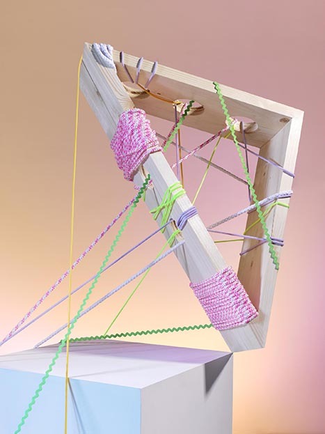
Studio Thomas and Amy have also paired up for the creative aspect of the identity, honing in on the idea of the “anticipation of the reveal” as their primary theme. With this in mind, they’ve worked on a series of stills and short films taking abstract, textural images and using them to create varying tones.
Of the project, Studio Thomas says, “We aimed to create a brand that gives the floor to the galleries, and celebrates the art, whilst also creating a space for changing and exciting content to keep the Fair feeling fresh, year on year.”
Source: It’s Nice That
63 notes
·
View notes
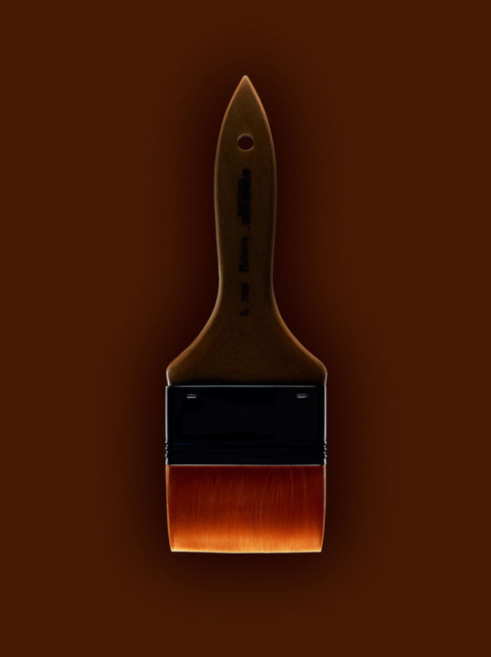
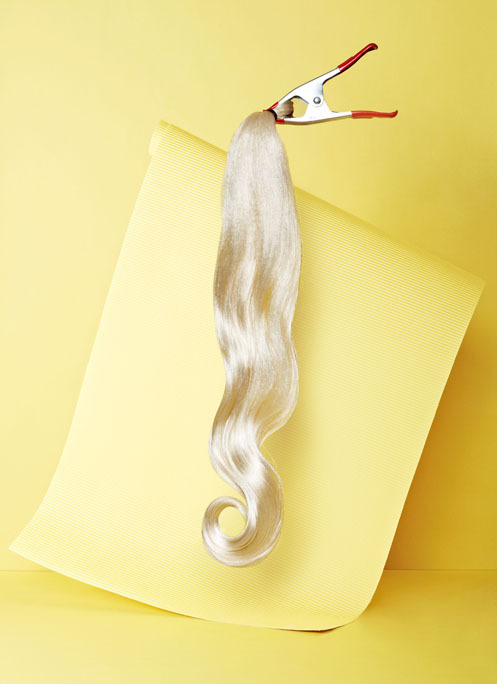
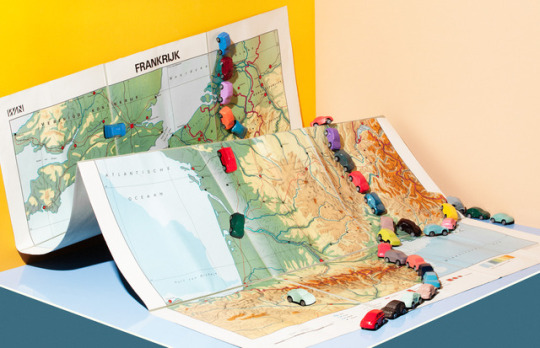
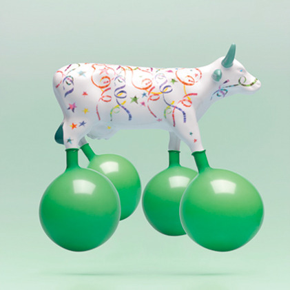
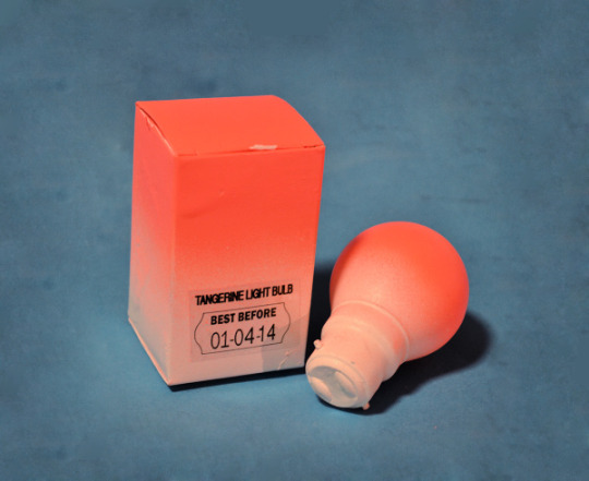
Photo
amy currell photography still bodegon http://bit.ly/2JYbCC7
0 notes


Video
youtube
Client: YCN
Job: Amy Currell Animated Show Reel / YCN Awards
Music and Sound Design
0 notes

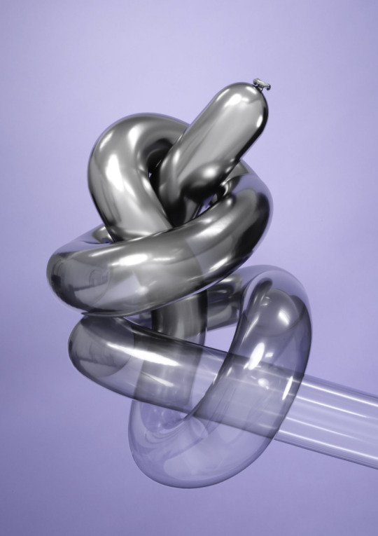
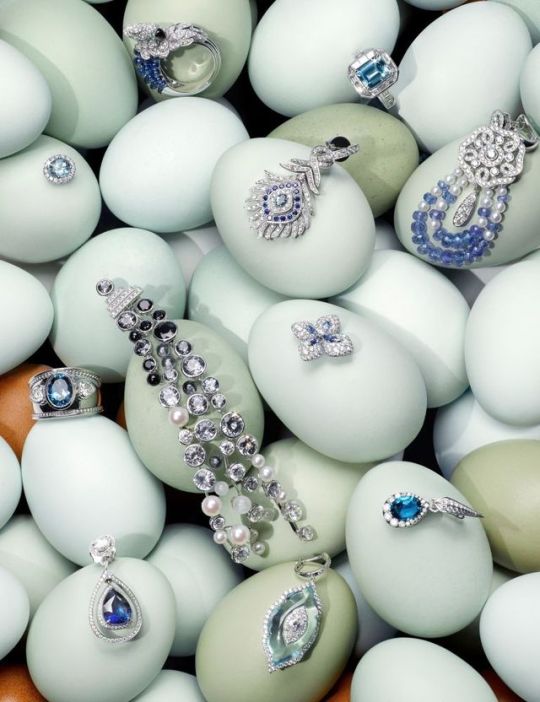
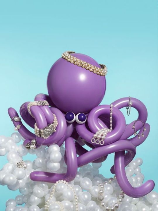
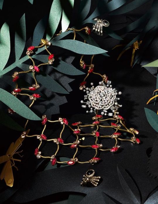
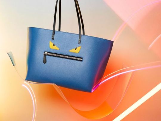
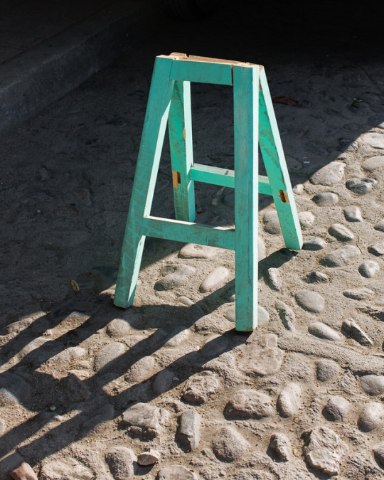
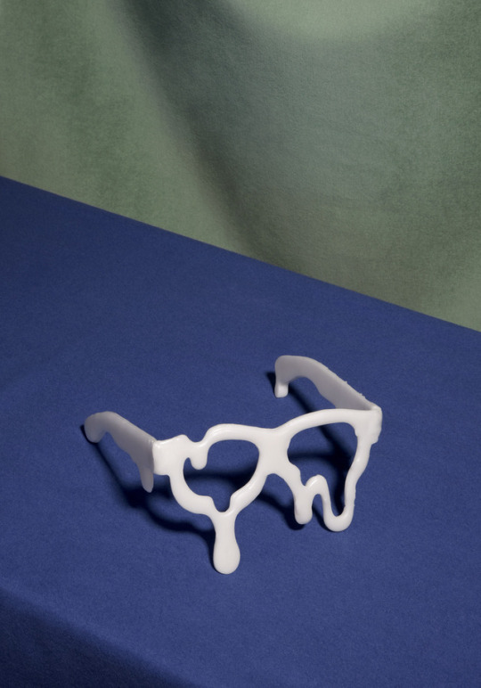
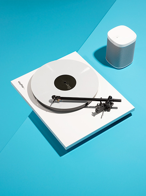
Photo
amy currell
25 notes
·
View notes
Last Seen Blogs

changery
Changery.

justmeandme12
Untitled

mayaranxzero-blog
Mayara De Souza

dollarmseyesviensbait
♱ MakeYouTellTheTruth ♱

debiansstuff
Bennett