#I wanted to do a fully Black & White Ink style. But I scrapped it. Then I did small bits of colour. And scrapped it. Sigh.
Text
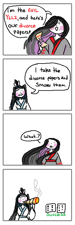
If I was in a lucid dream with a ghost, I would simply impress them with my blunt rolling skills
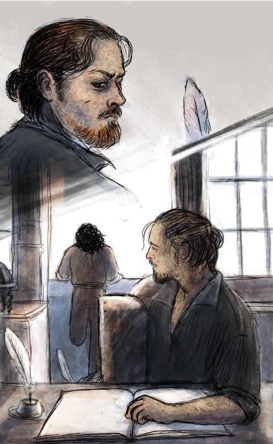
#poorly drawn mdzs#mdzs#wei wuxian#lan wangji#mdzs au#MDZS disco elysium au#This is brought to you by my Scrambled Egg brain - slowly burning up as I try to finish a long comic for this AU.#I hoped it would be done several days ago but I've changed things so many times....It is now Very Close to being done!#I probably should have just posted each page daily but at this point I'm just being stubborn. I want it complete and together.#Ruining the surprise a bit to say 'yeah its a digital art comic'#But its been tricky figuring out the style I want to use for it!#hence the swaths of MSpain(t) doodles that boil down to 'how would this look if I did X?'#I wanted to do a fully Black & White Ink style. But I scrapped it. Then I did small bits of colour. And scrapped it. Sigh.#This comic started out as just the first panel and then my brain went 'hold on. Its time to make a dumb joke'#Any disco elysium fans who finished the game probably know the scene I'm doing for the *actual* comic after seeing this <3#Anyways I know in my heart LWJ would roll the worst blunts ever his first time. And then dedicate himself to the rolling craft-#-until he has finally mastered it. He would roll blunts so good that people would hire him and pay him a monthly salary for it.#But he declines. His master blunts are for his beloved and his beloved alone.#wwx would roll above average but after having lwj do it for him he can ever go back.
2K notes
·
View notes
Text
part 2/6
2nd part of my old Black Sails scraps and doodles from 2016–2021. Not in any particular order.
This time the drawings are short comics that were abandoned for a reason or another, mostly because I lost the interest or felt like there was too much to redraw compared to the satisfaction of finishing something else more interesting. There’s also some talk about rigid mindset and how overthinking can lead to stagnation.
Contains early silverflint moments, specks of dust, rackham's glasses are found, jealous-Billy spying, desk-Flint gets caught, "squint-squint", a quiet moment and its bird dilemma etc.
And please do not steal and repost elsewhere. But if you do get inspired, feel free to make your own interpretations!
Long-ish post under the cut!
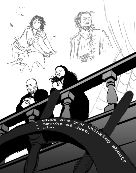
“What are you thinking about?”
“Specks of dust.”
“Liar.”
The idea was to show how much they and their relationship had changed. This was around 2016 when the season 3 began and I was still re-learning to draw with a tablet. Another art from the same time period (and idea) is this art: The Dynamic Duet.
And for some reason I was really stuck up thinking that I’d have to first do the sketch, then the clean line art, then planes underneath, then shadows etc. and I have always struggled with that kind of approach! Mainly because I hate doing clean line work, lol. And I was a fool for trying to start with a white canvas! It’s so much harder to find values and plan things, or at least in my opinion..
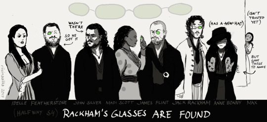
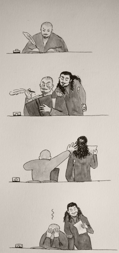
“Rackham’s glasses are found”
To celebrate their new pirate alliance, they share the four lenses of Rackham’s sunglasses as they were also found at the time (because I wanted it to resurface and they could be made into jewellery you know...). This was right after the episode where Anne fights and hurts her hands (here wearing protecting mittens from Max even though she’s not trusted at the moment). Uh, this doesn’t spark joy interest me much and it’s quite stiff and would recuire a lot of redrawing faces, so - discarded!
I somewhat like the idea still (them having something to share, although it’s on Jack’s detriment). I tried to find a stylished comical easier doodlier? way to draw them and draw clean lines etc, but it just wasn’t for me. Also here too, the background is blank and too bright. Later I started to think things as scenes and draw everything at the same time instead of adding the bg later or trying to show everything (and everyone) at the same time.
Here’s also Billy in the same story:
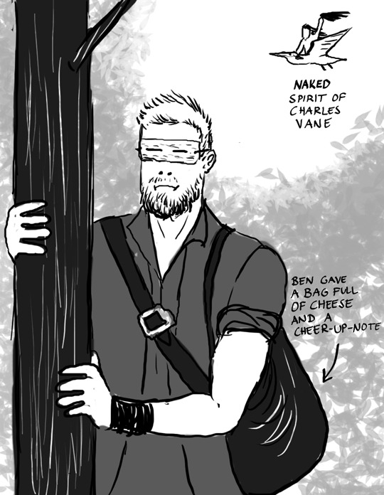
He’s spying on them and since it’s so bright he’s wearing his diy “sunglasses” and being envious to the others. *cough* uhhh...Idk? Also people were shipping Ben Gunn (and cheese) with Billy, so that bled into this too... Charles’ spirit is riding the “big white bird” that was mentioned in Teach’ story and in this case it’s a pelican.
As you can see, I also wasn’t using the brushes that I use nowadays. A hard (or soft) round brushes with no change in opacity just aren’t for me. For example, in traditional art, I struggle with markers and copics, but really enjoy charcoals and watercolours. I prefer ragged edges, layering and thus blending things into each other (and leaving the viewer to fill in the gaps) instead of having stark or definite things. I also struggle with vector drawings, although I have decided to finally start learning to use them...somedayyyy.
Also, I wasn’t paying attention to anatomy, like, at all LMAO. I was just so happy to be able to put something on the canvas.
This is one of my first ink drawings, but I cannot find the original anymore. Again, I like the idea, but not how things look art-wise. And I was so adamant, that I have to get everything right in the traditional drawing and not fix anything later on on photoshop because then it would be cheating. And thus, I was never able to move on or finish this properly the way I liked it (idiot).
BUT! It was a good practise to just draw and test things on paper and gain confidense on drawing things in overall (as I was still getting back into art). To get over the fear of blank paper you know, and try to find my style whatever it would start to form into.
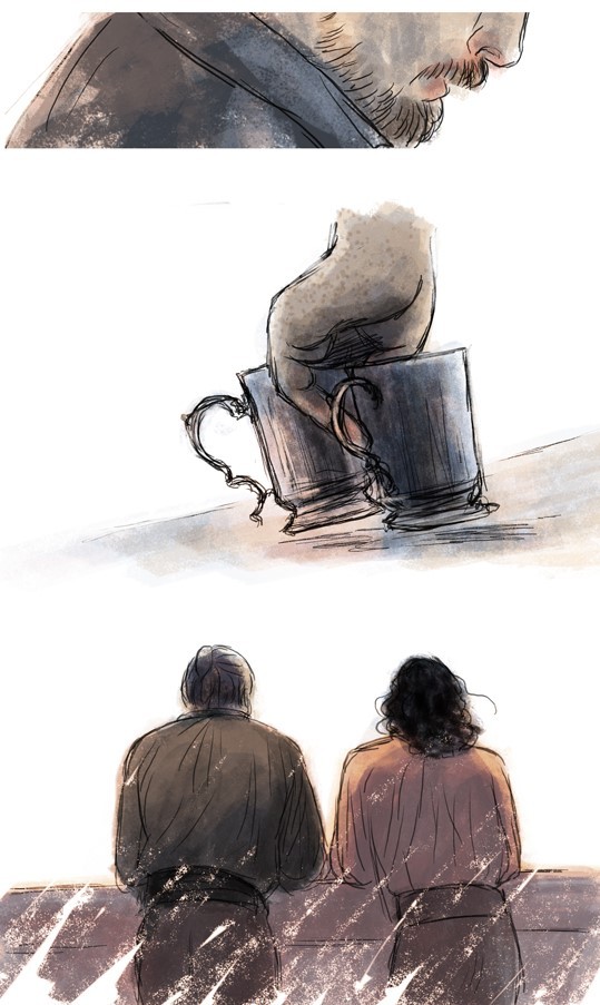
Oh, yeah, Desk Flint.
Desk Flint was a thing for a while (still is, lol). Another drawing from that time is this Slingshot Pirate (2016). And Desk Flint keeps repeating in many later works too. The point is mainly “Flint sitting behind his desk and people interrupt him and I don’t have to draw him fully”
Well, anyway... moving on.
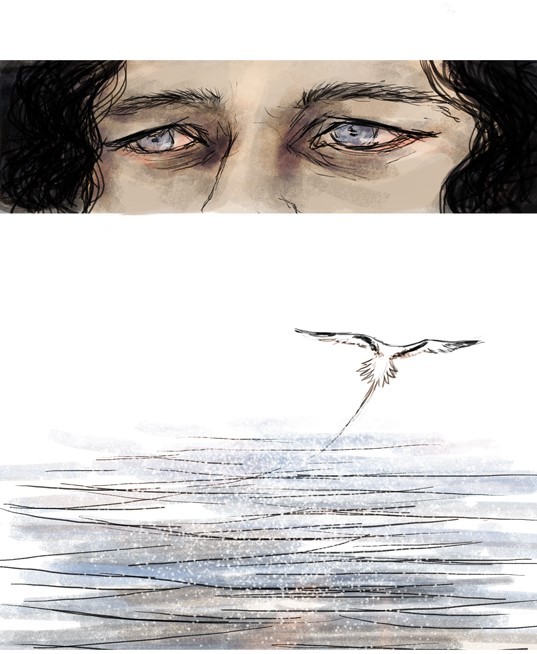
Here’s a plan that has been stuck for years. It’s name is “Squint-squint.” Left is the sketch (with another sketch underneath because the expressions were clearer in the old one). On the right is the continued piece with colour scheme but I cropped the eyes panel and faces out (it was so ugly for some reason) but if I ever continue/finish this, it will be redrawn there in the middle.)
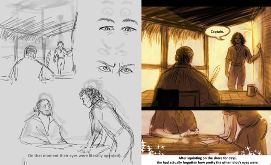
Left. “On that moment their eyes were literally open(ed).”
Right. “After squinting on the shore for days, they had actually forgotten how pretty the other idiot’s eyes were.”
I still like it, quite a lot, but my perfectionist ass only sees too much “boring” things to draw and get right, so it hasn’t been a priority for a long time and other works have kept me occupied and more interested in them.
--------------------
“Quiet Moment.” 2018 (a wordless comic happening after the events of Charles Town)
I’m going to explain after these pictures, but see how big the difference is when you start to look at references and plan things together (the space, “camera” movement, background etc). I also started to colour with coarser brushes:
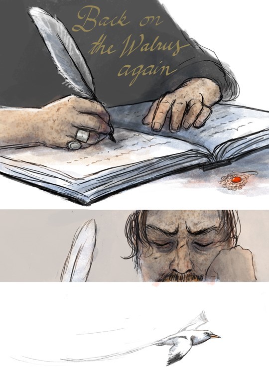
I drew this around early 2018. A lot of improvement! Still quite a lot of negative space (empty white backgrounds), but it fits this work. A few things tell where we are (the ship’s cabin and the balcony). Changing distances and how things are cropped/framed make things more moving and focused (and less to draw, lol). Colours and brush strokes are softer, more layered and so on.
But guess why it’s still a wip!
I couldn’t decide what bird is flying over there.
Yeap! At first it was an albatross (doesn’t go to Bahamas?). Then a seagull (but which seagull? there’s so many subspecies! Is the ship at sea or at the harbour? what birds are there on the open water/ close to the shore?? oh noo...) So, yeah, wayyyy too much over-thinking.
At some point I ended up with white-tailed-tropic-bird which was a plus! because it sounds like the bosun’s whistle, but at that point I was so tangled and frustrated and still had so much to finish with this that I left it be. Also Flint’s face looks different in every frame so I would’ve had to change some parts, lol. And then I forgot it for a couple of years! And then I had learned to draw a bit differently and again saw too much things to do, so it’s quite hard to take on this again, especially when there are so many other interesting wips waiting...
But I still really like the feeling of it! And the colour scheme. So I might just limit the things I’m allowed to fix and then post it as it own someday. I mean, it’s 90% finished, but the last reach just feels like miles.
And that’s what usually happens with my wips. They reach a certain point and it suddenly becomes really hard to finish or get back into.
But every time I learn things and then use the information in another work! :D
Final note for this post (altough this has been said hundreds of times): use references and look how things go and try to see the structure and form beneath things. And think where it is happening and how the light and surroundings affects the characters and/or spaces. And maybe think what you’re trying to convey with the art, what idea? what emotions? what purpose? or like, what are you trying to learn with the piece? and so on...
Thanks for checking this out, I hope you had fun <3
#black sails doodle#long post#but not as long as the future ones heh#tag for Block Spoils doodles#<- if you want to black list these
36 notes
·
View notes
Text
A whole new me-ish...
Dear friends, it has been so long and I have become a new person! Well, no, not really. I'm still me. I still have a filthy mouth and a foul mind, but writing has taken a back seat to the other things I have started creating.
Since the Covid lock down I have been experimenting with model making and painting, taking a particular interest in lighting said models with LEDs, better known among us nerds as Light Emitting Diodes. LEDs come in many shapes and sizes, plus they produce a very good variety colours, they also draw relatively little power and finally, they can be run from a watch battery. As you can see, there is lots to like with LEDs, but there is a downside, to them if you want to use a lot, for a start you need to use more power than you get from a watch battery. Connecting LEDs to a larger battery pack or power supply is a great way to pop them completely, or build them up into a slowly failing system. The way to avoid doing this is to use a resistor, to reduce current flow into the LED and prevent it burning out. Calculating the value of resisters is fairly simple, but I have to reply on the resistors I can salvage from the various pieces of broken equipment I have access to. In this case, I was able to scavenge the resisters and LEDs from the three broken printers I had in my stocks of trash electronics.
Now speaking of F**king printers, I made a discovery while taking apart my failed Cannon printer/scanner. It had a reservoir inside where the ink got dumped during use. Basically, it had a series of tubes that took the ink from the head and dumped it into a wads of cotton wool at the back of the machine, that made the inside of the printer case absolutely filthy with wasted ink. The two HP printers I dismantled, did not have this system and it led me to wonder, was this the cause of the constant need to replace ink in the Canon? Was it really continuously pumping horrifically expensive ink into the waste bin? If this was the case, what a terribly wasteful system and I can confirm that having seen this system, I will never buy a Canon printer again. I am sure that it had another purpose, other than to rapidly waste ink, but it was a terrible system in which a brand new ink cartridge lasted less than a week.
My model projects started fairly simply, with a small Hotwheels car that I found and then painted, as reported in a previous blog post on here. The second model was a scratch built Star Wars Pod Racer, made from recycled bubble bath bottles, hand sanitiser bottles and bottle tops. Again I fitted different coloured LEDs to resemble engine glow and the strange energy binding that holds the jet engines together. I made the base from scrap wood and cardboard and added stones and pebbles from the garden, all covered with a Papier-mâché and baking soda. The paint was acrylic from the local cheap shop and it is surprisingly good.
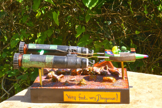
From here I moved onto another hotwheels car, this time with a zombie theme and full LED lights. I went on-line and found an inch tall figure from the TV show Walking Dead, who was a character called Daryl. In the show he wore a lot of black leather black leather according to the photos I found on line and in this case, used a large kitchen cleaver. With model railway grass and another twig from the garden to look like a felled tree, the scene was set and I was very proud of this creation. So much so in fact, that I gifted it to a very dear friend of mine who like me loves a good zombie movie.

The next project was a repair and build for a Snap On Tools branded toy break down truck that my lovely wife had been given along with a set of Snap On sockets she bought when she was working as a motorcycle mechanic. Over the years, the truck had been played with by children, dropped into toy boxes and it was looking really rather second hand. The wing mirrors, door handles, rear facing lights and both cranes needed repairing or replacing and I sculpted the replacements parts from superglue and baking soda or from lumps of solder, all of which I carved with files and a scalpel. The broken parts were repaired and finally the truck was stripped down to the component parts and thoroughly cleaned, before being put back together. Once the truck was finished, it really needed a place to sit, so I designed a garage from the 1950s for it to sit in, with an old style petrol pump and a couple of oil barrels.
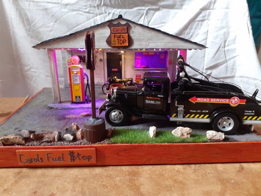
The petrol pump was a 1/24 scale resin model kit purchased on line and the rest of the garage was built using recycled cardboard and lollypop sticks. I used a series of garden stones and then a tub of sand brought back from Bermuda by a close family friend, some time ago. The sand was a lovely pink colour, made up crushed coral and shells. It is perfect for modelling because it is not the boring granular sand of my local beach, which is gritty, fine and easily wind blown sand. By this time I was experimenting with colour washes, applied to painted base coats. The depth of the colour achieved is just lovely and the lighting effects really bring out the glow of the paint. With the garage finished, a few Easter egg details were added that only the most observant nerd will notice. But there was still a large hole in the model that needed to be filled somehow. Dearest wifey went web browsing found a scale model of a Vincent Black Shadow motorcycle and it fitted perfectly into the gap, to be illuminated by a soft white LED. Once finished, I could not have been more pleased than when Wifey took the model and plugged it in. Oh yes, this time I had used a PSU or power supply unit with a timer circuit to run the LEDs as a night light in our hallway to the bathroom. Given how many of the LEDs I had used to light the garage forecourt, the shop window and parking bay, mains power was really the only option. On this occasion, I purchased a set of pre-wired LEDs that already had a resister fitted in series with the LED, meaning that it is safe to run them on the mains power.

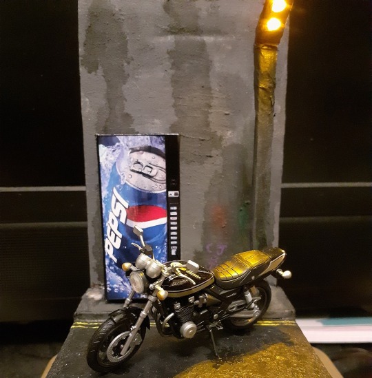
My next model was a Motorcycle diorama, a classic Kawasaki Zephyr, a model kit found on e-Bay that was then imported from Japan. The kit was perfectly formed, it was hard to believe that they had been moulded from plastic, however the detail was so fine, my old eyes needed a magnifying glass to see them clearly for paint or glue. Once the bike was fully assembled, I built a small ten centimetre squared street scene, with a graffiti covered wall and a drink machine for the bike to sit with. The Pepsi dispensing machine was purchased from e-Bay yet again, for just a few pennies and it is beautifully printed onto photo-paper, meaning that the finished model when assembled is exquisite. The nearly completed model once again needed something else and I was at a loss of what to do. Yet the thought of lights never strays far from my mind and I designed a street lamp with an orange glow to look like an old sodium lamp. My childhood was spent in the gloom of sodium lamps, both here and abroad, when catching ferries at four in the morning to travel across Europe. The lamppost was made from a sliver of scrap wood and some tissue paper to give it a concrete like texture, with two orange LEDs secreted in the head. Once finished, I was not overly happy with the result, but by that time, it was too late to go back. The lighting effect was really nice though, but the weathering and fake litter were really effective additions, making it look like the bike was parked on double yellow lines in a very run down city street.
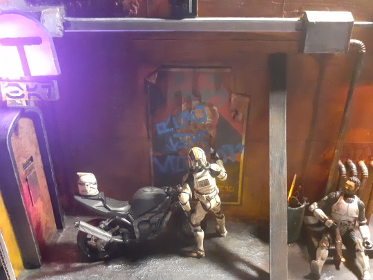
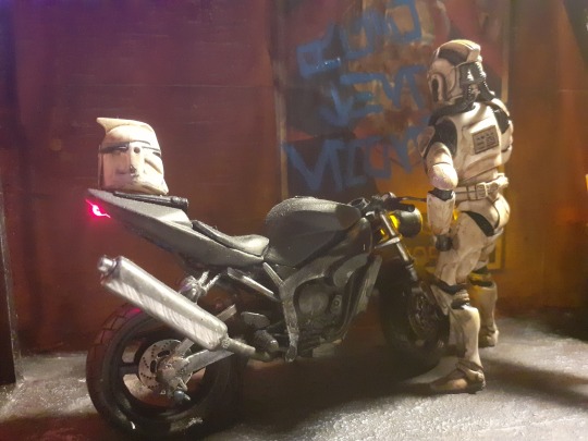
This led (snigger) me into my most recent model, another Star Wars inspired diorama, this time in 1/18 scale, with Hasbro Clone Trooper action figures and an old, rather broken Maisto motorbike. Normally, Star Wars has little to do with motorcycles, but while filming the Obi Wan Kenobi series, Ewan McGreggor was photographed during a break, sitting on his own motorcycle reading a copy of a motorcycle newspaper, while in his full Obi Wan costume. This was all the inspiration I needed and I found that the broken motorcycle model was just the right size for the action figures. Once again, I devised a plan, found the LEDs and used the parts from my destroyed printers. I even managed to use the scanner light head, at first using a variable resistor to adjust the glow. Sadly I over ran the strip and the LEDs burned out. Luckily I had a spare to play with and used a recovered resistor to run it instead. This has the opposite problem to the variable resistor which had too little resistance, being too high a resistance to allow a full glow from the strip of LEDs. I gave one of the Clone Troopers a bong made to look like it was made from the leg of a battle droid, with a flickering orange resister to show the burning spice in the bowl. The other clone was given a spray can of bright blue spray paint, modelled from plastic scraps and superglue. Again, once the model scenery was constructed, I really enjoyed the weathering and dirtying of the street. The washes have made all of the plastic parts look like rusted metal girders or filthy litter soiled streets or heavily corroded chemical pipes. I absolutely love the process of weathering, taking something shiny, well painted and nice looking and turning it into something filthy, damaged and rusted, with just a few washes of colour and stain.

So this is what I have been doing, as well as writing the occasional short story for a Christmas book release, editing the writing club book in time for another Christmas release and even working on the sequel to my first novel, Letitia. So how does this make me a new person? Well, I have finally embraced the fact that I am an artist and I absolutely love playing with paint. I may not be able to draw particularly well and I certainly cannot sculpt in clay or stone, but I can build and paint model scenes scratch build my own kits from trash to compliment the model kits or other parts acquired else where. I have to be honest, it is all such fun.
#diorama#scratchbuilt#starwars#hotwheels#hasbro#clonewars#electronics#art#newartist#painting#modelmaking#snap-on-tools#art-from-scrap#recycledart
0 notes
Text
Evaluation:
My overall thoughts on the ‘Breaking Boundaries’ project was to choose a topic that is censored in today’s society and dig deeper into the meanings and people around it. The theme can be interpreted in a variety of ways; the physical act, the emotional side and the invisible but obvious boundaries in our society.
When choosing a topic, I needed something that would be endless with research meaning there was a low chance of exhausting the topic and/or becoming bored with it. I looked to reason inspiration and interests; I played with the idea of the subconscious mind in relation to dreams as I had begun to draw some of the dreams I was having and writing down, however that would solely rely on me having interesting and dissectible dreams. I turned to T.V and the documentaries I was watching on murders, poisoners and meant to be psychopaths. This had a wide range of possibilities and aspects to focus on, and it peaked my interest the more I looked into it.

This idea was developed further when I watched an interview Piers Morgan did with a ‘so called’ psychopath, allowing me to pinpoint a certain aspect of the subject of Psychology to psychopaths, sociopaths and murders, exploring the differences, the causes and the traits that are looked for when diagnosing. I decided that I would use documentaries as a source of research and adding my own analysis of the situation and the person in question.
My secondary research would be the documentaries and artists that inspired my outcomes, as for my primary research I started to look into the traits, which lead me to online quizzes to determine what percentage you are of psychopathy and sociopathy, which meant I became my research and started to analysis myself in the same way. The impact it created on my work was the question of masking these characteristics hiding them from others, this led me to my main influence for my final outcome.
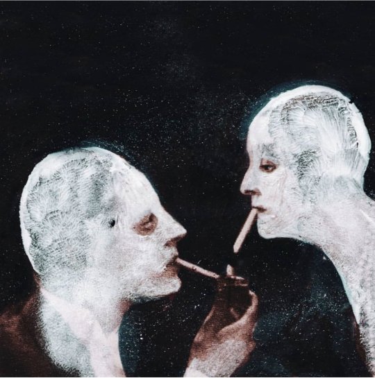
This artist was Julia Soboleva, the technique she had developed drew me in for many reasons. It was a quick way to work meaning I was able to create a series of work in a short amount of time, giving me time to choose and develop my favourites for the outcome, as well as fitting in with the subject of masking our true selves. After the workshop of producing a series of work using her technique, I wanted to develop and push it further, filling up a sketchbook of work. It shows the experimentation of the transparency of paint, the use of colour, the choosing of found imagery and which parts to leave exposed. By using Julia Soboleva’s technique as a starting point, I have developed my own way and style of working, keeping to three colours of paint and using mostly black and white imagery and portrait style images.
The wider world issues I have researched are the documentaries on different murder cases, the psychology behind the crimes committed and how the ‘professionals’ identify and diagnose these people. This affected my views on the people and the subject, as I saw that some ‘professionals’ over analysis people turning them into something they’re not, especially if they were diagnosed at a younger age, they will be told all their life ‘ this is what you are, this is what it means, you can’t change that’. It has made me realise that not everything you read is true and most is exaggerated to create this extreme version of the label psychopath.
From the beginning of the project, I knew that my work would be aimed at older audiences due to my darker style but also the more complex topic. Psychology as a subject covers a range of different areas going into great depth and exploring the meanings behind our actions and thoughts, analysing every aspect of the human mind. Very young to early teens would either be confused with this subject or it will just not interest them; therefore my targeted audience is late teens and up due to our need to know why things happen that develops more as we grow up. We begin to overthink and over analyse ourselves as a society and need to know what makes us the way we are. The imagery is also more suitable for older audiences some may find it frightening or uncomfortable to look at. Anticipating this, I asked my younger brothers if they thought my work was suitable and they both agreed that it wasn’t meant for younger people as they found it hard to look at.
As well as age being a factor for my targeted audience, I thought about what my audience has to be drawn to in order to capture their attention. For example, my mother appreciates my work but it does not spark her interest as she looks to nature and folklore for inspiration. My audience are those who are curious about the darker side of humanity but also the way our minds work and how it goes unnoticed in day to day life. I wanted my audience to be those who or inspire them to, like me, already study the body language of others and how they react to situations, wanting to dissect what people put on show to uncover what they are hiding. However my audience are also those who simply like the style of work, who are fans of murder shows and documentaries and/or fans of the band whose song I chose.
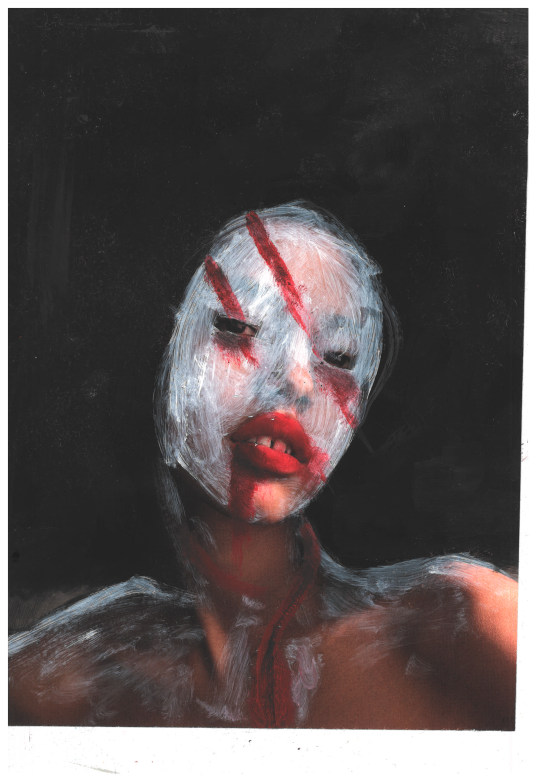
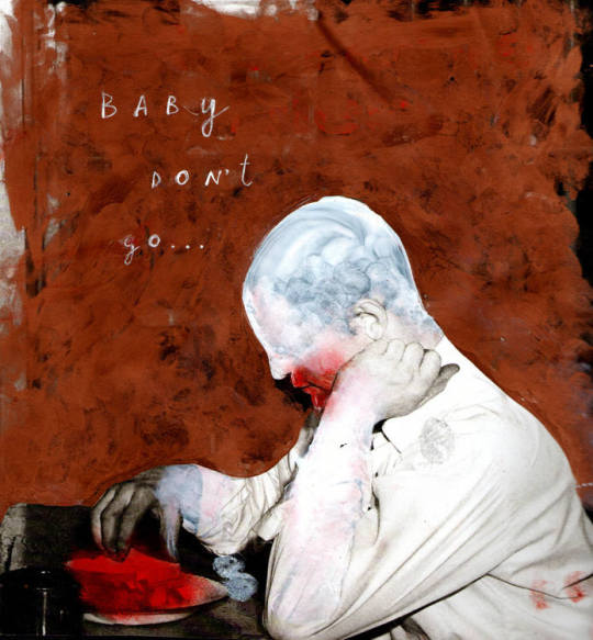
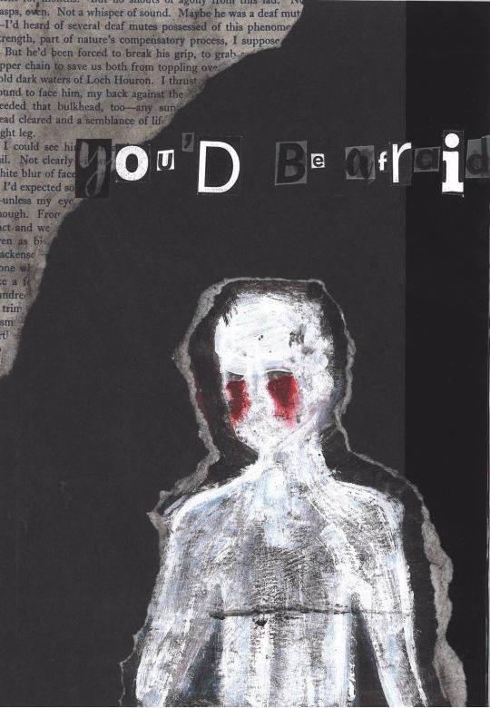
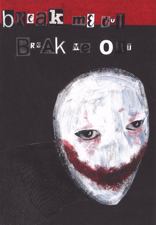
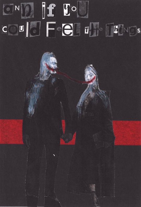
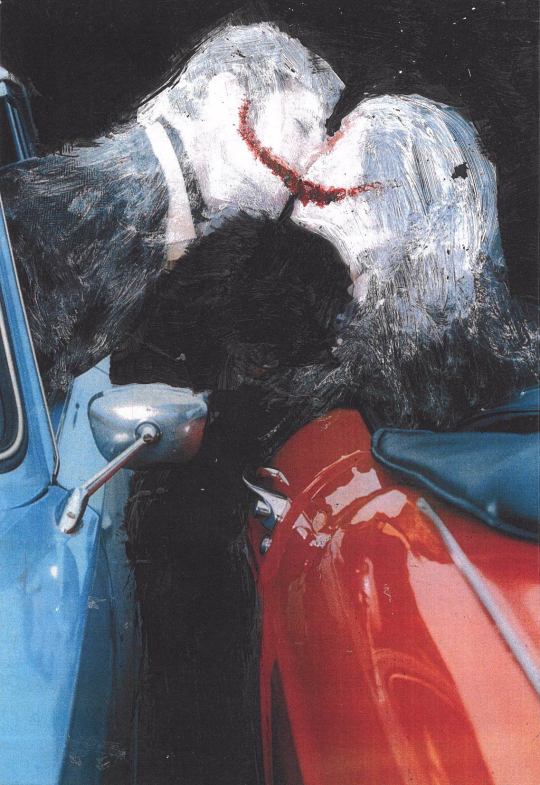
Focusing on my chosen technique, I believe that the choice complements the subject of murders, psychopaths and sociopaths, showing how many mask their lack of emotions, disturbing thoughts and monstrous actions they have committed. For many of my pieces, I’ve left the eyes exposed to remind others and those who it represents that they are still human; this may be comforting but it also may make us fear humanity more. By taking an already existing photo and manipulating it with paint, I am able to alter our reality, leaving some recognisable features whether it be in the environment or on the figure, creating a dream/nightmare sensation.
I believe I have made my final outcome appropriate for my targeted audience as my chosen song, subject and way of working link together with darkness as the theme. The final outcome came out as I had envisaged, meaning that my original idea for my targeted audience has not changed. I do however believe that it has developed to also target those involved with photography as I carefully chose the imagery based on the poses, colour and environment.
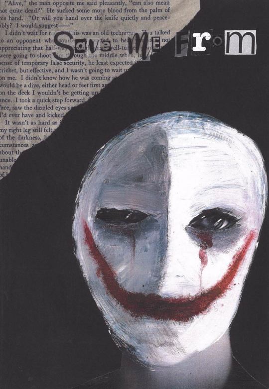
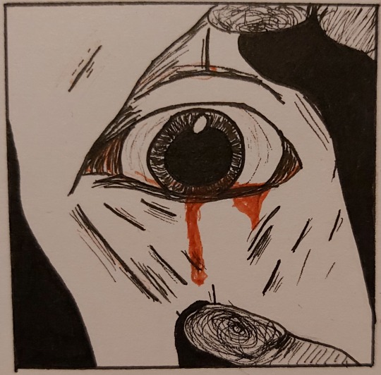
During this project, I was introduced to new techniques including etching with acid, collagraph and working with typography. The technique that had the greatest impact was the etching, as it tested my drawing ability as I had to perfectly draw from my original design. This method allows you to incorporate a large amount of detail, meaning that nothing of the original design is lost. The outcomes of this workshop were three black and white professional prints. However, in my original design there was colour which was lost during the printing. The monochrome block look complimented the graphic drawing style of my design which pushed and developed it further.
Until the last three weeks of the project, I had still not settled on a method of working as I wanted to continue developing shown techniques. Not only did each method contrast each other in appearance they also created different feels and would change the meaning behind the lyrics. I was more focused on picking the technique that achieved the feeling and meaning I wanted my audience to get from my work than a technique that I wanted to do. Fortunately, this technique covered both and also allowed me to create a large amount of work to choose from when it came to my final outcome. The workshops taught me that a piece of work doesn’t have to take a long time and have a large amount of detail to be impactful, as it’s about manipulating it to fit your way of working and the theme you want it to fit.
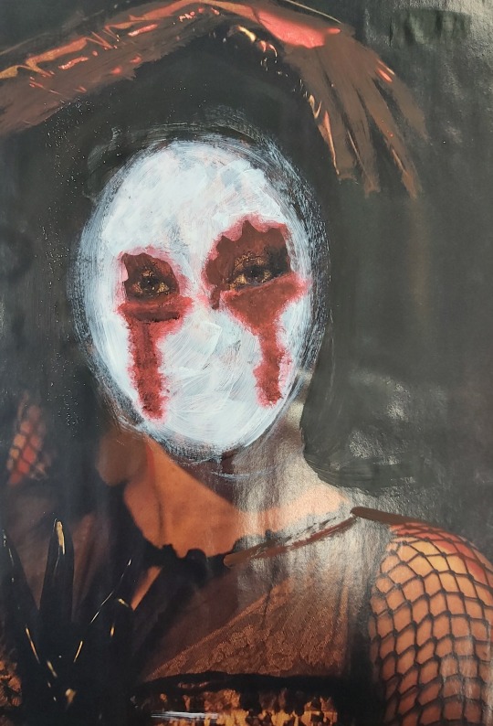
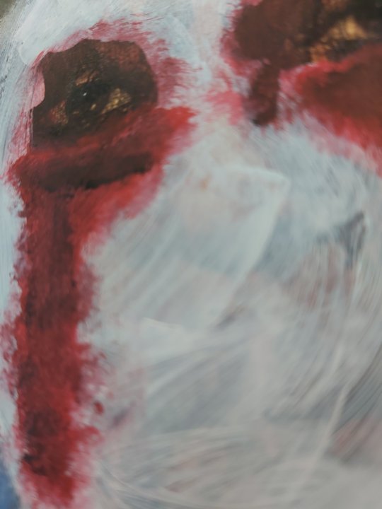
The two workshops that had the most impact on my final outcomes were the Julia Soboleva workshop and the typography workshop with Craig. From the Julia Soboleva workshop, I created a series of work experimenting with the application of the paint, and different ways to add depth. I thought about my brush strokes, which direction I wanted them in and whether or not I wanted them to be visible; I also wanted to see how the effect of the piece would change when changing the transparency of the paint, allowing more or less of the original image to show. This meant that I was able to control what my audience saw, and censored certain parts of the face or image.
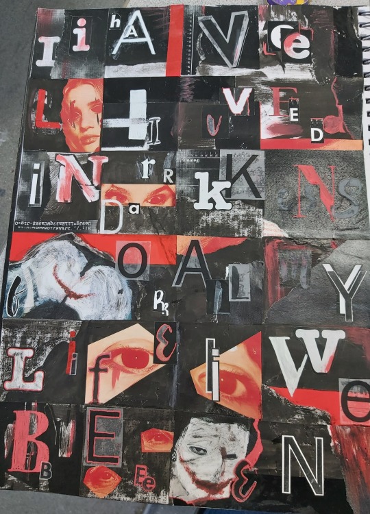
In Craig’s typography workshop, we combined text and collaging, to write out our chosen lyrics. By using a different variety of fonts and sized letters, I created a mismatched and ‘wrong’ look to my work. I decided to develop it further by adding red and using photocopies of my previous work from the project, as well as ink and scraps of imagery. I was able to create a piece that flowed and linked back to the rest of my work, and without knowing, to my final outcome. The workshop inspired how I would write my lyrics that complimented my images but also able to bring it to the next level.
The most important decisions I had to make during this project was what method I would work in and which song I was going to use. When looking at the different methods used, I thought about how they would change the interpretation of the subject but also if it fit with my targeted audience. An example is the Egon Schiele inspired technique, drawing over found imagery in a continuous line, elongating the torso and necks in his style. However I felt I was not able to develop it in a way I wanted to fully represent my subject. I decided straight away that I didn’t want to incorporate collagraph prints as it consists of ‘perfect’ shapes and straight lines, which creates too many contrasts with the exploration of the imperfect human mind and the faults within it. I wanted to use portraits and full body imagery to show human kind in many different shapes and forms.
My original song choice was Every You, Every Me by Placebo, due to the brilliant and clever lyrics, which somewhat exposed some censored subjects. However it didn’t fit perfectly with my subject and I didn’t want to change the lyrics to then spoil them. I discovered my chosen song The Dark Side by Muse when listening to them, but I had never been fully focused on the lyrics; when I did listen to them it fit so perfectly with my subject and truly captured what effect I wanted to give off. The decision was easy and without making it I would not have appealed to my targeted audience.
When creating the original pieces for my final outcomes, I didn’t just want the painted over image with the lyrics, I wanted to add texture and more meaning behind each piece. I first decided which out of a series of work I created using Julia Soboleva’s technique I wanted to use for my book as well as wanting to use black card to work on to push forward the colours but also to be a sturdy surface to work on. One decision that majorly affected the look of the final outcome was the decision to use photocopies of my work rather than the original image. This meant the images were matt and brought out the texture of the brush strokes more.
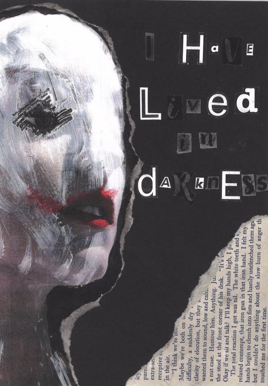
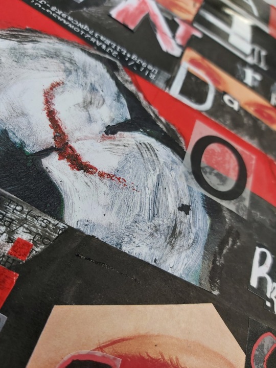
To add texture to the collages, I used pages from a book called When Eight Bells Toll, picking out paragraphs that and phrases that linked with the image. For example on page one I chose the section with the sentences ‘ to clench into fists and hastily unclenched them’ and ‘the slow bum of anger that touched me for the first time’; and on page eight ‘Death was waiting to reach out and touch with his icy forefinger’ and ‘But I could smell death in the air.’ Though this may not be obvious to those viewing it, I believe that it is a subtle and important part of my work.
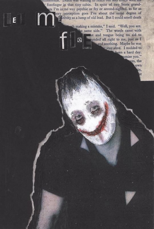
There are hints of red throughout my chosen images, however I wanted to add more to further bring out the rest. I used tape for this as it’s a bright blood red, contrasting with the dark theme as well as using it to separate parts of the collage, highlight parts of the image or simply add a shiny texture. I did this with black tape too which had a more subtle effect, but still separated the matt images from the matt background.
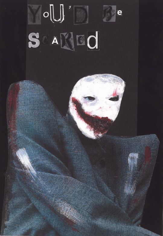
I wanted to get my book professionally printed with a hardback cover to add to the authenticity, choosing it to be matt as to allow the detail of the brush strokes to be seen. My chosen cover was a piece I did at the beginning of the project due to the dream-like sense it has to it as well as the strange peacefulness to it; I chose not to have the title on the front as it would take away from it, and have it on the spine of the book, The Dark Side. For the back cover, I knew on the website having it black wasn’t an option, so I took an inverted piece of paper which had faint white specks and a subtle change of black, which I felt created dimension. On the bottom of the back cover I wrote in white text the title of my book and the song I chose, The Dark Side by Muse. I decided I wanted to write the name of the band as I didn’t want to take credit for the lyrics.
Unfortunately, I was let down by the company who created my book after leaving enough time for it to arrive. I opened the book to discover that some of the letters had been cut off at the sides, making it unreadable as well as printing one image twice meaning one of my designs was missing. I plan on getting a reprint as I want this project to be fully complete and I would like to see my book published correctly.
To be critical, I would say that I planned my final outcome well, as I took a lot of time thinking about the composition of each page and which image would fit with each lyric best. I created a paper mockup to get an idea of the final book, as well as annotating each design talking about the composition. For time management, I am aware it is something I need to improve on, as I have been struggling to get up on my days off and fine motivation due to mental health and being at home for a whole week.
As an artist, I feel I have developed not only my skills but the pressure of having more time and freedom within a project, knowing that what I achieve on my days off greatly affects my grade and outcome. I hope that these developments show in my work as I am more grateful than ever to have access to the college facilities and actually be at college.
0 notes
Text
Task 1:
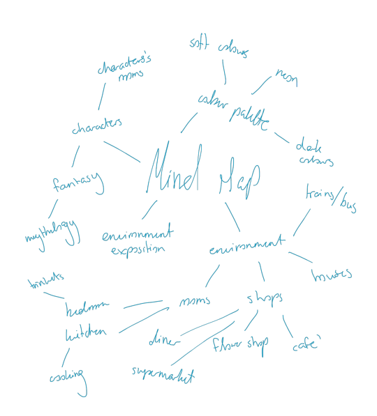
I wanted to use this unit as an opportunity to help build my skills in creating environments that provides the viewer with narrative context. For my thesis project I want to create multiple works each showing an environment where the viewer can piece together the story just from the environment itself and the way things are placed as well as the lighting to show the mood of the ‘moment’. Since it isn’t easy to show a story just from the environment without any action happening, I wanted to practice building up environments and figure out ways how to make them show pieces of a story.
Setting:
The story of the project will be taking place in the medieval era so in this case I will have to gather references of buildings, architecture, style based on that particular era to give it more believability.
Things to improve on:
Perspective
Lighting and shadow placement
Use of colour
Building an interesting environment
Not focus on making everything look refined
Workflow:
Gather references
Create moodboard for each piece
Create different concepts sketches
Style experimentation
Block out core parts of the scene
Build up the environment
Add final touches
Mise-en-scene
Mise-en-scene is the visual presentation in a piece of visual media; the lighting, prop placement, setting, depth of space and even colour scheme. The lighting used in a scene is one of the most important tools used to set a certain mood and establish emotion (Frank Manchel, 1990) and depending on the type used whether it is high-key or low-key, the mood changed a long with it. High-key lighting is mostly used to indicate a lighter and more optimistic mood, while on the contrary Low-key uses hard light to emphasize the shadows on the scene or character, creating a dramatic effect with mystery elements as it helps isolate subjects.
Experimentation:
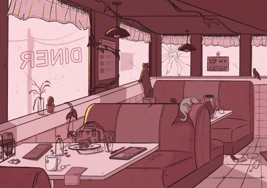
My initial idea for the thesis project was to have a point and click game based in a diner with a more simple and illustrative style using a warm colour palette. In this piece I had tried improving on my perspective skills and putting some items on the tables to see if they look natural. I didn’t really get far in this piece because of the idea change but from what I gathered when working on it, I need to still improve a lot on objects should look from certain angles and adding small details to grab the viewers attention to certain areas.
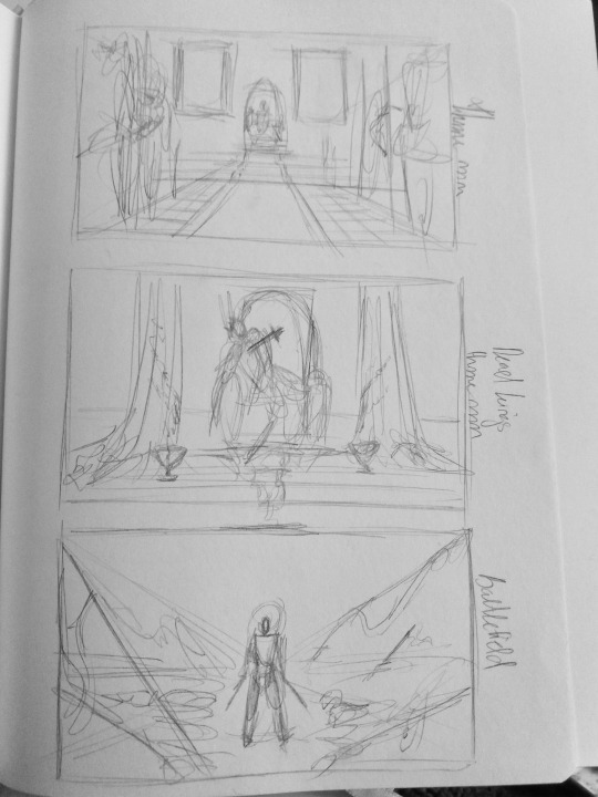
I tried doing some very quick thumbnails to put out some of the ideas and scenes I had in my head when thinking of the story and how it could be pieced together to create a full story. For one of the pieces I wanted to create an environment of a throne room with the main focus being the throne with the corpse of the king with a sword impaled in his chest. The cobwebs, torn curtains, decaying corpse/skeleton and dried blood indicates that the event has long since happened and this is what’s left of it. Although the viewer didn’t get to see what actually happened, they can piece is together themselves but still be left to wonder the reasons it happened.
Inspirations:

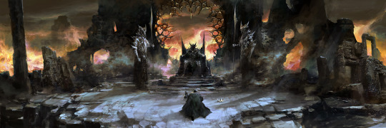
Chris Gold
Juhani Jokinen
Risk Management:
Realistically since I am not very well practiced in creating and actually drawing environments, I will probably have a harder time creating as many pieces as I wish to make. For this unit I don’t actually plan on creating fully rendered and detailed pieces, but rather have them drawn in a sketchier way as a stepstool for when I actually go ahead to create the final pieces for my thesis project. The finals for this unit will resemble more concept art so that I will have a very clear vision of what I plan on doing for my thesis and by then I would have hopefully improved in aspects such as creating a certain mood with lighting and shadows. The finals concept art pieces will only be done in black and white since it will help reduce time restraints and I also think that it would help me focus on lighting and shadows, and bring aspects of chiaroscuro in there.
One of the most difficult part in the creation of the environments will be actually drawing them the exact way I visualize them in my head. Each piece will be based on an important part of the story I created and it is very important that these pieces each do their part of telling a piece of the story or at least give a sense of there being more to it. For my thesis project I plan on there being over at least 6 pieces so for this unit I wish to create the same amount as my finals, so I would at least have a guideline for when I go to create those.
When it comes to actually creating the pieces I don’t think I will encounter any problems regarding programs or tools. If something happens to go wrong with my main tool which is the screen tablet, I can easily start using the tablet connected to my laptop however that would probably slow me a bit down. If worse comes to worst I could turn to using ink on paper since I am well accustomed to it and I don’t plan on using colour anyway.
Update:
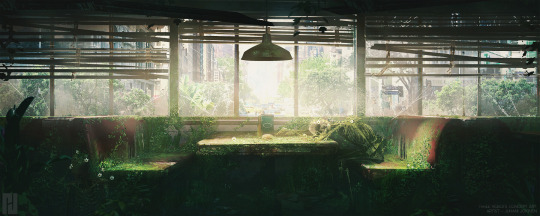
I ended up changing some aspects of my thesis project, while still obviously keeping it based around environment storytelling, I decided to make not focus on a whole story and show parts of it as that was out of my skill level and I was finding it very hard to actually implement what I had in mind into a piece. I decided to instead create a single environment based on a character’s bedroom and have multiple items laying around to indicate who they are and what they do without actually seeing the character.
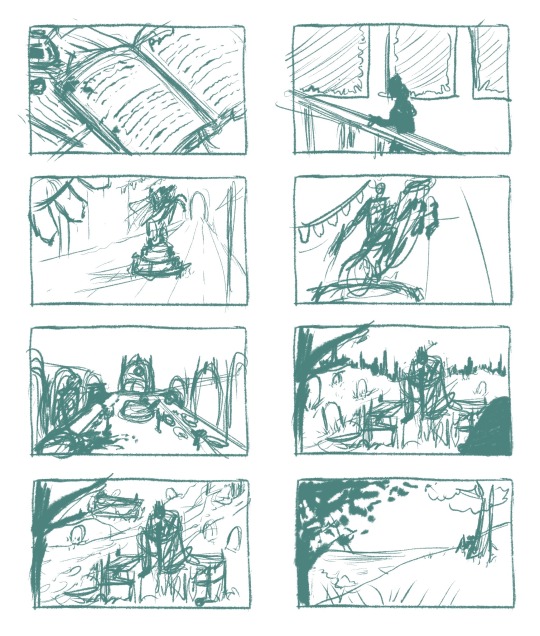
For this unit I was initially going to create multiple concept art pieces to help prepare me for the thesis final pieces, however since I changed that idea I wanted to still have this unit help me in that so I instead decided to also do one piece for this unit. Similar to the original idea I wanted to implement environmental storytelling so I settled on using the very first sketch I did for this unit and further improved on it to create the final scene
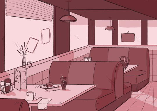
The diner is shown to be abandoned, with belongings to someone laying around and food and drinks still left unfinished. I was originally going for a more eerie feeling, with low-lighting and bright spotlight coming from the bulbs above onto the table; I ended up changing this to a more serene feeling but still keeping the mystery element. I wanted to show that nature had taken over slowly, with vines growing around parts of the diner and animals searching for scraps of food.
Throughout this unit I think I improved a lot in my perspective skills compared to how it looked at the start and even how lighting and shadows work and how to implement them to convey a certain mood.
Author Statement
The piece shows the aftermath of something that had occurred that leaves the diner completely abandoned apart from the animals lurking around inside it, eating scraps of half eaten food. Vines have grown over the place along with cob-webs covering every surface. I wanted to leave it completely up to the viewer on why the place was left like this, what happened and what caused it.
The piece also shows the passage of time through how long the vines have grown, the mold covering the leather seats, webs covering pretty much every surface and the grass growing to the gaps in-between the floor tiles. The items left on the tables hint a bit at who was sitting there before it was abandoned and even indicated a bit at what period in time it was. The mood I was aiming for was a serene one, the calm after the disaster that has long since occurred.
0 notes
Text
Behind the Stationery: Worthwhile Paper
Today’s installment of Behind the Stationery takes us to Michigan with Kristen Drozdowski of Worthwhile Paper! The beginnings of Worthwhile Paper started by happenstance when they had some extra space screen printing a poster. I’m excited for Kristen to share her unique story about how she dreamt of her business name (and it stuck!), details into her screen printing design process, what inspires her art, and her goals for 2018. Take it away, Kristen! —Megan Soh
From Kristen: Starting Worthwhile Paper happened organically for me like a story of cause and effect. I first discovered my passion for making cards and smaller prints almost by accident — by using the extra space on a screen when printing a poster. There were a few inches left in the layout of a poster my husband and I were screen printing so I squeezed some little positive sayings on the side and we cut them into postcards. We took them to one of our first local craft fairs and the little positive cards went over well, but more importantly I found myself connecting with the shoppers more over the positive cards than anything else. It made me feel happy and human to make connections like that, which sparked my idea of making more cards.
Shortly after, I had this dream that I had my own card line and was telling someone in my dream that it was called Worthwhile Paper. I woke up thinking it was such a dorky name, but a little later when I sat down to name my business it just held on. There is this very real idea that sometimes the things that require more thought or work are the most worthwhile things, like climbing a mountain and getting to the top, doing a really long yoga practice to get to the other side of your sense of self, or going through all of the work it takes to screen print cards! It continues to fuel my work. One of my favorite things about Worthwhile Paper is that it is a business that I get to do with my husband. It has been such an adventure for us, a designer and printer love story, and he has been supportive in so many ways along the journey – always encouraging me and helping me feel empowered as a business owner.
Worthwhile Paper is a collection of lively screen printed paper goods for lovers of nature, magic and meaningful design. We are a wife + husband team who love to create beautiful print work to share with others. Everything we make is drawn and lettered by hand and screen printed with earth-friendly papers and inks. Featuring a unique blend of nature and minimalism, our designs carry a goal to truly bring some positivity and love into the world through meaningful connections – whether that is a personal reconnection to nature or a connection between two people.
My love for the design and print world feels like it was always here, but really took root for me in college. I was always incorporating hand drawn lettering and designs into my work and I learned how to screen print. Finding this path was more of a process of elimination and discovery than anything else – I had so many interests when it came to what I wanted to do with my design background and I tried to explore them all. At one point, I had two part-time jobs (both in the design industry) and on the side I was taking on freelance design jobs, doing calligraphy for wedding invitations, designing gig posters, and exploring more with personal side projects. But as my schedule shifted after becoming a mom I became stressed in keeping up with everything and I slowly and intentionally started dropping away from the types of work I was offering starting from my least favorite, and eventually dedicated myself to pursue Worthwhile passionately and fully.
Last summer I made the exciting jump to move Worthwhile out of our house and into its own separate space. I found this amazing building nestled in between houses hiding behind pine trees and a wooden fence — so, not quite a store front but not totally hidden either. I walked inside this place and immediately felt at home. Sprinkled with windows with natural light pouring in and the perfect shade of warm white paint on the walls, it was practically made for us, and at this point I am still in denial that I actually get to work here. Inside lives my drawing studio, office, our wholesale inventory and shipping area, and a large area in the middle that during non-working hours we call “The Guest Room” – our workshop space.
We have been hosting a variety of creative workshops here including my own design and lettering workshops as well as other crafty events for beginners like weaving, macrame, and terrariums. We’ve been having open shop events and appointment based shopping hangouts with local customers too, and it has been so fun to be able to have a physical space to bring people together. It excites me! Where we print is not a far trek — just down the road is VGKids, the screen printing shop my husband co-owns. They screen print a variety of wonderful things but their specialty is large scale art posters and tee shirts. We print all of our own things there when a press opens up or on the weekends.
During the day at the studio I am usually either drawing, finishing designs on my computer, making layouts, attending to emails, bookkeeping, taking styled photos for social media, and making tea (and then forgetting about it until it’s too cold). I have a few super amazing women working for me too, to help with managing our wholesale accounts, updating spread sheets, pulling orders and packaging our items. I am so grateful to have a team, I couldn’t keep up at this point without them.
I am always thinking of ideas. Sometimes when I start a design, it feels like the end of a process instead of a beginning because the idea may have been living in my head for a whole year or so! If you spied on my phone and went through the notes app, you would find hundreds of one line ideas or phrases that pop into my head that I jot down there. (I’m guilty as ever for using my phone instead of a notebook, don’t send the paper police). Once I’ve reached the point where I want to start bringing some ideas to life, I will start with small, very fast thumbnail sketches. This allows me to get the ideas of how I want a design layout to be quickly without judgement about details.
Then, I work up toward a more finalized design in pencil, using a light tablet to trace over and make revised copies until I get to an original that I draw either with black ink or a combination of black and colored gouache paint. Sometimes if I am working with multiple colors I like to make separate layers because that is how my screen printing brain works, and then I scan everything in, make the final layouts and choose ink colors via the Photoshop Pantone matching system, which is how we determine our screen printing inks.
My design process is usually a very fun and fulfilling challenge. Lately, bringing a collection together has become more slow and organic rather than strategic. For the collection of art prints that will come out soon for spring, I started by simply sitting down and drawing what I liked and wanted to explore. After I had a substantial amount of work, I laid it all out in front of me and chose what I wanted to keep and what I wanted to make out of it. To start, I usually draw from multiple points of inspiration. This ranges from inspiration from nature to deep inspiration that stems from feelings, or sometimes it’s more obvious inspiration from my existing work (maybe I tried something once and want to expand upon it, or there is a certain color palette I want to use more, or a theme/direction I want to pursue further). All in all, the inspiration that I find the most meaningful are my day to day interactions and emotions.
Phrases in my cards may have started as something I said out loud, wrote in a note once to someone, or something I wrote in my journal. It is really important to me that my approach as an artist who makes material things for sale isn’t centered around what I think will make me the most money or based on the most popular on-trend thing. When I am designing, I want it to feel real, so I always ask myself things like, “Who in my life would I send this card to right now? Where in my house would I hang this print? What would I use this notebook for?”. If the answer is nothing or nobody, than I scrap the idea. If I don’t want to use it, how can I assume anyone else will? It’s an easy game of “do I like this or do I not?”.
If I am being honest, the fact that anything I make resonates with anyone and makes them smile or feel happy truly feels like a gift. Sometimes I can’t believe that this is what I get to do for a living, and I am excited to continue growing and learning.
The business end of this is fun and all, but I live for the times I am able to turn away from my computer and phone and just zone into the creative abyss in my plant-filled studio where engaging with technology is not allowed (unless you count my light tablet for tracing). I almost never even have a light on because the window light is my best friend. One of my struggles is wishing I had more time to just make art for art’s sake and explore creativity. It is so hard to break away from the mindset of making art that gets turned into a product. I have this deep desire to just make to simply make, to explore and use making as a way to learn things about myself and dig deep, but part of me feels this fear of not even knowing how to anymore.
I know that even if I lived in a cave in the middle of nowhere I would find a way to make something and share it with someone. Maybe the desire to share is just something we have as humans, and it’s not all that bad. Nevertheless, I am really feeling a nudge to create more space for exploration and fun in the new year. I’ve been getting back into painting and I just installed a mini screen printing setup in the corner of my drawing studio. (Since we print in larger quantities of our products right now with legitimate professional equipment, I haven’t printed something by myself in years). In 2018, I’m looking forward to getting messy, and reuniting myself with the roots of my love for screen printing, and of course continuing to find inspiration for my card and print designs.
Photos by Heather Nash Photography.
Want to be featured in the Behind the Stationery column? Reach out to Megan at megan [at] ohsobeautifulpaper [dot] com for more details.
from Oh So Beautiful Paper http://ift.tt/2G7utql
via IFTTT
0 notes
Last Seen Blogs
dyslexic-mess
haha
kelpo-cereal
Collage Of Cool Stuff I See
snottygirlsprissyboys
boogie
julliette-zorradelapaz
Escarabajo gris

sunsoosoo
#StreamICC