#also think the colors are more cohesive that what I usually end up with
Text
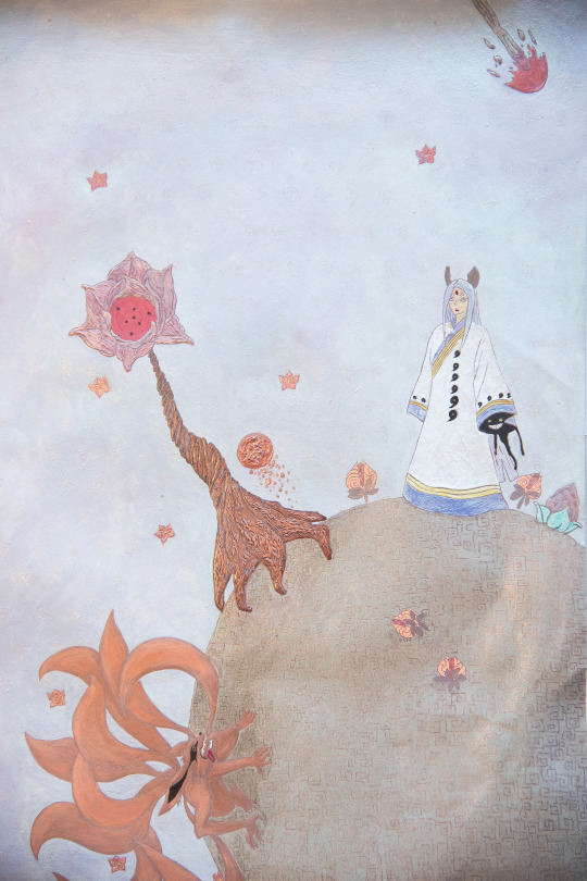


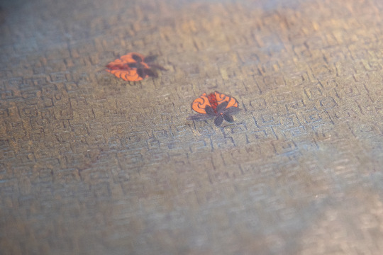
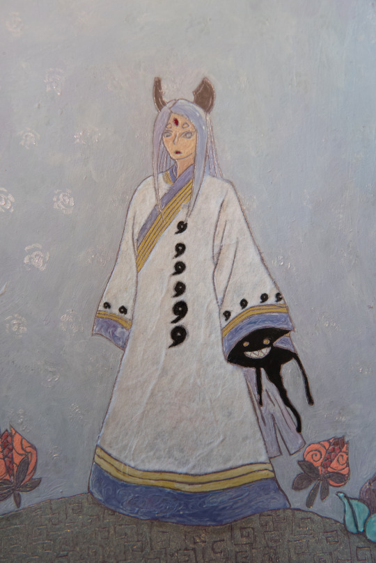
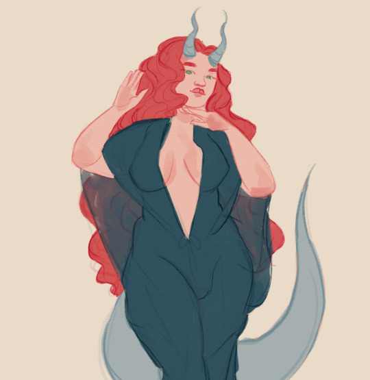
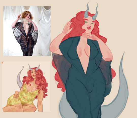
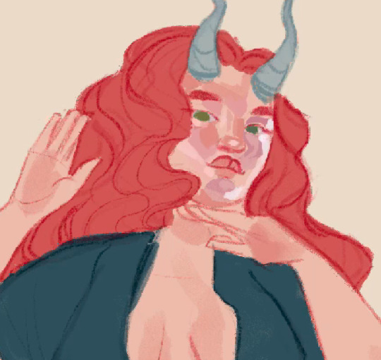
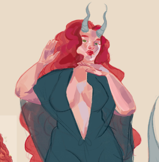
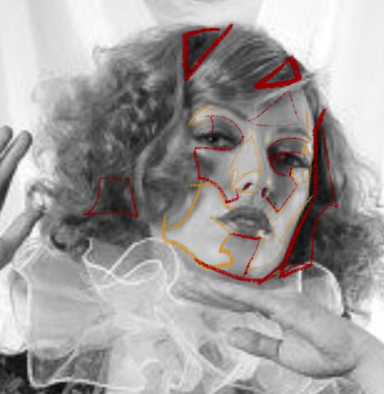
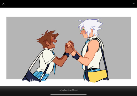
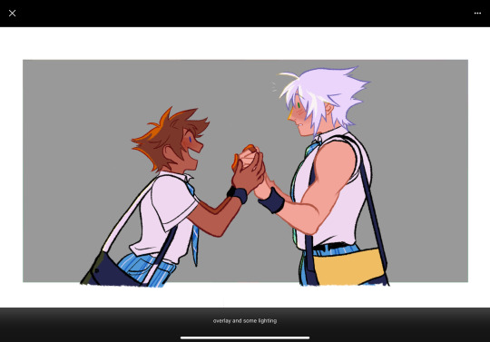
What if Kaguya's moon exile had been a bit different...
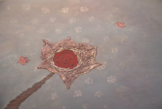
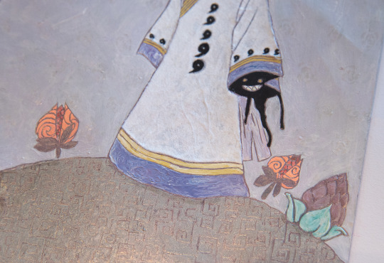
#Naruto#kaguya#ootsutsuki kaguya#the little prince#le petit prince#id in alt txt#mine#mixed#<- gonna start using that tag cause those are the only pieced who don't get one when my origami and 3d stuff does so.#justice restored#can you believed I've had the idea for this piece last autumn?#while I was doing my labyrinth I was obviously staring at that white kozo paper for a while#and the kaguya ost came on my playlist#and I thought oh it'd look so cool for her coat...#and lo and behold it sure does#the little prince fusion came about bc we found the back cleaning my grandma's books last year#we found the book*#same time when I did my mr seguin's goat little kidpix drawing if you remember. same library lol#This was very fun to do and I'm very proud of how I picked the different elements to replace the ones in the cover...#also think the colors are more cohesive that what I usually end up with#as usual check out my#wip#tag if you wanna see some more process pictures videos etc#but you can always ask me abt it too :3#and PLEASE click on the photos to se the details better
72 notes
·
View notes
Text
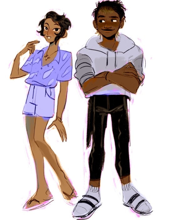
a trashcan’s guide to coloring
using @thoughtfulshepherdmongerkid beautiful ivy rose, because I’m thinking of her always and also really struggling w the comm sorry (also this is long as hell fair warning)
sketch/line-art. I suggest making it at least kinda neat so you have a solid guideline, but honestly just do whatever you gotta do. I also like to set my sketch layer to multiply so that the line art meshes w the base
2. usually I lay down one base color (in this one it’s pink), then I use a clipping mask to lay down some flat colors. the brush you use for this won’t really matter because it’s gonna get covered by rendering (merge layers when you’re done)
3. get your references!! you’ll need them for when you start painting over your base, trust me. references changed my life and saved my summer harvest
4. now, on a layer created above your sketch and base, go in w/ a mix of lasso tool/freehand brushing and start blocking in your colors. the values on our faces naturally form blocky shapes, so try to focus your energy into getting those down
I like to use the spectra brush to render because it adds a nice texture, but feel free to experiment with what you’ve got. also, I tend to go darkest -> lightest -> middle in terms of coloring order
if you struggle with value, I suggest finding any picture (make it black and white by turning saturation down) where there are 3 clear values (black, grey, and white). then with a colored brush, outline all of the different shapes those values make. kinda like this!
5. quick color theory run down before we wrap up: use a cool toned grey (red based, pink based, purple, etc) for the blue parts of the skin, a desaturated red/pink for purple, and gray yellow for green. this will give you very lively and compelling coloring without being too crazy. obviously, you can do whatever you’d like, but I’ve found that this makes my palettes more cohesive and adds depth to the skin
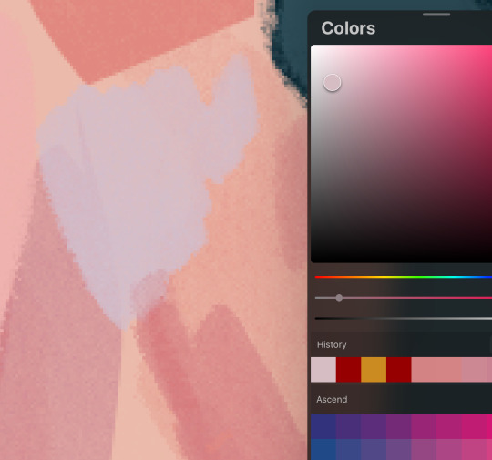
6. so I can’t really finish this piece because I have to start working on commissions again, but after an hour ish of blocking and blending, you should end up with this
and then if you continue and blend a whole lot more, you’ll end up having something more like this!
also, little lasso tool guide
to lay down the colors you’ve gotta click the brush, personally I like to freehand instead of color drop, but you do you
finally, if you aren’t satisfied, you can either 1) merge all of your layers and add a gradient map, or 2) merge your layers, duplicate your new layer, add a gradient map at 100%, and change your canvas blending mode to soft light + change the layer opacity. this’ll make your piece more vibrant and cohesive
#final disclaimer: you will not get these exact results if you aren’t at my skill level#art tutorial#sage’s art tag
72 notes
·
View notes
Text
BUGGIN-0UT CAS CRASH COURSE!
I have zero video editing/ recording knowledge so i had to settle for this, hopefully its still helpful.
REFERENCES
@ iamkimey, blkkstar, dravenonline
When I use references, I rarely aim to make the Sim look exactly like the actual person. Instead I tend to select my favorite parts or features from each picture. Sometimes I don't use references at all, and people's features just pop into my head. Either way, my Sims are inspired by real people 95% of the time.

------------------------------------------------------------------------------
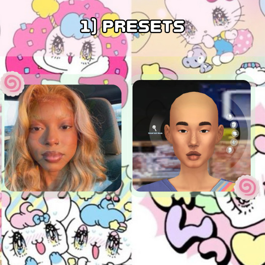
PRESETS
I loosely picked presets that were Similar to the reference I was using. I specifically liked the shape of her features and the fullness of her face, so that's what I focused on. Btw, I never aim to make it look exactly like the reference. I learned years ago that trying to make a perfect match is impossible unless you're using a face mask and As a perfectionist, it only sets you up for disappointment.
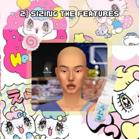
SIZING THE FEATURES
I think we all notice how cartoonish vanilla sims are so to make my sims look more "realistic" I do not make the features any bigger than the default size and I usually size the eyes down 1-3 bits, average being around 2. For the rest of the features I try to balance it out so that they're all cohesive.
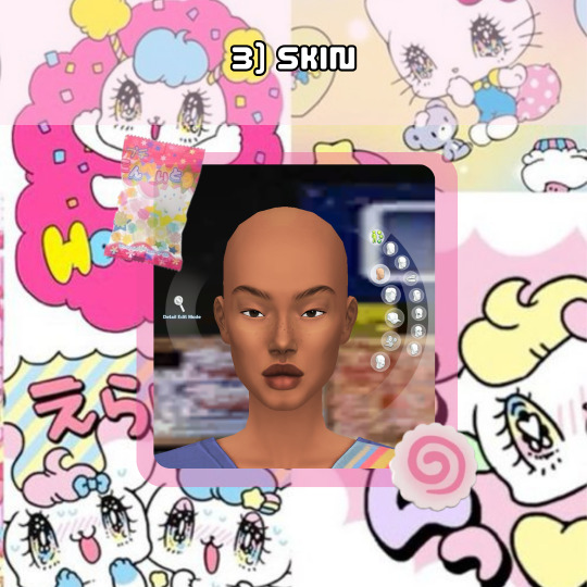
SKIN
When selecting a skin tone, I usually click around randomly or aim for something similar to the reference. In this case, I chose a tone randomly and adjusted it using the color slider.
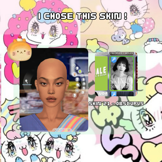
For this Sim, I desired a fuller, more plump face, so I searched for a skin that went with that look. Now, here are my most important tips! As you can see, this skin is an "Asian skin” but I'm not aiming to make this Sim Asian, I just chose it because it lacks cheek shadows. Skin details are important to my Sim making process and I cannot stress this enough! I plan to show the difference it makes by creating two different Sims using the same base at the end.
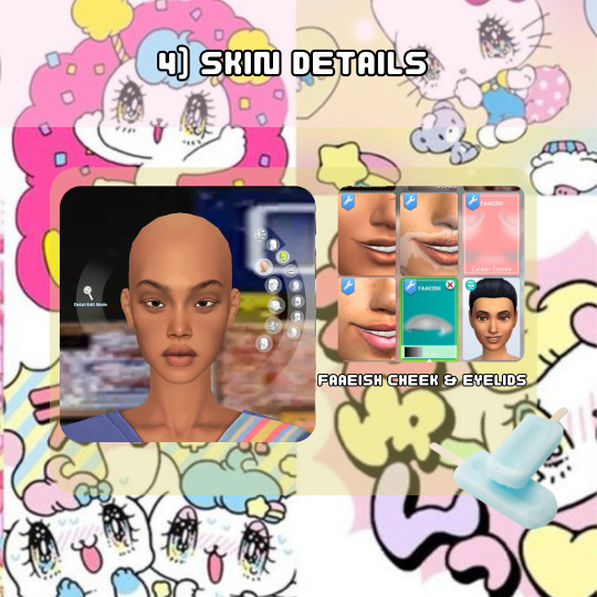
SKIN DETAILS
When it comes to skin details, I always use the Faaeish cheek and eye details. I've been using them for years and they significantly enhance my Sim creations. I use a variety of skin detail overlays, especially those that include skintones, because they offer more texture and definition. However, many overlays don't align well with the base game skin tones and I generally prefer non-overlay skins because overlay skins often have grey undertones for black skins. For this reason, I recommend using the color slider mod.

MINI COLOR SLIDER TUTORIAL
Here's an example of how I use color sliders to match my skin details. It helps if you're already familiar with color, hue, tone, etc., but it's not difficult if you're not. The swatch here is the closest match I could get in terms of color, so I'll use saturation, opacity, and brightness to achieve a closer match.
1) If it appears too orange, adjust the brightness and/or opacity.
2) Darkening the brightness helped, but it still looks too orange.
3 & 4) I reduced the opacity to slightly less than halfway, and it worked.
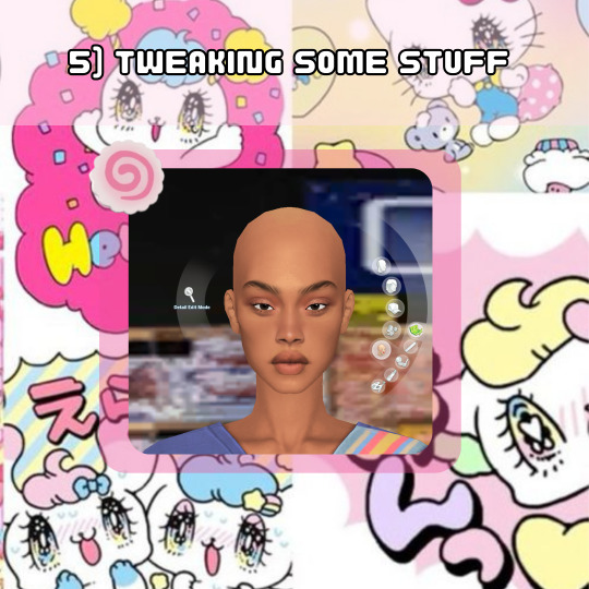
TWEAKING SOME STUFF
I adjusted the nose and lips to align with the fullness of the face. Remember when I mentioned cohesiveness earlier? Well, I'm going to dive into that a bit more right now. I chose a softer nose overlay to appear less defined and more rounded because a sharply defined nose on a full face wouldn't be as harmonious (although it can still work and look beautiful for sure). I added a lip overlay for fullness for the same reason. I then tweaked the face to ensure all features were facing neutrally (straight across, not up or down turned) to maintain consistency, because what???? cohesiveness blah blah blah!
MAKEUP
Time for the fun part! I also use makeup skin details, which are superr helpful with giving my Sims distinct looks. This is how I can use the same base skin for almost all my Sims and still make them look unique. For eyeshadow, I use eyelid overlays and adjust the color using the color sliders, following the same method as before :). In the images, you can see the difference between using no makeup skin details and using them. You can also see the difference in lipstick before and after using the color slider. OH! I also included heterochromia, inspired by one of the references!

EYES
I always reduce the size of the eyes and go for ones with less shine to achieve a more "realistic" look. Since these were the only Heterochromia eyes I had, and they leaned towards the cartoonish side, I made them very small and raised them a little to appear less round and more oval-shaped. I also adjusted the brightness to darken the eyes, creating more shadow for the sclera, which I feel like enhances the realism…Then ofc I make them a lil cockeyed, cause whats a buggin-0ut sim if the eyes dont look like they tryna see each other.

SKIN BLENDING
This is a new method I've been using to add texture to my Sims. I utilize the color slider mod to blend skin overlays, non-overlays, and facemasks. For this Sim, I chose the Tems skin by ClaikSims, mainly because she fine BUT !, it was a good choice because the spacious eyelids matched up perfectly. When doing this step, I recommend not setting the opacity too low, it can make the skin see through, which makes double nipples, eyebrows, belly buttons, etc. If this does happen, I honestly just use the body and cleavage masks by Sims4Melancholic.
DO WHATEVER YOU WANT!
The final step! I revisit my references and see what else I can include, such as their hair, makeup style, aesthetic, and so on.
I didn't change anything except the makeup. I just wanted to show an example of how much it can change a Sim, regardless of the skin used.
….
And that's my CAS process! Nothing too crazy…i think???. I've been doing the same routine since 2018, minus the sliders ig.
If you have any more questions, feel free to ask. I dont say much, but I do not bite, またね!
#b0:tutorials#forgot to mention i also use HELLA sliders and use them at every angle#Didnt realize i did all this until i had to break it down step by step#AND DONT ASK ME FOR SHIT ELSE!#nah im jp#i am a proud gatekeeper tho so you probably wouldn’t want to frfr
21 notes
·
View notes
Text
Worm and Costumes, pt. 1
(pt. 2 here!)
I’m really starting to admire how well the costumes in Worm say so much about their characters. You’d obviously want this, since a good superhero/villain costume is always supposed to represent a person well, but this can often get lost due to aesthetic trends or demands for matching outfits or a need to have a level of asthetic cohesion for a group. Worm uses its “no themed teams” rule to let costumes’ symbolic meanings shine, giving us a masterclass in how to use costumes both for blunt metaphor and subtle characterization.
Looking at each of the core Undersiders’ in turn: we have Brian’s motorcyclist outfit, almost unrecognizable as a costume if not for the sculpted skull visor. This makes it feel almost ad-hoc; you could picture Brian starting out his criminal career, not having anything to protect his identity, so just putting on his helmet and calling it a day, modifying it with the skull once he had enough money from jobs. It helps sell how the Undersiders started out as something approaching goons-for-hire, with its leader looking like the souped-up version of the comic book henchman wearing their usual duds plus some clown makeup/animal mask/whatever they need to nominally fit their boss’ theme. At the same time, like Brian, it’s incredibly practical—it protects the head and provides great anonymity while still being intimidating. The way it seeks to intimidate, too: the intense machismo of the outfit, motorcycles and skulls and darkness, all of which is ultimately just hiding him, is really indicative of his specific damage. Grue’s outfit is the most imposing, but it also is the most covering, the most padded, the one that reveals the least of its wearer.
Then we have Tattletale’s domino mask and purple/black skintight bodysuit. Its probably the most stereotypically “comic book”-looking costumes of anyone, just loud and colorful and completely impractical for crime, which works with how much she commits to the cops-and-robbers theory of capedom. The out has very little obvious utility—it doesn’t even seem like it would do a good job at hiding her identity!—but that itself is a statement of confidence. It says “I know you’re not gonna do any lasting damage, and you know I don’t need to get physical to hurt you.” And the seeming failure to protect her civilian identity is misleading: yeah, she only has a domino mask, but its specifically designed to highlight parts of her face to suggest a whole different structure (not to mention her being meticulous about keeping different hair styles for her cape and civilian identity). It’s much like how Lisa’s seeming openness is a steel trap: she’ll delight in giving you all the details, and then you’ll end up blindsided learning “oh she’s only been letting us think she’s a psychic” or “oh Lisa Wilbourn isn’t actually her real name” or “oh she knew about my plan to betray her from the beginning.”
On the other end of the spectrum, we have Rachel’s incredibly minimal costume: just a cheap dog mask from the dollar store bin, worn with her civilian heavy coat and boots. Its brash, its crude, the effect worn together is more a slasher villain look than a supervillain ensemble. Its a nominal costume, less a nod to the rules than a thumbing of the nose towards it, which is appropriate: Rachel has no cape/civilian identity split, what with her identity and background being public knowledge, and she has the least patience for the cops-and-robbers game than any of the Undersiders. If she wasn’t reigned in by Brian and the others, she probably would have been in the birdcage or on a kill list by the story’s start. Its no wonder she doesn’t bother with the mask half the time; she has little understanding and no patience for the unwritten rules of the game they’re all playing. For her, its not a game at all.
In contrast, its clear from Regent’s costume that its all a game to him. He wears the carefree dress of some young prince out of a story book, what with his loose white shirt and silver diadem. His Venetian mask makes it seem like every caper may as well be a trip to the masquerade. It suggests a spoiled demeanor, undue confidence built from a privileged upbringing, while also hinting at a cruel and hedonistic streak often seen in the wealthy and aimless. At the same time, we find out quickly that his costume has a purposefully misleading exterior: his mask is padded, his loose shirt hides a bulletproof vest and his scepter doubles as a taser against the unsuspecting. Jean-Paul himself narrates for us how his tuned-out, playful demeanor lets him hide the more horrifying things he gets up to, and his costume similarly is used to paint over a man with more skin in the game than he lets on, ready and eager to strike out against the unsuspecting.
Most tantalizing for analysis, we have Taylor’s costumes. The way its initially presented (ooh, its grey because I haven’t gotten better dyes yet, I mostly just worked on it in the garage during my free time, I haven’t actually worn it out on patrol or anything) makes it seem slightly dinky and novice-level, and it is—as a hero costume. As a villain costume, it ends up working perfectly. It’s shortcomings as a hero costume just create more opportunities for it to work as a statement for the Warlord of the Boardwalks; just like Taylor’s shortcomings do the same. Her costume is too dour to be light or inspiring, so she uses it to seem inhuman and frightening. Her powers don’t lend themselves to easy takedowns of her opponents, so she opts instead for ruthless takedowns. Her costume can’t let her mimic the beautiful, statuesque features of heroes, so she leans in the other direction and becomes as unsettling as possible, covering her gangly body in an always-writhing mass. She’s not a great public speaker, so she speaks through her minions, or through a jittering mass of bugs in her vague silhouette, or she gives patient, logical-sounding explanations that make you hate her even as her arguments sit in your head like a tick, growing larger as you feed it your doubt.
The match between appearance and methods only grows once she adopts the Weaver persona. The grey-and-electric blue color palate is supposed to signal her adoption of heroism, and while the color scheme is certainly more approachable and familiar, it also lacks the warmer colors of the old costume’s yellow goggles. And one of the aspects of Weaver that make people want more time devoted to this portion of the story is how despite now working for the “good,” Taylor is at her coldest, holding her new teammates at arms length while working them to the bone. At the same time, she has her fingers in more pies than ever: she is taking on dozens of criminal operations and wearing them down with attrition, confronting new and terrifying endbringers on a much more frequent basis, and trying to line up as many pieces as she can for the prophesied doomsday. What better way to symbolize how much she’s juggling than literally giving her more arms?
And then there are the parts that just scream their meaning at you. How she finds the initial version of the weaver costume ill-fitting and generic. How she now has a beetle emblem facing towards the sky, but it’s actually turned upside-down from its old orientation. How she goes back to the Skitter costume whenever she has something personal to fight for, when the undersiders are with her in the fray. Its great. It’s loud, it has no trace of subtlety, it is yelling what it want’s you to take away. Just like the best costumes do.
(pt. 2 here!)
#worm#wildbow#parahumans#this might be pretty surface-level analysis#but it was fun to write about all the same#leo says#leo reads worm
408 notes
·
View notes
Text

Revisiting Reflectmon, a decade+ old OC.
Was talking to my friend about my TTRPG character, Mercutio, and we got to discussing fictional character digimon partners. The questions was odd for me because Mercutio was technically a spin off of a decade+ old digimon OC, Reflectmon.
We got to talking about how different the two characters ended up being, and I realized... I made that original design over 10 years ago with very few changes. I'm better at character design now, and should take another crack at it based on the original concept I was going for!
So here is a redesigned Reflectmon!I don't think I'd change there name, but if I were to choose a name now "Flectiomon" would work too. (Like reflection, deflection, inflection, etc.)
I've very please with how it turned out. I know some people might prefer the original, But I think what was lost from the original is still mostly present in the spin-off/spiritual successor TTRPG character mentioned earlier.
I'll leave some rambling notes below the post for anyone curious! (Warning. I repeat myself a lot.)
So the original Reflectmon was designed around 2013. (It might have been even earlier, however a lot of my early art work is unfortunately lost to time.)
I have a better understanding of character design now, and I wanted to make the new design more conceptually cohesive.
Here's what worked:
- Marionette + Ball jointed doll themes
- The mirror mask that emotes in fun ways like a TV screen.
- Eyeless face underneath that is a little creepy.
- More humanoid appearance.
What Could Be Improved:
- The devil tail was an x-men reference, because I really loved Nightcrawler when I designed this character, and the Mercuremon line were listed as "Mutant Type" digimon (haha). However, it is only vaguely related to the actual character concept (via shadow Seraphimon) and really didn't make that much sense by itself. I didn't want to removed it completely as it was good for the character silhouette. So I replaced it with a Marionette string that acts like a tail instead! We go more with the theme, AND we still have a sort of tail.
- The hat, while a reference to AncientWisemon & Wizardmon, went too far in a different direction. Now it references AncientWisemon's hat and Mercuremon's helmet more closely.
- Design was a bit busy over all and needed some toning down and streamlining.
- Pushed the Marionette + Ball jointed doll themes further with more obvious ball-joints and puppet-like aspects.
- Adjusted face and hair colors to have a more faux-porcelain-doll look that a lot of ball-jointed dolls have. They also now have a ball-jointed doll bowl cut.
- I don't remember why I put X's on the eyelids under the mask? I think I just thought it looked cool? My best guess is I was going for a "see no evil" thing since Mercuremon had a bunch of church stuff in Digimon Frontier, but I have no idea. Anyway those are gone now since they didn't help the design read any better.
- Other minor color adjustments to help with contrast.
Reflectmon, as the spirit of steel (a man made alloy), is supposed to be depicted as a toy made of synthetic material (as opposed to the wood spirit, who is made of natural material). This is why I wanted to really reference the look of ball jointed dolls, which are usually made of plastic, and can have a porcelain look. I'm over all happy with the new look!
#my art#DMFR#reflectmon#digimon frontier#digimon frontier rebirth#old OCs#chatters#Honestly making Reflectmon and Mercutio look less like each other is kinda nice too. Since they ended up being so different in my head spac
39 notes
·
View notes
Note
Might have asked you that before I'm not sure but. Do you have some sort of process for your redesigns?? What kind of stuff do you try and pay attention to when redesigning a character? I also wonder what is important to you visually when designing clothes? like, is there any type of shape hierarchy you try and go for? Also Where does your knowledge of clothes come from?
These ended up being many questions haha. Anyway love your redesigns, every one you do is like a little gift in my day!
those are all wonderful questions and i hope i can answer them (or even understand my creative process enough to give them)
There are two design choices I try to stick to, one is thanks to me playing hero shooters and that's recognizable silhouettes:
try to give the characters a unique shape or trait that even if you put them in different clothes or hairstyles, you can always tell it's meant to be them by that specific thing.
The other is, thanks to fandoms, i know people like making OCs or trade characters around if there's factions, so I like making "faction" clothing that's unique to a group of people, whilst still making each character wear it uniquely even within the group itself
lot of the designs are affected by what i SUBJECTIVELY perceive the character to be like and what style of clothing i connect to that kind of behavior, be it from real life experience or what just. flows nicely, i don't know how else to say it :') like there's difference between elegant or street wear, of course they can overlap, of course they have no dictating on what each of those means about each person, but good rule of thumb is that we dress to express ourselves on first glance (those that can afford to do so for whichever reason) so if you're daddy's little lawful good you're gonna dress differently than a bold punk. those are pretty basic thought processes, not much unique :'D
so sadly i think lot of it just comes from my subjective perception of who these characters are and what i could highlight about them. as for the clothes themselves, i don't even know really, character design- from clothes to size, shape, color to body language- is just something i always loved to do and wanted to do, be it for games, comics, or re-designed existing characters :') i used to watch fashiuon shows, went to art school where most are poor students that are very creative and pretentious, i changed my style multiple times during each chapter in my life, i try to meet variety of people that affect me and inspire me. i usually have multiple ideas for a look per character but don't want to put a pin on it until it just clicks for me. there are few of those clicks i've missed in my MDZS redesigns but were close enough that i posted it anyway, as i was too excited to share them :') still may want to revisit it though!
I'm so happy to know they did well though, it's something i've heard the most praise for from all of my art and i really wish i could follow up on it in more ways than just few more art of those looks. there's nothing that bothers me more than boring or not cohesive looks for a cast of otherwise interesting characters, MDZS donghua and CQL costume design were destroying me :') but it was enough to at least inspire me
thank you for this task ♥♥
27 notes
·
View notes
Note
would you be willing to make a tutorial, vid/ speed paint or step by step, on how you color? i'd love to know how you approach coloring, b&w or in color! you don't even have to explain, of that's difficult, i'd just like to see how you color & if you use multiple layers. or if you have any tips/ tricks for CSP or procreate? sorry, trying to study your art since i really love how you draw & color all of your pieces. ;w;
thank you so much 🥺💕 I actually share step by steps and videos over on my patreon but ive wanted to make a speedpaint video for some time now!! Since I haven’t been finishing any illustrations lately i don’t have anything new but!! I can share some old stuff below:

While i tend to change things up depending on the piece, I do tend to follow certain steps. If it’s line art, i’ll sketch -> lineart -> block colors -> shade -> usually multiply a cool tone -> add color accents on top of that and if i do a more flats heavy piece it’s basically the same minus the line art.
I tend to (try) to approach stuff with values first so i usually go for greyscale, maybe a gradient map (i’m trying to figure these out lol) and then mess with colors after


sometimes that leaves things more saturated or a little flat and it really depends on what i’m going for.
I do the same for when i block colors in first.


I feel that i’ve actually been struggling with trying to get my colors just right recently but! I do try to think about how i can improve them when i’m working. For example, having warm vs cool tones to create focal points. Trying to keep palettes cohesive so there’s only one or two accent colors. I also like to add pops of complimentary colors to line art/accent spots to bring more attention to them. At the end of the day I kind of just… do things at random though and it’s all about working with a piece until it just feels right. Sorry the information is a bit more vague then anything but studying other artists is a thing I do a lot, as well as just doing general studies! It helps teach your eye what colors go together, why you like certain color combos, and how to focus on the shapes more than anything 👍
Also here’s a time-lapse if you’d like to take a look! There’s a lot of flashing at the end as I swap through colors so be warned but! the general gist of my workflow
hopefully that at least answers a question or two but if you have more feel free to ask! thanks for reaching out !!!
19 notes
·
View notes
Text
As a distraction to Sad Thoughts™, yesterday I drew a concept design for Little Helper.
For context it's a shiny Chandelure for a pokemon story I'm crafting as a pick me up. Just scroll on if you aren't interested in me rambling about that and world building lol


Light and dark background for clarity. They're supposed to look like they have little fangs both above and below the lip... Thingy, but it didn't translate well in the end I suppose.
I like the overall design even though I'm not the biggest fan of shiny chandlure's color scheme. Went for 'expensive chandelier your grandmother paid a professional to clean instead of getting a Swiffer'. Don't get me wrong, I see what they were going for, but I think it could have been a bit more interesting. Like silver metal as well as the flame and body color? Idk, it IS better than Lucario's shiny though.
Why the hell they chose yellow I'll never understand. I'll die a hater for that one.
Anyway! I figured it would make sense that a professional breeder, breeding their own pokemon to assist in their business, would go out of their way to 'create' a stunning specimen. A sort of flex. And I liked the idea of stained glass. Might redraw this to lean more into that and maybe play with the colors more. But I wanted a basic design first, which I did! Hopefully it's cohesive before I start playing with the colors lol
Since I don't have such plebian concerns like budget or complicated pixel designs to translate into workable 3D art or whatever, I can just... Make it a Thing™ that Pokemon actually have some damn variety. I mean, we get that every so often in the anime, but it's a notable exception to the norm. And I get why, don't come at me, I promise I'm not bullying the 90s anime for not handcrafting hundreds of subtly unique designs for every instance of a species we ever see.
The point is that I don't have that problem. So if I want minccino to have different fur colors aside from Normal and Shiny, I can do that. Easily. Same with everything else. I doubt I'll go so deep into the weeds it's stuff like, this is a mixed breed Squirtle with lovedisc or magikarp in there. They'll generally still follow Pokemon logic of favoring a specific parent with maybe moves or abilities passed down if they're different species. Common, out in the wild Pokemon will look pretty typical usually. But once you get into domesticated Pokemon, they tend to look notably different. You can always tell if a pokemon was wild caught instead of carefully bred.
Just different color or fur/scale/claw shape. Minor adjustments depending on how bred they are for traits. IV bred pokemon will likely have unique traits that make it easy to spot deliberate breeding. Even if it's not that big of a difference. Like Sneasel having tufted ear... Feather things instead of a smooth leaf shape. Or spots in their fur. Stuff like that.
It seems like a fun detail.
Also decided where Edna, the main OC is from as well as some little details like being really used to having Pokemon groom her from a young age. Her parents have minccinos that are pair bonded and groomed her every morning. So Yolky, and eventually the rest of her team, tend to play with her hair.
Gets a little dangerous with Toxitricity, Danny (short for Cadenza), cause he puts down poison in her hair but she gets a bit immune after a while as well as the rest of the team lol. It was either poison braids or static frizz everywhere. Gotta compromise somehow!
It'll be fun to play around with established designs for a more unique look!
#mittens rambles#pokemon fanfiction#pokemon oc#i really enjoy the creative fan designs but it would be A LOT to keep up with so ill limit to mostly aesthetic lol
5 notes
·
View notes
Note
hello…. can i ask how you make your pretty themes and icons…? i love them so much and i want to learn how to do something like that too. i hope this question is allowed…
how do you make themes feel so cohesive? whenever i use emojis they look so out of place…
omg nonnie hiii!!! ofc I would be happy to answer this for you :D please feel free to ask for more tips/advices if u need anymore help <3
so usually, I free style it! but ofc there's a bunch of other factors that go into it! here's what I usually think of when I'm creating my themes (not in order, please don't feel pressured to do it exactly like how I do it)!:
color scheme: OKAY. this one is the SECOND MOST important factor out of everything. sure, you can put random colors in, but the more complimentary the colors are to each other, the more visually pleasing they are to look at! this also includes your blog background/accent color. it doesn't have to match, but make it appear complimentary to your pinned post theme.
symbols: symbols are the non-emoji's in my post like these [𓂃, ♰, ໒꒱]. these also compliment your blog/tags if placed/used right! there's a bunch of symbols you can use, and I'll link them HERE & HERE. (If you do not know where to find the copy and pasted symbols, look at your clipboard if you're on Android or use the paste option as soon as you copied it on Apple <3)
images (banners/dividers): i recommend searching up dividers on tumblr IF you a) don't know how to make one OR b) you want to play it safe, but for banners, go to pinterest! REMEMBER!! your images HAS to have the same color scheme as the rest of your blog to make it visually pleasing. one good divider/banner maker i can think on the top of my head is @/cafekitsune! although I personally never used her banners/dividers, people I see/know have!
BE CREATIVE: LET YOUR IMAGINATION RUN FREE !!!! this is the MOST important factor of creating themes. most people have basic themes because they don't seem to find any reason to decorate it and that's a-okay! but in your case, you want to decorate it so the best form of advice I can give you is to get into the mood/zone! listen to music or whatever that'll help you get into the groove! (I usually listen to music that aligns with the theme I'm making [doja cat theme: doja cat songs] lmaoo)
but honestly, the best way to put it is "trust the process" bc at the start it looks like ur getting nowhere until you look at the finalized version and think "wow this actually looks good"
OTHER TIPS:
DONT BE AFRAID TO EXPERIMENT WITH COLORS/EMOJIS/SYMBOLS!! it's usually how I end up with my themes looking the way they are lol
don't rush the process it can take hours 😭 (2-3 max, 30-1 hour min for me) what I mean is the stages you have to go through, picking what you like and don't like — eliminating until the choosen photo/color/emoji/symbol!
LOOK AT OTHER BLOGS FOR INSPO!!! I used to always look at other people's pinned post/themes and mixed it all into one original theme! but ever since 2024 started I've been free styling it on my own lmaoo. IF YOU FIND A BLOG THEME YOU RLLY LIKE AND WANT TO USE, CREDIT THE ORIGINAL USER !!!!!!! ASK IF YOU CAN USE IT AND RESPECT THEIR DECISION IF THEY SAY NO (meaning don't use them as inspo, find another one).
heehee hope this helps in some way <3 don't hesitate to ask for more of my help :D 🩷
4 notes
·
View notes
Text
Emmylou Harris - Songs & albums that are in my soul
So for her birthday, since I don’t focus on her solo career as much as it deserves on my blog, I wanted to make a list of my favorite Emmylou albums and share my personal “best of” playlist made for the occasion. I think her talent in creating a cohesive record with its own unique vision as (mostly) an interpreter of songs is severely underrated, but she’s consistently proven to be an album artist first and foremost and all of these are the perfect showcase of that. Do yourself a favor and go check them out now!
5) Roses in the Snow (1980)
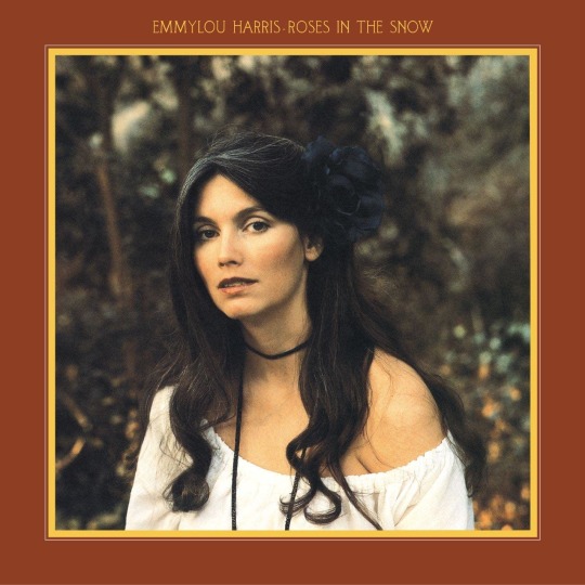
Going Bluegrass, baby. This album might have my favorite backstory. Story goes that, despite her quick rise to fame as a country star, some critics had bashed her for not being “traditionally country” enough (ikr, what a surprise), so she just made this spectacular bluegrass infused record which was also a smash hit. If this isn’t iconic behaviour, I don’t know what is.
4) Blue Kentucky Girl (1979)
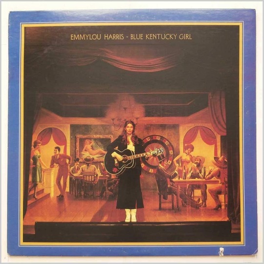
This was a bit more of a slow burner for whatever reason, but I have grown to love pretty much everything about it and every single track. Perhaps her warmest and prettiest sounding record, without ever going over into cheesy territory. Nothing but tasteful, exquisitely arranged and performed good ol’country music with the usual array of special guests to die for.
3) Pieces of the Sky (1975)
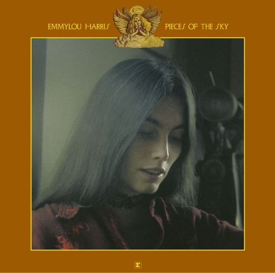
Emmylou once said that learning that Gram had died was “like falling off a mountain” and the only thing she could think of was making a country album almost in his memory. She ended up making two in 1975, but the first one was truly unforgettable. True to her promise, it’s hard not to hear the silent presence all over Pieces of the Sky. He’s the canyon on fire in Boulder to Birmingham, he’s “the one who made a queen of a simple country girl” in Queen of the Silver Dollar. He’s in the duets they once had or the songs he played her (Sleepless Nights, Bottle Let Me Down, Coat of Many Colors). And just like that, a star was born and Gram Parsons’ spirit lived on.
2) Quarter Moon in a Ten Cent Town (1978)
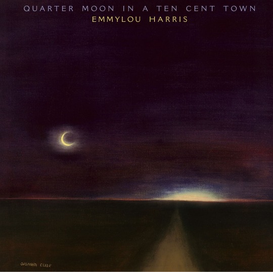
I love everything about this album. Starting from the cover and title, courtesy of Susanna Clark. It opens with the double punch of Easy From Now On/Two More Bottles of Win which alone would be enough to make it a favorite of mine, but then it goes on and every track just keeps hitting it out of the park. Perfectly balancing more mellow and upbeat songs, her voice glides through each one now with the confidence and control of someone who’s entirely tuned in with their own instrument and at the very peak of their power.
1) Luxury Liner (1977)
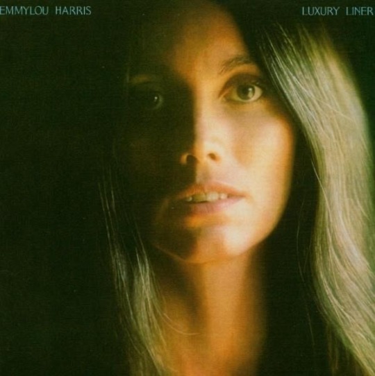
Now I have talked about this album time and time again so it’s no secret what I think about it, but I will never get tired of hyping it up. It’s the one that truly catapulted her career into stardom. It’s the moment she completely came into her own and made it very clear to everybody, starting with herself, who she really was. It’s country and it’s rocking. It’s underground music gone mainstream without losing any of its authenticity. It’s outlaw country gone Nashville. It’s playing by her own rules and staying true to what she learned and where she came from. It’s one of the greatest country albums of all time, if you ask me.
Playlist: https://music.apple.com/it/playlist/best-of-emmylou/pl.u-mJy88LDtzmxLDKe
12 notes
·
View notes
Text

🎶 Muse hairstyles explained 🎶
Musa's Enchantix bewitched me, it entranced me, it seduced me with it's gorgeous hair. I have given into my deepest of impulses and now her hair is ever so slightly blueish purple. It's barely noticeable, nobody touch me, I have absolutely no regrets. I love it so much she's so pretty. As for a like, cohesive style. Musa's hair is only down at fancy events, as she very heavily seems like someone who doesn't like having their hair down. That's about it. Idk if there is a theme to these, they're all things that she'd super wear, they're usually twin hairstyles, and thats it. Though I find it really interesting that Musa's fashion is usually heavily on the more masculine tomboy and comfortable side, but her hair is always ultra feminine and styled. I think it's such a good cute bit of characterization. She's a girlie your honor
Anyways on to the individual styles
Short hair: My beloved short hair pigtails Musa. I love her. Drawing her short pigtails was always super hard before I just stopped trying to make them stick up like the way she does in the show XD. Also this is the type of shirt Musa wore in the second chapter of my Rivusa fic, and I got really attached to it. It's so cute!!! And it matches her vibes! Love
Long hair: I've made it clear that I'm not a super huge fan of Musa's long hair but honestly, it's not her long hair's fault. It's the fact that everyone else has long hair mixed with the fact that s4 on use this as an excuse to competely erase all of Musa's tomboy fashion traits. Like?? I'm sorry, I didn't know my favorite character was "snarky Stella lite who likes darker colors". Anyways, eventually I came upon the way to fix this, which was to give her a fuckin undercut!!! Hell yeah!!!! It's both super feminine like her original pigtails but with a alt twist that protects her from her distinct personal style from being erased. I love her undercut so much!! I picked a undercut specifically because it looks the most feminine and Musa tends to be super femme in her hair and I didn't wanna tamper with that, and she of she puts her hair down she can cover it up for a more classic look that she's sometimes fond of. It stikes a good balance between both of her styles me thinks. Bonus my redesign of her s3 outfit. I feel bad saying this bc I don't like it all that much. Like the weird not sleeves and the sweater dress with pants...not my thing. Idm it all that much, but it both looks like a really warm outfit, but also like she'd be cold at the same time? I just gave her an oversized button up shirt dress. It's still pretty alt, esp with those colors, and fashionable! I really like it. Also, yes, she also got more piercings when she went to get her hair lengthed. She deserves them <3
Loopies: Tbh, while s5 will own a small piece of my heart and soul for fixing the myriad of crimes s4 committed against Musa, I never understood why they used the bun hairstyle instead the twin hairstyle they had right there for her pajamas?? It would of been in much better keeping with Musa's original style??? Anyways I've swapped those, so not this is older Musa's classic hairstyles. Her twin hair look slowly gets more and more mature looking :)) with a bonus jersey shirt she stole from Riven
Baby Musa: pre season one Musa!!! She's in her skater girl era, with her ultra short low pigtails so they don't get in the way of all the helmets she wore. I imagine as soon as she started living by herself she chopped off her hair as teenagers tend to do, she didn't wanna try ultra short hair in front of her dad and worry him lol, and then shes slowly letting it grow back to see what length she likes the most. Idk if she cut it this short or if it was shorter originally. This experiment ends up telling her that she likes all hair lengths on herself lol. She's rocking big shirt big pants fashion in this pic btw, for the vibes. Originally all of these drawings of music only had a lobe piercing, and something about the way I was drawing her was driving me mad. Eventually I realized I needed to show her getting more piercings as she got older lol. Seriously I was agonizing before I put more piercings on the other Musa's and suddenly everything clicked
Summer look: I love her classic s5 hair sm ok? I had to include it somewhere. Her hair is still up and it's still feminine, but with the overwhelming amount of feminine from her outfit the bun not being too feminine works in it's flavor as Musa's original style hasn't been thrown in the trash SEASON 4. I turned it into a summer look, with that one red crop top form her stock art. She looks so ready for summer fun, gosh I love her. She has my second favorite pair of earrings I put on her here, which is a shame bc you can't see them xd, curse her bang—BACK!! BACK S4 SIDE SWEPT MUSA BANGS!!! BACK YOU FOUL BEAST
Cozy Musa: Yeah this is her hair from the second movie. As much as I dislike so much about it from the non senseical plot, lack of continuity, writing, voice acting, Skloom getting engaged for the second time, and really everything but the satisfaction of Erendor becoming a full villain, the gowns the girls wear, and the super Trix, uh. I really like Musa's hair. It's unique and funky, and it's something she'd totally do. The outfit wasn't all that bad, I'd even say it was better than her s4 camping outfit, until you notice that she's wearing socks OVER her shoes and I remember that the designers are either geniuses or the the enemy and I should never trust them too much. Anyways I decided to pair this hair with a more casual look bc it's a bit too showy for hiking, but still chill and causal enough for going out in a chill way. Like a super chill date, or shopping day. Something to spice up a otherwise boring outfit. And ya know I had to include a cropped hoodie somewhere!
School dance: Musa puts her hair down, once. Part one, short hair version. I imagine Musa usually very much dislikes having her hair down, but I'd willing to tolorate it for the sake of a really cute outfit, and I think this outfit is deserving of the occasion from short hair Musa era. Bonus a metal earring that I'm just now realizing looks like a sword earring. Love to see it
Eraklyon ball: Musa puts her hair down, twice. Part two, the famous version. Gosh I love this outfit so much, like her s2 dress will forever and always be my favorite, but this one is so elegant. I had a lot of fun with her hair piece, and fucking around with her bangs instead of just making them side swept again. Unlike Stella, I don't think Musa would ever go without bangs lol. This is my favorite earring btw. It's so cute and classy. V fun, this one has my favorite bangs swell
Gala attendee: Musa puts her hair down, trice. Part three, not really. This is based off of those high low dresses I saw from s6 that I only remember because they gave Musa a hat!!! >u< one of the few things s4 got right, yess Musa loves hats!!! Give her a hat!! So I included the orange and purple colors with the top design in principal bc it was the only dress that gave her a hat. This time I gave her the smaller pigtails with her hair down, and asymmetric slide swept bangs. Tbh those images of later seasons Musa with this hairstyle in the ugliest way possible (her pigtails are so much shorter than the rest of her hair that she must of specifically cut them and I hate it, I hate it so much) kinda made me dislike this hairstyle, but I still had to include it bc despite the crimes it's still a quintessential Musa look. She is still a cutie and I love her
40 notes
·
View notes
Note
If I have to be honest, Life is Strange True Colors fandom is the least toxic fandom of them all. Everyday, I keep seeing the same arguments from the LisSubreddit and Listwt, usually by the same group of people (whom I won't name - chances are, they might be on tumblr too and could be reading this too). Such as ship wars, which are the best endings, and let alone same insults everyday like "max flopfield" or listwt starting shit and being triggered over petty reasons or over nothing. But this is what happens when you're in the small fandom dedicating to Life is Strange, I know we're all desperate for new contents. So am I, but why use the same takes that'll cause unintentional or unnecessary drama for the sake of something new? I miss the old days when we're only writing fanfictions, drawing fanarts, or coming up with ADORKABLE headcanons :(
I get what you mean, and you’re right. The lack of new content means that old discussion (more like argument topics) get rehashed over and over. Social media like Twitter and Reddit tend to create their own echo chamber as the loudest voices drown out more nuanced takes and those people become too discouraged to continue (I unsubscribed from the LiS subreddit ages ago and I never go on Twitter). But nostalgia can be deceiving; the fanbase was more active in 2015 so there was more fanfiction and fanart, but on the flip side the ship wars were at their worst and LiS1 was the subject of awful online vitriol just because the protagonist was a teen girl. I still remember the downright nasty Pricefield vs. Amberprice ship wars in 2017 and the relentless hate (and racist reactions, but I won’t go there rn) that LiS2 got in 2018. Nowadays it’s like LiS2 never existed and it bums me out, even if my feelings on the game have soured since 2018.
But I’m gonna change the subject, because I was so interested in your wording “the true colors fandom,” because I think that’s a larger issue within LiS: the internal divisions within the series and the separate “mini fandoms” for each game. It’s sadly true that fans of LiS1 are rarely also fans of 2 because there’s so little overlap. This series has has a weird trajectory from the beginning, because it’s clear that LiS1 was always meant to be a small standalone story that achieved runaway success and spawned a prequel by another studio, and then DN suddenly had to figure out how to turn LiS into an anthology series. But the very specific, unique, and unprecedented (for its time) style and cultural impact that LiS1 had simply cannot be replicated twice. As it stands, the dead parents, queer characters, supernatural elements, and indie soundtrack simply aren’t enough to keep these games feeling cohesive and like they are set in the same universe. And as such, they never attract the same fans back to the next game. Not to mention the spin-off content has been kind of lukewarm: I stopped reading the comics and it seems like everyone does not want the TV adaptation to happen.
Adding onto this, discussions about TC fizzled out disappointingly fast because it’s a shorter game with a safer, more conventional plot. The characters and main ships are the least problematic than they’ve ever been, the game is almost squeaky clean with its political correctness, and the choices are never controversial. The thing is, that leaves almost no room for discussion. I think Alex’s parents had a lot of potential for their choices and how they affected their children, for example, but they’re barely in the game. TC kind of reminds me of Tell Me Why, actually: a very safe, careful, small game that was meaningful in the moment but one that people move on from quickly.
Anyway, thanks for sending this message, it’s nice to have a LiS-related ask again.
#anon#answered asks#lis#listc#lisbts#lis2#life is strange#life is strange 2#life is strange true colors#life is strange true colours#life is strange: true colors#life is strange before the storm#lis before the storm#pricefield#amberprice
40 notes
·
View notes
Note
Hi, I hope this is not a weird question but, could share some fic writing tips. I want to start writing iwtv fics and I have a few drafts started but I'm having such a hard time figuring out how to make a cohesive story that is compelling. Every time I read back my writing I just hate it and it doesn't flow nicely and it's discouraging.
Hey dear!
Ohhh, congratulations on wanting to start down that road! No, I'm serious, writing has enriched my life so much, but it can be... quite daunting as well. 🤗
Also, I feel terribly flattered and... a bit scared... I'm not quite sure whether I'm the right person to ask, I sometimes feel I'm a bit weird in this regard, but... here goes. 😅
Start with a sentence. I know this may sound weird, but I usually reach for the scene and try to imagine it as in a movie or show, how would you start that scene. What would you see, what would someone say. Is there an introduction necessary? Do your readers know immediately what you're showing them, or do you have to explain? Try to put that down. And then...
Follow your story logically, one sentence after the other (it doesn't matter here if you jump around writing, just that the sentence before has to fit the one after.) Logically may seem weird again (we are in a creative spot after all^^), but characters are bound into their universe and behaviors, right? Those aspects follow rules - use them. For example, for IWTV, we have Lestat's backstory that informs a lot of his actions - and that Louis and Claudia do not know about. That is a rule for him, a restriction. It informs his actions. Same goes for the show racial context, Claudia's age (of course) etc, etc.
It helps me to "hear" the characters. Like, when I write dialogue, I literally hear them talk in my head. I conjure them. The cadence, the accent. And again, there's rules to that, what would they say, what wouldn't they. And why.
Leave a lot to the imagination. Especially while writing fanfiction gives you the freedom to just... skip details. (I do like to do it in original fiction, too, I think it frees the story up, and when we read we fill out the gaps with what we know...) Your readers already know the story, the show, the characters... let them come with their own mental image for them and just build on that.
Your characters will tell the story. And they will sometimes do what they want. (Brains are weird^^). If you want them to go where you want to, you will have to have a strong grip on them. Or... alternately, you can just follow where they go^^. Like, I have that one Naruto fic, right, "A change of color". When I started that monster (it's 560k, finished), I had a vision of the starting scene... and the end scene. I knew where I wanted to go. I never knew that it would take me 1,5 years of continuous writing to do so. But, I knew it would take a while, so I commissioned art for it, to fix those scenes in my mind. And let my brain do the rest. Use your subconscious for that. I usually put notes down so I don't forget where I want to go and let them reach those "on their own".
Use emotions. We are emotional beings, so are "they". Figure out what makes them behave as they do. Try to bring that across without spelling it out. This ties in into the "logical" of earlier, but can be more painful to conjure^^.
That's... my two cents. 😅
A few things to you especially *hugs*
You say you have a few drafts started - that means you have ideas. That is so exciting?! You could run them by someone if you're feeling unsure, but your mind obviously wants to tell a story. Wohoo?!
Don't try to go in with the pressure of making it compelling or cohesive, or whatever... just write that idea down. Get it out. Often, beta readers are a very good idea though *laughs* (though I usually only have one in events 😬) - maybe find a discord server to join and discuss your ideas, and ask if someone feels like looking over your story? If you don't like to discuss your ideas beforehand, that may not be ideal for you though.
Flow is something that comes through practice I think. And I'm often not happy with mine either. But, again, try to write logically. If Louis does one thing... what would then happen. How would he feel, what would he do, how would Lestat (assuming you write Loustat here, but just replace the names otherwise^^) react. Usually it clicks into place for me like that.
And, last but not least. I was terrified, when I posted my first fic on Ao3. "Baptism". It's full of spelling errors, too, lol. I haven't fixed those in the online version (I did a book version a while back with the whole series that came from that, and I fixed that, but not the posted one.) Being shit-scared before posting is normal. (It does get better though, eventually imho)
You know why?
Because writing is a journey. It may not seem like it right now, but writing will be a companion, it will develop, it will change. You will hate it, you will love it, and sometimes you have to force yourself to go through it. But it's worth it^^, no matter whether you write a smut PWP, or a coffee shop slow burn.
So... just write. Write that most intense idea down, the one that's been bugging you to get out, and post the f***er. Get it out :)). This is your story. No-one else can tell it like you do.
#asks#writing#iwtv#interview with the vampire#hope this helps nonny!!!#also we neeeeeed more iwtv fics :))#go have fun with it!!#writing tips#ask nalyra
16 notes
·
View notes
Note
Welp, my brain’s gonna be on FIRE 🔥.
ULTIMATE RANDOM QUESTION TIME PRT. 2: Do you know those pictures/moon boards that you have on your fanfics? Like the pictures at the top of the titles? I’ve always loved those and I wanna know, how do you make them?
Ooooo what a fun random question! 🥰
So, for a while, I did banners for my fics. And for those, I would use Google. So for LOHLDOW, I searched "little girl reading," and for OMG Roommates, I think I first searched "roommates," but I didn't like the results, so I think I ended up doing "couple moving." But I would always add "Twitter header" to the end so that way Google would pull images that had that more banner sizing.
Then, I would open up the PicsArt app, and sometimes, I would mess with the sizing more, maybe crop it. But I'd add a filter over the image using the "effects" option until it was to my liking, and then I'd add the fic title as text. Sometimes, I had to use the blur tool and blur the image beneath where I want the text just so the text is more legible (I did this with the Wonderland banner), but yeah!
But, of course, recently, I've made the switch to fic moodboards, and for those, Pinterest is your best friend. I usually just search for things related to the plot of the fic and then collect images. So for Regency Cassian, I searched "Regency romance aesthetic," and got all the pictures I wanted from that. That was probably the easiest moodboard I ever made. Lol. But for one of my new WIPs (a little peek behind the curtain here), I searched "werewolf aesthetic," "witchy aesthetic," "werewolves," and because Nessian are magically bound by marriage in this fic, I also searched "handfasting."
You can also search for the couple too! Like "Nessian," "Nessian aesthetic," and even "ACOSF aesthetic" to get like Nesta and Cassian and couple type photos. I have a whole heap of those saved for moodboard use, and you'll definitely notice a lot of the same ones used across many a fic author's moodboards lol. There's just not that many long haired men aesthetic photos, ya know?
But anyways! You want at least 9 images. If you have more, then you can swap as needed if you decide an image doesn't work the way you hoped.
But then it's back to the handy dandy PicsArt app! I use the square collage feature, and I have my border set to 3, but do whatever makes your heart happy. I add all my images, and usually, there's one or more images that are a bit too HD or the colors don't quite match the rest, so PicsArt lets you add filters to individual images in collages and I'll use that to sort of soften and get it to feel more cohesive.
When it comes to arrangement, I personally like to mirror. So, for Werewolf Cassian, I have the handfasting photo in the center then "Cassian" in the top right corner and "Nesta" in the bottom left corner. I have wolves bottom center and witchy top center. I have Nesta's magic top left corner and Cassian's claws bottom right corner. I just like how that composition looks that way. But you find what works for you and makes your heart happy!
Then to finish it up, I usually like to add a filter to the whole finished collage. Nothing crazy, but it just gives that final cohesiveness of all the images in my opinion. Save that final image and bam! You're done! And if you're anything like me, you'll probably waste hours laying in bed and making these 😇
Sorry this is a whole ass essay, but I hope this helps! 🥰 also, just for you, enjoy the werewolf Cassian moodboard below the cut for reference 😘
2 notes
·
View notes
Text
my current favorite thing to do when i need to Make Something but can’t get myself to work on current projects is what i like to call
~*~* the randomized picrew cast game *~*~
i’ve been making a handful here and there and i thought it was fun so i wanted to share my process in case anyone else enjoys the idea :) screencaps and such under the cut, but to tempt you, here is one of the casts + premises i’ve come up with using this game!
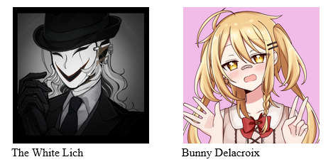
[image id: two picrews beside each other. one depicts a person in a black suit with a scary smiling mask. the other is of a white girl with blond hair in pigtails and yellow eyes. wearing a feminine dress. the masked character is labeled The White Lich and the girl is labeled Bunny Delacroix. /end ID]
Premise: Bunny is an ordinary middle school student, until she accidentally walks through the wrong door and ends up in a horrific world of nightmares and monsters. Luckily, she is rescued by a strange and terrifying being known only as the White Lich. Bunny doesn’t know the Lich’s reasons for rescuing her, but with no one else to trust in this terrifying world, she has no choice but to travel with the silent masked being as she tries to find her way home. /end ID]
So! First thing I do is I go onto picrew. Then I go to the Discovery page.
Then I either open up a random number generator, or I grab some dice, whichever I feel like doing at the moment. The discovery page usually has 12 recently created picrews at the top of the screen so I focus on those.
First, I randomly generate how big the cast is going to be. 5 is my hard maximum; at max it gives me enough characters for a protag or two, 2-3 supporting characters, and an antagonist, or a larger slice of life cast, whatever. But more than 5 gets unwieldy, so I stick to that.
Ok, so for this example, I’ve decided I get 3 characters in my cast. So then I roll to see which of the twelve most recent picrews I’ll use. I usually use a different one for each character for some Variety, but you can do them all in the same picrew too if you want to make sure they all have the same vibe.
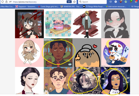
[image id: a webpage displaying 12 different picrews. The 6th, 11th, and 12th are circled. /end id]
Okay so I’ve got my picrews! I open up all three and start with the first one.

[image id: a picrew page. There is an image of a person looking at the screen, and below them, a series of faceshapes to chose from. /end id]
picrew link
Now I go through each page, one at a time, and use my dice or random number generator to decide which option to use. For example, on this page, I’d roll a 4 sided die (or use a number generator) to pick a face shape. Then I’d roll a random number for a skin tone. Keep going until you have a finished Guy.
Question: why not use a built in randomizer button?
Answer: Most picrew don’t actually have a randomizer option, despite the die there. I think it’s an opt-in feature. And when they do, you end up getting this kind of weird vomit character that doesn’t have much cohesion. Doing it one page at a time lets you see the character develop as you go, and it also allows for the following home rule I gave myself:
The home rule: you get up to 4 vetoes on anything added to the character. If you don’t want your character to have three different hair colors, you can veto it. If you don’t like an accessory, you can get rid of it. If you don’t like the chosen hair color, you can change it. But you only get 4 changes. You can use them as you go, or you can finish the character all the way through then go back and make up to 4 changes. I do both depending. This helps the character have some design cohesion.
The other potential home rule: if you’re using dice, you won’t always have a dice that matches the number of choices in a picrew. So sometimes I’ll let myself consider any number higher than the available options as a “you get to pick this one” option.
And that’s it! You go through all of your chosen picrews until you’ve got some Dudes.
here are the other two picrew links i used
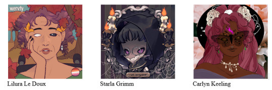
[image id: three picrews. the first depicts a light brown skinned woman with short, curly red-brown hair and some faint wrinkles. She has no pupils or irises, and one of her sclera is black. She has yellow leaves in her hair and is wearing eyeball earrings. She appears to be in a wheelchair and is sitting in an autumn background. The second is more of a chibi style. It depicts a person with brownish-grey skin, dark magenta eyes, glasses, and black hair with short bangs. They are wearing a black cloak that pokes up as though here are animal ears underneath, and are surrounded by a scene of candles and spiderwebs. There is a plaque beneath them that says “not anyone.” The third is a darker skinned woman with reddish-magenta hair and eight brown eyes like a spider’s. She is wearing her hair in an intricate ponytail with big white flowers in it, and seems to be wearing a large black witch’s hat. She has a low cut dress and a string of pearls around her neck, and there is a butterfly against her face that is partially see through like glasses. There is also a glowing pink symbl on her forehead. The first woman is labeled Lilura Le Doux, the second is Starla Grimm, and the third is Carlyn Keeling. /end id]
And this is where the fun part begins! Now that you have your characters, you get to figure out what their relationship is to each other, and what kind of story they might have to tell. Looking over these characters I’ve made, I actually feel like they have a lot in common design wise. There’s something witchy and magical about each of them, and they all have some features in common that makes me think they could be related. Maybe sisters?
So my story for these ladies would be something like this:
Though close as children, it’s been a long time since sisters Lilura, Starla, or Carlyn have seen each other. Each proud, powerful witch is busy with their own jobs, their own relationships, their own goals and dreams, and over the years, they have grown apart in more ways than one. But that all changes when Lilura stumbles across a plot by the witch elders to bring back a dangerous beast in order to bolster their waning power. Now on the run, Lilura will need all the help she can get. With her sisters as her only allies, the trio must race against the clock to foil this dangerous plan and make it out alive. But with tensions rising high and their old squabbles about magic, life, and how each should be lived causes them to butt heads - can they get along long enough to save the world?
And that’s the random picrew cast game!
At this point, you can do whatever you want. Write a story about your new characters, draw some pictures of them, make a comic, or be like me and just squirrel them away in a vault to probably never think about again <3
But it’s a fun little creative exercise, and I thought it was worth sharing! Obviously, all of the rules are malleable. There is no right or wrong way to do this.
If y’all do it, please share your new casts! I’d love to see them or hear if this is useful to you, or if you have any suggestions for how you make the game work for you :)
16 notes
·
View notes
Text
Art Update
Hi, guys! I haven’t blogged about my art journey all month, so I wanted to give you guys an update. I feel like I’ve sort of been in a funk, but, at the same time, I’ve gotten better? Anyway. Here are some highlights from the past month. (Confession: I’m only showing you the ones I’m happy with. I’ve actually made a lot of art that was rubbish too. XD Oh well. All part of the process, right?)
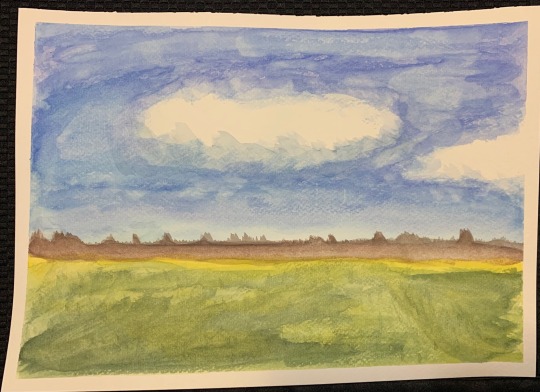
Above is a watercolor landscape that I did along with an instruction video series. I’m happy with the puffy cloud in the center. I also like the colors of the grass in the foreground and the mountains in the distance. In the video, the instructor said they were supposed to be a line of trees, but mine are mountains because I said so. I think mountains look better at the end of a vast grassland.

I also started doing acrylic. I think I’m kind of getting the hang of watercolor, but acrylic makes more sense in my head with putting the darker colors down first and adding the lights and highlights on top of that, so I’m giving it a try.
I have a video series for acrylic painting too, so in one of the lectures we painted an egg in black and white. For my first acrylic painting and not knowing what the heck I was doing, I think this turned out really well. I really like the shadows.
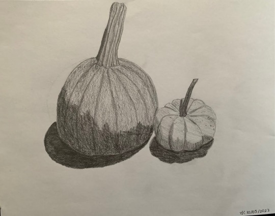
I’ve also been doing a lot of drawing. Below are two pumpkins. They make me happy. The real ones are sitting on our dinning room table now looking all festive for the autumn season.
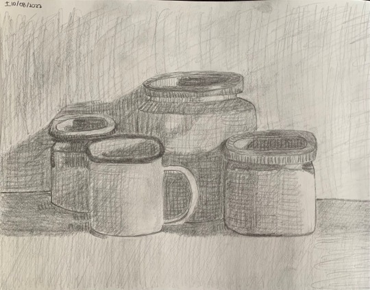
So, the below was actually a picture in a book I got from the library on drawing techniques. It’s three different ceramic kitchen jars and a coffee mug. It was featured in the lesson on hatching and crosshatching. I thought it looked cool, so I tried drawing it. It turned out really well! The image in the book is probably copyrighted, so I can’t show you a reference photo. You’ll just have to take my word for it that I did a good job with my reproduction.
It’s funny. It doesn’t look like I drew it. I feel like it’s too early for me to have a distinctive “style”, but when I look at the below, it’s obvious that this image didn’t come out of my head. So I must have some sort of basic, cohesive elements that characterize my work. I have no clue what those could possibly be. XD
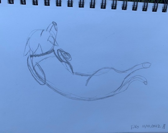
So, I’ve heard about this thing called “gesture drawing”, but I’ve never learned how one goes about doing it. ^.^; Below is a quick “gesture drawing” I did of my daughter Eiko as she was lying out in the yard. (Yes, she does lie with her leg sticking out in back like that. She also only eats lying down. She’s a strange, beautiful creature, and I love her.)
I tried to do one of my son Noiz too, but he didn’t stay still long enough for me to complete anything. XD
Lastly, here is the final project I did for my drawing class that just wrapped up. It’s my ocarina (dark blue), a tea mug (a slightly darker shade of blue), and a blue and white porcelain bowl containing three clementines. The colors are really pretty together. It doesn’t come across in my greyscale drawing, but know that I thought about the colors when making the composition.
The drawing turned out pretty okay. It’s a lot bigger than I usually work, so the size was a challenge. Looking at it after the fact, there are a lot of little things that I would finesse some more, but I kind of just worked on it for a few hours, got tired, and said, “Good enough. I’m going to bed now”.
There are things that I’m really happy with about this too. The mouthpiece of the ocarina looks really good in person. I also like the way the top of the tea mug turned out as well as the handle. The reflection of the bowl of clementines in the mug also looks pretty good. I think the right-most clementine turned out well. I had a little trouble with shading. It’s so hard for me to shade light, but I think the right-most clementine turned out well.

At the moment, I’m actually taking a portrait painting class. XD I’m super new to acrylic AND portraits, so I’m way out of my depth, but the instructor is very nice and supportive. (She’s the same one who did my drawing class.) All of the other students are way more advanced than I am, but that’s okay. We’ve only had one class, and I’ve already learned a lot. Maybe I’ll share my portrait with you guys at the end of the class. If it’s not too embarrassing. XD
Thanks for reading! <3
#Drawing#Graphite#Watercolor#Watercolor Painting#Watercolor Art#Acrylic#Acrylic Painting#Acrylic Art#Mikau's Art#Still Life#Landscape#Gesture Drawing
9 notes
·
View notes
Last Seen Blogs
wilted-woman
what if we kissed in the middleschool comic picrew

themindline
TheMindLine

karipapsempit
Untitled
christoffersenmorris87
The Life of Roman 924