#cause the crt texture
Photo
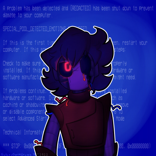
Had to get a Robot Grian in here, one because I love technological creepy stuff, but also because I just. Wanted to share my design for him. Since he got updated when I updated NPG’s design.
(reblogs with tags/comments are appreciated. thankyu. I’ll put an unfiltered version under the cut)
#hermitcraft#hermitblr#robot grian#roby#tw eye contact#tw bright colors#tw eyestrain#cause the crt texture#ask to tag#germdraws#germ draws
42 notes
·
View notes
Text
So I haven't watched Spy Kids for probably 20 years? It came out in 2001, I never saw in theatres, but my stepbrother had it on VHS. I remember watching it several times when my step-mum and father first started dating but never after they moved into a house together, which I think cannot have been any later than 2003. The podcast How Did This Get Made just got me to watch 2004's Sleepover staring Spy Kids' Alex Vega, and it had me going 'man, I should rewatch Spy Kids, a film I used to love—hell I should watch all the Spy Kids movies because I've only ever seen the first and Robert Rodriguez is a director whose work I want to dive into' and since its 2023, with a little bit of effort I can easily do that. (Also, I always thought, based on a vague knowledge of their similar poster design, that Spy Kids 3D and The Adventures of Sharkboy and Lavagirl were the same movie, but apparently not! Also, Sharkboy et al. had a 2021 sequel? That was popular? And is getting its own sequel? Will have to investigate.)
Thoughts on the opening ten minutes of my Spy Kids rewatch:
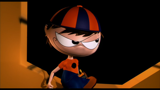
This production logo is so ugly it causes me physical pain. I hate this boy with his Kate Moss arms (Miraculous Ladybug arms, for you youngsters out there), his ugly beanie, and unbearable smirk.
Also, the telecine weave on the production logos is very noticeable, they're bouncing all over the place and it got me idly musing as to when more modern image stabilization techniques simply took that away. Not that we really noticed in 2001 because even with auto-tracking, gate-weave and other playback artifacts were just accepted as a given on your eight hundred pound convex CRT TV with 480 Ps of resolution that output enough radiation to kill grandma with a Jeopardy marathon.
Do young people know about VHS tracking, auto or otherwise? Does the above paragraph make any sense to them at all? Do they know the pleasures of laying your hand on a still-warm television screen and having your whole body shiver as the static discharge runs through your unresistant flesh? Kids today with their big pants and their blue-tooth hula-hoops and their fancy PSPs just can't understand.
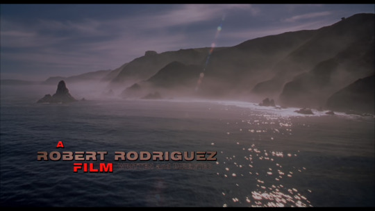
The opening shot of the movie is so under-exposed (or, more likely, over-exposed and then over-corrected in post) that Rodiguez's 'written and directed' credit is unreadable. You can see its blur to the right of the red 'FILM' there. It's so bad I thought there was something wrong with my copy so I... uh... found a new copy with a larger file size and it turns out that, nope, it actually just looks like that. Even in fancy 1080p this is just a terrible ærial shot. There's some fantastic shots and cuts in this film so to open with such a stinker is bizarre. Was it bad coverage that day, only one good shot in the can, did somebody fuck-up the film in the lab? I am curious.


Carla Gugino is so cute in this movie it's criminal. Not to be a lesbian but oh my god oh my fucking god. 12 year-old me was all about Carmen but adult me just wants 90 straight minutes of Carla Gugino in casualwear wandering around her lovely home smiling coyly. I would buy a BluRay player to own that movie on BluRay. I'd not picked-up that she played the mom on The Haunting of Hill House because she had long styled hair instead of this absolutely flawless textured pixie cut.
10/10, no notes.
I would like to spend an hour talking about the incredible tilework in that bathroom and nothing but the incredible tilework in that bathroom. I will update you if the film has any further shots of the incredible tilework in that bathroom but I fear it does not.
As as an aside, kind of furious that this film was not more influential in the field of home decor. Two decades of effing shiplap and cold grey suburban blandness—what if we'd given up on bloated cookie cutter micro-mcmansion shitboxes and instead gone all-in on brightly coloured Andalusian rough plaster and stonework? What if we all had great tilework in our bathrooms, like the kitchen sink in Howl's Moving Castle?
You know what I mean, you depraved tile nerds.

I don't want you to think Antonio Banderas is not also a total smokeshow in this movie.
Because boy howdy.
He's a goddamn hunk.

There's a four-second long shot of Banderas flicking this ring box along the coping of the Eiffel Tower balustrade, and all I can think of how hard it was to get to get that box to stay in a straight line, how completely frictionless the box must be (did he shellac it?), and if his marriage prospects would have been ruined had it—in all rational likelihood—gone flying off the railing and smashed into the Champs de Mars.

You know you're in for a rollicking good time when the helicopter perfectly slices-off the stone heads of the two statues, but it's the padre giving the benediction while attack choppers go roaring over head that gives you chills.

A particular shout-out to this lovely unnamed bridesmaid on the left here who not only takes 'putting a parachute on the bride' in stride but looks gleeful and fabulous doing it. Where's her movie?
In 2001 we really thought computers were going to be cool and fun instead of machines that sold our personal lives to corporations and gave children crippling anxiety disorders.


Carla Gugino has a track built into the floor so that her vanity-computer chair can slide backwards across the room so she can have face-to-face chats with her husband. From this we learn two things: 1) she does this so often she's automated it for maximum efficiency, and 2) Banderos, in an ordinary desk chair, never attempts (or knows better than to attempt?) the reverse.
To be continued?
#spy kids#spy kids rewatch#antonio banderas#carla gugino#robert rodriguez#alexa vega#shiplap#interior design#andalusia#tile work#howl's moving castle#miraculous ladybug#telecine#films#weddings#spies#kate moss
116 notes
·
View notes
Text
Daedalus
KR spoilers for "Chariot of Gold." Kitt and Bonnie come to terms.
Bonnie arranged her tools. She organized them alphabetically, by size, by function, and by color, rending the functionality of her garage asunder. A plain black box leers at her from her work table, unmoved, sealed, and untouched. Within it lies her reason for working, secondary only to the binder of papers stamped with the Foundation Knight.
The sound of tires shuffling against metal draws her attention. Her grip loosens on the handful of ten millimeter wrenches she'd been fussing with, causing them to slide to the floor with a clatter. She flinches at the sound.
"Bonnie."
Tires shuffle again, back and forth, giving the sleek black car nestled in the rear of the semi-trailer a nervous appearance. She watches his steering yoke waggle back and forth through the windshield.
"Yeah, Kitt?"
His wheels should be chocked in place. He trembles violently in time with the semi as it crosses over broken asphalt. Her skin crawls with the unseen gaze of the car.
"When will we be installing the new component?"
He speaks softly. The gentleness is not lost on her, so different from his confident inquisitiveness. She can tell he doesn't want to overstep-- but what is there to overstep?
He didn't do anything wrong.
"…I'm sorry, Kitt," Bonnie says.
"You didn't do anything--" Kitt starts.
"Yes, I did, Kitt. And I know you've forgiven me, and I'm very grateful, but it's still-- it's hard, Kitt," she wrenches out. "I never want to do that to you again."
Before she can think better of it, she pulls the metal tabs keeping the box together. The lid falls open, revealing a knot of plastic that she delicately pulls apart. The component within-- a security upgrade.
Kitt pops open his door without a word.
Bonnie lingers at his side.
"I'm scared, too, Bonnie," Kitt says, just as she pulls open the door handle.
His cabin, usually so inviting and familiar, terrifies her. Only the gently pulsing light indicating his voice encourages her to slide into the driver's seat, already warm to the touch.
"But I know it will never happen again. It was not your fault. But the logic loop may never go away."
Bonnie swallows against a lump in her throat. Her hands shake as she unseals the control panel beneath Kitt's dash, lowering it slowly to the floor with her fingertips. Here, everything. The three daughter cards that support the microprocessor.
They'd shocked her as she ripped them out.
"You can do it, Bonnie," Kitt says gently.
"You're scared?" She asks.
Kitt's CRT monitors warm up slowly. Instructions and blueprints coax her into beginning the arduous process of modification.
"It is the only… reasonable… conclusion to the kind of processes I have been experiencing. I do not relish it, nor do I enjoy it. Emotions are beyond my scope. What use is a car that gets scared? Angry?"
His voice is a soothing vibration from the speakers. Her fingers memorize the texture of hard plastic and high-end alloy as she draws measurements and ideas.
"It's okay to be scared," Bonnie murmurs.
There's a brain inches from her hands. She's lobotomized him once. There's a person she can cut holes into and solder new connections and thread wires through. Blood and wine and electricity flows beyond her vision, a nervous system only she understands.
And is that not the issue?
"We can be scared together," she says.
"I have found that things are easier to face with a friend," Kitt says thoughtfully. "But is it alright that I feel?"
Bonnie breathes in, holds it within her chest.
"Always, Kitt."
34 notes
·
View notes
Text

Day 18: Computer
This section of the cave had a completely different feel to it compared to the last areas we were in. The walls were smoother and much more circular and uniform. Small boreholes in the walls and ceiling became more and more common as we went along. My first thought was that these tunnels were dug by some large burrowing animal like the giant ground sloths once did back on Earth. What we found at the end, however, was something indescribably more impressive.
As we continued down, we began to stumble across thick black plants sprouting from the cave ceiling. I assumed they were a mysterious type of cave vine or perhaps the mesenterial filaments of a large terrestrial polyp breaching down from the surface. These roots were all the same uniform diameter, the same diameter as the bore holes. However, when I went to take a genetic sample of the roots, my equipment found no trace of organic matter. I knew I had to investigate and so I hesitantly and cautiously cut open one of these vines.
It was much harder than I expected it to be. The skin of the vine had a similar feel to unglazed ceramic in both texture and hardness, however it was flexible like a dense rubber. Once opened, what I saw Inside were thousands of flexible glassy rods, no thicker than the width of a hair. This was like no other plant I've seen so far. It was at that point I realized what I was observing couldn't have been a plant, it was too uniform and wasn't made of any organic matter. That's when the impossible realization began to dawn on me. Could this be a construct; some sort of device built by the Kyurral or maybe even something built by what came before them.
Lily and I quickly followed the path lined with these occasionally jutting cables to see where they would lead. The tunnel was long and the lack of any marking on the smooth walls made it tedious to traverse. After a few hours of quick paced travel, the tunnel began to open up. The cables disappeared into the walls and ceiling and the tunnel ended abruptly, dumping us into an unfathomably immense underground chamber. The room absolutely hummed with energy and life. Thick pillars made of glistening bluish-green glass splined with oily, iridescent metals held up the room. We watched as blinding pale blue arcs of electricity jumped between these pillars which caused patterns of individual glassy filaments within the pillars to glow and spread their light further down.
Swarming overhead were thousands of bat-like rays. They clung to these pillars like swarms of flying lumpfish, and seemed to flock towards these beautiful and powerful electrical arcs. I was fortunate that these rays had little fear of me as I was able to walk right up to them and observe them up close. While I first thought they may be the same species that we encountered before, the body plan of this ray is distinctly different from the fallen one we found a while ago in the icier parts of the earlier cave system.
These rays were a dull blue-green, similar in color to the glass rods, with a trim consisting of a pale-blue bladder filled with some type of buoyant gas. All 4 of their eyes point downward which, I assume, means they spend a majority of their time flitting about with few to no predators coming from above. Their bodies are covered in lighter stripes, most likely to break up their silhouette while flying together in a swarm like zebras. Funnily enough, their stripped bodies and their irregularly square body plan reminds me of ancient CRT static from primitive monitors back on Earth.
The strangest thing about them would have to be their mouths. They have no teeth, they don't even have jaws, rather, their mouths are built like one large suction cup. They use this specialized mouth to latch onto the glassy pillars for a purpose unbeknownst to me at the time. When they detach, however, I could see a thin arc of electricity jumping between the pillar and their mouths. This led me to a highly improbable theory which is only fitting within this highly improbable room.
The Kyurall don't possess the same technological advancements that we have on Earth. They are more technically akin to Europe's medieval period, relying on wood and stone for building with limited use of metals. They don't yet seem to have a use for electricity as their agricultural methods, all done by hand, produce an abundant surplus of food and all labor can be effectively done manually with little to no overflow of demand. However, we did have a run in with a particular Kyurall who mentioned an ancient people that seemed to possess an unshared fondness for the technological.
One of the things they mentioned was a ‘thinking ore’. An ore, I assume from the translation, meaning a lump of metal underground. The same ore which, according to Kyurallian history, was being fed metal to constantly grow. It's very possible that this ‘ore’ of which they speak wasn’t being fed, it was being built. It's possible these pillars aren't simply decorations, they could be what this room is built intentionally for. These pulses of light and arcs or electricity aren't just beautiful, they're functional. I believe it's possible that we are standing within the heart of an ancient computer system built by the precursors to the Kyurall.
That theory led me down the path of another theory; specifically one involving the rays. They seem to latch onto the side of these glassy pylons as if they are waiting for the electricity to flow through. Their mouths, being the odd shape that they are, as well as the arcs of electricity visible when they disconnect from the pillars leads me to believe that these animals are electrovorous. While an animal that subsists exclusively on electricity is mere speculation on Earth, I've seen far weirder adaptations on Atria to at least humor the possibility.
Unfortunately, things do become worrisome if this theory is true. Much like on Earth, the majority of the food web of Atria is fueled by sunlight. However, there are always exceptions. Microbe that utilize chemosynthesis form the base of the food web within the biosphere of hydrothermal vents. And, more recently, entire ecosystems have been discovered within the buried nuclear exclusion zones that are fundamentally fueled by radiotrophic fungi. If this species of bladder ray is electrovorous, and it feeds off the power stored within this ancient machine, then they could very well be the bottom of the food chain down here. If this biome's food web is fueled by artificial electricity and not sunlight like I had hoped, then we may be well and truly stuck down here.
[End Transcription]
2 notes
·
View notes
Note
Oh boy, what do you think of the Silent Hill 2 remake trailer? I can’t speak for the other announced stuff cause I’m pretty basic when it comes to my appreciation for the series, but I do not care for the style change. There’s nothing wrong with the original’s graphics, and those FMVs in particular are still phenomenal! Do we really need to see every single strand of James Sunderland’s five-o-clock shadow?
I know the original source code was lost, and I know a game as old as SH2 should be played on modern hardware, but if Bloober are gonna remake it from the ground-up, I just don’t see a reason to make the new graphics so overly-polished, the devs of the original made the choices they did for a reason, it’s just detailed enough where each character has incredibly subtle details like Eddie’s dilated pupil’s and Maria’s slight stomach flab, but it leaves just enough room for your imagination to fill in the blanks.
I worry with these new graphics, it’s gonna be like those instances where some horror movies get so overly-remastered that you can see the imperfections that the film grain could hide. At the very least, why not recreate the FMVs to apply to the entire game? I think that could actually be interesting… so long as more of Team Silent were involved. I don’t know much about Bloober and haven’t played any of their games, but I hear they tend to have some major problems with their writing and horror.
We recently discussed Pathologic 2 as a great example of expanding on the original in a different way, but at least the original was a compromised vision so it makes more sense for a game like Pathologic Classic to be remade from the ground-up.
Am I coming off as too nitpicky with just this single trailer to go off of?
If anything you are being too tactful in describing the situation.
The current popularity of video game remakes is symptomatic of a creative crisis at the heart of the industry, as well of the average consumer's expectations from technology. Players have allowed themselves to be persuaded by the unfinished thought that the best path to revisit the classic games they grew up playing is to have them reworked to look modern and pristine; paying little or no mind to the fact that their perception of the original game experience will irreparably be altered in the process. Certain studios, on the other hand, feel much more at ease with the prospect of developing a new version of a beloved game whose known popularity gives them a risk-reducing safety net, while also bypassing the strenuous work of developing an original concept.
Just a few days ago in another comment exchange here, I repudiated the Bluepoint remake of Shadow of the Colossus, for me the foremost example of the perils this practice entails. To that, I would add that other atrocity that was the also recent Panzer Dragoon remake. I feel downright terrified by how the majority of players considers this to be entirely harmless.
Silent Hill 2 is a game from its time and for its time. I remember that the slight resolution upgrade seen in the XBOX edition already exposed the fragile seams that stitched it together. The aesthetics were designed with a CRT TV equipment in mind. As you say, this specific visual style doesn't lend itself too well to modern displays. Adding sheen to its dull textures compromises its entire visual identity. Increasing the detail of character models poses impossible interpretative challenges, leading to the result we saw in today’s presentation, where there is nothing left of James' original facial features to be recognized in the remake. Paradoxically, we’re expected to summon the memories of something exceptional and familiar, use them to fill the credibility gaps of some high definition ersatz that will, in its turn, consume them and replace them by lesser ones.
There was already enough information available to establish that Bloober was developing a Silent Hill project, namely the fact that a partnership deal was announced last year right about at the same time Tencent became a major shareholder for this studio. Their games are, for the most part, unconvincing. I played Observer and while it was fine as an independent project, it was clearly not a congruent experience. They also face-lifted it but a few years after the first edition, which I found suspicious, even though it’s their IP to do with as they please. The Medium isn't a complete failure, although it shows a poor lack of understanding of what constitutes horror in a video game experience. I never even touched Layers of Fear games because nothing about it seemed to deserve any attention. Although they are an already established studio, this will be their biggest project yet, with a potential target audience much wider than any of their previous titles. Nothing should distract us, however, from the fact that these are mere tradesmen foolishly attempting to recreate a work of art.
I will say that Townfall, by No Code, has the smallest margin by which it may succeed in taking the base themes of Silent Hill and working them from an angle that fits the studio's own artistic direction, freed from the pressure of making the game look identical to its prequels. Their other games, Observation and Untold Stories, are sufficiently unique and inventive for me to preserve moderate expectations that they may actually be in the process of creating the first dignified sequel since the release of 'The Room'.
12 notes
·
View notes
Text
Apropos of nothing I have suched mix feelings about video game remakes these days. Examples that fundamentally change the original game like FF7 Remake or the Resident Evi remakes are totally fine to me, but it’s when you pretty much get sold “here’s the original game again but with higher res textures and maybe some QOL updates” that I’m always a bit more huh. Cause on one hand, it’s obvious enough why we get these. They’re relatively easy to develop since most of the core work is already done. Games are taking longer to develop so a remake is a good way to hold down fans of a series while they wait. They sell well and people want them, it’s nice having all your games on one modern platform and not having to bust out the CRT and Gamecube setup or dust off your old 360 controller. And for series that haven’t had a proper new entry in a while it’s a great way to gauge fan interest and work forward from there a la Crash N.Sane Trilogy. Like the benefits are obvious! And hey, I’m someone that asks for remakes or remasters or whatever have you as well. Above all else it’s just convenient, you know?
But then the main obvious drawbacks are like. First of all, a lot of remakes are generally charged at full price, which just feels about as transparently “please give us bigger profits” as it gets. Pay full price, sometimes even more than the game originally launched for - just to get that game that already existed but again. And then there’s also just the creativity argument. It doesn’t take a genius to slap HD textures on a 15 year old game. Remakes aren’t interesting games because they already existed. We already know what they have on offer. The fact that “an old game but new” can end like a huge gaming conference or something feels kinda wild to think about, right? Persona 3 fans are about to get to play Persona 3 again but with a new UI and some other stuff but it’s fundamentally the same game as the one Atlus re-released on modern platforms like last year, and jesus christ that’s one hell of a con they got played for.
But then who am I to play a high ground here, as if I haven’t asked for and been excited for remakes of games from the literal last console generation that I already own and have played. And more than that, as easy as it is to critique the fact that the industry is just releasing games we’ve all played but again, some of us actually haven’t played these games! The remakes are an excuse to! New fans are checking out games they might not have had the chance to play otherwise and that’s absolutely a good thing.
Suppose just yeah, very multifaceted thing. I’d maybe say more but oops I have to go now byeeeeeeeeeeee
1 note
·
View note
Text
The influence of The Legend of Zelda on Mystic Searches

If you’re reading this, you probably have a well-worn memory of your first adventure through Hyrule. You were probably moved in some significant way that was nothing short of profound. The experience, and all that blossomed from it, may have even shaped your identity to some degree, not so dissimilar from past generations listening to that evocative album, seeing that mind blowing film, or reading that pivotal novel. In celebration of the release of Tears of the Kingdom, I thought I would share how the original golden cartridge (and its immediate sequel) radically impacted the trajectory of my young life, and how it impacted my upcoming NES game Mystic Searches.
I know that it was 1987, though I couldn’t tell you the month or even season. I was seven years old, and had somehow earned some significant good will in the eyes of my parents. As a reward, my father brought me to the stacked-to-the-ceiling aisle of endless adventures at the local Toys R Us (may it rest in peace). There, in an end cap display, was something provocative. The box did not sport the branded, black-box treatment, nor did it have an illustrative depiction of its game characters in some dramatic pose. Instead, its minimal fantasy iconography against the notable gold tint teased something new and different. It was, of course, the most expensive of the games (at half the cost of the system itself!), but apparently, I had done something worthy of this reward.
By the time we got home, it was night. I didn’t bother turning on the lights. I tore open the box. Pulling out the gold cartridge was excavating a hidden treasure. For a moment, I just admired the way the TV’s static shimmered off the reflective surface in that dark room, causing its subtle texture to come to life in a supernatural manner. I put the cartridge in my NES, pushed it down into position, and pressed the power button. For those that grew up with the NES as their formative gaming experience, you may recall that half-second of anticipation between hitting the power button and a new game’s title screen appearing. Most often, the player was met with a static image of some sort set against a mostly black background, some game choices (1 player / 2 player or the words “Press Start”) on the bottom two thirds, and a copyright line encroaching the border outside the title safe area at the bottom. I had played enough games that this is what my mind expected.
Instead, radiating from the small CRT, the entire room filled with a peach glow. The sun was setting over an animated waterfall pouring over monolith mountains, accompanied by a haunting, somber sonata that set the tone of what was to come. I remember being hypnotized as the sun finally set, the screen faded into darkness of night, and the music pushed with intent into the scrawl of minimalist lore that was just dense enough to allow my imagination to drip down into every crevice.
Before I had even pressed the start button, the direction of my life was altered. Even more than the enthusiasm for adventure upon which I was about to embark, the seed of something was planted that would come to define the next 35 years and counting. And maybe if you’d asked me at that moment, I could not have properly articulated it (I was only 7 after all), but the first ten seconds of the Legend of Zelda was all it took to flip a proverbial switch that converted me from passive player to aspiring, active creator.
From that moment forward, I wanted to create something that had that same profound effect on someone else. It became a dragon to chase. It became a fundamental purpose of life.
That sentiment only grew as I played through the game, and as I look back, it’s easy to understand why. Had we ever played a game before that point that was so large in narrative scope that it needed a method of saving progress? Had we ever played a game before that so deeply conjured varied biomes? Had we ever played a game before with such a diverse bestiary, as mechanically interesting as they were unique and iconic? Had we ever played a game before that rewarded us for exploration and experimentation rather than being so focused on the shortest distance to the end goal (who here bombed every wall and burned every bush in Hyrule)? So many of these attributes became core tenets of games going forward that it’s hard to imagine a time without them, but there is certainly a reason that so many who experienced this evolution of video games in real time hold this game in such high regard. I’d imagine it’s comparable to a memory of seeing The Wizard of Oz in color on opening night. If you only ever experienced the game after having played thousands of hours of its descendants (which would be the majority of games in your library), it may be hard to appreciate the radical steps. But for us who experienced it first hand, it was nothing short of magic.
I could run down a comprehensive list of things that still strike me as clever or brilliant even by today’s standards, but the list would likely be a common one that you’ve read a thousand times before. One subtle one that always stuck with me that I never see discussed was how much world the minimalist narrative could suggested. Considering the grand scope of three decades of memorable moments in the greater Zelda pantheon, one of my favorites is still a subtle, often ignored moment of narrative from the original that still resonates as brilliant to me. I remember walking into caves, meeting NPCs and shopkeepers, and getting lulled into the flow of that expectation. And then there was that one cave with the old woman, subverting all I’d come to know. She said nothing. She offered nothing. She just stood there, silent. Was it a glitch? Was it a puzzle? It was such a punctuation point that I remembered it for days as I grinded my way through the vast world. And then I happened upon a man who offered me a letter. “Show this to the old woman,” he said. And that strange cave encounter had been pronounced enough that I knew exactly what it meant. I returned to the silent woman and gave her the letter, at which time, she opened a potion shop. It was a simple trigger mechanic, but its implications set my seven-year-old’s imagination ablaze. Suddenly, six words and strategic use of a single 16x16 pixel sprite conjured volumes of potential narratives about the paranoid, desperate underground rebellion; a network of survivalist hiding in caves and communicating in code across the kingdom, mounting some last futile attempt to combat the overwhelming legion of Gannon (no, that’s not a spelling mistake, that’s the name of the antagonists as referenced in the opening crawl of Zelda 1). What was the old woman’s role in this? What was her relationship to the man with the letter? What did the letter say that would compel her trust? In my mind, I answered all of these questions with sweeping fanfiction. Time spent playing Zelda on the NES was more than engaging with a game, it was a constant creative workout. There was just enough framework there to serve as a skeleton for my own adventure. Link wasn’t the hero, he was the avatar; I was the hero. Link wasn’t saving the day; these were my personal accomplishments. Hyrule wasn’t the world I saw on my screen, that was just a symbolic reference like language in literature; the world was in my mind.
Not long after came Adventure of Link. There are very few who played this game in real time that have the same perception of it as those who only know these games in a retrospective manner. In 1987, it was brilliant. It was unique. It broadened the world and the lore. Entire towns had stories all their own. It was an RPG, but the battles weren’t random. You navigated a top-down map, but were pulled into vignettes of side-scrolling adventure. The physics and mechanics of actual swordplay against Iron Knuckles was exciting. Battling the Barba was intimidating. The downthrust attack was original and gratifying. Squaring off against your own dark shadow was thematic. It certainly was a different sort of affair, and by this point so many games had been released to compare it to that it didn’t seem as revolutionary as its predecessor, but I still consider it to be a great and important installment.
I never beat Adventure of Link as a kid. I’m sure I got close. But the creative seed that these games had planted soon became a budding vision for a game that took the best of both and combined it all into a NES masterpiece called Mystic Searches. While my young mind had no capacity to understand the logistics involved, I wanted to create a top-down adventure game in the style of The Legend of Zelda, but with the added platforming mechanics of Adventure of Link (2.5d gameplay). I wanted open world exploration like The Legend of Zelda, but sub-quests that helped you meet characters and earn rewards like Adventure of Link. Essentially, my underdeveloped creative mind wanted to synthesize two of my favorite games into a derivative hybrid that may as well have been The Legend of Zelda 3 on the NES, but with wholly original characters.
Some of you may know the story from there. That ambitious little 7-year-old kid and a friend dummied up all of their clever ideas, stuffed a bunch of illustrations in a box, sent them to the address they found in the back of Nintendo Power, and begged Nintendo to send them the stuff they needed to make the game. It was sent back with a form letter and lost to time, only to be found by a much more capable adult me who was feeling nostalgic for my old Zelda cartridge. And thus launched my adult mission to build that game for the NES almost 30 years later, culminating in the documentary The New 8-bit Heroes, and ultimately being responsible for hundreds of new homebrew games due to the NESmaker tools that were inadvertently created as part of our building process (read: Nintendo never sent us the stuff to make our NES game in 1987, so 30 years later we built the stuff ourselves…).
Mystic Searches, the moniker that was buried with those old childhood illustrations, has been a creative project for a decade now. I’ve worked on it through marriage, the purchase of my first house, birth of two kids, two major hurricanes, a 1500 mile move, two major career changes, a global pandemic, the deaths of friends and loved ones…a lot of life has gone into it. And all of the modern creative sensibilities that come from creating against the backdrop of adult life have visible roots in those formative experiences playing The Legend of Zelda.
I get asked often how close the game is to those drawings. Obviously, there was a creative challenge inherent in translating concepts from the mind of a child through the eyes of an adult (not to mention, 30 years of gaming vernacular and experience with storytelling). But there were certain aspects that were so pivotal, I could not abandon them. Mystic Searches is a 2.5d adventure game as I always imagined it to be; a top-down perspective with a z-coordinate jumping mechanic as first conceptualized. Mystic Searches does have an incredibly rich lore (complete with supplemental novelization, art book, and comic series), exploring vignettes in an open world to help create a real sense of a living world. It has a broad bestiary with large and ominous boss battles. And of course, it would never satisfy the ambition of that 7-year-old kid if it didn’t run on a cartridge on real hardware. The influence is clear. While Mystic Searches has developed an unfathomable amount since its inception, there is no doubt that it owes its existence to those experiences playing The Legend of Zelda, and I reflect on that as I get ready to celebrate a return to Hyrule in Tears of the Kingdom. While it’s far from a clone, it is perfectly fair to call Mystic Searches a love letter. With release of the cart scheduled for the fall and a Switch port coming not long after, I hope that once players are finished exploring the new Hyrule adventure, they’ll take their first step into Myrinda in Mystic Searches, and I hope that for those who had similar transformative experience with that original gold cartridge, our wooden special edition cartridge can make them feel like a kid again with a fraction of the same transformative effect. At that point, even if it’s just a few people, and those people also go on to be compelled to create something awesome because of it, I’ll consider the years spent working on this project a complete success.
Check out MysticSearches.com for more details.

0 notes
Text
2021 Summer Painting Challenge: July 17
July 17th? Geeze, what happened? I take a break for like a weekend and next thing I know more than half the month is gone! What happened?
Oh, yeah. Bideo James.
I mean, it wasn't just that, I had a fair bit of house work and work work to catch up on, and my AC broke which left me largely unmotivated to do anything at all until I could replace it, but yeah. What free time I've had so far this month has gone to these two games, one a remaster of a game I loved from the PS1 era, and the other a moody atmospheric 2d platforming metroidvania with a soulsesque feel.
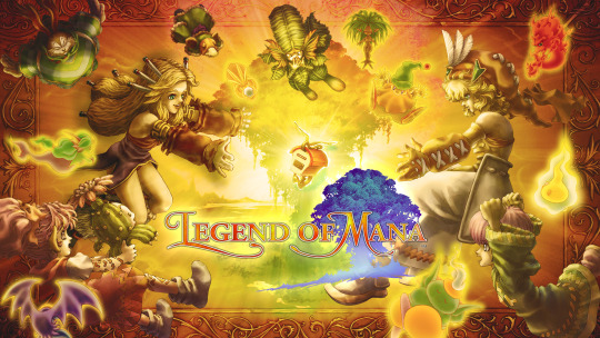
Sadly, Legend of Mana doesn't really hold up. Oh, sure, it still looks good - once you get over the janky mismatch of the clearly-designed-for-CRT pixel art sprites with the crisp, high def, water-color style background art. And the remastered music sounds great. But the combat gameplay was pretty bad by the standards of its own day, and nowadays it's just... I'm sorry, past me, but it's just aweful and absolutely brings down the rest of the experience.
Like, yeah, there's so much to do, so many systems to engage with between skills and special attacks and smithing and pets and spell crafting and robots, and absolutely none of it matters because the core combat system it's all layered on top of, with its sludge-like movement and extremely passive enemies, just doesn't give you any reason to engage with any of it. There's an option in the remaster to turn off the enemy battles altogether, but while the game's various story paths aren't terrible for action rpgs of its era, they're not strong enough to be an entire game in themselves. Such a shame, really. I was hopeing it would be something I could recommend to @retphienix, but while I'd love to hear his thoughts on it, I just can't recommend it as worth the time investment, despite how lovely everything /other/ than the gameplay is.
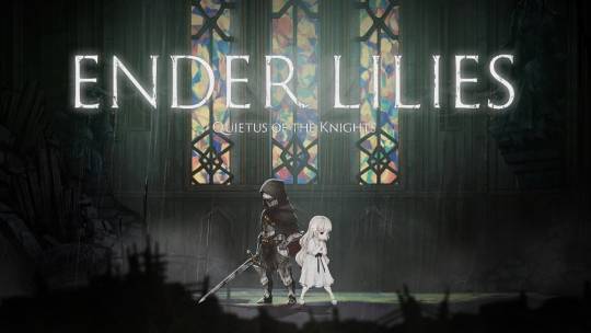
Ender Lilies on the other hand is actually pretty solid, and it did draw me in enough to 100% it. It's no Hollow Knight, IMO, but for fans of the genre it's absolutely worth a deep dive while you're waiting for Silksong. I'd say it's more on the Castlevania side than the Metroid side, but I honestly haven't played enough Castlevania games to say that with confidence. I do wish it was eventually a bit more clear on some basic details of the premise. Unless I'm mistaken, the game never really explains the 'Rain of Death' that is a core aspect of the premise. Like, does the rain cause the blight? Spread it? Activate it? The blight itself is emanating from the abyss deep underground, how does it get into the clouds to rain down from above? But whatever, the game's more about its atmosphere and tone and themes and gameplay and challenge, and those are all more than strong enough to make up for a bit of murkiness in the narrative, which is pretty common in souls and souls-inspired games regardless.
....
So, anyway. Yeah. With my new AC in place and video game fugue passing, where am I with the Summer Painting Challenge? IIRC my pledge for the month was:
Commission Raven Guard Rhino
10 Zombies
10 Dire Wolves
I had also intended to get some of those sidequest tutorials left over from June done this month, but now it's going to be a bit of a struggle just to finish my relatively modest pledge for July. Not as much of a struggle as the June pledge was, but still. The rhino definitely needs to come first - I was supposed to make commission progress along with the pledge last month and that just didn't happen. The last batch I finished for that commission was so brutally overdue that it's a wonder I can show my face in public. A bit of work yesterday leaves progress here:

A pretty decent start on the internals, which I want to get painted before assembly. The goal for today is to finish the internal painting and basic chasis assembly, as well as assembly & texture painting on the dire wolves and zombies. Goal for the weekend is to finish painting on the rhino chasis - leaving aside accessories like the doors & pintle guns.
The finished product should be something akin to the previous rhino I did for the same commission:
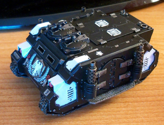
The new one one won't have the same round side doors & fancy modeled front plate, but needs to hit about the same painting quality & style.
7 notes
·
View notes
Text
Restoration and Preservation
I recently watched the Jacob Geller video about RE4, the HD Project, and game restoration. The HD Project is an interesting idea with tons of passion and dedication that’s well covered in the video. However, I have a few problems here.
Firstly, RE4 is only 15 years old, and when historians start discussing restoration processes they’re generally talking about physical art (such as paintings) that’s several decades or centuries old. This is framework doesn’t make sense for a game, which is digital, especially considering it’s barely what any other mediums would even remotely consider being old.
Second, I think this HD Project, while thoughtful in concept and fueled by the best of intentions, illuminates a serious issue we as an industry/community have with regards to preserving games. Put bluntly, we’re overly obsessed with graphical/technical fidelity and this obsession is causing us to view any perceived technical shortcomings as shameful or grating. This obviously comes to a head when we seek to revisit older games, our nerd drive for nostalgia is in direct odds with our gamer need for technical supremacy. It’s as if we’re ashamed of our nostalgia, and in order to resolve this conflict we seek remakes, HD projects, remasters, definitive editions, free next-gen upgrades, graphics mods, reboots, etc. We want our nostalgia as long as we can now have those sweet frames, res bumps, HD textures, gameplay improvements, quality-of-life improvements, patches, etc.
This gives me the impression that gamers love the IDEA of older games, not the actual games themselves. This framework of the idea of the game fits well with recent remakes, especially those done by Bluepoint. Many gamers love the idea of Shadow of the Colossus or Demon’s Souls, even if they’ve never played them and have no intentions to play the original versions. So, with a rock-solid new team and awesome new technology, gamers think they can experience these games now that they “live up to modern standards.” As long as it “feel like I remember,” then it’s all fine from this framework, the idea is “preserved.” This framework views games as temporary products, with an idea at the core and everything surrounding being a technical stepping stone to said idea. And since it’s a product separate from it’s creation, it’s constantly subject to whatever the current “modern standards” are for any given time. There’s a saying that games are never finished, they’re only shipped, and I think this framework of the idea is a natural extension of this notion. When speaking to others online about this issue, I’ve gotten plenty of responses that boil down to “well, the original creators were constricted by the technology of the time, I’m sure they would’ve wanted the original release to look like how the remake/remaster looks now if they had the tech.”
The major issue I have here, and the core of my argument against such remasters/remakes/HD Projects, is that games are not a simple product in a vacuum to be upgraded as deemed necessary to our whims. Games are, in fact, the collected work of many artists and designers from that specific moment in time. RE4 isn’t an idea, it isn’t a single product devoid of context, it’s a collection of the work of numerous artists, designers, programmers, musicians, directors, producers, etc. The work of the original creators matters, their technical limitations matter, their clever workarounds and technical mishaps matter. When preserving games, we should be preserving their work, not the idea or vague feeling of their work. I know that it’s near impossible to preserve games in 100% of their original form, GCN, CRT and all. But I think we could be doing a lot better, and I think if we changed our perspective on preservation from preserving the idea, to preserving the original artists work (warts and all), we’d be able to more clearly identify what is and isn’t faithful preservation. That’s why I’m such a huge proponent of emulation and faithful ports. These are the way to preserve games properly in my eyes, not some sort of “enhancement” that only seeks to bury the work of the original artists.
And isn’t it funny, that our constant cries for better and better graphics falls squarely in line with the interests of giant corporations that seek to weaponize our nostalgia? They’re more than willing to re-sell you games you own, classics, but in order to justify the the re-sell they claim to have the “definitive” edition this time. It’s the games you love, only better! Now please open up that wallet, you know the deal. A deal gamers are willing to make, for they get an improved version of the idea, their nostalgia and technical desires are satisfied by the glorious free market.
Will we be able to preserve 100% of the original creators work? Probably not, and that is a genuine shame. But we could be preserving 90-95% of their work, and we should. Instead of celebrating the efforts of those who would “improve” games that are not their own, we should celebrate what the original artists were able to accomplish at the time. When I play RE4 now, I don’t see a dated game in desperate need of a graphical/mechanical facelift, I see a game that countless artists/designers crafted with the utmost care. Of course it has shortcomings compared to modern games, I’m not expecting it to stand next to them (even though I still find it more enjoyable to play then 90% games released in the past decade). When I play an older game, I’m transported back to a time when games were made differently, with different standards and expectation for what was successful game design. We can still learn much from older games, but it’ll be hard to learn much from the original creators if we constantly ask for their work to be painted over.
2 notes
·
View notes
Video
vimeo
Electrostatic Bell Choir from Darsha Hewitt on Vimeo.
Static electricity affects everyday materials in curious ways – hair stands on end when rubbed with a balloon; laundered clothing clings together if an antistatic sheet is not tossed into the dryer; a static shock transmits from a finger after one drags their feet across the carpet…
The Electrostatic Bell Choir is an electromechanical sound installation that plays with the static electricity emitted from discarded CRT television monitors. This static (that can be felt when one places their hand on the screen when the TV is turned on) is gleaned for its potential to generate subtle movement and is used as the driving kinetic force in the artwork. Sets of static bells* consisting of ultra lightweight pith balls and bells from old grandfather clocks and rotary telephones are mounted in front of an assembly of twenty reclaimed Cathode Ray Tube television sets. A control circuit cycles the TVs on and off in alternating sequences which causes static to build up on the monitors. This static charge agitates the hanging pith balls, causing them to waver and lightly strike the bells ? resulting in quasi?melodic compositions. The TVs are muted, tuned to various channels of white noise and physically spacialized in order to devise a dynamically layered soundscape textured with the signature high-frequency hums, pops and buzzes of the cathode ray tubes warming up. Although compositions are programmed into the piece, it inevitably takes on a character of its own as the static fluctuates and dissipates in response to ethereal nuances (i.e.: changes in air quality such as humidity). The glow of the screens and the subtle resonance of the bells magically punctuate the dark surroundings of the installation.
*Electrostatic bells were invented in 1742 by Andrew Gordon, Professor of Natural Philosophy at the University at Erfurt, Germany. This is the first device known to convert electrical energy into mechanical energy (the moving of a bell clapper back and forth between two oppositely charged bells). It was popularly used at the time to predict oncoming thunderstorms by sensing static electricity in the air. The Electrostatic Bell Choir aims to focus the sensibility of this invention to a more personal scale where it demonstrates the intriguing effects of the invisible environment that constitute our domestic spaces. The artwork is at once mysterious yet can be tangibly deconstructed as the relationship between the static charges and the bells is observed as the TVs illuminate and catalyse the effect.
2 notes
·
View notes
Text
Imac As Display For Mac Pro

Press Command (⌘) + F2 on the keyboard of the iMac that you want to use as a display. Your target iMac will now display the desktop of the other, connected Mac. To exit TDM, just press Command + F2.
in short, i understand the answer is 'no', but I am wrestling with the alternatives.
16in MacBook Pro versus 27in iMac. We'll start with the more powerful, and more expensive, 27in iMac and 16in MacBook Pro. The 27in iMac was updated in August 2020, so it's relatively new. Apple's new Pro Display XDR is the first own-brand monitor that the company has produced since it discontinued the 27in Thunderbolt Display back in 2016. Intended as a companion for the.
The Problem:
I have a MacBook Pro (Retina, 15', 2014) at work, and I tend to work from home a few times per week.
I currently use a very old external display (>15 yrs, CRT via VGA adapter) when I work from home.
That PC is now completely dead (Win XP, corrupted hal.sys) so I was planning to buy the new iMac Retina 5K as my new home computer.
Then I found out that the new iMac Retina 5K cannot be used as a Target Display for a MacBook Pro, and possibly will never work in that capacity.
(bandwidth limitations of ThunderBolt 1.2 can't drive that many pixels, or something like that, but doesn't really matter)
As a work-around, I was hoping to put the MBP in Target Disk Mode, and boot the iMac from the MBP disk.
I tried that at the Apple Store this morning with one of the 'Geniuses'.
We selected the MBP disk on startup, but the iMac just ignored the MBP disk and booted from it's own internal disk.
I suspect that is the same issue where the MBP cannot drive the iMac display, and/or Thunderbolt limitation, but again, doesn't matter.
The Alternatives, each with it's own set of Cons:
1. Buy last year's iMac which works fine as an external ('Target') display for the latest MacBook pro.
I really don't like the idea of buying last year's technology, especially since I tend to hang on to my PCs longer than average.
Also, I have compared last year's iMac to the Retina 5K side-by-side, so obviously, I would really like to get the 5K. :-)
2. Reboot the MBP into Target Disk Mode, mount it as an external disk from the iMac, and have access to my work apps and data.
I tested a few things at the Apple Store this morning. Some apps crashed, but I am still running Mavericks on the MBP, so I suspect this will be fine once I upgrade the MBP to Yosemite. Of course, this would be a pain having to reboot my MacBook every day or two. Besides the time hit, I would lose all my context from one day to the next. :-(
3. Get the new iMac Retina 5K and a separate display for the MacBook when I work from home.
This seems like it would be a silly waste of money and limited desk space.
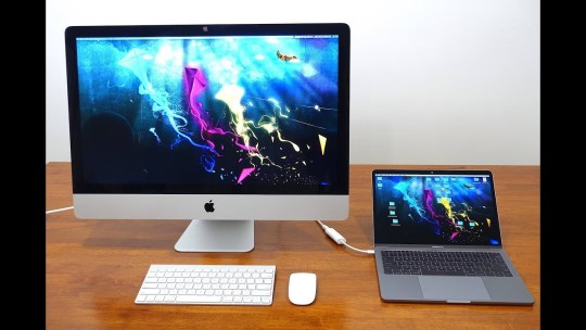
4. Just use the MBP display when I work from home.
I have a herniated disc in my neck, so using the MBP display all day long is literally a pain.
Any other / better solutions I haven't considered?
What are people doing who have bought the Retina 5K but also have a MacBook?
TIA,
Nate
MacBook Pro (Retina, 15-inch, Mid 2014), OS X Mavericks (10.9.5)
Posted on
Believing is seeing.
The first 32-inch Retina 6K display ever. Up to 1600 nits of brightness. An astonishing 1,000,000:1 contrast ratio and superwide viewing angle. Over a billion colors presented with exceptional accuracy. And dynamic range that transforms the professional workflow. Introducing Apple Pro Display XDR, the world’s best pro display.
XDR. Dynamic range to the extreme.
The contrast your eyes see between brightness and darkness is very challenging to reproduce in a display, leading to the development of High Dynamic Range (HDR). With breakthrough backlighting technology, Pro Display XDR takes brightness, contrast, and color to a new level. Far beyond HDR, it’s Extreme Dynamic Range (XDR).
A brighter idea.
Typical desktop displays have sustained brightness around 350 nits. Some pro displays exceed this, but most can only sustain it for short periods of time. Pro Display XDR produces an industry-leading 1000 nits of full-screen sustained brightness and 1600 nits at its peak.1 It gives you the power to maintain extreme brightness without ever dimming. Along with efficient backlight control, this delivers outstanding contrast between the brightest brights and the blackest blacks. The result is an incredible 1,000,000:1 contrast ratio and stunningly real XDR imagery.
1600 nitspeak brightness
Show your truest colors.
Pro Display XDR always gives you the truest representation of your work. A P3 wide color gamut provides a color palette capable of creating the most vibrant imagery. With true 10-bit color, Pro Display XDR can produce more than a billion colors with extreme accuracy. State-of-the-art calibration and a sophisticated algorithm ensure that you get the highest-quality color possible.

P3wide color gamut
LED in a whole new light.
True-to-life imagery requires having extremely bright areas of the screen right next to extremely dark areas. Without precise backlight control, this can cause an unintended glow called blooming. Pro Display XDR is able to dramatically reduce blooming using advanced LED technology, light shaping, and intelligent image processing.
Innovation in every layer.
Every aspect of the light imaging system in Pro Display XDR is crucial to the overall quality of what you see onscreen. Each element builds on top of the last to create a display with unbelievable brightness and contrast.
576 blue LEDs work together.
Typical LCDs are edge-lit by a strip of white LEDs. The 2D backlighting system in Pro Display XDR is unlike any other. It uses a superbright array of 576 blue LEDs that allows for unmatched light control compared with white LEDs. Twelve controllers rapidly modulate each LED so that areas of the screen can be incredibly bright while other areas are incredibly dark. All of this produces an extraordinary contrast that’s the foundation for XDR.
Light is mixed and shaped.
For even greater control of light, each LED is treated with a reflective layer, a highly customized lens, and a geometrically optimized reflector that are all unique to Pro Display XDR. Through a pioneering design, light is reflected, mixed, and shaped between two layers to minimize blooming and provide uniform lighting.
Color is transformed.
Converting blue light to white is a difficult process that requires extremely precise color conversion. It’s why most display makers use white LEDs. Pro Display XDR accomplishes this conversion with an expertly designed color transformation sheet made of hundreds of layers that control the light spectrum passing through them.
Brightness is taken to the edge.
Pro Display XDR extends exceptional image quality to the very edge. To ensure that LEDs along the sides of the display mix well with adjacent ones, a micro-lens array boosts light along the edges. This creates uniform color and brightness across the entire screen.
One chip makes it all possible.
With a massive amount of processing power, the timing controller (TCON) chip utilizes an algorithm specifically created to analyze and reproduce images. It controls LEDs at over 10 times the refresh rate of the LCD itself, reducing latency and blooming. It’s capable of multiple refresh rates for amazingly smooth playback. Managing both the LED array and LCD pixels, the TCON precisely directs light and color to bring your work to life with stunning accuracy.
Superwide viewing angle.
When multiple people review work together on a single screen, it’s critical that everyone sees the same thing. While most pro desktop displays claim a wide viewing angle, in reality, color and image quality become distorted when seen off-axis. With industry-leading polarizer technology, Pro Display XDR achieves a superwide viewing angle that maintains exceptional color and contrast.
Up to25xbetter off-axis contrast
than a typical LCD

Nano-texture glass.
Light scattered to further reduce glare.
Less glare.
And even less glare.
Every Pro Display XDR screen is engineered for extremely low reflectivity. And if you’re in an especially uncontrolled lighting environment, there’s an innovative matte option with nano-texture glass. Typical matte displays have a coating added to their surface that scatters light. However, these coatings lower contrast while producing unwanted haze and sparkle. The nano-texture on Pro Display XDR is actually etched into the glass at the nanometer level. The result is a screen with beautiful image quality that maintains contrast while scattering light to reduce glare to the barest minimum.
Goes with the workflow.
Professionals require a lot from their displays. But each person has different needs. Resolution, reference modes, reliable calibration. Pro Display XDR has everything you need in a modern workflow, bringing a new level of efficiency to every production. It wasn’t just made for the pro workflow. It redefines it.
5K
Retina 6K. Expand your view.
Higher resolution means more than just a better-quality image. With a Retina 6K display, Pro Display XDR gives you nearly 40 percent more screen real estate than a 5K display. While most displays max out at around 150 pixels per inch (ppi), our Retina display has 218 ppi, providing astoundingly sharp and detailed imagery. It’s a massive creative canvas that easily fits 4K content, your tools, and much more all in one screen.
Many creatives. One vision.
Pro video workflows involve a range of professionals with unique setups. What’s always been missing is the ability to see the same image across an entire production. Pro Display XDR allows pros at every point in the process to experience exactly the same groundbreaking picture quality.
On location.
From the start of a shoot, Pro Display XDR reveals the content you’re capturing with incredible accuracy.
Post-production.
Image reproduction remains consistent across every point of your workflow, ensuring that everyone is always on the same page.
Reference modes.
It’s easy to adjust Pro Display XDR to match the requirements of HDR, HD, SD video, digital cinema, and broader uses such as photography, web development, design, and print. Just select a mode, and the display reconfigures itself to match a specified color space, white point, gamma, and brightness. And coming soon, you’ll have the ability to create custom reference modes.
True Tone.
The lighting around you can affect the way you see onscreen colors. True Tone on Pro Display XDR uses a breakthrough dual ambient light sensor design — with a sensor on the front and another on the back — to better gauge your overall lighting environment. This facilitates more exact adjustments to the color and intensity of your display, so you can have accurate viewing in all lighting conditions.
Expertly calibrated.
Pro Display XDR is optimized to more than meet the standards of creative professionals. Every display goes through our state-of-the-art color calibration. Each of the display’s 576 LEDs is also individually calibrated and has its light profile stored. An algorithm then uses this information to determine the exact light intensity at which each LED should be modulated to produce the best possible image.
A beautiful picture is only part of the story.
Best Displays For Mac Pro
Pro Display XDR is stunning every way you look at it. Its screen stretches edge to edge with just a 9 mm border, so your work takes center stage. The aluminum enclosure is just an inch thick and features an innovative lattice pattern that reduces weight and increases airflow.
More air than metal.
The lattice pattern machined into the aluminum has many advantages. It more than doubles the surface area exposed to air, facilitating additional airflow and acting as a heat sink. This allows for fast and quiet cooling, enabling Pro Display XDR to sustain an extreme level of brightness indefinitely. Inlet and exhaust vents work through this pattern to draw in cool air and eject hot air away from the system, limiting the potential for hot air to be reingested.
Elevate your work. And rotate it, too.
Imac As Display For Mac Pro 12.9
Every aspect of Pro Display XDR was designed with pros in mind. Pro Stand is no exception. Height, tilt, rotation — it’s completely adjustable. It’s stable without taking up much space. And its ability to rotate to landscape or portrait makes it perfect for any type of work.
Fine-tuned fine‑tuning.
Pro Stand makes every adjustment of your display feel seamless. Precision tilting and 120 mm of height adjustment help Pro Display XDR adapt to any viewing condition. The angle of the display stays true even as you adjust the height. With Pro Stand, you get a display that feels weightless, moves effortlessly where you want it, and stays exactly where you leave it.
Every side is its good side.
Pro Stand gives you the ability to move between landscape and portrait whenever you want. All you have to do is unlock the slider and turn the display. Whether you’re a developer, a photographer, or a composer, you can see more of your work without endless scrolling.
Detach. Move. Attach.
Having the freedom to move between being on set and working in the studio can make a big difference. The magnetic connector on Pro Stand makes it easy to attach and detach from its polar-opposite magnet on the back of Pro Display XDR. These magnets guide the connection while latches automatically engage and securely lock the stand to the display. Detaching it is as simple as unlocking the slider.
Available VESA Mount Adapter.
Imac As Display For Macbook Pro
Many pros have unique mounting setups for their displays. The VESA Mount Adapter attaches to the display in a matter of seconds for quick and easy mounting.
Powerful partnerships.
Connecting Macbook Pro To Imac
Pair Pro Display XDR with Mac Pro to create the ultimate professional workstation. Or connect it to your MacBook Pro with Thunderbolt 3.2
Use AR to see Pro Display XDR in your workspace.
Open this page on your iPhone or iPad to view Pro Display XDR in AR.
0 notes
Photo


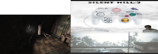


hHiii, I was creating a set up for my Silent Hill 2 playthrough with a gamecube controller, but kept forgetting the controls and also the second monitor I had was very distracting sometimes (it just showed my desktop), so I made some sort of border or image to occupy it, the second monitor is now this custom gamecube control guide I made. It is now a very pleasing look.
Oh and for future notes: I am running the Silent Hill 2 repack Mr DJ version, with an HD Patcher, the game’s resolution must originally be 640x480 so that the HD patch functions, anything higher will make it 4:3 aspect ratio (and being a given that this is originally a 2001 game, [the pc version being released in 2002] this game was meant to be run through an old PC monitor or a CRT TV, it’s max resolution is 1024 x 768, doesn't go any higher or has custom options), running it in HD and 16:9 aspect ratio has it’s benefits and problems: namely it is a 2001 game so the textures will be extra crispy and some things like trees are literally pixelated sprites (seriously look at THEM). The noise filter helps quite a lot to fuzz those edges out BUT THEN Again, this game was originally meant to be run through a fuzzy old ass computer screen, not a HD one or your laptop’s screen. I could try using NVIDIA’s forced Anti-aliasing but I don’t wanna mess more with the game.
Important note too: To make the PC Version stop the audio loop glitch (which is caused from your PC going too fast and the game not being able to catch up), you put on the same settings I did (picture), you go to your Task Manager, go to details, sh2pc.exe, and set Affinity to only use 1 CPU, this is the number one fix, running as administrator and Windows XP comparability also helps.

1 note
·
View note
Link
Have you ever been gaming and a level will load but everything looks all muddy and blurry. After a few seconds, everything will suddenly become clear and sharp? Don’t worry, you do not need glasses, this is something known as texture pop in. With the rise of HD gaming, texture pop in is something that has become far more noticeable than it once was before, but what is it and what is the cause?
What is texture pop in?
To understand why textures pop in, you first need to understand what is actually going on when a texture seems all blurry and then suddenly becomes a high quality image again.
When a game level is loading, the textures will need to be loaded from the disk and into memory. Larger images that are higher quality will take up more RAM. If every visible texture was loaded into memory during a game, there would be issues with memory. To keep this memory use down, lower quality textures will be loaded for object that are further away from the player. Since the player is far away, they are unlikely to notice the poor quality. It’s a win win!
Texture pop in occurs when those low quality textures are not replaced with high quality textures quickly enough.
What causes textures to load blurry at first?
Since low resolution images take up a small amount of memory, they can be loaded very quickly. As I mentioned above, they also consume a smaller amount of memory. To load a level up quickly, low resolution textures are ideal. This saves the user having to wait as the textures can finish loading once they are in the level itself.
In an ideal world, the player should never notice that the low resolution textures were loaded before the high resolution ones. Unfortunately there are variables outside of the game that will negatively influence it. If the disk drive is busy or the player moves too quickly from A-B, there may not be enough time to load up the high resolution texture before the player gets close to it.
If the disk is also busy for external tasks or is running slow, texture pop in may become more prevalent. Internal factors such as the game engine may also be at fault. Games built on the Unreal Engine are known for being plagued with texture pop in issues.
Why don’t older games have the same issue?
There are a few potential explanations for this. Texture pop in is unlikely to happen if you are playing an old game on a modern PC. Gaming hardware is far more powerful now than it was when the game came out. It should eat through everything the game throws at it. What about back in the day though? Texture pop in never seemed to be an issue 15 years ago.
Texture pop in has always been a thing, but back before high definition visuals, it wasn’t something that was as pronounced. The fully rendered texture was still a low quality image and could still be considered “muddy”. Combine this with the fact that you might have been playing on a CRT monitor, which will provide a lower quality image in general when compared to modern LCD screens, the muddy texture was further obscured.
Halo 2 was one of the more notable games where texture pop in was a very noticeable thing. The game had no load screens. Loading low res textures from a distance and loading in the higher quality when the player got closer was an intentional feature, it just didn’t work as well as expected.
Is there a way to stop it happening?
If you are gaming on PC, one way to reduce texture pop in is to upgrade your PC hardware to use faster components. Consoles are obviously more limited, but there is one thing you can do. Changing the disk drive is the best thing you can do to reduce texture pop in on PC and consoles.
SSDs or solid state drives are known for their incredibly fast read and write speeds when compared to the more common spinning disk drives. With the ability to read and write far quicker, textures will load much quicker. This may not eliminate texture pop in that is a result of game engine or programming, but it will greatly reduce pop in caused by your read speeds.
The post What Is Texture Pop In appeared first on Nerdburglars Gaming.
via Nerdburglars Gaming
0 notes
Text
Project Warlock – Review
For me, there is nothing like taking a break from all the cover-based shooting, open worlds and stealth mechanics with a well-crafted first person shooter. These games are like the taking shots at the bar: They may not be as fancy as wine or as intricate as a cocktail, but they are hard, fast, and guarantee a night to remember!
However, I am hardly thinking of the AAA military shooters that cause angry fans to break the internet every year. No, no. What gets the job done are shooting arenas, an arsenal that would make a warlord drool, and legions of monsters begging to be introduced to your shotgun. What is needed is a classic, arcade shooter.
I was therefore excited to dig my claws into Buckshot Software’s latest indie title named Project Warlock. It has been some time since I tasted that sweet violence only this genre of games can provide, and Project Warlock seemed an excellent place to ‘get back into the game’ so to speak. Ferocious enemies, perilous environments, many weapons to choose from… its all here!
Whoops… might have squeezed the trigger a little hard there…
Unfortunately, my experience with this game fell tragically short of my anticipation. While it boasts all the right features on paper, Project Warlock just makes too many stupid mistakes in its execution. I would be lying if I said my overall experience was a positive one.
Shoot first, ask questions later
Much like every run-and-gun FPS on this planet, the story counts as much as crust on pizza. You play as, you guessed it, a unnamed warlock that has to rid the world of evil monsters and their overlords. Players will basically just shoot the crap out of everything across five main worlds ranging from medieval castles, frozen wastelands, Egyptian deserts and urbanized dystopias, before facing off against the ultimate source of all evil in hell.
It is generic, but it’s all you need. Each world features 5 main missions along with one boss fight. These 5 missions are then divided further into smaller gameplay episodes generally lasting around 6-8 minutes each. You spend your time massacring monsters, searching for multicoloured keys, and making your way through the maze-like levels while keeping an eye out for secrets.
Health. Put every damn XP point on health.
The reason why Project Warlock’s missions are so chopped up is that this game contains absolutely no checkpoints or quick saves. Your progress is only saved at the ‘Workshop’ once you complete an entire mission. If you die during an episode, there is the option of using an extra life to restart the episode from the beginning. No lives? You have to replay the ENTIRE mission.
Most players will find out soon that this game is seriously challenging; even on easy difficulty, most enemies can kill the warlock in a few hits. Playing on the hardest difficulty must be an exercise in outright masochism, unless brutal challenges are your idea of a turn-on.
Pixel perfect
So let us consider the good, the bad, and end with the ugly. What Project Warlock absolutely nails down to the last pixel is its visual presentation. Much like the classic FPS games of old, namely Doom, Heretic and Wolfenstein, this game embraces a visual theme composed of low polygonal environments with sprite-based enemies.
As such, textures, objects and particle effects appear as if they have been plucked straight off an old Pentium 1 machine, but Buckshot Games have used the Unity Engine to add some nice, modern lighting effects. Much like Octopath: Traveler, the final effect is a pleasant fusion of flat sprites that still manage to impart a three-dimensional feeling to the overall visual style.
No effects
More pixels!
Players are even given the option to activate additional visual features like even more heavily-pixelated textures, or classic CRT styling if you really want to go old school. These small little touches shows how Project Warlock strives to be authentically retro in its presentation, and it honestly made me feel like I was a kid again at times. Yes I am THAT old!
This girl is on FIYAAAAAA… man I love Alecia Keys.
The darkness descends
Most unfortunately, Buckshot Games wasted the game’s visual potential by making many environments too dark. I get that they wanted to give the game a more somber tone, but I often struggled to see what was going on. This was totally unnecessary as Project Warlock would certainly have been more visually appealing if it had a more colourful and varied texture palette.
To make matters worse, some levels take place in almost total blackness. The game does provide the player with one spell that throws a small circle of light, but this cannot be used simultaneously with a weapon. Seriously, have we learnt nothing from the whole Doom 3 flashlight fiasco!?
Let us risk a little more light… more… more… more…. and more… little more….
The light spell was not the only useless magical trick. In fact virtually all of the spells I unlocked in the workshop were all a waste of upgrade points (which are really hard to find by the way). A ball of lightning that floats in mid-air and shocks individual enemies sounds cool, until you learn it barely does damage.
So you opt for the magical axe that can be summoned to slash at your foe, right? Might as well wack yourself with the worthless thing for all the good it does. The final nail in the coffin is that I often experienced a bug where the magical spells would not even go off. This usually happened when I loaded into a level for the first time. Not good.
Just shoot me
The one thing that has always defined arcade shooters since Doom in 1993 is that they make you feel super powerful. When Duke Nukem or Serious Sam pick up their guns and put on sunglasses, you know its on. Given the ridiculous irony of not choosing to use magic in a game called Project Warlock, the gunplay better had be very good, and for the most part it is top-notch.
The sound design in particular is impressive. The guns create delightful booms and bangs which later had me casting apologetic looks at my subwoofer… before taking aim at a flying devil lady and KABLAM!
My girfriend when I leave the cap off the toothpaste…
Every enemy that ends on the receiving end of your gun explodes into a gorgeous mess off flying giblets and blood everywhere, which really adds the cherry on top of a great shooting experience. The warlock even has a wood cutter’s axe as a melee weapon that makes a wonderful ‘WOOSH’ sound right before chopping whatever is bothering you in two.
Descending into Hell
Still, the engaging gun action and nostalgic visual impact fail to distract from the really silly flaws at play here. While the opening sections of the game show a lot more attention to level design and gameplay, it is as if the developers just lost their perspective as they were creating the final areas.
Dark Souls games have taught us that a game cannot just be hard for its own sake. A game’s difficulty must exist as a fair challenge for the player to do better. The player might not have the skills to overcome certain obstacles yet, but they must have the tools.
However, when I flip a switch and four robots capable of killing with one or two shots spawn all around me in pitch darkness, that is neither fun nor exciting. That is just poor enemy placement rather than a enjoyable challenge. Don’t forget: You will be forced to replay the entire mission from the start if you run out of extra lives.
I really do not understand why the developers thought it wise to insert these scenarios so frequently into the game’s latter half since it nearly ruined my whole experience. The only challenge I got from all of this was trying not smash my keyboard through the screen.
The simple addition of a quick save option might have alleviated much of the ham-fisted difficulty curve, and it was therefore a silly but crucial oversight. I know that is not how things were done in the golden days, but Project Warlock paid enough respects to the past through its visuals. It is not essential to bring in every single aspect of retro shooters just for the sake of authenticity.
Stay right there sphinx boss! Now, I will take my flashlight out but don’t even think about moving!
Then there are the boss fights. Did Buckshot Games never play Serious Sam? Now THAT is how you make a player face off against a colossal enemy. What you don’t do is give the boss almost hit-scanning weapons while endlessly spawning lesser enemies on the ground. Even if the boss fight is a separate level, dying means replaying the entire previous mission if you want another go at it. Another design choice that simply baffles me.
This game could have been an excellent homage to everything that made the proto-FPS titles the quintessential video game experiences of their day. Sadly, what little potential it shows cannot outshine its numerous design faults. As it stands, I find it hard to recommend Project Warlock to anyone other than people who absolutely relish difficult games, or those waiting for the next Doom mod to arrive.
Nostalgic art style
Sound design
Variety between levels
Satisfying gun play
Poorly constructed boss fights
Warlock game with useless spells
Frustrating difficulty spike
Several levels are too dark
Shoddy enemy placement
Playtime: 8 hours total for single player campaign
Computer Specs: Windows 10 64-bit computer using GTX 1070, i5 4690K, 16GB RAM
Project Warlock – Review published first on https://touchgen.tumblr.com/
0 notes
Text
Chrono Trigger on Steam: Dang-o
Well It’s Not Exactly Pretty
By DANiEL SHAE
No driving thesis here, just some thoughts and observations of the port.
Like many of you, I’m a lifelong fan of this game. I still have my SNES (actually, I have four of them), and my original CT cart with a “got all the characters to ** and defeated Pink NU Spekkio” file on it. Even went so far as to get a NU tattooed on me. Because I am a sucker for this game.
As you’re probably aware, toward the beginning of 2018 SE granted us a “surprise release” of Chrono Trigger. Like so many others, I bought it immediately. Then? The backlash. Tremendous backlash. Mostly for the weirdly smoothed graphics that appeared to most like a “bad mobile port”. So, somewhat responsibly, six months later SE pushed an update attempting to appease the mobs of enraged fans by allowing the game to be viewed with graphics “similar to the original pixel art”. That description is straight from the in-game menu.
The release of the update was surrounding by a flood of articles purporting that “SE put the original graphics back in Chrono Trigger and now it looks WAY BETTER...” (I’m paraphrasing here). And to a degree, sure, it is certainly better than it was. But dang-o. Guys, this game is still pretty mangled. For a game whose original was so thoughtful, beautiful, and meticulous, this feels sloppy AF. And I know that some people likely worked their asses off, because I too work in the game industry and I understand how it goes. This isn’t just any game, though; it’s Chrono Trigger. I would think that, regarding a game which was completed 23 years ago and is considered by millions to be a masterpiece, people would be a thousand times more careful touching it now than even the original team who created it back then. That’s certainly the case with nearly any other art you’d find in a museum. But that’s not the case here. Square Enix has the resources to do it right, but this port is unfinished.
First 15 minutes of gameplay, I encountered some triggered events which caused me to become stuck inside another sprite and I had to reboot the game to continue (the specific one I remember is returning the girl’s lost kitty at the fair). Thank God for the “bookmark/resume” feature, which is actually a pretty cool addition to the game. Anyway, I’m now 20 hours in (Death Peak after a lot of grinding), and I’m glad to say that pattern has thankfully not persisted.
But there are other issues. Some minor. Some kinda hideous.
I won’t bore you with pixel uniformity (or the apparent lack thereof), but as you can see pictured above, there are some serious issues with mixed aesthetic. You may have to give it the ol’ “right click, view image” to better see what I’m talking about. Most of the assets are displayed in clearly defined “pixels”, but then there are bits like the Epoch, which appear more like, for my lack of real terminology, freaky blurred nonsense. Flying this bad boy around is a uh...well it’s a “trip”. I’m not one to easily embarrass, but between you and me I keep my head ducked and hope to God an NPC doesn’t walk out onto the world map to see my smeared-ass ride rippin’ across the sky to elevator jams. Also I tried switching between “Original” and “High resolution” graphics—Epoch appears to be the same in both. Maybe I’ve just unearthed a bug in my game, but then if so that’s still a problem.
There are lots of other graphical issues: Orphaned pixel noise that becomes painfully visible during effects like white screen flashes. Freaky solid black pixel chunks during the “cool parts” with the Ocean Palace and the Black Omen. The area around Giga Gaia’s face gets honorable mention for some extra weird shit going on when you slap him around (I was using Cube Toss/Iceberg Toss).
As they say: The list goes on.
I’m actually fine with how the battle menu and gauges look now, even if the gauges sometimes cover sprites a little crudely. I get it. Sacrifices must be made. However, the speech panels and game menu panels don’t look like they belong at all to the same game. They’re bizarrely clunky, a different resolution than the rest of the game assets, and frankly the texture on them looks as though somebody was just dicking around with the spray paint tool. Which might be fine if they were the same resolution as the other assets.
SIDE NOTES ON THE MENU:
1) “Settings” can be accessed from the title screen menu and from the in-game menu, and it offers completely different options depending on which you’re in. That’s what they call a UI/UX “no no”.
2) The behavior of the title menu is...weird. That’s as profound as I’m going to be on this bullet.
3) From the in-game menu, to find the “Quit” option, one first has to navigate to “Settings”.
How the hell is quitting a “game setting”?
The hit boxes, or colliders, or [whatever the hell they are] are unpolished as well. This version of the game feels much stickier in places than previous releases I’ve played (SNES, PS, DS). I’ve encountered several NPCs whose colliders are perhaps double their actual width/height, making it a real pain to traverse certain areas.
I can’t make up my mind about the anime cutscenes. I was super pumped at first when they added them to the PS release, but now I almost wish they were a separate thing from the gameplay. Watching those moments in anime, only to immediately see them again in the original 16 bits, ends up feeling a little disjointed. Plus, occasionally (specifically I’m thinking of Frog blowing open the cave to Magus’s keep), it causes the sound to break for a few moments when it comes back from the cutscene to the 16-bit animation. I dunno. Mixed feelings.
I’m still having a blast playing through it. It maintains maybe 85% of the original charm—and 85% of Chrono Trigger is still a hell of a party. I’m glad they added the DS content. I’m not overly pissed that they only opted to keep half of Woolsey’s localization (frog still charmingly speaks in Old English, just not when he’s having flashbacks to being a child/young adult for some reason) but modified parts of it to include some of the newer English dialects (featuring phrases like “nom nom nom”). OK. Cool I guess. We need the newer generations to “understand” our art.
OK, that’s more-or-less the end of my thoughts on this. It’s enjoyable, but extremely messy. I don’t recommend this version for first-timers to the game. If you can swing it, play the SNES cart. On a CRT. Play it with scanlines. Sweet, beautiful, hot, sexy scanlines. And if you can’t, get a DS copy.
Actually I’m not so obsessed with the “glory days” that I’d turn my nose up at a full-on remake of this game. Pls. I’d take a modern Chrono Trigger in a heartbeat.
EDIT: 49 hours. Beat the game. Multiple times. Got all 13 endings. The most noticeable of the graphical issues are: Epoch, beating Magus and warping to 65 Million BC, Ocean Palace appearing, Black Omen appearing, random buildings throughout the world maps, racing Johnny, scenes with the Gurus/Janus being warped away from Lavos, Black Omen after killing Mammon, and pretty much all of the endings. The Epoch and ending credits sequences are the worst. Still, tremendously fun—just not impressive looking compared to the product that was completed 23 years ago.
0 notes
Text
Week 13 - Homage Project Reflection
Black Box, White Noise (2017). CRT TV, laptop, digital video. Installation view (temporal) at CNM Office, 11-12 April 2017.
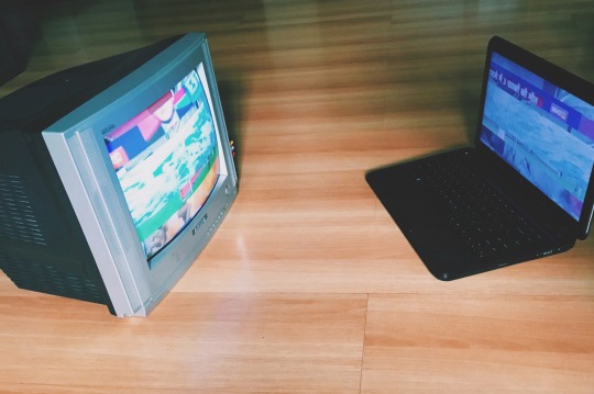
Black Box, White Noise (2017). CRT TV, laptop, digital video.
youtube
Video work for Black Box, White Noise (2017). 1min 10s.
Process
Using Don DeLillo’s quote from White Noise as a starting point, I began to think of ways to communicate the anxiety and panic from informational saturation -- something that communicated the trepidation in the almost Beckettian wait for a catastrophe. Building upon what I’d set out to achieve with Task 1, where this saturation of media was applied to the idea of individual identity, I wanted to apply this concept more generally to human experience. Whereas the work I created for Task 1, Don’t leave me to my own devices, existed purely in the digital realm, I wanted concepts to manifest in physical form for Task 2.
As such, I began thinking of ways in which it could take physical form -- I mentioned Nam June Paik during class discussions, and feedback was that his installations tended to rely on density and mass, something I could not replicate with limited resources.
Another point brought up was the means in which I could communicate the emotional experience to the audience -- how do I convey this anxiety? Thinking about these issues raised led me to look to Nam June Paik’s more pared down installation works, such as TV Buddha, which relied on choice of objects as opposed to mass of objects. I also decided to rely upon the use of sound to communicate the anxiety -- perhaps unpleasant, static noises could be weaved into the installation, building on the idea of white noise.
With these ideas in mind, I came up with a simple sketch of how the installation could take form.
I then began obtaining materials -- a CRT TV, a laptop, and something that could serve as a plinth. Wooden apple crates would serve as plinths (the processed wood acting as an interested material counterpoint to the electronic equipment). Several rounds of experimentation were needed for this process -- to get the equipment working, placement of the materials, wires, adapters, plugs needed, even repurposing an old PS2 as a DVD player because of its portability.
After being certain of the workability of the physical installation, I moved on to creating the video. This involved the use of video editing software and the use of found footage from Youtube.
The choice of videos to splice into the video work was selected on the basis of its visual texture, colour, and greater implications. These implications or symbolisms were meant to be as eclectic as possible -- news programmes, cooking sequences, entertainment programmes, images of nature. A juxtaposition of serious or neutral with the banal, mindless or facetious. The list of videos are as such:
TASTY COMPILATION PART 1
https://www.youtube.com/watch?v=88WTy6pgrQE
Chhattisgarh TV Anchor Supreet Kaur Reads Her Husband’s Death On Live TV (FULL VIDEO)
https://www.youtube.com/watch?v=kCuZyFld-GU
Ping Pong Trick Shots 3 | Dude Perfect
https://www.youtube.com/watch?v=UeG1ftTmLAg
Blue Ocean Waves Slow Motion - Free Stock Footage
https://www.youtube.com/watch?v=KGhsX1GDibM
YAMIL ASAD 2015 - Media Punta - Volante Ofensivo.mp4
https://www.youtube.com/watch?v=ZRyB4K1asqw
The Mummy - Official Trailer #2 [HD]
https://www.youtube.com/watch?v=GzorZUuZqEI
Sailor Moon Opening 1
https://www.youtube.com/watch?v=b8Rvwu8Wykw
After splicing the videos together, I began to corrupt the video’s data -- a process of databending using Audacity. Importing the video footage as raw data and editing the content allowed me to produce authentic glitch effects.

The process of glitching itself required several rounds of experimentation, and I edited the glitched footage in with the original. Now that I had the footage, sound was another aspect that I had to create. This was synthesised through the use of sounds from old dial-up modems and static -- a sufficiently disturbing and otherworldly combination of sounds.
And finally came the installation process -- putting the artwork in place at the CNM office.

Lugged everything over to the office with a mini trolley and finally set everything up. The installation was then left for viewing until the morning of the next day.
Brief Write-up
Black Box, White Noise
2017
CRT TV, laptop, dual-channel digital video
An ephemeral installation/video work paying homage to the concept of brain fade as outlined in Don DeLillo’s White Noise, this work emerges from a fascination with the concept of informational saturation. Emphasising the “incessant bombardment of information” faced by the modern individual vis-à-vis mass communication, the work’s utilisation of moving image, databending and sound serve to communicate the unceasing “panic, noise and interference” engendered by these incessant flows; a dialogic back-and-forth of images, graphics, tragedies, statistics, data, and flows as a consistent, inescapable process from old to new.
Part of a submission for NM3205 Digital Art and Culture by Professor Flude, Marcia Nancy Mauro.
Full Write-up
Black Box, White Noise (2017) is a video work and ephemeral installation emerging from my fascination with the concept of informational saturation; paying homage to the concept of brain fade as outlined in Don DeLillo’s White Noise. Emphasising the “incessant bombardment of information” faced by the modern individual vis-à-vis mass communication (66), the novel suggests that the constant stream of data, images, and media has textured human life to the extent that an almost spiritual dependency upon the digital is forged within the individual.
Because we’re suffering from brain fade. We need an occasional catastrophe to break up the incessant bombardment of information. [...] The flow is constant, [...] Words, pictures, numbers, facts, graphics, statistics, specks, waves, particles, motes. Only a catastrophe gets our attention. We want them, we need them, we depend on them (66).
The electronic and the artificial become us – it both comforts and alienates. The novel conveys this ironic dichotomy by creating an atmosphere of unceasing anxiety, an unending trepidation that accompanies the overall impotency of the modern individual in coping with this saturated existence. So frighteningly expressed that one can only imagine the extent to which these feelings may have grown with the rapid growth of new media – and the scale of the catastrophe this necessitates before we are shaken from brain fade.
In his lecture, Black Box, Black Bloc, Alexander Galloway describes the hypothesis of the “fully programmed and also re-programmable” biological bodies of the cybernetic city – an eerie prediction of society that seems mere continuation of DeLillo’s expression of modern being (2). How does one integrate such incessant progressions and flows into a bearable form of existence? Galloway states the appropriate response to such a cybernetic city: “panic, noise, and interference” (2). It is a revolt that relies on a specific invisibility, a non-invasive blackness. Almost akin to observing a black box – the mystical cypher “without windows”, waiting to be decoded, deciphered, revealed to be rational (3). It is a “new approach to knowledge” – where only inputs and outputs certain, we allow the object to remain “opaque”, and we make every judgment based on observation, with “no access to our or anyone else’s inner life” (5-6).
My artwork thus draws on both concepts – of panic, noise, interference, and of looking, gazing, observing – in an attempt to engage with the incessant flows causing brain fade. The viewer is made to watch; to observe images that come in fragmented splices, but fill and overwhelm the screens unceasingly. They move across the frame, almost screeching with static and noise, as if to announce their appearance, a looping video that flickers between states. It is, as Olia Lialina suggests, an “infinite séance”; a looped screening that exists for however long the artwork is installed. It becomes a “formless story” about the modern individual’s relationship to the unending streams of information. More literally, a stream of water cuts through the images presented; flowing through as representational expression of the flows of information. Just as financial flows are symbolised by water in Hito Steyerl’s Liquidity Inc., so are informational flows represented by the same element in this work. The stream is panicked and churning – communicating the same urgency as all the other flickering, fragmented images. They cut into frame at different speeds, interfering – clambering to be seen, heard by the next, a communication of unceasing anxiety.

Figure 2. Charles Lim, SEA STATE 7: sandwich (2015). Single-channel HD digital video. 5 minutes.
In terms of formalistic reference, the video work draws upon Charles Lim’s SEA STATE 7: sandwich, which utilises a similar aesthetic of spliced moving image to communicate the complexity and constancy of an issue. Using images of water and the seaside, it uses ever-shifting landscapes to communicate the same sense of contested meanings of space and territory in relation to Singapore’s use and importation of sand. Movement in my work is thus an expression of the trepidation; an anticipation of the catastrophe that is to come, heightening a sense of anxious escalation.
Even more salient is its physical form as installation, which utilises a television and laptop facing the other directly, locked in an almost dialogic loop of moving image. This ceaseless cycle is reference to Nam June Paik’s TV Buddha, though facing the box of the TV is instead now a laptop, the “splayed open” black box instead of the image of the Buddha (Galloway 3). Images of the spiritual are not present – the black box perhaps becomes the intermediary for a spiritual experience.

Figure 3. Nam June Paik, TV Buddha (1974). Installation with closed-circuit video camera, monitor, and sculpture.
Works Cited
DeLillo, Don. White Noise. Penguin, 1999.
Duvall, John N. "The (super) marketplace of images: Television as unmediated mediation in DeLillo's White Noise." Arizona Quarterly: A journal of American literature, culture, and theory 50.3, 1994, pp. 127-153.
Galloway, Alexander. “Black Box, Black Bloc.” Culture and Communication, 2010, cultureandcommunication.org/galloway/pdf/Galloway,%20Black%20Box%20Black %20Bloc,%20New%20School.pdf.
Lialina, Olia. An Infinite Séance. 2007, art.teleportacia.org/observation/infinite-seance.html.
London, Barbara. "Time as Medium: Five Artists' Video Installations." Leonardo 28, 1995, pp. 423-426.
0 notes
Last Seen Blogs