#creativepitch
Text

We will be having a "Dealing with Rejection" event on Sunday April 30th at 3PM AST/ 7PM GST all about Rejection and Resilience. We have a guest speaker, William Bonfiglio, who will be talking about how to persevere when you can't find someone to publish your work.
Everyone is welcome to join on our Discord: http://discord.gg/f7bSyYUevM
#creative#writing#creativewriting#poetry#fiction#prose#critique#authors#pitch#pitching#creativepitch#creativepitching#critiqueclubinternational#publishing
2 notes
·
View notes
Photo
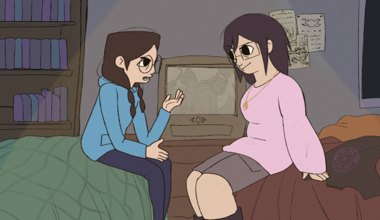
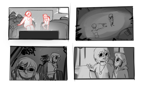
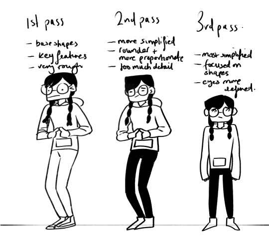
Here are some of the first drafts for concept art & style frames for my film! It was challenging to think of what scenes i wanted to do, since they had to be important ones, so i did some thumbnails of potential scenes to give me inspiration for what to draw. This was a really helpful way to plot out simple scenes very quickly.
The first one im most happy with since it incapsulates the exact kind of style I want for my film. Cartoonish but hints of realism, such as the objects and background looking more realistic which plays into the story - the main characters being caught up in their child-like game to notice the real world dangers around them. After the tutorial on the 12, I got some feedback to change it because there was too much purple, which i heavily agreed with. Though sticking to the colour palette was my original plan, it may be better to not be limited by it.
In addition to that, i also included the Wicca symbol for change and transformation, foreshadowing events in the film (Though the characters are not inherently pagan, i thought it’d be ironic considering they taunt and play with powers/forces out of their control) Here’s the original:
I also received feedback to change the streetview one which the sisters will travel down in two scenes. However, the colours are exactly how i want them to be so I’ll be taking that over into the new piece with more exaggerated perspective to add something dynamic to the scene.
The last concept frame I did was one I planned to be a zoom, and it might be the final shot I use for the film.
2 notes
·
View notes
Photo
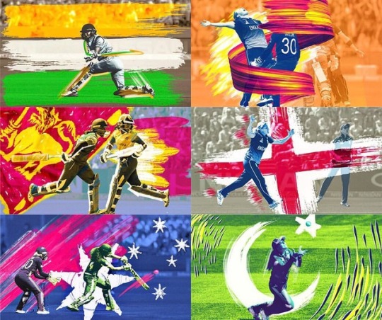
Styleframes from our winning pitch for the Women’s Cricket World Cup TV coverage title sequence and show package. Celebrating the passion, enthusiasm and diversity of the event with a distinctly Caribbean flavour. Using existing footage we stylistically treated carefully selected moments from the tournament with super saturated colours and graphic tonal overlays. The team’s flags were integrated into the footage as animated brush stroke illustrations. These graphic reinterpretations of each flag formed the main feature of the sequence, mimicing the motion in the footage and serving to accentuate the sporting action. Players were rotoscoped and treated with contrasting colour schemes allowing us to weave our brush stroke animations behind and around the players in 3D, adding new depth and movement to the sequence. . . . . . . . #titlesequence #brushstrokes #womensworldt20 #t20 #womenscricket #cricket #cricketlife #lovecricket #visualgraphic #tvshowpackage #wearebolder #icc #tvc #creativepitch #ident #creativeagency #adobe #styleframes #2dmotiongraphics #graphicdesign #designagency #broadcastdesign #visualgraphc #graphicgang #graphicillustration #illustragram #illo #animatorsoninstagram #storyboarding #storyboard https://www.instagram.com/p/Bs3rNr1Hzh9/?utm_source=ig_tumblr_share&igshid=1qca53s0u8oiz
#titlesequence#brushstrokes#womensworldt20#t20#womenscricket#cricket#cricketlife#lovecricket#visualgraphic#tvshowpackage#wearebolder#icc#tvc#creativepitch#ident#creativeagency#adobe#styleframes#2dmotiongraphics#graphicdesign#designagency#broadcastdesign#visualgraphc#graphicgang#graphicillustration#illustragram#illo#animatorsoninstagram#storyboarding#storyboard
0 notes
Photo
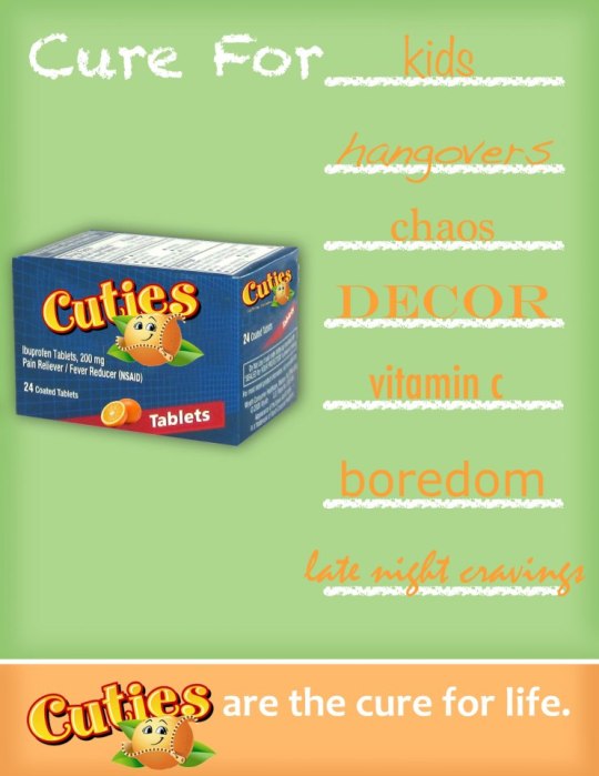
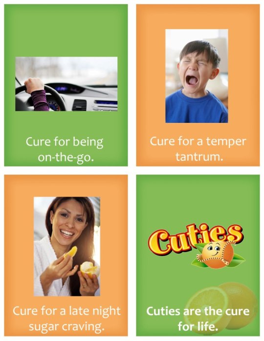
So this past week I had my Cuties creative pitch for my advertising class. In all honesty, I’m really proud of it and I think it came out REALLY well. I gained so much more respect and admiration for all the people who actually do this in the real world. Not only is it intense, fast paced, creatively challenging, and sometimes extremely stressful, but it’s also really fun and cool to think that the ideas you’re developing can go on to touch lives or make a difference in the world. I also learned how important objectives are to a campaign’s overall success.
My group expanded upon the objectives we were given by our “clients.” We were given the task to develop creative that would “Spread the word that Cuties are back.” Not only did our creative go with that objective, but it also repositioned the Cuties brand as a fruit for the whole family. Cuties has a history of keeping their product as a kid’s snack. My group wanted to really make it seem okay for moms and dads to consume the fruit too without feeling bad about it.
When compared to other groups - we really deviated from the main objective. Is that necessarily a bad thing? I don’t think so. We still really showed the audience that Cuties were back in season and made it known that moms and dads needed to go buy the healthy snack for their kids. However, you can’t sustain a full campaign with legs and arms on just the idea of hype and anticipation. There has to be some reason for moms to go buy the snack other than the fact that her kid loves Cuties. I think my team was successful in being able to accomplish both goals. Our creative was stellar and creative - you can see it with this post.
With all that being said though, objectives are SO KEY for campaigns because it’s kind of like the guidelines. It sets the frame for what needs to happen and what needs to be developed. Without them, a team is just kind of lost and clueless. So a key takeaway from this whole project is definitely to make sure objectives are thorough and given, and to follow them and make sure your creative relates back to them in a cool and fun way.
0 notes
Photo
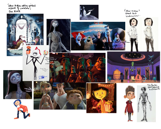

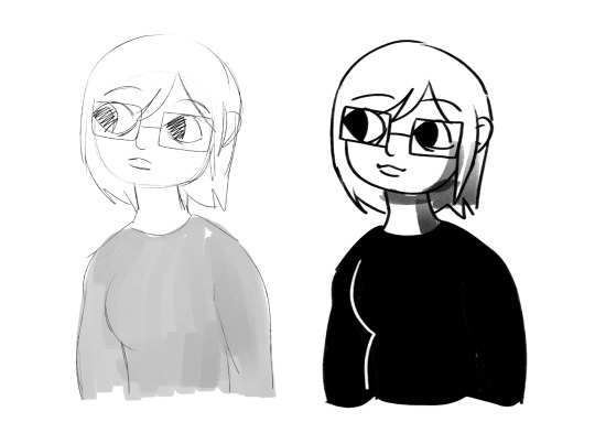
Character design update: after finishing my first drafts, I found that they weren’t quite the style I was looking for, since they looked too cutesy. I made a mood board of Tim Burton’s work to help me discover what I wanted to draw inspiration from, since he uses a lot of young characters in his films. I took inspiration from the bigger heads and long limbs, with large expressive eyes and defined noses & mouths. The features are squashed but still proportional.
The second image is a quick sketch I did whilst referencing the mood board, which looked much better to me.
1 note
·
View note
Photo
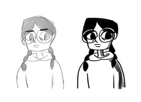
Final Designs
After the feedback, I decided to make their tops both completely different colours for a better distinction of character. I’m overall satisfied with these designs for now, since I think they strike a good balance of keeping important character details and also being relatively easy to animate. I also had a thought about how because the tops are a lighter colour, they’ll be easier to shade in the darker part of the film.
0 notes
Photo
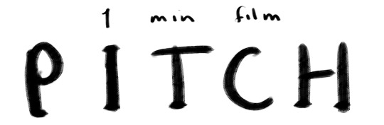
Here’s the PDF for my 1 Minute Film Pitch!

0 notes
Photo
Some more sketches of Bex & Geo. I drew these two sketches to get used to repeatedly drawing the characters, as well as to decide what kind of line thickness I wanted in my film. I think the left was too sketchy and would make my drawings too inconsistent, and the right one was too thick. I’ll strive to go for an inbetween. I really like rough pencil textures coupled with smooth lines, so thats the sort of brush I’ll use for them
0 notes
Photo
Here’s the PDF for my Character Designs!
Here’s the PDF for my Backgrounds & Concept Art!

0 notes
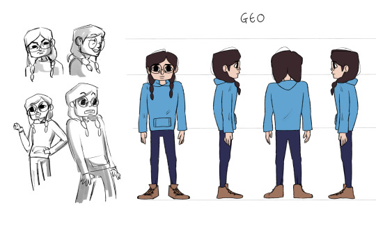
Photo
Geo
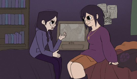
Geo is a nine year old girl from England, living with her family and shares a room with her sister. She has a curly bob and round glasses with a square face. She wears a hoodie and black leggings with trainers. She’s thoughtful, reserved, and shares a similar humour with her sister after living together so long, but often takes things too seriously. She looks up to her sister, but often gets wrapped up in the logical side of Bex’s bold statements. She pretends to brave in the face of danger to impress her sister, even though she’s actually cowardly.
This is the rough drafts for my character, Geo, in the 1 min film! Here, I wanted to contrast her sisters shapes so I gave her a sharper, squarer form to fit the more rigid personality. I also chose round glasses to contrast the square face. I’m not entirely satisfied with the style yet, but i think this laid out a good foundation for what kind of form she will have - lanky, tense, reserved.
0 notes
Photo
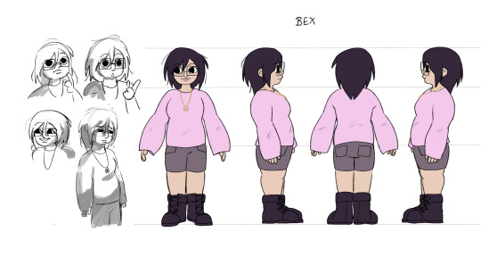
Bex
Bex is a sixteen year old girl from England. She lives with her parents in a comfortable home from a village. She has short straight brown hair and square glasses with a round face. She wears a tank-top with a cardigan, and shorts with combat boots. She’s cheerful with a good sense of humour and a big dreamer, but struggles to stay motivated to meet her goals. She has a great relationship with her sister, but often gets into arguments with her about the shows they watch together. When paired with Geo, they encourage each other, for bad or for worse. The severity of a situation does not sink in for her until the danger is tangible, which is shown near the end of the film.
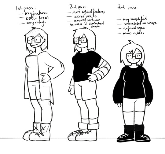
These are my first drafts of the character design of Bex in my film! I wanted to get a feel for what sort of style I think would work, so started rough with a basic human figure in a cartoonish style with minimal detail, however I think the aesthetic isn’t fitted to a horror genre film yet.. In the notes: with each evolution I was trying to aim for something maybe not as simple, but with memorable features - big black sweater, big boots, square glasses. I specifically chose to give her square glasses to contrast the roundness of her face.
0 notes
Photo

~+* First post! *+~
Teaser
Two sisters venture on midnight trip to the park for a dare. It turns grim when the darkness becomes an enemy.
Synopsis
Bex and her sister, Geo, are a pair of inseparable sisters, having a regular night of downtime. They are watching their favourite horror TV show about two brothers fighting ghosts and demons to save the world. Bex jokes about how they could live that life easily with Geo, but Geo disagrees. Eager to prove her point, a dare is made for Bex to go to the local park, rumoured to be haunted, and to ‘defeat’ it using weapons from the show: salt, an iron fire-poker, and a cross. Sneaking out whilst their parents sleep, they make their way to the park in the dark midnight hours, doubts creeping up on them both as they’re forced to confront whether they truly believe in the supernatural, and if there’s something worse in the shadows that’s waiting for them.
Medium
May switch between animation style – 2D but may use a combination of traditional and digital for example using traditional drawings for the background and animate digitally on top, using William Kentridge as inspiration
0 notes
Last Seen Blogs
shootah
WATTS UP

sub380
Sans titre

ohimtherebabey
another cock in the murder machine

tepoteblog
Tepote