#css animation tutorial
Note
Twine support please Super Manon🙏
How do I make the title at the top of the chapter flicker?
YAY an animation question :D
Preface: animations are great and fun to add to the ambiance of the project, BUT are not always accessibility-friendly. Try to consider this when starting a project (and include a toggle for animation, similar to the notification toggle here).
There are many many different ways to make a text flicker, it really depends what you mean by flickering:
SugarCube Add-On shaking the text
Greyelf had compiled a bunch of different text animation here, that you can find in Harlow. A handful makes the text flicker/move.
HiEv's glitchy code (can have subliminal messages)
HiEv's drunk code (less flickering, more blurry)
HiEv's blinking code (flickering, but not forever, can be made so)
And then, there are probably hundreds of codepens or the-like on the internet animating text to flicker (search "CSS flicker text" for a few results, here's one making it look like a neon sign!).
Note: whatever CSS/JS code you will find online that is not created specially for Twine will need to be tweaked. This has to do with the built-in CSS/JS code in the format used.
But, let's do a simple flickering animation as an example to talk about the base of CSS animation.
As always, the basic code can be found in my Paste-Bin (because Tumblr sucks).
CSS ANIMATIONS - The Basics
Animations created with CSS needs essentially two things: a '@ keyframes' (damn you Tumblr) and the 'animation' CSS rule. The first defines the way the animation will go, the second will link that animation to the relevant block and indicate other information (how long it lasts, whether it loops, whether there is a delay, etc...).
And for it to work, you'd need a container to target (like a span or a div) wrapping the text.
Keyframes
All keyframes are built in the same way:
@ keyframes animation-name {
keyframes-selector {css-styles;}
}
You will need to indicate :
a name. Here, let's take flicker.
a selector a.k.a the percentage of the animation duration where something changes. It can be done in percentage (0-100%, you can have whatever number you want) or with "from/to" (same as 0 and 100, any other stop needs to be in percentage). Here, let's have the flicker happen half-way through.
a css-rule which changes the style. It can be anything, from changing the colour, to the size, to its placement*. Here, flickering the text will mean changing the opacity.
So, for the example, we will get this:
@ keyframes flicker {
0% { opacity:1; }
50% { opacity:0; }
100% { opacity:1; }
}
*Note: some CSS animation (like placement or rotation or transform) will need for the target item to be displayed as a block or positioned in absolute. The more complex the animation, the more you will need to test and tweak.
Animation Rule
Now that we have an animation, let's link it to the targeted item. The animation CSS rule is a compiled version of 8 different rules (animation-[insert rule name]). the most important ones are the following:
animation: name duration iteration-count;
Here's what you need to define:
name [also animation-name]: the name of the keyframe animation. Here, we defined it as flicker.
duration [also animation-duration]: the duration of the whole animation. Let's make it 1 second here.
iteration-count [also animation-iteration-count]: how many times the animation goes. Since we would want it to flicker forever, let's make it infinite.
If you want to go further, you can also defined the following aspects:
timing-function [also animation-timing-function]: indicates the curve of the animation speed (slow start, slow end, etc...)
delay [also animation-delay]: delaying the start of an animation.
direction [also animation-direction]: whether an animation should be played forward, backward, or alternating.
fill-mode [also animation-fill-mode]: define whether an animation takes the styling in the start of the animation or the one at the end.
play-state [also animation-play-state]: define whether the animation is playing or paused.
Going back to out example, we have defined the animation rule as such:
animation: flicker 1s infinite;
In the meantime, I have wrapped my text in a div:
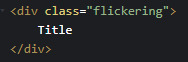
And included the css rule to my stylesheet:
.flickering {
font-size: 50px;
animation: flicker 1s infinite;
}
Now to check if it works!

Yay!
Now go forth an create weird animations :D
89 notes
·
View notes
Text

CSS Blur Background Image on hover
#css blur animation#css blur background#css animation tutorial#html css animation#html css#codenewbies#html5 css3#css animation examples#css blur background image on hover#css#frontenddevelopment#pure css animation
5 notes
·
View notes
Text
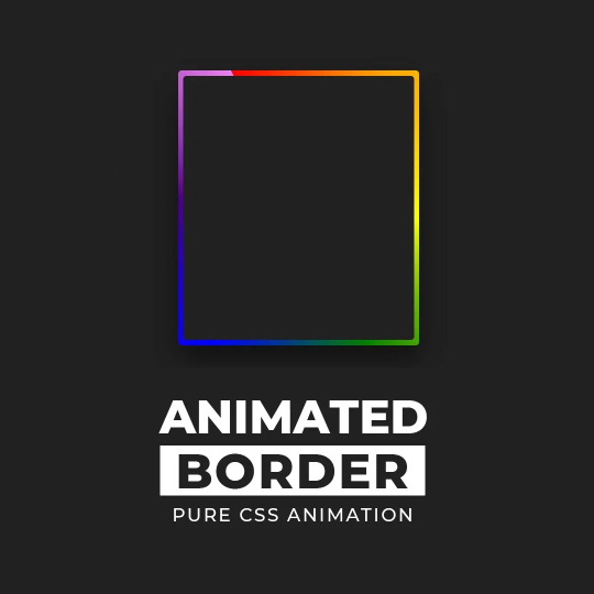
CSS Gradient Border Animation
#gradient border animation#css border animation#css animation examples#css animation tutorial#css animation#cool css animation#css gradient animation#css gradient#learn to code#code#html css#css#html#css3#frontenddevelopment#webdesign#frontend#gradient
7 notes
·
View notes
Text

CSS Form Input Animation
#html css form#css form#form design html#css input label animation#input label animation#css animation examples#css animation tutorial#cool css animation#html css#divinector#learn to code#code#frontenddevelopment#css#css3#html#animation
3 notes
·
View notes
Text
youtube
Fancy css button animations
2 notes
·
View notes
Text
Animation : CSS Bouncy Loader 5 examples.
The CSS Bouncy Loader is a simple animation that creates a bouncing effect, typically used to indicate to the user that content is loading.
#best design#loader#css animation tutorial#webdesign#webdevelopment#html5 css3#css animation examples#loaderdsign#beastloaderdesign
3 notes
·
View notes
Text
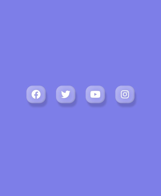
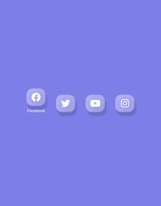
Floating social media icons Using HTML CSS
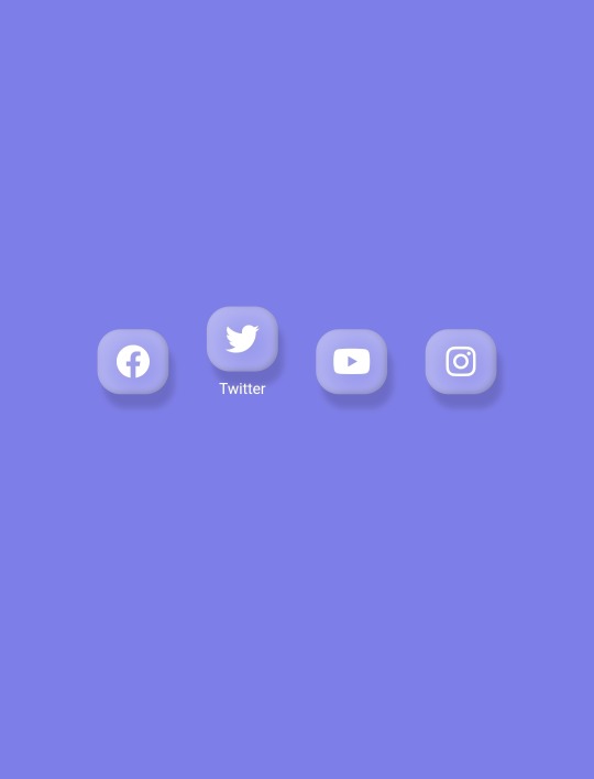
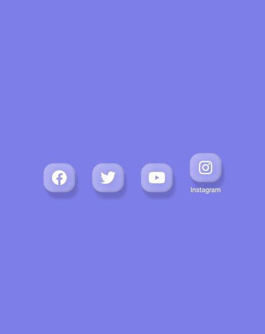
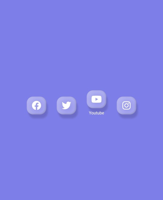
youtube
#fronten#frontend#css animation tutorial#htmlcoding#css#htmlandcss#webdesign#html#coding#css animation examples#Youtube
2 notes
·
View notes
Text

5 notes
·
View notes
Text
Mastering HTML5: The Complete Guide to Modern Web Development
https://buy.stripe.com/dR6dUN4Mx7G72hG8wz
0 notes
Text
CSS tutorials for beginners: Learn CSS step-by-step with WebTutor.dev
CSS, or Cascading Style Sheets, is a stylesheet language used to describe the presentation of a document written in HTML or XML. CSS allows web developers to separate the presentation of a web page from its content, making it easier to maintain and update. CSS works by using selectors to target specific elements on a web page and applying styles to them. Styles can be applied to individual elements or to groups of elements, and can include properties such as font size, color, background color, padding, margin, and more.
CSS provides a powerful and flexible way to style web pages, allowing developers to create beautiful and responsive designs that work across different devices and screen sizes. By mastering CSS, you can take your web development skills to the next level and create stunning websites that stand out from the crowd. To get started with CSS, you will need to learn the basics of CSS, including selectors, properties, and values. You can then start experimenting with different styles and layouts to create unique designs for your web pages. There are many online resources available for learning CSS, including tutorials, videos, and courses, like Google CSS, WebTutor so you can choose the method that works best for you.
3 Methods to Add CSS to Your Web Page
To add CSS to a web page, you can use one of the following three methods:
Inline CSS: Inline CSS is added directly to the HTML element using the "style" attribute. For example, to set the text color of a paragraph to red, you can use the following code:
<p style="color: red;">This text is red.</p>
Internal CSS: Internal CSS is added to the head section of the HTML document using the "style" tag. For example:
<head> <style>
p { color: red; }
</style> </head> <body>
<p>This text is red.</p>
</body>
External CSS: External CSS is added to a separate CSS file with a ".css" extension. The CSS file is then linked to the HTML document using the "link" tag in the head section of the HTML document. For example:
<head>
<link rel="stylesheet" href="styles.css">
</head> <body>
<p class="red">This text is red.</p> </body>
Understanding the Basics of CSS Syntax and CSS Selectors
CSS syntax consists of a selector followed by one or more declarations enclosed in curly braces. A declaration consists of a property, followed by a colon, and a value, separated by a semicolon.
CSS selectors, on the other hand, are used to target specific elements on a web page and apply styles to them. Selectors can target elements based on their element type, class, ID, attribute values, and more.
For example, consider the following CSS code:

In this example, h1 is an element type selector that targets all h1 elements on the web page, #header is an ID selector that targets the element with the ID of "header," and. intro is a class selector that targets all elements with the class of "intro."
By mastering both CSS syntax and selectors, developers can create effective and efficient stylesheets that apply styles to their web pages in a targeted and precise manner. There are many online resources available for learning CSS, including tutorials, and courses, making it easy to get started with CSS and advance your skills.
By mastering the syntax of CSS, developers can create effective and efficient stylesheets that apply styles to their web pages in a targeted and precise manner.
Additional information about CSS comments
CSS comment syntax used to add notes or reminders to the stylesheet for developers to reference later. They are ignored by the web browser and do not affect the rendering of the web page.
In CSS, comments can be added using two forward slashes (//) or by enclosing the comment in /* and */.
Example
/* This is a CSS comment that spans multiple lines.
You can add any notes or reminders here that can help you or other developers understand the code. */
h1 {
color: blue; /* This sets the color of all h1 elements to blue */
}
In this example, the first line is a CSS comment that spans multiple lines and is enclosed in /* and */. The comment is used to provide additional information about the code that follows.
The second comment is a single-line comment that starts with //. It is used to provide information about the line of code that follows it.
By using comments in CSS, developers can make the code more readable, maintainable, and easier to understand.
Overview of CSS colors
Colors are an important aspect of CSS and are used to style HTML elements with various shades, tints, and hues. In CSS colors can be defined using keywords, RGB values, HEX values, HSL values, and more.
Keywords: CSS provides a set of predefined color keywords, such as red, blue, green, black, and white, among others.
RGB values: RGB stands for Red, Green, Blue and is a color model used to represent colors in digital devices. RGB values range from 0 to 255 for each color, where 0 represents no intensity and 255 represents full intensity. RGB values can be defined using the rgb() function, like so: rgb(255, 0, 0).
HEX values: HEX values are another way to represent RGB colors in hexadecimal format. HEX values start with a # symbol and are followed by a combination of six letters and numbers that represent the intensity of the red, green, and blue components. For example, #FF0000 represents the color red.
HSL values: HSL stands for Hue, Saturation, Lightness and is another way to define colors in CSS. HSL values can be defined using the hsl() function, where the hue is represented by a value between 0 and 360 degrees, the saturation and lightness values range from 0% to 100%. For example, hsl(0, 100%, 50%) represents the color red. By using any of these color formats, developers can add a wide range of colors to their web pages and style their HTML elements in different ways.
#Css Tutorials#Learn online CSS#learn the basics of CSS#Basics of CSS Syntax. learn CSS Selectors online#mastering the syntax of CSS#important aspect of CSS#learn CSS colors#online CSS colors#learn css#head first html and css#html css#best place to learn html and css for free#css animation tutorial#css lilac#online tutorial
1 note
·
View note
Video
youtube
Flower Animation In Css | Css Animation Effects | Html Css Graphic Design
0 notes
Video
youtube
HTML Block and Inline Elements | HTML Full Course Part 15
#youtube#development css html5 php nodejs wordpress javascript react angular python vuejs django redux typescript 100daysofcode udemy javascript30 b#learn html#html5#html#css animation tutorial#pure css animation#css
1 note
·
View note
Text
Background Loop CSS
#css background loop animation#pure css animation#css animation tutorial#html css animation#animation#html css#codenewbies#frontenddevelopment#css animation examples#css#html5 css3#code#animated
3 notes
·
View notes
Text
CSS Text Glitch Animation
#css text glitch effect#text glitch css#text effects#css animation tutorial#html css#css#html#frontend#codingflicks#neduzone#glitch animation html css#code#css3#frontenddevelopment#animated text#animation
3 notes
·
View notes
Photo

Animated Background CSS
#css background animation#background animation#css animation examples#css animation tutorial#pure css animation#css animation#latest css animations#css tricks#animated backgrounds#html css#learn to code#code#divinector#animation
12 notes
·
View notes
Text
How to add animations to your website?
CSS animations make an element of the web page move or change its appearance during an action by the user. Modern websites use animations to draw the user’s attention and make the navigation interactive.
Animations help make the website dynamic and offer a satisfactory user experience.
So let’s see how we can make our own animations.
How to add animation to a website?
1)- animation-name and animation duration
To apply an animation to an element we should first of all give this animation a name and a duration.
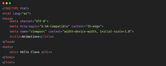
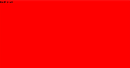
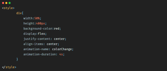
Let’s say that we have a simple <div></div> where we will add some text and we want to animate it.
We will give the <div></div> a width of 50%, a height of 400px and a red background-color. So the HTML will be:
And the CSS that you can add inside the <head></head> tag will be:
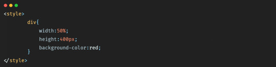
So in the browser we’ll have a simple <div></div> like this:
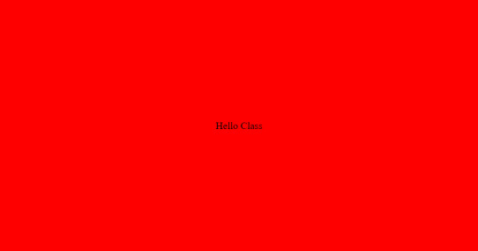
Let’s add a display flex style to center the text in the middle of the <div></div>.
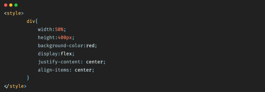
So in the browser we have:
Now let’s animate our <div></div>. Let’s say that we want the background-color of the <div></div> to move from red to yellow.
First of all we should add a name to this animation so that we can capture it after, and then we should add a duration to say how long should it take for the <div></div> to go from red to yellow.
So the code will be:
So here the animation-name property allows us to give a name to our animation. And animation-duration allows us to give a duration to the animation.
But by adding these properties only we will not see anything on the browser, nothing will happen.
To run the animation we should use the @keyframes property and add to it the name of the animation like below:
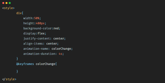
The @keyframes property defines a starting point and an ending point for the animation, which will be expressed by adding keywords from and to.
So to make our <div></div> go from red to yellow within 4s we’ll add the code below:
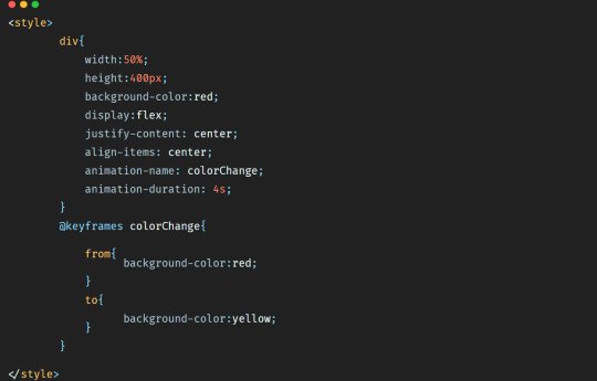
So in the browser we’ll have this animation:
youtube
As you can see, the color went from red to yellow within 4s.
We can also change the width and height properties of the <div></div>. Let’s say that we want the background-color to change, but we want also the width to become 30% and the height 200px.
The code will be then:
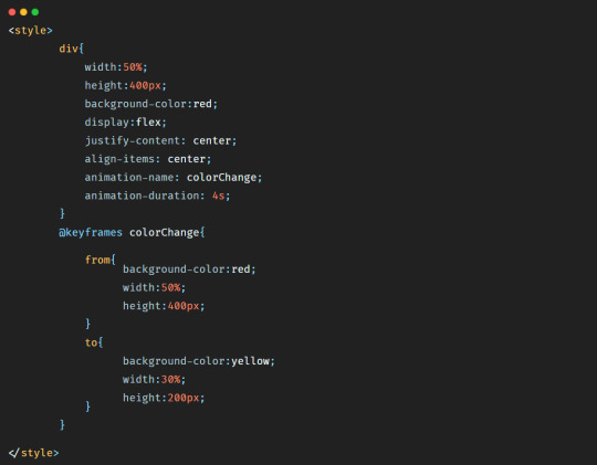
In this case the animation will be:
youtube
Now let’s say that we want to change the background-color of the <div></div>, but this time we want the background-color to be blue first, and then green, and then pink, and then at the end yellow. And let’s make the duration of the animation 8s to have time to see it.
So the code will be:
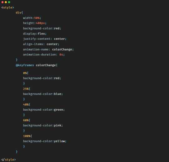
Here as you have probably noticed, we removed the keywords from and to and used percentage instead. It is because by using percentage we can define more styles that we want to see during the animation of our element.
The animation will look like:
youtube
To continue reading check my tutorial: https://purpose-code.com/how-to-add-css-animations-to-a-website/
#css#css animation tutorial#css animation examples#html css#development css html5 php nodejs wordpress javascript react angular python vuejs django redux typescript 100daysofcode udemy javascript30 b#learn css#htmlandcss#html5 css3
0 notes
Last Seen Blogs

boogieboba
ceo of disco dan

psycho-chantal-maille
Psychologie-Psychanalyse

joqahocac
Untitled

nulldc-cheater-download-jd
👑 nulldc cheater download (2022 PC) AVWV?

seoul-bros
Seoul Bros