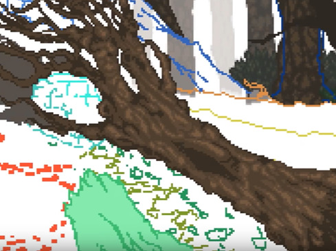
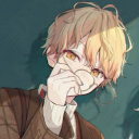
#drawn on such a small canvas it's almost pixel art
Text
1 am experimenting

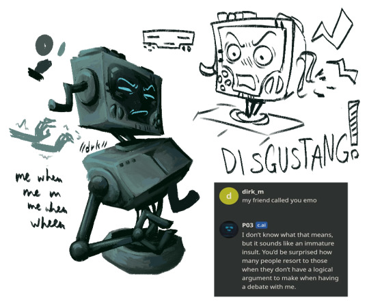
#drawn on such a small canvas it's almost pixel art#inscryption#daniel mullins games#inscryption p03#P03#PO3#he doesnt know what emo is#trying to spice up my rendering i like how this looks so far tbh#if a heartless machine why sp bitchy bout card games#love him sm you have no idea#i love his design n all but i will NOT be drawing his complicated ass arm at 1 am
391 notes
·
View notes
Note
First of all, I'm absolutely loving your comic. The way you draw, the backgrounds, the color, everything is just beautiful. And I'm really enjoying the story you're telling too! (Fellow ace here to thank you for the high quality asexual representation. You are AMAZING.) Thank you for existing and making art!
Can I ask an art question? What size of canvas and what size of brush for line art are you using for the comic? Everything looks so clear and crisp. I feel like I could just walk right into the scene.
Ah thanks so much!!! 💖 Quality Ace rep is a thing near and dear to my heart, so I'm glad I can provide for fellow aces~
And sure thing! I work almost exclusively in MediBang Paint, as it's just about the only good art app I've been able to find for Android tablets. :'D Initial canvas size is 2100×5700px at 350 dpi (so, uh- huge) so I always reduce to 600px wide in photoshop and slap a quick "sharpen" filter over it before posting.
As for my inking brush settings- here!
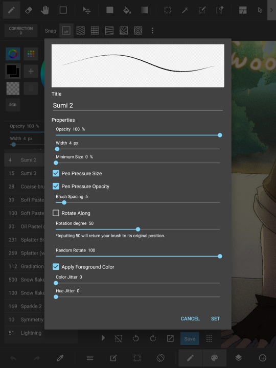
I like it because at that small size, it's only 1 to 2 pixels wide- but I still have pressure sensitivity for really, REALLY light details if needed. Then once the lineart is fully drawn, I duplicate the layer twice to strengthen the lines, and put a 3 pt gaussian blur on one of the duplicates- then lower the opacity to about 50% on the blurred layer. The result kind of reminds me of animation cels? And I really like that look lol.
Thank you for taking the time to send an ask! :D I'm always happy to answer questions! ^^
12 notes
·
View notes
Text
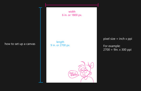
Things to keep in mind when preparing an illustration for print!
Disclaimer: I’m writing this specifically for a potential zine publication, so it’s not going to cover everything there is to know about going from digital to print. However, for illustrators, we can keep things pretty simple!
When you want to print your drawing, there’s two things that are important: SIZE and COLOR SPACE
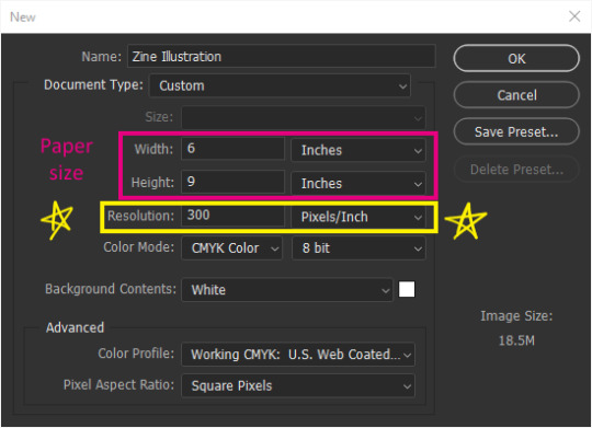
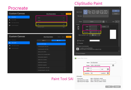
Hopefully this looks very familiar to everyone. This is what you see when you make a new canvas in Photoshop. It’s under File>New or Ctrl+N. It’s also the same in Procreate, CSP, PaintToolSAI, and other similar programs.

First off, make sure you are working at 300 pixels per inch (ppi)!
Photoshop’s default is 72. That is no good because printers work at AT LEAST 300 dpi (dots per inch). That means 300 dots of ink per inch (ish). Each pixel converts to a dot. Any less than that, your image will either not be as sharp as you saw it on your screen, or it will print too small.
After you’ve set your resolution to 300 ppi, you can type in your paper size. Width is the horizontal, or side to side, dimension. Height is the vertical, or up and down, dimension.
In other programs, the dialogue box should look pretty similar.
This is what my canvas will look like. I am just using 6x9in as an example since that seems to be a popular zine size, but you can work at whatever size you want. I’ve also added what these dimensions would be as pixels since pixels matter more if you’re also planning to post online.
A good range to stay around is 720+ pixels for your shortest dimension (think about it like youtube quality). Most artists stay around the 2000px to 5000px range depending on how much detail they want to draw and strong their computer is. More pixels = more yummy detail. For example, these two crops are the exact same pixel size, but one of them is closer up because the original image was drawn bigger. You can only do that with a bigger canvas.

Sounds obvious but you’d be surprised at how many of my classmates are trying to zoom in on their tiny default 5x7 at 72 ppi PS canvas and they’re like “why is it all pixelated!?” It’s because you have no more pixels, bro. Make your canvas bigger.
So, just because you’re planning to print at 6x7in 300dpi, doesn’t mean you have to stick to those dimensions. As long as the ratio is the same, it’s better to draw at 2 or 3 times the minimum pixels, and then downscale it again later.
Next, convert your Color Space (here it’s listed as Color Mode) to CMYK 8 bit. This is very important for print!
Don’t do this if you are not going to print. There’s a few drawbacks to CMYK that we’ll go over.

If you’ve already created a canvas, you can edit the Color Space (now they call it Color Profile...) by going to Edit > Convert to Profile... and select from the menu.

CMYK color space changes your file so it will only show colors that a printer is able to reproduce, which is also known as a color gamut. Put super simply, digital art is normally seen on an RGB screen, which, depending on your screen’s quality, is able to create very pure, and very bright colors, as well as very subtle darks and whites because you’re playing with actual light. The RGB color gamut is much wider than CMYK. When you print, you can only get as white as your paper and as dark or vibrant as your ink, and if you hold your paper up to your screen at full brightness, your paper isn’t going to look very white.

If you work directly in CMYK from the get go, Photoshop can almost guarantee that your print will have the same colors as what you intended.
or something like that. There’ll be less surprises. RGB is able to create such bright colors because it mixes light “additively” all the way to white. CMYK is like paint, it mixes colors “subtractively” so it’ll only get duller all the way to black.
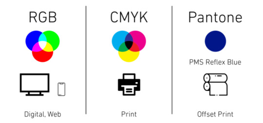
- I borrowed this handy dandy graphic from this article that explains RGB vs CMYK from a graphic design POV: https://blog.iccbusinessproducts.com/rgb-and-cmyk-correct-file-formats
- I also super oversimplified the nuances between the two color spaces, so if you’re even more confused, I recommend reading this article: https://tips.clip-studio.com/en-us/articles/4464
Unfortunately, you can only work in an RGB Color Space in ClipStudio Paint. Here is a link to a way to “proof” or preview the print in CSP: https://tips.clip-studio.com/en-us/articles/5656#763fe323
The last thing you need to know about printers is that they can’t print to the edge of your paper.
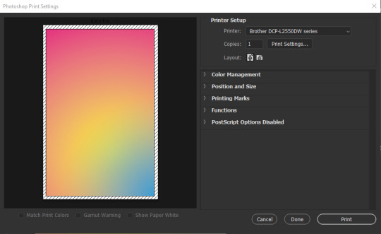
You will always have a 1/8th inch-ish unprinted border around your print. In Photoshop, under File>Print, this unprinted area shows up as those diagonal lines. You can chop it off with some good ol’ shears or straight-cutter but if you absolutely NEED your print to be a certain size, you will have to print on a larger piece of paper than your illustration, at least 1/8th inch on every side (so add a 1/4th inch to each dimension).
For example, since I want my zine to be 6x9in. our paper will need to be at least 6.25x9.25 inch. If you’re sending your image to a professional print shop, you can ask them if they’re able to print to the edge. Though personally, I’d rather just use a common paper size and just chop off the unprinted spots since common paper = cheaper paper.
tl;dr
Change your Resolution to 300 pixels per inch.
Change your Color Space/Profile/Mode to CMYK if you can.
Printers will leave yucky white borders on your print.
Work on a bigger canvas than you expect to print at so you can sneak in all those juicy details.
11 notes
·
View notes
Text
My approach to flat colors + limited palette drawings
This is a follow up to this post i made about how i go about figuring out a color palette for my limited palette drawings. an anon asked me about my actual technique of finishing them so this is gonna be an explanation of how I work in a limited palette with flat colors. I ended up with these thumbnails for a sketch last time so we’re gonna work from here and I’m gonna sort of walk through how i got to the finished version

first things first: every part of this process is just developed as a result of me messing around. take my advice with a grain of salt and if you think you know a way to do something better/that makes you more comfortable. go with that over what I say.
I’m honestly a little surprised when people express confusion about how i draw like this because it’s SUPER simple - literally all you’re doing is just stacking solid color blocks of shape. its very imprecise despite how sharp everything ends up looking.
First things first is that you want to decide how you will be handling your edges throughout the duration. Do you want your shapes to be ultra-sharp and precise, or do you want a little bit of a wobblier, grainier edge? Both can look good but it’s VERY much a matter of situational basis. i’ve been favoring looser and grainier shapes so that’s how i’m going to be working on this.
on the left here, you can see the shapes made with precise rectangular selections and an untextured pen, on the right, freehand drawn shapes and a grittier pen. There’s something immediately pretty different feeling about them. So play around with that first - its not something that’s fun to change halfway through! But lets step back a minute. It helps to work large to small. The two biggest shapes here are these orange chunks and everything gets stacked on top of them so i’m gonna do that first.
Now, a key feature of what i do: clipping masks. almost all digital art programs have them. What a clipping mask does is it constrains the pixels of a layer to the transparency of the layer below it. Here I have the light orange layer, and then on top of it the buildings and billboard are clipped to the orange. Most of you probably already know this and I’m overexplaining a bit, but there was a time when i didnt know how clipping layers worked and someone had to explain it to me.

now you’ll notice the shapes of the buildings are rough, and sloppy. here’s the fun part: since this is all about stacking shapes, only your exterior edges matter. this all gets filled in. be as sloppy as you want when you’re making your shapes. in fact, the outside edges get trimmed out a bunch to when i do this - i go in and erase them clean. Don’t be too finnicky about drawing perfect and precise! its a waste of time. As long as the silhouette is what you want, the interior can be a nightmare.
Working this way, it’s important to keep your layers stacked in a way you can make sense of. Right now there are four layers here: the background dark orange, the two main orange rectangle shapes, and then the buildings on one layer and a billboard on the other. I rack up a LOT of layers doing this and it makes it annoying in some aspects, but being able to freely recolor any one chunk without losing my detail is a key aspect of this.
So, I block those out
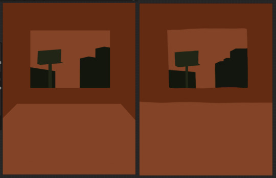
Next, I do the same for the smaller chunks that are still main shapes. There are once again, a lot of layers here. The top layer is the hair - you can see the head showing through it. The head and arm underneath the hair, same layer. Then the cup. Then the light green pieces of paper. Then the dark green ones.
The cup is technically farther forward than the head and arm so you would think it’d go on top, but the point isnt to recreate the foreground and background hierarchy with layers so much as it is to group things in a way i can work with. The cup goes underneath so it can be grouped with all the other objects on the table.
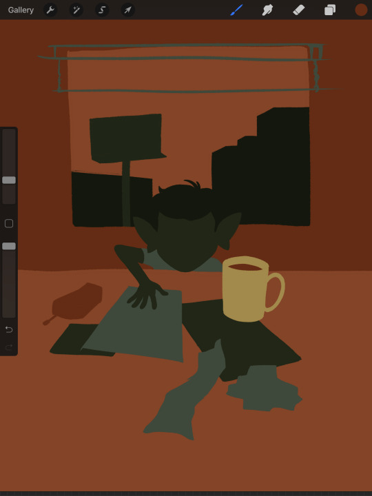
now, i just go and fill in all the shapes. i forgot to do the blinds but i get them later. you might notice a lot of these shapes are pretty rough, which was harder to notice before they were filled in. Now that I can see better, I go in with an eraser and clean up the edges until they’re the shape I want

sometimes erasing leaves little bits of ‘noise’ around objects like on this napkin here. i like to keep a little bit of this noise for texture, but if you dont like it make sure to get rid of it! if you’re working very crisp this will stand out a LOT
Next up is to add some detail onto the objects
I flipped the canvas here because the head shape was wrong - the ears were uneven and i wanted to fix it. I want to go about adding detail onto the billboard and buildings. i do all detail with clipping masks - but the objects are clipped to another layer and so nothing can be clipped to them. instead, i unclip them and just erase by selection for the same effect
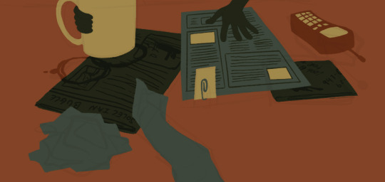
all of the text on the papers is clipped to the papers below it. the buttons are clipped to the phone. the yellow photos and card are actually another independent layer on top, in case i want to recolor them separately. im indecisive and end up recoloring things a lot. For the most part these objects are starting to become recognizable as more than just shapes
i go in an add the details on the background and character now. theres some more stuff on the table. the lines of the face and ears are on one layer, and the flats of the eyes below that. Here’s what each group of layers is, and what they look like on their own

The background/bottom chunk. Just the table, window, and shirt.
The middle bit. All the stuff on the table and the blinds.

Finally, the top, which is just his head and arm.
now this stage is the bare bones of the drawing. you can more or less tell everything that’s happening. it reads. but its very much lacking in something - it doesnt have a ton of depth or interest. and adding that additional detailing, the dept and interest, is where stuff starts getting REALLY tricky and subjective.
im gonna take you to a much simpler scenario to show the sort of options i go through at this stage
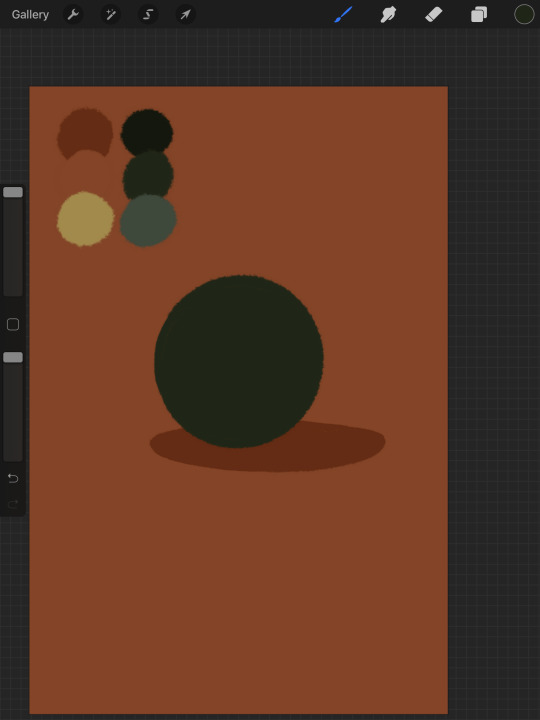
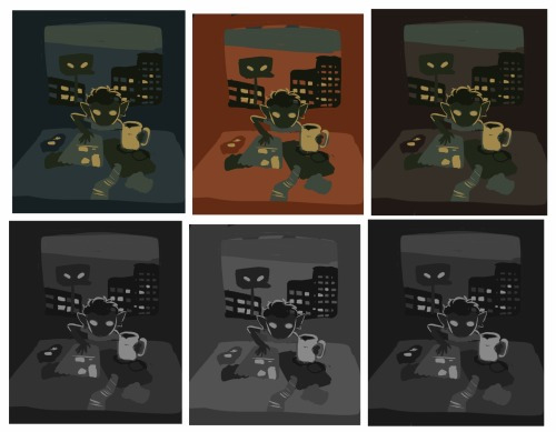
ahh its our dear friend, sphere casting shadow. this is, more or less, the kind of image we have. you can tell whats happening but it’s lackluster. there are TONSSS of ways frm here that you can go add interior detail to a shape once it has been established. here are some quick and SUPER rough examples
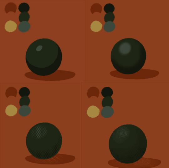
from top left to bottom right: flat cel shading, softer airbrushed/gradient shading, halftone, and a textured brush. Each of these has their strengths and weaknesses. They can also be combined.

for example, here’s the solid cel shading being used to contain a gradient/airbrushed detail. This image - probably the single oldest piece of my art i still willingly show people - is entirely colored with gradients being contained in cel-shaded chunks. It has a sort of soft, luminous quality but without losing its crispness.
here’s a super quick bust with some variations of stuff going on. obviously this is no masterpiece but you see how different types of detailing can interact with each other and be used to distinguish materials too.

With the mob psycho comic I did, the detailing that wasnt line was done using a variety of halftones of different shapes layered on top of each other


by contrast parts of my ace attorney comic use a textured brush and have a sort of blended, papery feel
any of them can work for pretty much anything as long as you are using it with intent. practice around. mix styles of finishing together. find a comfort zone. the more you do it the more intuitive it becomes and at the heart of it this process is a very intuitive way of drawing because of how far removed it is from realism.
Now here is the trick - light and shadow.
Everything up to this point has been very flat and adding detail helps but there’s only so much that can accomplish. To get HEAVY light and shadow you need to think about things differently. I think if there’s any part of this process that’s complicated, its this one.
To truly get the most out of your palette, you need to pick chunks of an image to be in higher/lower light and then either ‘step up’ or ‘step down’ the colors in that chunk. here’s what I mean.
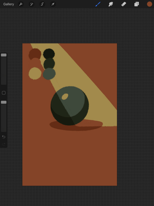
Here’s our ball with a beam of light on it. Everything Within the beam of light is one step in our limited palette lighter than anything outside of it. Here’s how I go about doing this: the shape of the beam of light is below everything else. Then, once I have the shape blocked out, i select it. With that selection in place, i go to EVERY SINGLE LAYER that’s effected, lock the opacity, and recolor that chunk. So what’s going on here is that there is only one more layer - the beam of light, below everything but the background, and the rest of this effect is just caused by every layer above it now being two-toned following the exact same silhouette. THIS is why it’s so important to keep your layers separate - if the shadow and highlight had been painted onto the base directly, i would not be able to do this without significant effort.
This works with all of the finishing techniques I talked about above
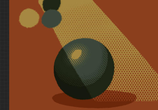
A combination of cel shading and half toning, all stepped up to give the appearance of heavier light on one area.This is also how I go about rendering transparency in this style. All of my layers are fully opaque and I allow the colors to do the work of conveying transparent material

Here’s our ball with the patterned/textured brush shading, being viewed partially through a window
it’s obviously not a very representational way of working, but as long as your audience UNDERSTANDS what you’re trying to convey, then you’re executing it successfully.
So with that, now we’re gonna go and finish this drawing.
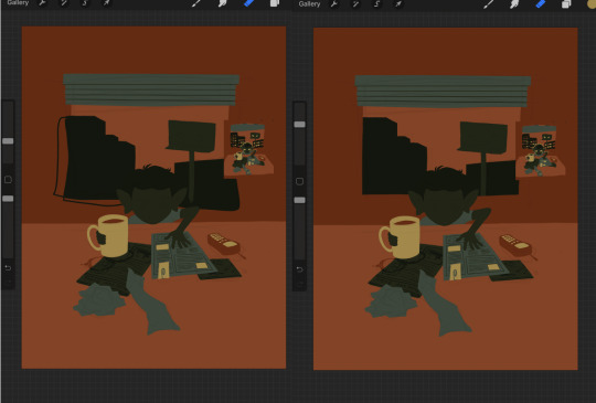
For this one, I decide a big central shadow is necessary. In the original thumbnail, he was backlit, which I still plan on doing, and that wouldn’t make sense without casting a shadow.

I’ve had to change the colors of some objects entirely in order to get this to work right. This is what I mean when I call this an intuitive process - some stuff felt weird, so I changed it. This also involves a bit of problem solving. The newspaper is now unable to be separated from his hand. Sometimes changing the color of an object makes that object look better, but ruins its relationship with the objects around it. It’s up to you to learn how to adjust and finagle things until you get it where you want.The paper he has and the napkin underneath it also all blend together now.
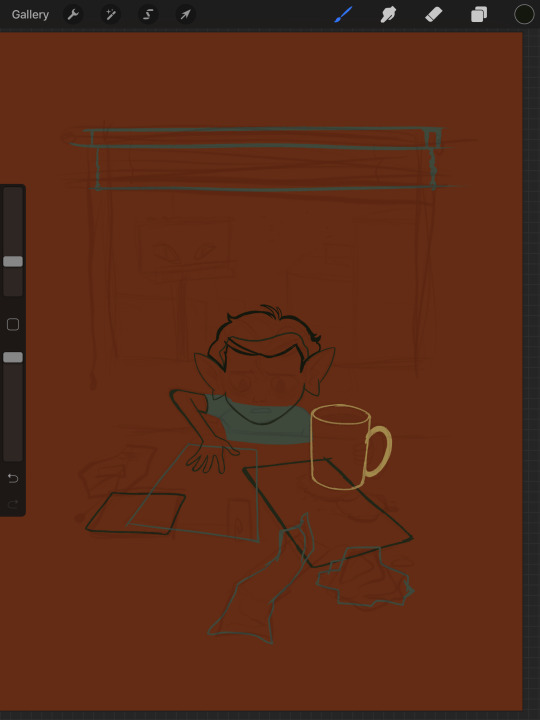
The next few parts of this process are REALLY just trial and error, where I toss a bunch of spaghetti at it until it works. It’s hard to decide what to screenshot, because I don’t know what will or will not be part of the finished drawing. To that end, you can watch the recording of this drawing here. This video isn’t edited at all so it contains a couple of minutes of really shitty sketching, and then all of the color thumbnailing work i did in the last post. Actually getting started on these final colors begins around the two minute mark. It is also sideways, I am sorry I don’t know why.
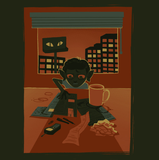
Now, here you can see where I’ve more or less worked things out. His hand’s not on the cup anymore because my friend pointed out it didnt have an arm attached to it. I added some halftoning to make a gradiating effect in the sky and on the table to give the impression of a sunrise. His eyes are different but as of posting this, I don’t like them and am probably about to go back and change them again. The Cup now has a shadow and some rim lighting. His hand is in shadow. The stain on the napkin is big enough to define the edge of the paper on top of it.
Little things like that.
The more you draw like this the more the way you need to think about your space becomes natural. I hope this helps and I wish you all the best of luck!
117 notes
·
View notes
Text
Learn Log #5 - Sandy Shores

Before I begin with this post, I just want to say a quick thank you for all the support on the last learn log. I didn’t expect to get to 10 notes let alone over 100 so it was a really exciting and pleasant surprise. I got some nice comments too which I really appreciate. Thank you, everyone.
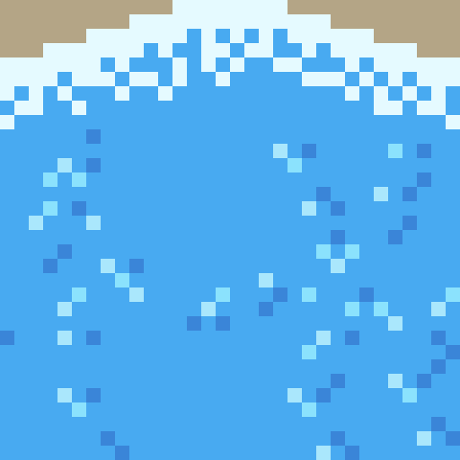
On my 5th week learning pixel art, I learnt how to make sand tiles, water tiles and rocks. I actually made this piece with 32x32 tiles instead of my typical 16x16 which was an interesting challenge but I enjoyed working with and learning from it.
Sand
When I started with the sand I, of course, started with my typical 16x16 tile size. I made a shoreline tile which had mounds of sand pushed back by the ocean’s waves which are shown below.

Making sand tiles, I soon realised, was going to be trickier than making grass tiles. I mentioned last week that with grass and similar environments you can make multiple small tiles and then place them in a scene in a variety of ways. However, with textures like stone, sand and water the design or condition of a tile should realistically have some impact on neighbouring tiles. As such one tile’s design might be repeated across the entire environment. Some pixel art software allows a tiled view so you can design the tile ensuring tiles connect and aren’t repetitive – unfortunately the software I use does not have this view. Therefore, I did a similar testing method to the grass last week where I copy+paste the tile across a larger canvas.
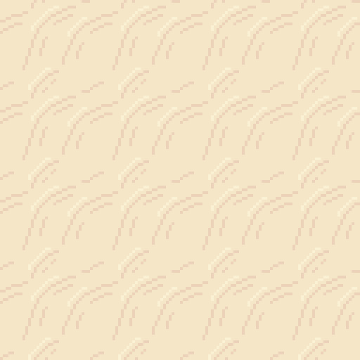
You can clearly see that this 16x16 tile forces mounds to be a bit to round and close together. This is when I decided to make the shift to 32x32 for this piece.
Above is my first 32x32 shoreline tile. You can see the larger size allows the mounds to space out a bit more and stretch so the mounds don’t feel as large or round. The two lines pointing into the mound are present to provide some sense of depth going into the mound. I decided to test it out and see how it looked.
This test looked a lot better, so I was satisfied with the design. Within the test, you can see it is quite repetitive. This is partially because the tile doesn’t do well with vertical repetition - making repetition more apparent. Additionally, I think the repetition might be a little less obvious when wedged between wave and beach textures. You might also notice the mounds are now slightly separated. This is because the mound has reached level ground and thus a hump would not be visible. The disconnection between mounds makes the tiles a bit less man-made, thus, a bit more natural. I decided to make a few final modifications on the shore tiles and finish it up.
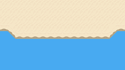
You can see here I added a highlight to the tops of the mound and darkened the first mound. The highlight is there to emphasise that the mound is sticking out and thus hitting more light while the darker colours were simply added as that sand will be freshly wet. I decided to add these tiles into a larger canvas to separate the water and the beach.

I added a blue background just to have a representation of water within the scene. Next, I needed a separate texture for the beach and tiles to connect the shoreline diagonally.
I wanted a separate texture for the beach because: A) the shoreline tile did not do well repeating vertically, and, B) the shoreline and the beaches of a coast look quite different. Obviously, if I made a pattern of mounds going horizontally or vertically like the shorelines I would run into issue A quite quickly so I decided to make mounds moving diagonally.
I made this beach tile using the colours of the final shore tile. I simply drew some squiggly lines diagonally with my mouse, removed the doubles from these lines and made sure the lines connected. I then used the same testing method as before to test the repetition of the tile.
This test is a mess. Some of the lines don’t connect and the mounds don’t feel smooth, rather, they feel choppy. Don’t worry, this is bound to happen if you use a mouse and maybe even if you use a drawing tablet and pen. So, I used this test to smooth out and fix up the lines as shown below.

Ahhh much better! The mounds look much nicer now. The texture looks a bit repetitive but not significantly so. The next step was to just add some more details now that I was happy with the pattern.
I added some highlights to and disconnected the mounds like the shoreline. This did increase how repetitive the tile looked but I did feel as if it was worth it as the change adding more depth to the texture.
I added in the beach textures and then fixed up the diagonal shorelines. The diagonals were canvas adjustments rather than individual tiles which of course wouldn’t work in a game engine like Unity, however, I’m sure I could make tiles of these diagonals once I created them in the canvas. Overall, I’m pretty happy with the beach so far. It’s a bit blocky right now but that might change once I add the water.
Water
I wanted the water in this piece to have a tropical island feel to it. I used the blue water texture I had picked and a white colour to draft a pattern I was happy with.
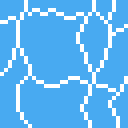
I felt this tile had a similar pattern to pictures of tropical beaches I’d seen online so I decided to go with it.
The test shows that this pattern is really repetitive due to the large square in the centre of the tile. This was pretty concerning; however, I wasn’t sure how I could really fix it up without starting the tile over. Sometimes you’ve just gotta let stuff go, so that’s what I did. I hoped that a few small adjustments would decrease the repetition of the tile.
I changed the white lines into two shades of light blue. This would hopefully make the lines less contrasted and the repetition less noticeable. I used two shades of blue to somewhat portray water that was dynamic in some sense, because of bubbles or the flow of water. This two-tone approach wouldn’t really affect the repetition.
I then added the same set of lines in a darker tone. I think water should have both highlights and shadows. It adds a bit more detail and even depth into the texture. This would hopefully also reduce repetition, but I wasn’t so sure.
Finally, I cut the lines similar to the sand. It’s unnaturally for all the water to be directly connected and it definitely emphasises that it’s a man-made repeating pattern.
I think this new tile looked a lot better. Particularly because of the change from the white colour which contrasted far too strongly. There is still noticeable repetition, however, I was happy enough with this tile to move onto the waves.

The waves were easy enough. The wave should approximately match the shore’s sand mounds because the mounds were created by the waves. I used this pattern up the top with a very light, almost white, blue to represent the crashing ocean foam. I used some dithering into the standard ocean colour to create the foaminess. At the top, I just added the wet sand colour because the waves were not covering that area. I continued the ocean tile pattern into the waves a bit just to make sure there wasn’t some strange abrupt stop into plain blue.
Once the ocean wand wave tiles were done, I added them into the scene.

Of course, the first thing you notice in this picture is the missing diagonal waves, however, you also notice the strange stillness in the wave tiles. Its strange that the pattern continues unaffected like that when the waves are colliding with the shoreline. Additionally, there is a significant lack of depth in the image.
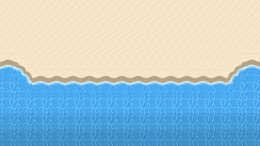
Here’s a fixed version of the beach. You can see I added the diagonal waves and changed the wave tiles so that the pattern is scattered due to the crash. The new wave tile means that while the pattern doesn’t stop abruptly, the water doesn’t seem still and lifeless. I darkened the two back lines of tiles to show that the water is getting deeper. Next, I needed to add a bit of variety into the beach.
Rocks
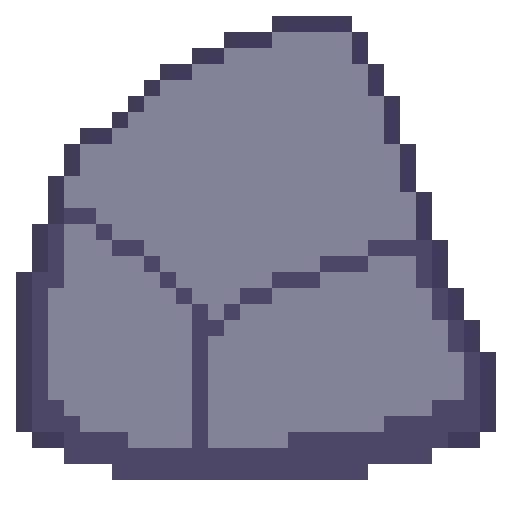
The first stage in making the rocks for the beach was drawing an outline of the rock with a few segments to show off either cracks in the rocks or the shape of the rock. Rocks aren’t perfectly smooth or round so you have to make rocks with that in mind.
Next is to add some shading to the rock with highlights and shadows. Removing dark outlines and replacing them with shadows is a good idea as it feels more natural rather than drawn.
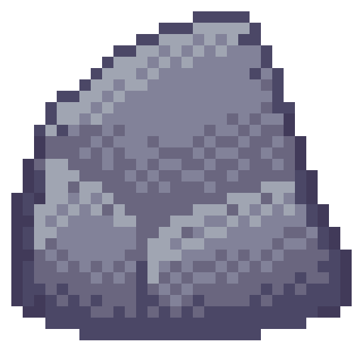
Like I just mentioned, rocks aren’t perfectly formed, and their shading should reflect that. I used dithering to add some texture to my rocks and added some small cracks and divots with darker pixels invading the space of lighter pixels.

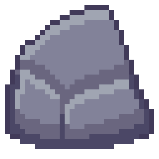
I made another two rocks and spread them through the scene. Rocks on the beach were given a small shadow and rocks in the water were given a water collision line so that they felt like part of the scene. I was happy with the rocks, but the beach could still do with a bit of life.
Crabs/Conclusion
Anyone else think crabs are pretty cute? Snip snip. I didn’t do touch-ups on this piece, but I did add crabs! I feel like they finish up the scene nicely.
I’m fairly happy with this week’s piece. Practicing dithering was quite fun. The textures are a bit repetitive and that is definitely something I’m going to have to think about going forward – different methods of reducing repetition in certain tiles. Additionally, I did a lot of modifications within the canvas rather than building the scene tile by tile. While making this piece did give me a lot of practice, I won’t be able to make pixel adjustments in a level. I’ll need to develop an understanding of what I exactly need for a level and then make tiles for my needs. Overall, while I enjoy looking at this piece it has given me some food for thought about how I’m going to build my levels and create the art required for that task.
That concludes this week’s learn log. Next time I’m going to be tackling a bigger task – learning how to make houses, furniture, snow, stone and man-made textures. This might mean I skip a week of posting or split the piece across two posts as I’ll be making both the interior and exterior of a cozy cabin on a snowy mountain.
My learning and this blog post wouldn’t have been made possible without these fantastic resources. Go check them out if you wanna learn some stuff about pixel art!
How to Pixel Art Sand by TutsByKai
Pixel Art 101: Water by Pixel Pete
How to Animate Water by TutsByKai
[Let’s Pixel] Water Tiles by HeartBeast
Pixel Art 101: Rocks by Pixel Pete
[Let’s Pixel] Boulder by HeartBeast
[Let’s Pixel] Lava Rock by HeartBeast
12 notes
·
View notes
Text
Learning to Create
It’s really difficult for me to admit that I’m an artist of any capacity. A lot of times, I consider that sort of term to be dedicated only to the working artist. You know, the ones who actually get paid for their work. The ones who end up creating things for everyone. The ones I admire greatly, to the point that I consider them to be living on Mt. Olympus while I’m stuck at a temple waiting for a chariot up a very steep road.
The place I work at now is a place where I don’t get to really create for myself. I create for other people. When I’m done there, I seldom get to make things for myself at home. There is an effort, of course, when I’m able to do so, but it’s hard to be that focused after toiling a retail job for 7 hours a day. You end up taking the opportunity to decompress and that ends up becoming an 8-hour decompress and you need to go to bed. That’s how it is for an adult, I guess. Don’t recommend growing up.
And that “9-5 Job, Now Do Nothing For Hours” mindset is something I need to work on, to be sure. In my mind, I see myself as someone who needs to be able to do something. I can’t make art to decompress, because art is supposed to be something important. I toil and toil, thinking about the process I need to decide on doing. “How do I become an artist like my favorite artists?” “What is the correct methods of learning it?”
How do I climb the mountain and join the greats?
In my monthly stint of introspection, I was watching a friend play Paper Mario: The Thousand-Year Door. To this day, it may still be my favorite game. Watching it again brings back a lot of genuinely good memories, both inside and outside of the game. The charm that filled the game’s varied and interesting world and cast has still yet to be matched for my personal tastes. And for years, it was the game I played whenever I needed a good pick-me-up.
Watching him play it for the first time and getting to hear the same sort of reactions I had to it 14 years ago ended up bringing an...odd memory back to me. And it involves this image.

Low-Quality Vivian For The Low-Quality Needs
Perhaps not this specific image in particular - the internet could have phased out that one- but something similar to it.
See, back in 2004 I was just getting in on the whole Internet thing. This was back when people used what was called an “internet forum”. This was a place where people can post their thoughts on a wide range of topics, such as: “How do you jump in Metroid?”, “This game sucks”, and “Do you think Kingdom Hearts 2 will be on Gamecube?”.
I was part of one forum for a good part of my teenage life. I started at around January of 2004, in fact. I suppose I consider that a turning point in my life if I remember it to that degree.
I was fairly active in that forum. And as I began to make my posts, I began to notice something. At the bottom of every post was what you called a signature.

Copyright Falcon 2018, filed under the Trademark of Best Girl 2004
They were a cute little way to signify that you were the one who was making the post. It was one of the small creative outlets this particular forum had given users, though you still needed it to be both 45-ish pixels tall and kept at a low file size to help those with 56k modems.
Typing that out makes me feel really old.
There were people who were making these small images underneath their posts and the cool, hip guy I was as a teenager was like “OH BOY I WANNA DO THAT TOO!”. Of course, in order to create this sort of stuff I had to be...sneaky.
Back then, I found a pirated copy of Paint Shop Pro 7. It worked decently enough for me, but as I was a young lad with strong moral values - I didn’t even curse until well into my later teens, the frickin’ twit - I felt extremely guilty doing this. So for my birthday that year, I ended up getting a legit copy of Paint Shop Pro 8. It was at that point, I suppose, that my desire to create stuff was ignited. I was thrown into the wide world of graphic design, making sigs for myself and others.
I eventually upgraded to Photoshop 7 - after throwing away all of those moral values and growing the confidence to say the fuck-word - walking even further into this new world for me. I started making signatures for people in flashier ways, abused lens flare to the point of blinding half of Nintendo fanboys, and even dabbled in creating wallpapers for people to use. This was back when 1024x768 was the norm, if you can believe that.
I talk about this because when my friend was playing TTYD, I decided to look up art of some characters again, and found Vivian - one of the party members in the game - once more. Only, this time, in a way higher fidelity than I had 14 years ago.
Best Girl in A Good Resolution.
In general, I’d consider TTYD as the game that first got me encroaching into graphic design. This was not due to the game’s art, which is still fantastic, but because of so many people suddenly wanting signatures of their favorite new party members in that restrictive 48 pixel height.
I would get private messages in the forum asking for sigs with Mario, Goombella, Koops, Yoshi, Vivian, Bobbery, the X-Nauts, Bowser, Peach...Rawk Hawk a few times...even had Zess T. the cook in there. It was wild.
So imagine my surprise going through Google Image Search for a post about Vivian and finding an image of her that was extremely close to the kind of art I had to work with back then. I worked for a long time trying to figure out how to deal with the blur of the pisspoor scan with its low resolution and JPEG artifacts. Back then, finding official art was pretty difficult alone, and official art that actually looked like it was scanned with proper care? You were basically stuck with what you had and needed to figure out how to hide it. The people who could find clean concept art became our dealer providing the good shit while we provided our services to others.
Otherwise, you just worked with what you had. This was problem solving. Back then, you didn’t have access to as many tutorials as you do now. You absolutely didn’t have as much access to tablets. Those were from Wacom only and they were expensive. So you were essentially on your own, only getting help from the occasional artist who decided to make small tutorials on the forum.
Thankfully most of the people for signature requests were also teenagers as well, who just thought you were amazing for doing this for them.
I suppose all this reminiscing got me thinking about that mountain again. The paths up the mountain are long but they’re rarely ever getting longer or shorter, just easier to traverse. Nowadays, tablets are so much easier to acquire and art programs have gotten a lot more manageable. Art you want to look at or study or even use for your small projects are readily available, with services that makes buying personalized art easy and supporting artists even easier.
The knowledge about art programs and processes is nigh-infinite at this point. You can get a young artist’s commentary about their own virtues of art in a single tweet at lunch and get an experienced artist’s commentary at dinner. You can get atelier-level art lessons for free on Youtube.
Almost anything you want to learn is feasible now. Climbing the mountain is easier than ever.
So naturally, with my inferiority complex in full swing, I always have to ask myself why I haven’t started climbing the mountain yet. Why haven’t I just started the trek up the mountain pass already towards becoming a technically-skilled artist?
And the answer is, I am.
It’s just at my pace.
When I was a kid playing make-believe with others in the playground, I was making steps. Throughout all my teenage years of making signatures for people, making wallpapers for others, and even making a properly-awful sprite comic, I was making steps. When I was getting people stealing my sketchbook and making marks over my drawing of a Sonic character at lunch in high school, I was still making steps. When I was being critiqued by people for my skills in ways I felt were unfair or spiteful, I was still making steps. Every time I open Photoshop or SAI and stare at a blank canvas and will myself into making a mark on there, I’m still making a step.
Every step further from the start point, which is far and away from where I am now.
In my mind, I still can’t help but feel like where I should be is as some sort of master of art, but it’s really not fair to me. In hindsight, if I had drawn something every single day with intent, I could be a technical genius with knowledge of all the principles of design lodged firmly in my mind. It sounds amazing, but that’s not something I did.
Considering “what could have been” ignores what I am now. I am someone with knowledge in these various programs for over 14 years. I’ve dabbled in multiple projects, some in my own design. I can consider those things invariably shit, but the stuff I did there was stuff I did on my own terms, which I learned from. I wrote fanfics, did signatures for people, made wallpapers and webcomics, designed websites, did roleplaying, made a storyline based on friends’ characters in an MMO, and played tabletop games creating characters that became some of my favorite creations in my lifetime.
I would never want to trade that away for some sort of technical skill level-up. I’ve made too many great friends because of all of this. I am who I am because of how I’ve gotten here.
Learning how to create is all about taking the opportunities as they come along. Even this post is, essentially, me seeing one image online after a game session with friends and getting a nostalgia blast for something completely unrelated to the game itself.
The act of creating is simply doing. If you do, you create. If you create, you create art.
If you create art, you are an artist.
Don’t let your inner thoughts dissuade you from that fact, ever.
Thanks for reading.
7 notes
·
View notes
Text
Guard Duty: A Development Retrospective - Devblog #4
The Art of Guard Duty - Pixel Practices
Howdy. Today I would like to take some time to talk to you about my process when creating art for Guard Duty. I’m going to be focussing on pixel art and practices you need to be mindful of when creating your art. Hopefully this will give you a bit of an insight into my process for creating the many pixel packed locations in Guard Duty.
Let’s start with a few basic things you’ll need to keep in mind when working with pixels. My advice here is geared around creating pixel art in Photoshop, but most of the rules will apply to other art packages.
First thing’s first - Decide upon a resolution and stick to it.
The problem I see a lot of people run into when starting in pixel art is in consistency of resolution, that is they often mix different resolutions within the image (or game). Mostly called ‘mixed resolution’, it is a where pixels in the image are not all of a consistent size, often leading to an undesirable look. Traditional pixel art is based on the foundation of a grid, where each pixel acts like a grid square. The pixels are unable to be placed outside of these grid squares, therefore keeping a consistency throughout the image. The hardware used to render pixel art in it’s heyday was unable to handle high resolutions, meaning that each pixel had to be carefully placed to make up the intended image.
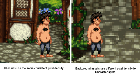
See this graphic for example, the image on the left is using a consistent pixel density whereas the one on the right is using a different density between the character sprite and the background (mixed resolution).
You see the difference? The larger pixels on the right-hand image look messy compared to it’s counterpart, this not only looks a bit strange but does not keep with the traditions of creating pixel art. You want to stick to the resolution you started with. There are some examples of modern games which used mixed resolution pixel art successfully, but these are normally used sparingly and are scaled in-engine, mostly to benefit gameplay.
Platformers often use sub-pixel movement to make gameplay smoother, which can lead to character sprites not lining up correctly with background assets. Sprites however are very rarely scaled in engine as this is far more jarring to look at.
Either way, you will save yourself a lot of hassle if you decide on your game’s resolution at the start and stick to this resolution throughout. Guard Duty uses a similar resolution to many of the early LucasArts and Sierra titles using a 4:3 ratio of 320 x 240px. It might not sound like much but that’s 76,800 pixels you’re going to have to wrangle. More than enough for me!
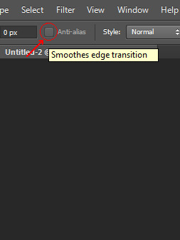
Moving on - Do not use anti aliased tools
Another problem I see that newcomers often run into is the temptation to use tools designed for high resolution artwork, things like the brush tool, smudge, burn/dodge and gradient fill are all inherently anti-aliased and will give you a heap of extra clean-up work. These tools create way too many pixels, with a massive array of shades and colours. You’ll find that tweaking your artwork becomes increasingly harder when using these tools. So just forget them, resist temptation to smudge your wall texture, or use your neat grass brush, It’s really not worth it if you want to create pixel art. The easiest way to keep track of anti-aliasing is to use (almost exclusively) the pencil tool, the pencil tool can be found by click-holding the brush in the toolbar and selecting the pencil from the drop-down menu.
I also recommend turning off the anti-alias setting on the marquee selection tool, transform tool, paint bucket tool and magic wand tool. All of these can be used in pixel art, but with the anti-alias checkbox active you will find that they create a lot of different coloured pixels around the edge of your selection, again causing issues when flood filling areas, or otherwise editing the image.
So as a general rule, make sure each pixel that is going onto your canvas is intentional. Photoshop isn’t really geared towards creating pixel art and you want to make sure it doesn’t do anything without your permission. Bad Photoshop! Behave!
Try to avoid scaling your pixel art
This is similar to my first point, but can often catch you off guard. Once you’ve drawn something on the pixel grid you may find that it doesn’t fit in a scene you’ve created previously, despite both images having the same resolution. You’ve drawn the sprite too small and although the pixels are consistently sized, it just looks tiny in the scene. Well, you’re probably going to have to redraw it, somewhat.
When you scale pixel art Photoshop will try to scale the pixels to match the resolution’s pixel grid, anything under a 200% scale will result in only some of the pixels being larger than others (some will become rectangular) and at 200% the pixels will be twice as big, but still fit into the grid. This is because Photoshop has to keep to the bounds of the canvas resolution and doesn’t know what to do with the new space between pixels.
You can see from the image that some of Tondbert’s upscaled pixels have stayed 1px wide/tall whilst others are now 2px wide or tall. His eyes, nose and left shoulder have suffered the most. Poor Tondbert. This is because Photoshop doesn’t know what to do with the pixels, at the chosen scaling it only has ‘small’ (1px) or ‘big’ (2px).
Anyway, to combat these issues you should always draw your pixel art with other assets in mind. When working on a game you don’t want to have to be scaling the character sprites differently between locations, so you should paste your character sprite into the blank canvas for the new location, so you’ve got something to reference the size. If you stick to a consistent resolution with all your art and be mindful of other assets you’re intending to use together you shouldn’t run into any of these problems.
When scaling pixel art, always use Nearest Neighbour interpolation and scale in multiples
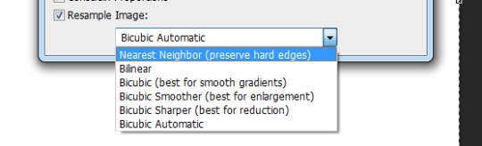
Pixel art is kinda small and most modern computers are displaying a 1920x1080 resolution or higher. This means when showing off your pixel art on a website, it can often look reeeeeally tiny. So, you want to be aware of your image resize settings. You need to make sure the image is scaled in exact multiples of itself, 2x bigger 3x bigger etc. So if your canvas is 320 pixels wide and 240 pixels tall, the upscaled image would need to be 640 pixels wide and 480 pixels tall. To keep it simple scale the image to either 200%, 300% or 400% depending on how big you want it, but never 250% or 225%.
There is also a setting at the bottom of the ‘Image size’ box in Photoshop that has a drop down list of interpolation types, next to the ‘Resample Image’ checkbox. Set this to drop down to Nearest Neighbour(preserve hard edges). It will make sure that your pixels always stay crisp when resizing.
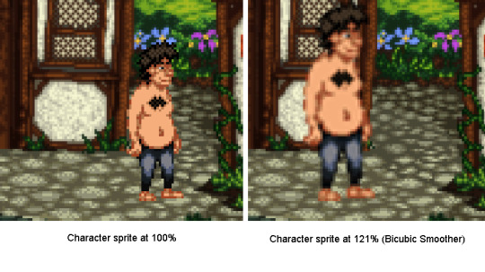
There is a similar drop down box when using the transform controls which you will also need to change, if you do not your sprites will become blurred.
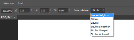
Note the amount of pixels Photoshop has added when trying to smooth out the sprite to 121%, this would make the sprite near impossible to modify beyond this point. Using the Nearest Neighbour interpolation solves this issue.
Stick to a limited palette
When starting out with an image I try to keep the colour count to a minimum, this way you won’t get bogged down with tweaking the finer details and can focus on the bigger picture. It also makes tolerance selecting bits of the image a lot easier. Try to keep to three or four colours per texture, dark, mid and highlight colours. You can add extra colours later if needed but removing colours is a bit of a pain.
Now we’ve gone over the basics, let’s get started on a creating a scene.
Start with a basic thumbnail sketch
This technique applies to both sprite and background creation, but for the purpose of this post we’re going to work with a background.
I like to sketch out a few different compositions for the scene before committing to one. I usually find I get something decent by the third sketch but it may take longer, just stick with it. Each sketch shouldn’t take more than a minute or two, we’re just establishing where the shapes in the scene are going to sit. I use a black 1px brush for this stage but the colour is mostly irrelevant (we will be changing that later). I liked the composition in the second sketch and decided to make the opening more central, adding a fallen tree to the left similar to the first sketch.
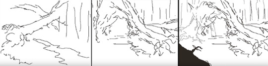
Develop the thumbnail sketch
I was pretty happy with this so decided to roll with it. The next image shows how I developed the detail in the image, sticking to the sketchy black lines for now. I occasionally use a dark grey colour to show objects that are further back in the frame.
Establish clean 1px outlines
In the next step I set my sketch layer to semi-transparent (20-40%), lock it and create a new layer then begin to outline each of the individual elements. Remember to use a 1px brush and the pencil tool. About 80% of the time I’m holding shift whilst click two points on the canvas to draw a 1px line between the two points. This saves a lot of time and really helps when drawing straight lines, or long curved ones. At this point in the process you want to keep your pixels as clean as possible, avoiding ‘double pixels’ where the line becomes more than 1 pixel wide.
For the time being I’m using a different colour for each of the elements in the scene, this will make it easier to colour them in the next step and helps to cut down on having lots of layers at this early stage. It’s not necessary, but if you’re drawing everything on the same layer I would recommend it. Plus this is probably the only time you’ll get to use bright pink, vomit green and orange in the same scene!
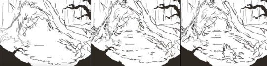
Separate the outlines and block in the colours
Once I’ve outlined the each of the elements in the scene I pick one and start detailing! I don’t worry about the finer details, I just aim to block out the main shapes and colours. What I have done below is use the magic wand tool (anti-alias turned off) with the tolerance set to 0 and contiguous turned off. This way it will select just that colour from the scene. I cut out the element and paste it into a new layer.
I decide upon a highlight colour and start blocking out the parts of the trunk that are raised, drawing these on the same layer as the trunk outline. Underneath on a new layer I am able to fill in the darker base colour of the trunk, as seen in the third image. This leaves the outline and highlights intact and allows me to use a larger brush size to block in the colour underneath.
You can see where I’ve added some trees and foliage from another background in the top right of the image, this is to get a feel for the colours used in those backgrounds, to help consistency between scenes and because I’m too lazy to draw new trees.
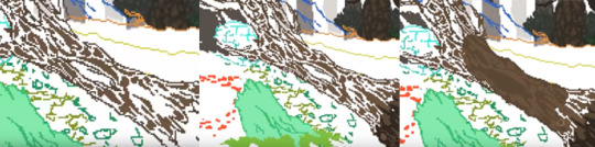
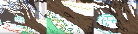
Apologies for the slightly blurry images, they were pulled from the timelapse video.
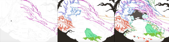
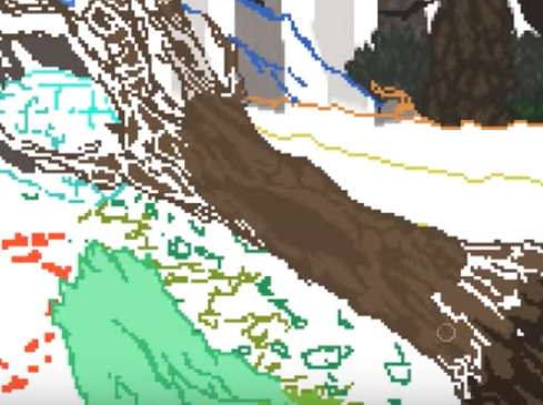
Add definition with shadows and fine highlights
This is the fun part, giving the object volume. First you want to add another layer above both of your previous layers. Then by carefully placing your shadow colour you can add heaps of definition to the shape. Here I’ve used it to bring out the cracks in the wood, as well as help the branches stand out against whatever will be behind them.
Thanks to having the colours on separate layers I am then able to tweak the balance between the three colours, ready for adding an extra fourth colour for fine highlights.
After adding the fourth colour we’re about done, the object has a nice shape to it with a decent amount of detail. You could work on it further from this point, maybe adding a second dark colour for shadows but I tend to leave it here. Remember, every step of this process was done with the pencil tool and a 1px brush, the only exception was the use of a 10 pixel brush for blocking in the colour. You can use this technique for everything in your scene, I like to merge the layers once I’m finished on each object but that’s personal preference. If you do decide to merge them you have the option of using a Brightness/Contrast or Hue/Saturation adjustment layer to tweak the contrast between the highlights and midtones etc, this won’t affect the pixels or add any anti-aliasing.
Okay! That’s about it. There’s nothing particularly fancy going on once you’ve setup Photoshop to handle pixels appropriately, you just need to follow the process I’ve laid out above and you’ll be creating rad pixel art in no time. If you’ve got any questions feel free to drop me a line on one of our social links or email me on the contact form @ www.sickchicken.com.
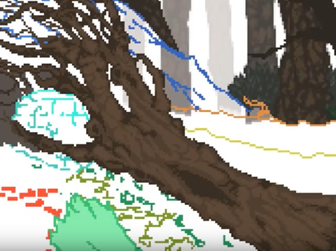
Here’s the finished image:
You can watch a timelapse of the process on Youtube here:
youtube
For a bit of additional learning, I highly recommend watching the ‘8bit & 8bit-ish’ Graphics GDC talk by Mark Ferrari:
youtube
Cheers!
-Nath
0 notes
Last Seen Blogs

darkobssessions
Dark Obsessions

waltdisneyworld1971
Celebrate The Magic
bigdickdaddysatan
Hello, welcome to italy
older-kasa-official
When can I see you again?