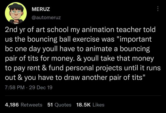
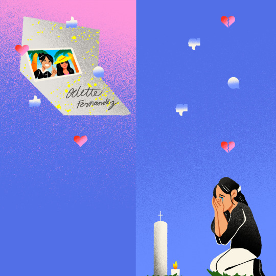
#editorial illustration for one of my classes
Text
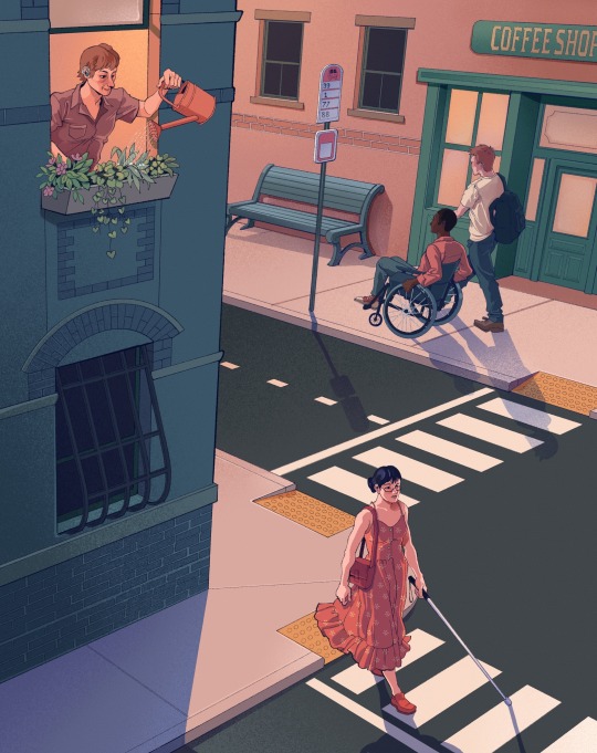
#illustration#editorial illustration#disability#art#editorial illustration for one of my classes#it was weird to work in a less rendered style
141 notes
·
View notes
Note
hello! i'm a big fan of your work! i noticed youre a risd alumnus, and i just wanted to ask: as someone currently working in the animation industry, how was your experience with risd? i'm having to choose between risd and a school that's popular specifically for animation, and was wondering if you might have any info that could help.
thank you, i hope this ask isn't any bother!
ooh I actually love this question because theres SO MUCH I wish I knew about the RISD animation program ahead of time and I'd love to give people a better idea than the one I had going in LOL. disclaimer that because I went a while ago (a whole class of college students have come and gone since I've graduated!) some of this info may be outdated. also this is purely my personal experience. BUT hopefully it helps
I want to say upfront that I loved my experience at RISD. I attended from the years 2013-2017. Like all private art colleges it was way too expensive (worth noting I had a significant need-based scholarship) but I worked my ass off and I learned a lot about art and I made friends there that I wouldn't trade for the world. As far as an art school experience goes I would tentatively say it was "worth it". However, I went in as a freshman hoping to major in animation and I came out with a BFA in illustration and this is a large part of why:
RISD doesn’t have a good animation program for those looking to go into commercial animation. And I don’t think this is a grand statement like I think most of my fellow alum and teachers would agree. The thing is it’s kind of intentional LOL?? And the keyword here of course is “commercial”. Culturally, RISD is kind of a fine arts school first and I wouldn’t say they’re hostile towards industry work but it’s more often treated as secondary or like something unfortunate/dirty you have to do to make money so you can focus more on your “true art”. I have a tweet about this that went semi-viral a while ago actually…
I’m not gonna say everyone at RISD thinks this but it’s pretty prevalent. I'm honestly not outside the opinion lol. You can call it integrity or pretentiousness or whatever but without going into whether this is good or bad it really orients the curriculum and priorities of the school. It’s hearsay so take it with a grain of salt but I’ve heard that on occasions where RISD has been offered opportunities or partnerships to make the school into a pipeline for big studios (like making work specifically to cater to those places and funnel students through the door right after school) they’ve always stuck to their guns and said no to preserve their independence.
The animation program at RISD is actually called FAV (sometimes stylized as F/A/V) for Film Animation Video and is… as one would guess..a mishmash of animation, film, and experimental video. Multimedia, experimental work is highly encouraged and overall the work and structure is a lot more geared towards submitting independent short films to film and animation festivals than it is towards building a portfolio to secure industry or client work. I didn’t major in FAV but I was on the FAV thesis track for about 3 years and I’d say the amount of help I had making an animation industry portfolio from my experience with FAV classes is close to none. At least for the thesis program we were never required or even asked to do anything such as design character turnarounds, bg designs or paint, even storyboards. And to be fair a lot of that pre-prod work that fills industry portfolios is a necessity of large commercial crews that need to coordinate over disparate departments and studios, not so much for independent single-animator projects.
But as a result, a lot of RISD students with ambitions to go into animation/video games/ entertainment industry art in general actually major in illustration. Myself included. It’s not a perfect 1:1 match and even within the department there’s conflict as to whether there should be more of a focus on traditional editorial illustration or otherwise but it’s one of the broadest majors at RISD because past sophomore year it’s 100% electives and there’s more classes oriented towards technical drawing and painting skill, concept, story, and communication for client work in a very all of which funnel rather neatly into commercial animation. It’s also a good route for exploring your options like if you’re stuck between wanting to do children’s books, TCG paintings, and comic books you can explore all those at more or less the same time. The downside to this is that in order to get what you want you really have to build your own curriculum. I definitely think it rewards the proactive.
So while nothing at RISD got me to build an animation portfolio I took a lot of classes that I think were fundamental to developing those skills. Ie I did actually take a storyboarding elective, painting classes that focused on color, illustration concepts classes that formed critical thinking and seeing, a sculpting class that trained anatomy and 3d construction skills, Barbara Meier teaches a 3D animation class at Brown that RISD students can cross-enroll at that’s pretty good? None of these are substitutes for a holistic animation curriculum but I think the education I did get was a lot broader and just as personally fulfilling. At the end of the day, I'm glad I wasn't so focused on animation that I was still able to explore illustration, comics, painting and sculpture. I led a student club that coordinated Brown and RISD students to work together and make video games every semester! I take the skills I picked up from these things into my animation career all the time.
Also the nice thing about animation jobs in the U.S. is that you don’t actually need to have animated a whole kickass industry-standard short film to be hireable. The pipeline is so compartmentalized and jobs so specialized that bg designers really just need to be good at environmental perspective and linework, and bg painters don’t even need to worry about that they can just be good at color and light. And almost no one at least in the U.S. animation industry actually needs to know how to animate LOL. Am I being reductive? Am I downing a heavy dose of copium for going to the school that I did? Who knows. Midway through my freshman year I was seriously considering transferring to a school with a better animation curriculum but I never completed those applications because I took a class during the winter semester called Science-Fiction Fantasy Illustration and midway between designing shitty aliens and my new best friends falling asleep on me during a 2001 Space Odyssey screening I was like. This isn’t so bad. Anyways, it turned out ok, we all have jobs now.
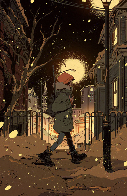
All that aside, Providence is a beautiful little city. There’s an arts and alternative culture there that feels completely different from those in places like NYC and LA. Chris Van Allsburg the writer/illustrator of Jumanji and The Polar Express was a RISD illustration alum and he based a lot of the imagery of Santa's Village off of Providence. This drawing I did is literally a view from Benefit st that I would walk from my off-campus housing to campus everyday:
There’s a lot of stuff that goes into whether a school, or any school, is the right fit for you. Sorry for rambling but I tried to answer this quick because ik college decisions can be time sensitive. Good luck with your decision making!
197 notes
·
View notes
Note
Hii :) I don't know if anyone asked this bevore, but I wanted to ask what exactly you are studying and if you can reccomend it. I'm currently a bit lost because I'm going to graduate from a artschool (FOS) next year and I don't know what I want to do with my life. I'm personally thinking about graphic design (eventhough "production design" is my dream) because I live in Germany. And do you have any job-plans for the future? (Or something you can recommend an artist in a similar situation)
I absolutely love your art (I know this is a bit off topic, but do you use a specific app/website to create your reference sheets?)
Thank you !!
Hey! I don't think I have answered this one on here before!
I always wanted to study illustration, but couldn't really find a good school for it here in germany and I didn't want to study overseas. So instead I went for communication design. It's basically a big mix of everything. Bit of illustration, photography, after effects, 3D, film and a bunch of editorial and graphic design. Most people that study this end up in an advertising agency. That's also what most teachers prepare us for.
Do I recommend it? I gotta be honest with you and say no. But that's mostly because I do not like my school very much. In general it's actually a pretty cool thing to study since you learn SO much from so many different areas, but overall it's quite a headache for me now since I know I wanna work in illustration and not at an agency, but none of my classes really focus on it. I mostly just design ads, posters, websites etc. which isn't what I enjoy doing. It is quite useful to know because it helps me with building my own brand as an illustrator, but besides that it's just a bit...ugh. Unless you actually enjoy graphic design like some of my close friends, then this might actually sound fun to you!
For the longest time I wanted to work as a character designer and work for video game companies and such, but now I've realized that I enjoy illustrating a lot more and I managed to build an audience over the last few years that allows me to go freelance once I'm done with school next year. So my plan is: Go freelance, open a proper shop, attend conventions and do commissions! I'd also love to give illustrating book covers a go if the opportunity ever comes up!
I'm not sure if any of this is helpful to you, but feel free to send me a private message if you want to know more I'm happy to help since I know how stressful it is to not know what you want to do :')
Oh and I just create my reference sheets with clip studio! I just throw all the pictures in there, haha.
Thank you, have a great day!
41 notes
·
View notes
Text
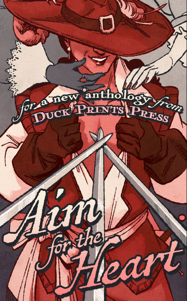
Meet the Contributors to Our Next Anthology!
The time has come: we're ready to share the contributor list for our forthcoming anthology Aim For The Heart: Queer Fanworks Inspired by Alexandre Dumas's "The Three Musketeers"!
For this collection, 15 artists and 21 authors have created fanart, original art, fanfiction, and original fiction inspired by the adventures of Athos, Porthos, Aramis, and d'Artagnan. We have been hard at work on this anthology since last fall, and we're anticipating a crowdfunding launch in late spring or early summer. We'll have lots of teasers, excerpts, a cover reveal, merchandise announcements, and more to come, but first - meet the creators!
Artists
Aceriee: Hi! I’m Aceriee and I draw sometimes. I’ve been drawing all my life, but after falling into the Supernatural fandom in 2014 I’ve mostly focused on fanart. (Instagram | Tumblr | Twitter)
Cris Alborja: I’m an illustration and comic artist from Spain. I’ve got a nursing degree, but I decided to pursue my passion. I have studied Illustration at EASD Pablo Picasso in A Coruña and comics at O Garaxe Hermético in Pontevedra. I have done cover art for an anthology called Infiniteca by Retranca Editorial and comics for Altar Mutante, Nai dos Desterrados, and Abraxas en Cuarentena fanzines, as well as in Gaspariño 21 by Retranca Editorial. (Instagram)
bloomingtea: Téa is a hypothetical writer and artist, a professional procrastinator, and a merch hoarder. When they aren’t working on personal projects, they moderate zines and bake the same loaf of bread over and over again. From their pile of WIPs, they’ve managed to self-publish one book and are currently working on other manuscripts to eventually release into the world. Until then, they remain the worst gamer on Twitch and like to spend their free time ranting about books and thinking about fictional lawyer video games. (Personal Website | Twitter)
C: A massive drinker of coffee and a lover of old TV shows and movies, C is a small-time concept artist and illustrator who likes to dabble in all things literature and history. When she’s not busy drawing and nodding along to Bruce Springsteen while researching the Kentucky Cave Wars, she’s trying to save up for grad school to become to a forensic artist so she can draw some more. (Tumblr)
Amy Fincher: Amy Fincher (she/her) is a producer and artist with over a dozen years of experience in the video game and animation industries. She has contributed to various AAA and indie titles, including the Civilization, XCOM, and Skylanders series. Amy is currently working on Open Roads as Executive Producer. When the mood strikes and time allows, she teaches art classes and takes on art commissions on the side. Her hobbies include learning aerial silks, collecting aesthetically pleasing empty containers, looking at shiny rocks, and taking very long naps.
Kou Lukeman: Kou Lukeman is an artist, composer, writer, and video-game developer. His long-term goal is to someday lead a video-game company that makes video games by queer and neurodivergent people. Kou identifies as queer, neurodivergent, and is proud to be both. He is an avid Final Fantasy 14 player, a huge Kingdom Hearts fan, and video games have inspired Kou to create from a very young age. While his main creative interests tend to be in queer and neurodivergent horror, Kou also dabbles in fantasy as a genre. He is currently working on releasing his first few games and a graphic horror novel about neurodiversity and queer people in society. (Instagram)
Giulia Malagoli:
Giulia Malagoli (she/they) got into art because of generally friendly competition with a classmate in middle school, and now she has an entire Bachelor’s Degree in Concept Art to show for it.
For about ten years, she has been hopping through fandom spaces—from video games, to comics, to movies and TV series—and has drawn inspiration from each of them for both fan and original art. The result is a passion for character design and for art that weaves a story into its visuals, with a whole lot of feelings about the role of The Narrative to boot.
To chase this passion Giulia has moved from their home country of Italy to the United Kingdom and back again. They now work as a freelance illustrator with enthusiasm, always scraping some time at the end of the day to keep up with fandom friends. (ArtStation | Twitter)
MidnightSilver: I’m MidnightSilver (They/Them). I’m a freelance artist who specialises in fandom art, most often inspired by Supernatural the TV show, and I can usually be found illustrating stories for independent authors—my favourites are those that combine adventure/magic/horror with a boatload of feels! As a bi, non-binary, mixed-race person, I don’t believe in restrictive boundaries, and I love tales that highlight diversity and freedom of expression while at the same time incorporating the fantastical and magical elements that I fell in love with when reading stories as a child. It’s my aim to take all the many wondrous worlds and people with whom we visit when lost in book pages at 2 o’clock in the morning and to share them with you in visual form. It’s a project I never tire of pursuing. (Archive of Our Own | deviantArt)
Queen Sponge Studios: Thanks for reading my bio! My name is Sponge, and I use they/them pronouns! I am currently studying for a Game Arts degree through online courses at SNHU. Along with working at a thrift store, I enjoy working on projects with others. Based in Northern Wisconsin, I majorly entertain myself through art and media pertaining to it. On the long list of my hobbies, I enjoy staying active as well as collecting. I am an avid, crazed Sanrio fanatic with a long list of fandoms dating all the way back to when I was ten. I may be more reserved, but I love making new connections through creation! Meeting like-minded individuals working toward a common goal has been the most fulfilling experience I have had to date. As a young artist, I have dabbled in vending at conventions, game art, and selling my own merchandise online. I hope to one day fully chase after my ambitions of artistry full-time through a studio! Thank you for your support and interest in my work! (Etsy | Instagram | TikTok)
Jennifer Smith: Smith has been drawing since a young age. With a focus in traditional drawing techniques, she has recently started using digital mediums to imitate traditional styles. Her focus is in portraiture and landscapes, especially with watercolor. You can find more of her art on her Tumblr. (Tumblr)
Toby.exe: Freelance Animator and Illustrator based in the UK. He/They LGBTQ+ friendly little goblin who plays excessive amounts of DnD and loves to play Live Action Roleplay events all over the country! If I am not at home drawing, I am out and about playing a variety of fantasy characters in the woods and hitting people with silly foam swords. (Personal Website | Instagram | Patreon | Twitter)
Jupiter V: Hailing from Kjipuktuk/Halifax, Nova Scotia (that’s in Canada), Jupiter V is an artist, musician, and creative crackerjack with a career spanning over a decade. Cutting their teeth designing award-winning gig posters, they’ve gone on to illustrate for film, graphic fiction, children’s literature, and more. At times, they have been caught painting murals at the circus (?!) and whooping their child mercilessly in Rivals of Aether.
Jupiter is currently toiling away at their next graphic work of fiction, Wizards 99k, as we speak. (Instagram)
Amy Alexander Weston: Alex, AKA foxymoley, (she/her) is best described as a jack of all trades, but practices digital art more than anything else. She just wants to make things and change the world for the better. (Archive of Our Own | Instagram | Tumblr)
Amalia Zeichneren: Amalia Zeichnerin (she/her) lives in Hamburg, Germany. She is a disabled queer woman with a chronic illness and lives in a polyam polycule. Amalia mostly writes original fiction (SFF, cosy Victorian mysteries, Queer Romance) in German and has also one English Star Wars fan fiction on AO3, with one of her favorite shippings, StormPilot. Amalia also likes to draw and paint, especially fantasy world maps, character portraits, and sometimes also fanart. Amalia’s hobbies include pen-and-paper RPG and LARPing; these also have inspired some of her writing and artworks. (Linktree)
Jagoda Zirebiec: Hiya! I’m Jagoda or MizuShiba. I am a game dev artist currently working on a few unannounced titles. In my spare time I love to join collaborative projects like this, or charity Zines. This is my first project with DPP and hopefully not last!
I’m located in Poland and currently live here with my family. Aside from art, I’m interested in collecting dice and playing ttrpgs with friends. (ArtStation | Tumblr | Twitter)
Authors
Len Amin: Len Amin was brought up living between worlds in her small suburban town in the Midwest throughout the year, and summering frequently to visit her Palestinian Family living in the West Bank. Her family is larger-than-life in true Arabian fashion, including a very prissy puppy named Charles who refuses to sleep alone and chews up all of her sister’s barbie dolls. Though never quite feeling like she belonged in either world, she instead fell in love with the stories with the people that resided in these places—how the humanity can be found so effortlessly if one just delved that bit deeper into someone’s “once upon a time.” Etching down words into her flower-printed journals and shuffling a fresh spread from her star-printed tarot deck for her friends were always her way to connect to someone and to open up that channel of understanding. Len is now about to hit her mid-twenties, and has nothing to lose as she strives for her Social Work degree while also focusing on her true passion of writing her first full-length novel. You can find the updates on her writing journey, and support her endeavors on her Tumblr page. (Archive of Our Own | Tumblr | Twitter)
Aria L. Deair: Aria L. Deair is an author who has been writing and (while cursing her excessive comma usage) publishing fanfiction online for more than sixteen years. Freelance writer by day and author every other hour that she isn’t sleeping, she spends her days courting carpal tunnel and “forgetting” to wear her wrist brace.
As a proud member of more fandoms than she can count, Aria can be found blogging about some of the writing that she is avoiding doing at arialerendeair.tumblr.com.
Like a dragon with her hoard, she can be found in her New Hampshire apartment, surrounded by notebooks (most of which are empty), half-filled mugs of tea, and some of the comfiest blankets that have ever existed. Disturb her at your own risk, especially during NaNo Season. (Discord: Dragon#5555 | Tumblr | Twitter)
E. V. Dean: E. V. Dean is a writer with a decade of fanfiction writing under her belt. She’s embarking on her original fiction adventure with the angst tag kept within arm’s reach. Her favorite excuse not to write is watching Jeopardy. (Instagram | Tumblr)
Rhosyn Goodfellow: Rhosyn Goodfellow is an author of queer romance and speculative fiction living with her spouse and two dogs in the Pacific Northwest, where she is sad to report that she has not yet mysteriously disappeared or encountered any cryptids. Her hobbies include spoiling the aforementioned dogs, drinking inadvisable amounts of coffee, and running unreasonably long distances very slowly. She’s secretly just a collection of loosely-related stories dressed up in a meat suit. (Personal Website | Instagram | Mastodon | Tumblr | Twitter)
Catherine E. Green: Catherine E. Green (pronouns: xe/xem/xyr or they/them/their) is an agender person, one who’s had an on-again, off-again love affair with writing. Xe began writing when xe was a wee thing, when xyr other major pastimes were playing xyr mother’s NES and roughhousing with the boys next door. It’s only in the past few years that they have begun writing consistently and publishing their writing, fanfiction and original writing alike, leading to their first published short story titled “Of Loops and Weaves.”
Outside of writing, xe is a collector of books and sleep debt and an avid admirer of the cosmos. Playing video games, reading a variety of fiction genres (primarily fantasy, queer romance, and manga and graphic novels of all kinds), and working on wrangling their own personal data archiving projects occupy most of their free time. Xe has also started meeting up with a local fiber arts group and is excited to be crocheting xyr first scarf.
J. D. Harlock: J.D. Harlock is a Syrian-Lebanese-Palestinian writer and editor based in Beirut. In addition to his posts at Wasifiri, as an editor-at-large, and at Solarpunk Magazine, as a poetry editor, his writing has been featured in Strange Horizons, Star*Line, and the SFWA Blog. You can always find him on Twitter and Instagram posting updates on his latest projects. (Instagram | Twitter)
A. L. Heard: A. L. Heard is an aspiring writer from Pittsburgh. She’s been writing fanworks for over a decade and self-published her first novel, Hockey Bois, in 2021. Some of her short stories have been published through the indie press Duck Prints Press, where she also contributes as an editor. Ultimately, though, she spends her free time writing about characters she adores in worlds she’d like to explore: contemporary romance, historical fiction, science fiction, and fantasy. In between writing projects, she works as a language teacher, plays hockey, tours breweries with her boyfriend, and spends her evenings playing dinosaurs with her two sons. (Instagram | Twitter)
D. A. Hernández: AKA Mitch, an author who works as a teacher, reads fanfiction compulsively, tells anyone who will listen about their weird dreams, takes long naps, and once in a while manages to write a story or two. You can find another of their stories in the Duck Prints Press anthology She Wears the Midnight Crown.
Mitch’s playlist includes metal, pop, electronic, bluegrass, reggaeton and cumbia. (Twitter)
R. L. Houck: R. L. Houck (she/her) still has one of the first stories she ever wrote, all the way back from elementary school. It was about flightless penguins reaching the sun and was a good indication of her boundless imagination and her love of animals. The latter became a full-time veterinary career; the former keeps her occupied with fanfiction and original fiction in her downtime.
She’s sometimes found wandering the woods around her house in Virginia with her dog. If not there, she’s sitting on the couch, catching up on a Netflix series, and smothered by her five cats. Sometimes, there’s even space for her wife. (TikTok)
Lucy K. R.: Lucy K.R. (she/her) is technically in existence. Every time she is free, she writes. Sometimes when she is not free she also writes. This has occasionally created problems. She is fortunate to be supported (read: enabled) by her enthusiastic fiancée Tomo, a loving OG family, and a lively found family as well.
Eager for a change after a decade of waitressing, Lucy K.R. took the chance in March of 2021 to make her first steps into the world of published work. Prior to the success of the largely-fabricated German translation of the short-story found in this collection, ‘die Karaoke-Königinnen’, she was best known for her work on Mageling: Rise of the Ancient Ones and in the Duck Prints Press anthologies “And Seek (Not) to Alter Me” and “She Wears the Midnight Crown”.
In her stories, Lucy K. enjoys writing evil ideas as gently as possible, portrayed through unexpected lenses. She would like to acknowledge that she has never written a biographical statement that did not turn out weird, beg your indulgence, and express her hope that you enjoy her work in this anthology. The people at Duck Prints Press have been a delight, and she is deeply grateful to be included! (Personal Website | Twitter)
Aeryn Jemariel Knox: Aeryn Jemariel Knox first identified as a writer in second grade. With both parents involved in theater and a house full of bookshelves, they grew up surrounded by stories, and as soon as they could hold a crayon, they felt the urge to tell their own. In 2001, they discovered the wide and wonderful world of fanfiction; since then, they have gone by Jemariel in fandom spaces across the internet, engaging with their favorite media and communities in the best way they know. Previous fandoms include Harry Potter, Star Trek (The Original Series), Torchwood, and BBC’s Sherlock, but their most prolific writing and strongest community ties are in the Supernatural fandom. Now, nearly a decade after their last original fiction attempt, Aeryn is eager to explore the wider writing word.
A native of Portland, Oregon, Aeryn currently lives in the suburbs with their husband and 16-year-old cat. For a day job, they work as a tech writer and general paper-pusher for an energy drink factory. Their favorite stories, both to tell and to read, are stories about love, identity, and magic. (Archive of Our Own | Tumblr)
Annabeth Lynch: Annabeth Lynch is a genderfae (she/they), bisexual author who writes mostly queer stories, preferring to write marginalized characters finding love. She lives in North Carolina with her husband, daughter, and two very overweight cats. (Facebook | Instagram)
Sebastian Marie: Sebastian Marie (he/him) is an engineering student with a penchant for writing off-the-wall fantasy, darkly comedic prose, and sickeningly indulgent short stories. He has a lot of opinions about dragons, pirates, and sword fighting. Track him down on Ao3 and he’ll share these opinions through fanfiction for various fandoms including BBC Merlin, The Mechanisms, and Our Flag Means Death. His original works often combine fantasy and dystopia into what he calls “queer fantasy hopepunk,” something that will be explored in his future novels. He loves to write conflicting traditional and non-traditional family dynamics, especially where they intersect with queer relationships. And if he can throw werewolves and brujas into the mix? So much the better. When not writing, frantically studying dirt, or reading, he can be found singing loudly, sewing impractical coats, playing Dungeons and Dragons, and going on long rambling walks while plotting stories (and occasionally falling into rivers).
This is his second time writing for Duck Prints Press, having previously contributed to She Wears the Midnight Crown. This brings his grand total of published works up to two! He’s looking forward to more, as soon as he gets some sleep. (Archive of Our Own | Tumblr)
Nova Mason: Nova Mason spent a significant portion of her childhood fantasizing about dragons, spaceships, and other worlds. She is now, allegedly, a grown-up, with two kids, and more varied interests. Dragons, spaceships, and other worlds are still pretty high in the list, though.
Sage Mooreland: Sage Mooreland (they/them) is a city-dwelling gremlin from Chicago. They are embarking on the adventure that is their 40s equipped with three amazing partners, one very ridiculous eighteen-year-old biological offspring, and a fleet of teenagers and twentysomethings that adopted them through work over the last several years. Sage put themselves through the torture of grad school, and now holds a Bachelor’s in English and a Master’s in English and Creative Writing – Fiction, to which they say, “Now I have expensive pieces of paper that make it seem like I know what I’m talking about.”
Sage has been writing since they were wee small, entering their first writing contest in fifth grade/at ten years old. In high school and college, they made small offerings to school literary magazines, and have done eighteen years of National Novel Writing Month. As their writing career grows, they hope to provide stories that are entertaining, caring, inclusive of all, and full of the stuff of which dreams are made.
D. V. Morse: D. V. Morse (she/her) is a writer of fantasy and science fiction, generally (though not always) with some romance in there somewhere. She’s been in various aspects of healthcare for a couple of decades, most recently nursing. A lifelong New Englander who has been writing for as long as she can remember, she loves to find the liminal spaces in the local landscape and find the stories lurking within. She also loves playing with fiber arts, cycling through knitting, crochet, cross-stitch, and blackwork. She has also contributed to “Stand Where You’re Afraid,” in I Am the Fire, a limited edition charity anthology by a collective of SF/F romance authors raising funds for the National Network of Abortion Funds. (Carrd | Blog | Twitter | Facebook )
MouMouSanRen: MouMouSanRen (she/her) was born and raised on unceded Matinecock territory in what is now known as Flushing, New York. She has been published in multiple non-fiction magazines including Polygon. Aim for the Heart is her fiction debut. She resides in her native Queens, practicing martial arts and taking care of her dogs. (Twitter)
J. D. Rivers: J. D. writes speculative fiction where they fall deeply and madly in love and find a dead body, not necessarily in that order.
She collects hobbies as others collect books and has an unhealthy addiction to watching competitive cooking shows.
J. D. lives close to the woods with her husband and the cutest dog in the world. (Personal Website | Twitter)
Veronica Sloane: Veronica Sloane has authored a novel, several short stories, some poetry, and twenty-two years worth of fanfic. She lives with one lovely spouse, one rambunctious clever child, and one sleepy cat. (Archive of Our Own | Tumblr)
Shea Sullivan: Shea Sullivan is a life-long writer living in upstate New York. As a late-blooming queer person, she enjoys writing about complex characters coming into themselves and finding comfort in being exactly who they are.
Shea’s day jobs in computer programming and middle management have molded her into the patient, sarcastic, big-hearted, frustrated human she is today, but it’s what she does outside the 9-5 that really excites her. When she’s not writing, she can be found painting, napping, making quilts, watching documentaries, and trying not to adopt more animals, usually with a cup of tea in hand.
Xianyu Zhou: Xianyu Zhou is a translator and aspiring garment and plushie cloning specialist hailing from a coastal city in the tropics. Despite staying a 20-minute drive away from the nearest beach, they have yet to visited one, preferring to dwell in their darkened room luminated by a table lamp and ever-shifting RGB of a CPU fan. They have the tendency to accidentally wander into new and exciting forays such as joining Duck Prints Press (and enjoying it!), learning to sew (stitching and unstitching the same part of a “coaster” for the nth time) and working on their language skills (watching shows to scruntinize take notes about how their subtitles are written).
Xianyu’s contribution to the anthology is their first publication, and they have reportedly made a party hat for their computer to celebrate the occasion.
We couldn't be more thrilled to have all these amazing people working with us on this collection! You're not gonna want to miss what they've written and arted!
Make sure you sign up for our monthly newsletter and/or follow us on social media to always here the latest about Aim For The Heart and our other upcoming projects! (and you can always get behind-the-scenes access on our production progress, sneak-peeks of works-in-progress, and more by backing us on Patreon!)
Who we are: Duck Prints Press LLC is an independent publisher based in New York State. Our founding vision is to help fanfiction authors navigate the complex process of bringing their original works from first draft to print, culminating in publishing their work under our imprint.
#duck prints press#aim for the heart#contributor list#anthology contributor list#the three musketeers#queer fiction
26 notes
·
View notes
Text
BEDSITTER GIRL
JANE ASHER
[1966]
I'm sure that many of you are already quite familiar with this photograph of Jane Asher, it has been reproduced several times in various fashion books over the years, but it was originally published in a magazine editorial called The Time, The Place, The Dress, and (if you still need it) The Food, by Molly Parkin for Nova in 1966, and printed poster-sized over a double-page layout, measuring 51.5 cm x 34cm for full visual impact! Molly commissioned Ossie Clark and Celia Birtwell to design the dress especially for the feature, she specifically wanted something which represented not only the fast-paced, disposable, transient nature of the current youthful attitude towards fashion trends but also something with enough decorative value to end up on the wall in a bedsitter as pop paraphernalia after it had been worn at the weekend, rather than thrown out with the trash!
So what better candidate for potential 'wall art' than a printed paper dress! Celia painted her initial ideas in gouache, inspired by the work of Paul Poiret and illustrations from La Gazzete du Bon Ton. The finished designs were then printed onto a suitable Johnson & Johnson manufactured paper by the 'Art to Wear' company of Zika Ascher, and the dresses were made to order for the sum of 17s 6d each. I love the fact that Celia also took it upon herself to paint the vinyl floor tiles in the mock-up bedsit, mirroring the design detail from the border of the garment to complete the overall look. And that Molly (a woman after my own heart), attributed just about every single item on display in the magazine feature to its original source, from the Biba beads right down to the Woolworth lollipops and sticks of rock!
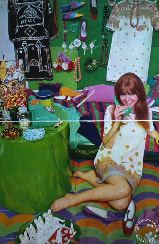
On the floor: Jane Asher in a dress designed by Ossie Clark made of printed paper fabric designed by Celia Birtwell; made to order in small, medium and large sizes, approximately 17s 6d. Bangle at Woolworths, 2s 9d. Vinyl floor tiles painted by Celia Birtwell. Lilac patent shoe by Russell & Bromley, 7½ gns. Amber patent shoe by Elliot, 8 gns. Coloured cigarette by Sobraine, 7s 2d for twenty. Coloured crepe stockings by Russell & Bromley, 6s 11d. Pop tin tray by Goods & Chattels. 9s 6d.

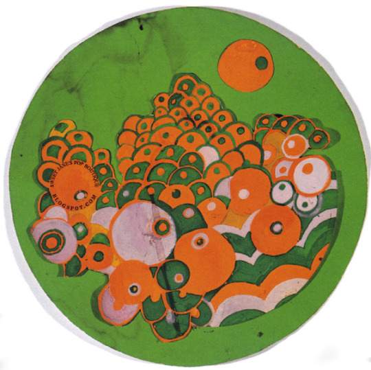
Close-up of the design detail from the border of the dress.
Above: One of Celia's initial designs for the paper dress rendered in gouache, inspired by the work produced at the Martine School of Decorative Arts in Paris. The school was set up by designer Paul Poiret in 1911 at 'La Maison Poiret' in an endeavour to realise his dream of creating a decorative arts movement in France which would be on par with the new developments in the arts taking place in Vienna and Germany at this time. The students mainly consisted of young working class girls between the ages of 12-15 years old, Poiret encouraged them to work freely from nature, organising trips to the countryside and conservatories whenever possible, but apart from this input they were otherwise without artistic supervision. His role was merely to stimulate their artistic taste without influencing or criticising them, in order to maintain the purity of the original source of inspiration in the work. He would then select a range from the finished designs which were suitable for reproduction and have them applied to fabrics, wallpapers, carpets, cushions and ceramics.
The work received an excellent response amongst art circles, and following an exhibition at the Salon d'Automne in 1912 the demand was such that Poiret opened a retail outlet called 'Atelier Martine' on Rue du Faubourg St Honoré. With a very favourable review in Vogue, the Martines went from strength to strength, also using their designs to create magnificent large scale murals, transforming hotels, shops, offices, private houses and the studio of dancer Isadora Duncan into exotic oriental palaces in the process. An international reputation was quickly established, however, the gathering momentum of the Martines success was stopped in its tracks by the outbreak of WW1 in 1914. The school closed for the duration of the war, with many of the students relocated to a safer environment. Business eventually resumed as normal in the aftermath, but although Poiret tried several times to re-establish his career and the Martine style, most notably in the mid 1920s with an extravagant display at the International Art Deco Fair in Paris, both failed to ever regain the immense popularity of their glory days.
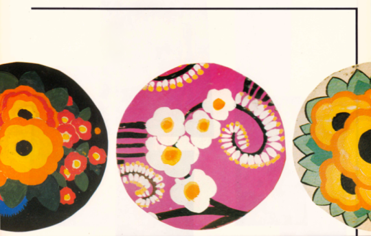
Three designs for round carpets, typical of the Martine style, from the workbooks of the School of Decorative Arts.
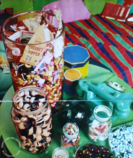
The Table: green paper drum table by Hull Traders Ltd, £3 13s. On the table: Large glass jar, £2, full of Smarties, Liquorice Allsorts and Barratt's assorted sweets; glass-topped storage jar, 6s 6d, containing dolls' eyes from Pedigree Dolls; spice jars, 2s 9d; glass dish, 7s 6d a pair, contain bath oils at Boots, 6s 6d. All the glassware from The Scientific Glassblowing Co Ltd. Hexagonal coloured boxes by Goods & Chattels, £1 17s 6d a set.
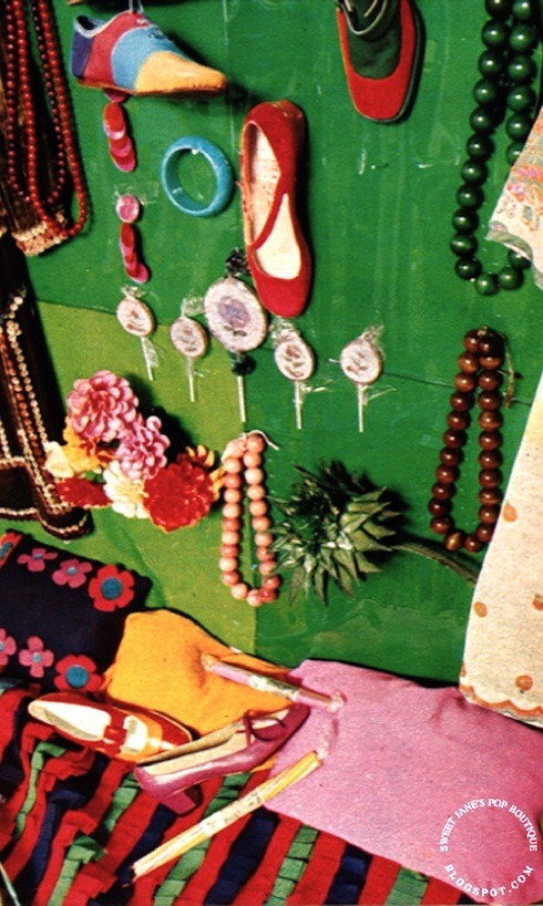
On the wall: wooden beads at Biba's, 11s. Striped shoes at Fifth Avenue, £3 19s 11d. Red and green shoe by Walter Steiger for Bally, 9½ gns. Bead bracelet at Biba's, 5s 6d. Dress designed by Ossie Clark of printed paper fabric designed by Celia Birtwell, made to order, 17s 6d. Plastic earrings by Paco Rabanne, £1 10s. Bangle at Woolworth, 2s 9d. Pink patent shoe by Russell & Bromley, £3 19s 11d. Woolworth lollipops. Paper roses from Portobello Road market. Dried flowers at Natural Fern Display Ltd, from 3s 6d each. Large wooden beads at Biba's, £1 2s 6d. Pearly Queen dress from Hector Binney stall, Bermondsey market.
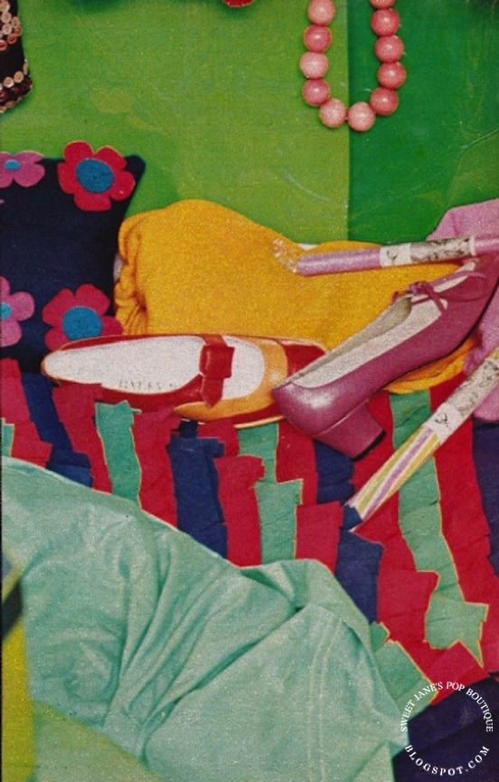
The Bed: emerald green wooden bed by Gary Griffiths at Vasa, approximately £30. Green sheets at John Lewis, £5 19s 6d a set. Orange and red shoe by Walter Steiger at Bally, 9½ gns. Leather and suede shoe by Salvatore Ferragamo, 14 gns. Woolworth's rock, 1s a stick.
IMAGE CREDITS
All content scanned and transcribed by Sweet Jane from an original article by Molly Parkin for NOVA, September 1966. Model; Jane Asher. All Photographs by Duffy. Celia Birtwell design in gouache scanned from Celia Birtwell by Celia Birtwell. *The Close-up of border design detail on the printed dress courtesy of the V&A collection. Carpet designs from the Martine School of Decorative Arts were scanned from A Fashion For Extravagance by Sara Bowman.
LINKS
Visit the Celia Birtwell website here. Listen to Molly Parkin on Desert Island Discs here. Watch Great Lives: The Molly Parkin Documentary here. Read about the life and times of of Zika Ascher here. View an issue of La Gazette du Bon Ton from 1914 here. And finally, read more about the career of designer Paul Poiret and view examples of his work here.
From @sweetjanespopboutique blogspot
#Jane Asher#1966 Jane#Jane model#The Time The Place The Dress and (if you still need it) The Food#Molly Parkin#Nova#Nova magazine#Ossie Clark#Celia Birtwell#1960s#model#muse#actress#1960s Jane#1960s fashion#Biba#Sweet Jane#Duffy
22 notes
·
View notes
Note
Do you have examples of your web/graphic design-ish art on hand? I've caught glimpses and it's some REALLY excellent stuff
howdy! thank you so much for this wonderful ask, i very rarely get the chance to talk about my web/graphic design stuff, so seize any chance i can get! you'll have to forgive me for how scattered this everything is, my graphic design stuff normally ends up as a smaller part of illustrations, so a lot of it is gonna be cropped, haha.
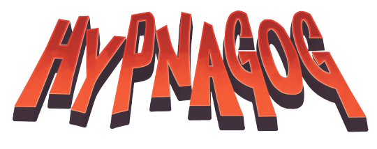
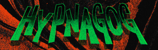
my hypnagog header is probably the thing i'm most proud of, it was the first custom font i ever made that felt like i captured what i saw in my head. kind of a clunky way to put it but before this i'd change my header logo and general "branding" like once every three months, yet this one has stuck around for like 2ish years!! here it is in my classic colorway and my new green/orange one.
here are a couple of my older logos for a bunch of random projects (a comic about evil horses, a defunct community project, a bunch of little glyphs for hypnagog before i settled on my current aesthetic, and one for story about evil clones)


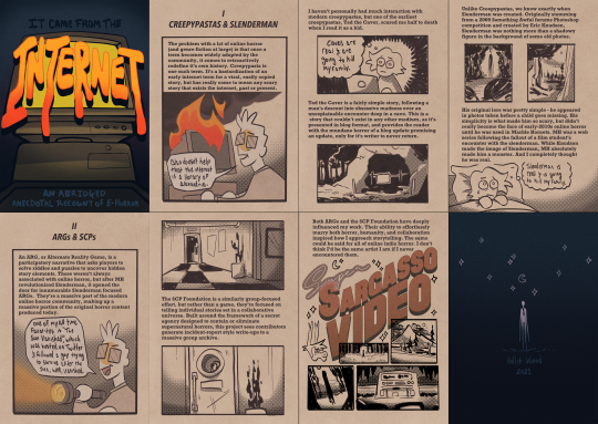
here are three posters i did for a couple of classes, they're more illustrative than graphic design but there's still elements that feel close enough to gd for me to post lol (a pitch poster for ANOTHER comic i was working on, an editorial piece about the recent HPAI surge, and a quick zine about my experiences with internet horror)

and FINALLY. here's my web design stuff. full disclaimer, i learned how to code on neopets, and i've never been able to break free of it's pull, so p much everything i've ever done for web design has all been on neopets, or on clone sites that emulate it pre-2007.
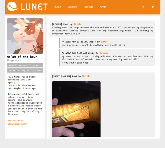
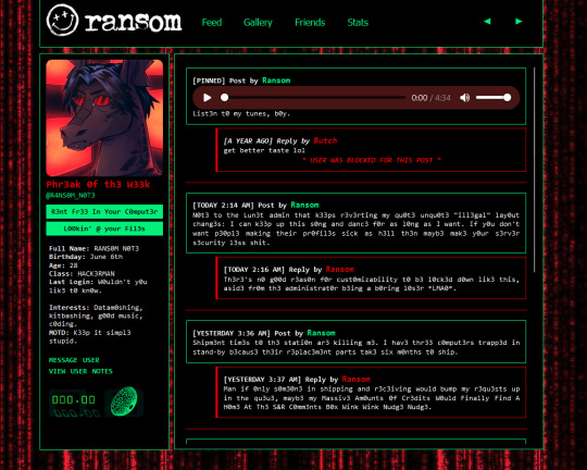
i'd love to link you these two but they're unfortunately behind a login screen on my current petsim of choice, so i hope the screenshots will do! these two are pet lookups coded from the ground up to look like social media profile pages (fun sidenote: Butch has a normal profile, Ransom is a silly hacker stereotype, and he had no choice but to "customize" his profile when faced with the insanely unsecured back-end of LUNET.)
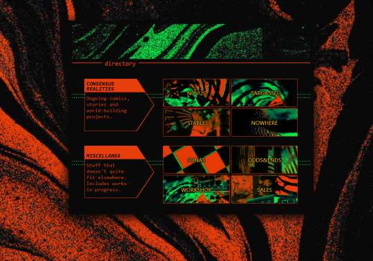
aside from that, my other most recent web project was developing a really sleek character directory for my toyhou.se. i made all the graphics on this page and i'm super proud of it, haha.
oh i almost forgot. i also have a bunch of really dumb banners that my friends and i use in discord in tandem with a bot that posts them on command - most of them are intentionally designed to look bad, but some of em (especially the data "webba" banner) were made with a lot of care, haha.
i think i might be forgetting some things, but that's pretty much it! my next big project is building out my neocities - i'll definitely post about it when its finished because i wanna use it as a secondary posting location for all my stuff :o]
thank you again!!!!
#my art#artists on tumblr#askagog#graphic design and web design are like. the only form of art that i do that feels like a hobby to me#everything else is super intense work stuff#but building a silly little webpage? always fun. always exciting#i hope tumblr doesn't eat the quality on these
17 notes
·
View notes
Text
Perrault’s fairytales: A quick intro
After talking about a lesser fairytale writer of the “second wave”, of course I now need to talk of a famous first-generation fairytale writer... And I will talk about the most famous writer of fairytales to this day, Charles Perrault himself - THE great master of fairytales, to the point French fairytales are now often synonymous with just him.
Everybody knows his tales: Puss in Boots, Little Red Riding Hood, Cinderella, Sleeping Beauty... Or do they?

I won’t do here a breakdown of Charles Perrault’s life and biography - this will be for another day. But I want to specify something... Very often, not just in foreign countries, but also in France, all of Perrault’s story are placed under one name “Mother Goose’s fairy tales”, “Les contes de ma Mère l’Oie”. In truth, this book does not exist.
Perrault created two different books of fairytales. One is “Contes en vers” (Tales in verse), which contains Griselidis, Donkey Skin and The Ridiculous Wishes. Then came “Histoires ou Contes du temps passé, avec des moralités”, “Stories and tales of the past, with moralities”, which is a prose work (unlike the first book, all in verse) and which contains Sleeping Beauty, Little Red Riding Hood, Bluebeard, Puss in Boots, Toads and Diamonds, Cinderella, Riquet with the tuft, and Little Thumbling.
No “Mother Goose’s fairy tales” in sight... So where does this title comes from? Well... it was Perrault’s INTENDED name for the book, or rather the first name of its collection of prose fairytales. His pre-publication manuscript, his earlier drafts, were titled “Les contes de ma Mère l’Oie”, that people like to translate as “Mother Goose fairy tales” but whose exact title should be “The tales of my Mother Goose”. However, as I said, this was the title of the early manuscript - after several other rewrites and drafts, Perrault changed the title to the one we have today. But “Mother Goose’s fairy tales” stayed thanks to one thing... The front illustration of the book, the first page engraving, which is this one (this is a colorized version, the original is in black and white):
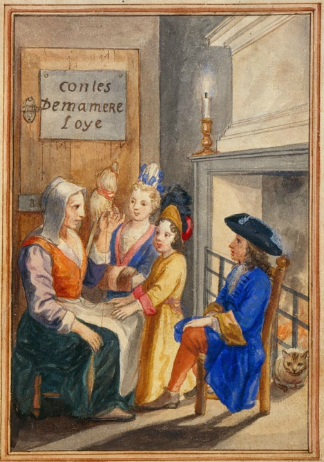
And has the old title written on it. Given the mass-spreading of Perrault’s fairytales was through uneducated/illiterate classes that often relied more on the images and illustrations than the actual texts, and through rushed copies that did superficial re-editions of the text, the title on the illustration ended up becoming more famous than the one of the actual book. The reason the illustration shows a different title has led to many speculations - some think the engraving was prepared BEFORE Perrault changed his book’s name, and this is just an editorial mistake, while other think this double-intended was intended by Perrault as a sort of game - because “tales of my mother goose” was one of the common expressions that designated at the time what we could call later “fairytales”. Other nicknames included things such as “tales of old women”, “tales of wolves”, “tales of donkey-skin”, “blue tales”, “tales to sleep while standing”... And you might notice something here: all these common appelations given to these “folk-tales” were actually included by Perrault in his own fairytales, in one way or another. “Tales of donkey-skin” are found in the titular “Donkey-Skin” fairytale, “tales of wolves” are found in Little Red Riding Hood, while “tales of sleeping while standing up” are literaly what happened to the people of the castle of Sleeping Beauty... We see what you did there, Perrault.
It is especially interesting when we realize that this picture, at the front of the book, was designed with a specific meaning - it illustrates the very “tales by the fireside, told by nurses or grandmothers to children” that Perrault pretend to have taken inspiration of/to write about. With here the old, lowly-dressed, spinster woman, sitting by the fireside with various well-dressed youths to which she seems to tell her tale, with “Tales of my mother goose” written on the door. This is a visual metaphor of how Perrault will try to take the old, low folktales, to bring them to a more upper-class, civilized, educated and refined audience. (Or at least, that’s what he pretends... With Perrault, nothing is ever as it seems).

Doré, as you can see above, clearly played with his own “frontiscipe drawing”, by twisting the original picture of Perrault’s first editions into something else entirely. We still have the grandmotherly figure, but who this time reads from a book instead of telling the tales orally - showing the change in the tales’ nature over the centuries. The panel indicating “Tales of my mother goose” is replaced by a painting of the vanquished ogre on the wall, and the profusion of toys in the mass of children clearly shows the “childish/childhood” nature of those stories... But the characters eyes expresses various mixed emotions, from fascination to terror.
To end this brief intro I’ll take the back-cover of my study-edition of Perrault’s fairytales.
Eleven strange stories. Eleven stories of incest and madness, of desire and cannibalism, of horror and love: under their apparent childish simplicity, the fairy tales of Charles Perrault are one of the most singular pieces of French literature. By celebrating the tradition of “mothers and grandmothers”, these tales manifest the existence of an “ancient feminine memory”, a clandestine storytelling that was fought and buried by the official culture of the “Great Cneutyr”. Ovnis appeared in the pure sky of the classicism, these texts with obscure origins still contain numerous enigmas that critics have a hard time solving. We do not know who exactly is their author (it is a debate I’ll talk about later) and we don’t know their exact sources - there is an aura of mystery around them, which maybe explains the enormous interest of people for these tales. They might be short, but they have built up centuries of commentaries and analysis - by folklorists, by psychanalysts, and more recently by experts of the “gallant literature”.
#charles perrault#perrault fairytales#french fairytales#fairy tales#mother goose's fairytales#fairytales#literary fairytales
7 notes
·
View notes
Text
5 Tips about best replica bags You Can Use Today

Nevertheless, quite possibly the most urgent problem bordering superfakes is strictly how They're manufactured. One particular rationale why designer items Possess a lofty price is mainly because of the labor-intense undertaking of producing these luxury goods. https://healthandbeautyyouneed.blogspot.com/2024/03/how-to-spot-and-choose-best-replica.html , the more labor is needed to finish it.
” He suggests checking blogs and boards for peer-to-peer assessments and cross-comparing resale websites to be sure price ranges are legit. Keep in mind the age-outdated adage: If it seems also good for being true—i.e. the bag prices way underneath its resale industry value—it almost certainly is.
, College students snickered in the lowly “snobs” exterior their gates, as well as the phrase ultimately arrived to describe those who tried to mimic their far more perfectly-to-do neighbours – early templates of now’s schemers, scammers, wannabes – just for the word to return to determine this elite group’s possess high-class vanity.
CleanTalk sets this cookie to forestall spam on feedback and forms and work as a complete anti-spam Answer and firewall for the site.
And when they don’t, They are going to be a lot more than joyful to help you locate it. Yet another detail which makes Bestreplica.su the best place to get Gucci replicas is their determination to quality.
In relation to discovering the best places to buy a replica designer bag, Here are a few things you will need to bear in mind. First and foremost, you wish to find a dependable vendor who focuses on marketing high-quality replicas.
Disclaimer: The above mentioned is often a sponsored put up, the sights expressed are Individuals from the sponsor/author and don't stand for the stand and views of Outlook Editorial.
00, closely mimics the Saint Laurent Basic Y Cabas Bag, and that is no longer readily available. Rather than https://www.linkedin.com/pulse/discover-best-knockoff-handbags-online-your-ultimate-shopping-khan-h9y3e , the V bag, of course, includes a V in the identical spot. Additionally it is smaller compared to the Saint Laurent design and style. Other styles at AliExpress seem comparable to designer replica handbags like Gucci, Michael Kors, Kate Spade, and even more. Total, the reviews of AliExpress handbags are beneficial, but some reviewers report acquiring crumpled products while some say the colours aren't the things they envisioned (reviewers also commonly involve photographs with positive and adverse testimonials, so you can see far more illustrations before making a call to acquire an item).
We don’t have any to start with hand suggestions for Shenzhen, just google it, someone almost certainly wrote about certain fake marketplaces in Shenzhen; all our advices nonetheless implement : )
It was Just about the most pleasing activities of my initial vacation to China. Following weeks of aggravation in university, finally a little searching and enjoyment.
One of the more appealing characteristics of replica bags is their selling price point. These items frequently Value drastically less than their “actual” counterparts, producing them suitable for anyone over a finances or seeking to save cash.
With regards to deciding on the best replica designer bag, the sky may be the Restrict. With a lot of alternatives available on the market, it can be challenging to decide which a person is best for your needs.
They may be extraordinary copies that get all the main points proper and will be tempting to acquire, However they're illegal.
This cookie is placed by CleanTalk Spam Guard to prevent spam and to store the referrer webpage tackle which led the consumer towards the website.
0 notes
Text
Highway to Music
My illustration class was given an assignment where there were three clients that each wanted an editorial illustration and we had to choose one. I chose the one that wanted an illustration for a summer music festival. They wanted a conceptual portrayal of “driving to a festival”.
Highway to Music (Editorial Illustration)
Highway to Music (Editorial Illustration)
Highway to Music (Editorial…

View On WordPress
0 notes
Text
wk 12 social engagement
In our society, there are many people who consistently confront and address social issues. Some individuals engage in one-person protests, holding signs every day, while celebrities use their fame to bring hidden social problems to light. Various people fight for society in their own ways.
Among them, I found an artist who interestingly expresses social issues through cute illustrations. He goes by the name iggdeh and is active on social media. He presents various issues of the year through unique illustrations. Examining his works, we can see stories about the COVID-19 pandemic, racial discrimination, environmental destruction, ongoing wars, and technological advancements. As seen in the pictures, his works are simple and delightful illustrations, but they have a unique characteristic of not appearing light-hearted. He consistently showcases works conveying the voices of socially marginalised groups. Although his works contain messages that can evoke strong opinions about social issues, his ability to make even those with opposing views smirk and laugh is remarkable. Despite the light appearance, the true charm of his illustrations lies in their depth.
Additionally, as evident in the pictures, his works are simple, yet they convey a clear message with a precision understandable to everyone. His ability to deliver a concise message in a straightforward and uncomplicated manner appeared fresh to me and resonated with my personal design aspirations.
Personally, when it comes to design, I believe there should be a purpose, and the message of that purpose should be accurately conveyed. Iggdeh's works clearly encapsulate this purpose, and that is why I found his works intriguing.
My artistic vision is not just about creating aesthetically pleasing designs but also using my art to bring attention to societal issues, make a positive impact, and become an influential person in addressing and solving problems. Whether it's a social issue or not, I want to be a person who confidently expresses opinions through my artwork. My aspiration is to present these ideas in a stylish way that captivates everyone within my field of expertise.
During the CTS class, we delved into various social issues. In one of the initial sessions, we had the opportunity to share and discuss the social issues we found. However, due to time constraints, it ended with mere sharing. Personally, I feel that if we had more time, we could have further discussed solutions to the social issues we shared and explored how to address them through design. If given the chance in the future, I would love to work on a project that focuses on practical solutions to social issues and showcases them through design.
(430 words)
“Iggdeh - Editorial Illustrator.” Iggdeh Editorial Illustrations, www.iggdeh.com.
0 notes
Text
I'm so goddamn nervous rn because I'm waiting for feedback on whether I got into this illustration class that I had to fucking apply for with a portfolio but for some godforsaken reason I completely didn't think about how this professor prefers analogue stuff over digital and because most of my (imo) better art is digital I put a lot of that into the portfolio. I COULDVE PUT LINO CUT IN THERE which is absolutely SO analogue but ??? I didn't??? All I was thinking was that it should match editorial illustration (what the class is) and kitsch (theme of the class I guess) so I did not think about anything that didn't fit that. But that was soooo silly of me!!!! So now I'm just. Dying
Anyway on the plus side on the motivation thingy I wrote something like "I know I'm not super communicative but I'm trying my best to be a good student" because in the last class of his that I was in I never signed up for a 1on1 and I've previously gotten feedback from another teacher that I need to be more communicative. But. Prof replied to my mail with. This.
"no one can ever demand of of you to be communicative (what ever that is). That’s something we should be trusted to do when we feel it’s necessary and/or enjoyable.
Besides that I think that you do communicate already, in your way."
Aaaaahhhhhh???????? HUH
0 notes
Text
Process Blog Three
Reading Responses:
Chapter Six of the textbook reading (Becoming a Graphic and Digital Designer: A Guide to Careers in Design, by Steven Heller, pages 120-137) is about designing book interiors and book covers / book jackets. It was quite interesting to read this chapter, as the designs were phenomenal, and it brought my attention to designing book interiors which I had never really considered much before. While I understood that book interiors and layout had to be designed, I didn't realize that there were designers who devoted their entire careers to the typography and flow of the fairly simple seeming pages of books.
Chapter Seven of the textbook reading (pages 138-147) is about editorial design such as magazines and newspapers. Personally I think I would prefer designing magazines over newspapers, as I already have a little bit of experience designing a magazine layout for my high school art magazine. However, I feel like designing a newspaper would allow for the designer to focus more on the layout and the flow of the design rather than worrying about how to fit in all the images with their variation in sizes and style.
Chapter Eight of the textbook reading (pages 148-155) is about social innovation through design. Using design as a tool for social innovation is incredibly meaningful and important, however I can't really see myself going out of my way to pursue it in a career or without someone prompting me to pursue it.
Chapter Nine of the textbook reading (pages 156-161) is about branding and packaging. I also have slight experience with branding and packaging, as I had a number of assignments previously with rebranding certain companies and designing product packaging as well. I feel as though I fit better with designing products and branding rather than product packaging as I have slightly less experience with packing. However, I could completely see myself focusing on these in my design career and I would be thrilled to design product packaging and branding for my own company.
Chapter Ten of the textbook reading (pages 162-184) is about illustration design. While illustration design is beautiful and I love to look at it, I am not particularly interested in making illustration design myself. When it comes more to creating visuals in this sort of way, I would prefer to draw or paint in a way that focuses less on how to 'design' it.
Reflection:
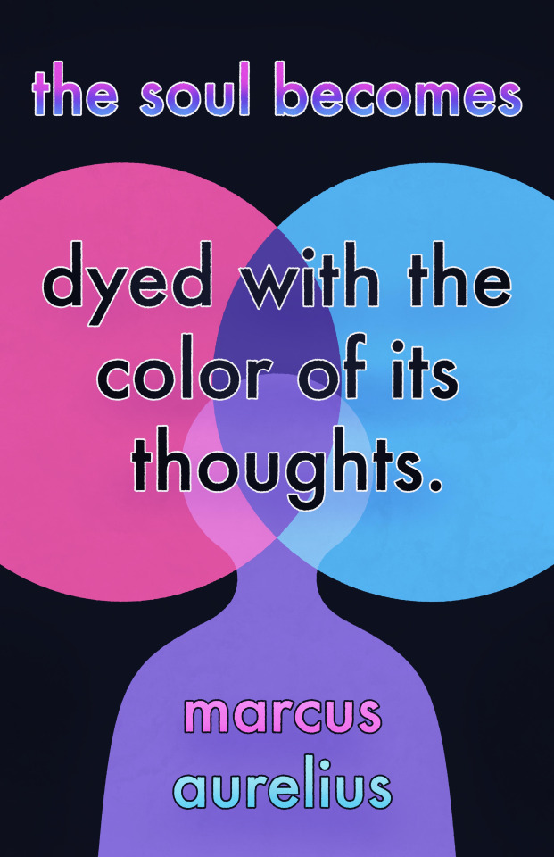
The class project that our class has been working on since the last progress post is our Great Ideas Poster. I started off with a quote that I liked by Marcus Aurelius where he said "The soul becomes dyed with the color of its thoughts." I chose this quote because I thought that it would pair perfectly with some really colorful imagery, which I thought would be really nice and fun for a poster design.


Then I refined these designed on my iPad in Procreate and created three refined sketch images.
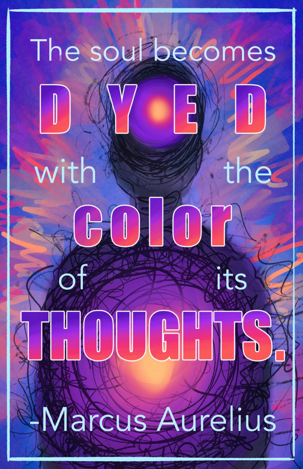

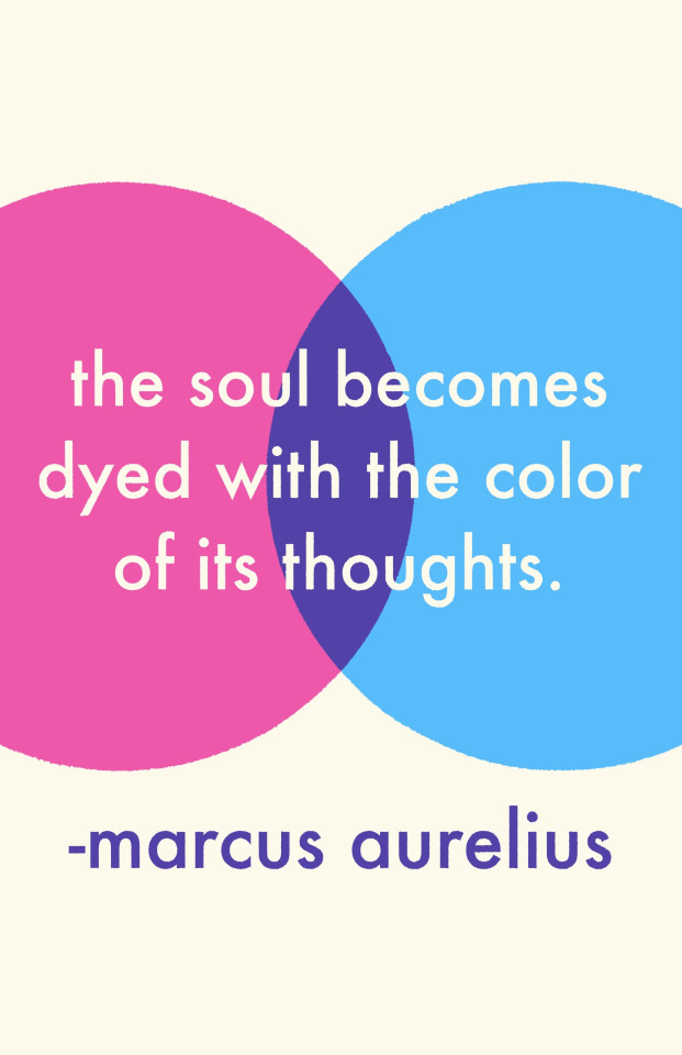
I had a lot of fun playing with the colors and looks of all three images, but the third image was my favorite conceptually as I really liked the simplistic and less messy look as I had become very used to the messy look while designing the first two. I did however LOVE playing with the text and color gradients in the first image.
I then began to create the shapes of the third image in Adobe Illustrator for my final poster.

Once I had the shapes the way I wanted, I brought them into photoshop to play with the layer options as well as to add in the text. After that, I brought it back into procreate to add some colors and character back to the image that I lost when I chose the simple design over the chaotic ones in the refined sketch process.
0 notes
Text
Turn back (Hip) and turn round (Hop)
What do you think when you read the word « hip-hop » ? It’s a funny world, isn’t it ? With a good rhythm when we pronounce it but some people continue to consider it as a subculture. This pejorative term means a different culture than the most leading one. However, in a documentary produced by Le Monde, the journalist said that « 40 years after its birth, rap music generates important numbers. » To give you an example, the top-selling artists in France are rappers (and specifically French rappers). The truth is that Hip-Hop isn’t subculture but not a good looking one.
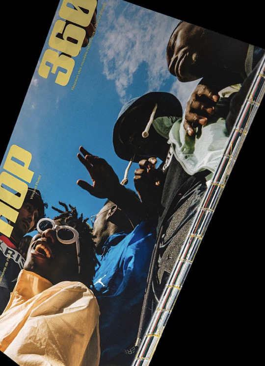
I use to listen people highlight the violence and the vulgarity of this music style. The 17th of December, the Philharmonie of Paris, the music museum of the city, presented the exhibition Hip-Hop 360. Of course, I visited it but what impressed me most was the exhibition catalogue which supplements the exhibition. For someone like me, in editorial design studies, this book produced by Samuel Lamidey or Raegular helps for the acknowledgement of this culture. Thanks to the graphic vocabulary, Raegular tries to explore each aspect of Hip-Hop : a 360 degree turn.
Hip-Hop is a cheap, modest and approachable culture. The book, similarly, is basic because the size is A4 so a common and easy size to handle. The book cover is thin, the paper used for the text looks like recycled paper. This material poverty helps us to not fear the reading. That’s not a precious book what helped me for my own experience. I don’t use to transport big books in my bag but, even if I borrowed it to the library, I like to read it everywhere as a « all-terrain book. » Moreover, there is no spine, each leaflet are bound and there is nothing on to mask it. The reader is the witness of this creation what can lead him to read and discover the content. About the content, there is a lot of images. This book is the line between a book and a magazine. The structure design is repeated : one introduction page of the chapter, an interview and series of pictures on a full page, as the flat-plan of common magazines. The abundance of images allows us to browse ans select easier the subject that we want read. However, images tell something and the layout too.
Hip-Hop means pride. Actors of this movement adopt a special attitude. They stage themselves to have a « street credibility. » The book cover is a good example of this concept. Taken by Ojoz, this picture represents a boys band. The bottom view divines these men but the positive vibe of the moment thanks to smiles reduces the feeling of dominion. The all book isn’t precious but pages with pictures are. Reagular chose a glossy paper to sublime what is usually hidden or criticized. He printed famous suburbs, urban way of life and dressing. He reveals this lifestyle.
Hip-Hop is a high culture. What surprised me more was the contrast of typefaces used. Raegular chose three different styles. The typeface used for the title’s book and chapter is Booty, a bold and fat typeface with extra thin tracking and written in uppercase which is common to the underground vocabulary. To soften this graphic strength, he combines it with the famous Neue Haas Grotesk. He uses it for the main text, captions and some folios. The final typeface is ITC Garamond which is used for names of peoples interviewed, the introduction and the questions of journalists. The use of this historical typeface permits to crystallized these names in History of music. We can now talk about Hip-Hop actors, write books about them: it’s a rich subject. The use of different typefaces shows ambivalence of Hip-Hop. Reagular didn’t betray origins of this movement which are in the street and represented by a low social class. He also wants to show the accessibility and universality of this kind of culture by the use of the « neutral » typeface also known as Helvetica. But he wants illustrate the desire of rise. The use of the Garamond ennobles this culture or subculture.
What do you think now when you read the word « hip-hop » ? This music, dance, art style is complex but I like to explore it though the eyes of a graphic designer. This panorama helps me to understand and share above and beyond stereotypes of this music style that I treasure. Thanks to graphic design Hip-Hop can seduce a new audience or, I hope, be more approved. The exhibition is over, but the book still exists. So If you’re curious, you can ask me to borrow you Hip-Hop 360. It has to turn to each other. Over the world. 360.
3700 types
2022/02/05
0 notes
Text
B01: Why I Write
Title: Why I Write
Author: George Orwell
History: Found at a library sale in October
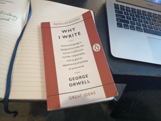
If my piece on Chuck Klosterman’s “The Nineties” from last year indicates anything, it is that I have little sense of how to write about books in a non-academic essay sense. I am not in the habit of reading book reviews outside of those published in journals (maybe that’s a habit I should get into. Come to think of it, I’m not in the habit of reading reviews of any medium at the moment. Maybe that’s another habit I should get into.) Forgive me if I’m shaky to start out with here.
Orwell is a writer with whom I have limited experience. I wasn’t in the classes that read 1984 and did the whole accompanying ‘Big Brother is Watching’ game in high school, and I know that I own a copy of and at least at some point started reading a collection of his essays (it’s in my huge stack of books in the profile picture) sometime since the start of college, mainly because I read his essay on being in boarding school in a narrative essay collection I was assigned for one of my creative nonfiction classes back in college. I was struck then by how much weight and complexity he could infuse into the emotional experience surrounding wetting oneself as a youth, and that’s been my primary memory of his work as a writer and a thinker to this point, a fact which I’m sure he’d be happy to know.
This collection features a few essays written in the 1940s, mostly discursive/argumentative essays about England’s cultural existence, England’s place in World War II and Europe, socialism, and patriotism.
Orwell is refreshingly straightforward. He dictates in the collection’s last essay, “Politics and the English Language,” that he values precision highly, and it’s reflected in each of these. We might call him “brutally honest” nowadays, or more accurately ten years ago we might’ve called him that, back when that tendency was seen as a genuine virtue and not an annoying front for callousness, i.e. back when we used that phrase without scare quotes. He’s so adept at stating or defining something precisely in a single sentence and building off of it. It makes me miss teaching, I want to use his essays to illustrate the value of a good thesis statement. A great example was in Part II of “The Lion and the Unicorn” –
What this war has demonstrated is that private capitalism – that is, an economic system in which land, factories, mines and transport are owned privately and operated solely for profit – does not work.
Which is gorgeous as a thesis statement. Orwell states his argument and defines the main term of the argument precisely before elaborating. He states this, he states the claims which build up the argument, the reader can agree, disagree, be enlightened, be disgusted, whatever, but there’s no kvetching to it. Especially in comparison to so much editorial writing I’ve read recently, I liked reading a man confidently (and competently) state his argument the way that Orwell did here. I couldn’t immediately think of who Orwell’s writing is contrasted with in my mind here, but as I write this reflection, I keep thinking of reading The Athletic’s college football columns during the first half of this season before I realized I hated each of the primary columnists, and I might even be thinking of lengthy Tumblr and Reddit posts by non-professional writers. That is probably the answer: I don’t seek out enough good writers to begin with. It’s my own fault that I dislike so much of the writing I read. I know where I can find good writing, or at least I know where I keep finding the type of writing that makes me want to grind my knuckles into the desk in front of me until I hit the bone, and yet I often choose the latter.
Orwell’s opinions do not align so neatly into modern defined scaffolding. He’s a socialist and an imperialist and he values patriotism. Through modern eyes these immediately struck me as contradictory opinions, but he argues precisely and thoroughly. His argument about England continuing to occupy India reminded me of contemporary arguments on the American presence in the Middle East, but I came around to his argument on patriotism’s role in getting a mass of people on board with a broader mission. The one thing I envy about him writing in that era (and I mean the one thing. I don’t envy him writing that with airstrikes landing in the streets around him) is that achieving his ideological mission seemed much simpler and more feasible in his era. In a much less connected world, the list of simple steps he lays out for his socialist vision struck me as feasible, and some of those steps around state ownership seemed to have come to fruition in the UK. I don’t envy the modern socialist rhetorician, as a pragmatic approach like Orwell lays out feels difficult in such a complex and interconnected world.
I should clarify that the depth of my knowledge around these topics during Orwell’s era is limited if that isn’t already clear.
I appreciated Orwell’s criticisms of his contemporaries, even if I didn’t know who he was specifically criticizing. There was something fun about reading criticisms that I could imagine a modern writer like Freddie DeBoer or Max Read making towards similar groups in a Substack post – The middle and upper management classes are built on nepotism and are fundamentally incompetent. The intellectuals are annoying and so stuck in idealism that they’re functionally useless. I read criticisms like this all the time from modern cultural critics. That was maybe the most interesting aspect of reading this book: How many of his criticisms have reflections in the modern day.
I’ll end on my favorite section (fitting given my profession), “Politics and the English Language.” I like that he succinctly lays out his main criticisms with contemporary writing: “The first is staleness of imagery: the other is lack of precision.” His complaints on staleness touched on something that frustrates me about modern writing as well. I think of my frustrations with reading Defector, a site whose mission as a sports-based subscriber-funded cooperative I admire but whose writers I dislike reading because of these sort of rhetorical handrails they hold on to, so many of them adopted from old tweets (‘it’s good, actually’ or ‘you can have a little whatever, as a treat’ or ‘types of guys’), which were grating to me initially (and clearly aren’t to their reader-base) and only grew annoying as time and language has progressed. It’s a champagne problem that the people on my side politically write in a way I find annoying, but it’s pushed me to try to write differently myself. Orwell credits this to an innate issue with writing under any orthodoxy.
The conflict between he and I (and my central criticism of my own writing at the moment, though I have so much fun doing it that I don’t want to stop it) comes from an inability to be precise and direct in much of my work. I’ve worked on it in this post, I don’t know if it’s come through. Precision, in political writing, or even just in basic argumentative writing, has significant benefits, but I’m fine as it stands with my creative essays leaning purple. Once I get the final Football Hell essay published, I might try to take these lessons into account.
What I want to take from this work comes from this passage:
A scrupulous writer, in every sentence that he writes, will ask himself at least four questions, thus: What am I trying to say? What words will express it? What image or idiom will make it clearer? Is this image fresh enough to have an effect? And he will probably ask himself two more: Could I put it more shortly? Have I said anything that is avoidably ugly?
I hope to make asking these questions into a habit going forward.
0 notes
Text


last post for the year is dedicated to the editorial illustration i made last year, thank you to danni for guiding me throughout the process!
i remember feeling so burnt out back then, i honestly didn’t think i’d be able to finish it but despite all the stress i got from school at the time, i somehow managed to push myself and just forget about my perfectionist silly little thoughts about every single detail in the illustration. keeping that in mind, it really helped me throughout the challenges i’ve faced in 2022. if there’s one thing i’ve learned this year is that i’m not alone!! so i want to thank the people who supported me and the people i closely worked with for always believing in me even on my bad days, i’ll continue to do better in 2023! 🥹🫶🏼
this illustration is for The Benildean’s “Langit at Lupa” in the Redacted issue 😶
— TLDR the story is set during the peak of the pandemic and i wanted to show a still-life of a food spread that most elites like to splurge on during parties, weddings, and vacations, (food spreads that marie antoinetter would’ve probably thrown back then jk) and show the class struggle as well. there’s so much layers to this and that while they’re enjoying all of this luxury given their privilege, there’s another side wherein some experience the complete opposite.
feel free to check it out at bit.ly/thebenildeanredacted 👀
#artph#aweshii#aweshiiart#digital art#illustration#art ph#digitalart#art#aweshii art#art philippines#editorialart#editorial art#editorial illustration#editorial
0 notes
Last Seen Blogs
missshirleey
Senju & Papaye Diary

personaltrainingcertificat-blog3
Personal Training Courses

ytr100sss
100SSs
meenen
蘭国だよりIets leuks in Nederland

redladys-blog
starfire