#me: maybe if i add gradients it won't be the same as always
Note
Maybe a dumb question for you x3 I adore your character designs, specifically how detailed they are. I'm trying to improve my own character designs and was wondering, how do you come up with all the little details without making the overall design look cluttered?
Thank you so much aaaaa you're so sweet!!
And a bit of a disclaimer before getting to this: I haven't got character design classes, I've mostly taught myself by observation and practise!
So, I think the key part to cluttered designs is to have places where the designs can clutter, and parts where the designs can rest. Unless you're going specifically for the kind of design where every inch is covered in details (think about the Pathfinder Iconics, for example, all of which have extremely detailed designs- and that's part of the style), it's always nice to have a bit of balance.
If you have a design filled with details, the person may not know where to look at. It can also get in the way of flow and such. For example, I tend to concentrate details in the belt area and in the shoulder area (as well as the head, sometimes), as you can see in this example:
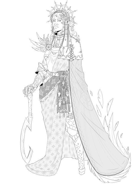
All while giving some rest in the chest and skirt (which for me, tends to be the simplest part in most designs).
I think it also helps to have parts where the detail has volume (in the sense of having different elements/objects, such as a belt with potions and tools and a sash), and where the detail is simply a pattern. Patterns can add a lot of richness to a design without cluttering it up too much, as they are part of clothes and flow with them.
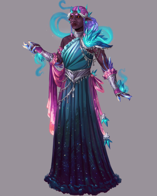
For example, here the skirt has some patterning (the starry bits), folds and frills, but it's still part of the same cloth and it keeps the clutter down. Compare that to the belt piece, which has a lot of dangling pieces and a ribbon, or the shoulder piece, which has a clutter of crystals and more metallic bits.
I also try to keep things balanced on both sides. If you have a huge pauldron in the left side, try going for a bulky gauntlet in the right side! Having too much clutter in one side and none in the other can work against you.
Finally, I think colors are also essential on this. If you give a character a lot of clutter but it's all within the same colors and has similar values, it won't be as overbearing. If you give a belt with 5 potions and they're all between red-to-orange, it won't be as cluttering as if you made them be of different colors.
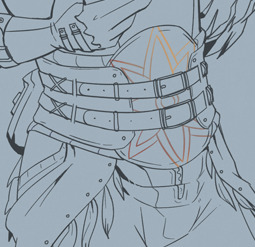
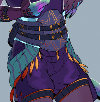
For example, here: While the lines have a fair amount of detail, the fact the belt piece is mostly of the same colors makes it less visually cluttered. The hanging cloth, being brighter and having the golden dangling bits, is actually more visually encumbering. Notice how I made a gradient on the belt pattern, too: That was made because if I left it as a bright gold, it would be causing much more visual clutter because it'd contrast too much against the darker tones.
You can use this in order to bring attention to specific details within cluttered designs. If you wanna show a sword's sheat on a character who wears many layers of rags and hanging cloths, make most of the rags and cloths be a dark color, and keep the sheath bright (or the other way around). Values are key when you want to bring someone's attention to a specific place!
I hope this all made sense. My English is failing me a bit today so I'm sorry for any mistake!!
40 notes
·
View notes
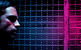
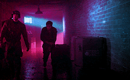
Photo


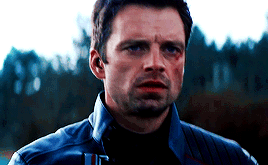

A semi-stable 100-year-old man.
#buckybarnesedit#marveledit#coloredit#sebastianstanedit#sebstanedit#usersakshi#userliliana#dailyavengers#dailyteamcap#mcufam#andthwip#userivonne#bucky barnes#pink#blue#mine#my gifs#*#me: maybe if i add gradients it won't be the same as always#i 'm so annyoing but blue and pink just SLAP together
3K notes
·
View notes
Text

Okeyy here it is!! I decided to put together a step by step (gif) coloring tutorial where i list the layers i use and how i've so far made them work for me.
I've been giffing for 2 years now (i'm using PS CC2019, the example pics are in finnish but icons and placements should be the same) but it's an ongoing learning process.
My coloring style is quite natural, i don't do fancy stuff often and i mostly just want the colors to look as true to real as possible but better than originally. And for this kind of style i've found the steps below working for me.
I also don't have any base psds or anything that i'd often use. I always start the coloring for each set from the scratch because, to me, it's the most fun part of giffing. I have 6 layers I use every time and then some random additional ones that i often add too. None of this is me saying what you should do, this all just me explaining what i do and hopefully this can be helpful to someone.
Ok ok time to get to the point so:
1. Curves
I always, like literally always, start with this layer
Sometimes i just drag the line upwards to brighten the gif but very often i use the eyedropper tool
Choose the white tool, pick the whitest (but not 100% white coz then it won't do anything) spot and it will make that the whitest part of the gif. It also works great at correcting the colors, sometimes you need to try multiple different spots to get the best result
The black dropper tool works the same way, only opposite, so clicking on the darkest spot you make that the blackest part of the gif
If the effect is good but a bit too much, you can lower the opacity of the layer, or the other way, so if it did well but not enough then duplicate the layer
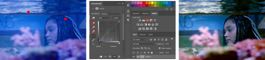
Example: the difference between the left and right photo is 2 clicks and this, my dudes, is why i worship curves. I chose the white eyedropper tool and clicked on that light spot visible in the water, then i chose the black eyedropper and clicked on fatou’s hair and that’s it. Needs more work, but that’s a pretty allright (and easy!!) start (zoom to see better)
2. Levels
I drag the left and right sliders a bit to the center to get contrast (left ~5-20, right ~240)
The eyedroppers work on this layer pretty much the same way as in curves, but i'm more used to using them only with curves
3. Black and white gradient map
I set the blending mode to soft light and lower the opacity to ~10-30 %, this brings some depth to the colors imo
4. Vibrance
I usually add ~20-60, it really varies tho and you can just wing it most times
5. Exposure
I set the top one (exposure) to 0,1 - 0,2 and bottom one (gamma) to 0,97 - 0,90. This is an effective layer so better not do too much
6. Color balance
Owing my life to this layer
I add this layer at around this point of coloring but i drag it to be the bottom layer, since when it's under the rest of the layers it's more effective
In the midtones, i always drag the bottom slider towards blue, something as small as +2 might work, sometimes you need to go +15 or so. I might drag the middle slider slightly to the left to reduce the green tones, and the top one on either side depending on the tone of the gif
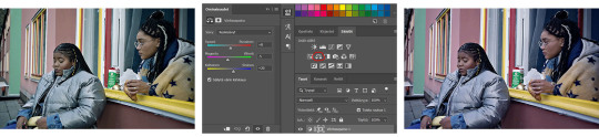
Example: this one doesn’t have any of those other 5 coloring layers i always use so it needs more work but also it shows how effective color balance is. I added more blue than normally, at least with one layer, but this one needed it imo. Love to see the green go whoosh
At this point the coloring might be done (jk it likely isn’t) but if it needs some more work then i might try one or some/all of these:
7. Photofilter
I mostly use either warm orange filter to bring some warmness to the colors or cold blue filter to correct yellow/green/red tones
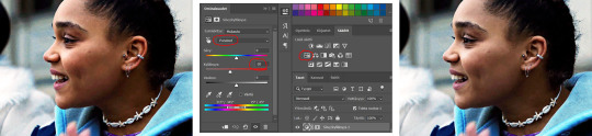
8. Hue/saturation
I choose red and drag the middle slider (saturation) to -5 to -20, this helps to reduce the orange/unnatural skintones
Example:
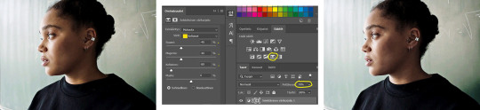
9. Selective color
Playing around with whichever color i want to add or reduce, if i feel like the gif needs more contrast i choose neutral and/or black and drag the bottom (black) color to the right.
If sometimes the whites are too blinding, i choose white and then the bottom option (black) and drag it to the right ~10 -20.
If the skintones are too yellowish, i choose yellow and go -40 / -40 / -80 and leave the blacks at 0. If it does too much, i lower the opacity of the layer, or in case i want it to be more, i duplicate the layer
Example: (zoom and cry happy tears over the ugley yellowness being gone)
10. Gradient map
For example blue-white gradient to get to colder tones, yellow-white to brighten/soften the colors or smth like pink-blue if you want to get fancier (the options are limitless tbh)
I set these to soft light and lower the opacity, usually to less than 40%
If i want the color to strongly affect the entire gif, then i leave the blending mode to normal or choose color
11. Brightness
Adding this if some more brightness is needed (i don't use the contrast option here but go to levels instead, if needed)
_________
Tips with poc!!
Some things i've found to be helpful when wanting to bring color back to the skintone after brightening or other adjustments have taken some of it away:
a. Check the points 8 & 9
In selective coloring choosing neutral or black and then black in them and dragging it to the right helps to darken the skintone
Try choosing red or yellow and then yellows or blacks in them and dragging the slider either to the left or right, depending if you want to add or reduce the yellow/red tone
Honestly the best advice i can give with selective coloring is to just simply play around, choose a color, drag them sliders to the left 'n right and see what happens
b. Go to channel mixer and add a little bit of red (+101-105)
c. Add levels or contrast or vibrance layer
d. Choose a warm colored photo filter
e. Be careful with exposure and too much brightness
_________
Soooo yeah, these are the layers i use, sometimes you can't do everything with the same layer so for example i might add one or two more curves to get brightness, or multiple selective coloring layers or add another color balance etc.
Generally i like to do small changes with one layer and not everything all at once.
_________
As for when saving the gif for web, these are my settings. I translated the one’s that aren’t obvious but everything else i’m assuming doesn’t need translating since this view always looks the same.
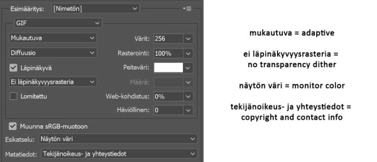
I use diffusion 90% the time, but when it doesn’t look quite right i try pattern. And sometimes when the gif has been really dark originally (😩) and has needed tons of brightening layers, noise might be the best option.
At the bottom i have the quality set as “bicubic”.
_________
So that’s it! If you made it this far, thank you, ily <3 Lots of stuff i’ve learned along the way and lots of stuff to be learned. Hoping that maybe you got to learn something from my way of coloring, too. And if not, thanks for reading anyway 😌✌🏻
#here it is 😳#i've never done posts like this but i tried to explain stuff as shortly but clearly as i could#hope it's easy to follow#and that i didn't forget anything crucial jdjdkdkd#gif tutorial#coloring tutorial#mp
49 notes
·
View notes
Last Seen Blogs
tluxrbrn321
센트립 비아그라 구입처,kkv3.0pe.kr 카톡:ppt33

naszircrock4
naszircrockett
ashes-to-asheshq-blog
make us poster boys in the scene
stewardesses2
Second Time Around