#sbk


Text
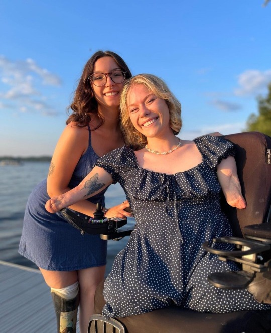
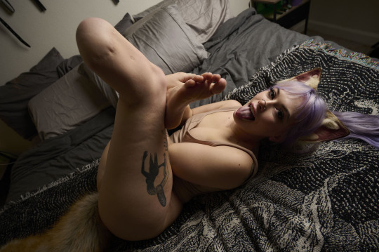
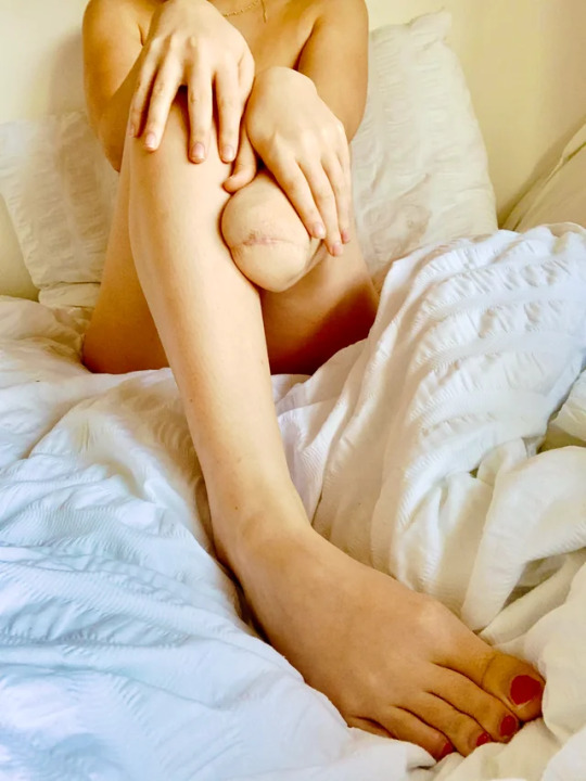
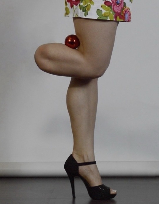
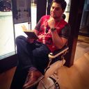
Amputee besties
#wheelchair#wheelchair girl#amputeegirl#amputee#quad amputee#quadruple amputee#sbk#below knee amputee#prosthetics
157 notes
·
View notes
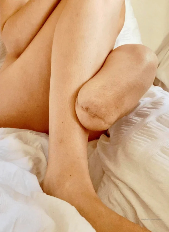
Text
#amputee#amputeegirl#lbk#sbk#left below knee amputee#leg amputee#onelegged#one legged#one leg#prosthetic leg#prosthesis#artificial leg#amputiert#amputation#stump#stumps#amputada#amputierte frau#amputee woman#amputeewoman#amputee girl#amputeebeauty#amputee beauty
61 notes
·
View notes

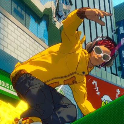
Text
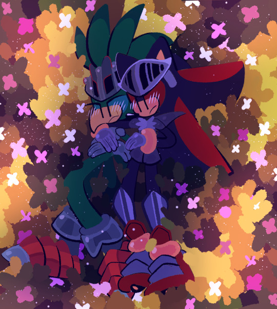
💚🌸🖤
#lancelot#lamorak#shadow the hedghog fanart#artists on tumblr#art#sonic fandom#sonic fanart#shadow the hedgehog#shadow the ultimate lifeform#sonic the hedghog fanart#sonic the hedgehog#sbk
24 notes
·
View notes
Note
how do you feel about jsr3's new look?
Oh boy. I’m mixed on the game’s look right now. Sorry if this is long…
Like, it has stylization, like the shadows having a bit of hatching…
…And the backgrounds have a chromatic abrasion and halftone dots.
The characters are cel-shaded! I even think they have an outline! …It’s very thin, but it’s there!
It’s mainly the character models. Not the designs, those range from great to good enough. I believe it's the realistic proportions and detail that are throwing people off. Being able to make out all those wrinkles and folds. His face looks ill-fitting against the rest of his model.
It’s all a little too reminiscent of Robotnik from Sonic 06. Realism dressed cartoonish.
For me, they’re just THIS close to the uncanny valley. For others, they’re already in it.
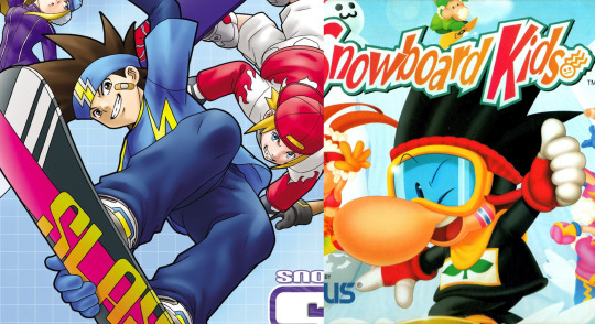
It feels like an SBK: Snowboard Kids situation. These designs are good by themselves. But when compared to prior entries? They just look off. Doesn’t help that they have to share elements from prior designs.
Look, we decide for ourselves who’s right and who’s wrong. I always try to be optimistic and sympathetic, even when I really shouldn't. But the fact we debate at all, to this degree, is concerning in itself.
Luckily, it's early in development. Sega can address fan issues. They (probably) still have time! …If Sega gives them time, which they historically never do. But hey! It’s a “new era”!!
#ask#thanks for the ask!#ask me questions#jet set radio#jsr#sega#jet set radio 3#jsr3#sonic 06#sonic the hedgehog#snowboard kids#sbk
27 notes
·
View notes
Video
flickr
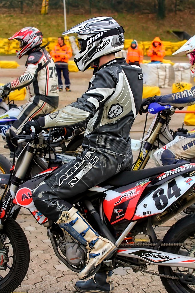
Cross guy von driver Photographer
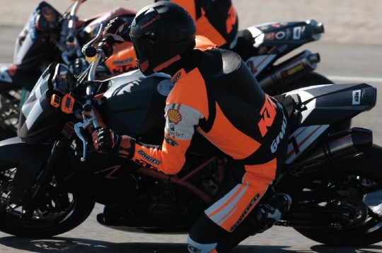
#Aprilia#Cagiva#Honda#Kawasaki#Husqvarna#KTM#Simson#Suzuki#Yamaha#Ducati#Daytona#Buell#Moto-Guzzi#Triumph#BMW#driver#motorcycle#leathers#Dainese#Motorrad#Cross#MotoE#SBK#crashes#Motorcross#Enduro#オートバイ#オートバイ、革、川崎、ヤマハ、ドゥカティ、ホンダ、アプリリア、スズキ、#摩托车,皮革,川崎,雅马哈,杜卡迪,本田,艾普瑞利亚,铃木,#flickr
14 notes
·
View notes
Video

flickr
MotoGP by driver Photographer
#Aprilia#Cagiva#Honda#Kawasaki#Husqvarna#KTM#Simson#Suzuki#Yamaha#Ducati#Daytona#Buell#Moto-Guzzi#Triumph#BMW#driver#motorcycle#leathers#Dainese#Motorrad#Cross#MotoE#SBK#crashes#Motorcross#Enduro#オートバイ#オートバイ、革、川崎、ヤマハ、ドゥカティ、ホンダ、アプリリア、スズキ、#摩托车,皮革,川崎,雅马哈,杜卡迪,本田,艾普瑞利亚,铃木,#flickr
11 notes
·
View notes
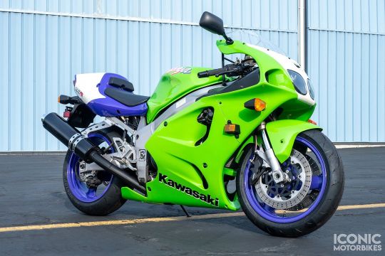
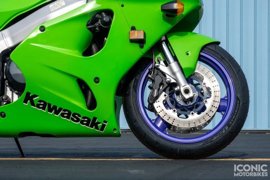
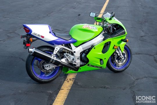
Text
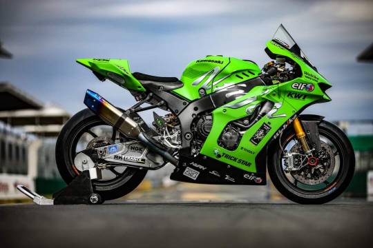


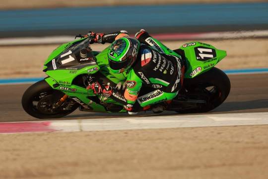
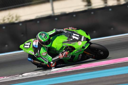
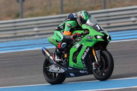
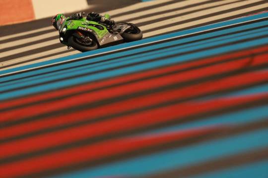
2023 Webike KAWASAKI ZX10R WEC
29 notes
·
View notes


Text

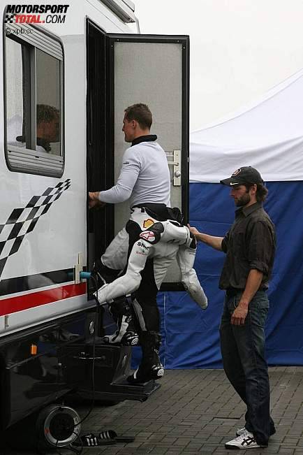
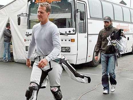
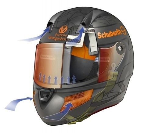
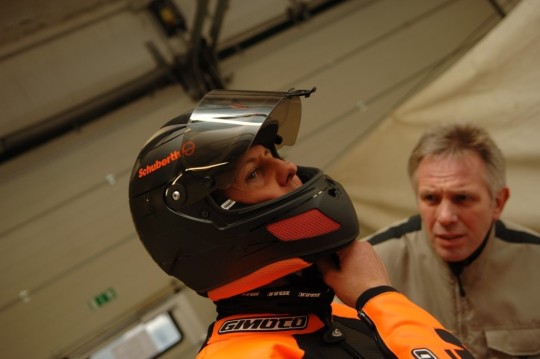


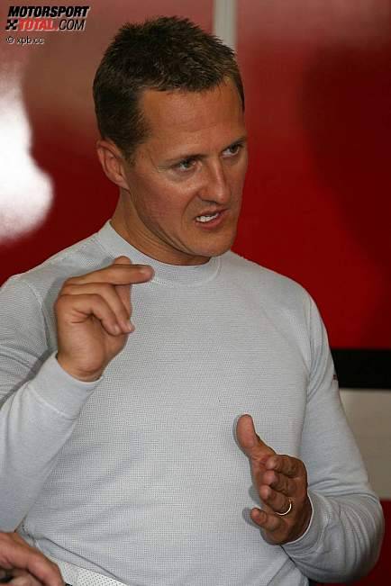
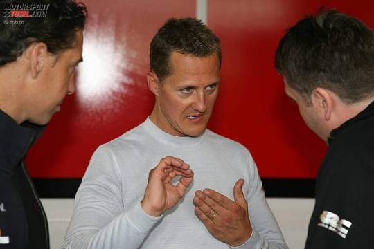
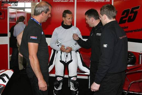

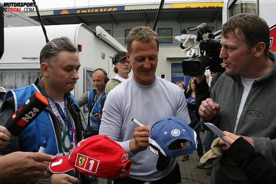

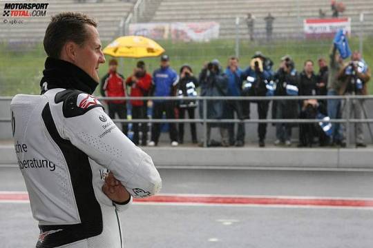
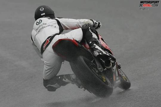
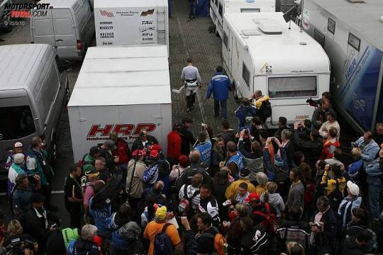


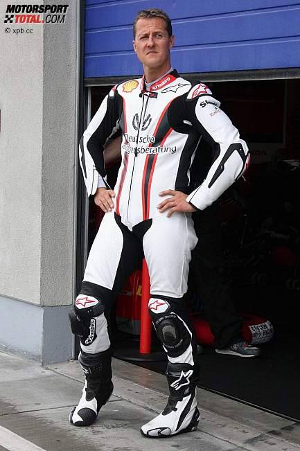
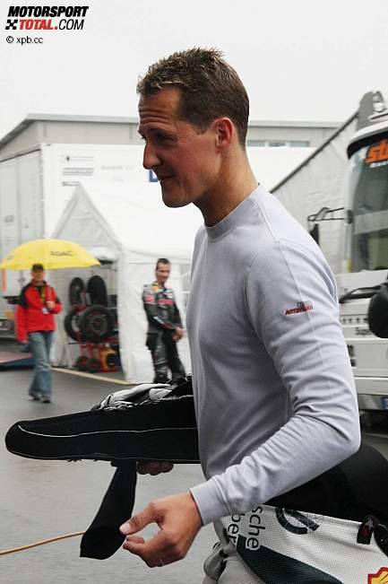
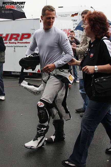
During this time Michael also worked with Schuberth (helmet makers) on a new type of biking helmet.
#michael schumacher#biking#next few posts will be about Michael's biking phase#When Michael really got into biking!#sbk
24 notes
·
View notes
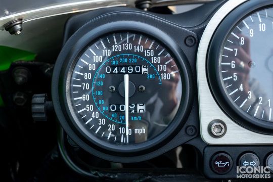
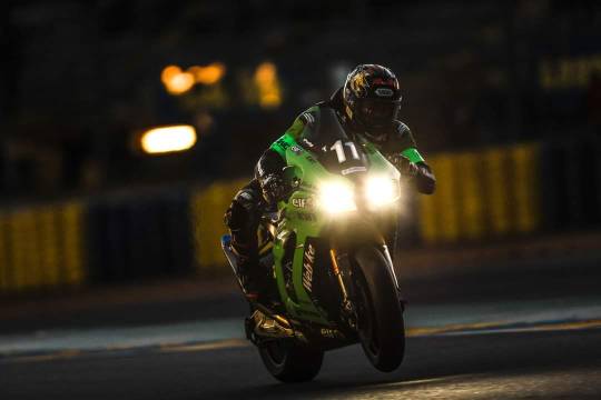
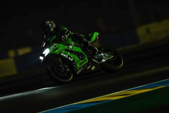
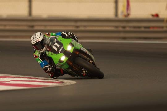
Text
Oliver König
#motorcycle#oliver könig#sbk#sport bike#racing#motorsports#ride hard or go home#built for speed#kawasaki#zx10rr#moto love#lifestyle
10 notes
·
View notes
Last Seen Blogs

rainbowlil03
i need another name?

ssjsabri985
7% solution
leik777
DC Universe Abridged & YOUNG JUSTICE BITCHES!

jualprprtirmh
Tanpa judul
yedem
[closed.]