#source: jackthevulture
Text
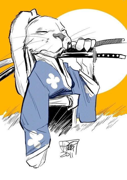
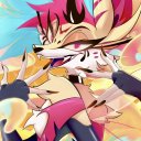
Admetus: *about to be killed in a horror movie by a sweet looking monster* Oh sick creature design glad I got to see it up clo
7 notes
·
View notes
Photo


(Updated as of February, 2020)
READ EVERYTHING PLEASE
Paypal ONLY, Prices USD, Payment Via Invoice
Do not send me an ask or a dm on tumblr, twitter, or instagram. Email Only.
Hello! I’m opening up for commissions again! I’m offering two types, Standard and Artistic Liberty. Only very simple, geometric backgrounds and props, no environments. Highly detailed character designs and props may result in additional payment to be negotiated when you contact me.
STANDARD
Line: Half Body - $20 | Full Body - $30
Flat Color: Half Body - $35 | Full Body - $45
Shaded: Half Body - $50 | Full Body - $60
Extra Characters: +50% of the base price, each.
ARTISTIC LIBERTY
Sketch: Half Body - $15 | Full Body - $20
Color: Half Body - $30 | Full Body - $40
Extra Characters: +50% of the base price, each.
Artistic Liberty commissions are an option that are less restricted in style and color than the standard type. I may experiment with different brushes and techniques, and because of this the results will not all be a uniform and consistent style with other commissioned pieces. I am open to input from commissioners on directions you’d like me to take the piece! This can be things like color schemes, kinds of brushes to use, or even example pieces from work I’ve done you’d like me to emulate. If you want to give me permission to tweak your design to fit my style more, feel free to let me know! Otherwise I will try to stay close to what you provide me with.
Ordinarily I offer a WIP stage, but with Artistic Liberty commissions you can opt out if you trust me and would like the final to be a surprise. I will not, however, give a full refund after the final is completed. (I charge minimum 50% up front, which will be kept after completion.)
PROCESS AND PAYMENT OPTIONS
Contact me with the type of commission you’d like, an idea and some form of reference. This does not have to be visual, it can be written, though I do appreciate any supplementary references you can give me (example: images of clothing and hairstyles, examples of body type, colors you’d like me to use etc.) These aren’t design commissions though, so don’t expect me to change the design multiple times without asking for additional compensation. Please be thorough: if it is important that it be in the image, I have to know about it. I will happily make changes to WIPs, but if you ask for additions and changes I couldn’t have known of, I may ask for more compensation.
Once I agree and give you the ok, I will do a WIP. (Tell me if you wish to opt out of the WIP stage, otherwise I will send a WIP.) This is when you can look over the sketch and ask for changes, or OK the WIP to move on to completion.
After you clear the WIP, I will send a Paypal invoice, so please provide the email linked to your Paypal at this time. Do not send the money directly to my paypal.
You have two options, depending on what is most comfortable and convenient for you.
1. 50% of the payment up front, and 50% after you OK the final.
2. 100% up front.
After payment is received, I will start work on the final, and deliver it to you for approval.
I will make changes to the final if you are unsatisfied with it. Any major changes that could have been resolved in the WIP stage will cost extra, along with other major, time consuming changes and additions that could have been brought up in the WIP stage.
I will not give a full refund after the final is completed.
RULES AND RESTRICTIONS
Will not draw:
Extreme gore, some is okay. Ask if unsure.
High detail mechanical parts. (Ex: Realistic motorcycles, Live action transformers like designs. This is not something I have any experience in and I am not the artist to come to for this sort of thing, sorry! Simple and organic robots are fine, like cartoon transformers and the robots from WALL-E)
Pedophilia, of any kind.
Licensed characters (Fan characters and OCs are fine, as well as characters who the creator has explicitly given permission to draw commissions of (please provide sources for permission given in this case))
Bigotry or hate speech of any kind, caricatures or fetishized depictions of minorities.
Pornography (Artistic nudity is fine.)
I have a right to refuse any commission, do not push me if I say no. I will not argue with you and you will be blocked if you do not respect this.
I can draw most characters if given reference. I also have a flexible style, so feel free to ask me about that when you email me, or suggest a direction you’d like me to go. It is much easier to list the things I will not draw than things I will. If you aren’t sure, ask me! :)
130 notes
·
View notes
Photo
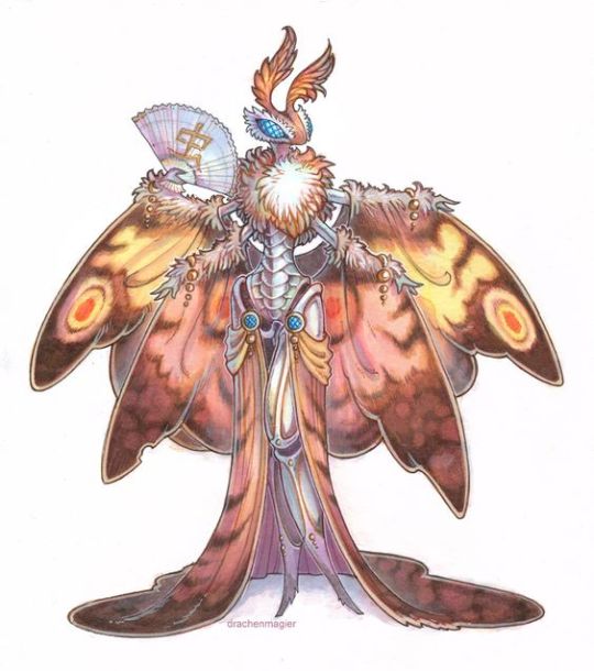
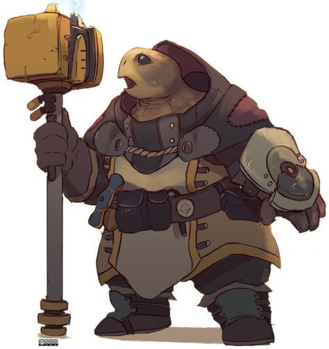


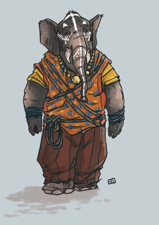


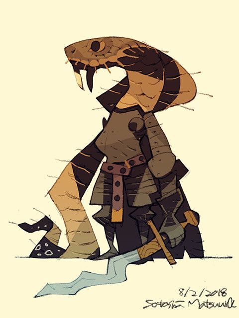

source: drachenmagier source: source: source: source: source: source: Patrycja Wojcik jackthevulture source: Satoshi Matsuura source: source: SanjuroyoJimbo
Animalfolk
In Gem World, the asharah, kuon, aves, and anura are the most populous forestfolk species, but they are only a small part of the larger animalfolk family. Other species include:
zoion, or bug folk
turtle-kin
hero-folk (hare, otter)
herd folk
tusks
mouselings
battra
ophids (adders)
lizardfolk
and more: bear folk, cross & gators, pierre (parrot-folk), and many seafolk species
0 notes
Text
10 Interesting Images...
Part One of start of term homework- 6th September 2018
The following images are ones that represent themes and visual elements that interest me artistically and inspire me to create. They are listed in no particular order.
1.) Boris Becker- River Valley Motor Lodge (1994)
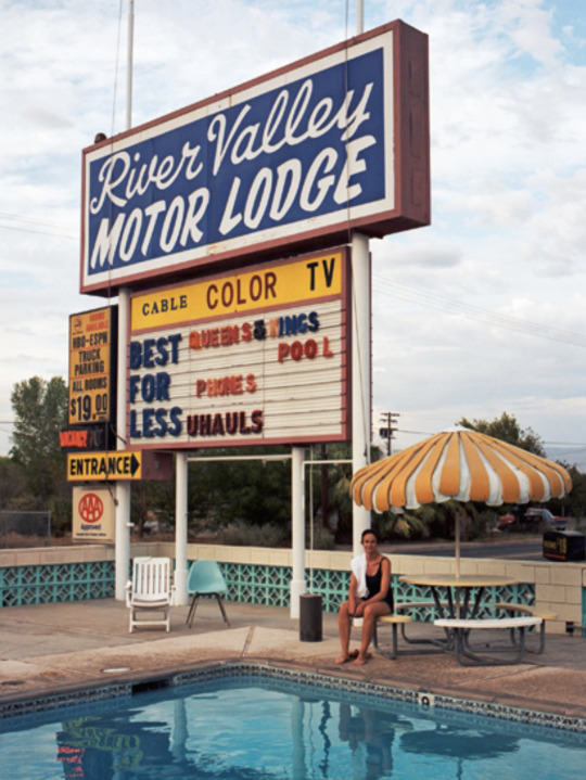
This image was taken by Boris Becker, a student of the famous photographer of urban American landscapes, Stephen Shore. It depicts the roadside sign and pool of River Valley Motor Lodge in Needles, California 1994.
I am fascinated by the evolution of the urban space, vernacular typography and Americana, and so this image really attracts me artistically. The bright colours of the sign clash beautifully with the overcast sky and run-down vibe of the motel, creating a slightly melancholic atmosphere. I am very interested in the design of signage, particularly the use of these linked with the history of entertainment and leisure businesses such as hotels, shopping center and theme parks. I find the idea of these places, dedicated to good times, being shut down and abandoned- their signs the last echo of the past, absolutely fascinating. The delicate decay evident in this image- drooping sun shade, cheap plastic chairs and stained concrete reminds me of this romantic abandonment. The composition of the image leads the viewer’s eye downwards from the original shock of the bright sign, towards the single swimmer sat at the side and then to the blue of the water. Only then, once looking closely, do you notice how close the pool is to the road and the unchecked undergrowth on the opposite verge. These details add an odd sort of charm, reminding me of budget seaside holidays. Stephan Shore’s work often captures these feelings, and Becker has mastered his techniques in the taking of this photograph.
Phaidon. 2018. Stephen Shore in Düsseldorf. [ONLINE] Available at: http://uk.phaidon.com/agenda/photography/picture-galleries/2010/september/03/stephen-shore-in-dusseldorf/. [Accessed 1 September 2018].
2.) Beth Caverner Stichter- The Question that Devours (2012)

Beth Caverner Stichter creates large clay sculptures of animals, depicting their struggles to survive as well as deeper human questions symbolically. She sculpts in a way that the creatures seem to have almost sprung from the material itself, leaving marks that accentuate the power in the animal's movement. They are often painted in neutral monochromes which further focus the viewer on the form and life in the piece. The Question that Devours is sculpted over solid pipe armature and weighs 600lbs
I am drawn her work, and this sculpture in particular, because of my love for the fluidity of the pose, and the representation of the predator/prey relationship both literally and symbolically. I am absolutely fascinated by the texture of the clay, especially the imitation of the wolf’s fur and the careful way it has been painted to emphasize depth and curves. The lunging position of the wolf and the frozen, curled fright of the rabbit convey so much emotion without needing facial expression. Together they form a question mark asking the viewer to address their own looming predators. Each viewer can take something different away from the meaning of the piece. This complex impression combined with the sheer visual impact of the sculpture makes it one of my favourite artworks.
Beth Caverner- Portfolio. 2012. Making of The Question That Devours. [ONLINE] Available at: https://www.followtheblackrabbit.com/gallery/the-question/. [Accessed 1 September 2018].
3.) Sara Kipin- Catch and Release

Catch and Release is a digital painting by illustrator Sara Kiplin. What drew me most to this image is the amazing use of colour and contrast. Kiplin uses the digital medium to its full potential by employing bright, even, flat areas of colour punctuated by details added on another layer. This creates a ‘poster’ style painting which is very affective when viewed online and printed in large formats. I consume at lot of fantasy and science fiction media and find it to be one of my biggest sources of inspiration and motivation artistically. I often find myself drawn to artwork with fantastical elements, which is in part why I enjoy this illustration so much.
Although the image is visually complicated, Kiplin’s use of colour keeps the viewer unconfused. The eye is immediately drawn to the merman caught in the net. He stands out above the dark reds and blues of the scene around him in his pale yellow- seeming otherworldly to even the fish he has been caught with. The expressions of the fishermen range from interested confusion to frustration and anger. The central fisherman who reaches out to the merman is difficult to read- but we can be sure that he does not seem shocked by his catch, which makes me think that perhaps this is a regular annoyance. I think that this illustration is very successful in creating a narrative basis for the viewer to continue- keeping the painting interesting and engaging despite its relative simplicity at first glance.
Sara Kipin. 2018. Sara Kipin. [ONLINE] Available at: http://www.sarakipin.com/. [Accessed 03 September 2018].
4.) Unknown Photographer- Hoisting the Elephant (1930s)
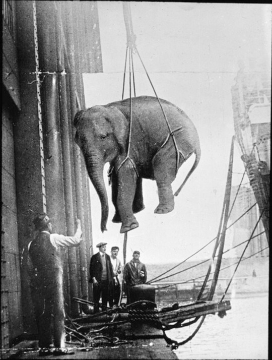
This image was taken by an unknown photographer in the 1930s. It depicts a circus elephant being hoisted onto a ship for transport. I discovered this photo while collecting images for my Foundation Diploma final project, in which I was researching the history of animal use for entertainment.
I find this image interesting because of how unique and ‘of its time’ it is. The composition makes the unusual scene immediately eye catching- the negative space behind the elephant makes the animal the sole focus, before leading the eye down to the more cluttered dockside and workers watching the action. The awkward, unnatural position and situation the elephant finds itself in is in a modern sense quite unbelievable. I find this quite ordinary transportation practice of the time shocking and cruel, and at the same time am fascinated by the logistics of it. It shows the dark side of this kind of entertainment industry as well as what running a circus looked like in a practical sense back in 1930.
I find snapshots of the inner workings of entertainment businesses very interesting, especially how drastically public opinion and attitudes have changed towards animal use and handling. I also enjoy the number of fantastical narratives you could come up with to accompany this strange, cruel image.
Flickr. 2018. Glass Slide Fairground Images 1930. [ONLINE] Available at: https://www.flickr.com/photos/twm_news/sets/72157627692102509/. [Accessed 03 September 2018].
5.) JustJacksArt- Toothless
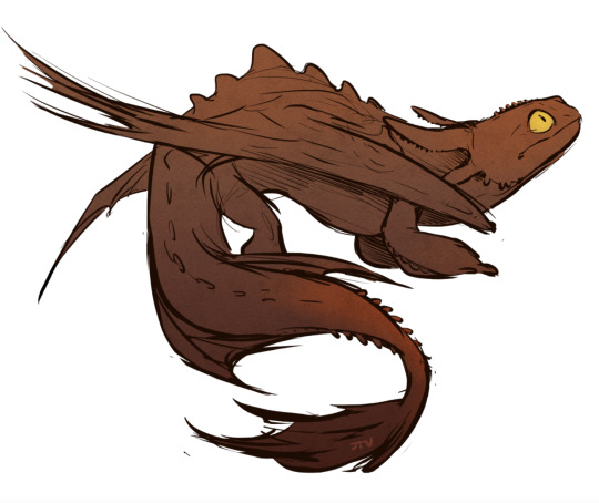
Dragons were the subject that got me into art and illustration in a serious way. Something about the hybrid form of lizard and bat visually really inspires me and was what I drew nearly exclusively when I was younger. I have always especially been fascinated by wings, both bird and bat- how they interact with the body, folding and curving as well as providing the ability to make dramatic poses.
This illustration by Tumblr fan-artist JackTheVulture is of the Dreamworks character ‘Toothless’ from the How to Train your Dragon animated film franchise. Toothless’s design was built around the movement and behaviour of cats, mixed with the sinuous nature of lizards and snakes. This gives him real agility and poise when viewed from an animation standpoint; I think this illustration does a great job of capturing those points in his ‘s’ shaped pose and alert expression. The lack of a background and simple dark colour choice makes the viewer consider the dragons silhouette as the single focus. This reminds me of iconic dragon design motifs throughout history on medieval military banners, pub signs, packaging and architecture which often make use of this shape. I love the idea of cramming the creatures form into a small space (on a rectangular sign or as a wall bracket for example) while still retaining that iconic, recognisable silhouette.
I am drawn to movement in the illustration and artworks that inspire me. Animation is something I would really like to explore in relation to this.
Tumblr. 2018. Tumblr. [ONLINE] Available at: https://jackthevulture.tumblr.com/post/130933612483/quick-toothless-doodle. [Accessed 04 September 2018].
6.) Slinkachu- ‘They’re not pets, Susan’
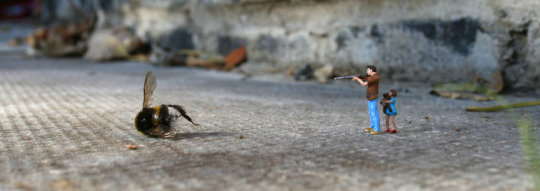
Slinkachu is an installation street artist who creates tiny scenes using model railway miniatures across the city of London. This piece was created for his book Little People in the City. Slinkachu creates the scene, photographs it and then walks away- some of his artwork is discovered by lucky people with a high attention to detail, but most is destroyed accidently by city life. ‘They’re not pets, Susan’ was installed at Primrose Hill, London in 2007.
I absolutely love the entire concept of Little People in the City because I find great joy in small details. I think the idea of a city filled with tiny, secret artworks- little people going through their lives unnoticed by most, mirroring the big world around them, utterly wonderful. This piece is one of my favourites because of the humor and dramaticism of the scene. The bee, so large compared to the figures that it seems a beast not an insect, lies dead, shot by a father protecting his daughter. The action seems simple until you read the title given to the artwork, which suggests a reflection of real people’s obsessions with containing wild, potentially dangerous animals as pets. The fact that the young daughter was the one perhaps trying to tame the bumble bee, suggests it is human nature to try and control the natural world in this way. The irony is that nature is bigger than us all- we are only tiny specs on the pavement to be stepped on or washed away.
Slinkachu. 2018. Slinkachu. [ONLINE] Available at: https://slinkachu.com/. [Accessed 03 September 2018].
7.) Pam Wishbow- Eating Crow

Pam Wishbow is an illustrator from Seattle. She creates lino prints, screen prints and enamel pins. Printmaking gives her images a unique edge, she uses the limitations of the medium, a limited number of colours and misalignments of layers, and integrates them into her unusual style which matches their ‘woodland’ themes. I think the use of a limited colour palette is a underrated tool- it makes Wishbow’s prints eye-catching and cohesive.
Eating Crow is one of my favourite pieces by Wishbow, firstly because of the style of the figure. The combination of hard angles, for example the knee, elbow and bum, with the soft curves of the back, shoulders and head, echo the outer orange shape and are very effective. The amount of detail in the woman’s surroundings allows the viewer to discover more the longer they look which is always rewarding. I think the layered effect of the colours due to the nature of lino printing as a medium, gives the piece a ‘hand-rendered’ charm which compliments the forest setting of the subject. The choice of the complementary colours orange and blue is a bold decision which further emphasizes the negative space of the figure, drawing the eye downward from the woman’s head to skull at her feet. The base orange colour encapsulates the piece in an almost-oval, containing the detail and making it easier to digest.
I am very inspired by the host of important and thoughtful creative decisions going on in this print. I think there a lot of valuable lessons that I could learn from viewing Wishbow’s prints at the same time as enjoying her style.
Pam Wishbow Illustration. 2018. Pam Wishbow Illustration. [ONLINE] Available at: https://pamwishbow.com/. [Accessed 04 September 2018].
8.) Rembrandt- The Storm on the Sea of Galilee (1633)
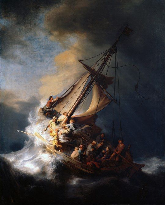
The Storm on the Sea of Galilee, Rembrandt’s one and only seascape, depicts the miracle of Jesus calming the storm on the sea of Galilee, as written in the New Testament of the Bible (Mark, Chapter Four). It was famously stolen in March 1990, during what is considered the biggest art theft in US history, never to be seen again.
What I love most about this painting is the realism of a moment frozen in time Rembrandt has managed to capture. The storm tossed ship lurches on the peak of a breaking wave, sails sodden and rigging snapping loose against the canvas, the clouds overhead miraculously break into bright sunshine, warming the faces of the salt-sprayed disciples who fight against the might of the waves. The focus of the painting sits on the bright front of the wave as the sun hits it, allowing the eye to travel across the painting from left to right. Jesus sits in the rear of the boat, a faint glow around his head, and is one of the last subjects to be noticed in the shadow of the mast. Somehow this makes his miracle of calming the storm greater in the quiet humility of it. He does not stand at the prow, commanding nature the water like Moses, but huddles in the back surrounded by worried disciples.
Boats and seascapes are some of my favourite subjects in all creative media- film, art and literature. There is something about a small wooden ship, a lifeboat for the crew, at the mercy of the power of the ocean that really interests me. I am also very interested in the mystery that surrounds the theft of this gorgeous painting, where is it now? how has it never resurfaced?
ISGM. 2018. Christ in the Storm on the Sea of Galilee | Isabella Stewart Gardner Museum. [ONLINE] Available at: https://www.gardnermuseum.org/experience/collection/10953. [Accessed 04 September 2018].
9.) Bryan & Wendy Froud- Labyrinth Nibbler
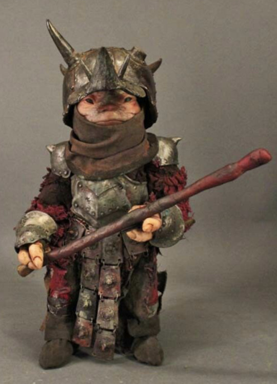
The puppet above was one of many used in the 1986 musical fantasy film Labyrinth directed by Jim Henson. In Labyrinth, most of the central characters are beautifully crafted puppets. Jim Henson’s Creature Shop is famous for creating the puppets for The Muppets, Sesame Street, Where the Wild Things Are and he most complex and ambitious puppetry feature length film ever, The Dark Crystal. Bryan Froud one of the head artists responsible for the creation of Labyrinth’s puppets, had a background in the ‘muppetry’ techniques, and his wife Wendy was responsible for Yoda in The Empire Strikes Back. Together they and their team crafted hundreds of ornate, fantastical characters for the Henson’s film.
I am extremely passionate about hand animation (puppets or stop motion), prop creation, and conceptual design for film. The puppets and animatronics designed and made for Labyrinth are some of my favourites due to the sheer attention to detail in the textures of their clothing and faces. The Nibbler (a type of troll) in the image above, is one of three. These creatures have a small role in the film but are my favourites because of how small and strangely cute their design is. I adore how real the creature feels due to the wear present on the armour and the shabbiness of his red sleeves.
This type of puppet is something I would love to learn how to create, as well as understand the performance and anamatronics required to bring them to life.
Owen Williams. 2018. Labyrinth: the behind-the-scenes history – Empire. [ONLINE] Available at: https://www.empireonline.com/movies/features/labyrinth-movie-history/. [Accessed 04 September 2018].
10.) NotMusa- Where u Goin?
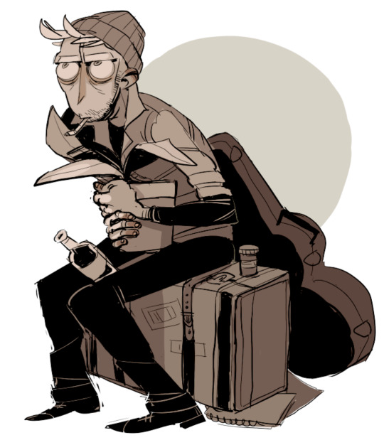
NotMusa is an anonymous artist who draws their original characters Ian and Donovan digitally, using Paint Tool SAI. The above image is of Ian, Musa’s primary character.
Musa’s style is gloriously rough around the edges. While painting and drawing digitally can often make artwork too-clean and too-smooth, Musa managed to maintain that hand-rendered sketchiness in their work, which I greatly admire.I often struggle with overworking illustrations, and find Musa’s artwork to be inspirational because of how its roughness is not a limitation but a merit.
I am very interested in character design in illustration, and think that Musa’s Ian is a good example of a well designed character. With one glance you can tell he is tired, grubby and an addict. His clothing suggests a rough life, possible homelessness, which is echoed by the props around him. You can also tell he is creative from the inclusion of the guitar. His large eyes and variation of tone allow the piece to be very expressive. Being able to infer all this in a quick look at a single illustration shows how effective his design is.
I was intrigued to see and understand more about the character, which drew me into Musa’s artwork. Like Pam Wishbow’s illustration, Musa utilises the addition background shapes to bring their artwork together, as well as make it stand out as a silhouette which catches the eye.
Tumblr. 2018. Tumblr. [ONLINE] Available at: http://notmusa.tumblr.com/tagged/sketches. [Accessed 04 September 2018].
0 notes
Last Seen Blogs

rau-ias-study-circle
Rau IAS Study Circle

pa69allen
naked men's body

vortahoney
Space Butch
scooby-nubie
✕Redivivus✕

work-hards-blog
Saiba mais - blogs