
zpredraws
A blog to help aspiring artists
Hello! This is an art criticism blog directed towards Vivziepop's art, mainly. Though she'll most likely not take this blog to heart, I'm sure that it'll at least help some artists out there who'll take away any useful info from this blog!
This blog is mainly made to show fans who are willing to listen that not every aspect of Vivzie's art is perfect, to show that there are some things you should and shouldn't pick up from artists you love. Even other professional artists have something they need to work on.
83 posts
Don't wanna be here? Send us removal request.
Last Seen Blogs

ali-mireie
Untitled
blackchunli
super saiyan rose ϟ
highclass4life-blog
High Class
cling-film
Furmina Versace
rubberhosetoons
RubberHoseToons
Text
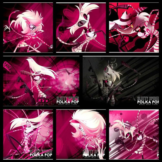
Could you critique the Zoophobia 2016 picture?
It has the entirety of Safe Haven in the middle of an empty field.
The size of those houses seem off,they’re just so little in comparison to the dome,or that coliseum building,they’re like little bumps on the ground.
There’s a speed draw of it on her channel.
Thanks in advance,keep up the good work!
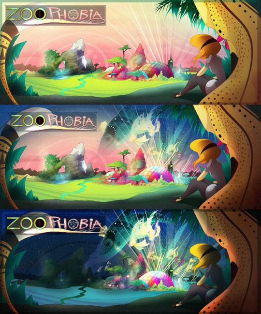
I agree with you on the part about the world of ZP being an empty field. It’s obvious that Viv’s strongest point in terms of backgrounds is nature scenes. You can obviously see some of the districts peeking out from behind (desert, mountains), but the emptiness at the front makes it feel underwhelming.
If she’d put more time into adding more of her world in the image, like populating the buildings in the front of the city, the whole scene would’ve definitely looked a lot better. She could use the basis of the theme that she has, which is “Zoo” and designed the world based on that!
She could even draw a little party/parade area going on at the foreground which could give a hint about ZP’s potential culture with partying and the arts.
Overall, there’s a lot of wasted potential and this image could look much more breathtaking if more time was spent on it.
However, I do enjoy the good use of value and shading in these images, it’s one of the few rare times the shading is in harmony with the scene and follows the light source!
49 notes
·
View notes
Note
The first Celestina picture (with two versions of her), I mean. Maybe you could critique the second one too someday (I never even saw that one before, go fig).
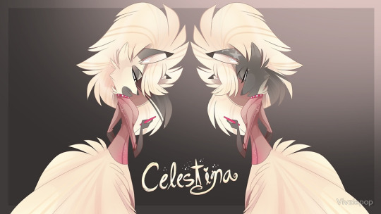
There are some anatomy issues that has been brought up many times before, such as the limb lengths.
But other than that, there isn’t anything much wrong with the image, as there isn’t much to critique.
54 notes
·
View notes
Note
What do you think of figure drawings? And how does one stay anatomically correct while drawing one? :0 any tips..?
Personally, I think figure drawings are great for observing the shapes, proportions and range of the anatomy! It’s good practice for your observational skills.
My tips:
method 1: Quickly draw the whole figure, lay down the outline with a lighter pencil. This is acts like a draft/guideline for the figure so that you have a rough idea of the shape of the pose. You can then use a darker pencil/color to properly define and fix the initial, lighter draft under, adding muscles, fat, and other details depending on how detailed you want your figure drawing to be.
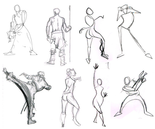
(Example online)
method 2: Draw the skeleton first, this helps you check the proportions and how the shape of the figure works! Then flesh it out using geometric shapes, which after then you can have a grasp of where the finer details should go!
Don’t worry if it isn’t perfect! The whole purpose of figure drawings is to practice your eyes and hands with a bunch of quick sketches!
These are just my tips, they may not work for everyone, but there’s also a ton of examples online that could help you, don’t be afraid to search them up!
161 notes
·
View notes
Note
I know they are demons, but seeing your redesigns of Jack and his mom, I would love to see Damian and/or his mom more jackal like.
I’m sure with the previous examples it’d be easy to imagine how those two would look like!
Personally I think Damian’s mom has the closest design out of the Jackal family who resembles an actual jackal the most, without the distinct grey back!
22 notes
·
View notes
Note
I know this isn't Vivziepop related, but I'd really like your advice. What advice do you have on creating a cartoony style? I know you've talked about this in the past, but I struggle specifically with creating faces/head shapes. I want to have a cartoony style, but at the same time want head shapes to have a variety throughout my characters. Do you have any advice?
I’d say start out like how every artist starts out with: Your inspiration. Is your favorite artist’s style cartoony, or is there a specific style you like to follow as a source of guidance? Use that style as a reference, like ideas, a style needs a place to start out from. (In my case I started out from realism, then moved onto a more cartoon-look.)
Afterwards, break down that style. Follow that style through sketching, learn what type of techniques, rules, and shapes were used when drawing that style. Does the artist love using beady eyes? Round noses? Small bodies? Get a good grasp of that style before branching off and experimenting it with other styles.
Look at other types of cartoons, sketch them, break them down into parts, and then use those parts and mix them together to see what you get. Sketch down those results. Keep trying and have fun with it till you find the style you’re happy/satisfied with. You can compare it to the original referenced artist to see how far you’ve come.
From there, don’t ever stagnate. Styles can continue to be developed other than the shape itself. Experiment with the lines, the colors, patterns, even the concept itself. (E.g An artist whose style revolves around Mythology.) You can even move onto how cartoonish your backgrounds can look!
Don’t stress if you haven’t found your style, it takes time to find your identity through your art and it never stops evolving even after that!
79 notes
·
View notes
Note
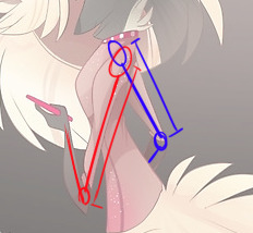
I love your blog! Can you redraw the London Bridge speed draw in order to point out the mistakes Vivz made? It would be really useful. Thanks
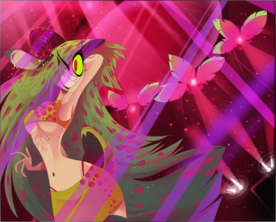
Slight Anatomy issues:
Odd elbow/arm
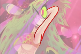
Wynnie’s left arm looks really odd in this image, I’ve gotten a few of my friends to look at this and they agree too. It looks oddly distorted..
I thought it was due to the joint at her armpit area, but after looking through some reference images online, I found out that Wynnie’s arm is missing a few muscles in the triceps area, causing her whole arm to look “rubbery” in a way, which doesn’t make sense because her other arm is drawn in a straight and angular way, and she managed to draw this quite nicely on JayJay in the Pride image:


Also slightly adjusted the neck position so that it lines up with the body a little bit better. Her neck looks a bit too far back for a fun party pose so I shifted it forward.
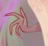
Minor Hand Anatomy (Fingers)
Viv most of the time could draw her character’s hands correctly, but in this image, Wynnie’s pinkie finger is way too long, it’s actually the same length as her other fingers. In silhouette:
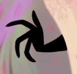
Adjusting it slightly is totally doable!
Shading/Lighting problems
The lighting is interesting, yet kind of confusing at the same time. The way each light direction is facing gives “Party” effect but it causes the whole image to look chaotic as a result. That purple ray in front of Wynnie is really confusing because it’s purple in color as opposed to the other pink showlights in the image. There’s no unity in the lighting.
Another problem that is quite common in Viv’s works is lack of value.
(Image grey-scaled):
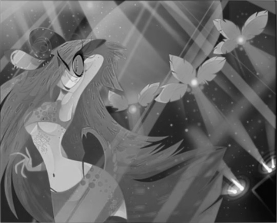
From the grey-scaled image alone you can see that Wynnie is melting into her environment, which might be the opposite effect Viv was initially going for. This character is a party girl, she should pop and stand out in the image, but because of the clumsy use of value, it really affects the final look.
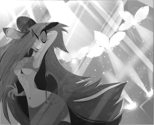
(Excuse the poor photoshop work) Wynnie is now more distinguishable from the background by making either the background lighter, or Wynnie lighter. In this case due to lighting, I made the background lighter so that it looks like Wynnie is blocking the light, making her stand out.
I also added some darker tones to make her body “pop” more from her hair!
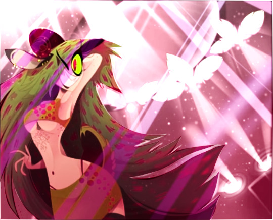
(Overlaid the original colors with some adjustments, slightly messy and a little bit too bright, but I hope it drives home the point.)
To any artists who are learning, I recommend you to check your values through this method of grey-scaling your image before coloring it!
Other comments:
Breasts - Clothing Top issue
I’m guessing Viv really wanted to draw an under-boob image of some sort, which kind of resulted in Wynnie wearing this odd tank top-boob tube combination that makes her breasts look as if they could pop out with one dance-move. Personally, I think it’d be better if Viv drew a bra on her if she wanted to go all out and show the underboob angle.
Confusing background
I’m honestly confused with the background going on over here. There’s a door visible (or a window?) at the bottom-right, but there are bright lights above that door. Is this a fashion show or a party room? I’m really confused...
100 notes
·
View notes
Note
Do you have anything more for expressions to avoid "same face syndrome"? I noticed you did that for Jiji and the wolves I think? There's also hands and legs/feet. Viv seems to draw all character hands skinny and sharp, but I've heard from my art teacher in school that was a no-no... The legs she draws are also disjointed from a few drawings I've seen... Advice to avoid this?
From what I know, the same-face problem usually comes from either the characters having similar facial designs, or limited expression variety.
With the recent Crymini redesign, at least Viv is (really) slowly spreading out and expanding her werewolf head shapes/designs. She’s deviating from the standard JayJay face, which I can at least respect that.
I think that most of the werewolves are impulsively designed, that’s why their development/designing process is quite almost instantaneous. (e.g If Viv wanted to design a werewolf, within a few minutes she can come up with one, all with its own color scheme.) Of course this causes a few downsides such as the faces looking almost the same, the eyes, and sometimes body-type or even personality, judging from artworks of them.
Do you have anything more for expressions to avoid “same face syndrome”? I noticed you did that for Jiji and the wolves I think?
For expressions, you got to know your characters fully. Develop their personality, who they are. Different people have different types of expressions. People’s smiles can vary from person to person (some smile with their eyes barely visible, some can smile with their eyes half-open.)
Some people don’t laugh, some people find it hard to emote. It all comes down to your character’s personality, their identity.
The internet is full of references and even websites for facial expressions! Use them to your advantage, you can incorporate human smiles into your creatures with a little bit of experimentation!
There’s also hands and legs/feet. Viv seems to draw all character hands skinny and sharp, but I’ve heard from my art teacher in school that was a no-no…
I’ve seen her deviate with this in some characters, like Mackenzie’s cat-mom. Vanexa, Spam, Zill. I think that the sharp hands and feet are just a really strong artist’s preference, like how she prefers certain body types and such, which isn’t really a bad thing. Would be interesting to see her branch off with characters having more larger, and rounder hands!
All I can say is experiment with the character’s shape during the development process. Take your time with that development process. Give the character the attention to its design. Or you could end up with potential lookalikes.
The legs she draws are also disjointed from a few drawings I’ve seen
Lack of laying down structures before drawing the first sketch. Drawing on impulse does this. Sometimes she can pull it off without drawing any underlying skeleton but it’s really a hit-or-miss.
Personally I think it’s because she’s been “trained” through sketching via pen/marker, and it may have developed this bad habit of sketching extremely fast, which causes her to skip over drawing a skeleton first before fleshing it out.
It’s definitely handy for animation to be able to lay down sketches fast each frame, but it badly impacts her illustrative works where you can stare at it for long periods of time.
85 notes
·
View notes
Note
Can your compare Viv's old Art to her new Art? and show where she improved and where she got worst? and also critique the way she designs her character and pick the color for them?
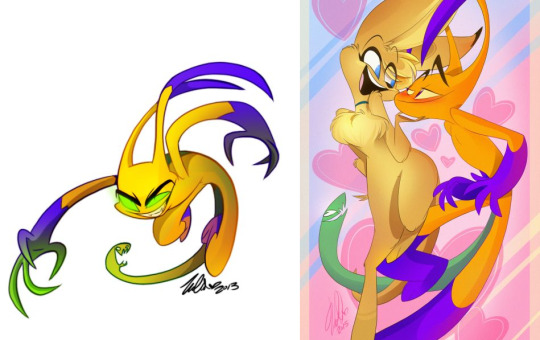
Left: 2013, Right: 2015.
Like I said in a previous post, her highest point was during 2013-2014.
Value:
The image on the left (2013) has a much more greater use of value. Look at how Zill pops out from the white background. The shading actually adds really good depth to him! If you compare both of these artworks when they are greyscaled:
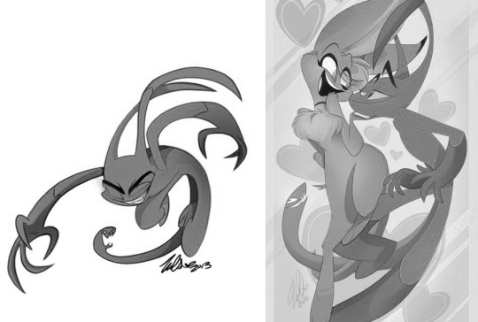
Notice how 2013 Zill has much more darker areas. This is Viv’s shading being utilized to really make her art pop. There’s actual dark values which adds depth to Zill, he looks three-dimensional, catches your eye, and stands out. Value was one of the highlights in her old work, which is lacking in her new work.
Line Weight:
2013 had much thicker linework, which makes the line-weight visible. You can see dynamic lines and it adds onto the shape of Zill’s pose. In her new work, the lines are so thin, therefore the line-weight is barely visible.
The way she colors in the lines as well. 2013′s lines were colored in with colors that aren’t too dark, or too light, yet it blends into the colors to give the vivid look Viv intended in her new work. 2015′s lines were colored with too light of a color, too close to the body’s color that the lines are fading into the character. This causes a lack of depth to her art, as there already is a lack of value in terms of shading. The lines should be thicker to compensate the little presence of value in her new art.
Anatomy:
In terms of anatomy, it’s a little bit of a hit-or-miss. Some parts of her anatomy in terms of the lengths of limbs are sometimes better in her old art, sometimes her newer art has better anatomy. Anatomy is one of the least consistent in her works.
The way she has drawn hands/fingers, shoulders, and figure has improved, on the other hand, her limb lengths consistency has faltered depending on each piece drawn.
It’s been clearly shown in some of her newer, and older works that she can achieve good anatomy with her work being hers. She just needs to put more thought into her work, it’ll make other people happy to buy it, it’ll make herself be more happy with her own work.
Colors/Design:
Her color/designs are also hit-or-miss. I love her older works (on the left) as they show more variety in color choices implemented in her designs. There was a balance of shades and tints. Not every character had vibrant colors, vibrant colors were used sparingly depending on the character’s personality.
In her newer works, the colors seem much more compulsive. It’s like every character’s saturation was set to high, and when every character has saturated colors, it becomes overwhelming. The designs could be de-saturated a few levels, the characters would still be recognizable, and the audience wouldn’t feel so overwhelmed.
There’s also the overuse of the color pink, not muted in any way. It’s such a vibrant color of pink being used in more than half of her designs, also being used to shade characters, as well as in backgrounds. The thing with using this same color choices, it will become stale to people. I think her thought process during designing is to choose a color she likes, so that she’ll like that design. She thinks if she loves that design, others would feel the same, but this is slowly becoming repetitive to the audience.
People are easily bored, and repetitiveness only makes it more obvious to them about an artist’s limitations, and will think “Is that all this artist can do?”
The one thing that she has improved in colors is the use of pastel colors rarely seen in her older works, which looks really plush and soft, but even those are rarely seen in her designs.
156 notes
·
View notes
Note
Are there any examples of poor representation in Viv's art? For example a male character having a bindhi or maybe even that crazy religious guy in Zoophobia?
I didn’t mind Addi’s bindi situation as much, probably because the bindi is barely noticeable in some of the comic’s panels. Sometimes his bindi is covered by his own hair too. It doesn’t seem to have any impact on Addi as a character, it’s more of lack of research so I can look past that.
As for Leeson, the religious cat character, I was sort of confused at that part of the story. I think it was more of the tone that most people had a problem with, it sort of came out of nowhere when there is this sole Christian character being portrayed as over-the-top and stereotypical. Was this scene supposed to be taken in an ironic way, a satire, or seriously? The tone was really unclear and it came off as bitter to me. I think some of the other mods here were also confused with what that scene was trying to get across.
The only other characters I could think of are Kiki and Daphne. People wouldn’t know that Kiki is trans, or Daphne is a feminist unless you are a pretty old fan or read the character info that is quite scattered about between blogs and social media.
Most of these issues with representation highly likely comes from the compulsion problem that’s been brought up most of the time. It starts off with the thought of wanting to have a diverse representation of minor groups, then adding them into the story without much thought.
You’ll end up realizing “I have these characters, but what do I do with them now?” , you’ll end up with token characters and it’s really hard to back out of that as the readers expect you to be heading somewhere with that character.
Because these characters were made from compulsion, the passion for them isn’t as strong and thus they’ll barely participate in the story, they were added with no direction for them. This pretty much nullifies the point of representing them at all…
45 notes
·
View notes
Note
Phrased it better than I did!
Aaaaaa I'm sorry I didn't mean that I was asking you to teach me/us color theory, I was just wondering where specific posts criticizing her colors were (if they existed), again, sorry about the confusion?
Sorry about that, we didn’t mean to come across like we were snapping at you. Jen is a little more blunt in her writing, I apologize if it came across as rude. We have mentioned in the past how Viv doesn’t know how to balance her palettes or create balanced palettes, how she never uses neutral tones, how she doesn’t seem to understand shades and tints very well - she uses a lot of different kinds of pinks, but those are hues more than shades.
Neutral colors are toned down colors, generally by mixing the original color with a gray or with its complimentary color. Neutrals are nice because they create a stronger sense of balance in a composition, so that everything isn’t hyper saturated looking and blinding the audience. Using neutrals also helps your saturated colors to stand out more so that you can create stronger focal points.
Tints and shades are used to create a degree of value in some cases, and general softness and balance in others. Tints are made by adding white to your color, and shades are made by adding black - so tints lighten the color and shades darken the color. Different hues are often confused for different shades.
These are tints/shades:
These are hues:
Hues are actually different colors, but tints and shades are all different degrees of one color. You can use a lot of different pinks and that would be using different hues. A lot of people think that Viv uses different “shades” of pink, but she doesn’t, she uses different hues. She also shades with hues and not with values, which makes her palettes look even more unnaturally intense, which makes them more unbalanced in the end.
So those are just some of the issues with color theory that Viv has, and I hope this helps to clear some things up. I’m sorry again if we came across snippy earlier, that wasn’t the intention. In the past you can go through posts and see where we mention highly saturated colors and lacking balance, but this is a sort of masterpost I suppose.
- Beth
108 notes
·
View notes
Note
One thing people have pointed out is her weird shading? Not only that, but her odd use of color and how she layers them? I'm new to drawing, so I don't know, but does every artist have their own way of shading and using color? Or am I just doing it wrong?
Does every artist have their own way of shading and using color?
Every artist does have their own way of shading, this means that Viv’s method isn’t wrong, but the way she carries the method out is just flawed in some areas that could be easily improved. I’ve seen some fans use her method of shading correctly and it actually enhances their art.
Shading is there to show depth in your drawings, to help the character/object make it seem as if it belongs in the setting (e.g character in a background).
One thing people have pointed out is her weird shading?
Viv’s shading is weird in the area that it doesn’t follow any nearby light sources. The highlights on a character always hit where it makes them look aesthetically pleasing. I’ve already covered it in these previous posts.
if the light source comes from the left, the light will hit the character’s face even if they are facing the other way. The character would feel as if they were just copy-pasted onto that background. instead of them being in that background.
Not only that, but her odd use of color and how she layers them?
There’s this other problem with Viv’s shading as in she uses the color which she thinks would look good on that character, to shade. If she thinks that Angel would look nice to be shaded with pink despite the background being orange, she’ll shade it pink. Her choices with color are always really random and on impulse for some reason, that’s why it’s always a hit-or-miss with her art.
Her method of shading also involves layering the shading over another layer of shading, which creates this problem of the minimum presence of value in the shading. Characters would look like they’re melding into one another, especially when they have similar body colors. There’s no proper value in the shading to add depth to distinguish them apart.
Or am I just doing it wrong?
I can’t say much about this part since I never saw your art, but basically if you’re shading, set a light source. Even if there might be no environment setting as a background, a light source is still important. Take note of value as you shade, value is extremely important when it comes to shading and you can learn more from searching online as to how it works and why it is important.
30 notes
·
View notes
Note
I think our blog also has explained multiple times about how Viv’s color choices are really hit-and-miss, you can look through it freely, anon! Though I’m not sure if I’ve answered an ask specifically about her color theory before.
I dont think people dont want you to fully teach it but show an example of how it shows she doesnt know it
We have addressed it before on this blog. She doesn’t understand balanced palettes, she doesn’t use tints or shades, she doesn’t understand proper applications of value, she’s admitted to not even understanding the importance of color theory and having never taken it. Practically every issue she has with color can be linked to her not understanding color theory.
- Jen
19 notes
·
View notes
Note
in your opinion, what are the best/worst designed characters of viv's?
In my opinion, I think that Viv’s best character designs are Husk, Castello & Salem, and Timber’s gang.
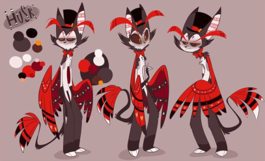
Husk’s design is one of the most pleasant-looking designs that Viv has. Nothing is too vibrant, the red is not that saturated and is balanced by the whites and cedar on his body.
His “Cat with Wings plus chimera” is quite interesting for a demon. His design carries out that “Magician from the 50s” quite well.
Husk’s design is nice on the eyes, shows his background and personality well, and has a nice charm to it.
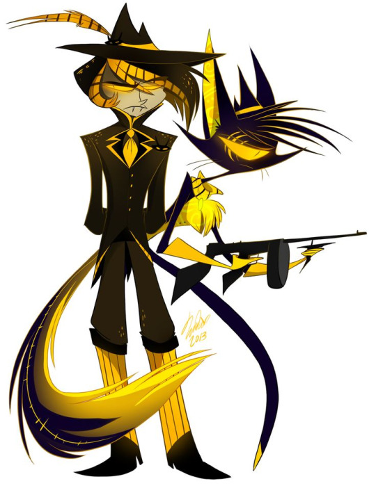
Castello and Salem are one of Viv’s really old character designs that she probably scrapped, which is a shame because this is one of her designs that utilizes yellow and dark colors quite well, though the yellow could be less saturated a little bit.
The yellow against black and violet carries out the “Gangster” look quite well. The fact that Castello’s costume isn’t totally black makes the yellow blend better. The dark hues intensifies the yellow, and actually gives off an intimidating feel to them, which fits their design.
The design is simple, isn’t in your face or too “loud” because of the utilization of yellow instead of the typical bright and loud red, and it compliments the time period they were in. Wished I could see more of these two, though.
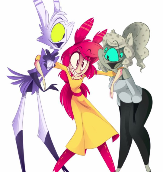
Timber and friends have one of the most charming designs, though again, Timber’s pink could use less saturation. Their colors aren’t too bright and are nicely complimented with each other. Quincy’s yellow eye helps him stand out and it compliments the purple color scheme of his. Timber’s pink and yellow helps her blend in with the pink and yellow hues of the world she’s in. And Maggie’s blue eye compliments well with her cool colors and blue-ish hues of her design.
Overall, the trio really compliments one another and fit their personalities quite well.
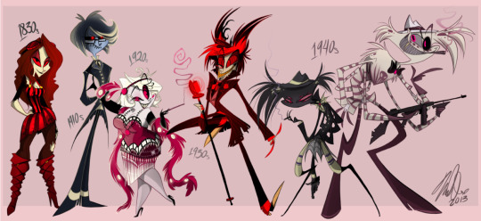
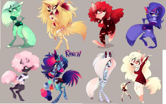
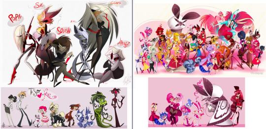
As an extra, I also loved the old Demon gang. I mean, look at the image above, back when Nifty, Crymini, and Vaggie weren’t in there. They actually looked like scary, intimidating demons that would fit with the adult-humor Viv was going for in Hazbin Hotel, or a darker, older world of ZP.
If you look at this line-up, the character’s designs don’t clash with one another, there’s a variety of colors and shades. The vibrant colors are used sparingly for Alastor and Charlie, Mimzy was the only one with pink. These characters balance out the less saturated Angel Dust, Baxter and Arackniss. No particular color overshadows the others, and it gets the character’s personalities across.
It is when most of Viv’s designs were overhauled by her favorite color, when she became too biased with pink that it kind of…devolved her characters. Back then it felt like the characters are who they are, but now they’re what Viv wants them to be…
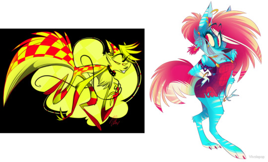
In terms of the worst, I think it’s a tie between Crymini and Elijah, followed by some of JayJay’s color schemes as well as new Angel.
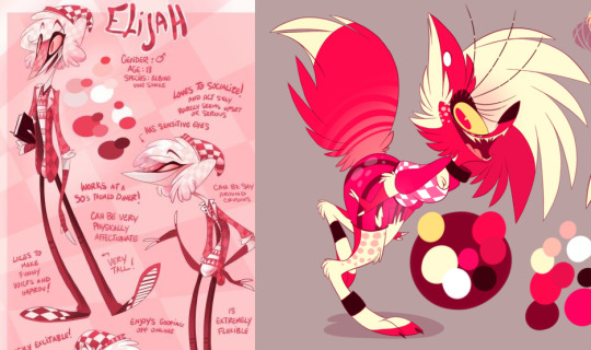
It’s really hard for me to say this because I really love Elijah’s design in terms of his shape, clothing, and personality, but it’s the colors that make me feel so overwhelmed by the amount of pink in it. His whole body is covered head-to-toe in hues of pink, not reds, pink. It truly shows Viv’s intense favoritism over a particular color.
Elijah’s design could be made much better if his colors were picked with more thought, instead of resorting to pink and just labeling him as an albino snake. His previous design of shades of green and yellow complimented Damian’s red design much better than this current one.
The same applies to Crymini. If only her colors were less saturated, less vibrant, would it be so much more pleasant to look at. Her design just looks really obnoxious the longer you look at it, the intensity of the hot pink is just extremely hard on the eyes.
Same could be applied to Whitney and JayJay as well, if their colors were toned down and less saturated, both will be nicer to look at. I could handle some of JayJay’s color schemes, but her blue-pink one is just so intense that it hurts my eyes. I’ve seen fan-art of JayJay with her blues and pink less saturated and she still looks fine, this is all just due to Viv probably not understanding color theory or picking whatever colors look best to her.
Lastly, Angel Dust is here not so much for being the worst design in how aesthetically nice he looks, but it’s more of “What exactly is he anymore?” Angel doesn’t have a consistent design anymore, he can be whatever Viv wants him to be. Looking at the above, few people on first impression would know that is the same character. I just don’t know what Angel is anymore, and I think many fans have that same thought too.
If Viv wants Angel to be a drag-queen, a gay pornstar, a mobster, a stripper, Angel will conform to that personality. Viv is focusing and developing Angel so much that she is actually over-developing him. Other characters are being under-developed, while Angel is getting more and more traits stacked onto him that nobody really knows what or who he is anymore..
Lastly, because of his color scheme changing from dull-grey to bright light pink. It’s just really hard on the eyes when the character is all pink and then the background is exactly the same as well. It just shows Viv’s limitation of her color uses and her bias/favoritism for Pink, which will just limit yourself as an artist and will become stale to audiences after a while…
169 notes
·
View notes
Note
Viv's eyes tend to look so out of place lately, especially on the kesha speedpaint. They seem blocky and miscoloured in comparison to the rest of her body.
The part that stands out in many artstyles, including Viv’s, is the eyes. The eyes are one of the most expressive parts of a character, and Viv likes to utilize this to get the character’s expressions across.
The thing is, because Viv’s style also involves exaggeration, she sometimes exaggerates other things like eyelashes, which causes Kesha’s eyes to look blocky. The eyelashes are so huge it ends up covering most of the eyes.
The eyes look out of place, it’s because of the lack of drawing structures, coupled with the habit of drawing on impulse, not willing to review and fix the mistakes while working on the piece. It all adds up to the final product looking like there’s no cohesiveness. Vibrant colors and drawing on impulse can only carry your art that far, and won’t be able to hide mistakes for long.
I think this is due to a really bad habit that has formed over the years/months. Perhaps it was because she wanted to get out art faster and this habit of rushing slowly developed over time and it stuck. causing her art to look rushed, unnatural and disjointed. Who knows?
24 notes
·
View notes
Note
i really enjoy your critiques.. would you ever consider offering them to other artists?
Hmm… I never really thought of this. It depends if people are willing to accept critiques. We don’t mind critiquing them, though!
As for how we’ll carry it out, I’m not sure yet, I don’t know how many people will be willing to offer their art for criticism.
25 notes
·
View notes
Note
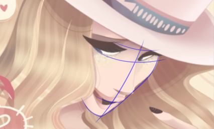
Great job here so far! As an aspiring artist, I'm finding this blog very helpful and I'm learning to pick up on things as a result. Have you seen the new piece Viv did of Kesha yet? Oh boy you're in for a ride...
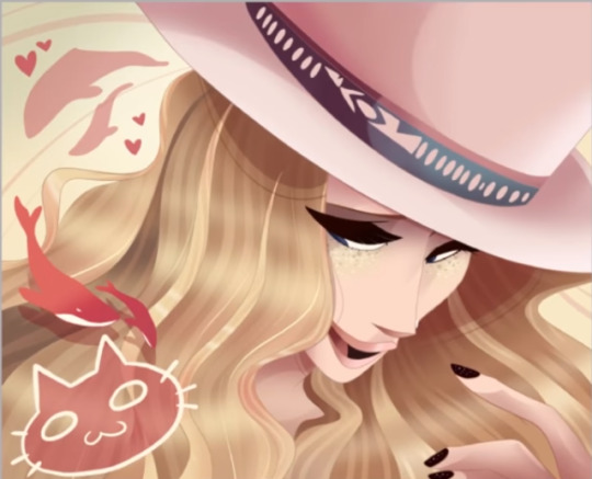
The newest (as of now) Kesha piece is actually quite pleasing to look at, it’s a really nice present to her idol, but it does have its problems that could be fixed.
Kesha’s fingers
Kesha’s fingers look odd here, her index finger seems to be longer than her middle finger, but after sketching over it, it doesn’t seem to be the case.
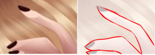
The fingers are actually of correct lengths, the main problem here is the thickness of the fingers. The middle finger looks much thicker compared to the index finger. It ends up giving Kesha these distorted fingers.
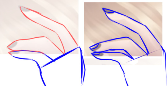
There’s also a small issue of the index finger being as long as her face, but it could be due to camera angles, so I can excuse that.
Angle of mouth and lips
Kesha’s mouth here, judging by the positioning of her tongue and bottom lip, doesn’t line up with the center of her face. Mixed in with the fact that there’s no teeth, it causes this weird look/expression that nobody could figure out yet are put off by. A smile with an open mouth should at least show a hint of a row of teeth to prevent threading into the uncanny valley.
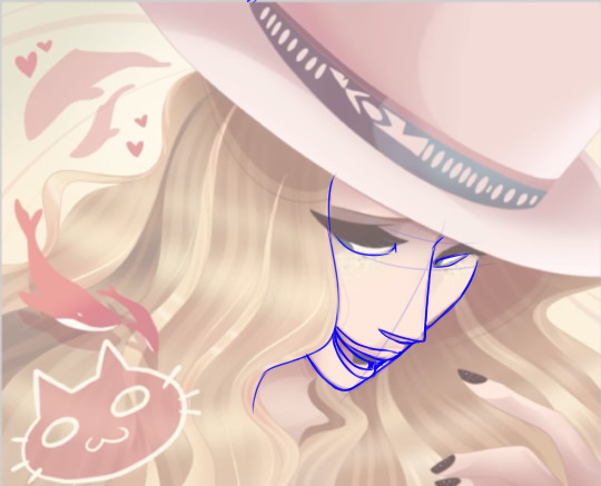
Not really the best sketch-over but it helps to get a visual point across.
Other Comments:
Eyelashes above hair:
I know some people are a little bothered by the eyelashes being above the hair, I can see where they’re coming from. The eyelashes could still be kept with the outline/faint silhouette behind the hair like what she did with some of her previous works. The hair covering the eyelashes also doesn’t affect the look at all, but this is all quite a minor style issue compared to other problems like anatomy and shading.
Kesha’s hat:
A small detail with Kesha’s hat being a little bit too large for her. It almost looks like a top-hat.
Overall look:
The strongest part of this piece is actually the color, it showcases how good Viv’s art can be with color being properly used. The colors here are not too vibrant to be blinding, not that saturated and is nice to look at. The shading actually provides real contrast to the piece and doesn’t make it seem like her hair is melding into her skin, or her fingers.
I think the reasoning behind this is because she used a reference image to pick and use the colors from as well as where to put the shading, which is why most of the previous problems with Viv’s methods are barely seen here.
I also like the pink whales at the side of the image, it’s a nice touch for that photograph/poster feel, but the cat doodle on the bottom left seems out of place, though.
50 notes
·
View notes
Note
Hello there! First off, I really love this blog, it has helped me so much!
There’s a previous post that may help you here!
Having a style is all about laying down rules, and not breaking them. It’s like a signature.
Little rules like eye-shape, body shape, colors, proportions, anatomy, is all part of keeping that style/character consistent.
One of the examples I’m going to use is Adventure Time, particularly about the character’s anatomy. They may not have visible angular joints in their arms like actual human joints, but it’s still a style because they don’t break their rule of the characters having noodle arms. It’d be odd if Finn or Jake were to suddenly have angular arms.
Another is Tim Burton’s style. His characters may have creepy eyes, branch-like arms, but they’re always around the same length. One arm/leg isn’t longer than the other between each drawing, the necks of the characters don’t shrink/expand randomly every time he draws them. If that character has noodle arms, that character will only have noodle arms and not angular arms.
Like with Steven Universe, Gumball, or even Avatar: TLA/LOK, Disney Characters. You don’t expect the character’s arms to be thicker/thinner than the other in some scenes but normal in the others. You don’t expect their proportions to suddenly change throughout the episode. They are always on point. They follow their own subtle art rules, character design-wise or art-style wise. Or else there’ll be this inconsistency that we see in Viv’s work.
Some people may say that all you need to do is practice and it’ll come to you and be reflex and muscle memory, well, they are partially-right. It is muscle-memory after awhile, but muscle-memory can only carry you so far. It doesn’t guarantee flawless anatomy if you were to sketch down your character without laying down structures first.
The main part that counts is your habits and your ability to pick out and weed out details through observation. If you’re able to discern your own flaws (when your own rules are broken) in your art and habits/methods and fix them, you’ll be able to go far.
33 notes
·
View notes