#cel overlay
Text
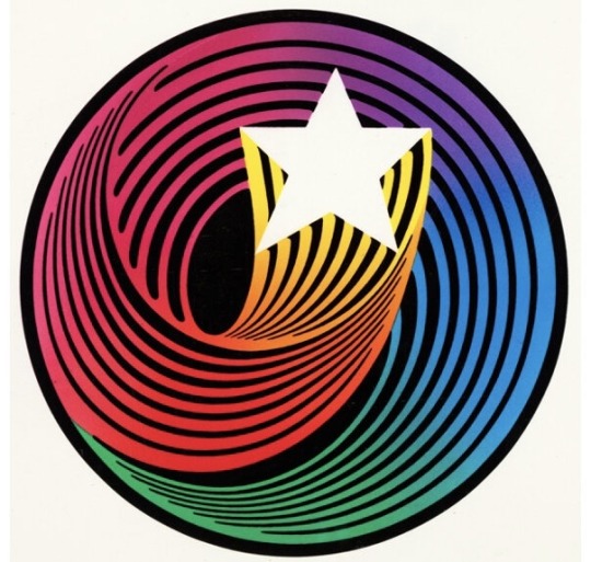
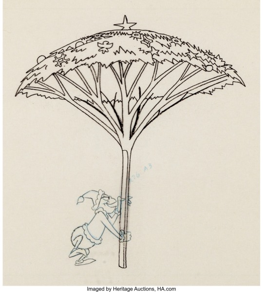
Hanna-Barbera Swirl Designed by Saul Bass (1970s)
#70s#hanna barbera#swirl#star#graphic design#saul bass#animation art#animation cel#cel overlay#1979#2002#Hanna barbera studio
360 notes
·
View notes
Text
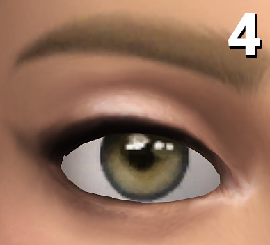
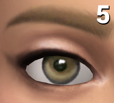
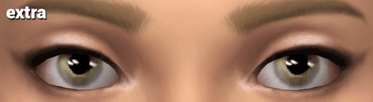
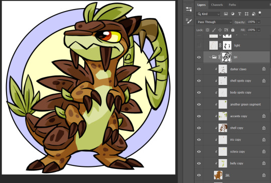
// Maxis-Match Eyes Masterlist
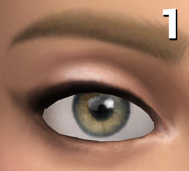
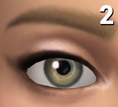
Was in mood to compile all of my maxis-match style eyes that I've already published, so here they are 👁️
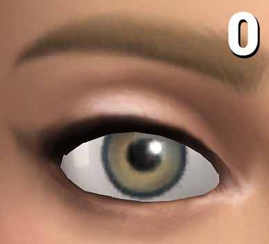
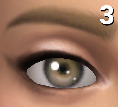
0: only here for comparison reasons, they're the default eyes from EA, the ones your game automatically gets shipped with!
1: Oasis Eyes (very much like the EA eyes, but a bit more textured and not as flat, using these brings a bit of life into sims while not changing the aesthetic. Shown here in the V2 version, the V1 version has a reddish sclera, which is a bit more in line with alpha style eyes)
2: Dazzling Light Eyes (my fav ones! I always have these ingame as my default replacement, as for me personally they're really close to feeling like the vanilla EA eyes but in better, when looking at townies I ALWAYS forget they have CC eyes)
3: Treasure Eyes (with these I've tried to achieve a cel-shading look, so I feel like they make sims look even more cartoony than the regular EA eyes)
4: Waterdrop Eyes (those have a clean, but different look than the base eyes, while still being really cartoony. May be the most expressive looking ones out of the bunch)
5: Oxygen Eyes (another one which line up pretty well with the general aesthetic of the base EA eyes, but a bit more jelly-like looking if that makes sense?)
And as a bonus, with my DIY eye kit you can turn most eyes into maxis-matchier versions by layering pure white sclera overlay swatches over them!
Example combination: Trauma Eyes + Sclera Color Swatch #20
#masterlist#ts4cc#s4cc#the sims 4#the sims#simblr#ts4#sims 4#sims#sims 4 custom content#ts4 cc#s4 cc#ts4mm#s4mm#ts4 maxis match#s4 mm#ts4 mm
545 notes
·
View notes
Note
May I ask on how you choose your colors when you color your art pieces? It is so pretty to look at the colors of your art, and I want to color like that, but color picking is very hard q-q
here's!! uh, the general areas in the color wheel where i try to pick depending on the vibe
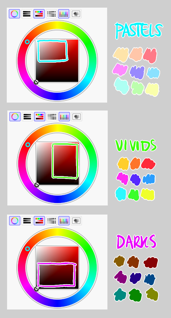
highly inaccurate because tbh i just color pick directly or try to guess the colors from my references and just adjust them to be a little bit more pastel or to the atmosphere
and if i have their colors memorized (such as ink or dream), i just pick by memory or by my modified colors LOL

color your scrunkly!
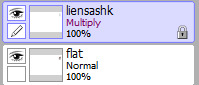
set your line work to multiply and lock opacity
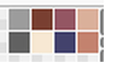
i use warm tones for white ish colors so uhhh idk whatever warm color from here
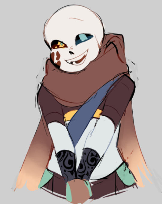

color the line work!!!!! ofc, shift the hue depending on the undertones of the surrounding colors
the skull color is a warm off-white, the undershirt is a blue-ish off-white, scarf is warm brown, so on and so on
the multiply function rly helps just blend things into the palette a little more, but if ur confident enough, you dont have to set it to multiply at all for extra variation
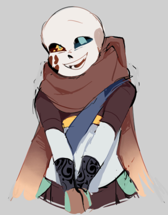
minimal shading by just taking the surrounding colors n adjusting the hue slightly n its value n saturation
gives it a very messy cel shaded look! been into it lately and stuff

and then i add a few overlays using the pin light layer mode!
i usually use these two colors together, it gives the right amount of pastel colors that really appeals to me
if you have access to gradient maps, i recommend using them lots!
it makes the pieces look a little more cohesive
the pin light layer mode imitates it n is very versatile if u cant use them though (like me when im just doodling on sai)
that's it!!! that's the basic rundown of how i color
i'm not very well versed in color theory so i can only do very basic color picking tips, but maybe next time i can offer ways on how to color more atmospherically!
have a nice time coloring your blorbos ✨
#Anonymous#tutorial#ref#ink sans#kia doodles shit#i hope this heeeeeeelps somewhat!!!!!#art tutorial#coloring tutorial#art help#art tips#art advice
371 notes
·
View notes
Note
If it's not too much to ask, how do you shade complex patterns easier?
Its not too much to ask at all!!
My easy trick for shading complex patterns in cel shaded Neopets style art, where you'd want to hand pick your shadow colors for each element:
First, I make a flat base layer, and put each unique color on its own layer that i clip to the base.
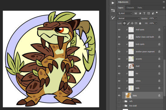
After i finish the flats, i then duplicate ALL of those layers, lock them, and recolor each duplicate with the color i want to use for that element's shadow. these are now effectively my Shadow layer, and i rename the base duplicated layer so i know its my shadow base.
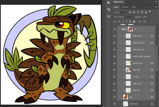
and then i use a layer mask on either the base layer or a folder i put the shadow layers in- i use this to paint in the spots where i want the unshaded areas to be.
This method makes it really easy to change my mind on a shading color for a specific area without having to carefully repaint the shadows, or tweak where i want the shadows to fall without having to worry about matching the colors, similarly to having the shadows painted on a multiply layer.
if i'm using a PSD where I already made a shadow layer, like my basic Centibyte base, i just duplicate all of the clipped areas from the flat color base, clip the dupes onto that shadow layer, recolor it to be the shadow color for the base color, and proceed from there.
You can do this trick for highlights also- I've noticed that highlights are typically used sparingly in Neopets art though, so I kind of just go with whatever i think looks right.
For Tyrannian, I decided it looks fine with solid white highlights at a lowered opacity of 70%, so i didn't bother coming up with a unique highlight color for each area. Sometimes I'll make the highlight layer an Overlay layer since that can help the highlights with not looking washed out, but it feels a little inauthentic and loses contrast over certain colors, and in this instance Normal ended up looking better.
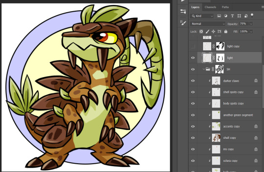
I hope this was helpful and not too unclear! I'm not super experienced with making tutorials, but I'm always happy to share what works for me as best I can!
#asks#neopets#neoart tips#god maybe i need a better tag for this stuff. i had to hunt down that it was 'neoart tips'#my older version of this method is ALSO in that tag- its a little more convoluted than this one though so i wanted to share the new version#lmao i was like 'lock your shading layer duplicates' and some of mine are unlocked in the screenshot. don't live like me. play soccer
144 notes
·
View notes
Text
alright, the other day i loosely implied that i would make a behind the scenes/tutorial type of thing. momma didn't raise no liar, so here goes nothing i guess!
step 1) rough sketch
honestly i skip this entirely if have a really concrete idea of what i want to do. sometimes compositions are just beamed into my brain from On High and a sketch is unnecessary.
step 2) 3d ref

this is where i refine the composition, lighting, camera angles, props, etc. i use DAZ studio for model posing and blender for almost everything else (props, horns, lighting, rendering).
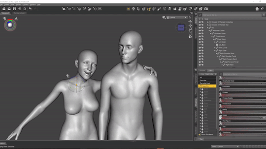
here's a 10 minute video on how to pose models in DAZ if you're interested in doing something like this! it's not very hard! basic posing requires almost no technical know-how.
i've heard magicposer and virt-a-mate are also good for model posing, but i don't have any experience with either program.

after i'm done posing, i transfer the models to blender so i can work on props, environment, and lighting because doing it in DAZ is ass. you can see that i went overboard on the ref for the paladin i worked on last year by modelling armor.
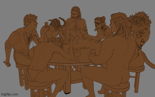
step 3) lineart

at this stage i'm synthesizing my 3d models, reference images, and style choices into lines.
the 3d likeness of my models is poor because I don't have time for that shit, so this is where my humongous folder full of bg3 screenshots comes into play.
for example: looking at my screenshots, astarion's forehead tilts back towards the back of his skull, much more so than my reference model. his chin and jaw are sharper and longer, and the transition between his brow ridge and nose is almost a straight line. if i combine the information from my 3d model and astarion's face, i get something like this:

3d models aren't fleshy (ie, tummy rolls, wrinkles, muscle deformations, butt squish) unless one puts in A LOT of effort like absolute madman chris jones.
you guys know bernini, right? he has a couple great examples of this. see how hades' hands press in on persephone's leg?
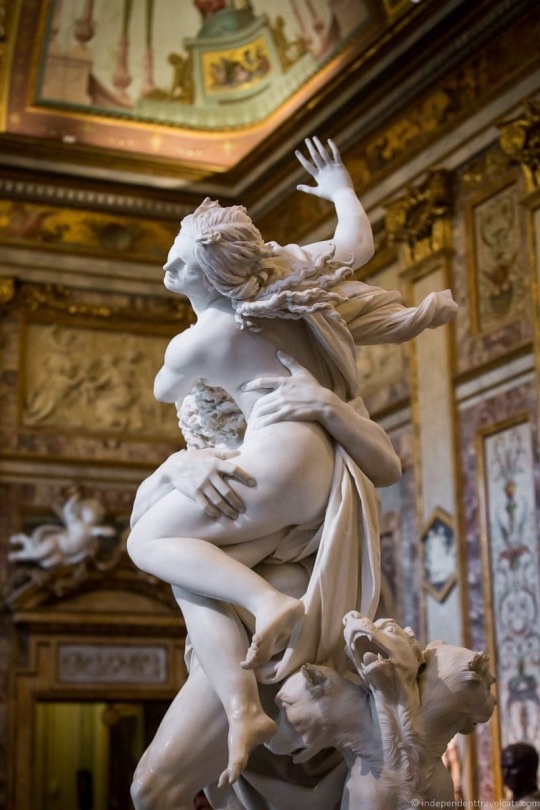

this is what we want to add in the lineart because it's too much effort for 3d. laziness is king.
i guess i draw clothes at this stage too, but for some reason there aren't many in this image. ( ͡° ͜ʖ ͡°)
step 4) base color
i have a little color picked palette that i use for everybody so i get their skintones right before i start messing with colored lighting. i'll use overlay and hard/soft light layers clipped to the base layer during the shading step later.
step 5) shading
if you thought we were done with the 3d part, guess again! i posterize my 3d reference so i can see the shapes of the shadows and highlights better. if i'm not feeling it, i can go back to 3d and change the lighting really easily.
could I make a cel shader for this? yes. am I going to? No. custom shaders are for people with intelligence and I am fresh out. posterization it is.

from there, i do a pretty standard cel shading deal that i usually blur and set to low opacity. (for this image i stuck to no blur because i had been looking at a lot of morebird's art and was really feeling the hard edges)
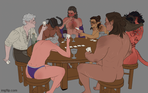
photoshop is what i use for final rendering because it has bangin tools. the brush customization alone make ps worth it, but i also particularly abuse puppet warp, noise generation, the camera raw filter, and layer styles.

step 6) background
i put the least effort possible into a background and then i blur it into oblivion so you can't fathom the depths of my ineptitude.
and then i have a finished image! ᕕ( ᐛ )ᕗ
#art tutorial#this got long!! the rest is under the cut#i encourage everyone to try out DAZ and blender! theyre both free!!#i love goofing around in 3d
71 notes
·
View notes
Note
hello! i'm not sure if you remember me, a while ago i asked about digital art and if it's possible to do on an ipad or something similar. i was really grateful for your response and i got an ipad over christmas! i didn't realize how expensive the pencils were though and was only able to get one recently. now that i have all of that, i download the first art program i saw (ibispaint x, i don't know how good that is) and feel super overwhelmed by everything, all the tools and brushes and i have no idea where to begin. i know this is a super broad topic, but i don't know if you have any advice for a beginner hoping to become a digital artist? or know of any resources? thank you so much in advance and no worries if this topic is too broad to really get into properly!
Oh hey!! Congrats on getting an iPad! And yeah, shopping for the pens is a big pain in the butt, but I'm glad you finally got it all setup!
So most of the advice I'm gonna give you is very basic, starter advice that can apply to virtually any digital art software, as the vast majority of them are built with the exact same base tools, they just vary in their intended purposes which means they may differ in more advanced settings and what they offer beyond the basics (ex. Photoshop has more colors than Clip Studio because it's built for editing high quality photos whereas Clip Studio is meant to emulate comic art, but Clip Studio offers more in the way of comic-creating tools such as specialized rulers, 3D material support, built-in screentoning, etc. and all of the software available will tend to have different brush engines, meaning it doesn't always 'feel' the same to draw in one software as it does in another).
Your bestest friends:
Layers! This is the biggest pro to going digital, because now you can work with layers! So anything you draw on each layer is preserved and can't touch or affect whatever's on the other ones :3 You can find the layers tab in Ibis Paint X in the bottom right, don't be afraid to make a bunch of them and mess around with what you can do. Play around with the different blending mode settings (in Ibis Paint it's the menu that's labelled 'Normal' in the layers popup) especially Multiply, Color Dodge, and Overlay, as those three are the most commonly used to make coloring more efficient and give your art some extra pop.
Lasso/marquee/magic wand tools! These are basic selection tools that allow you to select an area within the layer you're working on, so that whatever you paint won't travel outside of that area. The Lasso is a free draw tool, the marquee tool is typically 4 sides by default (so squares/rectangles) and the magic wand detects and selects a closed area with one click! (just note that by default it's only on the layer you're on, so if you use it on a layer that has nothing, it will typically select the entire canvas).
Alpha locking! This is a simple button setting you can click to 'lock' the layer you're working on, which basically means that whatever you've drawn on that layer, anything you add can't travel outside of that drawing. So if you want to quickly shade something without going outside the lines, alpha locking is your solution!
Clipping groups/layers! This is a bit more advanced but is basically an even better version of alpha locking that you can use in conjunction with it. Clipping layers are basically additional layers that , when you click the 'clipping group' button, 'attaches' that new layer to the layer that's below it. It performs the same function as the alpha lock by preventing whatever you draw on that layer from travelling outside of it, HOWEVER it comes with the added benefit that it's on an entirely different layer, meaning you can erase and mess with whatever's on that new layer as much as you like and it won't hurt the base layer. It kinda follows the same logic as animation cels !
Masking! Y'know when you're doing a traditional painting, and you put down tape to cover the area so you can paint over it and later remove the tape and everything underneath is untouched? That's basically what masking is! Once you put down a layer mask, using the erase tool on it will 'erase' whatever the mask is applied to, and using the brush will make it magically return! This may sound silly at first, but I find masking is especially helpful if you want to erase something on the layer you're working on without it disappearing forever! It's also really helpful for comic work because you can mask whatever's outside of the panels and voila, nothing you draw will travel outside of those panels!
Stabilization! I don't know how extensive Ibis Paint X is with offering stabilization tools, but many digital art software comes with it and it's a LIFE SAVER for new digital artists adjusting to the feel of digital art. It essentially 'slows down' the output of the ink on the canvas which helps a lot with getting cleaner lines in fewer tries. It's not quite as big of a deal when drawing on iPads because obviously you have more control by default by drawing directly on the screen, but it can still be really helpful when you need to pace your hand ahead of the actual drawing tool to pull cleaner lines!
That's pretty much all I can think of for now! But here are some other commonly asked questions:
1.) There are so many brushes to choose from, which one do I use?
The round brush is small but mighty. Virtually anything can be painted with it, it's simple, but malleable, especially when you start messing around with the hardness and opacity settings. Don't get too lost in the sauce with the brushes that are available to you, it can be very easy to get overwhelmed by all the options and variety. Some artists still work purely with just round brushes, some artists have custom brushes they like to use to speed up their drawing process or achieve certain textures. Play around with them, but don't get too stressed about which one you use because there's no wrong answer, the right brush to use is the one that gets the job done ! <3
2.) What canvas size should I use?
It depends on a variety of factors such as whether or not you're planning to print, where you're going to be posting it, etc. By default I like to work on 8.5 x 11 inch canvases (standard printer paper size) at 350 dpi, which if you want to make that canvas in Ibis Paint X, means you just have to make a canvas with a pixel ratio of 2975 x 3850 pixels! Just note that the lower you go in either pixel count or dpi, the lower the resolution, so it's typically encouraged you work at a minimum of 300 dpi (but you usually don't have to go any higher than 600) to ensure you don't wind up with any blurry low res JPG's/PNG's.
3.) Should I export my final drawing as JPG or PNG?
This is usually just up to personal preference, but like the canvas size, it depends on what you're using the image for. You can always export as both, the biggest difference between them is that PNG is lossless meaning you won't experience image compression like you will with JPG, BUT you're also going to have much larger image sizes. JPG is often fine for any standard posting, PNG is typically recommended if you want to have a drawing with a transparent background for printing (as JPG can't do transparent backgrounds) or if you just want to have a really high res image file for sharing outside of social media sites (as social media sites like FB/IG/etc. will typically compress the hell out of your images anyways)
Here are some other super helpful resources as well if you need some visual and/or audio guides:
Sinix Design - How to Learn Digital Painting (Beginners)
Marc Brunet - The Beginner's Guide to Digital Art
Skynix Art - 50 Digital Art Tips in 5 Minutes
One thing I also like to do is watch speedpaints of digital artists as it can really help pull back the curtain on what they're doing (or at least, it can help you see what they start with which can help you better picture the process of turning a blank canvas into a finished work of art!) And though I don't do it as often, if there's an artist whose work I REALLY like, I'll try and find their actual work files (many bigger artists sell them on their crowdfunding sites/Gumroad/etc.) so that I can actually break the drawings apart layer by layer for the purpose of analysis. Of course, all that is something that you'll grasp better over time as you learn the tools and learn to recognize what artists are doing in their own workflow, so don't worry if you don't glean a whole lot of info from the "big guys" right away, you should always be referencing artists who are higher along the skill ceiling from you but not too high that they're using techniques and tools that are outside of your realm of understanding.
Other than that, just try to have fun, don't stress too much about it, and save often!!! Part of creating art is learning to be at peace with the process, so don't stress too much if it takes you a while to get adjusted to the layouts and tools - at the end of the day, digital art is another medium entirely, so it's not uncommon at all for traditional artists to need a lot of practice to 'switch' to digital, because they both utilize different tools and techniques. Be patient with yourself, always be on the hunt for new resources and guides and references, and don't be afraid to experiment and make mistakes (the best part about digital art? Mistakes don't cost you any paint or materials!)
Good luck!! And congrats again! 🥰
57 notes
·
View notes
Note
Hello! You've probably heard this a billion times but after searching around on your blog without much luck I thought I'd ask: how do you create the sort of slightly hazy, grainy 'anime'-esque overlay/filter in your pieces? I love how it looks like a hand drawn cel or a shot from an 80's animated film - 'impeccable vibes' as the kids would say 😁. Keep up the gorgeous work, I always adore seeing your OCs on my dash ❤️☺️
Hey! Thank you so so much!
I add a Noise filter on top of the art when I'm done. Sometimes I find a noise overlay to add on (the clip studio asset store has a bunch), but when I'm not feeling lazy I do it in Photoshop because I like the results best. Here's how:


You can change the amount of noise to whatever you think looks best. Most of the time I set the distribution to Uniform, but sometimes I do Gaussian too.
Hope this helps and that you enjoy your TV fuzz!
122 notes
·
View notes
Photo


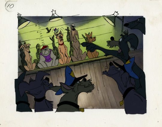


Concept work of Canine Mysteries (also called Canine Detective), one of the original pitches for All Dogs go to Heaven (1989). Gouache backgrounds w/ cel overlays. From The Don Bluth Animation collection at SCAD.
516 notes
·
View notes
Note
Hi I’m a new digital artist and your art style is so beautiful, definitely what I aspire to be!!! I was curious if you could share any info about brushes you use or your process (shading especially)
Ahh welcome to digital art!!
Thank you for the kind words! I use a Procreate for all my works, and I use Georg’s manga and ink brush pack for most of my inking. (Enpitsu, fude, g-pen texture the most)
for shading, it’s hard to explain, but I do my flats, then a gradient layer (multiply), cel shading(multiply), then some lighting effects with overlay and addition depending on the piece. Then I finish it off with some painting on top!
Also art hack I’ve recently started doing: copy the canvas at the end, then blur it slightly, and put it on overlay mode with lower opacity. Magic.
50 notes
·
View notes
Text
(Click for better quality!)
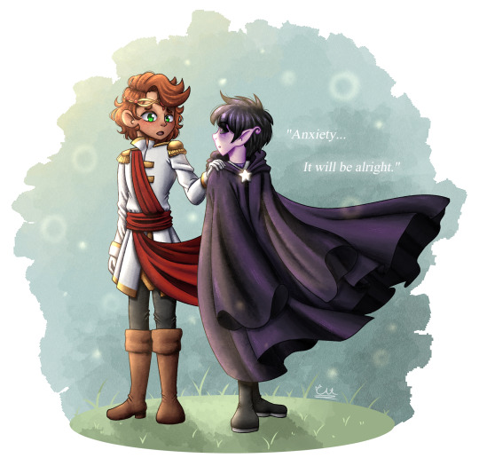
I had the incredible honor of collaborating with @wistful-wish in this year’s @sandersidesbigbang ! You know I can’t resist a good Prinxiety fic. And set in a fantasy AU with half the cast as fae? Virgil as an all-powerful fae prince? Roman as the himbo human prince that Virgil can’t help but fall for? The choice literally made itself for me lol
Go check out Tessa’s fic! She worked SO hard on it and it’s AMAZING!!! Also, go check out the incredible art @briandthemoon did for the fic! It was so cool working alongside such a talented artist, and their art for the fic is absolutely gorgeous!
-
[Image 1 ID] [The first image shows Roman and Virgil. Roman is placing a hand on Virgil’s shoulder. Roman’s expression is concerned, while Virgil looks surprised. Roman has tan skin, curly auburn hair, and green eyes. He is wearing a fancier version of his canon outfit, as well as a golden circlet with red gems imbedded. Virgil has pale, light pink skin with pointy ears that are slightly curled at the end. His eyes have black sclerae and purple irises that glow slightly. He is wearing a purple and grey shirt underneath a long, dark-purple cloak with a silver clasp shaped like a star. Virgil’s cloak and Roman’s sash are billowing to canvas right. Roman and Virgil are both standing on a circle of grass against a blue background, and tiny motes of light float around the canvas. The words “Anxiety… It will be alright.” are on the right side of the canvas, italicized and slightly glowing.]
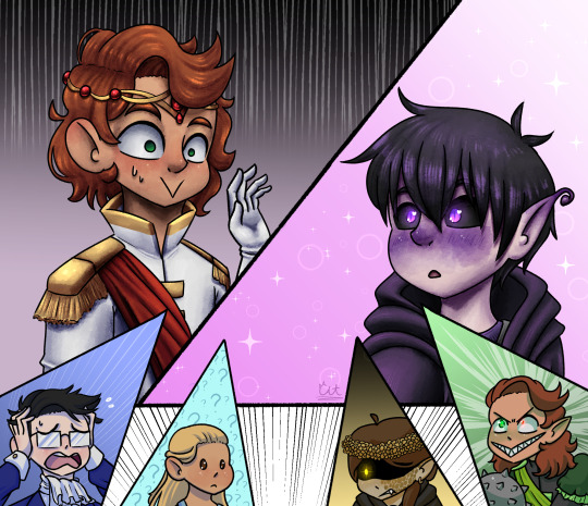
[Image 2 ID] [The second image is formatted like a comic page with six panels, the majority of the page taken up by two panels split diagonally, with four smaller triangle-shaped panels along the bottom. Black action lines spread behind the bottom four panels. The top two panels are shaded in more detail, while the bottom four panels are cel-shaded.
The top-left panel shows a headshot of Roman, who is sweating slightly and looks scared. His hand is shown recoiling. His outfit and appearance is the same as the first image. The background of this panel is a gradient of black to grey from top to bottom with vertical white lines lining the top and fading.
The top-right panel shows a headshot of Virgil, who is blushing and looks surprised/awe-struck. His blush is purple. His outfit and appearance is the same as the first image. The background of this panel is pink with light motes and sparkles surrounding Virgil.
The bottom far-left panel shows a headshot of Logan, who is clutching his head with both hands and looks incredibly distressed. He has light skin and black hair that is pushed to the side, and he is wearing rectangular glasses. His eyes are hidden by the reflection of his glasses, although his eyebrows slightly overlay the glasses. He is wearing a dark-blue suit with white cuffs over a white shirt, as well as a white cravat. The background of this panel is light indigo with white action lines shooting diagonally from bottom-left to top-right.
The bottom middle-left panel shows a headshot of Dearheart, a young girl with tan skin, long blonde hair, and brown eyes. Her hair is pulled back partially. Her eyes are simplified to dot-eyes, and her expression is confused. She is wearing a sleeveless blue dress. The background of this panel is light blue with a pattern of dark blue question marks.
The middle-right panel shows a headshot of Janus. He has long, brown hair tied in a side-ponytail, pale yellowish skin with golden scales along the left side of his face, and pointed ears pierced with hooped golden earrings. He is wearing a black cloak and a crown of yellow flowers on his head. His eyes are hidden by shadow, except for his right eye, which is simplified to a glowing yellow circle. His expression is angry, with his teeth gnarled to show one fang. The background is a gradient of black to yellow from top to bottom.
The far-right panel shows a headshot of Remus. His hair and skin-tone are identical to Roman’s, although his skin is lightly-tinged green and his ears are pointed. His right eye is a bright, radioactive-green, and his left eye is bright red and smaller than the right one. Both eyes are glowing slightly. He is wearing his canon outfit, although the eyes are absent from his sleeves. He is holding a morning star. His expression looks crazed and blood-thirsty. The background of this panel is light green with white action lines spreading outward from behind Remus.]
#sanders sides#sanders sides big bang 2022#prinxiety#virgil sanders#roman sanders#thomas sanders sides big bang 2022#tssbb 2022#sanders sides au#myart#fanart
254 notes
·
View notes
Text


(This is new information that I recently came across)
The Balrog from the 1978 Lord of the Rings as we know in the final film as the tall, bulky lion-man with butterfly wings is actually a REVISED version of their initial plan for the creature, which consisted of the same technique used for the Orcs, Ringwraiths and the Rohirrim of transferring the live action footage to painted cel, then painting the eyes/fangs over it.
They might/might have not completely shot the sequence when I guess they decided they weren't satisfied with the results and reckoned it was a better idea to make something actually animated, so the new lionhead Balrog body/head/flaming sword was overlayed over the original since they most likely wanted to keep the wings, in a misguided/rushed attempt to salvage, or improve, the original.

It's subtle but you can still tell that the animated torso/head is just an overlay. Ralph Bakshi never acknowledged this, nor has he sold that many Balrog cels, nor do I know anyone that owns one that can confirm that there is in fact, an alternate Balrog underneath.
And this cel is from one of his scenes not in the movie.
10 notes
·
View notes
Text
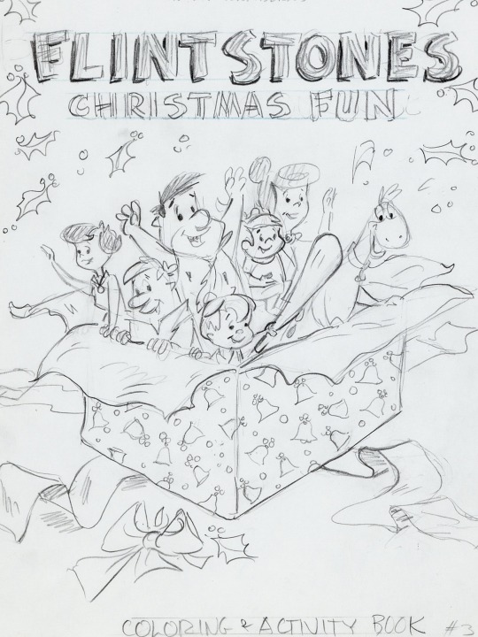
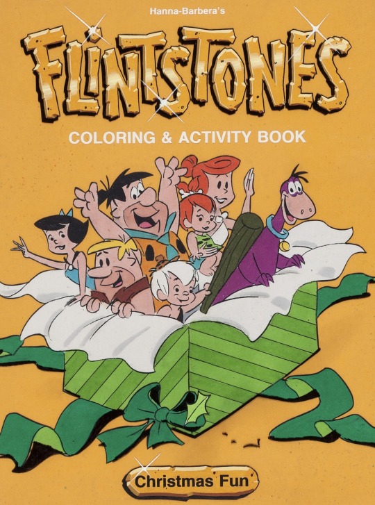
Flintstones Christmas Fun Cover Art (1983)
#80s#hanna barbera#the flintstones#the rubbles#cover art#coloring book#preliminary sketch#layout design#cel overlay#character designs#Art Scott#christmas
23 notes
·
View notes
Note
question. what do u use to animate . ?.!.?:.?
I used procreate, capcut, and prequel!
Procreate has an animation feature ( it’s not great but it works for me ) and so use that to make my gifs
I export them with transparent backgrounds. I then draw the backgrounds
( second one is pretty blank in the middle cus joes head covers it plus I was tired and over it)
I then put the backgrounds into capcut and add the transparent gifs as an overlay. I also duplicate that layer, use the filters to make it black, shift it a little and change the transparency to add the illusion of a shadow from the “ cel “
I export and put them into a new capcut file. I drew a bunch of mouths and overlayed them on top to do the lip syncing. Export finished video.
Obv you could keep it like that but I like my stuff to look older so I then use the app prequel ( also I only use the free filters cus I’m cheap )


Here we have plain, first round, and second/last round of filters.
First round is to make it look older and like it’s traditional cel animation. I like to use the effect “ lomography “ bcus of the blur. I then use the filter “ brownie “ cus it kinda dulls everything. And then in adjustments I make the exposure stronger, contrast less, highlights down like all the way, a little bit of fade, grain, and dust ( plus others you gotta fiddle every time )
Second round is to make it look like your watching it through your old tv/was ripped from an old vhs tape. I like to use the effect “ vhs “ and then in adjustments fiddle around again, I like to use temperature adjustment to make it cool toned cus I feel like that gives it more of an 80-2000s look.
#no one asked for that much detail#but whatever I’m procrastinating#how to make your art look older was something I struggled with for a while#and figured I shouldn’t gatekeep#art tutorial#retro art filters effects#my art#art#80s art effect
36 notes
·
View notes
Text

Dr. Seuss' How the Grinch Stole Christmas Grinch Animation Drawing with Christmas Tree Presentation Cel Overlay (MGM, 1966)
5 notes
·
View notes
Note
I followed you before because your art was awesome. I follow still because it's still awesome.
Honestly love your use of shadows and sheen.
I'm glad you like my art! :>
I will now take this opportunity to describe why I think my art is good!
I learned most of the techniques from watching tutorial videos.
There's no tutorial that can, like, tell you how to accurately portray form with shading (which is partially why my art is so stylized), you just kind of have to feel out the shape of an object if you're not using references (which is part of why references are SO important)
but there are tutorials that can tell you the basics of shading (digitally, in this case)! this is the process I usually follow, with some variations depending on context- it uses a lot of terminology that I am assuming you know the meaning of, but if you don't, google is your friend
this is NOT a step by step tutorial to shading, I am just explaining the process that I follow in a manner similar to a tutorial
(long post warning)
Things to keep in mind before reading:
I do NOT use airbrush for shading unless explicitly stated. Airbrush makes ONLY soft shadows, where you usually want a mixture of soft AND hard shadows to create an interesting composition. I personally usually cel shade, which is ONLY hard shading.
This assumes you have basic things down like the position of your light source and how to shade, like, where exactly to put your shadows and what shapes to make them. If you're unsure, try to figure out the shape(s) you're trying to create (everything is made of shapes, break an object down into the most basic forms possible and go from there) or just, like, use a reference lol.
This isn't me telling you to always use this method- I vary the method a lot myself while using it, based on context, so please experiment with different layers and techniques to find what works best for you and your style!
If you're not confident in your line art, shading the piece is not going to make it look too much "better" than what you're seeing. Shading uses value to create volume and describe form, but if the form being described isn't quite right, it probably won't come out the way you want it to (I have learned this the hard way).
Seriously, use references. Multiple.
Use the magic wand tool to select the area around your lineart, then invert selected area and grow your selected area by 1 or 2 px.
On a separate layer from your lineart, use the fill / paint bucket tool to fill the selected area with exactly 50% value grey.
This creates a base which you place underneath your line art, which is very useful, because you can then clip layers between it and your lineart directly to the base layer, making it impossible to color outside the lines
(but why don't you just use the fill tool to make a color layer?)
This can be a useful shortcut if you're in a rush, but the fill tool can often miss pixels or have unintended side effects if you forget to turn off anti-aliasing or something else. I also don't 100% understand how to properly use the fill tool sometimes, so avoid using it unless the context calls for it
use a multiply layer + greyscale value to convey shades that are darker than your base color
Even if you put a white that is, like, 90% value, a multiply layer will darken any layer underneath it very sharply. You can use this to put various greys and create volume with darker values. While it can be tempting to make an overlay layer or a soft light layer and put all of your shadows and highlights on it (I used to do that) you can get a greater range of value if you use separate layers for your lighter values and your darker values.
create an overlay layer to enhance darker shadows and begin forming lighter values
Overlay, being the cross between multiply and screen, is a perfect way to start exploring lighter colors in your piece without pushing the lever all the way to bright bright highlights while also making some parts of your shadows even darker
put a screen layer on top of the overlay layer to convey shades that are lighter than your base color and create white highlights
Screen can and will lighten your color to a very aggressive degree. I recommend using darker shades of grey in the 10-40% value range to convey "normal" lighting, and going over 50 up to 100 depending on how close you want the visible color to be to white.
create a soft light layer, set your color palette to 10% and 90% value "grey" and break out the airbrush, set the brush size so the cursor circle covers roughly 1/8th - 1/6th of the drawing
Using the airbrush on top of your other layers and also in a soft light layer is like a cheat code for rounding out your shading where your shading may be a little weaker in some places. As long as you don't overdo it, you can create a very convincing composition by combining the airbrush and soft light layer with your harder shading that has more value range.
use a normal layer to add marks of solid color on top of your drawing, like white lines reflecting on glasses or straight up 0% value black in some of the darkest parts of your drawing.
this can also be useful for adding additional details and contour / cross contour lines that may be missing from your line art
This step is not always necessary. It is nice to add a little bit of final rendering, but it can be superfluous, especially if you were particularly thorough in your previous steps.
I also use it sometimes to add things like glasses that just appear as the frame without any rendering regarding the lenses.
---
Feel free to repeat any of these layers to get even darker or even lighter values, or add more definition or multiple light sources. Like I have said, the decision to do so is purely contextual, and may vary from piece to piece.
If you have any specific art questions, or any holes I may have left in my process, my ask inbox is always open :>
If you are a digital artist and you see any flaws / room for improvement please feel free to leave criticism on this post or anywhere else like my asks or DMs! I'm always looking to get better.
Thank you for reading my long ass post, or at least scrolling through it all the way.
Either way, have a gold star!
⭐
11 notes
·
View notes
Text


Another picture everyone wants to know more about, and indeed one of my favorites from the past year is this one.
With this image, you can see that I started with the line art in black, only. No colored lines on this puppy -- the "feel" of stained glass demands big, dark lines in this case. You can see that I blocked out the colors in a very basic fashion and added a circle as a "guide" at this point. Eventually, it becomes a crescent moon...
I used an actual shot of the moon to fill in the circle on the second row. I think I just selected the area and used "Paste Into" to make a mask. I then set it to "Multiply" and cut the opacity about 50% so it picked up the gray color I blocked it in with, initially. I also shaded Toki and Eden with a green/blue hue. You can see it's sort of a "softened" cel shading where I blur the edges a bit. The next thing I did was to make the "glass" effect, and the way this was achieved was by selecting different sections of the figures and again using "Paste Into" to put a layer of marble I lifted off Google (see examples here) as a mask. Then I'd select a few more sections, paste a different marble pattern in, and repeat. I'd "Invert" the patterns (so they're black with white "veins") and set them to "Screen". I did the same with the moon, and by the time we've gotten to the last image of the second row, you can see I added a few more "backlights" to the image. This was done with the inclusion of a radial all-white gradient set to "Overlay" above the shadow layer. I also changed the very-back layer from white to black.
For the finishing touches, I added a few more highlights over another layer above everything, and in the layer between the colors and the black background, made a layer of blue radial gradient and some stars on either edge of the moon. The very, very last step was to put a layer of contrasting blue and red gradients above everything and set that to "Soft Light". I've left the gradient layer in the final image set to "Normal" so you can see what it looks like. Little things like this make a big difference in the final composition, and it's fun to experiment with overlays in such ways. :)
Thanks for looking! Hope you got some groovy ideas... Will definitely be pulling out some of my art from the past (and the future, I'm sure) to do more breakdowns like these since I haven't been giving you guys as many tutorials as I've wanted to, lately.
21 notes
·
View notes
Last Seen Blogs
hussini9
Untitled
lenore3vermore
° Lenny °
ktienh
Tien's Blurb

myphotoshootideas
Untitled
imasiphy
Imasilly lives here