#chiaroscuro lighting technique
Text
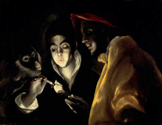
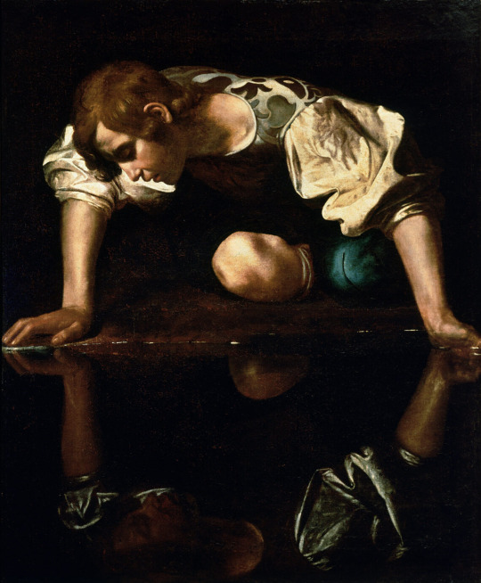
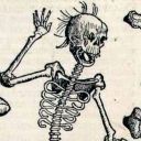
El Greco (Greek, active in Spain – 1541-1614) • An Allegory (Fàbula) c. 1580-1585
Chiaroscuro is a high-contrast lighting technique that utilises a low-key lighting setup to achieve contrast between the subject and a dark background.
#art#painting#fine art#art history#el greco#greek artist#worked in spain#spanish renaissance#genre painting#oil painting#master painter#chiaroscuro lighting technique#animals in artworks#pagan sphinx art blog#art blog#art appreciation
11 notes
·
View notes
Text
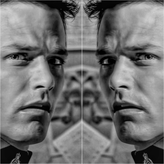
Just thinking about that iZ!AU diptych again.
I put a green overall cast on the first part - Remus carrying Roman.
I put a red overall cast on the second part - Roman carrying Remus.
In acknowledgement of types of color blindness - I tried Ps's Color Proofing options to see if anything would look a lil too muddy for such viewers.
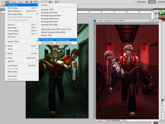


#these modes are not anomalous visual filters too#body horror/#blood/#(my ancient-ass copy of photoshop doesn't have tritan-type proofing... which could look interesting)#(i usually use this setting tho - when there's like textual elements where legibility is a priority)#(and my pref for chiaroscuro techniques help - higher contrasts in values / lighting)
1 note
·
View note
Text
Limbus Company and its visual portrayal of female characters, an essay
Limbus Company, and by extent, Project Moon has been a great example of how female characters are visually portrayed. In this article, I’ll try to dissect why and how, focusing on Limbus Company as it has by far the largest amount of images I can talk about. Let’s dive in.
Disclaimer: I'm by no means a professional so please, PLEASE don't clown on this i.e mention the summer controversy. I have a personal trauma on that and do not wish to revisit it. I know it's practically impossible to ask from tumblr, but still.
Visually portraying a subject
Where to start? At the very beginning, of course. Portraying a subject visually (not talking about female characters in specific yet) has a number of things attached to it. Perhaps the first question one can ask themselves is this:
Where do I want the focus to be?
Now, you can be short and say ‘the subject, of course’, but even then, that won’t often be precise enough. Let’s say you have a butterfly as your subject. Do you want the focus to be on its beautiful wings? Or its curious multi-faceted eyes, or its roll-up tongue? What do you want the viewer to notice immediately?
Arguably, even photos of landscapes have at least one point of focus. The pretty waterfall, the vast mountains, the green pastures or the starry sky. Some have the focus split up in two, where both the lake and the mountains are to be spotted immediately.
How focus can be created
There are multiple ways focus can be drawn to a specific part or to a specific subject.
One way is to simply make everything but your point of focus uninteresting. A common effect used is the Bokeh, which blurs out the background so that it will automatically appear as less interesting and more as a faded bunch of colors that contrasts with the point of focus which is sharply shot in HD. You can also make the background to be a flat color, like black or white. Some pieces of art additionally add colored shapes or lines behind the subject as to accentuate it further.
(an example of Bokeh. In addition, the direction in which another character looks shows what our main subject is, who is actually positioned off-center.)
You can also just…fill the space with the subject, as in a close-up of the thing in question. Following the previous butterfly example, it’s like only showing a small part of its wings, enlarged to comparatively huge proportions. This is also seen in portraits and to a lesser extent, similar art like waist-ups.
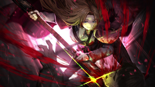
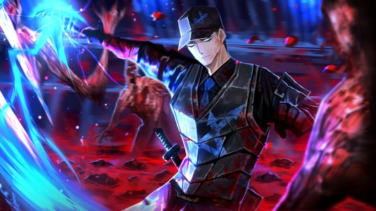
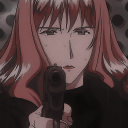
The eye is immediately drawn to what we should look at, which is the character who’s front and center in the image. Secondarily the blood. Her hair also uses the next point below: color.
If you’re working with color, then color is an excellent way to bring the focus to a subject. Bright colors and contrasts can be used, like what’s done here:
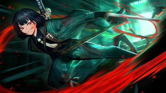
The bright red forms a direct contrast to the green that dominates the color pallette. It thus leads the eye to the red areas - aka the blood the character is spilling as well as her face, which is technically a tint of red. The red returning in her eyes which have a small trail, and on her bloodied face, as well as the yellow of her tie, further help to bring focus to her face and her expression. (Other than that, this image also has classic cartoon speed lines, which are minor but do help).
Light is also something I should mention. Using the image from above, the character is actually rushing towards the darker areas of the image. The light is coming from where she seemed to come from, judging by the speed lines and the trail of red we just saw in all its glory. The light forms a line around the subject which keeps said subject’s green uniform from blending into the darkness and the green of the image.
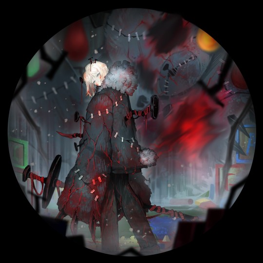
There is a specific technique called chiaroscuro (lit. ‘light-dark’) which is totally a real thing that even old masters like Rembrandt have used to bring focus. The gist of it is that the painting has very bright areas which is the subject, surrounded by dark areas, with not much in between. This technique is often used to make scenes more dramatic, and to immediately show us what the artist wants us to see, without any possible doubt. It’s like putting a spotlight on your head in a dark room. Chiaroscuro is also seen in Limbus:
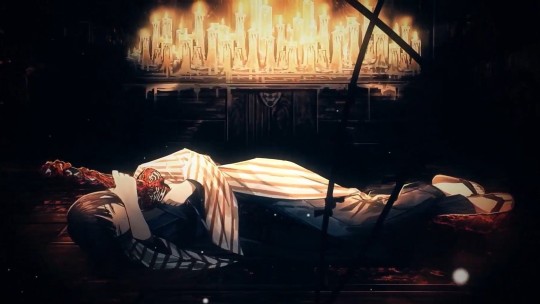
You can’t actually see much of the room our subject is in. The only light is coming from the candles, illuminating the top part of our subject. The other, darker half is much harder to see the details of. This makes it so that the eye is led from either the character towards the source of the light (the candles) or in reverse, both of which are possible and valid because in both cases, we ignore the pitch black part of the artwork.
How to create focus with characters (in specific)
Now, humans and humanoids are fascinating subjects to focus on, because there are so many situations a person can be in, and so much stuff a person can be. Are they the commander of a spaceship? A medieval ruler? An overworked office clerk? There are specific things that more or less pertain to humanoid characters more. I’m going into two aspects, clothing and posing - I’m aware there’s more, but for the sake of making this not longer than it is I’m going into only those two.
1. Clothing
What someone wears makes up a considerable part of how they’re seen and what they are presumed to be. This is also a large part of stereotyping. If you're wearing a t-shirt with pants, sunglasses, and have a camera around your neck, chances are people think you’re a tourist. To them, it likely won’t matter if you are, they will perceive you as one anyway. This is also important here: you might want to pretend you don’t know anything about the portrayed character or show their image to an unknowing friend and see what they think that the character is.
And that brings me to this point that I have seen so many times with female characters: their description/role not directly matching with how they are supposed to look if that were true. I’m talking about the battle-hardened veteran without muscles or scars of both kinds (even if adequate healing/scar removal is available in the setting). I’m talking about the scientist with a leotard under their lab coat. However, I’m not saying they should look a certain way or be the same - that’d be boring - I’m saying that…hey, it might make the viewer not take the character as serious as you want them to be.
The way clothing is built up can also serve as a way to bring focus to a specific aspect. Which will most often be either the boobs or the butt (or both) in the case of female characters. Look at this (non-Project Moon) example.
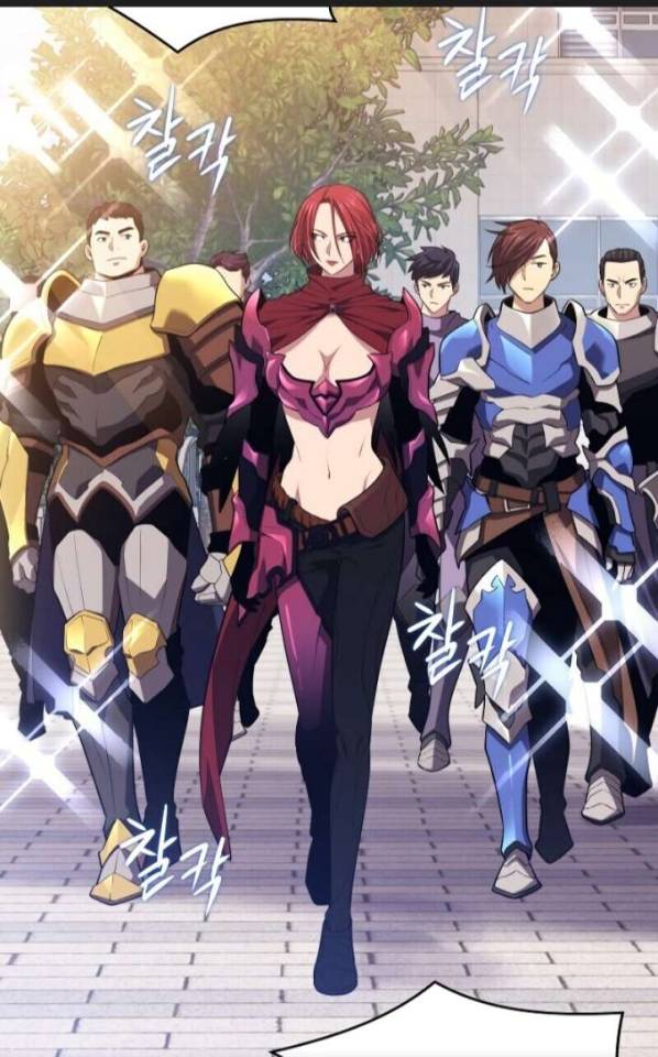
The woman in the front (obviously the focus due to the place she is standing in being squarely in the middle, and her red hair standing out) is the leader of that squad…as well as the strongest in battle. Without any protection of vital organs. With a shape under her boobs that would stab her fatally in the liver if she does as little as bend over.
The way her clothing is built up also brings the focus to her boobs - not only with how they’re prominently on display, but also with the shape the top and the fabric covering her shoulders makes. In a similar vein, her ‘pants’ and the belt all lead the eye downwards to her crotch as well. Furthermore, her thigh highs look skin-tight, bringing secondary focus to her legs, of course.
And last but not least. The guys behind her are actually properly armored from the neck down, making them somewhat more of a homogenous whole… in theory. The different body types, hair, and colors of the armor of the right and left dude make them stand out slightly more, which in turn only accentuates this ridiculous difference.
I don’t really have many Project Moon-originating images on hand that are similar to this. Every time we’ve had an ID with a female character being the leader of their group (of which we’ve had surprisingly many, actually - Don has two Section Director IDs to boot) they have usually been posing alone, or well, posing…their full uptie art normally shows a moment when they’re beating their enemy into a pulp instead of posing for the camera like in the above image. This is really consistent with the other half of the playable characters, who are male.
I want to give a special mention to two characters despite that. Faust and Rodion are both known as the more well-endowed characters, but from their IDs and E.G.O it is treated as something that’s there rather than something to be exploited.
The blue glint is the highlight here, illuminating her blood-stained clothing but also finding its equal in her small, blue eyes. I have found eyes like this and expressions like this to be quite rare on female characters. Just look at her and her face. She’s completely lost it, wrapped in twisted and warped euphoria of the moment of ‘purging’ another ‘heretic’ - and from the looks of it, the last one on the scene. She’s not even trying to clean her own clothing or face, or expose her boobs. That’s not what matters to her image, showing any kind of skin doesn’t add to her character. She’s caught in this violent moment, having her victim completely in her literal grip - not even her eyes are looking at the camera. This image showcases the violent and sadistic nature of the character.

I find this art to be a curious thing. The background is actually rather bright, making the inverse true: the character is dressed in dark clothing, so that’s what the focus is on instead. Her coat flared out in such a way it can almost be mistaken for the underside of her long hair, making her seem even larger (something certain animals use when threatened to scare others into leaving). Her actual figure is thus more obscured, it only being a few tones darker. The thing that keeps her from being a dark blob in the foreground is her sword, large enough to be an odachi. Because she’s unsheathing it, the glint that comes from the blade immediately draws attention - arguably away from her partially unbuttoned top. The animation of this in the game supports this: no boob jiggle, just her standing calmly in the moment she’s just about to unsheathe her sword.
Because I’m going to use this example further in this thing, keep this one on hand.
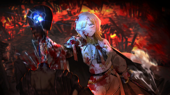
An image that’s again in the middle of the action. Rosespanner Workshop Director Rodion is right now turning an enemy into an unrecognizable stain on the pavement with her huge weapon. The highlight is her weapon again, but this time it actually serves as a secondary source of light, illuminating her face. The yellow coloration of this secondary light source also makes the whole thing more interesting than if it just had the background light that serves a similar purpose as it did in the first image of this post. Even though the image has a heavy pinkish tint, the red that splatters all over the scene is still very much present and they draw the eye back to the yellow light. While her pose is ambiguous, it keeps things vague by not putting any sort of focus on her lower body. In any other piece of media this pose would be viewed from another angle, as to profit from as much of her body’s curves. Not here. Her killing an enemy with visible ease is important. Not her pose. This sounds logical, doesn’t it?
2. Posing
Which brings me to this. The way a character is posed also plays a part in their portrayal. It is possible to accentuate certain body parts with this - like when a character brings their hand to their chin, or the way their legs are posed. No matter the actual scene that’s meant, the way the character is posed is a factor that decides how it’s viewed and where the focus lies. Most often I’ve found this to be when a character is shown wielding a weapon, but their ‘battle pose’ being rather something that accentuates their bare skin, or their little clothing that does the same thing.
Is your character actually showing that they’re dangerous through being shown fighting…or are they just sexily posing with a weapon in their hands to add a sense of ‘danger’? Some can be highly difficult to distinguish. Some CGs can show the middle of the action yet the way the character is posed still brings the focus away from the violence or brings a secondary focus to it. Unfortunately I don’t have examples of those on hand but I know they exist.
A character just posing with a weapon isn’t wrong - I draw that all the time - but when the focus is brought to a character’s boobs and/or butt with the pose the character is in, it will be kind of obvious (even if it isn’t true) that sexualizing those features of the character what the artist is really intending to do instead of showing how dangerous she is with the weapon.
I’m going to use this image from Echocalypse as an example. I regularly take poses like this as a reference point and then attempt to make them more realistic, or, funnily, point out their weirdness by putting a male character in it. Often I do this by using them for a different, more appropriately clothed character. This goes to show that clothing can already decide a lot in posing itself.
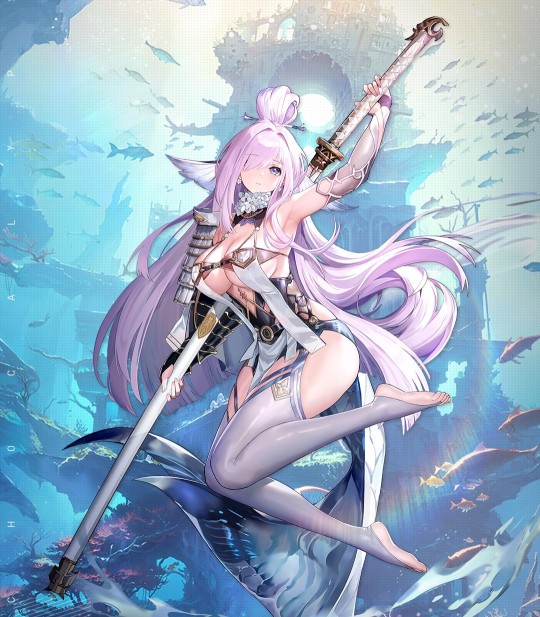
This character is posing with a weapon, a…particularly huge odachi in this case (I thought it was a staff at first until I saw the hilt). Which is exactly the same what Rodion is doing up there in the image we already handled. Yet, there are subtle differences between that image and this one, and it’s actually more minor than you think it is (disregarding the thematics of the pieces). Both characters…
are posing with an odachi of similar size (assuming that both characters are of similar height for ease of comparison) as opposed to being locked in battle; theoretically making the focus more on how pretty they look
have long hair (that, minus the bun and the bangs, have a similar cut) that makes their silhouette appear larger than it is
do have a relatively bright and sort-of detailed background going on
have large boobs
are unsheathing their weapon just slightly
However, to get to our first difference, we need to get back to point 1: clothing. Using the same two images, the largest difference is clothing. Kurokumo Rodion is wearing all-black clothing that covers her from the head down except for the unbuttoned top. If I had to describe what the other girl is wearing, I’d say she’s wearing a piece of armor on one of her arms, a flowered collar, thigh highs but no footwear otherwise, and something…obviously lingerie/bikini derived. I’m actually not sure if that’s a tail or part of the clothing.
But to return to our point: posing. The pose of Kurokumo Rodion is actually fairly neutral. She’s just standing there, menacingly! (I should note that their normal character talksprites are also just standing there neutrally) No, literally. Anyone with working legs and arms, can reproduce that. Just give them a sword prop and you’re done. Coat cape optional. The way she is standing does convey some sort of subtle confidence, however, just like the way she is actually looking down (at the viewer). It’s likely you’ll see the sword first for the reasons I mentioned when first discussing the piece above and then look at her from top to bottom as usual.
The way our other girl is posed…is a little harder to replicate in real life to say the least. Not only is this a floating pose (i.e you’d need support), the way her body is bent sharply brings the focus upon her boobs and butt. The human body is actually rather flexible, depending on how you’re built of course, but even so I do doubt whether anyone can do this pose even if they could somehow float in mid-air. Or do this lying down. I (someone with joints that are a little too flexible for my own good) haven’t tried and highkey don’t want to. The thigh and upper leg that is prominently on display, along with the way her body curves leads the eye to her butt or downwards towards her legs and feet.
Her facial expression is neutral, but I get some sort of… ‘dreamy’ vibe from it from the traditional anime-like proportions (huge eyes, tiny nose and mouth). Almost as if she’s doing puppy-eyes to beg for candy or something. It’s, well, what most people call to be a ‘babyface’. Kurokumo Rodion is also in ‘anime-style’ and her facial proportions are still a little bit unrealistic, but I do dare to say they’re more realistic than those of the other girl.
Also, small sidepath. What do you think the second girl is based off? One would judge from her tail that it must be some sort of water creature but whether she’s a shark or any other kind of sea creature isn’t really obvious. Would it surprise you if I told you she’s based on a bake-kujira, a SKELETON-whale (which sounds cool as all hell)? Without any kind of skeleton-parts worked into her design? To be fair, I wouldn’t have guessed it either if it were not for her canonical description.
Also, one last note about that latter image. I think that an odachi of that format would be extremely tricky to unsheathe in such a pose, because of the distance between your arms. Her arm that actually unsheathes the thing is also obviously reaching out, so she’d need more strength to do that than what the look of her arms suggest.
Speaking about arms…
On paper, our Limbus girls would have all the reason to have twig arms. After all, the City allows one to get stronger without visually changing their physique much. One can carry around huge weapons like chainsaws, lances and zweihanders without visible muscles. And yet. And yet.
One of the few times bare arms are seen (most art prefers to cover them up - for Limbus standards, this would be the ultimate fanservice thing), it becomes very clear that they at least have a basic tone. Like, the basicest of basic efforts is done to make them not look malnourished. Even if this girl above is not like, the strongest of the world (for as far as we know...) the muscles she does have are very lovingly shaded and detailed.
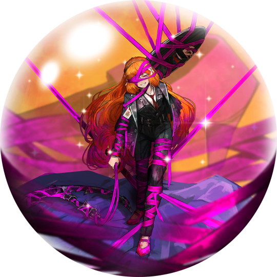
To end this, I’ll showcase something one last time with a funny in-game example: Roseate Desire. Roseate Desire is an E.G.O which wraps the wearer in pink ribbons and is highly implied to especially speak to the sin of Lust (which is the affinity of the attack). In the game, this E.G.O is given to two characters, a girl and a guy. In any other gacha game, it would only be given to girls.
While bent over and with a happy expression, she’s still coming to get you. How can you tell? For one, the huge anchor she has with her is within her hand (i.e opposed to it being tied up next to her or something like that), and the shield that’s tied to her arm. Despite being wrapped up, she does still look as if a portion of her is still in control, and her attack suggests the same.
Hong Lu wearing it always makes me grin. He does wear clawed gloves and his fingers are arched, that’s true, but the way he’s strung up like a puppet makes it so that he can’t even get you with those. The manner in which he is posed and his head is tilted is highly reminiscent of how one would pose a marionette. And ingame properly he doesn’t even use these claws in close combat! He wraps up the enemy in the pink ribbons with doll-like movement. Even the way he’s covered evokes a sense of powerlessness, like he’s led on by the ribbons instead of controlling them.
I think this example, along with the others, is implicative of how Project Moon’s visual portrayal of female characters is done so well. They’re equally portrayed as the male characters, if not arguably more powerful, and there’s an equal roster of 6 to 6. They’re not overtly sexualized by bare skin or impossible poses while the men are covered up in a sensible pose. These are characters designed for their personality and role first, not with fanservice or money in mind first. Even the female NPCs fit within this rule, even though they have less art to go from. When you have a game which had 97% completion on the story and a mere 64% on the systems (i.e monetization) it would kind of figure that character designs fall in line with the role the character fulfills, is it not?
175 notes
·
View notes
Text
DUE SOUTH 30 BELOW
@ds30below
Dessin d’après un screenshot de l’épisodes ”perfect strangers”
Drawing from a screenshot of the “perfect strangers” episodes
1er essais sur papier layout, essentiellement fait à l’estompe.
1st tests on layout paper, mainly done with stump.
La lumière de la série, beaucoup de clair obscure,encore plus présente lors des saisons 3 et 4, ainsi la l’image retravaillé par en HD ont influencé la technique.
The light of the series, a lot of chiaroscuro, even more present during seasons 3 and 4, as well as the image reworked in HD influenced the technique.
Essais sur papier à grain avec crayon pitt graphite matt, c’est horrible plus je regarde plus je vois les défauts !
Tests on grained paper with pitt graphite matt pencil, it's horrible the more I look the more I see the defects!
Petite référence au Vase de Rubin de l’épisode
Small reference to the Rubin Vase from the episode
And above all just a good little “quick” drawing exercise 😉
Et surtout juste un bon exercice rapide 😉
40 notes
·
View notes
Text

Altered State Chapter 34: Chiaroscuro II
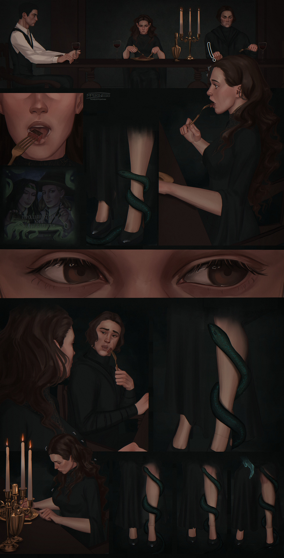
A vitriolic strain filled her chest as her veins tightened beneath her skin. She couldn’t peel her gaze away from the magnetism in his unblinking eyes—eyes that gleamed like black sapphires.
Sinister shadows and penumbra from scattered candlelight and the flickering fireplace moved across his knife-cut cheekbones, his hollowed cheeks, his defined jaw as he savored, chewed, and swallowed the rare meat.
Nothing about her compromised vision was soft or subtle tonight. Everything was harsh.
A sharp contrast between light and dark.
I'm excited to share this gorgeous art of the dinner party commissioned by the lovely @iamdronegirl (missrocklover) who is also translating Altered State into Russian!
These panels are painted by the very talented artist Imperiness: Instagram
It was even painted with the Chiaroscuro technique and really captured the theme! 🖤
#tomione#tom riddle#hermione granger#imperiness#hp fanart#absolutely amazing and I can't thank them enough
229 notes
·
View notes
Note
I finished chap 11...
I am so drained, I was debating if I should lock myself in a toilet cabin for the last minutes of my shift and I checked out right in the dot. My manager made a comment about it. What's with society and being expected to work longer than what is said on thr contract?
That entire last section with the poem and dissociation was so capturing. I am glad I left off yesterday at the scene where Bruce told Jason he could be legally alive again. Almost calling him Todd-Wayne.
Then Jay calling Bruce Dad. Ugghhhh my heart, the sugar. Which it highly needs with all the bitterness.
For me it already came of in the way that Jay did realize what is happening with him, with the zoning out on the cancer ribbon and the flashcards, and only accepted it when Jason read Narnia to him
~🔵
Hahahaha, yeah, it was a really draining chapter. It's a really draining fic, actually.
As a writer, I realized the way to make darker moments more impactful is by adding a light. Like the art technique Chiaroscuro. it makes it more dramatic, and it's kinda like those dreams where you're flying and then suddenly can't and you're falling and yeah.
yeah.
Writing dissociation is so much easier to than writing an actual scene. I can leave out so many details and it makes sense because they're dissociating
I live for Jason calling Bruce "Dad" if you can't tell yet. And younger Bruce said something along the lines of "I love you." when he hugged Jay.
And Bingo Bongo right on the Bullseye!! Jay's totally reasonable thought process was, "I'm just overthinking, if I stop thinking about it, it'll go away."
It did, in fact, not go away.
For anyone wondering, the fic is "In Every Universe; Still I Rise" I really hope I can get the next chapter up by next Friday
#jason todd#batman#batfam#dc comics#red hood#dick grayson#bruce wayne#ask me questions#ask me anything#asks#ask
21 notes
·
View notes
Text

Francisco de Goya. (1823). Saturn Devouring His Son.
"Saturn Devouring His Son," a haunting masterpiece by the renowned Spanish painter Francisco de Goya, stands as a testament to the dark and tumultuous depths of human emotion. This oil mural, completed between 1819 and 1823, portrays the Greek mythological titan Saturn (Cronus) in a horrifying act of filicide, as he ruthlessly devours his own offspring.
Goya's brushstrokes and composition exude an overwhelming sense of despair, madness, and terror, plunging the viewer into a world of macabre fascination. The dramatic chiaroscuro technique, with stark contrasts between light and shadow, intensifies the eerie atmosphere and enhances the raw emotional impact of the scene.
The central figure of Saturn dominates the composition, his hunched and twisted form expressing a malevolent frenzy. His grotesque features are distorted by agony and frenzy, reflecting the artist's skill in capturing the depths of human darkness. The crimson blood that stains Saturn's beard and hands serves as a chilling reminder of his savage act.
"Saturn Devouring His Son" is often interpreted as an allegory of the destructive forces of time, the fragility of life, and the futility of human existence. It serves as a reflection of Goya's own inner turmoil and the turbulent era in which he lived, marked by political upheaval and personal anguish.
#art#art details#art history#art academia#paintings#art detail#art aesthetic#classic art#romantic academia#dark academic aesthetic#aesthetic moodboard#dark acadamia aesthetic#dark academia#noir palette#aesthetic#aesthetic tumblr#light academia#tenebrism#fine art#european art#renaissance#renaissance art#baroque#baroque art#painting#francisco de goya#noirpalette
137 notes
·
View notes
Text
I'm pretty sure there's meant to be an embargo on press discussing Ripley until the 4th, but this Danish reviewer appears to have jumped the gun a bit.
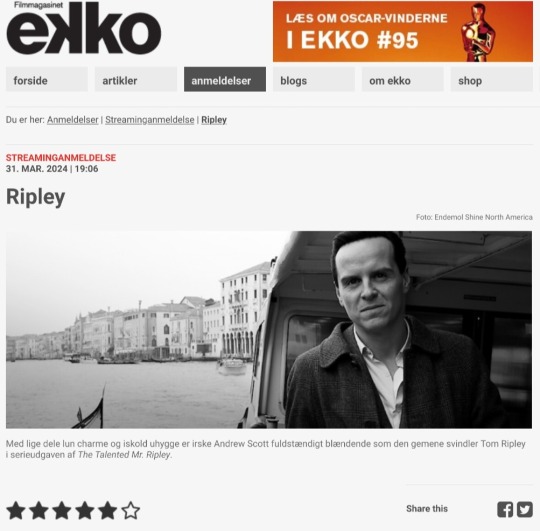
Aesthetically pleasing series with chilling Andrew Scott is a welcome alternative to the summer vacation-ready movie adaptation of Highsmith's thriller.
(English translation below the cut)
By Kristian Ditlev Jensen
Ripley is the title of Steven Zaillian's adaptation of Patricia Highsmith's recurring character Tom Ripley, who is the protagonist in five of her psychological thrillers.
The first book is the magnum opus The Talented Mr. Ripley, which has been adapted into several films. Most famously, the 1999 version starred Matt Damon and Jude Law.
The story is about a young conman, Tom Ripley, who hustles his way through life, but one day gets mistaken for someone else. He seizes the opportunity and gets the offer of a lifetime from Mr. Greenleaf, an elderly shipyard owner.
"Go to the stunning Amalfi Coast in Italy and find my son Richard Greenleaf. Persuade him to come home!"
In Italy, Tom quickly finds Dickie, as he is simply called. But instead of bringing him home, he murders the man and assumes his identity.
In a formidable double-cross, he fools everyone by pretending to be both Tom and Dickie when it suits him. All goes well until a police inspector from Rome starts to smell a rat. And soon the hunt is on for the perpetrator.
The journey takes them via Sanremo, Palermo in Sicily, Rome and Venice. But the the criminal is always gone, even though the policeman is actually sitting and talking to him!
Anthony Minghella's feature film is good, but it's also a legitimately summer-holiday-ready, box office-targeted take on the story of a con artist and low-life con man. Now this version finally gets competition from a far more uncompromising, over-aestheticized and visually astonishingly harmonious work, starring Andrew Scott (All of Us Strangers) with warm charm and icy creepiness.
It's not every day you see such a well-designed series, where everything from the dramatic choice to shoot in black and white, to the typography, to the production design of interiors and costumes is thought out down to the last detail.
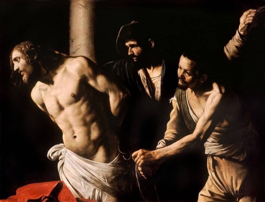
"The light. Always the light."
The line comes from a Catholic priest standing just behind Tom Ripley, who is looking at a Caravaggio painting.
Michelangelo Merisi, as the Italian painter was originally known, took his artist name from the village of Caravaggio near Bergamo. And it was he who coined the art term chiaroscuro - or clairobscur in French - in the years around 1600.
The term refers to a painting technique where dark and light are contrasted so that the images almost appear as black and white paintings.
Steven Zaillan - who wrote the screenplays for Schindler's List, Awakenings and Gangs of New York - has just modeled Ripley on the painter Caravaggio, who lived a dramatic life to say the least.
In 1606, Caravaggio stabbed pimp Ranuccio Tomassoni in the thigh with a small sword, causing him to die from the blood loss. The painter lived on the run for years before being pardoned by the Pope, but died immediately afterwards of a fever at the age of 38.
This story is on every level behind the series.
Ripley is shot in black and white, i.e. modern clairobscur, just like Caravaggio's own works. It's also about a criminal on the run and a murderer.
The story goes on and on.
In a key scene, there is a cross-cut between the historical Caravaggio sitting at a table with the murder weapon, a short dagger, and Tom Ripley sitting with a fountain pen in front of him.
In the twentieth century, you could kill with a pen. Today, you'd probably do it over the internet.
The whole analog universe that Steven Zaillian revels in - the series is set in the 1960s, while the novel was published in 1955 - is a stroke of genius. It allows him to work sensually with a wide range of things that seem to have disappeared today.
There are phone booths and people write notes to each other with pens. The typography is almost a tribute to the printed media in the form of newspapers, books, writings, signs, stamps, letterheads, patches of text, forms, checks and so on.
Similarly, shoes are a little story in themselves. And drinks. And ashtrays. At the same time, the declaration of love for the Amalfi Coast is so authentic it makes you dizzy.
The fact that the series is shot as something of an homage to the black-and-white king of them all, director Orson Welles, doesn't make it any less impressive. With a wealth of indirect and direct quotes from, for example, The Third Man, where the play of light and shadows on the walls of the stairwells play a major role.
Ripley is a rare true work of art on Netflix.
12 notes
·
View notes
Note
i love how you draw noses they look so good!! i love your art in general but the noses stand out to me especially! how did you get so good at it
honestly, i think the main secret to being a good drawer is just to look at the world a lot. every drawing i do unless it’s some bullshit doodle involves me looking at a bunch of different references, including stock photos and other people’s art, to figure out style, proportions, colors, etc. the vision of what something should look like that i have in my head is never going to be translated exactly onto the page (or in my case, my phone screen), so i have to figure out other ways to communicate those aesthetics onto the canvas (maybe some people are that talented at art, but im not).
but i don’t just look at photographs and artworks, i also look at people, at scenery, at the shapes light and shadow make when people talk, or move, or smile. i am constantly running a mental log of shapes in the world, how to take a 3D landscape and translate it into 2D through light and shadow, color and texture, angles and proportions. i look at all different kinds of art. i look for techniques i like, and think about how to actually accomplish those techniques. it requires constant experimentation and practice, and it requires curiosity and thoughtfulness, of honing a lens through which to see the world, as tapestry of shapes and lines and colors and textures.
as for noses in particular, it’s important to remember that noses protrude from the face (although of course the extent to which noses protrude varies from nose to nose), and that the secret to drawing a “good” nose is simply to communicate its dimensionality. to do so requires basic techniques of chiaroscuro (ie, light and shadow), so just try to notice how light hits a nose. ultimately, if you want to draw good noses you must study noses, if you want to draw good frogs you must study frogs, etc etc. it’s just a matter of noticing and analyzing the world in an artistic way.
#mrobot#asks#and even then im a bad person to ask bc ive never taken a single art class lmfao#not atla
25 notes
·
View notes
Text
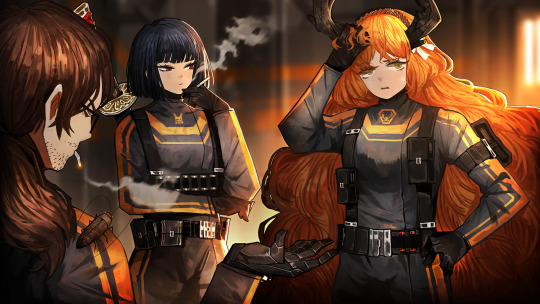
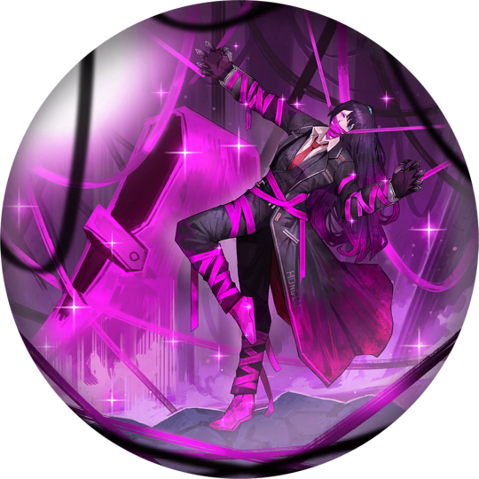
techniques used in Limbus art
High contrast between light and dark (chiaroscuro-adjacent), using light to draw the attention to the character.


(especially Ishmael with her long orange hair is good for this. I especially love how the light draws the attention to her head and staff, and she's fully covered despite being female and armored)
Contrasting colors, forming an interesting combination.


(first technique described is also present in the first three. in order: blue vs yellow, green vs red, green vs purple, blue vs red)
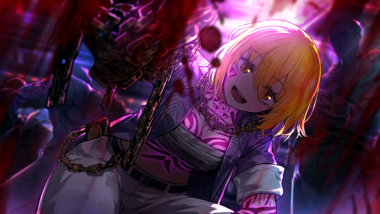
Greyscale base, with just a few traces of color forming the point of focus.
(contrast the grey outfit and bg with the colors and the red.)

(the few blue highlights draw attention to the character, and to the character in the back.)

(first technique described is also present. this time, the traces of color are seen on the hairtie, the hair of the other named characters, and ryoushuu's sword.)
126 notes
·
View notes
Text
This essay? Can you call this an essay? Surely you could but, you’re reading this on a tumblr post, so for now let’s call it an essay. This essay is going to be breaking down the cinematography techniques Sausage used in the opening to episode thirty one of his second Empires SMP season. I’m also going to go into why these work so well, and what they imply, a fair warning, this will be long, and I’m taking this 100% seriously. I’ll be using the correct terms for the things I’m talking about too, I’ll presumably have a list of definitions at the end of the post, and if it gets too long and I decide to not include that this link has every definition I will have used in this essay. Now that’s out of the way, let’s start from the beginning.
I’d like to first talk about the music, this is the first thing that really hit me when I was watching the episode for the first time (and the multiple rewatches I’ve done of the intro since then), and the effect it has on the person watching it depending on prior knowledge to Octagon as a whole.
Firstly, viewers of Ren and Doc’s season 8 will know that Octagon’s signature for their ‘cutscene’ music was very heavy metal inspired, it’s powerful music that The Octagon is absolutely deserving of, its intense sound helps the viewers understand what Ren and Doc are trying to portray. Octagon was built to utilise lightning as a powersource and employed game breaking technology in game to create some of its prominent features (Power Node 1, The OctaPortal, ect). Because of this, the shift to orchestral music as it’s introduction in Sausages opening is so incredibly interesting. Strings take the forefront of the music Sausage uses here, and strings are often used to portray elegance and grandiose, something Octagon wasn’t given in Season 8 itself. Octagon was threatening, but never elegant, always being added to, that process of violent construction the heavy metal symbolised is gone here, there’s nothing being added to The Octagon. And the music crescendos with each panning shot, emphasising the power this place holds, even just aesthetically, getting more and more powerful as it rises like a Wave. The dichotomy between Octagon's previous violent, aggressive and powerful portrayal through the music Ren and Doc use, and the elegant, imposing orchestral music Sausage uses, both to portray the same thing, is incredible. Octagon was awarded its elegance in death, and the music choices here reflect this beautifully.
People who never watched season 8, who have no idea what Octagon's whole deal was, are seeing this place in its tomb. It's an elegant coffin and that’s all they’ll know it for unless they go and watch season 8, and I think that’s wonderful, because it’s what Octagon deserved.
Next I’d like to draw attention to the shots in the opening itself, so we’ll start and progress through these in chronological order.
Firstly, we have a sweeping shot of the Lower left side of octagon, containing the base for the elevated boardroom, and the fully charged central power node, it’s an incredibly strong start to the episode, with the scale of Octagon being shown through the height of the warped vines that cover the islands floor. The wide angle shot used in this scene helps make the viewer feel small and vulnerable in comparison to the powerful elegance of The Octagons architecture.
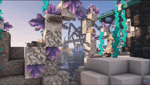
It then cuts to another, fairly low angle shot of the bridge, the sun is positioned behind the massive mechanical bacteriophage that holds up Octagon’s bridge, this shot utilises and amazing use of chiaroscuro and creates a sense of unease in the viewer, the blotting out of the light and the emphasis on the size of the structure continues to aide the threatening aura Sausage is clearly trying to portray. Both these shots (as well as many many other shots in this opening, utilise the ocean as a means to portray scale, the ocean is usually seen as quite a large and domineering thing, you can’t get much bigger than the ocean, however, due to the framing of the shots the ocean and surrounding landmass The Octagon sits on, completely dwarfs the viewable ocean. And it helps create a beautiful sense of unease, and powerlessness.
The next shot is my favourite in the entire opening, a tight, zoom shot of the inside of Octagon itself, the sleek glass flooring reflects the dark walls of The Octagon itself, and it really truly does present itself as an grandiose structure just due to the use of shaders, the slow zoom into the center of Octagon itself; It’s almost reminiscent of the evil lair in a spy movie. Octagon looks sleek, polished, the high walls and the tight shot create almost an air of claustrophobia, that’s only offset by Octagon's open roof plan, and the sheer scale of it, knowing the walls visible are three walls of eight. This shot really helps establish Octagon as a powerhouse and to indulge in a little anthropomorphism, a Baroness.
Our fourth shot is an Aerial view, with a high angle shot, a slow zoom out from the LOGZ Crane and its cargo. This high positioned zooming out from a central point really helps gauge a sense of scale here, only one and a half walls of the overall structure are shown in this shot, once again, using Octagon itself, and now the LOGZ Crane to dwarf both the island and the ocean around it. Our music is rising too as these sweeping shots help guide the eye to the important parts of the shot, adding to the mise en scene of the opening.
Moving on to the 5th shot in the opening, I’m actually going to talk about the music some more here, but this shot, a beautiful zoom shot of the bridge, covered by the calcite coral reef, is paired expertly with the introduction of a louder brass instrument in the orchestral score, these two elements together contribute to help provide that dramatic, powerful flair that Sausage is trying to convey in each of these shots. The music here perfectly fits the pace of the shot when paired with the illusion at a deep focus shot here on the Phange (sadly something not possible within the world of Minecraft). This continues to build up this sense of vulnerability and powerlessness in seeing The Octagon rising up out of the ocean. Sausage utilises a quick switch from a shallow depth of feel to a deep depth of field to create the illusion of a deep focus shot on the Bridge.
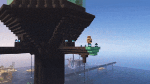
We now come to another of my favourite shots. Octagon’s right wall, with a slow pull out, with its name etched in the side in Bright Blue Copper. Once again the ocean is used to portray the sheer size of The Octagon here, with liminal land viewable, all these ocean shots help to aid a sense of loneliness that each of these shots have been oozing out. The Octaportal is visible in this shot, and very briefly, so is Sausage, the inclusion of Sausage himself is a powerful tool too, He’s almost unnoticeable against the sharp spires and spindly legs of Octagon, and it really does aid to this Real sense of unease, scale and the aforementioned vulnerability.
Here we get the near climax of our crescendo, the wave of music has ramped up as we focus our attention on Sausage, a close up shot on him that barely lasts a second, but is so important. Sausage is our protagonist here, He’s the character we see the world through, who we must trust to portray things as they are. He should be the most important thing in this shot, and yet our camera pulls out, and he is rendered unimportant against the violent architecture of The Octagon. Sausage isn’t important here, he’s a spec on the impact of this world, a visitor, an observer; and this sprawling, wide angled shot portrays this Perfectly. Sausage is not who we should be turning our gaze to here.
And at last our final shot. We are greeted with a tight centered view of the OctaPortal itself, a creation only possible through game breaking, a feat of this size deserves its own shot, we have another zoom in, a centered shot focusing entirely on the portal itself, where Ren emerges from, his clothing a stark contrast against the purple of the portal, Ren is in the Center of the shot. He is who we must pay attention to, he created half of this insane structure, in its threatening elegance and our focus is drawn to him.
However, in these two shots, an interesting thing happens. Our zoom out from the Sausage shows the scale of The Octagon. But the zoom in to Ren, focuses him in the shot, and yet never allows him to take up a large portion of it, it’s symbolic of how this was a monumental task, the workload and goal Doc and Ren carried on their shoulders was meant to be shared, not shouldered alone.
All of this together carefully rewraps Octagon, and gives it the recognition it deserved. Octagon was a Monumental feat, a beautiful mix of jagged violent architecture and classy elegance. This will be some peoples first introductions to The Octagon. This behemoth of a Building style, of a story, shared between Doc and Ren. And it feels cathartic to me as someone who holds Season 8 and The Octagon close to my heart, to have it be shown in the way, I presume, Ren and Doc wanted to present it too. It’s an amazingly well edited opening, the timings with the music and reveals of each section are utterly amazing, and Sausage, whether he intended to or not, created a beautiful homage to a silly corporation; that whilst it made no money, looked positively cool as shit
#wolf howls#empires smp#Hermitcraft#empires spoilers#rendog#docm77#mythicalsausage#I’m so sorry#but here’s the essay.#I’ll put this under a read more. soon. I’m on mobile
114 notes
·
View notes
Note
okay my brain isn't fully turned on and I have more to say on this subject that won't come out of my brain rn but ive been thinking about this for days and i need to share
I think trunks is like. he watches culturally important films, or like cult classics, a lot bc he feels it is a good way to expand his worldview or like just become more cultured. but by and large he does not like them.
oh for sure there's some he enjoyed. And there's a few where he's like 'Well, I didn't enjoy it, but i definitely think it was a good film. Just not my thing.'
meanwhile goten does not seek them out at all. he could not care less. BUT if Trunks is watching one when Goten wants to hang out, he'll sit his ass down and watch! He's not passing up a free fancy people movie!
And almost every time he REALLY likes it. And after every single one he goes on for like 30 minutes about Themes and Symbolism before interrupting himself to see if trunks wants to go get milkshakes.
and then after they get shakes trunks has to spend the night thinking about it. Why does goten seem to Get things so easily? Why does understanding worldviews he doesn't necessarily agree with come so naturally to Goten, when Trunks is actively trying?
Why won't Goten stop asking to see the movie where a disembodied head bites a girl in the butt (Hausu)??? Why does he think that's so funny????????????
PART 2: (Copy & pasted just to keep it all in one place)
okay i think i figured out the rest of what i wanted to say re: goten and trunks cultural movie bonanza
as an example it's not like goten knows what chiaroscuro is. but he DOES notice and enjoy how filmmakers use lighting to draw the eye to or away from stuff. He picks up on the little clues.
and once he starts watching enough of a certain genre he likes noticing how so-and-so film stands against the others. it's like i spy to him. and he likes hearing what a film has to say, under its layers. trunks talks like that sometimes, when he's doing business stuff. it's all code. it's mental stimulation
but Trunks is like UGH nobody has said anything for FIVE MINUTES can we PLEASE move the plot along. this is like a BUSINESS MEETING tbh. and it's not like he doesn't get the plot or, once he's taken a film class, the meaning of certain techniques. he just can't bring himself to care. AND THE MAN JUST WON'T LEARN HIS LESSON AND HE KEEPS WATCHING THESE DAMN FILMS.
also Goten like. he doesn't know these movies. his parents don't fucking watch movies. i mean maybe chichi watches like. romance and martial arts movies probably. he probably likes to compare himself to crouching tiger hidden dragon.
so he DOESN'T know what to expect!!! when trunks is like 'hey im gonna watch Citizen Kane or Vanishing Point or Deliverance' or whatever and goten says NEAT i would like to watch also and trunks is like 'I know. that's why i told you. come over around 4 okay'
and so goten doesn't have any sort of knowledge of these movies! it's exciting!!! bc the movies he saw growing up were his moms movies about kissing and punching and then whatever trunks took him to see in theatres. so like action and comedy and some horror. so it's new! it's fun! even when he doesn't really like the movie he's like 'well im glad i got to experience this new thing with my best buddy Trunks'
ALSO they watched Eraserhead once and goten sat there afterwards on the floor (he likes to sit on the floor) for like ten minutes chewing his lips before turning to trunks and saying something to the effect of 'Trunks. I'm worried about what kind of father you're going to be.' and trunks just sort of. sat there. and looked goten in the eyes for a while. bc he didn't have a response.
okay i think i got it all out of my system thank you for your time (i have been making my way through my movie bucket list so this is very strongly on my mind)
TL;DR: Trunks watches classic and high-rated movies becasue he thinks that he's an intellectual / because he's interested in increasing his cultural/artistic literacy & expanding his worldview. But he doesn't really enjoy most of them. And it is Goten who actually is able to see through to the heart of the film, exercise deep empathy, and reap delight at the tactics of storytelling unique to the medium. He's like WOOOAH SO COOL & MEANINGFUL .. (offers a critical analysis perfectly, that is sensitive and insightful). And Trunks is like wtf .... (stays awake at night pondering his deficits.)
DBALLZ COMMENTARY:
I WANT TO BE GOTEN ...
From what I'm gathering he A.) Has the capacity to UNDERSTAND what he's seeing B.) Has the capacity to ANALYZE/INTERPRET what he's seeing C.) Has the heart to EXPERIENCE the movie in full and D.) Has the faculty to ARTICULATE/VERBALIZE what he's experiencing.
Goten no doubt is lacking a lot of cultural and artistic context, but he makes up for it with his observant eye, and then over time what he gathers from one movie transfers to the next and he's able to feel even more moved and offer even more insight ....
It's because his heart is open .. Trunks is trying too hard without realizing it. And you can't have an open heart when there is inner pain that you're not aware of. That's what I think about Trunks .... his trying to be someone he's not (a movie-savvy type of guy) is entirely self-removed without intending to be... He thinks it's self-improvement but really he's being entirely daft to what intrigues his mind and what would really facilitate his growth. And he can't be open-minded toward others if he can't be open-minded with himself.
But the format of movies I guess really works for Goten, they're not usually longer than two hours and they're faster paced than say a novel and they're colorful and they have a lot of movement and the mode of drama-deliverance is altogether captivating for him .... They can communicate a lot with a few small visual or auditory details and Goten is hip to just picking up on those, because he's genuinely engaged and enjoying himself.
But Trunks has elected to adopt this hobby on an intellectual principle. But all the rest of him is like ehhhh whatyever. He probably likes sitting and chilling and eating popcorn. But there's a lot he's not into. It's just not his medium. Just doesn't work for him
I also think that part of it is that Goten notices a lot of things just because they are new to him. Trunks has been watching movies his whole life. Menahwile Goten has been only watching the movies of LIFE ... The lighting of the sun and the pacing of the seasons <3 Also Ponyo
So the whole thing is new and he's like "WOOOOAH .. SO COOL HOW the camera was so high in that shot so that it made me feel tall..... really shows you how small the character feels..." And Trunks just like Didnt notice that
Also trunks just DOESNT CARE !!!! But he doesnt know that he doesnt care. SILLY!!!!!!!!!!!!!!
I like this part regarding Goten: "He picks up on the little clues. and once he starts watching enough of a certain genre he likes noticing how so-and-so film stands against the others. it's like i spy to him. and he likes hearing what a film has to say, under its layers. trunks talks like that sometimes, when he's doing business stuff. it's all code. it's mental stimulation"
Thats such a way to put it .... Goten is being such a genius rn. He would liken it to the mysterious business-speech. IT'S ALL CODE. IT'S MENTAL STIMULATION.
I don't know any of these movies but I do agree that Goten would sit for 10 minutes and then say that to Trunks ... It's like him to assume that Trunks would be a father one day becasue that's just natural to him that's just life.
When this all started I think that Trunks was like "You sure you wanna watch this with me? It's not like Kung-Fu Panda or anything."
And Goten said "Are you kidding? I LOVE your movies. They're like delicate poetry being told through the form of telenovelas."
Becasue the only life-action TV Goten had been exposed to before was his mother's telenovelas.
I don't really agree with this next part but it's obligatory.
Goten would pick up that Trunks isn't enjoying the movies as much as Goten is, before Trunks even gives proper acknowledgment to his boredom. Trunks just keeps watching them and Goten respects that and doesn't think about it much, but eventually it must be pointed out that hey, Trunks isn't getting as much out of these as Goten is.
Maybe he keeps inviting Goten over so that Goten can tell him what the movie is about. That would make sense. But really I think that Trunks just likes to chill out with him.
But the way that Goten woiuld crunch the numbers in his head (if he's ever removed enough from the movie to ponder) (maybe during a pee break or something) is "He doesnt like the movies. He keeps watching the movies. He keeps inviting me to watch the movies. He doesnt like the movies. But he always invites me. Why do people watch movies with somebody if they don't like the movies? As an excuse to be with them. He just wants to hang out with me."
But he would take it too far and he would fall on the couch next to Trunks and start kissing on him sweetly and when Trunks goes like WHAT Goten says "you dont even like the movies. You just want to hang out with me and eat popcorn."
And the most self-awareness that Trunks had exercised about this whole thing was when he was wondering why he sucked such shit at watching movies compared to Goten. He never really thought about WHY he was doing this to begin with. And so he's doing some hard calculations in his head meanwhile Goten nuzzles him like a pigeon
11 notes
·
View notes
Text
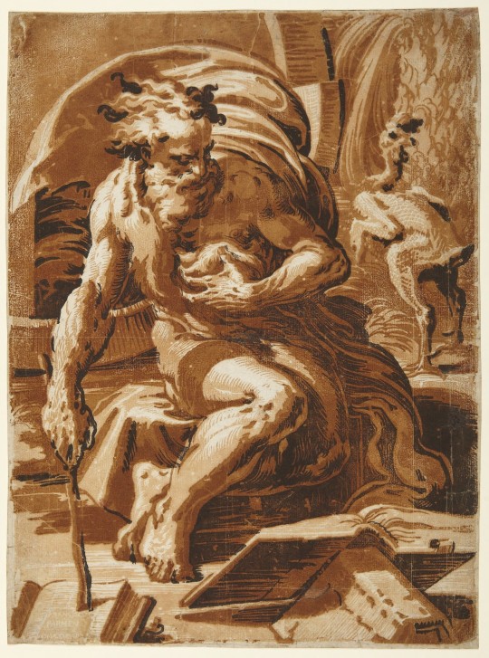
Ugo da Carpi (act. 1502–1532), after Parmigianino (1503–1540), Diogenes, chiaroscuro woodcut.
Princeton University Art Museum
«Considered to be Ugo da Carpi’s masterpiece, this composition is based on a design by the northern Italian painter Parmigianino. It shows the ancient Greek Cynic philosopher Diogenes, who relinquished all earthly goods in favor of a life of meditation spent in a wooden barrel. The plucked chicken at right refers to Diogenes’s mockery of Plato’s definition of man as "a featherless biped."
Ugo da Carpi was the first Italian artist to master the chiaroscuro (literally, "light and dark") woodcut, a printing technique invented in early sixteenth-century Germany, whereby color was added through multiple blocks of successively darker tones. The result was a rich three-dimensional tonal effect that imitated brush-and-wash drawings by artists such as Raphael, Titian, and Parmigianino.»
9 notes
·
View notes
Text
SpongeBob and Water (our, “things we like.”)
Names: Hayko Reyes, Melanie Dominguez, Kasandra Romagno, Louie Cruz
Luminanation - to illuminate, light up
Figurative art - describes artwork (particularly paintings and sculptures) that is clearly derived from real object sources and so is, by definition, representational. The term is often in contrast to abstract art:
Wet on wet - wet on-wet, or alla prima direct painting or au premier coup, is a painting technique in which layers of wet paint are applied to previously administered
chiaroscuro - the treatment of light and shade in drawing and painting
Landscape - depicts the natural world, focusing on the ground and sky as well as trees, mountains, and water
Character design - simply a study, is a document used to help standardize the appearance, poses, and gestures of a character in arts such as animation, comics, and video games.
analogous colors - groups of colors that are next to each other on the color wheel
characterchure - a drawing that makes someone look funny or foolish because some part of the person's appearance is exaggerated.
Cartoon - a simple drawing showing the features of its subject
Impasto - is a technique used in painting, where paint is laid on an area of the surface thickly, usually thick enough that the brush or painting-knife
9 notes
·
View notes
Note
spreading the adriana imai/skull merchant agenda, i'm here to request <3
adriana imai x fem reader? if you need inspo msg me!!
Chiaroscuro

Pairing : Adriana Imai x fem!reader
Cw: blood, gore, canon-typical violence, torture, murder, death, kidnapping, The Skull Merchant is a simp, tell me if I missed any.
Wc: 1.3k

A being of intelligence and cunning, Adriana knew what she wanted and how to get it, a creature of plans and technologies. She was a genius at her craft, wringing head after head to her growing masterpiece - a modern Leonardo. Her ingenuity and patience for attention seemed to win her everything she wanted: fame, money, blood and a reputation with the darker side of the world. Adriana took and took, pinning her eyes on something that had caught her attention and planning her way to get ahold of it.
She's a demon of two sins. The greed for money and the lust for fame. The greed for heads and the lust for blood. One was a means to an end and the other was the reward she reaped from the former. With money came fame. With deaths came blood.
She wasn't exempted from human attractions - distractions in her case. She liked pretty things, objects of fragility that hid secrets. She also liked dangerous things, making a hobby of stealing from others. She valued what she took, either pretty or dangerous, the pride she felt grow when they became hers.
Perhaps that's why she liked you so, the little artist that painted the most majestic piece of art she'd ever laid her eyes on. The graceful strokes of red and salmon, blended with the dark brown and black that struck the viewers with awe and adoration. The sticking contrasts of light and dark in your paintings made it come to life, like an image of your thoughts and imagination. The creation of a beautiful mind displayed for the world.
Every piece, every collection, every test was bought in her name. Her penchant for beautiful things had forced her hands into buying your work. She was your most beloved patron, a supporter of your work in the time of contemporary art that showed expressionism and conceptual art in waves. It prioritized newer art styles rather than the older ones, pushing back baroque, sfumato, chiaroscuro, classicism, etc
She wanted to know how your mind worked, how your technique made it looks real and how you came to this. She knew you were a freelancer, painting only whenever you felt the sparks of inspiration in your soul. She knew you came from a low-income family from a low-security area - much like herself. She could see the correlation between your art and your life, the darkness and the crimson in them, the heaviness and the dread from the simplest depiction of blood, and the trepidation and thrill from the bodies.
She wanted you, she wanted your mind, she wanted your hand, she wanted your paintings. You, it was you. You were the cause of her obsession, of her hunger, of her doom. You filled her thoughts as much as your paintings did. She wondered what she would find if she cracked your skull and peered into the soft tissues of your brain. Would it be the secret to your prodigious work? Would it be the answer to her obsession? Would it be the answer to your life? Would it be the link she felt between you both?
She couldn't stop herself, she'd gone as far as watching you and following you. In the darkness of the night, she would watch you tread carefully between alleys, and stalk you as you made your way through the city. Then she would watch you at home and your workshop, through the lenses of the surveillance cameras, Adriana watched you skip stairs with a heavy bag, an excited smile gracing your lips and a new, blank canvas under the other arm.
Your colour of choice was red, a deep crimson that reminded her of the ichor that breathed life into their bodies. A beautiful, glistening red that seemed a little too water to be acrylic or oil paint. Cans of freshly-opened or used paint littered the floor and walls of your workshop, red spilling from the edges, rolling down steadily when you cracked the lids open. Like blood, it stained the floor with red and brown spots.
She watched you dance around your canvases, hands twisting and bending like the body of a dancer, gracefully and fluently. In a fortnight, you'd have it finished, protected under a thin veil of cloth that hid it from prying and ecstatic eyes until the moment of unravelling. Be it flowers, a river, a plain, a forest, a person or a sky, it would be grand with the red shades.
If you needed black, you'd pour black. If you needed pink, you'd pour white. If you needed salmon, you'd pour yellow. You added your precious red to everything you used, the corners of your lips perking in a satisfied and awed smile.
Adriana wondered what was so special about your red, or why you returned with new cans every time you started a new painting. You always returned late with two freshly-opened paint cans and a canvas. It was suspicious, and it drove her insane.
Could she make you smile like that? Could she make your lips curve elegantly and prettily? If she was special, you'd approach her, no? She wanted to be like those random people from around the world that came to see your exhibitions and made you turn your head or catch your eyes. She wanted to be like them, but then, they all disappeared, as if they never existed (of course she knew they did, their physical form might've vanished, but their history and existence would never go unnoticed by her).
It made her curiosity perk. It drove her insane. She dared to follow you closer, threading a thin line of darkness behind you. Darting between shadows and corners like a common thug, it was self-degrading yet fulfilling - a means to an end.
Your secret. Their disappearances. The red paint. Your smile. Your inspirations.
It was filling, the moment Adriana caught a glimpse of the syringe tucked into the hem of your sleeve glinting under the yellow streetlight. Her heart swelled, her black, wretched heart pulsed with triumph and adoration. The red, the paint, it was blood. Your inspirations, the image you created through their last words, through the pain and sorrow they showed. Your secret, the murderous tendencies you felt when you painted.
She was thrown off her feet, the supporting pillars of her life falling apart as she followed you back. She had your secret, the dark secret you kept close to your heart was known to her and her alone. She truly had something that connected her to you. She wanted to be a part of your life, in the best ways she could.
She could hunt, capture and kill. You would bleed them dry and paint them in the throes of agony, making the most beautiful masterpieces known to her (the world too, she surmised, seeing that so many people came to see your work).
Adriana liked the sadistic grin when you cut their skin, watching the ichor bleed from the wound and into your new can. The gleam of your exacto knife under the white lighting of your basement and the dread in the eyes of your new inspiration was spine-chilling, making her knees weak and her mind dream.
She wanted to be behind you, an arm wrapped around your hip, body flush against yours as she led your dominant hand - holding a knife from her collection - near the skin of the person you caught together. Driving her knife into their heart, fingers intertwined and face mere millimetres from one another, close enough to touch, but too far to kiss. She wanted to be a part of your story and work.
"Hello, Miss Imai," you greeted her, head bowing lightly. Your smile illuminated the room, making you the center of her attention (not that it wasn't since she first stepped into the gallery). "I was wondering if you could join me tonight. I'd like to personally thank you for being my most loyal patron amongst them all."
The eager gleam in your eyes showed her your thoughts, the need to have her, to show her your work, to bring her into your life. You knew. You knew and she couldn't be any happier.
"You know," Adriana breathed, almost worshiping.
"Of course, you're my favourite, after all."
"Yes, please."
#x reader#dbd fanfic#dbd x reader#dead by daylight x reader#dead by daylight#the skull merchant#dead by daylight x you#fem!reader#adriana imai#Adriana Imai x reader
36 notes
·
View notes
Text
Project : Movement
Week : 15th Jan - 19th Jan
Artist Research : Caravaggio
From the Baroque period, Caravaggio is famed for his use of the ‘Chiaroscuro’ painting technique. A method that creates strong contrasts between light and dark. These deep shades and bright highlights emphasise the figure and their gesture, while also adding drama to the piece.
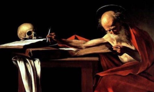
Caravaggio perfected Chiaroscuro. His figures looked realistic and lifelike, due to this technique of accentuating light and dark tones. But he also used Chiaroscuro to develop his subject matters of biblical stories, depicted in a dark manner.
I’m influenced by Caravaggio’s methods, as the picture reference for my painting this week is similar to his dark style.
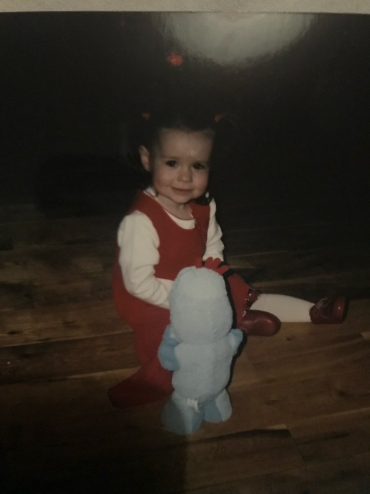
The background is completely shadowed, meaning the figure of me as a child is highlighted. The entire figure is the focal point. I think I can learn from Caravaggio’s techniques, by using extreme dark and extreme light paints to create a contrast.
11 notes
·
View notes
Last Seen Blogs

nlifestyle1
Untitled
ratliffwaller20
Ratliff Plays Around
yan-may-fire
ƆᴉN∀Ԁ

yelloweyedd
𝕁𝕦𝕡𝕚𝕥𝕖𝕣 🌟
shinkiiro
𝕵𝖚𝖑𝖎𝖆