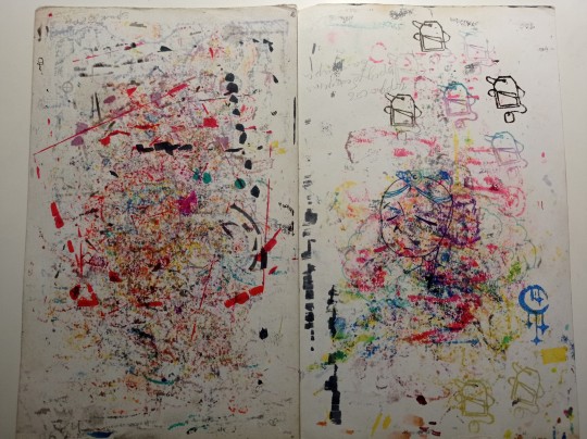
#do a gradient in markers
Text

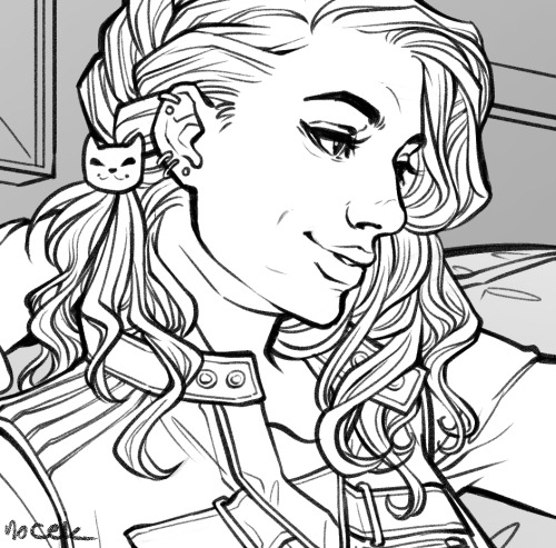
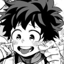
design from @buggachat 's bakery au
#do a gradient in markers#my brain says#it'll be fun#it says#apparently it works only if you push your paper to the absolute limit#miraculous ladybug#fanart of fanart
3K notes
·
View notes
Text
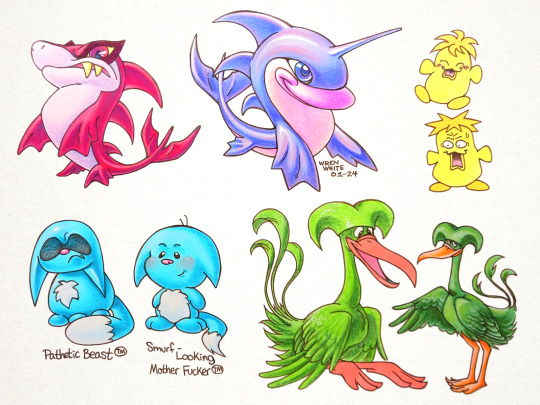
i've become somewhat obsessed with the oldest versions of some neopets' designs. i really vastly prefer the old jetsam and flotsam, as well as the old design for lenny. the updated lenny stripped it of its jester-like design elements which, imo, muddled and confused the point of its design. i liked its old jester hat and slightly curly toes, as well as its large, floppy-looking, goofy face.
also, i thought the oldest version of kacheeks was really funny. the drawing was kind of meant to be a visual joke, like, an over-rendered and uncannily shiny, but super simplified character like in ancient 3D art. but i feel like it doesn't really come through. oh well lol.

to tell you the truth, i don't really like the official art of ogrins. but i do think their design has potential (despite being somewhat wasted, lol). after all, they are a very odd and unique take on chimeras, being a cross between a goat, a tiger, and with other elements that don't have anything to do with real animals (their ears and tail make me think of fraggles).
regardless, they're really fun to draw.

this was a test drawing i did with the purpose of using glitter nail polish to see how it would look applied to a piece of art. surprisingly, not bad in photos, but obviously much more appealing irl. this would make great decorations to put on stuff like con badges. if only i ever went to cons, lmao.
#neopets#fanart#art#colored pencils#markers#traditional art#jetsam#flotsam#chia#kacheek#lenny#ogrin#kau#o ya also i used a paper texture for the bg in the first pic cuz pure white looked bad to me#i always want to erase the bg bc i don't like the gradient phone pics always have#but i also hate how the pure white looks next to the textured art#so i just stuck a texture in there#i'll probaby do that from now on to make it look more natural and less distracting
160 notes
·
View notes
Photo

Cryptids & Creatures of Folklore Day 12 — The Hadjel
The Hadjel is a mysterious feline said to live in the Guera Massif area of Chad, Africa. It is described as being a black lion of enormous proportions with a short tail like that of a hyena and a pair of truly massive canine teeth. People who first reported encountering the creature claimed they were frightened by its enormous size but soon realized that it had a difficult time opening its mouth due to the large teeth. They said it only hunted small prey and had to eat very slowly.
#drawtober#cryptids#cryptozoology#lion#illustrations#monsters#hadjel#art#blood#was planning to do more with the background but I was struck down with a migraine today :/#so I just practiced my marker gradient skills instead lol
89 notes
·
View notes
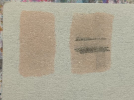
Text
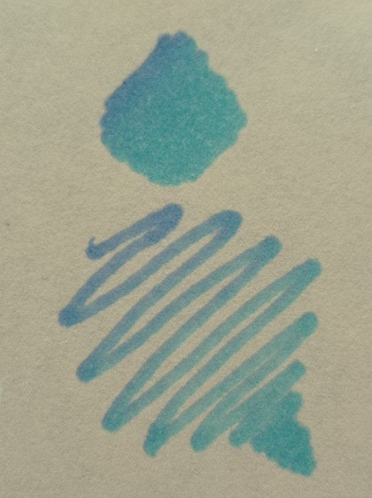
Sometimes… blending markers is hard
#I mean like. idk man! sometimes certain colors don’t blend together as well as other#or u need to start blending quicker to actually get a nice gradient#or u need to color a large expense w no line breaks. so like. the ability to visualize exactly what u want is more difficult#do u end up adding more after its dry#and sometimes the no pigment blending marker can help if u aren’t fast enough to blend without it#but then. it’s rlly easy to use that and accidentally just make all ur colors lighter!#so. yeah#I need to start incorporating colored pencils more ghghg. I bought some I just haven’t used them yet#they would probably help me get nicer gradients even if I screw up the markers ghgh#but. yeah. basically. this is a psa#srry the quality of my traditional coloring varies wildly from picture to picture. markers are difficult sometimes ghghg#pepper words#there’s some typos in these tags but u kno what I’m trying to say just ignore them ghghg
8 notes
·
View notes
Text
My Favorite Cheap Art Trick: Gradient Maps and Blending Modes
i get questions on occasion regarding my coloring process, so i thought i would do a bit of a write up on my "secret technique." i don't think it really is that much of a secret, but i hope it can be helpful to someone. to that end:

this is one of my favorite tags ive ever gotten on my art. i think of it often. the pieces in question are all monochrome - sort of.

the left version is the final version, the right version is technically the original. in the final version, to me, the blues are pretty stark, while the greens and magentas are less so. there is some color theory thing going on here that i dont have a good cerebral understanding of and i wont pretend otherwise. i think i watched a youtube video on it once but it went in one ear and out the other. i just pick whatever colors look nicest based on whatever vibe im going for.

this one is more subtle, i think. can you tell the difference? there's nothing wrong with 100% greyscale art, but i like the depth that adding just a hint of color can bring.
i'll note that the examples i'll be using in this post all began as purely greyscale, but this is a process i use for just about every piece of art i make, including the full color ones. i'll use the recent mithrun art i made to demonstrate. additionally, i use clip studio paint, but the general concept should be transferable to other art programs.


for fun let's just start with Making The Picture. i've been thinking of making this writeup for a while and had it in mind while drawing this piece. beyond that, i didn't really have much of a plan for this outside of "mithrun looks down and hair goes woosh." i also really like all of the vertical lines in the canary uniform so i wanted to include those too but like. gone a little hog wild. that is the extent of my "concept." i do not remember why i had the thought of integrating a shattered mirror type of theme. i think i wanted to distract a bit from the awkward pose and cover it up some LOL but anyway. this lack of planning or thought will come into play later.
note 1: the textured marker brush i specifically use is the "bordered light marker" from daub. it is one of my favorite brushes in the history of forever and the daub mega brush pack is one of the best purchases ive ever made. highly recommend!!!
note 2: "what do you mean by exclusion and difference?" they are layer blending modes and not important to the overall lesson of this post but for transparency i wanted to say how i got these "effects." anyway!
with the background figured out, this is the point at which i generally merge all of my layers, duplicate said merged layer, and Then i begin experimenting with gradient maps. what are gradient maps?
the basic gist is that gradient maps replace the colors of an image based on their value.

so, with this particular gradient map, black will be replaced with that orangey red tone, white will be replaced with the seafoamy green tone, etc. this particular gradient map i'm using as an example is very bright and saturated, but the colors can be literally anything.

these two sets are the ones i use most. they can be downloaded for free here and here if you have csp. there are many gradient map sets out there. and you can make your own!
you can apply a gradient map directly onto a specific layer in csp by going to edit>tonal correction>gradient map. to apply one indirectly, you can use a correction layer through layer>new correction layer>gradient map. honestly, correction layers are probably the better way to go, because you can adjust your gradient map whenever you want after creating the layer, whereas if you directly apply a gradient map to a layer thats like. it. it's done. if you want to make changes to the applied gradient map, you have to undo it and then reapply it. i don't use correction layers because i am old and stuck in my ways, but it's good to know what your options are.

this is what a correction layer looks like. it sits on top and applies the gradient map to the layers underneath it, so you can also change the layers beneath however and whenever you want. you can adjust the gradient map by double clicking the layer. there are also correction layers for tone curves, brightness/contrast, etc. many such useful things in this program.
let's see how mithrun looks when we apply that first gradient map we looked at.

gadzooks. apologies for eyestrain. we have turned mithrun into a neon hellscape, which might work for some pieces, but not this one. we can fix that by changing the layer blending mode, aka this laundry list of words:

some of them are self explanatory, like darken and lighten, while some of them i genuinely don't understand how they are meant to work and couldn't explain them to you, even if i do use them. i'm sure someone out there has written out an explanation for each and every one of them, but i've learned primarily by clicking on them to see what they do.
for the topic of this post, the blending mode of interest is soft light. so let's take hotline miamithrun and change the layer blending mode to soft light.

here it is at 100% opacity. this is the point at which i'd like to explain why i like using textured brushes so much - it makes it very easy to get subtle color variation when i use this Secret Technique. look at the striation in the upper right background! so tasty. however, to me, these colors are still a bit "much." so let's lower the opacity.

i think thats a lot nicer to look at, personally, but i dont really like these colors together. how about we try some other ones?

i like both of these a lot more. the palettes give the piece different vibes, at which point i have to ask myself: What Are The Vibes, Actually? well, to be honest i didn't really have a great answer because again, i didn't plan this out very much at all. however. i knew in my heart that there was too much color contrast going on and it was detracting from the two other contrasts in here: the light and dark values and the sharp and soft shapes. i wanted mithrun's head to be the main focal point. for a different illustration, colors like this might work great, but this is not that hypothetical illustration, so let's bring the opacity down again.

yippee!! that's getting closer to what my heart wants. for fun, let's see what this looks like if we change the blending mode to color.

i do like how these look but in the end they do not align with my heart. oh well. fun to experiment with though! good to keep in mind for a different piece, maybe! i often change blending modes just to see what happens, and sometimes it works, sometimes it doesn't. i very much cannot stress enough that much of my artistic process is clicking buttons i only sort of understand. for fun.
i ended up choosing the gradient map on the right because i liked that it was close to the actual canary uniform colors (sorta). it's at an even lower opacity though because there was Still too much color for my dear heart.

the actual process for this looks like me setting my merged layer to soft light at around 20% opacity and then clicking every single gradient map in my collection and seeing which one Works. sometimes i will do this multiple times and have multiple soft light and/or color layers combined.
typically at this point i merge everything again and do minor contrast adjustments using tone curves, which is another tool i find very fun to play around with. then for this piece in particular i did some finishing touches and decided that the white border was distracting so i cropped it. and then it's done!!! yay!!!!!
this process is a very simple and "fast" way to add more depth and visual interest to a piece without being overbearing. well, it's fast if you aren't indecisive like me, or if you are better at planning.

let's do another comparison. personally i feel that the hint of color on the left version makes mithrun look just a bit more unwell (this is a positive thing) and it makes the contrast on his arm a lot more pleasing to look at. someone who understands color theory better than i do might have more to say on the specifics, but that's honestly all i got.

just dont look at my layers too hard. ok?
1K notes
·
View notes
Text
Rain World Art Month Day 23 - Pearls

I had this idea as an old drawing from months ago (which unfortunately got accidentally deleted when my files were being weird), so I decided to bring it back for this prompt.
It's also another exploration of applying the traditional colored pencil/alcohol marker process in a digital format, with pretty good results (though it took like 4-5+ hours with 15 layers...)! I'm mainly just glad I could find a good color palette for this; I like throwing blues into my art but I have to figure out how to make it work well with Five Pebbles's naturally warm design, in which I also want the pretty oranges and pinks to shine too. Never underestimate the power of overlay gradient mapping in this scenario!
But anyway, I'm glad I got another chance to practice more advanced light/shadow techniques. And of course, another reason to draw Five Pebbles is always great!
-.-.-.-.-.-.-.-.-
P.S. I'm thinking of showing the WIP images of this to do an updated personal digital art process/tutorial thing! What do you think?
#art#artwork#artists on tumblr#drawing#digital#digital art#digital painting#painting#fanart#rain world#rw art month#rw art month 2024#iterator#rw iterator#five pebbles#FP#rw fp#quetzalli draws
144 notes
·
View notes
Note
Sorry, I know next to nothing about dog training.
How does the "try again" command work? Do your dogs understand that this means they didn't complete their task and to do it again, and how would one go about learning their dog that command?
It's called a no reward marker, and it effectively means that whatever they just did is not what I asked them to do, so try something else because they're not getting a treat for that.
Markers are great tools to teach dogs what we do and don't want as far as behavior goes. Most people are familiar with markers like "good" or "no", vs "try again" which is one of a series of markers that tells my dogs if the behavior they just performed is what I'm asking for. There's also "close" "almost" "not quite" "no thank you" and "what was that" as varying degrees of correct vs incorrect. Sort of like a game of hot or cold, he's learning to move his body the way I'm cuing him to do, but I'm asking him to puzzle out exactly what was wrong or right about the way he moved in response.
This is less of a thing you just teach your dog and more of a foundational building block on one's approach to obedience. For Fenris I knew I wanted to do a lot more shaping and puzzling through like this than exact precision work right off the bat, because I found a lot of success with that method for quite a few of my client dogs as well as my current set of girls. Creed, my previous doberman, never really fully got the hang of this until he was already close to middle aged, but I also think I lacked the training chops at the time to really understand the method I'm using here.
As a result, this is built from the very beginning, where as a 10 week old puppy I was asking him to do things and telling him a gradient of phrases for whether he did them correctly or not.
68 notes
·
View notes
Note
What’s your render process? It’s so pretty ^.^
Hehe thank you!!!
I'll use an out-of-context Night drawing to share the process XD
So first I'll make my sketch, line art, and then my flat colors. A lot of the time, I'll add in some gradients and subtle glow at this stage just to add in some more color variation for when rendering comes around. I also dont draw in all the details yet — like the string that'll be around his brooch later or his face marks. Whatever I feel like will get in the way of the painting process and will be easier to add in later, i leave out for now.
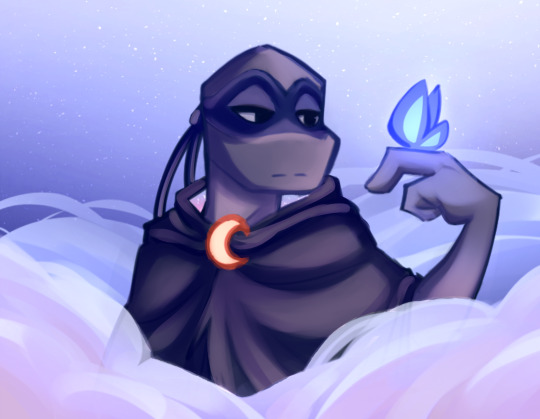
Now the ✨️ugly portion.✨️ For the lighting and shading, I use a paint brush. For the shadows, I'll usually pick them from the wheel myself, rather than using a Multiply layer. Then, for the lights, I'll almost always use a nice bright orange color on a Luminosity layer (note that this is on Paint Tool Sai — the equivalent to Luminosity is an Add layer on most other programs) and slap those on where I think the lights go.
Shit's really messy at this point djejejwj but that doesn't matter toooo much. 80% of the drawing comes from the next step, the painting. It doesn't matter much if ur lights and shadows are messy rn cause it's gonna get all cleaned up anyway aha.

And now we're onto the painting, and this is the point where we merge everything down into one layer and start going ham :0. Usually, what I do is I take Paint Tool Sai's Water brush + Marker brush and start blending out all the colors and cleaning everything up. I color pick whatever part of the drawing I wanna clean up, then I'll blend it out and define the shapes until i feel satisfied with how it looks :DD this part of the drawing took around 2 to 3 hours maybe? Like I said, this is most of the drawing process aha
AND NOW THE BEST BIT, THE COLOR CORRECTION AND FINAL DETAILS !! This is where I make the glowy bits REALLY glow, and make the colors look a little more cohesive :0. Also, I up the contrast more, make them darks look darker and them lights look lighter >:D
And that's pretty much it, I think 🤔🤔 if there's anything anyone would like me to go into more detail with, I'm more than happy to answer :0 I like playing art teacher hehehehehe ❤️❤️✨️✨️
271 notes
·
View notes
Text
Tutorial for @mimssides
How I draw with alcohol markers. Beginner edition
First off all I want to specify: this is based on my experience only, so take it with caution. This is also my first tutorial ever.
1) Have an underpaper.
Unless you use some really thick paper, markers will bleed on your next page or table ( depending if you're drawing in a sketchbook or not). I recommend to have one list of some decent paper under the page you're drawing on. Decent means thicker than office paper, can be watercolor paper, it usually perfect for it. It's reusable and over the years mine two look like this:
( you can see there's a lot of stuff going on there)
2) Always, and I mean ALWAYS erase your sketch.
If you're doing a quick try out of color combinations you can skip this step, because you don't need the aesthetic or anything. I'm not sure how useful this tip is for colored pencils ( cuz I never sketch with those), but with regular graphite pencil it's very much important. Graphite smudges your markers, and not only that. It also gets trapped if you go over it with a marker, meaning you wouldn't be able to erase it and it's going to leave you with gray smudges all over. Truly awful.
3) Have your pallets on the same paper you draw on. Or simply - have pallets!
Colors can show differently on different paper, that's why it's important to do color swatches once you buy your markers. They are designed for specific paper, and on your paper they can look a lot darker or really pale. I recommend testing colors before you buy them, it's usually an option in the most craft stores. If you're buying a set just take 30 minutes to do all the swatches and naming them. It also helps visually to see what colors you have.
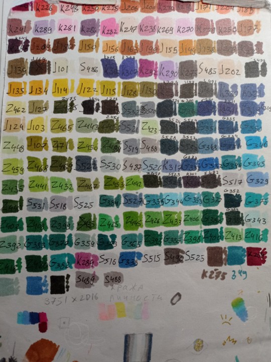
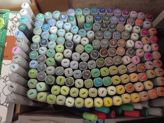
(I have a lot, but you don't need as much, there's like 60 colors I use usually and the rest are on rare occasions. Build a set you're comfortable with)
4) Make sure your materials all work together.
We already talked about graphite swatches, not the worst thing that can happen to you. Mainly you need to make sure how your materials work together, how they lay on top of each other. Make sure your lineart won't react to your markers, there's special waterproof liners and those are the best for markers ( mine are Pigma Micron from Sakura). See how your pens and liners act before and after you apply markers.
Decide which is better to use before and which after markers
5) No black.
I don't use black in any of my drawings. All you see is different shades of gray. It looks much more pleasant with the rest of the colors and it allows for my lineart to be visible underneath. Sometimes even those grays are too dark and I need to add more shades or white lineart to fix it

6) How to shade.
This is a very subjective thing to talk about. You can shade how you want. I will talk about two ways I shade.
1. Same marker. Markers dry. And when they do you can go over them another time. Usually that makes a darker shade of the same color and it's a pretty safe way to do the shading if you don't know which colors can go together. It doesn't work as well on the light colors and difference can be barely noticeable. It's a nice way to get soft shading
2. The pure chaos. Just kidding... Different color marker. It's hard to explain, and yo always need to test what works for you. If you want sharper shade you need to grab a different color, can be from the same hue ( for yellow - orange, for red - burgundy) or something a little more spicy. You can add different hues to your colors with different shades ( your black with red shades is suddenly looks burgundy, or purple, or blue). Experiment! Fail! Find out which combinations work and which don't!
If color seems a little darker than you expect you can go over it with original color, which might lighten it up. This tip doesn't always work

7) How to do gradients.
1. Choose your colors beforehand, see how well they work together. It's easy to do a gradient from red to pink, but not so much from orange to blue. You might need to choose lighter colors, because if you want smooth transition from one color to another you will need to go over them a couple of times and that will darken them.
2. Add a middle color. Not every gradient needs a middle color, but with it you can make your gradient much smoother, it will be more noticeable the bigger aria you cover. The more middle colors you have the more harder gradients you can do

( without and with a middle color)
3. Act quickly. Markers dry relatively quickly so you need to add colors one after the other, you can't go away before you're done.
4. Blend with the lighter color. You can also start with this color as a base but that doesn't work for all color combinations. Lighter color will go in top a darker and flow into it making it lighter and transition smoother. ( example: you go from red to purple to cyan, you will need to start with red, then purple going over red to soften it, and finally the lightest cyan going over purple and maybe even a little red). You always put darkest first and go over it.
There's other methods of doing the gradients. They are very similar actually, but for second one you will need a blender. For the first one grab two markers you want to use ( more if you're feeling risky) turn one of the markers upside down and touch their tips. Now use your understanding of gravity. Color from the top marker will go into the bottom one. The longer you wait the longer the gradient will be. Usually I don't need to wait longer than 3 seconds.
And you can do the same with a blender
8) How to use a blender.
Blender is a marker with no color. Usually it's named B000 (I recommend buying a blender with brush tip). There are many ways to use it.
Gradients: you can use two markers technique with a blender making gradient fade on one end, or you can mix colors inside the blender.
Fixing mistakes: blender will make a white show through your color, you can use it to get rid of the wrong color. But it doesn't work without some problems. Of course darker colors will likely stay, even if much lighter, and your previous color will try to flee ( likely to other sides, if you're lucky it will go on your underpaper)
That's all I have for you today. Experiment and learn something new. Hope that helps
111 notes
·
View notes
Text
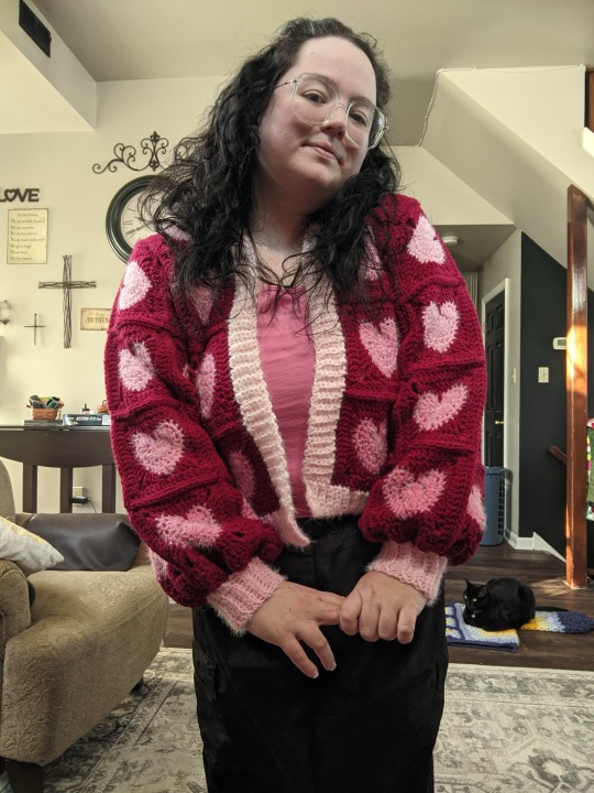
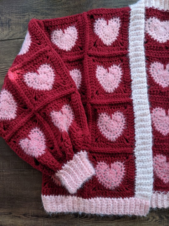
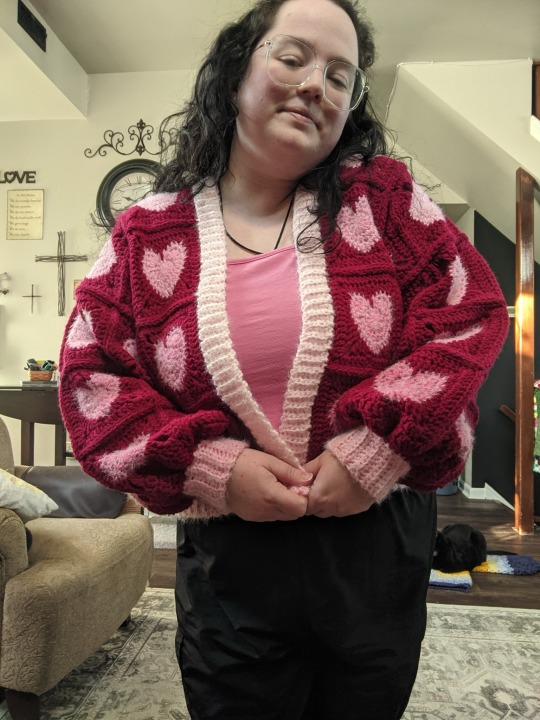
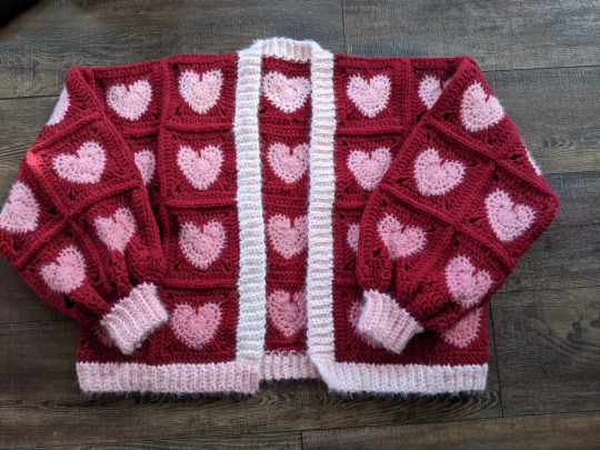
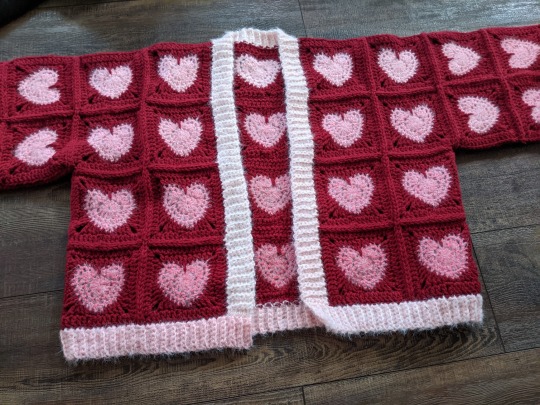
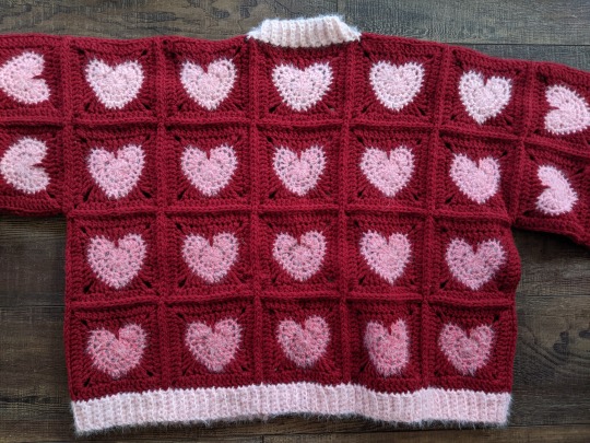
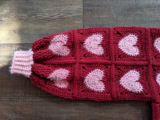
The Valentine's Day Gradient Heartigan!
Wow, that's a bit of a mouthful, huh!? As I continue my quest to make sweaters for all of my favorite holidays, I'm so excited to have finished my Valentine's Day cardigan--partly because Valentine's Day is my favorite holiday, and partly cos this sweater came out so frickin' cute!!! Click on the keep reading link below for all the details on how I made it!
Items used:
Red Heart Super Saver in Burgundy (red). I used just under three skeins for all of the squares and joining the sweater.
Caron Colorama Halo in Cranberry Frost. I used less than a full O'Go donut for all of the hearts, so I think you should be able to use a single cake for them if you want to make your own version of this sweater, and I used part of a second donut for the ribbing--so even if you don't get all of your hearts out of one cake, if you have a second to do the ribbing as well you'll be all set!
Even though the Colorama Halo is listed as a bulky yarn, it's really a worsted thickness, so I used a US size I/5.5MM hook for the entire project, including the ribbed border.
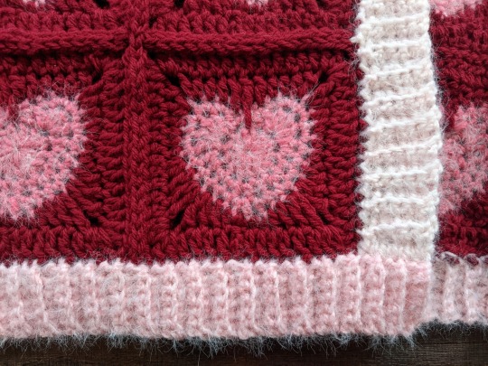
I used the pattern for the Little Heart Square by Raffamusa Designs for the squares, and added an extra row of double crochet around the outside (with 2DC, ch2, 2DC in each corner). I used a total of 60 squares for the sweater.
This sweater is, at its core, just a basic granny square cardigan, meaning that I built it by measuring another sweater that I like the fit of (this one, if you're wondering), making a single square, measuring it, and figuring out how many squares I needed for each section of the sweater to get measurements as close as possible to the model sweater. That may sound a little confusing or even daunting, but it's really not as hard as it sounds! Let's break it down a little further, piece by piece.
To start, here are some measurements:
Each heart square is 5x5 inches, and I blocked each one to make sure my measurements would be consistent and that my squares would have nice, even sides.
On my model sweater, the sleeves are 18 inches around and 15 inches long. So, with 5x5 in. squares, I made 4x3 square tubes, so that my sleeves measured a total of 20x15 inches.
On my model sweater, my front panels were 10x20 inches, so I made two 2x4 panels.
On my model sweater, my back panel was 26x20 inches, so I made a 5x4 panel.
I used a total of 60 squares for all of these panels.
To get the gradient, I made all of my hearts in order through a skein of Caron Colorama Halo yarn (technically I was using one of the O'Go donuts they were originally released in, not one of the cakes that yarn is available in now, but there was a good amount leftover, so I think you'd be able to make a sweater approximately the same size with a cake of the yarn, even thought the yardage is different). Once I had added the red border around each square and blocked it, I laid them out on a table starting with the top left corner of the back panel and working in a spiral from that corner, across the back, across the top of the right sleeve, over both front panels, and across the top of the left sleeve before moving down. Then, I used stitch markers and safety pins to attach the corners of the squares together in each panel so that I wouldn't mess up the gradient as I moved them to attach everything.
Once all of my panels were finished using flat slip stitch seams, I seamed the fronts to the back at the shoulders and sides, made the sleeves into tubes, and attached them to the armholes in the "vest" made from the fronts and backs. Then, I used a second skein of the Colorama Halo to add ribbing to the front and bottom, using a 6-stitch SC FLO rib worked directly into the edge of the garment and beginning in the front right corner of the sweater. I was able to make the front and bottom ribbing all one piece by just turning a corner in the last row of the front ribbing (the left bottom corner) and working along the bottom. For the sleeves, I started with the same color red I used to finish the squares and seam them together, and worked a row of double crochet (I decided I wanted the sleeves just a hair longer, for a slightly more dramatic poof), then worked two rows of *SC1, DEC1* before breaking the red yarn and attaching the pink. I did a 12-stitch SC FLO rib around the ends of the sleeves to create the cuffs.
34 notes
·
View notes
Text
Sharpie makes the best nail polish
Sal definitely just uses sharpies and markers to paint his nails and never let's Ash nor Larry do them "properly," no matter how much they beg. Ashley and Larry take their time and do the entire process cause "beauty takes time" (  ̄▽ ̄)
The mental image of Sal just being annoyed in the corner while Ash and Larry have their "nail salon" is just *chefs kiss* Todd is like Sally, he just does whatever and doesn't care if it's chipped or anything [he like me fr]
I say Ash is great at doing nail designs while Larry is better at gradients and water marbling ♡
#art#doodle#fanart#sally face#sally face fandom#sally face headcanons#sally face fanart#sally cara#sal fisher#larry johnson#ashley campbell#doodles#my art#sharpies make the best nail polish#and thats on periot#Ashley is great with nail art and exceedes with designs#while i say Larry exceeds in ombres and gradients#todd morrison#sally gang#sally face gang#sally face gang headcanons#sal fisher hates nail polish#larry and ash said 💅🏼
71 notes
·
View notes
Note
Hey! I love your art so much and was wondering what brushes and/or art programs you use, I'm an artist myself and am just genuinely curious. Sorry if this is a strange ask or anything... I don't use or get on Tumblr too often. Thanks for reading this ask and have a good day/night. (This is my first ask to anyone I think)
hey!!! i use Paint Tool SAI 2!
as of the moment (which means i constantly change it)
here is my main doodling/sketching/lineart brush:
my coloring brush:
any hard edged basic brush will do, you can also use the bucket tool or the lasso tool, it's simply for coloring
my blushing brush:
i blend this brush out by switching to transparency (making it an eraser) and lightly tapping the outside of the paint! (sai users, do this by pressing C on your keyboard. lifesaver been using this shortcut for years)
it's versatile, i love using it for gradients
marker brush (usually for ecto):
i use this brush only when i want to paint ecto (which i don't do often) but you can use this for other purposes too!
it's not my favorite, not even good enough for ecto imo, because my sai 1 version is much better
i blend things out the EXACT SAME WAY as the blush brush so please keep that in mind!

a basic brush im testing out for shading purposes:
it has a little bit of texture and is made for baaasically cel shading but slightly softer and has the tiniest bit of color mixing

blending brush i barely use and don't actually really like that much:
i'm still testing out blending brushes that i like because i can't find one that i like that isn't just blurring colors together or making them muddy when mixed together.
if anybody has suggestions, PLEASE let me know! anything like a procreate or csp blending brush that can be recreated would be great
and finally, my rendering brush:
it's basically a basic hard edged brush that can pick up the smallest bit of color
i use it to clean up and add final touches by using the drop picker often and over the entire artwork

ofc, change anything to your preferences. that's how it goes
these are just the settings that work for me :)
this also goes for the program LOL i know sai is not for everyone (but it's my baby my bestie my 5ever so like this is about ME)
i have an in-depth post about my CSP brushes and how i work with them (and i don't really ever use csp unless it's a big piece so it's not changing anytime soon) if that's what you have or prefer
my #ref tag is also a treasure trove of my old settings over the years if you'd like to see those too
74 notes
·
View notes
Note
omg what brushes and program do you use?
Oh I'm not sure this answer will be very usefull from amount of brushes listed. I have very few faves actually and mostly like them because they help me circumvent my perfectionism.
So right now I'm using Clip Studio Paint but I've been using Photoshop for a looooong time. Till they pissed me off too much with adobe adobeness. That's why part of my brushes are originally photoshop ones I've ported to CSP.
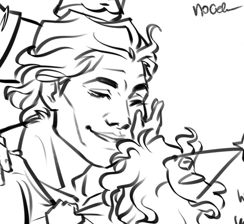
I mostly do linearts, like overly detailed ones, like this closeup:
Which I used DAUB FunnyGranny2 and back in PS times (and also now sometimes) I've used Kyle's Drawing Box - Animator Pencil 2016 from Kyle Webster (now available for free with PS as far as I know? still I had bought them ages ago and just ported it to CSP, works ok)
I like those two brushes because they are slightly grainy and aren't 100% smooth which helps me not to be as precious about smoothness. Otherwise I'd be smoothing it over and over again. Also they loose a bit of opacity with lighter touch which I like :)
I also like the Belgian Comics Smoother from Kyle's Inbox. It's very smooth but has a nice shape so I use it for touchups on color flats and lettering.
As for my more recent spiderverse comics of following close up:
I need to make them quick so everything is on 2000x2000 canvas and is linearted with DAUB - Fluid Ink Chisel 2 set permanently on size 30 so I won't be tempted :D It may not be grainy but I like how it changes it size and opacity with pressure and how it changes it's shape with direction of line.
Besides that I mostly use flat colors (I love the Lasso Fill tool in CSP) and regular soft airbrush too add some gradients.
I don;t use them that often but I also like Mirre's markers + blender if I do some actual shading but I also use Kyle's gouaches then.
And that's about it :)
55 notes
·
View notes
Text
I've seen some Reddit refugee PSAs going around, so I thought I'd contribute a few tips of my own that I haven't seen covered:
If you go to the original iteration of your post (not any subsequent reblogs, your ORIGINAL post) you can delete any comments you don't like. This does not apply to text added by reblog, only to the message bubble section.
Ublock Origin has trouble figuring out which parts of desktop to get rid of. If you want to delete a certain element (for example, the store widget), and your usual method isn't working, what you want to do is:
- Right-click
- Inspect Element/Inspect (Q)
- Look at the thing that's highlighted, then go all the way up until you hit the nearest "div = class" marker
- Right-click
- Hover over "Copy," then pick "CSS Selector"
- Click your Ublock extension icon
- Click the gears
- Find a blank space on the list that pops up and type "www.tumblr.com##" without the quotes
- Paste whatever you copied with CSS Selector after that, with no space between it and the ##
- Click "Apply changes"
You can hide your follower lists and liked lists. This is actively encouraged.
Desktop solution:
- Account (the person icon in the corner)
- Scroll down until you find your blog name and click "Blog Settings"
- Scroll through the page that pops up until you find "Share posts you like" and "Share the Tumblrs you're following" and toggle them off. This is the 3rd and 4th section of that page for me, respectively
Mobile solution:
- Your blog (the person icon in the bottom right corner)
- Settings (gear in the top right corner)
- Scroll down to "Pages"
- Toggle "Likes" and "Following"
Desktop only: Left your Tumblr logged in on someone else's phone/computer? Worried about account security? No problem!
- Account (the person icon in the corner)
- Settings (NOT Blog Settings. Just Settings. It has a gear icon)
- Scroll all the way to the bottom
- You have a list of any logins that have happened on your account. They come with the IP addresses used to access it. It tells you where it happened, and from what operating system. Deleting those with the X next to the listing logs that iteration out. If you have any on that list that you DON'T recognize, I recommend logging them out and changing your password.
Note: It says the list is only for the past 30 days. This is a lie. I have some that date back over a year.
Desktop only: You can make gradient text in your posts by following these instructions.
If your post has been blowing up and you're sick of the notifications, deleting the original post will delete its notes from your activity. THIS CANNOT BE UNDONE. If you would still like to check on the post, just not have it in your activity, reblog it before deleting it. You can continue to check the notes tab from the reblog while the original is gone.
It is common etiquette to tag spoilers for new games/shows/etc (ie, released in the last two months) as #[insert fandom here] spoilers, sensitive subjects as #[insert sensitive topic] tw, and long posts as #long post. Yes, even if you have a readmore (which you can add by clicking the weird squiggly line when you start a new block).
There is a bug on desktop involving readmore lines. Whenever you go back to edit a post that has a readmore in it, it moves the readmore down by one block. Make sure you move it back into its proper place each time by clicking and dragging.
You can click and drag different blocks of text to reorder them. Only regular blocks, though; not lists like this one. You can also do this with images you've inserted.
Desktop only: You can delete/remove tags/add tags en masse to posts using the Mass Post Editor.
- Account (person icon in the corner)
- Scroll down to your blog
- Mass Post Editor
- Select any posts in the grid you want. "Edit tags" is only for removing tags, you need "Add tags" to add more
Desktop only: You can see any blog's history of posts by typing in [blogname].tumblr.com/archive. The page that pops up looks very similar to the Mass Post Editor. You can filter posts on that blog by any of their most used tags, by month, or by post type.
This is especially useful for locating pornbots. Some pornbots will try to legitimize their place by picking a random popular tag (for example, #horror) and reblogging the top 10-100 posts in that tag without commentary. See if they've been active for more than week with the archive month filter.
Granted, the person may also be a new user, like yourself. It takes some deduction. But it's much easier to use the archive than it is to scroll through all of their posts until you hit the bottom.
Desktop only shortcuts:
J = move down one post. Useful for scrolling fast or getting past a notoriously long post (as in "Do you like the color of the sky" and all its cousins)
K = move up one post
Shift + R = reblog a post. Does not add tags
L = like a post
C = create a new post (brings up options on what kind of post)
. (period) = return to the top of the page
Shift + Q = add a post to your queue. Does not add tags
Shift + P = cycle through the color palette
112 notes
·
View notes
Text
Androgyne gender identity
Definition:
Androgyne, androgyn or androgynous gender, is an identity under the nonbinary and transgender umbrellas. Androgynes have a gender identity that can be a blend of both or neither of the binary genders. They may describe this as being between female and male, between man and woman, between masculine and feminine or simply 'in between.' They can also identify as neither feminine or masculine, or neither female and male.
from the nonbinary wiki
As stated in the definition, androgyne people are trans (they don't identify exclusively as the gender they were assigned at birth), and nonbinary (they are not one of the binary genders). Of course it is up to an individual to choose the words they use to identify themselves with.
The word androgyne has an interesting history, at times it was used as an umbrella term similar to nonbinary (I won't go in to much more detail here, but there is more info in the nonbinary wiki).
androgyne, androgyny, androgynous
As a rule, androgyne refers to a gender identity, while Androgyny refers to gender expression (androgynous would be the word used to describe an individual using androgyny as their gender expression). A person may identify as androgyne, and not be androgynous, and a person my be androgynous and not identify as androgyne.
But the split isn't quite so clear. In theory:
Androgyny is a wide category of gender expression that either mixes or omits markers of both feminine and masculine gender expression.
The nonbinary wiki
But,
Androgyny possession of both masculine and feminine characteristics. Androgyny may be expressed with regard to biological sex, gender identity, or gender expression.
Wikipedia
It is explained well in this post, but I think a good way to understand the difference is that androgyne is an androgynous gender identity. While androgyne will be used as a gender identity, and androgyny is more general reference to a blend of male and female characteristics.
What is overall the most important to understand that use of these words for individuals will vary. General use of these terms has changed over time. If an individual feels that these words help them to understand themselves (even if they don't fit the "exact definitions") then that is what is important. Words are here to benefit us.
Here is a useful graphic to understand the "androgyne spectrum":
androgyne spectrum
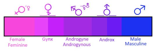
[ID: a scale, starting from the left with "Female" and "Feminine", then "Gynx", "Androgyne" and "Androgynous", "Androx", "Male" and "Masculine". End]
from this post, by @bentonthegay. And this post gives a good explanation about it, and about androgyne as a gender identity:
I think that the specific thing that makes Androgyne an identity all its own that I believe is within the center of the gender spectrum, right alongside other non-binary genders that blur the line between “male” and “female”.
Androgyne is the “neither” and/or “both” of the spectrum. It’s a bit of a blend of selected traits from both sides. Given, that means very different things to different people, so I imagine that not every Androgyne person dresses or behaves just like I do. [...] The part of the identity that sets it apart is how Androgyne people feel about themselves.
As an Androgyne person, I believe that I am not a man or a woman. I reside comfortably between the extremes. So I guess it’s not just a mix, it’s more that I’m a blurred segment of the gradient between them.
I do believe that Androgyne is an identity by itself and not just “a mix of female and male traits”. Given, that’s like saying a banana split is just ice cream with bananas and sweet toppings. You’re not wrong, but it’s not just that.
post by @androgynepositivity
Another important point to remember that while androgyne is a mix of the two binary genders, it is also connected to neutrality, being in the middle of the spectrum, it is "both" and "neither", and can be different for each person.
Similarly, androgyny can be both presenting femininely and masculinely at the same time, or more of a neutral look, neither feminine nor masculine.
multigender?
Depending on the person, androgynes may see themselves as falling under the multigender umbrella.
in the "Brochure for the Human Outreach and Achievement Institute" (1987) the following definition is found:
Androgyne: A person who can comfortably express either alternative gender role in a variety of socially acceptable environments. (Includes bigenderist)
Source
This is both an interesting historical look on the meaning of androgyne, but also the close connection androgyne has with the multigender (and in particular bigender) community.
The meaning of bigender has expanded in the past 30+ years. It refers to people who have two specific gender identities, these identities may be male and female but also may not be. Seemingly this can include androgynes.
The choice to include oneself under the multigender/bigender umbrella should be a personnel one. Do I feel like being androgyne is a mix of two things? Or perhaps it is one identity, one gender? Maybe the experiences of multigendered people resonate with me, and I would like to be connected to their community regardless? The history connects androgynes and multigended people. At any rate, we are all queer and therefore connected.
micro-labels
Femandrogyne: an androgyne person that feels more feminine than masculine.
Mascandrogyne: an androgyne that feels more masculine than feminine.
Neutrandrogyne: an androgyne with equal amounts of masculinity and femininity, and/or simply neutral.
Versandrogyne: an androgyne with amounts of femininity and masculinity that fluctuate, for example they could go between femandrogyne and mascandrogyne.
Demiandrogyne: an androgyne who relates partially, but not fully, to the androgyne experience (this term is also under the demigender umbrella).
Thank to @androgyne-culture-is in this post for the deffintions, they can also be found in the LGBTQIA+ Wiki.
flags and symbols
The official androgyne pride flag is:

[ID: flag with three vertical stripes, in the colors, from left to right: pink, purple, and light blue. End]
The pink represents femininity, the light blue masculinity, and the purple a mix of them both.
This is a great post explaining about other flags that are less known, based off the nonbinary wiki.
One important symbol is:

[ID: a circle with an arrow coming out of the top, and a horizontal line underneath the triangle of the arrow. End]
This symbol is a mix of female (Venus) and male (Mars) symbols. It is also an intersex symbol, and a symbol for other genders. In the image the symbol is pointing up, but it is sometimes depicted pointing to other directions.
Another important symbol is the Necker Cube:

[ID: illustration of a cube. End]
Necker Cube
n. 1. An optical illusion in the shape of a cube. May take either of two forms:


Proposed by the author as a symbol of androgyny, because it is either concave or convex depending on how you look at it. I prefer this to the mars-plus-venus sign, which depends upon a juxtaposition of stereotpyes (sword and shield for male, looking-glass for female), and which, furthermore, combines the signs for the two most irritating gods in the Roman pantheon. If we must depend on Greek mythology, I would prefer to take a cue from Janus and use some variation of the two-faces motif on the cover of some editions of The Left Hand of Darkness. The Necker cube, however, is simpler, and suggests ambiguity in more than mere gender. Who wants to design the lapel pin?
The Angel’s Dictionary, part of the Androgyny RAQ
And for more info: Practical Androgyny
There is much more history to the word and identity. Many more experiences it could include, but there is only so much I can cover. I do hope that nothing I've written makes it seem like this identity has rigid rules that need to be adhered to in order to identify with it. On the contrary. This seems to be a very broad and open way of identifying, and different aspects of it may resonate with many.
#androgyne#androgynous#androgyny#enby#nonbinary#trans#transgender#bigender#multigender#demigender#femandrogyne#mascandrogyne#neutrandrogyne#versandrogyne#demiandrogyne#gender identity
99 notes
·
View notes
Text
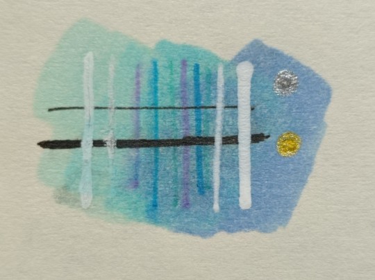
Newest entry in the Summer of ("bad") Art-
I discovered that water soluble markers are, in fact, *water soluble* - shocking, I know. Which means that if you draw a series of straight marker lines in a gradient and then paint clean water over them, you can do this-
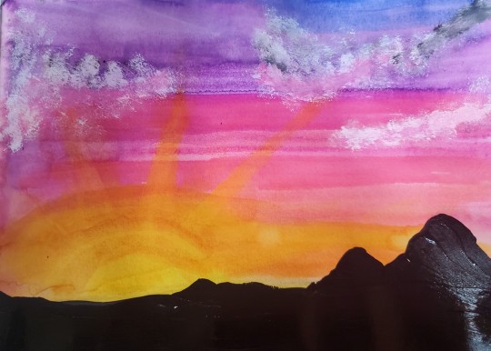
Mountains and clouds added in acrylic.
89 notes
·
View notes
Last Seen Blogs
sshikamaruu
Yo
scottguy
Liberal Ideas & Other Cool Things
dutchie-dd
Moved to @maribloom-art !
niksonsh
niksonsh
marsapanotaku
Incognito Otaku