#i have no explanation for this colour scheme
Text

#kimetsu no yaiba#kny#demon slayer#tanjiro kamado#inosuke hashibira#inotan#...ish?#modern au where it's just a sports manga?#silly sketches#i have no explanation for this colour scheme
713 notes
·
View notes
Text

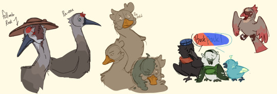
day 22: birds
read below for choice explanations
Some explanations for choices:
overall, i chose most of them to be birds you’d see in neighborhoods/around humans
liam - i thought that the fancy pigeon kinda fit with his round silouette + the backpack part is based on war pigeons and how they’d equip them with cameras to spy on the opposing soliders
bryce - i thought crows fit, not much to say. I think his silouette being much more sharper than liams is a nice contrast plus they keep their height different slightly
amelia - basically chose a blue bird, and i think one of the smaller birds fit better. actual finches don’t have like iridescent feathers like she does but uhh creative liberties
charotte - i wanted to give her a more imposing like height compared to the others, so i thought a duck would fit.
taylor - i thought the colours matched pretty well :)
charlie - i was most familiar with baby robins since they’re pretty common where i live, so i just chose that.
airy - i wanted him to be like really tall compared to the others who are relatively small/medium birds, and I thought cranes just fit. finding one that kinda fit with his colour scheme sucked tho 😭 the blue of his head/neck was supposed to be like the glass
#my artwork#osc#objectober 2023#hfjone#hfjone liam#hfjone backpack#hfjone moldy#hfjone charlotte#hfjone bryce#hfjone soda bottle#hfjone taylor#hfjone magazine#hfjone charlie#hfjone airy#hfjone bird au#i love birds so much you don’t understand#i might do more of the characters 😳😳#probably just going through the 2nd + 3rd batches and side/minor characters#I tried to be like…… relatively realistic to the irl birds but of course had to take some liberties lol#hfjone au#tw wounds#tw animal injury
142 notes
·
View notes
Note
how long did it take for you to come up with the designs for the clones?? did it come naturally or did you have to do a lot of thinking / concepts?
hm im having to go back thru my memories for this one bc it was a while ago... but iirc i had a handful of specific ideas for some of them: Three essentially as Bart with blue eyes, Five as an older clone, Seven as a robot, Nine/Nathaniel not having powers. And then i had a thing with their colour-coding which used to be more significant than it ended up in the actual story, along with the roman-numeral incorporation a la the movie Stardust.
the rest i pretty much made up on the fly when i drew that first comic, and its wild that their designs have stayed pretty much the same bc i was fully expecting to overhaul their looks once i actually nailed down their characters.
a couple details have changed since that tho. Six's cybernetic eyes came later, along with Eight/Jude's heterochromia and birthmark, and now Seven tilts more into the mech direction. I also hadn't figured out what Five's face would look like under the mask yet, and Nine/Nathaniel's hair being bleached was basically an afterthought that I decided to come up with an explanation for later. (iirc I didn't want Three to be the only brunette, so I debated Eight and Nine having brown hair. Pretty sure i made them blonde and bottle blonde respectively purely to have Three stand out more in the foreground for that one panel lmao)
also because I had vague ideas on their internal relationships I put a teaspoon of thought into their jumpsuit designs and how they relate to each other. Three and Five have the same earpieces and a black/white/accent color scheme. Eight and Nine have a black/grey/accent thing going on. Six's suit is a step removed from the rest of them with only black and blue happening, and the hardware around his face/ears matches Seven's design.
but yeah basically some stuff i had ideas for and planned out and other stuff i came up with after the fact, and a lot of stuff i threw in there and then came up with an explanation later lol
#asks#anonymous#that first comic was also the first time i drew any of the other clones which is wild#if i knew how much this project would take over my life i would've done way more variations and design stuff but#idk i like how it worked out#mostly the goal was to have them all have different silhouettes#so that even though they were all technically clones of the same guy#they still had enough to make them visually distinct#(Three being the exception of course)
38 notes
·
View notes
Text
A personal tweak to the Zelda Timeline
So basically I’ve been thinking about LinkedUniverse and been doing some sorta LU fanart and THAT had me thinking about the Zelda Timeline, and more specifically how it would make more sense if Four Swords and Four Swords Adventures swapped Timeline placements. And that’s what this post is about.
Why I feel FS would work better if it came after FSA in the Timeline and vice versa.
So reason number one is how Vaati is characterised in FSA & MC vs how he’s characterised in FS. In the former games, Vaati is shown to be power hungry and Cunning, like when he imprisoned and then impersonated the king in order to both find the Light Force, and stop Link in MC. And while he’s not the MAIN villain and is being manipulated by Ganon in FSA, I think it’s save to say that he’s still in control of his own actions, and was likely scheming up his own plans independently of Ganon, and I might add that in never of theses games has he ever shown interest in Zelda, never even called her pretty. Then we get to FS and suddenly Vaati has gone insane and is suddenly girl crazy and wants to marry Zelda, like, do I need to say more? He goes from Intelligent & Power Hungry, to Insane & Girl Crazy, and then back to Intelligent & Power Hungry. This Sudden change in character makes a lot more sense if FS came after FSA, as then he would be going from Intelligent & Power Hungry in MC, then staying that way in FSA, only to go mad from being sealed in the Four Sword for so long that he can’t even remember who he used to be in FS. Plus the new Timeline placement means that the fairytale mentioned at the beginning of FS suddenly becomes a reference to FSA, in which Vaati is partially implicit in Zelda’s and the Shrine Maidens kidnappings.
Reason number two is how the Gerudo are characterised in FSA vs OoT & BotW/TotK. Again It’s the issue of them going from Fierce Warrior Women in OoT, to Peaceful Desert Dwellers in FSA, and then back to being Warrior Women in BotW / the ancient past of TotK. This would, again, make more sense if FSA swapped Timeline placements with FS, because then the Gerudo are going from Peaceful Desert Dwellers, to Warrior Women, and then staying like that for all their later appearances in the Timeline, and since Twinrova is at least 360 year old, they very well may be the reason for this shift, as they have been manipulating the Gerudo tribe for a long time. This would also mean that FSA is now the game in which Ganon gets his Trident weapon that he uses in most of his future appearances.
And speaking of Ganon the third reason is Ganon’s reasoning for invading Hyrule + Shadow Link’s actions in FSA. In the Hyrule Encyclopaedia, the reason given for Ganon’s invasion of the kingdom of Hyrule is that he’s bitter over his defeat at the hands of the Hero of Twilight at the end of TP, and that Shadow Link, is a being born from that bitterness and brought into the world using the Dark Mirror. Now this is, in my opinion, kinda stupid. Cuz not only is the Ganon from FSA a different incarnation of Ganondorf than the Ganondorf that appears in TP and therefore shouldn’t be able to recall those events, but Shadow Link, (a being born from Ganon’s resentment) actions in FSA don’t really lend themselves to this explanation ever. Shadow Link, or I should say the Shadow Links in Four Swords Adventures only attack Link in certain stages, and when they aren’t doing that, their off harassing the citizens of Hyrule, smearing Link’s good reputation in the process. To me, if Shadow Link was born from Ganon’s resentment of being defeated in TP, then Shadow Link should be more focused on defeating the Colours, and not off tormenting the rest of Hyrule. Shadow Link’s actions DO however make a lot more sense if Ganon is invading Hyrule for similar reasons as to WW Ganondorf. That being he resents how the people of Hyrule get to live in a fertile, prosperous land, while the Gerudo have to endure living in the harsh, unforgiving Gerudo Desert, and want the kingdom for himself, this makes Shadow Link’s actions in FSA make more sense, since in this instance, Shadow Link is born from Ganon’s resentment of how easy Hyrule’s citizens have it, thus Shadow Link spends most of his time giving the people of Hyrule a hard time. And making FSA come before FS makes this explanation make more sense.
I feel like there’s probably more I could go into, but these are the 3 main points I wanted to talk about. I hope I’ve explained my reasoning well enough and that you have a nice day/night.
#legend of zelda#loz#link#shadow link#loz ganon#ganondorf#four swords adventurers#four swords#zelda#gerudo#vaati#hero of the four sword#lu four#lu dot#this is kinda Lu I think?#zelda timeline
29 notes
·
View notes
Text
So @crystaltoa 's post about the disparities between the metrus got me thinking, and it's kinda hilarious how the world building makes complete sense if you look at it from a toyline pov, but the moment you start delving any deeper it becomes dystopian
Like, sure, the elemental factions offer an in-world explanation for why you can buy the same toy but in different colour schemes (hey kids, why don't you buy the same toy SIX TIMES) (still a more honest approach than blind bags, but I digress) and giving each metru its own characteristics based on their element is more lore than a toyline ever really needed
but then you get this society with strict expectations of your career/home based entirely on something you cannot change, with extremely limited mobility. Even if you do carve out a life in a different metru, you'll likely be viewed as an outsider/oddity
I mean. Avatar did a similar thing with the four nations, but the main differences there are a) they are much more geographically separate, making it much more difficult to have that cultural overlap and b) it was framed as a destructive trait, caused by war and isolation and nationalism that the show dismantled throughout its run
And I know bionicle has Unity as one of its virtues, and it was a toyline first, story second yada yada yada, so it wasn't gonna go as hard as avatar did, but sometimes I do wonder how intentional the dystopian aspect was – esp because even after the Toa Metru forge the koros of Mata Nui, the villages and their inhabitants are still pretty socially isolated from one another. Takua's willingness to travel between villages is unusual enough that the turaga make use of that repeatedly
Idk, it's just interesting that we never really see the Toa Metru go "yeah metru nui's system was a little fucked up" or look too closely at their original home's flaws
#bionicle#lego bionicle#metru nui#tbf given the police state of metru nui i am leaning to it being intentional#but its the kinda thing youll very much miss as a kid
50 notes
·
View notes
Text
as promised in the last post, @kandavers requested an explanation for the ship names for Basil, Whisky and Will, and I shall deliver! Note: some of these are a bit of a stretch..
Their creators!
Will Wayward - @kandavers
Basil Bysome - @cutepotatook
Whisky Fudge - @kumakooo
Apologies I changed tones like 5 times writing this (I have the inability to keep the same tone for some reason-)
Sweet Star Speakers! 🍬 🌟🔊
Sweet - referencing Whisky's job as chocolatier, chocolates are sweet!
Star - space related in reference to Will's love of space!
Speakers - I wanted an alliteration going.. Basil's role is to advertise Welcome Home merchandise and people used to advertise stuff in the streets using a speaker, idk if this one is a bit of a stretch or not..
Charming Chocolate Comets! ✨🍫☄
Charming - Basil's trait of being the most charming of all!
Chocolate - Whisky reference!
Comet - space reference!
Sweet Sparkles! 🍬💫
Sweet - another Whisky reference!
Sparkles - Basil sparkles in appearance because he's so charming! and space has a lot of sparky stars which Will loves!
Purple Skies! 💜🌅
Purple - the colour of Will's skin!
Skies - this one has a double meaning! 1) beyond the sky is the space which Will wants to explore! 2) the sky is blue! (most of the time) and so is Basil and Whisky's skin!
Wholesome-meter Overload! ⛽
This one is pretty self explanitory, just look at them awww
Shy Rizz! (灬º‿º灬)♡
Whisky is more on the shy side whilst the other two is just trying to rizz (intentional or unintentional) as many people as they can-
Shiny Cookbook! 💎📖
Shiny - Basil is so charming that he shines and Will likes the shining things (stars) in space :>
Cookbook - recipes that Whisky would use as a chocolatier!
Star Sandwich! 🌟🥪
A sandwich requires at least 3 parts, and there's three of them! Sandwich is also food related so it loosely links to Whisky. Will likes stars and Basil shines like a star!
Space Foods! 🌌🍱
Will likes space, Whisky works with food, and space food packets are usually purple (like Basil)!
Charmed! 💖
This is us.. we are charmed.. because these three together are so charming..
Basil Leaf on a Star! 🌿⭐
Basil - it's Basil's name!
Leaf - Basil leaves are used a lot in cooking, and sometimes desserts which Whisky makes! Perhaps this can just be shortened to 'Basil on a Star', hmm..
Star - linked to Will!
Rocket Launch! 🚀
Rocket - Will needs a rocket to go to space! Fun fact: 'Rocket' also refers to a English leaf used for cooking! Wonder if Whisky can experiment with that..
Launch - kinda like launching a product that Basil would advertise!
Warmth in the Cold! 🔥❄
All three boys have mostly a cold colour scheme but their feelings for each other makes everything fluff and warm!
Cooking up Business! 🍳🏢
Cooking - Whisky has to temper chocolate which is kind of like cooking it right??
Up - Will needs to up up up to reach space!
Business - Basil advertises merch to bring in business for 'Welcome Home'!
Now!
Commet for 'Cooking up Business! 🍳🏢'! (I ran out of poll options...)
#let me know what you think of these!#I'm bad at tagging..#welcome home#welcome home arg#welcome home oc ship names#kandavers#will wayward#basil bysome#whisky fudge
58 notes
·
View notes
Text
Friends to Lovers Tournament: Round 1, Side A, Match 8

propaganda under the cut!
Aviskull:
MY URL IS THE AVISKULL GUY FOR GOOD REASON!! They are canonically childhood friends who left a team together to form their own. Skull got a lil possessive over Avi when two other silly goofy teams started fighting over him. Also there's 41 works of this ship on ao3 and I've written 21 of them with more on the way. I want them to at least get kinda far for my own self-validation because this is a rarepair in an already small enough fandom compared to others.
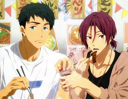
Sourin:
okay so i have a picture to crack explain the sourin supremacy

but i also have legitimate reasons lmao
1. sousuke and rin both GET what it's like to want something so bad but not be able to achieve it. they know each other's pain so well, and they know just how much effort the other person puts into swimming. AND THAT MUTUAL UNDERSTANDING STRENGTHENS THEIR BOND SO MUCH!!! this is also the reason why they are each others' comfort person because the other just GETS it, no need for any explanations
2. they're passionate as fuck about the same thing (swimming) and they help each other train harder and swim better,,, like get you a couple with the same obsessions as you!!!
3. THEY SWAM A RELAY TOGETHER and that means a lot in swimming because IT'S BASICALLY SMTH A TEAM DOES WHEN THEY HAVE ABSOLUTE TRUST IN EACH OTHER AND THEY DEPEND ON EACH OTHER AND THEY LOVE EACH OTHER AND IT'S BASICALLY THE SWIMMING ANIME EQUIVALENT OF I LOVE YOU
4. when sousuke told rin about the shoulder injury he was literally so devastated because his love couldn't follow his passions anymore,, AND WHEN SOUSUKE RECOVERED FROM THE SURGERY RIN LEGIT CRIED HAPPY TEARS!!! and sousuke was always there for rin w/e he had a slump bc he compared himself too much to haru and others,,, like gods they care so much for each other
5. sousuke is the earth and rin is the fire,,, AND RIN LIGHTS A FIRE IN SOUSUKE WHILE SOUSUKE GROUNDS RIN LIKE PLEASE THE MOTIFS ARE LITERALLY RIGHT THERE EVEN IN THEIR COLOUR SCHEMES (teal + maroon)
in short: sourin supremacy because these two bois are so perfect for each other
#friends to lovers tournament#coroika#splatoon manga#aviskull#sourin#free!#aviators#skull#matsuoka rin#yamazaki sousuke#polls#tournament polls#mod deli note: the sourin crack propaganda was just about the funniest thing i'd read all month god bless
79 notes
·
View notes
Text
What are Infused Oils?
What are they?
Infused oils are herbal components or spices placed in a jar of carrier oil like Olive Oil, Grapeseed Oil, Avacado Oil, Jojoba Oil, Coconut Oil, etc. Can be used in cooking, herbal ailments and skincare.
Are they essential oils?
No. Short answer, no. Long answer? I'll give you an explanation. Essential oils are distilled using Steam Distillation, Solvent Extraction, CO2 Extraction, Maceration, Enfleurage, Cold Press Extraction, and or Water Distillation. Lotta words huh? It takes a lot of work to make essential oils. Unfortunately, it also takes quite a bit of that plant to make even those tiny 10ml bottles you purchase. Of course, each plant varies. However, it still can lead to a larger environmental impact.
For instance, one pound of essential oil can be extracted from approximately 250 pounds of rosemary leaves, or from 150 pounds of lavender buds, or say 50 pounds of eucalyptus leaves. This is why you see some as more expensive than others. Unfortunately, you can see where the problem lies in plants that are more threatened or endangered. If you must use essential oils, source responsibly (and not from a Pyramid scheme but I'm not opening that can of worms)
Can I use infused oils in my practice?
Yes! Absolutely! All these oil recipes you see for spell oils are exactly that. You can even use the elemental correspondences of the carrier oils you use for spell oils. As an example Olive Oil is traditionally known for the fire element and Coconut Oil is water. The possibilities for your personal correspondence are endless!
Now I'll stop rambling. Here are a few methods I learned to infuse oils in my courses and through self-herbalist study.
Method One:
The Folk Method - The most common
Directions
Place DRIED herbs in a clean, dry jar. Leave at least 1 to 3 inches of open space above your herbs to cover with oil.
Fill the remaining space in the jar with the oil of your choice, making sure to cover herbs by at least 1 inch or more. If the herbs emerge above the surface of the oil at any point while infusing, pour more oil on top to ensure the herbs remain covered.
Cap the jar tightly and shake well.
Place the jar in a sunny, warm windowsill and shake once or more per day.
After 2 to 3 weeks, strain the herbs out of the oil using cheesecloth or a mesh strainer. Or you can leave it in but straining is recommended if you are using dropper bottles as it clogs the caps.
Pour into clean glass bottles.
Remember to label your jars with the date, type of oil, and herbs used! You WILL forget! Trust me.
Store in a cool, dark place. The oil may keep for up to a year.
Method Two:
The Heat Infused Method - Quick Infusion
Directions
Place herbs in the crock pot or double boiler. Cover with extra virgin olive oil (or other carrier oil of choice), leaving at least an inch or two of oil above the herbs.
Gently heat the herbs over very low heat (preferably between 100° and 140° F for 1 to 5 hours, until the oil takes on the colour and scent of the herb. Some recommend heating the oil for 48 to 72 hours at a controlled temperature of 100° F. Turn off the heat and allow it to cool. I personally prefer letting it sit in a crock pot for 72 hours as I feel like I get all of the benefits out of the herb.
Once oil is cooled, strain using cheesecloth.
Bottle in dry, sterilized glass bottles. LABEL your bottles with the date and contents before storing them.
Store in a cool, dark, dry place for up to six months.
Best herbs to infuse in oil
There are a countless number of herbs, spices and resins that can be infused into the oil. Please make sure these herbs are free from pesticides and chemicals (not found on the roadside). Dried herbs work best as you don't want your mixture spoiling sooner. Here are some great examples of herbs to use.
Pine needles
Calendula flowers
Chamomile flowers
Lavender
Lemon balm
Peppermint leaf
Rosemary leaf
Thyme leaf
There you have it! Now have fun and source responsibility.
Happy witching!
Want to read more?
On sustainability and impact:
Links:
Dangers of essential oils and pets:
Link:
Want to check out my other post? Look at my Masterpost
#witchcraft#witch#infused oils#spell oils#essential oils#aromatherapy#kitchen witchcraft#herbal magic#herbalism#herbalist#herbal medicine#witchblr
22 notes
·
View notes
Text
youtube
Howdy, podcast side of Tumblr.
I forgot to share this here, but on the 30th (yes, I cut the deadline that close) I uploaded an explanation of the Extinction from hit horror anthology podcast The Magnus Archives as part of my ongoing series analysing the Entities one at a time. For this, the penultimate episode, I wound up going way further into detail than I expected, resulting in the video analysing the least significant Entity being the longest in the series. Whoops.
As always, here's a breakdown of the art, for the curious. Although he isn't an avatar of the Extinction (in fact, he seems to be actively fighting against it in most of his appearances), it felt wrong not to do Adelard Dekker for this piece. I really wanted to play around with colour and contrast in this one, and I think it turned out pretty nice.

I dressed Dekker himself in a grey suit with silver accents, because I wanted him to feel very ordinary. Dekker is one of the most human characters in TMA, never seeming to fall to any Entity despite interacting with them very frequently. More than that, he's about as close as TMA gets to a true hero, being at least a comparatively strong force for good. Silver, then, I chose both because it compliments his suit very nicely and because it has mythological and traditional precedent, especially in European folklore, as a deterrent for evil or the supernatural. One of Dekker's most interesting traits is his persistent faith, which I knew I had to include somehow, so I gave him a silver necklace with a cross on the end. It's simple, but it works. The only pop of colour in his otherwise monochrome dress is the tie around his neck, which I've coloured green to show his connection to the Extinction. I know I needed at least a bit of colour, and a neon, toxic green is the colour I associate with the Extinction, so I used a darkened, desaturated form of it for his necktie. I always pictured Dekker as a slender, angular man, which I've conveyed in his face and body. I wanted to give him hair that stood up a lot into short points, and while I considered making them a bit rounder, in the end, the pointed tips just stuck. Finally, there's the glowing green in his eyes, which is, of course, another allusion to the Extinction. Not to imply that he's being guided or influenced by it, simply that he sees it. He was the first to catalogue it, and, admittedly, they do stand out quite nicely against the shadows over him.
In the background, I knew I wanted a skyline with a mushroom cloud behind it, but, as I was working, I decided to make the buildings different references to Extinction episodes. Before I get to that, though, I have to talk about the colour scheme, which is mostly pale green. This was both, again, because the Extinction's colour, in my mind, is green, and because it contrasted nicely against the reds and oranges of the blast. Starting at the leftmost building, it references MAG 144: Decrypted, with numbers running down the side and an antenna on top to send out its encoded message. The next one over is a reference to MAG 175: Epoch, being a massive, Empire State-esque building with abandoned boxes and detritus scattered on its landings, alongside a few more... "living" manifestations. There are only five statements which are the MOST likely Extinction appearances, so, for symmetry, I had to pick an extra statement to throw in. This wound up being MAG 65: Binary, since it's a fan favourite and plenty of people theorise that it actually was related to the Extinction. To get the idea across, I put a few distorted faces on large screens, though I do regret not lightening the entire building up a bit. Across the empty space, we find a reference to MAG 156: Reflection, designed to mimic a large carnival sign and featuring tall windows with thin creatures in them. The windows could have been a bit smaller, but I worried that they would seem too similar to the next building. Speak of which, that brings us to the MAG 134: Time of Revelation reference, being an apartment building in a French architectural style (I don't recall which one at the moment, but I know it was a specific one) filled with figures in the windows, some of whom are half melted into walls or floors. Finally, the last building is a reference to MAG 149: Concrete Jungle, with a rounded roof to mimic the circular shabonos of the Yanomami people and a large, concrete serpent for... obvious reasons.
I think that about covers it. If you've read this far, I hope you enjoyed, and get yourselves ready for the final episode of Entities Explained dropping later this month. With that, all I have left to say is good night, Tumblr people!
#youtube#magnuspod#the magnus archives#the magnus institute#the magnus pod#the magnus protocol#tma#magnus#tma fanart#the magnus archives fanart#tma art#tma podcast#tma spoilers#tma entities#the extinction#tma the extinction#extinction#the terrible change#the future without us#the world is always ending#adelard dekker#mag 134#mag 144#mag 149#mag 156#mag 175#mag 5#mag 65#mg 84#mag 114
38 notes
·
View notes
Text
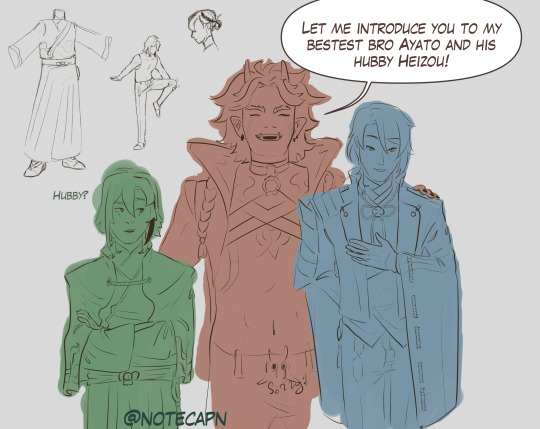
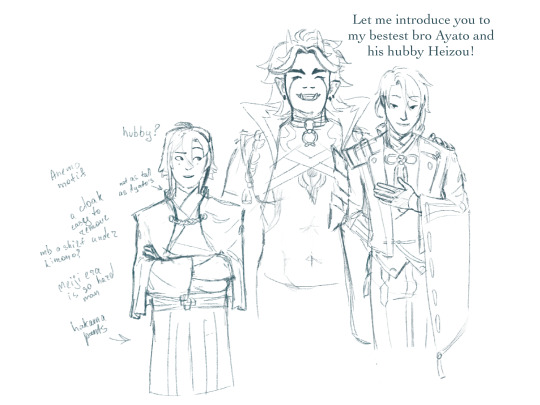
Itto looks like the type to say “hubby” unironically, love this guy
uh, my first concept of Heizou from arranged marriage au by @throwingstuffhere, thank you for inspiration there!
design explanation under the cut
uh.. look, character design is hard, and this is one of the first ideas i came up with after staring at Kamisatos for a while. this will change, if i ever do this again
there was this reddit post about Ayato’s design and how it was majorly inspired by Japanese Meiji era clothes, worn by both nobility and samurais, it is here, if you are curious
here, my main problem was, well, Heizou is decidedly not a samurai, so a lot of design choices for Kamisato siblings or even Thoma wouldn’t fit, he needs more space to move
so the liberties i’ve taken here (in this iteration, again, if i decide to work on this more i most likely will change things i didn’t do enough research for it to be any form of final design), i took Ayato’s design and adjusted it:
instead of Ayato’s coat, which will constrict his movements, flail around and overall be very impractical, here he wears a cloak, which is easy to remove and put it back on (and i imagine he’d flick the cloak dramatically); the Yashiro commission crest on his back
instead of the tight western trousers he’d wear hakama pants (or something along those lines), which also allows him more freedom
now, like Ayato, he’s also wearing kimono, but after sitting on it i’ve started to lean towards a western shirt under, but those tend to be tight as well, so cropped? Heizou doesn’t tend to worry about propriety and it wouldn’t be visible anyway, so that might be one of the changes i’d make
unlike Ayato who wears at least four layers of fabric, Heizou would have at most three and that’s counting the cloak
to emphasise the fact that Heizou is a part of the family, but is distancing himself from them, I’m giving him clothing of similar style, but slightly different colour scheme (i know this image is not coloured, bear with me):
Kamisatos’ accents colours are deep blues, purples, golds. well, in Ayaka’s case, it’s more pink then purple, but I’m wilfully ignoring that, now it’s light purple
Heizou in this au might wear gold and purple, and burgundy (or maybe orange-ish brown like his shorts from his og design) as “his own” color, so he fits in, but also not really
every Kamisato (Thoma, obviously, included) has their visions motif in their clothing (or, well, their main outfits ig, i didn’t look at Ayaka’s new dress): so Heizou’s most likely will be on his cloak, like Thoma or Ayato, or his pants, like Ayaka’s dress. which also could tie into his character arc, if it comes to that: Heizou accepts his role and instead of the burgundy he’d wear his vision’s blue-ish green, so his colour scheme is closer to the siblings
did you know that inazuman designs tend to have a lot of rope and ties? well, i didn’t until before i started this thing, so naturally this design is too simple for Inazuma and genshin in general, so it needs more work
also i made his hair a bit less unruly then i would normally do (not that anyone could tell) and he doesn’t have the tie
actually nvm here’s the “canon” Heizou in my style
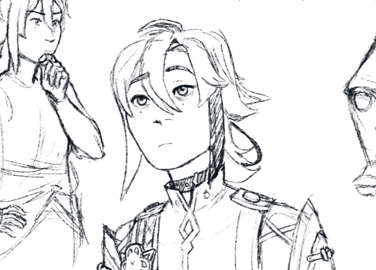
and if the lineart looks like shit, here's the sketch
#genshin impact#arranged marriage au#shikanoin heizou#technically kamisato heizou#kamisato ayato#arataki itto#ayahei#i swear im not insane#this is literally me learning how to lineart in csp haha#genshin fanart#as much as i love itto i was not ready to draw his whole design#i suddenly remembered why i stopped drawing huh#turns out art is time consuming and im a senior in uni figure that#notecapn art
29 notes
·
View notes
Text
WHY I LIKE GLASS JOE A LOT
I promised a lot of information about why I like Glass Joe so I wrote this in an hour with no plan, no proof reading, completely improvised. If I planned this it would probably be WAY longer lol but I'll spare you all the pain of that. SO. ENJOY MY REASONING.
Glass Joe. Glass Joseph. Fragile Joey. It’s a name that’s been uttered for centuries in many different forms, given many different explanations. Critics, theorists, philosophers alike have carved away at their lives trying to solve the answer to the universe's greatest question. And that is:
Glass Joe, good why?
I can answer that, absolutely.
HEY I LOVE GLASS JOE A LOT IF YOU DIDN’T KNOW THAT ALREADY JUST GOTTA ESTABLISH THAT HAHAHA OKAY LETS GO. SHOUTOUT TO THE FUCKING RTGAME PUNCHOUT VIDEO YOU DID THIS TO ME.
POINT 1: HE IS HANDSOME.
I swear to God this man was hand-crafted by the hands of an incomprehensible deity because HOW is he this flawless. He’s 5’10, great height honestly I’m 5’3 I don’t want to be dating a skyscraper you know. He’s a skinny bastard but that’s okay, more on that later. His hair, oh my goodness gracious, lord above, help me Jesus. HIS HAIR. IS SO GOOD. If you put that skateboard ramp ass hairstyle on literally any other character they would look like a dumbass, but here, on this man alone, it’s the most delicately poised series of ginger strands I ever did see.
His hair looks SO soft. It’s unbelievable. It’s such a lovely shade of auburn with hints of burgundy. It must smell like cinnamon. He must take great care of it. A real Head and Shoulders, coconut oil, double wash kinda guy. A real bougie kinda guy. Yeah he’s not great physically in SPORT terms but in PUBLIC terms he’s absolutely stunning and stronger than anybody else. I wanna run my fingers through his silky locks so bad it’s insane and to understand this desire I’ll have to be strapped down and operated on. DONATE MY BRAIN TO SCIENCE GO AHEAD. THEY NEED IT.
Not to mention it is SO fun to draw. SO SO SO FUN. Maybe I’m just lucky it’s such a wacky and dynamic hairstyle it transfers quite well into my artstyle, but it’s so fun. It’s easy, it’s fast, it creates an absolutely iconic silhouette, I love colouring it because it’s so damn pretty and ginger/red is such a broad colour scheme that can be put into a gradient so well (i love doing gradients with hair cause i hate when its just a block of colour). Nobody could understand the sheer joy i get putting that dumbass ahoge between the bridge of his fringe and the rest of his hair. That little ‘ right at the top ITS SO FUN. i love him his hair is great.
His face. Carved like the works of the finest artest. He’s a canvas of quality that can rival Van Gogh, for god sake. He’s got the jawline of a man on a lifelong mewing streak, STOP IT HE’S SO GORGEOUS I CANT EVENNNN. He is seriously so good looking. His eyes, the little pink-tinted eyebags that show he doesn’t need sleep because he’s so hardcore on caffeine, his gorgeous big ol nose i wanna kiss so bad, his super dynamic chin i wanna kiss so bad, his face i wanna kiss so bad. I wanna kiss him so bad. He is genuinely such a beautiful man its stunning, im literally a lesbian but if they somehow brought glass joe into the real world looking exactly how he does in those GOD DAMN CUTSCENES OOOOO i’d be bisexual so fast it’s crazy. He’s just that great. He’s got that power. I love his nervous little grin and the little creases on his face, cause he’s OLD AND SENILE. He’s 38 for god sake he shouldn’t look this good and sure, you can see his age slipping in a little with the eyebags and the wrinkles but that only ADDS to how stupidly divine he is in appearance. Stop that handsome man officer!! He’s breaking the laws of BEAUTY. GIVE IT TO MEEEEE. MEEEE.
His fashion sense although odd (ive never actually seen anyone wearing red trousers) just works. It wouldnt work on anyone else but it works on HIM. this is a theme. THINGS DONT WORK ON OTHER PEOPLE BUT THEY WORK ON JOE HE’S SO COOL LIKE THAT. his turtleneck kills me its so good it highlights what little figure he has and it contrasts his red hair so well cause its a really deep blue. SIGH. i wish. I have a turtleneck thats exactly the same but let me tell you i dont even breath the same air of fashion that he breathes. He’s so far ahead of the game he’s on an entirely different runway. He is not gonna sashay away anytime soon. On a constant shante. Unstoppable.
POINT 2: HE EMBODIES HIS CULTURE WELL.
Cats out of the bag, joe is a french stereotype. But. and dont quote me here. I find it very admirable HOW he is a french stereotype. Because he kind of.. Isn’t? He uses the characteristics of that stereotype sure, but he doesn’t engage with them the same way an actual french stereotype would. He likes coffee, he likes bread, he loves France like its his child, sure. But he doesnt have a twirly moustache, he doesnt wear a beret, he doesnt galavant around in black and white mime clothing. Even if that would be funny yknow it just wouldnt be as good.
His admiration of coffee and bread is so relatable cause hell, I LIKE BREAD AND CAFES AND STUFF! He needs that coffee to keep him going you dont understand. If he misses a dose of caffeine he’ll deflate like the pyramids did in despicable me 1. He’ll be a puddle on the floor, he’ll quite literally cease to exist. Coffee is his golden idol, his hand of midas, his treasure. He has great willpower (more on that later) but coffee is that secret weapon he uses to push him just a little bit further. Plus he just thinks it tastes good and is happy to express that, you cant blame the guy for that. A good drink is a good drink. Even though i dont like coffee he’s so happy with it i respect it. He makes things i dont like respectable. Thats whats so real to me. What a goat. As for bread, bread is just great. Baguettes are yum. All the french bread i know about is usually close to white bread and autism behold thats like the only bread i can bear to eat so its alright with me man. You can go to joes house and he will have one of those fancy bread cupboards. He’ll pull out baguettes like he’s at a renaissance fair and they have a sword shortage. He’s on the case. You will NOT leave his house on an empty stomach. Like a very caring grandma, he will get you fed with the most immaculate 5 star meal you ever did eat. French food is great and theres no doubt about that, thats why he loves FOOD. I TRUST HIM. HE KNOWS WHATS GOOD. if mr glass joe turned around to me and said ‘broken glass is good food’ you bet your ass id be smashing windows and munch munch crunching all day long.
Maybe his admiration of his country is a little over the top to some. You know the french landmarks in the back of his cutscenes, the ‘vive le france’ and singing the national anthem. But no. i dont think its excessive, i think its passionate. This is undeniably a man that is SO passionate about his culture and the lifestyle he’s grown up around, he’s not afraid to express it to other people until they cant stand it anymore. He’ll take as many hits as he needs to in the name of france. He is an embodiment of everything endearing about being foreign, honestly. An extreme love for the things his country has: food, landmarks, fashion, language, culture. EVERYTHING IS ON HIS LIST. NOTHING IS LEFT OUT. HE LOVES FRANCE AND I LOVE HIM. YES SIR!! VIVE LE FRANCE!! YES!!!
Also he single-handedly convinced me to start learning french. I seriously didnt care about it before but after i started to like him more and really get into punchout i downloaded duolingo and i still have a streak going AND im actually convinced to try hard in my french lessons and exams because yknow.. I want this fictional french guy to be proud of me. :]
POINT 3: HE IS DETERMINED.
OHHHHHH BOY. okay right im gonna get inspirational here. Play some dramatic orchestral music or something.
The thing about Glass Joe is that he never. Gives up. Never. There is nothing in the world you could do to this man that could possibly stop him from boxing. They call Kaiser a fighting machine but boy have they not seen Joe. once that man stepped into the ring for the first time, he’d found a second home, and i think thats evident. 100 times this man has fallen down, brushed it off and gotten right back up. He’s had hardships, ups, downs, tumbles, falls. But everytime, no matter what, he’s back on his feet and ready to try again. And there is something so admirable and inspirational about that kind of approach being written into a CHARACTER THAT IS MEANT TO BE A FRENCH STEREOTYPE. ‘GHHHH FRENCH PEOPLE ALWAYS SURRENDER ACSHUALLY’ SHUT UP!! NOT THIS ONE!! I like to think Joe’s motto is ‘never surrender’. Yes he’s a little self aware how ironic it is thats hes french and doing all this but shhh. He knows whats hes doing and he’s happy to do it. Because like ive said again and again, theres nothing that can stop him. 100 kos, 200 kos, 300, 400… you keep cranking that number up and he’ll keep cranking the punches. Keep those lights up, keep those gloves on, you knock Joe down and eventually, no matter how long it takes, he’s back for more.
Now dont misinterpret that, he’s not a masochist like aran ryan, no sir-ee. He doesnt enjoy losing, nobody does. But the thing is he pushes past that disappointment and those hardships because he knows that eventually, if he keeps on going, things are going to change. He knows that if he lays down the gloves and walks away, there’s no possibility of succeeding. You could drop Joe off on the other side of the world and just like that immortal snail, he’s gonna find a way back. Even if it takes forever. Cause he is weak but determined, he isn’t threatening but relentless, he is stoppable but unstoppable. Glass joe has the strongest will out of any character i know. Cause if any of my other favourites went through 100 whopping losses like he did, they’d retire on a tropical island and never interact with the world again. But not joe. Never joe. My king.
POINT 4: HE IS ENDEARING.
THIS GUY IS SO DAMN CHARMING IT MAKES ME WANT TO EXPLODE INTO CONFETTI AND GLITTER AGHHHHH.
Come on. How can you look at his smile, his lovely little, subtle smile with those shy old eyes, and not immediately fall in love with him. He’s got some many little subtle things. Like the way his pupils dart around or his little sway back and forth when he’s knocked out or the way he bounds back and forth on his legs like an old-timey guy about to have a squabble. The way his mouth goes :0 so very subtly when he’s breathing. The way he always looks either shocked beyond repair, completely zooted or very confused. It’s all so perfect. IT’S ALL THESE THINGS THEY MAKE HIM BRILLIANT.
Im seriously looking for scraps here but i love finding meaning in otherwise meaningless things. I love analysing every detail until there is literally nothing else i could possibly say about it. He is perfect for this.
His fucking VOICE. OHHH MY GOD. it was so damn funny the very first time i heard his voice, because honestly it feels deliberate how they put his humble cutscenes before his first bit of dialogue so you expect this soft-spoken kinda light-voiced french guy only to be greeted with CHRISTIAN BERNARD’S DEEP ASS VOICE. OHHH KILL ME HE SOUNDS SO HANDSOME I WANNA SINK INTO THE FLOOR AND CRY WITH JOY. i wouldnt even mind if he was a soft-spoken light-voiced french guy but they really had to amp it up a little and give this lowly frenchman the most eloquent unnecessarily deep and silky voice ever. HE DIDNT NEED THAT. BUT THANK YOU FOR GIVING HIM THAT NINTENDO CAUSE ITS ONE OF HIS GREATEST QUALITIES. Plus french is just a really fun language to listen to. I could honestly sit listening to joe’s voicelines on repeat for hours on end and be fine with it. They’re so good. He’s so beautiful sounding. Its absolutely hilarious considering his voice in comparison to appearance. COME ON!!! AAHAHHGGHGHGHGHGHGHGHAGHGHS I LOVE CHRISTIAN BERNARDS VOICE I WISH I COULD HEAR HIM SPEAK IN ENGLISH. I NEED MORE OF HIS VOICE. AGGGGGHHHHH.
POINT 5: WHATEVER ELSE
I erm i erm i just wanna say i love joe so much. The way he’s constructed, appearance, personality, physicality, dialogue, culture inspiration, story. EVERYTHING about him is just so cool and fun to think about and in my head it all weaves perfectly together to create the best character in all of fiction. It has now been over 2 unapologetic years of me yapping on about this guy. Whether it be his canon self and the things he does or the fanon version of him thats ive sourced from other peoples awesome HC’s or forged from my own lore. Any excuse i get, i talk about joe. Because it is so utterly fun. Yeah, he’s not the only boxer i love!!! Not at all!! I have several other favourites persay, but on the punch-out tier list joe is so good he has his own category thats about 4 ranks higher than what S rank is. And that is deserved.
He loves his culture, he never gives up, he’s arguably a weakling and an absolute screwup but he never lets that get in his way because of her persistent he is, he’s gorgeous, he’s cool, he’d be a great friend, dad, boyfriend, husband, EVERYTHING. He’s got a weird hairstyle and weird fashion sense but somehow he looks great with it. He beat NICK BRUISER CANONICALLY?!?! He’s french, he’s ginger, which in a joking sense makes him the worst but against all odds he is the best. The french are lucky to be represented by him because he’s so utterly and unapologetically awesome and cool and fun and nice and inspiring and all that jazz. There is not a single thing that could stray me away from the path of Joe. my lore for him is SO deep. My admiration for him is INFINITE. Ive read through his wiki a pagillion times. Ive beaten him over 80 times in-game simple because i like seeing him so much and.
Well. i have entire shrine dedicated to him. let me know if you wanna see that....
14 notes
·
View notes
Note
Minimus in the humans are cute au. He can't handle that the cute human on the ship thinks he's the cute one. God I love his colour scheme and stache.
Minimus had heard that humans could be adorable, but he never expected to see such a rare pet as yourself with his own red optics.
Everybody had gathered to look and admire you so he didn't dare to go and meet you himself despite wanting to. He would get a chance to see you closer some another time-
"Mags, no wait, Minimus!"
Minimus flinched, knowing that it was a mistake to enter the room on his own and out of his Magnus armor.
He was on his way out when Rodimus had called him and Minimus knew he had no other choice but to join in on the conversation. Seeing no way out, he sighed and approached the table where Rodimus, Drift, Tailgate, and Rewind had gathered to admire you.
Primus give him strength, you were so cute. You were so small when compared to the Cybertronians surrounding you and your eyes were big and shiny and so pretty color...!
As he saw you, you saw him and you gasped as you covered the lower half of your face. Minimus was startled by your reaction and thought that you had found him scary looking.
"Y- You're...!" Your voice was muffled behind your hands but when you put them down he saw the huge smile on your face.
"So cute...!" You couldn't help yourself. You squealed out of pure cuteness overload like some people did when they saw a kitten, puppy, piglet, or any other overly cute animal.
"What?!" The mechs surrounding you shocked in pure shock and you clasped your hands together as you looked at the green mech before you.
"You're so cute and handsome, I've never seen anyone like you!" You awed openly and Rodimus blinked.
"Wait, isn't Tailgate much cuter than old Minimus?" The captain of Lost Light asked as he pointed at the white minibot with his thumb and you glanced at him quickly.
"Oh, he is cute, but..." You turned your adoring eyes back to Minimus, "He just is my type!"
You were serious. Minimus couldn't believe what he was hearing. You're the pet you're supposed to be cute, not him!
And you called him your type. What was your type? Oh, Primus, Minimus couldn't help himself!
"...ute..."
"What was that?" Rewind asked and Minimus cleared his intake, "I said... ute..."
"What?"
"I said they are very cute!" He finally snapped and mechs looked at each other, you and then Minimus, "Then, would you like to take them?"
"Excuse me?"
"We were discussing who should take them but since it looks like you two like each other then maybe you should take the human." Drift offered an explanation to the green mech.
"You mean...?" Minimus looked at you and you smiled as you nodded happily.
Seeming to accept this offer, the minibot cleared his intake and nodded, "Then, if it just is alright with everyone then I wouldn't mind having them..."
He looked at you one more time to make sure you were alright with it and you beamed happily. The two of you introduced yourselves to each other and smiled.
You were going to get along well.
#humans are cute#transformers mtmte#transformers#mtmte#minimus ambus#ultra magnus#rodimus#rodimus prime#tailgate#rewind#drift#lockdown#anon#ENJOY!#I LOVE MINIMUS ALSO
82 notes
·
View notes
Text
Ok so I know that the actual reason every AA character has one (1) outfit per era is budget constraints
But here’s a fun in-universe explanation: there’s a culture among lawyers in AAverse that you have One Signature Outfit that you wear to work every day
AND… this culture is Manfred von Karma’s fault
Let me explain
MvK is maybe the only character aside from the judge that we see wearing identical clothes in different eras. He wears the same suit in 2001 (AAI2-3), 2012 (AAI1-4) and 2016 (1-4). My headcanon is that he has multiple identical expensive bespoke suits, which he has worn every workday for his entire career, fully as a power move/“this outfit is Perfect so why would I need a different one” thing
(I say he definitely has multiple and it isn’t just a coincidence because after DL6 he would have had to destroy the jacket with the bullet hole to leave no evidence, and yet he wears the same identical outfit in AAI2 when we see him pre-DL6)
From the POV of all other lawyers: this guy always wears the same outfit, AND he always wins. Easy grounds for a superstition to develop.
So by the games’ era, it’s just the norm for lawyers to choose a Signature Outfit, and wear it to work every day For Good Luck
(This norm is a thing for defense attorneys too not just prosecutors. This helped Furio pull off his ridiculous scheme in 3-3)
And here’s a funny scene we can extrapolate from this headcanon: at some point, maybe post-trilogy, Miles *eureka*s that the signature outfit thing is MvKs fault, decides to make a symbolic gesture to change this culture, and he shows up to the prosecutor’s office wearing that light blue coat from the 2-3 end cutscene. Everyone loses their shit— EDGEWORTH wearing a DIFFERENT COLOUR????
157 notes
·
View notes
Text
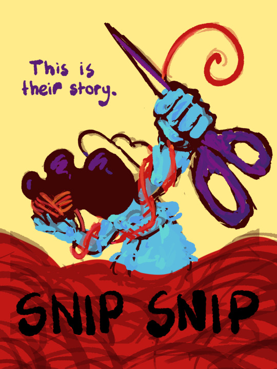
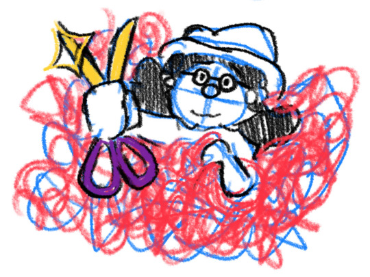
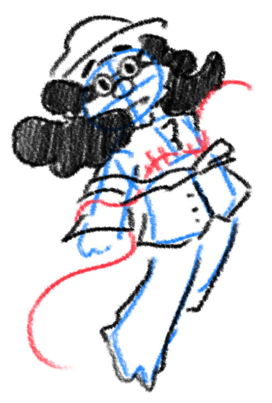
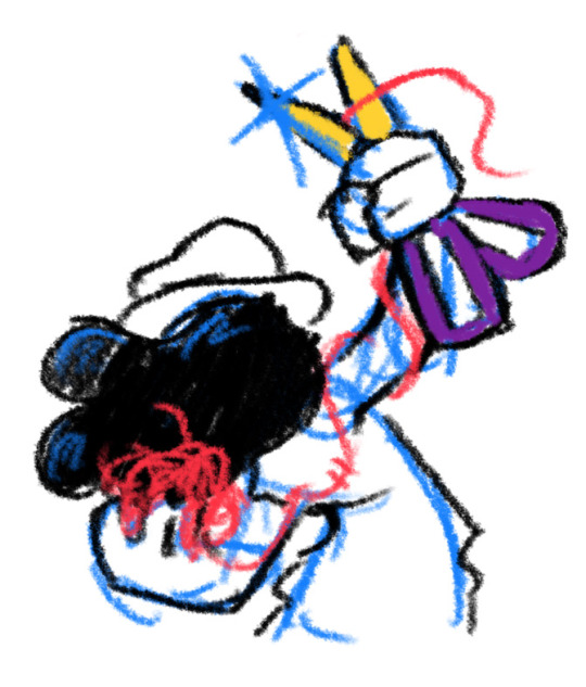
I thought I'd share the sketch of this poster/book cover as well as my initial concepts! You can click the "Read More" button for more in-depth explanations on my design process.
Thhis is all for my latest fanfiction, Snip Snip, so if you'd like to check that out, then...
Now let's crack in!
For the release of "Snip Snip", I actually had several different directions in mind! One was a comic of one of the scenes from the fanfic—specifically the one where the Professor breaks down in front of Kate and Joyce with the line "I don't like being a woman"—and the other was a series of doodles showing the Professor's transition. Unfortunately, both directions met dead ends as I couldn't find the motivation to do either. The most progress I made were these sketches.
If you're wondering, "The first one looks familiar..." that's because I reused that pose for my first promo art! It was too good of a pose. I couldn't waste it :P
But anyways, after a period of getting extremely frustrated over the lack of progress, I realized my main problem: I was biting off more than I could chew. I didn't know this at the time, but I was dealing with burnout from school assignments that made drawing more ambitious ideas like the ones I had very difficult. Hence, I had to scale it down. It made me think, "Why not do something like a movie poster or a book cover?"
That's how the sketches at the top of the post came to be! I consulted a friend of mine over which pose to choose, and he picked the third one which I understand why so. The obscuring of the Professor's face not only made it cool, but it adds symbolism in how we don't really see his true identity—the real him—until his transition. Here's the first sketch!
As you can see, the title is on the top left corner! However, I moved it to the bottom for two reasons
It's advice I learnt while looking up how to make movie posters since moving the title to the bottom tends to bring more focus to the illustration above.
I couldn't find a font that fits! And the idea of doing typography again (especially after the Keep Yourself Safe poster...) was really not what I signed up for.
But then it left the problem of the top corner looking empty. It was too distracting! So what did I fill it in with? The subtitle: This is their story. The composition is now more balanced, and also the subtitle tickles me.
As I said before, I looked up movie posters for this! Special thanks to the Nashville Film Institute and Muse by Clio for their articles that guided me during this poster making process. I will say though I got really sidetracked watching Filmmaker IQ's The History of the Hollywood Movie Poster 😭 It's really interesting, I'd recommend watching it!
One thing I learnt is that movie posters limit their colour palettes. Of course, this is good advice for art in general, but movie posters emphasize on its colour usage to attract the audience with their simple yet bold schemes. It is a piece of advertisement after all! Following their footsteps, I limited my colours to the primary colours (red, yellow, blue) and purple to make the scissors pop and allude to the nonbinary flag colour scheme.
And from there, it was just a matter of experimenting with rendering! I wanted a mix of pop art and storybook illustrations, so I mixed lineart with lineless, and I wanted to retain the energy of the sketch while still polishing it, so I cleaned the sketch, merged it with the colours, and painted on top of it rather than make a separate lineart layer.
Overall, I'm extremly proud of the end result! The struggle of figuring out the promo art for this fic has been tormenting me since the beginning of the year, so I'm glad to bring it to an end. Thank you for reading my ramblings! I hope you learnt something or at least had fun? Either way, have a good day!!
#this truly has been a rambles moment#i really really recommend watching that video by the way it is FASCINATING#the professor#shane madej#puppet history#poster design#art process#design process#art#artists on tumblr#sketches#concept art#chris p fried rambles#chris p fried art
10 notes
·
View notes
Text
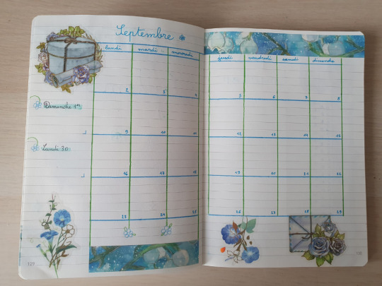
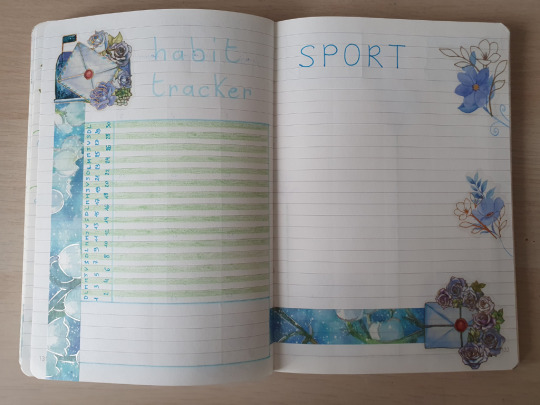
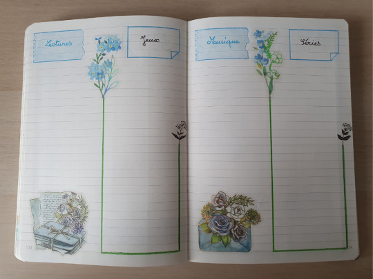
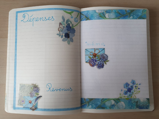
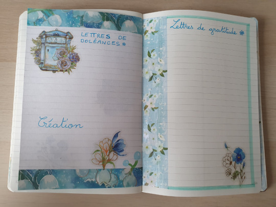
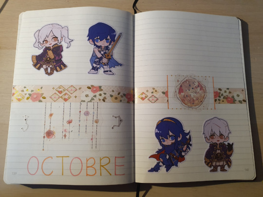
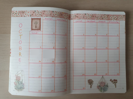
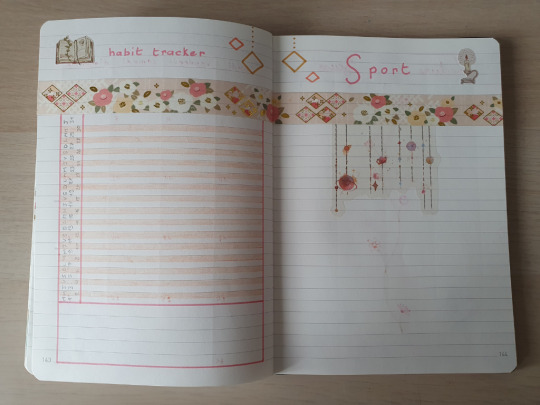
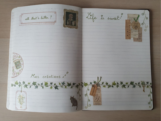
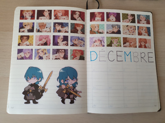
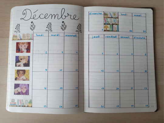
Bullet Journal 2024 [3/3]
The explanation of the page spreads is on post n°2, see the links at the end. Let's get right into it!
Credits for the Fire Emblem Lords stickers @vieryplus
Credits for the FE3H washi tape @calamari-inari
September
Every year I fuck up somewhere, and it was the September presentation page. I chose a theme I didn't have enough stickers / washi / pencils for, so I had to change last minute. I glued the bad pages together, and I pasted a big cutout to complete the month... I love this new theme anyway, so it works out.
October
A pretty cute one, nothing special. I had to improvise the color scheme after the September Incident™ but it looks coherent.
November
I struggled to align the ivy stickers for the presentation page, but the green colors are very soothing. I wish I used the khaki colours more on the calendar, it looks a bit too bright. The last two double page are such a great mood ✨
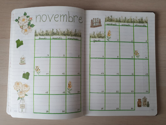
December
The theme is just "I love Three Houses, how did you know?" 😂 I love the rainbow wall of students with all my heart 🖤💙💛💜 (I'll probably end the year in Dimitri's mental state but everything's fine 💀)
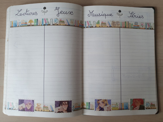
Back to Summary
May to August
8 notes
·
View notes
Text
oh my god thats so sweet of you!!!! thank you :DD also super sorry for deleting your ask btw
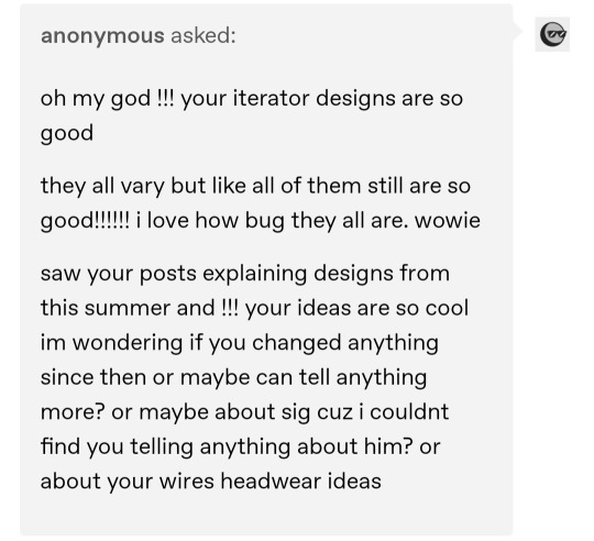
To get down to business well uh iterators huh, so I can tell you have read some of my ramblings before (very fun) and I will say in general I stand by those ideas - model differences and stuff - with some smaller changes here and there, for instance I made pebbles antennas stupidly long cause I think it looks funny - plus tons of tiny refinements, but generally I dont have too much to add unless theres something specific your wondering about - so I wont focus to much on that. Instead I'm gonna chat a bit about the other stuff you mentioned (NSH and wire headwear) ^-^ so heres the guys! (I'm gonna expand a bit on their design designs)
Ok so you have actully managed to point out something I really hoped no one would notice, which is that I never draw No Significant Harrasment (NSH) - who I hope you meant when you asked about sig, if not then dont look at me - and that is because I despise him with my whole heart. Or well, his design, the character is fine but I cannot draw this guy, I hate his colour scheme and his stupid little cape and why is his head symbols green on green - who allowed this - and in general we are not friends, which is a pity because I have alot of headcanons about him. But as you can see above I have semi settled on a design for him (note the semi, I am not super happy about it) and I do have some toughts and explanations.
So first of, I put NSH as being from the same model generation as suns - so predecessing moon and pebs by a bit - with older designs that have a larger focus on "religious stuff" combined with the anchients overall bonkers fashion sense - more is more - if you wanna read more about that its in this post about suns.
- I would also, this is a side note btw, like to mention I think having them being older models gives room to have some key differences between the oldies (NSH and suns) and the youngsters-ish (moon and pebs) in that one, they have older machinery and also early machinery which means both rougher quality and more wear and tear - which I like to think give them both the idea of slugcats as messangers earlier than most, as they knew their easily damaged functions (broadcast masts for example) would not last forever, which gives them a reason to want to solve it (by breeding scugs I guess) and added onto that I - and this is pure headcanon and speculation - like to imagine a lot of the "taboos" that pebbles and moon have - or well that I speculate they have, the no killing yourself or harming citizens taboo is confirmed canon, but I dont think its farfetched to asume they have other restrictions programmed - something that would most likely be added in later modles, but would be absent in the earlier ones like suns and NSH (not the earliest models but early) which theoreticly would give them a bit more leeway and "creative freedom", which ok why am I talking about this back to why NSH looks like that. -
Back to that, so suns and NSH will share design similarities: lack of face (to represent a lack of ego), lots of robes and layers, which leads us into the slightly more relevant sidenote of iterator clotheing:
So fashion comes and goes in cycles, your mom rebeled against her grandmothers clothing choises and is horrified when that fashion comes back via her daughter who think it looks cool again (20 year old rule or whatever) and that also applies to iterator design (look at that old suns ask for more info on this). So while I have talked about general trends a little, now I wanna talk about waistlines - in robes, because I have wanted an exscuse to talk about it, I be brief promise!
: so like you probably havent noticed all my iterators have different waistlines, or at least the ones from different generations - ignore moon, I'm a no robe for moon beliver, I like to draw joints and wires to much to give her robes - and I will sadly report I have not looked to closely at actual anchient fashion for the choises I made, but well cant have everything. So the most notable is probably pebbles, where I, ok Imostly fell for temptation of a modern highwaist cut, which while moslty being about my own tatse, also is an atempt to convey some form of "modernity" because while its a bright orange robe on a robot, it has a similar cut to highwaisted jeans. Which gives the silhoute from a couple years ago with a big bulky upper body and stick legs. But pebbles isnt intresting in that way, no its because every other design is a resistence against that.
And this again leads into the cycles of fashion. Because we know iterators were built under many cycles - however long those are - so we can asume it will be kinda like how fashion has changed from the 11th centrury to now. Which gives to reason that iterators have been dressed differently too. This added with that - from what I understood - different iterator cities (colonies) had different cultures (boradcast, red, in sky islands) all this then makes me kinda figure that the iterators should have different robes. Yes that was a long winded way to say that characters look different.
So back to waistlines and how their all anti pebbles robes - the most notable difference is of course suns, who has no waistline. They are not only without to create a bigger difference between them and pebbles, but to also lean a bit on - and this might not be the same for every culture - but on the general idea that older clothes were more "modest" or in this case, there are more layers and any hints of there being a body under there is desperatly covered. and that "modern clothes" have less layers and have show more skin - not that pebble is showing skin, but hes wearing one robe instead of seven. So with that the idea that suns is older is conveyed a little bit at least, and the same then applies to NSH. NSH while also having lots of layers, is different from suns by having an empire waistline, mostly because I think their cute and need them to look different, but also to give a hint that they have different city fashion cultures and also because when I see empire waists i think old paintins and old paintings=old.
-also while I'm on the subject of cultural differences between iterator facilities. Can we talk about how we only really get to see anchient society as its presented in moon and pebbles (shared?) facility. So really its very possible the whole aestetic is complelty different like five local groups away. Food for thought. -
So faceless and robe-rich is a similarity between suns and NSH, and I could mention many more, but I'm gonna restrain myself and only talk about headphones. As you can tell I - and most fanartist here - like to draw their antennas differently for all of them! which is also canon, but I also ignored canon so were gonna talk about it. Mostly the antennas give room for some fun mini details, like how moons look like wings or fins while suns are just sunbeams.
Anyhow so most people make NSH bald, me included, mostly because the super cool official art of him gives him no antennas (sad). I asume that means he works via bluetooth.
(I was about to start speculating about their headphones but that got to boring even for me so sorry if your super intrested in why iterators probably have headphones)
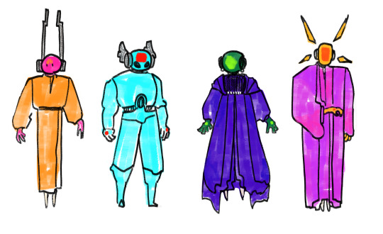
But I had a ulterior motive with bringing up the headphones - and not only to be able to point out moons antenna, which I delight in drawing - but also so that I can transition into the second part of this way to long response! itertors hairdos... wire-dos? basicly this \/
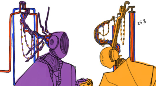
(im reusing my wip because these are a pain to draw so we use what we have - I coloured them in a bit for better oversight.)
(also I was gonna start talking about if iterators would actully do personalisations like this - as we can argue about if they concepulize themself as their puppets and see a meaning to decorating them - I would argue yes but also its complicated- and also explain how iterators have different prefernces, which I realised most people probably already asume so I didnt need to explain that - anyhow so that got to long so I'm not gonna get into it. Instead were gonna go into this section with the assumptions that they do fun things with their wires. and also that the wires connect to their nape and backhead instead of their back or spine.)
So to me th biggest thing to remember when we talk about potetial wire headwear is that:
- iterators live 24/7 without gravity and because of that cannot be bothered by to heavy headwear, therefore theres rooms for them and anchients (and me) to get funky with it without having to concider gravity.
-anchients wore absurdly many decorations - and while giving iterators flashy decorations does take away from my earlier statement that they were based on more humble monk stuff, we are going to asume they used the fancy headwear for cermonies and festivals (which we also know anchients did) and that it was used for showcasing and fun. If some iterators preffered to keep them afterwards is another query.
So with that in mind lets break these headwear thingies down!! :D
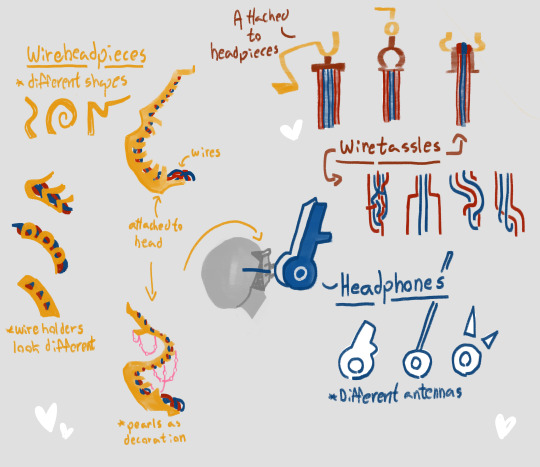
so as you can (hopefully) tell there three components in the headwear. The headphones that are different depending on iterator and are not removable (or as unremovable a computer part can be). Then theres the actual headpieces that keeps the wires togheter. These can be switched out and changed depending on whats preffered - also I drew them in gold but any material works, if were being closer to canon they would probably be made of some purposed organism and maybe be neon pink - theres also pearls dangling from them because its a perfect opertunity. Third theres probably the part I think is the most fun which is the actual wires. They obviously go through the headpieces and then are set free via wiretassles (that also comes in different forms) and after that is where my own speculations about wires comes in. Which is really simple in that iterators can most probably move the wires at will - they can control their arm thing, pearls and other objects in their chambers, reasonably they can move the wires - and I think its fun if different iterators move them differently. Like suns keeps them straight and neat, or pebbles moves them in syncronized formations or moon who just lets them hang, so many oppertunities ok ( you can see the general idea in the drawing). The wires then connect to their movement arms and connect to the mainframe.
And thats kinda about it? I dont have like anything super intresting to say about just the hairdos other than that I think its very fun and also that everyone is sleeping on wire customizations I am obbsessed with the idea send help.
Ok I think I'm done chatting!! Hope your still here and that this wasnt insufferable to read. Uh, thanks for the ask :D
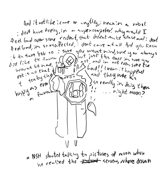
(NSH for your enjoyment)
#asks#rain world#no significant harassment#also sorry this took a bit to answer i got distracted reading moon and pebbles dialouge trees#i suddenly have so many toughts about how iterators see themself and how they work#anyhwo also HI IF UH someone sent me two really long asks on anon about my reverze iterator au and if your reading this PLEASE dm so i can#gush about it its such a delight but im so bad at answering asks that i forgot to answer#so like if your seeing this hit me up please#also this applies to anyone i am a way better chatter in chatrooms#ahem yes sorry actual anon i just had to say that!!#anyhw aughjdofje your so sweet for sending this!!! hope this was close to what you wanted :)#ok ok we are listening to guys on every corner by the mountain goats
14 notes
·
View notes
Last Seen Blogs

mhatet-xxv-blog
mhatets:]
killedbyfrank
Brickoli Biggest Fan
dopaprime-blog
the art of dopaprime

classychicoutfits
Untitled

asayuriofficial
AsaYuri