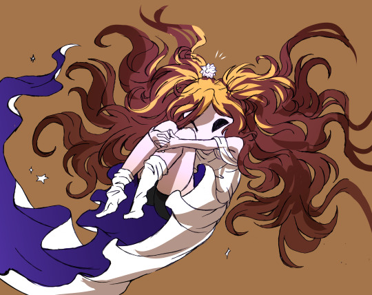
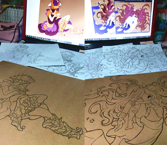
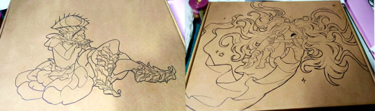
#i ruined the lineart by adding color
Text

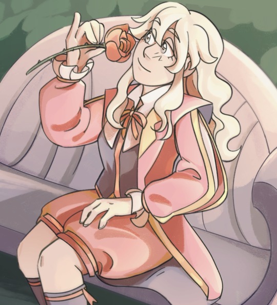
my father preached on sunday and the church had funeral flowers sitting out from the day prior. i sketched them while i was there, then made this based on a few of them. i think it turned out nice.
i used Artist's Loft colored pencils and soft pastels, as well as a gelly roll while liner. the sketchbook is also from Artist's Loft.
cross-posted on Insta
#art#flower#funeral flowers#yes#i drew funeral flowers#they were pretty#i get that it may be morbid#or at least my dad acted like it was#i like this drawing#i ruined the lineart by adding color#whatever#i'll never imprive if i don't suck first#enjoy my trash#flowers go brrr#have a nice day#soft pastel#colored pencils#i like multimedia art#mortus draws
4 notes
·
View notes
Text

Magma doodles of a reverse espresso I made on the fly that I decided to clean up.
#cookie run kingdom#crk#espresso crk#espresso cookie#swapped with Madeleine#obviously#tthe friend i was drawing with made Madeleine#so go check out hemlock for that#doodle#no detailing srry#why the hell did adding color ruin the lineart#im broken over this
22 notes
·
View notes
Text
Dnd oc Nadia for pose practice, and lineart practice. I'm doing some art training these past few months.
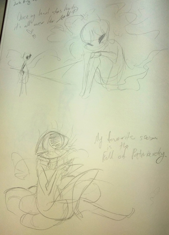
#my art#my ocs#i accidentally merged layers too early and ruined the lineart with a perspective blur --#and wasted a lot of time trying to bring back the lineart from an older layer....#lesson learned... but also i like being able to liquify all layers at once and it's a hassle unless they're all merged#maybe i should stick to 4 layers.. lineart .. foreground.. background adfkasdfh --- and atmosphere on top#nadia is so pink and golden that darker colors muddy outfit rather than adding contrast :(( --#so i wound up putting big light on her cover up the muddy color mistake but now she looks overblown ajdfafhfhdskfj
10 notes
·
View notes
Text

this is so stupid but i actually quite like jayce's skin on this one--- it looks like its supposed to be
#coloring in general is a bit harder when your line isnt black; at least thats my experience.#you have to play more with colors to make them fit; and also some colors are not... registered as the actual color they are.#like for black i actually use deep purple; but it cant be too deep bc otherwise it ruins the whole aesthetic#with the line being lighter than the filler. i dont use actual black anymore i think; its always some shade or purple.#depending on the other colors i use a very very light shade of pink/red for white. i can also use actual white#but then again; it depends of the other colors lol. and in this case isnt even that light of a color. skin is other issue#i have a palette full of skin colors but i dont really use it for just the color-- i moreso use it as a reference.#then you have me being all stupid with the color wheel for a bit trying to find a color and the saturation that fits the piece.#and dark skins are kind of their own thing; bc otherwise it doesnt give the image of actually being brown#and actually gives the image of idk you fucking slapped a random color on them. and VEEERY rarely actual brown in the color wheel works#rn jayce's color is in a mix between pink and red. but it doesnt looks like that!! it mixes and looks brown in the piece.#i used a different color on the one with chase but that was because the lineart colors were different kjsnfkjndjfds#so yeah for someone who doesnt have that much of an eye for this; this is kind of a training in a way. its ok though#i refuse to go back to pure black lines the thought of doing them sickens me (no that doesnt means i dont like when others do them)#(and no im not saying using black lines its easier or not as worthy or something its not what im trying to say)#sorry for going in a ramble about how i color?? idk sorry i just thought about adding it#lilith whispers
1 note
·
View note
Text
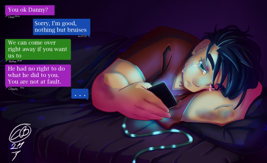
Sleepless night (colored)
It's the end of @green-with-envy-phandom-event and I'm collecting all the lovely posts where my lineart was colored (and coloring it myself because people are inspiring)
Let's start with @englandamericaitaly who made an alcohol marker version of this with blinds shadows falling over Danny, and did an absolutely amazing save adding details where the markers made a happy little accident and I can't tell where that was. Awsome.
From @nanaarchy we get this version placed in the gore category because of the bruises but that's not the only thing that packs a punch in this one. The text bubbles adds so much to the piece and brings it all together. And I just have to point out the posters in the background and the Stars on the blanket! XD
@fuyuthefoxwriter gave us this version adding a NASA phone case and really showing the bright light in Danny's face from the phone. And you are right "The sleepy insomniac trying to sleepy without a ghost ruining it" it doesn't work, but maybe turning down the light levels on his phone would make it easier. ^^
Continuing with @balshumetsbaragouin submitting this version. My thoughts are just STARS! Yes! The gentle cell-shading gives a softness to this one and the text below is so true. School starts in 3 hours and no sleep.
We have @audaciousanonj giving us this version focusing on the light source of the phone (which was my intention when making the lineart XD)
Finishing off with @jamiethebeeart who made this version that has such calm and softness to it reminding me of the early mornings when the sun is on the face and one rolled over to avoid getting it in the eyes.
169 notes
·
View notes
Text
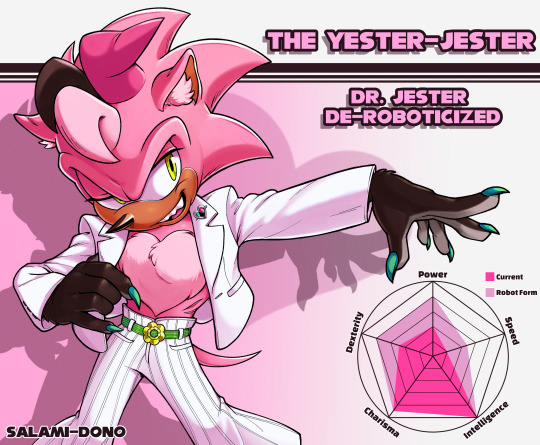

What did Dr. Jester look like when he was alive? He looked like this! Yup, I've restored Dr. Jester's original form, the hypothetical Yester-Jester. He'd only go through with de-roboticization if Uncle Chuck/Sir Charles Hedgehog asked him to. (Yeah, Chuckster!!!) Dr. Jester could only be ruined by Uncle Chuck. Not reformed—ruined. tee-hee 🤭
Why would he give up his immortality...! What a fool.
My friend said that my art looked like a JJBA Stand stats eye-catch, so I added a pentagon for ability parameters. It helped me fill up the empty space. 😸 His intelligence is maxed out, but he certainly isn't as wise as Uncle Chuck.
I also included a version without the color layers. The lineart was my favorite part. Unfortunately, the pen I used can no longer be found.
59 notes
·
View notes
Note
palette 80 ancient ruins for mensah?
oh boy this is another one of my favorites so far
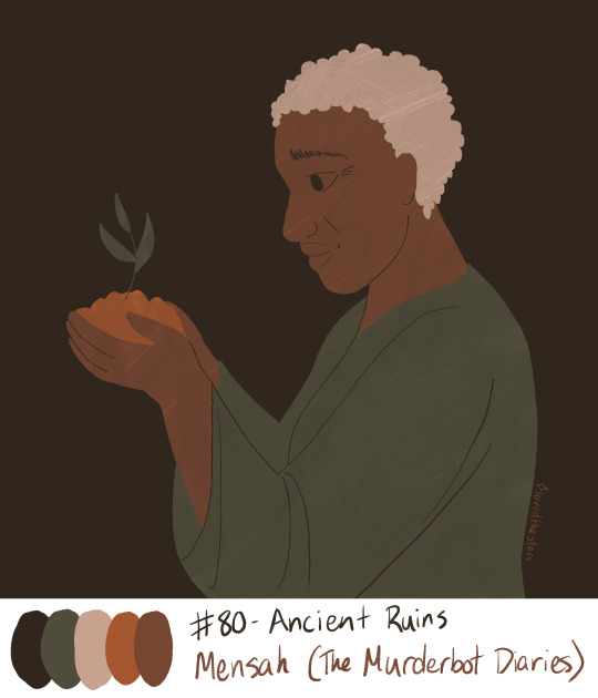
The palette made me want to draw Mensah on Preservation or in a way that represented Preservation's ideals. The second this image of her with a Plant popped into my head i was like YES. I did a sketch and filled in just the flat colors with no lineart and then was astonished at how striking & simple it looked, almost like a mural. I added lineart but only where I needed it, and in the same color as the background--the way I did it actually reminds me a little of Ancient Greek black-figure pottery, which is fitting given the palette name! And i distressed it a little with a layer mask to make it look painted and a little worn. I'm so happy with how earthy and soft this looks 🥰
(I'm making some fun & low stakes drawings from this palette challenge! I have plenty of prompts lined up but you can still send me a palette + a character or idea in my ask box! 💜)st
#stars art#palette game#ask game answers#murderbot#murderbot fanart#the murderbot diaries#mensah#this one is really simple but i think it's more impactful that way#also for once i did not have to hesitate over drawing a face or find a way around it#i've drawn mensah a bunch of times for my animatic project!! i know how to draw her!!#it would have been fun to give this a cool border but i didn't have the patience for it
98 notes
·
View notes
Text
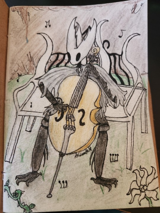
i think they should play the cello. as a treat
i feel like i ruined this the second i added color but by the time i did it was far too late to turn back. thats the unfortunate peril of traditional art
i dont hate it, still, but i liked it much better when it was just lineart, rip. still sharing it
heres the sketch. while the lines arent clean it represents it well enough
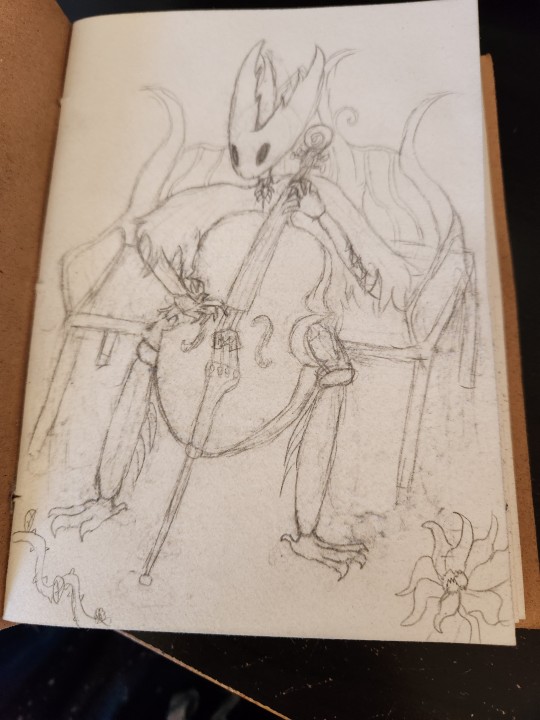
maybe ill go over the sketch digitally someday and clean it up to be just black and white art
#akira scribbles#hollow knight#hk#the hollow knight#thk#fanart#theyre plucking cause i didnt wanna draw a bow#sorry for how shit the cello looks. despite being a string player for 8 years i still cannot fully grasp a cellos proportions#probably because im a violinist
37 notes
·
View notes
Note
Just rambling here bc I saw your post about putting the flat colors down first before inking and OMG it's so much better than lineart then adding the flats. you can get way better shapes and anatomy down when you aren't focused on lines. rachel why did you stop using this method DX
I have seen drawing footage of her lining over the colors that are from as recent as S3. Nowadays though it seems she just has her assistants flat everything out for her and put in the lines, most of the time it seems all she actually contributes is the shading and backgrounds after the fact (and it often ends up ruining the flats themselves, which is a huge bummer)
It's a great method though! I've definitely stuck with it since making that post, at least for Rekindled. And I've found it's helped me get an even stronger grasp on anatomy that I couldn't before so even when I do go straight to sketch and then lines, my proportions are coming out way better now. It's great :> <3
#ama#ask me anything#anon ama#anon ask me anything#lo critical#lore olympus critical#antiloreolympus#anti lore olympus
54 notes
·
View notes
Text

en ver.
✩! COMMISSIONS OPEN!✩
•PRICE:
(excluding taxes)*
*countries outside the EU will have to pay the monetary tax (+1€/2€)
- (10€-15€ if per character added)
—1: full effects
Bust : 16€
Half body : 20€
Full body : 26€
—2: flat colors
Bust : 14€
Half body : 16€
Full body : 22€
—3: only the line
Bust : 10€
Half body : 14€
Full body : 18€
*price may vary depending on request details (few details: price may be lower; detailed: price may increase)
.
↳ 2 lineart:
(you can choose the one you want the price will not change)
-textured line
-classic line
.
•RULES:
- Payment via Paypal only!
-You will have to pay 50% of the price before I start the sketch (for obvious scam/fraud reasons).
- Do not remove my membership logo.
-Credit me if you reposted it.
- Respect the time I need to finish the commission. I don't want to rush at the risk of ruining my work.
- No commercial uses.
-I have the right to refuse a commission.
.
•I draw :
-OC
-Ship (couple) / Selfship (you + a character/person)
-Real people in my style (next slide example)
-Fanart
-Random character
•I do NOT draw:
-NSFW
-Furry
-Gore
-Realism
-Mecha
.
If you have any question :
• DM me on my social media
• send me an e-mail: [email protected]
• Check the link in my bio
#art#artwork#digital art#small artist#character art#drawing#ibispaintdrawing#ibispaintx#sketch#commisions open#open commissions#taking commisions#commission#art commisions#commision info#commisionwork#drawing commissions open#drawing commisions
3 notes
·
View notes
Note
https://csmeaner.tumblr.com/post/691136250561888256/chowlings-im-never-gonna-b-over-the-fact-that
I used to really love this Chow's original design, and I hoped to trade for it. Then Saphir got it and ruined it like every other chow they get.
https://chowlingspecies.com/images/characters/0/900_rUejpxrk7B.png - honestly, cute design for Halloween. I like the tail.
https://chowlingspecies.com/images/characters/1/1336_meDgLibWyn.png - whatever absolute dogshit this is? and I don't mean the accessibility stuff either; im also disabled that isn't the part that's bad. It's such a vomit of design pieces.
post related
the usual saunt boringness. oddly the lineart is clean edit: that's because it was drawn by someone else lmao

this looks like someone wanted a mignyan but ended up with a chowling. i think the main problem is just the pose. above all limbs were separate and visible from each other, but this one has them mostly overlapping and suffocating the space. it's just overcrowded and the added colors turned it from something clean and charming to something with too much
3 notes
·
View notes
Text
Sort of MercyTale Patchnotes but also not
Writing Chapter one and Figured I would give an update on how its going now that I finished the updated designs! continued underneath the cut~!
Prologue is done! with little glimpses of angst!
I have an editor now! my good friend Mouse/TastelessSkin agreed to help me out! :D
Melody is officially gonna be trans. not going to affect the story, but the idea wouldn't leave my head.
I know now that, canonically, Sans doesn't actually remember resets... but he kinda has too for this au to work (I'll try to keep him as canon as possible in other works of mine though)
Cover art is sketched out, so I just need to finish the background and lineart/color/shading and it'll be ready for the post!
I'm playing through a genocide run slowly while I write this- the idea is for me to be able to run around the underground so that I know what rooms come after which. its a lot easier on my brain than just looking up a map lmao
also kinda unrelated but Mouse found me a dark mode extension so now my eyes don't hurt/strain when trying to write.
Mouse is the best and I will fight ya'll on that.
Also, EVEN MORE EXTRAS.
...My brain decided to try and come up with what the different themes/music would be for the au and now I can't stop it lmao.
The ruins would be similar to their original theme, but more somber- kinda like your walking through an empty tomb.
Flowey's theme would be similar, though a bit less somber than the ruins.
Snowdin would seem verry calm, kinda give you the abandoned ghost town kinda vibe
Waterfall would be similar to the ruins. its original theme is already pretty somber though, so maybe just some haunting wind added to it?
Hotlands would be waaaayyy more quiet and less bopping than it usually is. unlike the others, it would also be a decent bit more ominous, like your slowly approaching something sinister.
the core would be even more ominous- its like, the ominous feeling is slow, starting in hotlands and coming to a climax after the core.
New home! this is where its REALLY unsettling. It would give you the feeling of being watched by something really, REALLY dangerous. like a giant predator is nearby but not yet chasing you.
Sans theme would, obviously, be megalovania, but it would be very orchestral. a slow build up, but once it got going its GOING. it would have hints of 'Your worst nightmare' and 'Finale' in it, but it would have quite a few more pieces of 'Megalo strike back' strung throughout it. It'd kinda sound like the boss music for an eldritch deity, or something out of monster hunter.
the Soul remnants theme would be their original themes (Bonetrousle, heartache, Spear of Justice, etc) but with a more haunting, somber feeling to them.
Honorable mention, but Melody's theme would probably be pretty cheerful. kind of a mix of toriel's theme and 'Your best friend'.
...yes I'm putting a lot of thought into the rewrite. this au/fic has been unfinished since 2017- I think its about time I finished it.
0 notes
Photo

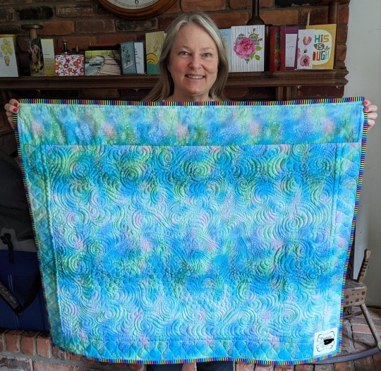
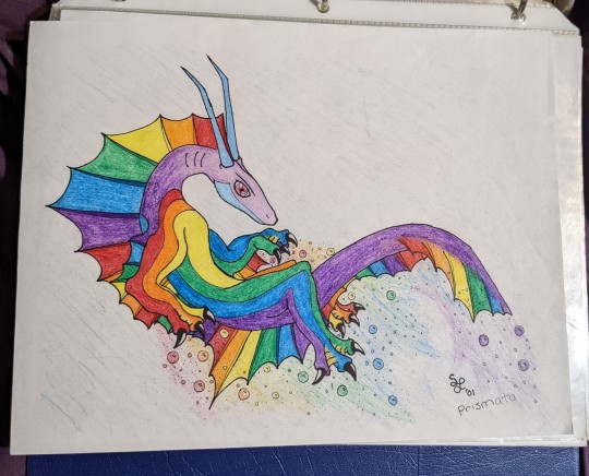

In high school in 2001, I drew a dragon.
He was an ocean-faring dragon named Prismata, the father of one of the main characters in a story I wanted to write called “Adrift.” The story centered around a small pond dragon named Koi that gets swept out to sea and meets a young sea dragon named Prism- Prismata’s son. Prismata has gone missing (”missing,” I know where he went, he ran off with Amethyst), leaving an imbalance in the local ecosystem’s hierarchy, as Prismata previously protected a huge swath of the ocean in the area. Prism has been struggling to hold onto the same territory against a young mongrel dragon named Rife that is determined to prove his worth. Koi arrives in the middle of this, and helps them to come to peaceful terms so they will take him home.
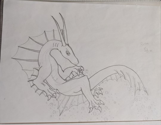
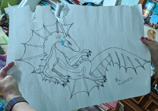
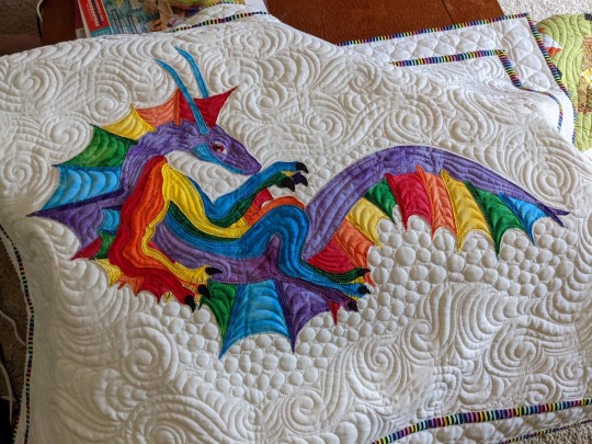
My mom, @mamaspark, adored the original drawing of Prismata, enough that she wanted to make a quilt of the drawing. In 2006, I redrew the drawing with a little simpler design, and she made the lineart into a pattern (pictured above, slightly chewed up by her cat, Finny, who was Helping as cats are wont to do). SIxteen years later, today, she presented it to me for my birthday!
The piecing on it is absolutely amazing, down to the little black claws that are actually individual pieces of fabric she stitched on with hair-thin thread. She sent it out for quilting to someone that quilted in the bubbles and the swirling water. The rainbow fabric on the edges came from a friend of hers. A lot of work and a lot of anxiety went into this, but it turned out perfectly imo!!
She made the grave mistake of telling me she almost put sparkly gems in the bubbles and colored the rainbow trail he makes in the water, but she chickened out because she was afraid to ruin it. I told her no amount of added rainbow would ruin this boy. So she still has it in her possession, hopefully to add rainbow to the bubbles, and I cannot wait to see it bedazzled!
#dragons#dragon#quilting#quilt#artwork#crafting#my mom#personal#good things#prismata#my darling boy#complete asshole of a creature if you're wondering#but pretty enough to make up for it
2K notes
·
View notes
Photo


Gift Box Art for my dearest beloved @lunarcatten and @konveeart 💗
(They were extremely late birthday presents that I enriched in care package for Christmas)
Making Process ⬇
So, I got a cardboard box like these to send a package and I really loved it so I decided that i wanted to use similar ones for those two and the idea to paint them came along, cause I thought it would be neat.
I sketched both ideas very roughly
Then proceeded to doing the full sketch on a different paper.

After that I scanned them to test out some color ideas (because I am not very good at colors). Catten’s eye girl was originally going to be in shades of pink, but I liked the Halloween colors better at the end.

After that I used the light table Konvee had gotten me for my own birthday a few years ago to re-draw the sketch on a new paper so I could eventually pressure trace it on the cardboard.

Due to the texture of the paper I couldn’t see what I was drawing very well, so I thought I might as well use a colored paper in between and see if it works.

It did! And so, since I didn’t have carbon paper, I had to re-draw the sketch on both sides in order to transfer the pencil on the cardboard.
Suffice to say- I was super stressed during that process, because I had washi-tapped the A4 onto the box and drew over it, but I have no way of being sure it was working. So once I was done and removed the washi to lift it, I breathed a serious sign of relief before I started inking.

I used typical MICRON Sakura pens for the lineart.
I was very happy for how they were coming along at this point!
I knew I would use acrylics to color them (not any specific brand). I think I had painted some cosplay props with acrylics in the past but I haven’t drawn with them. Generally I don’t draw traditionally too much and even less so with a paintbrush, but I wanted the colors to stick (shoutout to my mom for grabbing two tubes of white acrylic for me, because I didn’t have any).
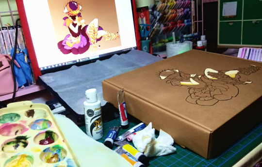
I was really excited of how well they worked and how fast they dried. Having the reference I had made for colors was such huge help.
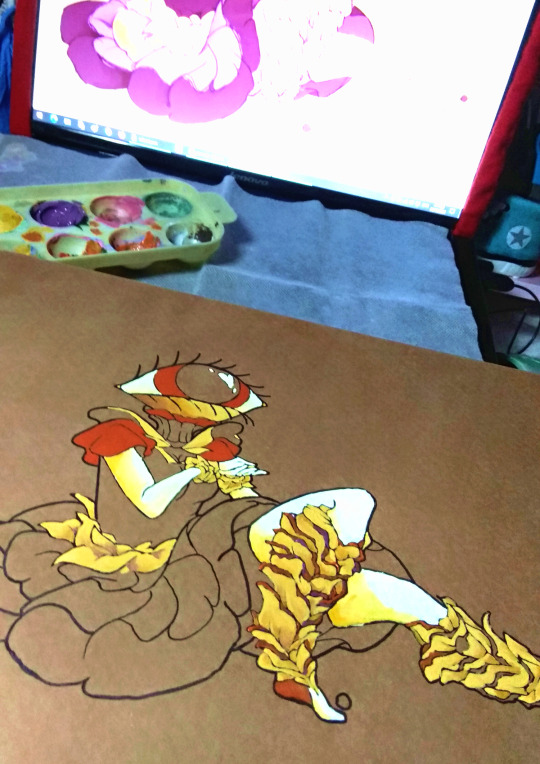
She was going to have a quote as well, but I didn’t trust my handwriting and I didn’t want to ruin this at this point, so I added hearts in her colors instead! 💛
I was very happy with this result and so I moved on with Konvee’s drawing. let me tell you- I was DREADING that hair.

I started from lightest to darkest, since it had worked well on the first one and then I started painting the hair. I did go to sleep at some point here in order to continue the following day.
Both their hair and the sky I ended up adding inside their dress took a lot of layers, not because the first ones didn’t look good, but because I was just indecisive. In the end, I made it!
Finally, I went over it all once more with the MICRO to revive the lineart and done!

I was really excited to give it to them, because some of the things included in these boxes I had kept in my wardrobe for half a year.
They both loved them and in case you’re curious, the boxes included pins, keychains, artbooks and some art supplies. ✨
24 notes
·
View notes
Note
how many layers does a typical piece of yours have?
too many. I delete and merge layers constantly, but photoshop counts every new layer so it’s naming every new layer as the total amount of layers you have. i’d say typically I use 80-250 throughout the entire drawing, although I’m never using that many at the same time. there are a couple reasons why I use so many: 1. I like being organized when I work so I sort things into folders and name all the layers, 2. I’m a huge perfectionist so I often duplicate layers to keep them “just in case” and when drawing things like fences i’ll use a brush of a certain size and draw lines to make sure the railings are evenly spaced, and then outline that for the lineart and then delete that first layer, and I redo things again and again and again until I’m satisfied, 3. when I use references for for example a balcony or wills face, it really annoys me to have them on the side so i’ll for example copy part of his face and drag it so it’s next to his face for a closeup, 4. when adding details sometimes i’ll make a low opacity white layer under my new layer so I can see more clearly what I’m doing over the older layers, 5. I use ctrl+shift+alt+e or whatever the shortcut is to copy all the layers pretty frequently to move things around or check how this or that would look without ruining the actual drawing. I also use this to compare several versions of the same drawing to see which one I want to use. and 6. I use new layers to fuck around with the colors, you’ll understand why I say that if I do a post on coloring. I have a specific technique I use but often it means I make a looot of layers.
19 notes
·
View notes
Text
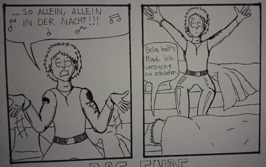
Madness draws: Behind the Scenes of the “Alleine in der Nacht” die ärzte fan comic.
A few weeks ago I posted this comic:

This post is yet again just another drawing behind-the-scenes post but You can go and reblog the original post here.
And as always, all my ramblings are under the cut!
This one was relatively easy to do because I just woke up one morning and internally died from laughter because this idea just happened like a random pop up window in my brain. I wrote it down to my phone notes and later on also into my sketchbook:
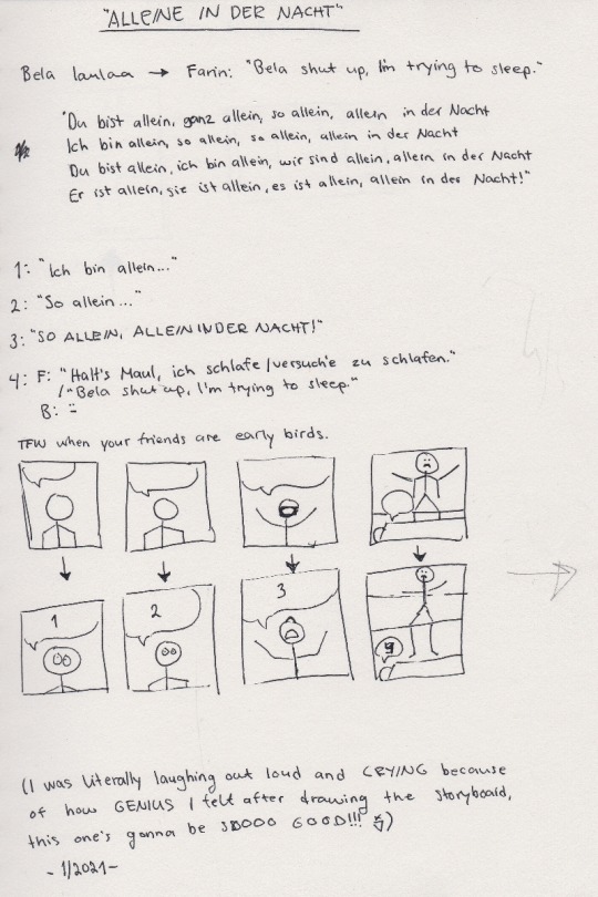
I was laughing out loud when I was drawing those images, Bela’s face still is cracking me up :D And because I’m yet again trilingual with my comics, there’s only one word in my mother tongue and it’s: Bela laulaa = Bela sings.
And other fans might recognize the lyrics of the song, I needed to write them down in order to decide which ones would fit the comic the best.
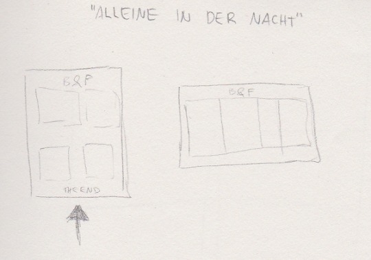
This one is then again me trying to see how it will fit on a A4 paper. Originally I saw it in my head more like a short, regular comic strip with 3 panels but somehow I couldn’t get it to fit into 3 panels. And 4 panels was too many in a row so I decided to go for a full page then. That caused bits of trouble to me because I normally don’t draw the comic book faces THAT big and it’s surprisingly hard to draw them in bigger scale. (With pencil drawings it’s the opposite, the bigger the better. It’s much easier to draw an eye the size of a finger instead of a size of a tip of a needle.)
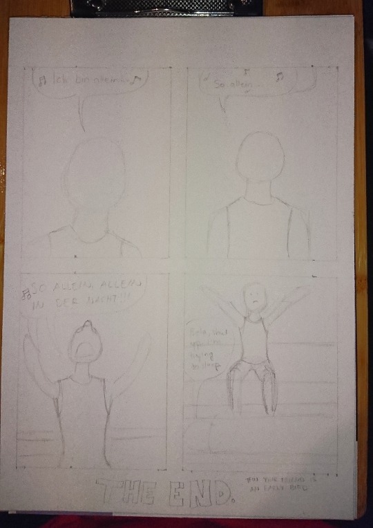
Here’s the first sketch! Just the shapes to see how and what I need to draw. Sorry for the awful photo quality again, my phone’s camera has really gotten really bad after these 3 years of use...
Anyhow, the third panel caused me some troubles because I knew how I wanted Bela’s arms and hands to be but I didn’t see them that good in my head so what I did next was to try different postures into my sketchbook:

I also tried this foreshortening technique I saw in a video of after a Tumblr post, even tho I don’t find that too hard to do myself anymore but it was still interesting and can really help making the eye and brain to see the image in 3D. So here I finally figured that I wanted Bela to have is arms like he was singing something very theatrically. I think it turned out pretty good.
Next I struggled with the bedsheets and I figured that I am a bit too good at blocking out information when I draw because I tried to draw unmade beds from reference photos and I’m able to follow a line but also able to completely not see any other lines around the line I’m following. Like I’d often follow a line to somewhere and suddenly notice that wtf there’s SO MUCH MORE lines all over the place in the photo but I just did not see them.
^Here’s two pages in my other sketchbook that I got for the comic stuff especially because the paper is actually white. The bigger sketchbook has light yellow tint to the paper so it can mess up with the colors when I need to try out and look for perfect colors from the colored pencils. (This sketchbook is also smaller aka A5 because Derwent sketchbooks are expensive but this was the only A5 one with a bit grainy paper in white. The A4 one is cheaper and from Mont Marte.)
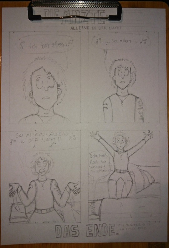
After a while I was done with the besheet and the rest of the second sketch. I don’t have a photo of the comic with just the lineart, only a photo where the first panel is already colored and now I actually need to talk about the coloring.
That caused me lots of trouble because I really love playing with lights and shadows in everything (drawing, photographing... everything) and I do know how to do the night effect in black and white, but I have only once before done that with colors and it’s never that easy. Plus that one was my first comic when I started drawing again in 2018 and it was not that good to begin with.
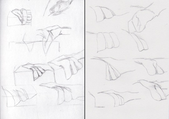
I run some tests with the pencils, as well as some shading tests:

Käsi = hand, iho = skin. I use Derwent Flesh Pink (I have a 72 set of Derwent Watercolour pencils) for the skin color and was then trying out other colors to see which one would look the best for shading. It was actually really difficult to do and my sister suggested that I’d use only cold colors but like... how do you use cold colors on a skin without making the character look dead? :D
I imagined that there’s a moon shining in from a window that would be behind the “camera”. I almost ruined the first panel because I wasn’t exactly sure what was I even doing and what did I want from the colors:
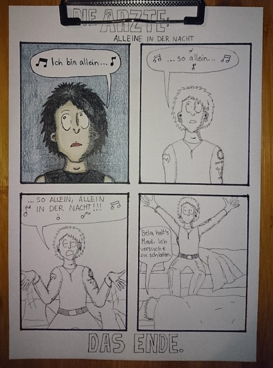
Here’s the lineart and almost finished first panel in colors. I really liked the lineart and this would have looked so nice in black and white too, maybe even better. But I just saw that blue background so strongly in my mind that I just had to go for it.
The first panel was really difficult to do like I said and I almost ruined it at some point. But it also taught me something because with the rest of the panels I knew to start with the skincolors and end with the black (I started the first panel with black, I think... kids, never do that, always start with the light colors! :D) and I think the last panel is the best what comes to the colors in the final comic. I also added light blue here and there to make it look more like the colors of a moon at night:
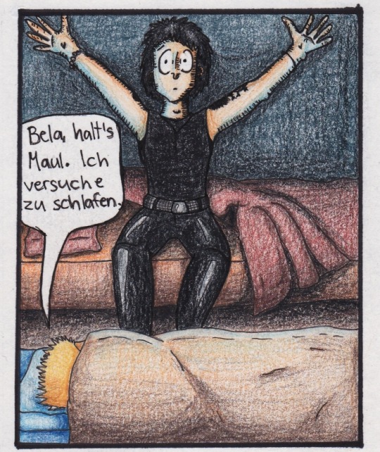
I’m actually very happy with all of the other colors in this panel! It also reminds me of a book I had and used to read as a child. It was about this girl that went to an appendix surgery and all the images were drawn with either colored pencils, pastels or crayons and it looked grainy the exact same way as this one too. It also had lots of red and orange and brown colors in it. (I wonder if I still have the book here...)
Then there’s also the title and “Das Ende”. Originally I was going to do the late 80s logo they have e.g. on the 80s live vhs/dvd but then I just saw another post in my dä blog’s queue and I just needed to do this logo instead!
I had just a couple of weeks prior ordered a pack of white Sakura Gelly Roll pens and needed to test what would make the best compination and with which black!
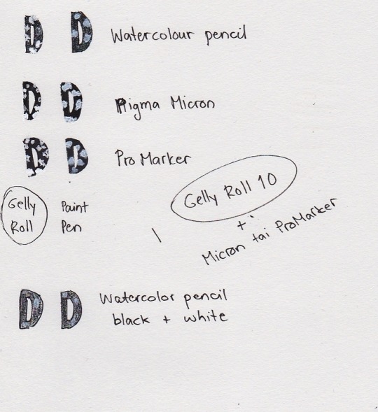
I also had bought a white paint pen but it’s useless. As you see, it just looks grey after it dries and it just... doesn’t look nice. Plus it takes so much time to dry AND it’s extremely messy and I have paint more in my hands and a puddle on the paper but barely none where it should be. So my choice for the logo was to use either Pigma Microns or Promarkers (I think I chose the latter) and the thickest Gelly Roll aka 10. This was the result:
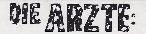
And I’m actually super happy about how it came out! Couldn’t do that good looking spots on the letters because can’t make splashes with a gel pen so I did a few bigger ones here and there and then just poked everywhere with the pen to make it look more random. You can actually see how it’s slightly whiter than the paper if you look closely, but it’s not too strongly whiter so it looks pretty nice like this.
So, this was less work than the “Widumihei” one but it was also an interesting piece to draw. And I think I have now this comic drawing more freshly in mind so that drawing the next ones (there’s three waiting for sketching already) will be much easier as well :)
#here take the last behind the scenes post then#I mean next ones are going to be actual new drawings because now I'm done with these I had in mind#mcrmadness draws#mcrmadness draws: behind the scenes#my comics#dä fanart#die ärzte
7 notes
·
View notes
Last Seen Blogs
lastkissmp3
Meet me in the afterglow
sairobee
sairobee . tumblr . com

ga179us
Untitled


thatrabbitcom-blog
#ThatRabbitCom