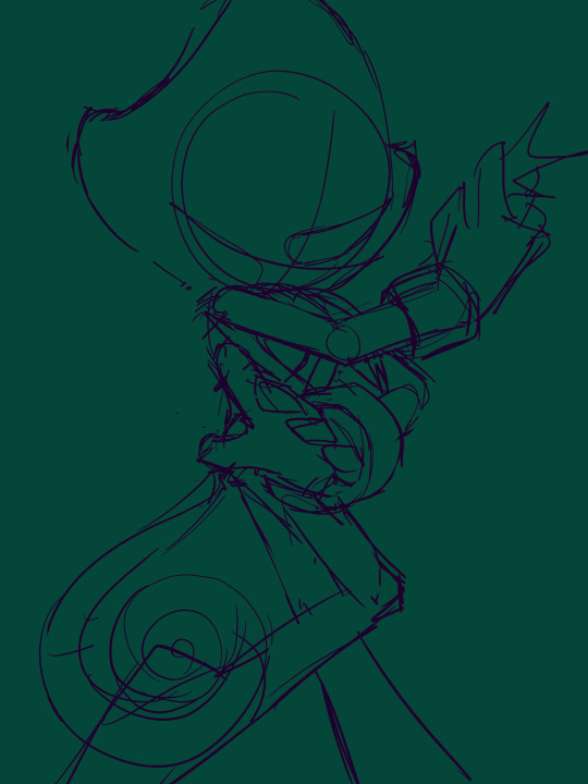
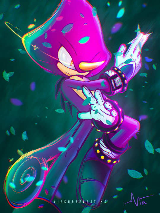
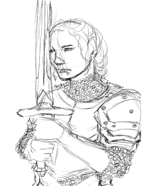
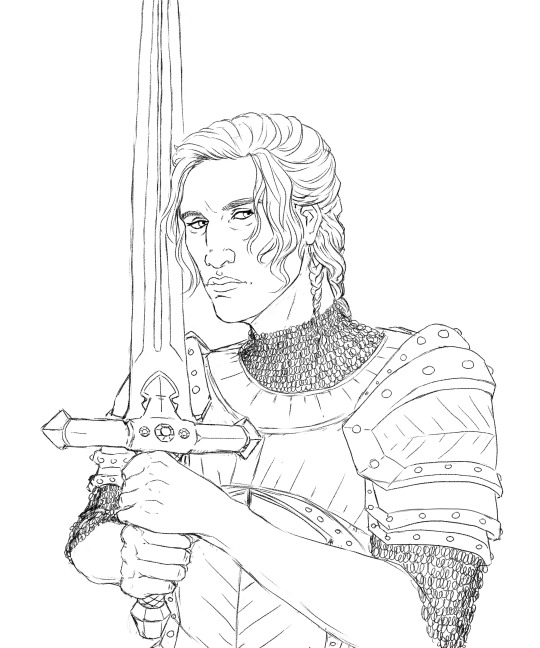
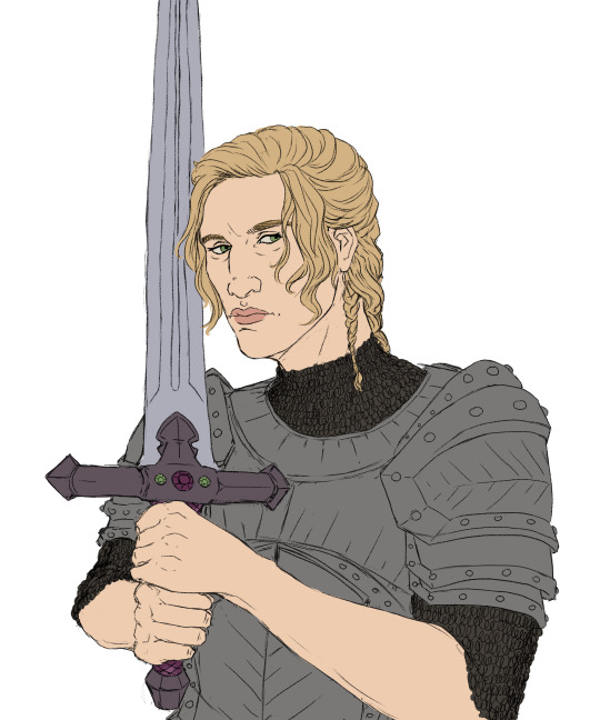
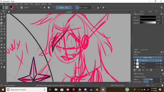
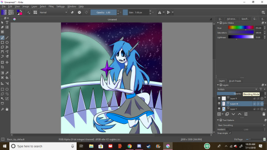
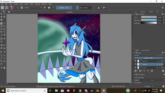
#i’m getting better at doing lineart-ish stuff!! :)
Text

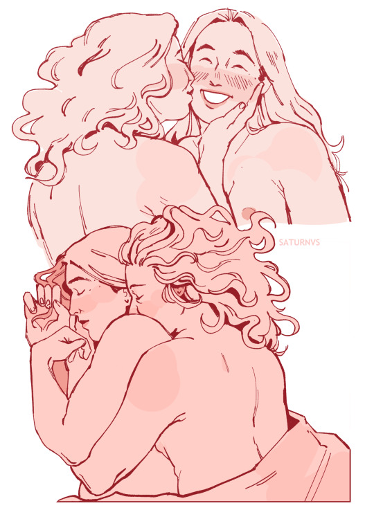
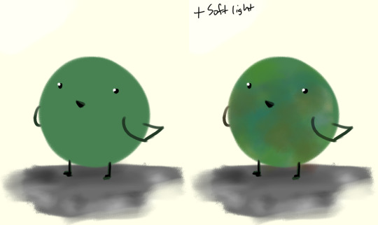
soft n sleepy
#i’m getting better at doing lineart-ish stuff!! :)#i love love love the sketch of them spooning it looks so comfy 😭#killing eve#villaneve#villanelle#eve polastri#fanart#art#my art
4K notes
·
View notes
Note
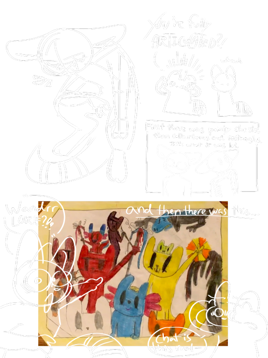
HII wait are you THE the Wanderer (like the one on yt)??? Really sorry if not and I’m mistaking you for the wrong person here
In any case! I love the way you draw iterators and slugcats SO MUCH??? Like your style is just so incredibly eye-pleasing and wonderful to look at I am in incredible awe. Anyway uhm. Yeah! Scuttles away
(- @strandedaylily)
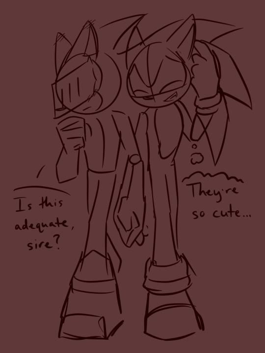
yes!!! i am :]!! the one who animated tr on yt yeash thats me💥. and its you!! the real strandedaylily,, reposted some of ur stuff recently to show it off f4 answering this. love ur thingers :DD✨
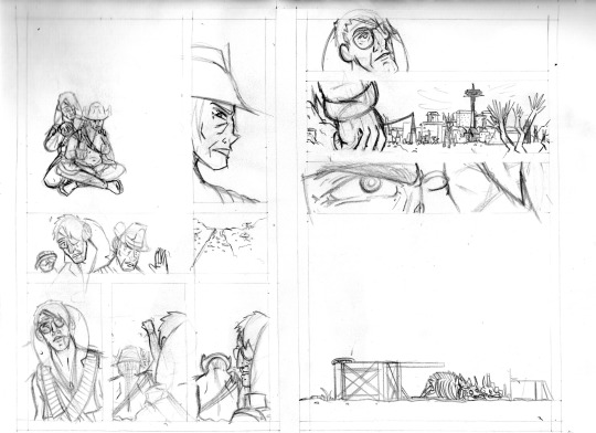
and thanku sm 😭😭 that means??? so much??!? its been a journey finding my style and i love that u love it sm!! i have a few diff styles for iterators and slugcats, and whipped up these fast sketchy style analysis sheets last night.
observe:
Iterator Styles
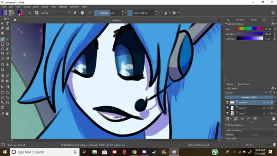
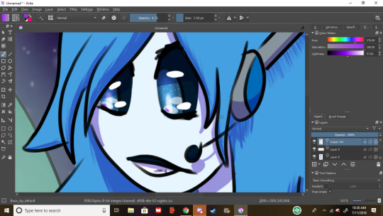
I have two main styles for iterators: chibi and humanoid-ish. round head vs oval head with a cheek curve (cheek curve is a staple of my style. was actually against it when drawing iterators with it for the first time, yet it’s become such a signature now XD. I love it a lot huhu). here is an example with my lovely boy Twine (he is not the main antagonist despite his mischievous posings). also!! slim eyes for devious characters, like twine and shadows (and leaves, unwillingly /lore). the two ogs 💛 with their yellow jack-o-lantern faces. theres a phrase i made up a bit ago: you can’t spell wanderer without jack-o-lantern-faced iterator, can you?
got better with posing over the years but im still struggling with fabric and cloaks </3
Slugcat Styles
now for slugcats, its evolved a different way. rather with two stages, they have a few more. when i first discovered rainworld, i had a very simple way of drawing. u heads and 3 fingers and toes, aswell with really odd aggressively-digi legs. and then it evolved when i learned “sketching” (blotting down odd shapes with barely any sense of proportion. balls for the elbows, no line of action, eyeing it and getting anatomy wrong lol) and things got really disproportionate. theres more stages, but i made a few complex and simple examples of my style over the years :]!! maybe i put too much effort into it but it was interesting to figure out!!
theres some timeskips in the big timeline one, and some other arts of mine might showcase style changes a bit better, and this is only my digital gallery, but oh well!!! whats done is done until its undone💥 /ghibli movie reference

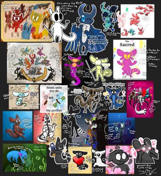
didn’t do iterators or general effects-and-tidbits-i’ve-learned (shading, rendering, lineart, etc) bc i’ve spent so much time already. so you get SLUGCAT BEAM BLASTED💥💥. all this art ranges from 2019-2024 (the years i’ve been a rainworld fan :])
yes i spent hours analyzing my old and new art just for fun but i think i learned something. thanks for asking this and putting a big smile on my face :]!! have a good day you (and anyone else whos reading this. thx for reading so far and so much💛✨!!)
#rainworld#rainworld slugcat style evolution#style evolution#style growth#personal art journey#art evolution timeline#art evolution#style changes#rainworld slugcat#rw slugcat#rambling#yapping into the void#slugcat beam blasted#wanderer overload#hashtag look at my old art#im happy about where i am rn and how far ive gone :]#keeping arting you lovley beginning and intermediate and master artists!!#artist appreciation
3 notes
·
View notes
Text
“Ugly art”
I’m not sure how to label this, originally intended for it be a mark exercise, It has aquired some emotional significance to me, to the point of naming it, it’s kind of emotionally charged, but it’s not really vent art, I wasn’t trying to express anything with it.
I have absolutely not clue wat to call this thing.
Anyhow, I have been struggling with feeling like a faillure, just in everything, Didn’t actually graduate this year my art was getting worse the more effort I was putting and in general putting effort in life was either doing nothing or making living more painful.
Art wise this meant that drawing with the stylus was simply painful, I drew with a mouse and keyboard for about a year, I reached a fairly high high, I got to a point where what I want to draw and improve at was getting stunted by the keyboard and mouse, I was basically transitioning from Paint to Krita again.
So I fished out a stylus I was given out of a closet that I forgot about and set to try and do that transition again, this time mouse to stylus.
I’m putting a lot into it, to the point of gripping the stylu’s pen in a “propper” way rather than how I usually hold pens and whatnot (my normal grip would put too much pressure on it, I have snapped a bunch of cheap pencils in half over the years simply by using them), looked up what sort of exercises would I need to do with it in order to get the muscle coordination, how tf you actually draw using your fingers, hands, wrists, elbows, arms and shoulders.
I basically set myself to learn how to run upsidedown in order to be a marathon runner. (granted I did procrastinate a bit with deciding to actually do that)
And that’s all fine, I know it’ll take a lot of time and effort in order to get there, I knew the quality of what I’ve made would decrease, same thing happened when I first moved from Paint and I’d be able to use less of what I’ve accrued with mouse and keyboard with the stylus compared to it (I was essentially making quasi drawing layers on paint by the point I decided to move on).
The issue came when I came to be patient and kind to myself over this, it became specially painful as I was making the linework for a piece of my sona, 2/3 of the time was spent ctrl Z’ing every new mark I drew so it fit the sketch better and meshed nicer with the other marks already there.
I broke when 2 things happened, requring to have a straight line at the sole of one my feet that meshes with the toes (so a straight line that connects well with not only one curved line from one side of the foot, but another one in a different direction making the toes), and a bit less importantly that the backside of one of my knee’s wasn’t working when I lined it, it looked fine on the sketch, but it was because it was thicker than the lineart, so I’d have to prob redjig the sketch since it was a fairly large rework.
And that’s the keyword that made drawing so painful, *rework*, all I was doing was making a mark, undo and repeat, I honestly should’ve scrapped that piece sooner, because it made me too anxious to draw at all, so I stopped drawing which made me anxious to start drawing again, and then when I set myself to start drawing again, even if it’s almost nothing, just a mark exercise, I didn’t because all I was doing was worrying about starting to draw (thanks ADHD)
Doing anything with the stylus was pain, and setting up my workspace to use it takes a bit of effort which is basically poison at this point, so I basically stopped using it, I didn’t want to give up on improving, so I didn’t go back to drawing with mouse and keyboard (it’s not pixel art, it’s legit cartoon/manga ish stuff made with the straight line tool lol), so I stopped drawing and just kept constantly comparing to myself.
All this rambling is to give context to why this specific mark exercise became significant for me. at this point drawing has been a obligation I set myself that I procrastinated.
I actually enjoyed making this thing, which is why the quotations in the name of it are also a part of the name, I don’t give a shit, I don’t care if I draw “good art”, I’ll draw shit, I’ll draw stuff that looks worse, I don’t care if I draw stuff that makes me look like I’m getting worse, stuff that’s ugly.
Whilst I initially did undo some of the marks in order to make them again but I tried to only undo whatever I did if it was a random squiggle the stylus drew because I accidentally hit the pen on it, I also used it for my signature so it’d be legible
A given line is squigly? it stays. The lines are fraying? they stay. Stuff is not allgined? they stay. The marks aren’t close enough and it’s becoming less of a line and more noisy rectangle? it stays. Straight lines are curves? they stay.
It looks far worse than another mark exercise I made last week, but this one the hard part was stopping rather than continuing.
Really hope I do the same thing for a full piece next year, It’s gonna be hard but I’m gonna try to stick with making “bad/ugly/crap art”
1 note
·
View note
Note
helloo , question .. how do you draw your sonic characters and bodies ? face , torso , and that kind of stuff .
i am able to draw sonic characters well enough but when it gets past the chest and shoulders i just make a rounded shape or try to conveniently hide it . thank you if you respond !
( btw your art is gorgeous may i eat it /pos )
Hi anon! <3 I hope you’re still here, sorry for the wait. This was tricky to answer since I mostly just wing it lol but I will do my best to explain my thought process! Keep in mind that this is just how I do it, that doesn’t mean it’s the right way, plus I’m learning new things all the time ^^; Excuse the messiness and the rambling:
Personally I like to draw characters about 4 heads tall, sometimes even 5 heads if I’m in a “legs for daaays” kinda mood lol. Officially Sonic characters are about 3 heads tall, but I find that giving them longer limbs gives me more freedom to make dynamic poses. In this example, you can get an idea of how tall I make them:
After figuring out the height, I draw what I call the flow line or action line (not my term… p sure I stole that from someone lol). This helps the piece feel more dynamic, preventing it from feeling too stiff. In this case with Silver, it’s the pink-ish line:
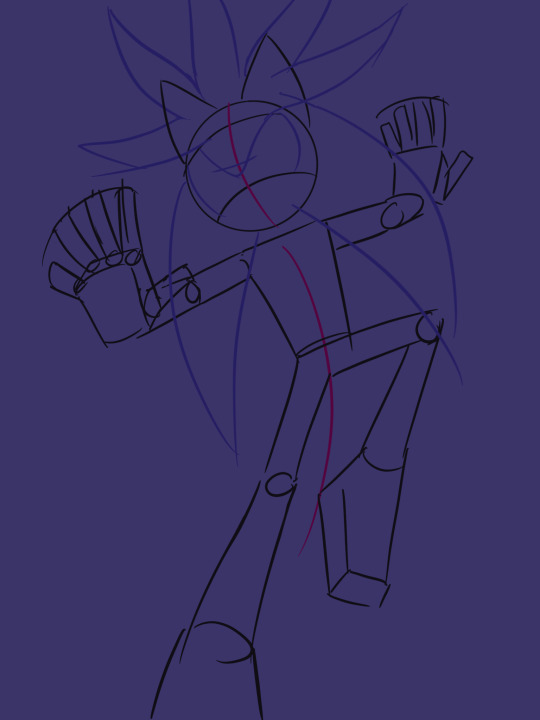
Notice how I draw circles for the joints. That just helps with proportions, in other words, the length of the limb compared to the body. Think about where your elbow is in relation to your torso; that’s usually where I put it. For Sonic characters, hands and feet are really big. I usually make them about the size of the face.
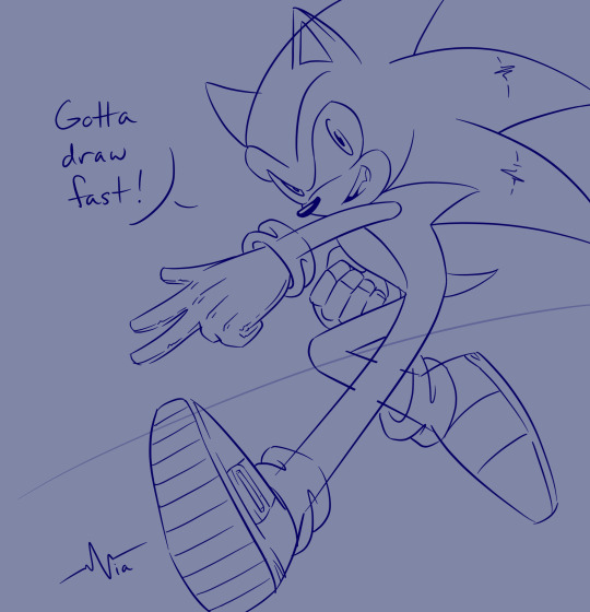
My sketches change all the time… Sometimes I don’t even keep the sketch bc it usually turns into the “lineart” layer (in quotes bc my lineart is just cleaned up sketches ^^;) But I found this Espio sketch. Notice how it changed quite a bit. I felt that his body was too stiff, so I exaggerated the bend to his body and felt that looked much better. Basically, exaggerate curves whenever you can:
Another tip: When it comes to perspective in limbs, think about if you were to chop the limb (a bit morbid, I know lol). Which way would the limb face?
I also like cropping the characters so that they extend past the page. This helps them feel like they exist outside of the canvas and prevents them from feeling confined within the frame.
Here are most of the tips summarized:
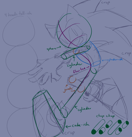
Here it is a bit cleaned up:
If you think about it, everything is essentially a 3D shape: a sphere, cylinder, cube, etc. Sometimes they’ll be altered shapes (torsos are basically altered cylinders, feet are altered cubes, and so on). If you can make these shapes, you can draw pretty much anything! That’s all you need to take away from this, really <3
Those are all my secrets ;) Sorry it’s all over the place, my brain is just so scrambled asdfgh but I hope this helped a little, and maybe I’ll see your art sometime! <3
#via answering#anonymous#yes you are allowed to eat it lol#long post#via doodling#sonic the hedgehog#sth#I started rambling about perspective and composition which you didn’t even ask for my b ToT
32 notes
·
View notes
Photo
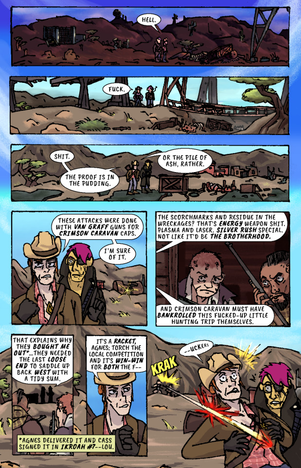
Whiskey river, take my mind,
don't let her memory torture me.
Whiskey river, don't run dry,
you're all I got, take care of me.
—“Whiskey River,” Shotgun Willie (1973)
It Keeps Right On a-Hurtin’
#15 - Vegas Outskirts
Collaborative Issue!
Guest Colorist: @malpaislegate / @socksual-innuendos
Archive Links
«« First | « Previous || Next » | Last »»
Read IKROAH on Archive of Our Own
Notes / Original Pencils / Transcript:
Notes:
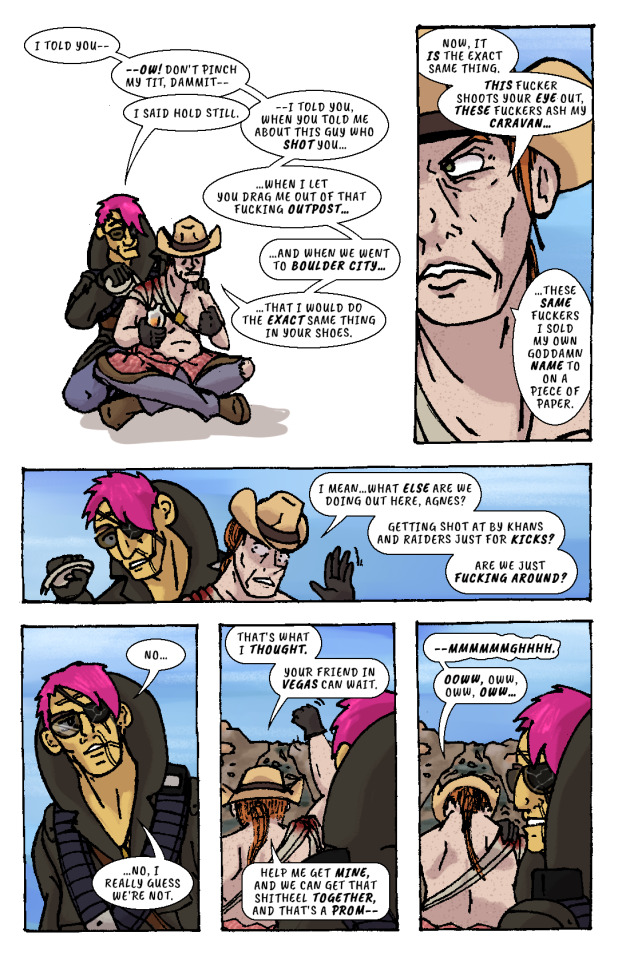
MAN that’s gotta hurt!! Volume 2 kicks off with a bang, literally if you count the gunshot and honorifically if you count Socks’ knockout color job on this issue. Look at those lovingly rendered bullet wounds!! Muah!!!
It’s been a relief having a month off from the comic as I handled a bunch of other things but there’s a lot to look forward to in Volume 2, as you can probably tell from that very forboding fist clench at the end there. Will Agnes and Cass get the revenge they’re looking for? Can they make it big in Vegas? Will it keep right on a-hurtin’? Find out next ish as Cass leads Agnes to meet the first of their new “friends.”
Original Pencils:
The pencils for this issue are like an autopsy report of all the things that can go wrong with your art if you don’t plan ahead and pay attention. Listen, friend, to my tale of woe, and learn from my mistakes so they don’t become yours!
First, you can see a lot of places where there’s floating objects, empty backgrounds, and incomplete heads. Part of this is because I always intended to just copy and paste repeated elements across each panel instead of drawing them multiple times, but other times I was forced to just because of my lack of planning. The top three panels on page two, for example, required me to draw the background I’d use for them on a separate page.
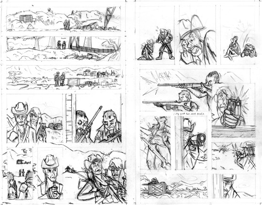
Second, you can probably tell that I actually had to flip the two raiders around in the final lineart because I forgot to keep the hands their were holding their guns in consistent—and since I couldn’t flip the middle panel on the second page without ruining the composition, I decided to flip all of their other appearances so that they’d be lefties. I doubt you even can seamlessly wield those particular guns left-handed.
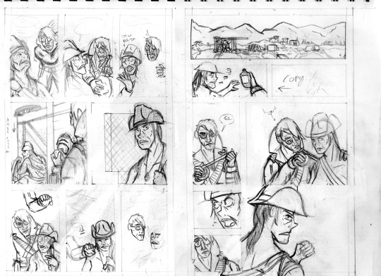
Third, the size of the cart that Agnes and Cass are kneeling behind changes CONSTANTLY and is dramatically oversized from the third page onward. After inking these pages, it took a lot of work to correct the inks and shrink that cart in each panel, but fortunately it came out looking good.
And finally, I completely redrew the second panel on the fifth page because it wasn’t until I had already handed he pages off to my colorist that I realized having a second profile shot of Cass so soon after a first one was just...redundant and lazy-looking. So I went back to my sketchbook and whipped up a much more unique, striking angle (I also just wasn’t satisfied with the quality of my art on that panel, so I’m very glad I redrew it). But again, my failure to plan ahead bit me in the ass and my redraw attempt wound up taking up a lot more space than I thought it would, so after inking it I had to basically surgically remove it from the other inks.
I’ll be honest with you folks: part of the reason that I work in such simple, thick, high-contrast lineart is because it’s very easy to make corrections and adjustments with stuff you could technically color in Microsoft Paint.
Transcript:
EXT. SOMEWHERE IN THE MOJAVE, morning. AGNES SANDS and ROSE OF SHARON CASSIDY stand over the wreckage of a caravan, scattered over a dirt road.
CASS: Hell.
EXT. SOMEWHERE ELSE IN THE MOJAVE, midday. Looking over a second wrecked caravan, at the bottom of a ditch.
CASS: Fuck.
EXT. PRE-WAR HIGHWAY OUTSIDE OF VEGAS, mid-afternoon. AGNES and CASS survey a third wrecked caravan.
CASS: Shit. The proof is in the pudding. Or the pile of ash, rather. These attacks were done with Van Graff guns for Crimson Caravan caps. I'm sure of it.
As CASS explains her theory to AGNES, a short distance from the caravan two RAIDERS peer at the two of them from inside a barn at a ruined farmstead. They have snake-bite tattoos on the sides of their shaved heads and are holding rifles.
CASS: The scorchmarks and residue in the wreckages? That's energy weapon shit. Plasma and laser. Silver Rush special. Not like it'd be the Brotherhood. And Crimson Caravan must have bankrolled this fucked-up little hunting trip themselves.
The RAIDERS move out from the barn, sneaking up on two passers-by who’ve stopped at the caravan wreckage.
CASS: That explains why they bought me out...they needed the last loose end to saddle up back west with a tidy sum.
(NOTE: *Agnes delivered it and Cass signed it in IKROAH #7—Lou.)
CASS: It's a racket, Agnes: torch the local competition and it's win-win for both the f—
SFX: KRAK
A gunshot rips out from one of the RAIDERS’ rifles and sears across CASS’ shoulder.
CASS (gasping): —uckers.
CASS slumps down beneath the overturned caravan wagon on the road, clutching her shot shoulder.
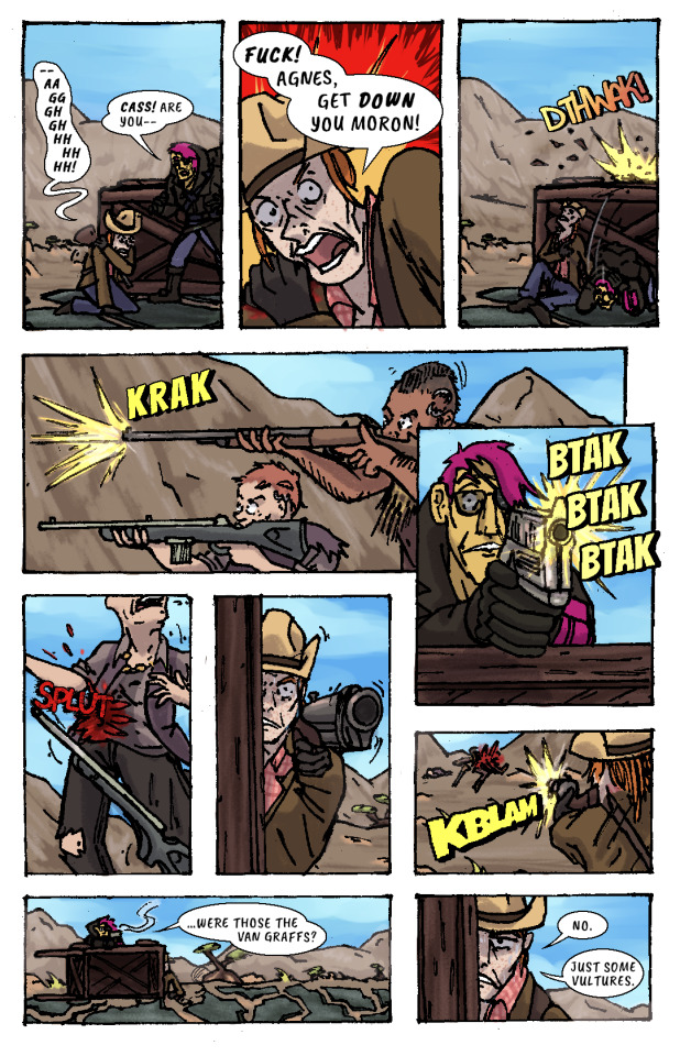
CASS: —Aaggghghhhhhhh.
AGNES: Cass! Are you—
CASS: Fuck! Agnes, get down you moron!
AGNES ducks behind the cover of the wooden caravan wagon just as another gunshot splinters the top lip of it.
SFX: DTHWAK!
The RAIDERS advance on CASS and AGNES’ position, firing at them from off the road.
SFX: KRAK
AGNES leans over the top of the wagon with her pistol, returning fire.
SFX: BTAK BTAK BTAK
AGNES lands a shot right in one of the RAIDERS’ guts, and she drops her weapon and falls down.
SFX: SPLUT
CASS, leaning out the side of the wagon, takes as careful of aim as she can with her shotgun by holding it with her good arm. Trembling, she fires, connecting with the other RAIDER.
SFX: KBLAM
The would-have-been RAIDERS are dead.
AGNES: ...were those the Van Graffs?
CASS: No. Just some vultures.
CASS leans back behind cover to sit against the bottom of the overturned wagon again, wincing from her shoulder injury.
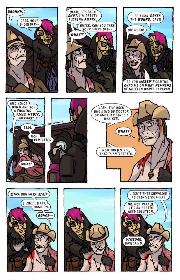
CASS: Ugghhn.
AGNES (slipping off duffel bag): Cass, your shoulder—
CASS: Yeah, it's been shot. I'm pretty fucking aware.
AGNES (unzipping bag): Quick, can you take your shirt off—
CASS: What!?
AGNES: —so I can dress the wound, Cass!
CASS: Oh! Good! So you weren't coming onto me on what remains of Griffin Wares Caravan.
CASS starts removing her shirt while AGNES produces a bottle of something from her duffel bag, and dampens a rag with its contents.
CASS: And since when are you a fucking field medic, anyway?
AGNES: 2269. NCR Certified.
CASS: What?
AGES: Yeah. I've been one kind of doctor or another since I was six.
CASS: What?
AGNES: Now hold still, this is antiseptic.
CASS: Since you were six!? I...shit, wait, hang on, Agnes—
AGNES pressess the rag onto CASS’ shoulder wound, and CASS winces instinctively. But, confusingly, there isn’t any pain.
CASS: ...isn't this supposed to sting like hell?
AGNES: No, not really. It's an acetic acid solution. Vinegar, basically.
AGNES begins cleaning the wound with the rag.
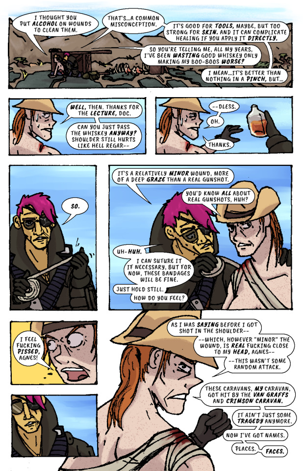
CASS: I thought you put alcohol on wounds to clean them.
AGNES: That's...a common misconception. It's good for tools, maybe, but too strong for skin. And it can complicate healing if you apply it directly.
CASS: So you're telling me, all my years, I've been wasting good whiskey only making my boo-boos worse?
AGNES: I mean...it's better than nothing in a pinch, but...
CASS: Well, then. Thanks for the lecture, doc. Can you just pass the whiskey anyway? Shoulder still hurts like hell regar—
AGNES hands her the whiskey bottle. She’d already gotten it out.
CASS: —dless. Oh. Thanks.
AGNES unspools a roll of bandages in her hands, then begins wrapping it over CASS’ shoulder and across her chest..
AGNES: So. It's a relatively minor wound, more of a deep graze than a real gunshot.
CASS: You'd know all about real gunshots, huh?
AGNES (unfazed): Uh-huh. I can suture it if necessary, but for now, these bandages will be fine. Just hold still. How do you feel?
CASS: I feel fucking pissed, Agnes!
AGNES recoils, taken aback slightly.
CASS: As I was saying before I got shot in the shoulder—which, however "minor" the wound, is real fucking close to my head, Agnes—this wasn't some random attack. These caravans, my caravan, got hit by the Van Graffs and Crimson Caravan. It ain't just some tragedy anymore. Now I've got names. Places. Faces.
AGNES resumes bandaging CASS.
CASS: I told you—ow! Don't pinch my tit, dammit—
AGNES: I said hold still.
CASS: —I told you, when you told me about this guy who shot you...when I let you drag me out of that fucking outpost...and when we went to Boulder City...that I would do the exact same thing in your shoes. Now, it is the exact same thing. This fucker shoots your eye out, these fuckers ash my caravan...these same fuckers I sold my own goddamn name to on a piece of paper. I mean...what else are we doing out here, Agnes? Getting shot at by Khans and Raiders just for kicks? Are we just fucking around?
AGNES finishes bandaging CASS, then leans back, pensive.
AGNES: No...no, I really guess we’re not.
CASS: That's what I thought. Your friend in Vegas can wait. Help me get mine, and we can get that shitheel together, and that's a prom—
CASS raises her arm to shake her fist as she speaks, straining her shoulder injury.
CASS: —mmmmmmghhhh. Ooww, oww, oww, oww...
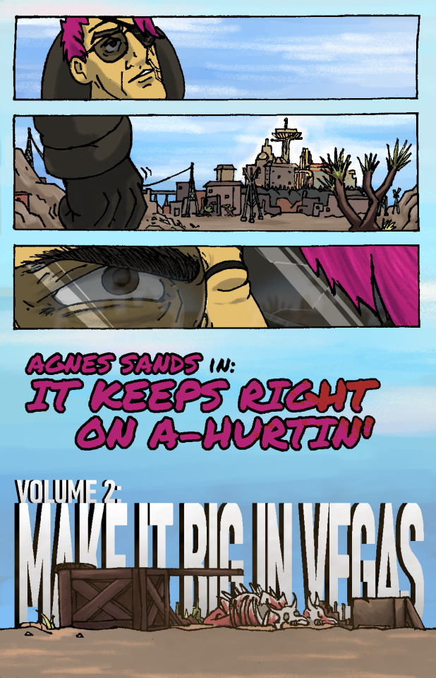
CASS grabs her shoulder in pain while AGNES looks off in the distance and stands up. She looks out towards the horizon—towards VEGAS, and the pre-war casinos and hotels that still gleam and glitter in blinding sunlight.
Her fist clenches. Her brow furrows. Her body tenses, all over, staring at that city, that place.
The caravan wreckage remains alone on the highway, brahmin bones long picked clean by scavengers.
AGNES SANDS IN: IT KEEPS RIGHT ON A HURTIN’
VOLUME 2: MAKE IT BIG IN VEGAS
176 notes
·
View notes
Note
👀 may we know more about rhythm man?
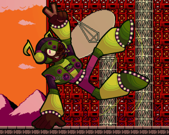
we sure may!!!!! rhythm dump under the cut as always
rhythm man was made to do a variety of tasks relating to sound! mostly he either does sound checks for important devices like hydrophones, sonar, seti listening devices, stuff like that, or he analyses the audio that they pick up in greater detail than any human or almost any computer can. someone [probably dr light, who created him] showed him a rhythm game pretty early in his life, and he instantly fell in love with the game genre and, more significantly, the concept of music itself. he's still doing the job he was designed for, but his real passion and arguably what he's better known for in-universe is creating music, which he uses his intricate understanding of audio to excel at
he makes a point of being a cool guy to be around! he's nice, fun-loving, and always has a joke ready. he's very encouraging of others, and thinks everyone should get to chase their dreams and do what makes them happy. when there's no bright side for him to look on, though, he doesn't really know how to act, and as such he feels uncomfortable confronting serious emotional situations and has a bad habit of repressing any negative feelings he doesn't know how to deal with and just letting them get worse. he might be developing some resentment towards his work for how much of his time it takes up that he'd rather be spending pursuing his interests, but oops that's not a fun feeling! better bottle it up and not think about it
all robots are neurodivergent but rhythm in particular has SO much undiagnosed adhd. he [probably] doesn't mind his job, but he can't pretend to be nearly as enthusiastic about it as he is his music, and tends to come off as distracted and spacey when he's at work. he's also capable of entering a hyperfocus-like state that temporarily re-allocates computing power usually dedicated to spatial awareness and sensory processing to focus on something else, which was designed to let him analyse audio with even more precision. rhythm occasionally uses this feature as intended, but more often finds himself turning it on while he's making music or playing a game to get into the groove more
he'll gladly enjoy any genre of music, but anything under the electronic umbrella is his favourite to listen to and create, especially bass music and all its subgenres! outside of genre preferences he likes songs with a lot of tiny bits and pieces and intricate details to notice - i think he'd really enjoy bill wurtz's music, for instance, due to just how much is going on in almost every song. he posts the music he makes online, and has a pretty sizeable following for both the novelty of a robot that makes music and the fact that everything he makes genuinely slaps super hard. being a robot, his criteria for 'good' music is all very simple and objective stuff like whether it's in key or has a time signature that makes sense or follows a pattern rather than just being random sounds, so he's able to appreciate almost any music for what it is and can name the number of songs he actively dislikes on one hand, although despite his best efforts to be forgiving he's a bit of an audio quality snob
the only sound he genuinely doesn't like is white noise, because the total lack of a discernable pattern or anything notable freaks him out. it's hard-coded into him to try and find meaningful noise in very fuzzy sound, and even if he analyses it back and forth on every level and concludes that it's just random aural static he's still left with a feeling of unease about it. his headphones have a sort of noise-cancelling mode that completely blocks out most background noise so he can maintain a conversation without constantly pausing to overanalyse everything he hears - without the noise cancelling he's got the world's worst case of auditory processing disorder. he's weak to psychic cry because it's just a really violent blast of white noise, and is one of the only bosses susceptible to its stunning effect because the sound freaks him out so badly he has to stop for a moment to force himself to ignore it
almost everything about rhythm came from the idea i had for his stage! i imagine it functioning as a sort of rhythm platformer where almost every moving part is timed to the beat of the stage music. it's the obligatory yoku block-spamming stage of the game, but in theory if you follow the music and jump across in time with the beat you'll make it through without much trouble [and maybe even have fun! in a stage with *yoku blocks!!*]. other stuff like constantly-spawning enemies and the attack patterns of rhythm himself would also be on that same beat cycle! as for theming, his stage is a mostly-vertical climb up a radio tower - wily's reprogramming takes his repressed frustration over not always getting to focus on his passion and upgrades it to outright spite, and he decides that actually you WILL listen to his mixtape whether you want to or not and proceeds to hijack the biggest radio tower in mosteropolis and override every single station with lofi beats to take over the world to
rhythm is the first robot master idea i ever had that wasn't a reference to something else, although for a pretty long time he was only a stage idea and a name. maybe that's why his design changed more throughout his development than any of the other guys [even between the sketch and the final lineart for this art i refined his look like 3 times]. initially he had a more 'tough'/punk-ish look, with spikes on his helmet and around his wrists and ankles, but i ended up phasing most of those elements out in favour of the led lights and generally less intimidating look. i briefly considered having his design reference rhythm heaven somehow, since it's my favourite rhythm game and the only one i'm any good at lmao, but nothing came of that - perhaps his stage enemies could have some rh references in their ranks instead, chuck some screwbots up there or something. he also had massive anime sunglasses at some point but it's better for that design to never see the light of day
he also likes dancing! hence his funky moves in the art. his body shape isn't compatible with every dance style what with the clunky robot limbs and having a stereo for a chest, and he definitely wasn't built for physical agility, but with a little practice he can pick up most dance moves no problem. he's definitely a dance battler, and i think he would love rhythm games that trick you into exercising like dance dance revolution or just dance. rhythm man does a frame perfect ddr tas in real-time on an actual cabinet
that about wraps it up for the rhythm infodump, thank you for asking about him!! as always here's the unfiltered and transparent versions of his artwork


#i'm really proud of myself for coming up with the quaver headphones. i think those look neat#zos draws#mega man#mega man oc#robot master oc#rhythm man#zos answers#zos talks#anon#zoriginal characters
30 notes
·
View notes
Text
Anon said: Not an ask, but I frickin love your art style! 👌
Ah heck, thank you so much!!!! <3
Anon said: I refuse to use Emojis but You. Do. Not. Need. To. Apologize. For. Taking. Breaks! We are not entitled to you and you are not required to provide art for us! These are stressful times, and even outside of these times, taking breaks from social medias is completely acceptable.
Thank you for the kind feeling!!! But it’s fine, I’m not beating myself up over it or anything, just apologizing for my habit of going on breaks without letting anyone know beforehand haha
Anon said: your outfit ideas are amazing ! do you have a source of insperation?
Thank you!!! I do a lot of people watching, and that’s about it tbh! I do look at fashion photos and magazines and, like, clothes displays in stores? when I happen across them, but most of my inspo when it comes to outfits starts from me watching people and liking how they’re dressed - in that sense I like watching vlogs and stuff like that too, people these days are so stylish...
Anon said: I really love your lineart and coloring style!! Would you mind sharing your brush settings? Or some art tips? If you don't want too this okay too, keep up the good work !!
Since my brush settings are a reward for my $6+ patreons, I don’t really feel like it’d be fair to share them! But you can probably find some old version of them in my art tips tag :D as for art tips... for lineart the only thing I can really say is to not overthink it and just go with the flow, whatever feels comfortable for you will make for the most visually pleasing lineart too, in my experience! Coloring is something I’m constantly experimenting with as well, but there too my usual mindset is “the easier and faster the better” - generally, I just use flats and then add shadows on them with any color that goes from light blue to pink-ish purple on a layer set on multiply, anything that makes it look fancier than that is just me adding small details like sparkles or shines or anything of the like!
Anon said: GUESS. WHOS. GETTING. OLD!!! me. It’s me.
Everyone is! Constantly! It’s how the passing of times works, terribly enough
Anon said: hi!!! as someone who really admires you as an artist, has very little experience in art and would /really/ like to get better at it, i'd like to ask you: how did you get so good at it? (apart from constant practice, of course, i realize how important that is!) this is coming from someone who really has no idea where to start! what was your starting point, and are there any tips you can give a complete beginner like me?
Hmmmmmmmmmmmm the thing is that drawing a lot really is all there is to it, but if I had to give one single serious tip for this it would be to find something you really really really really enjoy drawing and to just draw it - draw it badly if that’s the only way you know how to draw it, but make sure to always draw it while having fun, and slowly you’ll get better without even realizing you are. If you like a ship, draw that ship! If you like plants, draw plants! If you like animals, draw animals! It’s okay if you don’t know how to draw it, or if you feel like your skills aren’t good enough for what you mean to draw, because honestly I felt like that when I started too, and I still feel like that every time I pick up my pen, and I’m sure I’ll forever feel like that for as long as I’ll draw - my ideas will always be bigger than my skills, and maybe so will yours! So what’s it matter if you start drawing stuff beyond your skill level now or later? At least you’ll be having fun with it, and the only way to learn how to do something new is to go and do it, anyway
Anon said: hi! do you do commissions?
I don’t, sorry! Thank you for being interested, though!
Anon said: Hi there! So I'm rereading Quote Love Unquote (a classic for sure) and had the urge to go find the art you had made for it. And oops, like, two hours have gone by of me just scrolling through all of your older comics and art. I love it all SO MUCH. Your artstyle is just so damn enjoyable and all of your comics never fail to make me smile. I'm always looking forward to whatever you choose to make in the future regardless of fandom. Thank you for being awesome!!
God that’s such a nice thing to hear, thank you so much!!!!!! ( TT-TT)<3
Anon said: I made an ask before (u answered it dw) but u thought I was saying u missed my first one. U didnt! I was saying it made me so happy that u responded you’re an angel! Ily v much!!
Ahhhhhhhhhhhhhhhhhhh that’s good then!! that’s very very good!!!!!! ily too!!!! <3<3
Anon said: How can one's art be soooooooooooooooooooooooooooooooooooo good?
Thank youuuuuuuu ;;;;;;;;;; I do!!! my best!! ( ;u;)9
Anon said: You like tododeku?
Yup!
Anon said: Zero grafity kisses are the opposite of the spiderman kiss
How so? :O
Anon said: Hi! This is seriously out of nowhere but I wanted to tell you I reread your Bokuto-Kuroo-Terushima tattoo au strip all the time because it's just so delightful and seriously cute. Polyfidelity is the kind of poly my partner and I practice and I don't see it played out too much, so to see a relationship like that with characters I love and an art style I adore fills me with such warm fuzzies. It's so so lovely. Have a great day!
I’m so damn glad to hear that!!!! In that sense that comic still means a lot to me, so I’m happy to hear it means something to you too!!
Anon said: Friendly reminder that I fucking love you.
I love you too anon!!!!!!!!!
Anon said: Ma lo sai che sei sempre più brava?
aaaaaaaaaaahhhhhhhhhhhhhh!!!!!!!!!!! (TTATT) grazie mille!!!!!!!!!
Anon said: Hi um did you know that 🤰🏻🤱🏻 this lady had her kid?????? wtf i didnt know
I can’t even see the emojis from desktop lmao but good for her!!!
Anon said: hot take: jirou, momo, kami, and shinsou in a poly relationship.
You know what anon, you’re incredibly valid and I respect you
Anon said: I just absolutely love your art! Whenever I see it, it makes my day! Your Kiribaku stuff gives me life! Keep making beautiful art, and stay safe during this time!
Gosh, thank you!! You stay safe too, anon!!!!
Anon said: HOW do you draw cloths
You keep in mind that gravity is a thing and let your hand do kind of whatever while hoping no one will notice you have no clue what you’re doing!! (...seriously tho I never studied these things I just do whatever feels like and hope for the best hahaha any experienced artist looking at my stuff is probably wondering what the heck it is that I’m trying to do...)
Anon said: Your style is so amazing and distinctive. Everytime I see it I’m like OH ITS THEMMMM and get super stoked
That’s so cool to hear!!!!!!! I genuinely have no clue what makes my art mine, but I like knowing people can recognize it anyway! It’s such a neat thing!!!
Anon said: Were you the person who did those "stopping an angry...." posts? Am I remembering this wrong? If that was you, where could I find those?
Are you talking about my bakuboys comic? If so then it’s in my bakuboys tag! :D
Anon said: Hey, you’ve seemed kind of tired and sad lately. I’m not going to ask you if you’re okay because you’re probably not, but I wanted to say I really do hope you feel better soon!
!!!!!!!!!!!! Thank you so much ;;;; I’m doing my best!
#fran answers#i have stuck in my head sudden desire by hayley williams#but i only know something like two lines and a half from it#it's been two days why is my brain doing this to me#halp#long post
210 notes
·
View notes
Photo
my drawing progress as promissed. The separate pictures are under read more if you’d like to see these and read a bit more about the process
I should also note that I use paint tool sai can’t really get used to anything else :D
01. Sketch - a very rough sketch, approximate how the picture might look like usually looks nothing like it lol

02. lineart - I play with linerart enough till it looks okay ish. I cannot do straight or clean lineart, ever. Besides it’s not like lot of people will really notice the lineart isn’t as clean. The trick is to use huge canavas. I use 3600x2800, no one knows it’s shaky if the picture is huge, right? Funny thing is i tend to return to lineart when I’m coloring the picture because while it might look okay black&white the mistakes and weirdness tends to stands out with color. Also flipping canavas during drawing is your best friend.
03. flat colors - each layer is separate unless it’s like tiny things like eye color and gem color.
04. Shading - lol no idea how shading really works or light so I’m just winging it. Not much advice there, but if you draw with references do note where shadows are even if they are barely visible it really makes stuff lot easier (coloring metal is difficult as heck, references really make lot better). Plus if all important layers are separate using clipping mask is awesome when shading.

05. final picture - okay i forgot to add that everything aside from background layer is in one layer set. Why? it’s easier to use clipping ground over whole layer set and set that to multiply or anything else and just add some shadows here and there same with light.

not sure if this will be helpful for anyone but hope you enjoyed <3 (also sorry if there are mistakes
#drawing progress#idk if to call this tutorial not really#maya draws sort of#ok to reblog#lol forgot to add final picture
16 notes
·
View notes
Note
hi! i know you probably get asked this a lot, and im so sorry to ask, but i was just wondering if you had any tips for those struggling to find a unique kind of art style? i personally stick to realism, but ive always really wanted to have my own style (if that makes any sense), but i tend to struggle a lot when it comes to that! thank you so much && i rlly love your art!! keep up the good work !! :-)
Hi! Actually no, I’ve only ever gotten one and I thought it was a joke so I never answered ^-^’ I’m happy you asked though, and thank you!! :o❤️
It’s really good to start with realism because it’s something you have to learn no matter what style you draw to get a good feeling of what should go where (and you don’t have anime as a base skill and have to go back to learn real anatomy later on, which is a real fucking pain :<)! I usually train by using quickposes, it’s fun and simple :)
Then, of course, comes stylisation.

This is all bout finding your sweetspot. I used to copy styles to see if I liked them, and when I didn’t, I jumped to the next in hopes it would work better for me. This didn’t work because a style is a compilation of things the artist finds apppealing - we all have our own mixes. What helped me in the end was to choose my ten top artists and study just what I liked about their art, as in, why I was drawn to it. Like: I like the way (all on insta) @/lovisb proportions her faces and has fluidity in her poses; I love how @/z.pico drawns legs and arms; I love how intense and expressionful @/kimjinggus draws eyes and lips aso!
I’d reccomend to do this and to study their art in general, since there is stylised realism that you can draw insperation from (like (on insta) @/kildren and @/iriscompiet), then toggle all these pieces together and eventuelly you will have mastered your own art style (and don’t worry about it being an immediate thing, because it’s going to take time for you to connect the pieces and see what you like with what)! The same goes for colour and the way you do lineart.
Imma be real and say that most of the AFTG art is things I’m not overly proud of, just because I’m taking barely no time to check fluidity and proportions and stuff... the fact that I’m doing lazy noses for example. I enjoy myself some semi realistic, clean western comic-ish styles, like:


So do things you can be proud of, becuase otherwise it’s easy to be discouraged. Also, my style still hasn’t set because I’m still figuring out just what I like, just scroll through the art tag and you’ll see. Don’t stress it, it’ll get there eventually ^-^
(It’s a bit all over the place, but hoped it helped! Good luck! :))
138 notes
·
View notes
Note
Hello there! I read all of your how to zine thing and I've been thinking how to organize a portfolio online... Do you have any suggestions or tutorials on how to do one? I use Google drive but I don't like it anymore (it seems unprofessional) so I was wondering if you have any tips óvò thank you in advance and sorry for my English!!
aaaa it’s ok I’m no native English speaker either, so don’t worry!!
For your question, I personally have started using the Adobe Portfolio (it seems to be free?) as I have the Adobe CC for uni purposes and thus already an Adobe account. I innicially wanted to have it for design stuff only but then discovered I could make a second portfolio so I made one for my internet illustration/art stuff as well and used it as portfolio for zines (idk if it interests you but in case you want some inspiration, here’s the link.) I’m still kinda unsatisfied as it doesn’t really have a gallery option where you can click through the images individually, it really is catered to mobile users and the images look uncomfortably large on the desktop for me, but in general building them is kind of intuitive even if the layout options are rather limited.
I personally don’t have much experience with other portfolio websites (I only tried deviantart’s portfolio before and wasn’t really satisfied with it either, but that’s been years ago.) I would recommend doing some research (maybe some of my followers also has suggestions?) and maybe also consider using a general website from a website builder like weebly or wix (I think there are also free options?) as they are a bit more flexible in their layout.
EDIT: I added a list with some website builders and portfolio websites on the How to Apply post, if any of you have more suggestions, I’ll add them to the list as well. Just a note that I don’t have experience with every website on the list.
Some of my study friends also from other universities used a PDF file with their best works and sent that to agencies, so that might be an option, too, especially if you’re only allowed to a very limited number of pieces. With programs like InDesign it’s fairly easy to make a cohesive and nicely designed PDF (I recently got some suggestions for similar programs as a lot of people suffer from Adobe raising their CC prices but I haven’t tried any of them so I can’t vouch for them.)
For me, it largely depends on what specifically the portfolio is for.If I were to apply for an agency job, I’d try to fit in as much of my range as possible while still trying to focus on what the specific job is for. I think that tactic works for zines as well, even though it’s more illustration-heavy than necessarily corporate or editiorial design. I started to categorise my works more by projects/purpose so that the individual concepts are gathered together instead of having “sketches” “illustrations” “typography” etc. as throughout time, you’ll get more and more interdisciplinatory projects so you can’t sort them that easily. Of course you can sort them also on the main focus for the individual projects (a magazine might be sorted into editorial or typography for example.)
I made an extra category for my comic project to have everything together, currently most of them are just some illustrations but I’ll add more concept art and stuff like that later on.I also like displaying commission or zine works in a seperate category so it’s easier to see what people can expect from hireing me, plus it also shows that I actually already have experience with zines and commissioned work. Of course you don’t need to put all your commissions/zine works into it, especially if you don’t like them/don’t find the result very pleasing anymore. A portfolio is always courating your own works by what you consider your personal qualities.
As I already have mentioned in the portfolio post, I also try to kick out works that are older than 3 years from the portfolio staples that I use when zines only ask for a few of my best pieces (like 3-5) but I keep them in my online portfolio site if I still like them on a general basis, especially if the style is something I still can pull off. I also never use pieces I never published anywhere online so I usually just link to the tumblr post if there’s only a limited number of pieces allowed. I just try to keep my tumblr organised and aesthetically pleasing and check if all the links still work.
For the layout, I recommend using something simple and neutral as the work itself should be the focus, not the very fancy design around it. This especially should be the case if you want to display several styles and/or moods/colour schemes. If your style is very pastell-y and cute, of course a more cute and pastel design compliments it well. But if you also have very dark colours and for example gory designs, it most likely will clash with the works and thus isn’t a very wise descision. Safe colours are always white and any completely desaturated greys that are somewhere in the lighter and mid-range shades. Black can look good, too, but imo should be handled with a bit more care. I probably would recommend a darker grey instead as it doesn’t swallow too much light. You want your work to pop but having too much contrast between your work and the background can also get uncomfortable for the eye.
I also would recommend not using too fancy and playful fonts as they easily distract you from the actual work. I also wouldn’t use Times New Roman and Arial as they aren’t very comfortable to read (and don’t have a very good design.) Calibri is always a very safe and well-designed font that most likely is an option everywhere, but of course just look through the font options and test what suits your works the best.When picking a font colour, please always check the contrast to the background, especially when you use more saturated colours. I also wouldn’t recommend using 100% saturated colours as they are also very uncomfortable for the eye.My prime example of very little readability is bright red on pitch black background. It’s one of the most uncomfortable combinations to read as red is very aggressive to the eye and through the very high saturation also is difficult to distinguish in front of the very dominant black. Having a red-ish grey would work much better, especially if it’s a lighter shade, and not using black but a darker grey would take away the tension as well. Just play around a bit until you get to a visually satisfying result.
Always be aware that starker contrasts also always draw the eye, so you want the most contrast in your works and not in what surrounds them. If you have especially light works with maybe a very delicate lineart and little contrast, you might want to use a white, pastel colour or light grey with a fairly light font (that still has enough contrast to the background to be readible)
The most general advice I can give is focussing on displaying your works and not distracting from them. I would try to have a very simple and cohesive site that puts everything together in a harmonizing way and also doesn’t have too many subcategories so that navigation is easy and smooth.
I hope that helped in some way? ^^;
8 notes
·
View notes
Note
Do you have a tutorial or guide or anything on how you do colors because all of your pieces have such nice colors and lighting Seriously, the use of colors in your art isn’t something I’ve seen very often; I was wondering how you choose them & how you get those effects with the software? Thanks so much is advance if you choose to answer this :)
Thank you ;;;_;;;!! I do, but I think it needs a revamp.
I’m going on a very long ramble.

(Heads up! I’m not professionally trained, I have just watched and read a lot of tutorials and deviated from there with my own thing. Unless it has something to do with color blending modes, there is a good chance that I am using a silly fake term for many of these concepts. Also, I use Krita, but everything here should also be done possible on Photoshop, Medibang, GIMP, and I believe Clip Studio Paint. Autodesk Sketchbook and MyPaint don’t have filters like color balance, sharpening, etc. and I don’t know of an easy way of changing the saturation of a painting on SAI and FireAlpaca easily since I’ve never used SAI, I’ve only used FireAlpaca once in a blue moon, and searching for either doesn’t give a “one click” option that doesn’t require undos... but everything about color choices/lighting/color filters/blending-modes-that-aren’t-saturation should stay the same.)
There’s as many ways for things to be beautiful as there are birds in the world. But that’s too many birds, so its good to have a process that you try to follow. This is kind of an ideal setup, but I think this is how streamlined I wished I paint. (I usually bop between consolidating colors and adding detail, continuously, for all eternity until i give up and smash that post button blindfolded. I’ll explain what this means.)
So color wise, I try aim for two things: good value blocks and balance (cohesion), and interesting hue variation (jitter).
------
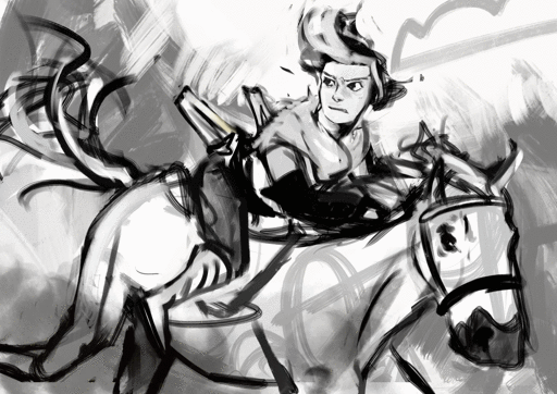
Setting the Ringabel painting with the saturation at 0%/setting the colors on grayscale, then simplified:


These blocks of different colors both provide structure to the painting, and also add to the composition. The thing I want people to notice most - Ringabel’s beautiful, luscious hair that he lovingly tends to every morning (and his face I guess) - is the area with the most contrast. There are logical-ish subdivisions between each part of the painting and I want to preserve these chunks of logical blocks throughout the painting process, or swap them out for Even Better Blocks.
Even then, I want there to be visual interest and a balance of values around the entire piece, which is why I added lighter glitter around areas that aren’t interesting enough to have real detail. No one is going to stare at that area too hard, but without it, this dynamic painting feels too empty.
Also, if I were to do the painting from the ground up again from this thumbnail, I’d also include gradients, to aid in carrying the eye to the focus having a better base to build on.
This also makes it easier to play with the lighting before getting to the meat of the work!

----
If we take Ringabel to max saturation, you can still see a bit of the value blocks, but there’s just a lot of colors slapped around everywhere:

I like this effect because it squeezes the maximum amount of visible interest out of a block of color as possible while still keeping the cohesion. And it’s not too hard to do - when you shade your painting, use two different colors instead of just one. When you add lighting, use two different colors. When you have a blob of color, slap some random color on that blob using a softlight blending mode.
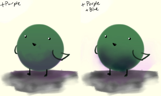
If there’s a concentration of color around an area and there’s an unbalance, add that color on the other side of the painting, to balance.
I like to call this jitter.
----
Let’s talk about cheating really quick:
“I kinda want mess up the colors but in a way thats kinda consistent”
“This is too bright.“
“This is too dark.“

“There’s not enough contrast!! >:(“
“Too much !!!! Contrast!!!!“

“THIS IMAGE WAS SUPPOSED TO BE PURPLE“
There is magic in the filter list. Jump in and have fun! (And fix your stuff.)
----
And.... that’s the philosophy.
Keep big chunks to stay organized
But have randomness to be fabulous
No shame in fixing mistakes.
----
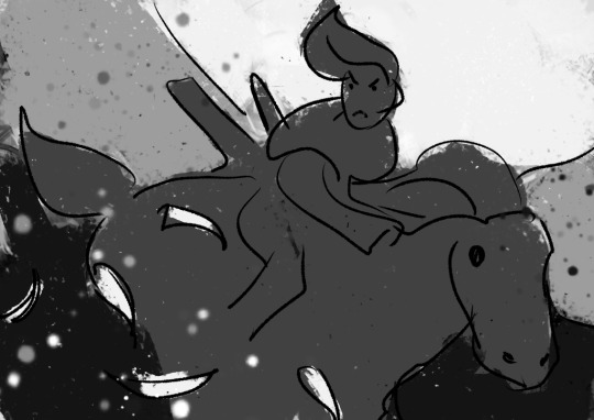
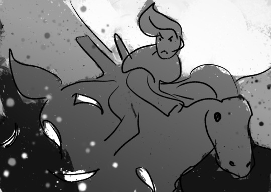
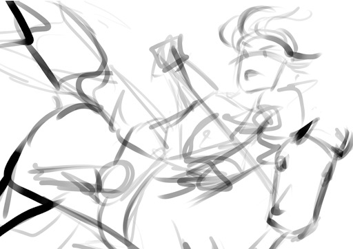
So from that, actual painting process for Ringabel on a Horse (clop clop). Here’s the thumbnail, which I drew before I knew how horses worked:
Then we choose hues. This will change over the course of the painting; I ended up with Green, then Red, then Yellow, then blue?
Then, allocate the colors in this way -
Dominant Lighting, Secondary Shading
Secondary Lighting, Dominant Shading
Rim light, another light source
Random random pops of color. because why not.
And pop them in this order:
Base/lineart
Initial color
Random colors (literally any color on the wheel) - Softlight/overlay - introduce jitter
Area Light 1 - (1) - Softlight/overlay - cohesive light
General shading - (2) - Multiply - cohesive shading
Detail shading - (1) - Multiply - jittery shading
Rim light - (3) - jitter - Softlight/overlay/COLOR DODGE - cohesive, out of left field light
Area light 2 - (1) -Softlight/overlay/COLOR DODGE - cohesive light
Detail - ;;_;; - FIX YOUR MISTAKES, C L E A N
Consolidate - (All 4) again to fix colors from the detail portion
GLITTER - (All 4) - jitter, glitter
Filtering - :D
The idea for 4-9 is that we have a balance of detail (jitter) and cohesion that we need to upkeep, and we need to strike a balance between adding cohesion and removing detail, and vice versa. Usually, I repeat those steps over and over and over and over, trying to get it just right. I tried to keep it simple here for the sake of the tutorial and my own sanity.
And now we do the thing.


Thanks for sticking around, and have a fantastic day!
#tutorial#art tutorial#digital painting tutorial#painting tutorial#sorry this took so long#thank you for the request#and have a good night!#hotvivitea
19 notes
·
View notes
Note
Hiya! You're art is really good! I was wondering if you could show your drawing process? I'm trying to develop some tips and stuff, heh.. thank you!!! - ♡♡♡
Well for starters, thank you so much! I’m glad you enjoy my art! But I’m very sorry if this isn’t as in depth as one might hope, I’ve been in a bit of a rush this morning, so my apologies (also please forgive my uncropped screencaps)
To start off, I either sketch it out on paper and take a pic, or sketch in krita. I typically use krita for almost everything I draw digitally. To start, my default canvas size is around 3300 x 3000, and if I’m not feeling lazy, I fill the canvas a nice grey. I don’t know why, but it makes the drawings nicer.
I like to start off with a basic idea of what posing I want, with a loose crosshair on the head to figure out where the character is looking, in this case, the weird floating thing we got here

Next, I start putting in shapes and finalizing our pose. most drawings of mine are built with shapes (usually most obvious with DKtDW Michael, he’s very rectangular.) For hands I use that pentagon shape, this helps me plug in the thumbs and fingers. Our character here is very slight, so i used sort of a tube, ect, ect,

next, I refine the crosshair. Most artists who use a crosshair only have a line for the bottom of the eyes, but I never got the hang of that one, so I have it for the top and bottom (also I gave her a tail. Because.) And then I place the face stuff on. Eyes I like to do “anime style” (sparkly, only the top and bottom lash line are lined, ect, ect,) unless it’s robots, and by exenstion animatronics. One thing I’ve learned is a good idea is if your character has pupils, sketch the iris first, then the pupils. This will work better for you and gives you a nice ratio of iris to pupil.
Next, plan the hairline. I usually have two hairlines I apply, rounded, and widow’s peak. This will help you plan the hair out easier, which is beneficial for short and long hair.
I’ve never known how to describe the way I draw hair, but generally, make it flowy if it’s long. Hair tends to be curlier with shorter hair, because it’s less weighed down, and please, practice different hair textures and styles, I may go into that more if anyone wants me to try to do a hair tutorial.

Next, move onto clothes, and refining other details. I like to make skirts flowy, flowy is fun, dynamic, and interesting, visually.
uhhh let’s refine that glowy thing, right? Let’s make it a crystal. Crystals are fun.
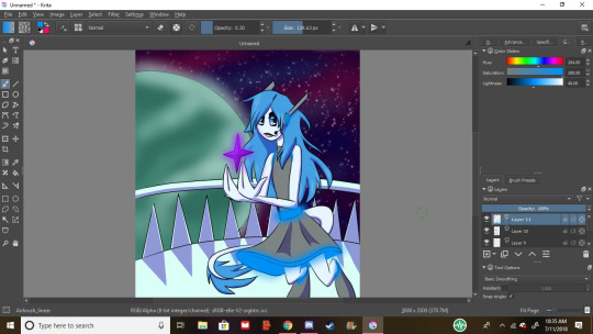
Next, let’s give her a background.I wanted to draw space, so we’re drawing space now. I gave her a planet.
Line the background! I use Basic_tip_default on weighted smoothing for almost all my lineart. Don’t be afraid to use the line and circle tools. They’re helpful, and denying yourself the tools that the program comes with is dumb, and limiting.
Rad, the lineart’s done on the background!
Next, let’s line the character. For hair lining, use gentle strokes, it creates a feathery and light feel
For lining around the eyes I turn off weighted smoothing, and feather ‘til it looks like eyelashes
lineart complete, nice
Next, let’s lay out some background colors. Try not to make them too overpowering compared to the character, or you’ll the character as the focal point. I’ve chosen my main galaxy colors, and my color for the planet. The balcony will be a sleek white. I’ve been taught not to use pure white or pure blacks and greys, but you do whatever makes you happy, don’t let anyone boss you around unless you’re paying them to teach you, or they’re paying you. I use pure black for lines, and pure white for eye shines, but it’s important that you work out what makes you happiest. Art isn’t about what’s the standard of the time, it’s about what makes you happy. If neon ponies is what makes your heart soar, then make all the neon ponies you could ever dream of, you beautiful soul.
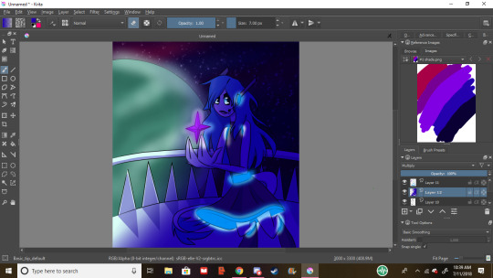
Next, fill in the bg’s most prominent color with either the fill bucket or a large brush, this is my galaxy base.
I like to airbrush the other colors, but sometimes it’s too sharp, so let’s
b l u r i t o u t. I used the 99 x 99 radius to get it absolutely dreamy
star it up baby, bc you’re a star. my favorite brush for sparkles and stars is FX_splat_starfield, it’s lovely
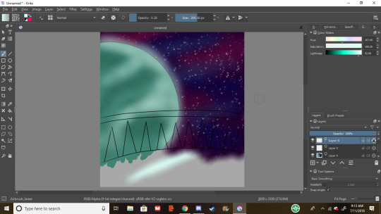
next the planet, I airbrushed some darker and lighter teals for detail, as well as gave it a haze around the edge for because.
Then we’re all colored!
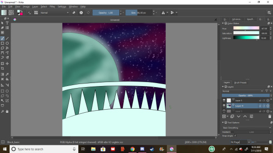
shade it up, babey. In this piece’s case, our light source is the planet, so we shade accordingly. the shades in the ref docker are my go-to’s. Good rule of thumb is the warmer the light, the warmer the shade, but my default is the purple-ish blue color, i set it to multiply and the opacity to 40%
Next I block in the character’s colors, I only do this if this is my first time drawing them, if not, i use the previous image or the character’s ref sheet

flats are done, and she looks spiffy, let’s shade her
cool
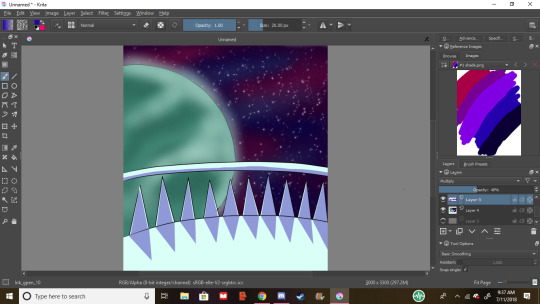
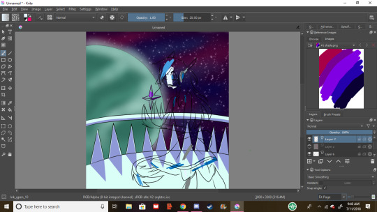
close up of the hair shading. i always take my lining brush, and make it thinner for hair shading, it looks fluffy, and nice. this is also the beginning of the eye shining process, for fancy eyes like hers, i take white and lower the opacity, that way no detail is lost, and it’s still nice and shiny, for plain eyes, i just up the saturation and lightness
next, over the lineart, put pure white like this, it make the eyes have lots of depth. and an option if you have a light source that’s a different color, a shine of that will really tie it together.
nice, she’s shaded and highlighting. but now we need some… glowies
much better. if your light is especially bright or your character is pale, some reflection goes a long way. i use the airbrush for glowy stuff and these reflections on matte surfaces
Now we shade in a way that effects bg and character, i call envo shade. I went ahead and took my airbrush set to erase where stuff glows, but now it looks too sharps, so…
We blur it up again. Perfect.
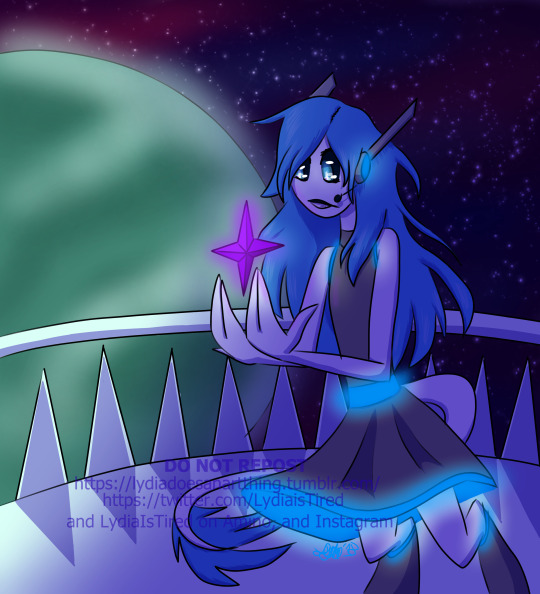
Never forget to sign and date your work. Dating is so you can look back and see how much you’ve improved, and signing is just good practice, but i won’t get into it. i tend to watermark my stuff after it being reposted so many times, but that’s something you can decide on. Again, please keep experimenting and trying different things to develop how you draw, and if you ever use these methods, feel free to send me the link so I can see ^^, have a lovely day, and if you need me to explain anything further, shoot me another ask.
Commission info
#lydiaistired#lydia does an art thing#art process#art tutorial#ish#digital art#artists on tumblr#autistic artists
34 notes
·
View notes
Photo
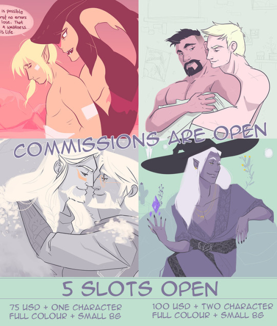
Hey my shinning little stars!
It’s that time of year when I open up commission slots. I’m only opening five slots so hurry up and send me an ask so we can get in touch my little quasars!
75 USD One Character. Waist-ish Up. Full Colour. Smol Background Elements.
100 USD Two Characters. Interacting. Full Colour. Smol Background Elements.
Anytime you commission me you get an initial sketch, and a colour palette to sign off on. All payments are required in full, before work begins either via paypal or e-transfer. Work is usually completed with in 48 hours of being commissioned -- unless I get five all at once. I will only ask for payment when I begin the work™.
If you wish, you will be mailed a postcard sized hard copy, signed on the back by yours truly no extra charge.
Before you excitedly send me your asks, please read my usual FAQ:
Why do you only do full colour? 75 USD is way too much I want just a sketch! Good question! I feel that my work looks best in color. Its an integral part to the mood, and execution of each piece. If you REALLY want to pay 75USD for just a sketch or a lineart then by all means but you will be paying the same price regardless.
Can I comission you to draw anything? Yes. With in reason. I will draw NSFW stuff, OCs and whatever else you like. Again as long as it is within reason and not illegal you may always inquire. :)
I want bright colours! None of this pastel shit. Sorry friendo, pastels are my jam. #pastelordie lol.
Why is your art so expensive?! I know other artists who draw better than you for half that price ! My art is expensive because it is what I deserve little star.
127 notes
·
View notes
Photo

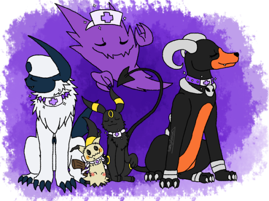
FINALLY IM DONE WITH THIS OH MY GOD. My SAI crashed while I was finishing the painting one of the images and my stupid past-self hadn’t save literally since I had finished the lineart, which meant I had to start doing the colors all over again.
Which sucked. A L O T .
BUT, WITHOUT ANY OTHER INTERUPTIONS, I HERE PRESENT, FUTURE!VIRGIL IN MY SANDERS SIDES POKÉMON AU....
Nurse Virgil.
Yes, you guys aren’t seeing or reading wrong, I thought for what I wanted Virgil’s future to be in my AU, and somehow the idea of him becoming a nurse on a pokémon center came to me and I was like “????? it??? somehow fits his character in my AU??? And he would look nice af??? Heck yeah, let’s do this.”
Honestly, I was thinking about how he does always try to look out for everyone and everything, and somehow the idea of him in my AU becoming a Nurse clicked and i loved it. So yeah
I HAVE thought a little about how and when in his path he decided to follow the path of becoming a pokémon nurse and all, will explain better under keep reading like I always do. But one thing I knew I had to give him, was a new “nurse pokémon” like the ones Nurse Joy always have with her in every generation, and then without even thinking much, I went with Audino simply because it’s shiny is purple.
Yes, that was the only reason, and is a valid af reson.
His old pokémon obviously still are with him, and seems like we have a new addiction BESIDES Audino?? my, my how did that little fella joined the team, I wonder??
Perhaps the information is under the read more....~
and warning. It’s DEFINITELY a LOOOONG one. Told you all I imagined the story behind WHY Virgil took this path. :’D
BUT FIRST. TAGGING LIST!
AGAIN, IF YOU DO NOT WISH TO BE ON THIS TAG LIST ANYMORE, PLEASE INFORM ME! My reason behing this list is mainly the feedback received on my past SSPokémon!AU fanarts and such. So yeah...sorry if you didn’t want to be tagged ;u;
@revengeraptor @samthekoalabear @not-so-innocent-bi-sander@warnadudenexttime @anxious-fander-talian-bean@flynnisthename@anxiousoddish @madly-handsome @pastel-patton123 @virgil-angsty-sanders @smokeyrutilequartz @heythereprincey @ flowersquirl
Virgil ended up taking into the nurse path after taking the job of being Nurse’s joy “errand boy” for a while. At that point in his life, he was actually living with Patton in his daycare, finally deciding to stop wondering the world after something he didn’t even know what was. He did help Patton around the daycare, but still liked to help the old nurse on the pokémon center every now and then. Patton obviously had nothing against it and even encouraged Virgil to do so, always happily saying how he could see Virgil’s anxious and reserved self slowly but surely start to dissapear as he could see the boy slowly start to open up easily to others and trust them a little bit more.
The Nurse Joy he helped was already pretty old, having worked on what she loved for pretty much all her life, she was also always happy to have Virgil around even if just for the company, something about how when you worked on taking care of pokémon and seeing trainers come and go so fast, she barely was able to take a break, it was nice to have a helping hand other than from her pokémon. Until one day she asked Virgil if HE wasn’t interested in actually becoming a nurse himself, seeing that without even realizing Virgil DID start to do more than just “get her itens and medicine she had bought from town” and actually helping around with treating the pokémon that trainers would bring. Virgil obviously thought she was joking??? Like, Wasn’t becoming a nurse a Joy thing??? All nurses he had seen in his journey WERE Nurses JOY after all. Sure, he might had helped the poor woman with taking care of the pokémon bringing them their medicine and food, but surely being an ACTUAL nurse of a pokémon center was WAY Different than THAT. And most importantly, he still saw himself as an anxious mess, what if he couldn’t treat a pokémon properly?? what if he messed up and ended up giving the wrong treatment???
Joy answered his doubts. And say that no, while most nurses WERE Joys, it wasn’t actually a “only Joy” thing. Anyone could actually apply and study to become one, the Joys were simply the most famous and best at that, but that didn’t mean ALL Joys were nurses, or that all nurses WERE Joys, she knew the poor boy anxiety problem, but still tried to reasure that he would do fine, it wasn’t like he really needed to if he didn’t want to, it was just a suggestion of her, he obviously wouldn’t be at that boat alone, all his pokémon WOULD be able to help him around, even if he probably would get a new “healing pokémon”. All his pokémon already were pretty much therapy pokémon so, it would obviously be completely fine. But still. The final choice to apply and try out all the studies was his.
Virgil didn’t think much of it then, but..the more he tought about it, somehow, the less strange it was??? He even talked with Patton and Logan about it, bringing the deal up as a joke, but then they both actually agreed it could be something he could do??? Again, it took a lot of talking from Patton’s and Logan’s side to make Virgil believe it was something he was capable of, and then a little more on Logan’s side pointing out the positive traits the study would bring, and finishing saying “You might study and finish it with golden stars, but it’s not like that means you ARE OBLIGATED to become a Pokémon Nurse. You can go for the knowledge, but if at the end of all, it isn’t something you want to do, you can come back. We won’t bring the deal anymore and we will support you in your decision.” That Virgil decided to actually go back to the Nurse Joy to ask where exactly he could apply to study, who not only gave him the adress, but also a recomendation letter that surely got him in the Pokémon Nurse university, and eventually finished with golden stars.
Now that THAT Part is out of the way... A little bit more about him once he became a Nurse:
While it is an POKÉMON center, specialized in taking care of Pokémon, he also takes care of trainers who might have been injuired or attacked by pokémon. Like, trainers under effects of a Paralizing Powder and stuff like that.
Virgil as a nurse is literally 30% less anxious, 60% more frustrated and 100% DONE.
Ask him “why there isn’t a hot nurse Joy working here instead of an emo kid”, I fucking dare you.
“Geez, I don’t know Derek, Maybe because the poor woman might have other dreams in mind and don’t want to stay behind a desk wearing all the shit that comes out of the mouth of guys like you??? Maybe she just didn’t want to become a nurse??? I DON’T KNOW DEREK, WHY ARE YOU HERE ASKING STUPID QUESTIONS WHEN THERE ARE TRAINERS ACTUALLY NEEDING TO HAVE THEIR POKÉMON HEALED AND ARE HAVING TO WAIT BECAUSE YOU ARE AN ASSHOLE THAT IS KEEPING ME FROM DOING MY WORK TO ASK QUESTIONS LIKE THIS HUH DEREK?!!? WHY?!?!!?”
Definitely not giving up his dark clothes and make-up simply because he now is a nurse. His uniform is literally more purple-ish than pink, and he only allows himself to wear the white apron.
He honestly just...worries. Which is something he always did. But now he is more worried because of how dumb some trainers seem to be like?? Why would you fight a LV35 Ursaring when your poor Bayleef is only LV17???? WHY Would you look at a dark forest full of wild Vileplumes and Glooms and think “Yeah, I can definitely go through there without a repellent or anything like that, i’ll be JUST FINE.” Seriously. He just can’t take all that anymore.
All his friends are obviously proud as heck of him for becoming a Nurse, but that doesn’t mean he doesn’t get frustrated with them as well.
More than once Patton was bought to the center after being poisoned by hugging a Muk.
“Patton, tell me..WHY did you hug him?!?!”
“HE LOOKED SAD!!!”
“PATTON, HE’S LITERALLY MADE OF TOXIC AND POLUTION WASTE!!”
“THAT ONLY MEANT HE NEVER HAD BEEN HUGGED, SO I DEFINITELY HAD TO HUG HIM!!!”
The others aren’t any different though.
“Logan, I swear, If you have to be bought here again because you exasted yourself to the point of collapsing, I am tying you up to the table.”
“That’s ridiculous, I assure you, I am perfectly FINE! You and Patton are simply exagerating. I can define my working and resting time just fine.”
“Logan, You do realize your Alakazam literally knows the pokémon center number right.”
“....How does he even know how to dia-”
“I gave him orders to keep an eye on you and literally put you to sleep using hypnosis if he sees you overworking yourself again.”
“WHA- HOW- HOW DID YOU-”
“I talked to him, i know. shocker. Don’t try me Logan. Just do what I say. DOCTORS orders.”
“Remy...what...what are you doing here...it’s...literally 3AM. WHY did you press the emergency alarm?!?!”
“...’Cause it’s an emergency???”
“... None of your pokémon are with you and you look fine.”
“Im out of coffe Virgil.”
“...wha-”
“there’s none left home! :(”
“...Remy, I already told you. The guy that runs the coffe bar here in the pokémon center only comes and open it up at 6:30AM. Go home.”
“wait wait! I have another reason!”
“...What.”
“ I Came...uuuh...to hang?! :D”
“Get the fuck out of my pokémon center, before I send you straight to an actual hospital.”
“Aaah, my fair Virgil...isn’t it amazing how after all those years, I’m now a famous Top coordinator, and you are coming out of your shell and helpng so many people! Isn’t it amazing?!?!”
“The only amazing thing here Princey, is how the fuck you managed to actually win the Grand Festival when your moves are still mediocre at best. ;)”
“ *offended princey noises* “ WHA- HOW DARE- YOU!! I-
“Love ya too princey. Now here. Ariel is completely healed, thank you hope to see you soon. ”
“....im not sure if you just want to see ME again, or if you want my pokémon to get hurt.”
“And that is what you have to think about for the next contest~ Hope to see you in the judges line soon.”
His relationship with Roman still is...strange. They love eachother tho, no one say anything, they probably will realize by themselves.
Yeah...probably.
He does still love contests and all that, he DID grew up around it. So he often is called to be one of the judges of the contests around, which is something he happily do if he isn’t too busy.
He got Audino from the old nurse Joy that got him to apply in the first place. She was a “new recruit” sended to her, but since she was retiring now that Virgil was taking her place in the Pokémon Center, she decided to let him have her.
Hey, she was purple, he wasn’t complaining.
She also is probably 30% of his emotional control now that he works at the pokémon center, so that is a bonus.
As Joy had said, he was able to keep his old pokémon with him and have them help around the center. Even if neither of them had healing abilities like Audino does, they manage to help in other ways.
Most of the time, they help with bringing itens and medicine he needs, but they also help the trainers around the center to wait for their turn so the whole thing doesn’t become a mess in days where the place is full.
Most people were rather...scared of having a GHOST type like Haunter in a place where it isn’t uncommon to have sick and hurt pokémon. But it didn’t take them long to realize that Virgil’s Haunter was literally the biggest goofball and prankster they had seen. He is AMAZING with baby pokémon and young trainers/children that come around the Pokémon center. There are literally days were schools would bring their pre-school studants to the pokémon center just to see Haunter. Virgil had agreed on it. Haunter definitely is happy to entertain the kids and to help spread that Ghost pokémon aren’t “evil” or something like that.
Mimikyu is ALSO a new addiction to the team, but it’s one that happened BEFORE he went to study. Mimikyu was a gift from one of the other guys to him. Who was that gave him a Mimikyu??? Mimikyu’s type is literally the only and big hint im leaving here. ;)
Mimikyu loves to wear bows, so Virgil always make sure to tie his “uniform” in one. The little guy LOVES it. Mimikyu mainly stays close to Virgil during the day though, helping him more behind the desk than anything. He still isn’t really used to big crowds. Virgil can understand that feeling.
#my art#sanders sides#thomas sanders#virgil sanders#tsart#pokémon#sspokémon!au#sspokemon!au#Virgil 'Like hell i'll throw away my dark clothes aesthetic simply because i now work at the pokémon center' Sanders.#look at those smug af looking pokémon dashdaklhda i love them.#haha oooh boy#that was a long one#jdslajdlkas im so sorry :')
33 notes
·
View notes
Note
i LOVE the way you paint!!! would you ever be willing to do a tutorial/give some tips on painting?
Hey, thank you so much!!! I’m really flattered that you’d ask, but I honestly feel like I have very little technical grounding in digital painting and am nowhere near qualified to tell anyone else what to do... I’ll try to explain a little about what I think about while painting/the way I approach it but I’m nervous about giving bad advice, so please take what I say with a grain of salt...
I usually colour my sketch layer red or blue and set it to multiply, then whack some kind of neutral-ish colour underneath before I very sloppily lay down flats behind the sketch. I don’t think it matters very much but I just use the default hard round brush in photoshop, sketching and usually flatting on like 80%. Then if I’m feeling fancy or for the sake of this ask I can make another layer on top of the flats to roughly block out shadows, set it to multiply and reduce the opacity until I like the colours (or, more accurately, until I can stand them I guess)
Then I make another layer on top and start painting. This is pretty much just tidying up the lines and trying to define form a little more clearly. In this part I don’t pick any new colours - the whole process I pretty much have one finger on i and one finger on b and am just flicking back between the eyedropper and the brush tool (mostly set to around 50% opacity) nonstop the whole time. I think it’s useful to make the lineart and background coloured because it helps to have a set “dark point” and “white point” which aren’t flat black and white while you’re in this step. Constraining your basic palette that way helps highlights and shadows pop later on and also I think makes it easier to retain colour harmony overall.. (Sorry if all this is super obvious/rote!!)
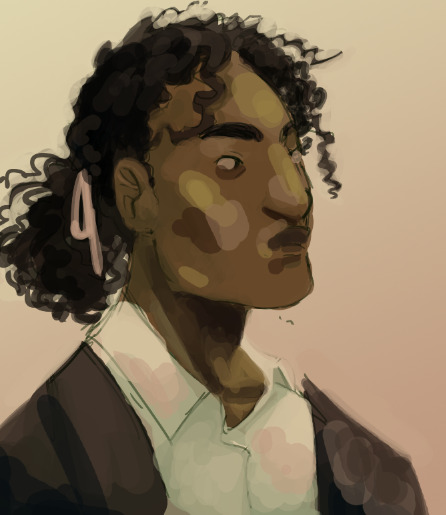
I know this is not a super helpful part to get vague about, but from that point it’s basically just blending, refining, adding more highlights and shadows where necessary, etc. This is the fun part but also the most difficult to give any concrete advice on. You can probably see that 95% of my process is just making stupid decisions and then trying to fix them lol, but I don’t think that’s so bad, imo the process of drawing/painting basically is just making dumb problems and then trying to fix them... it’s easier to define light and shadow in harsh ugly colours and then gradually blend and soften than to go the other way.... ohhh I feel so dumb trying to give anyone advice OTL just try to think about ambient lighting where u can, texture is easy to define loosely (and loosely is all I usually bother with) with the direction/length of your brush strokes, think about places where skin is loose or tight or hollow or smooth or oily, try not to be too married to your initial sketch and move stuff around where you need to (although this one stayed pretty much the same apart from a few little tweaks..)
Anyway, then I fiddle around with the colours a bit until I hate em less, fix any last second stuff that was bugging me and eventually can’t stand to look at it anymore. VOILA!! My biggest and only valid piece of art advice is that if you are like me you will always be embarrassed and ashamed of everything you make but just make it and don’t make excuses for it anyway. The best way to get better is to do it a lot!!
Also I don’t know if this helps but I found a couple old (non-TAZ related) gifs I made of painting processes.
(that gravity falls one is... so... old...)
Anyway, hope that helps a little and that your day is going well anon!!!
#i feel so snotty whenever i try to give art advice#i wanna add the disclaimer I ACTUALLY DONT KNOW FUCKING ANYTHING#Anonymous#hugbear talk
78 notes
·
View notes
Note
hey man your comic stuff?? fucking amazing do you have any tips for a novice child artist such as myself
hmm!!! thats a good question if i have any advice at all…i dont really draw things in comic form that often because of how slow i am…its a whole project for me lol
also natch im just an amateur at all of this vs people who like…pay attention to how to do things really well and/or draw comics on a regular schedule &/or get paid for it and all. so seeing this i was immediately trying to think of like, advice ive seen from random professionals on twitter & stuff & i’ve tried to moreso shake it down to the stuff I’M actually doing when i draw a comic. which is a bit tricky because of my small sample size & the fact that i dont have any kind of consistent process or technique unifying all the comic-type stuff i draw
like sometimes its just a few floating sequential drawings and other times is definitely more like, really thinking of it in terms of how i’m going to structure it in Comic Form & use the format to adjust my presentation of whatever idea i have
like i know ppl whose Job (officially or just by their own standards) to do a bunch of comics pages will do a script of scenes to decide what goes on what page and sort dialogue / action into panels & describe how things will look etc…and then do like maybe really rough layout pre-sketches, then the first rough sketch for a page, an optional more cleaned up sketch layer on top of that, and then the final lineart
i sorrrt of do a version of that, in that i am generally sitting on a Comic Idea for a while before i even start getting into the business of thinking through how it’ll actually work. i have to make sure that im “committed” enough to the idea to wanna make more than one drawing for it, and that i think i have at least a vague notion of how i could put it into a comic. sometimes i DO end up just putting the notion into a single drawing or condensing it into like, 2-3 lil floating drawings or w/e. coz a lot of the times the idea starts out really vague, often with one “moment” that serves as the whole inspiration & that i then try to build a scene/sequence around….a lot of the details beyond that can be really vague in my mind, like the setting or dialogue or who’s involved or what happens or the pacing or extra events or etc…basically Everything is real amorphous for a while
so yea step 1 is me having this one idea and trying to decide if building a scene around it would be a better way to present it vs just having one drawing, & if i think i can actually effectively carry it out….which is in reality even less fancy than it sounds…i just sit on an idea for a while & never get around to actually focusing on it / putting down any of the thoughts abt it that im formulating. but the upshot of me putting it off for forever is that i do end up with a kind of mental script / layout for a comic before i start it…..but even the extensiveness / format of these unwritten scripts varies a lot for me
like, a few times when i have made something that’s maybe longer than just one page &/or something ive been mulling over for an extra long amt of time (which tends to be stuff that is starting out w/ heavier than usual ideas) i’ll like, actually write down what happens page by page, even plan out specific panels, maybe even put down a few rough sketches of certain parts. i’ll have the Main Moment which is the idea that started the whole thing in the first place, but what tends to happen is i’ll come up w other moments that i think could lead up to / frame / follow the main moment, and i pretty much just decide how they all fit into one cohesive piece. so what my “rough drafts” look like for these more extensively planned ones—still really not that exhaustive, i only put things to paper when im basically done enough w my ideas to be just about ready to start actually making them—can vary in their actual formats (e.g. simple chronological bullet points of events, a few drawings, a rough sketch of how the whole thing might look), the core of it is basically just me finding a way to nail down how i’m going to arrange the Moments i have and how i’m going to lead one into the other…….like for things with enough pages / panels, i’ll tend to focus on which Moment will end each page &/or each line of panels, then have an idea of which other Moments i’ll need to put on which of those pages, and kinda figure out how to pace things
again that all sounds like maybe i have a real process…..I Do Not
im kinda lucky in that i think i have a decent sense for composition without having to struggle over it too much. so a lot of times i can leave a lot of that up to be felt out as im actually doing the rough lineart for the first time. i also often don’t nail down panel arrangement that carefully & also make it up as i go along a bit, which is probably not something anyone should emulate. someone was saying something about how some certain page layout of like, 3-something-something panel rows looks best, i dont know. i’m guessing, as with all things, nobody can say “always do this / never do that,” but i think staggering odd/even numbers of panels in each row is always a good guess. just makes it easier for them to read more distinctly at least, surely
sometimes i DO think about certain panels when i wanna frame a certain “shot” in a very specific way. but im just kind of doing whatever. i know vague rules like that wide shots / negative space slows down the pace, vs tightly cropped / small panels / packed w a lot of visual info tends to read as a faster pace, more chaotic. i dont quite go too wild about that sort of thing tho, because for me as a reader, a lot of times really tight shots that are like cutting between 5000 different angles rly fast all in a row, sometimes it is absolutely unreadable to me, as in i do not understand the visual info at all. it feels like the equivalent of how action movie editing keeps hanging on to the “incoherency = intensity” vs just me tuning out until the scene is over & missing details b/c i just am not getting anything out of it
thats not much of a factor for me coz i dont really ever do things with extended sequences of movement / action or whatever. i’ll keep things in one place. i’ll like to do smaller, “quicker” panels moreso to like, show simultaneousish details / to extend one moment…..occasionally i do Big Panels for a moment of higher intensity / impact too. btw putting a High Intensity moment in a super tiny panel is always really funny for the contrast of it all. i dont think ive ever done it, but it is
ummm…….also planning where your speech bubbles will go is good. i dont do that enough, but i should. most of the reason i dont have a more proper, organized process to anything i draw is that i just dont have the focus / patience to slow down for More Planning vs just going ahead and drawing it. jokes on me, since some quick vague planning can make it a lot easier on yourself vs just diving in and struggling w something for ages
uhhh also since im not that fantastic or mindful of panel layout? sometimes i’ll make a point of just having uniform rectangle panels of the same size/shape, so i only have to really worry about the layout within the frame. this is mostly good obv for things with not that much shift in pacing throughout it or action or whatever…you lose the advantage of how panel sizes can affect the tone of a shot or something & probably cant get that detailed in ur drawings but that is often Fine By Me
when i do use the uniform rectangle structure though, i kinda have to focus more on each individual panel, vs like, knowing ok, these three moments are going on this page, i have a vague idea of what’ll connect them, just make up the individual panels as you go along. this does mean that i have to kinda think more about what justifies each panel….how its different from the ones before & after it or how i might want it to be similar to “hold” a shot for a beat or w/e or draw focus to a small movement, what’s actually going into each panel, if i can/should condense two panels into one, etc. its still a lot of playing it by ear, i dont have solid rules of how i think i should do it each time
even when i do have a like whole plan for something im drawing i’ll often make more changes as im actually making it. sometimes its deciding something would be more effective, sometimes it’s just “hey this would work too & be easier,” and thats definitely fine. nobody knows the change you made, and Easier isn’t necessarily Worse anyways. convenience is good where you can get it
ive also definitely had specific comic artists formatting/framing styles in mind when i specifically wanted to use that while drawing my own stuff. like the way i’ll draw maybe a kind of horror vibe (more diagonal lines / “fractured” panels than i’d normally use, quick tiny shots of different smaller details, that kinda stuff) is gonna be different from when its a calm & quiet tone. where i dont really get too creative with the panels really & keep them pretty steady
and then that one time i did a largely nonsequential sort of panel collage b/c the marge simpson anime gave me great inspiration for how to combine & present a bunch of vague notions i had floating around all into one page. it was a good accomplishment & thats unsurprising because the inspiration i was using was That Good. thank god we can all benefit from each others good ideas and knowledge & work & all that. it does help to jump on a feeling of “wow what a cool comic i wish i could make something like that.” just go ahead and make something like that…
ummm this is all on the technical side-ish still but i dont really know what to say abt the kind of stuff that makes me wanna draw a comic in the first place vs just putting the idea into a regular single drawing…usually it Is kind of a more nuanced moment that i think would be better presented within some amount of context and buildup and all that. i basically exclusively draw emotions….and sometimes theyre better shown with some amount of action/dialogue, or at least a few different shots or something. i dont know if this area is helpful information or anything anyone would benefit from knowing about, or even if i have anything to say about it…is it all self evident maybe? idk! i do think i communicate emotions best through comics…not that each one is “here is my mood!” or talking about me at all, but i was for example trying to communicate about an abstract emotion, i think i can draw about it better than talk or write about it or anything. i DO sometimes draw more directly from my own specific feelings/experiences for things, but mostly when i think it can be relevant…i cant really do anything all that directly autobiographical, even casual diary comics or whatever. thats what my text posts are for… but i have been interested in how to convert these huge emotional issues that i’ve been v familiar with into a few pages or panels and how to present its impact in the simplest, straightforward ways i can manage…sometimes i think its worked for sure…..i feel like i gave a more Relatable sense to a certain experience by putting it in comic form than any of the times ive discussed it as a personal thing at length via text. like i said i communicate best via comics probably, despite not drawing them all that much coz im too damn slow lmao
speaking of, i’ve kind of been like “what a waste” abt the fact that i dont have like, a proper approach or regular strategy to thinking up comics before i draw them, but i think theres something actually okay to be taken from that lol……just that i know if i got too caught up in trying to plan it all out perfectly before getting into actually drawing it, i’d be making it into a bigger project and slowing myself down even more & i’d risk dropping it partway through or just never getting started at all. so if i have a less than perfect end result, at least i have an end result, and ive finally got that one idea out of my head in some way. and i feel like some of my comics do work out decently enough….a good handful of times ive been surprised w how well some ppl receive them
so i think it is good to just go ahead and dive in. i did that once w an idea i’d been sitting on for like half a year, and i think it turned out good enough. i just knew i could easily spend months and months more turning over all the details, which might make it Better, but would also mean that yknow, i’d never actually get around to making it b/c of feeling like it had to be ideal. so i simplified it a bit, used a uniform panel layout, did little drawings, and just got it drawn out in an afternoon or two. and now at least it exists lol. and ive sort of come back to the same idea in a way…if i feel like it turns out i wanna elaborate on something more, i can just make another pic/comic built on the same theme, who’s gonna care or stop me
i also try to focus on what lines are/aren’t necessary to avoid things being confusing or just pointlessly cluttery….this isnt a big issue b/c i dont often bother w bgs. dont emulate that either lol…….but im not doing any Serious art so its no big deal to me if im not “good” or not progressing as spectacularly as i might. i dont need my drawing abilities to be that amazing here. but bgs still serve a purpose beyond being a “skill” or whatever so im trying to include them more, aka occasionally, at all. still hardly ever. but sometimes you at least need like one halfassed establishing shot yknow. anyways
mmm this has all been kinda vague and i’m trying to think if there’s anything more specific i could/should talk about!! i dont know. i dont have a good perspective on what its like to look at my art while not being me lol & what ppl might think or what stands out to them or whatever. rip
sorry this is so long, i dont really have ppl wanting to know abt my Processes or drawing thoughts or whatever so i’m kinda jumping at the chance to talk about this sort of stuff after having been actually prompted to. but i dont know if i’ve said anything at all!! i dont know if any of it has been helpful
“tldr; i dont really know what im doing, but go ahead and jump into actually making them as opposed to feeling like youre ready / you know the best way to make a page, because nobodys ever ready or can say This Is The Best Possible Version so just go ahead and use whatever process feels like it makes your life easier, while still actually making the damn comic” is my whole thing, i guess
i dunno, if there was some specific thing you wanted to know abt that i didnt talk about / talk about well here, feel free to ask me to specify because i totally will, which is both an invitation and a warning obviously
sorry this is so long everybody…….writing an essay & by the end of it not being sure if ive given any info at all is part of my whole Thing
#long post //#jfc this is even longer than i thought#i dont know if theres anytning helpful about this at all#maybe its that ‘’if you think i’m good its good news for you b/c you probably know what youre doing just as much if not more than i know#what i’m doing’’
3 notes
·
View notes
Last Seen Blogs
f-fools
Fools
vansk
v per vendetta ;;

wangdavy
大衛
dahliadreamcraft
Dahlia Dreamcraft

womenwhorule
WomenWhoRule