#inking and coloring a traditional art piece was so so fun
Text

Just got caught up on @silverskye13 ‘s monsters splitting hairs fic! The world building is so well done, I couldn’t resist drawing the setting. (Also I love mountains, so win win)
As always, click for better quality :)
#traditional art#inking and coloring a traditional art piece was so so fun#hmmm maybe I should do that more often…#I also. did not look at any msh fanart before drawing this so my designs are not in line with canon lol#monsters splitting hairs#rendog#docm77#geminitay fanart#my art
39 notes
·
View notes
Note
I don’t really have a lot to ask I just want to say I love your art style! It kind of reminds me of like Eldritch Horror meets Celestial Divinity type of thing so with that said I was wondering on how you came to this type of art style you do and how long did it take you to experiment until you found the style that you wanted? Sorry if that sounds kinda confusing 😅 thanks for taking the time to read this and have a good rest of your day!
Thank you! I did not found my artstyle, my artstyle found me. Here is a timeline of my digital art/illustration journey
2014 - The beginning
I finally took my tablet and bit the bullet that was digital art. I remember specifically forcing myself to draw (because it was not fun) because I wanted to learn digital art no matter what it took.
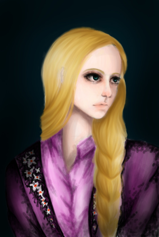
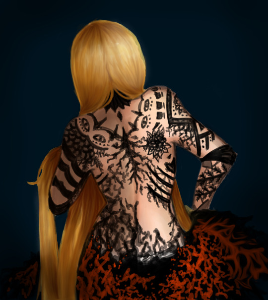
2016 - Experimental
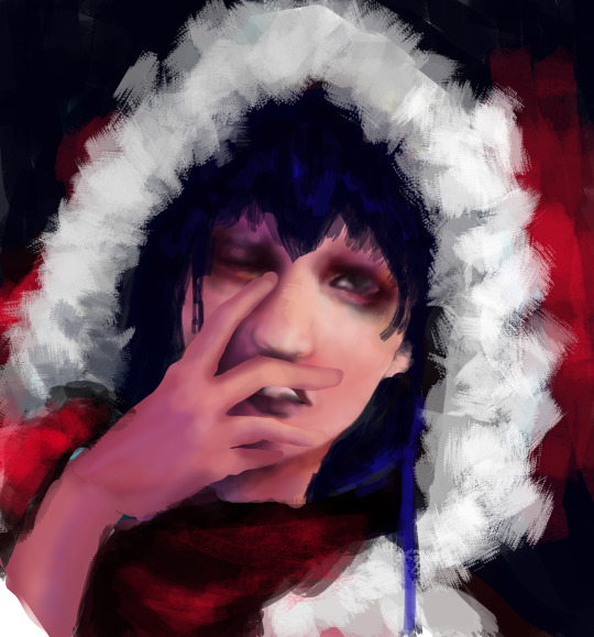
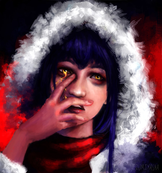
Boldness seems to have dominated this phase, not because of the themes but because I rendered without any under sketch (example above of how the first draft looked like vs the end)
2017 - The breakthrough
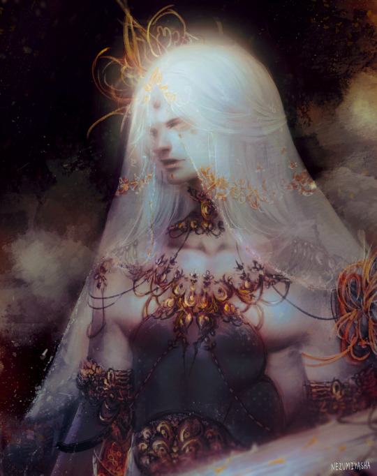
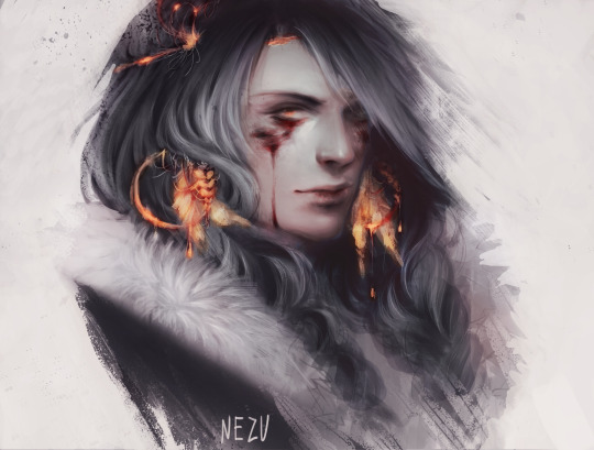
It was only from here that digital art began feeling RIGHT. The most important things I've learned were how to render texture variation (especially softer things like hair and fur) and how to color a drawing from greyscale. I was slowly settling onto my desired artstyle
2019 - Happy accident
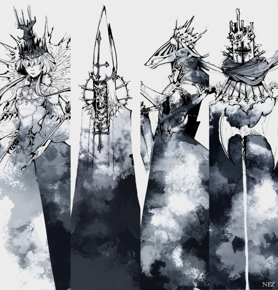
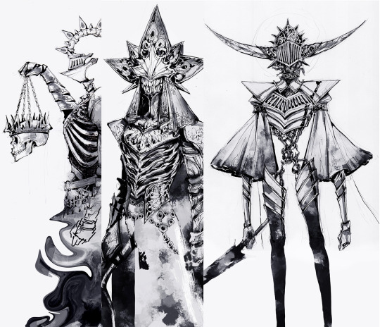
We were tasked to design characters based on chess pieces during college. 1 week deadline. With the mindset that no one will see my designs except my teacher and I, I did things boldly and rendered them (trad ink plus digital shading) to emphasize shape and design, rather than texture variation.
I began mixing traditional lineart with digital rendering.
2020 - Fallen from heaven
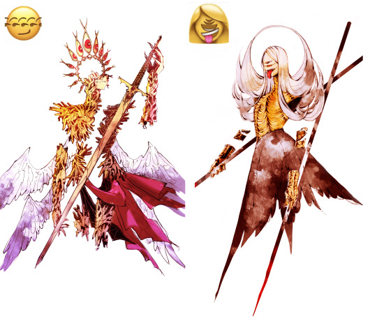
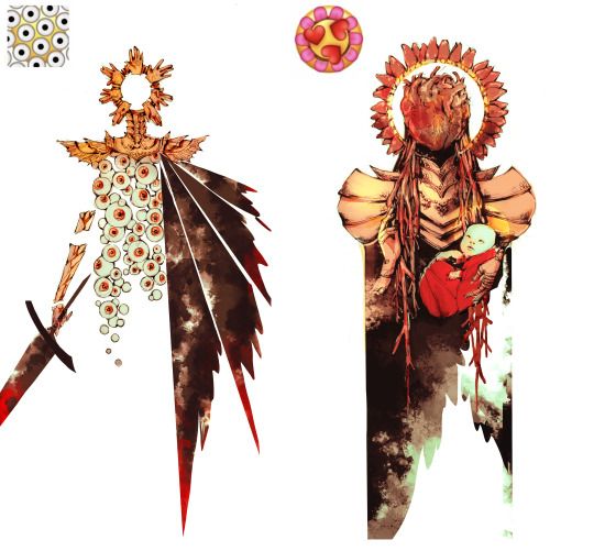
My friend and I decided to attempt to design angels based on widely popular tumblr emoji mashups. It was the first time I colored one of my character design drawings, using similar methods to the ones I've learned in 2017.
2017 - 2024
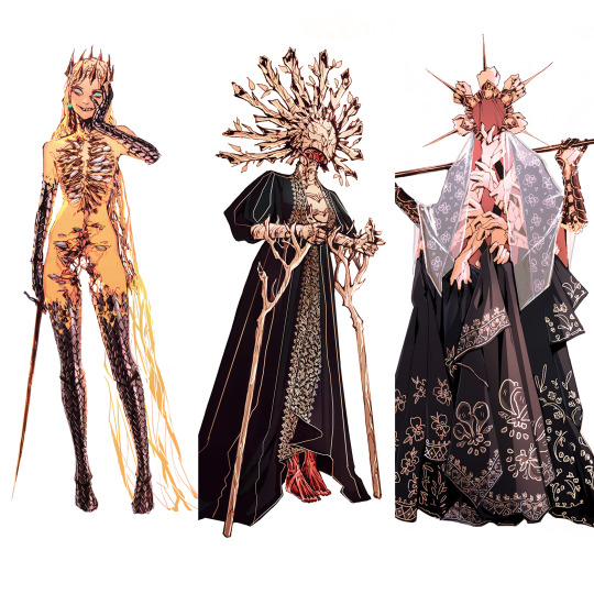
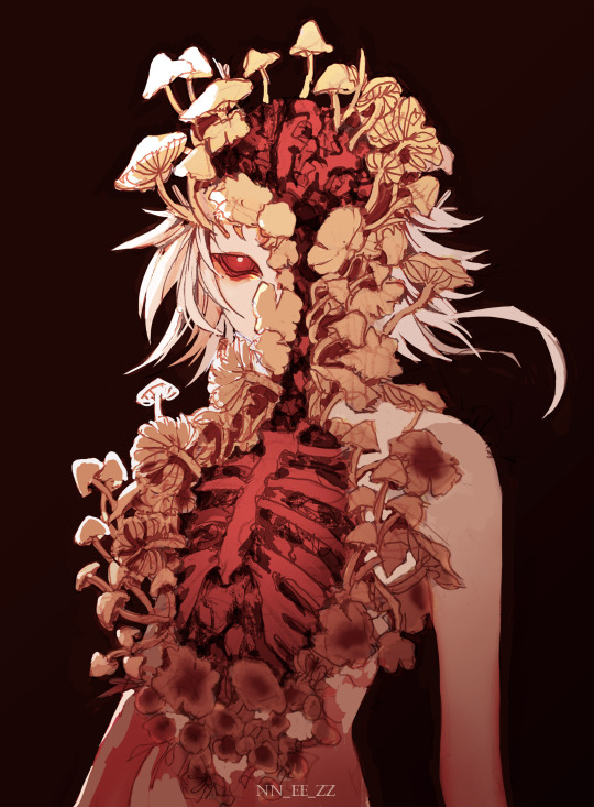
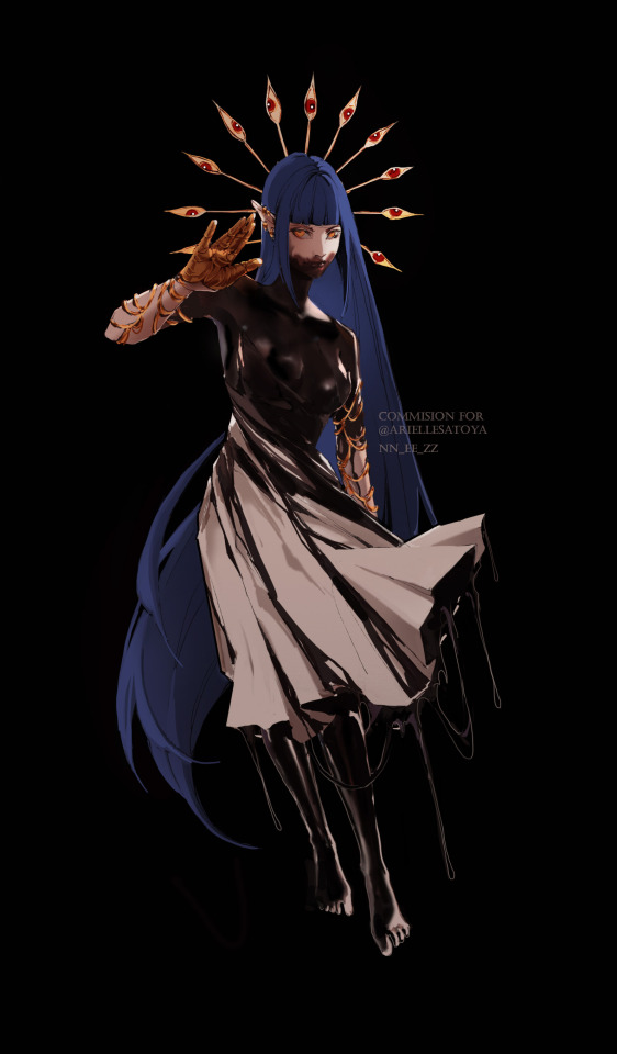
I cannot name nor describe my artstyle nowadays. I haven't seen many people with something similar either. I use what I've learned in all my phases; the spontaneous boldness of 2016, the texture variation of 2017, the sharp shapes and design mindset of 2019, the mix of traditional and digital from 2020. It all melted together and keeps evolving.
The way I approached art changed too. I was so worried about making things beautiful and technically outstanding when today I only worry about making things interesting and readable.
407 notes
·
View notes
Note
Been absolutely obsessed with your vintage inspired designs, i have been staring at them for the past hour just trying to wrap my brain around how you are able to create something SO CONVINCING that im incapable of distinguishing your designs from legitimate works from 70’s indie zines(great work btw) so i have to ask, how do you do it, how long do you spend on an average piece? How the HECK do you make your color halftones identical to news print? I have so many questions!!!
Gee Willikers! Why, Thank you!!
I think the time I invest into submerging myself into the art of that time really helps! I accumulated a library of old print media that I study up and down-- I love it, I love seeing the process in the works, themselves 🥺
So, I tend to take what I learn from that and apply it to the processes that I use to make my art :D I layer the colors separate on different blend modes (which makes it look like printed ink!), shade the canvas like a piece of paper, bleed lines, desaturate and fade colors according to age and wear... And work with the idea that I'm not making digital art per se, but rather working with a digital medium while using traditional techniques!
And I spend about 3-5hrs give or take on single piece! But I've been doing this for abt 2 years now... dang.
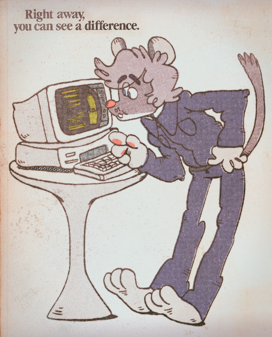
This is how I started! ^
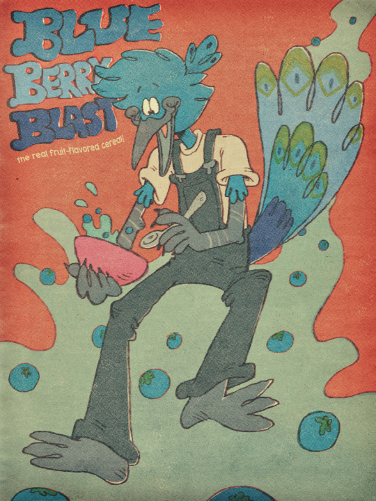
And one of my more recent pieces :3 there's a lot more going on, but you can still see similarities
It's super fun when you get into it! Next time you're at an antique store, pick up an old magazine or book. Look through the art and see if you can figure out how they made it (which colors they layered, if they printed it using riso, what tools were used: ink pen, brush, pencil...) I GO NUTS FOR IT IF IT'S NOT PLAIN TO SEE BY NOW LOL
And thanks for askin! :3
112 notes
·
View notes
Text
Belladonna Nightshade - Halloween Dark Fairy
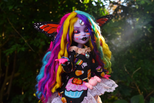
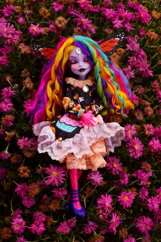
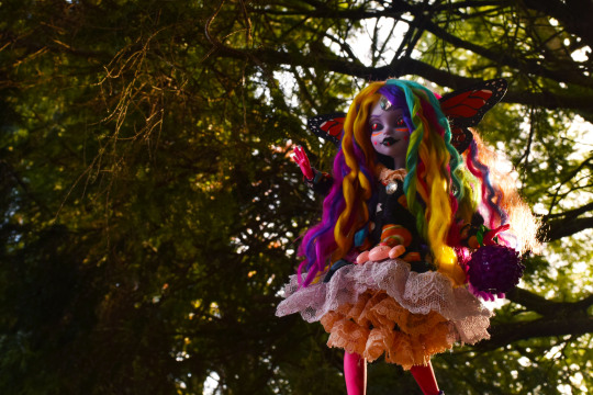
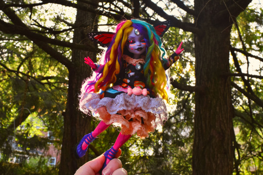
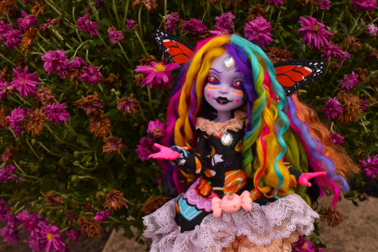
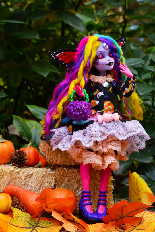
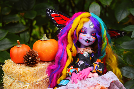
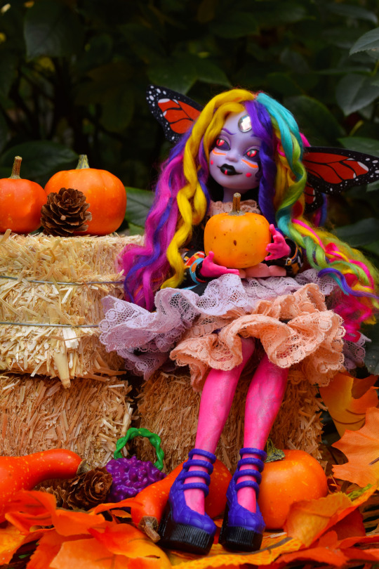
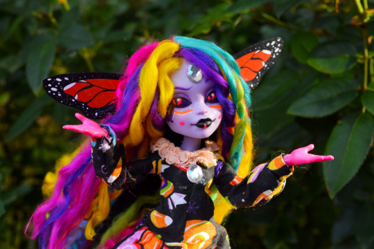
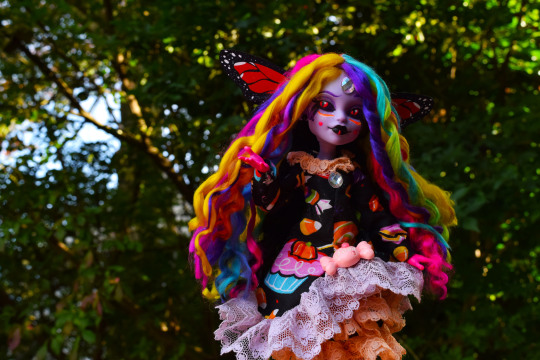
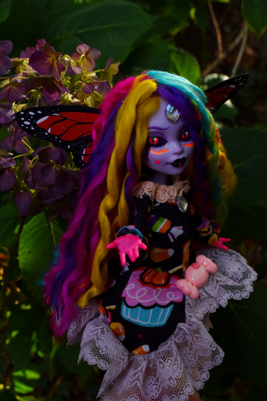
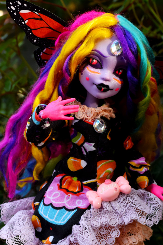
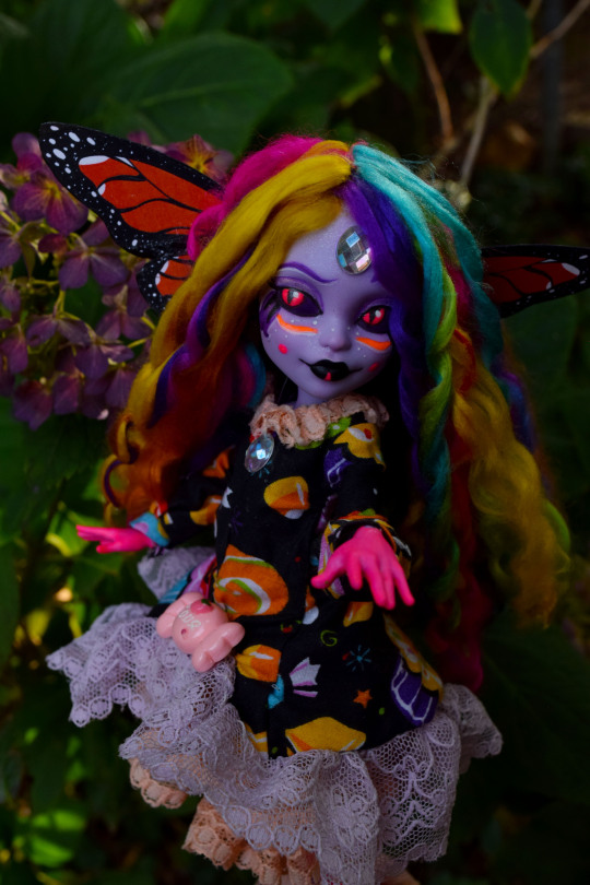
Base Doll: G3 Twyla from Monster High
Clothing Pattern: Dollightful's Asymmetrical Dress (read to the end, I have notes about this)
Happy Halloween everyone! Since becoming a doll customizer, my Halloween dolls are usually related to my favorite indie horror game, Bendy and the Ink Machine. However, seeing as I've completed two Bendy dolls already this year, I felt it was time to give myself a break and try something a bit different. My friends over in DollyAnna's Discord server wanted to do a collaboration, so we decided to all make some Dark Fairies for Halloween!
Belladonna Nightshade is a mischievous fae that loves to play tricks and tempt mortals. That said, she's easily bribed with a sweet treat or two, and will usually let you be if you have a little candy or pastry to give her. I haven't decided what I want to do with her yet in terms of a story, but there is a part of me that would love to have her in my Equinox story.
When you consider the fact that most of my other Halloween dolls are black and yellow, it's no surprise she ended up super colorful. XD Would you believe this is my first doll with rainbow hair? Yeah neither did I, but she is! Part of my style is having really colorful and vibrant dolls, it surprises a lot of people that I've never done a rainbow before, but honestly? I'm glad to have finally tackled one! I'm also glad to have worked with another G3. Twyla is very near and dear to my heart, and I was so psyched to work with her mold! You can't see it in any of these photos, but I used glow in the dark varnish on her eyes and neon markings, so that her eyes still glow like the original. I will say, this doll has a lot more acrylic paint than my others, just by the nature of I don't have any pencils in neon colors. It was nice to get the practice in, I feel more confident than I did before in my brush skills. It was also nice to have a doll with dark scleras for a change! I haven't done that since I made Dreamer, it's surprisingly fun to draw on!
I was inspired by a LOT of different things with this one, and I went back and forth on my concepts a lot. Black light skeleton make-up, butterflies, fairies with non-traditional wings, candy, jesters, these were all sources of inspiration, and I think most obviously of all, Dollightful herself. This wasn't intentional, but I ended up using a doll of one of her favorite characters, with a lot of saturated colors which we know she loves, and even her dress pattern! I've been wanting to make this garment for ages, and finally I had a reason to try it!
So those of you who know how this pattern works are probably asking "Kat, how did you make this fit a G3? This dress is supposed to fit a G1 Monster High doll!" Believe it or not, Requiem Arts has a method for easily adjusting G1 patterns to fit G3 bodies. It's as simple as scaling a pattern up to 104% and printing it that way. It's meant for her garments, but I don't see any reason why it wouldn't work for other doll patterns. So I tried it with Katherine's dress, and I'm happy to say it worked out just fine! I think I probably should have adjusted a bit more on the skirt though. This outfit is essentially two pieces, and the skirt with all the ruffles is a little tight around the booty, it could have used a little more sizing up. So if you own this pattern and want to try this yourself, do keep that in mind!
Do let me know what you think! I had so much fun working on Belladonna, she's so vibrant and fun, I wanna try more fairies like her someday. I also need to try using props more. I got these pumpkins and hay bales on sale, and it was fun using them to craft a little temporary set for photos.
#dollblr#doll customization#doll repaint#ooak doll#halloween doll#doll custom#custom doll#monster high g3#monster high g3 twyla#monster high custom#monster high g3 custom#monster high repaint#doll photos#doll photoshoot#doll photography#ooak#monster high ooak#longpost
204 notes
·
View notes
Text
disney descendants - but add TATTOOS
the Docks house the majority of the tattoo trade on the Isle, so the Sea Three grow up treating tattoos more casually while they've got more of a rebellious vibe for VKs living inland, like the Core Four.
to the VKs on the docks, tattoos most often serve as a show of ownership or as self expression.
for the Core Four and AKs, I imagine it's more common to see tattoos as individual pieces of art.
there's a lot of blurring that line, but seeing tattoos as self expression vs art can carry a lot into both how a person perceives tattoos in general and how they tend to design and place their tattoos.
Jay shows up at the Dragon's Den one day with a large, traditional, fully shaded, badass cobra curling around his bicep.
Evie and Carlos are fascinated but also a bit uncomfortable.
Mal immediately feels challenged, artistically, and starts designing a badass dragon design that she wants to get on her back someday.
Evie and Carlos don't get tattoos until years later, when they're in Auradon and comfortable in their own skin and are able to go to a nice, clean, entirely above-the-board tattoo studio.
Evie gets a little crown on her ankle.
Carlos ends up getting a number of random, small designs over time. Jane's name, a silhouette of Dude, the date that he last saw his mother (the date from when he's been free).
Evie gets a second tattoo eventually, on a dare, and gets a small ruler design on her wrist that's perfect for helping measure hems and edges for her projects.
Mal waits until getting settled in Auradon, too - first because she doesn't trust the skill of the tattoo artists on the Isle to do it "right," and then because she doesn't think her tattoo would be viewed as appropriate for the future Queen of Auradon.
once everything has settled out post-D3, though, and she's confident in her skin she brings it up with Ben (because having the Sea Three around is making her remember how much she really wants to get a tattoo, not that she'd ever admit to that).
Ben totally supports her and she gets a fantastical dragon across her back, painstakingly done by one of the finest artisans in Auradon.
Harry started tattooing himself when he was a kid, messing around with stick-and-poke techniques he saw the older kids using.
they didn't have great ink and stick-and-pokes usually fade pretty fast anyway, even faster when you're constantly in the sun, so he had a lot of fun with the canvas of his hands, arms, and thighs and did a lot of experimentation.
once he and Gil got closer, Harry did a lot of small designs on Gil when he was bored.
Uma got the first real tattoo of all of them.
she showed up at one of the tattoo shops dragging a bag full of tips and left several sessions later with a full sleeve of ocean waves crashing against a ship that was surrounded by tentacles.
she was pleased by how the artist had gotten it to look like the tentacles could either be pulling the ship to its doom or just giving it a hug.
Harry absolutely loved it and began going to get himself a new tattoo every time he scraped together enough tips and stolen coins.
a compass on the back of his hand; a dagger down his thigh; constellations dotting his arms; a menagerie growing one by one of seahorses and sharks and gulls.
he gets a traditional pinup on his hip; a grand, proper pirate's ship on one knee and a kraken mirroring its style on the other; he has multiplication tables and other memorization tricks done on the inside of his wrists to help him on tests.
months after his first (and only) hesitant, respectful request, Uma lets him get her name tattooed as a tramp stamp.
she goes with him and directs the artist and he ends up with her name surrounded by tentacles; they're strategically positioned to curl around the letters but also draw the eye to where they disappear beneath his waistband.
Uma didn't get tattoos as often but they were always grand and befitting her rank as Captain.
she adhered religiously to her colors and aesthetic, creating a map of black, turquoise, cyan, and purple whirls and lines that made her look ever inch the magical being she should be.
Uma complemented the heavy linework with little skulls and bones, sea creatures, and rolling waves.
I've seen some people say that "Wharf Rats" is just an insult Carlos called the crew, but I like the headcanon that it's the actual name of Uma's crew and that everyone who joined up was required to get a tattoo as a promise of loyalty.
Harry totally designed it himself.
Uma and Harry have the largest versions of it, so they added some extra detail and flare to theirs. Uma's on her chest and Harry's across his upper back.
most of the crew have theirs on a bicep but Gil got his on the back of his neck.
Gil didn't get any ink until he came back to the Docks and joined the crew.
once he was back, though, he tagged along and got something done every time Uma or Harry went.
he liked to get Harry to help him come up with ideas for designs that would draw attention to his arms and muscles.
Gil got lots of flowers and plants and birds on his arms, eventually tying the designs together into full sleeves.
Uma and Harry would roll their eyes but loved how badass Gil could manage to make a bunch of flowers.
colored tattoos were far less common than black linework and shading because it was much harder to come by substantial quantities of colorful ink on the Isle.
having his flowers colored made Gil's sleeves pop out and draw attention even more.
he got roaring waves and sharks and sea monsters on his back, pulling up into his Wharf Rats tattoo, with everything perfectly designed to flatter the flex of his shoulders and back.
on his trip around Auradon with Jay, Gil had a lot of fun getting a new tattoo in each kingdom, coloring in his chest with new kinds of flowers and filling up his legs with a variety of designs that reminded him of his favorite stops.
once she escaped the barrier and was restored access to her magic and heritage, Uma learned that her she could make her tattoos glow and reflect her natural magic.
she waited a long time for the day when she, Harry, and Gil were all free from the Isle and she was able to casually take her shirt off and enjoy Harry tripping on his feet and falling on his face at how extra stunning her tattoos were now.
Harry took advantage of the better resources for tattoos in Auradon and had his tattoos relined, as a lot of them were beginning to fade.
he had red lines and shading worked into the designs to give them an extra bit of pop, cohesiveness, and general Hook aesthetic.
for AKs, the most common tattoos were small and easy to hide, like significant others' names, important dates, and little minimalist designs.
Harry won a dare once and coerced Jay and several of Jay's tourney friends into going and getting larger, more artistic designs, though.
to Harry's surprise (and Uma and Gil's delight), some of Harry's first AK friends ended up being heirs from kingdoms like Matinui and DunBroch, with whom he bonded over tattoos after they approached him with admiration for his ink and for his opinions on design.
kingdom pride and fairytale tattoos are definitely a thing. an artist would have a lookbook with glass slippers and well known castles and glass covered roses.
just. TATTOOS guys.
#disney descendants#descendants headcanons#tattoos#descendants verse with TATTOOS#core four#sea three#mal descendants#jay descendants#evie descendants#carlos de vil#uma descendants#harry hook#gil descendants#bal#huma
286 notes
·
View notes
Photo

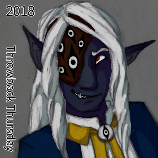


A very special throwback Thursday! Again!
This time a walk through Asim’s character design and how it changed over time and my journey through colorizing traditional pencil drawings.
Breakdown under the readmore.
(note: when I say “my DM”, he is also my partner who I have been building a DnD setting with, I wasn’t bullying a random DM into what I wanted, I was working with my partner to build a new setting while he was really stuck in Standard DnD and was letting that inform pretty much all the worldbuilding decisions.)
2017: The first color picture of Asim, and an attempt to colorize a messy pen sketch that I had been close to giving up on. The filter modes I used on the inking made the shadows harsh and dramatic, and while good for the piece, did not give me much control over the color. He was a basic drow with a color scheme picked out by my DM - my DM also insisted on shorter elf ears that didn’t emote and an overall human-like appearance aside from skintone.
2018: The DM had noted in an expression sheet I had distinctly drawn Asim’s canines - he said it made him look part orc but it was really just a stylistic choice I was playing around with. I leaned into it and suggested his father was half orc for a chance to give him more monstery traits and made his tusks a bit more prominent. I also used large emotive elf ears in the sheet to show the DM how it was a fun trait to allow. He agreed. I did some semi clean line art of a new expression sheet and experimented with coloring that. the line art gave me a lot more control with coloring, but I wasn’t entirely happy with it. The DM had given me a halfmask/eyepatch with a design I wasn’t too keen on but used it in the design anyway.
2019: Fully leaning into his orcish heritage, Asim as his stage persona Balam Yunuen. It was a expression sketch that got out of hand and I ended up fully shading it in pencil I loved it so much. Some more playing around with filters, having remembered a tutorial I saw on digital artists tinting their lineart, and I hit gold. My painting skills were still a little shaky but I learned a lot and he gained +1 Iridescent Skin.
2019 part 2: Another 2019 because I learned a lot that year and his design gained another tweak - a small snout and hints at the animal-like nose he would soon have. I found my stride with shading hair and have been going ham on it ever since.
2021: His sideburns! His finalized snoot! His resting crooked ears! Redesigning his eyepatch because dammit it’s my character he’ll look how I want him to look! At this point I had really settled into my style of colorizing my pencil drawings.
2022: Return of the chin tattoo! Redesigned and simplified into a sun-eye motif. Playing around with his cultural braid, the Makhiorya, a braid that you put beads on for everyone you invite into your family. Magical neck scar where his neck was torn out! I was beyond settled in my colorizing, I was getting bold with colors and lighting, constantly trying new things and learning from it.
2023:???? my kofi supporters are in the know on what’s coming ;)
Comms | Shop | Tips
#dnd art#dungeons and dragons#drow art#drow#half drow#half orc#dnd#dark elf#half elf#dnd paladin#monster art#monster boy#dnd character#dnd character art#throwback thursday#art throwback thursday#fantasy art
37 notes
·
View notes
Note
hey what brush do you use to draw in digital and traditional (if that doesn't bother you!💦)
No worries! I don't mind. :3 The answer isn't so interesting though ww
I just use the pencil tool in MS Paint & the binary tool in SAI 2. Default settings. Most of my art is done this way. I often sketch in MS Paint, and complete in SAI.


(a few examples)
I find it's easier to work within the simplicity of MS Paint, but I do like SAI's features, and sometimes I need the flexibility of pressure sensitivity to really chip away at my thoughts... I find myself relying on it more recently, as I got into JSHK. Human characters aren't actually my forte, and it takes many passes for me to get something legible... Trying to mimic Aida-sensei's ability to render clothes is also breakin' my back lol.
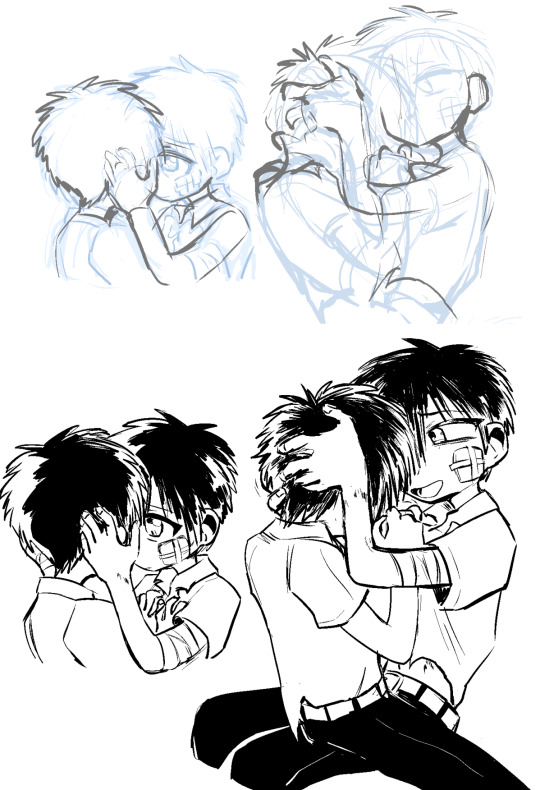
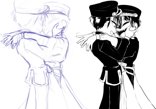
(just taking you behind the scenes :p)
Oh um ... Hm, I draw in my phone notes more often recently as well, so that's the only other variable at times. If you see something like this:
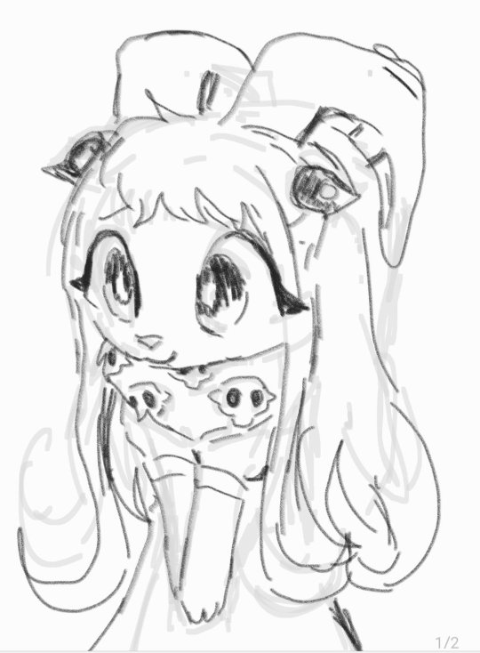

It's just me using the notes app on my samsung galaxy. I use it to jot down ideas for future me. Or... sometimes I'm just passing time. Nothing special about it, I would say, aside from the fact that it's more robust than the previous phone notes app I would draw on. I was fingerpainting back then, but now I have a stylus.
Edit: Wait I feel like an idiot for saying all this and literally posting a piece I made in CSP... SORRY!! My brain is small. That's what I use to animate as well!! !!! Sorry, I just use it once in a blue moon...
On CSP, the brush I like the most has been this one.
As for traditional, I use an assortment of things! It's a split between mundane art supplies (dollar store mechanical pencils, ball point pens, etc.) and some fancier stuff I've been gifted. Currently I have a set of prismas and a couple of ohuhus I use for commission work often. I also have some faber castell brush pens. I prefer inking pens with a flat tip, basically I disprefer fine points/microns etc. (I... um, have a bit of a harsh grip, so I'm prone to crushing them...) My traditional stuff varies a lot more so I'll just paste examples directly. For fun!

Mechanical pencil!
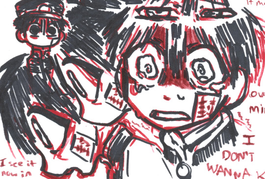
Sharpie!

Faber castells! (The greys are as well!)
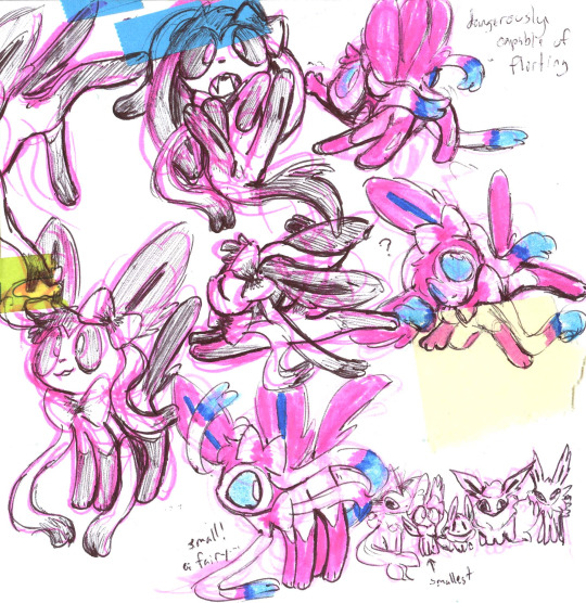
Ball point pen and highlighters!
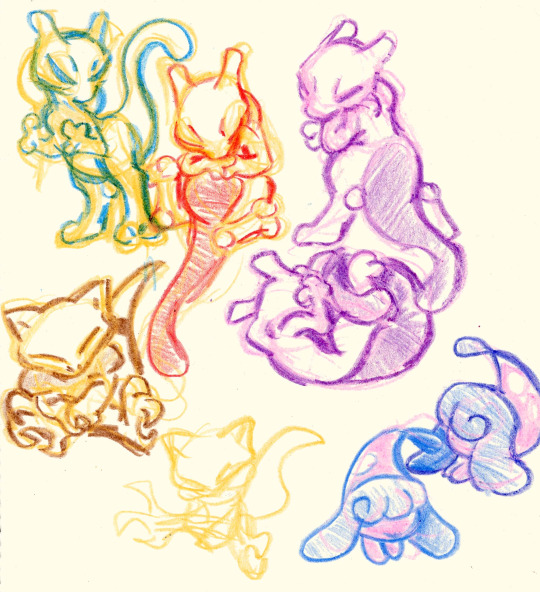
Crayons!
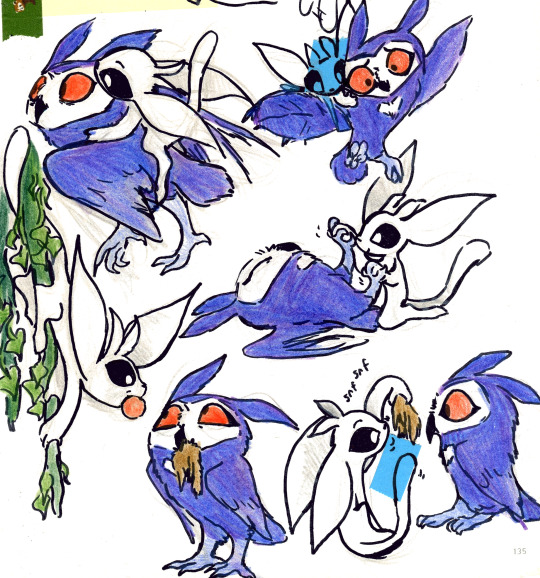
Woodless color pencil! (+inking pens, pencil...)
Ohuhu markers! (+pencil)

Prismas!
Overall, I like having an assortment of things to grab and mess around with, for different moods. I'll draw on any scrap of paper also (to the burden of my wife, who scans and edits ALL!!!! of my art, lol.) If you're at all seeking for a similar experience, I recommend playing with whatever odds and ends you got in your possession. It's not really a matter of skill... imo, cuz, I don't really feel as though I use anything very 'well', I just use it. Perhaps all equally sloppy, and for fun. Just have fun. ╮(╯▽╰)╭
12 notes
·
View notes
Text
💞 [ART] Lovers' Eyes 💞
Title: Lovers' Eyes
Artist: ???
Ship: Severus Snape/Harry Potter
Prompt #: 95
Art Medium: Traditional Art: watercolor, inks, colored pencils, and acrylic on 8" x 11" mixed media paper.
Rating: T
Warnings: Blood, Implied Cannibalism
Notes:
This piece was created for HP Soulmates Fest 2023 for the prompt: "(DARK / DEAD DOVE) Soulmates create codependency, create addiction. The more time they spend together, the more euphoric they feel. Time apart is literally like withdrawal. But they don't want their soulmate to suffer when they have to leave for work trips (or other leaving-for-extended-time-periods), so what are they to do? Some say the soul is stored in every part of the body... so maybe giving their soulmate a part of their body is the only way."
Many thanks to the mods for hosting this fest and the prompter for inspiring me with their fun prompt.
Summary:
Having a soulmate in their world was dangerous. Being away from Harry while he was in auror training was painful, but Severus found a way to keep Harry with him forever.
View on AO3!
11 notes
·
View notes
Text
Commonly Asked Questions.
I get asked the same 3-5 questions all the time, so I thought I might make this new lil pinned post to help everyone out! But first, I want to thank you all for visiting my blog!
Do you take requests?
No, I do not.
Are your commission open?
Yes currently! Honestly now a days they’re almost always open. You can check them out on my website HERE!
Are you okay with gift art?
Of course! I would be flattered! If you’d like, you can find most of my characters here on toyhouse (I promise to update it soon!)!
How do you get the retro/vhs effects on your art?
I actually made a tutorial on that here! But honestly at the end of the day it’s a lot of “I plug this picture into several different apps and video editing software.” I wish I could give you a simple answer, but there is no easy way to do it that’s the same every time. I rarely if ever do it the same way back to back. Some colors look better when edited in Photoshop, some in Photomosh Pro. I pay almost $100 a month to have access to all of the software I use to make these effects because it’s part of my job. But luckily you can find so many free tutorials and apps out there, you just need to be curious and try new things!
What do you use to draw?
Another vague answer whoo! Sorry, but I use so many things to draw! But usually it’s sketch/ink/color/shade in Paint Tool Sai, and then move it to Photoshop to add the background, effects and details. I also use Procreate and Clip Studio from time to time. When it comes to traditional, it’s usually standard cardstock or a mixed media sketchbook. Then I draw and color with microns, copic pens, jelly rollers/gel pens, prisma colored markers and copic markers.
Did you draw the backgrounds in your art? And if you use screenshots, where do you get them?
In the majority of my pictures, I use screenshots from old cartoons. I get these screenshots from the shows themselves. My friend is kind enough to set up a program that takes snapshots hundreds of times during the show. Then when the episode is over, they send them to me. I then spend HOURS, going through thousands of images and delete all but the good pieces. A majority of the time they take a lot of editing to be usable. I have to clean them up, remove character and scale the images.
This isn’t always the case however! I do often draw my own backgrounds! If you ever want to know, feel free to ask!
As for the more aesthetic/abstract backgrounds, I make those myself! I spent far too much money buying licenses and rights to use tons of different patterns and vectors. With those, I love recreating authentic backgrounds in the style of those seen in the 80s and 90s!
I see you draw a lot of Transformation/Chubby/(insert common movie trope here). Are you a fetish artist?
No, I am not a fetish artist. Do I draw art that might be someone’s fetish? Do I take commissions from people with a fetish for this subject matter? Yes, of course. But people need to realize, furry characters alone are a kink to some people. For me the difference is in how it’s drawn. And I personally do not draw my art in a way that sexualizes the piece.
I love drawing transformation scenes, people being swallowed by a monster, extra big tummies, but not because it’s something that I find hot. I just like drawing fun scenes. I get bored of just drawing a character standing in place all the time. I like drawing wacky scenes!
A lot of my love for these come from cartoons. Edmund getting turned into a cat in Rock a Doodle. Hercules getting swallowed by the hydra. Kaa hypnotizing... everyone xD It’s just a story telling tool and sometimes it’s fun to draw! I’m not into hypno but I do like drawing big, colorful eyes. I’m just whatever about tf but I love drawing the swirling magic effects and the character changing from human to animal. It’s just cool to me!
In short, when I draw these things, it’s like I get to draw scenes from cartoons and movies in my style. It’s so wonderful to attempt to emulate some of the effects and details they used in movies from my childhood. It’s not about the hand changing into a paw for me, it’s the magical sparkles and how it’s so bright and vibrant compared to everything else. Where you see it go from hand to paw, that’s what I love drawing about tf art! Or being able to exaggerate the body and make a character look weighty by making them really round. Getting to draw a comically big mouth, giving a fun and interesting perspective shot. I think that stuff is so neat! Because it’s art!
I don’t care if it is someone’s fetish. I’m not drawing it in a way that’s sexual. Heck, it even says I wont in my TOS! Everything is G-PG here in Sunday’s Playzone! I’m not here to make that kind of content. It’s okay if adults have fetishes, and so long as you and others aren’t sexualizing my art, all is well!
41 notes
·
View notes
Note
Have you ever drawn traditionally? Say, with pencil?
Oh yeah, of course! That's where I started actually. I didn't get into digital drawing/art until college, and even then I mostly drew traditionally. Ironically, I was slow, and even at a point stubbornly refused to do digital art for a while. But since it became more accessible and I found that it fit will with my interest in comics and animation, digital ended up becoming my main medium!
Old art incoming!
I used mostly pens and pencils, and stuck largely with black and white, and very little color. Below are some of the oldest pieces I could find at the moment. They're from 2008/2009, when I was 16-17 years old. One is a page from an old comic that I did, and another is the rare opportunity that I had to work with copic markers
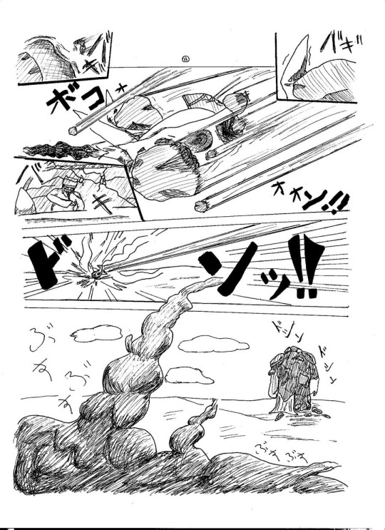
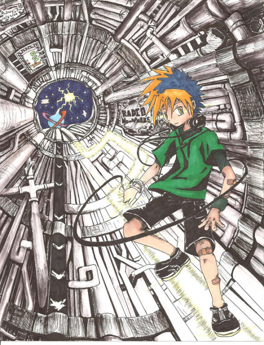
(these can still be found on my old deviantart (@/jadethestone) account haha)
I also did Inktober for a few years. For 2017 I used just ink pens, for 2018 I created India Ink portraits, and for 2019 I used some brush-tip ink-markers which were fun and colorful (all can be found on my instagram (@/renaissancef0x) if you dig far enough)


I actually really like working with India Ink and doing portraits. I even liked combining it with a bit of watercolor for a splash of color! These are my more "recent" pieces from around 2019. The second one was part of a series that was featured in a couple small galleries in Tokyo for a short time

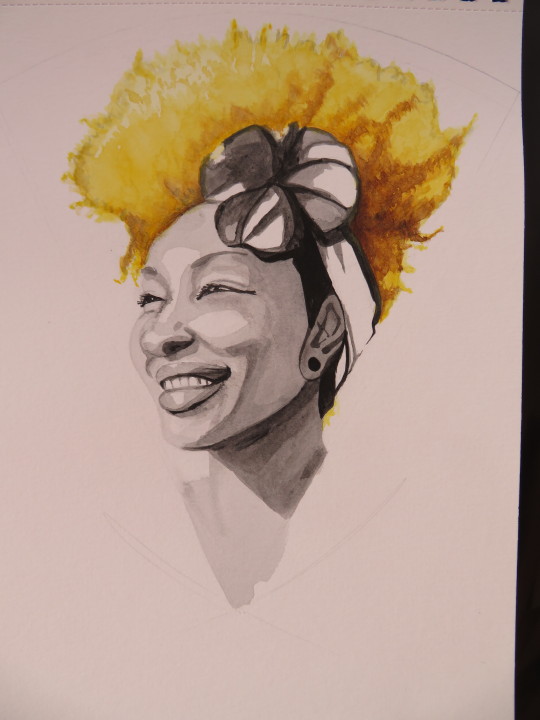
The main reason why I don't do traditional much anymore is because it takes up physical space and materials are more expensive. Also, I became more known online for my comics and such, so that's what I started leaning towards. When I started opening up commissions, I even offered traditional portraits, but no one wanted any, so I took them off this year.
It would be nice to have more opportunities to do/show off my traditional art skills, but I'm very focused on comics and animation now and I work better digitally with them
31 notes
·
View notes
Note
Hi! I actually am wondering about trying watercolors for the first time but feel a little anxious haha.. how you go about drawing on the paper with confidence? Like, watercolor paper isn’t exactly cheap. I think I got the cheapest one avaible from Canson but still the anxiety is real… do you pick very light pencils like 2B so you can sketch veryyy lightly, or before sketching on the paper itself you do a planning sketch in another paper?
Im asking this cos I really love your art and it’s so cool that it’s mostly traditional! And the way you draw Tails is too adorable and consistent while being in your style, it always feels like you have confidence when you draw him.
oh i think this is gonna be a long one
all in all?i have the same anxiety as you. but i've confidense that i can make something good sometimes, but not that i will get it right every time. So i keep trying, but heres some stuff that helped
a warning though, i keep going on and on in this reply and can get pretty negative at times
my watercolor paper i use costs 2 dollars and has 20 sheets so that's 10 cents per sheet. which i feel helps with my anxiety... it's the canson multimedia block too, 140 msg .....
watercolor sketchbooks i'd find online were around 80 or more BRL, and then 20 BRL shipping.... that's 20 USD in total...
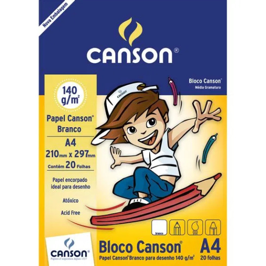
but a block of this plus getting it binded costs me 4 USD.....so i think that one [price] helps alot lol.....
as for the confidence.....

i've had enough time to do quite a bit of trad art, specifically ink and watercolors so im USED to the material and now quite as scared to "mess up" as when i first started it.... [hint, i still am]
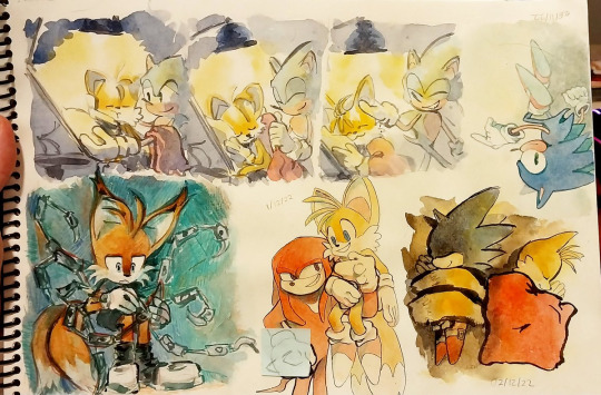
this is one example of a sketch page, they vary in size, and how "done" they are... i dont really worry too much about maintaining a rule of "everything in this sketchbook must be fully rendered " bc it ended up stunting my creativity

i did try the "sketch it onto a sketchbook and then pass it to watercolor paper" approach and tbh...? not really my thing... i've found that to me the first sketch always end up being looser than when i pass it on... i'm always more focused on getting the flow, composition and pose there than i am getting the right details or right lines or colors etc....
like this one, im more happy with the sketch, it's mroe dynamic, mroe fun
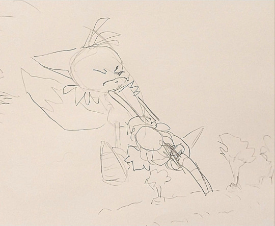
i DO sketch stuff on cheaper paper first when it's for trad art commissions though, just bc there i HAVE to make sure the client is getting what they asked
and i do use 2b pencils AND a "soft lead" mechanical pencil, btu tbh it's mroe bc of the feeling of it on paper than for the look of it...
here for example you can see the circle i used to have a basis on where tails would be.. i didnt erase it as i continued painting bc tbh it was just the sketch. i ended up liking it tho
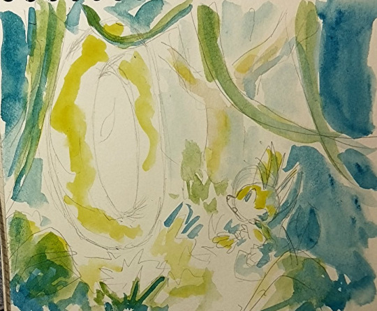
i actually got quite MAD and angry at myself recently bc i noticed how much my sketches were looser in the sketchbooks when i did try the passing onto watercolors thing and i had a full on discussion with a fellow artist about daring myself to be bolder in the future, it has been working well

I sadly have to say though, that figuring out how to build confidense is more of a personal journey, and i cant claim that what worked for me [trusting my first sketch] would work for you.....
It's time, practice, trial and error....
OH, one thing though that DID help me. is:
-There's no art wasted, even if it doesnt turn out how you wanted it, you still learned something.
-Makins these personal art/fanarts isn't some school paper you have to hand it to be graded and then not get it back. You can re-do a piece as many times as you want until you get it right!
I have quite a queue of pieces i plan on re-doing in the future bc i didnt like the first ones i did. im not perfect on confidence and i get scared of fully committing to drawings alot, many of them are pale not for choice bc bc i got scared of making my art too saturated and overworking it
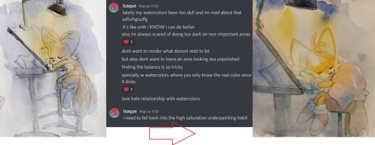
i am about to get negative now so stop reading if you dont want to see that.
HERE NOW i's a alot of pieces i made that im unsatisfied with and plan on re-doing one day:
too dull, simply way too watered
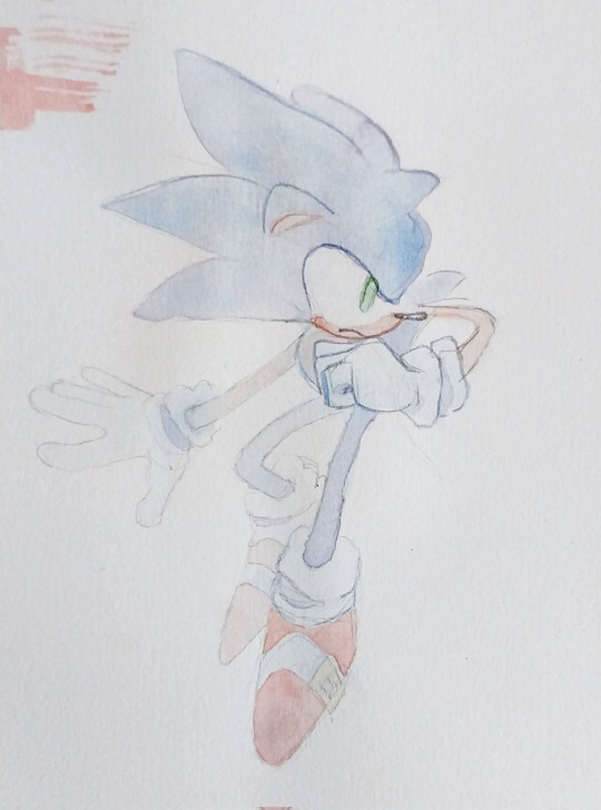
which led me to make THIS piece and do better colors
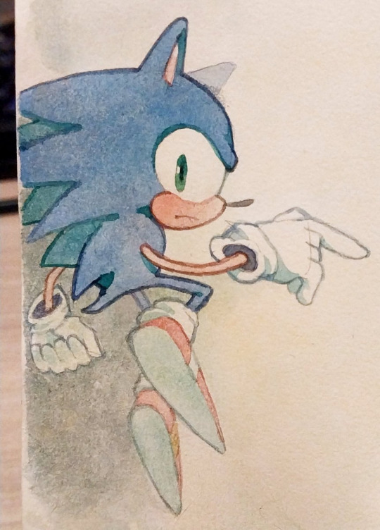
i hATE the way i did the lineart here. it's boring, the anatomies are wonky. it's a good concept but i didnt excecuted it as well as i wanted. but this piece has made me just go and try inking MORE so i could make up for it
which lead to this piece here eventually
This one here.... the colors look so muddy it just makes me SAD, bc i had been so scared to use high saturation that i went with the muddier colors by choice, if i had allowed myself to experiment i wonder how happier i'd be about it
which led me to make THIS piece with softer in value and more saturated colors
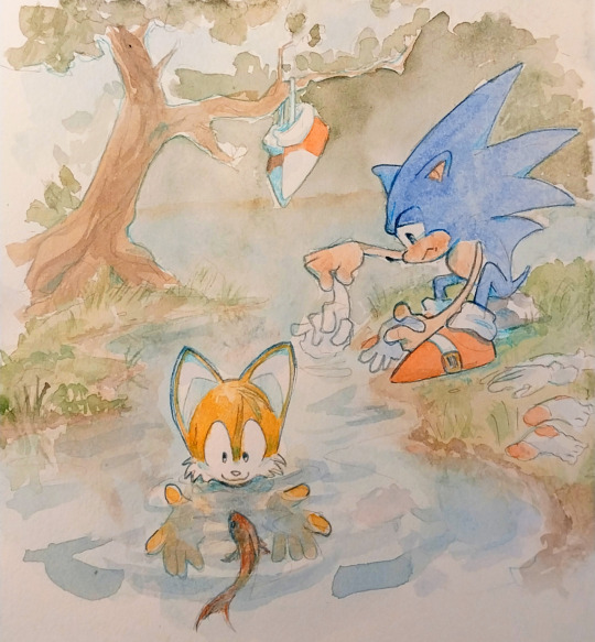
The colors and blending of this one are too soft and not bold enough for what i had envisioned it, i made it as fanart of a friends fic and it made me feel like i failed my friend and insulted her fic when i finished this. I dont think the piece looks bAD, mind you. i know it looks cute. and good even. But i had such high hopes for it.

which led me to make this one
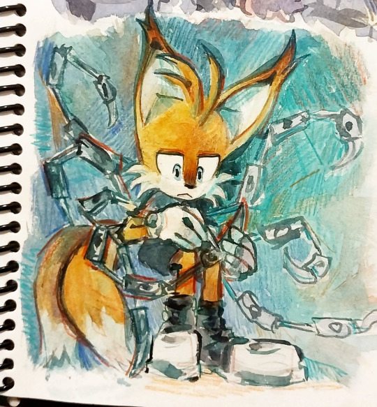
THIS ONE OH MY GOD HOW I HATE IT. sonics expression is SO creepy hes like a horror movie weirdo , honestly not my best work when it comes to anatomy

so i've been doodlin sonic now and then as practice so that i could make this one eventually

The perspective on knuckles could be better and the characters look out of place on this scene, the background is ok

but in this piece here i was able to get a better harmony between colors, background and whatever sparse linework i threw in

Theres so many more haha but i'll stop for now....
Dont get me wrong i dont ACTUALLY think those pieces are HORRIBLE horrible,,,, i see the flaws in them yes, but theres always something i like too, and i know people like them, and that people wont throw away a whole piece over one small detail that in the end doesnt even affect the overall thing....
i've just been getting into the headspace of "ok. at least this one is done, onto the next"
plus the whole thing i told you of realising my first sketches are looser....
sorry im not too good at talking about this and my points arent very clear, i dont think this is going to be quite the help you expected it to be because the truth is that the struggle with your art is soemthign that doesnt go away no matter what skill you have...
at times to me it feels more like a mentality practice than skill, reasurring myself that it's ok to get it wrong and try again, etc etc....
i used to go to therapy and one of the things we talked about was my perfectionism, how i used to be so scared to mess up a piece. that i wouldnt even start, and wouldnt draw for months. this has been going for years now and hey i've gotten better.
but..... yeah im in the same boat as you.... except mine is no longer just about the paper quality!
Sorry this got so personal now, i hope that this hasnt killed your hopes on getting better at the anxiety. it does get way better haha... trying to force your brain to not judge yourself so harshly is half the battle in my opinion, the practice of drawing is the other half....
good luck i hope you have fun painting, i know i do, i love the process even when i dont like the result, good night and thank you for the question
23 notes
·
View notes
Note
hey! what tools (pens colored pencils markers etc) do you use for your traditional work? the way the colors look on your pieces is so satisfying to look at as well as your lineart so im curious 👀
oh! thank you!! and also thank you for asking i love talking about my brushes
for sketching, i use multicolored .05mm lead— UNI NaNoDia is my go-to because unlike a lot of other colored graphite i’ve used, it doesn’t have that waxy feel and it erases more cleanly. these are kinda hard to find in store (i order mine online) but michaels carries red-lead and blue-lead architectural sketch pencils and those work too. tbh any colored pencil will do but i’d recommend sketching very lightly because they tend not to erase well
for the mechanical pencils themselves, any model is fine, but lately i’ve been using more pentel, uni and tombow brand models— office depot or staples usually carries at least some kind of these? you don’t have to get the fanciest stuff tho, a 3$ pencil body works fine
for inking, i use fine-tip/pointed felt tip markers (usually kuretake, tombow, pentel, but faber-castell works too, and most of these are at michael’s) as well as brush pens/synthetic bristle-tip brushes. for those, kuretake, akashiya sai, and pentel are my favorites, and it’s fun to experiment with different brands, brush tip sizes and ink colors to get better effects.
for coloring i use faber castell and mildliner markers! and sometimes posca paint markers.
i hope that helps?? most of these brands can be found at your nearest office supply/stationery/art supply store. i also like to order from jetpens dot com when there’s a specific item i want that’s not in stock near me.
oh and i know mildliners/faber castell marker packs can rack up the prices— for what it’s worth i rarely buy those in bulk, the collection i currently have is stuff i gradually accumulated… if you’re not certain about trying a new model of marker, i’d suggest just buying one or two colors you really like and experimenting basic shading with those for a bit, and buy more colors when you feel you need them
ok yea!! ty for letting me ramble and i hope this isn’t too much at once
9 notes
·
View notes
Text
Ya, I think I left enough characters out that my "ranking every 'mostly white + usually a cool color + maybe gold'" post warrants a part 2 (if enough valks of this design genre get released to warrant a part 3 though, I'm just gonna cry). Usual disclaimer that while I'm trying to be objective as possible about this, art is a very subjective medium and I am not immune to bias. Anyways-
S tier (wouldn’t change a thing)-
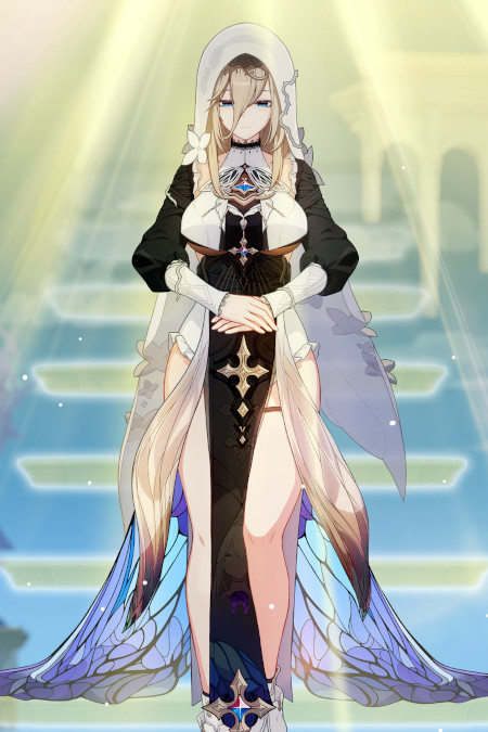
still not entirely sure if she belongs on this list because the black and white elements are pretty well balanced, but eh- we're here now
Forget just this genre for a sec though- Aponia has one of my favorite designs in the game
It's the skirt, it's entirely the skirt
I'm glad they kept the outfit mostly black and white (other than the bits of jewelry used to keep the outfit cohesive) because I think too much color would've just distracted from the skirt
I also appreciate they made the white fabric different textures. It really helps to separate the veil from everything else
The usage of vines and flowers to break the symmetry of the design is a fun nod to Aponia's failed attempts to control the world around her
A rank (minor changes needed)

I just want that front white shirt piece thing have a "light blue to white" gradient on it to better separate it from her legs
Otherwise, this design is a friend
Nice use of texture, I really like how the sleeves look like fabric dipped in ink where the ink is just gradually creeping up
I also just think it's funny that she's the jade knight, but her color palette is mostly blue, where as Azure Empyrea's color palette is mostly green
The red accents are also nice
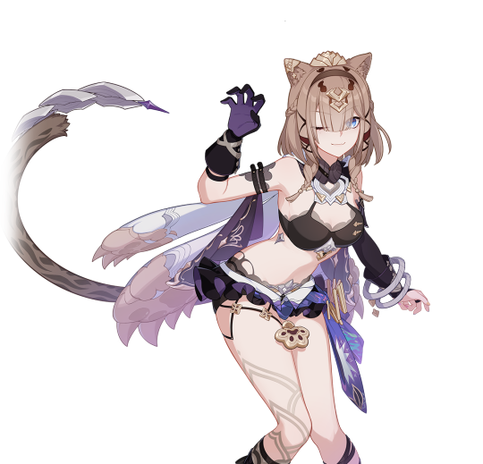
I think from a more objective standpoint, this design would be in B or C tier, but it's my list and I like the design, so it's going in A tier
I'm also not sure if there's really enough white to warrant her being here
The bikini top and mini tutu are goofy (I think I'd personally just make the top a turtleneck crop top with a book window cut out, and the tutu into shorts and a fanny pack), but I kinda like them
There's just a lot of nice color variation in this one
D tier (for disappointments)
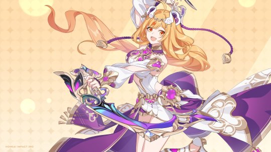
Getting this disclaimer out of the way: I am aware of the racist elements of this design. I am not SWANA though, so I don't really feel it's my place to go in depth on it (I'd be happy to link or reblog other people's arguments though)
Congratulations to mihoyo for making me sick of the color purple. I literally didn't know that was possible
I know she had a purple Hoody that one Manga, but I really with they went with a blue/green, orange, and gold pallet instead
The dance motife feels kinda out of nowhere? Idk if she has a love of dance in one of the Mangas, but it was never really mentioned in game before now
Also having Rita (the British lady) be the one to teach her a Persian inspired dance was... a choice
I could see a redesign going a couple different ways
One being really committing to the whole "it looks like a regular outfit" think, focusing on the changing roles of valkyries and moving more towards the aesthetics of APHO
Maybe have her story take place in her home country, thus why she could be wearing more traditional clothes (and have a grandma or someone like that teach her the dance)
My other idea would be keep the story the same, but change her design to be more of a throw back to early valks, leaning more into the mech suit idea
I wish we got the bear hood
F rank (I have very few productive things to say because these invoke my inner Ragina George)
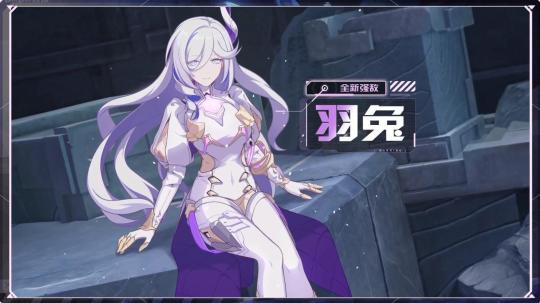
F, for "that was the ugliest f'ing skirt I've ever seen"
Ya, I know I'm breaking my "only out valks" rule, but fuck this design
There's so little tonal variation
Between the hair and shoulder puffs, this design just ends up looking incredibly top heavy
Mihoyo, keep her pants on
Just like Hares writing, this design is uninspired and directionless
I keep seeing people compare her to Shenhe and Eula and I'm gonna need yall to stop slandering my queens like that
Comments from the homies:
"Shorty look like an ice cube gum box"
"Why does she have nipple ribbons"
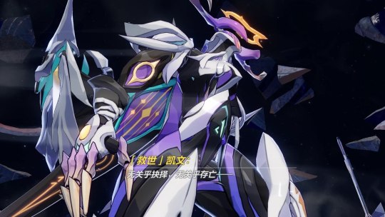
Froot loops abyss herald looking ass
Every day, I wonder if the trend towards monster design similarities in both games is an intentional way of hinting at further down the line multiverse plotlines (not explaining why it could be this here), or just a marketing decision
TLDR: these types of designs can work so long as they go bold on the colors
#honkai impact#honkai aponia#li sushang#honkai susannah#honkai pardofelis#honkai hare#I just needed to wind down after doing homework all day#And this seemed like a fun way to do it#Never thought I'd get sick of purple but mihoyo surprised me
16 notes
·
View notes
Note
1 - 23 :3
cracks knuckles
okay
1. how would you describe your art style?
uhhhhhhhh, maybe "safe" is the word rn. whenever I think of my art style, what comes to mind is just how little I've been pushing things with it. I wanna change that ;D
2. what's your favorite thing about your style?
I realize I like to use semi-realistic proportions, its cool how comfortable I've gotten with drawing faces and bodies
3. what's your least favorite thing about your style?
It's so static man. same thing I said for the first question, I don't think anything really looks bad, but it just is lacking in creativity in comparison to the older art that should be looking worse than what I do now. I prefer my older stuff ;D (looking at you inktobertale2021.. where did it all go wrong)
4. favorite thing to draw?
regular ol people. human characters are def more in my comfort zone, which explains why I keep hitting skeletons with the humanization ray (also I prefer to draw feminine characters)
5. least favorite thing to draw?
I can't even say I rlly dislike it cuz of how rarely I even do it, but I am procrastinating so hard on learning backgrounds..
6. warm colors or cool colors?
cool colors are my fav, but i find it easier to work with warm ones (I used to put a cool overlay over all my warm toned drawings hgdhfg)
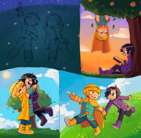
7. show us a WIP
behold, the wip ever. this drawing... was supposed to be posted on august 2022. and then, it was supposed to be posted on dec 21st, dream and nightmares birthday. (atp if I do end up wanting to finish this idea again, I'll probably just scrap it and start over)
8. what's the most fun and least fun parts about your process?
most fun is flat color and rendering. (though I rarely do the latter anymore) and for least fun, tbh a lot of the sketching part tends to be difficult for me, sometimes its cool tho
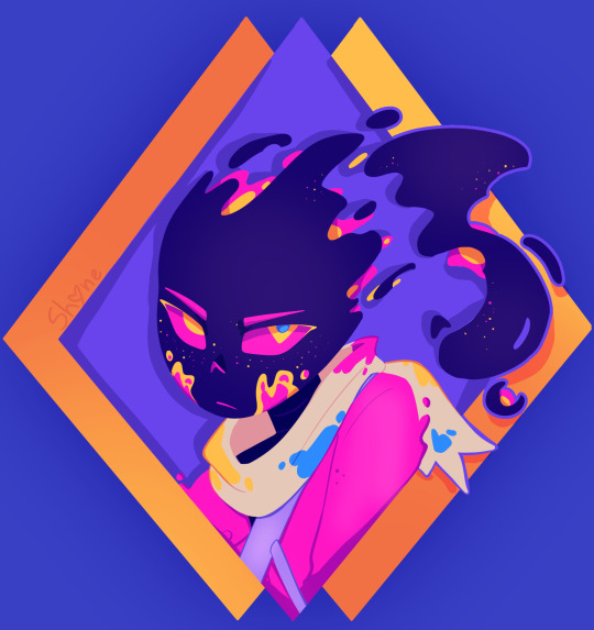
9. show us a finished piece alongside the original sketch
example from when sketching was fun

10. how many different sketches do you usually have until your piece is finished?
I think I do need to make more of at least thumbnail sketches tbh.. I usually just make one and keep editing it, trusting the process. (and that fails like 70% of the time. woww wonder why sketching isnt fun for me-)
11. show us the last thing you drew, be it a finished piece or a small doodle
can this count,,
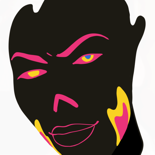
12. show us an old drawing
first deltarune drawing. here's the redraw I later made of this :3 (also old hsgdhgf)

13. how long do you usually take one a piece?
depends. I'll have like 276478923 wips started, and then I get a random idea that I just have to do right at that moment, and I'll get it done in like 1-4 hours. meanwhile old sketches start to rot and maybe if its lucky I'll revisit it before my motivation dies and my style is too different to wanna continue from where I left off
14. digital or traditional?
digital all the way, i've gotten too dependent on the transform tool + liquefy ;D (and many other things tbh but I'd be here all day if I tried comparing them more jhdjdf)
15. if digital, what program do you use?
procreate, the layouts on other drawing programs scare me
16. favorite media to work with when drawing traditionally
pen on paper (am I understanding this right wdym media-)
17. what do you love getting compliments about?
I like when people enjoy the humanizations I come up with, and also original designs in general
18. are you satisfied with the attention your art usually gets?
hmmm yeah
19. how often do you draw?
very often, I just don't have finished things to share most days
20. a piece from this year that you're really proud of
:3
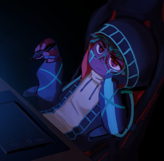
21. something you would like to improve on
the dynamicness (well, the lack of it) of everything, as said before
22. what inspires you?
Ink sans and a ton of creators in this fandom (also animated shows and movies, I love animation)
23. what's something you hope people notice when looking at your art?
idk tbh, just notice it at all and I'm happy :>
#shy rambles#ask game#long post#twinribbonz#yaayyyyyyyyyyyyyyyyyyyyyyyyyyyyyyyyyyyyyyyyyy#another sign to look for more references#my problem may be going from imagination too often
8 notes
·
View notes
Text
Bits and pieces of stuff
Lots of sketches on this one, and more traditional art!
@girlwiththepapatattoo @p-riama @goldenshowman
KenUno first because they’ve taken shelter in my brain for the winter.
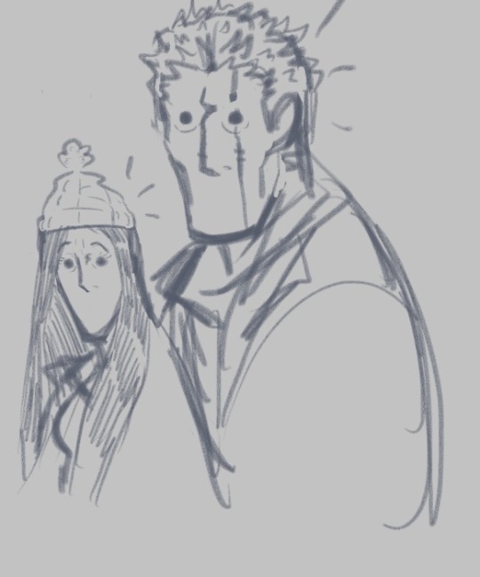
This was a couple minute sketch for fun; wanted to give them both hats but once more I was about to run out the door for work when I did this.
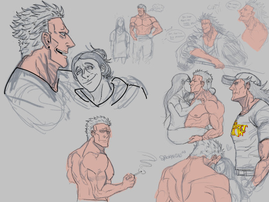
Update on this sketchdump page!! Did some inking and started colors :))

Love doing soft and tender poses with them. I’m realizing that my brain is defaulting to Modern/Actor AU for sketches like these; because I purposefully made them out of character to fit within our society as individual human beings. But I honestly like diverting from their canon selves; I love writing/drawing them as people like you & I.

Ugh ok sorry for the shit lighting, I did this just before I was about to pack my art stuff up to sleep. But I found an excellent replacement for posca pens; Arrtx Acrylic markers. You don’t need to prime them & they don’t mess up the paper if you go over areas multiple times. I’m still playing around with them but I whipped up something real quick.
And once more the Demo remaster that Have a Nice Life just released has me listening to Trespassers W on repeat, that’s where said lyrics in the red come from (the demo version sounds a bit better than the official version on Sea of Worry imo)
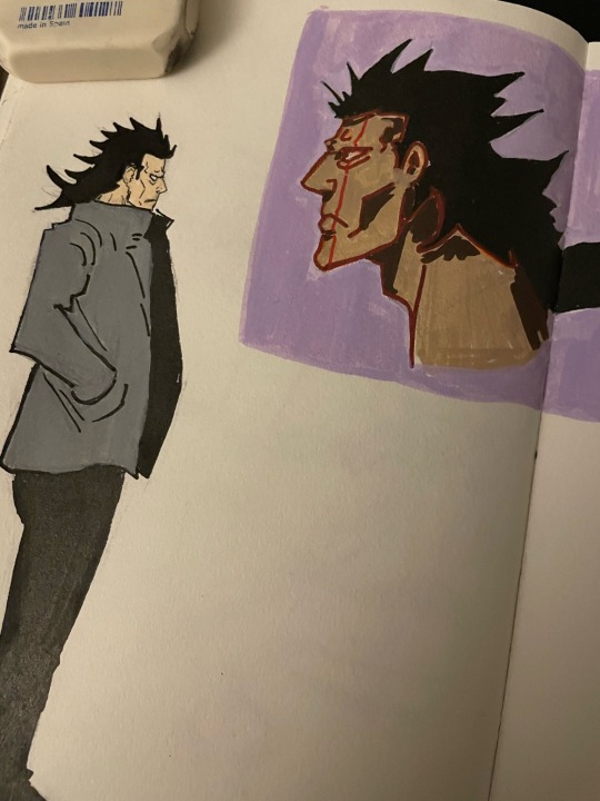
A little closer (I have to put a second coating on the purple in the Kenny headshot)
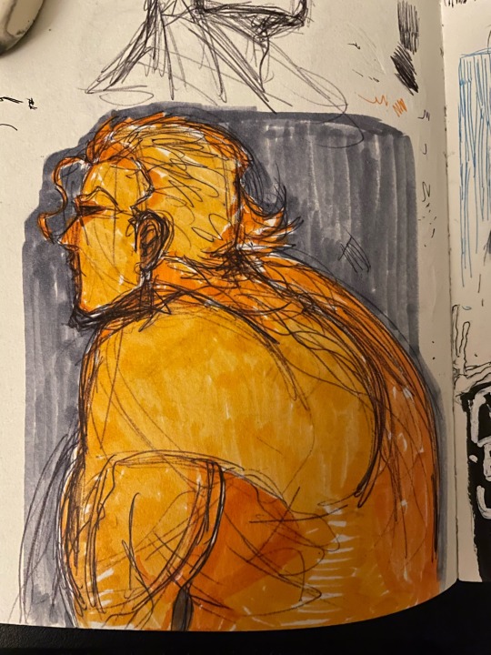
An old Tesoro sketch that I love so much ☺️ did it in ballpoint pen after not sketching in pen in a while.

Small Tesoro sketchdump. I will always adore playing with his hairstyle & his facial expressions.
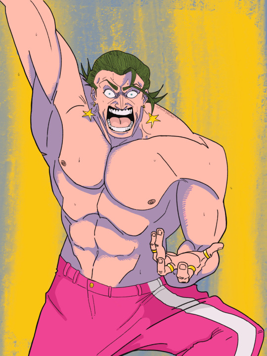
Monster of the New World, Gild Tesoro
And my most recent piece! Very proud of it; was messing with blend modes in procreate, really wanted to challenge myself here, and I think it came out stunning!
Timelapse of the above piece:
#KenUno#unoken#kenhana#gild tesoro#one piece#bleach tybw#bleach anime#art#fanart#anime#manga#one piece film: gold
15 notes
·
View notes
Text
Unusual OC associations
Big thanks to @scribbledquillz for the tag! I'm not sure who's done this already but @ringneckedpheasant @rosella-writes @n7viper @plisuu and @melisusthewee have fun!
I have done this for Taren before but by gods I will do it again! Also for Violet she is big on my mind rn.
Seasoning:
Taren: sweet paprika, cinnamon, cloves, those cans of chipotle pepper in adobo sauce ...he's a warm boy 🥰
Violet: purple basil, annisseed, lavender, rosemary, nustershums, rosewater, hibiscus. Not necessarily all together lol but you know what? concoctions. If it's purple, an edible flower, or an acquired taste, I think it suits.
Weather:
Taren: grey days on the brink of storm. Damp, you can smell the rain coming and feel the static.
Violet: hot girl summer! Bright sunny beach weather that's a bit too heavy in the air.
Color:
Taren: green, gold, auburn, brown, all the earth tones and some light blue for good measure.
Violet: do you even need to ask? Also royal blue, silver, white, and black.
Sky:
Taren: thick with interesting clouds, clear and starry.
Violet: a clear blue day, a summer nighttime thunderstorm
Magic power:
Taren: well, spirit healing. Spirit communion and intricate rituals/glyphs also
Violet: walking bomb, irreverent illusions
House plant:
Taren: potted pine tree that got too big so you had to plant it in the yard. It will get taller than your house it will live for a hundred years.
Violet: straight up mini cactus. In a silly colourful pot with googly eyes.
Weapon:
Taren: kill 'em with kindness and when that doesn't work settle it with fists.
Violet: caltrops, potion bombs, poisoned daggers
Subject:
Taren: linguistics, linguistic anthropology
Violet: organic chemistry
Social media:
Taren: Matchsies! ;) LiveJournal, goodreads
Violet: vine
Make-up product:
Taren: glitter eyeliner (his boyfriend did it it was just like that meme)
Violet: lipstick, poison nail polish like the Warden in Holes.
Candy:
Taren: those little guava candies, dried mango, weed gummy
Violet: twizzlers, sour gummy worms, candy necklace
Fear:
Taren: abandonment
Violet: nothing!! (hurting others)
Ice cube shape:
Taren: hearts 💕
Violet: spheres, dry ice
Method of long distance travel:
Taren: ship, aravel
Violet: horseback
Art style:
Taren: very detailed fine lined tattoo art, traditional embroidery
Violet: old school sailor tattoo art, peanuts style cartoons
Mythological creature:
Taren: faun
Violet: griffins!
Piece of stationary:
Taren: does a tattoo quill and mallet count? Ink.
Violet: fancy letter opener...
Three emojis:
Taren: 🌿🛤📚
Violet: ☠️💜🐶
Celestial body:
Taren: stars, specifically the constellation tenebrium
Violet: Venus
8 notes
·
View notes