#some of the character designs may change
Text
@askpokeeosin
Previous Post
72 notes
·
View notes
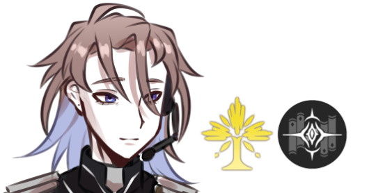
Text
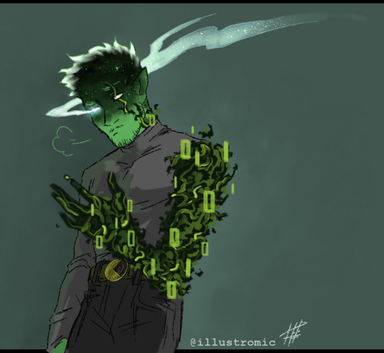
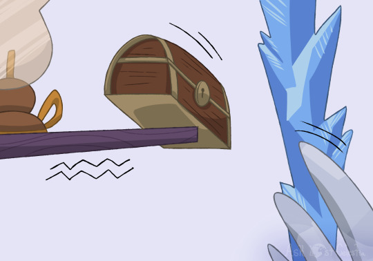
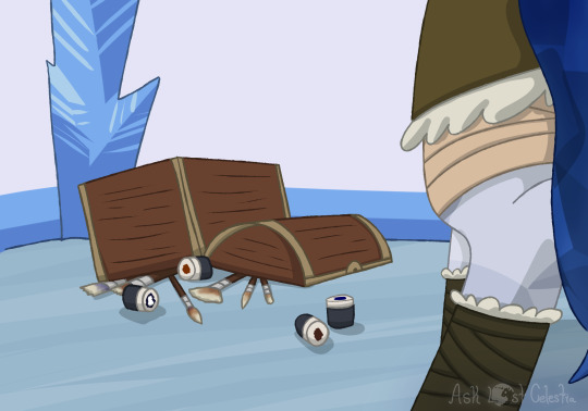
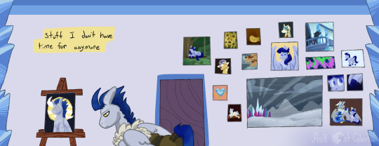
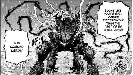
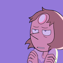
If homework important then why Etoiles lore
#qsmp fanart#qsmp etoiles#qsmp#my art#this design may change as I get used to it lol#but I wanna draw him more often he's such an interesting character#leaned into the star theme for him bc i can't resist star themes lol#also I'm slowly mapping out some biology notes for the code monsters/code infections....#tldr the codes are like plants to me idk why
425 notes
·
View notes
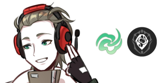
Text


wanted to draw some hermits since i was binge watching a couple episodes here and there- first time drawing them seriously with my own design
#hermitcraft#been watching on and off recently#i wanted to try and draw some peeps- having looked at a few fandom designs as inspiration and a little bit of reference#might redesign the 3rd batch- i was kinda winging it when colouring and designing them ('cept for suma- might change his colour pallete tho#also this might be just me- but tango- the name- always reminded me of a lizard/gecko kind of character#so i went with a fire gecko- with elfy ears- idk i just think its a really neat idea#grian is so short lmao#etho is just etho#there was an idea that each hermit may lean more cartoonish to realism- depending on how i design their minecraft skins#by the end of it i kinda just did whatever lol#my art#minecraft#minecraft fanart#hermitcraft fanart#hermitcraft fandom#doc is pretty tall- but i had to scale him down so he fit in the roster lmao
83 notes
·
View notes
Text
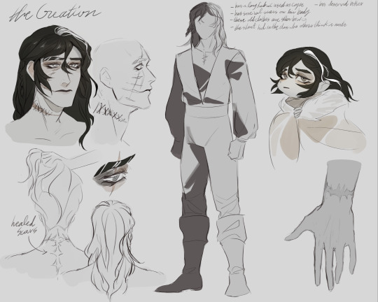


Figuring out how I'd like Creature/Adam to look like :>
#the character sheet is old actually#I may change some stuff later#frankenstein or the modern prometheus#frankenstein's creature#adam frankenstein#i guess#character reference sheet#character design#gothic literature#classic literature
301 notes
·
View notes
Text
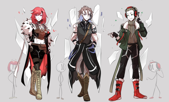
full versions of my de-sticked/hsr'ed version of triple threat
types + paths
#thsc#the henry stickmin collection#ellie rose#henry stickmin#charles calvin#triple threat#honkai star rail#a-u art dump#thsc x honkai#using honkai as a general franchise term here cuz. brainrot (this is technically hsr related but my actual aus are honkai impact stuff)#so consider this a placeholder tag for whatever this is. anyway#a lot of this was thrown together as this was meant to be like “what if they were designed like mhyv characters”#hence the assymetry and the eyes and. basically everything.#though theyre not littered with too many details though even im not that mad#but the idea of taking literal stick figures and turning them into complicated ass designs was funny to me so ofc i had to do it#i do have reasons for why some things are like That though..#the stick poses were drawn before i completely figured out the style so if they look wonky…thats why#and for the record while i have these now i still wanna draw them with orb heads so. just imagine these fits but simpler and orbed for that#i jsut havent figured out how i wanna do that just yet…#anyway designs may and probably will change over the course as i figure things out... cuz the shoes arent cutting it for me#this was already done a bit ago right after the “warm up” i just needed to fix stuff and write the ID#writing outfit descriptions is difficult when you are NOT good with words...#ellie puts the harm in harmony
129 notes
·
View notes
Text
I got to participate in the Secret Strahd/Santa on the Misthoppers Discord Server! (:
I was lucky enough to draw @irishandrogyne's Caspian! A reincarnation of Alek!
This was super fun to be a part of; Irishandrogyne, I hope you like it! (:
#shrimp divorce!!#< the misthoppers tag (:#ok rambling time (:#I got so excited seeing that I was drawing caspian and strahd omg#*and* to mess with my Strahd design and give him fluffy hair#i may have change my usual design for him a bit actually.#it was really fun to draw (:#Caspian's outfit is his masquerade one (: I wasn't sure why he was missing his horns (horn? antler(s?)?) in the piece i saw so i hope i did#the right thing adding them#I decided to experiment with some shading this time (:#the black shadows mainly#but that brush i used for the highlights was a new one#i downloaded it the week i started on the first draft of this#then didnt use it for... over a month? idk the last few weeks have been a blur oops#ok normal tag time#digital art#dungeons and dragons#character art#dnd#curse of strahd#alek gwilym#Caspian - other's PC#other's ocs#strahd von zarovich#strahd cos#described art#if/when the piece i got is posted#i'll be sure to reblog/share it here (:
49 notes
·
View notes
Text

Upcoming Ballad changes 👀?
#loz au#wip#Ballad (Kheprriverse)#they/he#thinking about his design a lot more >> just how some things came to be#as I change FD I also change Ballad since theyre kinda linked (lol)#the white in their hair also changed a bit. more prominent + starts on left side of their usual part#but him in his main casual outfit + the green half-tunic is now just a cloth#switched his belt coz thats been bothering the fuck outta me#also changing his biggoron sword because that fucker cant have a single consistent design#yknow after all the trouble i went through making its oh ref twice#scarred eye is now his left (he’s left handed) + starts where the eye is for uh. lore.#also he doesnt close his eye often anymore. tho i may give him some sorta patch to cover it… not sure yet. probably wont#i’ll get to his armor eventually. that ones gotta take a lot of thinking.#ballad’s kind of the main character so I do wanna get their design how i want#they’re justa dad who wants to get everything done with so they can go back to their wife and son#*dont worry about the weird coloration in one spot. i use an auto action to auto-color my line art before i go in manually*#Kheprriart
69 notes
·
View notes
Text
Do you guys see my vision


#bucchigiri?!#bucchigiri#marito jin#jin marito#nonokoko's art#my edits#I hit him with the trans beam. Mahoro is trans too btw#Their parents expected a boy and a girl and they sure had them lol#sorry if the top surgery scars are weird it's my first time coloring them instead of letting them in black so idk what I was doing#I just complicated my life x10 harder by giving him more tattoos? Yeah I did now I'll have to remember them and draw them *le sigh*#trans headcanon#not entirely convinced in letting his lower tattoo have the same colors as the butterfly. May change that detail#not proud of the result it looked better in my doodle phase tbh like what's up with that arm. Oh well#giving snake inspo features to characters related with snakes on their design in some way is my passion. Long live animal characteristics#♡ — my art#artists on tumblr#character headcanons#IMPORTANT FACT: the scars are supposed to resemble the S from Siguma that's why they are rounder than normal scars would look like
31 notes
·
View notes
Text
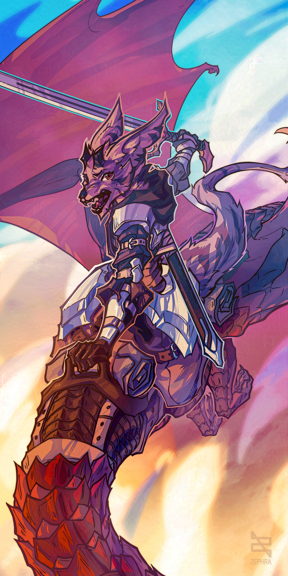

#always have fun working in this style#the sketch earlier i was a bit frustrated with#but cropped/did some edits and had fun working on this#Dragonrider#dragon rider#dragon art#dragon#rider#i swear someday ill have a name for this species#but may change their design slightly and keep them as a character#sona#art#cell shading#cell shaded#digital coloring#lineart#traditional sketch#small artist#small art account#small art blog#furry artist#furry art#furry
16 notes
·
View notes
Text
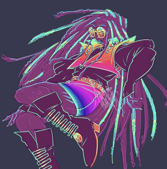
synth based oc concept named Synthia 🎆 is this anything
(no longer Muzix related due to recent news 👍)
#I drew her with dreads but after finishing this I think box braids would have better suited my vision 😭#fashion may not be coherent but hoohhhh….#as much as i genuienly love drawing the same people over and over again I duly miss character designing!!!!!!#may not ever do anything with her but i really wanted to draw the idea in my head anyway#my art#original characters#edit: with what’s happened she is now going to be a regular oc because I’m still in love with how this design came out lol#maybe tweak some parts! dunno if name should be kept of changed
25 notes
·
View notes
Text
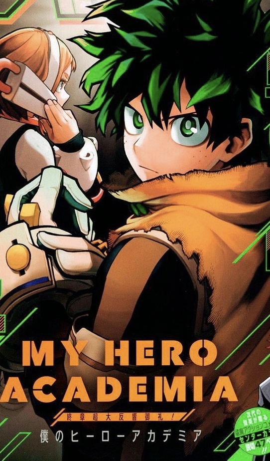
Deku’s hero costume and indicating tonal shifts within a story
This post builds on everything I mentioned in a previous one, and highlights the brilliance in Horikoshi’s character design. To be more specific, the brilliance in Deku’s design and his hero costume. I also want to start this post by saying that I am an artist myself, and while I’m always learning new things, I do have some knowledge and understanding of color theory and character design. Now, on the surface, Deku is purposely made to look as non-threatening as possible. He has very few sharp edges, his face is round, his eyes are round, and he has very curly hair. Furthermore, when you learn art and character design, one of the fundamentals is understanding how shapes affect the audience’s perception of the character. It’s a very complicated subject and shape language can be used in various ways, but to simplify: sharp edges and triangle shapes indicate harshness or intimidation, square shapes indicate stability and balance, and circles or round shapes indicate softness and gentleness. Izuku falls under the category of circle shapes and as previously stated without his hero costume, particularly in the beginning of the story before he loses more of his innocence, he looks relatively harmless. But let’s take a look at his first hero costume…
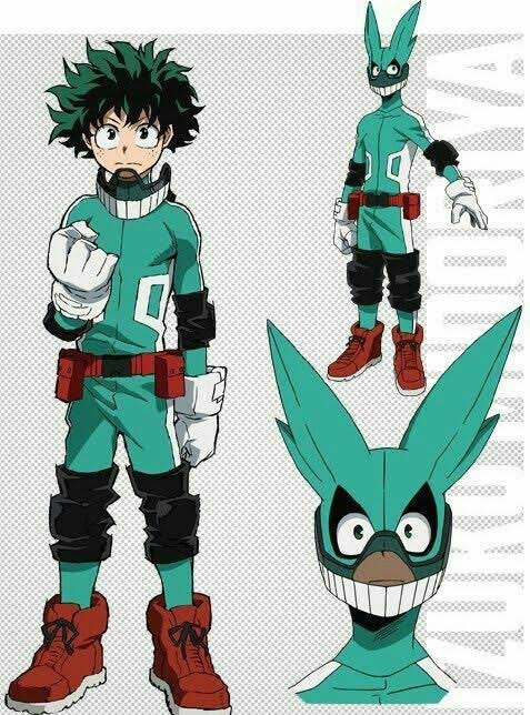
His first hero costume is very bright, with a mint green and white & red accents. Izuku has just begun his hero journey, and he has not had any pressure placed on his shoulders yet (except his need to not be useless and prove himself as having value due to his trauma from years of being looked down on for his quirklessness). He doesn’t know about the true history of one for all, or all for one. He hasn’t even encountered shigaraki yet. The use of highly saturated and bright colors are supposed to look odd on purpose, because this costume was designed by an bright eyed child who simply wants to be a hero, and not by a pro who’s been training for this moment for years. Furthermore, the light color scheme fits the idea of a positive protagonist who wants to goes into everything he does with an upbeat attitude. Think of Superman, who also have very saturated, bright colors in his design, and is another character is is known for his optimism. It should also be noted that the shaped in the hero costume are much sharper compared to deku himself. The stripe pattern, the utility belt, and elbow/knee guards are all very angular. This then can be taken in two different, yet connected directions. Deku, despite coming off as a harmless character, is able to function well as a hero right from the start because of his intelligence and ability to think on his feet. He’s an analyzer who takes his time to dissect his opponent’s weaknesses, and therefore one could say that he holds the capacity of being a very grounded character. Sound familiar? That is the square shape doing its job of conveying another aspect to Izuku that is best seen when he is in action as a hero. Thus, Izuku’s inner strength, reliability, and strong will are conveyed through square shapes in his costume. However, the angular nature of the same design patterns I’m mentioning, in addition to the pointy all might ears on his head, could also be hinting at Izuku’s ferocity in battle. I’ve already mentioned in a previous post I linked at the start of this but will link again just in case you don’t want to scroll up again lol, that Izuku has an intense, repressed inner rage that stems from his childhood trauma and self loathing. The sharp edges in his hero costume allude to this fact, but it can easily ignored since the color scheme is so bright and positive— his inner darkness can be overlooked by Izuku’s positive exterior. But let’s take a look at deku’s 2nd hero costume, and how it indicates a shift in Izuku’s character.
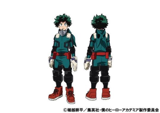
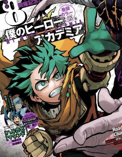
It should first be noted that Izuku only puts on this costume After the sports festival. The festival is where the process of an insurmountable amount of pressure being put on Izuku’s shoulders begins. He learns about the true legacy of One For All, he learns about his destiny to fight All For One, and he is told that he has to become the next symbol of peace and therefore has to have an “I am here” moment. All of these things are responsibilities that Izuku was never previously told about, and was never given any indication that he had to worry about. Thus, Izuku’s mental health begins taking a serious downward decline starting at this arc. This decline, or regression, follows him for the rest of the series all culminates in the vigilante arc. I won’t go into too much detail about that, because as previously stated I’ve already gone in depth about it, but I am mentioning this because this costume perfectly represents the beginning of Izuku’s regression. The color is much darker, and instead of white accents there are black ones. I cannot emphasize enough how big a deal it is for a superhero to change costumes to wear a much darker one. Spider-Man is the most well known case of this, as all of his darker toned or black suits often indicate a dark time in his life where he struggles with his inner rage and weight of responsibility. Does this sound familiar? Horikoshi loves heros such as Spider-Man, and that is why quirks such as blackwhip and danger sense are based off of Spider-Man’s abilities. It wouldn’t be much a stress to assume that is where Horikoshi also got the idea of making deku’s suit darker from. Therefore, Deku putting on his darker suit after he begins his slow downward spiral serves as foreshadowing to the audience that all is not well with our protagonist. While it may look better than his last, because he has become more mature and thoughtful about his choices, what it represents is not come-Worley positive. Furthermore, the hints of white, the remnants of his first costume, serve to show the remaining innocence he has left, or will have left by the time he stops wearing this version of the costume. It’s not much, buts it’s a beacon of hope that maybe it’s not too late.
By the time Izuku unlocks his shoot style, even more black is added to his costume in the form of his leg armor and his iron soles. He shifts to the shoot style after the summer camp and Bakugo retrieval arcs, which were very intense and traumatic events for him. He’s developing his own identity outside of allmight, which is positive, but the increasing amount of dark colors in his suit is concerning. His mental state is getting worse, he is continuing to enter a darker phase in his life, and it is happening at a slow enough pace that most other characters do not notice what is happening. Surprisingly, his costume does not change much for most of the future arcs. From a strictly character design perspective, this makes sense, as constantly changing a characters costume can make them less recognizable and thus alienate them from the audience. Plus, it’s simply easier to draw because the author will always know how the character is supposed to look. But, this could also be a sign of how Izuku tries even harder to put forth a positive persona while at the same time hiding what he is going through. We all know that things get worse before they get better, so let’s look at another costume change…
We don’t have many colored versions of Dark Deku yet, but from what we do have we can see how much work horikoshi put in his design to make it as menacing as possible. From the tattered costume, to the muddied colors, to Deku’s facing being hidden by a mask and cowl full of sharp edges, with only his pupils being visible. One thing about character design that I haven’t mentioned yet is the effect of showing/not showing a characters face. With characters, seeing their faces tends to make the viewers relate to them more, as we can more clearly see their facial expressions and make eye contact with them. Covering a character’s face purposefully creates a disconnect between them and the viewer. Think of characters who have something to hide, or struggle to be emotionally vulnerable. The personas of Batman vs Bruce Wayne, Spider-Man vs Peter Parker are comic book examples of characters who present themselves very differently as super heroes compared to their civilian forms, and wear masks that cover most of if not all of their faces. Furthermore, that is why in many Spider-Man movies the character will take off his mask a lot, even if it is mid-fight, because the audience needs to see his face in order to connect with him during those important moments.
Now with Izuku, as previously stated, we don’t see any of his face except his pupils while he is in his Dark Deku form. We are instantly disconnected from him. That is also why we’ve rarely seen deku wear his mask up until this point— even though we knew that it was always there as a part of his costume. The only other time that deku wears his mask for a significant amount of time is with his first costume, and when we is trying to simply imitate all might instead of trying to be his own hero (just as a lot of bright-eyed children would do when it comes to their innocent wish of wanting to be like their hero). He is trying to run from his emotions and who he is as Izuku Midoriya by hiding behind the persona of the Hero Deku, the 9th holder of One For All whose only purpose and source of value is to defeat All For One. Only when he takes the mask off at the end of the arc do we finally get to see genuine emotion from him. In addition, during this arc Deku is incredibly aggressive and vengeful. He has very little patience for his opponents. This is emphasized by the fact that there are almost no soft edges in his costume at this point. With it being torn to shred, there are shard and jagged edges everywhere you look. It may be a pain to draw, but it’s worth it for the effect it achieves. Any source of light colors are also gone. The white accents, which once represented the little innocence that Izuku had left as he continued to be plunged into the darkness of the hero system, are completely gone. His white gloved are now a dark brownish color, and even the dark green of his costume has become even darker. He’s so dirty that in many drawing of this form he is even drawn in all black, furthering the parallels between him and other comic book heroes with dark forms. He is the embodiment of despair and rage, thus cementing this costume as one that, in the words of civilians within the manga, “would never guess is a hero”.
Now this leads us to Izuku’s final costume change. Once again, we don’t have many colored pieces of this one and the ones we do have don’t show his entire body. However, we can notice some things about the color. Gran Torino’s cape is not longer just a thrown on addition, and instead Deku’s entire costume feels more cohesive and inclusive of the cape. Not only that, but the specific shade feels more like the color gold than a plain yellow. Gold is a color that often signifies success, and is commonly seen as the color of champions. Izuku is ready to finish this story, the legacy of one forand for all (lol, get it). But this time, he’s ready to do it with the help of his friends. That is what makes him a champion, instead of the villainous persona he had when he tried to complete OFA’s legacy on his own. Furthermore, the main color of his costume is much darker, and almost looks black. Izuku has been through a lot dating back to when he was a little kid, and he has a lot of trauma. He’s tried to run from that trauma all his life, but by the end of the vigilante/villain hunt arc, he finally is able to confront it in a healthy way with the help of his friends. He’s finally healing, and while he will never be able to get the childhood and innocence that he lost back, he can still find comfort and human connection as he moves toward a better future. Similarly, much of the lighter, more highly saturated colors on Deku’s costume will never come back. Gold is not a color often seen on children, and thus his costume is much more mature than his previous ones. While it may be bittersweet seeing our protagonist all grown up, the use of color and return to similar shape language signify that change is a part of life, and that at the end of the day a person will still be the same at their core. What matters is finding hope and success in the darkness.
So what does this all mean in the context of the story at large? Well, since Izuku is our protagonist and we go through the story via his perspective, as he regresses, and his costume changes, the story changes. We enter BNHA with a comedic and lighthearted story. There’s plenty of gags, pretty black and white interpretations of good and evil, and a decent amount of relatively laid back chapters/episodes. But during the arc that stain is introduced, Deku’s costume changes because of his own issues, and the story gets darker. His story gains more black accents, and the story becomes even darker. Deku has is dark deku form, and the story is the darkest it’s ever been. But once deku changes into his final costume, the story is still dark, but there’s a sense of hope that things will get better. Deku has hope that he can save Shigaraki. Thus, Horikoshi masterfully uses color theory and shape language to shape Izuku Midoriya as a character, his regression, and the increasingly dark tone of the story through the eyes of our protagonist.
#I had an epiphany and really wanted to write my thought process down even if this may seem obvious to some people#I just find it so interesting how deku’s costumes subvert the audience’s initial expections of him#Like the shift in the story perfectly coincides with the change from his first costume to his main one#And the shape language in the costumes say so much about who deku is as a person and hints to the audience about much of his hidden nature#Horikoshi is a master at character design and using it to progress the themes of his story#We need to pay attention to the little details such as as character design and title names more because everything has a purpose#We just need to be willing to see it#character design#bnha#mha#boku no hero academia#my hero academia#midoriya izuku#izuku midoriya#bnha spoilers#because I mention his latest costume#Bnha meta#bnha analysis#kohei horikoshi#Deku#bnha deku
97 notes
·
View notes
Text
So I found this picture of Ezra in his bounty hunter outfit from “Through Imperial Eyes”

And that got me to thinking: what if he kept this as his outfit after that episode? Minus the breathing apparatus thing.
The pauldrons, the change of color scheme, plus whatever tech that is on his right gauntlet
#idk I just love when characters that usually wear the same outfit all the time suddenly have a change in design#also I really wanna know what those tally marks on his left pauldron mean#this also made me start thinking of a bounty hunter Ezra AU that I may or may not have to expound upon at some point#star wars#star wars rebels#ezra bridger#through imperial eyes
225 notes
·
View notes
Text
belphie is real fuckin cute for someone who choked the absolute fuck out of me for fun
#i wanna take one of those big ass cartoon wooden hammers n hit him HARD ASF over the head with it#so he drops items like a fucking video game character#he drops like two pillows n an oversized hoodie LMFAOOOOOOOO#honestly his design……. genius#but also i need to fuck him up for healing purposes#i’ve literally never seen a character get so much development in the span of five fucking seconds#he went from ‘fuck mc and all humans’ to ‘mc can we cuddle 😞👉🏼👈🏼’ in like three secs#the way i hated him for a bit after that#like baby we not gonna zoom past u killing me !!!!!! my body was right there on the floor ?!!!!???????#talking abt some ‘bae i changed bae 😫😫’#get the FUCK outta my face with that BULLSHIT#and yk what he’s still more tolerable than levi to me 🤭#yeah he may have killed me but is he on some ‘im just some weirdo loser otaku’ bullshit ???? no#actually 🤭 belphie needa move over i’m bouta nap too on MEEEEEEEE#obey me shall we date#obey me x reader#obey me belphegor#obey me mammon#obey me lucifer#obey me barbatos#obey me#obey me leviathan#obey me x mc#i love blowing up the tags fr#idc 🤪
331 notes
·
View notes
Text
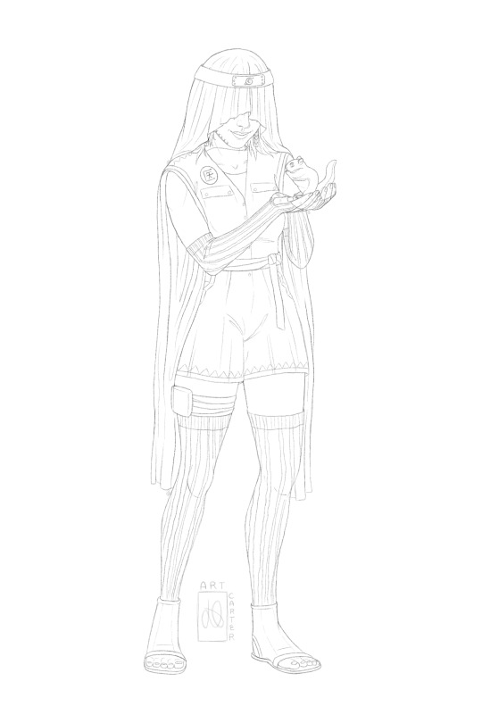

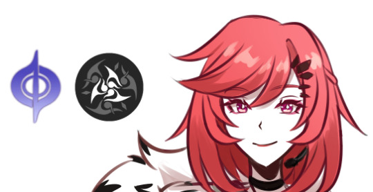
CHIKA HŌKI - Naruto [sketch + block colour]
pinterest board | more art | commissions
tag list (ask to be added or removed): @risingsh0t @sstewyhosseini @chuckhansen @statichvm @roofgeese @unholymilf @florbelles @confidentandgood @arklay @jinfromyarikawa @shellibisshe @simonxriley @queennymeria @marivenah @faerune @feypacts @mrdekarios @liurnia @thedeadthree @jacobseed @jackiesarch @heroofpenamstan @morvaris @jillvalentinesday @shadowglens @fenharel @alexxmason
#my art*#oc: chika hoki#artists on tumblr#naruto#naruto oc#anime oc#my ocs#character design#original character#digital art#here she is y’all!!#may end up changing some colours on her outfit#but veil and play suit are set#I love her guys#like come on how could you not#anyway I hope you like!#I’m tired so gonna go sleep#work is dragging my ass and I’ve only been back 2 days
27 notes
·
View notes
Text

Hint of Bunny lore and a slight redesign to pull the colours and such back to match the rest of the Welcome Home cast!
Template by @fetusmeme
Reblogs are appreciated!
#welcome home#welcome home oc#welcome home sona#wh bunny#my art#doodles#i promise im drawing the other characters and not just obsessing over my oc hsdfhsdfh#i almost had ed/die and wa/lly doodles done today but i need lots of breaks for my hand still#but there should be a Lot once i get it all coloured#and a comic planned out that needs lined and coloured too#i really am so excited to just DRAW every day again shfhsdfh#also bunnys design may continue to change as i try to fit them in with the others#without losing who they / we are in the process and the reasons i made some choices
38 notes
·
View notes
Text
I'm probably in the minority with this but I wish the first 3 arcs of Sailor Moon Crystal were a two-part movie series (like they did with Eternal and Cosmos.).
This will probably make the Crystal fans seethe at the mouth bc God forbid anyone has an opinion different from them. But we probably would've avoided a lot of the embarrassing poor animation choices had they turned the material into two-part movies for each arc. They'd have more time to focus on the good bits that moved the story along. They'd have more time to also focus on the animation quality of the movies.
Maybe, as a result, they could've spent more time honing their character designs versus getting better after three FULL seasons of SMC.
Sorry not sorry, the designs in Eternal and Cosmos are way better than the poor attempts to copy Naoko's style that plagued the first 3 seasons of SMC.
#yeah i said it. i think the infinity arcs character design sucked balls#before anyone goes ugh youre a 90s fan ... all i have to say is: and? so what? i like versions of sailor moon and will criticize all of them#nothing is above criticism you dinguses#the musicals? the bandai ones are a YMMV in quality. the later ones are good but sometimes the songs suck.#manga? inconsistent artwork but i actually like that about the manga tbh - gave it a lot of 'action' in its line work. but 1d baddies#90s anime? theres a lot of filler. some of the filler is good. others are BORING. series does not grow w/ audience after 3rd season.#90s anime pt.2? the aging up of mamoru and him having a relationship with rei. ew ew ew. they ruined mamoru for me lol#pgsm? nothing. its perfect. oh wait one criticism is that they only did the first arc. le sigh. woudve loved to had more#crystal? questionable designs. questionable additions that deviated from the manga. kept in some stuff that sucked about the manga#crystal pt.2? like keeping in haruka kissing usagi to uh intimidate her??? really fucking dumb and huge yikes. the first 3 seasons r boring.#crystal pt.3? which is funny bc its far more condensed vs the 90s anime but somehow manages to be just as boring as the 90s filler eps.#manga addition: i like the manga and i still prefer it over crystal any day of the week.#we good? good. now keep your reply in the drafts#incel + crystal = cryscel fans#btw this is true w/ dragon ball super. they decided to adapt the movies into the series and the series ended up having 🥚#🥚very questionable animation choices that were fixed but still didnt look that great. like id rather watch the movies they came from.#because if im going to get disappointed that they didnt give vegeta the final strike on freiza - it may as well look good.#still mad about that. vegeta deserved so much more and no one will never change my mind#vegeta being denied from killing freiza was the same as denying venus landing the final blow Beryl. YOU KNOW IM RIGHT.
8 notes
·
View notes
Last Seen Blogs
potataosoup
[Dukely Duties]
zasloveski
why are u my clarity?

duh-heather
heather grey
zasloveski
why are u my clarity?

mdraws
Untitled