#tons of clashing patterns etc
Text
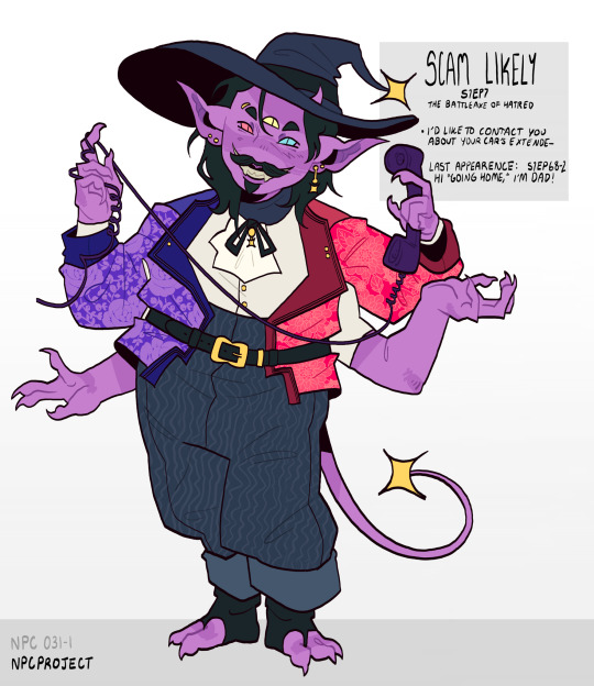
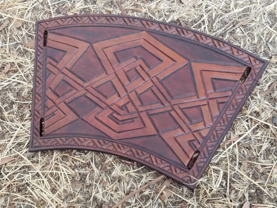
NPC 031-1 Scam Likely
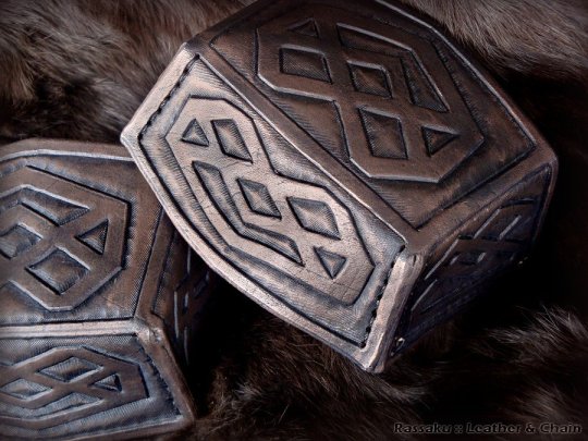
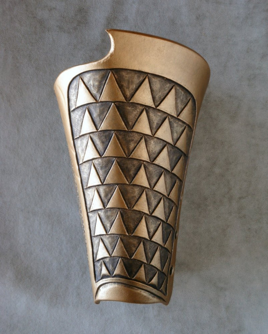
#he’s my favorite so far#i KNOW yall have been waiting for him i hope i didn’t disappoint#dndads#npc project#dungeons and daddies#s1#major npc#scam likely#design notes:#goblin esque in features but i wanted to make him stocky and dramatic#tons of clashing patterns etc#lots of hands#big hat just because he deserves it
966 notes
·
View notes
Note
Since your an animator, when does the details on the character become too much to animate? When do you have to simplify it to make it work?
Probably the most glaring sign there's too much detail is when viewers don't know where to look, and this applies to 2D and 3D animation. When the screen is filled with clashing colors, patterns, and textures, the eye bounces all over the place trying to take it all in. It gets overwhelming and distracts from the story. If you ever saw sparkledogs on DeviantArt back in the day, you'll know what this looks like. Just WAY too many different colors, patterns, accessories, and so on.

Maximalism is fine for home decor if it makes you feel cozy and content, but if you're designing for a wider audience who will see your characters moving on screen for prolonged time periods, you won't want to give them headaches.
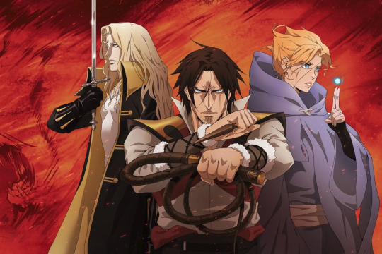
As far as hand-drawn animation on its own, judging when a design's too detailed will depend on deadlines and the production's budget. Time truly is money: The more time it takes to animate a character, the more it will cost. Line mileage is a big factor in determining timetables, though if a show's art style leans toward realism, with lots of interior lines for hair and cloth (and shading to match), the animators can compensate for that with limited movement. Castlevania's a great example of this, with characters only making subtle movements most of the time (mouths, hands, eyes, head tilts, weight shifts, etc), allotting the most time and budget for the mind-blowing action scenes. It's all about knowing where your priorities are.
If you're animating in your spare time with no deadlines, I suppose it's a matter of figuring out the sort of workload you can tolerate. If you want to animate something majestic and complex with a ton of layers, go for it! Just understand that it'll take a long time to finish, so you'll want to be sure you have the passion and patience for that kind of thing.
In general, I'd recommend starting with a simple design and adding story-related detail as needed. If it doesn't say anything about the character, leave it off. It's far more preferable to have a streamlined design than a cluttered mess.
27 notes
·
View notes
Note
idk if anybody asked yet but taemin duh and also mayhaps sunmi and doyoung 🫶
gonna be real i procrastinated this ask so much bc i didn’t wanna assign taemin anything bc u know when someone is so everything to u that nothing seems good enough…. so let’e start with sunmi and doie!!! for sunmi i wanna assign halpern or richard quinn, we know she can kill it with really high concept looks and tons of colours, clashing patterns etc. and i just think that either of those designers for her would be. amazing. did i already do a doyoung tbh i feel like i may have but whatever i’m assigning him armani boy right now, get it babes. now okay for taemin literally what i keep thinking is heaven gaia. like that’s the only designer whose entire creative direction i feel can match the unlimited potential and transcendent quality of taemin in a way that would make sense for a partnership. so i guess that will be my answer but i still feel like heaven gaia would need to step up to truly match him.
send me an idol and i’ll tell you which designer/brand i’d give them a brand deal with
1 note
·
View note
Text
Litha Flower Crown Tutorial
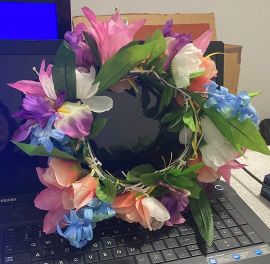
Hello everyone!!! Litha is coming up and to celebrate, I’ve made a flower crown!! It’s fairly easy to make and easily customizable so I thought I’d share a tutorial with everyone since it’s a lot easier than it looks! Whether it’s for Litha, a different holiday, or even just for fun, I hope this tutorial is helpful for you. Here’s what the finished product looks like!
If you want to make one exactly like mine, here are the materials that you’ll need:
-2 pieces of wire
-electrical tape (or any kind of tape that won’t create a goopy mess- I used black)
-3 different colors of ribbon (I used super thin ribbon in pink, white, and yellow)
-5 types of (fake) flowers. For this particular crown, I chose pink, orange, white, purple and blue. The specific flowers I got were; Hyacinth (blue), Roses (orange/peach), Peonies (white), Lilies (pink) and Iris (purple)
-Scissors or wire cutters
Obviously you can substitute the colors, flowers and materials as needed- make it your own!!! The whole point is to have fun while making something awesome.
Some helpful hints:
-Get the flowers at Dollar Tree. $1 for a bunch of 5-6 flowers and they have a huge selection!
-I got the electrical tape at Home Depot. I believe it was around $1.50 and there were tons of colors.
-You can find the wire and ribbon at your local craft store. I got the ribbon for $.79 at Michaels, and there was a huge sale going on so it was even cheaper. The ribbon is super thin which is perfect for this project.
-If possible, use wire cutters to cut the flower stems as there is hard plastic and a thin wire. It’s possible not to (I didn’t), but if you can save your hands some pain and struggling you might as well :)
-If you don’t want to make a crown but still want to make something with flowers feel free to hang this up as a wreath!
———
Throughout making this flower crown, clear your head and think of summer and infuse your flowers with thoughts of the sun. If it helps, burn some incense, play some calming music, or say a spell while your flower crown is coming along. This is a time of protection and joy so envision these things as you work on your crown.
Now without further ado, let’s make our flower crowns!!
🔮🌙🔮
Start off with your two wires. You can either measure your head or eyeball it to get the correct size. If you plan on wearing anything bulky, like a hat or an intricate hairstyle, add a few inches or measure with it on. You don’t want your headpiece to be too small. I personally eyeballed it and checked it to my head before twisting the wires together. I made it a little loose (not too much) but enough to where it would stay on my head by itself.
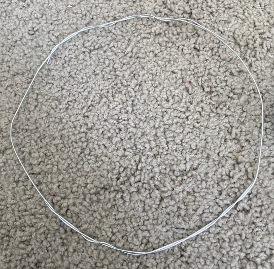
As you can see, the shape doesn’t need to be perfect. As long as it’s in the general shape it will be fine. At this point you’ll want to take a small piece of tape, about 4 inches long (you don’t have to measure it) and wrap it tightly around the part where the wires are twisted together. You’ll eventually want to cover the entire wire in the tape, but do it in chunks so it’s easier and more manageable.
Once again, it doesn’t have to be perfect. This is just giving a base we can attach the flowers to. At this point, you’ll want to have the entire circle covered in tape. There shouldn’t be any kind of sticky residue anywhere, and you don’t want any pieces of tape ends sticking out. Nothing’s worse than getting sticky residue in your hair or on your clothes :(. At this point, set the circle down for a few minutes while we prep the flowers.

As stated earlier, if you have wire cutters this part will be slightly easier, but if not you’ll be 100% fine. Separate each flower and cut as far down as you can to leave a long stem. This will also account for any errors where the plastic and/or wire metal refuses to cooperate. Decide if you want to leave the leaves on or if you just want flowers. Personally, I like the look of leaves so I left them on the stems. There should be one leaf part to each flower, sometimes two depending on the type. Here is where you’ll decide if you want a specific pattern or how you want to add the flowers. I just did what I felt was right and looked the best, and went one flower type at a time. (All the roses first, then lilies, etc). There is no right or wrong way to decide on a pattern!!

At this point, I cut my three pieces of ribbon. I went flower by flower so I cut all the ribbon as I went along. I color coded it so pink was by the base of the flower, yellow was under the leaf, and white was at the end of the stem. You’ll want to double knot it tightly in the three different locations. Once again, there is no right or wrong way to do this as long as you feel it looks good and the flower won’t come off.
As you can see, you want all the flowers to go in the same direction. This is important. If you put them going different directions, the flowers will squish and clash and you’ll get frustrated trying to tie down flowers that are fighting you.

As you go along adding flowers, make sure to keep tying the previous ribbons in. This part is hard to explain but basically you’ll end up wanting the ribbons to be flat against the circle just like the stems. This will help make everything look neat and you won’t have random ribbons hanging every which way. Keep adding flowers how you want.
You can see more of what I’m talking about with the ribbon in this picture. By now your flower crown should be shaping nicely. Keep adding flowers, tying ribbon and shaping your crown. You can obviously stop whenever you feel your crown is complete.
After completing the flower crown, feel free to enchant it with a spell if you haven’t already and want to, or put it in the sun so it can absorb the rays and infuse with the suns energy.
And there you go! A completed flower crown for Litha, or a summer wreath to decorate your home. :) Let me know if there are any questions and of course tag me/comment with pictures of your flower crown!!! I’d love to see what you make!!🌸 🌺 🌹
#litha#flower crown#tutorial#witchy tutorial#witchcraft tutorial#summer equinox#witch#witchcraft#flower crown tutorial#flower#flowers#diy#witch diy#litha tutorial#witchy things#celestial witch tutorial#sun#litha ritual#magic#witchy vibes#magick#energy#solar magick
223 notes
·
View notes
Note
you’ve talked a little bit about this wrt dan, but i’m curious: what are your favorite seasons/arcs for the main gg characters? (serena, blair, dan, nate, jenny, vanessa) cause everyone’s personalities tended to uh, shift a bit from season to season and storyline to storyline, and i’m wondering which eras of those characters were your favorite?
oh, so i sat on this question for a very long time, and spent a ton of time thinking over it. here we go!
i loved the way serena was written in s1 and s2. she was so full of joy despite all the difficult things she’d endured, so bubbly and warm and... lively is ALWAYS the adjective that comes to mind for serena, despite how it’s a terrible pun. but yeah! she had an energy to her that was very childlike & genuine, and i loved that about her - despite the things she’d endured, she was so full of light (?? how do i describe this.) i know that serena’s arc gets notably more tragic s3 onwards, but i feel like the way she was written lost a bit of depth s3 onwards as well. she had a sharp wit, and a good sense of humour, she was playful and... most notably, she had this little giggle? that she literally NEVER does in the later seasons, which makes me sad?? she stopped laughing like a child at the age of, what, 19?? idk. in s1 & s2 serena had so many layers, and i feel like as the seasons went on they tried to, uh. keep only the surface layers? they didn’t really do justice to the character they started out with.
my answer for vanessa is actually the exact same, with slight modifications. vanessa’s energy in s1 and s2 was unparalleled. literally the best. i loved her and the way she was critical of everything and YET so ready to learn. compared to all these rich, privileged, white people... her presence was just SO good and so important to me, because the way she was so critical of the uber rich was something nobody else really was, and i think that perspective WAS valuable and should’ve remained, haha. idk what it was about s3, but i feel like they didn’t keep the crux of who vanessa was? it wasn’t a BAD vanessa season as much as an incomplete one. i felt they could’ve done so much more with a character like vanessa.... she’s so vibrant and full of life! and the way s3 was for her was very surface. and then in s4 they just demolished her character entirely. i’ve said it before, i’ll say it again: what jenny, juliet and vanessa did in 4x09 was TOTALLY out of character for vanessa. she would never, ever do that. and by the time s4 came around... someone else said this, i don’t remember who. but they said that vanessa was basically being used as a plot device more than as a character. notice how she’s always in the right place at the right time to overhear the right thing? it’s a travesty, because vanessa was just..... so significant to me. like her being there added so much value & even changed the tone of the show imo.
my blair feelings are very complicated. i think she’s fascinating, and i love leighton & her performance. i love book blair so much more than show blair, and idk why or how to explain it. i mentioned this in that post where i ranked the characters, but while watching blair in high school specifically i can’t EVER forget that she would probably hatecrime me, and even when she’s out of school she is still supremely racist at times. i actually liked blair best in s5 - and i know she was going thru ~tragic~ stuff (i think they dialled the tragedy too high actually, like, blair had TOO MUCH on her plate and from a storytelling point of view it was... ambitious, to say the least, to hope to bring all out of that out on tv) but like, keeping her tragedy aside. her capacity for kindness and care really shone thru while she was with dan, and i liked how the d/b relationship took her out of her comfort zone and her “but im a Waldorf!” bubble and let her, idk, be a person. i liked her in s4, too. i feel like blair is a really good, nuanced, fleshed out character as blair, and the way she clung to being a waldorf combined with her rich-white-girl privilege got kind of boring after a while because like. she’s not like louis? her character has so much depth. her character doesn’t need to be reduced to a title, because she’s SO much more than that.
i feel like i need to do a lot more rewatching when it comes to dan because i CANNOT be objective about him. he reminds me far too much of myself!!! down to his flaws and his mistakes and his issues – i was a precocious little shit in high school at times in very similar ways to dan, i like to think i’ve grown out of that (& am perpetually making an effort TO grow out of falling into those patterns) & that’s what i want for dan, too. dan’s arc feels real to me, because a lot of it is my arc, too. feeling lonely, out of place & unaccepted in high school --> being a popular kid in college… that hits really close to home. s1 & s2 are important seasons to me because i’m extremely protective of awkward, trying-his-best high school dan (he can be awful at times, but he can be earnest and sincere, too!) i feel like s4 is actually the best dan season – took me a while to get here, but halfway thru my s2 rewatch that’s how i’m leaning. but dan’s arc was very interesting to me, and i wish they’d kept his heart. trying to retcon him as evil fell absolutely flat to me, like. who are you convincing! one of my friends and i were joking about how georgie blackmailed dan into pretending to be gossip girl (she obviously has dirt on him that nobody else does.) anyway. dan’s arc felt pretty true until the end of s4. i wasn’t a big fan of how he was written in s5, i felt like something had been taken away from his character, but i don’t know how to say it better. you’re right though, i have gone over this a lot! so i’m not going to break my head over it, ‘cause we’re already a thousand words in and i still have nate and jenny to go.
speaking of jenny, though: i think dan’s storylines REALLY needed more of a big brother arc. the way he was characterised, especially in s1, was very “i would kill a man for my baby sister” and i have NO idea where that went or why they got rid of it. (actually, i do have some idea. fucking chip wiskers apologism & elevation of chair over literally anything else. sigh)
okay, now speaking of jenny in terms of jenny. i liked her s1 arc, like, her trying to make friends with these people & trying to keep her morals and realising she can’t do both was interesting. i think that should’ve been that with her clashes with girls in constance, though. and afterwards, either nothing happens, or she transfers out of constance, etc. jenny’s s2 arc makes me sad – she was exploited and treated like dirt in so many ways :( the jenny/agnes was interesting in s2, though, and there’s no way to interpret it that ISN’T lesbian. i’ve always felt like jenny’s feelings for nate in s2 are very comphet. jenny’s s3 arc made me even sadder than her s2 arc- she was alienating all her friends one by one, making everyone hate her, and just…… spiralling. she really needed a better support system. her s4 arc made no sense. like. why did she come back in the city to fuck with serena like that? it didn’t feel right.
yeah, all that said… i feel like there are many super intriguing elements of jenny’s storylines and arcs, like, even within canon events if things had been executed differently, it could’ve been actually good/empowering. but the writers hated jenny. and this show was never a feminist show.
ah, so… nate. he started out as a flake in s1 & s2. that’s his whole thing. he doesn’t know who he wants to be / how to get what he wants / how to get where he wants. he takes people for granted. he isn’t dependable or reliable, he lets people down (most notably, blair & vanessa.) and he means well, sure! but his life is like amber and he’s trapped in it. he doesn’t follow his heart, he’s too busy trying to please the wrong people, etc etc. in s3 he’s suddenly so ready for commitment, which always breaks my heart because vanessa!!! but anyway. s3 has a shift in his character, possibly him getting dumped at prom and realising that high school is over and one thing that tethered him to his family (being a kid, being a high schooler, being a minor, whatever) – one big thing that held him there is gone. so it makes sense that he starts trying to be his own person. i like s3 nate, and s4 nate. we see nate sort of gradually try and be a moral compass, and it’s interesting to me. when i write d/n fic something i really focus on is dan finding nate dependable, and i think that’s a value that builds in nate over time. nate of season 1 is not dependable, nope, no way. but nate of s4 seems like a decent friend to have. in s5 and s6 they more or less threw his entire arc to the wind and gave him so many shitty storylines (sage spence, wtf? nate would not do this. he’s been on the opposite end of this before, he would not carry the pattern forward, ffs.)
idk. this almost hit 1.7k, LMAO. i hope it made some amount of sense!
11 notes
·
View notes
Note
any tips on how to color ???
Learning how to improve your coloring process takes time, and it takes making some mistakes. I have improved a lot over the past few years and only because I have made some questionable editing mistakes in the past (I just always make sure to never make them again). Under the cut are all the tips I could think of :)
Gifs can only be 256 colors. When you’re coloring a gif, you’re basically trying to reduce the amount of colors in a scene so your gif doesn’t lose quality when exporting. A gif can never actually represent the true colors of a scene.
I know this is obvious, but every single gif needs some sort of color modification / editing for it to look better.
My most important tip is to learn the very basics of color theory. It changes how you color dramatically and you can understand how color functions within a gif. Learn about the color wheel, primary/secondary/tertiary colors, complementary colors, and cool/warm colors. Afterwards, I also suggest looking up basic paint mixing videos where someone shows you how colors are mixed together or made darker/lighter (even better if you’ve had personal experience with mixing paint). Personally, I approach coloring gifs like I would my paint canvas in real life—when I color a scene I’m essentially “painting” over it with the adjustment tools in photoshop.
And building on the previous concepts of color theory, do not attempt to turn the original scene from red to green, blue to orange, yellow to purple, etc. It looks horrible because those are complementary colors; they are the absolute opposite of each other and mixing them makes a very muddy brown color. Instead, warm colors can easily be turned into other warm colors, and same goes for cool colors.
Reducing contrasting / clashing colors in gifs can improve the color of your gif drastically when exporting.
In gifs, red, blue, and green are the worst colors to edit because they’re the most likely to break up within a gif. These colors also break down the fastest as a gif ages.
I don’t know who said this to kpop gifmakers years ago, but please don’t be afraid to use the curves, exposure, brightness/contrast, and levels adjustment layers. Using those layers can actually help you improve the quality of your gifs drastically and make your gifs actually pop out on the dash. If you’re afraid of whitewashing someone, that can always be fixed later on by learning to adjust those layers and various others.
For kpop editing specifically, please know that Asians are not straight up canary yellow, bright orange, or tomato red. Asians do not have the same universal skin tone/color—Asia is comprised of thousands of ethnic groups which means we also have tons of variations in skin tone. Basically, Asians aren’t yellow. All the members of a single idol group do not have the same complexion, and much less to say the whole Korean music industry. In terms of color mixing for editing, Asians are a mixture of yellow, red, orange, white, and a very minimal amount of a cool color depending on undertone.
I highly suggest learning about how lighting works in a gif. Always question where the light in a gif is coming from—is it from the side, the front, the back, the top? I often see editors try to reduce contrast completely or make someone completely yellow/orange/red/brown in an effort to reduce whiteness/lightness on one side of the face. Differences in lighting are completely natural and one side of the face being lighter than other is just how lighting works.
Personally, I always color to enhance a gif. I’m always trying to reduce the gray layer/cast on scenes that occurs from compression (but sometimes that’s also unavoidable because of the grain or quality). I try not to over-edit most of the time but that’s also personal preference and everyone has a distinctive style. When I make a gif, I want it to age well although that may seem impossible.
Making the blacks blacker and whites whiter increases contrast in a gif. It makes your gifs pop and stand out.
Be careful with the use of vibrance/saturation/hue. Those can easily reduce the quality of your gif. The most important layers for coloring gifs (in general) are selective color, levels, and color balance.
The higher quality a file particularly is, the easier it is to manipulate colors for editing. Those gifs are less likely to break up and can withstand more coloring than the average gif. Basically, the more layers you add to a gif, the heavier it’ll be to export—so a reduction in quality. I find that gifs with tons of layers end up looking “sticky.”
In my opinion, the best editors on here are those who always color from scratch. They’re more flexible in how they color and actually know how to color a wider variety of content no matter what. PSDs are very nice and easy to use once you’ve developed them, but you also get stuck in a rhythm and forget how to color from the very beginning. An editor can become inflexible with the use of the same PSD.
I highly suggest checking your gifs on mobile. Gifs in general look very similar on desktop, but on mobile it’s a completely different story. Load your gifs into Tumblr’s photo uploader then publish them on a separate sideblog. Then, with your brightness turned up all the way, look at your gif on mobile and zoom into it. You’ll be able to see how the gif has been compressed, how the coloring has changed, if there’s any “breakage” in the gif. Then you can slowly modify your editing process to also look good on mobile. For me, my editing has improved a lot since I started making my gifs primarily for mobile—how gifs look on desktop do not really matter to me anymore.
Exporting gifs: I suggest checking what diffusion vs pattern looks like on mobile. Pattern has some little difference with diffusion in the desktop browser (sometimes you have to look closely to tell the difference on desktop), but on mobile there’s a huge difference. Gifs exported in pattern in general look very old and worn on mobile, especially with yellow/orange hues. Pattern on mobile can make a 2160p Blu-ray remux file look like it was originally a 1080p 2 GB compressed file—it essentially adds a worn surface to a gif that makes it look like it was made in 2017 not 2021 (completely refutes the need to download a HQ file in the first place).
Saving in pattern: If you’re giffing from a Vapoursynth processed file, please do not save the gif in pattern. Vapoursynth makes gifs very smooth and diffusion works best with smooth, grainless gifs. The pattern export sits on top of a Vapoursynth gif like a dirty mosquito net. In general, pattern is best when you have two dominant complementary colors in a gif that are directly clashing with each other in movement OR gradient scenes with lots of shifts in hue and movement. Pattern can help hide the breakage of color within those gifs due to the excess movement of color. Also, I think pattern works best with animation, especially figured with black outlines or scenes with tons of color (those look least worn on mobile).
12 notes
·
View notes
Note
Do you have any tips/advice on playing the Missing Link?
Alright, since some of you may not be familiar with some of Guilty Gear's "older" mechanics, I'll give you some tips:
1. Blocking is pretty much the same as in most fighting games, with exception that you need to hold down the Respect button to perform Faultless Defense (for most that's the L1 button, check your control settings). It will burn through a lot of your built-up Chaos Gauge if you were on the offensive, but at least you won't take damage while guarding, and you can even block better while in mid-air.
In more modern GG games, it's a lot easier to do this because you burn less Tension (that's the Chaos gauge by the way), you can also use it to cancel your movements briefly if you have the meter. It's useful for sudden stops and fast falls if you're in the air, or just want to jump really quickly.
2. It's a lot harder to turn around in GG1, but at least you can take advantage of this with the Taunt button in mid-air. If you manage to airdash behind a character, press the Taunt button and you'll make a sudden turn and can quickly attack them from behind. If you're fast, you can land an airdash combo and attack their backside! Practice this a bit in training mode and you'll get the hang of it.
If you’re blown away by an attack, try using Up+Any Button to perform an Aerial Recovery. It’s a tad different from more modern ways of recovering, but it’ll get you back on your feet so you can block at least.
3. As you probably already know, the Respect button also doubles as a "charge" button for most characters (Axl, Testament, and Justice are the only exceptions to this). If you input your respective character's "charge move" and begin to charge up the attack, you can briefly cancel the charge and reset your character's position. This is a LOT like a Roman Cancel! So when you perform a string of attacks, whether they are blocked or not, whether they HIT or not... you can input your charge attack and "cancel" the combo to continue the previous string of attacks.
Here's an example (using Sol Badguy):
Heavy Slash > 623+R (Charge) > Heavy Slash > 623+R (Charge) > Heavy Slash etc.
Some charged-based combos are really powerful and REALLY broken, but they still have a certain amount of pushback, so be careful how long you try to do them, forward momentum from a ground dash or breaker dash will help extend the combo.
4. This one's very important... if you find yourself in a pinch, where your Lifebar is in the Yellow, assuming you've lost half your health gauge, remember that you've entered Awakening Mode (Kakusei Mode) and for the rest of the round, you can perform an unlimited number of Chaos Attacks (called Overdrives in later games).
So if you're wounded, you can perform moves like Sol's Tyrant Rave (632146+H) or Ky's Ride the Lightning (41364+H) over and over and it doesn't even cost you Chaos Gauge meter! Take advantage of this whenever you can. Even Sol's Dragon Install can be buffed and re-buffed for an extended period while in this state.
5. Let's assume that your opponent is putting you under a LOT of pressure, if you have some Chaos meter, if you're blocking, you can perform a Gamble Attack (later called a Dead Angle guard cancel). To do this, you need to press Forward+2 buttons while blocking. It's a bit more costly than Faultless Defense, but it'll help you get back on Offense a lot quicker.
Also, please remember that some attacks of the same strength will clash. If you manage to clash against your opponent 3 times in a row, both of you will be pushed back and you’ll have some breathing room.
6. Momentum is very important in this game, especially if you have Chaos meter. Assuming you have a full gauge, you can charge at your opponent and RAM in to them! This is called a Breaker Crash dash attack! (Slow characters like Potemkin and Kliff can't really do this move, but others can!) You can use this not just as a way to attack opponents, but to extend combos after a knockdown or blowback! You'll have to do some experimenting with it though.
7. Certain counterhits will result in a Dust blowback, just like when you hit Dust (Slash+Heavyslash) input to knock someone in the air. If you're quick to react, you can press the Up button to perform a Homing Jump which leads in to an Aerial Gatling combo, it takes practice and reflexes, but take advantage of it whenever you can.
8. Gamble Attacks aren't the only move that can be canceled while Guarding. If you press Punch+Kick either while guarding or during a sequence of attacks, you'll initiate a Danger Time Instant Kill poke. The screen will go red and you'll have a chance to input your Instant Kill. But be alert and be FAST because if the opponent inputs theirs before you do, it's the end of the match!
If you know your opponent is trying to Instant Kill you, perform 214214+any button to try and escape the Kill attempt, and they'll dash behind you and you'll have an opportunity to attack them immediately afterwards.
Danger Time itself is often random and risky, but if you get used to taking advantage of it and can read your opponent (not just the CPU), it turns in to a very powerful mind game.
Also, be very careful, as some attack counterhits will also initiate a Danger Time poke, like many of Testament's moves.
9. Charge attacks aren't the only way to extend combos! A lot of your arsenal of attacks can be jump-cancelled. That's right, you can jump after an attack hits or is blocked. You can use this in the form of Instant Airdash Combos. The input's a little tricky as you have to press Up and Forward-Forward (88 or 77 after a ground attack that can be jump canceled), but with enough practice you can dash in on your target in the middle of a combo and use the momentum to extend your attacks. This is super effective on big characters like Potemkin and Justice.
10. Take advantage of spacing. If your opponent is far away from you and they aren't attacking, this will give you a safer opportunity to charge up your moves. Ky Kiske and Kliff can often take advantage of this with their projectile pressure. Use Ky's Level 2 or Level 3 Stun Edge and you can really lay the hurt and pressure your opponent. In Kliff's case, his Reflex Roar Level 3 can wipe out 50% health in a single blast! He's very powerful.
Is your opponent running away? Catch them with Potemkin's Level 3 Graviton (623+R/P Slide-Head)! Potemkin can also use Nitro Hook to close the gap on his opponents if they try to retreat (he later gets to use the move Hammerfall~).
Also, moves like Chipp's Ten'i Teleport (22+any) and Sol's Riot Stamp (214+K or 66+K) are really good at keeping you in your opponent's face when needed for pressure.
Axl and Millia are especially good at keeping their opponents at bay with their respective moves, so if you like poking people at a distance, give them a try.
11. Finally some tips for fighting bosses Testament and Justice.
For Testament: either try to poke him from a distance or pressure him as much as you can, because he's good at laying traps on the field. His combo strings are very long, but he doesn't charge cancel, so be patient and wait it out if you're blocking. If he brings out his EXE-Beast on the ground, be ready to jump and you'll take less damage in the air, just watch out for Grave Digger.
For Justice: at the outset she likes to spam her Michael Sword and Imperial Ray, so you'll need something powerful that can either interrupt those attacks (Potemkin's Graviton, Axl's Chain Trap, or Sol's Volcanic Viper/Ky's Vapor Thrust), or something that can stun her at a distance, like Stun Edge or Gunflame.
Like Testament, Justice has a very long string of gatling attack combos, but she can't charge cancel either, so wait it out if she's in your face.
If her Health is low, she'll begin spamming Gamma Ray, so be ready to use Faultless Defense, or a fast move that can interrupt the startup of her attack. The more you harry Justice with pressure attacks, the less of a threat she'll be. Just watch out for moves like Valkyrie ARC and SBT, as she'll use those if you pressure her too much.
Characters like Axl or Potemkin have a slight advantage in that they can attack Justice at long range, so use that to your advantage.
12. Last but not least: how to unlock Baiken!
Obviously you can only use Ky or Sol. I choose Ky because he's easier/safer to use.
Again, take advantage of Level 3 Stun Edge, most A.I. can't deal with it, so it does a ton of damage, even if they block it. While they're blocking, charge up another Level 3.
Get used to dodging Instant Kill pokes, as after Stage 8, the A.I. will step up its game and the game gets harder. But, they can't Instant Kill you if they can't touch you, so play keep away with that Level 3 Stun Edge.
Ky can also endlessly spam a mid-air Stun Edge if you're practiced with its input.
Ky's Stun Dipper is also useful in that it causes knockdown, use this for Okizeme frame advantage and charge up your Stun Edge while they're on the ground.
If you've been training and get used to Testament and Justice' patterns, you can wreck both of them with Level 3 Stun Edge.
After that, you just have to fight Baiken and unlock her.
Don't worry, even if you lose a round or match against Baiken you can still rematch her and try again without starting over. Baiken's a pushover compared to Testament or Justice (in this game at least, she gets stronger in later games).
----That should do it!
If you're still having trouble, just experiment in Training Mode some more till you get the hang of things! Be sure to read the manual and get a full grasp of the game’s mechanics!
6 notes
·
View notes
Note
Can you explain some of the terms in the history of fandom purges post? For example, what is a pro-shipper blog??? I’m really scared to be deleted! I’ve bren here for years!
Of course, I’m happy to explain! This is a very brief summary, if there’s anything you need to know more about, I’m happy to do my best. Fanlore is also a good site to look up some more stuff!
This is looooooong so under a cut! This is the post in question, for those of you wondering. Let’s go through it from top to bottom. I’ll skip the ones with links because you can follow those links to get more information.
Several times in the ‘90s as you can see on the timeline, authors and creators (and big studios like Paramount and LucasFilm) went after fansites, threatening them with Cease and Desist (C&D) letters and shutting them down. This was fairly common practice, and it wasn’t until fansites like Fiction Alley got big enough, and had actual lawyers on their side, that fandom was able to fight back. Ao3 keeps lawyers on staff for this very reason, because fandom falls under “fair use” and is legal.
Anne Rice is mentioned several times on that post and that’s because she is notorious for going after people who do fanwork. She is extremely controlling about how her characters are perceived by others, including going after anyone who writes a bad review about her books, and people writing their own interpretations of her characters just gets her goat like nothing else, apparently. And she has the money and lawyers to take down quite a lot of people. Thanks to our darling Ao3, we can write as much damn Interview with a Vampire fic as we desire, but you can understand why most fan archivists and fanwriters didn’t want to touch that possible lawsuit with a ten foot pole.
And, if you’re wondering what AOL, an email system, has to do with fansites? Well, another way to share fic, even before fansites, was through email chains. YES, YOU HEARD THAT RIGHT, READ AND LEARN, MY TINY CHILI BABIES. You had to sign up for an email newsletter to get fic! And oh, the fandom wars that could go on in this email chains… there’s a pretty infamous X Files one but that’s another post for another time. Anyway. X Files was one of the original “fandoms that ate fandom” (FTAF), a fandom so big that everyone was into it no matter what their original fandom was (Star Trek and Supernatural are two other examples of FTAF). AOL had a way of… how do I explain this… basically AOL was “hosting” a lot of the early prototypes of fansites, a version of the early email chains. So when The Powers That Be (TPTB) expressed their distaste for X Files fanfiction, AOL purged their X Files sites.
In the early 2000s, FanFiction.Net (FFN) was considered a safe haven. FFN was one of the first really big multifandom sites. Before that, if you wanted to read, say, Star Trek fic, you had to find a Star Trek fansite. If you then wanted to read X Files fic, you had to find an X Files fansite. And so on. Fan archives were often limited, and you might have to go to three different fansites to get all the fic out there, or even to get different kinds of fan material: a fic archive, a fan forum with news on the show/film/book, and a fanart archive.
Welcome to the dark days, my children.
Note: There are still some amazing fansites out there, filled with archived fic, fanart, and even some “virtual seasons” for television shows. If you or anyone you know is in charge of one of those archives, I beg of you to consider working with Ao3′s Open Doors project so that the fanwork on those sites can be preserved for future generations even after the original archivists pass on, lose funds, or lose interest.
Anyway, FFN was a huge relief for everyone because they no longer had to do all the work to archive our fic. Trust me, running an archive or even just uploading your fic back in the day could be exhausting. God forbid you get even one damn bit of your formatting wrong when you uploaded or it would all turn into a mess. And now, you could get your fic all in one place on one site! You didn’t have to sign up for all these different archives! You could have a single pseudonym and a single account for all your fic! The angels sang!
So when FFN got rid of fic without warning, it felt like a real betrayal. First, FFN banned porn, or anything they deemed to earn an NC-17 rating. Which is, as I’m sure you can immediately recognize, a sticky subject since people’s opinions are subjective about that. What does/does not qualify as porn? When is a fic too sexually graphic, what is and isn’t appropriate, etc?
Then FFN banned RPF, which stands for “Real Person Fiction.” If you write about Viggo Mortensen and Sean Bean banging each other, congratulations, you’ve written RPF (RPF was a big part of the Lord of the Rings fandom when the movies came out, fun fact, aren’t you all glad I went down this rabbit hole of research so you don’t have to). If you write about meeting Chris Evans in the airport and the two of you going on a date in the food court, yes, that is RPF.
The other FFN bans mentioned are script format, CYOA, Readerfic, 2nd person, and Songfic. Script format is where people would write things in, well, a script form. I don’t remember exactly why that was banned, I think it was a combination of fear of copyright infringement and just the formatting was so damn annoying to do. CYOA is short for “choose your own adventure” and was banned because it just got too unwieldy for people. This is creeping into gatekeeping territory on what is “legitimate” fic or not. “Choose your own adventure fic is annoying so we’re going to ban it!” is part of a slippery path on what is appropriate or not. “Readerfic” is written in 2nd person POV like so:
You open the front door and are immediately met with the smell of death. You’ve never been around dead people before, so you have no reason to know what the smell is–but somehow, some long-forgotten instinct tells you. You know exactly what this is.
Readerfic is where the reader, you, interacts with characters in a TV show. Take that little snippet I just wrote, for example. If that bit is a part of a larger fic where you’re a Loser and you’re friends with the kids from IT and help them defeat Pennywise, that’s an example of Readerfic. 2nd person is just any fic that uses the “you” as the POV instead of “her” (3rd person) or “I” (first person). This is one of my old-as-dirt Castle fanfics so excuse the quality but here is an example of 2nd POV fic. As you can see, Readerfic is 2nd person, but not all 2nd person is Readerfic.
Songfic is where a fic would use song lyrics throughout, sometimes to the point of annoyance, in telling the story. Basically it was where people would use a song that reminded them of their OTP and write a vignette based around that song. FFN banned it because again, fear of copyright C&D from songwriters and studios.
This was all in the early 2000s, as the timeline in that post shows, but it wasn’t the last time FFN banned things. In 2012 we all got yet another scare when FFN, without warning, purged a fuckton of fics in a porn crackdown. See, we all figured out preeeeetty quickly that nobody was moderating fics to see if we were following the “nothing NC-17 rated” rule, so people kept posting smut, myself included. FFN’s crackdown was sudden and we lost a ton of fic that way. It was after this ban that Ao3, which had been created c. 2009, really started to gain steam as people moved en mass over there.
Also, as the timeline shows, FFN used to have fandom forums. That was where people could discuss things. The forums had been pretty dead, what with LiveJournal and Tumblr, BUT, they contained a fuckton of valuable fandom discussion and meta. FFN purged them, and years of important fandom history was once again lost (along with juicy fandom gossip/wank/scandal… shut up we all have our guilty pleasures).
So that’s all the FFN stuff.
Gryffindor Tower, Sakura Lemon Archive, and some other examples on that list are not about fandom purges so much as they are about what happens when we have an archive run by just one person or a handful of people. That person dies, or is unable to foot the bill for the server, or the people in charge get into a personal argument. Whatever the reason, suddenly, that archive is gone. And so is all of that fic, and all of that history. Wiped away with a keystroke.
Strikethrough and Boldthrough on LiveJournal were similar to the FFN purges. You can read the whole story here, but basically a group of radicals claiming people in fandom were writing child pornography got LJ to purge a bunch of forums and pages, including a rape survivor forum and people who had only written 18+ consensual slash fic. Yeah, no shock that it’s always the slash fic (slash means m/m fic, femslash is w/w) that gets attacked no matter how G rated it is. Once again, everyone woke up to their journals, their forums, their fanwork, their years of history, gone.
Can you see the pattern here? A corporation like Marvel (another entry on this list) will go after fansites, and because Marvel has so much money and so many lawyers, the site caves and does what Marvel asks. Or a bunch of annoying people speak up, usually about smut/porn, and the corporation (LiveJournal, Tumblr, DeviantArt, etc) will get rid of blogs, fanart, fanfic, etc without warning.
This is why fandom cannot trust corporations. Corporations are out there to protect themselves legally by any means necessary and to make profit by any means necessary. Fandom inevitably clashes with that. So, inevitably, the corporation is going to turn against us.
In China, as you saw on the list, it’s especially bad because it’s not just corporations, it’s the government itself. And the government can, has, and will jail people who make fanwork that goes against what the government feels is “good/moral,” like slash fic.
*this section here edited 10/22/19 to update information*
The most recent are the Tumblr purges. Ah, the Tumblr purges. “Pro-shipping” blogs are blogs that are, as the poster of the list themselves explained in a reblog of this post, anti-anti blogs. Anti-blogs and antis are people who are against shipping. Pro-shipping blogs are blogs that are very aggressively “ship whatever you want” and “antis go away.” You’d know if you had a pro-shipping blog. So unless you have one of those, you’re good. I don’t really know the details about this one since that’s not really my discourse wheelhouse so you might want to ask around to get more information.
*okay we’re all updated now, back to the rest of the post*
And of course most of us know about the NSFW ban. Tumblr has a major problem with porn bots. Instead of staffing more people (Tumblr employs FAR too few people to handle the kind of upkeep this site needs) and having actual humans search through and find the porn blogs to delete them (which would be exceedingly easy, trust me, these porn blogs are not hard to find), they just let it keep being a problem. Eventually this led to Tumblr’s phone app being banned from the app store for inappropriate content.
Again, instead of dealing with this maturely and getting rid of the porn blogs, Verizon decided that all NSFW content was banned, and set about deleting all blogs they deemed NSFW. There is now an algorithm that determines if a post you made is NSFW, and it’s flagged and hidden, and you have to petition to get an actual human to look at it and decide if it’s NSFW or not. This algorithm, as I’m sure you can imagine, is absolute SHIT at finding actual NSFW material and will flag the most random BS.
Again, this is an example of a corporation purging and destroying our material. LGBT+ blogs discussing safe sex practices/giving sex advice, sex workers/cam girls who could safely use this site to make a living, rape discussion/survivor blogs, fanwork, people’s fun porn sideblogs, all of it once again destroyed.
Fun.
In just March/April of this year, in fact, several people’s blogs were deleted with no warning and for no reason. My dear friend @qqueenofhades lost her blog for weeks, and she and I and other friends had to petition tumblr daily to get it back (I sent so many emails that one tumblr tech got snarky with me). My darling @koortega suffered the same issue before getting her blog back. Alas, our dear @mearcatsreturns wasn’t so lucky–her original blog, and her years of work on it, were lost forever. Tumblr still hasn’t (to my knowledge) properly explained what happened, although it is telling that a lot of these blogs were queer-friendly, fandom-heavy content generators.
As the list said, this is why we need Ao3 and we need a solution for other kinds of fanwork like videos and fanart. This is why we can’t trust corporations to have our best interests at heart. This is why, despite all of us continuing to use tumblr, we need to find another solution for our fan blogging needs because they will screw us over again and again (until I become rich and famous and can buy this hellsite and run it properly dammit that is my lifelong dream don’t judge me).
I don’t think you’re in danger of getting deleted without warning, nonny. The company that now owns Tumblr seems to have a pretty good track record of running sites, and at least warning people before deleting shit. But that doesn’t mean it can’t happen again. I live in a state of… don’t be paranoid, but be ready, if that makes sense? Think of it like having an earthquake/tornado/hurricane first aid kit in your home. You aren’t constantly thinking about how you might need that kit for a natural disaster, but when that natural disaster hits, you have that kit ready.
Some people have backed up their blogs (I’m not sure how but you can google it or ask around). Others put their fic onto Ao3 (I backed up all my FFN fic onto Ao3 in 2016 for this very reason even though my FFN fic is, for the most part, utter crap). But we don’t have a long-term solution, which is what concerns people and is why that person made that list–to remind us of what we’ve lost and that we’re still in danger of it happening again.
I wish I had a better solution for you, nonny. I wouldn’t live in fear, if I were you? But I would ask around, and see if there’s a way to back up your blog. Because hurricanes do blow in.
#mads answers things#fandom#fandom history#fanfiction#fanfiction history#sorry this got so long#this was probably way more information than you needed nonny
94 notes
·
View notes
Text
Fashion design for OCs: A study of Monster High
Previously, I made a post about how to begin approaching designing clothes for your OCs, mainly suggesting studying real-life fashion trends. Which is a good place to start, but what if you really want your characters’ outfits to really reflect who they are as a person? Well, I feel like Monster High is a good place to start studying.
Monster High is a fashion doll line, launched by Mattel in 2010. The dolls had two things going for them that Mattel’s biggest line, Barbie, didn’t - first was that the dolls were based on famous monsters from folklore, literature, and film; the second was that each of the characters had a clear personality that has stayed consistent throughout the web series and various direct-to-video films made to promote the brand.
And the outfits for the dolls do an amazing job at communicating each character’s personality - they have to, because character drives the kind of play children will act out with their toys, and children need to be able to clearly identify the good girl, the mean girl, the fashion girl, etc.

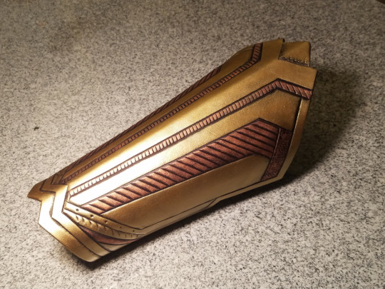
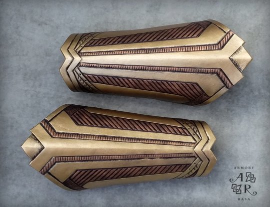
Let’s start our discussion with the lead character of the franchise, Frankie Stein, the daughter of Frankenstein’s monster. Frankie’s outfits almost always incorporate plaid or argyle patterns, usually with a short skirt, often with a tie. She is usually dressed in black and blue, occasionally with yellow as an accent color.
Looking at any of these outfits, you can immediately tell that Frankie is supposed to be a school girl, because plaid skirts are a staple of many girls’ school uniforms. The tie helps to emphasize the idea of a uniform. However, the cut of her clothes and her often slightly punk-ish accessories bring to mind pop punk girls like Avril Lavigne. This tells the viewer that Frankie is a student, but that she is also fashion-minded and lets her personality through.
Likewise, the clashing patterns and mismatched pieces that you often see in her outfits reflect her status as a Frankenstein-style monster - she’s made up of different pieces that may not go together, and thus her personality is sometimes a little scatterbrained and trying to find the way to fit in.

Next, let’s talk about Draculaura, the daughter of Dracula. Draculaura’s outfits are almost always skirts or dresses, which usually have plenty of bows, ruffles, lace, or all three. When she wears patterns, they have either a bat or heart motif. Her main colors are pink and black, and you usually see her with her hair in pigtails. She has a little pink heart beneath her left eye.
Immediately upon looking at Draculaura, you can see that she’s goth... but peppy. The bows and ruffles are ultra-feminine, indicating that she is the girly-girl of the group, while also echoing our usual mental image of Dracula as being an elegant aristocrat. They also take some influence from Japanese lolita fashion, which, combined with her childish hairstyles, show that Draculaura is young and immature.
There’s tons of dolls in the line, so I could go on, but I’ll finish up here with Clawdeen Wolf, the daughter of the Wolfman. Clawdeen’s outfits are the most variable of the three pictured here, but animal print in unnatural colors is a common motif, as is purple and gold. Her accessories often include zippers, and she wears asymmetrical earrings. Her hair is usually long and wavy.
Clawdeen’s outfits vary a lot, which could lead some people to think that her personality isn’t as apparent through her looks -- but on the contrary, it absolutely is. Clawdeen is a fashion designer, so it makes sense that she would have the most range in what she wears. Additionally, her outfits are usually separate pieces or have lots of accessories, which indicates that she mixes and matches to create complete looks. Just from looking at her outfits, it’s clear that she puts the most thought into what she wears. However, the motif of animal print ties things together, giving her a distinct vibe even when her outfits are so different.
Her outfits are also much more ‘street wear’ than the other two, who look more like they dress for particular occasions.
------
When designing outfits for a character, think about what you want to communicate with them. It can be tempting to either put everyone in jeans and t-shirts or in haute couture, and depending on what you’re going for, there’s times and places that can work. But if you want your characters’ outfits to be easily identifiable as *theirs* even without seeing them on the character in question, you need to find common motifs that communicate aspects of the character. This doesn’t mean the same cuts and colors every time - this just means pieces that are similar enough to give the same vibe.
Go look at your closet - chances are, the clothes you wear the most often all have something in common, be it color, style, even era they were made. Now, think about what another person may assume about you based on your clothes.
In order to design iconic fashion for your OCs, you just need to reverse engineer what clothes to give your OCs based on what assumptions you want people to have when they see them.
#art#artists on tumblr#advice for artists#original characters#fashion design#fashion#monster high#reference#tutorial#frankie stein#draculaura#clawd wolf#long post
133 notes
·
View notes
Text
A discussion about human organization and behavior.
Human behavior or to simply put it how human beings behave is known to be a basis one looks at in order to distinguish a person’s identity from another. It is described as a complex interplay of three components, namely actions, cognition and emotions. These three plays a huge role specifically with how they affect each other. Implying a connection between the three it therefore builds up the concept of behavior. To further explain the topic first we must define the three components.
Cognition involves our mental skills, the ability to acquire knowledge and process ideas through thoughts it also includes the simplest act of decision making. Actions, is simply the things a human person does that be seen by the naked eye. And lastly, emotions. Happiness, anger, disgust, anger and etc. emotions can vary into different forms. Psychology defined the term as a complex reaction pattern, involving experiential, behavioral, and physiological elements, by which an individual attempts to deal with a personally significant matter or event. But despite the complexity it is best described as the things that are made through your feelings. Now that we know the definition of these three aspects we now ask the question “How is it relevant to behavior?” All of these aspects tend to be a bit dependent towards each other to the point that the sole existence of these things formed one certain thing, the behavior. It can’t be called behavior if the existence of all the aspects isn’t present then completely highlighting the importance of one to each other.
But why are we talking about human behavior? As we all know human behavior consists a wide variety of sub-topics under it. Behavior itself can introduce us to the mind-boggling topic of conditioning but we’d rather skip that part cause the main focus of this essay is its relation to Human Organization.
What is human organization? A human organization is one form of an abstract concept called a system. A system is an assembly of parts that form a whole greater than the sum of the parts. Every system has some unifying principle or force that holds it together. In the case of a human organization, this unifying element is provided by the management of the organization. But how does behavior relate to this? As defined earlier, human behavior in the simpliest words is know as the act of process of how one human being behaves. The simplest form of organization we all know is the ever famous society. One society includes a number of different individuals that holds their own share of human behavior. As presenting our selves to other the behavior we hold that differentiates us from others serves as the viewing point of our personality. This single process is one of the major acts one does during an organization. Therefore showing the close relationship of behavior and organization.
There are instances where behavior clashes with the organization and there are lucky occurances of behavior being the first ingredient to the creation of an organization between of course, humans. Either way human organization is somehow being affected by the occurance of a non-voluntary human aspect like behavior. Knowing how instances like this happens so normally without us noticing can be quite fascinating. One can explain how things like this works through tons of words but in the end experience would still serve us a fine-dining worth of information about matters like this.
Photo source: japan-talk.com

2 notes
·
View notes
Video
youtube
I would just like to add the quote:
“Hoping some ‘black bastard’ would have a go at me”
In America we say “lookin’ for a fight.”
It is the moment you are ready for someone to attack you unprovoked so that you have the righteous indignation to be the victim and therefore excuse yourself of the emotion and the actions you would take to relieve the pain inside of you.
So the racism, I concede, is that Neeson went into a place he believed he would be attacked by a black man. His anger was racist.
My anger that I talked about before was... is there a word for size? Racist, yeah, ‘cus it was aimed at large white men. And my dog was beat by a big white man and she was straight up sexist for about six years, barking at any man who walked into our house.
There is a spectrum of racism, of all -isms, because our brains make patterns and life is made of a chain of experiences. And in a time of finding people who are racist, of the internet telling us who people used to be and giving us the tools to see growth or judge pasts, we have to learn to understand that power and the spectrum of racism.
We’re all racists in some ways, whether from a lack of diversity or an experience of false narratives we decide to accept, or because we have a preference for people or culture. Racism isn’t avoidable because we’re human, our brains form patterns, we tell jokes and stories and we grow and we learn and we experience pain and we hurt and we need to have a place to talk about the spectrum of racism without mobbing a person into good or bad.
We think we know ourselves, that we know what the middle is and that we are right. We judge ourselves by consequence and when we don’t have one, we are sure that we are the middle. But we confirm our own biases over and over unless we are put in a position of diversity, of different, until our context is no longer applicable - the language we are accustomed to no longer applies, our clothes look strange, our culture is foreign, etc. And some people will go through so much more of this otherness in their daily lives than others, and those people will be more self aware by nature of having to adapt themselves to various experiences.
We will all be more comfortable in some places rather than others, but not judging the other for being different or blaming it for being uncomfortable to us is being an adult, is understanding that black and white literally don’t exist. Dichotomies are ways to talk about big ideas, and those big ideas are important. There are problems in the world, there is racism, I’m racist, I used to code switch almost immediately talking to a black person and one time I did that and the black guy was upper class and absolutely thought I was mocking him. Maybe that was classist too (it was) but my experiences adapted faster than I could account for the information at hand and I had never had an experience where that had been a negative thing to do.
We laughed about it, we talked about being discriminated against, about racism and about growth and how to know how to talk to people, we became friends out of that awkward experience. And really, the answer I keep coming to, is that we need to be forgiving in order to grow. If we don’t, people won’t be able to talk about growth and they will fear it. We need to know who the real threats are and stop perceiving everything as a problem.
What is acceptable racism? How do we give ourselves the space to grow and how do we discuss trauma and growth? How do we forgive each other and have conversations about race and hope and move forward together?
Okay, I’m done with this now I think. Maybe I just want to talk about that anger because I’m trying to deal with it myself. I want to talk about how to be helped when we’re hurting because I am trying to be vulnerable and talk about things that are stopping bigger progress. If we attack every person for being vulnerable when they are talking about something that involves growth, how the hell can we encourage growth in the first place? Outrage culture dismisses that growth and gradient as black-and-white because then it can annihilate the “bad” and be part of the good and make clear judgements.
I think we’re all scared that we’re not good and we just want to be good and we use that fear as a weapon. We just want to survive. But we need to discuss the spectrums of ideas, because without it, we stop anyone from growing into a good person and blame them for the bad and we get rid of them and then wonder why the heck our society is still the same, still racist when we’ve gotten rid of all the racists, we wonder why we judge each other more when we got rid of all the bad guys?
We judge each other to be safe, to survive, understanding how we make those judgements and how to make them flexible and how to be adaptable humans and see the world as full of changes even as we’re overwhelmed by the instability makes us stronger than the people we fear. Forgiveness and growth allows us to negotiate peace, warring against the bad just encourages continuous war. We don’t know each other, we don’t know why we each feel the way we do, but if we spend some time self-reflecting and understanding what the spectrum of acceptable racism is to us, then we can start to navigate the greyness of the world without so much anger and fear.
Ugh, okay, anthropologists we talk about race and culture, and America is a crap ton of races and cultures smashing together, it’s literally our job to observe people and talk about them and how they interact with each other. It’s kind of our jobs to talk about these issues. It’s our job to fail and be corrected by the people we’re observing, and I know it’s scary, but where are you?
We are trained to have vulnerable conversations about race and culture and biases and how to understand the limits and understand the self as a scientist and as a human. We sit in lectures for hours about these topics and how to have discussions about important concepts. Why aren’t we talking to the people about all these topics we study? Why aren’t we taking the lead here when we simultaneously yell about how important anthropology is?
This current even right here is why it’s important. Let’s talk about it. What is racist in Neeson’s discussion? What is culturally relative, what is the conversation about, how can we talk about our thoughts and our ideas and our experiences together in a clash of culture and experience and a society that has a strong tendency to avoid emotion?
Let’s talk. I’m exhausted and pretty scared and angry and confused and overwhelmed and my moral compass is just stuck in a perpetual spin, so I’m gonna go ahead and tag my guys and gals who are anthropologists and sociologists into this talk <3 help!
15 notes
·
View notes
Text
Long tutorial time: How to Take Product Photos That Don’t Suck

If you’re trying to sell your handcrafted work online, then your photos matter so much -- I daresay almost more than the work itself.
“Upcycled” items that are literal trash (but attractively photographed!) can sucker people into paying actual money for them. And on the flip side, the best-quality leatherwork in the world is going to look dubious af when the product shots were obviously taken in someone’s kitchen, lit by fluorescent lights and a camera flash.
You will get more sales and you will be able to charge more for your work if you have professional-looking product photos -- not fair, maybe, but true. So today I am going to show you how to create decent-looking stock photos, ie, a picture of just the thing itself on a backdrop.
(The cat is unrelated -- clickbait, really.)
I’ll admit upfront that I am very, very far from being a photography expert, and I'm sure an expert could do better than me, but I can't afford an expert and probably neither can you. And this isn’t about the mechanics anyway, it’s about the setup, and just making these small changes can seriously up your game.
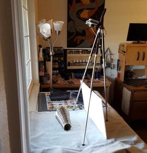
Step one: camera
Unless you've already got a good camera, your best bet is going to be a smartphone -- and make no mistake, smartphones are a close second, not a distant one. Modern smartphones are phenomenal, they’re far better than even slightly-dated digital cameras. They can't get you the soft-focus background that an actual, professional camera can (the lens simply isn't long enough), but you can approximate that effect with photoshop if you want to, and the set-up I'm demonstrating here doesn't need a fuzzed background anyway.
The only critical feature is that your camera can take sharp, in-focus pictures.
If you don't have a good smartphone, find a friend who does and beg/wheedle/blackmail/bully them into letting you use it for a bit.
Honestly, I've got a good camera, and half the time I still wind up using my phone because I’m too lazy to bust it out.
Step two: backdrop
There are a lot of artistic things you can do if you're taking pictures of a product in situ -- action shots, still lifes, pictures of it worn by models -- and all that will help your customers visualize themselves using the item, but it's also vital to have pictures of JUST the thing, pictures that cleanly and clearly show exactly what the customer is going to be receiving in exchange for the money they throw at you -- aka stock photos.
And for stock photos, you don't want to get creative with your background. In fact, if you can use the same background for many/most of your images, it will contribute to an attractive, coherent look for your shop. That means finding a neutral-toned backdrop that will work with any color item you put on top of it -- white, black, grey, beige, basically.
White can mean a lightbox...

(And there are a million tutorials online for how to rig up your own DIY lightbox)
...or another popular alternative is a white table pushed up against a white wall; the seam between the two is visible, but discreet enough that the eye glides right over it.
Black, you can do with cleverdick manipulation of the settings on an expensive camera, or you can find a non-reflective black backdrop -- which is easier said than done. Fine, dense, matte black velvet (think theatre curtains) is the go-to black backdrop, just make sure you run a lint roller over it before taking pics.
Any other color is going to depend on the backdrop you choose -- I personally have had excellent luck with some warm-grey velvet (?) yardage that I picked up for pennies at a goodwill a million years ago. (I’m not sure what it is -- it has the pile of velvet, but shorter?) I didn’t buy it for that purpose, but it’s since proven to be an incredibly versatile backdrop, and I’ve taken to using it for everything:
etc.
And even if you’re not stumbling onto a super-good-deal at goodwill, a yard or two of your chosen fabric will generally do you fine.
What I don’t recommend is:
- shiny fabric (anything shiny is overall more difficult to photograph -- and shiny spots will draw attention to themselves, rather than your product)
- vivid colors (limits what color items you can display on it; will often clash if the item is close-but-not-quite-the-same color (and what looks fine to your eye may not look fine on film); can distract from the item you’re showcasing)
- patterns (again, distracts from the centerpiece; draws attention to the background; moreover, is hell to clone-brush)
Here is all three of them being the perfect storm of not-a-good-stock-photo:
Which is not to say you can’t do something artistic with it...
...but it’s not very versatile, and it’s not exactly “stock photo” anymore.
One of the reasons I really really like velvet for a backdrop is that there’s nothing in the world easier to clone brush. Which happens, for instance, if I get my roll of photos transferred to the computer and realize there’s some lint I neglected to brush off, or if I was too lazy to iron my backdrop so it’s got wrinkles/creases in it, or if the angle I had to take the photograph from clipped the edge of the backdrop--

--it is super fuckin’ easy to clone all that out. (It also takes the burn tool really well, to darken the edges and point the viewer’s attention toward the middle of the picture, see above.)
Other backdrops that can work are fur (or faux fur):
The great outdoors: mulch, leaves, dirt, sand, etc--
(That was taken at my shitty old apartment complex, so I had to carefully remove the cigarette butts from the shot first. -_-)
(I admit I’ve mostly stopped using these kind of outdoor backdrops -- they’re harder to pull off than wood/concrete/fabric -- but in the hands of someone with an eye for composition, they can definitely be used to good effect, so I’m including them here anyway. You just want to make sure that the background isn’t distracting from the item, which you can sometimes do in post by darkening/fuzzing the background relative to the focal object.)
Concrete:
And wood:

In short, there are many things that are (1) unobtrusive and (2) neutral-colored that will make excellent backdrops.
Professional photography backdrops (essentially, the velvet I have) are close to true neutral, not affecting the “feel” of the picture at all, and there are tons of tutorials online to make your own DIY photography backdrops.
Conversely, you can also use a specific backdrop to help create the mood you want to convey for the piece -- concrete for gritty and urban; fur to evoke a rich and sumptuous feeling (or a primitive one, depending on what you’re selling); wood or rough-spun cloth for something rustic; dirt and leaves to take it back to nature.
I’m not going to say the sky’s the limit, because we’re talking stock photos not ARRRRT!!, you gotta rein it in a bit, but you do have a lot of options -- anything that’s not going to clash with the mood or distract from your product.
Step three: lighting
USE THE FUCKING SUN.
Don’t ever, ever use a flash for product photography, seriously, are you some kind of SAVAGE?
Cardinal sin right there; go straight to hell, do not pass go, etc. Lighting like that, your product looks like it’s drunk at a frat party.
Moreover, unless you are a wildly over-funded professional, and possibly not even then, there is no light source superior to the sun. Sure, if you finish your project at midnight and can’t wait to share it, take some snapshots in your shitty studio light and send them to your friends--
--but do not make that your product listing photo. You can do so much better.
(And notice the color difference too -- natural light tends to be much better at capturing color that is true-to-life. The second picture is far more accurate to the actual item.)
*
That said, direct sunlight is a HELL NO go. The shadows it casts are way too stark, and details can get lost because the camera has trouble navigating the gap between the super-dark parts of the picture and the super-bright parts.
And it turned out that I’d never bothered to keep any of the photos I took in direct sunlight (because they sucked), so for the purposes of this tutorial, I had to take a couple of my WIPs outside and go make some.
Direct sunlight:
The glare and the obvious shadows make these photos look strikingly amateurish. It draws attention to the background, highlights the fact that the bracers are just sitting in some lame dead grass. These photos look like someone finished making the bracer, carried it ten feet out into their backyard, and snapped a picture.
Which, yeah, is what we’re doing, but it doesn’t have to look it.
By contrast, indirect sunlight, when I move it four feet over into the shade of the house:
Right away, the diffused light (sort of soft-focus?) is more in line with what you see in professional photos. They still need editing before they’d be ready to roll out -- fiddling with contrast/saturation/white balance; clone-brushing out some of the distracting elements in the background; darker shading around the frame to center attention on the product -- but they have the potential to be decent photos now, instead of being critically flawed from the get-go.
When you’re using sunlight as your source, you’re usually going to be setting up either outside in the shade, or inside next to a window.
The context for some of these shots can also be hilariously un-sexy when you zoom out:

*
Sunlight tends to be much better at retaining the textural details of your work too, because more light means your camera can take a much quicker shot (low light = camera compensates by leaving the lens open longer to collect more light = blur).
If you want to really capture the fine texture of an item, natural light coming from one side (like through a window) is perfect, because of the shadows it casts:
On that note: if you’re trying to use a window as your light source, you may have trouble with the far side of the object being completely lost in darkness:
Which can be artistic, but doesn’t make for a great stock photo.
The solution is not to use another light source, but to use a reflector -- my go-to is white foam-core posterboard:
Which can fill in the shadows that are obscuring parts of your work:
Mirrors or foil can work for this too, but they tend to cast stark/uneven light, whereas the white board diffuses it, and diffusion is pretty much always what you want.
*
On the subject of diffusion: overcast days are your BEST FRIEND. They basically turn the whole sky into a lightbox for you. You get soft, beautiful light from all directions, muted enough to reduce glare, but there’s still more than enough light to keep your camera happy and your details sharp.
(Man I wish there were more clouds where I lived.)
Here’s an interesting little contrast -- this one was taken on a sunny day, but in the shadow of my house, using a white reflector to move light around:

And then the very next day we had rain, and I was like, hell yeah, and took it outside for more pics:
Obviously both have had the contrast increased to bring out the details, but the mood difference between the two is 100% the weather.
*
And that is FAR from everything there is to say on the subject of photography lighting, but for the purposes of amateur product photography, those are the important bits.
TL;DR:
- Natural light
- Diffused light
*
Step 4: post-production
This is also not something I’m an expert in, I’ve learned just enough to get by and called it good enough. (It’s why I lean on overcast days whenever I can, because it eliminates a lot of the lighting problems that I don’t know how to fix in post.)
But here are some of the things that you will find yourself needing to know, and should be looking up how-to’s on for your graphics editor of choice:
White balance/saturation
Light comes in different colors, but the human eye automatically compensates for it, so often times something looks good to your eyes, but then comes out way funky on film.
Indoor lighting tends to be yellow-hued, because that’s what feels warm and comfortable to humans, but it looks nasty in photographs:

Natural light tends to be white (which is why it gives you more accurate colors), getting more blueish as it heads toward evening:
You can compensate for both by adjusting the white balance, in which the program figures out what white is supposed to look like, and then calibrates all the other colors in the picture accordingly.
Brightness/contrast
Is it bright enough to see the details? Is the contrast high enough to make the details POP, instead of blending together into a muddle?
You can apply brightness/contrast adjustments to the full image, and then (if necessary) go in by hand with the burn/dodge tool (brightness up/brightness down) and add extra highlights.
(Don’t go overboard on this though -- this isn't art, this is a product photo, and if you take it too far from the real object, you are lying in your advertising.)
Blur/sharpen
Are the focal points sharp? Sharp areas of an image are what draws the eye, so if your photos are blurry, they’re no good and there’s no fixing them -- grab your camera and go take some more.
Is your background less sharp than the foreground? A too-sharp background will distract from the central point, so sometimes you can put a very subtle blur on it to trick the eye into ignoring it. (Dropping the brightness and the contrast are also both ways to make the background less eye-catching.)
Clone brush
Basically a mini copy-paste tool, you grab parts of the image and copy it onto other parts. This is good for tidying up your background -- coloring in corners that your backdrop didn’t cover, or removing distracting irregularities.
Again, this is one to be used sparingly, because this is product photography, it needs to be accurate, not idealized. You don’t get to scrub off the imperfections and make it look like you’re better at [whatever] than you are.
The only time I consider it acceptable to use the clone brush tool on the actual product is for editing out flaws in the leather itself. It’s a stock photo; customers are not going to be getting the exact item shown in the photo. I’ll be making a new one for them, one that’s not going to have those exact flaws. (It’ll have excitingly new and different flaws! Such is the nature of organic materials.)
Edge gradients
A subtle shadow around the edge of your picture brings the whole thing together, makes the background recede a bit, and directs the eye toward the centerpiece. Too heavy a hand with this will still look nice, but more staged; it alerts the viewer that you’ve been photoshopping and kills the “I woke up like this~” illusion.
Relatively natural:

Dramatic!
Watermarking
You want people to be able to find their way back to you when your work inevitably gets cross-posted without the source (fuck you in the face, pinterest), so it’s not enough to put your initials or abstract logo or illegible signature on it, you need your google-able name or company name.
At the same time, people have been known to crop out (or clone-brush out) watermarks that are big and tacky, so it’s in your best interests to make your watermark tasteful and inoffensive. (Also: ugly watermarks just bring down your whole image, seriously.)
Some of the pictures above are old enough that they’re sporting my older & less professional-looking watermarks, but what I use at the moment is this:
(But, y’know, smaller.)
Best way to do watermarks is usually to create another layer over your image and blend the two. For dark logo/light background, the settings for the new layer are 1) blend mode: multiply, 2) opacity: 85% (adjust as needed). For light logo/dark background, the blend mode is probably going to be “soft light.” And then just paste your logo in the corner of the new layer -- the blend mode means your logo doesn’t have to be transparent, the program just ignores the parts that are lighter/darker than the background.
*
And that, I believe, is the end. o_O I had no idea I had so many opinions on the subject of product photography.
Again -- I’m not a pro. I don’t know how to use 99% of my camera settings or 80% of my graphics program. (For fuck’s sake, my go-to graphics editor is the bootleg version of Paintshop Pro that I acquired in 1997.) This post represents the sum total of my knowledge on the subject.
But it just goes to show that you can do a lot with only a little, and that your composition and sense of aesthetics are far more important than what gear you’ve got.
#y'all should reblog this#because there are people who NEED TO SEE THIS#much obliged#gremble has opinions#tutorial#photography#diy#making this yo business#long-form tutorial
39 notes
·
View notes
Note
I absolutely love your blog! Your outfits are so well put together, and the whole thing has a really nice positive aesthetic. I'm curious though, what got you into fashion? And how did you learn to curate your look?
Thank you so much! And I’m afraid my answer for this stuff is always a bit useless, because I’ve been obsessed with fashion since I was old enough to be obsessed with stuff in general. A lot of the stuff that I do when putting an outfit together is completely instinctual; I just know what works and what doesn’t. I can tell you that these shoes won’t work with that dress, but I can’t tell you why. (I have the same problem with grammar and writing conventions, since I grew up reading so much that I never consciously learned the rules.)
I can give you a few tips on how to curate a wardrobe/aesthetic, but they’re pretty general. But also very long, as it turns out, so let’s continue this under the cut.
The first thing is just figuring out what you like and what you’re going for. I recommend using something like Pinterest and just pinning stuff every time you see something you like. It can be all kinds of things–runway models, someone’s selfie, a photo of a landscape, etc. After you’ve been doing this for a while, scroll through the board and think about recurring patterns. What are some things you keep seeing over and over again? Are there any colors that are present in most of the pictures you’ve pinned? Looking at that, you can figure out some stuff that you really want to incorporate into your aesthetic. Let’s use me as an example; looking at my Pinterest, I’m noticing some patterns. Right now, I seem to be into:
earth tones and neutrals, esp. dark green and off-white
stripes
athleisure
draped, loose stuff
fun details, like jewelry and embroidery
(My Pinterest actually tends to lag a little behind what I’m really into, because now that I’m a High Level Fashion™ I kinda do things in the reverse order of what I’m advocating here. So I’m actually into more tailored, somewhat professional stuff now. But this is a good way to start out.)
So I’ve got that. Now, I might think about my closet–what stuff do I already have? I definitely have some draped/loose stuff, and plenty of earth tones and neutrals. I also own a lot of jewelry, but I don’t wear most of it. So if I want to move closer to this aesthetic I seem to like, what do I need? I need striped stuff–I don’t have much–and athleisure clothing. I also might want to look for some embroidered stuff, and I should sort through my jewelry and get rid of the stuff I don’t wear.
With that in mind, I can go shopping. I find that having a list like this really helps keep me from a) spending too much, and b) buying random crap that doesn’t actually work in my wardrobe. If I know that I’m looking for stripes, athleisure, and embroidered stuff with an emphasis on earth tones, neutrals, and loose-fitting things, that rules out a ton of clothing! I can also go through stuff I don’t wear very often and see if any of it fits what I’m into, and maybe that clothing will get a second chance instead of getting donated.
(I do also recommend getting rid of as much clothing as possible, basically, because having stuff in your closet that you don’t actually wear much can make it harder to see the stuff you do like and wear. But I don’t mean “oh you should own thirty articles of clothing and No More” since I am absolutely a cluttered maximalist. If minimalism works for you, cool, but I don’t recommend it as a hard-and-fast rule. I just recommend getting rid of excess crap.)
Now, let’s say I’ve bought some new stuff, and pulled some old stuff out of the depths of my closet. Combined with the stuff that survived my hypothetical closet clean-out, I have a pretty decent wardrobe set up. It’s not totally complete yet, but I can definitely make enough outfits for most Life Stuff I have to do. Next, I have to turn it into outfits!
(A note on storing clothes–I’m boring and practical and do it by function. So shirts are together, dresses are together, etc. But I’ve found that, when I’m in situations where my closet ends up jumbled, I come up with some cool outfits because I see two things near each other and realize they could go well together.)
When I’m getting dressed in the morning (or picking my outfit out the night before, if I’ve got my shit together) I ask myself three things:
What’s the weather going to be like?
What am I going to be doing?
What do I want to wear?
These questions all interact with each other. For example, if I want to wear a crop top but it’s gonna be twenty degrees Fahrenheit all day, I’m shit outta luck. But what if it’s going to be forty degrees, and I want to wear a light, summery dress? I can make that work, with clever layering. Unless! What if I’m going to be outside a lot, catching buses and maybe walking through town? Then I might want to wear pants; a lightweight dress in cold weather only really works if you’re gonna be mostly indoors, no matter how well you layer.
Let’s use today as an example. Right now I’m typing this partially dressed–I didn’t have work this morning, and I don’t have to leave for class until 12:50 pm. (I should be doing homework in this time, but whatever.) So, what’s the weather going to be like? It’s going to be in the low seventies, overcast, with a low chance of rain later. What am I going to be doing? I’m going to class, and then I have work in the evening. I also rinsed my hair this morning, and the dye is fresh enough that it’s leaking/rubbing off on things a little still. Since it’s wet, I want to leave it down to air dry. That means I can’t wear anything too light-colored on top, since my hair will touch it and stain it; if it was dry, and I put it up, I could wear a lighter shirt. (It comes out with some stain remover spray and a wash in cold water, usually, but it’s not a risk I enjoy taking.) With both school and work, I want to dress a little nicer/more professionally. And, because of work, I have to wear a brightly colored top. What do I want to wear? Well, luckily enough, I want to wear a brightly colored top that I bought recently and haven’t had a chance to wear yet. And it’s orangey-pink, so once my hair’s air dried a bit more, the stains shouldn’t show.
This top works with the weather (although I may need a light jacket) and what I have to do today. Now, what should I wear with it? My black pleated skirt would be cute, but I just wore it yesterday. It doesn’t need to be washed, since it didn’t actually touch my skin and I didn’t do anything strenuous, but I don’t want to wear it two outfits in a row. My dad just made a trip up to drop off some things I forgot at home, including some bottoms. But none of those work; they clash with the top, aren’t right with the weather, or would just look a bit weird. Maybe a pair of jeans? It’s going to be cool enough that I can do that without overheating. I think my mom jeans would look too ‘80s-in-a-bad-way with the shirt, but my skinny jeans would look nice! And I can wear a random pair of compression stockings under them.
Now, with my skinny jeans, I have to wear boots. Which ones? Well, I also want to wear my newish watch, which will kinda match the shirt. It has a brown band. My brown boots will look nice with that, although I’ll need to remember to wear socks on top of my compression stockings, since those boots are a tad large. The boots are leather, and I’ve never bothered to seal them, so I try not to wear them when it’s going to rain. The chance is low enough, though, that I’m not worried about it. But wait! The brown boots have brass buttons, and the watch has silver parts. Oh no, not mixed metals! Well, I’ll have to make it obvious that it’s intentional–I’ll wear the chevron earrings that have a few different metals in them*, and I’ll mix it up with my other earrings too. I might wear a necklace, if I can find one that I think works.
None of my jackets that I have with me at college work perfectly with the outfit, so I’ll just grab my olive green one with the daisies embroidered on it. It’ll look fine, and I won’t include it in my photos. With my makeup, I’ll probably do some brown, and I might mix some metallic stuff there as well. I’ll most likely go for a darker lipstick, since bright ones would clash with my shirt.
So yeah, that’s my thought process picking out my outfit today–I started a lot of it last night, because I was thinking this was a day where I could finally wear that new shirt. It looks like a lot written out like this, but I go through it pretty quickly in real life.
I hope that helps!
*this is why I wear that pair so often lmao
3 notes
·
View notes
Text
Issue 1: Tass
How long have you had your store: I started officially selling clothes after I finished college in 2013 and moved back home to the suburban midwest, so I guess 5 years now! I was working at the local newspaper at the time but was looking for an extra way to kill time, not necessarily even to make money. I started with Poshmark and loved connecting with other people who liked similar clothes, which was actually kind of rare for where I lived. I loved being able to see people showcase their own style in the form of their own closets and let people “shop their closet”. I also became really interested in clothes trading, which I like doing with my irl friends, so the fact a lot of people were willing to trade items was also really cool to me and something I hadn’t seen before.
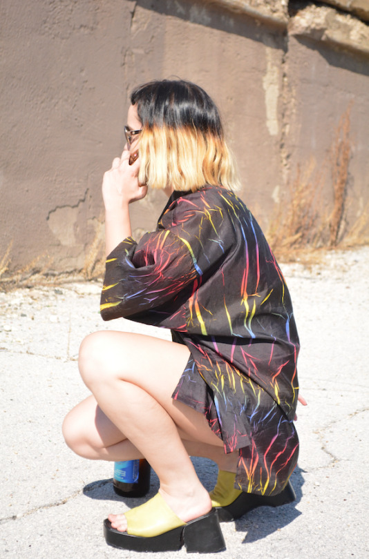
How would you describe your shop? I think the clothes I sell are kind of more one-off like something that would be worn as a funny statement piece - I love a bright color and bold pattern, power clashing, and anything rainbow, glittery or that can incorporate faux fur in a tasteful way. It’s pretty reflective of my midwestern lifestyle and probably the clothes I consistently have the most of are windbreakers and winter coats, the main way we can express ourselves here for half of the year or more… There are a few sticker art projects I have in my store that I started doing around 2012 out of boredom when I was still in school, the most prominent one probably being the 6 foot tall Britney Spears poster that’s completely covered in (vintage) Lisa Frank stickers but never intended to actually finish or take seriously. Over the years I used sticker collaging as a way to keep my mind off things and have it be a means to add color and vibrancy to otherwise more plain posters/art.
When I first opened my shop in 2013, I made a holographic wall out of posterboards to hang my clothes on and that was my first store display on Poshmark and Etsy and always tried to have unique ways to show my clothes ever since, and to change the look of my store at least once a year. I’ve wavered between thinking having consistent “branding” is best and thinking it’s best to change as my ideas change, and have ended up going with the latter at whatever expense that has had, resulting in my store bio now being “Hi I’m Crazy Branding” lmao. The last time I re-did my store I got a mannequin from the city off Craigslist that I painted hot pink and move around my yard or put against different backdrops/bright colored walls to model the clothes. At one point I put velcro on the back of all my stuffed animals plushies and trolls and stuck them to a white wall in my apartment I was living to use as the background. I used to love to bring around solo holographic poster boards to my friends’ houses before we went out so that we could all take pictures behind them as the backdrop, portable aesthetic is essential.
What era or year is your favorite in fashion? My favorite looks are early 90s minimalistic grunge but not too minimal - Black jeans, velvet dresses, and plain tees, all of that, but then on the flip side I love the super excessive part of those eras of fashion too, like rainbow everything and floating glitter inside plastic holographic accessories. My favorite outfit of all time is something my aunt gave me from her 80s closet, it’s a long elastic teal leopard mermaid-style skirt with a matching teal leopard flowy button down shirt, all cotton and polyester. I love outfits that are completely matching like that and have been seeing that lately in brands that I follow, so I hope that sticks.
What item of clothing in the world are you lusting after or saving up for?
One of those new robot dresses that react to your moods or whatever lmao but if I’m being more realistic there is a designer who I really love that I found on Instagram who knits beaded sweaters using like thousands of different colored beads and completely covers them. They’re works of art and I would love to have one some day and be able to support an artist too! I’m definitely always lusting after new pairs of plain black pleather platform (but not too high anymore) shoes. I love the brand Hot Lava and I guess if I'm saving up for one thing it would be their "Barbed" rainbow matching bralette/pants combo.
Favorite clothing brand/brands and why? Since I usually only buy thrift for myself these days, my favorite brands are probably just based on design only but I love Discount Universe and other sequins-covered clothes or otherwise outlandish/tacky patterns, especially if they’re owned/designed/produced by women - Wacky Wacko, I have the Tabloid Dress they made a few years ago and it’s one of my favorite of all time even though I never wear it I also LOVE everything from Big Bud Press and YardSale666 in general.
What music do you like, does it play a role in your personal style? The music I listen to most now is probably "experimental pop" and growing up I loved pop punk. Both of those have affected my style and stayed with me to this day, I still wear skinny jeans and slip on Van-style shoes most often no matter what else I’ve layered on top of it. I used to like to purposely wear edgy clothes and do my hair to provoke a reaction out of people when I was younger - my brother would pass down band shirts to me that said things like “What the F*** are you looking at?” (lol) and I would cut them off into a crop top and wear it with a super long high-waisted thrifted pink and purple plaid skirt. That was definitely my go-to outfit for like an entire summer straight. I’ve always liked clothes that makes a statement even if it’s in a literal way with words, clothes with a lot of text on them, and I really like the new wave of DIY embroidery, especially on thrifted or up cycled clothes. Band tee shirts were also just like a huge part of growing up for me, buying them at shows and collecting them and wearing them all the time. Also in my shop I have a guitar that I completely stickered/bejeweled which was one of my longest running projects that I really want to make more of. It was one of my brother's old acoustic guitars that he let me completely deck out and it perfectly combines the femme pop elements I love with an actual instrument. Music and fashion are so intertwined all the time I think, and clothes/accessories are something that always stuck out to me about singers and bands too! I love how fashion plays a role in music today too and can make or break an entire aesthetic or era.
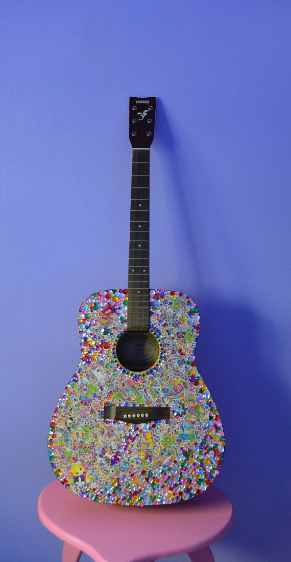
Does living in your city/state inspire you? Where are you most creative? Yes lmao living in rural suburban Illinois actually inspires me a lot and I’m probably the most happily creative here. When I lived in the city, things were a lot more stressful so it made me work on a lot of projects to distract myself, but I eventually burned out from that pretty bad. I get inspired by midwestern people but mostly in a way that most people find cringey, I mocked it more when I was younger but now try to tastefully incorporate it into my looks. State Fair Chic is inspiring to me. My mom has a lot of handpainted and iron-on sweatshirts for different holidays that are staples of my closet. Living in the midwest and being bored definitely made me thrift more and imo makes the thrifting better, it made me always be working on craft projects, and always changing my hair and style.
What things do you love to create? I think my favorite things to create are entire rooms and looks, I like to make different aesthetics through combining colors, furniture and fabrics that all feel familiar even if it’s a little chaotic. My long term project with my bedroom was turning my walls of thrifted art (with 20-30 framed pictures) into matching colored frames that fit the whole look of the room, so I guess just really getting at the details of design. I think I’m pretty tacky so I like to stick to things that embody that and will always love stickering huge projects, painting everything plain into bright colors and incorporating anything I find thrifting or in the garbage into larger art aesthetics. My favorite thing to do is thrift and upcycle clothes, furniture, wall art, lamps, etc. anything that I see “potential” in lol.
Who are some of your favorite artists?: There are a ton of artists I follow that inspire me every day, definitely just “regular” people or like more lowkey artists. People who thrift or collect and refurbish toys are amazing to me and I love the doll community on IG. Witches or people I’ve met through astrology who are creating more spiritual art inspire me every day with their words and presentations. I also love comedians and movies, I love John Early and Kate Berlant and recently saw they collaborated with Peggy Noland and Seth Bogart of Wacky Wacko so that was iconic to me.
I collaborate a lot with my brother who has done a lot of graphic design stuff for me over the years. He makes resin toys of his own and designs t-shirts. He’s great at painting and drawing, two skills I never was good at that I really appreciate in him that he is always willing to lend a hand to me. He is two years older than me and went to school for advertising so exchanging ideas and doing projects with him is something I like to do too. He also has more of a background in music production so we recently started trying to make music together. We both love combining fashion and music!
What album do you recommend to pick up ASAP? Hayley Kiyoko - Expectations, hands down the vibe for summer
Follow Tass on Depop!
Depop.com/trashbitch
1 note
·
View note
Photo


Our Beloved Sponsors
We’ve had a great year at Put This On, and we’re excited to bring you more content in 2018. This year, we added a new contributor (Richard), and we’re aiming for a site redesign in the next month or two. All this has been possible thanks to our sponsors. So, before the year closes out, we’d like to give them a special shoutout and update readers on our sponsors’ happenings.
There’s only one tie for black tie events: a black bow tie. The Hanger Project just released a new range of them. Skillfully handsewn in Paris, using soft silk fabrics, they’re available in nearly a dozen styles -- diamond points, batwings, butterflies, etc. This is the tie you need if you’re wearing a tuxedo, but a black bow tie can be even used to dress up a dark worsted suit. You can wear one with a navy suit, white shirt, white pocket square, and black oxford shoes for special occasions, such as the New Year’s Eve party coming up.
Proper Cloth just added some new cotton-cashmere blend shirts this week. They’re woven in Italy as part of the Thomas Mason collection, a brand for exceptionally high-end shirt fabrics, and the 15% cashmere mixture adds a bit of softness to that Supima cotton yarn. Aside from being wildly soft, they’re also warmer and more refined than your traditional cotton flannels. With New Year’s Eve coming up, Proper Cloth also has nice guide on how to choose the right tuxedo shirt.
If you’ve been thinking about picking up a Chipp tie, now is the time. The cost of silk is increasing, which means Chipp has to raise the prices on their grenadine and ancient madder neckties soon. The new price has yet to be determined, but the change is coming mid-January (current prices will be honored until then). We’ve said it before, but a navy grenadine is one of the most useful neckties you can own. It adds visual interest to solid colored sport coats, while remaining neutral enough to not clash with patterns. Black, burgundy, and dark green are also useful, although Chipp has them in every color under the sun. The ancient madder ties, meanwhile, can be worn with tweed sport coats and flannel suits in the fall and winter months.
Today is the last day for Dapper Classics’ end-of-year sale. Customers can save an additional 25% on already marked down items in the sale section by using the checkout code YES17. There are a ton of Dapper Classics’ signature socks in there. These are made in the USA using fine cottons and wools, and have handlinked toes for comfort. The cottons are unique in that they’re made with an open weave, which makes them breathable in the warmer months, but also very durable.
Huckberry is also having a clearance sale, where you can find select items discounted as much as 60% off. There’s a ton of stuff here from coveted brands -- Taylor Stitch denim shirts, Snowpeak fleece jackets, Corridor field jackets, Raleigh Denim jeans, Rancourt moccasins, Patagonia bags, and a whole lot more. There are also a bunch of handsome watches here if you want something better than your basic Timex, but don’t want to spend four figures.
Finally, our thanks to Twillory. Their current end-of-season promotion runs through New Years, then prices go back up. For the moment, you can pick up four dress shirts for $179 or five for $209, bringing the price of each as low as $42.
If you want to advertise on Put This On, just email us at [email protected].
4 notes
·
View notes
Text
8 ROOM MAKEOVER IDEAS PERFECT FOR MOTHER’S DAY
https://ift.tt/3fwHpYu
Mother’s Day is right around the corner and because moms deserve the best – the perfect gift can be tough to shop for. To make things even more tricky, you can’t exactly go browsing at the mall or her favorite store right now. But don’t worry. What if instead of buying something, you fixed up a special space for mom in her house? Having an organized space for creative projects, relaxing, or reading is one of the best presents you could give mom this year.
Check out these 8 room makeover ideas and create the perfect retreat for mom this Mother’s Day.
1. Craft Room Makeover
Does the mom in your life love to scrapbook, knit scarves and blankets, or transform vintage yard sale finds into works of art? Fixing up a special spot for her to harness her creativity and tackle crafts may be the perfect Mother’s Day gift. If there’s not already a designated spot in the house for a craft space, find an unused nook or simply set up a small table in a guestroom or home office. You don’t need a ton of space — just room for the essentials. If she already has her own crafting space, organize that messy area as a Mother’s Day surprise.
Must-haves: A bulletin board — complete with inspiration shots — is a fun way to personalize a craft room’s style without having to add additional art. Besides the basics, consider ordering a new set of colorful pens and pencils online.
Decorating tip: If you don’t have a standard desk to use for storage, items that normally go in a drawer — like scissors — can be hung on hooks for functional wall art.
2. Reading Nook
Most moms would love a little more time to themselves. Set up a spot near a sunny window or bookshelf for curling up with a book. A window seat is the perfect potential reading nook. Add a shelf with some of her favorite reads. Fluff up a few pillows and blankets to make it cozy. If there isn’t a window seat in her home, you can achieve the same feel with a comfy chair in a well-lit corner.
Must-haves: Accessorize with plenty of big pillows and a soft blanket or two. Don’t forget a small table to hold cups of tea. Make sure this room makeover has adequate lighting or a lamp nearby for late nights or stormy afternoons – especially if she lives somewhere like Portland, OR, or Seattle, WA where it’s often overcast and gloomy.
Decorating tip: Consider putting in an easy-to-install curtain around the nook for privacy (and naps).
3. Baking Station
If she loves to bake, setting up a baking station is as much a gift to yourself as it is to her. Regardless of the kitchen size, it’s worth it to get inspired and designate a place for all of her baking supplies. Fill a small, portable cart with essential ingredients, tools, cookbooks, and recipes.
Must-haves: Glass containers make it easy to find basic ingredients. Keep a few cutting boards, whisks, rubber spatulas, and rolling pins on the cart too. Think about what mom likes to bake and add the appropriate items — cookie cutters or cupcake liners, for instance.
Decorating tip: Make sure the cart can be stored when it’s not in use. If there just isn’t enough room for it in your mother’s kitchen, consider clearing and organizing a shelf near a convenient countertop or workspace as a makeshift baking station.
4. Home Office Makeover
If your mom typically works in an office, she is likely working from home right now. But even if she’s retired, having a space to work on her own special projects is important. It doesn’t have to be particularly grand. It could just be a matter of helping her clean up a cluttered home office or kitchen desk space, sliding a desk and chair into an empty closet, or transforming an unused hutch into an easy-to-clean home office.
Must-haves: Make sure that whatever space you choose has adequate lighting, outlets, and internet access. Complete the room makeover with a few patterned boxes, a fun bulletin board, and a unique mouse pad.
Decorating tip: If you’re helping mom set up a small home office, keep in mind that you don’t have to store everything nearby. Store extra paper, files, and other less-used supplies in labeled boxes and in another room.
5. Bath Sanctuary
Moms always deserve to be pampered, but this is especially true on Mother’s Day. While we typically send our moms to the spa to get cared for, she can still have a luxurious spa experience from the comfort of her home. A great place to start is to design a relaxing space for mom to take the ultimate spa bath at home.
Must-haves: With the right tools, an average bath can become a place for pampering. Accessories are key with this room makeover — candles, plush towels, silky bath oils, soft soaps, and sponges should all be laid out. Don’t forget to clean the bathroom too. It’s difficult to relax in a bathroom that’s a mess.
Decorating tip: Take into account that scent is a huge emotional trigger. Choose subtly scented candles and bath oils that blend, not clash, with one another.
6. Relaxing Outdoor Space
Maybe mom’s outdoor space is a place that relaxes her more than a bubble bath. Sweep off an outdoor patio or rake the dead debris out of her garden. Freshen things up with a new layer of gravel, freshly potted plants, or even a newly planted tree.
Must-haves: A truly comfortable outdoor space has all the makings of a great indoor space. Hang up some wind chimes, add side tables for iced tea and magazines, bring out cozy pillows and blankets, and ensure there is good lighting (whether natural or artificial).
Decorating tip: Adding aromatherapy to the outdoor space in the form of fragrant plants is a quick way to create relaxation. Incorporate potted plants, or plant them in the ground around your seating area. Lavender, gardenia, and clematis are all great options that provide a light and sweet fragrance that can last through the summer.
7. Organized Closet
Create a celeb-worthy closet space for mom. Even if she doesn’t have a magical dressing room, a few personal touches can make even a plain closet worth spending time in. Organize clothes by color and try to make things accessible and easy on the eye. Replace any worn-out sweater boxes or shoe racks with labeled alternatives, hang purses and jewelry on the wall, and neatly fold clothes in drawers.
Must-haves: Place wall hooks on the inside walls of the closet. This will act as a designated space for scarves, belts, purses, bathing suits, etc. Additionally, it will allow mom to quickly grab frequently used items and accessories.
Decorating tip: Fluorescent-lit dressing rooms have taught us that lighting makes all the difference when trying on clothes. With this room makeover, make sure mom has a flattering spot to put her outfits together. A floor lamp could be a nice alternative to harsh overhead lighting.
8. Clean House
If there’s one thing mom shouldn’t have to do on Mother’s Day, it’s clean the house. It doesn’t sound that fancy, but if she is too busy to do it herself, cleaning her house can be the perfect gift. Deep clean her kitchen, bathroom, living room, and bedrooms. Clear her clutter and get things organized. You can take on the task yourself, or give her a gift card to a cleaning service so she can schedule it on her own time.
Here’s the link to the original article:
https://www.redfin.com/blog/room-makeover-ideas-for-mothers-day/
Call Brunswick Organizing Solutions now if you need the help of a professional organizer in decluttering your home and keeping it clean and organized.
Brunswick Organizing Solutions
Leland, NC 28451
910-477-3768
https://www.getorganizednc.com/
Cities Served
Leland, Wilmington, Shallotte, North Myrtle Beach, Southport, Bolivia, St. James, Oak Island, Ocean Isle Beach, Sunset Beach, Carolina Shores, Calabash, Castle Hayne, Burgaw
from Blogger https://ift.tt/2W4eFhS
via IFTTT
0 notes
Last Seen Blogs
meow-0-meow
meow

leahmakin
What The Mad Mind See's
sxgars
𝒔𝒖𝒈𝒂𝒓𝒔
benpolo
this blog is rated t for trash

resi-horror-fan
give me coffee or give me death