
chupii0ni
Limi
❀She/Her❀﹥ I still working in improving my art.﹥ If I post, please don’t take my work without credit.✧Canadian/Cambodian✧
15 posts
Don't wanna be here? Send us removal request.
Last Seen Blogs

3585world
World 3585

ghostietoadart
Ghostie Toad
aurlu-gives-me-full-life
AurLu Gives Me Full Life


constructioncondos
Pre Construction Condos
Text
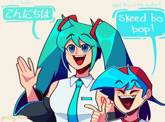

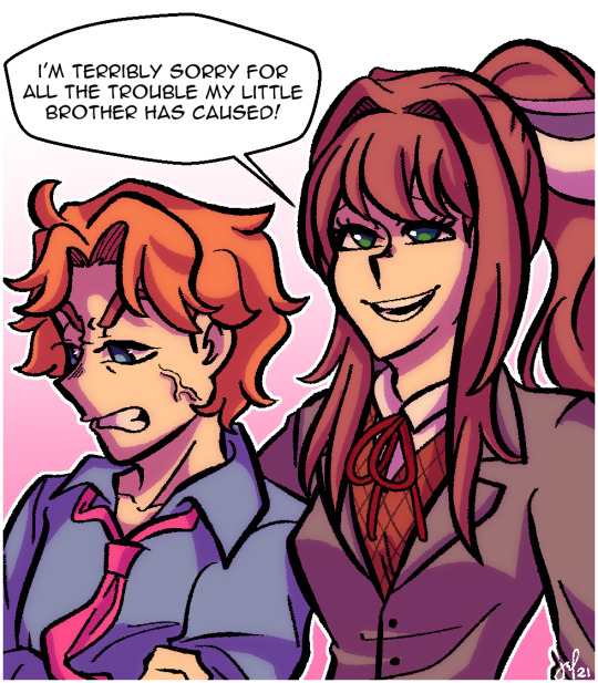
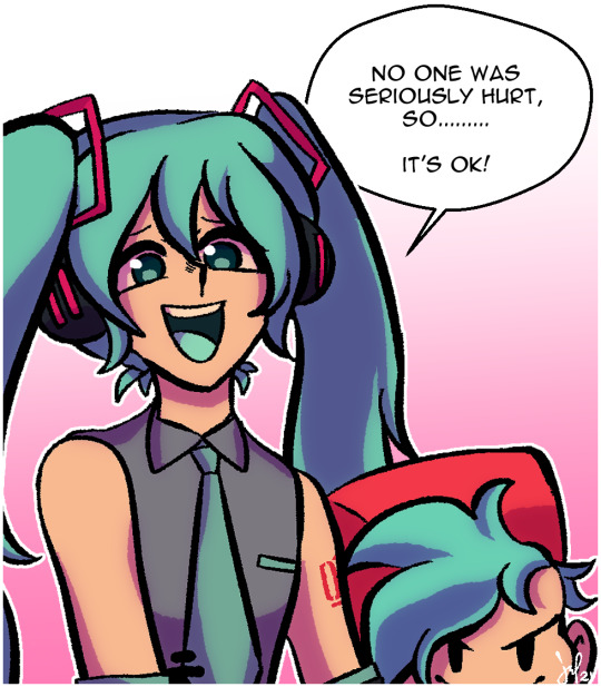
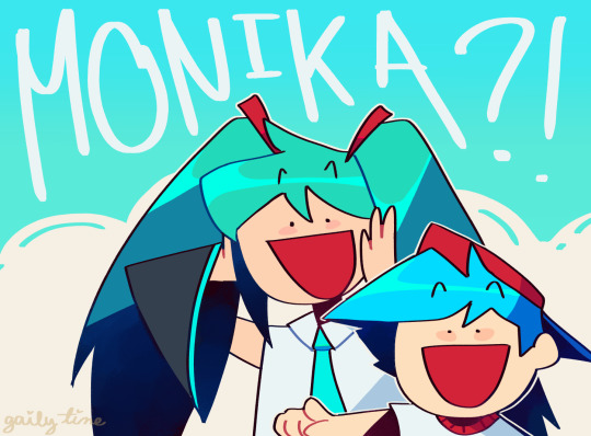
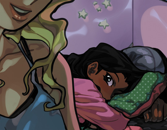
Show off and tell [sisters edition]
This comic just gave me a gallon of serotonin and decided to finish this silly comic!
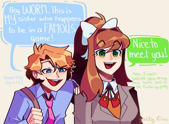
Alt. Ending
28K notes
·
View notes
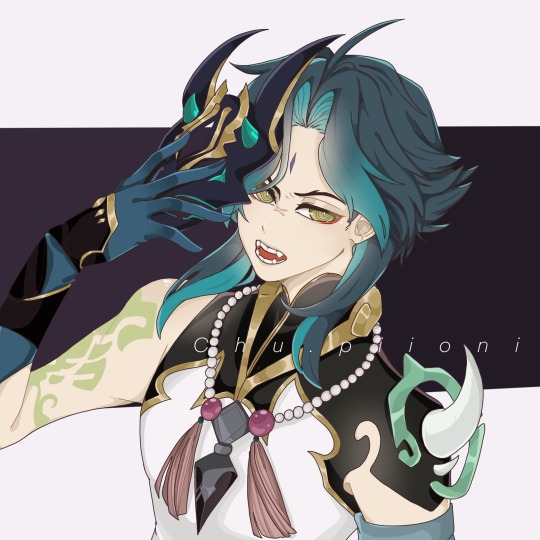
Text

ARCHON OUTFIT TIMEEE
62 notes
·
View notes
Text
Xiao time
16 notes
·
View notes
Text

It is the water boiiii
34 notes
·
View notes
Text


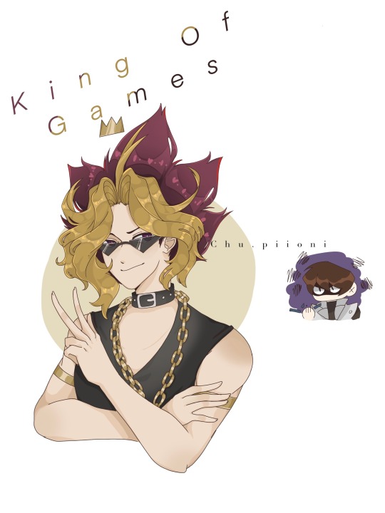
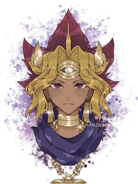
Look at the tiny Seto, and school has been killing me.
I rarely do anything detailed for my post but in case, please don’t erase my watermark.
#digital art#digital illustration#anime#anime art#yugioh#art#atem/yami#yugi moto#seto kaiba#yugioh atem#yugioh yugi#yugioh seto kaiba
24 notes
·
View notes
Photo

Little previews of my vision pieces for the @get-your-gay-on-zine! Pre-orders are open now!
671 notes
·
View notes
Text

Gonna give him all my hugs rn.
78 notes
·
View notes
Text
Inuyasha my first anime I watched as a kid.
169 notes
·
View notes
Text
Phos in a nutshell


It's not even a hundred chapters yet and Phos is now resorting to genocide
3K notes
·
View notes
Text

When chapter 95 still hurts.
#digital art#art#anime art#digital illustration#houseki no kuni#the land of the lustrous#lapis lazuli
73 notes
·
View notes
Text
I miss Yugioh a lot, and I am determined to watch it!
125 notes
·
View notes
Text

Second post! Sucrose from Genshin impact!
29 notes
·
View notes
Text
so a while back I made a “how-to” for how I render gold for shits-n-gigs. Recently, I had to reference this myself because I straight up FORGOT how I paint gold in the middle of working on a commission.
Figured it would be fun to share, if yall want to know my gold painting secrets (spoiler, im very lazy and just want the fastest and dirtiest way to get something done. and for me, this is it)
Here is my no-fail, 10 step (it sounds like a lot, i swear its not) method:

1) Draw thing
2) Ink thing. When inking I draw big “I” shaped black chunks on metal stuff. Usually I’ll put one thick and one thin next to each other. If I’m being especially lazy, I will literally just draw a black scribble in a vauge I-ish shape.
3) Flat color block. I usually go for a mid-tone yellow-ish color. Not super saturated.
4) Shading. Use a more saturated color several shades darker. I focus the shading around where I inked those black “I” shapes. I wrote to be mindful of a light source, and this is what you should do. But I’ll be honest, I usually just shade around the edges.
5) LIGHT. Use a bright saturated yellow color. I usually pick one and then color adjust as necessary once it’s blocked in. Catch the rims/edges of objects. I usually use more of those double “I” shapes in the middle.
6) SPECIAL EFFECTS BAYBEEE. Douplicate highlight layer. Set it to “Add.” Use gaussian blue until it glows to your liking. Adjust opacity as you like.
7) ONE MO ‘GAIN. Repeat step 6. Set to “Color Dodge.” Adjust hue/opacity as you like.
8) Futz around till you like it. I like to add more color dodge above the ink layer to brighten some spots. This is optional.
9) Corrections. Assuming you’re working on a non-white background, those Add and Dodge layers will show over the edges of your lineart. This is where I take a soft airbrush eraser and remove what I dont like.
10) Final futzing. Sometimes I’ll add a dark blue Overlay layer to reduce saturation and increase contrast. Added some “shinies.” To do this draw some thin cross-shaped lines that taper at the ends. Duplicate layer. Change layer mode to “Add.” Use Motion Blur in the same direction as the cross long-ways.
AND YER DONE CONGRATS. Are there better ways? Eehhhh probably. Do I use them? Nah. This is what works for me and my work-flow, so feel free to try it out if you want! ✨✨✨
12K notes
·
View notes
Text
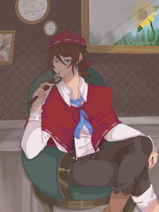
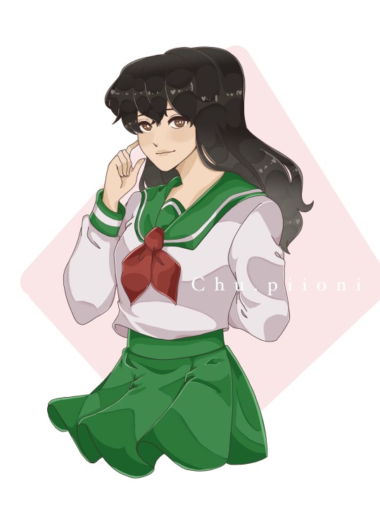
Edgar Valden as first post!! I really like his character design and his plays.
17 notes
·
View notes