
helloneato
HELLO NEATO
a dual designer forever building a creative world around her bum ticker graphic design | textiles | typography
33 posts
Don't wanna be here? Send us removal request.
Last Seen Blogs

gawkinggeeks
Gawking Geeks
spicybeefu
beefu's art!

nerdychaoscherryblossom
Sam the Tumblr Fan
fear-the-coward
+ FEAR +
lucky0stars
Lucky ~ Stars
Photo
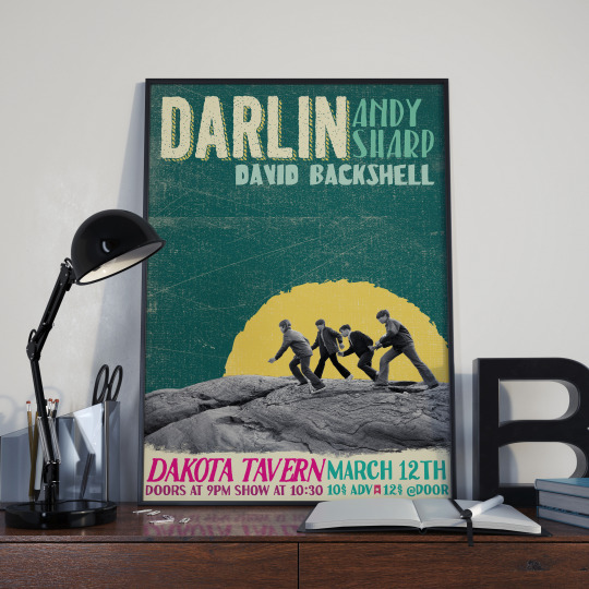


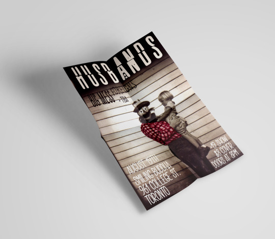
Kevin Butler requested a poster design for a show he was to host and play with two other local musicians. He asked for something with grit and texture but light in mood. Using digital collage and several layers of brushes, they collectively were happy with the final print and the provided formats for social media promotions.
4 notes
·
View notes
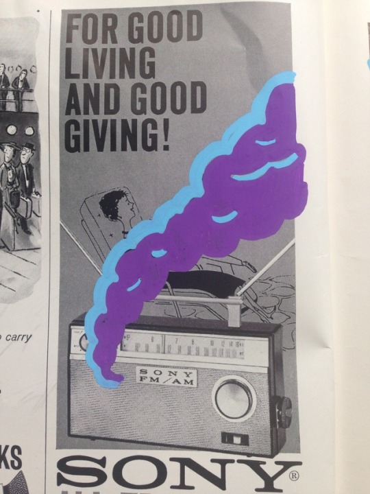
Photo
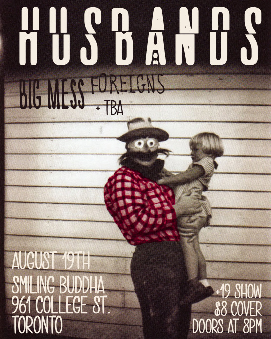
Wanting to continue the band's "dark and weird" visuals, I selectively colorized a vintage photograph of an unsettling Halloween costume from the 1940's.
0 notes
Photo
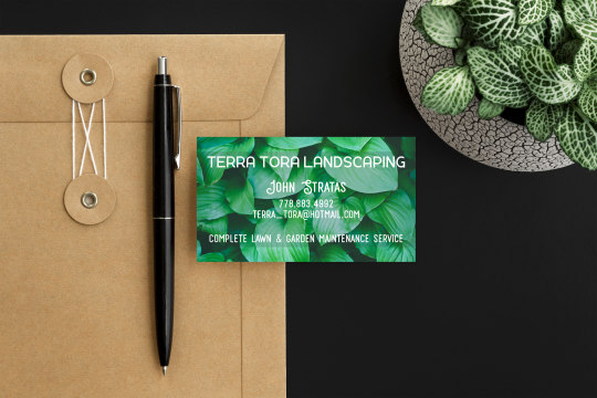
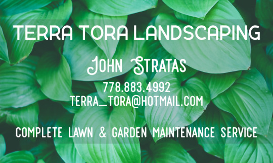
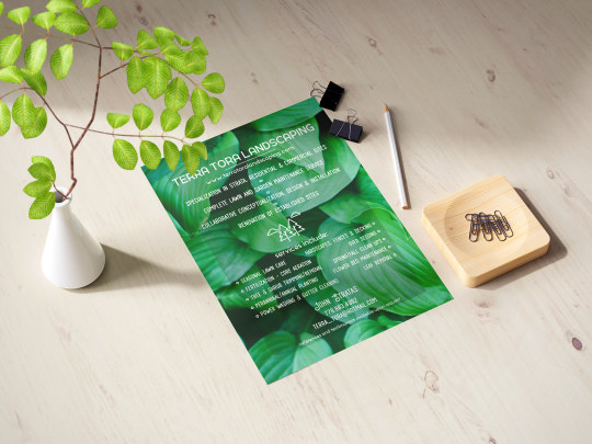
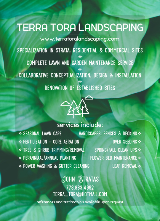
John had grown tired of his old cards and flyers he had been using for nearly 5 years. He asked me to design new and eye catching print files to promote his landscaping company.
#idenity design#graphic design#flyer#flyer design#business card#identity design#print design#vancouver
2 notes
·
View notes
Text
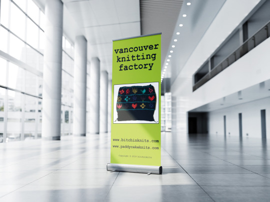
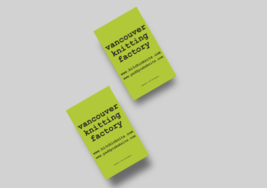
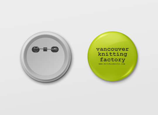
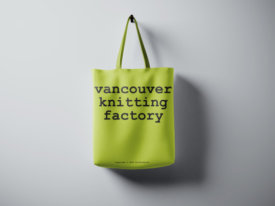
This client came to me wanting a refreshed look to her small business. I kept with the charteuse green she loved and went with a more clean typography that held that vintage feel she was hoping to keep. I stripped away the crowded info and photos from her previous branding to have her brand name be the focus and stand out in the bustling of craft market crowds.
#vancouverknittingfactory#vancouver#crafts#knitting#market promotion#promotional material#pin#tote bag#banner#business card#graphic design#idenity design
0 notes
Video
playing with pattern color ways can be a bit dizzying
2 notes
·
View notes
Photo
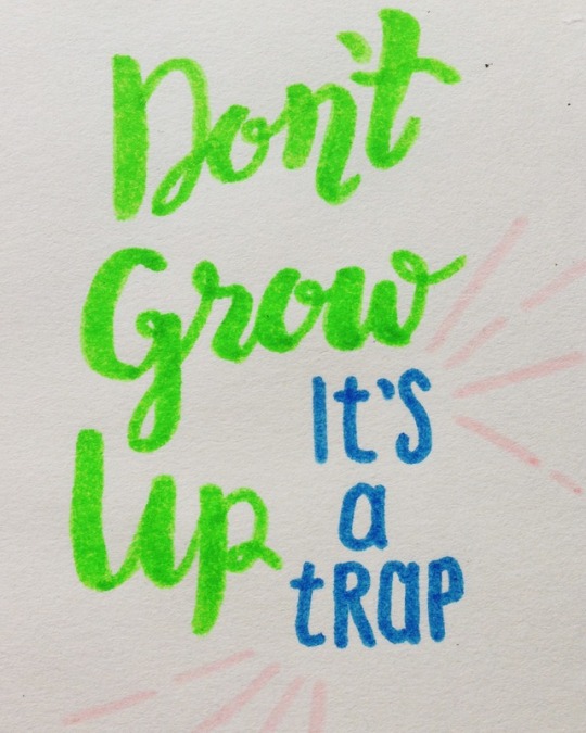

quickie lettering practices
1 note
·
View note
Photo


Posca paint markers are a game changer
2 notes
·
View notes
Photo
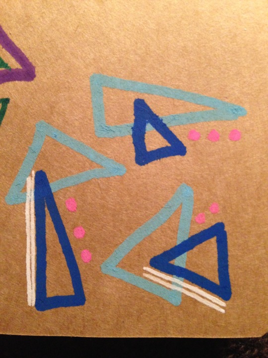
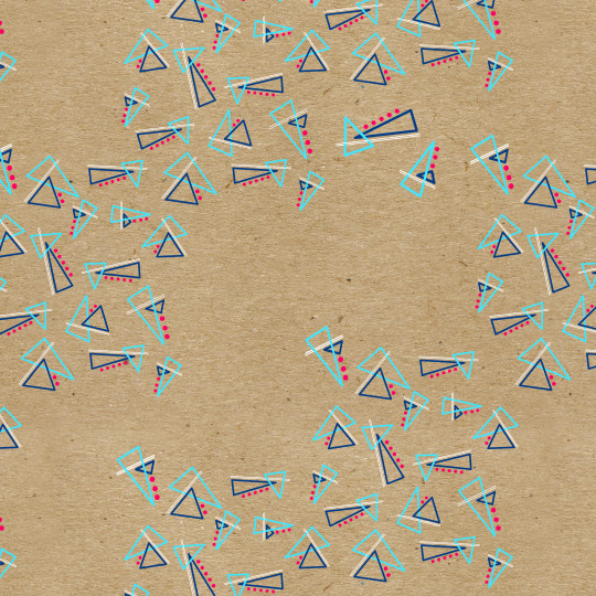
the start of a new little project with Clotho.co, a digital printing textiles company based in East Vancouver.
Print of the Week : Triangles Blue
Starting with a quick doodle with paint markers on kraft card then duplicated in vector for digital printed fabric. Loving the combination of vector and photograph! something to play with soon again
#patterndesign#surfacedesign#graphic design#dualdesigner#triangle#digital printed textiles#textiles#Vancouver#eastvan
2 notes
·
View notes
Link
shoot me a line about any projects you may have in mind or simple for a quote. together we can say something neato!
0 notes
Video
vimeo
ARTIST WEBSITE Design animation from HelloNeato on Vimeo.
a little animation to show the navigation of an artist website design
0 notes
Photo
Rotations of rain
Maddy Young, 2016
(a small gift for my friends Stef and Adri)
9K notes
·
View notes
Photo
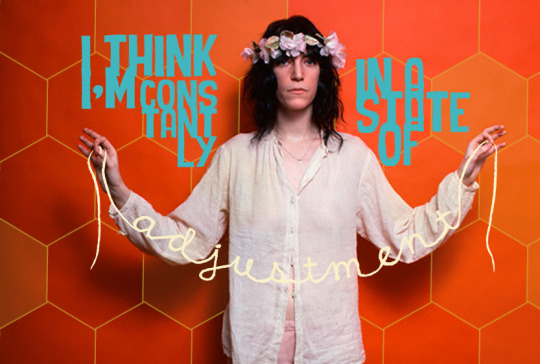
my lady hero and the strength in her words
1 note
·
View note
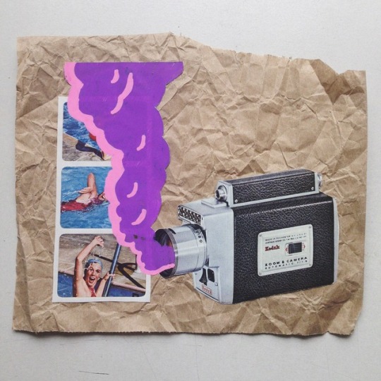
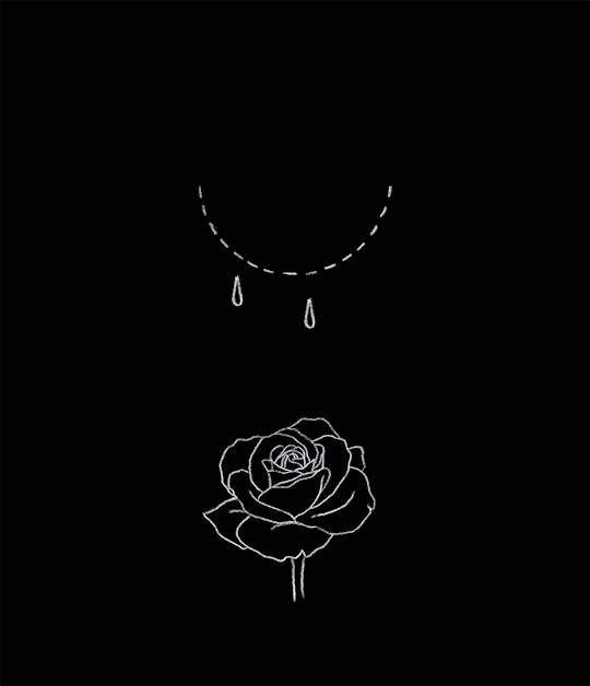
Photo
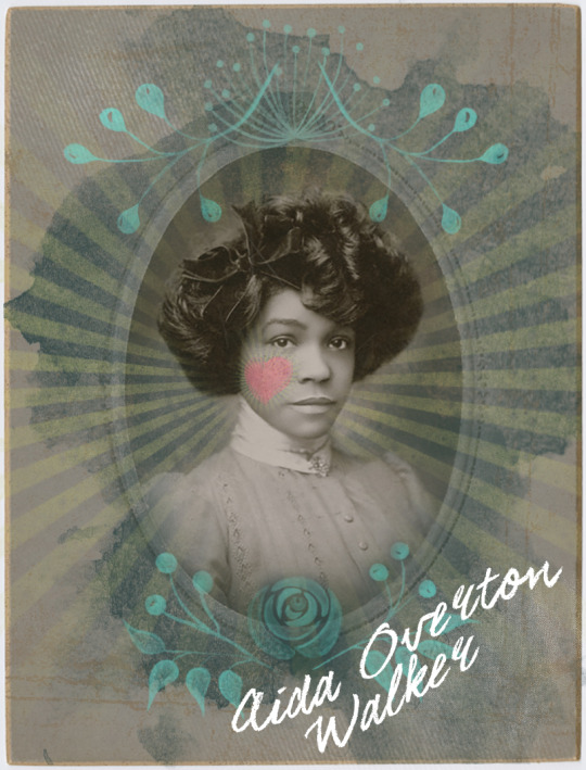
came across this lady going through the NYC Public Library scans and danced with it in photoshop
2 notes
·
View notes
Photo
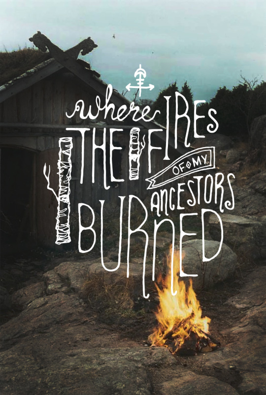
ben howard lyric
1 note
·
View note