Last Seen Blogs

kudae
They Mean Nothing • And Yet They Are There

howtoemails
How to fix email problems

sweatyfuryenemy
Fetch The Bolt Cutters

victorsierraecho-blog
Love the travel and adventures

book-binder
Caitlyn Reads Books
Photo

i’ve been practicing my pixels!
228 notes
·
View notes
Photo

little house!!
82 notes
·
View notes
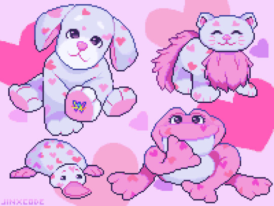
Photo

littlest pet shop!!
112 notes
·
View notes
Video
youtube
look at these guys go!!
12 notes
·
View notes
Link
hey guys! if you didn’t know, i also post music! you can find some of my stuff on my soundcloud :]
2 notes
·
View notes
Note
hi!! i’ve recently started a portfolio project with some friends to create a retro styled game. while i like to think i’m decent at digital art i still struggle with pixel art and i absolutely adore your style and pixel pieces. if it’s alright can i ask if you have any tips for working with pixel art?
aww, thank you so much!! <3 i'm not an expert by any means, but i would be happy to share a few tips that may help you out!
first things first, i use aseprite as my program while working with pixels! however, you can make do with any art program that has a binary tool :]
1 - Coloring the lines!
something that i think can add a lot to pixel art is coloring in the lines in specific places to suggest a softer edge, or difference in lighting (and accuracy aside, it looks more interesting!)
2 - Shading!
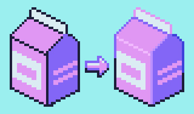
when it comes to shading, there are a lot of different ways you can do things based on your own style!
personally, i tend to avoid what's called pillow shading, which is basically just shading around every outline of the art with no difference in weight. i also prefer not to make the shading overly detailed with too many different colors, as it can muddy up the palette and readability (especially with smaller sprites!)
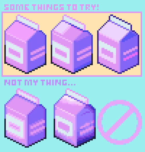
out of the three examples on the top, the first one is what i would personally use! sometimes just having simple shading is best, but it really depends on the size...
3 - Sizing your canvas!
one of the most important parts of pixel art is a choice you have to make before you even begin the artwork, which is how to size the canvas.
if it's too small, you may not have enough room to fit all the details
if it's too big, there may be parts of the sprite that seem barren and kinda wonky
... so use your space wisely! depending on the thing you're trying to draw, a larger or smaller canvas may be more suitable.
4 - Color Palette!
another small tip is to try and re-use as many colors as you can from your existing palette! it's fine to add a color here and there as needed, but using as few colors as possible can make your artwork feel a lot more coherent
---
i hope this helped a bit! if there's anything specific that you would like some tips on (making character sprites, tilesets, etc), just let me know ^__^
#art tutorial#art tips#pixel art#pixel art tutorial#pixel art tips#pixel tutorial#how to make pixel art#tutorial#how to#resource#game dev#pixels
291 notes
·
View notes
Photo

tralala
15 notes
·
View notes
Photo
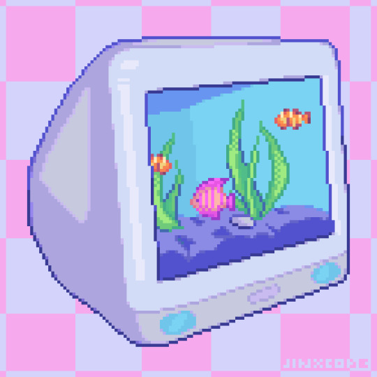
fishy fishy aquarium screensaver...
360 notes
·
View notes
Photo

fun things!!
151 notes
·
View notes
Photo
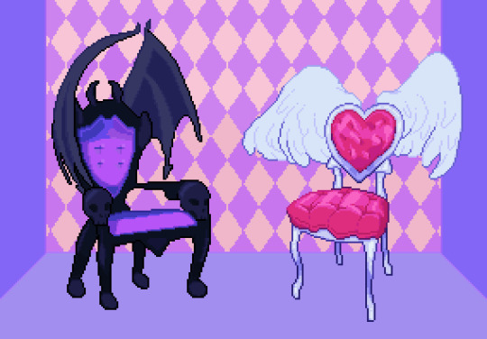
the ultimate personality test: would you sit in the goth or prep chair?
97 notes
·
View notes
Video
youtube
floating my melody theme
17 notes
·
View notes