pyrorptrs
Rapterslasher Productions
The main tumblr for pyrorptrs
121 posts
Don't wanna be here? Send us removal request.
Last Seen Blogs
sunassembly-sd
Sunday Assembly San Diego
sandiegobookkeepers-blog
Easie Bookkeeping
myjourneywithbraces-blog
My Journey With Braces
southlandscs
Best Private School in Los Angeles County, CA

theidealattorneyguide-blog
theidealattorneyguide

Text

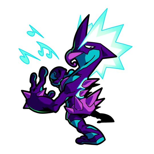
Made a basic lil' ref for me gremlin, "The Syphon" or Sy for short.
12 notes
·
View notes
Text
29K notes
·
View notes
Text
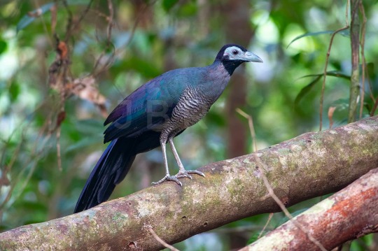

Bornean Ground-Cuckoos (Carpococcyx radiceus), family Cuculidae, order Cuculiformes, Tabin Wildlife Reserve, Sabah, Borneo
photograph by Jason Bugay Reyes
965 notes
·
View notes
Text
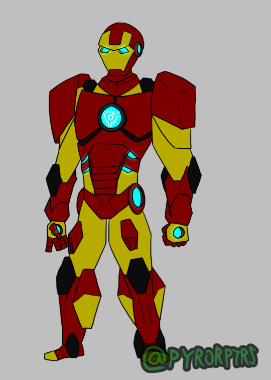
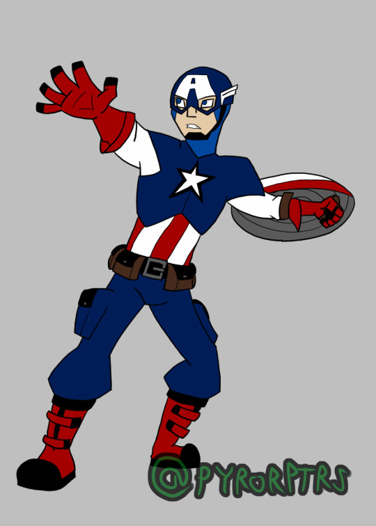

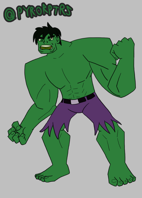
I've been doing redesigns of pop culture characters. Mostly working off the idea "What if I was put in charge of making a show around these properties" and the core founding Avengers was one of the first batches I finished
Ironman: Pretty straightforward; I just wanted something that looked armored, but could easily be simplified. I primarily took inspiration from the EMH version and the first couple of suits from the MCU with the intent that this is his Mark IV suit. That way I can easily do more suits and updated for him the future, particularly to flesh out future line-ups. I also threw in some black detailing to not only avoid using Gray (which most other associated Ironman characters heavily use), but to also act as a winking nod to how he took inspiration from one of his hot rods in the movie for that suits colors. My only real issue with how he turned out is some of the proportioning, so if/when I draw him again I'll try to make his shoulder less broad and his feet larger.
Captain America: Cap was pretty easy to a design for too; I leaned more towards his classic look, but tried to make it look like it was made from more modern materials. So instead of wearing chainmail in a simple suit, he has some pretty standard military gear with an armored chest piece and helmet. I also added some tactical pouches since I can see him either keeping a couple supplies on hand for long missions or to have something to slip a McGuffin into. I kind of have the opposite problem with his proportions that I do with Ironman, so when I draw him again (be it this specific design or more updated suits) I'm going to try to make him broader.
Thor: I prefer his more armored look from the mid 2000's-2020's, but wanted to start with a more classic EMH inspired look. Not totally satisfied with his face and might change the colors a bit in places if I redraw this design, but I do like how he turned out for the most part. Obviously I used the classic version as a base, but I made his belt buckle larger and tried to make the symbol on it look more like a cross between a tree (Yggdrasil) and an Eagle. I also turned his armbands/bracelets into fingerless gloves, taking some inspiration from his Ultimate counterpart and added one of those discs on each hand (I'm thinking they could light up when he's using his powers like the ultimate version too). I tried to keep the helmet simple and easy to draw while keeping the wings on them. I might also change some of the blue pattern on his boots to yellow to help them stand out more.
Hulk: Pretty simple, the only real thing I did was try to keep him a saturated green rather than the flushed one he has in the mcu. I have more problems with him compared to how the others came out, but that's mostly because I'm still figuring out how to draw human faces in my style and do exaggerated physiques, both of which are things that I'm going to have to improve through practice and experience. otherwise I think he at least works as a good starting basis for a good hulk design in my style.
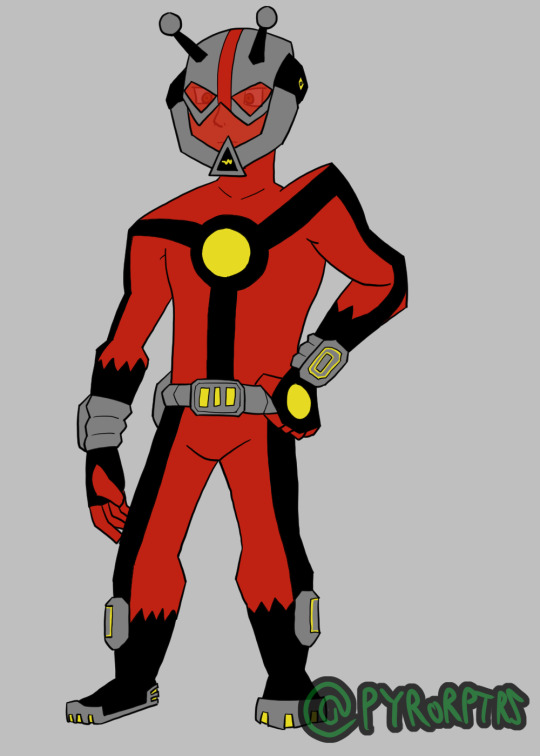
Antman: Leaned toward Hank Pym since I hate how we skipped straight to Scott Lang in the MCU. Obviouisly both classic and EMH were the main inspiration for my take, but I did try to add some aspects from the MCU suit with a more enclosed look and proper gauntlets. I also tried to include a spots on both the gauntlets and belt for him to control his size shifting so that it's easier to justify him doing it without having to draw him going through that motion over and over again. I also tried to adjust the red to be a bit more orange-ish to have him stand apart from other very red-centric characters, though I'm not totally satisfied with the results.
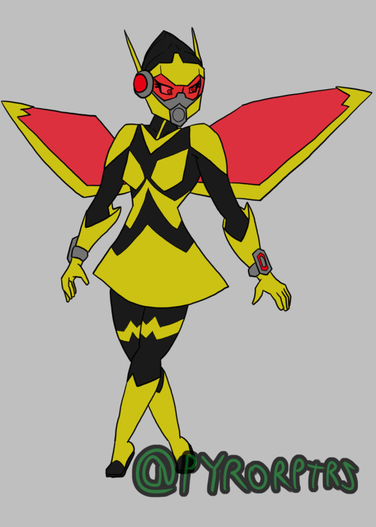
The Wasp: I pretty obviously leaned heavily into the EMH version for my take on Janet Van Dyne, but I also tried to keep the enclosed suit idea for her like with Antman, so I threw in some aspects of the MCU design. I like how Wasp size alteration and other abilities are presented as more legit powers compared to Antman having to rely on the suit, but I did try to give them some visual cohesion by reincorporating the techy aspects of the formers suit into Wasp, though it's probably there more to help here store Pym Particles. I also gave her more of a proper undersuit and helmet and made the wings look kinda techy (Though I tried taking some inspiration from the space suit she had in EMH for those). I also tried throwing in some red to homage some of her original color scheme, but mostly limited it to stuff specifically surrounding her Pym tech.
I'm still trying to figure out how I would go about a story for HOW this version of the Avengers would from; though I would like Loki to be more of a final boss sort of deal, so I'd want to hold off on him being a direct threat until later. I could say that a single villain or one of the dedicated villain factions are the cause, but I think that would be too similar to the opening of EMH and Assemble. So maybe having it be so that a couple of notable, but usually unaffiliated, villains for Ironman, Thor, and maybe Antman team up to try to take them out one at a time, but the fight inevitably leaks out into the streets and draws the attention of the others resulting in them properly teaming up to stop the villains.
11 notes
·
View notes
Text
I've been doing redesigns of pop culture characters. Mostly working off the idea "What if I was put in charge of making a show around these properties" and the core founding Avengers was one of the first batches I finished
Ironman: Pretty straightforward; I just wanted something that looked armored, but could easily be simplified. I primarily took inspiration from the EMH version and the first couple of suits from the MCU with the intent that this is his Mark IV suit. That way I can easily do more suits and updated for him the future, particularly to flesh out future line-ups. I also threw in some black detailing to not only avoid using Gray (which most other associated Ironman characters heavily use), but to also act as a winking nod to how he took inspiration from one of his hot rods in the movie for that suits colors. My only real issue with how he turned out is some of the proportioning, so if/when I draw him again I'll try to make his shoulder less broad and his feet larger.
Captain America: Cap was pretty easy to a design for too; I leaned more towards his classic look, but tried to make it look like it was made from more modern materials. So instead of wearing chainmail in a simple suit, he has some pretty standard military gear with an armored chest piece and helmet. I also added some tactical pouches since I can see him either keeping a couple supplies on hand for long missions or to have something to slip a McGuffin into. I kind of have the opposite problem with his proportions that I do with Ironman, so when I draw him again (be it this specific design or more updated suits) I'm going to try to make him broader.
Thor: I prefer his more armored look from the mid 2000's-2020's, but wanted to start with a more classic EMH inspired look. Not totally satisfied with his face and might change the colors a bit in places if I redraw this design, but I do like how he turned out for the most part. Obviously I used the classic version as a base, but I made his belt buckle larger and tried to make the symbol on it look more like a cross between a tree (Yggdrasil) and an Eagle. I also turned his armbands/bracelets into fingerless gloves, taking some inspiration from his Ultimate counterpart and added one of those discs on each hand (I'm thinking they could light up when he's using his powers like the ultimate version too). I tried to keep the helmet simple and easy to draw while keeping the wings on them. I might also change some of the blue pattern on his boots to yellow to help them stand out more.
Hulk: Pretty simple, the only real thing I did was try to keep him a saturated green rather than the flushed one he has in the mcu. I have more problems with him compared to how the others came out, but that's mostly because I'm still figuring out how to draw human faces in my style and do exaggerated physiques, both of which are things that I'm going to have to improve through practice and experience. otherwise I think he at least works as a good starting basis for a good hulk design in my style.
Antman: Leaned toward Hank Pym since I hate how we skipped straight to Scott Lang in the MCU. Obviouisly both classic and EMH were the main inspiration for my take, but I did try to add some aspects from the MCU suit with a more enclosed look and proper gauntlets. I also tried to include a spots on both the gauntlets and belt for him to control his size shifting so that it's easier to justify him doing it without having to draw him going through that motion over and over again. I also tried to adjust the red to be a bit more orange-ish to have him stand apart from other very red-centric characters, though I'm not totally satisfied with the results.
The Wasp: I pretty obviously leaned heavily into the EMH version for my take on Janet Van Dyne, but I also tried to keep the enclosed suit idea for her like with Antman, so I threw in some aspects of the MCU design. I like how Wasp size alteration and other abilities are presented as more legit powers compared to Antman having to rely on the suit, but I did try to give them some visual cohesion by reincorporating the techy aspects of the formers suit into Wasp, though it's probably there more to help here store Pym Particles. I also gave her more of a proper undersuit and helmet and made the wings look kinda techy (Though I tried taking some inspiration from the space suit she had in EMH for those). I also tried throwing in some red to homage some of her original color scheme, but mostly limited it to stuff specifically surrounding her Pym tech.
I'm still trying to figure out how I would go about a story for HOW this version of the Avengers would from; though I would like Loki to be more of a final boss sort of deal, so I'd want to hold off on him being a direct threat until later. I could say that a single villain or one of the dedicated villain factions are the cause, but I think that would be too similar to the opening of EMH and Assemble. So maybe having it be so that a couple of notable, but usually unaffiliated, villains for Ironman, Thor, and maybe Antman team up to try to take them out one at a time, but the fight inevitably leaks out into the streets and draws the attention of the others resulting in them properly teaming up to stop the villains.
#the avengers#avengers#Marvel#Ironman#iron man#Thor#captain america#Hulk#incredible hulk#Antman#ant man#the wasp#tony stark#steve rogers#bruce banner#hank pym#janet van dyne#redesigns
11 notes
·
View notes
Text
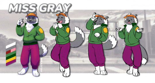
Introducing, MISS GRAY~!
This isn't her original design, but more of an adjusted one. For this version she is a retired racer, turned trucker. She misses her days on the raceway, but makes some great times on her deliveries! One too many close calls, but nothing tragic yet...
She may appear in other forms in the future~
5 notes
·
View notes
Text

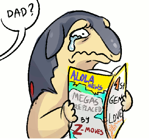
Happy Pokemon Day!
My 1998's Yellow team is STILL the best team~ ❤️
54 notes
·
View notes
Text
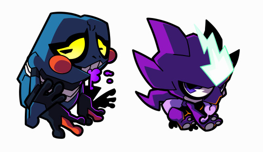
Selling some adoptables for 15$ each to deal with some finances. DM me if interested.
8 notes
·
View notes
Text
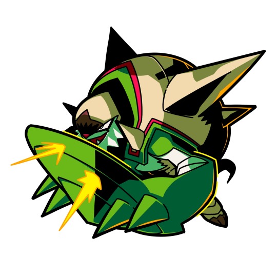
SIIGHHH i forgot to post here again
have psittacosaurus, my favourite pokemon (dinosaur)

22 notes
·
View notes
Text
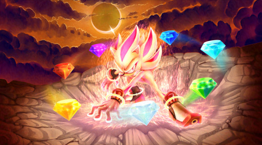
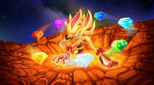
Super Shadow - Unbound
---
An alt. to my Super Shadow pic posted earlier >>> LINK
Normally, Shadow wears these inhibitor rings to suppress his inherit chaos energy. This probably doesn't matter in his super form. However, I like the idea that he's potentially hiding more power behind them.
535 notes
·
View notes