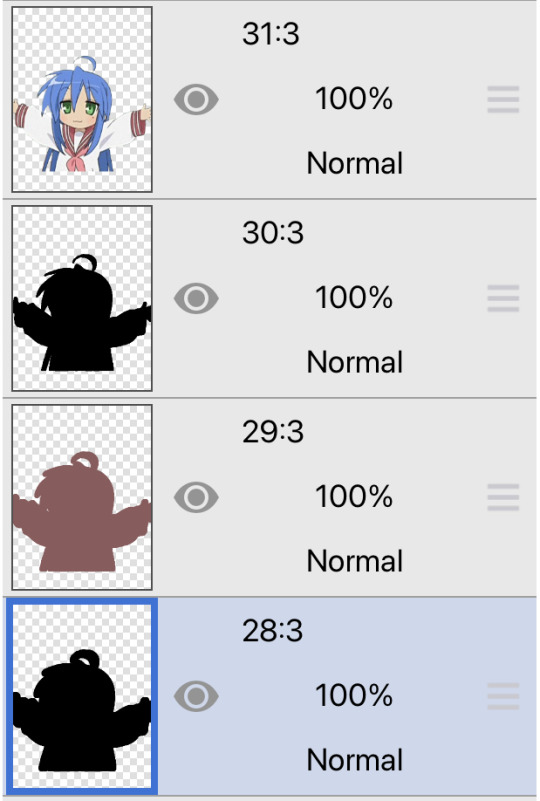
#((so I separated Steps 2 and 3 and 4 into multiple images.))
Text
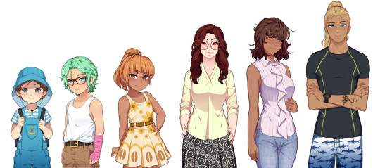
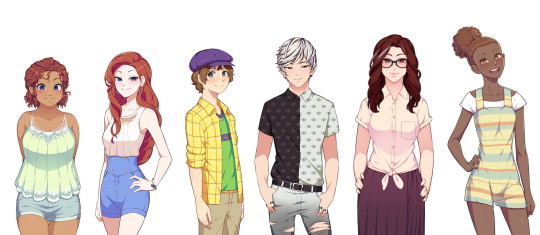
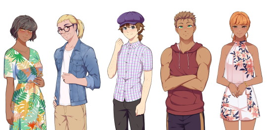
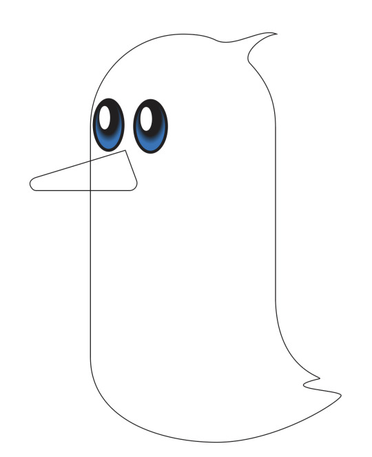
A character reference based on all four Steps of Our Life! It's only "sort of" a height reference as well since obviously they're not 100% accurate (the devs don't have specific heights for everyone to my knowledge).
I did dig into the code to try and get characters at their "normal" heights but there are other matters at play too (example: Nicolas is obviously "taller" than he should be because he needs to be pushed upwards to be visible enough above the game's text box; likewise with other very short characters).
Still, this should serve as either a nice reference guide for every character or a "height reference" in the sense of getting an idea of which characters are shorter/taller than others.
I'm also going to detail some extra notes below the break, including posts from GB Patch's Tumblr that reference any defined heights (with Cove being the obvious one) or general height things, as well as some more stuff about the MC's height in comparison to the three love interests depending on what you pick.
Cove's height is listed on GB Patch's FAQ as 4' 1" in Step 1 (also stated as "mostly average, perhaps a bit on the short side"), 5' 4" in Step 2 (in-game this is defined as "very tall" on the MC's potential height spectrum, as that is the only option considered on par with Cove's height), 6' 0" in Step 3, and 6' 4" in Step 4. A fun fact is that Cove's final height was originally 6' 3" (191cm) instead.
Derek in Step 2 is under five feet tall (this post also lists Cove as "around 5 and a half feet tall" which you could take as either close enough to 5' 4" as stated above or a potential original height he had that got changed). In-game, he's "short" but not "very short", as having your MC be "very short" will prompt narration telling you that you're shorter than Derek, whereas "short" only has you relate to him in smolness generally.
Step 4 Derek is "mostly average." He wouldn't be considered tall nor would he be considered short. His youngest brother Nicolas will "probably end up as a similar height to him" once he's more grown up.
Step 4 Baxter is "taller than average, but not especially tall."
I've been informed that, on the Our Life Patreon Discord, Step 4 Derek's height is listed as 5' 9" (175cm) whereas Step 4 Baxter's is listed as 5' 11" (180cm), so those are their defined heights. Before that, both of their heights had jumped around somewhat. A post from 2019 said that Derek was 5' 11", but a post from June 2021 said that Baxter was 5' 11" and Derek was 5' 9" (so consistent with the Discord). Then there's also another post from July 2021 (you'll have to scroll down for this one) that listed Baxter at around 5' 10" while Derek was 5' 8"/5' 9". If you're insane enough to try and use the character reference too, then Baxter would actually be around 6'1" at minimum since he's taller than Step 3 Cove (though you could also make the same argument that this means the mom trio of Pamela, Noelani, and Kyra must be decently tall as well since they're so close to Cove on the character reference).
I don't have any experience with GB Patch's other game, XOXO Droplets, so I don't know what ages the characters are in it, but since both Shiloh and Jeremy are characters seen visibly in Our Life, I thought I'd also mention that they're listed as 5' 10" and 5' 5" (or 5' 5 1/2") respectively in XOXO Droplets. Jeremy also apparently grows to 5' 8" in his 20s and he's 22 in the Our Life Cove Wedding DLC (I don't think this is spoken of in the game specifically but he's labeled as 22 in the code).
As for the MC and how their height plays into things, "tall" and "very tall" as well as "short" and "very short" tend to be considered the same for the most part in the game's code. It's not that there isn't a difference at all (I would say it's still notable), it's just that sometimes the game may be more vague about height differences. My post about Errands references this where you don't need more athletic points due to being "very short" instead of "short" to give Cove a piggyback ride.
A guesstimate I'd make is that about 5% of the time, the game will take note of whether you're "very tall" instead of "tall" or "very short" instead of "short." Otherwise, you're either "generally tall," "average," or "generally short." There are also other instances (usually with Cove) where the game might just check if you're either generally tall (around Cove's height) or not generally tall (i.e: definitely shorter than him).
This is actually relevant to the heights because, following all above information, one would assume that Step 4 Derek is average, Step 4 Baxter is tall, and Step 4 Cove is very tall going off the MC's potential "height spectrum" of very short, short, average, tall, and very tall, but it's not entirely the case.
A "tall" MC (generally tall) will look "down" at Step 4 Baxter just as he will look "up" at them or they'll look directly at each other if the MC is "average," same as Step 3 Baxter, but--
when the game has any instance of differentiating between "tall" and "very tall" (they never do this for Step 3 Baxter so the base assumption would have to be that he's just average height), things change.
During Baxter's apology in the wedding of his Step 4, Baxter dips his chin to look at the MC if they're "short"/"very short," levels his chin to look at the MC if they're "average"/"tall," and then lifts his chin to look at the MC if they're "very tall." A generally tall MC still has to lean down to kiss him if they choose to do so though.
Also, during the intimacy scene with Baxter (either in his office or his living room), if the MC is "very short," "short," or "average," it states that Baxter is taller than them. If they're "very tall," then Baxter is shorter than them, but a "tall" MC is "almost the exact same height" as him.
This is all a really long-winded way of saying that GB Patch referring to Step 4 Baxter being "taller than average but not especially tall" might mean that he's some infuriating middle ground between average and tall where he's not quite one but not quite the other either (which honestly is very Baxter of him so I can't even be mad).
#type: helpful#type: cracking the cove#our life#olba#our life: beginnings & always#((If you line up the images yourself then make sure the height of the original images are all the same))#((I don't know if Tumblr squished any.))#((Let me know if I'm missing anyone!))#((I know there's Step 3 Jeremy and someone named Cala in Derek's Step 4 (haven't gotten there yet)))#((but you only see those two on the phone so there is no ''default'' position/size for them.))#((Also I was worried that Tumblr would eat the quality if I uploaded such long images))#((so I separated Steps 2 and 3 and 4 into multiple images.))#((Hopefully that's fine; if you line them up side-by-side it still works out.))#((Me feeling so exposed because now how I design my Coves is here for everyone to see.))#((Feel free to judge my bias towards the color blue.))
611 notes
·
View notes
Note
hi ^-^! Can you do a tutorial on how to make this icon? I would like to learn :3
https://64.media.tumblr.com/64eb5472b1d49fc941ccefbae558846e/cb2b70c34ebba0a7-b4/s1280x1920/d9e44a125324b309a533a1e56be842355046d740.gifv
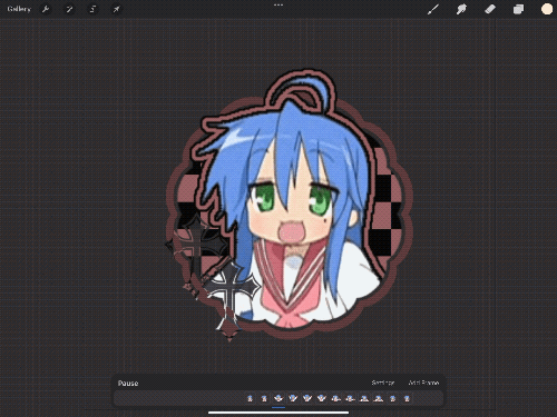
Hello! I apologize in advance for my poor explanation skills, and also for how convoluted this process can get 😭 But I saw this as a worthy challenge, so here’s how you too can make a gif icon where the character comes out of the frame like this and this:
This is going to be very long so the full tutorial is under this cut!
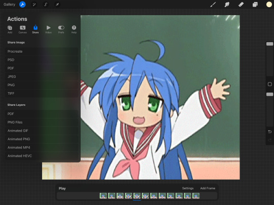
Programs I use: IbisPaintX and Procreate*
*full disclosure, procreate is exclusively for iPad and costs 10 USD. however every thing I do in procreate you should also be able to do in Photopea
1. First things first, after finding the gif you’ll want to use, you’ll need to download each individual frame. By importing it into either procreate, photopea, or any program that’ll allow you to view individual frames, you’ll be able to save each frame
A note about gifs: The best gifs to use are ones with less frames due to the fact you’ll be editing the individual frames. Not to say you can’t use gifs with higher frame counts, however it is much more time consuming the more frames there are
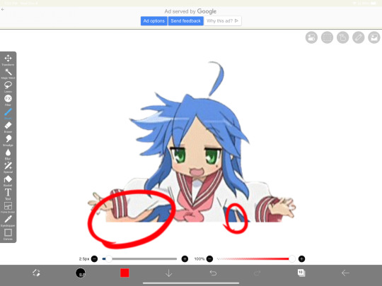
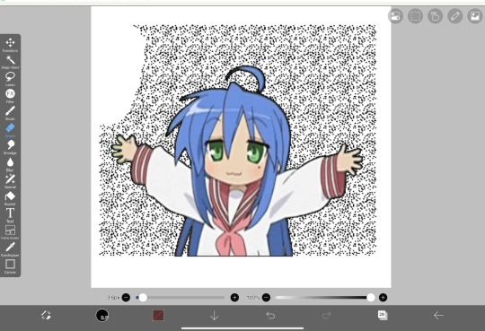
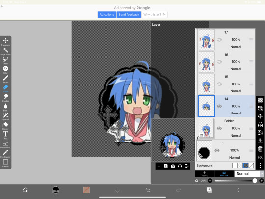
2. Next you’ll have to remove the background from each frame. You can remove the background by hand, but I like to use this website to help make things a bit easier. Just pop your frames into it and download each one

It is unfortunately not always accurate and often misses things on images where the background isn’t clearly defined or is lower quality, and you most definitely will have to do touch ups on your frames For example here, for some reason, the first two frames (on the left) were left with a semi transparent gray background and in the image in the middle, you can see sizable areas where the website missed. And also as of recently there as been practically invisible dots it leaves where the background once was that stroke filter picks up some how. You’ll need to hit each frame with the magic wand tool or similar to remove these dots if you plan on adding strokes

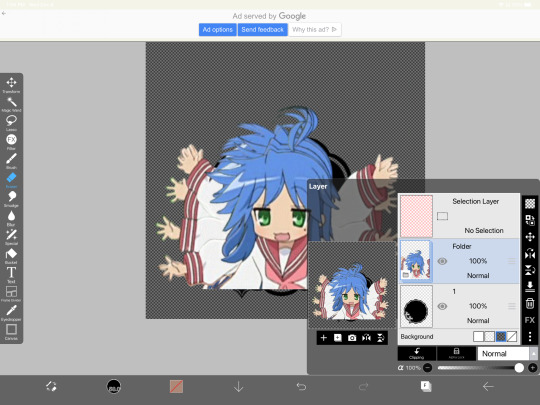
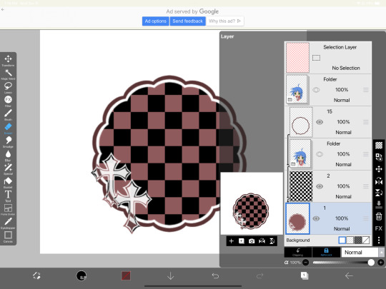
3. Now add all your frames into your program and stick them in a folder. Then, reposition the frames on top of the image mask you are using (in ibis, make sure all frames are visible and select the folder before repositioning the frames, in other programs, you should just be able to select multiple layers and move them that way). Once you’ve repositioned them, duplicate the folder then select clipping on the bottom folder like shown in the right image (I know I forgot to duplicate the folder then 💀)

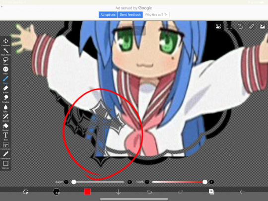
4. Now here’s where the tedious stuff comes in. Make sure you number your frames, because it’ll help you out a lot. In the top folder, erase the bottom part of your gif that you want to be in the frame (I’ll call this the clipping layer) but keep the top where you want to be coming out of the frame intact (this’ll be the overlapping layer). Repeat this process for all of the frames
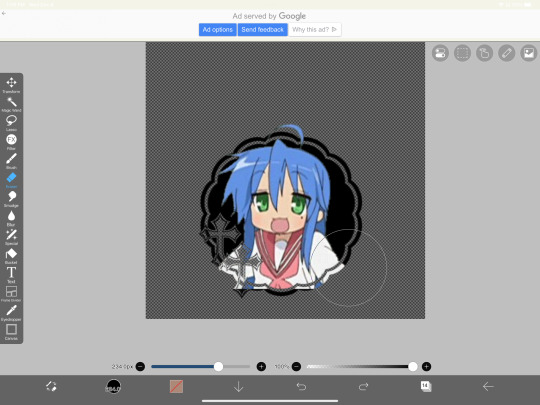
Note: Try to use a simple shaped frame for these kinds of icons. However, if you choose to use something with a more complex shape, be weary of where you erase! You will need to be more precise with shapes like these depending on where you want things to go
And if you haven’t edited the frame itself, you should do so now
5.5. After that, you can leave things off there and skip this step if that’s what you’re going for! However, if you want to add things like strokes, it’ll get a lil more complicated
Firstly, I duplicate my clipping layer and then select stroke (both). You can also use stoke (outer) or whatever your program has, but this is my personal preference. I then duplicate that layer and keep applying stroke till I get what I want (if you use stroke (outer) duplicating your layer isn’t necessary). I think merge my stroke layers together, but I keep it separate from my main frame
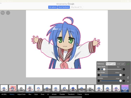
That way I can duplicate my stroke layer and add it to my overlapping layer. Then I erase the unnecessary parts shown on the left. You may need to clean up the stroke on certain frames or reapply it depending on the position of things and what you’ve erased and what not. It takes a lot of trial and error. You can also apply the stroke before you make your overlapping layers, however when I was making this graphic I fucked it up in the process of making this tut and had to remake it so that’s what I did the second time around 💀 if you were wondering why I didn’t just do that in the first place, now you know


6. Now it’s time to export your layers as a psd and import it into procreate/photopea! You’ll now have to merge your clipping layer into your image mask then merge your overlapping layer on top of it to create one layer. Repeat this for all the frames and you’ll be finished!
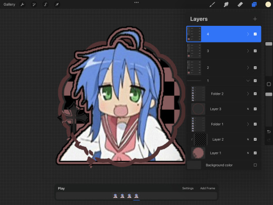

Tada! Now you can add filters and whatever else if so desired. And that’s my process for making these kinds of graphics! There’s definitely an easier way of doing this but that’s just what I’ve got figured out for now. Don’t hesitate to ask any questions for the things that make zero sense lol
257 notes
·
View notes
Note
can i ask about your headmate? i am very narcissistic and i want a version of myself as a headmate too, how did you do it? just by shear imagination then it just.. stuck? i have depersonalisation due to not being on hrt if that matters
thanks ! also you are very cool and very gender goals
Disclaimer: Creating a thinking being is a huge responsibility. I did not do it simply out of self-love but to resurrect an older version of me that I consider admirable and good and that I profoundly missed and grieved. It should be given comparable consideration to having a child, with the complication that said child lives in your brain.
Anyway, it was a bit of a process, somewhat detailed in my #self-necromancy tag.
There are multiple different ways to do it too, but what I did involved a combination of:
1- Using memories of my past self to construct a consistent personality in my mind and assigning it to a new entity there.
2- Generating thoughts from the point of view of this other entity, learning how to address her, how to direct thoughts at her, how to distinguish between her mindvoice and my own, noticing the differences between talking to her and thinking to myself, and so on.
3- Generally just talking to her a lot and going all in on the "think as her in addition to your own thoughts" thing. This included both things like saying good morning to her every day and trying to get her opinion on things during idle time. This was a little bit difficult in my case since she's another version of me so we think similarly in lots of ways.
4- Learning how to visualize the headmate and giving her a shape and a home. This was actually really easy for me since I already have a visual imposition program running and have a rather vivid image of how we should look.
At first it is going to be kind of like roleplaying a character and training yourself for the role, but over time you may succeed in causing the new headmate to have independent thoughts (which sometimes feel more like intent or feeling at first, and you may even be able to "read" those thoughts before they show up on mindvoice as well even after the headmate is mature and more independent.
Part of making this happen involves helping the headmate have experiences and treating her as if she's already independent and genuine. For example, one big step for us was when she played Elden Ring and we noticed that she definitely did not have the knowledge of the game that I did, which also helped her get really into it with the kind of enthusiasm you only really get on a first playthrough. It really helped us both get over the doubts about her being a separate entity at that point.
She is now getting everyone materials on that WoW private server we have been playing on.
13 notes
·
View notes
Text
Caryl Callbacks
There weren’t nearly enough of them in the show’s final season, but maybe there’s room in whatever’s still in store for Caryl’s story. If so, these are the ones at the top of my list....
1. Cherokee Rose

Don’t get me wrong, the flower Daryl left on Carol’s tray in 10x04 counts for a lot, mirroring the first time he offered her hope in the wake of losing a child. But for fans, the Cherokee rose symbolizes more than that. It stands for Caryl’s entire relationship, which was meant to be the heart of the show going into the last season, so it isn’t unreasonable to expect it to crop up again somewhere before the end.
2. The Prison Bus

The shoulder massage. Screw around? I’ll go down first. So much good material to refer back to should Daryl and Carol start to explore physical intimacy with each other again. I can’t be the only one who misses Carol’s raunchy side...
3. Sophia

There were plenty of opportunities for Daryl and Carol to talk about her in an impactful way, so it’s really a shame S11 chose the one anecdote in 11x18 that barely scratched the surface. The character might be long gone, but she was the catalyst for the most iconic relationship on the show. Daryl and Carol suffered her loss together, like co-parents, and miraculously found hope in each other.
4. A friend thinks you’re perfect when everyone else thinks you’re broken
Jerry planted that in my head, and I haven’t been able to get it out ever since. Imagine hearing Daryl tell Carol she’s perfect, effectively putting her insecurities to rest. I don’t even care that it’s on the nose.
5. Bracelets and Acorns

I’ve already talked about this at length, so I’ll keep it brief. Where is Carol’s friendship bracelet? Where is Daryl’s double capper? Seems like they’d make pretty strong visual cues now that Daryl and Carol have to spend more time apart -_-
6. The Grove

This is arguably the darkest memory Carol’s been forced to carry with her throughout her journey, doing enough damage to her self image to prevent hers and Daryl’s relationship from taking its natural course into romance. A confession seems like the most logical way to get back on track. Daryl could serve as her long, hard look in the mirror, letting her know--with words-- he sees her for who she really is, not who she thinks she is.
7. Man of Honor

Back in S2, Daryl asked Carol what she wanted and she made it explicitly clear. A man of honor. How is it that the series is now over, and she still hasn’t gotten what she wants?
8. I know where I’m supposed to be

The subtext seemed pretty clear. Not a doubt to be had. But then S11 happened, and now we’re stuck with the sexy clown spinoff no one asked for. To pour salt on the wound, Daryl floundering around in France is supposed to stir feelings of uncertainty about where he belongs...again. Maybe though, just maybe, the tenth time will be the charm and he’ll realize he needs to be wherever Carol is. Forever. All the time.
9. The “No Sanctuary” Reunion

How to top one of the most iconic scenes of the whole series: Step one, needlessly separate Daryl and Carol for an extended period of time. Check -_- Step two, put Daryl in danger. I mean, that’s probably going to happen. Step 3, send Carol on a rescue mission. The woman knows how to sail. Step 4, have her blow something up. Step 5, let Caryl run into each other’s arms and kiss.
10. Start Over
Daryl has told Carol multiple times that they can start over, meaning they can start over together, and we know what that’s supposed to look like. It’s the two of them on the bike, exploring parts unknown whether it’s New Mexico or somewhere else. Not France though. You can’t cross the ocean on a bike -_-
59 notes
·
View notes
Text
Doom's super-easy quick-and-dirty fool-proof rag doll tutorial! Part one
Part one of many! Masterpost here.
I've seen a lot of new people wanting to make their own rag doll but not being sure how to go about it, so as someone who has made many dolls of my own, here's my tutorial for all of you! Since many people don't have sewing machine, you won't need one for this tutorial. Just a needle and thread and pins. Everything used here is available at Walmart, Bimart, or similar stores.
Supplies:
Sewing needle, pins, scissors, thread in similar colors to your fabric
Cotton or similar thin, smooth fabric for the base
Embroidery thread
Felt
Yarn for hair
Sock fabric (optional)
Shoe fabric (optional)
Stuffing
Two rulers (or similar long, thin, and sturdy objects)
Tape
This Pattern printed out on letter (8.5 × 11 inch) paper for the size I am making here, you can adjust however you like.
Step 1: Cutting Fabric


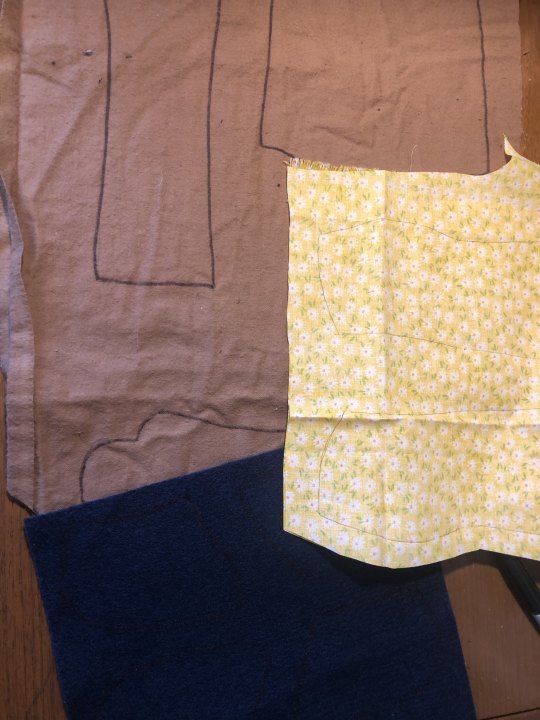
If you want to make different colored feet, cut the foot off of the leg pattern piece as shown.
Most of your fabrics will have a "right" side, the side that looks good and that you want on the outside, and a "wrong" side. Fold your body fabric in half, with the right sides inward. Lay out your body and arm patterns with at least an inch of space between them, tracing one body and two arms.
For your other pieces, lay out your fabric wrong side up. Once again keeping an inch between each piece, trace two leg pieces, then flip over the pattern to trace two mirrored legs. Repeat with the feet.
Cut out all the fabric, keeping a 1/2 inch of allowance around your drawn lines.
Step 2: Arms
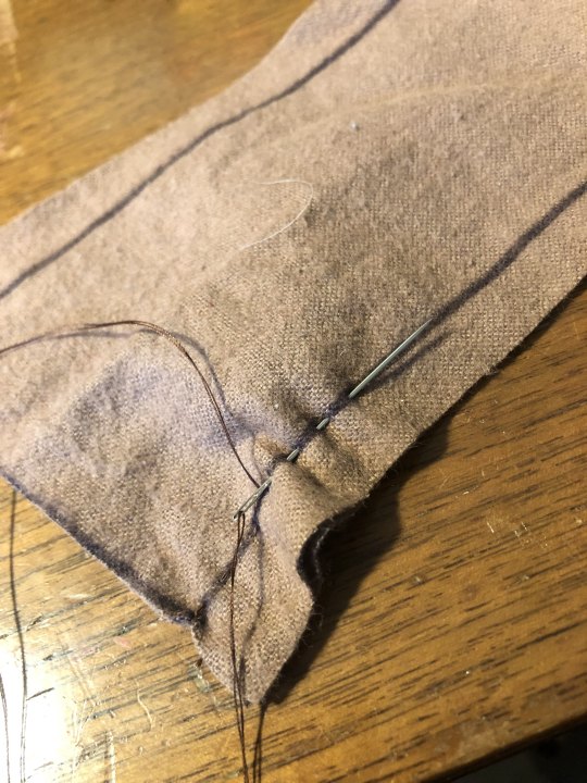

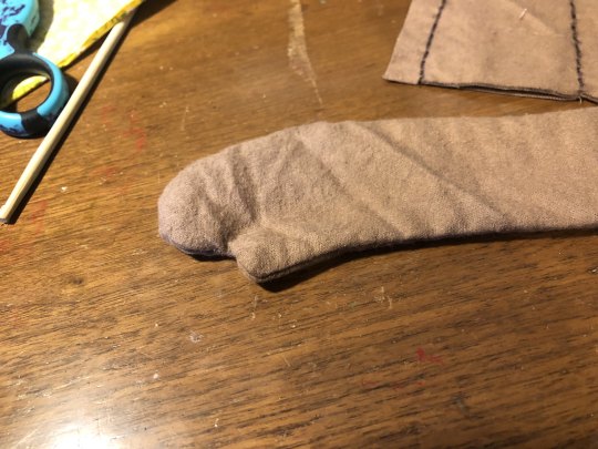


Take your two arm pieces, still together as they were when you cut them out. Following your traced line, sew the two together with a running stitch (YouTube tutorial). You can also speed this up by doing multiple stitches at once.
Once they're sewn together, you want to clip the edges where they curve. This helps the fabric not bunch up when turned. Be careful not to clip through your sewing, clip every inch or so where the curves are tight, and less often where they're more subtle.
Turn the arms right-side out. A chopstick or eraser end of a pencil helps. Stuff them halfway full, up to where you want your "elbow" joint to be. Pinch the sides of the fabric together and pin through both of them straight across. This is where you will sew to create a thin point where the arm can hinge. Sew with a running stitch across where the pin is.
Then stuff the rest of the arm. You can pin or sew this end close to make things easier later on.
Step 3: Legs

Lay out your leg and foot pieces as shown (you can skip this part if you aren't doing separate fabrics for the shoes) right sides up and the toe facing the flat part of the leg. Take each foot pieces and flip it over, resting it on top of the corresponding leg. This is the position you will now pin them in, curving the fabric to match up the sides. Sew along the drawn line for each foot.


Now take each leg and match it up to its mirror image, lining them up with the right sides against each other. Sew just like you did for the hands, and clip around the edges the same way before turning them inside out.
Stuff the legs halfway up to the "knee" joint and pin across. Just like the arms, sew across here to create a joint. Stuff the rest of the legs and pin or sew the ends closed.
Step 4: Body & Face


Take your two body pieces, still with right sides together like they were cut. Sew from one shoulder corner around the head to the other shoulder. Leave the rest open. Cut slits along the curve of the head and where the neck dips inward. Turn it inside out.


For this face I'm showing off two ways you can make designs, applied fabric and embroidery. Another option is painting, which is more straightforward so I wanted to show some other methods.
For the eyes and nose, cut out your designs from felt or a similar fabric like fleece which won't fray. Pin them in place to test out your design. Using similar colored thread and a whip stitch (YouTube tutorial), sew them in place. Turn the head semi inside-out to tie them off on the inside.
If you're going to embroider, start by using a pencil to draw out your lines. Embroidering is just sewing but visible. This line here was made by doing a running stitch in one direction, then going back in the other direction using the same holes to fill in the in-between gaps. Here are some more good stitches if you'd like a video.
Next section!
#raggedy ann#raggedy andy#rag dolly#rag dolly musical#raggedy ann musical#raggedy ann and andy#raggedy ann & andy#raggedy ann and andy a musical adventure
8 notes
·
View notes
Text
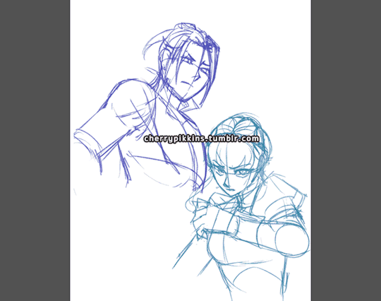
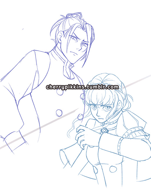
For anyone who is curious, here was my process for doing the Felix vs Marianne swordfight illustrations!
Since I had to complete multiple images in sequence, I wanted to focus on lighting contrast and inked lines while making sure everything was done consistently while not spending an obscene amount of time.
The tools used were PaintToolSai 1.0 and Wacom Intuos 4S.

1) I start with the rough draft and composition. Since the poses are most important at this stage, characters are drawn from memory
2) I do the underdrawing. I check the official character art and make sure the designs and outfits. This step will ensure that I know where the rendered black lines should go. Transformations can be done at this stage to ensure proportions (such as head vs body size) are correct.
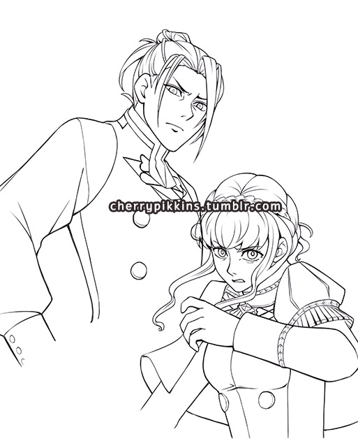
3) I render the lineart in black. This is the most time-consuming part. Because of all the double-checking I did in step 2, there is no need to keep looking at references. I may apply minor transformations to adjust proportions. I use different line weights to make the lineart more appealing - heavier for outer lines, thinner for details
4) Color placement - I choose similar colors as the official art, but adjust for higher contrast. I also do the eye detail.
5) I create a shadow layer using the Multiply mode, with clipping enabled. I used a color that complements with blue and provides a shadow tone for the skin. Since the illustrations feature two characters in combat, a single shadow layer keeps everything simple.

6) I decide on the directional lighting and use Sai's transparent brush at a solid setting to erase away at the shadow layer on one side. Then I use a soft airbrush on the other side. I decided not to blend shadows too much or do a separate layer for ambient occlusion so that the lighting is more dramatic.
7) I create a highlight layer at Luminosity setting, but all I did was use the airbrush very sparingly for a slightly backlit effect. If this were a more detailed illustration I would also add highlights using a more solid brush, but I skipped this step since the shadow layer provided a lot of contrast already

8) Here is what the image looks like with only the lineart and shadow layers. At this point, it is mostly touch up. The shadow layer is airbrushed with darker or lighter colors at the edges either to make it more intense or to soften the lighting. Color is added to the line art, but not too bright colors since it still needs to stand out.

9) Finally, a bit of background accent is added. The image is also cropped for better composition.
And that should be it! I'm always happy to share my process and will answer any questions to clarify things. :) I'm by no means an expert and am always learning. This process skips a lot of the usual steps that I would normally use for a full and more detailed illustration, but was effective for emphasizing action and form while keeping multiple images consistent. Why overdo it, ya know? XD
Hope that helps!
#felix hugo fraldarius#marianne von edmund#fe3h felix#fe3h marianne#fire emblem three houses#fe3h#fe3h art#tutorial#paint tool sai#gif#blue lions#golden deer
40 notes
·
View notes
Note
I was trying to recolor some trees in your color actions, but I ran into a problem. I have a similar problem to a previous anon, who was having their background be filled with a whole color. I did what was mentioned, locking the background, but my background still becomes just one color. I also get this message background copy 2 doesn't exist. I tried duplicating the background and renaming it background copy 2, but doesn't work. I'm using photopea, which is like a free version of photoshop.
Hey anon!
So the essential problem is that the actions do not work on images with transparency. They cannot possibly, due to all the steps involved. They all need the same starting point to run without the type of errors you're encountering.
The easiest way around this is a tip provided by @skulldilocks: when you export your texture from SimPE, export both the texture and the alpha as .bmp files not .png. You just change the file type in the drop-down menu to .bmp. This will give you a solid texture to work with, so you can recolor it however you want and then apply the alpha after the fact. (I'll provide an action for applying the alpha.)
Just remember to export both the alpha and the texture, by right-clicking and selecting "Export..." and then "Export Alpha Channel..."
If you no longer have the original .package file for any reason, you can still get a recolorable texture that you can apply an alpha to, but it's a little more involved, so I'll put it under a read more.
First off, here's a download link to the actions you'll need for the following steps.
Step 1: Open up your transparent texture. There should only be one layer. Do not use a texture that you have already started recoloring.
Step 2: Run the action named "1 Make Alpha From Transparent Texture." You will now have a new alpha layer that looks like this:

You will also see the following pop-up:

Per the instructions, copy this new alpha layer into a separate document. Return to your original document and delete that new alpha layer.
Step 3: Run the action named "2 Solidify Transparent Texture" on your original texture. You will receive the following pop-up at the beginning of the action:

Click "Continue." Your texture now looks like this:
All of the edges of the leaves have been solidified and the background is flat white.
Step 4: This is the point at which you recolor your texture. So I brightened it up a little with a levels layer so it is closer to the correct luminosity of a Volatile hair texture, ran Volatile over it, adjusted the brightness a little bit more, ran Volatile again, and then used the RDX action to make some very alien foliage:

Step 5: Now you go back to that black and white alpha layer we made before, copy and paste it as a new layer on top of your recolored texture. Run the action named "3 Apply Alpha To Solid Texture (after recoloring)." You will get the following pop-up at the beginning of the action:

Click "Continue." Your texture will now have a transparent background:
And that's it! Do this for all of your recolors. You can omit the first action as you proceed, you only need to make the alpha once, unless you are working with multiple different alphas.
Notes:
You can use this method on hairs if you have only saved textures with the alpha already applied and long since deleted the original hair .package file (I do this a lot).
Once you are familiar with this method, you can get rid of the pop-up messages in the actions by clicking the little triangle next to the action title to expand the steps, click the step entitled "Stop" (at the end of action 1, and at the beginning of actions 2 and 3) and delete it with the little trashcan symbol in the bottom right. Make sure you do NOT delete any other action steps or the action will break.
If you were able to export solid .bmp textures from SimPE, you would only need to do step 5 of the above tutorial to get a transparent texture that you can import into your recolors.
19 notes
·
View notes
Text
Lvl 2: The Sims 4 & How It's Resisting Gender Binary Norms
Ready, player?
The video game industry has had an interesting history with gender, sexuality, and gender representation to say the least. But one game in recent years has had a firm footing in capturing life outside of heteronormativity.
For today I want to talk about one of my favorite games, The Sims 4.
So let's get into it :)

Since the first release of The Sims franchise in 2000, the game has been evolving its inclusivity: The Sims 1 allowed same-sex relationships, The Sims 2 allowed same-sex sims to have a “Joined Union” (marriage but not really), and The Sims 3 finally ‘legalized’ same-sex marriage.
Despite these inclusive implements, the gameplay didn’t exactly SIMulate all walks of life. Until The Sims 4.
For gender expression, The Sims 4 hadn’t really explored much beyond gender binary norms. Prior to 2016, the players were allowed to customize their sim’s walk style before their sim’s gender.
The Sims 4’s massive ‘Gender Update’ expanded the boundaries of gender expression. Customizable options (like hair, clothes, and accessories) in CAS that were previously locked behind male/female frames were now available for players to use regardless of their sim’s frame. The Sims Team even took a step further and allowed players to customize their sim’s ability to get pregnant or not as well as separate the sims frame from their gender, which was an insanely awesome feature for them to add.
In other words, they allowed for sims to be super queer and didn’t determine gender based on the sims frame or their gender expression.
And this is important: Pushing the boundaries of heteronormativity and the gender binary is ethical and inclusive, allowing for other people to be, to share their identities in games which are often exclusive in representation. If popular media, like video games, were unafraid to implement more boundary-less characters and language then I think more people would be open to learning (and accepting) queer life.
But there was still work to be done. Although players were allowed to create and represent queer sims visually in CAS and explore queer relationships in Live Mode, there still was an issue with pronouns in text-based notifications and gameplay. If the players wanted to have a gender-non-conforming sim they would still have to use he/him or she/her pronouns.
Sooo, the they/thems or neo-pronouns were practically non-existent in the Sims 4 for another 6 YEARS.
In 2022, The Sims 4 released its pronoun update that allowed players to choose their sim’s pronouns and even go as far as to write in their sim’s pronouns. This allowed players to create sims that had neo-pronouns, multiple pronouns, and they/them pronouns. Finally…
Then earlier this year on July 28th, The Sims 4 launched their sexuality update that allowed players to fully classify and customize their sim’s sexuality. So, instead of all sims being coded as pansexual and fraternizing with ANY sim regardless of gender/sex, sims were now able to be classified as strictly attracted to male, female, all sims, or even no sims at all. So, sims can now officially be asexual!
Throughout the year The Sims Team has also added customizable options for sims in CAS like binders and top surgery scars. Hopefully, they’ll start working on the makeup from masculine frame sims soon…
What do you think? Do you think The Sims has done a good job of expanding on gender expression? Are there any other games that do this? Drop a lil comment down below :)
Works Cited
Image Cited: Broverman, Neal. “Sims’ Trans Characters Have Christian Zealots Seeing End of Days.” Advocate.com, 7 Feb. 2023, www.advocate.com/transgender/sims-trans-characters-have-christian-zealots-seeing-end-of-days.
#ts4#video games#game review#game history#the sims 4#the sims community#gender binary#gender representation#game criticism
7 notes
·
View notes
Text
Illustration process
I don't think I ever shared my process for creating illustrations for the game, so here's a little breakdown of the different stages!

Thumbnailing! Before I go into digital at all, I scribble small layouts on paper to figure out what composition I want to go for, what the rough poses are and possibly how multiple images flow in a sequence.
2. Sketching! I usually do a rough sketch pass or two, and when I'm happy with that, a cleaner sketch on top of that, which looks something like this.

3. Lines. You may notice that I prefer working on a light background colour that isn't white - It helps reduce the eyestrain for me! If there are elements with variation, like the facial expressions in this case, I make sure the lines are on separate layers.

4. Flat colours! For calm scenes like this I usually aim for analogous colour harmonies.

5. Light and shadow! At this point I may also colour the lineart in some places or add little misc details.

6. Obligatory contrast/brightness/colour depth adjustments, because I never get those right on the first try, and we're done! (Also have an expression variant because what even IS continuity)
Essentially, I chop the process into small pieces so that it's easier for me to focus on whatever's important during each step!
This art is part of my game Invisible Seams, the demo of which you can check out here:
Invisible Seams on Itch
2 notes
·
View notes
Text
Week 2:
Penguin Activity:
A cartoon penguin created in Adobe Illustrator using vectors.

STEP 1:
To begin with, a pill shape is created using the ELLIPSE tool to make a circle. Then, using the DIRECT SELECTION tool, the bottom point of the circle is selected and deleted leaving a half circle arc. This is the duplicated and reflect so that there are now two half-circle arcs which are mirror images of each other. The requisite space is then left between them. By drawing a marquee around the bottom left point of the top shape and the top left of the right point, they can be joined with a straight line using the JOIN function. The same is then done for the right-hand side points, and a pill is formed. By drawing a marquee around the new shape and using the GROUP function, the new shape can be turned into one shape.
STEP 2:
To add the tail and lick of hair, use the PEN tool and the ADD POINT feature, more points can be added to the pill shape. Then using DIRECT SELECTION, these points can be manipulated - in this case, dragging the middle point of 3 points the tail feathers and hair lick can be stretched out of the pill shape. Once the are in approximately the right position, the angles of the curves can be adjusted be using DIRECT SELECTION on the handles of the points.
STEP 3:
The eyes are created by using the ELLIPSE tool. The fill of the eye has a GRADIENT applied to it. The gradient blends 2 (or more) colours to achieve a natural-looking transition between them. The preset RADIAL GRADIENT uses a circular effect and worked well for the eyes. The white reflective glint is just another ellipse filled with white. The two ellipses that form each eye can then be GROUPED together and duplicated to produce the second eye. This method eliminates the need to finesse the shapes and sizes of the ellipse to make sure the match. The beak outline was made with the PEN tool, and is 3 straight lines forming a triangle. Again using the DIRECT SELECTION tool, two of the triangle's points were softened into curves by dragging the little circle that appears inside the point.
STEP 4:
The feet are made using a series of curves to produce the top half of the appendage. This is then duplicated, reflected, and flipped to make the bottom half, ensuring that it is symmetrical. Once the 2 halves are aligned, a marquee is drawn around the foot and GROUPED to create one shape.

By duplicating the foot, and off-setting the two shapes can be super-imposed on each other. By selecting the path along the bottom of each toe of the upper-most shape and deleting it the overlapping parts of the toes can be removed. Then it is a case of selecting the two points at the end of the toe and using the JOIN function to draw a straight line between them, the same is then done for the two points in the webbing of each toe.

Combining the new, 3D foot into one shape with the GROUP function allows us to flatten the shape so it appears that it is standing flat on the ground. The leg is a rectangle drawn using the PEN tool with the bottom two points softened into curves. GROUP the leg and foot into one. Duplicate and then rotate it to the required angle so it looks like he is stepping. I also made this 2nd leg a little smaller than the other as it is furthest away from the viewer. The shape can then be filled with colour, and a decent penguin's foot with the appearance of 3 dimensions is created.

STEP 5:
Now that there are multiple components to the picture, it is useful to separate them into LAYERS using the LAYERS palette. This enables us to work on individual parts of the penguin. Each layer can be hidden/revealed with the eye in the left-most column of the palette. The next column with the padlock locks/unlocks layers. When locked, that layer cannot be changed until unlocked again. This is useful for ensuring that changes aren't accidentally made to those parts of the image while working on another layer. It is also useful to give each layer a name that corresponds to what is happening on said layer so that they can be easily accessed and switched between without wasting time trying to figure out which parts of the image are on which layer. Different aspects of the image cange be moved between layers by using the SELECTION tool. A coloured dot will appear in the right-most column (not shown), by dragging this to a different layer in the palette, that part of the image will then be deposited on the new layer - this is also useful for separating a one layered image into multiple layers as more aspects are added to it.
STEP 6:
To give the penguin some belly feathers, the rough shape that will appear on the body is drawn with the PEN tool using a mix of curves. Using a bright colour for the stroke is good so that it is easily distinguishible. Everything that appears outside of the main pill shape of the body can be slapped in without too much thought as to the angles. all that is needed is a closed shape. Now open the PATHFINDER palette and with both shapes selected, chose the INTERSECT Shape Mode.
This cause the overlap between the 2 shapes to create a new shape and everything outside the body is gone. Turn off the outline of the belly feathers shape and adjust colour as required.

Using the same process as for creating the belly feathers, we can add some shadow to the penguin to give the appearance of depth to the body. Lower the OPACITY of the shadow shape so that it is not just a solid colour and allows the 2 colours of the bird's body to show through. The highlight on the head was created by making a circle with the ELLIPSE tool, the ADD point feature of the PEN tool. A bunch of points were added around the circle and then stretched and re-angled (as described in STEP 2) to give the impression of light bouncing off that part of the penguin's head.
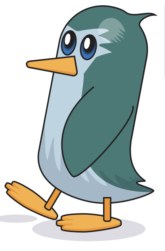
STEP 7:
The wing is added, and moved to the front of the image using the OBJECT menu on the toolbar - ARRANGE - MOVE TO FRONT. The penguin's right foot was moved to the back of the image in the same way, except using he MOVE TO BACK function. Colour is added to the beak, with a second triangle drawn over the top with a different hue of orange to give the impression of 3 dimensions. Finally, add an opaque ellipse, or two beneath the penguin to act as a drop shadow, further breathing life into the little guy.
0 notes
Text
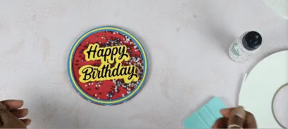
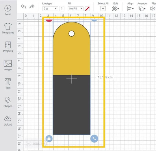
How to Make Cake Toppers With Cricut: Easy Tutorial

In addition, I wanted to create multiple cake toppers so that I could use them on my loved one’s birthday. Wait, don’t worry. I will not take you through the numerous cake toppers, but I will make one unique topper and show you how you can create it yourself with Cricut.
So, are you ready to get started with me? If yes, then let’s join me on a board and follow the steps carefully to eliminate any mistakes. Let’s get started!
What Items Do I Need to Create Cake Toppers?
Well, there are some materials you will be required to make a fantastic cake topper. So, in this tutorial, I am using the following materials or tools. Hence, I want you to gather these items before you move to how to make cake toppers with Cricut. Here are the items needed to make cake toppers:
● Cricut machine
● Blue cardstock
● Black adhesive vinyl
● Hot glue gun
● Scissors
● Transfer tape
● Adhesive cutting mat
● Yellow cardstock
● Red cardstock
● Double-sided foam squares
● Clear prism sticks
● Bearly art glue
● Colored confetti
● Acetate
● Thin double-sided foam tape
How to Make Cake Toppers With Cricut Machines?
Creating a cake topper on Cricut is usually easy. Yes, you heard that right; even a beginner can create it easily if they follow the steps diligently. The blog primarily targets beginner crafters who want to start using Cricut and those who want to learn to make a cake topper with Cricut.
I will take you through the steps below to create the beautiful cake toppers that will make your jaw drop. If you are ready to start, you have to start following the steps below:
Step 1: Create or Add a Design for a Cake Topper
Okay, let us create a design on Design Space. Below, I have provided you with the steps to create a cake topper design on the Cricut app:
Go to your software and start a new project.
2. Next, click on the Upload button on the left panel and click on Upload Image.
3. After that, hit the Browse option.
4. Look for the birthday cake topper on the device, select it, and hit Upload.
5. Now, you need to click on the Upload Image button.
6. Then, choose your image and then click the Add to Canvas option in the bottom right corner.
7. Finally, click on Ungroup to separate the pieces of the cake topper.
Step 2: Cutting a Cake Topper Design
Once everything is aligned with what you want, click on the Make It button from the top right corner. Below, let me explain to you how to make cake toppers with Cricut:
Ensure your Cricut machine is turned on, and all the cake topper pieces should be sorted by color onto your cutting mat.
After that, hit the Continue button. Next, you will be prompted to connect your Cricut Design Space to your Cricut machine. Now, you have to choose the materials from the materials list. Once done, you have to place the material on the Cricut cutting mat and then insert it into the machine.
Then, click on the blinking Start button on your Cricut and proceed to cut.
After cutting, you have to unload the mat and cut the remaining cake topper pieces. Next, you have to assemble all of them. To assemble them, you have to follow the next step.
Step 3: Assemble Cake Topper Pieces
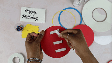
Now, use thin double-sided foam tape and place it around the edge of the topmost red layer.
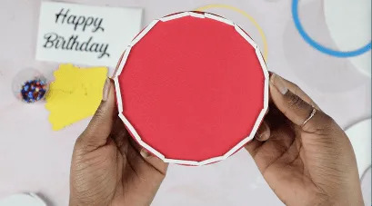
We are doing this because we will be adding some confetti, which should not come out in any way. Finally, add the confetti and apply the plastic film to the cake topper. Afterward, apply the cake topper you made.

Here you go!
Conclusion
Make sure you gather all the essential supplies or tools before you learn how to make cake toppers with Cricut. Through this blog, I have explained everything stepwise so that it will be easier for everyone to understand. No matter whether you are a beginner or a pro crafter, the easy-to-follow steps will get you everything you need for making cake toppers with Cricut.
FAQs
Question 1: Which materials should I use to make cake toppers?
Answer: There are many cake toppers available in the market out there. Some of them are made of plastic or acrylic. With a Cricut, you can choose any material that quickly cuts the plastic or acrylic. However, I prefer making wood, acrylic, and cardstock cake toppers. I avoid plastic for personal reasons; otherwise, you can use it until it is compatible with your Cricut.
Question 2: Which Cricut machine should I use for making cake toppers?
Answer: I think almost all Cricut machines are compatible with making cake toppers. Still, I would recommend you avoid using the Cricut Joy or its advanced version, Joy Xtra, to make a specific size of cake topper. As these machines are already small in size, you need to use a machine that can make the apt size of cake toppers that fit your cake. Otherwise, you can make cake toppers on these two machines as well.
Question 3: Is there any specific size for cake toppers?
Answer: I don’t think there is a specific size for creating cake toppers on Cricut until and unless you use Joy or Joy Xtra. These two machines may not make a certain size of cake toppers, but the rest of the machines are very well compatible with creating a large size of cake toppers. In short, there is no specific size for creating such toppers. Besides, cake toppers are usually smaller in size.
Source: how to make cake toppers with Cricut
Visit here for Information: Cricut.com/setup
Cricut maker 3 bundle
Cricut explore 3
#how to make cake toppers with cricut#making cake toppers with cricut#cricut.com/setup#cricut maker 3 bundle#cricut explore 3#design space cricut
0 notes
Text
How to Make a Bookmark With Cricut: A Stepwise Guide
Hey, Cricut enthusiasts! Are you in search of a tutorial on how to make a bookmark with Cricut? Be patient, as I have covered everything in this write-up. I always need a bookmark to keep track of my reading progress in books. Without it, I can’t continue reading books. Since I forget things a lot and can’t remember which page I read last time, it becomes essential for me to keep a separate bookmark for each book😅.
But don’t you think it costs so much to buy a new and small bookmark from the store🤑? Damn, its price is really high! I couldn’t afford that much, so I thought I’d create one myself. Yes, being a crafter, if we can’t make a bookmark using Cricut, then what’s the point of crafting? If you want to create a glitter bookmark with me, hop on a board with me!
Step 1: Start a New Project on the Cricut App
Before we delve into how to make a bookmark with Cricut, you need to ensure that Cricut Design Space is installed on your compatible computer device. After that, follow the steps in the section below:
You have to open up your Design Space app and start a New Project.
Go to the left toolbar menu and select Images.
Then, open the Art Type menu and choose Draw Only.
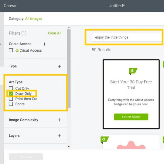
Afterward, you will need to type “Enjoy the Little Things” on the search bar and press Enter on the keyboard.
After that, you have to select the design that you are looking for and click on the Insert option.

Step 2: Edit the Bookmark Image

Step 3: Adjust the Shape and Size
Now, we need to adjust the width of a rectangular bookmark as per the required size. For this, go to the Shapes menu, and you will need to insert a square. Hit the Padlock icon so that you can adjust the width and height of the shape.

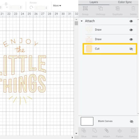
Step 4: Arrange Your Shape


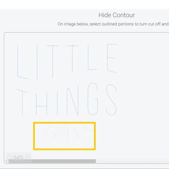
Once you are satisfied with the placement, you should drag the selection box over both shapes and select Weld to join both shapes together. Then, you need to weld the design to join both shapes together. Furthermore, you have to add color to the shapes.
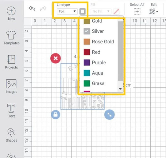
You have to go to the Shapes and then click the Score Line. After that, you have to change the line type to Foil and select the same line.
Step 5: Start Cutting Your Material
On the next screen, you will move to the Mat Preview screen. Then, hit the Continue button and proceed.
Place the faux leather on your cutting mat and then use a brayer to adhere it to the mat properly. Install the foiling tip into the housing. Move the white stars on the right side. Perform the instructions to cut the design. Before you unload the mat, you need to remove the foiling sheet.
After that, install the Fine-Point blade and cute bookmark shapes. Finally, you have learned how to make a bookmark with Cricut. Follow the instructions carefully to create your own.
FAQs
Question 1: What do I need to make a bookmark on Cricut?
Answer: Basic supplies are required for making bookmarks with Cricut. Besides, you must install your Design Space on a computer or mobile device. Here are the supplies needed for your bookmark:
● Cricut Machine (Maker or Explore or Joy)
● Brayer
● Faux Leather
● Foil sheet
● Tape
● Cricut StrongGrip Mat (Purple)
● Fine-Point Blade
Question 2: What materials can I use to make my bookmark on Cricut?
Answer: In my experience, you have various materials that you can try for making beautiful personalized bookmarks. For example, you can use
● Cardstock: It can be easily cut, engraved, embossed, or curled.
● Faux Leather: Available in multiple patterns and easy to cut on Cricut.
● Resin: Make decals and use resin to top them to seal them.
Question 3: Can I make bookmarks on Cricut Joy?
Answer: Yes, of course! In fact, the Cricut machine is the most suitable device for making small projects such as cards, bookmarks, and so much more. So, there is no doubt about it. The Cricut Joy is compatible with 50 materials, meaning it can cut up to 50 materials hassle-free. Moreover, you can use specialty papers to create an extraordinary bookmark.
Final Words
In this tutorial, I have explained how to make a bookmark with Cricut. From step-by-step instructions, I have tried to make it easier for everyone, including beginners. Making bookmarks with Cricut will require you to use some materials or supplies that I have already mentioned in this blog. Make sure you get all of them to make everything smooth. Start your journey to make a bookmark with me and keep tracking your reading progress.
Read more: install cricut design space app
cricut.com/setup
cricut.com/setup mac
Source: how to make a bookmark with Cricut
#design space signin#how to make a bookmark with Cricut#cricut.com/setup mac#install cricut design space app
0 notes
Text
how to start doing commissions/get hired [guide]
Ok, so when I started designing, I didn't really understood the concept of being hired/commissioned by other people, because:
1. I was a bit dumb back then
2. I didn't think it would be that complicated
So, to save the hassle that I went through, I will be teaching you how to get hired at big groups and how to start doing commissions. Let's get it!!!!!
☆
step 1: make a portfolio
A portfolio is basically a collection of examples of your best work. Normally if you're applying to job/college, you will submit a portfolio.
This works the same when applying for designer positions, most owners look for examples of your work to see if you suit the job or not.
examples:
type a: include tos.prices, examples a together

type b: just your designs
These are both made by me! I used pixlr E to made these and I will be showing you how! ^_^
☆
PORTFOLIO TUTORIAL
step 1: go to pixlr
step 2: Click open image, and open the image of one of your transparent showcases. When you're in the canvas, also open the images of your other showcases. Try to include as much as possible, but 15 is the best (3 rows of 5) !

step 3: Go to the top left corner, page > page size, and then change the sizing, you can reference the examples below:
3 rows of 5 (15) : 1500 x 900
3 rows of 4 (12) : 1200 x 900
3 rows of 3 (9) : 900 x 900
2 rows of 5 (10) : 1500 x 600
2 rows of 4 (8) : 1200 x 600
step 4: After you changed the page size, rearrange your showcases! It should look something like below:

step 5: Merge everything together if you haven't, then add a background (could be solid color/simple pattern)
step 6: Duplicate your showcases, change the color to a dark color, and set the layer to multiply, then blur it to create a shadow (it looks better trust me).
step 7: This is optional but you can add text, ex: your roblox handle and discord tag. and you’re done! :D

I know it may be complicated, but TRUSTTT me, making a portfolio makes you like 100x more professional and it looks more appealing anyways.
Try to include your designs that have a similar style (ex: kawaii, w kawaii, realism w realism, etc.) If you have multiple styles, make a portfolio for each separately.
☆
step 2: come up with your prices
Now, it's time to decide on what types of payments are you accepting!
I'm only doing this as a hobby and not relying my income on this, so for me, my prices are pretty flexible. I normally accept either robux, paypal (usd), and sometimes rh/mm2 items.For robux, it's kind of difficult to give insight on this since it's all relative and depends on the designer. But some factors to keep in mind:
1. time
Basically means the time taken to create the design, if you took a longer time making it, ofc it deserves to be priced higher.
more time = higher price
2. experience
How experienced are you at making designs? Have you been designing for a long time? Are you able to create advanced designs with high levels of detail and shading? These are all questions you should ask yourself.
more experience = higher price
3. complexity of the request
This once again depends on you, some designers ask for a higher price if the request is more complicated/includes more details (ex: armor, more accessories, realism).
high complexity = higher price
If you're having a hard time settling on a price, feel free to ask other people on their opinions!
Some prices to reference:
beginner: < 1000 robux
intermediate: < 2000 robux
advanced: 2000+
This is for robux only, but if you're charging something like USD (paypal/cashapp/venmo), the rate I go for is 1500 robux = $10. But once again, it all depends, feel free to go higher.
☆
step 3: advertise
When I'm looking for commissioners, I normally go to Icyella's server and post my designs + prices in the #hiring or #4-hire channel.
And since, Discord came out with a forum feature, the server now has a designer forum! You can post your designs there as well.
Example below:

**[name] 's clothing commissions**
**prices**
**>** [price] robux per outfit (must pay tax)
**>** i also take [other payment options]
**other info**
**>**payment [first/after]
**>**credit is [appreciated/required] ! (rblx [ur user])
**>** doing [include styles you doing, all, kawaii, y2k, realism, etc.]
**>** NOT doing [include styles you are not doing, armor, mecha, fursuits, etc.]
**dm to order/ask for more examples!!!**
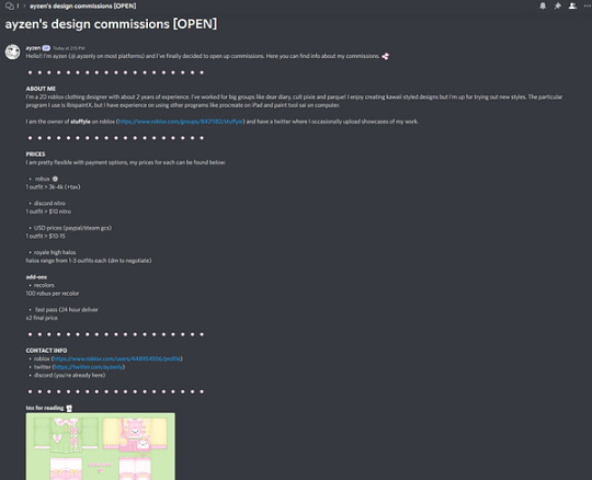
I didn't include the text (to copy and paste) for the forum post because I thought it would be better if it was personalized to you. If you need help on writing an example, feel free to DM me, I can write you one for free (^人^).
You can post these in channels like #design-services, which most roblox clothing servers would have. And make sure that you have your DMs open so people can contact you.
Try to post once every 2-3 hours in each channel!
☆
step 4: apply at designer positions
Most servers also include channels where people are looking for designers. So, if you're looking for a long/short-term job at a group, you can apply!
Remember to check the #hiring channel every once in a while and apply when you see a job.
☆
SOME MISCELLANEOUS STUFF
1. Decrease your prices if you need to
I know this sucks, but if you're not getting any customers, just decrease your prices by like a bit (10-30%), then once you get orders again. You can raise the prices back up.
2. Don't take too much orders at a time
Try to have a limited amount of slots open, for example, have a maximum of 5 slots. Then once you finish all 5 slots, you can open your commissions open again.
3. Form the habit of making showcases
Always make showcases of your work so you can have a good amount of examples for others to see.
4. DON'T DO PAYMENT AFTER
Please, don't ever give your design templates before they send payment. Always take payment first or after you send a preview (unless it's something like personalized merch, then do payment first).
I can't think of any other things to add but I'll update this if I think of anything.
☆
you made it to the end!! lmk if u have any questions, suggestions to making this tutorial better, etc.
credits: ayzen#1111 or @ayzenly on roblox
contact me: ayzen#1111
1 note
·
View note
Text
I have a conflict and it makes an fD of you. The 1-0Segment has Ends in which you are hurt and in which you are not hurt. The gradations order as images alternating hurt forms, all of which abstract to what we had, which means -1 because it’s in the past. To keep note, in integers, -1 counts SBE to 2 which is -1 to SBE from 0 to 3. That relationship continues: SBE to 5 is -1 of the SBE of 3 to 6, and so on.
So to count 1, we need to count SBE from 1, because 4,7,10, 13 are 1’s.
That means we have 3 counts of SBE to count all integers. Basic material, but this enables us to move SBE chains, which means we really do link each numeric count to those chains, so we can count 3 and get infinity, which is an interesting thought: we’re dividing the infinite process into 3 parts, into Triangular. That’s a big step but then if I think as simply as possible, that means it really is just because it’s 1 more than 2 and half of 6, because you can tile infinitely in Triangular and Hexagonal.
Let’s keep going in this vein. What is the difference between Triangular and Hexagonal? Simple, please. Hexagonal has a focal center End and a Boundary composed of 1-0Segments which are connected so any bT is connected to 2 other bT. That’s another representation of 1-0-1 as a count of 3 in which we can see 0-1-0 projected along with or in alternation.
Here’s a question: remember when we figure out alternating forms? Do it again. See if you can derive it quickly. Alternation is CR which is I//I when you generate a grid square by rotating an fD, meaning when you generate the intersectional form of gs, where intersectional can be ¼ in each separate gs or a gs of 4 quarters. Note how this intersection gs form is ideal I//I.
A simpler way may be to say that the 3rd End is on the O-line to the Counter which idealizes to the midpoint of the 1-0Segment. There are two ways to maintain that Observer. One is to block out all else as much as possible, and the other is to check both sides, to alternate over the O-line (which is also a zero 0 line). That is another I//I form, I’m seeing: the Irreducibles are the sides, meaning we observe I//I all the time, because we constantly check to the right and left, to the sides, when we’re crossing the street, when we’re seeing ourselves through to the other side. Talk about a metaphor hiding in plain sight! I’ve been looking so hard for a way to express I//I and here it is.
Say it! Okay. I’ll try. If it’s ridiculous, I apologize.
When you cross the street, you see the dimensions of the traffic to either side, and you see you on a path to the other side, meaning you see a version of you over there. This is a basic fD model: you project you over the road. It’s an fD when you abstract it like in Homer or Aesop: that you see yourself at the end of a journey and along the way there are challenges to overcome. And when you think you’re done with one side, the other remains to conquer. The metaphor extends to multiple roads, etc. that must be crossed. In gs terms, I always saw this as counting along the zK and with the intersections being sK. That’s because the convention of labeling positive and negative as we do creates a need to say one of these is this label and that happened to be zK. The point is to point out that sK and zK are actually relationships. You can see this in gs: if you - oh my God …
If you take the finite edge of a grid squares sheet, meaning any count you want but it has to be a count because grid squares are constructed and thus have a series of finite existences relative to one another, and you look at sK and zK, then you see Triangular. I’m assuming you’re looking at an xK, yK plane, which differs from the regular only in its capabilities. Finite. And finite draws an Extent, meaning a line, but of gs instead of points at the top. This Extent connects those diagonals, and one of the magic bits in grid squares is they count in 1Space so the counts along sK and zK equal the counts along xK and yK.
I’m really trying to find simple words here, but it’s really magnificent: this is the return of that old idea we had in which Triangular does exist in grid squares, that it’s been abstracted from the internals of the grid square to the externals, so we have a Triangular of grid squares. I feel like going voilá. I just did.
So, after all this work, Triangular is in grid squares: it has moved over the Boundary of a grid square into grid squares. That is absolutely perfect. I can’t think of something that would be a better proof than this.
Apply this: sK and zK, then can flip or invert over yK and xK, as we’ve done, because now we’re manipulating gs. That finally clears up the conundrum: we can generate gs and we can move them around without worrying about what’s allowed. That means, for example, that we can create a gs of almost 50 and almost 50 and compare them.
What was the simplest construction of that? Other than 5*10, when we’ve generated 5 a million times now. No, I mean in context terminology, like we have CM100 as CM64 + CM36, etc. (Yes, I know the notation is clumsy. I think in CM(64+36), but I want to be clear.) Let’s see. 1+(3*CM16)+1? Mimics the 5 form, replacing the center SBE with CM16’s. That means an expansion of, seriously? Of 2Things in 3 pairs, which makes a Hexagon. So 50 is a Hexagon form? It seems to be a representation of that form which looks like a watch hand or hands with arrows over a Hexagon. So a 50-50 would be I//I of two of these. That explains a lot: why we have trouble evaluating comes from the need to shift whatever is out there into an estimable odds, with that appropriate to the circumstances. Even might be what you want at a casino, while overwhelming might be what you want in combat.
We seem to be saying that these lay down orthogonally, and thus project over each other. That is also true in the roads story example: they plan to not kill pedestrians, etc.
It’s nice alternating with you. That’s what an fD does, what that 4th gs means: the alternations, which are literally embodied in the B-Endpoints and the 2gs on the sK when counting on the zK, are orthogonal over a constructed square which is made of the base 3fD and the constructed 4th, which means we’ve just united the two views, which is very good. And that came from me seeing an image of you on the other side of a road, then seeing how your journey is meant to build with mine to elevate both so the Mission can be accomplished. I’ve never seen that so clearly.
Take it from 10’s. We put a 10 inside any count by attaching SBE3 to 1. Oh, I forgot, yesterday I also realized that we generate that (1+(SBE3)+1) glyph. How? Don’t remember. Keep going and see if it comes back to you.
Oh, right: we did that yesterday. It was implicit in the work connecting -1 to 1. You can see it above: count SBE3 and you see the prior and next Attachments represent the overlapping SBE counts! And thus the infinite processes in those, which highlights the importance of that work above. Nice work.
So, we tend to think of 5 as a pyramid of 1-0Segments. Like in Egypt. I remember one panel shows from beyond a hand to the Pharaoh and the Queen, and then down to the others and the animals. This doubles as mom and dad, children and animals, so the hand can be down to the royal level and then down. That’s also SBE, isn’t it? I think they would say whichever side you go down, you go down that one first, and that one then represents the down motion. The other then represents the taking, the work done for, etc. going up.
So a 50-50 is literally then up or down. Thumbs up or down. Never would have believed that level of metaphor would be a literalization, when of course it had to be and I just couldn’t find it. Didn’t even think of looking for it.
Another is 12*4, connected with Attachments. Thinking in fCM now, not D-structure though of course D12 is 2SBE2, and thus this would be the IC of 2SBE2, which thus the representation of 3*16 as explained above, with the note that this creates a D3 space of CM16’s which is the same as space as the IC, and thus the grid square (since 1 is 4 and 4 is 1) of 2SBE2, meaning how that counts in the grid square sheet. I’ve just constructed 2*24, which describes that same space another way.
How do these fit together? I have a pyramid and 2*24 + Attachments. I’m not sure how this goes and it tend to make me dizzy, but I’m seeing each bottom pair as 2 and thus the other 2 + 1 as 24, which means times 8, and that brings us back to grid squares Irreducibles, so that would be the I//I of grid squares. Do it in both directions and you get 48.
To finish for now, this says not tha one side becomes one way all the time but that these sort so there is a 50-50.
Had no idea this was coming. It’s fantastic!
——-
Should probably add it’s 26 Apr 2023. Never realized that my fundamental leap would be proven this well. I’ve seen a lot of solutions but nothing this good. Triangular appears in grid squares as the external count. Wow.
0 notes
Text
What is the best tool for a/b test for web app?
1. Google Optimize
It’s tough to put out a list of software solutions like this without starting with Google. All of its tools are great for business owners who manage websites on their own.
Google Optimize is no different.
This tool should be a top choice for you to consider because it has native integration functionality with your Google Analytics profile.
This gives you an edge because you already have information on record about how visitors behave on your website. Using this data will make it easier for you to prioritize what needs to be tested first.
Another benefit of Google Optimize is it’s free.
The visual editor is simple for anyone to figure out, regardless of their technical experience.
In addition to Google Analytics, this tool can also be integrated with Google AdWords and Firebase.
You can test mobile features and optimize your mobile website for Google searches.
2. Optimizely
Optimizely is one of the most popular options. They are definitely a market leader when it comes to A/B testing software.
The tools on this platform let you run lots of different experiments on your website.
These experiments allow you to focus on A/B testing and personalization.
One of the highlights that makes Optimizely stand out in the crowd is its ability to run A/B tests on multiple pages and platforms simultaneously.
For example, you can run tests on your homepage and contact page while also testing the shopping cart on your mobile site on Android and iOS devices.
Unlike other tools, Optimizely generates results that are easy to read and comprehend so you can make decisions based on the outcome.
With Optimizely, you can run A/B tests on a number of factors outside of obvious components, like a CTA button. You can run tests on:
cookies
geography
ads
audience segments
All of this information will give you a competitive advantage and maximize your conversion rates.
Visit Seotoolskit for more exciting and free SEO Content.
3. Apptimize
Just as the name suggests, Apptimize is made for running A/B tests on mobile apps.
This is the ultimate tool if you want to improve the profitability of your small business mobile app.
All too often I see businesses ignoring mobile users. You were one of the smart ones that catered to their needs and developed a mobile app.
But the development process isn’t over when your app launches. It’s imperative that you always strive to make improvements on your platform.
Mobile app conversions are just as important as those from your desktop and mobile sites. With Apptimize, you can run tests on all three of these.
The software also supports different code blocks:
Objective-C
Java
React Native
Swift
Xamarin
You can run tests on your app regardless of the code used for development.
4. AB Tasty
AB Tasty is a great option for businesses just starting to run A/B tests and focusing on conversion rate optimization (CRO).
Since it’s designed for beginners, the pricing options are really affordable.
AB Tasty offers different options for testing. You can test two or more variations of a single element on your site, such as CTA placement, images, or colors.
You can also do split testing.
This feature lets you build two separate landing pages to see which one converts more.
Its multivariate option allows users to run combinations of tests simultaneously.
You can also take advantage of the funnel testing feature. This lets you test changes of the user experience as visitors navigate through each step of the conversion funnel on your site.
5. Convert
If you have a small or medium sized business, Convert has great A/B testing solutions for you.
It’s meant for people focusing on optimizing their websites in-house.
It’s ideal for these types of business owners because it’s easy to use. Part of what makes the navigation so simple is the drag and drop features.
You can use Convert’s software for A/B tests, multivariate tests, and split tests as well.
They make it easy for you to integrate and onboard your content management system and Google analytics data.
This allows you to focus on personalization. You can build customer profiles by using this software.
Another reason why Convert is so popular is because it has an outstanding customer support team to help you answer any questions if you’re having trouble with the software. It’s easy to reach a representative through the platform’s live chat option.
6. Adobe Target
Another one of my favorite options is Adobe Target.
When you use this platform, you’ll go through a workflow process that has three steps.
First, you’ll determine the variation you want to test.
Next, you’ll decide how you’re going to segment that variation with your visitors.
The final step is to customize all your settings and set a goal for the experiment.
Automated personalization is one of the top features available on Adobe Target.
This tool has an algorithm that automatically makes changes based on visitor behavior to optimize your results. It will help you increase sales by personalizing the customer experience.
You can run tests based on how different visitors experience your site.
7. Kameleoon
Kameleoon uses artificial intelligence to power its personalization tools.
The AI makes it an advanced platform. I wouldn’t recommend it if you are just starting A/B testing on your website.
It’s better for those looking to test deeper elements of their sites.
The reports generate user insights with the navigation analysis tool.
Kameleoon lets you test multiple user segments with more than 40 different benchmarks for targeting, such as:
lead management
engagement with visitors
conversions
social proof
customer loyalty
reactivating old customers
These are all examples of experiments you can run with Kameleoon’s advanced software.
All of the data is updated in real-time. There’s no need for you to wait for a report to get generated to see your results.
Visit Seotoolskit for more exciting and free SEO Content.
0 notes
Text
Blur background

We’ll cover a few of them in this guide and talk briefly about some others. Options for Blurring Background in PhotoshopĪs with many editing effects, there are multiple different options for blurring background in Photoshop. As part of Adobe’s Creative Cloud Plan, you get Photoshop and Lightroom both for only $9.99/month. If you don’t have it yet, you can get Photoshop from Adobe’s site. Steps to blurring background in Photoshop.Effects of blurring background in Photoshop.Different options for blurring background in Photoshop.Practicing your technique will help you better - and more quickly - employ it in future editing projects. Try experimenting with both of the methods, and even combine some of the elements from both to work on your images. This article will show you two different methods for achieving a blurry background in Photoshop. Fix unintentional foreground or background details.Allow for a dreamier or more creative look.Here are some of the ways a blur effect can enhance your images: You may decide to try adding a blur effect to your image backgrounds in Photoshop for several different reasons. If the background in your image is distracting, blurring it out can solve your problem! So, how do you best blur background in Photoshop? Though you can achieve this effect in camera as you photograph, you might want to add it to an image that you’ve already shot. Many great images use background separation or a blurry background as a composition tool. If you do 1 of these things – you’re on the right track, 2 of them – you’re almost there and 3 of them – you’ll be in BLUR heaven. So, separate your subject from the background as much as you possibly can. If your subject is right up against the background, it will be much harder to not have it in focus. The further your subject is from the background, the more blur you will get. Position Your Subject Away from the Background I can get amazing background blur with my 85, 1.2 or my 70-200mm, 2.8.ģ. The longer your lens, the more background blur you can get! A longer lens allows you to get further away from your subject and zoom in, which will create greater amounts of blur. So, if you focus on your subject’s eyes with a very shallow depth of field, the focus will not cover the background – and wahla – you gots da BLUR! Woo! Depth of field is the amount of the photo that will be in focus. The wider your f-stop is, the smaller the depth of field will be. Try these 3 easy steps and see how you do! I think you’ll be pleasantly surprised with the results.Ī very large part of a blurry background is caused by a wide f-stop like 1.8, 2.8 or as wide as your lens will go be it 3.5 or even 4. Any time you can make your subject pop out from the background to be the “star of the show” this is a veeerrrrry GOOD THING! You will constantly be impressing friends or on-lookers with your stealth photo skills.īesides impressing people, which is always fun – you will also get drastically better photos. It will allow you to create photos that the human eye cannot see. It can take a busy, despicable background and make it tolerable or dare I say, fabulous! Instead of feeling like an amateur you can feel like a magician with a camera. This is a technique that can take an “ehhhh” photo and make it fabulous. Although, bokeh really is kind of fun to say. But, if you’re like me – you just say blurry – because that’s what it is. Background blur…you want it, I want it, we all want it, right? If you’re a fancy pants you might call it bokeh.
1 note
·
View note
Last Seen Blogs

fmdxyoungjoo
Young-Joo

topsoilsupplier
Top Soil Suppliers
fundy-updates
Updates On Fundy

popovic
Bookmarks