#(photoshop itself doesn't but the brushes still do)
Text
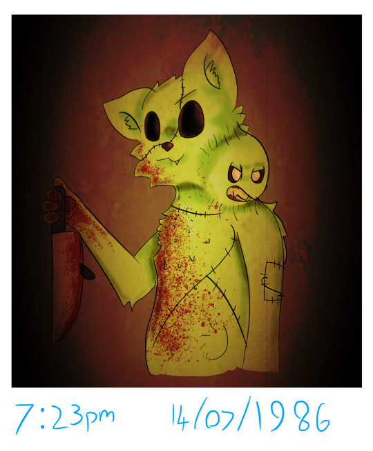
wow vittu and kitr meow meow
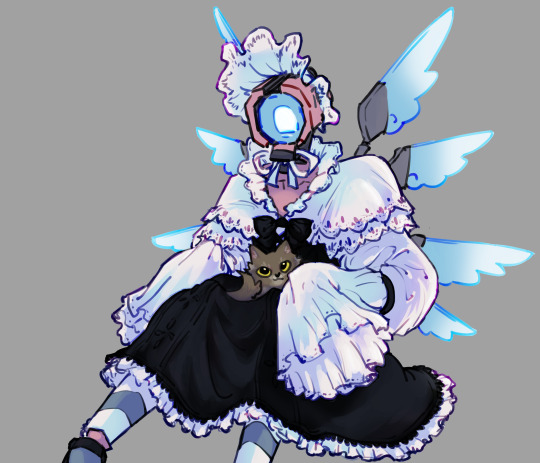
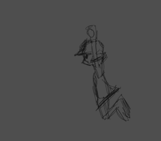
testing out some more lineart based stuff, alternative colors under the cut
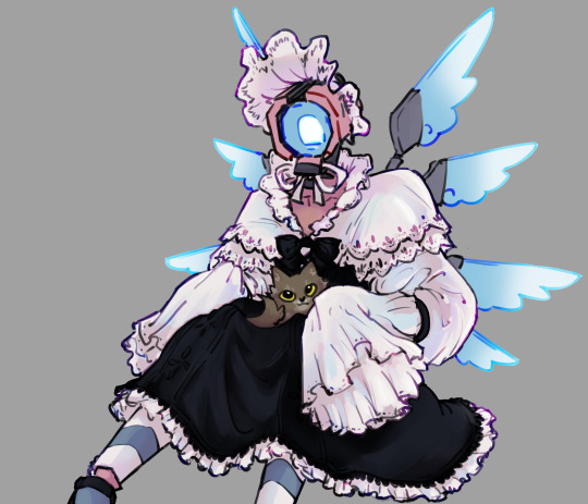
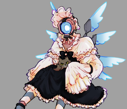
#if you know what this is based on. you have great gaming knowledge and deserve a star#and before anyone says it. no. its in the goddamn design. i did not just hide her hands for no reason#ctrl u my beloved#v2 ultrakill#kitr ultrakill#ultrakill#my art#basic photoshop brushes fuck hard btw#(photoshop itself doesn't but the brushes still do)#color dodge color burn difference my saviors
536 notes
·
View notes
Note
just curious, whta app/program do you use?
Okay, since I'm not the type of person to stick to only one art program/app and whatnot, here's my short reviews of every art program I ever used and the ones I still use.
PaintToolSai1/2 - pretty useful for people who don't own a drawing tablet cuz it has an amazing curve tool. Otherwise, I try not to think abt that abomination of an program.
GIMP- ummmmm..... it exists. Def not for drawing, more for photo editing or fixing ur art
Photoshop [multiple vers] - OK everyone sees it as a Lord and Savior of art. I say it's overloaded with so much stuff it can be overwhelming sometimes. Also better off fixing photos and drawings on it if you're not a professional.
FireAlpaca - making small animations on it was actually pretty fun, simple, easy, I'd recommend it to any beginner who doesn't need complicated tools just yet. But wants to try out new things and experiment.
IbisPaint- a lot of people use it and prase it, idk the damn thing never clicked with me. Especially after the "glitch that erases ur drawings with a square" thing, Tried it, now I avoid it. Nothing interesting abt it.
Medibang [currency use] - Currently wondering when they're going to treat the Pc verson and the app verson the same. A lot of stuff that are on pc are not in the app so lookout for that. it's alright, great for me and my lineart and comics and stuff. Kinda gets overwhelmed when folders get introduced for the drawing. But he's a champ yo, alright for paintings but not perfect. (Unfinished drawing)
Sketchbook [currently use]- alright for paintings, not so much for lineart at least to me. Some brushes are so overpowered that the app verson struggles to render it properly. (One of my unfinished paintings in it)

Krita [currently use] - It's okay. As I stated way before, I'm in a love/hate relationship with it. It has everything an artist would need, but the damn thing crushes on itself way too much . Bro is so overpowered he struggles to find balance in his life. Eh but I love it anyway, I used krita since the proper launch when it had nothing but few brushes and stuff, when it looked like a SAI copy or sum. Amazing to think that it was inspired by GIMP out of all things. (Fast animation I made in it)
Have in mind there are lot's more programs and apps out there. It depends on what you need from a program and your own skills, and lot's of other things.... they all have their strong and weak points, that's for sure.
42 notes
·
View notes
Note
hiii your art always make my day better, so hope u had a good day too. But can I ask what brushes you usually use in your arts? Like the way you use brushes and colors are so good TuT I can't fathom it sometimes. How do u make those kinds of textures. I'm new in this tumbler, so apologies if it's already been answered before. <33
Heyo anon, thanks for asking and no problem! I've answered this a couple of times before across all my platforms, but ig this is a good opportunity to answer and add to my carrd FAQ! <3 Let me break down what I use them for a bit too. (lots of blabbing below so I'll but a read-more tab)
Main:
(sketching) Design pencil (default in CSP, you can probably find it on the assets store because it was from the earlier version of CSP)
(sketching/coloring/general use) G-pen
(sketching/coloring/general use) Dense watercolor (same case as the design pencil)
As for brushes that I use for texturing and painting, I use the Daub brush pack for CSP. My favorites come from the aenigma, pigmento, and basiliscus sets. You can find them on gumroad, or just google! I believe they have brushes for procreate and photoshop too but I think the brush packs aren't the same across platforms.
For making the texture itself, it's kind of a random process that idk how to explain properly lmao. Let me link my Kokomi timelapse so you can see how much I jump around the canvas to carve out the textures:
I like to use different blending modes and layer tons of different colors. The color jitter function is super amazing too for that purpose, but probably shouldn't be overused for the sake of balance. (personally still trying to avoid over-saturating my works with textures tbh)
To be 100000% honest though, I tend to jump around a lot, and I certainly don't use all of those brushes in every piece.
I used to lurk around a lot myself and hoard tons of brushes other artists were using, until I saw a comment of an artist I admire: "sometimes the brush you use really isn't important. Without practice the painting will be ugly."(not the most accurate translation probably because it was written in another language)
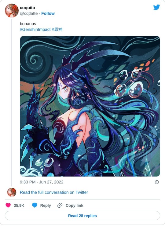
After that I had like… an epiphany moment where I really believed them, and drew a Bonanus fanart in June. I made the lineart with a g-pen (which I never used cuz I always thought I'd be somehow inhibiting my creative power using default brushes or something), and the piece ended up blowing up on twt much to my surprise.. LOL. After that, I started to care less about other's brushes and instead of looking for more, try to figure out how I could make cool textures and strokes with the ones I currently had at my disposal.
(said bonanus art)
This isn't a statement to say "stop looking for other artist's brushes, copying brushes bad, etc" because there is a LOT that you can learn from using other artist's brush inventory.
But you can also have a lot of fun drawing when you focus less about what other's use, and more about what brushes YOU are comfortable using + feels right to you. Sometimes you may even need to tweak them a bit in their brush settings instead of using their default form before they feel comfy for you! It's a matter of exploring and figuring out what works and what doesn't in your workflow, hehe.
Anyways I hope this answer helps as we all continue our art journey together. Sending positive vibes your way anon! <3
20 notes
·
View notes
Text
Nostalgia and Memory
Final
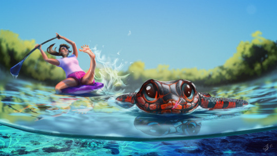
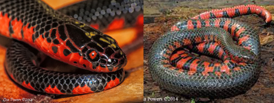
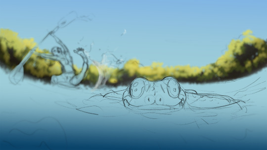
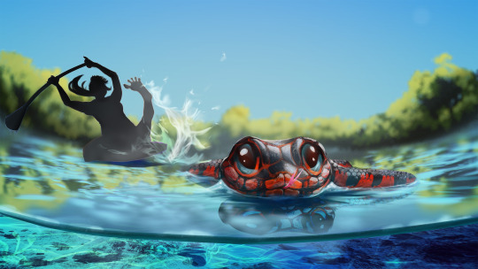
I wanted to choose a positive memory for this piece from a holiday adventure to Crystal River in Florida. I have a fear of snakes and my encounter with this particular mud snake helped overcome that a little. I was paddling along the river, my partner and our tour guide further upstream, when a large black and vivid red snake passed close to my leg. I immediately thought of the age-old advice that brightly coloured creatures are often poisonous, which I learned was mostly false when I frantically researched it later. I stayed perfectly still in my panic, but as the snake passed, I noticed that it was happily minding its own business, just going about its day quite confidently and happy to share the space with a large floating biped. Still, when the snake had passed a safe distance, I hurriedly took my legs from the water just in case anything else crept up on me.
Research
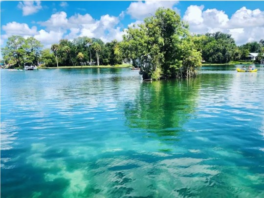
Crystal river is a fresh water river with stunningly clear waters that wouldn't feel out of place in the Caribbean. I wanted to capture the colour and clarity of the water in my piece. The colour itself lends to the welcoming and holidaying vibe of this memory.
I chose emulate Disney/Pixar rendering and colour style for this memory as memory doesn't always appear in the mind as realistic, and Pixar has a marvelous and very scientific way of eliciting emotion through its colour use (ROGERS, 2021). Most of the Pixar colours seem to be neon pastels, this style gives space for capturing the colours of crystal river and even enhancing them as memory can.
Examples of Pixar pallets:


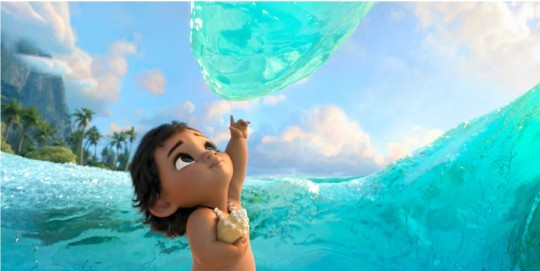
In Moana, the neon color of the water entity enhances the feeling of wonder and magic.
My memory does not accurately recall details, for example, when I think back to that event, I do not see the Smaug-like eyes of the snake pictured below, but rather a more caricature version where the snake has cute shiny, button eyes. Pixar has a wonderful stylisation of real life that will lend to the feelings I'm trying to convey.
I wanted to be accurate in my colours when presenting the snake, but also stylise its features to come across as cute, confident, and oblivious to the alarm it caused!

A key style cue for Pixar animals is large eyes that don't seem to anatomically fit in the head, bright colours, expressive eyebrows and a big smile.
Process
As I began my rough thumbnail sketching, I was struggling to show the snakes face, which would need to be a key focal feature in order to show his cuteness. I realised that I needed to for-go the strict recollection form the first person and adjust the angle to make it all about the snake, but still capturing the aftermath of his passage. I tried a lower angle with a wide-angle lens distortion to capture the micro-elements. The distorted curve helped add drama and a dynamic flair to a simple composition.

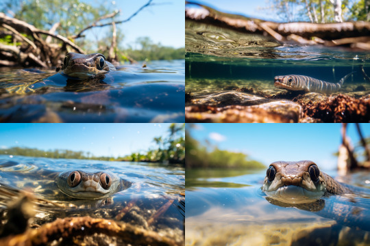
As I was pleased with the direction, and to get a more relevant photo-reference, used the prompt: "looking down at a very cute mud snake swimming ontop of the crystal river in florida with depth-of-field mangrove roots in the background and blue water underneath. --ar 3:2". This was a great realistic reference for rendering.
I had chosen to go with a depth of field with a shallow focal range, this meant most of my assets would be blurred. I was able to work quickly and efficiently by using Photoshop's powerful blurring filters to achieve a realistic result.

After roughly painting out the forms with a foliage brush, I ran it through the Lens Blur filter in Photoshop.
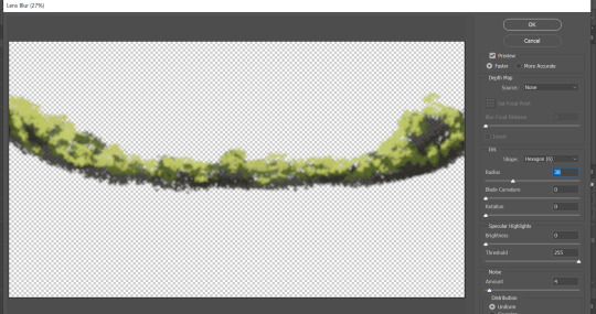
I also used a Photoshop filter to blur the undulating water effects which were painted using a water specular concept brush. To match the shallow depth of field, I used the Tilt Shift blur filter which lets you control the depth of field (1), focal range (2), and focal point (3).

I duplicated the water effect layer twice to create the light refraction. The first layer is the primary layer that shows the colour of the water beneath the surface. The second layer is a deeper and darker blue moved just a couple of pixels above to create a core shadow, and the third layer, in white, moved just a couple of pixels above the last, creates the specular. I adjusted the opacity of each until accurate.

Crystal River underwater reference image:

The water beneath the surface was relatively easy to achieve with a pretty realistic result. The most valuable players being the rocky textured brush and the perspective transformation tool.
In image one I created the water line against the lens and painted in the vibrant colours that captured the Crystal River.
In image 2 I used the texture of the brush to add in some debris and then manipulated it into perspective.
In image three I used another concept brush for ground rocks.
In image 4 I used a rectangular brush with fall-off to create the caustics, which I also warped into perspective. The shadow of the snake helps emphasise its length and size and the trail of caustics is a cute detail to show motion.

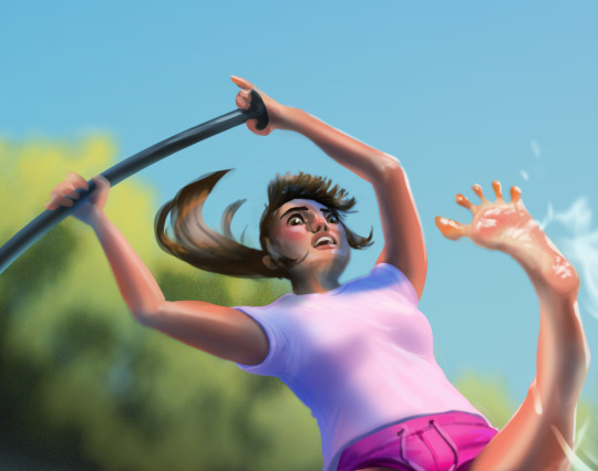
I wanted to spend time detailing the caricature of myself even though it was going to be blurred. I wanted to capture the fear in my eyes and have my focus be on the snake. Sadly, I think this feature is a little lost, but if this were to be animated, a change in focus, or a close-up of the character's face would help sell the emotion beyond the large movement of the limbs. The splayed toes are another cue to the emotion which I think is pretty cute and funny.
I wanted to have more control of how the character was blurred, so I created a depth map where pale is foreground and dark is further away, this would have to be inverted later to be applied using the Photoshop filter.
The filter requires the depth map to be applied as a layer mask (unlined or later deleted so opacity is not affected). I copied the depth map and pasted is directly in situ into the layer mask (alt+lft click to select) and inverted the entire layer.
In the Lens Blur filter, I selected "Layer Mask" as the source for my depth map and adjusted the sliders to where I was happy with the blur amount.

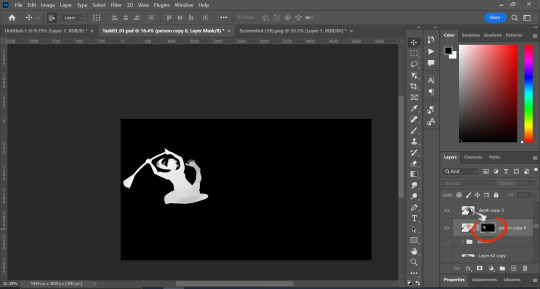
It was a little late, but because my assets were painted independently to the rest of the scene, I was able to move the character and snake into positions better suited to the composition.
I am really pleased with the way this piece turned out, the colours and characters match the style I decided to pursue. The main critique from my peer review, on which I agree, is the movement of the character; pushing the dynamic element of the pose and positioning. I struggled a little with the angle of the person, and the movement seems to create some confusion as to whether this person is falling in the water or dramatically pulling their leg from it, I will need to work on the clarity of my story telling!
References:
ROGERS, A. (2021). How Pixar Uses Hyper-Colors to Hack Your Brain. [Online]. Wired. Available at: https://www.wired.com/story/how-pixar-uses-hyper-colors-to-hack-your-brain/ [Accessed 25 October 2023].
Image References:
DISNEY. (2016). Moana. [Photograph]. Burbank: The Walt Disney Company.
GRANT, C., SAUNDERS, M. (2023). Waterways of Crystal River, Florida. [Photograph]. [Online]. Available at: https://www.outsideonline.com/adventure-travel/destinations/north-america/explore-the-waterways-of-crystal-river-florida/ [Accessed 25 October 2023]
MIDJOURNEY, (2023). Looking down at a very cute mud snake swimming ontop of the crystal river in florida with depth-of-field mangrove roots in the background and blue water underneath. --ar 3:2. [AI Generated Photo].
PIXAR. (2016). Finding Dory. [Photograph]. Burbank: The Walt Disney Company.
POWERS, L. (2014). Red-bellied Mudsnake 01. [Photograph]. [Online]. Available at: https://kysnakes.ca.uky.edu/snake/farancia-abacura [Accessed 25 October 2023].
POWERS, L. (2014). Red-bellied Mudsnake 04. [Photograph]. [Online]. Available at: https://kysnakes.ca.uky.edu/snake/farancia-abacura [Accessed 25 October 2023].
QUALITY LOGO PRODUCTS BLOG. (2023). 8 Color Schemes from the Pixar Universe. [Online]. Quality Logo Products. Available at: https://www.qualitylogoproducts.com/blog/pixar-color-schemes/ [Accessed 25 October 2023].
WAKE AND WANDER MEDIA. (2020). Crystal River, Florida. [Photograph]. [Online]. Available at: https://www.forbes.com/sites/willmcgough/2020/08/20/road-trip-florida-5-insider-tips-for-visiting-crystal-river/ [Accessed 25 October 2023]
0 notes
Text
Fonts
For my book cover I am currently looking to make hand drawn text, I believe this would allow me to have more control of the text itself. However I do still want to play around with text and fonts to be safe because from previous works I did last year I wasn't able to create great looking text
It was meant to look sloppy however I feel like it just looks bad, The text looks too bad to be formal and it looks to clean to be marker, I believe if I had just used the proper brush in photoshop. Another thing to note is that I do have a new program to work in with different tools that may be useful for creating text for my old work.
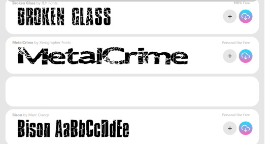
All I'm trying to state is that text might be a better choice for me if I either struggle with drawing text or feel like I'm running out of time, The link above is one of the font websites I could freely use to find useful fonts that I feel might work for my text.

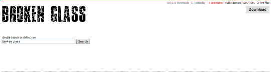
This website didn't have what I wanted which was some kind of glass shard text to look similar to the shattered lens.
This was more of what I was looking for.
DaFont is the main one I use in college as we used it once for a previous project and I didn't really need to use another website as DaFont always had the fonts I was looking for.
DaFont seems to have less options than Fontspace, out of the two I think Fontspace has a larger category making it a lot more useful than DaFont.
I don't have very high hopes for this website, I don't have any particular reason as I've never heard of it however it is still a possible candidate to get different font styles from.
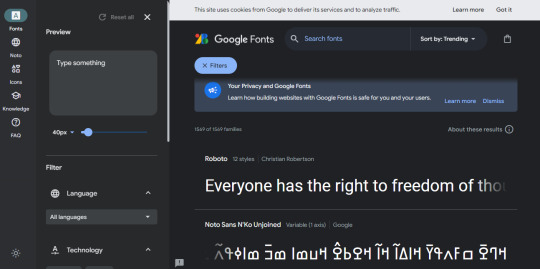
Immediately I consider this the most professional looking page.

I've run into an issue, it seems this website doesn't have any textured texts, It appears to offer a large verity of formal fonts however when it comes to fun and strange textures I don't believe this site is a contender.
0 notes
Note
20, 8, 34 and 46?
20. Mac or PC
pc! i did briefly use a mac at one point years ago when i used my family computer instead of my laptop for gifs, but other than that i've always been a windows girlie
8. What gif trend do you hate
already answered this, but i guess another one would be when the current trend for blending/double exposure style gifs involves like 3 or 4 gifs all blended on top of each other to the point that it gets difficult to see what's going on in them (again, totally not a hate, more just not a love!)
34. A set that took you a long time/was really hard but you’re really proud of how it came out
this buddie set nearly drove me insane specifically because of trying to draw that damn string. the version of photoshop i was using at the time (which i've since updated) didn't have a brush smoothing option so i couldn't just draw it in photoshop itself, so i had to download a whole separate program and open a still version of the gif on there, draw the string as a layer on top of that (which took so many attempts each time to look right) then save that as a png and open it on photoshop to put it on the gif itself. and then trying to make sure they all lined up. absolutely never doing it again but i am glad i didn't just give up on the string idea altogether!
46. Ever gotten a really sweet compliment over a set
so many and they always make me so happy!! as much as i do enjoy making gifs, compliments in the tags are like the fuel to keep making them, especially if the set doesn't get a load of notes just knowing that a few people liked it enough to say something lovely about it is just 🥺🥰
questions for gifmakers!
1 note
·
View note
Text
kinda wishing i’d bought an ipad pro and procreate instead of a cintiq ://///
#personal#i wanna use procreate but it's not available on laptops#also with an ipad i could draw anywhere..... i could lie in my bed and draw#with cintiq i have to actually sit down at my desk and also it's huge and takes up so much space when i'm not using it#lmao it's fine it was only like 600 euros it's........ fine................#i could also use ipad for school thingz#but it's not like i can afford one and i'd feel bad for having spent like 600 euros on a cintiq that i wasn't using#i'm just pissed off i still don't know how to use photoshop after a year and medibang has bad brush selection and procreate isn't available#like i just want a simple enough art program but with good brushes for digital painting#fucK!!!!!!!#i'm just feeling super annoyed with digital art lately bc the programs i'm using and my skills re: those programs#just won't allow me to create the kinda digital art that i'd like to create#and it's not just the programs but there are things i don't like about the cintiq itself either#but like 8 months ago i still thought cintiq was a good idea so......... WHAT CAN YOU DO I WANNA KICK PAST ME IN THE HEAD#you know when u buy something super expensive and then it doesn't live up to your expectations............ the worst
1 note
·
View note
Note
Do you have any tips on how to start digital art? I want to try but I just don’t know what to do
Hey there!
I'll try to give you a few tips that come to my mind spontaneously and that were on my mind when I started drawing digitally. Since I don't know whether you are referring to hardware, software or drawing itself, I'll try to cover all three:
1) Hardware
To be able to draw digitally, you need a device that lets you draw on a PC or an all-in-one device.
I started with a Wacom Bamboo Fun, which is no longer available. I think an equivalent is now the Wacom One (without screen); or any other company. These are all classic tablets where you draw on the plastic surface without a screen. So you always have to look at your screen in front of you, not at your hand. It takes a bit of practice, but you learn quickly.
Be sure to check the quality of the pen: how many pressure points are there and does it support tilting, etc.? Many very inexpensive products cut corners here.
The big next step is tablet PCs (all-in-one devices), although I'm personally not a fan of them. The iPad seems to be quite good, but also expensive. I have a Surface Pro, which I can't recommend. It's great as a PC, but not for drawing.
I use a Wacom Cintiq now, which is a screen you draw on, but you need an extra computer for it to work. Also, it cost me 2k at the time - it’s basically a very expensive screen. So it's definitely not for beginners and I don't recommend it to you yet.
It's best to get something cheap and then upgrade when you realise that it's good for you. If you want an all-in-one device, an iPad is probably the best solution here, otherwise the simple tablets without a screen.
Many have touch, some don't. Personally, I deliberately decided against touch at the time because I had a bad experience with the feel of my Surface. Hit or miss I guess.
The most important part: It doesn't matter that you get the most expensive device now because so many established artists have those. There are many very very good artists who still use the "simple" tablets without screens. Everyone has their preference and I think that's what you have to find!
2) Software
Here it probably depends on what you want to draw: Illustrations or comics. Some apps are more suited to one or the other.
Personally, I'm an absolute fan of Clip Studio Paint (Pro), which is often on sale for little money. Photoshop is very powerful and simply too powerful (and too expensive) for beginners.
Programs that I consider user-friendly and suitable for illustrations AND are free (PC):
Krita
Autodesk Sketchbook
Medibang Paint
PaintTool Sai
They're all fine for a start, but are limiting when it comes to brushes, materials and functions.
Programs that are good for illustrating (iPad):
ProCreate (just under 11€ once)
Clip Studio Paint (7€/month)
For PC/Mac, Clip Studio Paint is a one-off price. They usually have a spring sale - here you can get the basic version for just 40€, which I would highly recommend to anyone, as the programme is very powerful and still user-friendly. The big advantage I see with Clip Studio Paint is that it gives you a perfect interface for drawing comics while remaining flexible enough for illustrations.
... now I sound like a commercial 😬
3) Art
If you have drawn traditionally before, digital art is not that different. As described above, you would have to get used to it for a short time, but everything else remains the same. How you move a pencil and how to draw for example eyes.
In my opinion, everything stands and falls with brushes and overlays in order to get a satisfactory result that corresponds to the previous traditional standard. Textures can completely change images and give them a "real" appearance.
It is also important to know that if you have had experience with e.g. Copic, colour works very differently digitally. Here you probably have to look more closely at colour theories to make sure you don't reach for the poisonous green for the grass, which with a Copic will eventually soak into the paper and dry and become a pleasant grass green. That’s not going to happen with digital colours.
Otherwise I can recommend Youtube videos. There are some good videos here that explain anatomy, etc. Marc Brunet does some really nice stuff, although I think it’s all about personal preference here.
In the end: draw what you like! And don't get discouraged if something doesn't work right away. We digital artists have Ctrl+Z, but many other pitfalls that you will probably notice in the course of time.
Hope that was a bit helpfull! 💕
22 notes
·
View notes
Text
die ärzte stuff from my sketchbook 2/?
I wanted to keep these separate from the previous sketchbook post because this is all about hair "studies".
I know how to draw realistic hair, and I know how to draw comic book hair. But to draw something from between those? That was a huge challenge. So I tried out things and eventually watched some video tutorials too, and tried to use those freshly learn tips and tricks.
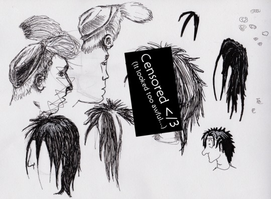
This was my second attempt with that one Richy Guitar scene I'm (still) trying to draw, but Bela's face was too difficult to draw once again, so I abandoned this one. And that failure is under the censored one because it really looked awful. I ended up making an edit of the scene in photoshop so that I can draw Bela's face from a more easier angle. Or the angle itself was not difficult, it just made him look quite weird to begin with and that was not fun nor easy to draw because it was impossible to get to look similar but also like Bela - when he doesn't even look like himself enough in that original screenshot.
But yeah, to the hairs now. The Farin/Richy on the left was my first try of these, and the second one was by using something I saw in video tutorials. I think all those Bela hairs I drew before these and really had a hard time figuring out how to draw black hair! I tried the brush pen and I tried fineliners but nothing seemed to work.
Then I went to watch some tutorials.

And this is what I came up with. It definitely was getting better and better, but this time Farin's hairstyle was causing me problems. It was really difficult to find even any tutorials because every "spiky hair" tutorial was about manga or anime, and most "hair colouring" tutorials were for digital art or real hair and that was not what I was looking for.
What comes to the texts... you see, I tend to become bilingual or even trilingual when I make notes. I switch between Finnish and English all the time and don't even notice it myself. The texts under Farin hairs go: "Meh...", "Could work." and "That is lacking something."
But otherwise I'm really proud of those Rod hairs! Finally managed to nail the black hair shading and highlighting :D And holy shit Rod's hair is actually so much fun to draw! Bela's 13 hair also turned out pretty nicely, and the last 80s Farin hair is already a step to the right direction.
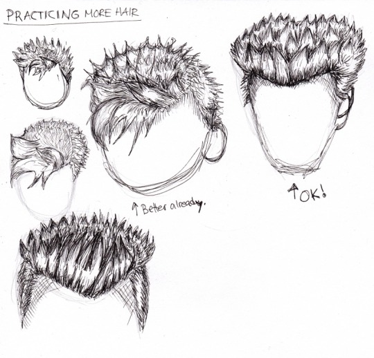
This is the last scan so far and with this I decided to look for Farin photos just to figure out how to exactly draw this hair. It was not an easy task but I think the right top one is the best one of these.
The middle one has too round head so it looks more like Rod than Farin, but it tried to be one of the 80s Farin photos, the same one as the middle one on the left. I can see already things to fix and practice next time - some of the "spikes" at the back in the one on the bottom are too small, and it doesn't look like pointy hair between that and the front part - unlike it does with the top right one. There's still some stuff to do and practice, but this is already a LOT better than e.g. the first sheet in this post!
9 notes
·
View notes
Note
hi! im trying to get into digital art now that i have some spare cash and a bank account, but i have no idea where to start! what programs/apps/tablets/pens do you like/dislike? do you have any tips for a beginner? thank you so much for any help!
Before I had a tablet I would scan my pencil work in, bring it into paint tool sai and use the lineart feature to line it. Took forever but it worked.
I prefer larger tablets. Less minute detail to tax my wrist. I have a wacom intros 5 touc but the fucking charge/connector port died almost immediately so I have to use rechargeable batteries. I've had it for *years* though and it still works. Like I think I got it on my 18th birthday and I'll be 28 this month, they get banged up over time and I has to duct tape the little plastic cover but it works fine and wagon let's you download the drivers on their site of your pen pressure stops working.
If my tablet ever dies I'll be looking for a new brand though cause recharging the batteries sucks if you forget one.
As for tqblets, make sure you get one with one preasurw. Trust me, it'll give you so much joy.
Tie your pen to the tablet somwbow. Best piece of advice I can give you. Since I tied mine with a long ribbon to my tablet I've *never* lost it.
I prefer using sai2, it's 50 bucks to purchase, no secondary fees, works for one computer only but they have ways of getting help if your computer does and you need to transfer stuff over or whatever. Sai2 has a text box feature, more layer options and more stupid to do and it a more reliable in my opinion than the first sai. It's also way more user friendly than Photoshop but it doesn't allow you to make stamp brushes like Photoshop does. I still like it better. Paint took sai doea not have an autosave or recovery, sai2 does and let me tell you it's worth it.
Another tip- there are free to use programs, I personally don't like them but other people swear by them if you don't want to buy something expensive.
Also? Wagon tablets are so fucking exoenaive, even more than they used to be and honestly it's worked for 10 years without needing repairs except for the charge port but I don't know if its worth all that money spent except on longevity.
Though the longevity is really nice so I can't honestly say what other tablets would be good. I've replaced the pen nib more time a than the tablet itself and it came with lik 20 mind and I haven't gone through them all yet so... win win on that account.
Uuummmm all the other advice I can give is just to have fun, try out different programs, many of them have free trials and stuff and just go for it.
44 notes
·
View notes
Last Seen Blogs