#Vernon Courtlandt Johnson
Text
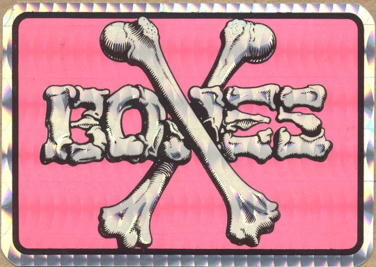

STREET ART -- STREET STYLE -- STREET CRED OF YESTERYEAR -- LOOK FOR THE CROSS BONES.
PIC(S) INFO: Spotlight on two Powell Peralta Cross Bones Wheels sticker designs, the first is a bootleg design from a vending machine, c. late '80s/early '90s, the circular pink design is an original, c. 1986. Artwork by Vernon Courtlandt Johnson, a.k.a., "VC Johnson."
Sources: www.flickr.com/photos/www_oldskatestickers_com/4305948785 (Flickr 2x).
#Powell Peralta#Powell-Peralta#Stickers#Punk rock#Powell Peralta Cross Bones#Cross Bones Wheels#Vintage Stickers#Powell Peralta Skateboard Wheels#Skateboard Wheels#American Style#VC Johnson#Vernon Courtlandt Johnson#Street Style#1986#80s Skateboarding#Powell Peralta Cross Bones Wheels#80s#Graphic Design#VC Johnson Art#1980s#Cross Bones Skateboard Wheels#Pinkcore
6 notes
·
View notes
Text
Interview with Vernon Courtlandt Johnson, a fine artist based in Santa Barbara, CA. Recorded in his home on August 10, 2014
by Mike Giant for Monster Children
0 notes
Photo


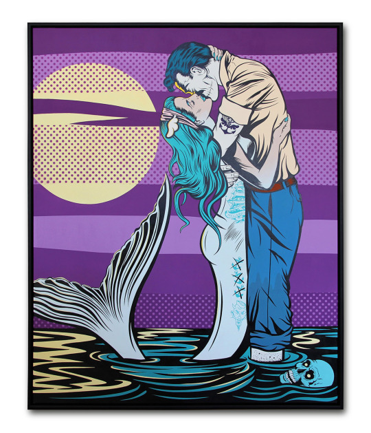


D*Face’s “Painting Over the Cracks.”
On view beginning August 6th, 2022 at Corey Helford Gallery in Los Angeles, California is artist D*Face’s highly anticipated solo exhibition, “Painting Over the Cracks.”
Instantly recognized as one of the UK’s most prolific Urban Contemporary artists, D*Face (Dean Stockton) has occupied the forefront of his practice since his first sell out show in 2005. Born and raised in London, his childhood interests of graffiti, California skate culture, and punk aesthetic were well nurtured from an early age. Having come across the likes of Jim Phillips and Vernon Courtlandt Johnson amidst the pages of Thrasher Magazine, he was initially inspired to follow a path of graphic design and illustration, before eventually taking a more freelance approach to his art. After learning to screen print his own stickers, he took the public domain of the street as his canvas, blending art, design, and graffiti in a manner that pre-dated the emergence of street art as it is known today. It was in this newly found outlet that D*Face quickly gained attention from others, mainly for the clean, vivid nature of his designs that quickly spread across the city. Even today, D*Face continues to approach his work with the same anarchic energy that drove his career from the outset. His murals can be found across the globe and his subversive-pop style and iconic D*Dog logo have become an inseparable part British Urban art and it’s ever-expanding medium.
Often describing his work as ‘aPOPcalyptic,’ D*Face seeks to pick up where the masters of 1980’s American Pop left off ─ to establish a very real, albeit tongue in cheek criticism of our consumer dominated world. By subverting the images and icons of the everyday, the artist encourages the eye of the beholder not just to ‘see’ but to carefully consider that which they may otherwise take for granted. By re-appropriating media from decades of materialistic over-consumption--advertising, comic books, and on-screen romance--and reshaping it with cleaner lines and the vibrant hues of his pallet, D*Face’s work acts as a necessary wake up call to overly conspicuous society of the 21st century.
Regarding his new works, D*Face shares, “Yes, yes, I’m aware the actual expression is to ‘paper over the cracks’ but for obvious reasons, painting felt more appropriate to me and to this show ─ with nearly one hundred murals under my belt, I’ve spent my fair share of time painting over real cracks in real walls. If you haven’t heard the expression before, it essentially refers to the act of ignoring or hiding an issue in both the literal and metaphorical sense ─ it’s putting on a brave face and pretending that ‘the issue’ doesn’t really exist.” Adding, “After living through an unprecedented, historical moment in time that saw us globally locked down as a result of the pandemic, I think we’ve witnessed our fair share of ‘cracks’ appearing across society and culture alike, some fresh, some older, and some deeper than before. In many of these cases it felt like the approach was to apply a big dollop of metaphorical paint to cover them up, only for the cracks to reappear slightly worse further down the line. This show and body of work is a collection of my own personal observations and feelings from the last couple of years. My intention is not a love letter to what we have lost and nor is it a celebration of the change that was catalysed by the pandemic, because, let’s face it, there’s been good and bad in both. Rather, it’s a visual acknowledgement of the altered society in which we now find ourselves and which we must strive to make better.”

BUY PRINTS | FOLLOW ON INSTAGRAM
77 notes
·
View notes
Text
Subcultures in Bournemouth
Looking for further design inspiration I wanted to look into subcultures within the youth of Bournemouth. Initially I looked at the surfing culture as the pier is one of the best spots here to surf at and is a key part of Bournemouth.
Bournemouth pier has long been a well-known surf spot, "first being surfed early in the 60’s by quite a few ‘radical dudes,’ the whole of the Dorset coast was then explored for new waves (which there were plenty of)."
Whilst many non-locals may not see Bournemouth as a surf spot, the pier offers sheltered along with a consistent break, attracting many local surfers.
Looking at how visual communication has been influenced by surf culture is a good starting point for how I can draw inspiration from this and put it into my own work.
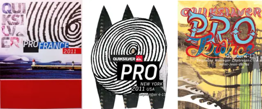
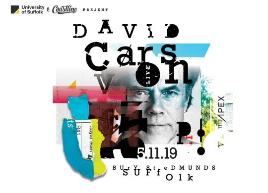
A good point of inspiration is surfer David Carson. "He is the world’s most imitated graphic designer, at least among magazines that do “hip” and “edge” and who like to break every typographic rule there is while straight-jacketing themselves to another set of strictures".
Taking inspiration from surf and the ocean being wild and unexpected "six years ago, Carson designed, at BeachGrit‘s behest, 151 new logos for the WSL.
The existing logo, he said, “has no soul. The logo just doesn’t represent the sport very well. It’s pedestrian, unoriginal, forgettable, safe, gentrified and corporate. All things surfing is NOT, at least to me.”
His creative style is clear in his designs and reflects his views on surfing culture and is something that could provide inspiration for my own designs and the way Bournemouth should be viewed.
Another notable subculture within Bournemouth is the "healthy growing skate scene with multiple cliques made of older OG's and a load of young rippers that can usually be found in any of the relatively okay skateparks surrounding our small seaside town".
"In the early days of skateboarding, skateboarders had to be resourceful and creative. They used DIY techniques to create their own custom boards and designs, which often involved repurposing old skateboards or other materials. This DIY ethos also extended to skateboard graphics, which were often hand-drawn or spray-painted onto the bottom of the boards. These early skateboard graphics were heavily influenced by surf culture, featuring waves, palm trees, and other beach motifs.
As skateboarding gained popularity in the 70s and 80s, it began to influence art movements like punk, street art, and graffiti. Skateboarders and artists began to collaborate, with skateboard companies commissioning artists to create graphics for their boards. The skateboarding industry also began to attract artists who were drawn to its rebellious spirit and DIY aesthetic. Skateboard graphics became more sophisticated, featuring intricate designs and bold colors that reflected the energy and attitude of skateboarding culture."
"One of the most influential skateboard artists of this era was Jim Phillips, who designed graphics for Santa Cruz Skateboards. Phillips' bold and colorful designs featured skeletons, monsters, and other irreverent imagery that became synonymous with the skateboarding subculture. Other prominent skateboard artists of this era included Vernon Courtlandt Johnson, who designed graphics for Powell-Peralta Skateboards, and Pushead, who worked with Zorlac Skateboards."

0 notes
Photo
width: 8" length: 31.45" wheelbase: 14" nose: 6.75" tail: 6.5" medium concave standard popsicle shape 7-ply birch wood construction original artwork by Vernon Courtlandt Johnson Powell Ripper 8" deck Powell Mini Logo 5.5" trucks / 139 mm hanger width / 206 mm axle width Powell Mini Logo 53 mm 101A wheels Powell Mini Logo bearings Phillips bolt pack griptape. #gollohe #skate #kigali #rwanda (at Kigali, Rwanda) https://www.instagram.com/p/Cpk0rbsqWxP/?igshid=NGJjMDIxMWI=
0 notes
Text
Juice Magazine Merit Awards 2022
Juice Magazine Merit Awards 2022
The Juice Magazine Merit Awards recognize exceptional creativity and have been awarded to Vernon Courtlandt Johnson, Herbie Fletcher, Dibi Fletcher, Steve Olson, Peggy Oki, Axis Valhalla, Chloe Trujillo, Beatrice Domond, Andy Anderson, Indigo Smith, Greyson Fletcher, and Lullah Trujillo.
The first recipients of the Juice® Merit Awards are a radical ensemble of rule breakers and mark makers who…
View On WordPress
1 note
·
View note
Photo
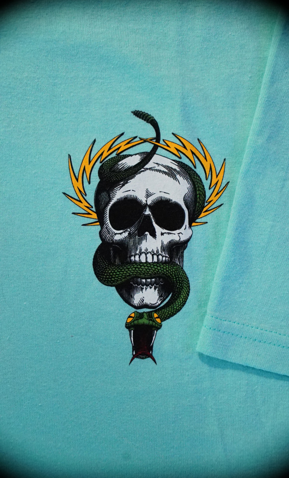

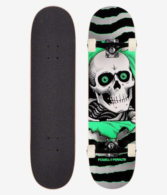
McGill Skull & Snake T-Shirt, available at skate shops worldwide.
Just as Mike McGill was perfecting the 540 McTwist in the summer of 1984 at Swedish summer camp, V.C.J. was working on a new deck graphic for him. Since the "Skull & Bones" theme was proving to be popular, that was the direction chosen for McGill's new deck. Mike's input was to add the snake and lightning bolts since there is an abundance of both in his home state of Florida. McGill's Skull & Snake is truly a classic skateboard icon.
Originally Released: 1984
Artwork by: Vernon Courtlandt Johnson
3 notes
·
View notes
Photo

Poster 37, 2014. Another show that I’m looking forward to is the return of @cobrakaiseries . I grew up watching the Karate Kid films so seeing those now instantly brings me back to being a kid in Southern California, riding bmx bikes over to the arcade with a little Bananarama playing in the background. This poster was created for @galleries1988 for their annual Crazy 4 Cult show back in 2014, before I ever dreamt that an actual Cobra Kai show would be possible. The idea behind this was a recruitment poster for the dojo. Basing the look in the 80’s was the fun part cuz I got inspiration from one of my favorite artists as a kid, Vernon Courtlandt Johnson, better known as VCJ. He created much of the iconic graphics for @powellperalta skateboards back in the day. His amazing style is so evocative of the early 80’s and I added some of those hand-drawn touches to the rendering of the cobra. VCJ also created a lot of custom typography for those skate decks so I also tried that out for the ‘Cobra Kai Karate’ type. #posterdesign #karatekid #cobrakai #vcj #powellperalta (at San Fernando Valley) https://www.instagram.com/p/CYEz9H-JJca/?utm_medium=tumblr
0 notes
Photo
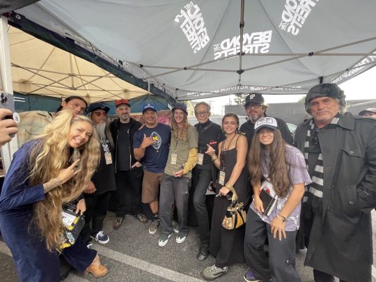
Homage to one of my favorite artists and the graphics he did for my favorite skate board company when I was a kid. I’m talking about the amazing V.C.J (Vernon Courtlandt Johnson) and @powellperalta. He is an important inspiration in my development as an artist and designer. Respect!🤘🏽 . . .#kwestone #dedstock #powellandperalta #skateboard #art #airmax90infrared #airmax90 #ripper #homage #vcjohnson #sneakerheads #sneakerart https://www.instagram.com/p/CN-oAXIhQPa/?igshid=6suzts5k2xcj
#kwestone#dedstock#powellandperalta#skateboard#art#airmax90infrared#airmax90#ripper#homage#vcjohnson#sneakerheads#sneakerart
0 notes
Photo

I have been working on this new card back artwork all day and I'm really excited about it. The illustration is based off of the legendary Vernon Courtlandt Johnson's skull and dagger. He was the original artist for Power Peralta and shaped the future of skate art forever in my eyes. These card backs are going to be rad. #ink #illustration #skulls #skullart #skateart #toy #toys #toyart #cardback #brutelegs #skellagor #wolfpits #wolfpittoys #art #moleskine #sketchbook #design #blisterpack
#brutelegs#illustration#skellagor#skateart#art#toy#skulls#toyart#wolfpittoys#moleskine#skullart#wolfpits#blisterpack#ink#toys#design#cardback#sketchbook
1 note
·
View note
Photo

The Winged Ripper graphic was created by artist V.C. Johnson in 1986. Originally it was used as the 1986 Bones Brigade Summer Tour graphic on T-shirts and stickers. Later the graphic was redesigned and used as the top graphic on decks replacing the Oval Dragon. The "XT" refers to Extra Tough Bonite construction, which was later changed to "7-P" When Bonite construction was discontinued. Originally Released: 1986 Artwork by: Vernon Courtlandt Johnson 12" Wide Available here 👉 bit.ly/wingedripperstickerred (or link in bio) #powellperalta #oldschoolskateboarding #skatetilldeath #bonesbrigade #80sskateboarding #skateordie #oldschoolskateboarddads #oldschoolskateboards #skateboardingisnotacrime #powellperaltaripper #7ply #vcj #ripper #powellripper #vernoncourtlandtjohnson #80skateboarding #vintageskateboards #skateboardreissues https://ift.tt/2mSqo0F
0 notes
Photo

7.25" x 27"
The Per Welinder Viking Skull was illustrated by V.C. Johnson in 1984. The fanged fantasy graphic was meant to reflect Per's Swedish origins.
Originally Released: 1984
Artwork by: Vernon Courtlandt Johnson
8 notes
·
View notes
Last Seen Blogs