#and the watercolor style of the backgrounds r so cool
Note
I'm so sorry for such a random q and u don't have to answer this but do u have any tips for writing college essays? Ive been putting it off for a while now bc all of the prompts r so vague 😭 (how am I supposed to have a defining moment I'm SEVENTEEN 😢)
hey nonnie! happy to try and help
disclaimers first tho. 1) it's been a while, and topics wise our prompts are probably pretty different 2) the school i ended up going to, i was very confident admission was almost guaranteed (though, it was not the only school i write an essay for)
my common app essay (i think) prompt basically asked how my environment shaped me as a person. i think generally you should approach writing a college essay the same way you should build any academic paper.
break down the prompt
college essay prompts can be vague bc they're just.. really open for you to write about things. but take a bit of time, sit down and look at the different aspects of the prompt - what is it asking, what topics does the prompt cover, and what is the main question they are asking?
generally, imo, college app essays are a way for admissions to understand who you are as a person, outside of other admission requirements like test scores or academic standing. so ultimately you want to consider what the prompt is and how you can use it to describe yourself. i know this is vague and tricky, but do your best at this part.
2. figure out what you want to say, and outline it
i swear by essay outlines. even 5 minutes of organizing thoughts will make a stronger, more coherent essay. and boy did i used to write a lot of essays. starting broad and then honing in might be helpful. it's also cool if you just generate lots of ideas, more than you need - you can always cut things down later.
since this is a little easier for me to talk about, one of the essays i wrote was about an artist that "changed my life." i picked my artist, then worked my way thru why him and his work were important to me - his style, and his background as a person/artist were the two main points that i wanted to focus on. from there, further - describing his work, what it was and what it did, how it impacted me, how it influenced my work, etc etc.
for the record, for this essay my outline looked like this: (not the full outline)
why tyrus wong is the bippity boppity besthell yeah his art!!!
prettiest fucking thing ever
watercolor - expressive and emotive. all his pieces have this ethereal quality - our guy walt disney was intrigued by what he called its “mysterious quality”
WHAT he’s so talented watercolor? painting? animation yo what about some fucking KITES he can do it all
i can't say i recommend writing college essay outlines like this, BUT your outline is important in that: it makes sense to you and it serves its function as a structure for you to build an essay on.
also, outline is where you do the brunt of the work. ok the above one isn't a great example, but by the time you organize the thoughts and points you want to bring up, it should be detailed enough that it's easy .. you just take your outline and transform it into actual sentences.
the environment essay is a bit too personal, but ill share an edited version of it that gets the point across
family relationships (how it shaped me)
a. my parents values, high expectations
i. explanation
b. how my relationship with my parents changed over time
i. explanation
3. write da essay
personally i start drafting sentences in the outline, or figuring out specific wordage, so it's easier transitioning btwn outline and essay. keywords, specific points, all of it goes in. write first, edit later.
ultimately, i think the essay should have some sort of "story" progression - some sort of change, or a cause and effect. from the beginning of the essay to the end, u should feel like uve expressed urself in a way that i think, shows what u value and how u have grown, and ur capacity for growth. or something.
other
get feedback. even from one person have em read it, tell u what they think - specific feedback is better, so ask specific questions depending on what u think u need
read other people's essays, but don't get too caught up in it. i don't think every college essay has to be particularly Deep or a big metaphor. if there's an experience for you to write about that you at the bare minimum give one fuck about, do that.
if ur reading other people's essays i would look for essays that ppl have written for the school(s) you're applying to, and if you know anyone personally > papers that are for a big shot school or for programs that aren't as relevant to you (i.e. focusing an ivy league paper if you're not applying to one, or whatever) - not to say don't read them at all, but the closer the better you have an idea of the standards and successes for the school YOU want to get into
what you write about doesn't have to be a "big" thing, it just has to be somewhat personal.
idk don't worry about it too much. put effort in, try, but don't spend more time on it than u feel is necessary. remember, it doesn't have to be the best essay someone in admissions has read (though great if it is!) you're looking for enough that they're like "yea, u seem cool, put em in college"
college essays are kind of gross and it's always weird to write abt urself and feel like ur saying things u never would. it's ok. sit down, put something on paper, work your way from there.
#I'd be happy to help think abt ideas with a specific prompt but this is all general advice#idk if this is helpful i hope it's something#maybe it was just for my situation - im definitely biased - but like... passable essay that would get me in over writing#the essay of a lifetime#asks#anonymous#also im very tired so if i said something wacky.... sorry
4 notes
·
View notes
Note
Hey, do you have a good Yuri story recommendation with good art? I have been reading Run Away With Me Girl and I would like something of the similar sort. Manhwas are also okay!
i’ve made a few recs in the past talking about series with good art styles, so maybe i’ll make another one?? w/ a few manhwa and webtoons thrown in! stuff with unique presentation and/or good art :00
- ano koro no aoi hoshi
- after hours
- nettaigyo wa yuki ni kogareru (aka a tropical fish yearns for snow)

- partition

- blooming sequence

- muted (on webtoon)
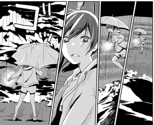
#i'm MOST excited about muted actually bc it comes back in may :000#and the watercolor style of the backgrounds r so cool#anon#ask#rec#yuri#wlw
213 notes
·
View notes
Text
Editing tips, I guess?
Hey uhhhhh, so I've gotten lots of new followers over the past few weeks and wanted to do some kind of thank you?? Also, I have seen a fair share of "omg HOW" in the tags on my edits (which??? always make my day?? my week??? my life????)
Anyway, I thought I'd share some of my ~techniques with y'all? So here goes:
(lmao this got really fuckin long so cuuuuuut)
1. Make EVERYTHING a Smart Object
Okay, maybe not EVERYTHING, but seriously. Do it. It will save ur editing life. You ever shrink something down and then an hour later change your mind and decide you want it bigger? If you're not using a smart object, it’ll get blurry when you scale it back up and you’ll be fuCKED!
To make a layer/group a smart object, just right click on it in the layers panel and select "convert to smart object". This makes Photoshop store the layer's original data in a separate space for safe keeping (an embedded .psb file, to be exact) -- so you can shrink it and enlarge it as many times as you want without any lossiness.
As soon as I paste/place a screencap, texture, or whatever into my document, the first thing I always, ALWAYS do is convert it to a smart object!!
Why, you might ask?? Continue to item No.2 :)))
2. Harness the POWER of Smart Objects!!
The reason I am obsessed with Smart Objects is because I am obsessed with making any edits as non-destructive as possible. If you use “Image > Adjustments > Levels/Selective Color/etc” on a regular layer, that’s a destructive edit. Same goes for any Filters (such as blur/sharpen) and transforms (Warp, distort, perspective). You lose the original data that was there and the only way it can be undone is with ctrl+z. Might not seem like a huge deal at first, but if you keep chugging along for an hour and decide, “hmm, maybe i went too hard on that levels adjustment after all...” your only options are deleting the layer and starting over, or uh... hoping it’s still in your history panel.
However, it's really easy to avoid destructive edits when you use smart objects!! Because all those adjustments, filters, and transforms become “Smart Filters”. Smart Filters have all the non-destructive advantages of performing these adjustments via adjustment layers, but have the added bonus of ONLY effecting the layer they’ve been applied to, instead of cascading down and effecting all the layers beneath. (Which can be a good thing sometimes, but that’s a whole other topic)
Smart filters are attached to their ‘parent layers’, and can be hidden, deleted, or modified (by double-clicking their names) at any time:

Can I hear a wahoo???
Other cool things about Smart Objects:
You can copy a Smart Filter with all its settings to another layer by alt+click+dragging it over
You can change the order in which Smart Filters are applied by clicking and dragging them around
You can edit a smart object independently/in a sort of 'isolated' mode by double-clicking on its thumbnail!! I like to use this for edits that are specific to a given screencap-- like cutting out the background and any initial adjustments, like levels and selective coloring. Once you’re done editing the contents of the smart object, hit ctrl+s and it will automatically update in the main document!
But really, the biggest thing for me here is psychological. I know I’m much more willing to try things and experiment when I know that I can easily go back and tweaks things at any time. Otherwise, I’d stick with adjustments I don’t really like all that much simply because it would take too much time/effort to redo them.
3. Don't even THINK ABOUT using the eraser tool or I will STOMP YOU to death with my hooves!!
Use a layer mask instead. Please I am begging you. It all comes back to making your edits as non-destructive as possible. If you erase something, it's gone forever. When you mask something, you can make changes to which parts are visible/not visible as often as you want.
For the newbies or the otherwise unacquainted, a mask is a greyscale ‘map’ attached to a layer (or layer group) that controls its opacity. Black areas give the layer 0% opacity, white areas will give it 100% opacity, and you can use shades of grey to achieve partial transparency. You ‘draw’ on these layers with the your trusty brush and paint bucket tools.
You can create a mask by selecting a layer and then clicking the little mask icon at the bottom of the layers panel (it’s the one with the little circle inside the box). Draw black on the parts you want to hide, and if you erase too much on accident? Just paint back over it with white!
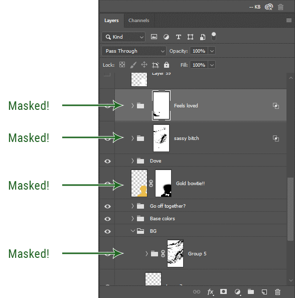
I love masks, and sometimes i will throw an already masked layer inside a layer group and apply a second mask to said group. This way I have two masks that can be edited independently from each other. Like layer mask-ception.
So anyway, yes. Eraser tool? Don’t know her.
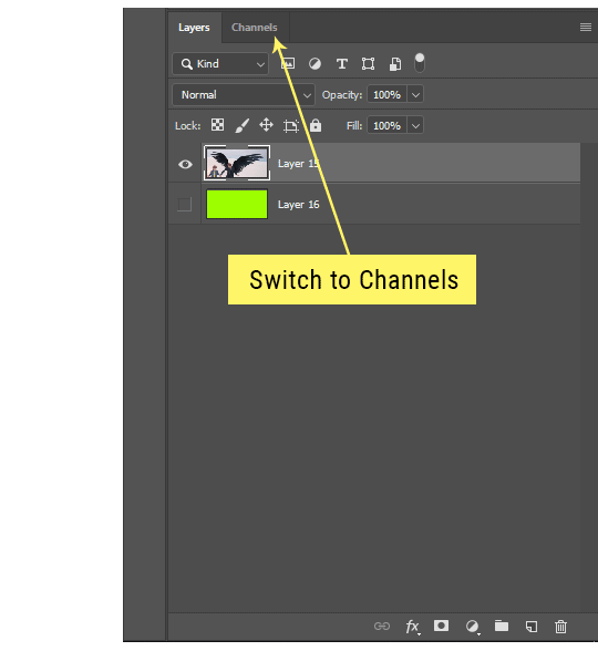
4. Try using channels to create masks!
This is a technique that works REALLY well for cutting out complex shapes, such as wispy hair (or feathers!) -- provided there's strong contrast between the subject and the background, and the background isn't too busy.
This is also a fantastic method for capturing alpha transparency. For example: If you have a neato paint stroke/splatter/watercolor texture you want to use as a mask, but has a solid background that’s getting in the way of things. This method will capture all the semi-opaque areas flawlessly!!
While editing your image (which you had better have made into a Smart Object!!!) do the following:
Switch from the "layers" panel to the "Channels" panel.
Toggle through the R, G, and B channels, and decide which one has the most contrast for the areas you are trying to mask.
Ctrl+Click that channel's thumbnail. This will create a selection marquee.
Switch back to the layers panel
Click on the target layer/group (the one you are trying to mask)
Click the mask icon at the bottom of the panel (the one with the circle inside a box)
Release the selection and invert the mask if necessary
If you're using this method to cut out a subject from its background, you probably won't want alpha transparency. In this case, select the mask thumbnail and use a levels adjustment on the mask itself to bump the contrast until you have more of a cutout effect!
It sounds like a lot of steps, but it’s really simple! So I made this handy GIF: (click to view from beginning)
Sometimes you won’t want to use this method for the entire image, but just a specific part. For example, if you’ve cut out a character with some other method (magic wand, manual brushwork), but are having a hard time with their hair in particular. Use this method to create the selection, but instead of converting the whole selection into a mask, use the brush tool to apply the mask only where you need it! You can invert the selection itself with shift+ctrl+i.
5. Outlining text
The font I used here is Salomé, which is actually a solid typeface with no outlined version. But you can make virtually any font into an outlined version if you so desire!
There's two possible methods here, actually:
The Easy Way:
Add a stroke layer effect to the text layer (by selecting the layer, clicking the little “fx” button at the bottom of the layers panel, and choosing “Stroke...”)
As far as settings go, aligning the stroke to the inside usually yields the best result/maintains the integrity of the letterforms.
Make the color of the text itself match the background.
If necessary, use the lighten/darken blend modes to create the illusion of transparency.
If you need true transparency (which I didn't until I decided I wanted to apply a gradient over the text), you'll have to try something else-- The Also Easy But Less Than Ideal Way:
Right click the text layer in the layers panel and select "convert to shape".
Now you can edit the fill/stroke the same way you would any other vector shape.
Again, you’ll want to set the stroke alignment to ‘inside’. For vector shapes, those settings are a little hidden. You’ll wanna open up that little dropdown in the toolbar with the line in it, and click “More Options”.
This is semi-destructive, so if you're working with a lot of text you might have to edit later, consider duplicating and hiding those text layers first so you'll have a 'backup' of it.
And while I’m on the topic of text...
6. Try breaking up your text layers!
I know a lot of people like to draw a neat little text box to put their text in, and then they center it all nice and neat and probably use a small font size to make it subtle and stuff... and that’s cool. Everyone’s got their different styles and things they like to emphasize in their edits and there’s absolutely merit to that sort of thing (case and point: the bulk of my dear @herzdieb’s work), but. Listen.
I love typography. I love a good typeface. The stroke widths, the letterforms, the ligatures, the serifs... I get like, horny on main for a good typeface. I like to make the text on my edits BIG, so that those details can shine. I also like doing interesting things with the text. Jumbling words/letters around, distorting them, deconstructing them and just... letting the text really ~interact with the rest of the composition instead of just kinda politely floating on top of it.
I’m not saying you have to do that kinda stuff. Or that I think neat little floaty text boxes are boring, or lazy, or whatever. It’s just... personally, I get really inspired by type. Fun type treatments are one of those things I LIVE FOR, something of a ~signature of mine, and I encourage everyone to just... try it? To use text as more of an integral Design Element and less of a... idk. A caption?
So if you have a quote, or even just a word... put each word (or letter) on its own text layer. And then: make ‘em different sizes. Make the words so big they don’t fit on the canvas. Rotate each one at a fun angle. Scatter them around. Go nuts. Use masks to chop parts of the letterforms off. Make ‘em overlap. Just have at it. Or, as the kids these days are saying: go absolutely fuckin feral.
If that really just isn’t your style, or doesn’t work/make sense for the edit you’re doing, fine. Delete all the layers and just do a text box or whatever. But. I’m tellin u.
Give it a try.
At least once.
Just... a lil taste.
7. Understand the difference between lighten/darken vs screen/multiply
For a while in my photoshoppin' youth, my understanding of these blend modes basically amounted to "darken makes things darker, and multiply makes things really darker", and vice versa for lighten/screen. But there's an important difference between how these blend modes work, and if you understand them, you can use them more... strategically? I guess?
Darken and Lighten are kinda misnomers tbh, because they technically don't really darken or lighten anything. What they actually do is make it so that only the areas of the layer that are darker or lighter than the content of the layers beneath them are visible. This produces some pretty nifty layering effects that you can't achieve with screen and multiply.
Here’s an example: (if you’re reading this on a phone with the brightness dimmed down you probably won’t be able to see the differences)
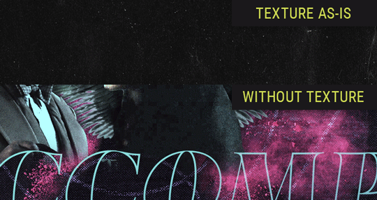
Without any the texture applied, you can really see the noise/graininess of Crowley’s jacket in the screencap. You can also see the ‘seam’ where Crowley fades into the background-- the jacket is a green-ish black, while the background it’s fading into is more of a purple-black.
With the texture set to ‘Screen’, the whole image becomes lighter across the board. Crowley’s jacket gets lighter, and so does Aziraphale’s jacket and the pink cloud thing. This does little to nothing to obscure the poor image quality and disguise that ‘seam’.
But with the ‘Lighten’ blend mode, ONLY the dark parts of the image appear lightened, and not only do they appear lightened, but they get kinda equalized. Notice how the patchy jpeg artifacts on Crowley’s jacket disappear, how that color seam smooths out, and how the brightness of Aziraphale’s jacket and the pink cloud doesn’t change at all.
This isn’t to say that lighten/darken are better and that you shouldn’t use screen/multiply. They each have their uses. But most often, I find myself using lighten/darken because the way they work is honestly really helpful? And just cool af?
8. Masking individual frames on gifs
If you ever feel like torturing yourself by making a gif that has frame-by-frame masking, my advice is don't try to mask each frame from scratch. You'll get patchy/wobbly results from the masks being slightly different on each frame.
Instead, mask the first frame, then alt+click and drag that mask onto the next frame. Make any minor adjustments to the new mask as needed, and repeat for each frame. This saves time and more importantly, keeps the masking consistent on areas with little to no movement, which makes a HUGE difference in how smooth the final product will be.

If you look at the edges of the animation, they’re nice and steady and consistent. It’s only the parts that have a lot of movement (like the back of his neck) where you can see any ‘ghosting’/wobbly-ness happening.
Sometimes the mask will move when I copy it to the next frame. Like, for the whole document. It gets nudged 20 pixels down or to the left or s/t every time. I have yet to figure out why, but I’m betting it has something to do with shooting myself in the foot with the frame 1 propagation settings at some point during editing?? ANYWAY, when this happens, just unlock the mask from its layer (click the little chain icon between their thumbnails) and move it back into place.
In these cases, I also like to pick a spot with a hard edge (such as the shoulder in the above gif) as a reference point of where it needs to be moved to. It kinda sucks having to do this for every frame, but you already signed up for some suckage when u decided to mask every frame of a gif, so I mean... 👀
9. Don't be afraid/too intimidated to do manips as needed!
Manips can be tricky if you're really striving for realism. There's light sources and color grading and perspectives to reconcile!! But when you're doing an artsy Edit with a capital E, odds are those kinds of discrepancies will be thoroughly camouflaged by all the levels, black and white, etc adjustments you're doing!
Something I run into often is, "I like this screencap, but the top of their head/hair is chopped off :(" But if I go back through all the screencaps from the scene, there's usually another frame where the camera is planned/zoomed out enough that I can steal the rest of their head/limb from it! And since it's from the same scene/shot, the lighting and color grading should already be a perfect match!
A super simple example:
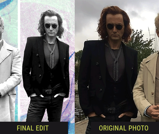
So I wanted to use this picture of David and Michael for this edit, but 1) They’re standing on the wrong sides for their characters, and 2) part of David’s arm is covered up by Michael’s.
Of course, the easiest course of action would be to just mirror the photo so they’re on the correct sides, but 1) mirroring faces tends to yield wonky results, and 2) that still wouldn’t give me a perfect, free-standing cutout of Crowley to place wherever I want in my composition (as opposed to being forced to awkwardly position him off the edge of the canvas to hide the fact that the other arm is missing)
Fortunately, it only took all of like, two (2) minutes to draw a crude selection around his good arm, copy and paste it into a new layer, flip it around, and add any necessary masking to get the shape right.
My point here isn’t to teach y’all how to do manips, or to pass this off as an impressive example of one. Because it’s really, REALLY not. My point here is to demonstrate that even something as tiny and simple as this can really open up your options for what you can actually do with an edit/composition.
So next time you’re feeling limited/inconvenienced by the crop of a screencap, just... you know. Consider whether or not it’s worth attempting a quick and dirty manip to fix it.
Another Example:

Sometimes you’re torn between two screencaps. You like one element from Screencap A but also want some other element from Screencap B. What to do? Just frankenstein ‘em together. Layer one on top of the other, get them lined up, and mask out the necessary parts.
It’s easy to get hung up on stuff like “Uh... should Crowley’s shoulder be doing that?” but let me assure you that like... the people looking at the final product are none the wiser to your butcherwork and will not notice. Especially if you’re going to add a bunch of contrast and color adjustments later on. (in fact, sometimes I’ll apply those adjustments first so I’m not distracted by any discrepancies that are going to come out in the wash anyway)
“I dunno... 🤔🤔 doesn’t seem anatomically correct... 🤔🤔🤔🤔” thought no one.
Point is... point is... dolphins you can get away with a LOT more than you think you can. Don’t let the desire to make these kinds of manips perfect get in the way of just... making them good enough. The bar isn’t that high, I promise.
10. Know what inspires you
What types of edits get you EXCITED? What kind of work do you see on your dash and go, "oh, I'm reblobbin' THAT!!1!"
I know for herzdieb, she's all about emotional pieces. She likes matching words/lyrics/poetry to on-screen moments and punching you in the feels with both. She hears a song, or reads a poem, and the lightbulbs go off for her, and she does her thing.
As for myself, I just live for the aesthetics of an edit. The colors, the fonts, the composition. I almost never know what text/screencaps I'm going to use when I start an edit. I just see a font I like, or a color palette, or a texture, and think, "I wanna use that!"
And once you know what inspires you, collect that inspo! I hoard textures and fonts. I have them organized into neat lil folders. When I wanna make an edit, that’s where I start. I just browse through them all until one or two start calling my name. Herzdieb collects songs and quotes and poems. Maybe your thing is color palettes, or aesthetic-y photos. Or whatever.
The point here is make the kinda stuff you like/want to see. Not the kinda stuff everyone else is making or the kinda stuff you notice gets the most notes.
11. Be able to let go of things that aren't working
I often begin an edit with a rough idea of the style, colors, or layout I'm going for. And I almost always end up doing... something totally different.
So don't get too fixated on what your initial ideas are. Be open to experimenting and just let the edit be what it wants to be. If something looks nice, do it. If it doesn't, don't try to force it just because, "well, I was inspired by this piece that did xyz and I wanna try it too".
When you see a certain effect that inspires you, just keep it in mind as a possible solution for the next time you make something-- don't make it into a benchmark, or some imaginary 'goal' you have to meet for This Edit You Are Working On Right This Moment. In fact, sometimes the elements I end up ditching are the very ones I started with, that initially sparked my inspiration. And that's okay. Inspiration can be a moving target, and if your vision for something changes, let it.
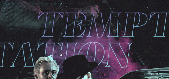
You wanna know what inspo reference I was looking at when I started that “Temptation Accomplished” edit?
Fucking this: https://search.muz.li/YTdiNjkwN2Rh
You might be thinking, “how the fUCK was that the inspiration??!! Your edit looks nothing like that at all!” ...and you would be 100% correct, and that is 100% my point. I spent a good hour or two trying to incorporate that cutout text layering effect before finally accepting the fact that it just wasn’t working for the edit I was making. And it wasn’t until then that it actually started to come together.
12. Be patient, and take the time to explore all your options!
I’m not gonna lie, y’all. I spend hours on my edits. I usually complete them over the course of 2-3 days/sittings. I rarely have a plan. 99% of the time I'm just throwing things at the wall and seeing what sticks. When I get stuck (when, not if), it helps to step away from it and come back later with a fresh perspective/set of eyes.
Every single edit I've posted, I have at some point felt like giving up on because I thought it looked like garbage (and not just because I was being self-deprecating/doubting myself, but because at those points, they simply weren't finished/something about the composition just wasn't working for me)
Work through those moments, and if necessary, take a break/sleep on it. It's always after I've exhausted my early ideas that the really good ones start to come to mind!
Here’s how the character poster edits I did progressed:

In Classic Me™ Fashion, I literally started off with just... textures I liked, and a font that I liked. Now, there were obviously a lot more ‘steps’ involved in both designs, but hopefully at the very least this gives a sense of how things get from point A to point B.
So uh... thanks 4 comin 2 my TED talk. I hope u learned at least one (1) cool new thing or maybe just feel vaguely inspired by this rambling mess?
158 notes
·
View notes
Note
sorry if this is a dumb question bt how do you decide which parts to watercolour and which parts to embroider ?
Hi! I don’t think this is a dumb question at all, this is like, a whole artistic process! It takes a lot of consideration and knowledge about how the different media will appear on the cloth to make the best decision for the art overall! Several people commented recently about how the watercolors help make the line work stand out more, and I agree completely. Too much thread, or thread stitched in different directions or with different techniques can distract or muddy up the whole thing and leave you with a less satisfying result. BUT! Too much watercolor or blank space leaves the piece looking empty! It’s a challenge!
I’m going to use a lot of examples to demonstrate what I mean. So uh, long post a-hoy:
Textile arts are awesome, and there are so many different kinds of stitches that offer a whole range of textures. I use three of those: backstitch, satin stitch, and detached chain (daisy) stitch.
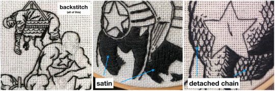
[Image 1: work in progress of a Captain America work with a focus on the stitching; Image 2: Newly young Steve embroidery, with a focus on the satin stitching; Image 3: Captain America and Jarvis embroidery, with a focus on the chain stitching on Cap’s suit]
So for black line/stitch work, backstitch is for all of the outlines, satin is for filling in, and detached chain is for Captain America’s weirdo fish scales on his suit (and the R in my stitched signature 😄).
When it comes to choosing thread vs watercolors for colored (non-black) areas, I have a few generalities that I use: satin for action/block text and watercolors for most color area fills.
Block lettering looks especially cool when all of the satin stitch is in the same direction and that, in itself, helps the text jump from the cloth, just like the text jumps from the page.
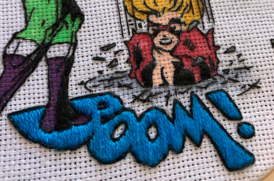
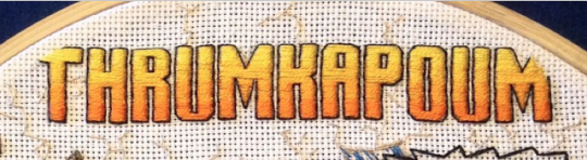
[Image 1: Close-up of the BOOM from 3-part She-Hulk embroidery; Image 2: THRUMKAPOUM text from The Tank embroidery]
Something that both of those lettering areas have in common is a lack of tiny or tightly grouped stitches. Stitches like this:
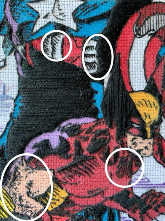
[Image: Close-up picture of Cap+Widow+Wolverine embroidery, with highly detailed areas circled with a bold white line]
These are the places I always use watercolors. Even if I could fill in those areas with colored thread, it would be almost (if not completely) impossible to also have them be in the same direction as the other satin stitch AND to keep the sharpness of the stitch itself. Just half a millimeter of difference genuinely changes the shape/slope of the stitch. Not to mention that the satin stitch will pull on the cloth, which will warp the stitches it surrounds. In summary, I don’t want to lose detail just to fill in color with thread.
There are needlepoint artists who use the chain stitch or back stitch (or others) to fill all sizes of space in their embroidery. I admire their work, and for a while I thought they were evidence that I wasn’t a good embroidery artist since I was “cheating” by using watercolors, but I know better now. There’s nothing wrong with having a style, and my style is effective and looks fucking cool, especially for comic recreation.
Watercolors are also effective for interesting and complex areas:
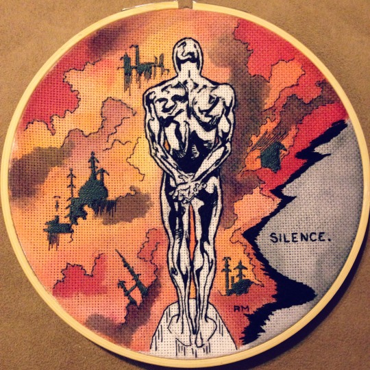
[Image: the Silver Surfer embroidery]
Could I have recreated that smoke effect with thread? Yeah, but it would have not really been a background then, you know? The Silver Surfer is the focus, not the background. Watercolors help keep the background as background without losing the color and shape complexity.
I am also a big fan of NOT coloring and letting the black line work be the focus:

[Image 1: Mockingbird embroidery; Image 2: Widow’s Jump embroidery; Image 3: She-Hulk embroidery; Image 4: PWANG embroidery]
I’m making all of this Thread vs Watercolors sound so clear and easy, but that’s because I’ve had a lot of practice and learning experiences. So I want to use a specific example for a work where I was really challenged with color: The TANK.
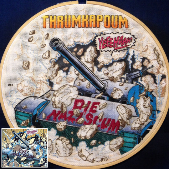
[Image: The Tank embroidery, from the 4-part Bucky Barnes work, with a small insert in the bottom left corner of the original comic panel]
Obviously in this comic panel, the tank is the focus, but I spent a really long time thinking about all of the rocks surrounding the tank as well as the rocks in the background. How do I make it obvious that there are rocks in front of the tank without distracting from the tank itself? How do I recreate the depth of the original comic between the foreground rocks, the rocks just behind the tank, and the wall in the background? Do I add any shading to the rocks like the comic has? And what about all the smoke??
For a long time, I considered using watercolors for all the rocks and background, but it never felt right, especially when I already knew I needed to watercolor the tank. So my first decision was made - no watercolors for the rocks and background. But then that kinda ruled out using just black lines for the background and rocks - there’s too much going on to just outline it without any color. I had been toying with the idea of darker floss colors for the rocks in the front and lighter in the back, but man, I was so nervous! What happened if by the time I finally stitched the background, it didn’t look like I had imagined it would? And jeez, I did NOT want to restart the whole thing if it looked bad. (This was a commission, so I couldn’t just say “OH WELL” and scratch the whole thing.) Luckily, the three brown shades for the three layers of rock was a good choice, and it turned out really rad - providing depth without distracting from the Tank. One place where I changed my mind was on the black watercolor fill behind the tank. I had been planning to stitch it, but that is definitely a place where the stitching itself would have taken away from the rest of the piece; that black section is the most background part of the whole picture - the last thing I wanted to do was bring attention to it by using thread.
There are a lot of parts of this that didn’t turn out the way I imagined at first, but they turned out for the better, not worse, and that’s because I trusted my artistic intuition and took some risks! I’m still really proud of this one.
Oh boy, I hope this has helped a bit, or at least given you a little peek into my decision-making process when I’m stitching. You are always welcome to ask more questions (maybe I’ll keep it to under 1k words next time 😅) but I think a lot of it comes down to creating and practicing and testing and deciding for yourself what you like. Really, that’s all that matters. Does it make you happy? Do you like how it looks? Then do that again. If you don’t? Try something new!
Happy stitching (and watercoloring)!
263 notes
·
View notes
Photo

Here’s my best-of-2017 art review!! Let’s play a game, it’s called “spot when tou gained a new special interest,” everyone wins ‘cause it’s really fucking easy
(Here’s 2016′s, for comparison!)
Links and comments beneath the readmore!
[ Jan ] - I was learning Medibang at this point o 3o Still pleased with this picture though.
[ Feb ] - Slim pickings in terms of finished pics this month, looks like I spent most of the month designing Baccano! gems. Here’s Rosetta.
[ Mar (a) ] - this picture is still extremely horrifying and extremely good. I’m very proud of the lighting and the color scheme.
[ Mar (b) ] - I’m moderately pleased with this picture although it definitely made me realize that it was Time to learn to draw a tilted-up head.
[ Apr ] - I was working on Improvement Hell for most of this month so there’s nothing super finished, but I really appreciated the way the experience taught me that if I sit my ass down and take the time to draw backgrounds, I can do it actually.
[ May (a) ] - I sat my ass down and drew a background. Everyone remembers that Daniel Danger’s art is incredible right? Good. This is just me imitating it.
[ May (b) ] - Good lighting, cool space effects. ...Which I mostly covered with the month label here, oops.
[ Jun ] - Ellis! I’ll tell y’all about Ellis eventually... I promise
[ Jul ] - One thing that happened because of a new special interest is I decided to fiddle around with art styles a bit, in part because Jen Zee’s art is so pretty that I want to c r y. So I was trying a few new things in this one.
[ Aug ] - obviously the reason I’ve been trying lineless art recently is, also, Zee’s incredible style. I’m also really proud of the expression on this one.
[ Sep ] - I think I started working on this one in August and continued into September, iirc? Also I really enjoy the easy gold leaf effect of lighter and darker shades of yellow in the “fluffy watercolor” or “fluffy pastel” brush.
[ Oct ] - not only am I getting better at facial structure but also at consistent face shapes? I think??
[ Nov ] - I finished this one in December but I sketched and started coloring it in November before I left for Japan. Fun fact: the cells were an extremely last-minute addition.
[ Dec ] - kisses are hard and backgrounds are not what I usually do myself and I am really pleased with how this picture came out.
#tou's art tag#2017 art summary#2017 art review#tou and a stupid commotion#tou and the sword boyfriend#art summary#art review
6 notes
·
View notes
Text
The Seven Steps Needed For Putting Yellow Flower Painting Into Action | Yellow Flower Painting
Tite Kubo’s hit activated alternation Bleach is broadly admired not aloof because of its air-conditioned shonen battles amid Soul Reapers and hollows, but because of the ambrosial characters, too, and there is a badly assorted casting to meet. Ichigo Kurosaki is a cantankerous but careful anti-hero, and his acquaintance Uryu Ishida is an uptight, bookish boy with a affection of gold. Ichigo additionally has a acceptable acquaintance in Orihime Inoue, who seems cool at aboriginal but is absolutely important to the story.
RELATED: Bleach: 5 Ways Rukia Has Grown Up (& 5 Things That Will Never Change)
Orihime is about like Rukia’s actionable adulation battling aback it comes to Ichigo, and like Rukia, she was already a prisoner, now a assured fighter by Ichigo’s side. She went from an accustomed babe to a magic-wielding hero, and there is no activity aback now. Here are ten absorbing fan art pictures all about this ambrosial but boxy red-headed girl.
The aboriginal access in this arcade comes address of artisan Quiss, who is built-in in a acreage of brownish tulips as far as the eye can see. Orihime is a babe who brand nice things, and she will accident her activity to assure the adorableness of Karakura Town, the Soul Society, and any added apple she’s visited.
The angry is over, and now, Orihime can relax in this acreage of tulips. Best of all, she begin a chicken one, which seems to be her favorite. She’s alike abashed a little, giving her an innocent and absorbing look.
This is the IchiHime pairing, a above battling
The Seven Steps Needed For Putting Yellow Flower Painting Into Action | Yellow Flower Painting – yellow flower painting
| Allowed for you to our blog site, within this period I am going to explain to you regarding keyword. Now, this can be a very first impression:
Little Weather Glass – Barb Newberg – yellow flower painting | yellow flower painting
What about picture earlier mentioned? is usually of which incredible???. if you think thus, I’l d demonstrate a number of graphic once more beneath:
So, if you want to obtain the outstanding pics regarding (The Seven Steps Needed For Putting Yellow Flower Painting Into Action | Yellow Flower Painting), click save button to store the shots to your computer. They’re available for download, if you’d prefer and wish to grab it, click save symbol on the article, and it will be immediately down loaded in your computer.} As a final point in order to gain new and recent image related with (The Seven Steps Needed For Putting Yellow Flower Painting Into Action | Yellow Flower Painting), please follow us on google plus or book mark the site, we attempt our best to provide daily update with all new and fresh images. Hope you enjoy keeping here. For many up-dates and latest news about (The Seven Steps Needed For Putting Yellow Flower Painting Into Action | Yellow Flower Painting) pictures, please kindly follow us on twitter, path, Instagram and google plus, or you mark this page on book mark section, We try to give you up-date periodically with all new and fresh pics, like your surfing, and find the perfect for you.
Here you are at our site, articleabove (The Seven Steps Needed For Putting Yellow Flower Painting Into Action | Yellow Flower Painting) published . At this time we are pleased to announce that we have found an extremelyinteresting contentto be reviewed, namely (The Seven Steps Needed For Putting Yellow Flower Painting Into Action | Yellow Flower Painting) Lots of people searching for specifics of(The Seven Steps Needed For Putting Yellow Flower Painting Into Action | Yellow Flower Painting) and of course one of these is you, is not it?
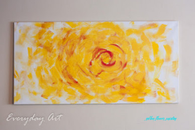
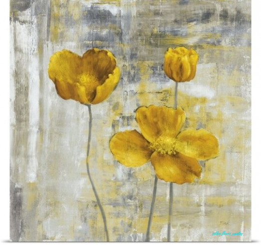
Everyday Art: Yellow Flower Abstract Painting – yellow flower painting | yellow flower painting
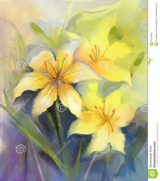
Watercolor Painting Yellow Lily Flower Stock Illustration .. | yellow flower painting
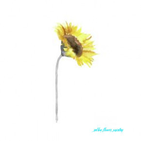
Sunflower Wall Decor Watercolor Painting Yellow Flower Gray Stem Minimalist Art Print by Joanna Szmerdt – yellow flower painting | yellow flower painting
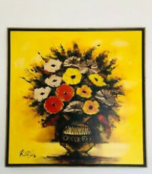
Details about Signed R Styles Lacquer Oil On Canvas Yellow Flowers Painting 24s 24×24″ – yellow flower painting | yellow flower painting
Flower Paintings by Key West Artist Janis Stevens – yellow flower painting | yellow flower painting
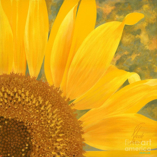
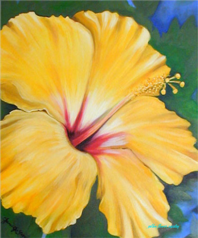
Yellow Flower by Nicole Shaw – yellow flower painting | yellow flower painting
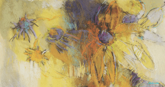
Abstract Painting Techniques: Flowers in Pastel Streaming Video – yellow flower painting | yellow flower painting
flowers | Originals by Paris Art Blog – yellow flower painting | yellow flower painting
‘Yellow Flowers II’ by Carol Black Painting Print – yellow flower painting | yellow flower painting
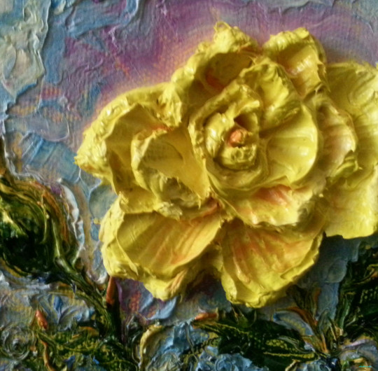
1940s era – Bourgeoise Bloomers – yellow flower painting | yellow flower painting

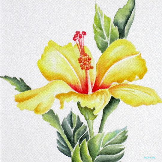
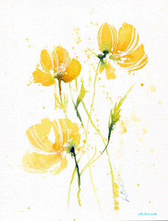
Yellow Flower.Hand Drawn Watercolor Painting On White Background W .. | yellow flower painting
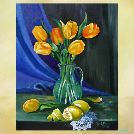
Oil Painting ,Yellow Tulips , Still Life , Original Oil Painting .. | yellow flower painting

angela moulton’s painting a day: Yellow Flowers in Blue Vase and .. | yellow flower painting
Vase with red and yellow flowers – yellow flower painting | yellow flower painting

Yellow Dandelions original watercolor painting Yellow flower – yellow flower painting | yellow flower painting

US $24.24 24% OFF|Hand painted High Quality Abstract Knife Flowers Picture Acrylic Paint on Canvas Yellow Flower Knife Oil Painting for Wall .. | yellow flower painting
Yellow Flowers – yellow flower painting | yellow flower painting

Yellow Flowers Painting by Sandro Akhvlediani – yellow flower painting | yellow flower painting
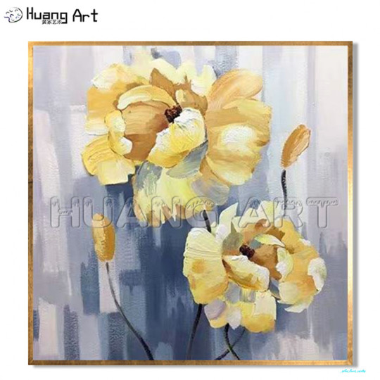
US $24.24 524% OFF|Two Yellow Flower Painting Hand Painted Yellow Peony Oil Painting on Canvas Flowers Abstract Wall Picture for Home Decor Art|Painting .. | yellow flower painting
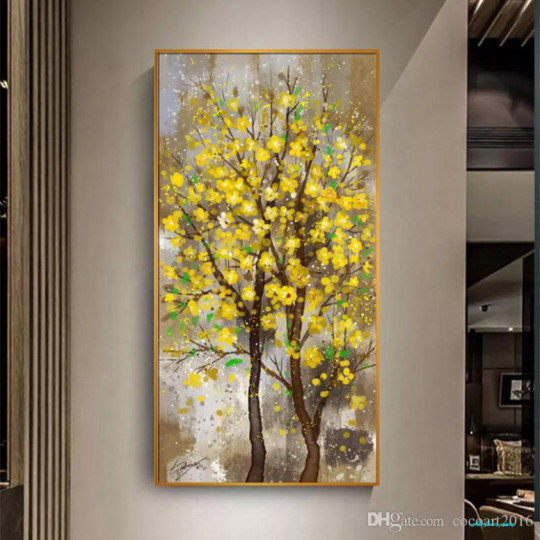
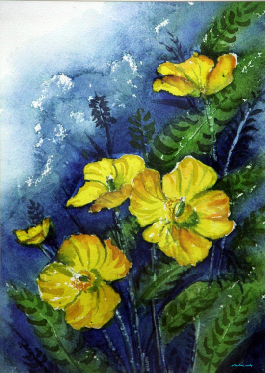
24 Yellow Flower Tree Picture Canvas Painting Wall Art Pictures For Living Room Entrance Painting Home Decor No Frame From Cocoart24, $24.24 | .. | yellow flower painting
Oil painting Flowers art abstract flower paintings acrylic yellow flower oil painting ocean canvas art flowers on black canvas – – yellow flower painting | yellow flower painting
24×24 ORIGINAL painting Yellow flowers artwork Bright floral | Etsy .. | yellow flower painting
YELLOW FLOWERS — PALETTE KNIFE Oil Painting On Canvas By .. | yellow flower painting
The post The Seven Steps Needed For Putting Yellow Flower Painting Into Action | Yellow Flower Painting appeared first on Flower Nifty.
from Wallpaper Nifty https://www.flowernifty.com/the-seven-steps-needed-for-putting-yellow-flower-painting-into-action-yellow-flower-painting/
0 notes
Last Seen Blogs

happifying-things
Happifying

anjoman-law
انجمن علمی حقوق دانشگاه آزاد خمینی

fuckyeahpipesofpan
Pipes of Pan

rissa-explains-it-all
Hire me, Playbill

jonasguimaraesjg020995
Jonas Guimarães (JG)