#btw by “dark art” i mean literally. visually. when there is little light
Text

mere hours before , he broke the yavin code (geneva convention) to save her. but she doesn’t know that. =/ oops
ref under the cut :]
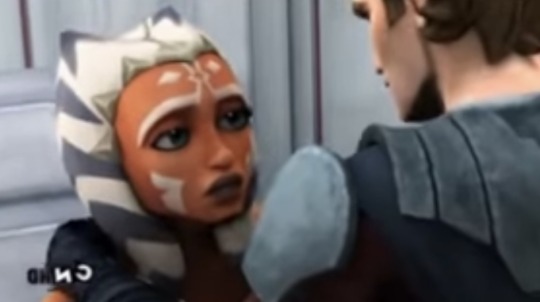

[through tears] so remember that scene at the end of the brain invaders arc,
#is my @ too small to make out? yes. can i be bothered to change that? no.#“a simple screenshot redraw” i said. “it’ll be simple” i said#i lied#i went off reference obviously#i’m not usually a big fan of dark art but this is Warm and just.skdjdjjd#btw by “dark art” i mean literally. visually. when there is little light#i love Dark art. yk. like damn girl u drew some fucked up shit!! yeah#anyway#.txt#my art stuff#sokaposting#star wars#ahsoka tano#snips and skyguy tag#snips and skyguy#skyguy and snips#anakin skywalker#tcw#pt#sw tcw fanart#sw tcw#sw art#sw fanart#the clone wars#star wars the clone wars#clone wars fanart#brain invaders#tcw 2x08#disaster duo#ahsoka
109 notes
·
View notes
Note
Hi, same anon that asked about your black!Ellie design! I just re-read your response and I'm still a bit confused since you said Ellie has a warm undertone, but her overall skin is mid-toned... If you were to describe this version of Ellie in a fic, what words would you use to help others visualize her better?
I'm a writer but I haven't written anything in a while. Just been creating various black characters and that's it... It's nice tbh, I made a black female knight earlier and I affectionately call her "my princely rosebud" (I hope you enjoy your day or night btw).
when i say "mid-toned" i mean, not dark, not light. if you made the drawings grayscale, the color would be mid-gray as opposed to black, dark gray, light gray, or white. of course, there's a range for mid-tones.
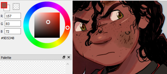

when i say she has a warm undertone i mean the overall hue is warm. brown, like gray, are neutral colors, but can be made warm or cool with the tiniest amounts of color to a base. same principle with skin basically.
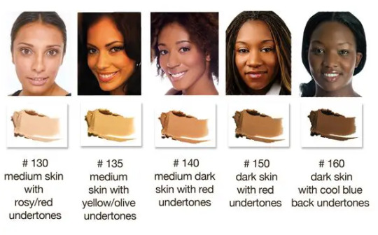
black skin in particular with a warm undertone appears more saturated compared to those with cool undertones who might appear to have a "grayer" tone. not to mean dull, but yknow. just not as warm looking aka orange-y. i've seen sources say that red undertones qualify as cool undertones but that's neither here nor there.
it's a little difficult to tell irl and it's a lot easier to tell in art whether a character has a cool or warm undertone.

in the old wip i posted, you can see that ellie's skin has a much warmer tone than dina's, which is cooler/slightly-reddish.
in regards to the writing question, i'm sorry to say but i would literally just say that her skin has a warm undertone (and relate it to a warm quality) ;-;
15 notes
·
View notes
Text
Back at it again with my self-indulgent comic posts. This time! It’s Supergirl: Woman of Tomorrow #3, perhaps the most tonally-distinct entry yet, with shades of The Twilight Zone.
Spoilers!
So, as mentioned, this issue is the most deliberate in terms of both its pacing and its tone, IMO.
What is that tone, you ask?
To quote Alex Danvers, from “Midvale”: Hello, darkness.
THE STORY:
Kara and Ruthye are still looking for Krem Clues in the alien town of Maypole.
(Which is actually just Small Town, USA, complete with vintage 50s aesthetics.)
But the locals are clearly hiding something! So Kara and Ruthye continue to investigate, and they eventually discover what it was that the residents of Maypole were so keen to keep hidden.
Genocide, basically.
As I said, this issue struck me as very Twilight Zone; a genre story involving the build-up to a dark twist, all set against the backdrop of an idyllic small town. (Think, like, “The Monsters are Due on Maple Street” but instead of focusing on the Red Scare, it’s classism and racism.)
The wealthier blue aliens kicked all of the purple aliens out of town, and when space pirates showed up to pillage and plunder, the blue aliens made a deal with them: the lives of the purple aliens in exchange for their safety.
Which is where the episodic story connects to the larger mission; it was Krem who suggested the trade, and then joined up with the Brigands (space pirates) when he was freed by the blue aliens.
The issue ends with no tidy resolution to the terrible things Kara and Ruthye discovered, but they do have a lead on where to find Krem, now, as well as Barbond’s Brigands.
KARA-CTERIZATION:
Ironically, it’s here, in the darkest chapter yet, that we get the closest to what might be considered ‘classic’ Kara.
Which I think comes down to that aforementioned deliberate pace--this issue is a little slower, a little quieter. It gives the characters some room to breathe.
That’s not to say Crusty Kara is gone. Oh no. She is still very much Crusty. XD
But anyways. A list! Of Kara moments I loved!
I mentioned a few of these in a prior post when the preview pages came out: I like the moment where Kara blows down the guy’s house of cards, and I like that the action is echoed later in the issue when she grabs the mayor’s desk and tosses it aside. A nice visual representation of the escalation of Kara being, like. Done with these creeps. (Creeps is an understatement but you get the idea.)
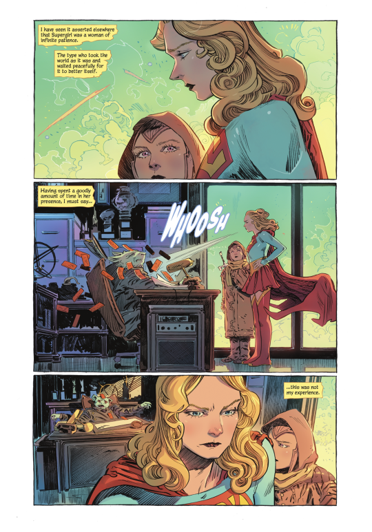
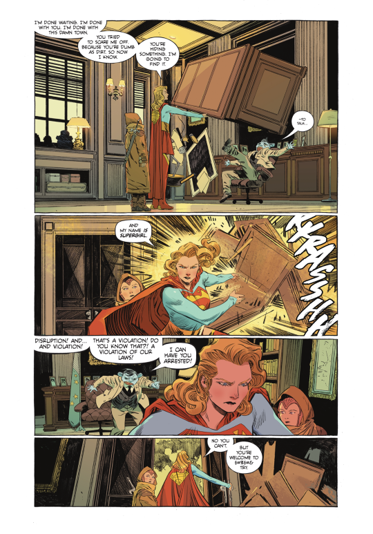
Another one from the preview pages: Kara explains to Ruthye that her super hearing won’t necessarily help her detect a lie, especially if she’s dealing with an alien species she’s not familiar with.
It not only reveals her level of competence and understanding of her super powers, it also shows that, you know. She’s a thinker. She’s smart.
Amazing! Showing, rather than telling us, that Kara is smart! Without mentioning the science guild at all wow hey wow.
(Sorry, pointed criticism of the SG show fandom.)
Anyways.
I dig the PJs!
And Kara catching the bullet! Not only are the poses and character acting great, it’s also a neat bit of panel composition:

We start with Ruthye’s POV, and then move to the wide shot of the room. The panel where Kara actually catches the bullet is down and to the side of the wide shot panel--we move our eyes the way her body/arm would have to move to intercept the bullet. Physicality in static, 2D images!
Also, like. It’s a very tense moment, life-or-death, but. Ruthye’s wide-eyed surprise at the bullet in Kara’s hand? Kind of adorable.
I was pretty much prepared for the page of Kara shielding Ruthye from the gunfire to be the highlight--it was one of the first pages King shared and I was like, ‘yeah, YEAH.’ But, shockingly? The TRUE highlight of the issue?
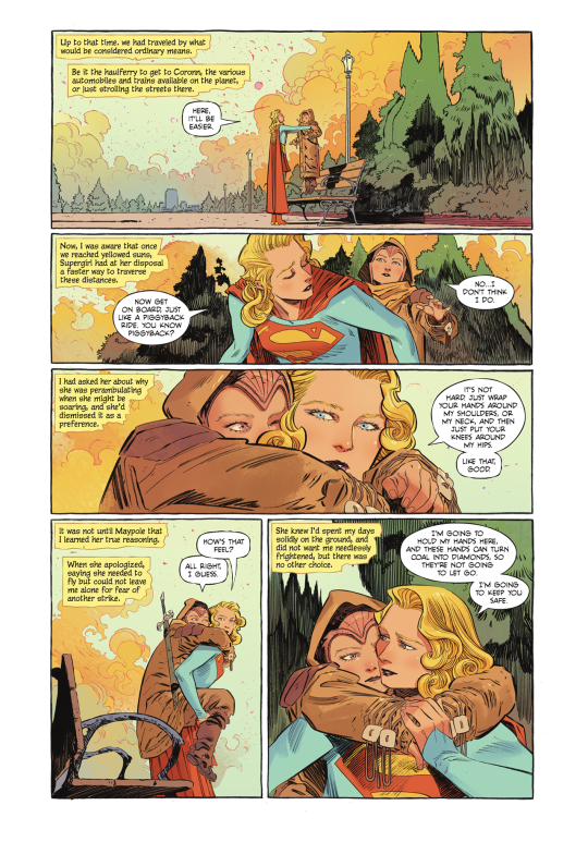

Where do I BEGIN?!?!
EVERYTHING. About this moment. Is lovely.
From Kara holding Ruthye above the bench to explaining the concept of a piggyback ride, to telling her:
“I’m going to hold my hands here, and these hands can turn coal into diamonds, so they’re not going to let go. I’m going to keep you safe.”
HNNNNNNNNNNNG.
Ruthye’s narration--about how Kara had avoided flying as she was concerned it would freak Ruthye out--just adds a whole additional layer of YES, GOOD, YES, and her line on that splash page is great: “You see, all that time, she was worried about me.”
HNNNNNNNNNNNG. AGAIN.
To say nothing of the STELLAR ARTWORK.
And SPEAKING of that stellar artwork, Evely and Lopes continue to knock it out of the park. Each issue is distinct and beautifully crafted, a true joy to look at.
Before I jump into more of the art, a few final notes of character stuff in general.
Ruthye is the one most affected by the experience in Maypole, as she can’t comprehend how a society of people that look so nice and gentle and peaceful could have been party to such a horrible act.
One of the big criticisms of the book thus far is that Supergirl is not the main character, and I guess I can agree with that observation. Typically, in Western media, the main character is the one who goes through the most change in the story.
And, yeah. That’s Ruthye.
As I was reading the end, where Ruthye sits on the curb and Kara hugs her, I was imagining how the scene would’ve played, had King stuck with the original idea for the series: Kara as the one learning to be tough/experiencing all of this for the first time, and while I think that could certainly work...
I continue to appreciate that King literally flipped the script; that Kara, especially in this issue, is like, ���I’ve seen this, I know this,’ as opposed to being the one going through a loss of innocence.
*Marge Simpson voice* I just think it’s neat!
Because Kara’s been a teen in DC comics for so long--ever since she was reintroduced to the main DCU continuity, actually--so this is all brand new territory, here. Having an older Kara who’s SEEN SOME STUFF.
(Alsoooooo, since Bendis made the destruction of Krypton not just inaction and climate disaster, but rather, genocide, and the subtext of a Kryptonian diaspora text, the waitress’ derogatory comment regarding the the destruction of Kryton, as well as Kara picking up the bad vibes the entire time, suggests not just a broad commentary on discrimination in all its forms, but specifically allegorical anti-Semitism. The purple aliens being forced out of their homes and into substandard living conditions, then the blue aliens--their neighbors and once-fellow residents--essentially allowing the space pirates to kill them, making them literal scapegoats, Kara discovering the remains of the purple aliens, and Ruthye’s horror at the ‘banality of evil’...yes. A case could be made, I think.)
(Which would probably require a post unto itself and a lot more in-depth discussion, nuance, and cited sources.)
(Should mention that King has brought up that both he and Orlando--the other Supergirl writer he talked to--are Jewish, and for him personally, that shaped his views on Kara’s origin story.)
I guess my point is that this issue is perhaps not as out-of-left-field as some might think, and just because there isn’t as obvious an arc for Kara, doesn’t mean there isn’t some sharp character work at play.
(I could be WAY OFF, of course, and I’m not suggesting it’s a clear 1:1 comparison. I’d actually really love to hear King talk about this issue in particular.)
Anyways.
Here’s the final page, which I think works, because as I mentioned before, there is no easy answer/quick wrap-up to the story of Maypole:

THE ART:
I mean. How many times can I just shout ‘ART! AAAARRRRRRRRRRRTTTT!’ before it gets old?
I dunno, but I guess we’re gonna FIND OUT.
There are some panels in this issue that I just. Like ‘em! From a purely artistic standpoint! Because they’re so good!

Like, I just really love the way Kara is drawn in that top panel. Her troubled, confused expression, the colors of the fading light, the HAIR.
Evely draws the best hair. I know I’ve said this before. I don’t care. I will continue to say it, because it continues to be true.
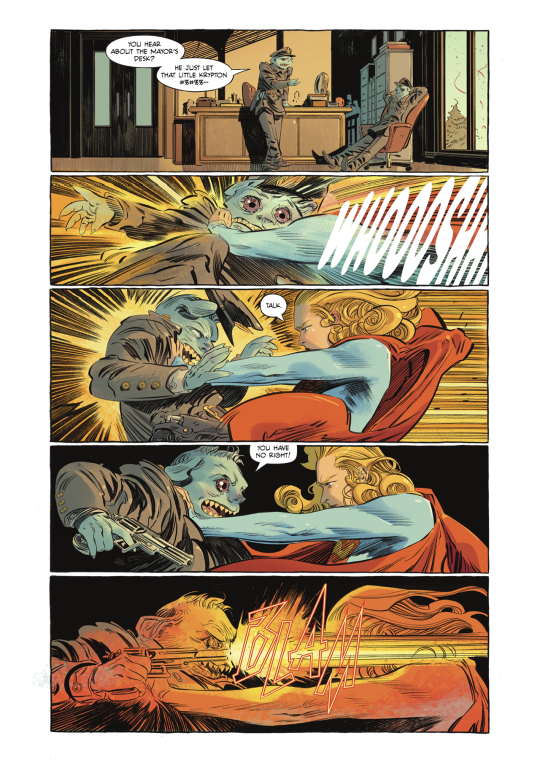
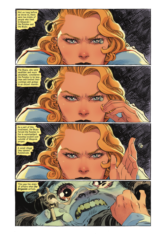
The issue I find myself running up against when I make these posts is that I really don’t want to post whole pages, as that’s generally frowned upon (re: pirating etc.) but with something like this, you just can’t appreciate it in panel-by-panel snippets.
(Guided View on digital reading platforms is a BANE and a POX I say!)
Anyways.
LOVE the implied movement of the cape settling as Kara speeds in and stops.
And, obviously, Kara flicking the bullet away is just. A+.
And the EYES, man. LOPES’ COLORS ON THE EYES???!?! BEAUTIFUL.
Also, should note the lettering! The more rounded letters for the ‘WOOSH’ of Kara’s speed (and, earlier, the super breath) work nicely, and contrast with the angular, violent BLAMS of the gunshots.
And, I gotta say, the editor is doing a really great job of not cluttering up the artwork with all the caption boxes. Which is no small task.
(I assume the editor is placing them, as editors usually handle word balloon/caption box placement, but I suppose it could be Evely? Sometimes the artist handles it. Either way, whoever’s taking care of all the text, EXCELLENT WORK! BRAVO!)
Okay I think that’s everything.
Ah, nope, wait.
MISC.
Just a funny observation, more than anything else: Superman: Red and Blue dropped this week, and King had a story in there, “The Special” (which was very good, btw.) Both Lois and the waitress swear a lot so I’m beginning to think that this is just how King writes dialogue for any adult character who isn’t Clark. XD
This is absolutely a personal preference but when Kara was like, “And my name IS Supergirl,” I was like nooooo. I know King is trying to simplify all of the conflicting origin stories and lore but I LIKE KARA DANVERS, SIR. XD
It’s almost assuredly a cash-grab/an attempt for DC to get all the money it can out of a book they don’t have much confidence in, but I like the cardstock covers! Very classy, much Strange Adventures.
(OH my gosh, can you imagine that issue 1 cover with spot gloss???? Basically the only way you could possibly improve on it.)
Okay NOW I’m done. For real. XD NEXT TIME: Kara and Ruthye go after Krem and the Brigands!
#supergirl: woman of tomorrow#long post#dc comics#supergirl: woman of tomorrow spoilers#kara zor el#comic thoughts#comic opinions#just occurred to me I should be crediting the creative team in these things#I think thus far I've included every title page?#still#will try to be better about that going forward
11 notes
·
View notes
Link
Writers? This is the artistic version of a short story.
Artists...?
...WHY??
So...many...questions.
A lot of this breaks what writers call “the willing suspension of disbelief.” It’s where the audience is willing to overlook implausible things in order to keep following the story. At some point their credibility has a limit, a breaking point where their ability to suspend and ignore their disbelief will snap, like hanging a thread from the ceiling, and then putting too much weight on it.
Some of these weighty questions include:
Why is she "standing" like that? She looks like she's sitting on an invisible stool!
Why is her cloak/sheet still bound up like that if she's been fighting long enough to get her sword bloodied?
Why is she so pristine when the wyrm corpse is clearly freshly arterially injured??
Why does she have no shoes and pristine feet when she’s clearly touching a bloody corpse?
Why is the tag end of her cloak/sheet...thing...whipped up under one leg and over the other when she’s been chopping up a monster and now has to fight another one?
Again, why is she so clean??
There are so many WTF questions...
What is she sitting on?
If she’s not sitting on anything, how is she supporting her weight in that position?
She’s not being supported by her feet, that’s for sure--is she seriously en pointe with her left foot (the one on our right, visually)?
And the one on the left (her right foot), if it’s resting at a 45-ish degree angle on a corpse so freshly butchered it’s still spurting, how is it she’s able to keep it in place when it should be slipping out from under her by all the laws of squshy meaty blood-filled things?
Where is the missing V shaped wedge of that tail? Look at the angles on those two cut ends; there is clearly a whole big fat wedge of flesh that is missing! If there wasn’t, that tail would literally have been an L shaped structure with the cut angling on the diagonal down into the corner, and that is just disturbing to contemplate...
...Where are the arm bones in those dragon-wings?? Seriously, that is disturbing, seeing the thin metacarpals and phalanges (the “finger bones” of wings if you look at wings as nothing more than elongated & weirdly angled hands) ...but not the arm bones...so where are they??
...Now this isn’t to say the picture is all bad! The concept is actually a neat idea, looking like a cross of Lord of the Rings meets all those hedonistic Renaissance paintings of the Ancient Greek mythos. And it would be 100% correct to mix mythos like this, as the Renaissance painters were doing that all over the place, mixing Greek mythos symbology into Biblical art, and vice versa (all of which was fan art, btw).
The streaky effect of the Nazgûl is wonderful, though I’d like to see a bit more tattering (along the same diagonal upper left to lower right lines) on that right side of the Ringwraith fellow, there.
The Ringrwraith even seems to be bending the airwaves around and above him, with the effects of the clouds sort of streaking in toward that bright spot in the sky above and behind. It makes it look like the halo is sucking in all the Light before fleeing into the West, or trying to suck the Nazgûl off the face of the planet to hopefully disinterate its evilness out of existence...
The bright part of the sky also kind of looks like dragonbreath fire, even though the Fell Beasts that the Nazgûl rode upon aren’t evern mentioned (as far as I can recall) as being able to breathe fire like dragons. So that’s another point of coolness.
I have no idea what’s going on anatomy-wise of the presumed fallen and chopped up Fell Beast, but at least some effort has been made to provide it with a (weird) internal structure. If it really is a Fell Beast and not meant to be a dragon or a wyrm, then I can accept the odd anatomy and darkness of the...I’m not sure if those are bones, but I’m presuming that it has some bones in its tail, and if it’s a foul abomination style creation, I can accept the creator had no clue.
I do like the crispness of the woman in focus versus the Nazgûl who is equally clearly not in focus.
Certainly the woman definitely looks like a Renaissance painting of a Greek Mythos Action Sequence! She’s in a classic serene, poised action pose that no doubt has some sort of supporting stool & armature behind and under the original model for her to rest her arms upon.
The symbology of Shield Maiden of Rohan certainly gets the first two components of that descriptor down visually: for the first part, she has a shield (lovely round thing, very Classic Greek Hero With Spiffy Expensive Metal Shield), and she definitely is using it to shield herself from something. (Plus the sword.) The other part of the symbology is the “modesty sheet drape” under one thigh (gotta show off them nekkid thighs, Renaissance foiks!!) and up over the other, between the legs, blocking off any view of or access to the mons pubis...aka, shielding her maidenly modesty.
However, there is zero sign she’s from Rohan, because there’s zero symbolism representing Rohirrim culture...and the key element to Renaissance pictures of various cultures’ mythos were that they were rich with symbolism. The Rohirrim, the Riders of Rohan, were emphasized over and over as horse people.
Tolkienn also cribbed the Scandinavian culture for his descriptions of them (I suspect the Golden Hordes of the Russian Steppes, heavily influenced by the Rus folks who were Scandinavians who had moved east and mingled with the Mongolian Empire remnants who a little earlier had moved west. The Greeks knew of the Scandinavian peoples (no, really, they knew of them! Electricity is actually just the Latin word elektron (which comes from a similar-sounding Greek word I’m not going to bother to spell correctly), which meant amber, as in the petrified pine pitch being shipped down through Europe from the Baltic Sea in the far north, which is surrounded by Scandinavian countries.
Yet there’s no signs or symbols of Scandinavia about her, no knotwork animals, no amber, just pale blonde hair (which frankly could be representative of the British Isles or partial albinoism)... So while there’s a lovely Greek Mythos in Renaissance Paintings feel to her...it falls short of being a true copy/homage, which is unfortunate. It could’ve been so easily fixed, too, with a bit of knotwork braiding painted onto the cloak/sheet thing.
I will say that the folds of that sheet are spectacularly well painted, lovely depth and dimensionality to them!
Same goes for the condours of her body, and the tail of the wyrm. I fully believe these are three dimensional objects!
The lighting is beautifully done. Admittedly if the light is coming from that glowy bit of the sky behind the Nazgûl, she should be in shadow...except he’s a Ringwraith, and it’s 100% acceptable for light to go through him, since according to cannon, they’re not fully corporeal. This is a “plot” point where fans who know the lore are more than willing to suspend disbelief.
I’m not a rabid Tolkienn fan by any means, but I do know enough to accept that Ringwraiths are wraiths, and not fully of the physical realm. Plus, Greek Mythos Heroes in Renaissance paintings are supposed to be Bathed In The Light Of Holy Goodness, sort of an inner aura spiritual goodness radiance-effect, I guess...? Either way, it’s symbolism, it indicates visually that the Light (Good) will shine through upon Heroes (& Heroines) when they are being their Most Heroic...and it’s very well done.
(...Another question if that’s her helm on the ground, where is the rest of her armor? Where are her clothes?? Or is this meant to parody the “sword and magic helmet!!” trope and the helmet was providing all her armor and clothes up until the point she removes it to reveal she’s a nekkid Not A Man? And really, are Nazgûl so far removed from their mortal lives that they need nakedness to be able to tell males from females of their own species...?)
If this were a story, it would be a crossover fanfic with awesome potential...but it falls a little short of what’s needed to successfully suspend the reader/viewer’s disbelief.
Why is it important to do a better job next time, to get these details a little more accurate? Because most Tolkienn fans I know are rabid about it, & willing to nitpick any mistakes or inaccuracies. Cast your minds back to the huge raging fandom debates around the Lord of the Rings trilogy movies about whether or not Peter Jackson & co were “butchering the mythos” of Middle Earth.
Also...I’m trying to figure out how the Nazgûl is standing, and on what if he is indeed standing, though perhaps he’s actually astride the fallen Fell Beast, and simply swung himself around while she was chopping off & somehow disintegrating that V-shaped wedge of wrymtail? I can suspend some of my disbelief for that, though it does add to the overall strain of that willing suspension, and obviously there were too many other issues that ended up snapping it.)
As an editor, if this were a story, I’d be telling the artist to fix the wing bones, to give the woman some shining chain armor with a Rohirrim tabard, or boiled leather armor and tabard--at the very least a tabard with the Rohirrim symbols on it!!. I’d also at the very least slap some Scandinavian knotwork on it, if not the actual Horse of Rohan. (I’d also suggest using the accepted colors for the Rohirrim banner, green and gold, though I might keep the majority of the tabard white and just have a gold-and-green knotwork horse centered on the chest, or something.)
I’d also request there be more chunks of hacked-off tail all over. (Bonus points if one of them looks like The Lonely Mountain! lol...)
Plus, I’d give her at least a tiny bit of blood spatters around her boots and on her thighs & a little on the lower tabard, to show she’s been fighting in battle all along. However, I’d actually hesitate to put the spatters any higher than belt-line at most (and definitely do something different than that cloak/sheet thing).
Why would I hesitate to get the chest area bloody? Because of the symbolism.
Renaissance paintings had blood & gore, but only up to a point. She’s the heroic figure who slays the 3rd Biggest Nasty of the entire trilogy (#1: Sauron, #2 Saruman, #3 chief king of the Ringwraiths, the one she stabs in the face-hole), so she needs the symbolism of still being Clean And Pure Of Heart, aka no muss, mud, tatters, or blood in the torso (chest / heart) area.
In fact, if you just replaced the cloak/sheet thingy with just a tabard (a white one with a little knotwork on it, and put Grecian sandals on her feet...that would seriously fix a lot in this image. You’d still get to paint the glorious three dimensional folds arrowing down between her thighs, “shielding her modesty.” and you could put some of the symbols of Rohan on the tabard (horse, knotwork, etc) to make her more clearly the Shield Maiden of Rohan, and not just a shield maiden, while still retaining that Greek Mythos feel.
(Plus, you could have a bit of Side Boob showing on the side closest to the viewer to make it clear She Is No Man, and still avoid the blasted censorship issues rampant in modern society, particularly on this site these days.)
...Definitely fix the dragon wing armbones with a bit of shadowing to remove the fact they look like they’re translucent with nothing along the upper/leading edge... ‘cause once unseen, I cannot un-see-it, and it’s creepy as-is... >.>*
I love the color palette. It’s very dusky, as in nearing-sunset-dusk, with lots of earth tones. It looks a bit dirty in its hues (as tragically poised battlefields should), and yet it has kind of a “Romanticism golden afternoon light” quality to it. These are all colors that I 100% believe Renaissance painters had access to and would’ve used. Excellent choices!
At a quick glance, it’s a good painting. When you look at it a little closer, however... the contrast between all the high quality stuff (lighting, three-dimensionality, focus versus unfocus, at least half the necessary symbolism is there, etc, etc) and the lower quality stuff (oy that lack of proper dragonwing armbones, etc) means it’s really not quite the artist’s best work, and it could be so, so very much better. Why?
Composition is as important as technical performance.
Seriously, the way she’s painted is gloriously done...except for her positioning. The dragon wings (I haven’t even touched on the odd angles of the metacarpal bones on the left-side one, just the right one, which is well done for the “finger bones” but there’s no way it should be pointing up lke that), those wings are too anatomically implausible, though I’ll admit they’re more about visual framing than being actual key features.
And lastly, if you’re going for a glorious Greek Mythos Renaissance Painting look to the art...go the whole hog. Paint it like it’s Second Breakfast, Elevenses, Lunch, Dinner, Tiffin, Tea, Supper & Midnight Snack all rolled into one.
Hell, paint a Loyal Dog (a staple of Renaissance symbolism), put it down at her feet (to represent the hobbit Merry, who was with her on her quests), and give it a little Rohirrim helmet and/or tabard! Go the whole distance with this. I truly believe this artist has that kind of quality in them!
If they did, I do believe all the old Renaissance Masters would totally thumbs-up this painting, if those flaws were fixed and the symbolism ramped up to at least a 9, if not necessarily a 10, rather than just doodling around down near a 5 or 6.
If this were a story and I was the editor for it (and presuming this was done on a tablet / computer, since if it’s an actual painting, that’s harder to fix), I’d definitely strongly suggest the revisions and rewrites listed above. And then I’d pimp the hell outta this painting.
(Oh, and to fix the weird positioning of her body, I’d give her a Radiant Aura Of Goodness with some golden streaks of light or something angling out at all directions, so it looks like she’s kinda floating, rather than wondering if she’s “suspended” by secretly sitting on a stick or a tail spike or something. That would help strengthen my suspension...as in the suspension of my disbelief.)
1 note
·
View note