#how to create optical illusions in illustrator
Text
youtube
#cover designer#how to create b&w letters#how to create block letters#how to create a font logo#how to create letter logo#s optical illusion tutorial adobe illustrator#adobe illustrator optical illusion tutorial#optical illusion adobe illustrator#how to create an optical illusion in adobe illustrator#op art tutorial illustrator#how to create optical illusions in illustrator#optical illusion in illustrator#how to make optical illusions in illustrator#s#blend tool tutorial#adobe illustrator#blend tool in illustrator#how to use blend tool in illustrator#3d type in adobe illustrator#Youtube
2 notes
·
View notes
Text

Truchet Quilt
I saw this quilt and was amazed at all the different structures you could see in it with such a simple building block, squares with diagonal stripes. The color control was a new idea for me, choosing a band on the hue spectrum. The function is how much the initial square is going to be rotated at position (x,y). (It should be a function from integers to integers.) Play on GeoGebra.

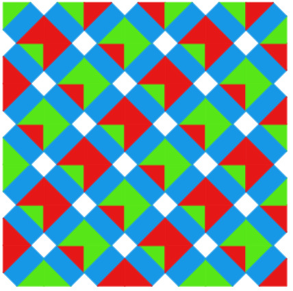

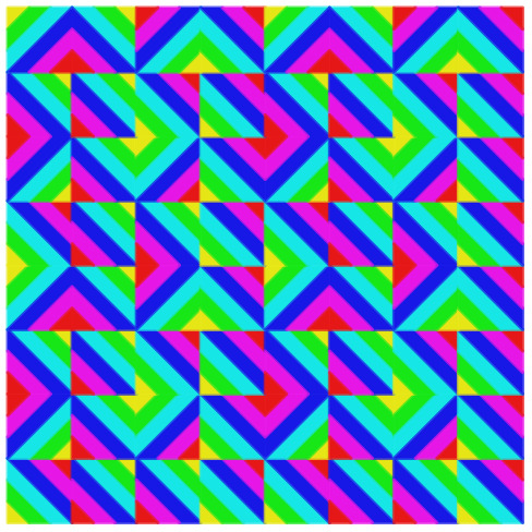
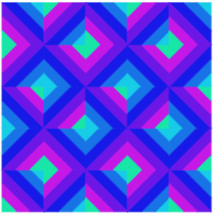

I asked @goldenboyreturns (as an art teacher) to take a crack, and this is what he came up with:
Quilt 23
Complementary

I like the juxtaposition of two complements; and the orange that we see next to this blue is very different from the oranges when they’re next to warm colors or other secondary colors.
Orange
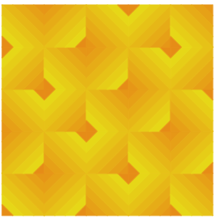
I like the gradient from orange to yellow; I think how the 8 distinct colors blend to create what looks like a gradient is a similar effect to an optical gray.
Form

I think this one kind of creates the illusion of form, or a 3D quality.
Hexagons

The squares kind of look like hexagons in this one.
Pattern
I think a simple version of the design— where the rotation of the square from row to row and column to column is more obvious— is a good illustration of pattern.
In his last one, you can maybe see why I called it a truchet quilt. He didn't play with the rotation, but I'm really interested in what he did with the colors.
Here's the original:

and a square of 4 blocks:

22 notes
·
View notes
Text
This video about the set design for Phantom of the Opera has me thinking about design engineering, and how it contrasts with regular engineering, and how that demonstrates the contrast in design philosophies between the Sheikah/Princess Zelda and Ganondorf himself.
The Sheikah design philosophy revolves around their spiritual idea that destiny governs everything, that everything was created with a purpose. To that end, the things they designed tended to be very pragmatic and illustrative. The Shrines themselves were designed with this ethos, each building being built for a specific purpose first and foremost. The decorations of their buildings were mostly focused on reproducing the world and cosmos in microcosm, not as something that distracts from the building’s intended purpose, but in order to explain to viewers in the know how this particular structure fits into Hylia’s Grand Design. Zelda herself is very pragmatically minded, attempting to reverse-engineer this ancient technology, or at least understand how it works well enough to reproduce it. She can be a very passionate, emotional person, but she’s not so hung up on aesthetics or trying to figure out “what it all means,” just “how does this work?” No frills, no artifice, just straightforward and to the point.
Contrast that with Ganon. After hearing a bunch of theorists describe Calamity Ganon as something akin to Puppet Ganon from Wind Waker, it clicked into place for me. Ganon is a set design engineer, rather than just a guy working in a workshop to build machines like the Royal Research Lab. His creations weren’t just built to fulfill a purpose, but to communicate something. The purpose his creations serve, while important, is secondary to that desire to communicate a concept, to produce a specific effect in his audience, even if the only thing he wanted to communicate was his contempt for Hyrule and its people.
“The Calamity” is a coup de theatre: this great big spectacle designed to produce a specific impression in the people of Hyrule. In this case, the desired impression was mass panic. Ganon purposefully obfuscated his methods in order to give the impression that “Calamity Ganon” was this vast, incomprehensible force of nature that could not be predicted or countered. Once you start seeing what he’s working with, as you start making connections between the Malice and whatever that ectoplasmic substance the Ultrahand is working with actually is, the actual mechanisms he used turn out to be relatively simple. He just relies on optical illusions and hiding his tricks in order to make things seem more vast and terrifying than they actually are, like how Bjornson used foreshortening to make the chandelier look like this perfect reproduction of the Garnier opera house’s chandelier when it was actually just a flat oval that could fit in the tiny theater and wasn’t as much of a pain for the stagehands to transport, raise, and lower as a perfect 1:1 scale reproduction would’ve been.
And then with Ganon’s takeover of the Guardian tech, he injects this design philosophy into the stuff he’s working with. A lot of what makes the Possessed Guardians so scary is the musical/sound cues associated with them, as well as their body language that suggests a cold, driven, purposeful hostility. Without that, they’re just big goofy buckets with legs. Just compare the Guardian you see in the castle flashback that’s unaccompanied by the iconic, anxiety inducing heartbeat of the “Guardian” music, being gently prodded along in a certain direction by soldiers with the Guardians you’d see patrolling Central Hyrule 100 years later. Ganon doesn’t just want an ambulatory robot that shoots lasers. He wants his war machines to intimidate, to terrify, to make their targets so scared that they freeze in fear (and coincidentally become much easier to hit). The Blights, too, were designed with this aesthetic of fear in mind. They’re also designed to suggest Ganon’s present, even if the artist himself is technically absent.
The desired effect is to establish the omnipresence and frightfulness of Ganon himself, to terrorize his targets, and to communicate his general contempt. He is concerned with the aesthetics of power, as opposed to just having impressive weapon specs. The Guardians by themselves are already potentially dangerous and destructive, as all weapons of war are, but Ganon needs to take it further, injecting his personality into each one he touches to turn them into a tool of communicating his will in addition to just weapons he tries to use to destroy Link/Zelda.
In summary, their general philosophies are like this:
The Sheikah: This is the world, this is how it works. Everything was made to serve a purpose, and this building, too, has a purpose. It was built to fit into this grand cosmic design we depict on its walls.
Ganondorf: I Want These Cretins To Pee Themselves In Terror When They Gaze Upon My Works. Let Them Hate Me, So Long As They Fear Me.
#long post#legend of zelda#loz thoughts#totk spoilers#totk thoughts#botw#totk#ganondorf#the sheikah#princess zelda#i have been listening to lingua ignota's 'caligula' again and that was one of the things that's got me thinking about#the aesthetics of power#and in particular how that factors into abuse and trauma and reactions to trauma#with regards to ganondorf and the nature of his lashing out against hyrule as implied by his japanese speech#and how lingua ignota herself depicts her response to abuse as coopting those aesthetics of power#in order to communicate her rage and grief and retake control of her own body and agency#the bombastic speech of 'butcher of the world' set against the backdrop of the sample of wendy carlos' score for clockwork orange#as opposed to the more hushed intimate 'deathdealer' that uses the exact same lyrics but communicates something more intimate#this juxtaposition of power and rage versus grief and vulnerability within the same character as they try to process their trauma#that i find really interesting
33 notes
·
View notes
Text

The Classic 60s Bait & Switch -- X-Ray Specs!
X-ray specs or X-ray glasses are an American novelty item, purported to allow users to see through or into solid objects. In reality, the spectacles merely create an optical illusion; no X-rays are involved. The current paper version is sold under the name "X-Ray Spex"; a similar product is sold under the name "X-Ray Gogs".
X-Ray Specs consist of an over-sized pair of spectacles with plastic or cardboard frames and white cardboard "lenses" printed with concentric red circles, and emblazoned with the legend "X-RAY VISION".
The "lenses" consist of two layers of thin cardboard with a small hole about a quarter-inch (6 millimeters) in diameter punched through both layers. The user views objects through the holes. In the original version, a feather is embedded between the layers of each lens. The vanes of the feathers are so close together that light is diffracted, causing the user to receive two slightly offset images. For instance, if viewing a pencil, one would see two offset images of the pencil. Where the images overlap, a darker image is obtained, giving the illusion that one is seeing the graphite embedded within the body of the pencil. Newer versions utilize manufactured diffraction lenses instead of feathers.
X-Ray Specs were long advertised with the slogan "See the bones in your hand, see through clothes!" Some versions of the advertisement featured an illustration of a young man using the X-Ray Specs to examine the bones in his hand while a voluptuous woman stood in the background, as though awaiting her turn to be "X-rayed". These claims, however, were untrue. In smaller print below the X-ray claims, advertisements and packaging state that X-Ray Specs operate by "illusion".
Part of the novelty value lies in provoking the object of the wearer's attentions. These subjects may believe that the device does allow the wearer to compromise their modesty, so are liable to respond with a variety of amusing reactions. Indeed, instructions with the packaging explain how to provoke such reactions, to "CONVINCE the gals that your X-Ray Spex are for real!"
The principle behind the illusion, as well as its use in a pair of "spectacles", was first patented (in the United States) in 1906 by George W. Macdonald (U.S. Patent 839,016). A tubular configuration employing the same principle as well as the use of a feather for the diffraction grating was first patented in 1909 by Fred J. Wiedenbeck (U.S. Patent 914,904)[citation needed]
X-Ray Specs were improved (U.S. Patent 3,592,533) by Harold von Braunhut, also the inventor of Amazing Sea-Monkeys.[4]
A previous product called the Wonder Tube worked similarly. Instead of glasses, the device was in the form of a small telescope.
Their name was used as the inspiration for the UK punk band X-Ray Spex.
5 notes
·
View notes
Video
youtube
Optical Illusion 3D Logo Design Tutorial: Abstract Geometric Shapes in Adobe illustrator.
Learn how to create an Optical Illusion 3D Logo Design using Abstract Geometric Shapes in Adobe Illustrator 🤩 This tutorial is perfect for graphic designers and anyone interested in logo design! Join me as I walk you through the step-by-step process of creating this stunning logo design.
#logo#logodesign#logodesigner#logomaker#logomaster#freelogomakingapp#kavucreative#adobeillustraor#illustrator#vectorart#vector
2 notes
·
View notes
Text
Animation history
Animation essentially is the manipulation of an image be illustration, or inaminate objects. Whilst creating a narrative.
Somer early devices were:
Magic lantern: It would project an image using a mirror at teh back with a light source, developed in 1603. Directing the light through long glass slides, usually a candle. by putting the sloides together it would create movement, making the magic lantern the first instance of “moving pictures.”
Thaumatrope: An optical toy featuring a picture disk held by two strings. The strings were twirled, spinning the disk, moving images on either side of the disk into one by the “persistence of vision,” an optical illusion that tricks the eye into seeing movement long after the movement has stopped.
Phenakistoscope: Known as well as a Fantascope, or “phenakistiscope,” appeared in 1833, featuring spinning, painted cardboard disks reflected in mirrors, which created the illusion of movement. however could only be viewed by one person at a time.
Zoetrope: Successor to the above. it was a spinning cylindrical version that presented images in sequential phases of motion that allowed multiple viewers. The cylinder contains several vertical slits, which provided a mechanism for the eye to keep the spinning photographs from blurring together while in motion.
Kineograph: Latin for “moving picture,” Known as the flipbook created in 1868. It is a small book of drawings, flipped pages would form of movement, they animate a scene.
Praxinoscope: In 1877, this surpassed zoetrope, replacing the narrow vertical slits with inner circle of angled mirrors instead. The angled mirrors provide a clearer view compared to peering at the moving illustrations through slits.
Beginning of the industry they recorded H.W Goodwin with the invention of Celluloid in 1887.
The first film was by Émile Reynaud’s Pauvre Pierrot (1892) by using a longer image roll for the praxinoscope, allowed for a longer viewing time. Acredited as the first animated film because the roll was hand-painted with 500 individual images instead of photographs.
However, it is argued by film historians that Émile Cohl’s Fantasmagorie in 1908, is the first animated film produced with traditional animation techniques, therefore making it the first.
Moreover, some as well debate the producer J. Stuart Blackton’s Humorous Phases of Funny Faces in 1906. As the first animated film. He used stop-motion animation, animated characters changing movements throughout his 3 minute film.
Going further some say Walt Disney Studios’ Snow White and the Seven Dwarfs (1937). Which uses traditional animation process of cel animation. This process allows transferring illustrations between frames, rather than redrawing from scratch. Therefore speeding up the process. Moreover no one had made a feature length film with the aim of making the audience cry. Which Walt knew this would mean the audience can actually related and care for characters on a another level, compared to just being entertainment for laughs.
And from this film Disney and Pixar came about, and created 3D animation software, most notable with Toy store. The first break through for a 3D film. Which in turn kept developing further to now Frozen which has crazy realism with materials, elements and clothing. Which wouldn't be possible without that catalyst Toy Story. As it showed how 3D can save production materials, and time (once it got more concrete) as well as how the audience received it.
3 notes
·
View notes
Photo
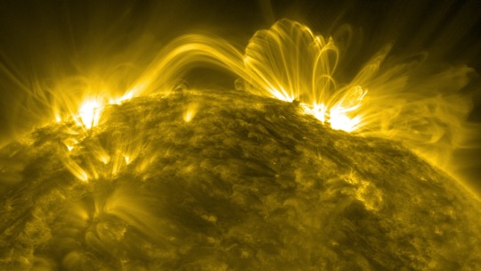
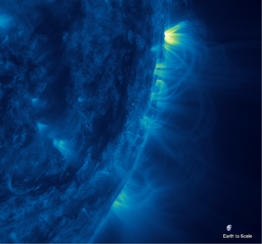
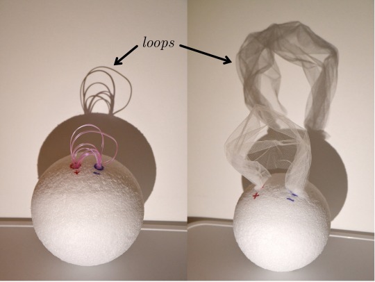
The Coronal Veil: Are the Sun’s Magnetic Arches an Optical Illusion? In visible light, the Sun appears blank and featureless. But through a solar telescope in a different wavelength, it is revealed to be much, much more. In extreme ultraviolet light, the Sun resembles a rumpled ball of yarn. It teems with giant radiant arcs known as coronal loops soaring through the Sun’s corona, or outer atmosphere. Coronal loops are considered fundamental to the Sun’s workings. Understanding how they form, change, and move is one of the key goals to understanding our closest star. At least that’s what researchers have long assumed. In a recent paper, solar physicist Anna Malanushenko and her co-authors argue that some coronal loops may not be what they appear to be. Instead, they may sometimes be optical illusions created by folds or wrinkles in much larger “sheets” of solar material that the authors call coronal veils. “If this is really correct, then we will have to change the entire way we look at and interpret coronal loops,” said Malanushenko, a scientist at the National Center for Atmospheric Research in Boulder, Colorado, and lead author of the paper published in The Astrophysical Journal. Ever since capturing the first images of coronal loops in the late 60’s, scientists have hypothesized what their 3D structure might be. The conventional model saw them as magnetic “tubes” formed by the Sun’s magnetic field lines. The tubes themselves are invisible; what we see is the bright solar material that flows through them like water through a garden hose. This “garden hose” model of coronal loops fit well with known physics and there was no reason to doubt it, at least at first. But eventually, observations that didn’t fit began to pile up. Just as Earth’s air gets thinner at higher altitudes, the Sun’s bright plasma, or electrically charged gas, gets thinner with height. That’s why it grows dimmer with height, and if coronal loops truly are tubes of plasma, so should they. But many loops maintain a consistent brightness, with no obvious explanation. If coronal loops trace the Sun’s magnetic field lines, they should balloon as they move away from the Sun as that magnetic field expands to fill space. “But they don’t get nearly as wide as we think they should,” Malanushenko said. “Most of them stay too thin and we don’t understand why.” Something wasn’t adding up, and Malanushenko started to question the observations themselves. After all, the Sun’s corona is “optically thin,” or translucent, like fog or smoke. She wanted to understand the optical tricks that could occur in that kind of environment. Malanushenko decided to simulate the process of observing coronal loops with a computer. She repurposed a 3D simulation of the Sun originally used to study flares, then wrote a program to “observe” it. She fired up the simulation, and her program took 2D “images” of it, just as telescopes give us 2D snapshots of the real Sun. Sure enough, the snapshots revealed bright arcs – artificial coronal loops on a simulated Sun. But unlike the real Sun, Malanushenko could pause the simulated Sun and look at its 3D structures behind them. And she found something markedly different from garden hose-like tubes. “I don't have words how to describe it, because this is not like anything that we see on Earth,” said Malanushenko, “I want to say this formation looks like clouds of smoke, or maybe a veil or curtains that are wrinkled.” Malanushenko created a simple model to illustrate how a veil could produce the illusion of coronal loops. The shadow created against the wall represents the 2D image we see in solar telescopes. The veil’s folds and wrinkles create a pattern of darker and brighter strands, in some ways similar to the image cast by real tube-like strands. “But many of the strands that you see here, they're just a projection effect. They're not real,” Malanushenko said. Malanushenko and her co-authors are quick to clarify that not all coronal loops are visual illusions. There were many instances where garden hose-like structures do really form, even in the simulation that Malanushenko studied. “It would be exciting if we could say ‘Our thinking was all wrong, we have a totally new paradigm,’” said Jim Klimchuk, a solar physicist at NASA’s Goddard Space Flight Center and coauthor of the paper. “It's not that way at all – but these veils, I'm sure they do exist, and now it's a question of proportions: are veils more common or are loops more common?” One thing the co-authors agree on is that there’s now plenty more work to do. “Now, do we have any idea why those veil structures are produced?” asked Malanushenko. “No! We literally just discovered them. Now we need to explain them, and we don't have a good explanation yet.” TOP IMAGE....Coronal loops on the Sun are captured in ultraviolet light using the 171 ångström channel of the Atmospheric Imaging Assembly (AIA) instrument on NASA’s Solar Dynamics Observatory. Credits: NASA/SDO CENTRE IMAGE....This ultraviolet image of coronal loops on the Sun was taken using the 335 angström channel of the Atmospheric Imaging Assembly telescope on NASA’s Solar Dynamics Observatory. Earth is shown to scale. The image shows solar plasma at temperatures around 4.5 million degrees Fahrenheit (2.5 million degrees Celsius) colorized in blue. In this image, loops extend far from the solar surface without expanding much with height, which is counter to the expected physics according to the “garden hose” model of coronal loops. Credits: NASA/SDO LOWER IMAGE....This simplified model compares the “garden hose” model of coronal loops (left) to the coronal veil model (right). In both images, the ball represents the Sun, and the shadow represents the image of the Sun that would be observed by telescopes. On the left, individual strands or tubes connect one part of the Sun’s surface to another. The shadow reveals obvious loop-like structures. On the right, a more complicated “veil” or translucent sheet connects one part of the Sun’s surface to another. The shadow still creates the impression of loop-like strands that in some places resemble those created by the garden hose model. Credits: Anna Malanushenko
2 notes
·
View notes
Text
Lost & Found
RESEARCH INSPO IMAGES
Erik Johansson
Erik Johansson isn’t as concerned with capturing moments as he is ideas. The Swedish-born, Berlin-based photographer and retoucher creates layered photo illustrations that combine landscapes and surreal concepts.


Photographer Li Wei
The Chinese photographer Li Wei became widely known for his extraordinary photos, on which he distorts the possibility so that people depicted in the pictures, as if would be in a state of weightlessness, flight or falling from a huge height. What is most interesting, Li Wei does not apply computer graphics or editing when creating photographs. Each photo is preceded by a long preparation and correct technical calculations. In order to transform the illusion into reality, the Chinese photo artist resorts to using iron cables, mirrors, acrobatics and scaffolding. Li Wei perfectly knows what is mirror illusion photography and how with it you can project your own image anywhere. His works refer to the pictures that play with your eyes.

Photos of him are successfully demonstrated at exhibitions in the world and are published on the covers of many respectable publications.
Chema Madoz
Another photographer working in this direction is the Spaniard Jose Maria Rodriguez Madoz, who creates black-and-white optical illusions hidden objects under the pseudonym Chema Madoz. He is fully confident that everyday things and objects can imagine new worlds, it is only necessary to look at them in a new way. Chema Madoz creates on his own photographs tremendous illusions, which bring the opposition of reality and the illusory world to the point of nonsense.
The photographer sees his main task in forcing a person to think non-stereotypically, without any limitations and red lines. On his pictures it is possible to notice the amazing forms and imagination of space, hidden among simple things. Chema Madoz opens up to the public a new perception of reality, a parallel world that excites the minds and explores new horizons.
2 notes
·
View notes
Text
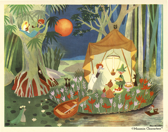
Animation Brief 01 - Week 1 - Research
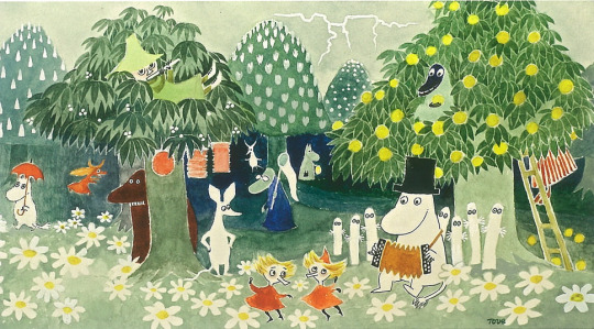
Above: Moomin
After being formally introduced to the animation course and forced coerced to listen to Radiohead, it was time to crack on with the "World Building" brief itself. The first step in plan was a group trip to the Limerick City Library...
...I didn't go.
To be honest I'm still just a wreck of a person and insomnia has been kicking my ass. There are things I can do while sleep deprived but engage in social situations is just not one of them. I felt like I was starting to panic so I just called it a day and went home.
I didn't stop working however, and like any bad maths student I may not follow the correct process to get a given answer, but right or wrong; I'm still getting to that answer. So basically I made my best attempt at following step one of our brief's outline, just alone and tired.

Above: More Moomin art to lighten the mood...
So step one of the brief, and the whole reason we were supposed to go to the library was for research. Our tutor Yvonne Sweeney outlined this for us. The idea was to look through the children's section in particular and find an aesthetic or the inspiration for an aesthetic to emulate for our upcoming work.
Personally I love the aesthetic of children's media like picture books, so this suited me fine. There's something so raw about illustrations made with the idea of engaging little kid brains. I find a lot of the most memorable children's artists had something idiosyncratic about their style, something imperfect or unusual is more captivating than the opposite. You have to keep looking to satisfy the brain's desire for understanding; "what is it about this that makes it look off-kilter"?
So with all that in mind I went looking at children's books for research. There's a lot laying around my house, not just from my own childhood but my siblings as well. It's pretty fascinating to look back and try to examine why the media we consumed back then had the hold on us it did.
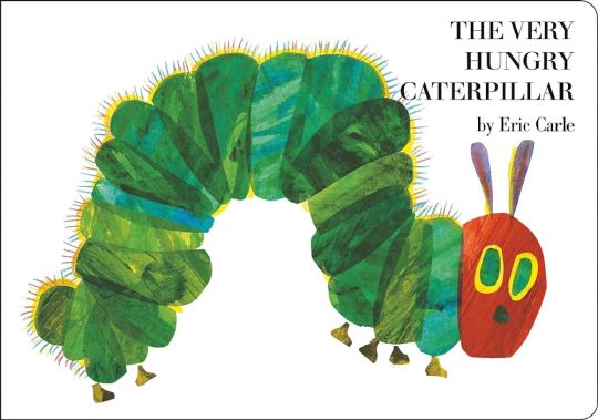
Above: The sin of Gluttony...
When thinking about books I read as a kid for some reason my mind goes immediately to the insatiable insect above. That cover is burned into my subconscious... Although until researching it for this project, I wouldn't have remembered how uncanny the catterpillar's face looks. It's cute in it's own way but also not unlike something you might see in a horror. I'm kinda reminded of the "redeads" from Ocarina of Time.
Above: I don't trust this guy's smile...
If I had to describe the art of Eric Carle in one word it'd probably be texture. Through the use of collage, his work takes on a very three dimensional, tactile quality. This was used to great effect in the Hungry Caterpillar book, with the titular character memorably biting holes out of the books pages.


Above: The flag of California I think
Beyond just what it evokes, on a technical level a lot of Eric Carle's stylistic traits line up well with the medium of animation. An animated scene is assembled, layered from foreground to background. In a simple shot moving these layers at different speeds can create the illusion of depth. This technique employs the parralax effect, having close objects appear to move faster than those further away. Similarly Carle's collage inspired aesthetic is all about layering, and the optical illusion of disparate parts making up a cohesive whole.

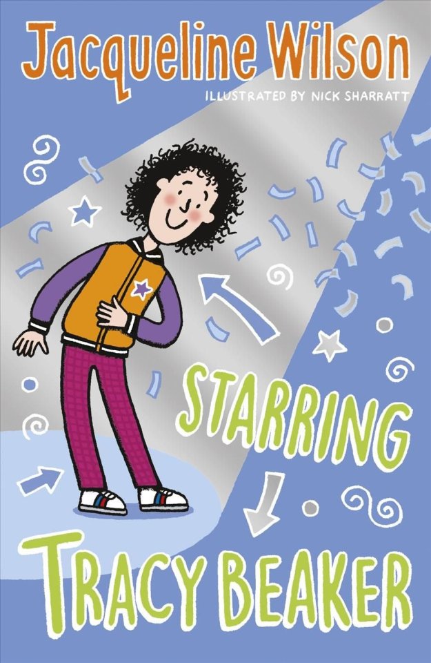
Above: The Dumping Ground
Another artist I wanted to highlight is Nick Sharratt, children's author and illustrator best known for providing the artwork for Jacqueline Wilson's Tracy Beaker books. I actually hadn't heard of Sharratt 'til now, despite having known his art forever. Sharratt employs a simple style with uniform line thickness and flat, vibrant colours. There's a loose, playful kind of energy to his work that I feel really speaks to children.
I was impressed to learn how dedicated Sharratt is to kid's media and education. He's been an ambassador for children's charity Theirworld for years, campaigning for children's right to a fair and equal education, regardless of gender, race or circumstance.


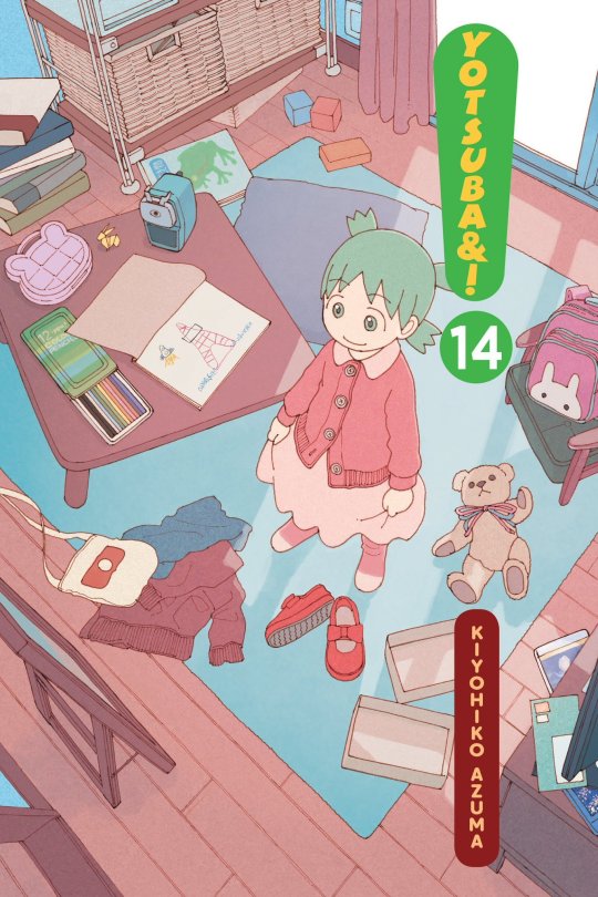
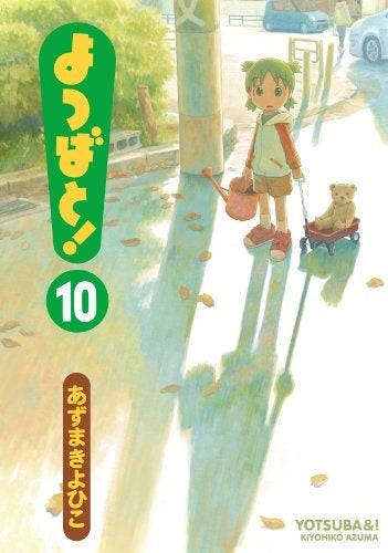
Above: (◕‿◕✿)
I don't actually know much about Yotsuba&! It's a long running Japanese manga series by Kiyohiko Azuma ostensibly aimed at children. It depicts the everyday adventures of a young girl named Yotsuba as she learns about the world around her, guided by her adoptive father, their neighbors, and their friends. I know a lot of people use it as a resource when learning Japanese because of simple, easy-to-understand nature and limited use of difficult vocabulary and grammar.
The art, like a lot of manga and comics in general, is more character than background focused. That said the covers have a lovely watercolour aesthetic with surprisingly muted colours for a children's series. I appreciate Azuma's emphasis on light and time-of-day in his illustrations. He recreates the world in the warm, optimistic light you'd expect from a child's perspective.
All that said, I'm pretty sure it's a series co-opted by 4chan type incels for whatever reason, so I'm somewhat uncertain about lumping it in here with genuine kids media.


Above: A more trustworthy smile
The last artist I'd like to mention is Tove Jansson, best known for her children's novel series Moomin, of which I've already posted some artwork above. Moomin is another one of those series I had no real contact with as a child. I stumbled across Jansson's work online, often seeing animated clips and illustration's of these bizarre yet deeply charismatic characters.
In some ways her artwork isn't the most suitable for this project, as her illustrations are dominated by the character with the background being there only to frame them. It's exactly because of this though, that I find her backgrounds so appealing. They represent a kind of warped space, where reality contorts itself around her characters.


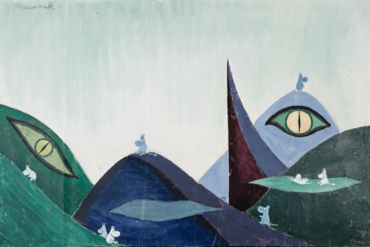
Above: Less Moomin
Jansson was also prolific, producing many paintings and illustrations outside her domain of children's books. What I find fascinating about her work is that you can see the same elements appear whether she was working in service of children, adults or no one in particular. That in itself may be getting at what made her such a powerful children's artist, she created art in her own single minded vision, unperturbed about what others might think. I feel that philosophy is at the heart of creating authentic children's media.
4 notes
·
View notes
Text
Top Graphic Design Institute: Dehradun
Explore a Diverse Range of Graphic Designing Courses at Leading Institute in dreamzone Dehradun
The best graphic designing institute in Dreamzone Dehradun will focus on providing candidates with all the skills required to create a design. This process will include ideation, digital application and rending of the design. Graphic Design course also gives candidates a chance to work with various applications from scratch. Through the program, you will learn about the essential aspects of Graphic Design for web and print media. You will also learn the creative aspect of the subject vehemently. You can create Vector based artwork and image composition and manipulation. The enrolled candidates will also get an opportunity to work with real-time projects to help them enhance their design skills.
Basic of Design and Graphics
Graphic design is the art of creating exciting visual content using computer software to communicate messages that inform, inspire, and meet the target audience’s attention. The graphic design program combines art and technology to communicate ideas by using a variety of design elements to achieve artistic or decorative effects with the help of interactive media. By using the visual structure and page layout methods, designers use typography and pictures to meet users’ specific needs and focus on the logic of displaying elements in interactive designs, to optimize the user experience. The core graphic design principles are Contrast, proportion, Rhythm, color, Visual Hierarchy, and Proximity.
Process to Create a Design:
Research about the project
Planning
Dealing with multiple ideas
Time management
Attention to detail
Types of Graphic Design:
Brand Identity Design
Marketing & Advertising Design
User Interface Design
Product Design
Publication Design
Packaging Design
Typeface Design
Motion Graphic Design
Illustration Design
Learning objectives of Graphic Design Course in Dreamzone Dehradun
The learning outcomes for this course are as follows:
All the essential elements and concepts involved in the design
Knowing about the aspects of print advertising
Learning about imagery and visualization techniques
Getting know-how about typography, color theory and its scope, importance, and applications
Learning about retouching and image editing
Designing the layouts for brochures and magazines
Understanding grid systems and layouts
Learning how to use raster and vector graphics
Graphic Design Course Modules
Graphic design training classes in Dreamzone Dehradun, combine creativity with technology to teach students in a clear and effective way. Below are the curriculum followed during the training:
Introduction
Basics of Graphic Designing
Web Designing
G-Codes
M-Codes
Design process
Color models
Understanding resolution
Types of Image formats
Typograph
Overview of popular software used
Designing of brand identities
Animation and 3D images
Color balancing
Elements of Graphic Design are:
Shape
Color
Space
Form
Line
Value
Texture
Graphic Design Software Tools:
Adobe Photoshop
Adobe InDesign
CorelDraw Graphics Suite
Adobe Illustrator
Inkscape
Sketch
Affinity Designer
Xara Designer Pro X
Gravit Designer
Photoscape
Jobs for Graphic Designers in Dehradun:
Graphic Artist
Digital Illustrator
Art Director
Creative Director
Package Designer
Visual Image Developer
Visual Journalist
Logo Designer
Broadcast Designer
Interface Designer
Web Designer
Multimedia Developer
Flash Designer
Layout Artists
Photoshop Artists
Top Graphic Design Trends in 2024 are:
3D Design
Emoji Design
Optical Illusion Design
Nature-Inspired Design
3D Typography Design
Cartoon Illustrations in Design
Voxel Art Design
Monochrome & Duotone Design
0 notes
Text
M.C. Escher
For my analysis, I’m going to be look at M.C. Escher. M.C. Escher is a Dutch graphic artist known for his intricate and mind-bending illustrations that used various techniques to build images that challenge people’s perception of reality. Three key elements he utilized were shapes, depth, and perspective.
Shapes play a key role in Escher's work as he often used geometric patterns and tessellations to create visually striking compositions. His attention to detail helped him to transform simple shapes into complex structures that appear both ordered and chaotic simultaneously. By repeating these shapes, such as squares or triangles, Escher created mesmerizing optical illusions that seem to defy the laws of physics. For example, in his famous print "Ascending and Descending," he employs triangular shapes within a square grid to give the illusion of an infinite staircase that leads both up and down at the same time.
Depth is another crucial element in Escher's artwork. He manipulates depth perception by incorporating clever techniques like foreshortening and overlapping objects. Through the careful arrangement of lines and shading, he creates a sense of three-dimensionality on what is essentially a two-dimensional surface. This technique is particularly evident in works like "Relativity," where different levels are interconnected through stairs and doorways leading us into perplexing spatial arrangements.
Perspective plays a significant role in Escher's art as well. He understood how altering perspective could distort reality and generate intriguing visual effects. He would use multiple vanishing points or impossible perspectives, he challenged our understanding of space and forced us to question what is physically possible. In pieces like "Waterfall" or "Belvedere," Escher defies traditional linear perspective rules by creating scenes that appear logically inconsistent but still somehow believable.
Escher’s skills is not only in his ability to manipulate shapes, depth, and perspective but also in his use of paradoxes and contradictions within his creations. By combining these elements with mathematical precision, he invites viewers into worlds that are familiar and disorienting at the same time. His artworks captivate us by their ability to challenge our perception, forcing us to question what we believe to be true.
M.C. Escher's genius lies in his skillful use of shapes, depth, and perspective to construct images that defy conventional reality. Through intricate tessellations, manipulation of depth perception, and the deliberate distortion of perspectives, he creates mesmerizing optical illusions that challenge our understanding of space. Escher's innovative approach continues to inspire artists and viewers alike as they navigate the complex interplay between art and perception.
1 note
·
View note
Text
Week 01 | Phenomenology
Phenomenology is the study of “lived experience” which is the study of phenomena that arise from the experience of being in the world. In simple terms, when two people see the same thing, what is their thinking or perception of the item is different from one another. Phenomenology plays a crucial role in enhancing the design process by emphasising the subjective experiences of users. This means paying close attention to how each person personally sees, feels, and experiences the world without jumping into conclusions. Things like emotions, behaviours and reactions easily influence people's perception in an item or a theme. Design is the purposeful and careful process of creating or shaping things, spaces, systems, or experiences to meet specific goals or solve specific problems. Some examples of phenomenology are the famous young and old lady optical illusion, and the duck and rabbit illusion.

Factors such as attention, cultural influences, and individual cognitive processes can contribute to which interpretation is dominant for a person, therefore individuals may perceive the same image differently. For example, a designer may embed some form of cultural or societal commentary in their work, audiences of different cultures or societal contexts may interpret it differently. When I design my trading cards for studio, when referencing the designer or illustrator, what they think of their own personal design identity will be different from how I perceive their overall design identity which is based on my research on their designs and works.

word count: 243
Class Activity:


Example of Phenomenology:

1 note
·
View note
Text
How to Create Optical Illusion 3D Striped Shape in Adobe Illustrator

How awesome is this optical illusion 3D ring that I created in Illustrator? It looks like it’s jumping out of the screen, doesn’t it? In this video, I will show you how to create this 3D ring using simple shapes and the 3D Revolve Effect. You will also learn how to create and use custom symbols in Illustrator, which will make your work more creative and faster. This is a cool and easy tutorial that anyone can do. Watch this video and reblog it!
Watch Now
0 notes
Text
Visual Effects in Fashion Photography: Creating Surreal and Captivating Imagery
VFX courses in Pune is a fantastic choice for creative types who dream of working in the film industry. High-profile projects, partnerships with major studios, and opportunities to advance in your career to manage other visual effects (VFX) professionals are all within your reach.
Fashion photography is an art form that constantly evolves, pushing boundaries and challenging traditional notions of beauty and aesthetics. In recent years, visual effects have emerged as a powerful tool in the fashion industry, allowing photographers and designers to create surreal and captivating imagery that captures the imagination and leaves a lasting impression. From whimsical transformations to mind-bending distortions, visual effects in fashion photography have the ability to transport viewers into a world of fantasy and wonder. In this article, we will explore the role of visual effects in fashion photography and how they contribute to the creation of striking and memorable images.
Visual effects offer a wide range of possibilities for fashion photographers to experiment and bring their creative visions to life. By employing techniques such as compositing, image manipulation, and digital enhancements, photographers can transform ordinary fashion photographs into extraordinary works of art. One of the key advantages of visual effects is their ability to enhance the storytelling aspect of fashion photography, allowing photographers to convey emotions, narratives, and concepts in a visually compelling manner.
One popular use of visual effects in fashion photography is the creation of surreal and dreamlike environments. By seamlessly blending different elements, such as fashion garments, natural landscapes, and digital illustrations, photographers can construct whimsical and otherworldly settings that transport viewers into a realm of fantasy. These surreal backdrops not only enhance the visual appeal of the images but also evoke a sense of wonder and curiosity, making them more memorable and impactful.
Visual effects can also be employed to manipulate the physical attributes of models, pushing the boundaries of conventional beauty standards. Through techniques like digital retouching and body modifications, photographers can create striking and unconventional looks that challenge societal norms and celebrate diversity. These transformations not only serve as a form of artistic expression but also promote inclusivity and body positivity in the fashion industry.
Furthermore, visual effects can be used to create illusions and distortions, adding an element of surprise and intrigue to fashion photographs. By playing with perspectives, reflections, and proportions, photographers can create visually dynamic images that captivate the viewer's attention and provoke thought. These optical illusions challenge our perception of reality and push the boundaries of what is possible within the realm of fashion photography.
In conclusion, visual effects have become an integral part of fashion photography, enabling photographers to create surreal and captivating imagery that pushes the boundaries of creativity and storytelling. From creating dreamlike environments to manipulating physical attributes and playing with illusions, visual effects offer endless possibilities for photographers to craft striking and memorable images. By embracing these techniques, fashion photographers can elevate their work, captivate audiences, and contribute to the ever-evolving landscape of fashion photography.
0 notes
Text
Top Trending Web Design Trends
Top Trending Web Design Trends
1. Videos as Design Components
Videos are always omnipresent in website design. In case you need to add interviews or promotional videos to your website, videos are the best way to involve your audience by enthusiastically delivering crucial data.
For more details on our products and services, please feel free to visit us at: Article Writing Services, Content Writing Services, Blog Writing Services, Press Release Submission Services & Press Release Writing.
Please feel free to visit us at: https://webigg.com/
Now videos are playing a new role in website design. From being totally informational, they are converting to design elements. Due to the seamless creation of new technologies, now videos can be included in the website design in exciting and new manners.
2. 3D Illustrations
The lines between virtual reality and reality are confusing. 3D effects and strategies in the 2D space are good instances of this in action. Designers are exploring every 3D element, from animations and illustrations to scenes made with images and objects.
Illustrations can add 3D effects and intensity with shadows and simply the right concept in the creative procedure. And this might cause something that has a more realistic feel.
3. Organic Shapes
Although geometric shapes were one of the big web design trends in 2019, organic shapes have taken place in 2023. Fluid or organic shapes are everything that does not include straight lines. These are the shapes that occur in nature, such as a river or lake’s edges, hills, and how they are winding and asymmetrical.
Organic or fluid shapes can amazingly break up a website’s segments without rough angles or lines. Moreover, they can be perfectly utilized in the background, like the way Android utilizes circles behind every item on their homepage.
4. Dark Mode
Dark mode is one of the most popular web design trends for 2023. It is trendy as it offers a low-contrast application or website that you can easily browse through in low light environments. It helps you highlight a particular content type as well.
Some other reasons to go for this trend include:
Dark mode works as a battery saver.
It gives your device a cool and modern appearance.
Your eyes don’t get stressed while using a device in low-light environment.
5. Changes in Scrolling
The changes in scrolling have already transformed the way users operate websites. This latest trend is going to stand out in 2023 with the transformation of scroll animations, horizontal scrolling, and scrollytelling.
This is why websites are getting more accessible and engaging instead of just playing a media role that connects users with web activities. These transformations not just help users get more engaging experiences but gather basic info from websites.
6. Parallax Animations
Parallax is an optical illusion that we see in our daily life. It occurs when nearer objects seem to move quicker than distant objects. The parallax effect on website pages looks so surreal and real.
The use of background and foreground for creating depth has another advantage of immersion. It converts the computer screen into closer to a theatre stage. Since users browse through website pages, they consider its performance as magical.
7. Maximalist or Minimalist Extremes
Both maximalist and minimalist web designs are in trend in 2023. Minimalist website design grows on simplicity, uncovering extra design elements. However, its less-is-more strategy can make a powerful impression on the target audience, offering them an easy user experience.
On the other hand, maximalist web design will focus on a no-holds-barred tactic in 2023. This approach gives value to creative expression rather than order. The advantage of adopting a maximalist web design trend gives you more freedom and there is less restriction when it comes to sharing your ideas.
8. Light Colors
Want your visitors to keep looking at your web pages? Then, opt for light colors. This kind of low-saturation, comfortable colors are sometimes grayed-out or dulled, just like a cloudy day.
9. Cursor or Mouse Actions/Icons
You might miss this small trend if you don’t focus on your cursor or mouse actions. As you hover, click, or scroll your cursor or mouse, their states transform into interesting things. This amazing trend not just displays the capacity of the design but helps make users happy.
10. Neumorphism
This is one of the most popular and ongoing web design trends in 2023. It contains 2 concepts – material design and skeuomorphism. Although it executes a minimalist approach, it serves a sense of 3D in the form of buttons and other design elements.
For more details on our products and services, please feel free to visit us at: Article Writing Services, Content Writing Services, Blog Writing Services, Press Release Submission Services & Press Release Writing.
Please feel free to visit us at: https://webigg.com/
0 notes
Text
The Importance of Texture in Office Interior Design: Tips and Tricks
A poorly designed space has just as much of an impact as one that is beautifully planned; whether you can see it or not, the importance of texture in office interior design, there is always a sense that something is amiss. In contrast, effective workplace design strikes a balance between aesthetics, ambiance, and functionality. Interior designers intentionally use seven elements—light, space, line, shape, colour, pattern, and texture—to achieve this equilibrium. The word "texture" has really taken off in this last component. But what is it exactly?
The look and feel of a surface or finish can be defined by its texture. You could question how it functions in interior design and the importance of texture in office interior design. Every material you use, including furniture, textiles, flooring, paint, etc., has a unique appearance and feel. These are used in interior design to add depth and interest. The common complaint that "the space looks/feels flat" is caused by the absence of texture or diversity.
Here is an explanation of the importance of texture in office interior and how you may utilise it to improve your office design.
Importance of Texture in Office Interior Design
1. As we've already said, adding texture to an interior area gives it depth. A textural element is visually dominant, which means it stands out. You can use texture design to provide the idea that a space is large or small when paired with other interior design components like light and colour or even on its own.
2. Contrast is essential to interior design because it generates visual interest. That is made possible by figuring out the importance of texture in office interior design. A space looks appealing when different materials and finishes are put together in contrast. This is especially valid for spaces with similar or monochromatic colour palettes.
3. You can create balanced interiors by using texture in interior design. Without a range of textures and finishes, any room would appear lifeless and flat. Variety really is the flavour of life. A space needs some plush and some rough elements for every smooth surface in order to remain intriguing. Hence, highlighting the importance of texture in office interior design.
4. A room's ambiance is just as important to interior design as its appearance. Additionally, the importance of texture in office interior design enables you to create the type of environment you desire. To create a pleasant atmosphere, you'd choose a mix of soft and grim fabrics. The obvious choice in a fully glam setting is luxurious materials. And so on.
Different Types of Textures:
1. Tactile Texture
The surface of the substance has genuine physical differences when it has a tactile texture. You can therefore feel the changes as well as see them on the surface. Each material has a unique feel, such as the wood's grain, the jute's coarseness, the softness of the fur, etc.
2. Visual Texture
Without actually holding any three-dimensional qualities of a physical texture, a surface can imitate one. For instance, laminates are flat surfaces that accurately imitate the feel of wood. Additionally, it has a variety of surface coatings, including matte, eggshell, bright, etc.
3. Abstract Texture
A textured material can be used to make a pattern or design that creates a new texture both physically and aesthetically. Riverstone fireplaces, brick walls, 3-D wall panels, and wooden pieces placed at different depths to create an undulating surface are a few examples. Additionally, the importance of texture in office interior design is highlighted.
4. Invented Texture
Invented textures fall within the category of visual textures. As its name implies, it would be different from the earlier instances in that invented textures are made rather than mimicked. These patterns use light, colour, and line play to create a completely different texture. One illustration is optical illusions. Surfaces with invented textures tend to be smooth.
How to Use Texture in Interior Design?
The overall design of the space and the different décor elements will influence how texture is used in interior design. However, a variety of factors can impact how and what textures you apply, and what is the importance of texture in office interior design.
1. Use Texture with Light
Materials with a lot of texture, like jute, wool, brickwork, etc., absorb light more than they reflect. Because of their visual weight, they function effectively as focus points and anchors. Such rough textures are useful for including rustic accents and a warm atmosphere. Matte coatings can produce similar results.
While focusing on the importance of texture in office interior, the greatest light is reflected by bright and smooth textures, which make them excellent choices for spaces with modern designs. They relax the area while also opening it up. They are frequently found in contemporary, minimalist, modern, and glam designs.
2. Use Texture with Scale
You can use distinct components like texture and scale to provide contrast to interior design. Additionally, you can combine them, particularly when layering textures. For instance, you may choose silk pillows, velvet upholstery, or long-pile faux fur. Because of the different visual scales, all of these plush materials can complement one another.
3. Use Texture with Colour
How we perceive texture and the overall design can be strongly affected by colour and finishes. Lighter colours, regardless of texture, provide the impression that the space is open and bright. Darker colours have greater depth and are gloomier and more alluring.
An excellent example of how to merge colours and textures is Scandinavian design. It is light and airy, therefore neutral colours are the main focus, but natural materials like wood, wicker, linen, jute, etc. are used to create a nice and comfortable atmosphere.
Source Link :
https://addindiagroup.com/the-importance-of-texture-in-office-interior-design-tips-and-tricks/
0 notes
Last Seen Blogs

smokezoneweed
smoke zone weed
4ragon
I'm still here

the-vex-archives
The Vex Archives

publishub
I Dream ~ I Publish!

wilmortberneusetrefenma-blog
Misty Turner