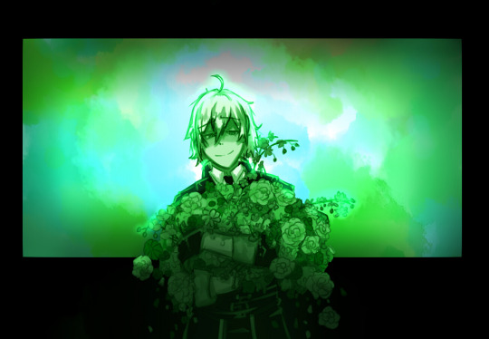
#i added more messiness just because it made it more visually appealing to my eyes lol
Text

'The sun is shining on me'
A quick messy silver drawing 'based' on Ferry's 'The world is shining on me', which is suchhh a good song----
(alt(?) vers under read more)


I messed with the hues, and these were ones I thought looked fun------! which is your favourite >_>?
#twst#twisted wonderland#silver twst#twst silver#twisted wonderland silver#silver twisted wonderland#i. i get it now - tagging him is a p a i n-#silver vanrouge#he deserves his paps last name >:[#ram's art#uhhhhh i was gonna draw someone like ace or kalim b u t#I could just imagine silver as the songs vibe more lol#which. is funny since i dont really like diasomnia alllll that much-?#well- i like them but the least outta every dorm - you know?#(this excludes sebek - i like sebek so much he's SUCH a funny annoying guy i adore every second he's on screen---)#ANYWAYS um- first time drawing the sleepy boy haha-#why. is his hair actually a pain.....???????? like>? it's so simple????? but that's actually so annoying?????#i added more messiness just because it made it more visually appealing to my eyes lol#also- i didnt bother doing too much detail since this was a quick doodle while i had free time- but----#the only flowers that had more 'detail' were ones that appeared when i researched flowers to do with sleep-#i. cant remember them though - i think orchids were one but i know nothing about flowers lol
120 notes
·
View notes
Text
His hair
Part 2 of this.
xxx
It had only been one day, but Weiss was starting to get used to her new hair style, a braid which Jaune had expertly crafted with his own hands, much to her surprise. While it wasn’t a striking visual change from her regular ponytail, the way it felt was different. A higher center of gravity which had been a slight inconvenience, but something which the boy had also helped her with in the form of a neck massage. Again, he had been surprisingly skillful in that department too. If she were to guess from their talk the other day, both the braiding and massage were skills instilled into him by his sisters throughout the years. She silently wondered to herself what else he was capable of.
Unfortunately, there was little time to explore how deep his domestic skills ran, for they were still on a mission to save the world. Even these brief moments of reprieve in which they were to gather their strength were almost coming to an end. Their final errand before they would set for Atlas proper was a wardrobe upgrade. Something everyone was most looking forward to. She too was excited for the prospect of finding a new outfit. Something that would carry on a message, one that would tell everyone of her growth and maturity. Besides, it had been a while since she bought something herself and wasn’t handed to her by one of her father’s servants. This time the girl would get to shop with everyone.
Even so, as she descended the stairs from their accommodation place in Mantle, a house Winter had managed to procure for them, she could not help but have the blond in mind. Jaune had come a long way from the boy that would trip on his own legs at Beacon. He stood taller, held more presence than before and his resolve to fight for his friends and those he cared for was admirable in her eyes. Weiss would not find it hard to admit that she enjoyed their talk the previous day, he had been great company. As she had enjoyed his service on both her hair and the massage. Speaking of which, she intended to ask for another one after breakfast. Perhaps they would retreat to a private room where they could share thoughts again. That sounded like an appealing prospect.
Her train of thought was interrupted when she saw a commotion in the hall leading to the living room. Her eyes could discern a distraught Nora surrounded by Ren, Ruby and Yang. Sensing the desolate mood, Weiss approached them, intent on finding the cause.
Weiss: What happened here?” She voiced her question, eyes watching each of them, prompting them to answer her. Her partner was the one to respond.
Ruby: “Uh, well, there’s been a bit of an accident, you could say.”
Weiss: “An accident?”
Nora: “I didn’t mean to do it! I mean, I did, but… not like this. I didn’t think he’d react like that.” The girl deflated at her own words, a contrast to her usual self. Next to her, Ren held a hand on her shoulder, her only source of comfort.
Yang: “You did jump him with a shaver and ran it through his hair without any warning. If I were in Jaune’s place, I would have been royally pissed too.”
Those words only made Nora slump even more. Weiss had never seen the girl so deflated.
Ruby: “Yang…” Ruby tried to scold her sister with no success. “Look, Nora, you know Jaune’s not really upset with you. He’s probably still shocked and processing the…uhh, change. Once he’s done looking at himself in the mirror, he’ll come right out. You’ll see.”
Yang: “He locked himself in the bathroom.” Yang added with the subtlety of a bull.
The leader of RWBY looked at her sister again with another frown. Said girl only shrugged. Apparently, she was the unforgiving sort when it came to hair or anyone messing with it, despite not being hers. Maybe she disagreed with Nora’s method that left Jaune with no word in the matter.
Weiss: “How long has he been in there?”
Ren: “Approximatively 20 minutes.”
Ruby: “We tried to talk with him and convince him to come out, but…” Her silence was enough of an answer.
Weiss looked at the door of the room where Jaune had apparently barricaded himself and frowned slightly. It was hard for her to imagine Jaune being self-conscious about his hair, but then again, she had not seen what Nora had done with it. On some level, she could understand Yang being upset with the pink themed girl for deciding to cut Jaune’s hair without his consent. But right now, given the situation, she figured it was best to try and get him to exit.
Weiss: “Let me try to talk with him.”
At her partner’s nod, Weiss walked past her and stood in front of the wooden door. “Jaune? Jaune, can you hear me. It’s Weiss. Can you open the door, please?” She knocked lightly.
Jaune: “W-weiss? Did you need to use the bathroom? I… I’ll be done in a bit. Just another 10 or 15 minutes and I’ll be out of your hair.”
Weiss: “I heard what happened with Nora.” When he didn’t immediately answer she continued. “Listen, no matter how bad you think you look, no one here will say anything about your hair. Would you be willing to come out?”
Jaune: “I can’t... it’s just, no. My hair looks awful.” His whimpers came from the other side.
Hearing him speak like that made her feel for him. “I’m sure it’s not even half as awful as you think it is.” Weiss tried words of encouragement, despite having never done something like this too often.
Jaune: “You’re right, it’s not bad… it’s worse!”
The approach was not working, Weiss realized. Then she would have to be more direct.
Weiss: “Jaune, open the door, please. You don’t have to come out. I just wish to see your hair for a moment. No one will laugh at you, I promise.” She looked at the rest with a stern look, making them silently promise that they would keep the promise.
Jaune said nothing for a few moments: “Okay, but… only enough for you to see.”
As soon as those words were spoken, the door cracked open and moved slowly, revealing the person inside. Jaune stood in front of her now, having stopped before the door could even open halfway. He only wanted her to see, it seemed. Perhaps he trusted her word enough to know that she would not break it.
Weiss appreciated that. She would stand by her promise and not judge. If anyone behind her would make the briefest of sounds resembling a laugh, then she would turn on them like a wintry storm. For everyone’s sake, the quiet remained and Weiss could finally see the state of his hair. It looked messy, like he had been trying to get cut it on his own, and given the scissors in his hand, he probably had. What stood out the most was the horizontal slash left behind by the blades of the shaver. They cut deep on the right side of his head near the temple. From what she could tell, it had cut the long bang he usually kept on that side along with everything else in the way, leaving the area almost devoid of his blonde tresses. That was a lot of hair to have lost suddenly.
Jaune: “Yeah, pretty awful, huh?” He gave a pathetic smile.
Weiss’ eyes softened at his look. She did not like seeing him down, not after he’d done quite a lot for her recently and started to get along together. With a serious expression, she put her hands on his chest and gently pushed him back inside the bathroom.
Weiss: “Come on. Let’s get you looking presentable.”
Both were inside the room and Weiss made sure to close the door behind her.
Jaune: “Weiss?” He looked at her in confusion.
The girl didn’t answer and instead motioned for him to take a seat on the chair that was in front of the sink and mirror. No doubt he had tried to fix what he could himself, but there was no doubt that he had struggled. Taking a towel, Weiss tucked it around his neck, making sure to cover his clothes. Gingerly, she took the scissors from his hand and grabbed a comb.
Weiss: “Word of warning, I haven’t had much practice with cutting hair, but I’ll do my best to fix this.”
What little practice she had had was when she was younger and attempted to cut her own hair herself, much to the disagreement of her father. Weiss had managed to experiment a few times before being forced to stop and go to a professional, again, courtesy of her father. At least he hadn’t dictated how her hair should be from that day and she could freely ask for her hair to be styled in her signature side ponytail without worry. A small win in her book, but a win, nevertheless.
Jaune: “Weiss… you really don’t have to do this.”
Weiss: “You’ve helped me with my hair. Let me do the same for you. Like I said before, I’m doing this because I want to.” When Jaune didn’t say another word, she began working.
Her moves were slow and inexperienced, but she tried to be as precise and meticulous as she could. As her fingers ran through his golden locks, she couldn’t help but note that his hair wasn’t as rough as she had expected. In a way, that made it easier for her as her fingers pushed to cut another bit of his hair.
As for what she was going to do with it, Weiss was unsure. She did not claim to be an expert in male hairstyles or what the latest trends were, so she settled on cutting his hair in a style that she deemed appropriate. Something she liked and found appealing.
Weiss: “Nora is pretty depressed over this. I’ve never seen her so down before.” She made small talk regarding the situation they were in. “I’m sure she’ll apologize to you once you see her.” And Weiss wished for him to forgive the girl. They were all close friends, her second family.
Jaune: “I know. I’m still upset, but I’ll probably forgive her in a few hours.”
Weiss nodded. That sounded like him, alright. He cared too much for them to be truly upset over something like this.
It took her a good 15 minutes, but Weiss believed she was finished. Discarding the utensils, she regarded the boy next to her making sure to inspect her handiwork with a sharp eye. Weiss had been surprised to discover that his hair was naturally spiky, but she decided that it suited him. Unlike the well-groomed men of Atlas with their tidy hair, Jaune’s hair had an edge to it because of that. It reminded the girl a bit of herself and her own choice in hairstyle. Her lips twisted in a big smile, she was pleased with the result.
Weiss: “Well, are you not going to comment on my work?” She urged him. Weiss really wanted to hear his thoughts.
Jaune: “It looks… okay, I guess.” Jaune responded after a few moments in which he checked himself in the mirror
Weiss: “You guess?” Raising an eyebrow, she waited for him to explain his thoughts.
Jaune: “You did a great work, Weiss. Honest.” He gave her a small smile and his tone suggested that he was genuine with his words. “It’s just different than what I expected. Not really how I would have cut my hair.”
With a small hum, Weiss took a step forward and entered in his range. Not perturbed by his surprise, she grabbed his face with both hands and began to closely look at him. With slow moves, the girl moved his head from left to right, up and down, basically inspecting him from every single angle. Under this much attention, Jaune could not help but blush. The way she looked at him and her soft hands touching his face, those had a huge effect on him.
Weiss: “Well, I believe that I did you a good service then.” Weiss released him and maintained her proud look. “This is much better than that scraggly mop you previously had.”
Jaune looked to the side: “My hair wasn’t that bad…” He mumbled, defending his choice.
Weiss: “Regardless, I still believe this clean look is an improvement.” Her smile widened minutely as she gave him a… was that a teasing look? Leaning forward, she spoke again: “You actually look handsome for a change.” Weiss had a playful look on her eyes, cheeks dusted in a pretty pink.
Jaune: “W-what!?” If his cheeks weren’t red before, they were now.
Weiss: “Make sure to clean up the mess and join us for breakfast. Also, do try to forgive Nora soon. It would be bad if we started our mission while at odds with each other.” Finding satisfaction in his lingering reaction, she turned around and made to exit, though not before stopping right as her hand touched the handle and turning her head to give him a side glance, smile still in place. “One more thing. I would like for you to give me another massage before we leave for our shopping trip. I’ll be waiting for you in my room after breakfast. Don’t keep me waiting.” With those words, she left the room.
Jaune was left to stare at the door for a few seconds, before he released a breath and ran his hand through his freshly cut hair. A chuckle escaped his lips as he turned to look at his reflection in the mirror. “How does she do it?” He asked himself in the mirror. Jaune did not get an answer, but he could feel his strong heartbeat in his chest. Perhaps that was a clue.
#rwby#Jaune Arc#weiss schnee#jaune#weiss#jaune x weiss#jaune arc x weiss schnee#rwby jaune x weiss#rwby jaune arc x weiss schnee#rwby whiteknight#rwby white knight#rwby white-knight#rwby yellowsnow#rwby yellow snow#rwby weissgold#ruby rose#yang xiao long#nora valkyrie#lie ren
120 notes
·
View notes
Photo

Congratulations, ALEX! You’ve been accepted for the role of HORATIO. Admin Rogue: Alex, I can’t exaggerate enough how thrilled I was every moment of reading your app. You were so clever and thought so quickly, it was like seeing Hunter being built in front of me, until he became not just a character I wrote, but a person in his own right, quick-witted and dipped in gold. He was mesmerizing from start to finish; I believe I ended up half in love with him by the end of reading it. You brought such exciting depth to him that I can’t wait to see him brought to life! . Thank you for bringing my most beautiful son to the dash. Please read over the checklist and send in your blog within 24 hours.
WELCOME TO THE MOB.
OUT OF CHARACTER
Alias | Alex
Age | Twenty-four
Preferred Pronouns | She/Her
Activity Level | I am a full time grad student but because of the messy events happening throughout the world at the moment, I have been left with more free time than I know how to handle! I anticipate investing that time in plotting with people and beginning threads so once classes pick up again, I am in a rhythm and able to maintain stable activity (catching up on all/most replies 2-3 times a week).
Timezone | US EST
How did you find the rp? | Honestly, at this point I don’t even remember. I have been lurking for eons, waiting for the right timing and the right character to become available, and now couldn’t be more perfect!
IN CHARACTER
Character | HORATIO, Hunter Marchesi
What drew you to this character? | There are about a thousand-and-one things that I could list here. I have always been drawn to characters that walk the line between golden and gilded, the ones that are a little bit too inhuman to be fully mortal and yet too weak to truly be a god. When I read Hunter’s biography, it was striking how electric he felt. Reading through the plot summaries, it’s evident that Verona has been wading through dark times for a while now, and glancing through several biographies, her inhabitants are not without their scars. Yet here is Hunter, a boy from out of town that stumbled into the greatest war the underbelly of Verona has ever seen. He’s too clever to be fully naïve, yet he’s rampantly green – and that newness brings with it a certain freshness. Hunter isn’t tarnished yet. His future is bright, and he’s ambitious enough to learn how to make himself known in a new society. All the possibilities that came tumbling in with Hunter was vastly appealing to me, as well as his capability to step confidently into this world. Also, this one line in Castora’s connection had me dead: “He doesn’t hate her of course; his family often deals in philanthropy.”
What is a future plot idea you have in mind for the character?
BECOMING INSTRUMENTAL: Being an initiate sounds significantly more important than Hunter currently feels. He’s too new to be helpful, too green to pretend that he knows what he’s doing. Hunter requires mentors to aid in his transition. After all, his face is one that’s never known a bruise, his fingers remain ignorant to the pulse of a trigger, and his nose blind to the rusting of blood. He has started taking on minor missions, learning what he can and aiming to impress, but he needs guidance if he’s going to thrive outside of his comfort zone, and the people that he receives that guidance from will leave a lasting impression upon the Montague’s newest recruit.
NEW MONEY: All his life, Hunter has lived within the penthouse of society. The Marchesi family had wealth so vast that it was rumored to transcend written record. Often, he heard his father discuss how he hardly considered new money families to be money at all. “After all, if you don’t have at least three generations of wealth, you’re no better than a peasant that happened to have a successful night of gambling.” Essentially, Hunter has no concept of what it means to happen into wealth, but he imagines it feels rather similar to his new position within the Montague ranks. It is not the Marchesi family that matters here. No, everyone around him owes blood it to the Montagues, and Hunter is beginning to expect there is no exchange rate for a life debt. He is dealing in an entirely new currency, which he finds remarkably exhilarating. His journey within the mob is just beginning, and as such he’s blinded by challenge and possibility and bolstered by a history that has never known failure. However, I anticipate Hunter stumbling as he assimilates into a new life, and as such, I expect that he will begin to struggle with his idea of self. Hunter is no longer defined by a name, or wealth, or charm; everyone around him carries such characteristics aplenty. For perhaps the first time, Hunter will need to learn how to identify himself without his very foundations, and that may entail a dash of demolition.
LOYALTY IS FICKLE: As someone that has only joined a mob to avoid certain death, Hunter lacks the strict loyalty that seems to flow through the veins of his new family. Of course, he remains loyal to his own life (who wouldn’t?), and to a certain degree, Henry (largely because the good professor had the courtesy to keep him alive). As such, Hunter is able to recognize that helping a Capulet would potentially ruin his future, but the fear of such ruination hasn’t yet gripped his heart. Why shouldn’t he reach out to Beau? What’s the worst that could happen? // The way I visualize this conflict entails Hunter reaching out to Beau before becoming completely entrenched within the Montague camp. Naturally, Hunter will come to realize just how dark and violent life at war can be, thus adding pressure to the help he’s become determined to offer, perhaps leading to the first glimmer that perhaps danger can be just as terrifying as it is invigorating.
Are you comfortable with killing off your character? | You have my blessing to kill him off as you see fit!
IN DEPTH
INTERVIEW
Hunter was never one to enjoy sitting still, and his leg bounced even as he reclined in his seat. Those that did not know him may mistake the bobbing as movement motivated by nervousness, yet there was too much light glittering across his eyes to be born of anything but excitement. He might as well have been starting his first day at his dream job, not beginning to repay a newly incurred life debt.
His accomplice didn’t appear quite as energetic. Their shoulders were slumped, their gaze downturned. When he’d walked in, Hunter had guessed him to be in his mid-twenties. With the cloud hovering over his head, he looked twice that age. Thirty minutes into a stake-out, Hunter had started picking up on the crow’s feet, the downward angle of his lips, the hair that was in desperate need of a trim. He’d always thought the grandiose mobsters of Verona would have more style.
Five minutes passed, and Hunter focused his attention on the dimly lit street in front of him. He’d been in the city less than a month now, and he barely recognized the intersection in front of them. “Where are we in the city?” he asked.
“Ten minutes north of the Roman Arena,” his partner answered. Hunter had introduced himself at the start of the mission, but his partner had settled for a quick once-over before settling on silence and slipping into the car. He hadn’t bothered to ask his name since.
“Haven’t made it to the Arena yet,” Hunter mused. His partner didn’t respond, so Hunter settled for another question. “What is your favorite place in Verona?” Again, he was met with silence. If they weren’t three hours into a stale stakeout, Hunter would have let it go. He would have read the tension between them as one better suited for silence, but three hours of nothing begged to be replaced by something of substance. “I think that I’ll be quite fond of Lamberti Tower when the time comes. Haven’t exactly had good reason to celebrate yet.” He leaned his head back against the headrest and waited for an answer that he knew wasn’t coming. This time, he let silence settle between them. The moon arched higher overhead, a desperate sliver against the abyss of the night sky.
Hunter glanced at the clock. It’d been ten minutes since his last question, meaning it was high time to strike up conversation again. “What’s your typical day like? So far, all I’ve done are stakeouts and guard shifts at the library.”
“Depends on the day.”
“You’re a real charmer, anyone ever tell you that?” Hunter softened the dig with a wink. “Know any particularly talented fighters? I’m looking for a sparring coach. Punching bags rarely hit back.” Silence. Not even a pity chuckle. “You’re going to need to start answering some of my questions. These are the easy ones.”
His partner glanced at him briefly. “Awfully bossy for an initiate, anyone ever tell you that?” A sigh, and Hunter assumed that was the end of the conversation but the next sentence came with a pleasant surprise. “What are you doing now? Working out? Running errands? Sucking up to your superiors? All worthwhile things, sure. But I’m guessing they aren’t scratching that adrenaline itch that drove you to sign up.”
“And what makes you think I have an – how did you put it? Adrenaline itch?”
“You’re young, confident, rich. The world was given to you on a silver platter so you’re wondering if it’ll taste different on paper. Need something to stoke your fire since you’ve never come in contact with real conflict. You made a mistake joining, kid.”
Hunter swallowed the first response that threatened to spring to his lips. His partner was trying to start a fight, to insult him to the point he’d shut up for the remainder of the night. He wouldn’t be so lucky.
“Alright then, if we’re talking about mistakes, teach me something. What’s the biggest mistake you’ve made thus far?”
“Man doesn’t go around bragging about his mistakes.”
For the first time all night, Hunter agreed with him. He didn’t want to speak of the first mistake he’d ever made in life that carried consequences. There was still something unsettling about remembering that night, Doctor Zhang creating bloodshed and making it disappear with the bat of an eye. He’d made it seem so easy, and Hunter couldn’t yet imagine himself in such a position. He’d wondered nightly if it was a mistake to have pursued Henry for this long, to think about him as frequently as he did. It led to far too many uncertainties. If Henry Zhang was his greatest mistake, then signing up for a philosophy course was the root of all evil. It sounded ridiculous. Naturally, that meant that the true nature of the mistake would require significantly more introspection than Hunter cared to participate in. So he settled: his biggest mistake was being in the wrong place at the wrong time. A shame, but at least it was true.
Nearly an hour passed, filled with a brief moment of excitement when they noted movement ahead only to be met by the visage of a couple stumbling home linked arm-in-arm. There were at least three hours still until sunrise, and Hunter was beginning to lose all motivation. There had to be a better use of time and resources. There was no way this would be his future.
“What’s the most difficult task they’ve asked of you?” he asked suddenly, sure that this night marked his own.
“Staking out in a car all night with an initiate that isn’t comfortable with silence.”
“I’m trying to learn. It shows initiative,” Hunter countered.
“It shows that you’re nosey.”
Hunter wanted to be offended, but he couldn’t help the soft laugh that bubbled from his lips. After a night of intermingled silence, distant traffic, and brusque responses, this was the closest thing to humor he’d encountered, even if it was at his own expense. “They haven’t asked anything difficult of me yet.”
“Be thankful for that, son. You need to learn how to crawl before you can walk.”
“Alas, I came out the womb already sprinting.” It might be the low lighting, but Hunter swore he saw the slightest smirk on his partner’s face. It was enough camaraderie to summon up the question he had been desperately wanting answered all night: “What are your thoughts on the war between the Capulets and the Montagues?”
What warmth he’d gained was quickly replaced with solid ice. “You shouldn’t ask questions like that.”
Hunter hummed. “Maybe not, but I’m still interested. I think it all seems very… personal. Professional on the surface, of course. They’re competing industries in a small space, conflict in inevitable. But it hardly seems as if they’re fighting over territory at this point. Everything feels much more intimate, and not in a particularly loving way.”
“You don’t know what you’re talking about.”
“Don’t I?” He sounded confident, maybe even cocky. But he wasn’t entirely certain, and that unsettled him. Ever since arriving and locking himself within Verona’s perfect cage, he’d been trying to uncover the nature of this war they were fighting. If he was going to risk his life for someone, it only made sense to know why. Yet the answers were vague, elusive, textbook. There were too many layers of blood staining these streets to ever get at the bottom of it all, and Hunter was beginning to realize that like it or not, he’d been assigned a side in this war. And he would fight it.
EXTRAS
ZERO TO SIXTY: While Hunter was never groomed for war, a prior life of extravagance and wealth was not without its incidental lessons. Around his twentieth birthday, Hunter experienced a bout of boredom stronger than any that had come before. University was routine (save for the exception of a single course that oft labored late nights, red eyes, and grins that dripped sunshine), his parents were content with his performance, and his circle of friends remained vast and glittering of silver and gold. There was no change, no challenge looming ahead, and so he sought to create his own. // The first time he slipped into the driver’s seat of a Ferrari 488, he was sold. Looking back, he recognized his first lap as a slow fumble, but at the time he had felt himself a natural. Sinking into curves made his heart race, and the rumble of an engine with more power than he could control sent all thoughts of discontent scattering. Ever one to turn talent to profit, he began to race on the weekends, soaring with pride as his name began to climb the leaderboards of local tracks. The thought of turning his passion into a full-blown career would flit through his mind whenever he was standing in the winner’s circle, but he would wake the next morning with the knowledge that the lifetime wages of Formula One racers appeared mere pocket change next to the Marchesi fortune. Little did he know that he could one day turn his talent into a lucrative career as a getaway driver for the Montagues.
Driving playlist: 1. Physical // Dua Lipa. 2. Ride It // Regard. 3. Roller // Apache 207. 4. Red Flag // Billy Talent. 5. Run Boy run // Woodkid. 6. Slip // Skrizzly Adams. 7. Legend Has It // Run the Jewels.
FAMILIAL INFLUENCE: The headlines have been screaming it for ages: the British aristocracy is running low on funds. However, a single glance at the Marchesi family would cast doubt upon even the most reputable reporter. With manors in three different countries, the Marchesis have no qualms about demonstrating their wealth. // Jasper Marchesi was the eldest of four brothers, and he inherited his father’s art empire upon his death. Collectionswere the Marchesi trade, particularly the acquisition of difficult-to-come-by pieces. Jasper often cited the families distant Italian roots as being the source of his exquisite taste, and he honored the heritage by building a home in Milan. It was at this home that Hunter remembers spending a majority of the year, with voyages to Britain reserved for the holiday season and vacations to Brazil confined to the summer. // While her husband was rapt with the arts, Ana Marchesi believed that wealth was best unearthed in the modern-day gold of real estate. She began investigating just how lucrative buying, selling, and renting properties could be while her father was still traveling the world on diplomatic assignments. What started with a few rental houses quickly morphed into buying mansions left abandoned by new-money families that never had a chance of living in such elegance and transferring them (at a notable mark-up) back into the hands of those with the resources to invest in such a gilded future. Jasper reminded her on numerous occasions that such a business wasn’t necessary, that marrying into the Marchesi family meant that she had already bought into a future of diamonds and galas, but Ana insisted upon building her own empire. // Between the decadence of his father and the intrepid spirit of his mother, Hunter was destined for success. His family’s background required fluency in English, Italian, and Portuguese, and his father’s aptitude for the arts and his mother’s skill with finance instilled a harmony of practicum and creativity within him. He exclusively attended private schools as a child and enrolled in the most prestigious university in Italy without batting an eye. He pursued a degree in economics, and upon graduation assumed control of a subset of art galleries across Italy.
PLAYLIST
More // Poets of the Fall —What do you give someone who has it all? More, just to be sure. I got what I wanted so naturally I want more, what I paid for.
Kansas City // The Mowgli’s — Been in a new town, got the same issues to work through. It turns out when you move, you just take them all with you.
Wanna Be Missed // Hayley Kiyoko — I wanna be missed, like every night. I wanna be kissed, like it’s the last time. Say you can’t eat, can’t sleep, can’t breathe without me.
An Evening I Will Not Forget // Dermot Kennedy — I remember when her heart broke over stubborn shit. That’s no way to be living kid; the angel of death is ruthless. And I’m always thinking summertime with the bikes out, pushing our luck, getting wiped out, days with nothing but laughing loud.
Power Over Me // Dermot Kennedy — I wanna be king in your story. I wanna know who you are. I want your heart to beat for me.
Pay the Man // Foster the People — Seasons change, you know it’ll never be the same. We’ll see the sun again before it fades. I just wanna say [REDACTED].
Cringe // Matt Maeson — She said I’m looking like a bad man, smooth criminal. She said my spirit doesn’t move like it did before. She said that I don’t look like me no more.
The Best // AWOLNATION —Me, I wanna walk a little bit taller. Me, I wanna feel a little bit stronger. Me, I wanna think a little bit smarter. Said I just want to be the best.
Classic Man // Jidenna — My name, calling all night. I could pull the wool while I’m being polite. Like darling, calling all night. I can be a bull while I’m being polite.
Bonus Track: 7 rings // Ariana Grande
PINTEREST
6 notes
·
View notes
Text
Still Not Dead Yet...
You may have guessed that I’ve got some blockage in the brain, hence the lack of content for months now... I’ve had a few ideas on the back burner that I kept passing on when I ran into issues, until finally now they are all the only things left on the back burner.
One is [Orion/Ghost Rider] and [Mister Miracle/Black Panther], another is the Fantastic Four, featuring [John Constantine/Reed Richards], and then also the Shazam family, which I’ve just had a few competing drafts of...
As for the the New Gods thing, my issue is largely that actually getting to Orion and Mister Miracle means having to iron out the whole God Wave, Source Wall, and New Genesis-v-Apokalips backdrop and that’s just tedious. I’m also still wavering on how to handle [Mister Miracle/Black Panther] in a way that doesn’t feel too ham handed, or worse just really awkwardly insensitive. On the one hand Black Panther’s real core appeal points hinge around Wakanda being on Earth’s Africa and on T’challa being a proud and powerful king. Innately having to incorporate the New Genesis thing meddles with that. Sure, he can still be a black guy in space, but the untethering from Earth and Africa takes a lot of the bite out of that. Also, while I love the idea of using Apokalips’ slave camps, and Mister Miracle’s escape artist and chains motifs to create a chain breaker and slave liberation narrative, it does feel like it’s kind of a step down from the stature of the Black Panther image. So there have been many rewrites, and none have felt right. Also several of them have necessitated heavy rewrites to the larger background lore as well, so that wastes a lot of time. It’s just been a tricky one in general.
With the F4 there’s a nigh infinite dilehma in constantly shuffling around basically everyone other than [John/Reed] and [Spectre/Dr.Doom]. I’ve tried Enchantress, and Madame Xanadu, and Deadman, Pandora, and even Black Alice as components to go with Susan Storm, but of them all none quite click the way I’d like. Johnny Storm too has been tricky to find a good match for, although I’m rather partial to Shade the Changing (Wo)Man, but Negative Man, Deadman (again), and Zauriel, among others were passed around. For Ben, Deadman was once again considered, Zauriel again as well, Blue Devil, Ragman, and Frankenstein’s Monster are all ideas I can still recall. For a moment I even considered just throwing the whole family together with the Trench Coat Brigade, but that felt super arbitrary and with no real synergy.
Key to a lot of this were ideas about sticking to Johnny’s “Flame On!” sequence to produce/retain some form of flashy, almost finger snappy, activation. Zauriel offered the option of him bursting into holy flame while sprouting wings, perhaps also of flame, which was certainly tempting. Zauriel was also an option for Ben, albeit from a different angle; lending to Thing’s Thing-ness and Zauriel’s biblical origin the idea that he might take the form of a biblical canon angel, a collection of looping rings and eyes and wings and fire rather than a man in any sense was very appealing to Ben’s “everyone treats me like a monster/freak“ drama, but it also made the logistics of any kind of day to day life too bizarre to gloss over comfortably. Deadman too offered opposed angles for the two of them; with Johnny it would be a kind of astral projection power with an emphasis on the “projection” as far as visual design goes --launching him out of his body in a very dramatic fashion-- but for Ben it’d be more of an existential terror, with his disembodied spirit having no body of its own and able to possess only inanimate objects, with the inclusion of corpses, rendering him very literally The Thing(s). Sue actually has less compatibility issues, but all of them are also pretty equally do-able, which left her waiting on the other two in the event that making a decision for either Johnny or Ben might offer some synergy with one of Sue’s many options.
And finally the Shazam Family...
I bring up the family together here and not just Shazam because his powers actually make him pretty tricky to work with. I actually considered Kamala Kahn’s Ms.Marvel, but that felt really on the nose. I considered him and Black Bolt as a play on words of power and literal voice powers, but incorporating the Inhumans was messy at best. I considered the Runaways and merging The Pride (the villainous parents) with The Salem Seven. I considered merging Black Adam with Nicholas Scratch and the Salem Seven with the Seven Deadly Enemies of Man. (Keeping in mind here that I’ve sort of already committed to [The Wizard Shazam/Agatha Harkness])
For a while I messed around trying to find some way to mix and match the whole Immortus storyline with the fact that we have Kang and Zod together here in Collusion, and that Shazam is kind of a Superman knockoff, but that went nowhere... I tried Shazam and Adam Warlock... At a very early stage in Collusion I even considered Shazam and Deadpool and Howard the Duck... And for a bit even Black Adam and Dr.Doom.
It’s just been a real big weird mess trying to pin down a balanced trio of powers, origins, and personality.
There’s also a whole mess involving the Skrull that I haven’t even gotten to a point where I could start a draft, not that I’m sure where I’d start it...
But I’ll get back to posting something more substantial eventually. I do think stepping away from all this when I did was probably a good move. But it’s the getting back into it that’s proving tricky. Still, I figure some kind of update beats nothing, and honestly I meant to do even this post sooner and put it off. Also, I confess I’ve distracted myself in the meantime with alternate fusions as well as just faffing about with things we’ve already got more or less set in stone, without adding anything new.
Not a great use of time, I know... :P
2 notes
·
View notes
Text
Music Videos
Here are 5 music videos that I find inspiring for the subject ‘multiverse’, the inspiration that comes of these videos can range from its imagery to its concept. Aspects of these may transfer to creating my own animations/videos I will create, or possibly the designs that I'll make for vinyl covers etc.
Psychedelic Ascension - Mr Traumatik
youtube
This music video is made completely of a drawing animation, it displays trippy visuals and bright colours to loosely portray the effects of psychedelics. Throughout the video there is a constant change in what you can see for that second, as they as constantly merging into another pattern, animal, object etc. I think this kind of imagery is really intriguing because you never know whats next, the complete unpredictability makes it almost impossible to take your eyes off it. I definitely think that a sense of unpredictability could be really effective when creating my own animation, as well as incorporating pleasant colours to help with the attraction.
Lucy in the Sky with Diamonds - The Beatles
youtube
Similarly to the previous video this piece’s imagery represents the effects of psychedelics as does the song, this is one of the oldest videos like this as it came out just at the peak of the psychedelic movement. Even though this video is an animation it was made very differently to what we think of today as animation, before digital drawings came about they used all sorts of materials to hand-make these animations. In this piece you can see paint, paper, pencil etc. being used, I think the way they used paint for clothing is really effective because it looks like paint and messy but that’s what gives it unique amenity.
LDN - Lily Allen
youtube
This next music video inspires me for its concept but also how it’s then visualised, the idea is about how with different perspectives your view on the world can oppose completely. As Lily walks along the street you see the positive/fantasy world turn into the unimpressive and sometimes harsh reality it truly is. What also changes is the vibrancy of colours, we associate bright colours with happiness and dull colours with sadness, therefore enhancing the disappointment of reality. I also think that the transition between the two is visually appealing, this in between is a stretched and blurry section with a hint of rainbow which I think is simple yet effective for what it is.
Unintended - Muse
youtube
Next is video that is again purely videography and includes only one consistent effect, this is the effect of stretching which is used mainly on humans. Normal videos of people walking, dancing or even fighting are taken first, of which are then stretched to make them wavy and twisting. When I was younger I remember watching this video and feeling creeped out and somewhat confused, even though these would be thought of as negative feelings I think if something can make you feel an emotion good or bad, it’s having an effect of the viewer which is always a positive thing. I now think the visuals are really strange but intriguing, the people still look human but their stretched bodies are almost alien like and therefore looks off overall.
Do I Wanna Know? - Arctic Monkeys
youtube
My final example is this animation of sound waves that turns into so much more, it’s firstly displayed with a single white line against a black background and overtime turns into many linear illustrations. The soundwave becoming detailed drawings displays a similar visual concept of the ‘Psychedelic Ascension’ video, it’s merging one thing into another in a way that displays unpredictable illustrations and therefore is exciting/interesting for the viewer. I also think this is really impressive because it shows what you can create with just one line, there are more aspects that improve it too like adding some lines of colour for a subtle addition.
0 notes
Text
PRESENTATION TO DEREK + FAKE STEVE
FULL PRESENTATION HERE IN THIS HANDY LITTLE LINK <3
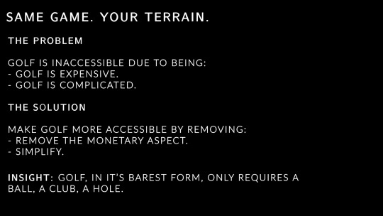
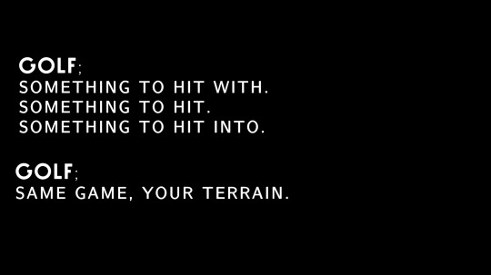
My copy is the most important part of my campaign ideas, as it’s the element that actually explains what the campaign is in a concise way - though I kept the copy of ‘Golf. Same Game, Your Terrain’ in this presentation, the way in which I titled the idea as purely ‘Same Game. Your Terrain’ is actually more visually appealing. It’s not too long, and it allows me to let the visual element speak for itself in terms of reference to the sport. The addition of ‘golf’ also doesn’t actually make sense within the copy on reflection, it’s a bit cackhanded, as within the copy itself I haven’t introduced the difference between golf and what I’m proposing, so I’m telling the audience it’s the same game, but I haven’t demonstrated why it wouldn’t be. The photography can speak for both this and the sport, utilising standard golf posing with non-standard equipment to demonstrate how it’s the same game, just your terrain.

Another new addition to this campaign that was introduced in the presentation is a lead on from the pub game ‘Shot Per Shot’, looking at alternate ways to get people involved in golf through things they are already doing, or things that they should be doing. This new idea revolves around styling recycling bins as golf holes, and getting people the putt their recycling into the bins, turning something good for the environment into a game for the consumer.
VIDEO LINK
Another element I added to this insight was an example of how the challenge may look visually through video uploads, with my mum and her coworkers creating their own DIY golf in their office.
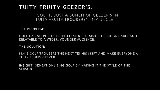


Following on from OG Steve’s advice surrounding the fashion campaign, I developed the activation of a pop-up store that only appears on golf courses, and to enter the store you have to get your ball into the hole, which opens the door - instead of push to enter, you putt to enter. Boom Boom.
This gets the audience involved in the sport by enticing them in with the exclusivity of the fashion collection. Alongside this, following along the thread of getting people involved by inflating their ego and offering them something special, I developed the idea of Tuity Fruity rewards, a system that partners with golf courses and/or driving range to allow free access to those that are sporting the Tuity Fruity Geezer collection, sparking both interest in the clothes and also enticing the consumer to play the sport through the special offer they get through purchasing the clothes. Nobody knocks a freebie.

For the third insight, I began to actually mockup some typography layouts for possible implementation into posters at a later date, which also lead me to begin to look at different typefaces that could be used within my campaigns.

I looked mostly at Sans-Serif fonts, with a few serif just to explore my options, as I wanted to convey that Golf isn’t the stuffy and boring font that people assume it is. Sans-serif has a more modern and trendy approach, whereas people who aren’t familiar or versed in type-faces associate all serif fonts with Times New Roman, the Daddy of Serif. The typfaces with the more rounded G’s are the most visually engaging, especially when talking about Golf, as they kind of have the visual connotations of a ball.
Though a bit of an obvious choice, green was the main colour that I experimented with in my initial mockups for my third insight. I looked mostly at brighter greens, or muted greens, instead of grass greens, to show that you don’t have to fit with the expectations of golf, but you’re still worthy of playing, you’re still allowed to play. It’s green, but not golf green, and yet you still associate it with golf and visually recognise it in association with golf.
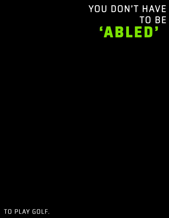

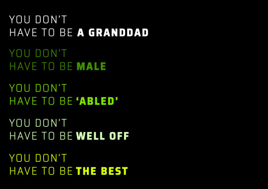
I didn’t include any imagery on these mockups, wanting to explore with text originally and work my imagery around my typography as opposed to vice versa. In the first poster, I explored keeping the ‘To Play Golf’ text smaller than the rest, and separated from it - by having the main bulk of the typography in the top righthand corner and the smaller secondary text in the bottom left, I could create imagery that directs the consumers eye down to the secondary text - they see what you don’t have to be first, are confronted with the imagery that slashes through these stereotypes, and then see what it’s in reference to, pushing the message in the top right alone ‘You don’t have to be abled’, and then specifying what you don’t need to be abled for in this case.
In the second mockup, I collected the text into a single location, but used the macro-micro structure from our workshop in term 2 to explore enlarging what you don’t have to be (’A Granddad’), and playing it next to the smaller text beside and below, trying to draw the consumer in with the confusing standalone, and then give clarity with the surrounding.
The style of photography I proposed to use for this idea was very close up, personal portraiture, referencing Lee Jeffries - his imagery is very high clarity, very intimate, and is often of the homeless, so he uses this in-your-face (literally) photography to confront the audience with the opposite of their expectations when they imagine this group of people. My goal is the same.

FEEDBACK FROM DEREK AND FAKE STEVE
DEREK:
- A massive ego boost. All three ideas are campaign-able, and can be spread across multiple activations. They have longevity.
- Some of the copy needs work - just a bit of tweaking in some cases. Especially the ‘Golf. Something to hit, Something to hit with, and something to hit into’. - bit long winded.
- He didn’t say it but I’m guessing he wants me to work on my visual because he always does xoxo
FAKE STEVE:
- Steve wasn’t fond of the recycling idea or the pub idea; he said it made things a bit messy, and diluted the original idea, which he thought was really strong. He said to reconsider including them, and expand on the other paths presented instead. It’s an idea with the potential to go down a lot of different routes, but this route ain’t one son.
0 notes
Text
Evaluation
Olly Benson
Curiosities Evaluation
Introduction
This FMP ‘Curiosity’ is the first time that I have been presented a brief where I have been able to largely dictate pretty much every aspect leading up to an outcome as well as the outcome itself. This was an exciting challenge to me as it allows me to explore aspects of graphic design and 3D that interests me most, showcase my skills I have learnt throughout the past 2 years as well as continue to develop these skills even more.
Given that the name of this brief is ‘Curiosities’, the only real guideline is that the project has to be based around something we are curious about. This guideline is very flexible as with the correct explanation in my blog I could have based my project around whatever I wanted.
While being able to work so loosely to no specific theme was seen as a exciting idea in my eyes, I did consider that there could be a number of negatives to working in this way. For example, I think it would be very easy to lose the general sense of direction at any point throughout the project. I imagined that it could be very easy to get lost or confused leading onto more confusion and an eventual break down. Along with this, without the help of a tutor I felt as though it could be very easy to conduct the wrong/unnecessary research with no clear theme.
My initial idea for this project was to base my theme around architecture. This is because I am strongly interested in architecture and it is the field of work that I desire to study at university. To explore this, I planned to create something 3D using at least 2 different materials such as wood, plastic or metals, as well as create some digital Illustrations to compliment my 3D outcome. I started to look at architects such as Malevich and Le Corbusier and this gave me the idea to create a modern 3D model of a building that had a removable roof and moveable modern furniture. However, this idea is very similar to my ‘Glitch’ project where I created a series or geometric, futuristic models of building along with some 2D digital Illustrations that showed a 360 degree view of one of the models. Whilst that project was probably my most successful one, in terms of what grade I got up to that point, I think it was important that I don’t just replicate it as it wouldn’t show that I am able to create work with a variety of approaches and styles, and would ultimately make my portfolio quite boring. Also looking at the timeframe I had, I think it was quite unrealistic that I would be able to create the model as well as the separate pieces of furniture to a high enough level.
Considering this, I wanted to focus my project on a certain field of architecture so that I could learn about new processes that I could eventually go on an use when I go into Foundation next year followed by university.
At our trip to the Design Museum, I got a collection of pictures of visually creative chairs each made with different materials; wood, plastic and cardboard. I was really interested in how these chairs were made and the thought process behind designing them. Additionally, we were asked in class to choose from our pictures of this trip and create some Illustrations in the style of Michael Craig-Martin. For this task I chose the picture I had taken of these chairs. This is what kickstarted my project ‘Graphic Chairs’.
Research and Influences
To generate some initial ideas, as a class we each collected 10 objects from a list of 30 given to us in a list. These were objects such as; something brand new, a house plant, 5 words to describe us. The reason behind this was to look at these objects and generate mind maps consisting of what ideas these objects gave us. For example I looked at an ice cream scoop shaped as a cow, this gave me the ideas of; children toys, looking at kitchen utensils in a graphically interesting way, dairy products (advertising, branding), infographics about food/sugar etc. Breaking down 10 different objects like this, creating mind maps and sketching, allowed me to generate loads of different ideas that I could have potentially explored for my FMP.
When we collected all the 10 objects, we inserted them into a display box that we had created ourselves that would be a visual representation of the contents within our proposal. I created my box mainly out of wood, but I also applied metal sheets around the outside of my box. These sheets I had tempered with before I applied them. This showcased that one of my strongest areas was in the RM/ WMP workshop. My box came across rather gothic as I added a chain and lock to the front of it, this gothic style wasn’t something I had initially aimed to go for as it isn’t my favourite styles. Despite this I think my box worked quite successfully.
Along with this, I created a few different mood boards that visually explored graphics that interest me; Clothing/Street wear, Advertising, Architecture and Sports. While this didn’t necessarily generate loads of ideas, it allowed me to identify what styles interest me most and made me consider how I could use my personal styles and interests to adapt my developments and outcomes throughout ‘Curiosity’.
As I was initially hoping to base my project on architecture, I went on to research renowned architects such as Malevich, Le Corbusier and Eliot Noyes. I looked at their different styles and approaches to architecture and asked myself questions such as; What Is more important; purpose or aesthetic? How can I combine both visuals an practicality to create something interesting? How can I use simple forms to create something visually complex?
What is more appealing; simplicity or complication? These are good questions to ask as even if my project change direction to something like advertising, these questions would still be just as relevant.
After this, we went to the Design Museum in London. This trip opened my eyes to all the different types of design such as street signs, architecture (materials and styles), gadgets (phones, typewriters), chairs and furniture. Most noticeably, chairs. I gathered a collection of visually unique and interesting chairs. At this point, I knew I wanted to base my project around architecture but I wasn’t exactly sure what area specifically. I think this trip was the strongest influence on my project as it opened my eyes to chair design and how it can actually be quite interesting when you think creatively. Before when I thought of chairs, I would think of something very simple with four legs that looks very generic. However once I saw the chairs on display at the museum I thought about all the different ways you can make a chair look interesting. Chairs are a vital part of buildings as well as our every day lives, so they still link in with architecture and would still be viable to put in my portfolio when applying for architecture courses for university.
Going to the museum was also important for my project as It was my first piece of primary research, as it was important that I hadn’t conducted all of my research over the internet using secondary sources. Once I had decided to base my project on chairs, I researched using books such as ‘Design as art’ by Bruno Munari that showed me a variety of sketches of chairs, exploring different shapes, lines and styles. Along with this, books such as ‘Design as architecture’ - Marcel Breuer, and ‘How to design a chair’. In previous projects I hadn’t used books for research as much as I should have and these books were very influential when I was sketching and designing my final chair, so in conclusion I think I am going to look to use books more than I have in previous projects.
When I was considering the composition of my chair, I researched famous chair designers such as Marcel Breuer and Charles and Ray Eames. Charles and Ray Eames were very influential on my project with their use of ply wood. Before when I would think of plywood I would think it was a very rough and messy looking wood. However if it is used correctly It can look very polished. Charles Eames used the process of moulding plywood using heat and moisture, however I didn’t have the equipment necessary to do this. Despite this, I still wanted to use plywood cause I liked the finish it gave. Along with this, plywood was a good option as the college have an abundance of it. Generally, plywood is quite cheap, so that means my chair would be very versatile and cost friendly.
To gather more ideas when I was designing my chair, I asked a number of students around class to simply ‘Draw me a chair’.That was my only instruction to them as I wanted them to draw their initial interpretation of a chair whether it be simple or complicated. This allowed me to compare the designs and analyse what styles and shapes people favour over others. This research was also vital as it was another piece of primary research.
Along with this, I looked online at unique chairs made from unorthodox materials such as rope, old cans or bottles and even full-sized chairs made from purely cardboard. This allowed me to consider the practicality of my chair but also how can I make it stand out? Could I realistically make it out of random materials? During this research, I messaged one of the designers on Instagram called Tom Price whom created a chair solely from rope that he had moulded a chair seat out of using a metal chair-shaped former which he heated with a combination of heaters and hot air guns. While I found out that It would not be possible for me to do this, It still inspired me to use a material like rope in my chair as it gave it a unique appearance.
Finally, during the construction of my chair I researched a number of processes of chair making. This includes different joining methods; What looks the best? What are the strongest? What is easiest to create? Along with this I researched different methods of wood sculpting and sanding; the artist Haroshi opened my eyes to a different type of sculpting that I had never thought of before. Additionally, I researched the different types of varnishes/finishing oils to eventually determine which one I would apply to my finished chair.
Throughout the project my research was quite consistently evidenced on my blog complimented with mind maps breaking down different artists quotes, approaches to design and aspects of their work that I put into my production file. Along with this I had sheets that allowed me to compare the work of multiple chair designers, looking at what I think work well or not, allowing me to come to a conclusion on the design or my chair.
I have been able to develop my critical thinking in all areas, but especially on the design of chairs which is an area of architecture that I hadn’t explored before. This will prove to be beneficial to me in the future where I will be able to showcase my skills in chair design in any job or course I do in years to come.
Experimentation and Development
First of all, as a class we completed 3 workshops that allowed us to experiment with different areas of Graphic Design such as typography (using different materials), screen printing (Inspired by Robert Rauschenberg) and also letter press (Inspired by David Carson). These workshops were important as they ensured that our projects were open to a variety of processes and not just our one idea that we want to do. They also gave us a number of artists that we could research and look at their approaches to graphic design, even if it wasn’t relevant to our final idea, It was still important to have a open mind.
When I decided to base my project on chairs I decided to create a variety of 3D experiments of models of chairs. To do this I used a large variety of materials such as cardboard, polystyrene, wood, metal and plastic. This allowed me to experiment with these materials and figure out which are most practical when creating a chair, but also which looks more effective than others. I went on to conclude that wood was the most practical material to use especially in the time line that I had. These experiments were also very important as they allowed me to explore different forms of chairs.
Further developments of these chairs included spray painting one of the wooden models and one of the polystyrene models. This was very beneficial to me as I have never spray painted before so I have learnt a new process. But I have also learnt that It may not be the best type of paint to apply to my chair as it has quite a shiny un natural appearance. Along with this, I decided to slightly burn one of the wooden models so that It had black burn marks around it. I think this worked very successfully as it added character to the model and made it quite visually interesting to look at compared to before. However this is also a process that I would have to be careful with if I was applying it to my final piece as once you do it there is no going back.
One of the new skills I learnt during this project was using the Hot Wire Tool in the RM room that Is used to slice through polystyrene. I quite enjoyed using this tool and was happy that I was able to learn something new whilst also generating ideas. However my polystyrene models weren’t very good as I wasn’t very good at using this tool. It has given me room to expand and develop on though when I go onto foundation as I would be quite interested in exploring sculpting with polystyrene, eventually going onto sanding it down to create smooth but precise details.
Alternatively, I created lots of sketches exploring different designs. I have a page consisting of simple geometric shapes, then a page consisting of generic chair forms. And then pages consisting of abstract shaped chairs using weird materials such as plastic tubes. From simple forms using basic shapes to quite complex designs; I was able to think of an idea that was inspired by The Eames, Tom Price and my own ideas that I am very happy with and proud of.
In class we was introduced to Michael Craig Martin, an artist who creates loads of simple
Illustrations exploring the shapes and lines of simple objects. This style interests me as I am intrigued by how he is able to make something so simple work so effectively.
At first, I wanted to also have a Illustration in the style of Michael Craig Martin that I could potentially install behind my chair in the exhibition that I would imagine would have complimented my chair quite nicely. However I did not have time to do this as I just about finished my chair on the day it was hand in, so I didn’t have time to take a picture of my chair then create a high quality digital illustration of it.
Once I had created a couple sketches of my final design before I started reading it, I decided to create a accurate digital sketch of my idea to present to Dave and the technicians in the work shop. I had done this as I thought this would be a much clearer way to show people my idea where as a sketch has the potential to be confusing. I annotated it with measurements that I based on chairs within the college. I decided to make my chair slightly larger than normal to ensure comfort as if the base of the seat isn’t wide enough it could seem more narrow than normal considering it is made from rope.
I was initially told I could either use MDF, plywood or try buy some wood myself to bring in. However I was running out of time so was hoping to use a wood that the college already had. To buy my own wood could cost me a lot of money as well. So my choice was between plywood or MDF. To experiment, I created the base of my chair 2 times using either one of these woods. I concluded that plywood was far more attractive to the eye and it would require less cutting out of wood as MDF is a lot thinner. This means that it is less likely that I would make a mistake.
The development of my final piece took roughly 2-3 weeks to finish. This included cutting out all the the strips of wood using the chop saw, laminating the plywood together, inserting dowels to ensure strength, piecing the wood together to overlap the corners, then sanding each individual piece of wood using 6 different types of sandpaper to ensure a really smooth finish, piecing all the pieces together, painting over it with finishing oil with 2 layers and finally applying the rope.
I thought that I used my time creating a body of work quite efficiently as I was able to create a wide variety of experimentations along with a refined outcome that is supported by the research and the development throughout the project.
Solution
I think the message of my project is that although chairs are very often overlooked and considered mundane by most people, they have the potential to be very visually exciting and in my opinion can bring a whole room together in terms of appearance and function. Different aspect of chair design such as form, material and size can all come together to create something that can draw people in that originally may have no interest in them before. For instance, before this project I don’t think I had ever really looked at and considered the forms of different chairs. It wasn’t really an area that I had any interest in before. However, since I have done my research and thought of loads of different ideas and eventually created a refined outcome, chair design is something that I am now very interested in. Every time I look at a chair I will consider its practicality against its appearance/ function over form.
My initial curiosity into architecture has drawn me into a more specific area of architecture that I will now be able to say that I have experience with. Along with this once I had conducted my research on chairs, my curiosity into the use of different materials and styles has allowed me to create a design that I believe is unique. I feel as though the use of laminated ply wood has worked very effectively. When I was initially told that I could either use MDF of plywood I was quite disappointed as my impression of these woods were that they both looked quite messy and cheap. However plywood can look very good when sanded down and laminated. The appearance of my piece is very much catered towards my personal style. I also think the use of soft cotton rope as the base of the chair has worked quite successfully as this rope is very soft and stretchy.
One of the negatives of my chair is that it rocks very slightly. If I had more time I would sand the bottom of the chair down so that It is all completely flat so that it wouldn’t rock.
Another one of the negatives of my project is that I haven’t worked tightly to a plan. As I have been quite busy outside of college, I haven’t been able to create a strict time plan to allow me to consistently finish off my blog posts and experimentations. My blog posts have been something I have gone on to push aside as I have developed my final outcome.
Along with this, I feel as though I could have generated more experimentations building up to deciding my decision on what I am going to base my FMP on. Apart from what we had done in workshops I feel as though there wasn’t much experimentations in my own time that explore different aspects of graphic design.
Some of the successful part of my project are that I feel as though I have created a creative chair that could catch the eye of some people. Considering that I had no history with chair design before this project, I am quite proud of my outcome and the different processes that I have learnt throughout. Along with this, I have created something that I can put into my portfolio when applying for university or jobs in the future.
To analyse the effectiveness of my chair, I plan to apply my chair in real life situations such as dining rooms, class rooms or offices to see what environments they fit in. From here I could give out a peer feedback sheet and ask my peers to choose which one works most effectively. Alternatively, I could email my chair to a professional architecture firm to get their feedback.
Overall, I think I can get more positives from this project than negatives. I have learnt a lot of new skills both technically and in terms of how to build and follow a project that I have largely created myself. I have really enjoyed this project and would probably consider it my favourite one during this course.
Throughout the past 2 years I have learnt loads of new skills, both technical graphic skills as well as general life skills. These practical skills include; a strong understanding of the majority of tools on digital packages Photoshop and Illustrator. These are programmes that I had never used before and now I would say I would be able to teach someone quite a lot if I need to. Along with this, my confidence with my general sketching skills have improved greatly. Even before this project I would have said that my sketching was one of my weakest areas which is concerning considering sketching is a large part of architecture. Throughout this project I have taught myself to sketch freely without putting too much pressure on myself to make the sketch accurate. This had allowed me to create a large quantity of sketches that prove to be a great foundation the the planning of my chair and my project as a whole. Additionally, I have also improved a huge amount with my resistant materials skills. Before starting this graphics course, I had never really worked on materials such as woods or metals. Now I have created a fully functional chair that (to me) is aesthetically appealing and unique.
Along with these technical skills, I would say that my general confidence has grown a huge amount over the past 2 years. I am now able to successfully hold group conversations with people, brainstorming ideas. This will prove to be hugely beneficial to me in the future as a huge part of being an architect is being able to discuss ideas with clients, responding to them and generating something that works with everyones best interests.
It is hard to say which one of these skills are most important as all sketching, resistant materials and confidence skills are a huge part of architecture. They will all prove to be very beneficial to me as I go on to develop and refine these skills next year on the foundation course, 4 years after that at university and then when I eventually go on to full time employment, hopefully as an architect.
0 notes
Text
something brewing: part i
The moral of this story is that I need to not do the stupid thing and accidentally press save draft instead of queue, since this was supposed to be posted at least a week ago. Oops. Anyway, this is part I of the previously discussed barista au, because I toyed with the idea for a while and it stuck around. Yes, I recognise the title is a horrible pun, but I couldn’t resist. I hope that everyone who liked the idea of this isn’t disappointed.
Premise: Oliver is a sports science student who has to maintain his grades in order to retain his scholarship and has a good chance of playing football professionally. Despite that, he’s serious about wanting to do well. His flatmates spend more time drunk than they do sober, so he’s given up trying to work at home and finds a little coffee shop to study in. What he doesn’t expect is to develop a painful, near-instantaneous, utterly inconvenient crush on one of the baristas.
i: marcus.
It was just past 5pm, and Marcus was comfortably settled into work for the evening. There was a lazy hum of guitar as his background noise of preference, the coffee shop wasn’t too crowded and that gave him time to open his textbook underneath the counter in between making drinks while Susan handled the customers and sorted out any food orders. The page was marked with the casual ease of someone who was used to reading in what spare moments he had, and ain’t that the truth? Honestly, he had trouble absorbing it all at once, so taking information in bit by bit while he did other tasks always worked far better for him, letting him actually retain it instead of forgetting it immediately after reading.
While he turned the pages, humming softly under his breath, dark hair clustered at his temples in slight, tousled waves made worse by the steam from the coffee machine. The scent of freshly ground coffee filled his nose, underscored by the lesser hints of different types of tea, and you’d think he’d be sick of it by now, but the fact was he found it comforting. It smoothed out all the rough edges of his day and helped him to concentrate.
Leaning across, Susan stuck a receipt in front of him. “Large latte with an extra shot for the tall drink of water down at the end there.” There was a mischievous note to her voice that he’d heard before, usually when a customer was particularly easy on the eyes, and he shot her a look back as he got down to making the drink, a grudging half-smile playing about his lips. She mouthed, “Eleven out of ten,” at him, her petite frame safely hiding her behind the coffee machine, and he lifted an eyebrow, because only once in a blue moon did Susan make that sort of assessment. Working in a coffee shop this close to the university, they both got to see a lot of different people walk in and out when they were on shift. One thing he had learned, however, was that he and his fellow barista had different ideas of what was visually appealing. Maybe it’s because she’s an art student, they find the weirdest things interesting. In Susan’s case, that often extended to people, too.
The latte was done in a matter of moments, his hands moving in a familiar rhythm that was as old as time itself to him now. Flicking a quick glance to the receipt to get the name, he walked down to the end and asked, “Large latte with an extra shot for Oliver?” before sliding the drink across the counter, a slight curve of his mouth because customer service meant you were supposed to smile and be courteous. Since he’d never really mastered smiling on command because other people thought he should, this was the nearest thing that he could manage.
When he glanced up to identify the customer, though, he didn’t expect to find someone looking directly back at him, and he certainly didn’t expect to recognise the face, even dimly. Oh. It took effort not to do a double-take, because he knew he’d seen this one around somewhere and couldn’t quite place where. But everything else apart, Susan had, for once, been exactly right. High cheekbones, gloriously messy brown hair, and as he took the drink, a warm, seemingly shy smile that didn’t match with the slight cheekiness of the friendly wink he paired with it. “Thanks,” he said, and as he walked away, Marcus got a wonderfully prolonged look at exactly how long his legs were. It took actual concentration not to let his eyes wander further. Not at work. He ignored Susan, who was trying not to laugh and failing, and instead opened his textbook again.
“Well. If he meets even your impossibly high standards…” Thankfully, her voice is naturally low-pitched anyway and the boy, Oliver, had long since vacated the immediate area for a table over in the far corner, or he might actually have stepped on her foot to silence her.
“Don’t start, Susan,” Marcus warned, attention momentarily drawn from the pages in front of him, a loose scattering of diagrams and pencils notations visible. “I’ve got to get this stuff into my head before the next class if it kills me. I don’t need distractions.”
He felt rather than saw her pout. “Well, if you don’t feel like being distracted, mind if I do? Honestly, he’d make a wonderful model, I might see if I can convince him to sit for me.”
With an impatient gesture that said be my guest quite clearly, Marcus went back to his book while Susan wandered out onto the main floor of the coffee shop. Ostensibly, she’d gone to clean up, but the odds were good that she’d find an excuse to be distracted, as she put it, while she was there.
ii: oliver.
Oliver was absolutely knackered. So knackered, in fact, that the only thing stopping him from going back to his flat and murdering his flatmate in cold blood, or falling asleep in the chair he’d just sat down in was the steaming cup of coffee in his hands. When he took the first sip, his eyes actually closed for a moment because thank Christ, caffeine. On the second sip, the warmth seeped through him and took away the fact that it was freezing outside. On the third, he was recovered enough to sneak another glance up at the counter and the dark head of hair tilted downwards over what looked like a book. They’d barely exchanged words, really, but Oliver knew himself, enough to know that he definitely liked what he’d seen when the barista had handed him his coffee. Sharp jawline, faint hint of dark stubble that managed to be attractive without being scruffy, broad shoulders clad in a long-sleeved navy-blue shirt rolled back at the elbows, and that maddening hint of a smile. Another sip of the coffee, and it was enough for him to tell that it was good, definitely good enough to keep him coming back. The odds were that he was going to be spending a lot of time here, and the reason why could be summed up very succinctly. “Drunken bastards,” he muttered under his breath, opening his backpack and pulling out his notes, wincing at the state of his handwriting. Right. Best neaten these up.
“Do you kiss your mother with that mouth?”
Startled, Oliver looked up, not realising that his commentary had been quite so audible. However, when he realised it was the redheaded girl from behind the counter, he relaxed. “She’d wash my mouth out if she heard me,” he said, amused. “Because like every mother, she’s convinced that I’m still five and won’t believe it until I prove otherwise. That was relatively mild.”
“Aye, I figured, you being very obviously from Glasgow and all.” The impish grin that accompanied the girl’s words left him confused, until she introduced herself. “I’m Susan. Barista by whatever hours I’m designated to work, art student by trade who couldn’t help but notice you’ve been gifted with the kind of bone structure that begs to be drawn.”
The words flustered him, left him wondering how the hell to answer, so he settled on an easy smile and deflection. “Honestly, I think your counterpart might be the better candidate for that,” he said, nodding in the direction of the other barista. When he caught the playful gleam in Susan’s eyes, he kicked himself. Why do I talk? “But I’m never opposed to a new friend. I’m Oliver,” he said, offering his hand outwards. “Which you know, because I gave you my name about five minutes ago when I ordered,” he added, cringing slightly at himself. And this is why I shouldn’t try to be social when I’m tired. “Sorry, bit braindead, the coffee was necessary.”
When Susan laughed and shook his hand, he couldn’t help but be a bit relieved. Usually, he had no problem navigating new interactions, but right now he was operating on far less sleep than he actually required. When her expression took a turn for the mischievous, Oliver became sharply aware that he’d probably said something he shouldn’t have. “He’s so used to me drawing him in between taking orders at this point that he’d probably be thankful for me practicing on someone else,” she said with a theatrical sigh. “And honestly, can you blame me?”
Watching the dark-haired barista move with the kind of controlled grace that made him look almost alien when placed behind somewhere as commonplace as a coffee shop counter, Oliver couldn’t argue with her and therefore, he didn’t. Instead, he spent a few seconds mulling over the boy, wondering what his name might be and why he felt like he’d seen him before. Probably around the university or something. Fortunately, he didn’t have to answer because she switched subjects a moment later. “So what brings you to our little hole around the corner from the campus? Besides the coffee, of course. I’m guessing you weren’t cursing just now for effect.”
Oliver sighed. “I ended up with an absolute dobber for a flatmate this year. Spends more time drunk than sober, and doesn’t know when to shut it. I like a drink now and then, but not when it means I can’t get any sleep because the eejit and his mates won’t shut it at four in the morning.” He rolled his eyes, pointed at the cup. “Hence the extra shot. Eight o’clock football practice this morning, class in the afternoon and I’m done for, and still got to do some work.”
The wince of sympathy was gratifying, as were Susan’s next words. “Well, that definitely explains the swear words. Should I get our resident coffee genius to make it stronger next time?”
Oliver didn’t even pause in response. “God, yes. If he can possibly add any more caffeine without giving me the shakes or making me ill, yes.”
“He can make anything that involves coffee and tea taste palatable, it’s a gift. Do you trust me?”
“I’ve just met you.”
“I’m a barista. Trust me. Give him free rein on what he makes you next.”
Oliver was too tired to make sense of the conversation, even after the first (excellent) cup of coffee, and his notes were swimming in front of his eyes anyway. “All right. Tell him that if he can make me something that’ll keep me on my feet for the rest of the evening and tastes as good as the first one did, he’s got a guaranteed customer for life.”
iii: marcus.
Marcus was somewhat expecting the cat that’s got the cream smile on Susan’s face when she practically sashayed back behind the counter. He’d looked up only once, seen that she was talking to the attractive boy from earlier (Oliver, his brain helpfully supplied) and snorted to himself, deciding to leave her to it. If there had been a slight pang of disappointment, well, he only had himself to blame, didn’t he? And this, this was why he didn’t do distractions.
“Hey, hotshot. Pretty boy over there says he’ll drink anything you make so long as it tastes palatable and doesn’t give him the shakes. Up to the challenge?”
So much for no distractions. Of all the things he’d anticipated her saying, that hadn’t been one of them. Against his own will, Marcus found his eyes unwittingly drawn towards the boy, suddenly becoming very aware that he had dark circles beneath his eyes and actually looked outright worn out, the more so as he sifted through what looked like pages of notes spread out on the table in front of him. “Hard partier with a hangover?” he asked, rather hoping that wasn’t the case.
“Footballer with early practices, late afternoon classes and a selfish gobby prick for a housemate who thinks four in the morning is an acceptable time to be pissed as a newt,” Susan amended, only managing to further pique Marcus’ interest, while simultaneously making him wonder how exactly she managed to inveigle information out of people the way she did. “He’s had a long day. Make him something good.”
“Your wish is my command,” Marcus drawled, abandoning his textbook and turning his attention to the coffee machine. “Did you get his number already? I figured it’d take you at least ten minutes to work up to it, and that was barely five.”
Out of the corner of his eye, he saw Susan unsuccessfully attempt to hide a smile, resolved to get her back for it later. “No, I don’t think I’m his type, though he didn’t seem to have trouble acknowledging that he finds you good-looking.”
Marcus didn’t bother restraining himself; he rolled his eyes at her quite plainly, and chose not to acknowledge the remark. Out of the corner of his eye, he saw her raise her hands in surrender. “Just passing it on, even if you don’t believe me.”
“Stop bothering me, woman, if you want me to make the damned drink,” he snapped, not meaning to sound quite as snippy as he did. Thankfully, Susan had known him long enough to know the difference between him wanting to focus and him actually being annoyed, and simply stuck her tongue out at him before heading out to the storeroom to go and obtain more takeaway cups. Left in peace, Marcus spent five minutes concocting something that would tick the boxes specified with the ingredients that he had to hand. The result ended up being a monstrous latte that only just fitted in the largest takeaway cup. It looked relatively ordinary, but he was confident that it would fit the bill. “Order for Oliver?” he called.
And if he wanted to watch the other boy walk towards him, well, he didn’t have to admit it to anyone but himself. Even if his rule was no distractions, he didn’t see any harm in appreciating the view, and there was a lot about the view to appreciate. When Marcus set the takeaway cup down in front of him, there was a shy smile playing about his mouth again and God, he wished he didn’t find it as attractive as he did. When the other went to reach into his pocket, obviously intending to extract his wallet, Marcus shook his head. “Try it first,” he said, leaning elbows against the counter and not quite able to help his curiosity. He didn’t often get to see the first reaction to a new drink, so this was a rare opportunity.
When the other boy inclined his head, raised the cup in his direction and took a long drink from it, Marcus watched his reaction move from neutral to enjoyment with a slight half-smile. He didn’t get the chance to ask the question, because Oliver (don’t pretend like you don’t know his name, Flint) had a much wider smile on his face now before he spoke. “I can taste the caramel, and…apple pie? And at least a double shot in there.” It was less of a guess when he had another long drink, and damn if that response didn’t make Marcus’ day in less than ten seconds. “God, that’s exactly what I needed, and I never would have ordered it on my own. How much do I owe you?”
Marcus shook his head again. “Nothing. You just helped test out a new special for the menu,” he said, wanting to outright grin, not quite comfortable enough to let himself do it. Finding the other attractive was one thing, but actually doing something about it was another. Probably has someone, anyhow. The fact that he was even considering the matter was more than he wanted to think about, shoved it away with a nod of his head as Susan emerged from the storeroom. “Get that down your neck, you’ll feel better,” he said, before disappearing into the storeroom himself, under the pretext of checking whether or not they’d received the new blend that was supposed to be arriving. They hadn’t, but he found a mess, like he always did. With a faintly exasperated sigh, he started to tidy up, ignoring the fact that he’d just bolted in the opposite direction to the first person he’d genuinely been attracted to in almost a year. Well, I always did have a knack for self-sabotage. Or maybe I just don’t want to waste my attention on a lost cause.
iv: oliver.
Oliver had been coming to the coffee shop for a few weeks at this point, for a multitude of reasons; the first being that waking up with a hot drink in his hand before his first tutorial or before practice was infinitely preferable to staying at his flat. The second being that his flatmate hadn’t proven to be any less of an idiot as time had progressed, and while the atmosphere between them wasn’t hostile as such, it might easily go in that direction if Oliver was around the flat more often. The final reason, and the one that he was all too aware of, was the fact that the coffee shop came with the added bonus of the dark-haired barista, whose name he’d discovered only four days prior. Susan had called back to what was presumably the storeroom while Oliver had been waiting for his usual morning order (a flat white). “Marcus, are you done in there yet?” For reasons he couldn’t understand, everything seemed to click into place at that point. The name was fitting, but that was also the point where he couldn’t entirely ignore the fact that not only had he liked what he saw when he first laid eyes on the other; he’d liked it enough for the interest to continue past the initial meeting.
So the combination of irritating flatmate, burgeoning caffeine addiction, and a need to work undisturbed also happened to coincide with the fact that he was developing a small, inconvenient crush on the barista, on Marcus. They hadn’t exchanged words much, nothing more than polite conversation really, but in that time, a comfortable routine had developed. In the mornings, Oliver had his flat white. In the afternoons and evenings, Marcus often had free rein on what to make for him, and he’d never yet gotten it wrong. With a glance, dark eyes seemed able to assess what kind of day he’d had and make the drink that fitted the bill. Susan hadn’t been wrong: the other had a gift for it.
It was late one evening when Oliver approached the counter with a textbook in hand, around 8pm, and was met with the half-smile that never quite made it to something more. It held mystery, that look, and he’d rapidly learned that he didn’t mind a little mystery. “Same again?” The question, ready when he reached the counter, made him smile ruefully. “Yeah, please. This thing’s making life difficult for me.” He raised his textbook, an analysis of sport psychology that was interesting enough, but not easy to translate to the project that his professor had given him. If he hadn’t been watching, he wouldn’t have seen the flicker of surprise, however slight, that crossed Marcus’ expression when he saw the textbook. That was nothing, however, to Oliver’s reaction when the barista responded, “Yeah, that one’s not fun. Been having a bit of a wrangle with it too.”
It took a few seconds for Oliver to click. Really? So maybe that’s where I recognised you from, even if dimly. “I didn’t realise you were in there too,” he said with a smile. “How come I’ve never seen you?”
“It’s a big lecture theatre. I sit up at the back and the lecturer’s usually turned the lights down for the projectors by the time I get there. I didn’t know you were in there either, to be fair.” That was when the usual half-smile that he’d become strangely used to widened, and oh, Oliver wasn’t prepared for that, because if the effect of the half-smile was bad, the full smile was absolutely devastating by comparison. He was sure that he was staring like a fool, and he didn’t have the will to sort it out. Pull yourself together.
“I’m aiming for physiotherapist eventually,” Marcus continued, seemingly not registering Oliver’s reaction. “But I’ve not seen you in any of my other classes, which are somewhat smaller, so I’m guessing you’re taking a slightly different direction.”
It took Oliver a few seconds to form a coherent sentence, and under other circumstances, he would have been really bloody well embarrassed about that, but Christ, he’s only human and that smile was like attacking the unarmed. “Yeah, I…I’ve been scouted for football, so most of what I’m doing is geared towards being able to coach and help other athletes if that doesn’t pan out,” he said. Though he knew that he was good at what he did, he wasn’t naturally a braggart. He felt the weight of Marcus’ scrutiny when the other looked at him more closely, and Jesus, he did the exact opposite of handling it well when the appraisal seemed to run past his face to the spread of his shoulders. Don’t blush, for the love of God.
“What position?”
The question caught Oliver off-guard, because his mind immediately went to places that it quite definitely wasn’t supposed to go while he was in public (I can think of lots of those), and the dark-haired barista (and incipient physiotherapist, apparently) could have easily chosen a better way of wording that. Was that deliberate? He couldn’t tell. Marcus’ expression was unreadable besides the smile and the tilted head. It was impossible to work out whether the other had spotted his preoccupation and decided to mess with him. If he did, game on. “Any number of positions, really, but I’m currently playing keeper,” he said, opting to accompany the words with a grin of his own, daring to put just a little flirtation behind the remark. When he heard a slight spluttering sound from further down the counter, he didn’t need to look to know that Susan had caught the gist of what he was implying, and he cringed because he’d honestly forgotten she was there at all. However, it was Marcus that sent her on the retreat with a truly impressive glare that made her disappear back into the stockroom, while Oliver wished for the ground to swallow him up as promptly as possible.
“I play striker, sometimes.” The conversation had turned back to football, and Oliver was thankful for it. Plays and strategies, he could discuss until light turned to dark, even if he was meant to be wrangling his way through the textbook still in his hands. Apparently Marcus’ attention span was much better than his, because in the time that they’d been talking, he’d still managed to make Oliver’s drink and mark the current page in his own textbook, tucked covertly beneath the counter as it generally was. To Oliver’s surprise, he smiled again, but this time there was an obvious edge of embarrassment to it. “Just realised I’m being a bit of an idiot, by the way. I’m Marcus; don’t recall ever telling you that.” When he came out from behind the counter, Oliver then got his first good look, up close, at exactly how the other dressed. A faded band t-shirt and a pair of dark, rumpled jeans that clung to all the right places. When the other offered his hand out awkwardly and Oliver closed fingers around his for the handshake, he grinned again. “Good to meet you properly. I’ll see you in our lecture, I guess. I’d better get back to work.” When he met the other’s eyes as they released grip, however, the brush of their fingers lingered and he wasn’t immune to the spark of that touch, far from it. Whoa. The other didn’t need to know that he’d already been fully aware of his name before now. “Yeah, you too. See you later.” And with that, they parted ways, Marcus back behind the counter, Oliver returning to his usual seat with coffee in one hand, textbook in the other, and quite probably a really stupid smile on his face like he’d just been hit between the eyes.
What Marcus also didn’t need to know was that his small, ridiculous crush had gone from mildly out of hand to completely insane in the span of about ten minutes, if that.
This is really not a good thing. What am I going to do about this?
84 notes
·
View notes
Text
Nocturnal Animals (2016) ★★★★
OSCARS: 1 Nomination for Best Supporting Actor (Michael Shannon).
Amy Adams’ face fills the frame, pupils dilated in fear, her mouth half-open as if she can’t take her eyes off whatever terrible thing she’s staring at. Superimposed over her face is a full image of a man – Jake Gyllenhaal, standing. The visual metaphor is vivid: he is in her head, under her skin.
This is the poster image, unequivocal in purpose, for Nocturnal Animals, Tom Ford’s Gone Girl-esque psychological thriller. Every other visual from the film proves just as painstakingly calculated; it has the look of an over-budget perfume ad, stylised to the last inch in tone, texture, timbre and composition. Shot on film by Seamus McGarvey (Atonement, Anna Karenina) and with a swelling orchestral score by Abel Korzeniowski (A Single Man), designer-director Tom Ford’s latest has shades of Blue (Velvet, that is) and harks back to Hitchcock-era Hollywood without feeling derivative of any one big name.
Built on the central premise of Austin Wright’s bestseller Tony and Susan, Nocturnal Animals is Ford’s full-time thriller, part-time critique of artful, empty lives. Amy Adams plays the book’s titular Susan Morrow, a married art gallery owner who feels like she should be happy with her pristine life, but can’t move past the cracks: her ‘handsome and dashing’ husband Hutton (Armie Hammer) is distant – a cinematic tipoff for an extramarital affair – and she’s much less satisfied with her work as head of an art gallery than everyone else seems to be. So when ex-husband Edward (Jake Gyllenhaal) sends her a manuscript of his latest novel (titled after an affectionate nickname he gave her in happier times), she seizes the opportunity to distract from her malaise for a little while. There’s even a deliberate ego trap on the first page to entice her: the dedication reads ‘For Susan’. Attempting to open the package, she gives herself a papercut that draws much more blood than it should; a visual clue that the innocuous-seeming packet of papers is, in fact, capable of grievous harm.
Soon, the book’s brutally violent events and its scathing sense of contempt (delivered by analogy) take over every waking moment for Susan, of which there are many (she often complains of insomnia). Chapter after chapter, ‘Nocturnal Animals’ acts like a chisel to each of the fault lines in Susan’s life, turning chip to gaping rift and fragmenting what little peace she thought she had left in her beautiful washout of a life.
Edward’s novel turns out to be the literary manifestation of all the messy hurt left over from his breakup with Susan, more details of which we learn in later flashbacks, which are indicated by warm lighting and a youthful sparkle in Adams’ eye. It’s part-therapeutic exercise – or exorcise – part-revenge piece for Edward, with Ford gesturing as much through a little scene at Susan’s gallery, where she does a double-take at a piece of artwork: the word ‘REVENGE’ arranged in staccato form. ‘Where did this painting come from?’ she asks, before Jena Malone’s caricature of the LA art world, clad in what looks like a gladiator sandal for the torso, reminds her that it was a purchase made by Susan herself some eight years ago. Edward’s novel has given Susan fresh eyes; like anything anxiety-inducing, it renders the familiar foreign, and forces Susan to take stock of the illusions in her life, exposing them for what they really are – or for what Edward (and Ford, in an interesting, though much too cursory suggestion) thinks they are.
The critique is clearly intentional here, but it feels underdeveloped throughout the rest of the film, like an inspired, but half-formed, idea forgotten about mid-production. Nocturnal Animals wants to tell us something, but it shouts over its own voice, all at once warning us about the dangers of betrayal, of falling into false complacency early on in life – its discordant voices speak of regret, selfishness, masculinity, anguish, and of the scars that make compelling art. This is the most frustrating thing about the film – that it can’t decide where to stick the knife in – instead pricking at us in an inexact, half-hearted sort of way when it has the potential to deliver a direct stab to the heart.
Ford is more successful in cutting to the quick elsewhere. As writer-director, his overhauling of the original story is bold and ambitious, deftly tweaking finer aspects of the original story to give the film a sharper psychological edge: the gothic appeal of Texas as the scene for violence replaces the book’s more chaste original setting of Maine, for example, while female lead Susan is promoted from housewife to professional aesthete to put more sting in the film’s tail.
This last amendment gives Amy Adams a role starkly different from those we’re used to seeing her in. As high-fashion, high-flying Susan, Adams moves in a way we haven’t seen her move before: calculatedly, as if she knows she’s being watched and wants to project confidence and grace – almost as if she was starring in that perfume advert instead. And when Edward’s novel shocks her out of that carefully-poised composure, Adams skillfully produces a changed Susan, convincing us that the damage is real.
Casting also works excellently in analogising the novel’s characters with the film’s: Tony and Edward are both played by Jake Gyllenhaal, while the former’s red-headed wife (Isla Fisher) and daughter (Ellie Bamber) bear uncanny resemblances to Susan herself. What the fate of the book’s women suggests of Edward’s post-breakup feelings for Susan is left hanging in the air. Instead, Nocturnal Animals more deeply explores the emasculation of a man jilted through the analogy of a man bereaved, with the fictional Tony experiencing in action what Edward went through in feeling.
This is no better exemplified than in what is by far the film’s stand-out scene – in which Tony takes a quiet, nighttime family roadtrip through a moonless Texas night before being set upon by a group of juiced-up menacing locals. Aaron Taylor-Johnson plays their leader, Ray, in an astonishing performance (remember Angus, Thongs & Perfect Snogging?) that deftly captures the surface charm, erraticism and underlying menace of a serial killer. Indicating deep cinematic instincts, Ford has us watch the entire roadside meeting from behind our fingers as its nerve-racking disquiet steadily builds to the full sinister end that we dared not imagine. A few faltering moments for Tony, and the power dynamics slide away from him; his later tearful exasperation at the complete loss of his control over the situation is achingly palpable, because a small part of us agrees with him when he says, ‘I should’ve stopped it’. Perhaps all those Taken movies have set us up to see Edward as a father-failure here. But Michael Shannon as gravelly Detective Bobby Andes underscores this sentiment onscreen with his quizzical questioning of Tony, implying his bemusement at the latter’s passivity: ‘It’s my understanding these fellas didn’t have any guns?’ and when Tony confirms as much, ‘Hmm. Alright…’.
As you’d expect from someone whose day job is as fashion designer, Ford’s detail is immaculate; perfectionistic. Every aspect of the mise-en-scene is purposeful: when a portrait shot swings wide to reveal a classic Pontiac on window display, it’s to remind us that we’ve seen it before – in the novel’s fictional world, where it seemed to run on Ray’s testosterone. There are plenty of these interesting totems appearing in both Susan’s life and the book to indicate a parallel; twin items that remind us that Edward’s story is very much stocked with his memories of Susan.
At first glance, Nocturnal Animals might be on par with 2009’s excellent A Single Man. Looking for longer, though, it gives itself away as the flashier, less eloquent teenage equivalent of its grown-up brother. There certainly is plenty to marvel at here: its packed tight with stunning design, intricate plot weaving and a bolt from the blue performance from Aaron Taylor-Johnson – and with Tom Ford’s meticulous attention to detail, there will still be much to discover in a second viewing. But seeing the film again won’t clear up that vague sense of not quite getting the gist – does it want us to leave the cinema more protective of our youthful, romantic voice – the one Susan ignored? Or is its principal message about the nature of art, or the hollow happiness to be found in capitalist pleasures? In either case, Ford doesn’t pay these themes enough attention, dropping them in and then forgetting all about them soon after. It gleams, but Nocturnal Animals only goes skin-deep.
youtube
1 note
·
View note
Text
To save wild nature, we have to attend to human nature, too. Here’s how to garden for all your neighbors, domesticated and otherwise.
Chairs, paths and other simple cues add a human element to our roadside wildlife habitat. (Photos above by Nancy Lawson)
[dropcap]Y[/dropcap]ears ago, a colleague was relaxing in his backyard when he heard a noise. Upon investigation, he discovered a stranger heading through an open window and toward his couch. It wasn’t a traditional home invasion, though. The squatter had taken one look at the property and assumed it was unoccupied: Why else, he reasoned, would the yard be so “overgrown” with wild plants?
This was not the scenario I’d envisioned when my workmate first asked for wildlife gardening advice. While offering ideas and plants from my habitat, I’d assured him he’d see butterflies and other animals taking up residence. It never occurred to me that his efforts would also encourage fellow humans to climb through his windows.
The problem was that the new gardener had implemented only half my suggestions, putting his plants directly into the old lawn that sloped to a busy sidewalk. He didn’t feel like bothering with part 2, which would have involved digging out the turf around his plantings or smothering it with newspaper and mulch. Instead, he let that old lawn grow high. The result was not the layered native plant garden I had imagined but a smattering of wildflowers engulfed in out-of-place fescues and invasives gone to seed. (Adding to the abandoned-home effect was an ascetic and nearly opposite approach indoors, where all walls, tables and shelves were bare.)
Though the front-yard planting was partly intentional, it didn’t look that way to other people. Without “cues to care”—a phrase coined by landscape architect Joan Iverson Nassauer to describe visual hints of human stewardship—the property resembled an abandoned lot or roadside ditch. While I find such free-range, self-willed patches beautiful because of their high value to wildlife, most suburbanites accustomed to mowed-down yards and sterile office parks see them as aberrant.
“Cues to care,” a concept first described in the 1990s, refers to visual signals of human intention. At Molly McElwee’s home in Catonsville, Md., a Baywise certification sign alerts passersby to the landscape’s ecological purpose. (Photo by Nancy Lawson)
As an environmentalist and wildlife advocate, I alternate between pushing for the world as it should be and accepting modest improvements to the one we’ve already created. Knowing how important a “messy” garden is to animals large and small, I’m often tempted to blow off the mass appeal of homogenized landscapes entirely. But if my quest to help nature doesn’t also attend to human nature, I risk something greater than the encroachment of an intruder just looking for a place to sleep: I risk losing the chance to influence the broader community. Research shows that neighborhood norms strongly influence landscape choices, and if well-maintained ecological gardens are more prevalent, they may have positive ripple effects across a community.
In replacing lawn with this new pathway to my front door, I’m nurturing an inviting space for neighbors and friends as well as habitat for wildlife . (Photo by Nancy Lawson)
And helping wildlife and meeting community standards aren’t mutually exclusive goals. “For way too long, I’ve heard from plenty of gardeners that the reason they don’t want to use native plants is that they’re messy-looking, and that’s just not true,” says James Faupel, the restoration ecology coordinator at Missouri Botanical Garden’s Litzsinger Road Ecology Center. “The wildlife will still use all these native plants, even if we design the plantings in a more traditional fashion.”
Most of my own 2-acre habitat is less of a garden now and more of a nature preserve. But in the areas of the front yard that are visible to neighbors, I put a bit of thought into appealing to the senses of the human animal as well. I know there’s no pleasing some people, like the couple in the cul-de-sac who cut down all their trees. But many more neighbors are open and at least mildly curious about this little wildlife paradise, stopping now to inquire about the flowers, admire the bees and butterflies, and even ask if I have any extra plants they can take home to their yards.
By incorporating the following visual signals of intentionality and care that I’ve learned from landscape designers and artistic friends over the years, I’ve been able to ensure we can fit in with our neighbors, both wild and otherwise, as well as inspire the creation of more oases for animals.
Let plants lead by example.
Winterberries are more palatable after freeze-thaw cycles, so they brighten the landscape late into the season before finally serving as emergency food for wildlife. (Photo by Nancy Lawson)
When a highway planting of winterberry hollies bore beautiful red fruit, excited homeowners called the Delaware Center for Horticulture for more information about the stunning shrub. The response surprised University of Delaware professor Sue Barton. “By planting something on the roadside,” she marvels, “I could make a bigger impact on people than anything I could ever write or lecture about.”
Long after the leaves have fallen off the winterberries, a mockingbird guards his fruit. (Photo by Nancy Lawson)
Adding native plants with colorful fruit or flowers to your own front yard can produce similar results, providing priceless PR for wildlife gardens while also nourishing their visitors. Those winterberries burn bright through much of the cold season because they become more palatable after a few freeze-thaw cycles; in late winter when other food is scarce, the fruits are emergency food for birds and mammals. In the summer and fall garden, plants that serve as both wildlife feeders and people pleasers include mountain mints, Joe Pye weeds, milkweeds, bonesets, coneflowers and many other native wildflowers.
Blooming as early as March and as late as November, the native coral honeysuckle vine (Lonicera sempervirens) invites our neighbors to admire its lush blooms and hummingbirds to feast. Hummingbird moth caterpillars rely on the foliage, and chipmunks and Eastern comma butterflies enjoy the fruit. (Photo by Nancy Lawson)
Frame the view.
Layered plantings are essential for creating wildlife habitat, drawing much more life than the large lawn across the street from us. They also add sloping lines for human eyes to follow. (Photo by Nancy Lawson)
Think about how you and your family might use the space, and design your wildlife plantings accordingly, suggests Faupel. Look out the window to see the garden from another perspective, and consider where you’ll need pathways for walking and access to beds. “It doesn’t have to be this big, beautiful blueprint kind of drawing. It can be a lot simpler,” says Faupel. “But if you start with that design element from the get-go, it’s going to look a lot more intentional to people. They will see that you are trying; they will see a more layered effect.”
The view from Molly McElwee’s front door is open and formal but also overflowing with wildlife-friendly plants. In addition to natives, she includes more conventional garden plants that are recognizable to neighbors, a strategy that Faupel employs in his home garden as well. Read more about the McElwee garden here. (Photo by Molly McElwee)
Mulling over plant choices and layout also helps ensure you have enough food and shelter for different types of wildlife throughout the seasons. Habitat hedgerows provide winter shelter and summer nesting sites for birds and small mammals while conveying neatness and order—traits considered desirable in the landscape since ancient Roman times. Rows of low-growing native flowers, grasses, sedges and ferns help define the edges while nourishing bees, butterflies, and many other animals. A mowed strip along the road in front of all these plants “frames patches of greater biodiversity with clear signs of human intention,” Nassaeur wrote, and makes unconventional plantings seem familiar.
A hedge keeps our streetside planting more uniform and provides cover for birds and rabbits, But it also creates a screen that helps me privately experiment with cultivating wilder spaces. This one started with a planting of red buckeyes, grey dogwoods, ferns and other native groundcovers, and soon enough staghorn sumacs and Eastern red cedars made themselves at home, too.
Plant in drifts.
Large drifts of just a few low-growing native plants—Pennsylvania sedge (Carex pensylvanica), roundleaf ragwort (Packera obovata), and sensitive fern (Onoclea sensibilis)—provide habitat within the context of a formal garden at the Missouri Botanical Garden’s Shaw Nature Reserve. (Photo courtesy James Faupel)
Too often gardeners treat a trip to the nurseries or native plant sales like a run on Filene’s Basement and fill their cars with anything that catches their fancy, only to get home and wonder where the heck they’ll put everything. (I’m guilty as charged.) Avoid the “collector mentality,” advises Faupel, because it almost always results in a hodgepodge that’s confusing not just to human eyes but also to pollinators. Many native bees spend their time gathering pollen only from certain species, and even those who are less discriminating can’t afford to expend too much energy flying around in search of more flowers. To create a planting that’s readable and functional for both human and wild neighbors, aim to start with a dozen plants, recommends Faupel: three that bloom in early spring, three in late spring/early summer, three in mid-summer, and three in fall.
An exuberant groundcover, golden ragwort (Packera aurea), helps tie together multiple gardens across my front yard, including in this grove of sassafras trees edged with sedges next to the driveway. After flowering, it stays evergreen nearly all year. (Photo by Nancy Lawson)
Many gardeners pull fleabane (Erigeron spp.) despite its value to bees, rabbits and groundhogs. Two years ago, I moved some from the pathways to create a clump at the edge of the rain garden, where it’s still free to reseed. The large drift makes the planting look intentional, elevating the status of a native species often dismissed as a “weed.” (Photo by Nancy Lawson)
As a longtime home gardener before I started working in ecological landscaping, I know how expensive it can be to buy multiples of a single plant at retail prices. Many native wildflowers are easy to grow from seed, and I also encourage gardeners to allow as many plants as possible to spread naturally in their gardens; you can always transplant or give away extras if your space fills up. An increasing number of companies—from Izel Plants to Missouri Wildflowers Nursery—offer small plants or plugs that can be much more affordable; check with your state native plant or botanical society for regional recommendations.
Create pathways.
Taming the wild: Human-friendly paths define the wilder plantings at the McElwee residence. DeKay’s snakes like to hang out under the arborvitae to the right of the milkweed. (Photo by Molly McElwee)
Paths through our meadow enticed our niece to go exploring on her own. When she returned after spending some time under a tulip poplar at the bottom of the slope, she said, “I found a special place!” (Photo by Will Heinz)
Though I’ve spent my whole life yearning to be surrounded by plants whenever possible, some people have a more claustrophobic reaction to lush vegetation. Impenetrable plantings can exacerbate fears of nature and feelings of separation from the natural world. Walkways winding through gardens have the opposite effect, inviting interaction with the landscape. When my niece was 7 years old and spotted a mowed path through our meadow, she fired up her wheelchair and took off by herself to explore, finding a new favorite spot under a tree all on her own.
Wildlife follow routines, too, traveling the same paths every day. By edging those paths with vigorous plants they can nibble, including goldenrod, sassafras and black raspberry (above), we’ve fed deer and other mammals enough to deter them from other plants. I also mix in scented natives they don’t prefer, including the lavender-colored wild bergamot (Monarda fistulosa) shown in the planting below. (Photos by Nancy Lawson)
Paths are just as well-trodden by wildlife, including deer. You can use this knowledge to help design a space where you and the herbivores can more easily coexist. When staghorn sumacs, ticktrefoils and goldenrods volunteer along pathways, I leave them, knowing they’ll get browsed soon enough. If certain plants are growing near a path that I want to protect from browsing (such as tasty Joe Pye weed, whose flowers will later feed butterflies and bees), I often add scented native plants in front of them—mountain mints, monardas, blue mistflowers, bonesets—to create an effective deterrent.
Use wood and rocks as habitat-rich natural sculptures.
When a neighbor cut down trees, my husband placed pieces of the trunk around the gardens. (Photo by Nancy Lawson)
Lining pathways and beds with rocks or branches creates navigational cues as well as hiding places for amphibians and other small animals. “I’m a huge fan of using found objects within the property,” says ecological landscape designer Jesse Elwert Peters of Jessecology, based in Saratoga Springs, N.Y. “The land that we live on is really rocky. Whenever we’re gardening, we dig up huge boulders.” Peters artfully arranges these unearthed treasures among plants.
Peekaboo! Leave fallen logs, and many animals will find them. (Photo by James Faupel)
Tree snags, logs, and pithy stalks are essential to cavity-nesting bees. (Photo by James Faupel)
At the Litzsinger Road Ecology Center, a fallen log provided a home this summer for broad-headed skinks, and Faupel also watched a mason bee checking out a tree snag as a nesting site. “It was just going around to every single little hole, stopping and seeing if it could fit, trying to find the perfect-sized hole,” he says. “These things are incredibly important, and it just goes to show you how many things wildlife are using. … A lot of people complain about carpenter bees in their home, going into porches and thing like that. Well, it’s because they don’t have anywhere else to go. We remove any kind of habitat for them.”
Logs and branches line beds and create art pieces in my habitat, where I sometimes hang bird baths from the dead limbs. (Photos by Nancy Lawson)
Our stumps are home to woolly bear caterpillars. PIleated woodpeckers snack on beetles and ants living in the decaying wood. (Photo by Nancy Lawson)
By placing a bat house atop a tree snag, Maryland artist Melinda Byrd created a sculptural habitat. Though bats have yet to roost, woodpeckers have excavated holes in the dead trunk, building homes for nesting chickadees and bluebirds. Stumps in my own garden offer shelter to woolly bear caterpillars, one of whom crawled into a crevice last year to make his home for the winter.
#gallery-0-3 { margin: auto; } #gallery-0-3 .gallery-item { float: left; margin-top: 10px; text-align: center; width: 50%; } #gallery-0-3 img { border: 2px solid #cfcfcf; } #gallery-0-3 .gallery-caption { margin-left: 0; } /* see gallery_shortcode() in wp-includes/media.php */
Bluebirds and chickadees nested in this snag following excavation by woodpeckers. Growing a vine on the snag would also create a natural trellis. (Photos by Melinda Byrd)
Add functional ornaments, and have a seat—or two.
While visiting the native plant area at the Massachusetts Horticultural Society’s Gardens at Elm Bank, I felt right at home. But for those intimidated by tall plants, a trellis and seat made of natural materials provides a calming, “we-meant-to-do-this” effect. (Photo by Nancy Lawson)
A fountain by our walkway pleases people and birds. (Photo by Nancy Lawson)
Arbors and trellises suggest a planned landscape in addition to offering support for climbing native vines. Birdbaths and water dishes on the ground are also recognizable cues of human influence. “It looks really nice, and it’s really a kind thing to do for wildlife,” Peters says. Even the suggestion of human habitation can ground a garden and help people feel more in their element. Adding chairs and tables near unconventional plantings lets them know that they, too, have an open invitation.
A chair among the grapevines, wild senna, trumpet creeper and hickory trees gives me a secret spot to watch wildlife without disturbing them. While I don’t expect anyone else to get this cozy with my plants, this simple addition to an otherwise “wild” spot never fails to inspire expressions of delight when visitors come upon it. (Photo by Nancy Lawson)
From this roadside vantage point in our informal front-yard garden, we see squirrels peel walnuts, hummingbirds drink from cardinal flowers, monarchs lay eggs on milkweed, and neighbors out for a walk who stop to chat. (Photo by Nancy Lawson)
In Sue Arnold’s Indianapolis garden, the backyard is also a front yard of sorts, visible to other neighbors who live around the lake. A seating area is all it takes to remove any sense of randomness from the natural plantings of grasses and wildflowers. (Photo by Nancy Lawson)
Post signs of the times.
Not long after I installed my Monarch Waystation sign, a male hatched in the milkweed patch and sat for a spell on the sign to dry his wings. (Photo by Nancy Lawson)
When my signs became unruly, my husband and father conspired to create a totem for them, complete with a carved bird my dad made for the top—whose shape a visiting reporter deemed “half-cardinal, half-kookaburra.” Several neighbors have inquired about where they can find such signs for their own gardens. (Photo by Nancy Lawson)
“Pollinator Habitat,” “Monarch Waystation,” “Humane Backyard,” “Bat Friendly”—at my house I refer to these signs as my 37 pieces of flair, but they’re more meaningful than the tacky pins Jennifer Aniston’s waitressing character is forced to wear in the film Office Space. Habitat signs from organizations like the Xerces Society, the Humane Society of the United States, the Audubon Society, the National Wildlife Federation, and the Save Lucy Campaign let your neighbors know your property is in transition to a more life-sustaining landscape. It even helped Texas master gardener Mary Karish fend off misguided demands to replace her garden with grass, “making it very difficult for the HOA to overturn what the city thought was a great thing,” she says.
Driving by a house in Newark, Delaware, last year, I was delighted to find a garden packed with native plants. At the corner of the property, in easy view of passersby, a sign from a nearby Audubon chapter explained the importance of the garden to birds. (Photo by Nancy Lawson)
You can contextualize your efforts by posting explanations of the importance of dead wood, available from the Cavity Conservation Initiative, and signs declaring your yard “pesticide-free.” These visual anchors can also help you spread the seeds of an idea—along with the seeds of your milkweed and other wildlife-friendly plants—far beyond your own habitat.
RELATED STORY: A Small Garden with a Big Heart
Wild by Design To save wild nature, we have to attend to human nature, too. Here's how to garden for all your neighbors, domesticated and otherwise.
0 notes
Text
The art of calligraphy, which has been practiced for centuries in Turkish Islamic Tradition and has been accelerated according to various ecoles and styles, has been advanced in Ottoman Tradition in every century starting from the reign of Sultan Mehmet The Conqueror.
Considering the traditional Turkish arts, the calligraphy, which is one of the preliminary examples to come to mind, is for those willing to dedicate their lives to it; it is an art looking for calligraphers who practice the art with their eyes, their heart and their hand. The lexical meaning of calligraphy is writing and line which is written and performed in accordance with the principles of practice in the art literature and is known as calligraphy art which appeals to visual and aesthetic tastes.
“Painting With Writing”
Hüsnühat (the art of nice and neat writing) or calligraphy systems are used in the methods of art practice. The fact that it contains texts that provide information on a specific subject creates difficulty due to both the way of implementation and the hardship of its execution. Therefore visual and aesthetic perception of the image in the form of the writing feature outweigh. Uğur Derman is one of the most prominent performers of the art of calligraphy and tradition which has such a long-established style and tradition, and also contributed to the historical and academic development of this art…
He describes his life, his love for calligraphy, and the efforts he has embraced in this endeavor in the same way as the soft folds of a calligraphy letter. “Sir, I’m a pharmacy, but I’m a man who’s devoted to our traditional arts. In 1960, I became a pharmacist, but from 1955 on, I became interested in traditional arts, especially calligraphy. My master is Necmeddin Okyay. I’ve been interested in calligraphy for 63 years. During this time, I have always been interested in this art. But I have a malady called amblyopia, innate, I guess, due to the inability of my sight functions I had to leave calligraphy practice after a while. Then I realized that; there is not a lot of reference source for the relevant artists in terms of history and technique of these arts. After 1961, I am dedicated to researching the history of traditional Turkish arts. Especially the calligraphy. Now that I look back, I see that there are over 30 books and more than 500 articles.”
Calligraphy From Iran To Ottoman
Considering the historical development of calligraphy, although its origins are based on the Arabic alphabet, Uğur Derman indicates Istanbul as a touchstone while explaining the main development of the art within the framework of Turkish-Ottoman culture and art and how art has developed in this process of change. “Calligraphy is a great art that glorifies in the hands of Turks for nearly a thousand years.This art was performed by the Great Seljuks in Iran, then the Anatolian Seljuks and finally the Ottoman, respectively.However, calligraphy gained speed especially in the Ottoman period with the conquest of Istanbul. Again, during this period, it also acquires a national character. While it is considered as an Arabic alphabet, starting from the 1490s, calligraphy enters into the process of kneading and interpretation within the scope of Ottoman art gathering-places. From this date on we can call this art a genuine Turkish-Ottoman art. With this beginning, its graphics and aesthetic value increased and continued until the 20th century. Almost no retreat had ever happened.”
In the art of calligraphy is a long and laborious process that continues with a master-apprentice relationship. The student eager to learn pays utmost attention to the words of the master, and also to the style of the hand, and to the style of calligraphy. Starting with one-on-one lessons, the process proceeds towards the path of the apprentice following the steps such as the apprenticeship, journeyman and eventually mastership. Prof. Dr. Uğur Derman explains why the art of calligraphy is called Turkish-Ottoman art by drawing attention to this characteristic, and how it has become aesthetically rooted in this period.
Zakat Of Art
“Calligraphy is learnt one one-to-one within the scope of the master-student relationship, not with an educational understanding provided in a public classroom. Not in a public class with collective education. Every student is taken care of by his/her teacher one by one. The most important thing is the fact that there is no material interest or accounting plan between the teacher and the student during the transfer of information, style, and attitude. The calligraphy master owes his student a debt o gratitude because back in the old days his own master also did not have any financial expectations. This is called the alms of art. This chain is moving in such a manner that it never breaks. Of course, art can renew itself every century. It has not been stuck in its traditional form and has been progressed and improved in terms of style and aesthetic style. You’ll appreciate that change in art is utterly important. This tradition brings along the aesthetic change and the reinterpretation of the form.” After 1928, the calligraphy is entering a static process with the Alphabet Revolution. But by that time, the master had been able to move forward without compromising from the apprentice relationship. The age of the generation can read the Ottoman letters and the new generations learned the Latin letters. But I can say that this pause process has begun to change slightly for the last twenty and thirty years. A more concerned, a more focused on generation began to catch up in this field. This art, after all, is practiced by heart. There are aspirants who set their heart on this art. In other words, after a process of disconnection, the calligraphy was born again. But it never was like the glorious period of the Ottoman Empire.”
#gallery-0-5 { margin: auto; } #gallery-0-5 .gallery-item { float: left; margin-top: 10px; text-align: center; width: 33%; } #gallery-0-5 img { border: 2px solid #cfcfcf; } #gallery-0-5 .gallery-caption { margin-left: 0; } /* see gallery_shortcode() in wp-includes/media.php */
Necmettin Okyay and Uğur Derman (1961, at the rose garden of Necmettin Okyay)
The art of calligraphy has a non-equivalent tradition in Western culture and art history. He began to cultivate himself in many traditional arts such as architecture, gilding, miniature, music, especially in the second half of the 18th century. It continues its impeccable entity by linking the lack of deformation to the art of calligraphy from the influence of Western culture.
The signature used by Kadıasker Mustafa İzzet Efendi on the panel at Hagia Sophia.
Western Interest On Eastern Caligraphy
Although the changes brought by the modern age have negative effects on the transfer of our traditional arts to the next generations, maybe it aroused the interest of Orientalists over time with orientalist wonder.Uğur Derman attributes this interest to the tradition of calligraphy as well as its visual, aesthetic richness.
“Westerners’ interest in our traditional art has always been intense. Maybe you heard the name of a French painter called Léopold Lévy. He came to our country in the 1940s and made a lot of interest and compliment to our traditional arts, especially calligraphy. We hear that Pablo Picasso was very interested in calligraphy and he added that he admires these lines. Moreover, it is the Algerian line that he saw, if he could have seen the Ottoman calligraphy works, I am sure that his interest would increase. There are also studies called scribbleby calligraphists. What is a scribble indeed? Once the calligrapher finishes his ordered piece of work and doesn’t have an occupation, just like how the footballer does the practice or the pianist works four hours a day, he also makes letters and sentences with his reed pen and ink in order to practice his hand skills. And the top of the sheet is so full that it’s called a scratch. As it is written with carbon black ink, it seems even darker. Westerners are fond of this work, they see it as a figurless painting. Interestingly, I witnessed the western artists or the enthusiasts most admire these messy sketches with disarranged lines”.
The calligraphy, which lived its most magnificent days during the Ottoman Empire, is nowadays far away those days. UgurDerman, who also mentioned this point during our conversation, is showing one of the examples of tens of calligraphy produced labouringly and decorating the walls of his house. He begins to read the harmony, formerly used as ornaments on doors and window lids, in the stanza practised by Kadi-ul asker Mustafa İzzet Efendi in accordance with the grace of calligraphy: “N’olagülmîh-ibâbıakdesintâcolsaşâhâna/Kisensinpâdişehlerpâdişehieyşeh-ilevlâk (…). Eymefhar-ıdüâlemeyâseyyide’l-beşer”
NOTES:
A Major Art Exalted At The Hands Of The Turks
Calligraphy is a major art that have been exalted at the hands of the Turks for about a millennium. The art’s major eras are called: Great Seljukian Empire in Iran, Anatolian Seljukian Empire and finally Ottoman eras. But especially during Ottoman era, the calligraphy gained pace right after conquest of Istanbul. It also acquired a national character during the same era.
Written Authorization
The person occupying in calligraphy is called as “calligraphist”. Calligraphistshave grown in the master-apprentice relationship for centuries. The person who is aspiring to learn calligraphy should take lessons from a calligraphist.First of all, the spelling of letters one by one, then the merging forms of two letters and its rules are learned. Later on,it is passed to mergingmore than two letters that is, line study. For this, initially usually a long ode, then some verse of the Koran and hadiths, prayers, words of wisdom are written. Candidate of calligraphist takes a kind of exam by writing before two or three calligraphistsat the end of this training, which takes approximately three to five years. If calligraphistsapprove this writing, they sign it. This is called “written authorization”.
By: Necati Bulut / Photo: Bahar Alban
*This article was published in the May– June issue of Marmara Life.
An Entire Life Dedicated To Calligraphy Prof. Dr. Uğur Derman The art of calligraphy, which has been practiced for centuries in Turkish Islamic Tradition and has been accelerated according to various ecoles and styles, has been advanced in Ottoman Tradition in every century starting from the reign of Sultan Mehmet The Conqueror.
0 notes
Text
macOS 10.14 Mojave review
Against my better judgement and repeat warnings from those who knew better, I went ahead and installed Mojave on my work computer the first chance I got. Sure, there were certain standard beta bugs and capability issues that made me regret the decision on occasion, but the only way to sufficiently test a product like this is use it day to day.
I can’t claim to have used every feature with any regularity. But that’s just the nature of an operating system upgrade. There’s a lot of ground to cover, in order to assure the update covers as wide a swath of users as possible. There are international features and updates to Apple’s machine learning offering — things that, in my case, don’t really impact usage.
Even with the broad scope of updates contained herein, however, 10.14 represents what is arguably the most focused macOS release in recent memory. Unlike High Sierra, which felt, in many respects (name included), like a refinement over its predecessor, Mojave finds Apple with specific mission in mind.
The last few years have seen the company hit mounting criticism that it had taken its eye off the ball when it comes to creative professionals — a segment of users long regarded to be the spirital core of its desktop offerings. There was a backlash against Final Cut, when Apple made changes for the sake of simplifying/streamlining, removing the high level of customization videographers had come to rely on.
Last year, meanwhile, Apple presented an uncharacteristically transparent view into the trials and tribulations of the Mac Pro line. “If we’ve had a pause in upgrades and updates,” Phil Schiller said during a roundtable discussion, “we’re sorry for that — what happened with the Mac Pro — and we’re going to come out with something great to replace it.”
Companies like Microsoft have seen opportunity in Apple’s further push into populism, targeting the ever-growing Surface line at those creative Pros. After all, while the category isn’t ultimately a huge one, the videographers, artists, musicians, et al. who use the products are among the most influential when it comes to buying decisions.
But Apple has begun to address these concerns. While the Mac Pro won’t be arriving until next year, it’s made important strides on the hardware front. The iMac Pro, for instance, presents an all-in-one alternative to the modular desktop, while the latest MacBook pros offer up some downright nutty specs on the high-end.
Mojave plays a central role in all of this. Many of the operating system’s marquee features cater to precisely those power users. Dark Mode, Gallery View, file metadata and Stacks are among the top new features here, and each have creative pros firmly in their sights.
I’ll be the first to admit that you’ll need to broaden your definition of “creative professional” pretty damn wide before I start to fit in. When Apple trotted out photogs, producers and interactive artists for a recent event, I’d be lying if I said I felt like I belonged.
That said, I’ve found a place for many of the aforementioned features in my own daily workflow. In the interest of giving the most time to those features I’ve spent the most time with over the course of the last four or so months, let’s start with the Mojave additions I��ve found the most useful.
Stacks
Every new version of macOS comes with several features that I can easily visualize becoming a part of my daily process. I get excited about the ways in which these additions will help me become faster, more productive, better organize. Invariably, however, they slowly fade into the background. I stop making the effort to engage and ultimately forget they’re even there.
In the case of many of them, I know my own disorganization and idiosyncratic methods are as much to blame as anything. The features are well-intentioned, but workflows are stubborn. And besides, just because you pay for the gym membership doesn’t mean you’re going to keep that New Year’s resolution, right?
Stacks, on the other hand, is straight up useful. As Apple has moved away from the desktop-based folder system, I’ve found my desktop growing more and more messy. It’s become the throw the dirty laundry anywhere approach to computer use. It’s bad and I hate myself for it, but what are you going to do?
Upgrade to Mojave, for one thing. While it’s true the company’s leaning heavily on Dark Mode as the flagship feature, Stacks is quietly the best and most useful addition. If you’ve got a messy desktop, simply Control+click the wallpaper or chose Use Stacks under view in the menu bar. Choosing this will automatically sort files into piles.
By default, the feature groups files by type. From the drop down, you can toggle this to group things by Date Last Opened, Date Modified, Date Added, Date Created or Tags. Clicking the top of the pile expands them out, so you can view everything at once.
Oh, and if you click Use Stacks again, everything will fly back into place, resorting your unruly desktop in the process.
Dark Mode
When Apple announced Mojave back at WWDC, Dark Mode got far and away the biggest response from the crowd. That’s what you get for putting on a show in a room full of developers. Of course, they’re not the only ones who’ve been champing at the bit for the feature. Videographers, photographers — really anyone who spends a lot of time staring at screens in dark rooms will likely appreciate the option.
When the feature is enabled, those applications that support it will default to the mode. The borders and backgrounds turn dark and white text is highlighted on a black background. In my Mojave first look a few months back, I lamented the lack of apps supporting the feature. At the time, Dark Mode was largely the realm of Apple’s own apps. Mail, Contacts, Calendar, and Safari Reader are among them.
Understandably so. Lead by example, I guess. Things have improved a bit since then. According to the site Dark Mode List, which aggregates examples from both macOS and iOS, there are at least 78 applications that currently support the feature .
It’s a start, but there’s still a long ways to go. After all, you lose some of the effect when you switch back and forth between apps that do and don’t offer the setting. For example, while Safari supports it, neither Firefox nor Chrome do. Also, some of Apple’s own, not pre-installed applications don’t support it either, including Pages. That said, the list is understandably pretty heavy on developer tools.
With Mojave launching today, however, I’d anticipate that we’re going to see more companies rolling out the option soon. In the meantime, it’s a handy feature for those who need it and it’s a nice option for the rest of us.
Dynamic Desktop is a fun addition — though there are two options at the moment. there’s the standard Mojave sand dune, and Solar Gradient. Both shift during the day, gradually darkening as the sun starts going down. It’s a nice complement to Dark Mode, and a neat spin on the blue light reducing Night Shift feature that’s been around for a while now. Of course, more wallpaper options would be welcome.
Screenshots
Okay, this is one of those ones I know I’m going to get a lot more use out of than most of you normal folks. Day to day, however, I’d say this is the feature I interact with the most. When you take a screenshot, a small thumbnail pops up in the bottom, right hand corner of the screen, similar to what you get on iOS.
It stays for a few seconds and then quickly slides off screen. It’s a quick and handy way to see if you got the job done. You can also click into the thumbnail to open it up to full size and edit it accordingly. Screenshots can now be saved to a number of different destinations to help avoid messing up your desktop, including Preview, Messages, Mail, Documents and Clipboard.
There’s a new control panel accessible by hitting Shift-Command-5. From here, you can capture the entire screen, capture a window, select a portion of the screen, record a video of the full screen or just record a piece of the screen. I used those last bits with a little less regularity, but all of the above really came in handy when putting together the images for this writeup.
Continuity Camera is a new feature worth mentioning in the same breath. It’s yet another avenue where the company is able to flex its cross-device functionality. The somewhat clunkily named feature is built into updates to first-party apps like Pages, Keynote, Numbers, Notes, Mail, Messages and Text Edit.
Once in the program, click Take Photo and it will utilize a connected iPhone or iPad to capture media. Take the shot, click Use Photo and boom, the image is inserted into the application. It’s a clever feature that works like a charm, though I’ll be honest — I haven’t found a ton of applications for it in my own life. The number of times I’ve been writing something on my laptop I felt would be enhanced by taking a shot of something nearby have been fairly limited, thus far.
That said, I could certainly see using it to scan a document into a PDF being a handy one. I probably could/should have used then when applying for a Chinese visa a few months back. With so many of these new features, however, the trick is making a point to make it a part of your workflow.
Finder
Gallery View is a nice tweak on the old Apple Cover flow feature, offering large thumbnails of files, with smaller, scrollable versions down below. Here, however, you get a full, straight on shot of the image. It’s particularly useful when scrolling through a lot of images quickly.
The addition of full metadata is clearly another bit aimed at appealing to professionals. Click a photo and you get a LOT of information in the side pane — more than most users will likely know what to do with. Along with the standard file size and dimensions, Apple now serves up things like camera model, aperture number and other EXIF data.
Quick Actions, meanwhile, brings some iPhone-style editing tools to the bottom of the side pane. From here, you can rotate an image — which is actually pretty helpful in my line of work — or mark it up in a number ways, including highlighting and the adding in a signature, a la Adobe PDF. Apple’s actually made Preview a bit redundant here, by bringing some of its best features directly to the desktop.
iOS apps on desktop
This is arguably the most interesting addition from an overall strategy perspective. Apple made a point of assuring its audience of developers and users that macOS and iOS are not merging, as has long been rumored. We all breathed a collective sigh of relief, before the company showed off one new way in which the lines are being further blurred.
The company is making it easier to convert mobile apps into a desktop versions. Why? For one thing, Apple would love it if more desktop applications were purchased through the Mac App Store — there are plenty of economic, ecosystem and security reasons for this, most of which should be fairly obvious. It’s also in the company’s best interest to have its most popular developers creating content for all of its platforms.
To kick things off, Apple made three of its own first-party apps available in desktop form: Voice Memos, Stocks, Home and News. Of the three, News is the one that’s made its way into my heavy rotation. It seems a bit silly to have a standalone news app, with all of the access desktop browsers afford. But after installing it and walking through the curation process, I’ve grown to appreciate the desktop notifications for breaking news.
Again, there are a thousand other ways to access that information, but News is a handy one-stop shop. That said, I rarely found myself interacting directly with the app. I mostly clicked through interesting notifications as they popped through. Thankfully, they never came through with too much frequency, which would be absolutely maddening.
Voice Memo is an interesting addition, as well. The cloud sharing with iOS devices is the killer app here. You can record something on your iPhone and listen to and edit it on the desktop. The use for desktop recording is a bit less clear. In most cases, it probably makes more sense to pull out your smartphone to record.
The gesture makes it clear that you’re recording the other person, it’s easier to move to device closer to the source of audio, and you don’t have to deal with the sound of your own typing during the recording process.
The desktop versions of iOS apps are also interesting from a UX perspective. Aside from scaling, not all that much appears to be tweaked — and that’s kind of the point. It’s a heck of a lot easier to essentially port something over than it is to rebuild from the ground up. Of course, without a touchscreen Mac, you’re interfacing with the applications through the cursor. In a few of my less proud moments, if found my hand wanting to reach out to tap the screen.
This is particularly the case with Home. The desktop version of Apple’s smart home app retains the square tiles from its predecessors. Still, the inclusion of the app in this original quartet makes sense from a user stand point. It’s handy, having access to all your connected home info in a single place accessible at work or on the road.
Odds and ends
Okay, time to bust out the bullet points.
That 32-person FaceTime chat is arriving some time later this fall on macOS. That will be a fun one to test — and I suspect a bit more manageable on a larger screen.
Both the Mac App Store and iTunes have gotten makeovers. The updates are in keeping with the company’s push toward editorial curation to help drive engagement. Anything that pays more humans to write about things like music is a good thing, in my book.
Your Mac will now ask for consent when apps access your camera or microphone, similar to what the company does on the iPhone. I people won’t be in a rush to remove the masking tape from their webcams, but this is definitely a good thing.
Safari’s protections have been beefed up. Passwords are stronger and last year’s cookie-busting Intelligent has been beefed up. Per Apple,
When you browse the web, the characteristics of your device can be used by advertisers to create a “fingerprint” to track you. Safari now thwarts this by only sharing a simplified system profile. And now improved Intelligent Tracking Prevention keeps embedded content such as social media Like buttons, Share buttons, and comment widgets from tracking you without your permission.
Time to upgrade
Is Mojave worth the upgrade? Well, yeah, duh. It’s free and brings a number of interesting new features. I’m not sure I’d call it a “love letter to developers,” to borrow a phrase from our iMac Pro review, but coupled with that new hardware, Apple’s clearly letting creatives know that there’s a place for them in the Mac’s future.
Your mileage will vary, of course, but I’ve found plenty of new features that integrate nicely into my own workflow. Stacks, Dark Mode and improved screenshots have all proven handy in the months I’ve been running the beta on both my work and personal systems. The final version of the operating system drops today for everyone, so you can partake without in all of those with a much more certainty.
Via Brian Heater https://techcrunch.com
0 notes
Text
Mastery Learning Project: Project Reflection
Understanding the basis for a target audience is critical when designing the perfect viewer. Utilizing the Settle and Alreck’s 15 Catalog of Needs as an advantage really opened the right paths to finding strengths and weakness of the campaign. Lining up the core beliefs of the target audience and organization helped narrow down the key elements that would intrigue the focus of the target audience for a call to action.
With focus on the Wildlands Network’s Independence, Nurturance, Understanding, Consistency, Succorance, Security, and Achievement to guide the campaign workflow, the comp ads were in sync with the interest of the created persona’s. Learning about the needs of each persona sheds light on the different subjects needed in the advertisements. Overall, the campaign played on factual information and design elements for emphasis on dramatic appeal.
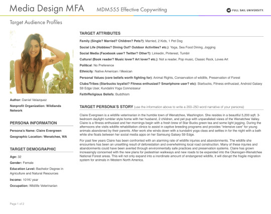

Knowing the persona of the target audience brings forth issues and goals relevant to their specific situation. For example, reaching out to someone in Washington will need to have specific key points that may be irrelevant to someone in Ohio. Maintaining specific interests with a common end goal is a solution to enforce a call to action on a continental scale. There are many diversifications to consider when developing a campaign. Understanding the audience is just the beginning. Getting into depth with your persona really drives the impact your campaign will have on the public in the personas general area. The personality and voice of your campaign reaching out for the created persona can draw in numerous amounts of people the design may have never considered to be an ideal target audience.
In this concept I took the perfect home and turned into the only place to be when going anywhere. No more landscapes to enjoy, toxic chemicals being released in the air, and dangerous materials scattered throughout the areas. Most of the disaster is from deforestation and the wildlife is all gone. No more song birds to enjoy. The entire concept is to fill the viewer with a post-apocalyptic version of life without wildlife. Smallish (2013) says, “…different viewpoints can affect the feel of our scenes as we produce a number of rough iterations.” (Chapter 7, Visually Defining Our Ideas) It is a common mistake to get too involved in the sketch instead of focusing on getting the idea out to most effectively communicate to the viewer. With this image I hoped to bring a raise to action in protecting what little forest and wildlife we have.

The main concept behind this ad is to communicate directly to the viewer visually and through strong text. This is a more aggressive approach that can bring the viewer a heightened sense of understanding with a twist. Most people see a lion as a wild and dangerous animal that can cause major damage to its prey. A safari guide or navigator is also considered an apex predator of the most devastating kind. Not only do humans destroy wildlife by the millions but we are also breaking down major eco systems that we also rely on to survive. As Felton (2011) explained in his book, there are a plethora of candidates you can use to bring the perfect message across in an effort to bringing a raise to action. (Chapter 19, The Power of Personality) I married the simple fact that animals are dangerous but just how dangerous are they compared to humans’ text with an image of a lion and a travel guide. I will in the future make the lion more ferocious to get more of a reaction out of the message and overall ad.

This was a very rough idea that played will with the future of wildlife photography. I tried to project this ad toward one of my personas. It was an ok concept, unfortunately it didn’t make the cut as one of my favorites. I tried to get the bears living in a filthy back alley way due to the over population of humans and over grown cities. This was to bring the viewer into a focus of security not only for wild animals but how they see the world around them. It is meant to bring them into a time where animals will learn to thrive in cities after the forests are nearly gone. The persona-based concept was made to gain rapport with plain folks that closely related to the viewer. (Felton, 2011, Chapter 19) This was not the best constructed ad despite the reach for rapport.
Going back to Felton (2011) “… you needn’t limit yourself to living people, nor do you need to be reasonable.” Therefore, I added a tree to demolition a home. It gives the reverse roll of having our home taken from us and bringing about new ideas and situations that flood the viewers imagination. It is a call to action in the sense of being creatively horrified by the mere thought nature could demo our homes to make room for forest growth. I think the viewer would be more conscious about the wilderness after seeing this theoretical ad.

I really enjoy this ad out of all the concepts I roughed out. It shows a great connection to my persona. I used photography and deforestation to bring the concept of saving the wildlands for the greater good. In the photos I tried to incorporate wild life to push the thought of destroying homes not only forests. It is a great concept from Smallish (2013) “concepts just seem to fall into your lap… storytelling strategy… composing concepts… involve playful thought… to make sense.” (Chapter 5, Honing your Ideas) I can’t wait to explore this concept a bit further and get more detailed with the call to action message toward the viewer.

Rendering this ad was a shot in the dark to be honest. I was going or a crazy shopping experience with the local window stores. I had bobcats pouncing on the car and one looking through the store window. A viewer could easily gain some rapport with the ad. I wanted to engage a little with the message, it just fell flat no matter how many versions I edited. Next time I would probably take out the word “Future.” It will give the sense of a more pressing time instead of just the future. I exercised this concept from (Smallish, 2013, Chapter 8) 180 degree thinking. The shopping experience is usually a great one unless you’re trying to avoid wildlife and predators in the neighborhood.
I chose sketches one, two, and five because of their intense visuals and adherence to mesh well with the message in the copywrite. Bringing the visuals and message together was the most difficult. Keeping enough copywrite to be interesting and informative while not taking away too much attention from the visual aid pushes the message for a call to action. Using straight forward visuals is powerful and shows the organization has nothing to hide. Being truthful and factual also brings a voice of justice.
The remaining sketches did not go on to the drafting comp stages due to over intensive imagery. The tree blowing up a home is not the message this organization would want to convey. Another not so well-done sketch was the back-alley bear cave with photographer. It would be too messy, and the message would of gotten lost in the visuals. Lastly, deciding not to go with the shopping animals, due to the confusion of trying to explain why wild animals would inhibit the city from deforestation was too much explaining. The message needs to be simple and the point relevant to the times.

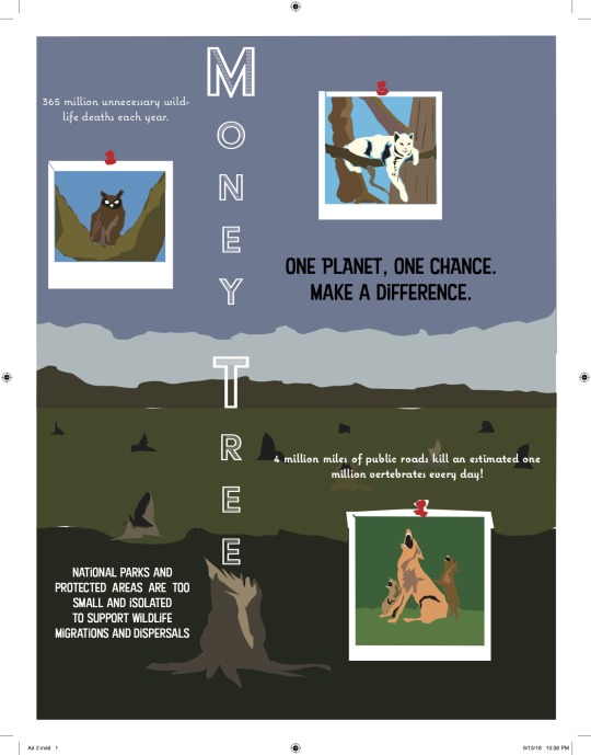

The first comp was with a predator as a focus and to bring a pinch of shock value through text. Assuming a dangerous animal would be more dangerous than a human is just unheard of. Next comp shows the text “Money Tree” in the place were a real tree would stand and there are pictures of animals that would live in the area before deforestation. The visuals for this campaign were quite strong, unfortunately there was not much room for copy. If the message could have been pushed a bit more this would have been a better advertisement. Lastly, the ad with a paradise home in the middle of a cut down forest. The landscape full of fracking and devasted trees was a bit much. It brought the message of a war zone rather than deforestation. Even so, this was one of my favorite advertisements and I believe it could have been the best of the three comps submitted.
To be honest I just winged it. There was no logical thought in developing the headlines. I thought about what the personas would relate to and started to write random quotes that would align with the core beliefs of the organization. Most of the headlines were full of misdirection and puns.
With the body copy, I wrote the most detailed factual information without being too wordy. This took some finesse due to the overload of factual information and message of the organization. I took the most pressing matters and the core message with a pinch of call to action to develop the final advertisement.
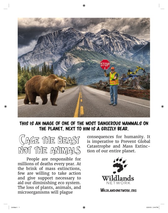

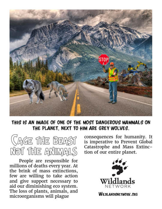
Rearranging the comps was difficult and I still will never be satisfied with the finished product. As an artist my work is never fully finished. With the gathered feedback I chose to go with only one comp to fortify unity between the ads. I then switched out the animals according to region in which the organization would be relevant to advertise.
Going forward I will take away everything I ever struggled with especially font design. There is so much depth in designing for a campaign it is almost overwhelming. It is a continuous learning process that never ends. Another thing I will take away is learning how to catch the viewer attention through composition. The psychology in which the eye moves across a page is critical when trying to catch and attain the viewers’ attention. Lastly, I will take away the most fun portion of the entire project and that is the development of the personas. I will continue to develop personas for every comp I do going forward.
0 notes
Text
My #1 Copywriting Secret: How To Hook, Convert And Sell With The Power Of Visual Flow
Human beings are very visually oriented.
We love visuals. We love shiny things that catch our eyes.
And that can play to the any marketer’s advantage. This is not only the case when it comes to the use of images, but also how the text is displayed on a page.
Since copywriting is so important, that means how that copy is presented matters—A LOT.
What makes copywriting so critical?
Let’s take a look…
Copywriting 101
Copywriting is everything when it comes to online marketing!
Good copywriting allows a person to sell absolutely anything.
And this means that anyone who wants to have a successful online business MUST know the art of copywriting. Every business person who wants to become a huge success in the world MUST learn how to sell through the written word.
What makes copywriting so special?
Simply put, good copywriting makes a person a more effective communicator. And this is incredibly important when it comes to online marketing. We can no longer meet with our customers face-to-face. Most communication with customers happens online now.
This communication has to grab the attention, develop a relationship, convey information, AND make the sale. If it fails at any one of these, the sale is lost. Period.
But the good thing about copywriting is anyone can do it! Anyone can become a good copywriter.
I know this from personal experience…
My Copywriting Story
A teacher once told me that I would never be a good writer.
She actually told me to stay away from a career that involved writing. Now, I am sure she gave me that advice out of the very best of intentions. However, because of what she said, I stayed away from writing for many years.
I had formed a limiting belief that I was no good as a writer.
As time went on, I found myself in Medical school, yet I was not enjoying myself. I wanted to own my own business and control my own future. I eventually found my way to internet marketing—but to be a successful internet marketer, I had to learn how to write.
Fortunately, I found a mentor named Justin. He saw one of my early sales letters and he reached out to me. He said I had potential, but I could do better.
Justin invited me to a workshop and I did an internship with him so I could learn more about copywriting. And one thing he said has always stuck with me. He said…
“The most important skill in business is selling with the written word.”
So, I studied the masters. I practiced and practiced. And I learned how to become a great copywriter.
Not only that, but I’ve learned how to use one VERY overlooked aspect of copy that allows me to write better copy than anyone else….
Visual Flow
How copy looks on the page matters!
Visual flow is THE #1 most overlooked aspect of copy. Believe me, I have looked around and even the top sales pages don’t use this strategy—if they did their conversions would be even higher.
Copywriters tend to focus on the words – but what about how it looks on the page?
What about the flow of the words?
Because no matter how great and compelling your words are, if no one reads them, it doesn’t matter.
If the paragraphs are too big or the writing on the page looks intimidating, people won’t bother. They’ll move on to something else.
We’re visual creatures. The page needs to be visually appealing for us to pay attention to it.
Think about where people’s eyes go on a page. It’s important to ask:
Where do people look?
What’s the flow of their attention?
How do you draw and guide their focus?
Copy needs to be structured in a way that attracts the eyes and flows naturally. This flow can make or break any copy.
How to Create Visual Flow
Creating visual flow is actually very easy!
There are a few simple strategies that can be used to ensure the visual flow on a page will catch the eye and guide it through the copy. These include the following:
Break Up the Text
First and foremost, NEVER use giant paragraphs.
No one wants to see a wall of text in front of them. Keep the paragraphs shorter. They shouldn’t be any longer than four lines.
Keep Sentences Short
Sentences that are too long are difficult to read.
Keep them short and sweet. If they take up a whole paragraph, split them up.
Use Font Changes
We can do so much with the written word today. We have the ability to use bold, italics, and underline to make text stand out. We can use color whenever we want.
This adds a lot of character to the text and that makes it less boring. It also allows us to emphasize key points.
Include Images
Images are a great way to supplement the copy and drive the message home.
Images can include diagrams, charts, or photographs—anything that adds to the copy. Just don’t go overboard. Keep the use of images minimal and minimize the amount of text in the images for the best results.
Switch Things Up
Don’t make all the paragraphs the same length. Use a mixture of short, medium, and long paragraphs.
Keep it Clean
The copy should always look clean and sleek, rather than messy or jumbled. If it’s too cluttered, it won’t attract the eye.
All of these tips will help any copywriter write captivating copy and avoid monotony.
Remember, visual variety is the spice behind any copy. This variety is created when the font, paragraphs, sentences, and images are combined in such a way that they attract the eye. And this keeps the copy fresh and interesting before the audience has read the first word!
Think of this variety in the flow of the copy as the copy’s visual rhythm—people connect with and enjoy a good rhythm.
And now, with these points in mind, let’s take a look at some examples of visual flow…
Examples of Visual Flow
Good visual flow is really quite simple to achieve. But sometimes it is useful to see some examples of what works and what doesn’t. What follows are examples of both poor and good visual flow.
Examples of Poor Visual Flow
The following examples show poor visual flow, which tend to result in boring, monotonous, hard-to-read copy.
Let’s take a look…
Written Sales Letter (WSL)
This is an example of a written sales letter. The goal of this WSL is to capture the reader’s attention and keep their attention so the marketer can make a sale by the end of it. However, this WSL struggles to accomplish good visual flow for a number of reasons.
How it fails at visual flow:
At first glance, it is obvious that this WSL is monotonous and boring. It’s just a bunch of text broken into paragraphs of roughly the same size. And a lot of these paragraphs are made up of one sentence. That means the sentences are too long.
There is larger bolded text that stands out. Visually, it looks like it should be a sub-headline, but the text is actually a part of the regular copy. The one image that can be seen is a step in the right direction, but doesn’t do enough to break up the monotony of the copy.
Overall, the copy looks like a giant wall of text and that’s just plain unappealing. Most people who look at this page wouldn’t even bother to read it.
This WSL will NOT grab onto and hold the reader’s attention.
Facebook Ad
This next example of poor visual flow is from a Facebook ad.
Although a Facebook ad is a very different type of copy than a WSL, the same strategies apply. The copy still has to have visual appeal and variety.
Here is the ad:
How it fails at visual flow:
At first glance, this ad looks like a big block of text, which is exactly what it is.
There is simply too much text all together. It creates one big, overwhelming paragraph. The text isn’t broken up and there is no variation at all.
Aside from the actual text, there is a link, which isn’t visually appealing either. This link should stand out and add some character to the copy. Instead, it blends in with the text so that it’s hardly noticeable.
The image is dull and very gray. It doesn’t catch the attention at all. Plus, it contains way too much text.
Overall, this Facebook ad has too much text and not enough visual stimulation.
Examples of Good Visual Flow
Now, we will go through some examples of good visual flow. And since we’ve gone through the strategies, the difference between good and bad visual flow will be obvious.
Written Sales Letter (WSL)
Here is another WSL. This time, it is clear that the visual flow is good. The eyes enjoy looking at this copy because it’s interesting and varied.
How it uses visual flow:
In this WSL, the variation of paragraph length is apparent right away. This makes it appealing to the eye. Some paragraphs are short, some medium, and some long. There is a good mix, which makes it easy to read.
The sentences are also short. Even in the longer paragraphs, there are at least two sentences.
Now, take a look at the format of the text. See how it varies? There is plenty of use of bold and italics.
And the text that looks like a sub-heading really is a sub-heading. It actually guides the reader’s eyes if they are skimming, helping them move from one section to another.
Ultimately, this example is easy to look at and read.
Written Sales Letter (WSL)
Here is another good example of copy in a WSL.
How it uses visual flow:
Again, there is good variation in this sales letter. The lengths of the paragraphs are well mixed and there is good use of short paragraphs. They stand out like bullet points and give the eye a break from the medium and long paragraphs.
Not only this, but the short paragraphs ask questions. They get the reader thinking and wondering and that keeps them reading.
There are many different text formats in this WSL, including bold, italics, underline, and CAPS. The sub-headline carries the story forward.
Overall, this WSL is easy to look at and read.
Facebook Ad
Now, here is an example of good Facebook ad copy. It’s long because it is posted right on the Facebook page as a status update.
How it uses visual flow:
Again, the visual variation in this Facebook ad great. There are plenty of short paragraphs and bullet points to break up the monotony of the medium and long paragraphs. This makes it pleasing to the eye.
And this ad includes as much format variation as Facebook allows in terms of CAPS, “quotes”, bullet points, and other text variations.
Notice at the bottom of the ad, there is a clear call-to-action box.
Facebook Ad
This Facebook ad also provides a clear example of good visual flow.
How it uses visual flow:
As with the other good examples of visual flow, this Facebook ad uses variation in the lengths of the paragraphs, short sentences, and bullet points.
In addition, there is great use of icons, such as exclamation points and arrows.
This ad clearly tells the reader what to do next.
Opt-In Page
Now, let’s look at an example of good visual flow on an opt-in page.
How it uses visual flow:
The first thing that stands out here is the use of a high-quality image. This is really important because it’s often the first thing on the page that the eye goes to.
Next, notice the catchy headline. It uses the trigger word FREE and it makes use of CAPS and underline.
There is not a lot of text on the page, which would be intimidating to the reader. And there is good use of bullet points to convey information.
The best part of the visual flow of this page is that it guides the reader in the desired direction—the flow leads the reader right to the opt-in button.
And that is the goal of this copy, to get the reader to opt in.
Opt-In Page
Here is another example of good visual flow on an opt-in page.
How it uses visual flow:
Once again, there is a high-quality image that immediately catches the eye.
The visual flow is great. There isn’t too much text, there are bullet points, and the flow leads the reader right to the opt-in button. And again, there is good use of formatting such as bold and underline.
This is an ideal model for an opt-in page.
Email
The next step in an email marketing campaign would be the email itself. With that in mind, here is an example of good visual flow in an email.
How it uses visual flow:
An email is a longer body of copy, which means it has to be approached in such a way that it immediately draws the reader in. This is accomplished with the use of a very short paragraph right at the beginning.
This very short paragraph is the hook needed to get the reader interested.
The email then offers a good mix of paragraph length to break the monotony of the copy. The overall flow is broken up. And even throughout the longer email, there is a variety of text formatting, including CAPS, bold, italics, and underline.
Overall, this email is super easy to read and skim, which is incredibly important for longer copy.
The absolute #1 skill any internet marketer can have is copywriting – the ability to sell through effective communication.
Copywriting is the ONLY way to connect with the consumer and build a relationship with them. Yet there is one aspect of copywriting that is almost always overlooked, even by the top copywriters…
The use of good visual flow to make the copy more appealing to the eye.
I’ve learned to master the technique of good visual flow. And this has made me one of the best copywriters in the world.
And here’s the good news…
Good visual flow is easy to achieve—for anyone! To achieve good visual flow, all a copywriter needs to do is the following:
Do NOT use long paragraphs—keep them to a maximum of four lines.
Mix up the paragraphs by varying the length—use a combination of short, medium, and long paragraphs.
Make sure the text is well broken up and draws the eye.
Make use of bullet points where appropriate.
Vary the text formatting by using bold, italics, underline, and CAPS throughout the copy.
All images should be of high quality and their number should be limited.
Never use too much text in an image.
Make sure the copy looks clean.
When these strategies are used, the copy will have good visual flow and rhythm. It will draw the eye and guide the reader to the right spot on the page—which is the call-to-action.
Anyone who is serious about copywriting and internet marketing MUST understand visual flow. It’s like a secret weapon.
And we want to help more people understand these potent strategies! We want anyone who is interested in online business to have a good grasp visual flow and all other aspects of good copywriting.
That’s why we are offering a FREE Copywriting Bootcamp!
Join us at this bootcamp to learn from the masters. The experts we will have on hand have years of experience writing captivating copy that has good visual flow.
And they will guide Copywriting Bootcamp attendees through the copywriting process.
Just sign up below and be ready to learn how to create copy that will sell anything!
I’m looking forward to seeing you at our Copywriting Bootcamp.
See you there!
[Read More ...] http://ift.tt/2xgk2iu
0 notes
Last Seen Blogs