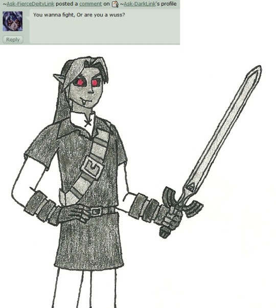
#it's kinda interesting/fun figuring out colors because I can try do like...a rough color sketch in photoshop
Text
rug hook edition of color combos I liked but didn't quite work out
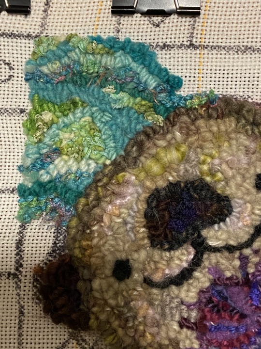
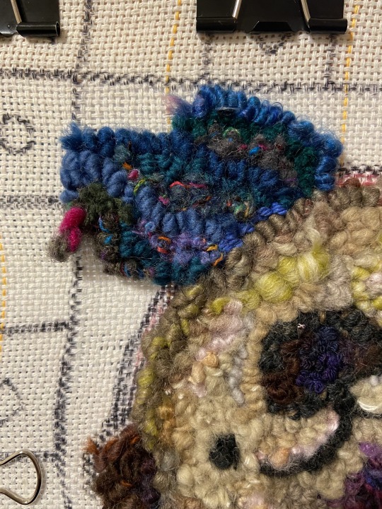
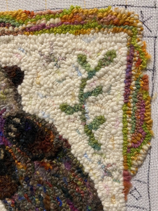
#wip#artists on tumblr#rug hooking#fabrication#fiber art#purely personals#delete later#def wanna do something with the second photo#gonna try redo the border in blue so we'll see how that goes?#like the first two backgrounds were fine but felt sorta intense/overwhelming all together#it's kinda interesting/fun figuring out colors because I can try do like...a rough color sketch in photoshop#but obv. the yarn color's not gonna exactly match plus can look a bit different once they're looped/next to other colors#edit: OH :O was able to give the swan gift one and they liked it a lot :'D
365 notes
·
View notes
Photo

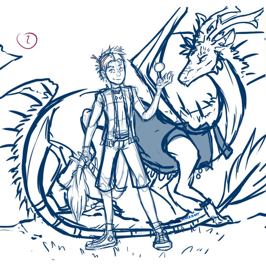
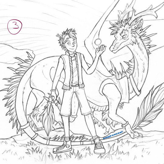


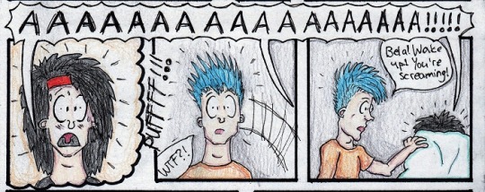
This is actually going on my IG sometime later this week (you can see my handle on there - ArborMakesArt), but I decided I might as well just post this here too since it’s relevant and already has the right formatting. And I can make a lot more commentary! Under a cut. Its the step by step of how I made the art of My Son the other day and kinda what happened during the process
1 - Extreme Rough - This is a pretty small thumbnail that I scanned and worked on digitally. This was a huge challenge since its been a long time since I colored more than one character in a drawing. If it were the same species it would be one thing but I needed to play around digitally for a while to get the scale of the dragon figured out. By the way I fount it was lot easier to just block out a shape for him than to do thinner lines, not sure why that is (maybe easier to process the volume?) but I thought that was interesting
2 - Sketch pass 1 - Entirely digital, still rough but now it’s looking like something
3 - Sketch pass 2 - Pencil. I printed out #2, stuck it on a lightbox, and refined the lines. I’ve never worked this way (digital to traditional) but it turned out way better than expected. He looks so cute :D
4 - Ink Lines - Printed out a copy of #3, inked using lightbox. Normally I’d spend forever going over lines trying to thicken them up but I was trying to refrain from overworking them and did this all in one pass. I was very proud of myself |D
5 - Flat Color - Yeah so actually for the most part it went really well, it just took forever getting the blending and this is also a large piece of paper. I’ve never tried coloring a glowing orb traditionally so that required a lot of pondering, but it was fun. However. After the flat colors were done was when the problems started.
FR colors don’t exist in markers, so I had to layer them a lot in order to get an approximation. So when I started trying to shade this, instead of layering some more, the paper reached it’s saturation point sooner than I guessed and just started pushing the colors around into a gross mess instead. For example the whole back of the dragon’s neck that would be in shadow smeared itself together. I didn’t get a scan of this because it was very upsetting, but thankfully stopped trying to marker shade before it did too much more damage.
6 - Shading Attempt and other stuff - Now I had to try to hide the color-smeared parts and shade more than I wanted to with colored pencils; I had planned to use them mostly just for highlights. And then...this next part was my fault. 8) I have an old set of pencils that younger me had a Big Fumble Day with and dropped, several times, in a row. I’ve dubiously microwaved them multiple times since then, figured they were all still shattered, decided to use them here anyway, lo and behold, they are all in fact, still shattered. Every time I thought about sharpening, immediate breakage. Tips falling out left and right. Barely got enough usable pieces out of the colors I needed to get this to a ‘close enough’ kind of state. I held onto them for a long time because they cost so much originally but obviously I just need to throw what’s left away and get a new set.
So that’s how this went! The ending was a struggle and so frustrating, an exclamation point to a generally terrible last week I was having. Although its not originally what I was hoping for I don’t think this is a bad piece or anything. Sometimes you know....stuff just happens. There is a lot I do like and I learned a lot of misc little things throughout the process. The colors are really pretty! And I love the lines a lot. He’s adorable and he’s one of my favorite characters anyway so I’m always so pleased every time he turns out nice. |Da The pencil pass lives on its own piece of paper from the finished one so I can still pull it out and enjoy that version whenever I want too.
#Arbor's art#step by step art#art walkthrough#flight rising#flight rising art#fr fanart#flight rising imperial#process art#long post#kind of late post
11 notes
·
View notes
Text
Rambling about my (dä fan)art...
I was writing another post and this kinda got out of hand and turned into me talking about my art overall. I’m gonna put this under the cut because I don’t know if people are interested in my art nor especially in my thought about it and my “art history” basically, but if you are, then I hope you enjoy.
And yes, this is gonna be about my die ärzte fanart mainly!
So let’s start with the HELL coverart drawing because that’s what I was talking about originally:

I’m extremely happy with how the drawing turned out in the end and I like that feeling of success when I’m happy with something I have created. That is not always self-evident with myself. More than often I have plain hated my drawings or have felt like there should be something done differently, or something that I could always improve at and do better. So this feeling where I’m actually content and happy with what I have created is something new and different. I have a dopamine rush every time I look at that drawing. I like the drawing. I think it looks nice. And I’m extremely happy about this fact and I am not afraid of admitting it. Perfectionism is a curse and a gift. It can sometimes make your life a living hell when something that is perfectly good still feels like it’s not enough. When everyone else sees that what you have done is actually good or even great but your brain just keeps repeating how it’s shit and everyone else is just delusional and that they don’t see what you see. And this is like the polar opposite of that feeling. It wasn’t other people who were delusional, it was you and youself all along. You were the one seeing the image in your head and the drawing not matching that image. Other people saw only what you had created and couldn’t compare it to anything. And that doesn’t mean it was never good.
So whenever I do these comics and comic style drawings nowadays, I just feel so happy. I feel that I am no longer failing them, I feel like I can draw the image I see in my head. I finally feel like I can draw, I have some skills, I’m not a professional and maybe not as good as everyone else but I’m good at what I’m doing. This is my thing and I’m good at it and it’s enough. And I love it when I feel like I’m improving. For years I felt like I was stuck, like my skills would have been glitching somehow, I didn’t get better no matter how much I drew. But I guess I tried too much and was too harsh on myself because I believed that a drawing is good only when no reference photos have been used. And I sucked at drawing without them. I still do! I was staring at the Hell coverart the whole time I was drawing! I wouldn’t have been able to do this if I didn’t! And this feels particularly good also because this is the first time I have tried something different with these comics. I have never tried to draw a photo or existing picture with this style. I have only drawn my comics and those I have created all by myself. The clothes come from what I have seen in videos and photos but the plots are created by me alone, with a idea coming from somewhere actual usually, as inspirations do.
For comics I do look at reference photos of people sitting or standing, or I look at the mirror, or even take photos of my own hand to be able to draw something. And that’s lots of fun and also challenging because I’m mixing there my old habit of portrait drawing with my less serious comic book style but I really really do like the combination. It also makes me feel that I am memorizing what I draw and the next time when I need to draw that same posture, I no longer need the reference photos because they’re no in my brain. And in my muscle memory. My hand remembers how to do the lines now.

Here you can see one of the sketches I did in 2018 - I had this image in my head and I wanted to draw it and I just... drew it in my sketchbook. Didn’t use pencil. But now I’ve noticed I like doing these on proper paper instead of the sketchbook AND it’s so much more fun to first draw the sketch with the pencil and then draw on it with the fineliners. That I have always done with the comics (apart from one) because they take more time than these quick sketches. But here you can see Farin’s legs on the first image - I think I might have looked at reference photos for that but then it was so much easier to do the to the comic I made in 2019.
I have now also figured out that a big part of my style is not to draw just simple straight lines. I like making those sketch-like lines even with the marker. They look more rough but that’s something I like seeing with my art. That’s what I was missing when I was staring at the lines I had drawn before and hated every detail of them. They were too clean and neat.
^These two I have also drawn on my sketchbook in 2018 and I don’t really know why. I guess I was still a bit stupid and didn’t really realize I’m drawing again. But anyway, they both were inspired by my own fanfiction I have written a long time ago. It’s one of my favorite self-written fanfics and it had these two scenes I just saw in my head and felt like I could try drawing them. Maybe that’s why they are in my sketchbook, I wasn’t sure if they were going to turn out even good... The marker around the second one obviously was shit and the paper wasn’t good for it, and I never finished with it so it looks a bit weird. Do I need to say that I really enjoy drawing very small, repetative details, like those tiles? It’s so soothing, almost like a therapy.
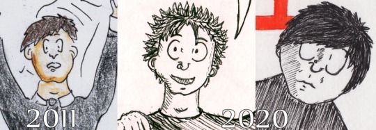
I think that quitting antidepressants in 2013 has done so much good for my creativity. If you compare my work from 2011 to 2019, the difference is huge - all are just parts from my comics:
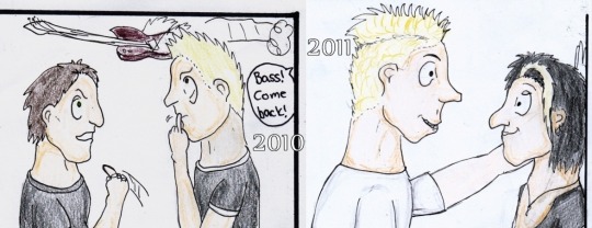
Can you guess see the difference? But have to admit I am jealous for myself for how I have drawn Farin’s hair to the 2011 one and maybe have forgotten to color Farin’s arm but... I actually had so long pause from drwing (~8 years) that I forgot how I did that and had to use THAT as a reference when I was trying to draw late 80s Farin’s at some point last or this year :D
Anyway, my style with the shadows is a little different when I use colored pencils than when I use markers. This is from my latest comic from this year, where I experimented with Promarkers the way I had never done before and I really like how it came to be:
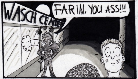
I have owned this set of Promarkers (black + 5 greys) for years and have never really used them, apart from the black which I usually used for the thick lines anyway. And wanted to see if I could find some use for the greys too! (Yes that’s Bela back there - this comic was an alternative ending for Für Immer music video :D)
And I wanna end this post with a face progress comparison for all three. During this I also noticed that before I used to draw their side profiles and it was really difficult to find images where I’d have drawn from from the front. And nowadays I have mainly drawn them from the front and it’s hard to find side profiles! Interesting! Here’s one of Farin and Bela from a drawing I made this year:

Also the hand that was so much fun to draw but I also took photos of my own hand in that posture in order to even draw that - that was fun! :D
But here are the last three images - using the HELL one as the last for each, of course:
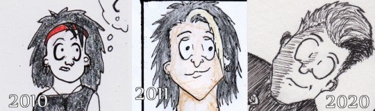
Bela has always been the easiest to draw. And the first one of these three is actually from my first ever Bela&Farin comic! I didn’t color their skin back then. With the next ones I already did color their skins too but I used darker colors to do the shadows. Nowadays I do the shadows with fineliners. Or it depends - that 2019 one doesn’t have that lol.
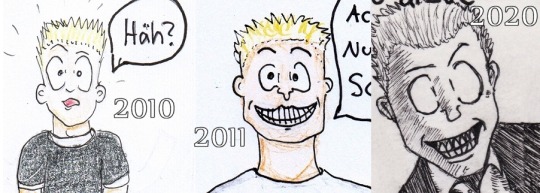
Damn it was so difficult to find something where I’d have draw Farin from the front :D And I see the HELL one literally is my second (or third) time drawing Farin with his grin. Or if you count all those numerous extra mouths I drew because I failed the first one, then I have drawn his grin at least 15 times by now. I probably can draw his teeth with no reference photos from now on.
I haven’t drawn Rod too many times. I can actually count about... 5 times? And then there’s only 2 times when I’ve drawn his side profile but he’s at the background. I don’t know if I’ve ever really succeeded at that, I usually try to draw his head a more round and his eyes smaller than for Bela and Farin and I was actually bit worried for the HELL one and was wondering if I’m going to ruin the whole thing. But in fact, that was actually easiest of them to draw. And STILL I’m surprised by how alike he looks in that last one. In fact, I think his dacial features are perfect for a carricature drawing so you don’t need to do more than a few lines for the mouth and it looks like his mouth. The middle one was for a drawing I made for a friend and with this I actually looked at photos so that I could draw some of his hairstyles from the 90s and I liked this one the best and it was also quite easy to draw too.
Do I even have to say that I’m not extremely motivated what comes to drawing? I feel like my creative has become what it has never been before. I still don’t really know what to draw but I just feel that whatever it is I’ll start next, it will be good. And if it doesn’t... who cares? I had so much fun with those extra mouths of Farin which was maybe visible from the video I filmed, and that is what makes drawing worth it. Before I took the drawing process so seriously and a mistake felt like the end of the world but now I laugh at them and make fun of them and don’t take them too seriously. And I always have ways to fix these, or I can redraw. Just like I did with Farin’s mouth (or a half of his face actually) for this newest drawing. The most important thing is that I’m having fun and enjoying what I do, that way usually the outcome will also be a success.
I have now at least 2 dä comics on my to-do list (I don’t remember if there’s a third one too) + one pencil drawing that is halfway there. It will take one more night/day for it to get it finished. I also have probably 5 ideas for self-comics etc. in my sketchbook and I try to find some time to work on those. Or actually I have a plenty of time. Adhd, time blindness and executive dysfunction just make it feel as if I didn’t :D Can’t wait to get working on my next drawing projects, tho!
(I wish I knew how to make art for a living even but that’s a topic that will need its own post which I’m probably do in a near future if I don’t forget :D)
#mcrmadness’ art talk#mcrmadness draws#the post has lots of text but also quite a many images#dä fanart#die ärzte#I have been drawing dä comics since 2010 - the old ones are very stupid but whatever :D#long post
5 notes
·
View notes
Photo
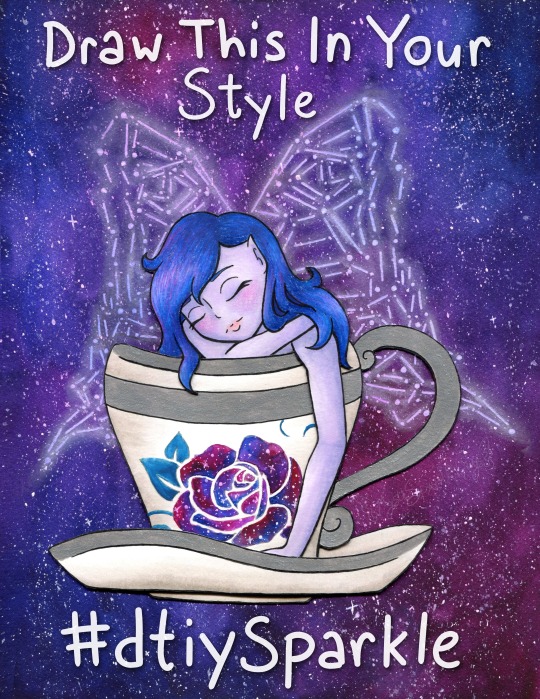
Draw This In Your Style!
Draw/Recreate This In Your Style, post the original art alongside it (on platforms that support it, elsewhere you can just link back to the original instead), and either tag it with #dtiySparkle or tag me, MysticSparkleWings (xxMysticWingsxx on Twitter) directly and I'll retweet/share/etc. it! No deadline, just create at your own pace!
____
You know, I constantly go back and forth on "celebrate milestones!" vs. "don't be that person that won't shut up about how many followers they have and the numbers and etc." Mostly because I usually find it annoying from other artists, even if I don't find the artist themselves annoying. It's complicated. I know it's important and in many cases helps grow a following further, but it also just gets exhausting, you know? Both to see it and to try to do it.
Still, I've been wanting to make a "Draw This In Your Style" (DTIYS) for a while now, but it didn't seem like the kind of thing to just do on a whim. It felt like there should be a reason for at least the first one, provided it went well enough to make me want to do more. I noticed a few weeks ago that I was approaching 1,000 followers on Twitter* and I saw an opportunity, knowing that 1. It would take me a while to finish the artwork (go big or go home, yes?) and 2. It would take a few days for the numbers to stabilize so that I would actually hold steady at 1,000+ and not be 1,000 one minute and 998 the next. (Followers go up and down like a see-saw over there)
*Thanks exclusively to Art Shares. I'm very sure I'd still have less than 100 if it weren't for those--and please don't be fooled by that number. 1,000 isn't teeny tiny, but in-depth interaction from a handful of people will always mean more to me than zero or minimal-at-best interaction from thousands/millions/etc, and frankly, my interaction over on Twitter is basically non-existent compared to the interaction I get here on dA, which precisely is why I prioritize dA over all other social media. It means more to me; it feels infinitely less passive.
But...I kinda didn't want that to be the only reason for the DTIYS. It just seemed...I don't know, cliche? Not right, somehow. Fortunately, the Twitter milestone happens to coincidence with I think I've finally stabilized around 300 followers on Instagram (after being stuck between 250 and 290 for months, consistently going up and down 2-3 people at a time), and I've also garnered over 400 watchers right here on dA.
The Twitter milestone is technically the biggest, but honestly, the dA one means a lot more to me. I thank each and everyone one of you, my fellow deviants, for thinking my art is worth the watch.
And I especially thank those of you--I'm sure you know who you are, I won't name names just in case anyone's not comfortable with that--that consistently fav and/or comment on my work. Your support and encouragement are why I keep doing this, despite the frustrations I may have along the way and aside from an innate need to create.
Speaking of which, if you're a loyal Sparkler I think now I'll get to the part you might know me best for; the long description of the artistic process!
Like I mentioned before, I noticed the milestone stuff a few weeks ago and thought now would be as good a time as any to get started on a DTIYS, so I started trying to brainstorm something that would be both fun for me to make and fun for others to recreate. I was having a little trouble on this front, so I took a trip to Pinterest and re-visited some boards I use to save potential draw ideas/inspiration on.
I was thinking I wanted to include a fairy since I've been wanting to get back into drawing them more regularly and fairies-via-Winx-Club is where I got my start here on dA and indirectly into getting more serious about my art in general. I was also thinking something with galaxies since those are usually fun to make and are a good way to make an otherwise plain or simple piece more interesting. I didn't want this to be too terribly complicated if I expected other people to draw it, but I also didn't want it to be too boring. And, of course, I was hoping for something I could lean into my mixed-media prowess with.
All that turned out to be quite the balancing act, but after some scrolling, I had some ideas and ended up with a sketch of a fairy in a teacup, with place-holder wings and a place-holder rose on the cup. The wings I knew would be easier to do the lines digitally (even if the final art was traditional, which I was planning on), and the rose I wanted to be slightly more sophisticated than my typical stencil-made roses, which I thought would also be easier to experiment with digitally. I was right on that front, thanks to some of the public domain images on PixaBay.
Beyond that, my original idea was fairly different from what you see here; I was thinking black hair, a fairly vampiric look, for the fairy, more typical butterfly wings, a red rose on the cup, and then an abstract galaxy wash, more watercolor-y and less saturated, for the background. And to be fair, that's still an interesting idea that I might return to at some point, but even as I worked on and finished the digital linework (fully planning to print them and then do what I wished with them traditionally, as has become a norm for me) something in the back of my mind told me that vision wasn't the right one; Not for this project, anyway.
Fortunately, I was a busy enough bee in between working on the lines for this that I partially had to step away from it to meet other time constraints and I could afford to step away from it and have some time to ponder what I wanted to do.
In my pondering, I kept coming back to the galaxy/constellation thing I've been experimenting with lately (Exhibits A, B, and C ). I hesitated at first since I knew for sure I didn't want to do the whole drawing that way and I wasn't entirely sure how to decided what to do with what.
Of course, after thinking about it a bit more, I decided I'd take a risk in doing the background and wings in the constellation style, and then somehow do the rest in a more traditional way. I'd have some more time to think about that while I was re-tooling the wings digitally for said constellation style, after having discovered that made life so much easier during my previous experiments with it.
I'd know from the beginning that I wanted to do metallic accents (most likely silver) on the cup and saucer, which in this case meant I'd need to use either watercolor or heavy-duty mixed media paper for them, and I definitely had to use watercolor paper for the wings/background. The mixed media will work for the galaxy technique, but the colors don't blend quite as nicely and I was concerned about how that might affect the overall look here.
Still, I didn't want to watercolor the fairy herself at least, which left me with a choice of alcohol markers or colored pencils. I was thinking pencils for the hair for texture, markers for the skin for the lack thereof. But I typically don't like using alcohol markers on watercolor paper. The additional texture feels too rough on the nib and it's almost like I can feel the paper soaking up extra ink.
I also thought that doing the background and the fairy on the same piece of paper was asking for a very big watercolor-y mess, so between that and the paper concerns, that led me eventually to deciding to split them up.
And somehow in there, the idea occurred to me that I could get a bit adventurous (read: crafty) and actually separate the various parts of the fairy and cup out a bit and not only solve my paper problem, but also makes things a little more interesting.
After yet more pondering (if you can say nothing else about my art, you cannot say it isn't well-pondered by the time it's finished!) I settled on having the layers as follows:
background/wings (watercolor paper)
back part of the saucer (mixed media paper)
the fairy (with her arm and bit of hair carefully plopped over the next layer; mixed media)
the cup (mixed media)
the front of the saucer (mixed media)
Or at least that was the plan, and if I discovered problems in this plan then I could adjust as necessary.
So I got to work on the background, which was fairly straight-forward. I layered on paint and blended to essentially my heart's content, and then let it dry overnight since it was getting late by the time I finished it, or rather the first layer. I came back to it the next day and layered on some more paint to fix some blending issues and darken the whole thing up some more.
While that second layer dried, I got to making the lines for the additional layers and cutting them out--uncolored for the time being, as I figured the layering would need to factor into that a bit--and setting how exactly they'd fit together. The only modifications to my plans I had to make, which I, fortunately, had the foresight to do while I was cutting, was to leave two little bumps at the "bottom" of the fairy (where her body meets the cup) so that she could sit probably as both in the cup but also with her hair and arm hanging over it. The little bumps were a sort of "grounding" behind the cup to hold the rest of her in place while the other pieces were wedged on top.
I hope that makes sense, it's a little hard to explain without seeing it for yourself.
Anyway. I'd also had the foresight to transfer an outline of the fairy and cup lines onto the background before I started painting, which helped with making sure everything was placed...semi-correctly...on the final piece.
I say semi correctly because despite my best efforts when I went to glue everything together it looked right in-person, but the digital scan would later reveal to me that in fact, the layered bits had all shifted slightly to the left and curved inward a bit more, like a right parathesis: ) But I'll come back to that in a minute.
Once I was convinced my layering gambit was going to work out, then I started toying with colors and ideas for the layers themselves. The clearest idea I had out of the gate was to do the rose in a galaxy style too, rather than just plain watercolor like I'd originally planned (teal for the leaf though because green wouldn't have fit with the rest of the palette and blue would've blended too well); either way, I figured it wouldn't pose much of a problem on the mixed media paper since it's such a small area. The biggest challenge would be the stars, but even then you could say the same thing: It's such a small area that star dispersion with a pen really wasn't that big of a challenge to make look convincingly like random star placement.
I went back and forth a bit on the other colors, but I ultimately decided that I liked the idea of soft purple skin and dark(ish) blue hair, maybe soft pink lips and a little blush, for the fairy herself. And I also decided to do a little warm-gray shading on the cup with markers, as opposed to just leaving it white.
The lips turned out so nicely I was tempted to try doing the blush with the same markers, but I have very mixed luck with marker blush (sometimes it blends nicely, other times I get a nice line despite my efforts), and so I decided to play it safe and do it later with pencils instead. Fortunately, the rest of the skin and the cup (both done with Copics specifically as that's where I most easily found the colors I needed) went nice and smoothly, as is the nature of markers on this mixed media paper. (Seriously; Strathmore 400 series Mixed Media works wonders with alcohol markers for layering and blending!!)
The hair was a little more complicated because of the color I was hoping for, but that didn't matter too much because half-way through I decided to change things up a bit and I added little bits of pink and purple into the mix, intentionally following the rest of the galaxy-ness of what I was doing. It's not much, but I think it was the right choice.
While I waited to make sure the cup was good and dry, I went to splatter town on the now-dry background, as was necessary for the galaxy look, and then used my phone to shine some extra light on the paper so I could see my lines and dots for the wings. And after giving the white gel pen a moment to dry, I then went back in with my PanPastel, as is custom, to make the wings glow. I have also now learned that a blending stump/tortillon is good for blending out the pastel in a tight space, while a dry paper towel or tissue works to semi-remove it if it goes on a bit too thick.
Everything, after drying, was then assembled and attached to the background with some handy-dandy tacky glue which was fortunately fairly quick-drying for liquid glue, stuck fairly well without me having to add a whole lot of it, and also not a sloppy glue mess everywhere.
I did have to carefully go back over some of my lines for the cup and hair after everything was assembled because I forgot to do so over the metallic paint and pencil wax before assembly, but it also worked out okay since a couple of corners for the hair got snipped a little short, so I could sort-of fix it by extended the corner on the paper underneath. (In hindsight this works a lot better in-person; on the undoctored scan the placement looks pretty off or incomplete)
And of course, with everything assembled, that brings me back to what I was saying about the scan earlier.
Like mentioned, everything had shifted a bit during placement and gluing, and I could more clearly see the lines I had missed in that process on the scan. Unfortunately for me, while in-person everything looks relativity fine, on the (undoctored) scan this shifting made the balance feel way off, at least to me. The fairy and cup were too far to the left, meanwhile, the ring wing stuck out too far on the bottom.
I fiddled and fiddled and fiddled with the scan, using the content-aware move tool half a dozen different ways before I conceded it just wasn't going to do what I wanted, and then my next-best idea was the extend the background to the left a bit. In doing that, I discovered the warp tool worked to my advantage for that, and so I decided I'd trying fiddling with it and see where it got me.
It's still not perfect, but it's better than it was. In the end, I used the warp tool to tweak the angle of each part of the wings and that made up for some of the balance problems without also compromising any of the lines (which was the biggest reason why the content-aware tool wasn't working; it kept messing up the lines or other parts of the drawing in the process). At the very least, I was able to do enough that it only really bothers me now when I start looking for the off-balance-ness.
I also ended up doing some minor touches, mostly just smoothing out certain lines and small tweaks, but once the balance problem was finally somewhat solved it was pretty much done. (Aside from, of course, me then also adding the words on top so people know what this is at only a moment's glance.)
The end result, both scan and traditional. I'm really happy with. The piece is plenty interesting to look at, but it's also not too complicated, especially when you break down the individual parts that make it up. (Literally and more figuratively.)
Thus, I can only hope others find it interesting-but-not-too-complicated enough to try their hand at recreating it. Even if no one takes me up on my "Draw This In Your Sparkle Style Challenge though, I enjoyed making this all the same and I'm really proud to share the art itself with you guys.
Hopefully though at least a few people will take a stab at it and I can focus on that and not explode from impatience in regards to various not-really-art-related things I'm currently waiting on.
____
Artwork © me, MysticSparkleWings
____
Where to find me & my artwork: My Website | Commission Info + Prices | Ko-Fi | dA Print Shop | RedBubble | Twitter | Tumblr | Instagram
3 notes
·
View notes
Text
Backstory time
A few people seem interested, so I’ll tell about how I got back into drawing as an adult ^^
I loved drawing in elementary school and a bit in middle school, but then i just...stopped. I don’t remember why. That was around 2005.
Fast forward to my first year of college in 2011. That’s when I got into deviantArt, zelda ask accounts there, and my first online friends due to that community. I was really lonely being away at college, so talking to these other kids felt so nice especially since my two roommates were awful to me.
Like I mentioned, I LOVED the zelda ask accounts. I’d just gotten into the game series that year, so it felt like I was talking to celebrities when I’d ask them questions. It was all in good fun, ofc. Then, in December, the girl who ran the ask accounts for both Blue Link and Dark Link decided to quit and pass on the accounts to someone else. Out of the blue, she asked me to be the new Dark Link. (This is where my online nickname comes from.)
I hadn’t drawn in years, yet she trusted me to take good care of her accounts. I was incredibly flattered, especially since she was very picky and we didn’t talk much. Others weren’t too happy only because another girl was supposed to be Dark Link. It was okay though; she took over the Blue Link account; she and I met that way, and we’re still friends to this day <3
Now, running an ask account for a character did a lot to change my life. It got me back into drawing, really pushed my roleplaying (which is now my favorite hobby), found me new friends, etc. But I’m only here to talk about the art aspect.
So...I didn’t know what to do! I hadn’t drawn in six years! So I grabbed a pencil and some paper and made a sample Dark Link before I began answering questions (Dec 2011):
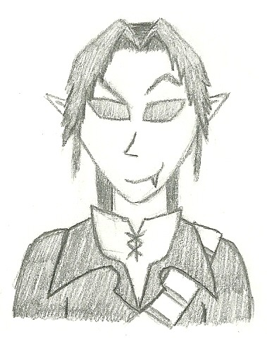
y i k e s
Oddly, my second attempt looked very different, and i used it for my first answer (Dec 2011):
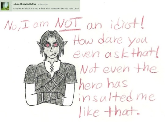
All i had at the time were mechanical pencils (which i pressed into the paper too hard), some crayola colored pencils, a sharpie for line work, and computer paper (since it was easiest for me to place onto our computer scanner). I looked up references like crazy, and I’d flip over my paper and hold it up to the light to check for mistakes. After I’d scan in the drawing, I’d use a simple photo software that was already on the computer to make the background pure white, and then it’s use MS Paint to fix any line art blemishes I could.
People liked me and I got closer to the friends I’d made, so i had the confidence to keep going! Also, it was a goal of mine to answer more questions than the previous account holder had.
It took until my 13th answer for me to try a 3/4 view rather than straight on (June 2012):
And I felt so proud of myself!
Fast forward three years, and my 34th answer (thought not my 34th drawing for the account) was when I really felt like i’d finally gotten a handle on drawing DL (March 2015):
Plus, answering this asshole AS an asshole was entirely satisfying >>;;
A year later, a friend i met in the community gifted me her old tablet, so i was able to start drawing digitally for the first time! To celebrate, I drew OoT Link as my first drawing (Jan 2016):

It felt incredible seeing my colors look so smooth rather than grainy. Lining still looked grainy, though, and took a million times longer. Also, having a plethora of colors to choose from was pressuring. But overall, i enjoyed the luxuries of using Sai (which i still use) over using paper.
Back on my Dark Link account, it took until answer 38 for me to draw digitally. But before that, I had done two AU designs for Dark Link and my first collab! I was feeling like a real artist! On my main account, I drew some pokemon, which allowed me to practice both lining and shading. Mewtwo was my first digital shading attempt (Feb 2016):

Shading was kinda fun, but i was so obsessive over the line art, that it took me hoouurs. It was awful, and i felt like i’d never get faster, though my friend who had the Link ask account encouraged me and gave me advice. As you’ve seen, my line art got much smoother, and i eventually stopped shading unless i was really in the mood since i didn’t enjoy it enough to make it worth all the effort and time. And speaking of time, my friend was right; i’ve gotten much faster now. It may still take me a few hours to sketch a bust sometimes, but that’s better than, say, a few days instead.
I began drawing for other fandoms; just fanart of characters I liked ^^ And i got my first commission in May of 2016. It blew my mind!!
Okay this is a small break in flow, but here is one of my last drawings of Dark Link i did for that ask account to bookend my development in drawing him vuv (Oct 2016):

Handsome boy. I still drew perfectly round irises back then, I just noticed. ...And I never really ended up understanding how to draw his hair lol oh well.
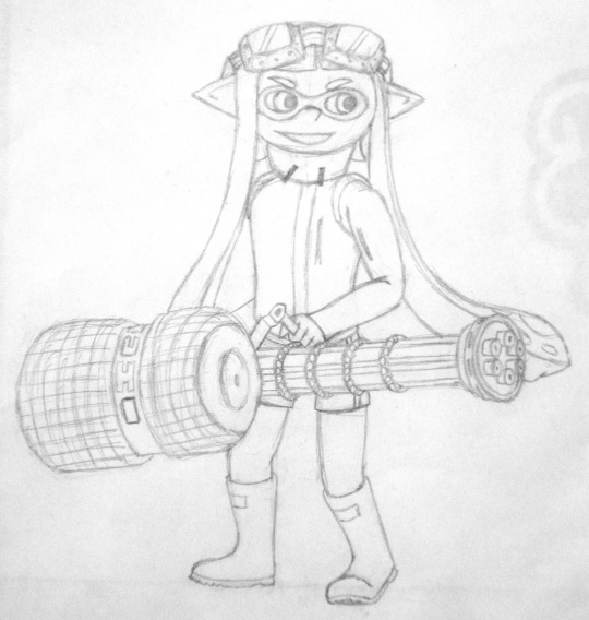
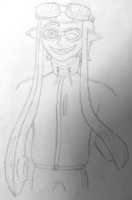
Anyway, when Splatoon came out in 2015 (taking a step backwards in my timeline for a sec), my friends i played with turned the squids they regularly played as into OCs, and i did the same so i could join in. That was my very first OC. And because of this, because of having my own character to develop and love and share, i got insanely obsessed and drew more and more and more.
If you paid attention to my drawing dates up above, you’ll notice my OC creation began before I got my tablet. Boy was it rough figuring out how to draw inklings when you’re an amateur artist with only a pencil. I’d show my development in drawing inklings, but that’s pretty specific and in too tiny of a time frame. Buuuut I can at least share my first attempt, mimicking the game’s style (Dec 2015):
Cute!
Aaand my second attempt, using my own style (probably a few days later):
Not cute lmao
I almost quit bothering to draw inklings after that, but then I got the tablet! And that tablet made me feel like i could draw anything. Sometimes, it still does... I mean, look at what i’ve been accomplishing lately (Dec 2016; Sep 2016):
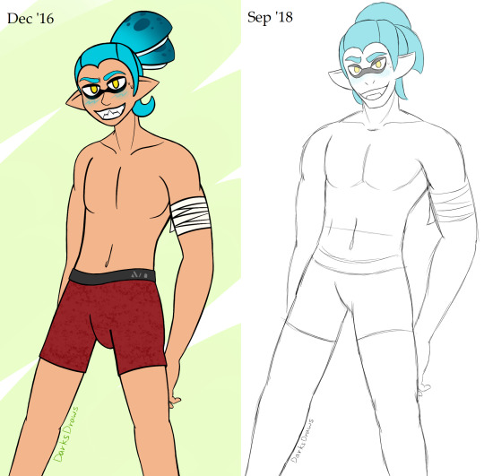
I’m sure you guys remember this comparison i posted last month, but come on.
Anyway, here’s where i am today! I guess what i was lacking as a kid was a real passion for a subject. Well, i had a CRAZY crush on Danny Phantom in elementary school(?), and I drew him a lot lol, but then I didn’t have anything after him. But once i found zelda and splatoon, i had reasons to draw again. Being able to bring my characters to life through my art is more satisfying than i can explain.
...And being spontaneously given a drawing account to keep up with is a fantastic shove in the right direction lmao
#i probably forgot some chunks but it's a miracle i even remember THIS much#i only had 4 hours of sleep so i hope this is an easy read#not art
6 notes
·
View notes
Note
hi! i ADORE you and ur work, ive been kinda cheering u on in silence but im gonna work on being a more Obvious fan :P anywho sorry but i was wondering if you have any tips on starting a comic? Ive been wanting to for months but im a bit nervous on where to start on the story + art process!
First of all, thank you so much! I appreciate the support regardless of how vocal it is ❤❤❤
In terms of starting a comic, I completely understand the hesitance; it’s difficult to start a comic, and speaking from experience, motivation is one of the most challenging things you’ll deal with.
1. Support Network:
Find people who you can bounce ideas off of and will help you write/develop the story and characters! Support networks will keep you motivated and also act as a test audience for ideas so you can make sure your story is cohesive.
2. Planning:
It’s really easy to get wrapped up in planning, but keep these things in mind:
a. How many characters? What are their names, personalities, motivations, goals, careers?
b. What is the main issue they are dealing with? Why do they care?
c. What location/time period?
d. How long do you want this comic to be
I heavily recommend not doing a long story as your first comic; I kept trying to do these massive comic plots that involved a SHIT TON of world building, multiple main characters, and various plot twists, and this fucked me over so badly. I got too caught up in the tiny details and so stuck on certain things and characters having to happen that I never ended up drawing anything because I stressed myself out.
3. Understand that you will have to cut characters and plot points, and you must be willing to do so
A lot of issues I notice with other artists, and especially myself, is that you’ll have these characters that you desperately want to put into a universe together, or you’ll have this one plot point that you really, really want to do… and in trying to force pieces into the plot that don’t necessarily belong, you end up with a congested, awkwardly forced cast that don’t blend together well.
One of the most common things I’ve read with comic startups is to make your plot first, THEN make the characters, and while making Brimstone and Roses, I definitely can see why. Trying to bend a plot around precreated characters with their own backstories is a headache and a half, and can stagnate your progress.
More under cut
4. Understand that no idea is original, and THAT’S OKAY.
It’s hard to come up with something that’s never been done before, and while I’m not saying to just rip off someone’s story, I am saying that it’s important to get that no matter how hard you try, someone has done something similar before. This is okay though! Part of storytelling is taking a familiar thing and bending it or reinterpreting it so the audience can see it from a different perspective. Don’t be discouraged, be motivated and see how you can change your story.
5. Time Management and understanding format
Create a rough schedule and stick to it; comics are really fuckin’ hard to make. They take a LONG time, and can be difficult to get people interested in so it means that you will start with a small audience and have to build. If you’re using Webtoons, there’s already a large base on there of comic readers, but do know that it’s not guaranteed you’ll be an instant success and it’s hard work to grow an audience.
Bimonthly updates are suggested at least, just so that your comic doesn’t lay stagnate and the updates will make your comic appear more often on the ‘new’ page, which will lead to more viewers. A lot of people also like to read comics once they have a few episodes so that it’s not so painstaking to wait for updates.
Personally, I’ve been trying to do weekly updates, but I am also taking summer classes so I’ve tried to break up my workload into 1 day is for thumbnails and rough sketches, 2-3 days is for line art, 3 days is for coloring and posting.
6. Be passionate about your comic
It’s hard to say to be passionate about your comic whenever I just said that you shouldn’t use characters/plots you’re already invested in, but honestly? You really do need to love what you’re working on and the characters involved because otherwise it will be really difficult to get yourself to draw them constantly. Talk about the characters with your friends, do sketches for fun, just do ‘What If’ scenarios; get yourself involved with them and their personalities and it will be so much easier.
As for my process;
I have a synopsis of the entire comic written up already (so I know each arc and what will happen, and the character developments of all characters involved).
I then took that and broke it into arcs, and then the arcs into chapters. I take each chapter and estimate how many panels it will be and if it should be broken up due to length.
Once that’s done, I create a script like so:

I then do thumbnails on paper, which usually are stick figures and very fuckin’ ugly (always plan for the word balloons).
Then, on my computer, I do a rough sketch of all the panels and readjust as needed based on pacing
Then I just do refined sketch, lineart, then coloring, then the after effects (lighting, tonal variation, etc.), and finally add word balloons before slicing it up and uploading to Webtoons. I’m sorry; I’d give a more in-depth reveal of my process but it’s fairly straight forward and I don’t honestly have screenshots of the editing stages.
It’s mostly just a lot of time consumption and planning.
I hope this helps! And good luck with your comic! Feel free to bounce ideas off of me if you want!~
36 notes
·
View notes
Note
Hiyya! For the artist asks, 1, 5, 7, 15, 16, 18, 21, 27, and 30?
i fghfhkh forgot about streaming today bc i ended up going somewhere, BUT i got my computer stuff sorted so i’m gonna stream in a couple hours at 7am CST i hope that works for folks. also! i’m gonna be doing more palette character designs as like a warmup so send me some hex-codes and i’ll design some characters with em!!
i put the answers under the cut because they got wordy eeee
1. Do you prefer traditional drawing, or digital?
i think i do prefer digital just for convenience, and i fnd it harder to actually finish a drawing traditionally. like my sketchbook is literally just... rough sketches. I do really like using acrylic paints though!
5.What’s your favorite thing to draw?
i really really like drawing faces and my ocs! i think figuring out different facial features can be the most fun part of drawing someone, and faces are the most interesting part of a character to me! which i guess is a good thing because it means i avoid same face syndrome better (or at least i hope so)
7. How often do you use references?
i am really bad about using references and don’t use them hardly at all, which is something i need to work on because i think it’s part of why i sometimes feel my poses aren’t very dynamic or fluid. usually i just kinda... make the pose myself and then draw how it feels?
15.How long does an average piece take you to complete?
mmm i work with a lot of breaks, so i can start a piece and not be done for a day or two but really the elapsed time is something like 3 or so hours?
16.Do you draw more today than you did in the past, or do you draw less?
i deffo draw more now than i used to! when i was finding pieces to use for my “art of 2017″ collage, i usually only had a piece or two for each month, but i feel like i’ve been doing a lot more recently!
18.What are you currently trying to improve on?
i’m currently trying to improve on moving out of my comfort zone when it comes to poses, making them feel more natural and weighted and fluid? and also on stylization a lot! i’m trying to move away from more anatomical correctness and more on like cartoony stuff
27.For digital artists: how many layers does a typical piece require?
ooh hmm. usually i sketch once or twice so that can 2 layers (give or take, depending on how many characters and background stuff), then i line which usually gets condensed into one layer but as i’m doing it can be something like 10+ layers since i like to keep things separate so i can fix them easier. then with my old coloring style i would do a seperate folder for each block of color, which would have a base layer and 5+ layers for shading, details,etc, but that got excessive so i boiled it down to just doing one base color layer and then however many clipping layers i need for details,shading,etc. so in total, it all comes down to smth like 20 layers i think?
30. What inspires you to not just make art, but to be a better artist?
this is a tough one. i think just this overarching goal of, one day my art is going to impact someone and i’m going to make characters that make people happy and i have to keep working at this skill until i get there. plus i love validation so theres that
#i'm gonna do it!!#i'm not gonna chicken out of it!!#this will be my first livestream oh boy.#it'll be on youtube btw#7 am sounds like a weird time but it's like 9pm for me#and i can't stay up late bc i have class tomorrow.#anyway i hope some folks tune in and it'll be fun!#tol-coolbean
2 notes
·
View notes
Text
Long text post
So before I go into this whole spiel I’ll just throw out the heads up that it’s about philosophy examining the nature of the self as well as the artist’s relationship to art. If those things don’t sound connected, well they are in my personal case because being an artist has become a part of my core identity and if nothing else occupies a lot of my time.
So, anyways.
At art school I developed a huge heap of anxiety over this sort of dissonance where I would feel myself getting better, inflating my ego, and then there would be people around me really quick to criticize it in a way that had no resonance with my understanding of what made art good or bad. People were bitching that it was like anime. So my fear of people’s perception of me coupled with my personal ego and my own self dissatisfaction over my giving into anxiety and never letting myself do what I actually want to do came to a head. I decided that I would draw more anime-esque whatever nonsense but it’d be so good that everyone would have to admit that it was good and people would stop judging me. This was basically entirelly a fear propelled ego balloon, with me somehow thinking I’d be enough of an artistic genius to create works that everyone would have to like and hating myself every time I failed to do that (which naturally, was every single time.)
And then I told my friend what my goal was and they said something that set me on the right path. “That’s impossible. No one is ever going to think you’re the best.” Which like, while ouch, was also completely true. There was no way that my anime loving inner self and my anime hating peers were ever going to get along in a way that’d leave both parties satisfied as to call me “the best.” Because what is “the best” really? Art is subjective, there’s types of good that have nothing to do with each other and that’s okay. So I set up a new goal : try to please just one person, myself. This turned out to be harder than it sounds.
Now it makes perfect sense on paper. If I enjoy what I make then I’ll probably make more of it, and the more of it I make, the better I’ll get at making it. And the people around me who see someone who is really into their work can probably respect me for that at least. So that led to the question of “what do I like?” and honestly? I’m not completely sure.
I realized while looking at designs and drawings that I could pretend that it was me who drew/made it, and my perception of it changed completely. “Would I be proud if I were the one who made this?” This led to some interesting revelations. There are plenty of things I enjoy and respect but would not be comfortable making myself, especially if it has some sort of aspect I don’t really understand. Like if it’s a robot, for example, and it has an overall shape that I think is “kinda weird” I probably wouldn’t be confident publishing it. Plus, I can only draw what exists within my own ken, and frequently when looking at other people’s designs I’ll encounter something which I’ve genuinely never really seen before and that pretty easily leads to “I like this, but I don’t think I would have liked it if I made it myself.” So the list of things I want to draw is already significantly shorter than the list of things I just like. Coupled with the fact that I know there are some things that are fun to draw but I don’t really like (like uh, neckties, or old men with weird funny faces) means that pleasing this “critical self” is a tricky endeavor indeed.
Then I tried starting to think of the things that I know I really like a lot. Like girls. And then I started to question “why do I like girls?” And I’d be lying if I said that there wasn’t a significant portion of that fondness that had to do with my own identity and orientation. I am a girl who is attracted to girls, but those things are sort of biological, you know? Like I didn’t choose either of those things. Actually I attempted to choose the opposite of both of those things, and was forced to accept reality both times. So would I still like girls if I wasn’t a girl who was attracted to girls? Is it really liking something if you had no choice in the matter? What if girls are secretly awful? I’m sure I would like them anyways, but my point is that my liking them has nothing to do with how good or bad they are. It’s just programmed in because I’m an animal. Plus, a lot of the other things I like I think I might like more or less due to pure exposure. Like I’m pretty sure I wouldn’t be very into anarchy if it didn’t pour down my tumblr feed long enough for it to start making sense. Like I’m basically two things : A lizard who likes things because they were instinctual and they were there since birth, and a snowball which is tumbling down life slowly picking up the tiny objects around that. I’m a fucking lizard snowball and that upsets me because it makes me feel like I have no agency in the matter. And all the agency I do have in my life I end up acting on the whim of the lizard snowball.
The other problem is that it’s not always obvious what I really enjoy doing and what I don’t. There’s definitely a bit of a worrying dissonance between the things I like doing, the things I’m good at, and the things that I “want” to do. End of first semester sophomore year I just got into Kim & Kim, Snotgirl, and Alters, finally seing comics that appealed to me and weren’t just men in tights or whatever, and I thought very strongly that I wanted to be a comic book artist. But actually trying to do comic book art was another thing. It’s time consuming and hard, both of those things exacerbated by my tendency to lean towards detailed designs with really specific proportions and strict anatomy and perspective. When you’re drawing something that’s more cartoony, I can see just how much more manageable it would be. So to really do comics, comics that look like the comics I like, I’d end up fundamentally drawing different things and I was not liking that idea. The comics that were as detailed as the art I usually draw all also have a whole staff working on it, not just one person. That also troubled me, because the idea of doing just the lines or the pencils or the colors or the characters or the backgrounds seemed kind of... incomplete to me. The closest thing to what I wanted was probably DOGS :Stray dogs howling in the (dark? Night? I forget which) which Shirow Miwa wrote and illustrated all himself. But he was also 25 at the time, it wasn’t super successful even when marketed to it’s core audience properly, and that man is also a god that does perfect figures in perspective without a rough sketch.
Where was I? Oh right, what I want to do. I “want” to do concept art. This is despite not really ever doing concept art before. I’ve never in my life made a turn around and if I end up hating doing that I’ll probably be shit out of luck and hopelessly confused. But I want to do concept art because i want to work in games and I want to work in games because I like games and games have robots and I think robots are cool and my school wouldn’t let me change my major to game art so I have to rely on my drawing ability somehow which basically just means concept art.
Looking at all this now I think it’s sort of obvious that I should just ... try drawing things... like drawing one of each and every...thing and seeing what I respond well to. Pretty much the spaghetti at wall technique. I hate throwing spaghetti at the wall because then I end up with a bunch of perfectly good spaghetti all over the floor but really I’ve tried rationalizing this from all angles and it seems the only way I’m going to find the truth is just by doing things and sticking to whatever feels the most fulfilling and enjoyable.
In substitution for an actual useful conclusion. For anyone who may read this I’ll leave you some advice : If it feels like you’re not liking whatever you try, and your thought is “maybe I’m too picky?” the problem is most likely that you’re not being picky enough.
1 note
·
View note
Last Seen Blogs
dylantics-art-dump
Dylan Does Art (Probably)
aboleth-eye
Aboleth-Eye's Worldbuilding Cauldron
accursed-worm
the worm in tham n0phis’ brain
kaisou-ja
kaisou_ja

planeicicle82
The Journey of Henry 675