#the solid colour process is just much more easy to work with
Text
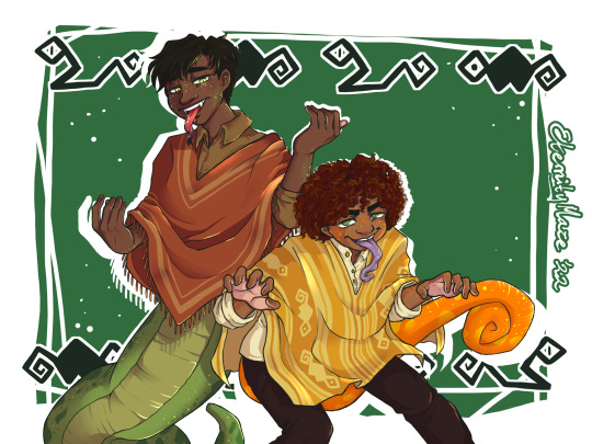
Snake and chameleon
(Original post date 29.03.22)
#encanto#camilo madrigal#carlos madrigal#mazedraws#certain parts of this I still really like#had so much fun with this#stopped watercolouring at this point#the solid colour process is just much more easy to work with#lends itself to more detail
25 notes
·
View notes
Text

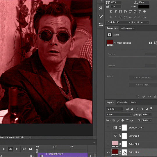
Thank you @cobbbvanth for asking me for this; I’ve never been more flattered! ☺️ I’ve only been making gifs for a little more than 2 years, so I’m really still only figuring Photoshop out, and my colouring owes everything to other people’s tutorials (some of which can be found here). To be honest, I was only asked some tips, but I have no clue what to include and what to leave out; so, here’s my complete (if random) colouring process.
NOTE: This is a colouring tutorial, not a gif-making one. The tutorial that taught me everything I know about that (and to which I am eternally grateful) is this one by @hayaosmiyazaki.
I. SHARPENING
My standard sharpening settings are:
One Smart Sharpen filter set to Amount: 500 | Radius: 0,4
A second Smart Sharpen filter set to Amount: 10 | Radius: 10
One Gaussian Blur filter set to Radius: 1,0 and Opacity: 30%
One Add Noise filter set to Amount 0,5 | Distribution: Gaussian
II. BASIC COLOURING
This is the part where I add most of the adjustment layers available and just play around with them. Obviously different settings work for different scenes, but I do have some standard ones.
Brightness/Contrast
I usually up the Brightness to +10-30, and the Contrast to about +10.
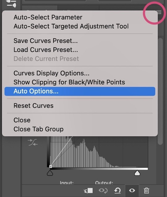
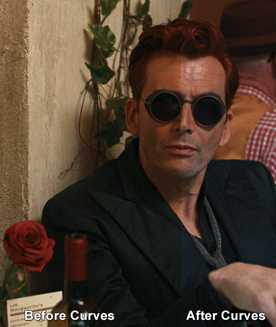
Curves
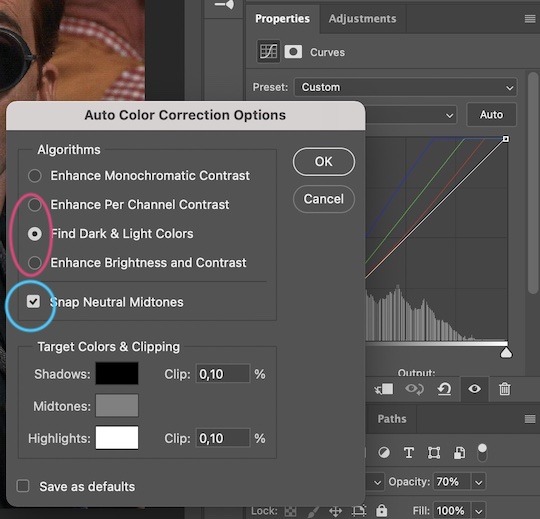
For the first Curves layer I go to Auto Options > Enhance Brightness and Contrast, and then adjust the opacity until I’m happy.
I might repeat the above step if the gif still looks too dark to me.
I add another Curves layer, I go to Auto Options and this time I pick either Find Dark & Light Colors or Enhance Per Channel Contrast, and check or uncheck the Snap Neutral Midtones option, until I see something I like. I will then adjust the opacity.
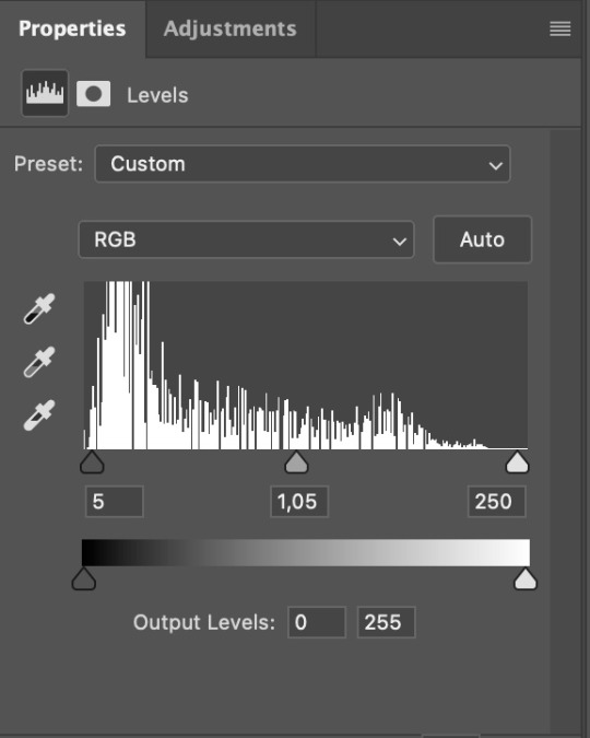
Levels
I add a Levels layer that usually looks something like this:
Exposure
I add an Exposure layer, where I usually set the Offset to around -0,0010.
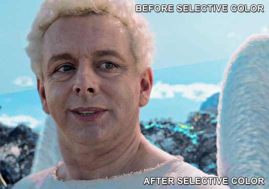
Selective Color
To make the faces look okay, I create a Selective Color layer, select the Reds and usually add some Cyan (+10-20%) and play around a little (±5%) with Magenta and Yellow too. I might also add another layer, select the Yellows and make slight tweaks there too.
III. FUN COLOURING
About colour manipulation: PiXimperfect just uploaded a tutorial that explains everything so much better than I ever could, so I highly recommend you go watch it. It’s made for static images though, and things are more complicated with moving images, so I also recommend @elizascarlets’s tutorial.
The reason I usually go for a softer colouring is that a more vivid one requires a lot of patience and precision, and I honestly can’t be bothered. Instead, I try to tweak the colous only a little, so that the edges can be a little rough without it looking too wrong.
One thing to remember is that each gif is different, and there isn’t one foolproof way to do this, so you will need to use a different technique depending on the gif you’re working with.
Okay, so, after I’ve decided what colour I want my background to be:
1. I create a Hue/Saturation layer and change the greens, cyans, blues and magentas to that colour. That’s easy enough, since it doesn’t mess with the face colour. I then set the blending mode to Color. If your background doesn’t include any yellow or red, you might be done here, like in the case bellow:
2. To change the yellows and reds, I create a new Hue/Saturation layer, select the yellows/reds, move Saturation to 100 (temporarily) and then play around with the sliders until the face colour isn’t affected. I then change it to whatever I’ve chosen and change the blending mode to Color.
3. If for whatever reason step 3 doesn’t work (the background is white or black for example, or just too red), I might create a Solid Color layer set to whatever colour I want, set the blending mode to Color and then select the layer mask and carefully paint with a soft, black brush over the people’s faces/bodies. I will then lower the Opacity, to whatever looks smooth enough. If there’s a lot of movement in your gif, you might have to use keyframes (see elizascarlets’s tutorial linked above). However, my main goal is to avoid using those; that’s why I try my hardest to tweak around as many Hue/Saturation layers as needed and not have to create a solid color layer.
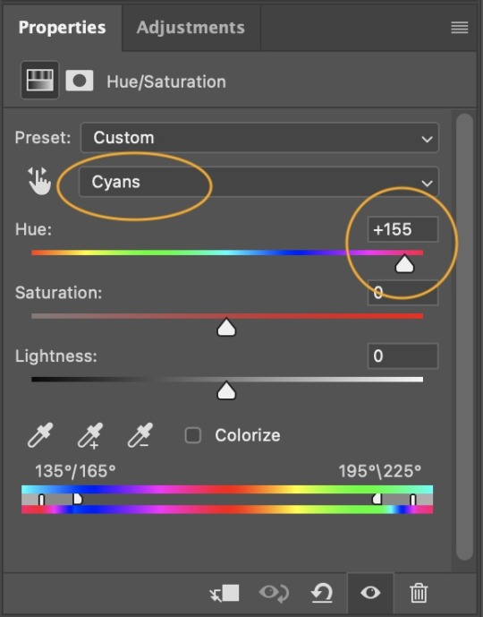
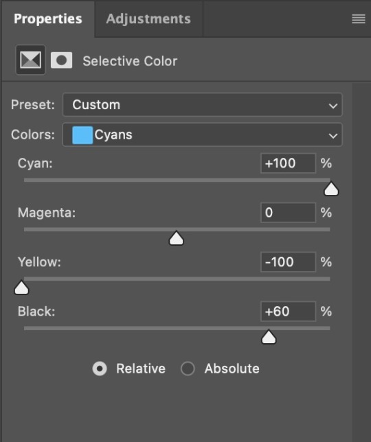
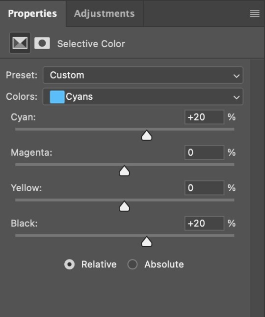
4. Once my background looks the colour I want it, I might add a Selective Color layer that matches my background color and then try to make it look more vibrant. For this Aziraphale gif below for example, I’ve selected the Cyans and then set Cyan to +100%, Yellow to -100% and Black to +60, then created another one, selected the Cyans again and then set Cyan to +20 and Black to +20.
5. If the gif has a white area, I create a Solid Color layer with a colour that matches the rest of the background and then set the Opacity low. I might also create a Selective Color layer, increase the Black and then play around with the colours.
IV. FINISHING TOUCHES
I create a Vibrance layer and set the Vibrance to around +30 and the Saturation to about +5.
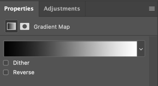
I create a black and white Gradient Map layer (with black on the left end of the spectrum and white on the right), set the blending to Luminosity and the Opacity to about 20-30%.
AAAND that’s about it I think! This ended up way too long and perhaps a little incoherent. I tried to make it as general as possible, so you might have to mix and match for best results. Feel free to ask me for further explanations about any one of these steps, and please tell me if you want me to go through the colouring of a specific gifset (although, as I said, I'm by no means an expert). Happy gifmaking!
#gif tutorial#allresources#completeresources#dailyresources#photoshop tutorial#chaoticresources#uservivaldi#userdanahscott#usersanshou#userfanni#userbuckleys#userrobin#tuserjen#userdavid#userzaynab#tusermimi#thingschanged#tuserju#usertj#userhallie#tutorial#minee
271 notes
·
View notes
Note
I really love what you do with the colors pallets. I was wondering if you had any tips on how todo them? I over complicate things, and I feel like I can’t do the pallets right, like is there a certain rule on color placement? Like the darker colour goes in the background, lighter further front?
… sorry 😭, other artists just make pallets look so easy, would you recommend using 3 or 2 colors to start with?
Sorry for babbling and thanks again 😂, honestly love seeing your art 😙, also, if someone wanted to gives your art/fic would you mind if they tagged you or would sending it in an ask be better?
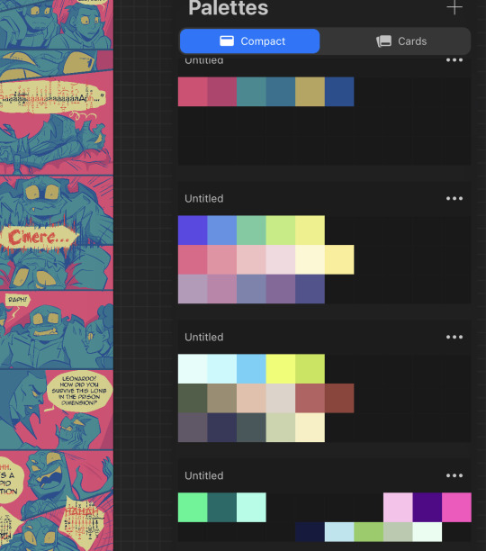
I’m still very new to choosing my own pallets. As for order, often I find the “pop”, or most saturated color works good for the background. Then for the characters, a less saturated version of the compliment color….or one that just looks nice. Then I do a light color for the eyes and any other elements I wanna emphasize. Lineart is done in black and then just alpha lock->fill layer with a color and slide around the adjustments until I’m happy. There’s not really a particular number of colors I think looks best, but I’m starting to like five color pallets. You can do three or even two, but five gives you some breathing room for variety.
A lot of it really is just what looks nice. I hate to say that, but there’s not an exact science behind it. Yes, you have to have knowledge of color theory, but also…It is just training your eye. Studying other people’s palettes, figuring out what rules they’re following, and how to play with and bend those rules.
This is why I will often go into the “color palett” tag for a starting point. But as a way to make them my own…I’ll do each color on its own layer. This way, I can change the hue/saturation/brightness and change, change, change, change, change until I’m satisfied. So much of the process is just playing. Play with one color, hop to another layer, play with that color, hop back to the other and adjust it slightly. And so forth. It sounds like a lot of time, but you get faster the more you practice.
This most recent color pallet actually started off as the THIRD row of colors, and then I just adjusted it until it was different, but still satisfying to me.
Finally I added one solid color (for this one I believe it ended up being a dark blue) above all the layers, and then just cycled through each of the adjustment layer types, until I found the one that looked the best. This last step is the clincher for tying all the colors together, and making them look cohesive.
Then colors are picked and saved. New pallet to use in the future!
134 notes
·
View notes
Text

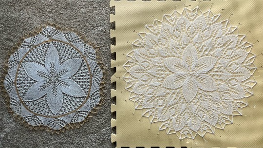
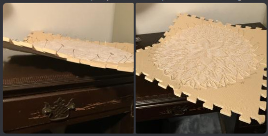
Man finished! I rate him a solid very cute out of ten.
This guy was published as a doily insert plus edging for a linen table cloth (seen Here). The linen part was of zero interest to me so I knit him as a stand alone doily and I very much prefer him as such. Chart A (the "doily") and Chart B (the "edging") match up for knitting in the round as a single doily.
Below the read more is going to refer a lot to the charts, which I got from the amazing Ramona French. While this is the only version of the charts I've seen, looking at the Rav page it seems to also be cut into A and B charts in the same spot. It makes sense in context of the original pattern but I don't like it, both for the reason i'll get to below and also because I straight up just don't like how it looks in the original pattern.
Even without the alterations I'll propose, I think he's a good doily just as he is. The problems I have are barely noticeable/nitpicky now that he's blocked out.
Starting with the edging vs doily distinction. This problem starts with the original pattern since it has you knit chart A for the insertion and chart B for the edging around every insertion and the linen tablecloth edges. But divorcing the actual charts from the linen, the charts really should be rows 1-31 of A as the "doily" and Chart A rows 33-41 and all of chart B for the "edging". The reason I'm so specific about this is because it's focus for any changes I would make. The end of chart A and the beginning of chart B flow together perfectly. It's where the doily/center flower ends (Row 31) and the edging begins (Row 33) that is the problem spot.

(I should've picked a darker colour foam to block this out on, sorry if it's hard to see)
The large center petals (doily) end with a yo, twisted knit 1, yo at the very tip. Then the set up row for the edging is all knits with a yarn over... that is off center of the petal. In a more personal gripe, I don't like how the mesh in the flower portion looks next to the edging. It's not bad (and would probably bother me less if it weren't off center) but it's not my favourite.
The mesh not looking nice next to the edging is an easy fix that comes directly from a doily that has a very similar feel to this one. Sechsblatt is another doily I've knit and also has a 6 petaled flower with mesh between the petals and an edging, but it's edging is separated by several rows of plain stockinette. In my revised chart I added just one odd numbered row of stockinette. I'm not 100% on this change, it's something that you just can't know if it looks good until it's swatched out.
The change I am 100% on is centering the yarn over to be directly above the tip of the center flower petal. There's a number of ways to do so, I'm honestly surprised it wasn't done for the original pattern. My revised chart moves the k2tog on row 35 to directly over the center stitch of the petal, which required moving the start of the repeat one stitch left. This also needs swatched out but I'm fairly confident it'll line up, at least better that just being blatantly off center like it is in the original, and since the k2tog was just moved instead of being added, the stitch count should still work out.
All other changes to the chart were simply made for personal preference/printing convenience.

Eventually I'll knit this revised version but I don't have a timeline on that yet, knitting the same thing multiple times is bad for my attention span. Regardless I would wait because I want to see how the crochet bind off holds up. I usually pin out every chain of the crochet bind out individually but I thought pinning two together looked really good on this particular doily. It made the blocking process a lot tighter. That could've been because I accidentally stretched it too much in the first place (I forgot this doily was 6 parts instead of 8) but it was incredibly funny to behold.
#knitting#knitblr#lace rot#lace knitting#doily#project: doily 13#he's so pretty ahhh!!#i'm minorly obsessed with his edging. i think it would look so pretty at like the edge of a skirt or cuffs or something#i'll have to come up with something to use it on that isn't so femme to make me dysphoric.#or i'll just add it to the edge of a shawl that i already don't intend to wear lmao
61 notes
·
View notes
Note
Can we know the thought process/inspiration behind jimmy and tango design?? I found it really interesting, with their shape and everything. So I wanna know if you don't mind ofc! :D
Sure!
to start with I specifically went in with the intent to animate them. Because of that I wanted to create a style that was simple and quick to draw, a lot of straight lines and such. So I created my mcyt style specifically for that (it's started to bleed back into my regular style between not animating for the last several months and raau which is more detail oriented, but...)
For that I took inspiration from kim possible, heartcatch precure, gatchaman crowds, pokemon, and other art styles with simplified, long lines, and kept the designs super simple and easy to memorize and copy over and over. I'm a very inconsistent artist so it only goes so far but... you know. I also simplified the facial features with the eyes and nose and such, and decided to use solid filled areas where their design utilized black. (Jimmy's talons and Tango's claws)
For Jimmy I knew I wanted to make him very birb. Not as much as some of the more harpy level monster boy designs grian sometimes gets, but a bit more than just wings and a few feathers around the ears. I took inspiration from gatchaman crowds and oofuri's bird mouth design for his smile to give him a beak. I tried out giving him a beak lip like I've done in some other designs but it just didn't look right and was too small a detail.
I gave him long bird legs with bird feet cause I love me some inhuman leggies and I knew I wanted him to hop and hold up his leg like a bird. A lot of his bird features had how I would animate him in mind (often still and a bit jerky and very expressive with his wings and eyes) I am NOT good with wings so I decided to go super simplified with them, I knew I wanted them to sit like a heart on the avians' backs. I started out also with a super simplified version of the elfish feathered ears I often give avian monster boys, and at first in my first animation I treated them like ear wings but it looked too awkward and unappealing so I decided to just make them elven, but animated.
For his eyes... I know there was a lot of people who said it was this or that colour. I wanted them to be a bit more spooky though, so I made them brown but gave him a blue glow for his avian self, which changed colours in his other iterations. I also made them big and round to be more expressive, cute, and like his very cutesy skin.
Buff Jimmy was popular by then but I 1) hate buff characters and 2) had a hard time picturing Jimmy that way cause he's so cutesy and squeaky around tango and his skin is adorable. Plus, buff didn't seem very birdlike to me. I did give him a bit of that dorito shape and wider shoulders than hips though. Actually I very specifically tought myself how to draw small butts to draw jimmy to give him that twig-legged bird appearance and cartoony and so not to have his design as sexualized as my other art tends to be (this was a deliberate choice across all my MCYT art) I didn't give him facial hair again cause I'm not a fan and struggle to draw it, I wanted the ranchers to be well within my comfort zone for easy animation.
I wanted to give him and scott- who have very similar and simple outfits - more distinction from each other, so I decided to make his denim and gave him a collar that was like feathers. I also made the choice to give him a very low waist line in his clothing to make him look longer, and because I just like that look. I made his jeans skinny jeans that faded into his talons because it just worked better, emphasized leggies and looked better. I made the choice to give him visible stitching to make it look a bit more like denim too.
Overall the goal was to get that top-heavy but clearly light enough for it to not matter look that a lot of birds have. Also I gave him a stray hair to make his hair look a bit unkempt and feathery. It's stylish but no kept well. I also wanted to give him freckles but I knew I wouldn't be able to keep them consistent enough without limiting myself in a way I didn't like.
I made him slightly taller than Tango, cause I love tall Jimmy and short Jimmy equally and decided on opposite ends of average, but that gaps been growing since tbh.
For Tango... He had a few major inspirations. Cats (lions specifically), fire, and Dr Drakken. I wanted him to look very mad scientist but like, also Creature. The main goal was that he should look ready to crawl up a wall on all fours at any given moment, and have an extra cartoony silhouette. He should look like he's probably made of playdough, and his actual build should be ambiguous.
The pants and sleeves I made puffy inspired by the likes of Magi and Dr. Drakken but sleeker cause the material is thicker and i wanted it to flow into the boots (my first drawing i have clear separation between boots/gloves and coveralls, but i ditched that in the very first frame of animations lol)
I tried really hard to balance out the fire cat features without making him look like a demon. I'm not sure how well I succeeded. If I'm honest the sharp teeth were very much self-indulgence. His tail I made a literal line because anything else looked too thick and I'm terrible at drawing thin tails, and this would be easier for animation. The hair I wanted to look styled but also maybe possible fire but you cant tell quite? I wanted to take advantage of them being cartoons for effect with this art style.
His vest I'm honestly still not sure if it's leather or denim. I just knew I wanted something thick and insulated-looking. I wanted his clothign to be somewhere between engineer and punkish. You know he listens to his music too loud while working on some machine only he understands. And the kerchief was a decision made via a comity of my friends after trying out a few collar styles. His eyes I wanted almost shaped and smaller than jimmy's just like his skin, but still very expressive.
I also gave him a rougher appearance with the wild hair and eyebrows to give him... mmm... ugly isn't the right word, cause he's not. Jimmy is intentionally pretty, while Tango's kinda... feral, unkempt, a tad scary but in a silly way, a bit more goblinoid. Not conventionally attractive, I guess, but that's incredibly vague. I imagine his appearance being described in its movement first and foremost. If any of that makes sense...
But yeah most of his design is defined by sharpness and fluidity. He is liquid but like... a liquid made of knives. I try to make sure his face is a little shorter and sharper-chinned than Jimmy's. I wanted him to have very bombastic movements like he is living motion blur but very pointed. His movements probably come off a bit more masculine than Jimmy's in general, but that's not really something I intended so much as turned out to be an unforseen side-effect of my other design choices.
And, um, well that's it without getting into things I decided later on and other versions of them. the general concept is they're both very animated and cartoony but if very different ways, and take after birds and cats quite a bit. Sorry, this turned out to be A Lot. I really did spend a lot of time thinking about their designs while making them, since I knew I'd be drawing them over and over for animations.
65 notes
·
View notes
Note
I love your bleach paint shirts they are amazing and you look incredible 🌠
Would you by any chance have any pointers on how to get started with that for someone who'd love to do stuff with bleach but has zero idea how it works nor much artistic talent/skills?
Honestly the reason I'm so into bleach painting lately is that I tried it last year and discovered it is like. CRAZY easy to do. all you need is regular household bleach, an area that it's ok to get bleach on, and a paintbrush. other stuff that's useful is electrical tape and card (for masking/stencilling) and a good spray bottle/mister. Recycling the kind of spray bottles cleaning products come in will give you a very blotchy/streaky effect which looks cool but will probably not stencil super well in my experience - I use a hairdressing mist bottle for stencils that gives a really even coverage.
As a step by step, my process looks like:
Put on light coloured clothes/clothes I don't care about, make sure soft furnishings are well out of the way, and cover any fabric (I have lino floors so usually just move the rug and work directly onto the floor)
Get the clothing I want to work on and put some thick cardboard inside it to hold it flat and make sure I don't bleach through onto the back
Draw out a design in however much detail is useful to you. I use a white pencil so it shows up well - dressmakers chalk would probably also be a good shout.
Cut any stencils I want to use (card, cartridge paper or tracing paper all work but bleach will just soak through regular paper. I have also had solid results cutting shapes directly out of gaffer tape) and stick them on with double sided tape.
Pour some bleach into a jar to work with, put bleach in the mister. Make sure you have some tissue or paper towel on hand bc bleach does go everywhere.
Paint with the bleach! I just use regular nylon paintbrushes for this. You should see the line developing almost straight away, but it might take a while depending on the fabric - sometimes you have to paint a bit blind while the bleach takes a while to work. Resist the urge to paint over it again until you've given it plenty of time!
Rinse it when you think it's developed enough! As soon as I'm done, I take the shirt to the bathroom, take the cardboard out, hang it up in the shower and just fire water at it. Once the water runs clearish, I rinse it properly in the sink. I do the shower step to make sure I've taken off a decent amount of the surface bleach before I submerge it cause I worry about the bleach spreading, but it may not be a necessary step. The water will probably run rust-red or grey for a while - that's what you want, that's the dye washing out of the bleached fabric.
I usually hang it on the bath for a tiny bit to drain off and do any last bits of developing, then stick it in the washing machine on a rinse/spin cycle.
Once it's dry you did it! New t-shirt!
Strongly recommend buying a good few plain black t-shirts to practise on and try out techniques with ☺️ I may go to fast fashion hell for this but I have a box of like 5 black shirts in my wardrobe that I replenish regularly for when I Get The Urge - I get ones that are like £3 from supermarkets and Primark/H&M and hoard them 😅
More details under the cut:
Some stuff about the properties of bleach:
Compared to pretty much any paint, bleach is SUPER viscous. Putting a brush in and pulling it out will stretch out a long string of bleach, and you have to reload the brush a LOT because it'll really only do one brush stroke because bleach likes to stick together
There's a temptation, always, to water it down to make it lighter or easier to work with. DON'T DO THIS (except if it won't come out of a spray bottle without it, and then water it down SUPER sparingly). Reducing the concentration of the bleach will extremely suddenly take it from "will give you a clear bright line" to "the fabric is very slightly paler if you squint in the right light"
The wetter the fabric gets, the more all the bleach will spread. So the more layers of bleach you put on the surface, the less crisp and more glowy the mark gets. In particular, cause spraying the fabric gets it fairly wet, I would always advise doing most spraying and stenciling last if you want to mix painting and stenciling.
Bleach obviously develops over time - depending on the fabric and the concentration you should get a fairly clear idea of how it's going to look after 5 minutes or so, but it will keep developing for a while and it looks a bit darker when it's wet, so you don't 100% know how it'll turn out until it's washed and dry.
There's two ways to moderate tone in bleach painting:
How much bleach you put on the surface (which you can control either by how much bleach is on the brush, or by layering up several rounds of bleach...remembering that the more you layer it, the blurrier it gets)
How long it sits (there's an upper limit to this - if it's been 10 or 15 minutes and it's still not as bright as you want you probably need to go over it again)
Because of this, you always want to start with the stuff you want to be brightest - so, on the ACAB design I started with the highlights on the lettering and the pig, the white squares on his hat, and his white fangs. Then I did the outlines, then worked down from brown to black.
Design notes:
You can't rely on getting crisp edges when you layer bleach on bleach, so I think it helps to leave some empty space around key details like lettering (like a black outline). One thing I've been experimenting with is masking areas off with cut out electrical tape or gently stuck-down card stencils that cover slightly more area than the design so I can work on a background without making everything a blurry mess
It's also very hard to rely on how dark or light an area will come out, so if you try to do bright white against dark brown, you might end up with a whole area of bright white. So again, outlines and empty space are your friends.
Bleach does spread and it is heavily affected by the weave of the fabric, so don't rely on getting tiny clear detail
Cool stuff bleach can do:
Spraying from a mister, spraying from a spray bottle, and just splashing/dribbling/throwing bleach directly onto the surface all give really different and fun effects and it's really nice to layer those up imo
Because of how viscous bleach is, you often leave drops and trails of bleach unexpectedly when you move your brush. this is a feature not a bug it looks Cool And Punk and you can use it to add interest
Different fabrics go different colours. Some go bright white, some go orangey/yellow - if you're really lucky, I've seen some t-shirts that go a really reddish orange and you get some cool bloody effects like that. As far as I can tell, fabrics with a higher cotton content are likely to go brighter (my denim jacket has gone almost bone white under concentrated bleach whereas most cotton mix t-shirts I've done go a fairly bright yellow/orange) while ones with a higher synthetic content may bleach a bit darker/greyer/murkier.
One other note is that bleach does damage the fabric's integrity a tiny bit. Not much, but if when you rinse it the back side of the fabric is more or less as bright as the front, you might want to treat the shirt with a little more care than otherwise - it's not a huge issue, but a few of the shirts that my partner made a few years back have started to develop holes in areas where there's been particularly heavy bleach.
33 notes
·
View notes
Text


Down go breaking my Side: Downside Runners-Up
As promised, here's the other folks! When have I ever let you down?
Stay of Existence by @hiygamer
Oblivion Ring for one mana is definitely no joke, but the fact that it only lasts two turns (barring shenanigans) does definitely change the mental math on it. It’s still definitely worth playing, since two turns can be an eternity if you time it right. It’s reminiscent of Suspend and a few other temporary removal spells, which are good for keeping yourself safe while avoiding drawing too much ire. Unfortunately with simple cards like this, I do kind of run out of things to say, but it is a very solid uncommon design, and I could see this being slotted into to Modern Horizons 3 with ease.
Thran Devastator by @bread-into-toast
Whoof, now THAT’S a downside. Losing all your lands for this hydra is gonna hurt for sure, but if you do it right, this is a massive beater. This wants to go in an incredibly specific deck- namely, a five-colour deck that still plays enough artifacts to make proper use of those powerstones- but if you do the work and get some luck, this can end the game for sure. Obviously the perfect play is to pop this on turn 5, so that you don’t lose any extra lands and end up net neutral on mana. Even then, it’s a big downside for something that easy to remove, but hey, so was Phyrexian Dreadnought. The secret is to never play it fairly, I guess. My one quibble is, why does the ability grant haste if the powerstones enter tapped? There seems to be a bit of a disagreement as to whether you should be able to attack with it right away or not. All in all, this is a fun card with a massive downside, and it makes my brain start puzzling things out in ways that I love.
Aether Processer by @snugz
Cut your effective mana in half, in exchange for the best energy producer in the game? That’s a big ask, but oh boy could it be worth it with the right deck. The fixing is a bit of a cherry on top, but it definitely does help make this card a little more tempting, even if it could definitely screw over some overly greedy players. Honestly, my only gripe with this, and it’s a minor one, is that Aether Processors are essentially ubiquitous throughout Kaladesh, since refining it is their main thing, so what makes this one special? Give me some neat worldbuilding deets! What does it look like? Who made it? Does it do something special, like have a 100% efficiency rate? This is mechanically awesome, and I just wanna understand where this fits in the world.
I'll see all y'all sometime next week for the rest of the commentary. Until then, ciao!
~judge @naban-dean-of-irritation
#mtg#magic the gathering#custom magic card#inventor's fair#commentary#runners up#come to the down side
8 notes
·
View notes
Note
Hey. I love your art and the style, I admire them very much.
I'm still a newbie in art. when I saw your artwork first things got me was the strong lines and volume and made me to think how can I add more volume to mine to look less flat? all my works look very flat, and the lines lacks any energy, so any tip that can help me would be great!
Hi, thanks very much! It's such a treat when someone says they enjoy my style!
As to my lines, the main thing to note is that they're traditional, either graphite or ballpoint ink, which I then scan in to colour. And beyond that, my number one rule is to Stay Loose when you're first sketching. So don't sit with your nib locked in place, but rather draw with as much of your arm as you can (this is why it helps drawing on an A4 piece of paper on a desk, so I'm not confined by a screen). Let the lines overlap each other where they need to be darker, if you want to emphasise a certain region's contour, add some more lines!
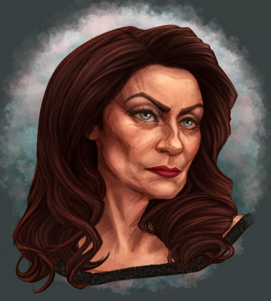
Here's a lil zoom on my most recent portrait that shows off the method:
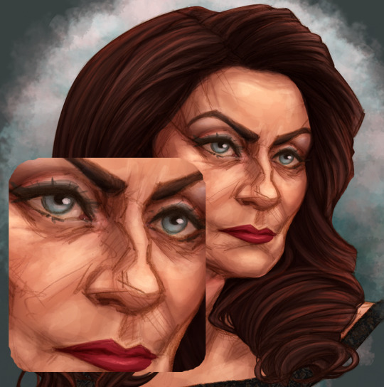
All the scritchy-scratchy lines provide a loose 'context' for the shapes, but then extra lines come in to reinforce the truly important contouring and convince the eye of the whole thing.
As to the "volume", I'm guessing you mean how I show depth by shading? Once again I always try to stay loosey-goosey, and really not focus too much on where strokes end up until the very end. To encourage this behaviour, I use a fairly large brush head (basic hard, round brush in PS) at varying opacity, and treat it like real paint, just approaching each thing I'm focussing on (like lips for example) with various angles of stroke until the core of it feels deep.
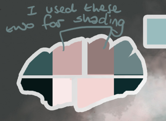
Make a colour palette as soon as you start the art! This will decide what overall tone your art has, as well as giving you easy access to colour picking as you paint, just like a physical artist's palette. I give it its own layer at the very top (so that it's not affected by any other layers). First, choose your middle colour, then darken one part of it like 50%, pale one part by the same, and if you want to, make even darker and paler portions. Then duplicate the palette and invert the colours. This will give you a set of secondary colours (either warmer or cooler) that will automatically fit in with your main colours -- Hacks!! You can use these colours to add depth and mood to your piece, by shading with them rather than the primary palette.
All that said, my shading process works like this:
(2.1 - I often add blush to a face at this point, as that ends up with a less even, more human feeling to the skin. )
1- base level: This is the colour of the area, the one you'd either pick with a colour picker, or what you'd try to eyeball as someone's middle-most skin-tone.
2- gradient: This layer is optional, but if I'm trying to get a realistic depth rather than more cartoony, I'll do this layer. It subtly follows the shape of the object, and probably won't be very visible until it's layered by the next shading level. Set this layer to multiply.

( 3.2 - make-up!! As a treat, it really gives me something fun to do early on.)
3- first shadows: Here is where I start defining the details, first with a brush that might seem way too big for the space -- but it's set to low opacity, so you don't have to worry! This is working from biggest brush to smallest, as you get closer and closer to the focal point of each stroke. This layer can be set to a basic multiply too, but if I'm going for something more dramatic, I'll use linear burn.

4- secondary shadow: This layer is where you gotta be a bit brave! When one is shading, it's easy to be too subtle, to make something look realistic. But then at the end, you find it's so subtle that it can look flat! Focus on the deepest folds in the image, including where areas are draped over (like the back of the neck, where hair is most solid).

5 - primary highlights: Here's where things feel properly Shaped for me! Where the skin is tightest across the flesh (so over bones or cartilage), we can throw some bouncy light to bring it to life! Don't worry about going overboard here, just use the Screen or Linear Light setting while painting, so you can see clearly what you're doing, then change it to a more fitting blend mode later if you need to.
One option is to choose a unifying colour, add it as its own layer, then toy with the layer setting (multiply/overlay/hard light etc) and its opacity, to get a feeling you like. Don't stop there tho! It might make things a bit flattened. So then you want to go into the Levels or contrast settings, and bring back some of those lighting curves!
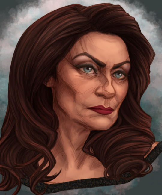
6 - secondary highlights/ eyelights: This is for any surfaces that are especially shiny, or are getting secondary lighting from something around them. With this art that wasn't the case -- I had intended to do some sunlight hitting her from ahead, but then forgot lol
(And yes my eyelights were on all the screenshots already, sorry, I do them first so my art isn't staring all creepy at me)
7 - unifying and balancing (optional): Say you've done a great job with your palette and everything looks balanced, but you *still* feel like it could hang together better, or you just want to make sure. I generally make a ton of versions of my pieces, so I'll use a combination of methods as I play.
In the case of this piece, I added a peachy tone set to Overlay mode at 10% opacity, to soften everything (subtle, but it's there!).
As well as adding tint layers, you should also go into the Colour Balancer menu, to give yourself a more accurate sense of whether you're going overboard with your warm or cool tones in the high, low or mids. Often even if I think things are really well balanced, I can end up looking at that menu and realising that my shadows are WAY too red, and dialling it back can give a more natural tone. Staring at a piece for hours and hours can make it really hard to tell without this tool.
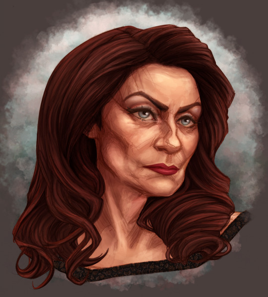
Using the colour balance menu, I came up with this very satisfying version:
I hope that was helpful, and that you'll link me to any thing you'd like me to check out in specific. (^_^)b
2 notes
·
View notes
Text
Week 4 Studio Tutorial - Perspective Drawing
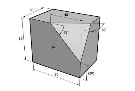
For this week we were looking at the different types of views in terms of how to present a object/product in a real world view, showing it’s solidity, shape, overall presenting its structure. These views are Axonometric, Oblique and Perspective. For this week we are focusing on perspective, and using 2-point perspective to present a chamfered cube (pre-class activity)
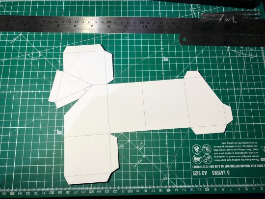
PRE-CLASS ACTIVITY
This pre class activity we had to make a chamfered cube, to be able to get a better grasp in perspective views as well as to help us in the tutorials exercise. Before cutting and scoring the card I practiced by cutting out the shape after printing it, then pasting it onto harder card that makes it easier for me to craft the cube. Overall it was a easy and slow process but it felt good since it was straight forward. However constructing the cube I had issues in making sure there were no holes when putting the chamfered cube together. This was most likely due to my folding even after scoring the paper. If I was to do this again I would cut some areas fully from the scaffold to have those clean corners and edges.


PART 1
Onwards to the tutorials exercise we were tasked to present this cube in a 2-point perspective, presenting the side and top view as well. Before starting this task, I had trouble grasping the technical points of the 2 point perspective as I usually free hand draw these types of perspectives before. So learning the accurate perspectives rather than estimates was a issue I was dealing with. But looking at the slide material and videos I understood the content and began to construct the views on A2 paper. Also doing sketches of how the 2-point perspectives should look like on A4 paper first helped me visualise what I needed to do but on a larger scale


After learning the step by step process of 2 point-perspective drawing it was nice to physically draw what I now understood. I thought there was certain dimensions for the gaps between the Perspective Plane, Horizon Line and Base Line, but it only mattered depending on the perspective you wanted. Being A2 size I had to change to working on a bigger table that didn’t have access to good lighting. So sorry in advance for the poor image quality as apposed to last weeks. To answer the question in the tutorial, I would’ve gotten the same perspective view given to us if my vanishing points were just a bit closer. So if I had to do this again, I would test in which vanishing points give me the best replicating view.

PART 2
For this part of the exercise we had to do the same 2-point perspective, except its just a cube and the perspective would be a bit far off in the distance. When constructing the cube I decided to still use the dimensions of the chamfer cube, to see if I can continue to create that same consistency of lines when drawing the same object to help myself for future scenarios where I have to draw a object in multiple views continuously. Constructing the cube after drawing the chamfer cube, the process was more faster than before as I've gotten use to the steps. I dont think I was able to make the cube look as if it was from a distance though. This could've been done If I brought the vanishing points much closer than before, something to remember if I do this again.

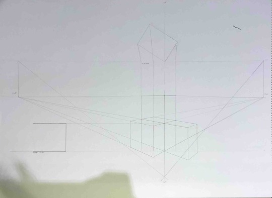
Part 3
This exercise we had to form eclipses inside the cubes sides that are exposed in the 2-point perspective. Constructing the cubes and perspectives went the same as Part 2, fast and easy to draw. I labelled the major and minor axis with different colours, orange and turquoise for easy differentiation between the two as well as to make it clear to the viewer. When forming the eclipses I had trouble getting a consistent curve on each arc when its sectioned into 4s on each side. This might've been due to my lack of practice before forming the eclipses. If I had to do this again, I would draw circles/eclipses as a warm up before doing drawings that need curves. Overall I think I went well in learning the fundamentals of this weeks content by looking through the slides and reading carefully, not really focusing on how clean lines are. If I had more time for this exercise, I would finalise the perspectives with pen.
(Couldn’t add more progress photos cause tumblr allows only 10 photos- the more you know!)

2 notes
·
View notes
Text
vision board 2024
manifesting is such a passive word - it brings to mind just sitting back and hoping things work themselves out magically. resolutions/commitments make me run the other away because of how boxed in and rigid they make me feel.
...I think we'll go with
aligning
because this feels more like an integration of my values with my goals, and taking conscious action to work on these. also "aligning" just has this soft pretty sound-feel to it. hehe. also in my head it doesn't feel abrupt, "aligning" seems to make space for the process of getting there - there being that space of satisfaction-with-self+sense of achievement (real or Atlantis, do you know?)

shadow
I've wanted to be a psychiatrist since i was a 13 y/o -> i've been studying for this exam unemployed since Mar 2022 -> the initial enthusiasm has died down, I've written 3 exams which didn't turn out to be as good as I wanted -> cut off from the hospital-world, in my little farmland cocoon, with no one else around me in the same - or at least similar - boat, after 2 years of being at this with snail pace improvement, it's hard to remember the big picture and why I'm doing this and to stick to it -> i'm feeling very behind my peers -> the behind my peers doesn't bother me as much because I chose this life for myself -> what bothers me is that I am too unmotivated to re-study everything - repetitive tasks don't come easy to me -> repetition is key to building memory and understanding so many concepts better -> I have mad perfectionist traits - it's a self sabotaging all-or-nothing mindset i'm struggling to break out of -> I get overwhelmed by the amount I have to do, often describing this exam-prep-process and trying to empty the ocean with a bucket -> I give into instant gratification just to numb this overwhelm, I come up with a 100 other things to do - again, just to escape the overwhelm -> i'm unable to enjoy anything i do ever because i always feel like i haven't studied enough+i'm aware that i'm running away from it -> studying has now become an anxiety, low self esteem trigger
in alignment
• remembering why
psychiatry, unpredictable hospital days, listening to people and being able to connect, coming from a place where i have solid knowledge to offer help, to help, to understand and to be a part of everyone's crazy human experience, to meet people from diverse backgrounds and places in life, hospital corridors and ICUs and co-workers doing their best to diagnose and treat, nurses tending to patients, curious questioning minds and hospital banter, going home at the end of the day feeling like i've learned so much, but still have a 100 new questions, and knowing that at least a few people are better off now than they were when the day started
• tapping into strengths
- i love studying - ironic that this is my #1 strength, given that i'm having so much trouble actually doing it - but it's the truth. i love it - love learning new science-y things, the more complex the concept the better, i love breaking things down, making notes and diagrams and sprawling mind maps. i am cute stationery all over my table and colourful sticky notes, highlighters, impeccable organized notes and all the mess that comes with it. when i actually get down to it, i can lose myself in it for hours and feel so fulfilled.
[as skeptical as i am about MBTI (sitting on the fence per usual), this is the best way i know to describe this. kudos]
Ne is good for developing a very broad knowledge base; being creative in connecting existing ideas/details into new possibilities; enjoying the process of discovering or exploring new possibilities
Te is good for strategizing -> breaking down a goal or the learning process into linear steps; good at organising information; can pinpoint what's the most important thing to learn; good at picking out strengths and weaknesses
• the challenge - working on weaknesses
Ne overpowering Si overlooking/dismissing important details that are critical for success; trouble sticking with a subject long enough to reach high level expertise; too easily distracted by new ideas to develop any of them to their full potential; difficulty prioritizing what to learn and when; undervaluing the necessity of maintaining regular habits; difficulty learning in environments that require extended focus and strict adherence to procedures (in which there is not enough time/space to explore ideas)
harness Si
strategize for methodical learning -> beats overwhelm, allows me to make the best use of time;
structure the concept at hand (table of contents or the headers are great indicators of the order in which the information should ideally be learned. my good Te also means i can come up with a good step-by-step process for myself); skipping around too much esp. b/w related subjects ADDS TO THE OVERWHELM and also, makes it harder to build ideas linearly/sequentially (vs my chaotic branching street map way) -> more likely to miss important details or shift attention elsewhere before developing a solid understanding of the concept at hand; the structure of the concept is also an easier way to keep track of what i've missed out on;
go from broad based knowledge to nitty-gritty detailed knowledge -> express and clarify my ideas in detail + apply the ideas in practical settings (tests, MCqs, discussions);
create linear benchmarks or checkpoints to reach in succession;
• temperance
having a strict no study beyond this time hour on the clock and sticking to it, even on the days when i feel like i have more in me
chill time isn't just to do chores, but also time to invest in things i actually i enjoy doing - which isn't only hanging out with friends, but also things i like doing by myself. all the pictures on the yellow part about making art, reading, deep listening to music, self expression - these are things i find very fulfilling. also, NOO GUILT while indulging in all of this, because if my mind is exhausted - irrespective of whether that's ideal or not - it's ok and normal to tend to it - and it is NOT A SELF-HATE POINT.
shadow
anxiety//hating my body//self-soothing with binge-eating and doomscrolling
in alignment
menty b has been the vibe of '23 - to say NO MORE would be wishful thinking, so i would like to at least say, i don't hate you, brain, for all the menty bs. i love you, i hear you, your tragic-victim-dramas are valid, i'll embrace them, sink into them and feel them instead of running away - but also, i'll hold your hand and hug you and we'll work our way out of this. i hope to work out that precarious balance between accepting my feelings and also parenting myself through it - and i mean, not omg you frustrate me you piece of shit burden parenting, but clear headed warm empathetic but i'll call you out kind of parenting.
healthy body image//healthy relationship with food
two terms thrown around the internet right up there with "self-love" and i cannot tell you enough how sick of it i am. but WELL, here i am, another one of those women caught in the eternal struggle with these two.
and - for the amount of SEO-ed articles i'll hit with these words, there's a serious dearth of actual practical hands-on information about how to get to the bottom (fulcrum?) of this see-saw. so ig the vision here is figuring out my own way through this all the while staying true to my values, and what is really good for me vs. the boxes and norms i'm being pushed into by society.
anxiety galore
understanding the roots and triggers of my anxiety, learning to sit through its discomfort and also, teaching myself new coping mechanisms to make it out of this discomfort without resorting to instantly gratifying self-soothing that really does more damage than harm in the big picture.
shadow
obsessing about the numbers on my scale, feeling like workouts have to be decided based on how much I've eaten the previous day, overall just spending more time feeling like I workout to look good vs work out to feel good
in alignment
on the good days running, walking, lifting, stretching all of it are really about savouring how good my body feels doing it. movement really makes me happy - also, I FORGOT TO ADD DANCING - just can't get enough of dancing aaa. but yeah, since forever, nothing cheers me up like movement. i love these little moments i have while working out where i really appreciate all that bodies are capable of. think actin, myosin, sliding filament -> muscle spindles, golgi organs, spinal and cerebellar and cortical control -> nerve impulses -> feeling those muscle fibers moving - it is such an honor to be alive. i love it. and i want more of my time spent working out and my drive to get on the mat to be more about this, and not this voice in my head counting down from 83 to 65 kilos and the internal head banging and misery when the scales don't move in its favour.

shadow
i can write a whole essay on my relationship with food - and i can promise you it'll be a trigger warning laden fucked up love-hate story of the forbidden-bad-boy-who-fucks-you-up-but-i-want-you genre. we'll save that for another time. for now it's the tldr - food has been a huge source of equal parts comfort and self-sabotage in my life, and i do not know how to temper this into something healthy.
in alignment
more so than body image, i have real exploration to do here. i want to really understand my values around food, and then work my way into how to align with these values. for now, there's vague bits of
food is fuel - which i find too idealistic and dry. especially given my culture, upbringing and love for cooking (chemistry and art combined!!!)- food as a pure energy source doesn't entirely cut it for me. but i definitely resonate with the fact that, stripped off the cultural significance and the emotional power it holds over minds, this is all it is. this is what dictates how much my body actually needs to thrive, and it dictates the food choices that would be beneficial for my body vs feeding my monkey-mind.
food makes me happy and this is something i needn't guilt myself over as much as i do. it's normal and natural. i also like the cycle syncing system i have (and struggle to execute in a healthy way) of eating what i crave for at different times of cycle because it just feels fulfilling - and there is nothing wrong with that.
practicalities like take-out and processed foods are too often time and energy efficient. eating out socially is a cute way to bond with fam & friends.
ethical consumption and this explains putting my honor-nature-value along side food. i'm not an aspiring vegan, and i also am not okay with the meat, poultry and dairy industries. but heck, what industry am i even okay with really? is the agricultural industry any better just because plants and soil and little bugs and critters are harder to emotionally relate to? but also how are you supposed to feed exploding urban populations and earn enough to sustain yourself comfortably if you don't MAXIMIZE PRODUCTION? ---as is quite clear, lots of figuring out to do here. but i am happy to announce that one thing i can be certain about are the markets featured on my board which are a reminder to buy from local producers vs corporates.

in alignment
social looking back at '23, i cannot believe how often my social plans have been let's grab a meal together and let's chill at someone's place - "cannot believe" because this is the exact city-life norm that i dislike and was most excited about not having to stick to living in a place like Goa. i understand the convenience of it, but i really want to actively make more plans that are outdoors, I FORGOT TO INCLUDE DANCING AND GREAT MUSIC PARTIES in my board but yeah, that's what i want more of - adventure and excitement, and i hope my friends and fam will be onboard for this.
harmony like real internal-external everything-is-in-harmony is something i stumble upon so often outside in the wild and ok, the wilderness i have access to rn is tame, but i love it with all my heart. i really, really, really want to roll around in grass, get tanned-sandy-sticky on beach days, huff up a steep hike, get stuck atop a tree because my fear-of-heights kicks in before i figure my way down, swim where my feet can't touch the bottom and my water-anxiety is yep - there in the background per usual - but i fuck-you it happily, find cute bugs and make friends with frogs, dogs, birds, cats. also i really want to go on a picnic and eat chutney sandwich, bro.
love ///private thoughts on boyf, friends and family (which includes koka and suzie)/// along the lines of fulfilling healthy abundant non-judgmental love given and received allowing everyone to grow in their own weird ways in the safety of knowing there's a fall-back space. ALSO TO WATER MY PLANTS.
money this is literally just to get done with my exam and be in a place to have a job that pays me good. also, to stick to my figured out financial system - trust me, it is pretty soundproof - i just would like to stick to it. consistently.

shadow
my vague vaaague sense of spirituality - where do we begin. i think, yeah, i'm definitely bothered by the vagueness of it. it always keep shifting and that i can handle - but i'm currently in a never-seen-before flux of i-don't-know-and-trust-ANYTHING.
i think of spirituality
1. as a belief system
a. to make sense of the unknown and un-controllable
b. to find meaning in a pretty pointless existence
2. and a practice that connects me to all my values which are little dots that add up to my sense of a "good person".
my anxiety has thrown 1a into complete disarray. 1b is thankfully intact - has been so since '21. 2 is now a myriad of things i keep switching between because my brain convinces me that nothing is really working.
i'm curious to know how people without spirituality as a base function healthily - i hope to meet more people who are comfortable being a-spiritual. as for me rn, it feels plenty disconcerting - and i'm actually pretty surprised by how, without even realising it, it's been pretty foundational in my sense of well-being.
the funny thing i've noticed - and i'm ashamed to admit, haha - is that when i'm feeling mentally unhealthy (anxious, apprehensive, lost, depressed, very very scared) - that's when i start to turn to things like those predicting-type tarot spreads, reiki, making unhealthy wishes and hoping there's a god-like-being to bargain with etc. - basically all the stuff my rational brain considers plain silly. i just do them because people say it works. i'm not okay with this. doing all of this gives me a weird feeling in the gut which - i'm struggling to put into words - is something along the lines of -> disliking the disingenuity it sparks because i know i'm doing them out of desperation, hating the feeling of "stooping low when i'm desperate" and just...not trusting what i don't know. i don't know if all of these things are real, i don't know how exactly it works, so i don't know if it's all good or if there's bad, and if things come at a cost or just well - okay, tldr i'm agnostic and my agnosticism gets uncomfortable.
in alignment
catch me in the throes of my anxiety and i'll say otherwise, but honestly, the vagueness of my spirituality-vision excites me. it feels like a near-blank slate and the curiosity that sparks is very fun.
temperance i love tarot! the symbolism in the cards are so ...open to interpretation - and that, to me, is wherein their power lies. i'm not a proponent of the "the-spirits-guided-me-to-draw-these-cards-for-you" but it's more of how i can look at all of this (pretty) imagery and find ways to apply it to my life - i think my conscious and subconscious come together and draw some meaning, you know? it's like reflecting on art - and that in turn being a reflection of your own mental state.
ANYWAY. temperance because that is the theme of life. there's no such thing as too much temperance.
roots and a leaf going with the flow it's almost comical the way my brain works - i love roots. i love big snaky roots and the strong sense of security they give me. when i'm feeling too crazy/anxious/floaty picturing roots actually grounds me - and immediately, my brain will go yeah roots for solid foundation BUT ALSO I DON'T WANT TO BE TIED DOWN - and my brain will reflexively put up this picture of a leaf going with the flow (wind/water). it's interesting how both extremes are hard anxiety triggers - a sense of feeling too tied down, and a sense of no grounding at all. and a big part of my spirituality exploration this year is hacking this anxiety problem - so yeah. strong, grounded, practical and secure, but also wild, free, floaty and moving and exploring - that's the vision.
0 notes
Text
What tiles to choose for your home
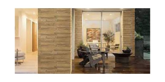
Choosing tiles from the huge available variety can be very difficult task. In this article we will give you some guidance, hopefully, helping you choose the right ones.
Ceramic or stone tiles. Firstly,What tiles to choose for your home Articles choose tiles best suited for the particular room functions. There are basically two types of tiles – ceramic and stone (porcelain). Stone tiles are suitable for outdoors (terraces, balconies, steps, etc). These tiles are resistant to weather elements – frost, water, frequent temperature changes, they don’t crack. Stone tiles are made from stone dust, thermally processed. These tiles almost don’t get water saturated and don’t need any maintenance or water proofing, and they are very hard to scratching.
Ceramic tiles can only be used indoors – bathrooms, kitchens, hallways. New design trends show that tiles can be used even in living rooms. While use of ceramic tiles is limited because they are easier to scratch or break, stone tiles can be used anywhere you want.
Size of tiles. Usually we suggest our customers using smaller tiles for small bathrooms. If the ceiling is low, vertically higher tiles will help create an optical illusion of higher ceiling and if the room is very small horizontally larger tiles will help visually enlarge room (while visually lowering the ceiling). Big size tiles are very difficult to work with – surfaces have to be ideally level, need a lot of cutting if surface area is small. Usually big tiles are used together with some strip of small decorative tiles, achieving some nice design features. Small tiles or mosaic give more freedom to some design solutions – such as creating rounded corners.
Grout lines. High quality tiles can be laid with just 1mm gaps – grout lines are less visible, creating impression of the solid wall. Tiling in this way is much more difficult – tile crosses can not be used and tile guidance is done only by eye. Lower quality tiles in different packages vary by size or colour tone. These variations are minor, but still visible when gaps between tiles are small.
We always advice to grout floor tiles in darker colour – it’s much more practical, because light grout will only look nice when it is new and it’s not possible to keep that way – over time it will get dirty and it will be visible. Wall tiles usually are grouted with lighter than tiles colour grout.
Tile colours. Times when it was fashionable to have bright coloured tiles are passing. Bathrooms are now becoming relaxation rooms not only to have a shower but to relax after work or even have some romance. Too bright colours may cause changes in mood while neutral colours will always be fashionable. Presently cream or white colour tiles with some inserts of brighter tile strips are combined together with contrasting colour accessories.
Easy to clean or non slippery tiles. Sometimes people have impossible requirements for tiles – nonslippery, but easy to clean. Nonslippery tiles have a rough surface and dirt easily sticks to it – cleaning requires more efforts than smooth tiles. Specialists advice on paying more attention to safety in wet rooms (pools, bathrooms, saunas) and then only think about aspects of maintenance.
We always recommend our customers to get some extra tiles - better to have a little more than necessary. Otherwise you may have problems ordering extra tiles – colour tone or size from different order may slightly differ and you may have to wait for few weeks.
Visit them right away we have Vivanta Ceramics in different type For Example: Wall tiles Manufacturers . They're the supply you've been hunting for.
0 notes
Text
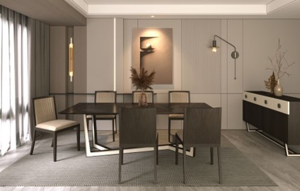
Choosing The Right Dining Chairs For A Luxury Dining Room Set In India

When it comes to curating a luxurious dining room, selecting the right dining chairs is as important as choosing an exquisite dining table. Dining chairs are not just functional; they are an integral part of the dining experience, contributing to comfort and aesthetics. In this guide, we'll explore how to choose the perfect dining chairs that will elevate your luxury dining room set in India.
1. Choose Chairs That Are Easy To Maintain
Luxury dining chairs should not only look beautiful but also be practical. Opt for chairs that are easy to maintain. In the Indian context, where delicious and sometimes messy meals are a part of the dining culture, stain-resistant and easy-to-clean materials like leather or high-quality fabric can be a wise choice. Ensure that the materials used are durable and can withstand the rigors of daily use.
Lazio Dining Collection
2. Check If They Are Easy To Move
Flexibility in your dining area can be crucial, especially when hosting gatherings or rearranging furniture for different occasions. Select dining chairs that are easy to move. Chairs with lightweight frames or those designed with handles or casters make it convenient to shift them around without much effort.

Apulia Dining Collection
3. Pick A Colour That Blends Well With The Dining Room
The color of your dining chairs can significantly impact the overall aesthetics of your luxury dining room. While it's tempting to go for bold or trendy colors, it's essential to choose a hue that harmonizes with your interior design. Neutral tones like beige, grey, or black often work well as they can complement various table settings and decor themes. However, if you prefer a statement piece, consider dining chairs in a contrasting color that adds a pop of vibrancy to the room.
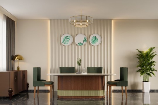
Novi Dining Collection
4. Select Comfort Above All
Comfort is paramount when selecting dining chairs. Luxurious dining should not come at the expense of comfort. Look for chairs with ergonomic designs that provide proper lumbar support. Padding and cushioning in the seat and backrest can enhance comfort during extended dining sessions. Test the chairs before purchasing to ensure they are comfortable for your body type.

Seneta Dining Collection
5. Ensure The Chairs Have A Stable Structure
Stability is crucial, especially if you plan to invest in luxury dining chairs. Inspect the chair's frame and construction. Chairs with solid wood or metal frames are generally more stable and durable. Ensure that the legs are well-balanced and have sturdy joints. Wobbly chairs not only compromise safety but also diminish the overall dining experience.

Calabria Dining Collection
Final Words
Choosing the perfect dining chairs for your luxury dining room is a meticulous process. It's about balancing aesthetics, comfort, and functionality. When it comes to finding the ideal blend, Viyom Lifestyles stands out as the leading supplier of dining chairs for luxury dining room sets in India. Their commitment to craftsmanship and design excellence ensures that your dining experience is not only luxurious but also a true masterpiece.
0 notes
Text
How to Safely Assemble Flat Pack Furniture
Flat pack furniture, or ready-to-assemble furniture is a popular choice with consumers. It is usually cheaper than solid piece furniture and provides a more diverse selection of styles.
However, the assembly process can be a bit difficult. It is important to read the instructions thoroughly, have all the parts and get help if needed.
Read the Instructions
Flat-pack furniture is more affordable than solid-piece pieces, and comes in a huge variety of sizes, shapes, and colours. However, it can be difficult to assemble and often suffers from poor quality. The instructions can be confusing and unclear, leading to mistakes such as joining pieces together in the wrong order, or left over screws.
Before you begin, read the instructions carefully to familiarise yourself with the flow of the work. Also, make sure you’ve got all the tools you need lined up in a convenient place before you start. This will save time and frustration.
It’s best to count all the small parts before beginning to avoid missing anything crucial. There is nothing worse than getting to the end of a job and discovering you’ve misplaced a vital screw. Assembling furniture is like solving a giant puzzle, so take your time and don’t rush it. If it gets too much, try to step away for a while and return with fresh eyes.
Make Sure You Have All the Parts
If you do not have all the parts you need, your assembly of flat pack furniture will be very difficult and frustrating. There is nothing worse than being half way through a piece of flat pack furniture and finding that you have a crucial part missing.
Before you start to assemble your furniture, lay out all the parts and fixings on the floor. This will prevent similar looking items from getting mixed up and allows you to check that you have everything that you need before you begin.
Ensure you have the correct tools for the job, a hammer (or rubber mallet), an electric screw driver, some screws and glue. Some pieces of flat pack furniture may require reinforcements like wood glue or construction adhesives. Having these in advance will make the job much easier. You can also hire a professional to assemble your furniture for you. Their experience will help to ensure that your piece of flat pack furniture is completed correctly and professionally.
Get Some Help
If you’re not used to assembling flat pack furniture it can take longer than expected. Often there’s a time guide at the front of the instructions which will give you an idea of how long it should take to build the item but if you have a friend or family member who does it regularly they can help you cut your build time by holding awkward bits together whilst you screw them in.
You should also make sure you have the right tools on hand to build your flat pack furniture before you start. Having a good quality power screwdriver with several different size bits in a variety of heads as well as a hammer and hex keys will help you get the job done quicker and easier.
Alternatively, if you find that building flat pack furniture fills you with dread or it’s the cause of many arguments in your household you can always pay for an experienced furniture assembly specialist to do it for you. They can save you a lot of time and stress and ensure that your furniture is built properly so that it looks good and functions as it should.
Don’t Overdo It
It can be tempting to just wing it with DIY projects, but flat pack furniture assembly is different. Manufacturers design their furnishings to be easy to assemble and predrill holes to save consumers time and money. They then package them with all the necessary parts and instructions.
It is vital to read the instructions and not skim them. If you do not take your time you could end up mixing up similar looking pieces or placing incorrect length screws in the wrong holes.
If you find yourself getting frazzled, consider asking a friend or family member to help you out. They will likely have the same goal of getting the job done as you and can provide a helping hand if needed. If things really get too much to handle, it is worth considering a flat pack furniture assembly professional. They have the right tools and know-how to get the job done quickly and efficiently.
#assembly of flat pack furniture#assembly flat pack furniture#flat pack furniture assembly#flat pack assembly Sydney#flat pack assembly cost
0 notes
Text
Upgrade Your Living Space With Gorgeous Timber Flooring Options
When it comes to enhancing the beauty and warmth of your living space, few things rival the timeless charm of timber flooring. Timber flooring has been a popular choice for centuries, and its enduring appeal continues to captivate homeowners with its natural elegance and durability. If you're considering a home improvement project that adds both value and style, timber flooring in Brisbane should be at the top of your list.
In this blog post, we'll explore the stunning options available in timber flooring and how they can transform your home.
The Classic Elegance of Hardwood Floors
When you think of timber flooring Brisbane, the first thing that likely comes to mind is the classic beauty of hardwood floors. Hardwood flooring exudes a sense of timeless elegance, and it's available in a wide range of wood species, each with its unique grain pattern and colour variations. Oak, maple, cherry, and walnut are just a few examples of the hardwood options that can elevate your living space.

Why Choose Hardwood Floors?
Durability: Hardwood floors are highly resistant to wear and tear, making them a long-lasting investment for your home.
Versatility: Whether your style is traditional or contemporary, hardwood floors complement a variety of interior design themes.
Increased Property Value: Installing hardwood floors can significantly boost the resale value of your property.
The Allure of Engineered Timber Flooring
If you love the look of hardwood floors but have budget or installation constraints, engineered timber flooring is an excellent alternative. Engineered timber flooring consists of multiple layers of wood, with a top layer of real hardwood. This construction provides the authentic appearance of hardwood while offering additional benefits.
Advantages of Engineered Timber Flooring:
Cost-Effective: Engineered timber is often more affordable than solid hardwood, making it a cost-effective option for achieving the same aesthetic.
Stability: The layers of wood in engineered flooring make it more resistant to moisture and temperature changes, reducing the risk of warping or shrinking.
Easy Installation: Engineered timber flooring can be installed as a floating floor, saving time and effort during the installation process.
Timeless Beauty of Parquet Flooring
For those who crave a touch of sophistication and history in their living space, parquet flooring is the answer. This intricate flooring option features small wooden blocks arranged in geometric patterns, creating a captivating visual effect that adds character and depth to any room.
Reasons to Choose Parquet Flooring:
Unique Patterns: With parquet flooring, you can choose from a variety of patterns, such as herringbone, chevron, and basketweave, to match your style preferences.
Visual Appeal: The distinct patterns of parquet flooring create an eye-catching focal point in your home.
Underfloor Heating Compatible: Parquet flooring works exceptionally well with underfloor heating, adding a touch of luxury and comfort to your living space.
Embracing Sustainability with Bamboo Flooring
As environmental consciousness grows, many homeowners are turning to bamboo flooring as a sustainable and eco-friendly option. Bamboo is a fast-growing grass that matures much quicker than traditional hardwood trees, making it an environmentally responsible choice for flooring.
Benefits of Bamboo Flooring:
Eco-Friendly: Bamboo is a renewable resource that can be harvested without harming the plant, making it a more sustainable choice compared to traditional timber.
Strength and Durability: Bamboo flooring is remarkably sturdy and can withstand heavy foot traffic, making it ideal for busy households.
Variety of Styles: Bamboo flooring comes in various colours and finishes, allowing you to find the perfect match for your home decor.
Exotic Beauty of Acacia Flooring
For homeowners seeking a flooring option that stands out with its unique beauty and rich colours, acacia flooring is an excellent choice. Acacia wood showcases stunning grain patterns and a vibrant spectrum of shades, ranging from deep browns to golden hues.
Advantages of Acacia Flooring:
Distinctive Aesthetics: Acacia flooring adds a touch of exotic elegance to any space, making it a conversation starter for visitors.
Resilience: Acacia wood is highly durable and resistant to scratches and dents, ensuring it maintains its beauty for years to come.
Low Maintenance: With its natural resistance to water and stains, acacia flooring requires minimal upkeep, making it a practical option for busy households.
Conclusion
Upgrading your living space with timber flooring opens up a world of possibilities to enhance the beauty and value of your home.
Whether you choose the classic elegance of hardwood, the allure of engineered timber, the timeless appeal of parquet, the sustainability of bamboo, or the exotic beauty of acacia, each option brings its unique charm to your living space.
Take your time to explore the various timber flooring Brisbane options available, and select the one that resonates with your style and meets your practical needs.
With timber flooring underfoot, your home will radiate warmth, sophistication, and natural allure for years to come.
So, why wait? Transform your living space today with the beauty of timber flooring!
Source URL : https://harristimber.wordpress.com/2023/07/28/upgrade-your-living-space-with-gorgeous-timber-flooring-options-2/
0 notes
Text
Different Types of Fabric Printing Methods
Whether you have your own designs or are looking for something to make your project stand out, fabric printing perth can help. There are several different types of fabric printing methods, each with their own benefits and drawbacks.
This method involves creating a stamp of your design, and then using it to print onto your fabric. It is very similar to potato stamping, but much more sophisticated.
Pigment Printing
Pigment printing is one of the most popular and commonly used fabric printing methods. It uses pigment dyes that sit on top of the fabric and are held in place by a binder or resin. The prints have a stiffer hand feel than dye prints due to the binder, but this is a trade-off for better color fastness and print stability.
The binders are typically polymeric materials such as polyesters, styrene-butadiene, and polyurethane. The binders have a three-dimensional structure that is crosslinked during some suitable fixing process such as dry heat or steaming.
The inks used for this type of printing contain pigments, which are non-organic and synthetic organic colors that are impenetrable to water. They are available in a wide variety of shades and are highly durable.
Reactive Printing
Reactive printing uses a chemical reaction at a cellular level in fibers to permanently lock colours into fabric. The process involves pretreating fabrics, digital printing with reactive dyes and extensive after print washing to ensure that the colours are bound in fabric fibre and not just lying on the surface.
During this process, many unfixed dye particles are hydrolysed to form a large number of colour molecules that bond with the fibres. This creates a strong and durable bond between the dye and the fibre, which results in better wash fastness and rub fastness.
In addition, it has a high color yield and is very cost-effective. If you are printing on a lustrous, shiny fabric like silk or wool that will be washed frequently, reactive dyes may be the best option.
Sublimation Printing
The dye sublimation process is very versatile in terms of what it can print. It is able to print any color imaginable. However, it is best suited to polyester or polyester mix fabrics that are white in color.
The process starts with the design being printed onto specialist transfer paper using water-based dye sublimation inks. This ink is then transferred to the fabric through heat and pressure. The heat opens up the fabric’s pores while the pressure cools down the ink, turning it into a solid.
The ink then penetrates the fabric fibers and is permanently embedded, meaning that your designs will stay vibrant for a much longer period of time than with screen printing. This is what makes it a very popular choice among businesses.
Deep Infusion Printing
Among the most popular printing techniques for fabrics, pigment prints are ideal for use with natural materials and can also work with synthetic fibers, which makes them versatile. This fabric printing technique uses specialist water-based dyes to penetrate deep into the fabric and make your print permanent. It’s perfect for intricate details and vivid colors.
Reactive printing is another heat-activated fabric printing method that requires pre-coating the fabrics and using a binder and printing additive to imprint the fabric with wax or dye. Then, the fabric is steamed to create a chemical reaction that permanently bonds the image to the fabric.
This printing technique is easy to do at home with the help of transfer paper. You can find these papers at most stationery stores or supermarkets.
Stamp Printing
Stamps are small pieces of paper that show that a piece of mail, package or card has been paid for. They are attached to the envelope, letter or aerogramme and can be used for either airmail or land mail. Stamps are made from a variety of materials and printing methods, and each epoch has its own remarkable characteristics.
One such method is photogravure, which incorporates photographic techniques with lithography. This allows for nice tone gradations. It also produces a textured image and can vary the depth of etching.
Another technique is lithography, which involves carving into a copper or steel plate. The result is that the stamp is printed with a series of dots that vary in size and depth. These stamps can be distinguished from the line engravings used before 1934.
#Business Card Printing Melbourne#point of sale signage#digital printing adelaide#pos visual solutions#Business Card Melbourne#pos signage#banner printing adelaide#Retractable Banner Printing
0 notes
Text
Art Process- Paper Planes (1)
I really wanted a painted, sketchy but still detailed look for these illustrations that would capture the essence of all the different pieces of concept art I have studied for this project.
To achieve that, I decided to work directly on top of the thumbnail sketch that I created initially and just use the ''COLOUR'' option in my blending settings to manually add all the colours necessary to both separate all the different elements (making it more readable and easy to navigate ) and also set the mood/atmosphere that I want for the illustration right from the beginning.


This is also where I started to refine some of the smaller details such as the satellite dishes, the air conditioner and some flower pots and hanging plants.
Being able to have all the different reference photos that I needed right next to me while sketching was very helpful since It allowed me to move back and forth between the pictures and my work very quickly and efficiently in order to correct any mistakes.

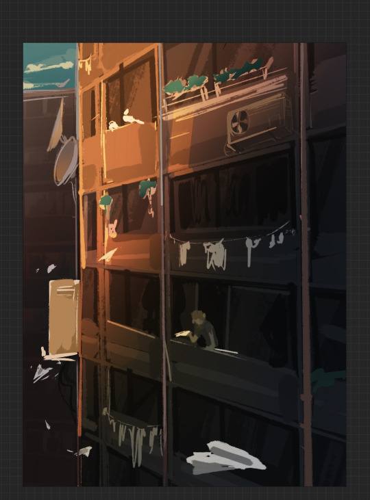
After that, I started working on the windows. This was very easy and quick since it is something that I have done before for one of my other projects and so all I had to do was repeat that process, but on a larger, more detailed scale.
I started by blocking in the shapes of the windows. I, then, added some random squares of colour of different opacities on top that would act as a rough interior for each of the ''apartments'' . This created a lot of dimension which looked even better when I added the glass-like reflections on top. As a final touch, I also added a white frame around the windows which really helped make them look more credible.
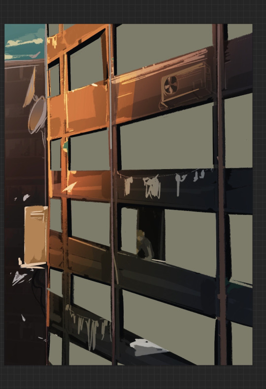
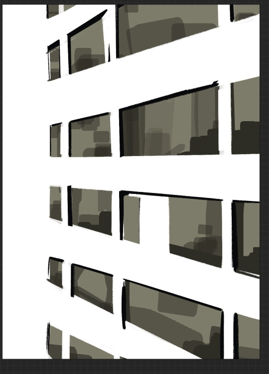

As I went along I also put in different textures and random brush strokes just to make sure that nothing looked too neat or perfect. Since buildings wear out and get old in time, this only added to the realism.
One of the biggest perks of digital art is being able to use so many unique and interesting brushes that allows for unique and interesting results.

Painting this felt like sculpting in a way since I kept erasing and adding bits and pieces until I was left with something solid enough for a base. Right from the start I tried to keep the colour palette consistent and simple so it wouldn't be difficult building details from there.

Since I based this building on the ones I used to see all the time in my country back in the day, I added all sorts of different elements that I could remember, even in terms of the building's structure.
Unfortunately, I was not able to add any clothes on the window clothing hanger . For some reason every time I tried to add something like a t-shirt or a pair of socks, they just looked out of proportion and out of place. I decided to just leave it empty in the end. This could be due to my limited understanding on perspective.


I was very excited to be starting on these smaller details since I don't usually do that in my concept art. I also think they convey the urban city aesthetic pretty well.
Making the air conditioner was extremely challenging since I had to work with a trickier angle. Fortunately, I managed to end up with something that looked good enough and it was then just a matter of how much detail to put without making it look too detailed in comparison with everything else.


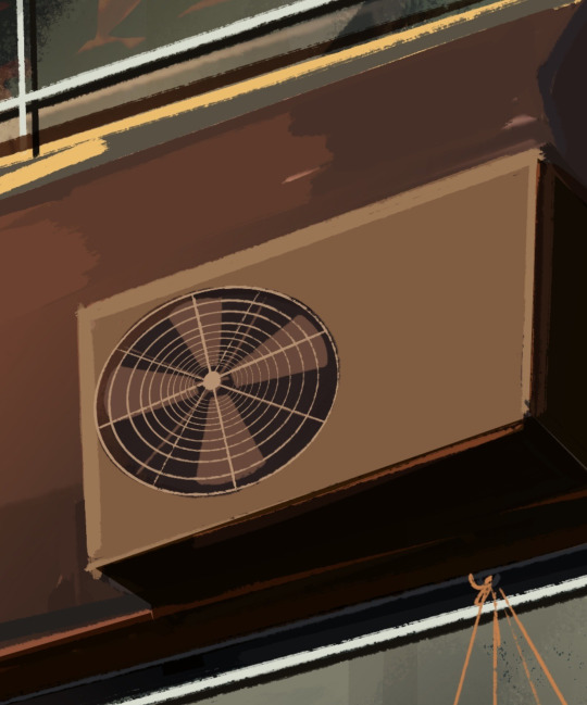
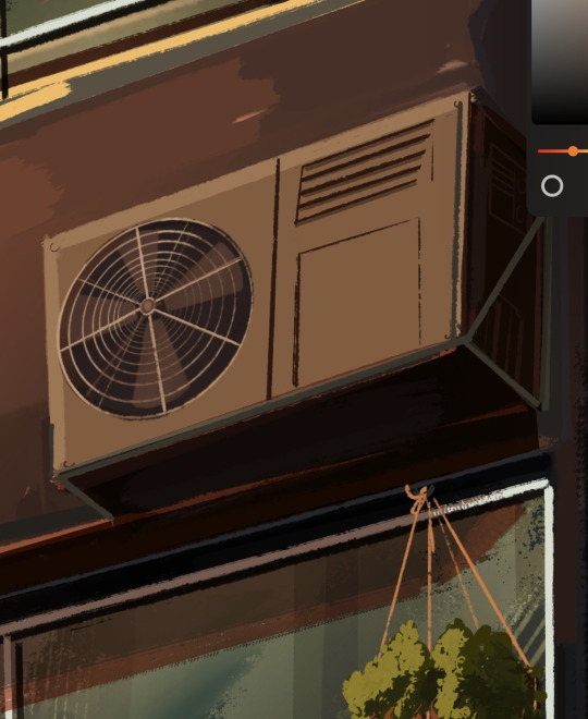
For the plants, I didn't bother with drawing every leaf individually but rather concentrate on depicting them as solid shapes that still showed the difference in texture. I especially like how the suspended baskets turned out. The concept art trials I did before starting my illustrations really helped me get more comfortable with things that I have never drawn before.
Since my pallet was mainly formed of reds, browns and yellows (basically, very sunset-y colours) , I tried to keep all the new colours I added on the warm side.


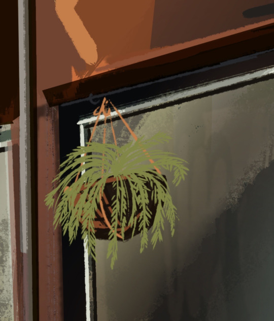
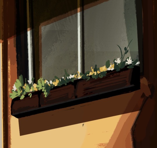
I then started adding the shading. Since I was working with a rather limited number of layers, this meant that as I kept progressing and adding new layers, I would also have to combine them and polish everything as I went along. I tried to not get too lost in the little details but rather concentrate on the artwork as a whole, but that was difficult sometimes since I wanted the illustration to look as organic as possible.

This is also where I started to work on the background. As I mentioned, I wanted a warm and tranquil atmosphere and so I changed the hue of the sky to something a bit more purple-ish (it is a bit hard to see but the sky is actually a gradient from dark blue to yellowish pink) , made the clouds more yellow (to look as if they are reflected by the sun) and even added some highlights to the building to separate it from the background.
0 notes
Last Seen Blogs

optimemploi
Optim Emploi
optimemploi
Optim Emploi

aksbynidhi
Wholesale Kurtis Online

mazhabi-bhai
Untitled

transgothzoey
Tgirl Zoey 27~