#back to practicing drawing people :)
Text
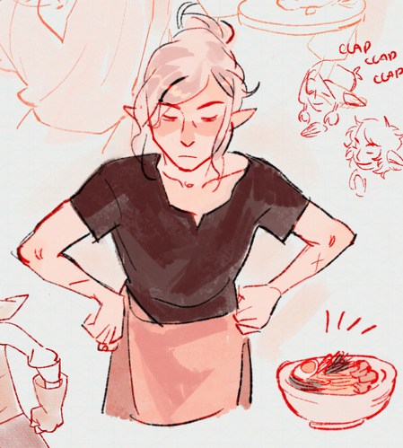
Taking pride in One's own appearance.
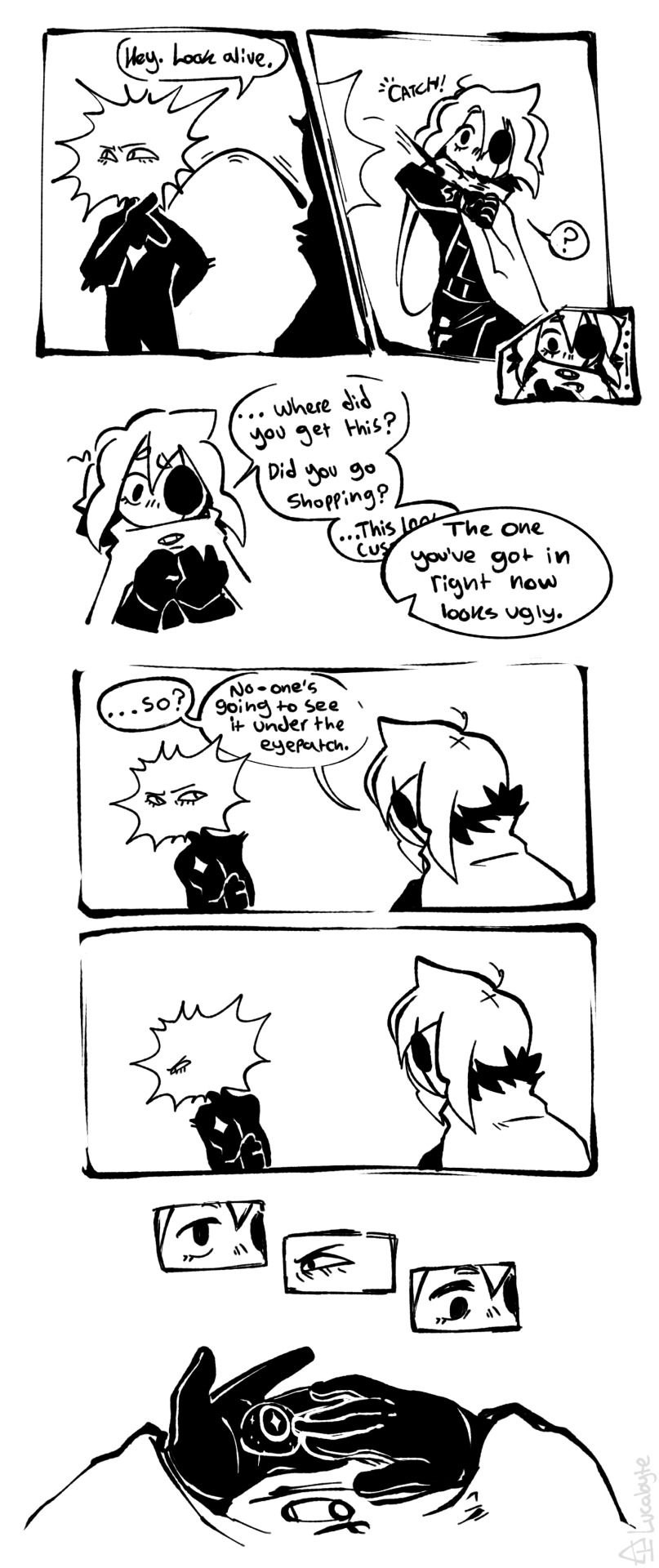
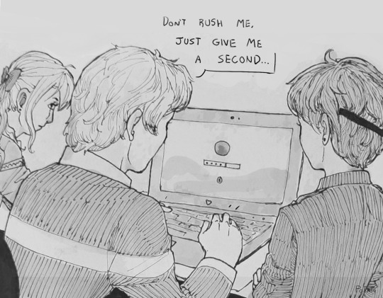
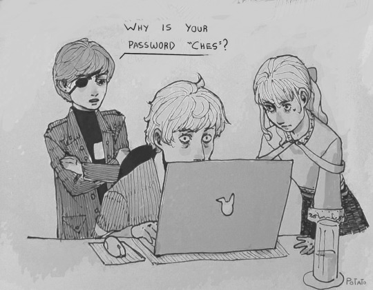
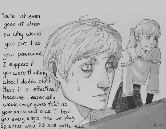
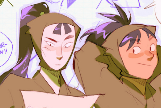
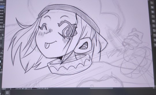
#you people are becoming my guinea pigs for my finally learning how to communicate information via comics. a thing ive needed to practice at#also BLEGH. YUCK. andrew hussie was right candy makes you sick. this is a little too saccharine for me. yeesh. let me get back to the meat.#isat#isat spoilers#in stars and time#in stars and time spoilers#isat fanart#in stars and time fanart#isat siffrin#isat loop#sifloop#doodlebyte#'let me get back to the meat' i say eyeing something similarly sickly in my sketches. at least it's mildly tormented as a counterbalance...#you people have no idea how much im having to stay my own hand. oh i can draw miserable nudity but the most basic of fluff? visceral#anyway i dont know the logistics of picking up a glass eye or where loop got money (besides pilfering from siffrin) & ive previously drawn#sif with a vague blank middle-grey eye as either being scarred over or a blank occular prosthesis put in quickly at the nearest town#i dont know that they'd have a glass eye during the game but considering prosthesis are reccomended to keep the skull etc from deforming#id imagine it would probably come up postgame as something to do now theyre not on a time limit trying to save the country#plus i assume that having it gouged at by a sadness wasnt exactly a clean wound by any measure#all this to say. idk i just wanted to get some information across in comic form to Test my Abilities#and we're far enough down now to say my absolute most wretchingly sweet fluff headcanon that actually inspired this#which is that i think siffrin gets into the habit of not wearing the eyepatch around loop so they kinda match.#and as a signifier to the other that they're letting their guard down around them. vulnerability etc.#just kinda wearing it around their neck so they don't lose it
747 notes
·
View notes
Text
Charlie will always be on time and even early to whatever it is she wants to get to. Unless she worked all night before on what she wants to do for the the activities next week. Then she would rather die than step foot outside.
#hazbin hotel charlie#hazbin hotel vaggie#hazbin hotel vagatha#hazbin charlie#hazbin vaggie#chaggie#rainbowmoth#varlie#vaggie x charlie#charlie x vaggie#charlie morningstar#art#fanart#artists on tumblr#digital art#bro pray for me im class holding in a shart 😭🙏#i know this might be obvious but like isnt it weird charlie has NO idea what death is like or ever will be like?#yet shes surrounded by dead people/sinners. has thay ever warped her mind into an ideal of what death is to her?#to me she probably thinks its a horrible thing. since shes practically immortal. yah. yah thats prty much it. i got nothn else 2 say#will be getting back to drawing my redesigns maybe even for the others fr#i didnt even TRY to redesign their pyjamas even tho they kinda goofy asf i just changed the colr of charlies thas abt it
221 notes
·
View notes
Note
Hiya! First of all just want to say I absolutely ADORE your art, the way you draw the lil silly guys makes me wanna scream and put them in my pocket! :,)
Saw you were taking requests and kindaaaa vague but Tails reminding Shadow of Maria always makes me crazy if that’s something you’d be interested in or have any ideas for! <3
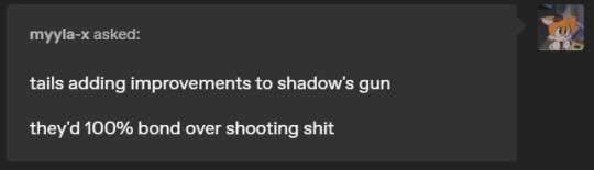

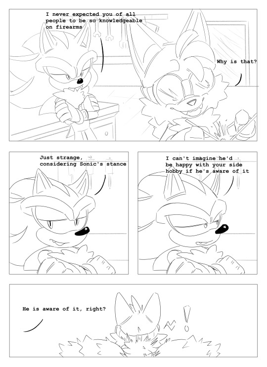
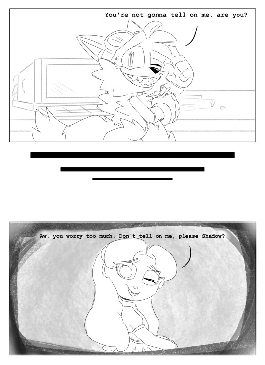
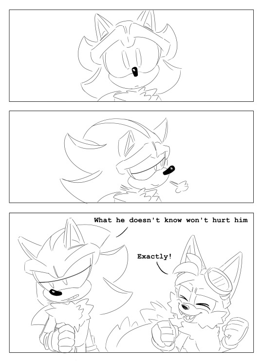
AHHHH ty ty. i think about that a lot too.
(for u too @myyla-x)
#sth#sonic the hedgehog#shadow the hedgehog#miles tails prower#tails the fox#ask#dunkinreqs#decided to take ur req and use it for some comic practice#this shit HARD#i cant draw people bare with me okay#but yeah i think of this concept a lot#i think maria had a mischievous streak#considering she had to amuse herself on the ark somehow#and shes gonna rope shadow in on her shenanigans#and certain mannerisms in tails just sends him back#any way hello new people#dunkinsart
723 notes
·
View notes
Text
I was inspired by something again
#this week hasn't been so great(some good some~ bad)but my brain always makes time for doods. dunno if ill get to make more this month tho#my traditional inking is still pretty rusty which is a shame cause I admire that skill strongly in other people so I hope I can#pick it back up#here though I did shade and kinda edit in digital cause I don't trust myself so much yet and don't wanna ruin it#at this point idk what's better for me. practice drawing bigger so I can get more detail in or stay small and manage the shading better#I'll... try something. eventually#gonna get a lil busy tho#kuroshitsuji#black butler#kuroshitsuji fanart#fanart#traditional art#inking#digital art#ciel phantomhive#elizabeth midford#edward midford#o!ciel#cheslock(mentioned)#oh I guess this is ship art. well would ya look at that#modern!au
450 notes
·
View notes
Text
I want to draw her better later but well I love her so much
#funky!art#guilty gear#elphelt guilty gear#I need to get back into drawing.. I really do want to especially drawing people I need to practice more maybe#Too used to drawing funny animals lately. Which is fine but I miss drawing humans lol
102 notes
·
View notes
Note
What was it like for you starting out as a beginner artist? How did you improve?
I mostly just incessantly practiced, experimented, and observed a lot for as long as I can remember. I grew up on a lot of videos going over tips and techniques for beginner artists and mostly just observed their processes and would try to bring them into my art. Othertimes I would just constantly experiment with my artstyle (what if I made the shoulders more defined, what if I changed the size of how I draw eyes, what if tried drawing different body types, what if I tried a pose with a lot more foreshortening etc etc). I tried to push myself a bit further everytime like maybe spending more time on the overall piece, adding backgrounds, drawing multiple people interacting. Drawing challenges also helped a lot I think since they pushed me out of my comfort zone or forced me to approach my art in different way than what I was used to. Things like “draw something using only one line and not lifting your pen from the paper”, or “create a bunch of random shapes using a colored marker and then turn them into characters/objects”, or even just dtiys challenges were great for this. A lot of the drawings I made from these didn’t really end up being things I was super proud of after finishing them, but thats fine since I still learned a lot and they still helped with improving. A lot of it was honestly just not being afraid to draw something I might not be happy with later in the name of getting that practice in and trying new things all the time.
I hope this is helpful, but I’m not too sure so I’m sorry if it isn’t, this is the best way I could think of summarizing it!
#pedia says stuff#asks#not drawing#so sorry it took a while to answer this#i had a bit of trouble putting it into words and was worried i was just defaulting to the usual answer of ‘i practiced’#but this whole thing still might boil down to ‘i practiced’ so. so sorry i tried#i just got excited all the time over learning new things and still do#shoutout to younger me who excitedly got up at 5am to look up fun2draw tutorials so i could work on that before getting ready for school#shoutout to me in middle school who got so stressed out when people would watch me draw#so i just learned to draw really really fast as like a stress thing#also sidenote if anyone ever does the ‘omg you draw?? can you draw me??’#hit them with the ‘sure here are my prices’. 90% of the time they will either back off or actually be willing to pay#i WISHHHHH i knew that in school instead of being too nice to say no
32 notes
·
View notes
Text
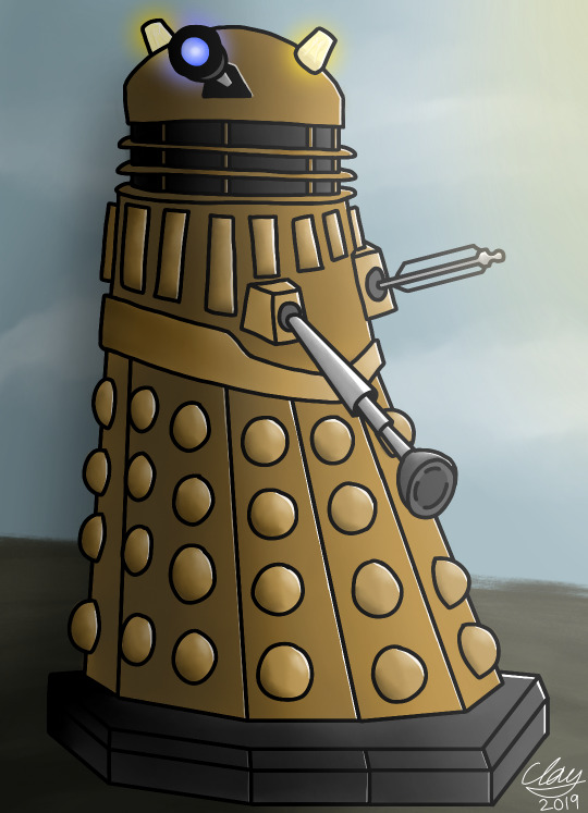
Seems that a handful of you were interested in seeing my old Dalek art, so I bring you this piece I made back in the ancient year of 2019!
#Clay Art#doctor who#Daleks#Clay Posts#story time to those who read tags!! (ily)#yeah so idk how many of you know this but. before i was yer average robot enjoyer#i actually exclusively hyperfixated on Daleks from doctor who. back then i was just getting into drawing so i learned how to draw them!#never felt the need to learn how to draw people so i just kept practicing my dalek drawing skills#so practically all of my old art after a certain point is just daleks daleks and more daleks haha!!#at least now i can draw other robotic looking things.... jury is still out on people tho. do stick figures count?#dalek art#dalek fanart#dw daleks#dr who#dr who art#doctor who art#daleks doctor who#doctor who daleks#digital art
23 notes
·
View notes
Text
The p3r dlc really has me walking around Tartarus with the Junes theme playing in the background. What a time to be alive.
#“Gio did you seriously spend 200 dollars on the aigis deluxe addition and then pay 35 dollars for a dlc are you fr??’’#“Gio they are practically stealing ur money away from you at this point what on earth are you doing’’#IDK 😭😭😭#nahhh I’m actually kind of broke now I’m getting worried abt my money supply ☺️ especially considering I’m still jobless ☺️#I might be getting a job at a dishwasher soon tho 😯#urgh I can’t believe people actually have to work….society….#tbh I’ll probably end up backing out last second as always bc I don’t want to wash dishes :(#why would I wash dishes when I could be writing or drawing :(#urgh#agghhhh#persona#persona 3#persona 3 reload#p3#If I actually do end up getting the job (doubt) I genuinely bet I’ll last a week before either quitting or getting fired#like fr 😭 I’m cooked#I have the worst work ethic ever it’s actually crazy#HELPPP WHY AM I RAMBLING ABT MY JOB TROUBLES UNDER A PERSONA POSTTTT#LMAOO#I lovveeee oversharing on the internet 💕🫶 🎉#anyways every days great at your Junes and whatnot#wish I could work at Junes smh#the junes theme song would make it bearable#BEARable haha get it haha bc teddie is a bear and teddies the mascot haha#persona 4#p4#persona 4 golden
25 notes
·
View notes
Text
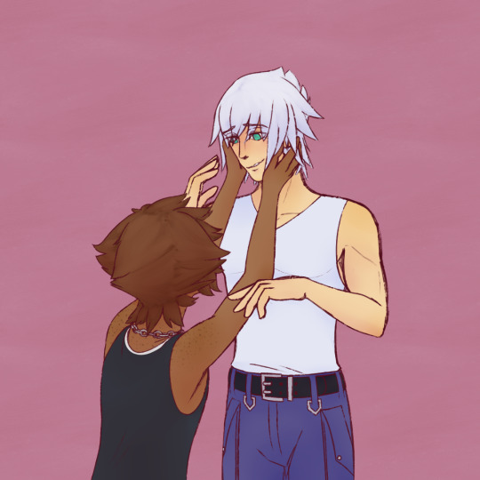
didnt get anything done for soriku week but i still wanted to draw them ...
#escuerel's art#soriku#soriku fanart#kingdom hearts#sora kh#sora#riku kh#riku#still experimenting#still practicing >w< figuring out how i wanna draw things#i recognize things i could fix by now#but i was already so far in by the time i realized. oh well theres always next time#i...idk how people draw soras hair from the back thats so confusing
46 notes
·
View notes
Photo

getting cocky.
#was playing dmc5 earlier after not playing for awhile#and vergil kicked my ass super hard bc i got too confident in my royal guarding skills lmao i died 3 times to him in a row#still had a lot of fun practicing rg though but. i'll be back to kick your ass another day bro i swear#devil may cry#vergil(dmc)#i like drawing smug vergil i think more people need to remember that he's a smug douchebag just like his brother is#allyart
743 notes
·
View notes
Note
how do you get your colors to look so nice and your lineart so red and vibrant? i love it
omg anon thank you!! 😭 im going 2 be honest I am Not Great with color theory... but i like having my sketch pages look cohesive to me...
BUCKLE UP this is going to need a readmore bc i like talking.
I always sketch in neon colors it's a habit i picked up from an old teacher but I'll think of a color usually on a whim and draw with that. and then if i want to draw something else ill pick another color that i think goes well with the page. usually most of my color schemes r analogous (colors right next to each other on the wheel)

yanked this from recent dunmesh post; i kept most of my colors within the pink/red/orange range.
i wouldn't recommend doing everything in monochrome or analogous palettes though because it's sort of a guilty crutch of mine XD.
sometimes when im coloring ill change the layer mode of the sketch. color burn gets you either very very bright or very very deep colors depending on the color of the flats underneath. multiply and linear burn do the same thing but they're a lot tamer and generally always return darker colors. im sure there's some technical bits behind this though. ill either color my lineart afterward to compliment the color of the flats, leave it as is, or mess with layer modes if i feel like it. my favorite trick is color burn + linear burn + some combination of two lineart layers and just fiddling until i get a nice burn effect.
mithrun was done with crimson red on color burn.
coloring... like 999% of this is relative color which is like. kind of the idea that colors look different when placed next to each other. if you eyeball it a bit it's pretty noticeable.

what i used to do a bit ago was i would fill in the area i wanted to color with one big mask of color, make a new layer that has a clipping mask down to the flat layer of color, and then draw my actual flat colors. the color of the mask helped me pick my flat colors bc if I picked a color i think stood out too much next to the mask i could kind of just adjust it until it looked a little more cohesive.
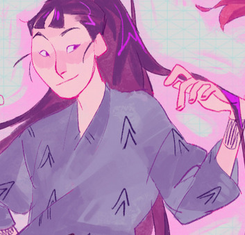

old ish drawing next 2 a canon reference. i ignore local color a lot...mea culpa....but my overall color palette here was a light pink, so the shirt here is actually a desaturated pink? or violet i believe. if you shift sort of that purple color far enough into the gray area of your color wheel it can take on a blueish or even greenish hue. it being next to a lot of warm pinks/fuschias helps.
a neat thing that kind of helps is that if you desaturate or saturate certain colors they can kind of take on a certain hue? not sure if this makes sense. sort of how orange here turns tealish blue the grayer it gets. so if im drawing something that's predominantly orange and i have a blue color i can just take an orange color and desaturate it until i get a color that sort of looks like blue. and that way it kind of looks more harmonious? at least to me XD
shading. i don't apply serious lighting to a lot of my drawings, but a helpful bit is that the shadows tend to be the opposite of whatever color the lighting is? i try to think first about the "mood" or the main color i want to go for in the drawing and then i pick a shadow color opposite of that. so for here, i wanted the lighting to be a coolish magenta so the shadows r lime green. if there's anything off i fiddle around until i get something i like. the shadows on the skin here were too green initially so i shifted them a little more orange.
there's a "band" of color going on between the transition of the shadows to the light. generally this could be for a lot of reasons and i tend to use it differently (core shadow? overexposure? etc etc). but this is a color post so ill try not to go too off track.
but generally digital doesn't "mix" colors the same way traditional colors do if you use RGB (cmyk is a bit better with this but is kind of a pain to get used to), so to make blending a little less muddy, i sometimes add an intermediate color to smooth things out a little. for example, mixing digitally blue n yellow tends to get you gray, but generally, blue + yellow makes green, so if im making a blue->yellow transition ill slap some green color in the middle so it flows a little better.
I do a lot more cel shading nowadays. if you've been on here for a while earlier this year i have another style of coloring but it's not really accurate to how shadows really work so i wouldn't recommend looking at it. it's mostly to add zest and texture to the underlying flat colors.
coloring your lineart does a TON to helping your colors look vibrant, though its like the garnish on a dish to me (same with shadows). i think it's good to try and play with your flat colors and try to make sure those look in order first before adding flourishes. usually ill leave it a dark, saturated color that again matches my overall palette but sometimes i go in and color them by alpha locking my lineart layer and picking a color that matches the flat colors underneath? not sure how to explain it properly.

i used a darkish purple for shuro's ponytail to match the dull red of the flat colors (more relative color! trying to simulate a black/brown while keeping the pink palette there) but a lighter crimson for laios's blond. the light was this super intense like blush pink so i thought it might be cool to add this neon salmon red in the areas of that light to really give off that vibe of a very bright intense rim light.
sometimes you could also tweak with gradient maps or color balance, which adjusts hue based on how light or dark a color is. these r fun to mess with as a final touch but i need to watch using them because they can become crutches real fast XD but those are also just tools to help you. in the end just developing a good sense of how color works and how you want to use it is the best place to start.
LONGASS ramble but yeah. tldr just kind of train ur eye for color and look at what you like best. which is unhelpful and a little sucky but it really is just observation and practice and maybe some personal zest.
happy drawing!
#SORRY THIS IS THE SIZE OF CANADA I YAP A LOT#i like being thorough when explaining myself a lot XD but i think the easiest way to get good with this is just repeat practice n observing#and figuring out how stuff behaves in certain situations and what you like to do and blahblahblah#if you have artists u like that do this well looking at how they use color might be cool#...i feel this entire post is just putting my entire thought process on blast LOLLL.#“eyeball it out” -> study some actual fundamental stuff and or intake new info or art -> apply it back to just eyeballing it out#i dont think i have a natural sense for some basics#but i dont think im naturally one of those people who grind out studies all the time and breakdowns either#i guess i just kind of like knowing the mechanations behind why to do a certain thing or how stuff works and then figuring out#how that translates into what i know nerd emoji#james gurney has a good book on color and light#if you like reading. but its very informative!#quirinahscreams#ask#anon#this is mostly just me talking about how i draw i dont think this is meant to be educational or informative XD um
12 notes
·
View notes
Note
5, 9 and 16 for that artist ask meme!
5. favorite little detail in a drawing you did
this one was kind of hard to answer because i lean so much more to simplification over 1:1 detail... that said, i really loved these ones!
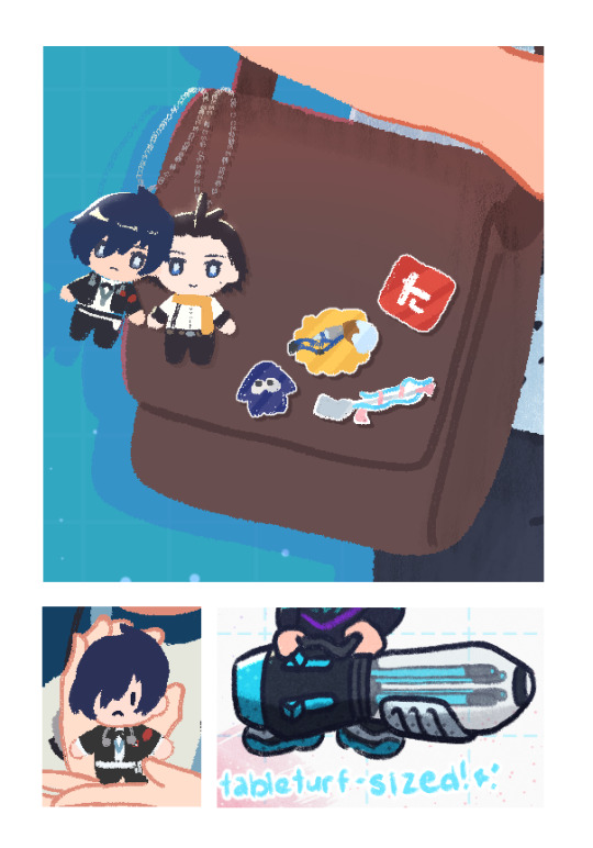
the bag from the top photo is from here, minato nui on left is from some con-related draws, the ballpoint splatling on right is from a vintage draws compilation!
i just really enjoy drawing little objects and props, and as much as i'm allergic to backgrounds, i hope to overcome that next year because my friends know i love getting obsessed over random objects for a few days...
9. any new art mediums youve tried (or overall styles if you havent tried new mediums)
i haven't gotten to do much mediums outside of digital art unfortunately.... but i would say this year was the year of chibification! i turned so many characters into little guys this year (shoutout to the nui tree!). which is really ironic because i also realized this year i find full illustrations more satisfying to work on throughout the process, despite the "simplicity" of chibis.
i did some limited color styles too! (blue, purple, and red + b/w). hopefully i can do more deliberate color palette stuffs though. i think it'd be a great exercise.
stylistically wise i think i could've tried more, but. its ok! thats what 2024 is for. yipee!
16. favorite piece of art from someone else (if you have one)
it feels like a cop out answer to say this but any gift art i got of my splatoon character... LOL... i didn't expect to get so attached to him (i changed my name in game to minatoast a JOKE!!!!). um. drops this gallery link here and scuttles away. im so very grateful. you're telling me people actually took time out of their day to draw my little guy? incredible!
ocs aside, i'd like to take the time to highlight some art from people on twitter (kitaro havers rise up!), since i do consider the things i reblog to be art i'm very fond of...
this art from tin of ryomina with flowers is so. oh my god. i was SO BEWILDERED AND HAPPY!!! i was minding my own business and then saw this rt'd on one of my friend's pages... i forget who lol but i was like "WAIT TIN Kick_TheeCan DREW RYOMINA??? I LOVE THEIR ART OF THE P3 PROTAG WHAT." i feel like i got pushed down a staircase in tartarus (positive)
and this art from chris (str3wberryy), my god, the composition fucks severely. i want to eat it. he also has an alt account on twitter (@/makotoyukilover) if you want to see more of their p3 protag arts :D
i also enjoyed seeing p3 arts from yamad_125, BSZZOWL, and elulit2. im so serious if you like ryominaigis you'll probably like taking a gander at these artist's media tabs! i find my way to see the twitter arts one way or another, nothing can stop me 👁👄👁
#lizzy askbox#RAAH IM SO GLAD YOU ASKED QUESTION 16!!!#i am filled with love for artists. and similarly to the question of what styles you take inspiration from#it was really hard to not write a text wall or link multiple..#but i've been itching to outlet somewhere how much i adore some of the art i see on twitter...#like ik i can just log into my acc again but the idea of being perceived on twt makes me antsy so i just dont#i literally vibrate in place and shake back and forth and quake whenever i see art. sometimes it occupies my brain for HOURS like. wow...#i want to draw like you... or.... wow.. it's so clear to me that you really love what you draw / that you're putting in time to practice...#and i know i linked p3 mostly but sometimes i see peoples portfolios for visdev and i go GODDAMN IM IN LOVE WITH YOU WHAT DID U STUDY#anyway... thank you again! this is so fun. my appreciation for 2023 is going up from this hehe
14 notes
·
View notes
Photo
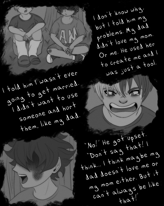
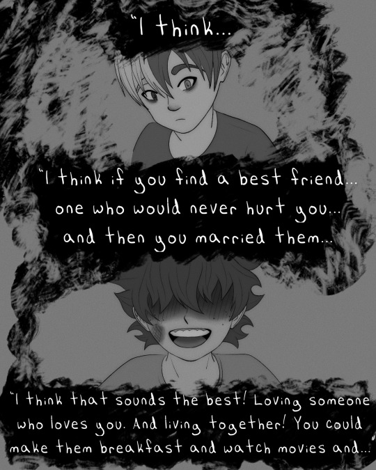
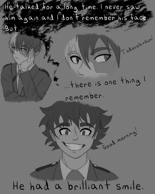
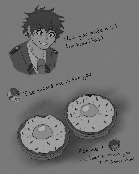
Joke’s on you, that wasn’t even Izuku. It was the guy from Food Wars with the bangs. The AM stands for…Amazing…Menus. Yeah.
#skylldraws#i realized i can’t draw kids so i wanted to practice#i don’t know how people make comics!!#this isn’t even a proper comic#not with panels or anything#and it was so time consuming#so many adjustments and back and forth between pages#the dish at the end is tamago kake yohan#which i would like to try one day#but I’d have to go abroad cause american eggs can’t be eaten raw lolol#not risk free anyway and I ain’t no risk taker#tododeku#tododeku comic#tddk#tddk fanart#tddk au#bnha comic#bnha#todoizu#todoroki x midoriya#todoroki x deku#shouto x izuku
294 notes
·
View notes
Text

I don't normally post wips but I'm excited to show what I'm working on...
#keroro gunso#angol mois#keroro#tamama#giroro#dororo#kururu#fan art#dollarneko#i finished the entire lineart ive spent 4h on this already and im excited to color it but i haven't started yet#i think i got the hang of the froggies finally. and can i just say i hate circles. especially during inking. my beloathed#this was soooo fun to draw actually. we are so back. 5 month long art block WHO im thriving i even practiced before this#''angol mois doesnt have hearts in her boots'' i am the god of my own reality#fanart#this is just a sketch but hopefully the people appreciate. feel free to rb as long as u keep the same energy when i post the finished piece
36 notes
·
View notes
Text
anyway, feenris is important to both their characters because he taught her that her kindness wasn't a weakness, and she taught him that he could still have conviction without losing the parts of him that purely cared btw. if that even matters to you.
#and they both lie like dogs.#feenris#iris hawthorne#iris fey#phoenix wright#i could elaborate on this but like. i think i have. a lot of times.#anyway just to be clear it's how he tells her at the end of bttt that he's always believed in her thus assuaging her fears about her so-#called 'weakness' having hurt him irreparably and being what draws him to hazakura to begin with#and how her strength is what he mirrored at the end of dahlia's case when he insisted that their love was real and he wouldn't believe#otherwise. they saved each other. do you see that. one could not have gone without the other or else both their lives would have fallen#into tragedy so much sooner. sure phoenix says that it's edgeworth who taught him to believe in people no matter what but it's iris who's#the first person whom he puts that into practice for. they're quintessential to each other. do you understand.#bring her back!!!!!!#ace attorney#ace attorney trials and tribulations
59 notes
·
View notes
Text
It's been ten years since I started drawing fanart, and I thought this would be a good occasion to share some of my first attempts:
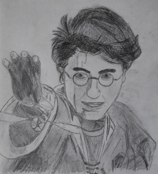
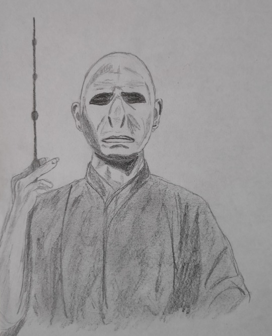
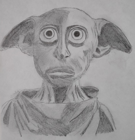
... I like to think that I've improved a little since then.
#sometimes people tag my posts with things like “how” or “i wish i could draw like this”#which i take as a huge compliment#but if you want a serious answer: practice. just practice#and you'll probably improve a lot faster than i did because it took me years#probably because i didn't even actively try to improve#and for the first couple of years i didn't even draw regularly but i kept coming back to it because i enjoyed it#and i still don't consider myself a particularly good artist or anything lol#there's still so much more to learn and to try and that's ... encouraging?#harry potter#harry potter fanart#hp fanart#traditional art#my art#old stuff
12 notes
·
View notes
Last Seen Blogs
bangtanseuphoria
✧내 Paradise✧

thedvwalkingwounded
DVWalkingWounded.me
lovesbitca8
LovesBitca8

dergarabedian
César Dergarabedian

nhacai78winvncom
Nhà cái 78twin