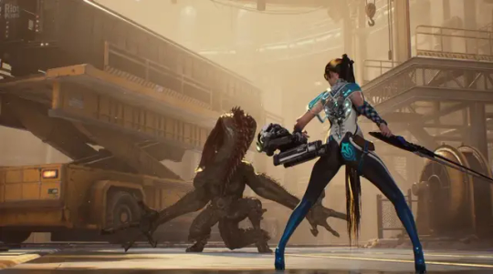
#character design commentary
Text

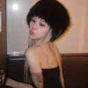
Clockwise from top left: series, manga, Adolescence of Utena movie, Four Days in Ohtori game
I thought it was weird how much Akio (along with Anthy) has different hair/skin coloration across all the RGU media, so I did a little comparison by sampling colors from screenshots and then adjusting the HSB until all the outfit colors were similar. Strangely, his eye color is remarkably consistent
64 notes
·
View notes
Text

This is truly stiff competition for the worst case of willful false equivalence we've ever seen.
So, for those not aware: Ongoing embarrassment to gamers and the gaming industry, Mark Kern (former lead on FireFall), has been desperately trying to get Gamergate 2 going on X/Twitter... well after others have given up. If you need to get caught up on Mark, I recommend this video by documentary maker and experienced game developer, Dead Domain:
youtube
One of the latest fiascos in this mix has been the comparison of responses to character designs from Hades 2 (Aphrodite, left) and Stellar Blade (protagonist Eve, right). The post isn't by Mark, but is part of the general harassment campaign he's trying to lead.
If you're somehow not familiar with Aphrodite, she's the Ancient Greek goddess of love, lust and hot girl shit. It is absolutely perfect characterization for her to show up to a battle (or anything else) nude but for her hair teasingly covering the intimate parts of her body. But the buried lede here is, you don't fight her in Hades and nothing about Hades 2 indicates she'll fight there either, she just likes the aesthetic and has no reason not to indulge.
Stellar Blade will release on 26 April 2024, so we can't really give an informed discussion of her character. But what we do know is the studio head is the illustrator from Blade & Soul, Eve is described as being a member of "the 7th Airborne Squad" engaged in an "operation to reclaim the planet from the Naytiba", and the promotion material promises "an enthralling narrative filled with mature themes, mystery and revelation. Embrace the relentless pace, with no time to pause between moments where critical, story-changing decisions are made."
It's to be compared to games like Nier: Automata, Devil May Cry 5, Jedi: Fallen Order and Sekiro. And the screenshots look like this:
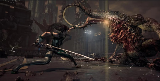
And yeah, unlike Bayonetta she's not supposed to be an unstoppable force of nature (and fashion) who is immune to self-doubt, she's supposed to be the scrappy underdog last survivor of her team.
Weird they gave her a costume that conveys... the opposite of literally everything they're supposed to be trying to tell you about her.
-wincenworks
#stellar blade#hades#hades 2#aphrodite#character design#costume design#commentary#mark kern#gamergate#dead domain#video games#false equivalence#blade and soul#nier automata#devil may cry#star wars#sekiro#bayonetta#firefall#science fiction#mythology#Greek#image#video#bikini armor battle damage#bikiniarmorbattledamage#babd#Youtube
1K notes
·
View notes
Text

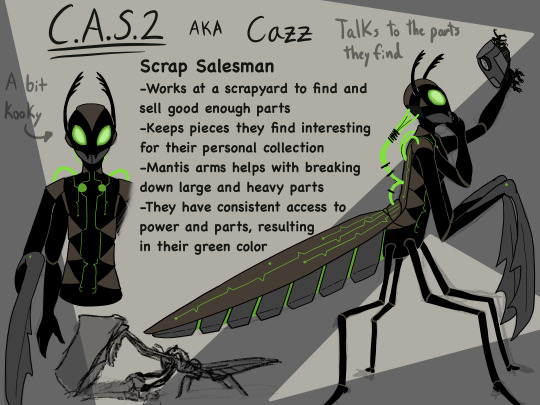
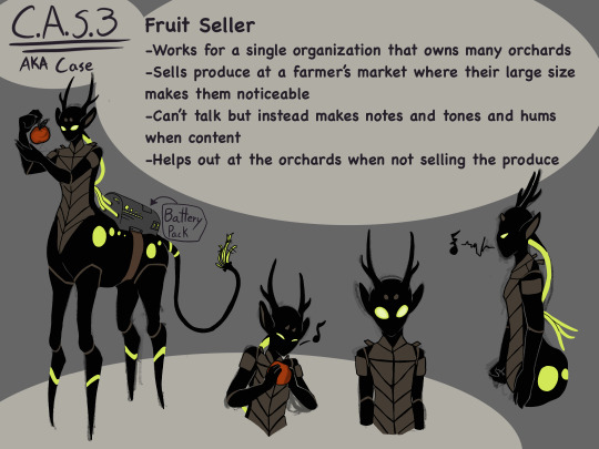
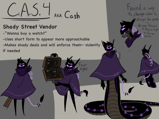
So @somerandomdudelmao made a version of their sona in a dystopia (inspired by @tapakah0 doing the same to theirs) and the person in this ask named the robot C.A.S.5 and I thought, ‘well then there’s at least four other C.A.S. units out and about in the world’ leading to this being the end result! It was a lot of fun to come up with the different customizations each C.A.S. unit has.
also, the design for C.A.S.4 (Cash) was partially inspired by @mobiitez post.
Doodles:

#somerandomdudelmao#tapakah0#my art#Dystopia au#Mob’s character design session#cass fanart tag#i think#I’m probably not going to make more C.A.S. bots but just know C.A.S.7 or Cast is bird based (not sure which bird yet) and blue for my sis#small detail but on Cass there’s broken wires on the back of their head so I decided that they used to connect to the body#Cash hates Castle while Castle is indifferent unless Cash tries to steal from her#Case is vibing with the farm life and making up little tunes#Cazz is a cross between the crazy old cat lady and a backwoods cryptid - they will stare at you from the shadowed depths of the scrap yard#while making commentary to the parts they keep for themselves and of those parts Benji is the favorite#Battery packs for C.A.S. units attach to the things that stick out their backs for the wires - except Cazz who made some internal modificat#No one knows exactly how since the mods are a chaotic hodgepodge of patchwork but they somehow work#Had a lot of fun watching others make stuff for the impromptu dystopia au the vibes of the world were awesome#Technically fanart#so yeah#enjoy!
907 notes
·
View notes
Text
Introducing: the DND Hazbin AU!!!


Sue me some of these classes and races are homebrewed…
Background: for board game night, the subject of DND comes up and Vaggie reveals that she was kind of a nerd while she was alive. She’s a bit self conscious about it but?? Charlie has heard her talk about it before and has wanted to play for ages but they haven’t had a group of people to play with. In a way it’s genius because. Dnd is basically an ultimate team bonding exercise; there’s a lot of empathy and problem solving involved…Vaggie is convinced to give a crash course on the rules, prints out a couple of character sheets, and the rest of the hotel (as per first character creations usually go) basically create themselves as their characters 💀.
Campaign summary: the world is set in a high fantasy adjacent of hell, where Charlie is dead broke and has 0 means raising money for a hotel to redeem the sinners of this realm. With the rest of her party, they set off from avernus (the top ring of the nine hells of Baator ) to Nessus (the deepest ring), where Lucifer has isolated himself within a securely guarded fortress. She intends to ask him to get an audience with heaven to plead her cause.
Team Comp: So the tank for this team is definitely Vaggie, with Charlie and Husk as the support + healers, nifty as a front line damage dealer, Pentious, Alastor, and Angel as long distance damage dealers. To balance out this team maybe Charlie multiclasses to a barbarian down the line??
#hazbin hotel au#Hazbin hotel fanart#charlie morningstar#vaggie#alastor#angel dust#sir pentious#hazbin nifty#hazbin husk#dungeons and dragons#LOOK AWAY I FORGOT TO GIVR LILLITH A THEMED OUTFIT#I had so much fun drawing this#alastor chooses warlock because vaggie says it’s like being and dark magician and he thinks that’s cool#only after making his character he realizes that having a patron is . too similar to what he’s actually going through#too prideful to change it now!#I have commentary on every single design choice and how it relates to the story in an out of game I would go on forever at this point
153 notes
·
View notes
Text
#shadowsight#medicine cat#shadowclan#fav character#a vision of shadows#warrior cats#warrior cats designs#commentary: the poll isn't over for another like. three days. but he is winning rn. and he is my fav ever so thats a good enough excuse lol
1K notes
·
View notes
Text
houseki no kuni brainrot doodles. ichikawa please release the new chapter soon the hnk countdown twitter account is gonna run out of pages to attach to each tweet
#houseki no kuni fans how are we handling the chapter drought#houseki no kuni#hnk#land of the lustrous#lotl#phosphophyllite#hnk phos#art#my art#doodle#ichikawa really combined the two most aesthetic themes (gems and space) into a monstrous masterpiece of a manga huh#i really liked lapis-phos' design can you tell#i also really like baby phos' design their green is so <33333#that's MY emotionally unstable prosthetic-having frankenstein's monster-like theseus ship of an enby character#gem hair... oh gem hair i love you so but why are you so hard to draw.....#non-hnk readers please go read hnk. you are going to be emotionally destroyed by themes of mortality/immortality/loss/body horror#no funnee commentary this time because. well. Post-Moon Phosphophyllite.#no watermark or signature#don't commit internet crime by reposting but if you wanna be a cyber criminal at least credit me#first time writing alt text please evaluate it
421 notes
·
View notes
Text

I SEE THE REFLECTION OF MY EPIPHANIES IN YOUR EYES
god what a killer introductory line!! something something the recognized self being in another person. the themes, the parallels, the arts and sciences and the poetics of architecture. daniil and peter's dialogues get to me every time.
#i want to draw them in the same grave tbh#pathologic#daniil dankovsky#peter stamatin#listen i know i used patho2's character designs and classic's dialogue. pretend its like. commentary on interconnected dialogues#between mediums and stories etc.
704 notes
·
View notes
Text
Glow Up of the Century

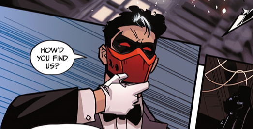
This is the most important redemption in all of comics.
#dc#dc comics#villain of the year#catwoman 57#catwoman comics#gotham war#comic pages#comic panels#comic art#character design#media commentary#funny#my jokes#original joke#jason todd#red hood#the red hood#jason peter todd#humor#comics#comic books#batfam#batkids#new romantics
97 notes
·
View notes
Text
May all those youtubers who made series where they just dissed beginner artists' ocs and labeled them as marysues a very i will find you
#Ruined a generations confidence in character design and writing#Me#I am part of that generation#Grrrrr constant worry that my ocs are too overpowered#Or overdesigned#And then i overcompensate and UNDERdesign and UNDERpower them and they become BORING#Ill kill and maim people#Looking so so SO hard at solarsands and spoctertech#Art commentary community: the worst thing to have happened to me as an artist#Sorry for the random rant but i just remembered child me being absolutely scared shitless of ending up on one of those#Instilled so much fear and anxiety in me about people in general concerning art and stories#Mauls someone#.txt
54 notes
·
View notes
Text
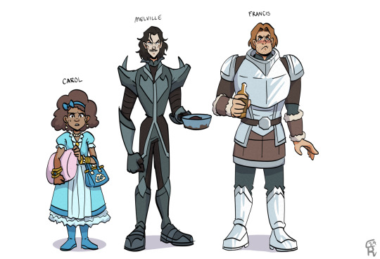
in which it is ethically and morally correct to bully a child
#diana wynne jones#the chronicles of chrestomanci#carol oneir's one hundredth dream#chrestomanci#character design#bigtime one of my favorite short stories#also decided to make carol a brown kid because one time friends and I were discussing childhood ocs#and everyone was like ‘hang on all your self-inserts were white girls too?!?!?’ and mind you we’re all filipino#very yikes of us in retrospect#but here methinks it’s fun social commentary lol#speaking of - certain lines in this short make me think dwj wasn't the type to shy away from criticisms people had to her stories#which is pretty neat to see laid out#also yes i believe melville should look as if vincent price and loki had a baby
26 notes
·
View notes
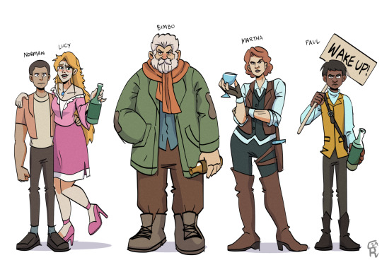
Text

So! A while ago I made redesigns for some of my least favorite Three Houses outfits. With a lot of the female characters, it feels like the priority with their design is "show boobs and/or bare legs". Obviously, I don't claim to be better at character design than the original artists, but here's my take with the following priorities (in order):
Representing the character and making them easily identifiable. Basically, the design should serve as a "condensed" version of their personality, abilities, culture, etc.
An outfit that I find (with my 100% correct and objective opinion, of course) to be attractive
Being reasonably practical, at least enough that it doesn't break immersion. Considers the character's job, available resources, etc.
Ordinarily I'd design an outfit to go with the character's body type, but I was lazy here lol. If people are interested, I could draw nice versions on the actual characters sometime. Oh, BTW, the concept for this post was heavily inspired by looking through the @bikiniarmorbattledamage tumblr :))))
Below are detailed descriptions on how I went about designing them, if anyone's curious! I will be bashing the original designs quite a bit because I find it funny, but I hold absolutely no disrespect toward anyone who prefers them to my poorly-thought-out versions :)
Bernadetta – I feel like the designers were trying to combine the female archer class outfit, Bernie’s own girly/plushie aesthetic, and the “fancy noble lady” style and it didn’t quiiiiiite work out. I really like the color scheme & overall shapes, so I just went about changing the few things that ruined it for me.
First off, the huge bell sleeves. They’re just silly and don’t match the outfit imo. I turned them into an elaboration on her cute gloves.
Gave her pants instead of booty shorts. I don’t think Bernie would wear a long skirt that would keep her from running around, but the exposed legs give her a “vulnerable” look that I don’t think she’d appreciate. Plus, having the leg-pouch strapped to her bare skin looked really uncomfy ☹.
The boots didn’t work as well with her shiny new Pants, so I gave her knitted leg-warmer things inspired by this gorgeous cipher art.
I expanded her leg-pouch-thing and gave her a teeny little dagger. I just think she’d carry weapons on her person.
Constance – Honestly, credit to her for doing the best she could with the god-awful Dark Flier class design. I still think her outfit is pretty ugly and sexist, so I made some adjustments. I tried to evoke a “noble lady” feeling, but keep the muted color scheme and lack of patterns to imply that she’s actually dirt-poor. I took inspiration from people like Ferdie (noble vibe; armor purely for show not practicality) but with her personal “edgy steampunk vampire” aesthetic.
I changed her stupid boob-cup breastplate. I don’t even care about the dangers of wearing boobplate in realistic combat—it just looks ugly. Like why do you need to go to extra trouble to say “I have BOOBS! TWO of them!!”? It’s embarrassing. I mean it’s fine if you’re proud of your boobs, but then don’t cover them up with metal maybe???
I realized that the designers probably gave her boobplate because, without it, her outfit isn’t actually all that feminine. Coco is a pretty feminine lady, so I remedied this by giving her puffy sleeves (inspired by the Awakening Dark Flier design) and a skirt-thing (with an awkward slit that would allow her to sit on a horse). The skirt had the added bonus of being incompatible with the stupid butt-grabbing hip armor. Good riddance!
Traded in her bare legs for some silly suspender-sock-things. I just thought they worked better with the skirt and more “girly” outfit overall. Also gave her shin-guards to extend the pink color scheme throughout the whole outfit.
I also changed her dress into a stylish vest that, imo, looks nicer (and comfier) with the armor. I gave her some gold accents on the vest & armguards for a dash of color.
Her belt got a revamp to work better with the vest.
Lysithea – On to our favorite doily princess! Her design doesn’t reek as much of “boobs and/or legs priority”, but it’s still silly and looks pretty uncomfortable. I actually really like the aesthetic, so I tried to keep it as much as possible. I did end up having to introduce another color (silver), though.
I think her doily skirt looks extra silly because it’s so dwarfed by her sleeves. I lengthened it, made it puffier, and added another layer beneath it.
More drastically, I ended up changing the whole top of the dress so it was a shirt & skirt instead. I’m not sure I have a justification for this beyond “I don’t usually prefer dresses”, but I’m pretty happy with how it turned out 😊 Also, what’s with the weird rows of ribbons(???) at her sides? Into the trash lol.
The ribbon attachment looks like it would be really cold on her bare chest ☹. I moved it down to the level of her shirt and attached it to her shoulders instead of her neck (for comfort).
Her shoes got boringer but less dumb-looking. What can I say, I’m not good at designing shoes.
Hapi – Hers is the least-bad of the Ashen Wolves’ timeskip designs, not that that’s saying much. I don’t really like gray and green as a color scheme, so I gave her a bit of brown and some more gold accents. Other than that, I feel like she has a sort of forest girl/witch/traveler look, which I tried to keep as much as possible.
Obviously, the silly boob-separator strap had to go. I have no problems with Hapi being sexy, but she’s much more the “forgot to put on my pants when I rolled out of bed at 1:00pm” type rather than the “put extra effort into showing that I have TWO BOOBS” type. Therefore, I kept a similar amount of skin showing but tried to make it easier to assemble.
Her new skirt was based on the Valkrie designs from other games (you’ll notice the similarity to the Mist-inspired outfit in this post). I think this version is both cuter and looks easier to move in. Also, I love giving everyone too many belts! Hers has a lil pouch for carrying random junk she finds.
Both her arms and legs looked a little boring imo, so I gave her some pretty bracelets and altered her shoes. Plus, her original boots looked hard to move in. Here, the actual boot is pretty loose but is tied below the knee with an extra laceable piece and above the knee with a brown strap.
Petra – Ho boy. I always felt like Petra’s design could be potentially problematic, although I’ve never done any research. Anywayyyy, it’s clear that the designers wanted something “exotic”-looking, but they had no ideas beyond “well she’s from a warm climate right” (In reality, someone from a warm climate would probably be unadjusted to the cold and bundle up… but that goes against the goal of “condensed character description” so I don’t really mind). Instead, I took a lot of inspiration from this awesome Cipher art! Her color scheme is a hot mess but not without potential, and personally I think I did okay with it!
Ok, ok, her design also does a decent job of indicating that she’s royalty from a hunting-focused nation. When re-doing her top I tried to keep that in mind, so I gave her some fancy jewelry and animal goods (i.e. fluff). I don’t feel like re-iterating the boobplate argument, so suffice to say that her breastplate suffered the same fate as Constance’s.
I adjusted her arm jewelry to be more to my liking. Not really any logic there.
Her miniskirt is pretty dumb, so I changed the shape and incorporated some hip armor (someone tell me the official name). I also took away the fluffy fringe, seeing as she already got some fluff around her neck. Instead, I added the pattern that was originally on her leg-band.
Do I need to explain giving her another pant leg? I know her outfit is based on the female thief class, but it doesn’t look good there either. And once again, I had no ideas for her shoes beyond not liking the old ones ☹.
#my art#fire emblem#fire emblem three houses#fe16#bernadetta von varley#constance von nuvelle#lysithea von ordelia#hapi#petra macneary#outfit design#character design commentary#digital art
99 notes
·
View notes
Text
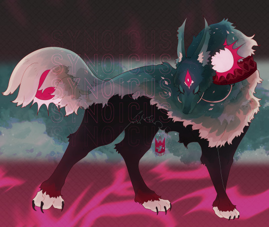
A once magnanimous guardian spirit, burdened by the people to bear the weight of two suns.
#Andraws#character design#monster#creature#me commentary. I'll be real I had this guy mostly done but I just forgo with artfight and everything#but! I'm happy with them haha
82 notes
·
View notes
Note
How do you feel about the character design of the spirit from dead by daylight? Her back story implies that her age is high-school or younger and the outfit, if you could call it that, makes no sense with it either. Another game that is fun but feels like it's being ruined by consistently sexist skins for other female characters.
From a more general perspective, the bigger problem with The Spirit, aka Rin Yamaoka, seems to be deliberate under development so that they can employ as many tropes and gimmicks as possible, without doing more than scratching the surface - and the general conflicts of what media is and isn't comfortable with.
Specifically a lot of it seems to be hung up in the idea that while men can be inherently evil or selfish in their violent motivations in infinite ways, women who become horrors generally conform to narrower tropes that almost always portray them as a victim.
If we want to move past this in horror and related genres, we need to not just support fictional women's rights, but also their wrongs.
Rest of the post is below the cut both because it is long, but also because it contains some disturbing imagery - however I think it's worth also just juxtaposing the promotional in-game depiction of The Spirit with the other very Japanese original horror creature in Dead By Daylight... The Oni.
I should also cover, there's probably a whole thesis worth of interesting discussion that could be had about the attempt to import Japanese horror into this game... but I'm really not qualified to speak on that in any meaningful way.
-wincenworks
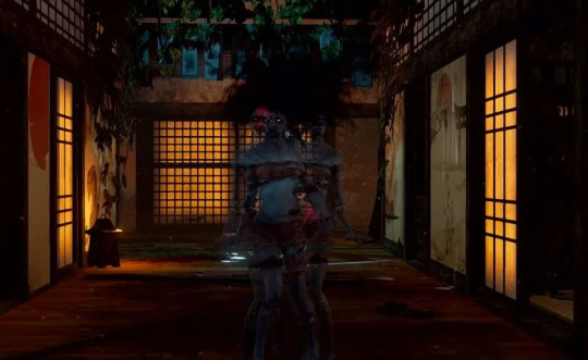
Looking into it, her backstory makes it very ambiguous since her lair seems to be a house from an era where traditionally unmarried women would live with their parents well after the age of majority.

And the image that accompanies her lore seems to support this:
And if they'd stuck with that, she had the potential to be very cool in the same way that Hisako is. Unfortunately, they did not do the deep dive into that and instead... well.
I can completely understand why people would conclude she is high school or younger since they decided to dive into the Japanese Schoolgirl trope as well:

Which creates a lot of issues with the default design which is less bikini armor and more... she's supposed to be naked but that won't fly so she's got convoluted bindings on instead. I don't think anyone is supposed to fap to it, I think it's supposed to emphasize she was a vulnerable girl who has become a monster due to horrific wrong that was inflicted upon her. There lies the double standard.
Becoming evil due to having evil inflicted upon you is a staple of the horror genre, often in a manner that is very critical of the society it was created in but just as an exploration of potential or imagined evil. However, how its portrayed is often different for male terrors.
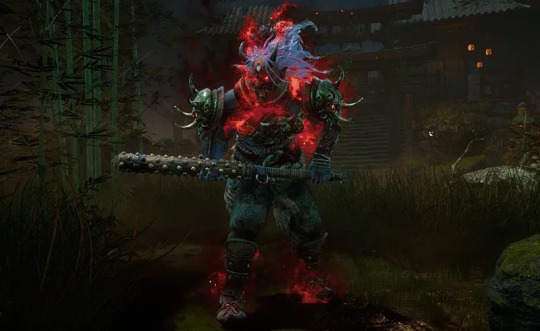
For example, Jason Voorhees has the victim of childhood bullying (culminating in being drowned at a school camp) and being raised by a very disturbed parent, he is the manifestation of rage and he looks like a buff blue-collar guy in a hockey mask. But like... he's in a different game so lets look at an example from Dead by Daylight.
Leatherface is, like Rin, both victim and perpetrator. He kills because his family commanded it, because he is scared of what will happen to him and because his life was shaped such he feels he has no choice to in order to keep living. This is what he looks like:
Nothing about this design projects his status as a victim, because for male slashers victimhood is supposed to be the twist, the unbelievable backstory - for female slashers its the rule, and the mandatory backstory.
Men can be the full range from victims to pure evil, women must always be victims who started with good intentions.
-wincenworks
#the spirit#dead by daylight#the oni#the cannibal#leatherface#rin yamaoka#horror#bikini armor#character design#ask#cooking-with-scorpion#commentary#video games#Bikini Armor Battle Damage#BikiniArmorBattleDamage#BABD
181 notes
·
View notes
Text
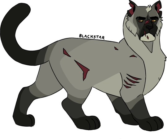
#blackstar#shadowclan#leader#the prophecies begin#fav character#warrior cats#warrior cats designs#commentary: i WAS doing my requests chronologically but i figured i'd get more enjoyment just doing the ones i had inspo for :3
298 notes
·
View notes
Text
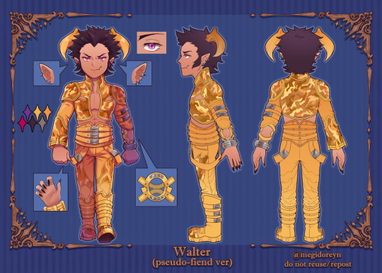

Since we didn't get pseudo-fiend designs for the alignment characters in SMT4, I was curious in seeing how they'd look! So I made a pseudo-fiend design and reference/turnaround sheet for Walter-Lucifer just for fun😈💜
He uses elements from both of Lucifer SMT4's phases, as well as Walter's human features.
💜twitter
#smtiv spoilers#shin megami tensei#shin megami tensei iv#smtiv#smt4#megaten#walter smtiv#as always: my personal commentary is below in the tags!#I think my favorite part was incorporating the wasp-like wings from (SMT4's) Lucifer Phase 2! The gradient in particular was fun to add ^^#His traje de luces (bullfighter uniform!) truly is a TRAJE DE LUCES/“flashy” given the yellows on Lucifer Phase 1's outfit LOL#Remembering how Doi in the SMT4 FINAL artbook said that he didn't think Lucifer was menacing enough LOL Gauhguahgh...TRAGIC BUT TRUE.#¿¿¿¿WHY DID THE GUEST ARTIST MAKE LUCY IN BASE SMT4 BALD???? WE WILL NEVER KNOW...#I didn't want to stray too much from Lucy's SMT4 designs which is why I kept the gaudy yellows and TRIED to offset that color blocking#I've actually drawn this design on twitter and multiple times too! but I've never posted this character sheet anywhere until today#fun fact: I actually finished this sheet 2 months ago in MAY...but I kept sitting on it and never posted it fsr LOL
62 notes
·
View notes
Text
Lets all look at Cock Out and The Skeleton beta testament okay
#scanned gg character designer magazine pages. smile. waiting for them to upload to gdrive. smile#the skeleton is not new that was in the 10th anniversary book. but this is a better image#left 1 is new but only a little different from their final design. but well the difference is um interesting. smile#also? ive said that skeleton testament looks like an elder scrolls character. and well this says their name was fucking Blackmore.#literally some elder scrolls shit.#other than that the commentary for them is not very interesting at all. but its okay lol#its the shortest text of all the characters and it says ‘shinigami’ 4 fucking times like Yeah i know i get it. i get it.#daisuke has said interesting things about their design outside of this its literally fine.#i can be autistic about them rocking an even sluttier skirt and originally being named Fucking Blackmore#the kat goes meow#gg#testament tag#missing link
34 notes
·
View notes
Last Seen Blogs