#i used a warmer color palette than i normally would and i tried to use more color for my shading and i just think it looks so pretty
Text
Kuko on the brain because we're getting rhyme anime s2 so ofc
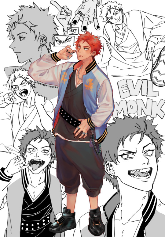
#kuko harai#hypnosis mic#hypmic#my art#you know the bed head one is my favorite out of all these cause i posted that separately lol#i did some fucking around with my coloring and i really like how it turned out!!#i used a warmer color palette than i normally would and i tried to use more color for my shading and i just think it looks so pretty#i gave up on my last kuko drawing so this feels like redemption lol#n e waysss i'm very much looking forward to rhyme anima 2 electric boogaloo#i'm also very excited for the songs#all the songs from last season were absolute bangers so i have high hopes
366 notes
·
View notes
Text
I’m going to do a quick analysis on the pieces I felt I learned the most from during Artfight2020. I made 20 character illustrations over the course of a little over a month, got to draw a lot of different characters and environments, and would like to catalog what I feel I gained from it in terms of technique and process. A little Post-Mortem, if you will. Normally I would draw a little cartoon or something as a header but I’m tired lol. These are not really in any order. I am going to include the username of the characters’ owners but am not going to “@” them as not to annoy anyone, these are just kind of my personal thoughts about my process.

Burn Forever - Character owned by @/evilbeards. Really love the colors in this one, it makes it look very regal, while also reminding me of medieval antiquity. This is the best fire I’ve done in awhile because it has both pleasing shapes, and a variance in hues within the flame. I made a point to remember this when I did “The Last Candle Burns”. I also really went all in with uplit lighting that clung to every crag in Tel’s face and think it paid off, it made me more confident that I could pull off more scenes with dramatic lighting in the future. Also, knocking the top of the throne of branches out of black and into dark blue gives an effective illusion of distance.

Bloodline - Characters owned by @/SaltiestGoat (twitter). A solution to characters presented primarily in black and white was to make the colors more symbolic than naturalistic - the story these two characters (who are father and daughter) were presented with was extremely vivid, and so it wasn’t hard to distill it into motifs that could be represented with color - power and violence as red, which is both compounded and spread via war/material wealth (gold), a cyclical relationship that is bright and searing against a cold, grey world. And white as something strange/supernatural and unearthly (eyes and teeth). Something I like when viewing art on a digital screen as opposed to a print or an original is the way that the brightest value of white feels like a stabbing pinprick, it really feels like it shines and elevates it a bit. But, anyway, using so much black was kind of a leap of faith, but it allowed for me to capture the sort of dreamlike atmosphere I was going for.

Dern It- Character owned by @/slabmangrave. Another one of those leaps of faith in using a lot of black, this time to create an illusion of depth implying that perhaps Hogarth here has been wandering around in an endless, stabbing field of cactuses, injecting a little humor, but also the vastness of the landscape. I found it a fun challenge to try and muster up a desert scene in a setting that effectively has no sun (relying on cool colors). The purple was a last minute addition that I ended up really liking, as I think it did better to silhouette The Teeth. I also used very minimal “line coloring” on this - something I really like about the source material is the textural mark making, and I feel like the starkness of black makes things have a little more of a tactile quality, in this case. I also think I might be on to something, representing specks of floating bits as small, short lines.

It’s Coming For You Through The Trees - Character owned by @/peg-head. One, I think this is my favorite set of teeth. I think the uneven quality of the two front teeth really sells it I also found it a fun challenge to change the camera up and have it be looking from a little ways below - I don’t think I entirely sold the concept of the character handing an object down to the viewer, but I think it’s a lot closer than my other attempts. I also liked using what was mostly a limited color palette, and getting to have a more desaturated, naturalistic range of colors. And like I said before, I love that small, stabbing pinprick of white light on a computer screen, and I think it works really well here.
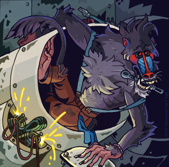
Grease Monkey: Character owned by @/night-margie. This one may have been the most extreme test of my abilities, as I usually try to stay away from background elements that are inorganic, if I can help it. But I’m in the throughs of working on my own sci-fi setting right now and figured I should challenge myself. Not quite limited colors per say, but I think the division of gold and violet light works to separate the different areas of the piece (I tried it first just with blue but found it to be way too homogenous). Not entirely successful in regards to making a character look like they are seated beyond the lip of an object, but I think the pleasing shapes the character creates make up for it…but just barely, lol. I think this has a good balance of black negative space to grimy such-and-such, and am pretty pleased with the stylization of electrical sparks. I’ll have to experiment with it further.

Cryptid Sighting: Character owned by @/gnarliegnasties (twitter). First of all I think the thing this encouraged me to do the most was invest in more abstract, stylized background elements to create the illusion of depth, and I really gotta keep that in my comic-ing back pocket . Typically, I don’t tint my blacks entirely - I usually just color objects and edges that I feel are of special interest, or need to look more cohesive (as is usually the case with seams in clothing or armor, or a character’s fingernails). But In this case, I felt tinting them violet would make the environment feel more lush, and would also attractively frame the warmer blue of the character. This is a color scheme I haven’t tried (teal, purple, blue-green and a light orange-red) and I really enjoy it.

Summersong: Character owned by @/satourni. I really love the colors on this one - but, this is one of those pieces where I feel like I could do it better if I tried again! I definitely learned a lot from - I don’t think the underwater effect around the character is quite convincing, and would have been better served with the surface being visible in the gap between Kester and the camera. I’d also say the small, beadlike drops of water are more effective than the really big, heavy ones. I’d love to do more underwater scenes - makes me homesick!

Hail To The King - Character owned by @/ petarvee (twitter). This is the one that I think I put the most time in that yielded the least satisfaction for me - I definitely feel like I overworked it. Snakes and creatures with likewise long necks are hard to draw, they need to taper in a way that feels natural, and I don’t think I really sold their feeling of mass - and the way it squishes and stretches - to my preference. I also stepped out of my comfort zone with the brighter, more saturated colors, and though I like the hoodoos, I think the rest of it is a little too discordant, despite my efforts. Should’ve had a stronger light source, or focused less on spectacle and more on portraying the character. I bit off a little more than I could chew with the hydra. I admit, I really like this artist’s work and was anxious about doing something for him - so, I ended up trying a little too hard to make something flashy. But, better to have rose to a challenge and failed doing something ambitious than to do something boring, I suppose.
In summation:
-Let shapes made out of solid colors or black create illusion of distance or more objects.
-More limited color palettes seem to yield the best results for one-off illustrations, I’m still a little new at coloring compared to other people and need to remember that. I need to “grind” a little more.
-A painted-in highlight accentuating an edge can both imply a stronger light source, and be a way to separate shapes too similar in value. But don’t overdo it or it becomes a little obnoxious.
-Knock back an object with color to make them feel further away - you know, atmospheric something or another.
-Balance black negative space with textured surfaces - it shouldn’t be a clean 50/50.
- Those little hash marks do a pretty good job at varying texture and particle effects. Use em more.
33 notes
·
View notes
Photo
Koh-i-Noor Polycolor Pencil Review
Well here's a supply I actually had no plans on acquiring or testing.
I have acquired plenty of colored pencils in the past, and honestly, the Koh-i-Noor Polycolors weren't really on my radar for the simple fact that it just doesn't seem like a lot of people talk about them. They didn't seem to stand out as terribly special. Most of the pencils I'm interested in acquiring usually have something special about them or they otherwise stand out for one reason or another.
These, likewise, ended up catching my attention solely because I found the 24 set on clearance at my local Michaels for $20.
Although, I was also vaguely interested because in my colored pencil research I had previously come across a theory that, since Chartpak is a sort of parent company behind the scenes (and the new model of Spectra AD markers are virtually identical to the Blick Studio Brush markers) that these pencils are either the same or are manufactured almost identically to the Blick Studio colored pencils. I don't have the Blick pencils, but I have considered getting them before since they've been reported as pretty good and they're supposed to be an artist quality pencil but the prices are more reasonable than some truly high-end artist pencil options out there. So I figured if I tried these and the speculation is on the right track, perhaps these would be a good way to get an idea of what the Blick pencils are like beforehand, even if they're not actually the same pencils with different branding.
Now, a clearance price of $20 still sounds pretty steep for 24 pencils. And to a certain extent, it is. But we have to keep in mind that brick-and-mortar stores like Michaels love to markup the product prices right out of the gate. Upon further research, this same set averages around $30 online, whereas the original price listed on these from Michaels is $50. For further comparison, at the same time that I found these, the store also had a couple of Faber Castell Polychromos 24 sets for about $30 apiece as a clearance price, and online the same 24 set goes for around $40 or more. So the prices are still technically good deals, they're just not like "ohmygosh that's so cheap I can't believe it!" kind of deals.
I had one other previous experience with Koh-i-Noor pencils in the form of their set of 12 tri-tone pencils, but those are more of a specialty item and thus I don't use them as normal colored pencils and I don't feel comfortable putting them through my normal colored pencil testing, same as the tri-tone colored pencils made by Crayola that I acquired around the same time.
So I went into testing these without much pre-conception for what they'd be like.
Even after poking around for some extra information on my Colored Pencil Testing Workshop and seeing how other people would describe and compare them, I still felt like I was going in largely blind since the comparisons were usually a little vague and base-level. And also, just, in general, there aren't a ton of in-depth reviews to be found for the Polycolors.
Of the information I found, I learned a couple of interesting things:
1. There's some debate as to whether or not these pencils are oil-based or wax-based. Most online listings say they're either oil-based or say they've been "made with oils." But there's a rumor that there was a translation error (since these are made in the Czech Republic/Koh-i-Noor is presented as a foreign brand) and they're actually wax-based. The most compelling idea I ran across is that they're wax-based but given some kind of oil bath as part of the manufacturing process. But the reason this matters is that it does affect how the pencils behave to a certain extent, and it also matters because it's not fair to compare an oil-based pencil to a wax-based pencil and expect them to perform the same. For example, oil pencils traditionally have better layering capabilities, but they're not good for getting a lot of intense color down quickly, meanwhile, wax-based pencils don't usually layer as well but you can usually get more intense color more quickly.
2. These seem to share a very particular trait with the Blick Studio pencils I mentioned earlier. The biggest sets you can buy for each have 72 pencils total. However, both lines have a Portrait set and a Gray set, and these sets contain some additional colors that aren't available in the 72 set. The Blick pencils, including these other colors, are a total of 91 colors. I couldn't find an official word on how many total Koh-i-Noor colors there actually are, but given the above speculation, it wouldn't surprise me in slightest if the number is also 91, which likewise add to the credibility that there's a link between the two pencils.
I can't comment much more on point 2, since I don't have any Blick pencils to compare them too, but I'll talk about point 1 more in a moment.
Before that, though, let's talk about the pencils' appearance and packaging. Aka, most likely the first thing you'll notice about them out in the wild.
The pencils themselves have hexagonal (hexagon-shaped/six-sided barrels) instead of smooth round ones, which I thought was an interesting choice since the longer I look, the more it seems that most companies make their regular colored pencils with round barrels and save the hexagonal barrels for their watercolor pencils. They also have dullish gold-dipped ends with a white line separating it from the main color of the barrel. The gold dipping is nice, but I'm not crazy about the white line. It looks kind of tacky to me, but that doesn't really have much bearing on how good the pencils are.
They also have gold printing on one side with the brand name, a number identifying the Polycolor line specifically: 3800 (at least I assume that's what it is), and the number tied to that specific color. The opposite side of the pencil, curiously, has black printing with the color name, some other 3-digit number I can't figure out because some pencils have the same one, another much longer string of numbers, a barcode, and "Czech," as in they were made in the Czech Republic. I mention this because, as someone that likes to chart and organize my pencils pretty meticulously and make sure I have the right color at all times, I found it kind of annoying in practice that the color name and number were on opposite sides of the pencil.
The packaging is a little more interesting. Koh-i-Noor seems to like this system of having their pencil sets both in a pretty nice storage tin with a completely detachable lid (although for some reason I find the tins seem a lot nicer in person than they do in pictures online for some reason) and then they'll have the tin with the lid off encased in a cardboard-backed, plastic-front hang card. I like this because I case us the plastic front as a disposable paint palette before chucking it in the trash, but otherwise, there's not really a lot of obvious rhyme or reason as to why they package them this way.
Beyond that, this set also came with a little "quality guaranteed" square piece of paper, just like my tri-tone set did, a piece of tissue paper that I guess is for putting in the tin on top of the pencils? And much to my surprise, a little fold-out pamphlet showing off all the products that Koh-i-Noor makes. Expect, for reasons I can't figure out, the tri-tone pencils don't appear to be anywhere on said pamphlet.
And yet the pamphlet shows all of these other supplies I previously had no idea that Koh-i-Noor made, including watercolor and acrylic paints, paintbrushes, papers, and even fixatives.
Overall though, this gives otherwise unremarkable-looking pencils a pretty nice presentation. And I personally really appreciate that the tin lid comes all the way off and isn't hinged to one side, but that's really a personal preference thing.
As for how the pencils actually work, for the most part, they're pretty average. They blend more nicely than something super cheap like Crayola or dollar store pencil finds, though I wouldn't say they blend quite as nicely as Prismacolor. I had some very minor issues with getting good, even consistency, and they're not nearly as soft and nice to work with as Prismacolor, or I would argue even as some of the other brands like the Polychromos or Schpirerr Farben. But you can see on the drawing here that I was still about to get plenty of layers going back and forth, and the blending still came out pretty nice and smoothly so long as I was patient with it. It didn't come as easily as something like Prismacolor, but it came well enough, I think.
What I did find interesting about how they perform is that, for one thing, they have a very sandy feeling against the paper that's uncannily similar to the June Gold Mechanical pencils. And the June Gold pencils are confirmed as being oil-based. Similarly, while I don't think these had the "limitless" layer-ability that most oil-based pencils like the June Gold, or Schpirerr Farben, or Faber Castell Polychromos do, they did layer for longer and better than I was expecting. This is what makes me think that the whole "wax-based but given an oil bath" idea is true, or that they are in some other capacity an oil/wax hybrid, instead of just being solely wax-based.
And they do feel more rigid and less soft like most oil-based pencils do. Which makes them seem like they have a weaker pigmentation whether they actually do or not.
Speaking of which...
As far as color selection for the 24 set goes, the only thing that I really feel like I'm missing here is a pastel purple. You get a white, a warm and a cool yellow, an orange, a warm and more neutral/cool red, a burgundy type color, a pink, a magenta type color, a purple, a warm blue and a cool blue, a dark neutral blue, a yellow-green, a seafoam/blue-green, a warmer dark green and cooler dark green, an ochre and a red, neutral, and dark browns, a grey, and a black. Personally, I think I would've swapped the magenta color for said pastel purple. Other than that, I think this is probably the most well-rounded selection I've seen of the 24 color sets that I have. And the colors come across as pretty rich and vibrant too, which I also can't say I was expecting. (And is also why I went the route that I did with the visuals and colors on this one.)
My other two main complaints are with the white and black. The white actually did better than I was expecting, but on it's out it is still pretty lackluster compared to the Holy Grail Prismacolor white. It takes a lot to get it to layer on top of other colors, but it is technically possible. But it does do pretty okay as a blender like most lackluster white pencils do. And the black, unfortunately, isn't a true black and is instead a very dark gray that thinks it's a black. It's dark enough you wouldn't really notice without putting it next to a proper black, but it's still a little disappointing to me because it just doesn't have quite the right punch to it because of that.
I will say that these handle gel pens extremely well. In a ranking out of 5, they get a 3.5, which is really good since I haven't seen anything beyond a 4 and most pencils struggle to get as high as a 3. I was genuinely surprised about that during testing.
Ultimately, they perform pretty well for $20. However, I don't think they're worth the $50 price tag Michaels original put on them. If you're going to spend that kind of money, I suggest getting the 72 set of Prismacolors that usually fall just shy of that number over on Amazon. But if you're curious or a colored pencil connoisseur, then they might be work picking up if you can find them for the $20 price point as I did.
The Koh-i-Noor Polycolors work just fine, good even, but they just don't stand out very much. I can see why not a lot of people talk about them; the more talked about brands like Prismacolor and Faber Castell really stand out and shine on their own (especially Prismacolor as the price has come down to the low end for true artist quality pencils over the years) and you end up getting more bang for your buck.
And personally, again, they came out pretty good in testing, but I personally don't really care for them. I'm not sure why, but I think it has something to do with that sandy feeling and the few performance issues I do have with them. Still, I did my best to not let my personal dislike affect the overall verdict on whether or not they're any good or worth the price.
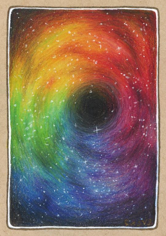
A little about the drawing itself before I bow out: I was going for a kind of black hole effect, in some kind of rainbow-galaxy, after not wanting to do just another typical galaxy but still wanting to do something that would really push the blending and layering abilities of the pencils. It's not perfect even in concept, but I still think it turned out pretty nicely. I also tried my best with my white gel pens to get a more natural and consistent star effect, since that can be kind of a challenge with colored pencil pieces using only gel pens to get said effect. And I think I managed pretty okay in that department.
And after all, was said and done, I went around the edge with my black Gold Shadow gelly roll pen, as it felt like the best/most neutral choice out of the different options I'd considered. You can't really tell on the scan, but it has a kind of neat almost not-there effect in person until you move it in the light, since the gold in the ink is really close to the tan paper color.
I may not be crazy about the pencils themselves, but I am pretty happy with how the drawing turned out, and it was actually really nice to take a break from Inktober stuff and work on a good ol' pencil test/review piece. It really hasn't been that long since I've done one, but I've done so much since then that it feels like it has, and I do really enjoy testing/trying out new supplies, whatever they may be, even if I don't like them that much or don't end up using them very often.
That said, I don't know when the next supply test like this will be, and it may not be for quite some time, but whenever it happens I'll be looking forward to it, that's for sure.
Now if you'll excuse me, Inktober has come and gone and that means it's back to making more complex art on the regular for me.
____
Artwork © me, MysticSparkleWings
____
Where to find me & my artwork:
My Website | Commission Info + Prices | Ko-Fi | dA Print Shop | RedBubble | Twitter | Tumblr | Instagram
4 notes
·
View notes
Note
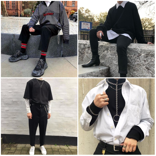
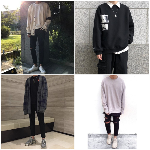
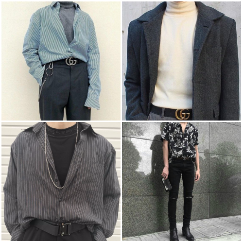
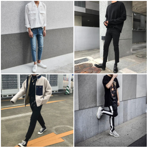
could you give us a rundown on each member's individual fashion style???
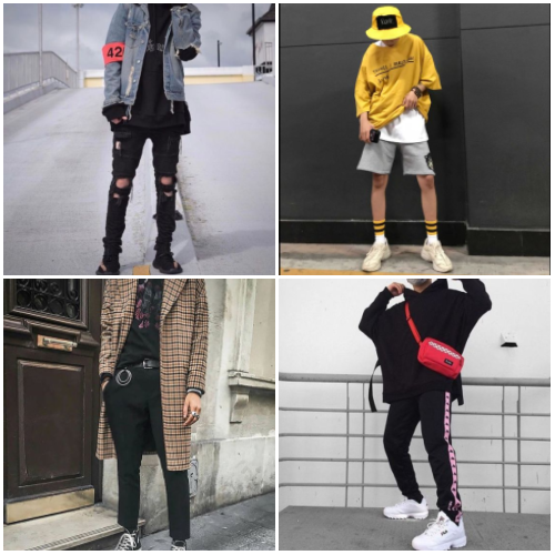
abso-fuckin-lutely, have some moodboards too for good measure
r.e.m.
likes looking “swaggy” like the swaggy rapper he is
wears a lot of looser patterned clothes that are technically “in” for hip-hop
often sees something on another idol and goes “that’s neat” then tries to find it on the internet
supreme? he’s got it because he’s full of swag and the company can afford it for him so he’s gonna take advantage of that shit
his entire closet? filled with stupid bucket hats and fanny packs. has decided he has too many. decided to sell them to owen and daesung. they were stupid enough to buy them
around the dorm you can usually just find him chilling in a sweatshirt and sweatpants. loves himself some sweats oh boy. probably wears sweatpants to the airport as well just because he wants to be comfortable on the plane so he’s not gonna give two shits about whether there’s a stain on his pants or not
hyunseok
the stylists always end up dressing him a lot more showily than he’d want to
aways likes to have at least one red accessory somewhere, big sucker for it
styled with dangly earrings and tons of rings? It’s more likely than you’d think
doesn’t dress with the complete mom aesthetic most expect of him when on his own time; is a supporter of skinny jeans, turtlenecks, layers, jewelry. he likes fashion, takes pride in looking good. when everything else feels out of his control, his outfits aren’t.
doesn’t tend to like wearing super bright colors, sticks to greyscale and red for the most part.
at the dorms, catch him walking around in sweatpants and ryeo’s t-shirts, silk robes, and glasses. his eyesight is garbage. usually is a complete mess on days off; wearing two different slippers, no glasses because he’s dumb so he’s just squinting at everything really suspiciously, no pants, and a t-shirt like five sizes too big while he cleans. help him.
tenshi
has two completely different styles. his idol fashion and his dorm fashion. they’re so insanely different that if any fan saw him in dorm fashion they’d be like “whomst is that???”
idol fashion: big comfy sweaters, jeans, the biggest long sleeve t-shirts because wc absolutely cannot have him showing off his muscles
dorm fashion: very tight work-out tees. basket ball shorts. but lets go back to the t-shirts. because when i say tight i mean he’s grown two sizes in t-shirt, but hasn’t gone shopping for new ones yet tight
would love to get to wear something other than long sleeves outside, but working for wc means that he’s supposed to maintain his sweet angel image so sweaters in 90° weather it is
finds work out clothes very comfy and would like to just be in them all the time
he tends to just sleep and wander the dorms in the morning in a pair of boxers and a large t-shirt that isn’t that big on him, but jui would drown in it
jui

he’d like to say that he’s the most fashionable member of k.o, but dohwan would probably punch him in the face if he said that and then proceed to go on a rant about why he’s the most fashionable member
loves anything that will button up and tuck into some tight jeans because he actually has great proportions and his legs are to die for, so he’s gonna show them off
wears only the finest of materials. hit him up with some nice silk and like designer denim. wishes he got that gucci deal instead of dohwan
accessories are a big yes. wears a lot of fun earrings and rings and bracelets. there’s always a nice belt holding up his pants because he’s that bitch
fashionable even at home. definitely has like silk pajamas and parades around in them being comfy and fashionable
can only steal jungsoo and kyungsoo’s clothing and is salty. wants to steal dohwan’s shit but the man’s 5’11” and it makes jui angry
gem
he’s low-key legally obligated to wear gucci at all times, according to him. he’s the fashionista of the group and debatably the best at styling himself, loves clothing.
has no problem with showy high fashion, loves anything with a bit of shimmer to it, silk, flowy shirts with the top few buttons undone, chokers, turtlenecks and button-ups.
big on accessorizing, especially gucci belts/anything with a brand name on it.
color wise, he likes blue and purple in particular — isn’t afraid to go bold with color to stand out.
doesn’t usually like showing much skin publicly, covers up even in the sun. he’s been made fun of by fans for wearing literal suits on the beach.
at the dorms, he’s more free with how he dresses. catch him making cereal at one in the morning wearing silk pants and no shirt.
jungsoo

the SOFTEST sweater wearing fool — loves sweaters, cardigans, and warm fabrics. he could complain about being cold in the middle of the rainforest.
likes bright patterns and colors, mainly because he’s so damn short and needs to find a way to stand out somehow.
has two modes: on stage, he’s usually styled very precisely and looks pretty damn hot. offstage, he seems tiny and about twelve years old, likes to pull his sleeves over his hands and swat people with them for attention.
is 10/10 the most likely to rip something by not even doing anything, is just a clumsy lil baby.
likes jewelry, usually necklaces and rings, has a necklace with a star on it he never takes off.
at the dorms, wears hongsol’s hoodies religiously and shorts or pajama pants with cute patterns like ducks. will defend his ducks with his life, don’t make fun of him, you’ll get a shoe thrown at your head.
sol
wow he’s just not put together when it comes to fashion much at all. has a stylist buddy that plans his outfits for the week cause she doesn’t trust him to do it himself
pun t-shirts? oh yes please. he has just the worst graphic t-shirts that are all like a million years old that he pairs with jeans
has once just gone to the airport in one of these stupid ass shirts and a pair of ripped to hell jeans and there were victories that laughed at him
likes denim. a whole lot. like he only wears jeans. usually black jeans paired with a white t-shirt or a black t-shirt
his fashion isn’t actually all that interesting in public because he still wants to wear a t-shirt and jeans, but his stylist friend is like “what the fuck do you think you’re doing” whenever he wears a fun shirt
his color palette is exclusively black and white unless he’s being directly dressed by a stylist for a performance
seungjae

boyfriend aesthetic, completely. likes to dress in layers with flannels, cardigans, etc. dresses for comfort and for practicality.
prefers muted and warmer earth tones, nothing too harsh on the eyes.
he’s usually styled in a lot of flowy and silky things, he’s not a fan but doesn’t complain.
has this one denim jacket all of the members have signed, he wears it all the damn time. it’s incredibly important to him, and he brings it with him wherever he might be filming.
doesn’t normally accessorize much or wear a lot of jewelry besides a designer watch — practical.
around the dorms, he’s usually in jeans and a flannel or knit sweater.
law
edgy bitch aesthetic, as could be expected. ripped jeans, leather jackets (if he can get away with not wearing a shirt under it, bet he’s going with that), flannels, denim jackets, anything experimental and showy. if he’s not really making an effort, sticks to jeans and black t-shirts.
the more skin he can show, the better; likes to show off his tattoos, has no shame with it.
doesn’t like wearing a lot of jewelry besides rings and earrings. he dislikes dangly earrings and prefers studs, and with so many piercings in each ear, that’s wise.
if he’s not wearing doc martens or converse, there’s an issue here, chief
part ii of the monochrome and red gang, but wears dark jewel tones from time to time. claims wearing white washes him out, usually avoids it.
at the dorms, he’s usually shirtless and wearing grey sweatpants. hates shoes and will be barefoot any time he can. refers to shirts as nipple prisons and usually gets smacked for it, don’t let him have rights.
kyungsoo
if there’s one thing to say about kyungsoo’s fashion taste it’s that everything he wears is at least three sizes too large on him. big sweaters, shirts, jackets, and more are his favorite things to parade around in
habitual clothing thief from his members. likes to steal jae and ryeo’s stuff the best. usually takes ryeo’s sweaters because they have similar styles
he’s already pretty small but his clothes always make him look even smaller. people comment that he always looks so soft in his big sweaters and flannels and stuff
likes pastels and greys more than your average bear. can almost never be found in a fully saturated color
a lot of his clothing falls into the ‘comfort over coolness’ area since he’s super sensitive to certain materials and doesn’t like tight fitting clothing
really loves the dress shirt under sweater combo as well as buying too big t-shirts/button ups and tucking them into a tight pair of black jeans
owen

the boy! loves! colors! pastels are a big yes for him and pairing those pastels with things like overalls and such is so much fun
he’s also a huge fan of things with pockets. like, the more space to keep stupid things in the better. owns a jacket with fifteen pockets that remi and kiyong bought for him as a joke, but he actually adores it and wears it all the time
follows like those modern flower-boy trends where he puts on some mom jeans and tucks a t-shirt into them. fans think it’s super cute
also a big ol’ sucker for putting cool jackets on top of his sweatshirts so he looks fun and edgy. his sweatshirts are 99% of the time stolen from dae
can just be super simple too. half of his shirts are just white or stripy and he’ll usually stick a button up on top of those and pair it with some jeans and white sneakers
speaking of sneakers, you’ll never find him in any other shoes unless he’s forced to. once wore converse with a suit on the red carpet
lux
loves sweatpants and oversized shirts/hoodies, skinny jeans. usually just looser tops and tighter clothing on the bottom, really.
big sucker for the color green, he claims it looks the best with his hair and skin color.
dresses for comfort and looks uneasy when he has to wear more delicate clothing and anything ridiculously expensive and fancy.
10/10 the most likely to buy some $3 t-shirt and wear it for like a week straight.
almost always wears athletic shoes of some kind.
around the dorms, he dresses pretty similarly: sweatpants, hoodies, burrows in his clothes.
6 notes
·
View notes
Text

I know this is 3-months overdue but better late than never, right? Here’s me trying to make a comeback. Let’s see how long I can last until my next hiatus lol.
2017 was definitely another year of beauty obsession and consumption. Probably one of the best years in the field’s industry for impressive trends and expressive creations, too.
For the rest of this post, I will be discussing my favorite products of 2017. Not all categories are included and not all highly talked-about products will be discussed (i.e., I do own the Huda Beauty Desert Dusk palette and the Jaclyn Hill x Morphe palette, but I haven’t had time to play around with it).
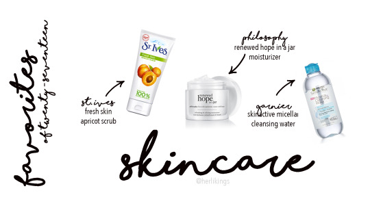
Let’s start off with skincare...
I’m at that age where I want to focus more on my skin, but also do not know exactly what I need for my age and skin type. However, among all the skincare products I recently started to accumulate, these three have been my tried-and-true for awhile...at least enough for me to continue repurchasing.
1. I love to my Clarisonic with the brand’s own cleanser, don’t get me wrong. However, I personally feel like my Clarisonic does not get down deep in my skin like an exfoliating scrub. After using St. Ives Fresh Face Apricot Scrub my skin feels more refreshed and cleansed. The added texture from the walnut grains, with the light smell of the apricot extract, is a pleasant way to wake myself up in the morning, especially for mornings after a long-wear of makeup. I personally keep my bottle in my shower.
2. I classify my skin to be more on the normal/oily side of the spectrum. I often go through phases of dry patches on my skin especially once fall and winter comes around. I like to believe my skin is a bit sensitive after some failed trials with facial masks, so I wanted a moisturizer that I knew wouldn’t irritate my skin. I used the Neutrogena Hydro-Gel Moisturizer for Very Dry Skin for awhile but it was alright. I repurchased it even thought I felt as if my skin was not fully hydrated; it felt like the gel sat on top like a hydrating primer. I forgot how I was convinced to try Philosophy’s Renewed Hope in a Jar Moisturizer in the first place but I’m glad I was willing to try it out during my time with Ulta Beauty. A little does go a long way but my skin always feels firm and perfectly hydrated (but not too hydrated).
3. I am still trying to get my mind wrapped around the use of micellar waters but I find this one to be especially handy in my kit. I like to use this with a cotton pad after using a makeup wipe. This is also my go-to product when I need to take off my stubborn falsies. It’s super gentle on my natural lashes but strong enough to take the lash glue off.

I truly believe foundations was one of my highly purchased product for 2017. In the past, I rotated between 3-4 different foundations because I did not want spend a lot on just one bottle once I run out (aka I preferred to wear drugstore foundations as often as possible because of it’s pricing compared to high-end formulas). However, I started to notice the benefits of investing in prestige foundations for many reasons (i.e., coverage, finish, and color match [!!!]).
Disclaimer: I am not including primers this year. To me, I feel like I didn’t find at least one primer that made me go, “WOW this is amazing.” Nonetheless, I still use primers as part of my makeup routine since I already have some in my kit.
1. Another tried-and-true that I constantly mention: Make Up Forever Ultra HD Invisible Cover Foundation. Medium to full coverage. This formula isn’t heavy on my skin; extremely lightweight and easy to blend. Little-to-no white cast. Also, this is one of the foundations in my collection that has the most spot on color match with my skin.
2. I was a bit hesitant to try this brand because no one really talked about it on social media. When I used to work at Ulta Beauty, a Fiona Stiles representative actually convinced a couple of my staff members (including myself) to not only try out the products but to purchase some as well (during this time of our training, the brand was on sale). I absolutely loved how smooth the Fiona Stiles Matte Finish Foundation Concentrate made my skin look. Since it is a concentrate, it does have a mouse-like consistency and is definitely my most full-coverage foundation out of the three favorites. With that being said, a little goes a long way for me. I also prefer to use this with a sponge. The finish isn’t completely matte - more of a satin finish if anything. Then again, maybe that’s because I prefer to apply with a sponge.
3. How can I not mention Fenty Beauty Pro Filt’r Soft Matte Foundation in my favorites? This is the first, and for now, the only product I have purchased from Rhianna’s line. I was going to wait on purchasing this foundation right away but a lot of my favorite beauty gurus I follow said nothing but good things. I’m glad I caved in and bought it. The first time I tried this on, I was just going out with some friends for a movie night. Applied this foundation a couple of hours before heading out just to see how it would wear. Caught a late movie and arrived home past midnight. As soon as I got home, I checked the mirror and oh my...I was so impressed with how it lasted - it still looked natural and felt lightweight. My oil was probably breaking through a bit at that point but not as bad. I was just obsessed and impressed with how my skin looked after many hours. This foundation became my go-to foundation for the rest of the year. As much as I tried to use a different foundation, I could not stay away from this. I prefer to use a brush for this foundation to get a fuller coverage, and then sometimes I go over the layer with a damp sponge after. I learned that tip from a Sephora associate at the mall and I can see why she does that extra step. This is such a great product that I decided to pack it in my traveling kit for some of my trips. The only thing I would critique about this product is the packaging: the cap feels flimsy so I’m always scared to pack it as is (I actually “repack” in it’s original packaging for my trips). I also don’t like how the pump gets dirty easily because it’s hard to clean sometimes.
2017 was the year of I learned to be more appreciative of concealers.
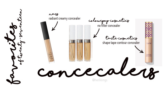
1. My ultimate favorite concealer of the 2017 is the NARS Radiant Creamy Concealer. When Ulta Beauty finally started to sell NARS during my time of employment, I was so excited to try the concealer because that meant that I can 1) see what the hype was all about and 2) use my employee discount on it haha. I fell in love immediately. My favorite part about this concealer is that it blurs out the appearance of lines and wrinkles. When the NARS representative came in to give a short training, he mentioned light-diffusing technology, which helps give one’s complexion a radiant, natural look. It is also a medium-to-full, buildable coverage.
2. Colourpop Cosmetics continues to impress the beauty industry with their phenomenal products at affordable prices. Their No Filter Concealers are full-coverage, similar to Shape Tape (but has a thinner consistency) for a fraction of the price. First, I got shade Light 20 only because it was rumored to be a similar shade compared to my other concealers. When i first tried it out it appeared too light..much lighter than my Shape Tape. However, it looked perfectly fine once blended out with a sponge. Yes, maybe a tad bit lighter than what I’m used to but definitely usable. The next time I made a Colourpop purchase, I ordered shade Medium 30 hoping it would be a better fit. This shade works for me but for days when I do not want to put a full face on; it has enough coverage to blend in with my skin if I don’t put any foundation/base on. Blends seamlessly.
3. Last but not least, of course I had to include Tarte Cosmetics Shape Tape Contour Concealer. Full coverage. Better color match, in my opinion, compared to the shades Colourpop currently offers. Even though it’s a thicker consistency, it doesn’t feel too heavy or drying. A little goes a long way.
I tried numerous of bonzers this past year from undertones to formulas. These stuck out to me.
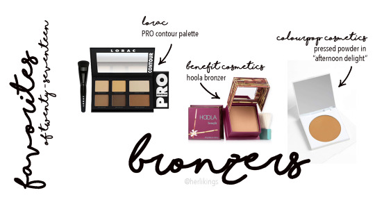
1. Tried-and-true my LORAC PRO Contour Palette. They did come out with a cream contour/conceal palette, but I still preferred their powdered version. I love this palette so much that I already hit pan on the banana powder and the large bonzer pan. Blends out easily. I always recommended this over the ABH contour palettes when I was working at Ulta Beauty.
2. Another tried-and-true: Benefit Hoola Bronzer. Can’t go wrong with this either. This has the perfect amount of neutral-gray undertones to provide a natural shadow in definition. Can also be used to contour.
3. When Colourpop released their pressed powder highlighters and bronzers, I was excited to try them. The highlighers are okay, but this Pressed Powder Bronzer in “Afternoon Delight” is impressive. It blends out so easily without leaving any streaks. This shade is perfect for my skintone - it’s warmer than the Hoola bonzer but not too orange or red.

I was totally obsessed with the glow this past year.
Disclaimer: I did not include any blush this year because I did not find one (other than the Amaretto in the BECCA split pan) that I gravitated to the most. I do have plenty of blush options, though.
1. The BECCA Cosmetics Split Pan Shimmering Duo in “Prosecco Pop/Amaretto” was ultimate my travel buddy of 2017. Brought this with me on most of my trips more than any other product. Prosecco Pop is a warm gold shade which allows it to pop without being too intense like it’s white gold sister, Champagne Pop. Amaretto is a beautiful blush - it’s not too brown to look like bronzer, but adds natural flush on the cheeks. Plus, having two products in one made packing a no brainer.
2. My initial thought when I swatched this highlighter was, “OH MY GOSH. Why didn’t I purchase this highlighter sooner?” Ofra Cosmetic’s Rodeo Drive is surprisingly, yet stunningly, so intense that you need to apply with a very, very light hand. One sweep across your cheekbones and you may blind someone. You should have seen my facial expression when I first applied it... *jaw dropper*
3. Colourpop’s Super Shock Highlight in “Wisp” is another one of my tried-and-true products, of course. This gold-champagne color and cream-to-powder formula adds a nice glow-from-within. Almost always packed this in my makeup bag when I traveled. Sometimes, I layer this under a powder highlighter to make my glow long-lasting and extra poppin’ throughout the day.
I didn’t know how else to name this category but it’s all related to the eye-area.
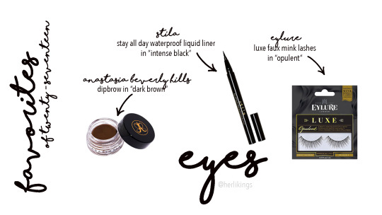
1. For the first time in a long time I did not mention my MAC Fluidline Brow Gel... I still love that product, though. The only reason I replaced it with the Anastasia Beverly Hills’ Dipbrow in “Dark Brown” is because this was my most used brow pomade of the year (mostly because I used the tester when at work). I started off with a darker shade to balance out my black hair I had going on earlier in the year, then switched to this as the black was fading out. A little goes a long way, but I still have to be careful with the amount of pressure I put on my hand + the amount of product on my brush during application.
2. I think I found my new favorite eyeliner. Caved in and tried Stila’s Stay All Day Waterproof Liquid Liner in “Intense Black” after recommending to Ulta Beauty shoppers. It is one of the best selling eyeliners at Ulta Beauty and my personal favorite compared to KVD’s. This eyeliner doesn’t smear and it glides on easily. The felt tip brush is flexible but doesn’t wear out. I’ve tried other liquid eyeliners similar to Stila’s but this forsure is still the best I’ve ever tried. Best believe I have a backup in my kit.
3. 2017 was the year I started to comfortably and causually wear false lashes. I loved Ardell’s Studio FX Wispie lashes until this Eylure Luxe Faux Mink Lashes in “Opulent” came into my life. It’s fluffy and soft; the band isn’t thick and is easy to work with. The first time I glued the pair on, I almost forgot I was wearing it. That is how light it felt.

A lot of brands released numerous of eyeshadow palettes all throughout 2017.
As mentioned earlier, I may not discuss all the breakthrough products of 2017, such as the Jaclyn Hill x Morphe palette or the Huda Beauty Desert Dusk. I do have both of the palettes but just haven’t touched them yet, or at least used them enough times.
1. Another tried-and-true to mention: Tarte Cosmetics Tartlette in Bloom. When I got this around the time of it’s release, I did not want to use any other palette. I wanted to mention this in this year’s favorites because it’s still one of the few products that works best on me over time. The amazonian clay formula is easy to diffuse without losing it’s pigmentation. It may have some fallout but I’m okay with it since it’s easy to blend out. The colors are great all year long. I recently got Tarte’s new Toasted palette but haven’t had time to play with it yet. I am certain that’ll be just as amazing as this Tartelette in Bloom.
2. Everyone’s favorite, Anastasia Beverly Hills Modern Renaissance. I think I mentioned in a previous post how much I absolute love the brand’s eyeshadow formulation - definitely one of my top favorite out there. This palette is clearly more bold in color scheme compared to the Tartelette in Bloom, but still flattering for different looks and on for different skintones. Created some of my favorite looks with this palette. A bit more fallout than Tarte and not as buttery, but smooth enough to work with. However, I think this has deeper color payoff than Tarte. In other words, it’s still worth it.
3. I kept debating whether or not I should purchase this palette but I’m so happy I caved in. This Urban Decay Naked Heat Palette is especially perfect for both summer and fall. The colors included can create both a warm, orange look or a deep plum smokey-eye. Probably the best set of formulation across the eyeshadow pans in the Naked palette series.

Last but not least, my favorite category...lipsticks. I own a lot already yet still continue to purchase more than necessary. I have a problem.
1. When I worked at Ulta Beauty, Nudestix was my go-to brand to upsell. Not only is the brand’s focus on easy-to-use products for people on-the-go, but it was also one of my favorite brands to personally use. These products are 1) perfect for busy people like me, 2) easy to pack (you can fit about 4 stix in one case, which also includes a mirror inside), and 3) almost most of the products are multi-purpose. When I had to get ready before operation hours I would run to the Nudestix fixture and create a look within 5 minutes. Guests constantly asked what I products I used on my face and later left with a couple Nudestix. My favorite lipstick they recently created is the Magnetic Matte Lip Color in “Boho.” When I had to set up the fixture and saw this color on the model, I knew I had to have it on my lips. It screamed “Coachella,” “90′s vibes,” and so much more to me. On my lips, it eventually feels a little bit more drying than expected but worth the color. It’s also long-lasting if properly moisturized beforehand.
2. Another nude to mention is the Kylie Cosmetic Lip Kit in “Dolce K.” I owned other shades before Dolce K but tend to gravitate to this shade more than the others. I barely use the lip liners (just because it’s easier to apply liquid lipstick when on-the-go), but the deep, beige nude color is a flattering nude on my complexion. I like the formulation of Kylie’s liquid lipsticks, too - long-lasting and not too heavy.
3. So here’s a funny story. When I moved back home and started to unpack my makeup collection, I found two unopened MAC Lipstick in “Whirl.” With that said, I keep one in my bag at all times no matter what. This dirty rose shade is one of my favorites because it’s not too pink nor too dark; it’s a great shade for some added color.
4. Jeffree Star Velour Liquid Lipstick in “Leo” has more of an orange undertone compared to the others, but it’s still a nude that works on me. According to the site, it’s “a true honey brown.” Pretty accurate. I purchased numerous of Jeffree Star liquid lipsticks all at once, but Leo is the only one that I tend to gravitate to the most. As much as I like Leo, I’m more of a Pisces (lol get it).
5. Last but not least, Kat Von D Everlasting Liquid Lipstick in “Bow n Arrow.” I love this shade so much. Probably the lightest nude I would and could actually wear. This fawn nude color is very neutral in tone, in my opinion. I tend to wear this when I have a dark, smokey eye.
AND THAT’S ABOUT IT.
That’s my take on my favorites from 2017, justified with my own personal experiences and opinions.
I wonder what will standout to me in 2018... Or maybe I should just use up everything I currently have in my kit... Only time will tell.
4 notes
·
View notes
Text
Hello Beauty Babes, HAPPY 2018!!!!!
Before getting into it, I wanted to wish you all a freaking amazing year that is full of accomplishments and blessings. I wrote you guys a very special message but it was a bit personal, so I decided to put it at the end of this post. so if you want, you can check it out!
Buuut for now, let’s get into some makeup!
This year has been full of new makeup. Some were good, some were bad, some were returned, but the very few have been chosen for my 2017 favorites!
Favorite Primer – NYX Hydratouch Oil Primer ($13.99)
It’s funny to think that I used to not even be that into primer & now I never go without it.
NYX HydraTouch Oil Primer is unlike any other primer I own. I never thought that using an oil primer would be so beneficial. When I saw it on the NYX website, I thought it was a great affordable dupe for the Smashbox Oil Primer. But seriously, this primer is way more than a dupe. it’s amazing all it’s own. It doesn’t feel greasy, or separate your foundation. It gives your skin and makeup a natural, glowing from within look.
Even when I use other primers, I still use a few drops of this in the foundation I’m wearing to give it an extra boost of glow.
Favorite Foundation – L’oreal Infallible ProGlow ($11.99)/ Maybelline Fit Me Matte&Poreless ($5.99)
I couldn’t choose between these two, so I’ve called a tie.
Loreal ProGlow is a Normal/Dry girl’s dream. It has medium coverage, but it doesn’t feel too heavy on the skin and gives your skin a naturally glowing from within look. I recently repurchased this and have worn it for most of fall/winter.
Maybelline Fit Me Matte&Poreless really suprised me. I thought that because it was matte I wouldn’t like it, but it has the perfect combination of factors that works with my skin, but also gives the benefits of a matte foundation like a flawless finish, long lasting, poreless appearance, etc. I also bought another bottle of this this year and ever since, I haven’t moved it from my vanity. Also, it’s one of the least expensive foundations I own at $5.99 but it performs better than some of my more expensive ones!
Favorite Powder – Maybelline Fit Me Loose Finishing Powder ($4.99)
When I heard that the Fit Me line was coming out with a loose powder, I was SOOO HYPE! And it did NOT dissapoint! This powder has such a nice consistency. It sets the under eye area amazingly. And because it’s tinted, I also wear this as an all over powder. It locks in makeup so well, I’ve reached for this numerous times this year!
Favorite Concealer – Wet N Wild Photofocus Concealer ($3.99)
I don’t know how else to describe this other than saying it’s bomb af.
It just works! I can’t explain it! It’s just really good, and it blends out flawlessly and doesn’t crease alot, and it has great coverage. This concealer is less than $5 but it works like a high quality product. I have two tubes of this so that I always have some at the ready.
Favorite Contour Product – Fenty MatchStix in Truffle ($25)
I’m Not gonna lie, I did buy the matchstix trio ($54) this came in because it was named after my dog, truffles. But now, it’s my go to contour product. It’s such a gorgeous brown color that looks great with my skintone. It’s not too cool, but not too warm either so it chisels out your cheeks without looking harsh. It blends out like a cream very effortlessly, but it sets into a powder and lasts for hours.
Favorite Bronzer – Iman Luminous Foundation Powder in Earth 2 ($9.69-$13)
I know this doesn’t advertise as a bronzer, but that’s how I use it and it’s my favorite bronzer this year sooo yeah.
I got this on sale at Walgreens and had no idea I would use it so much. it’s such a great bronzer shade and it has some slight gold reflect that gives your face such an amazing natural looking glow and warmth, it’s awesome. I also have another Iman Foundation Powder in a Matte finish in Earth 6 that’s also really nice, but this one has been on my makeup stand for months and I’ve used it consistently.
I’m not sure the retail price because I got mixed results, so I’m not totally sure the price, but it’s around $10-15. You can get it at Target.
Favorite Blush- Sephora Collection Blush -Hot Flush($14)/ Milani Baked Blush – Luminoso ($9.49)
Another Tie! (sorry, i’m very indecisive)
Hot Flush from Sephora Collection is just such a unique blush color. I still have not seen a blush that looks like this. It’s like the color of cheetos but with this beautiful warm golden sheen. It looks so amazing on the cheeks. It’s like nothing I own, and in 2017 I used this all the damn time
Milani Luminoso is just…I mean come on! It’s freakin’ Luminoso! Soo many beauty gurus love this and now I know why. It looks good all the time, on all skin tones, with any makeup look, etc. It makes your cheeks look absolutely amazeballs.
Favorite Highlighter – Girlactick Luminous Face Veil in See Through & Lustre
You guys know I LOVE highlighter and I have alot. You would think this would be a hard category to choose for me, but it really wasn’t. Because I knew that these highlighters dominated 2017.
Girlactik Luminous Face Veil was MY JAM! It not only looks blinding and like you can be seen from space while still somehow looking natural. It just melts into the skin! And, it lasts on your face all day. Lustre is a gorgeous pink toned highlighter and See through has a stunning gold champagne tone. This year I would switch back and forth depending on what my eye look was. If I was wearing a pink or cool toned look, I would grab Lustre. and for warmer looks, I’d grab See through. I did obviously wear other highlighters, but these two were one of my favorite purchases of 2017.
Honorable Mention: Maybelline Master Chrome ($7.99)
This highlighter is not only drugstore, but it is the perfect gold shade for highlighting your cheekbones AND it has a great formula! The glow is real, and I had to give it a shoutout because I reached for this all year long!
Favorite Eyebrow Product – NYX 3in1 Brow Pencil ($12.99)
I’ve never seen a brow product do so much in one. You have a pencil, powder, and gel all in one matching shade, all in one pencil. And all the products are actually great! The brow pencil is pigmented and long lasting, The powder sets in all the right places, and the gel is hella pigmented and keeps your brows in place all day! This idea is so unique and revolutionary. I was a bit shocked at the price, but after using it, you literally are getting 3 products in one, so it really is worth it.
Favorite Eyeliner – NYX Epic Ink Liner ($7.99)
Don’t be mad at all the NYX. you guys know I love NYX!
I never had an eyeliner that was a holy grail. I kind of just would pick out a liner at Target and hope for the best, but now, I need to have NYX epic ink liner in my life. It’s hella pigmented, the felt tip applicator is pointed, and you get the perfect winged liner that lasts all day and doesn’t budge! You can check all my Instagram (@SageSlays_) video tutorials, and 99% of the time, Nyx Epic Ink Liner is what I’m using!
Favorite Mascara – Maybelline Colossal Big Shot Mascara ($5.59)
I wasn’t going to do a favorite mascara, because I really have a #1 mascara in my collection I just kind of have my favorites, you know? But I realized when I was picking the products for this post that I used this mascara for most of the year.
It was my go to this year. It just works so well, it gives me volume, and length, it doesn’t make my lashes feel stiff or look clumpy. And I don’t wear false lashes, so I need my mascara to be POPPIN’ and this mascara, is poppin’.
Favorite Eyeshadow Palette – Morphe 39A ($32) / NYX In Your Element Palettes ($30)
You guys, I have alot of palettes. Palettes are like one of my favorite products to buy so this was really hard to pick. And even so, I had to pick two for a tie.
Morphe 39A is a palette I haven’t had as long, probably a month or so, BUT ever since I got it, I have used it so much. I’ve created two videos using this palette on IG, and I’ve used it everyday as well. You get 7 big pans for transition colors for all different skin tones, and you get shadows in a variety of colors so you can really get creative. Not to mention the formula is awesome, they’re blendable and pigmented.
NYX In Your Element Palettes were a big favorite of mine in 2017. NYX totally stepped it up. These shadows are super pigmented and easy to blend out, and you can create so many looks with the colors in these palettes. I wasn’t a big fan of the hiked up price ($30!!!) but I do feel like you get your money’s worth. The quality of these shadows is up to par with high end palettes.
Honorary Mention: Lime Crime Venus II Palette ($34)
The Venus II palette is such a unique palette. The shades are one of a kind, and thats why I use it so much. My favorite most used shade from this palette is Mustard and it is the perfect mustard shade. I use it in so many looks to get that warm mustard tone in an eye look. But the palette all together is very useful. Jam and Mud are two shades that I can use on a daily basis and pretty much all the shades are well loved.
Favorite Lip Liner – Sephora Collection Rouge Gel Lip Liner in Monarch ($11)
I don’t use lip liner all the time, but this lip liner was a HUGE favorite in 2017.
The sephora rouge gel lip liners as a whole are amazing, the formula is so unique. it’s not hard or stiff, and it feels so luxurious on the lips.
This shade Monarch however I literally took with me everywhere. It just looks good with pretty much any nude shade. I wore this sooo many times by itself, under a gloss, with a lipstick, etc. it’s such a diverse lip liner and is absolutely a holy grail product. I keep it in my makeup bag so that I always have it with me on the go.
Favorite Lipstick – H&M Beauty Lipstick in Biscotti ($9.99)
I’ve never tried anything from H&M beauty, but this lipstick is awesome saucesome. It is the nudest nude i’ve ever seen. It’s like concealer nude, but it looks good. The undertones in it are not at all pink (which I love) and it works well with so many nude shades. I like to use it sometimes on top of deeper nude shades to lighten them. But my favorite way to wear this is with the sephora liner in monarch.
Honarary Mention: Revlon Lipstick in Sandalwood Beige ($4.99)
This lipstick is such a gorgeous warm nude. I reached for this alot in 2017 because the color was so stunning, and the lipstick formula was fabulous.
Favorite Lip Gloss – Colourpop Ultra Glossy Lip in My Jam & Cabana Boy ($6 each)
I love lip gloss, I swear it’s making a comeback you guys. But this year, my go to lip gloss was the Colourpop Ultra Glossy Lip in My Jam & Cabana Boy.
Now I know these are two glosses, but they’re so freaking similar. same formula, same metallic finish, etc. But Cabana Boy is more rose gold while My Jam is a gold shade. These look so gorgeous on their own, but they also pair well on top of other lip colors and give them a nice metallic glossy finish. If i’m ever unsure of what lip to where I throw one of these in my makeup bag.
Favorite Miscellaneous Product – NYX Glitter Glue ($5.99)
I wanted to include this product because I’ve literally used it in 99% of my makeup looks this year. pigments, glitters, metallic shadows, I ALWAYS use the Nyx Glitter Glue. It keeps my shadows in place, and it also intensifies the shadow so it really stands out. I even keep a tube of this in my makeup bag so that I always have some on hand! I had to give this product a shoutout because it was well used in 2017.
Favorite Beauty Sponge: Mikasa Beauty Lemon Drop Sponge ($8.25 with code SAGCATHERINE25)
Courtesy of Google.com
I had to mention my Mikasa Beauty Lemon Drop sponge. I was so happy to have Mikasa Beauty reach out to me to become their affiliate. One of the products I tried was this sponge and I’ve used it ever since! It is sooo soft, it blends makeup out flawlessly, and I just love it. This retails for $11, but you can use my code SAGCATHERINE25 to get 25% off of your purchase!
Alright you guys! These are all my favorite products of 2017! What a year of makeup. I’m so hype to try out all the new makeup coming our way and to keep posting about it.
I want to say how blessed I am to have my beauty babes. You guys, the people who share my love for makeup and read my blog and watch my Instagram, you guys make me feel great. I love our little community and I love being able to thrive in it in my own unique way. The beginning of this year was very melancholy for me. to be honest I didn’t really believe I was capable of anything. I was kind of stuck. I spent a lot of time alone not progressing and wishing for a change. I was not only depressed, but was letting my emotions affect my physical health and sickle cell disease and got very sick as well. I don’t mean to make this a long ass sob story, I just wanted to really share so that you realize how much getting to this point means to me. I feel so blessed to be at this point in my life. I still have a lot I need to tackle and deal with, but unlike last year, I now know that I am capable of doing what I set out to. I know some may not think makeup is valuable, but it’s about expressing yourself and showing the world a different side of you every single day. and to anyone that hopefully is a reader of my blog that ever feels incompetent or alone, just keep going. You are EXACTLY where you need to be at this point in your life.
Success is Defined by your Willingness to Keep Going.
Keep up with me in 2018 on social media
Instagram: @SageSlays_ Snapchat: @SageCatherineXO
I love you beauty babes!
Stay Fierce, & Stay Ready for the new year!
XOXO, Sage Slays
Sage Slay’s 2017 Favorites!!! ✨🎉🎊🎉🎊✨💋💁🏾♀️ Hello Beauty Babes, HAPPY 2018!!!!! Before getting into it, I wanted to wish you all a freaking amazing year that is full of accomplishments and blessings.
#affordable#art#article#beautiful#beauty#beauty blog#beauty blogger#beauty favorites#beauty news#blog#blogger#content#cosmetics#current#cute#drugstore#drugstore makeup#favorites#fun#funny#holidays#inspiration#interesting#lifestyle#makeup#makeup artist#makeup blog#makeup blogger#makeup brushes#makeup collection
1 note
·
View note
Text
Hoarder Edition: Things I Don’t Like / Use Anymore
I’ve been going through my things trying to sort them out and it came to my attention that there are things in this collection in which I haven’t reached for in MONTHS or simply just don’t like BUT IT’S STILL THERE TAKING UP SPACE! Now, I’ve already given away some things to friends but those are the ones that I absolutely won’t use ever again.
The ones still here are things that I probably won’t use ever again but I might simply because IT’S STILL HERE.
This won’t probably be a “review” since I don’t think I even remember the last time I’ve used these.
Face
When I first entered the makeup world, I was a big powder foundation girl; I only wanted to hide the redness without putting on a cake. So it would make sense that the Innisfree Mineral Ultra-fine Pact and the Innisfree Mineral Creamy Pact caught my attention.
The packaging for both are the same.

Ultrafine

Creamy (Though my creamy doesn’t have a patter and is exactly the same style as the ultrafine)
When I first got these, I got these in both the shade #23 but I’ve always liked the CREAMY one better even though I didn’t know the difference between them. Looking and swatching them now, I can see the it.
The reason I’ve always liked the creamy one more was because it was somewhat paler and more neutral while the ultrafine was a bit darker and warmer. The ultrafine was also buildable to medium coverage while the creamy was just a light to medium coverage. Swatching it now side by side, if you didn’t know they were from two different pacts with the “same” shade, you’d think theyre two different shades.
They both have the normal Innisfree powder smell of a pix of baby powder and herbs.
Both have a mirror and comes with the same super soft super smooth sponge but I don’t really know if it really works for picking up the product. I remember being so fed up that I used a powder brush. Just swirl and apply.
Now, I’m not really sure of the naming but I feel like it’s the exact opposite. The ultrafine feels like a cream - to - powder to touch while the creamy pact feels finely milled.
Now I can’t talk about wear/wear time since it’s been a long time since i’ve even touched these. But for some reason, I can’t bring myself to get rid of them.
Continuing on from Innisfree, I also have the Pink Beam Mineral Pact.

It’s a highlighter. It’s a highlighter with a hot pink/ magenta iridescent tone and I couldn’t figure out how to use it without looking like I got punched in the face with a pink glitter fist. It also leaves a grayish cast so when you’re not seeing the magenta sheen, youre seeing it’s gray base.
Though it’s pressed, it’s very soft and prone to fall out and cracks. It also comes with the same sponge as the pacts mentioned above but smaller and there’s no hold compartment that separates the sponge from the product except a ratchet plastic holder, you know, the thing that usually comes in new packaging. I still leave it in there cause otherwise, where else would the sponge go? DIRECTLY ON THE PRODUCT?
The only reason I’m still keeping this is because of the possibility I’ll learn how to use a magenta highlighter.
Moving on with highlighters, the last one for the face category of this post is the
The SAEM Luminous Multi Highlighter in Golden Beige (The top left in the picture below).

This was probably my first powder highlighter and I thought the multi-colors where cool at the time. But let’s be honest, you’d swirl them together anyways. It’s not like you’ll tip in one of the tiny blots of color which by the way are like a centimeter wide. The whole thing swirled together gives you a gold highlight. I wanted it to be champagne but no it’s gold. That’s also fine. There’s nothing wrong with it. It’s smooth and a little goes a long way.
I just haven’t reached this in a while cause I’m simply over gold highlights. I’ve been reaching more for the benefit’s watt’s up or espoir’s lighting powder.
Eyes
I once when through a phase where I was really into white eyeliner. So I got the NYC Kohl eyeliner Pencil in 926 White.

Never liked it. I never understood how “Kohl” worked and how it was different from a normal eyeliner pencil. But I hated this particular one. Now, I don’t own many eyeliner pencils. Mostly cause I hate eyeliner pencils. They’re hard and they drag. This white one did just that. It tugged and tugged without putting any real pigment down (it was more like a white ghost cast). Tried to use it once, never touched it again. I always feel like I’ll have a use for it but I have yet to use it.
The only other eyeliner pencil I own is the e.l.f. Brightening Eyeliner in Black.
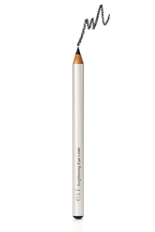
The one I have is in an all black pencil but it’s the same thing. This pencil liner is much better than the one mentioned above. It does still have a slight tug but it’s creamier than the NYC and gives much better pigmentation.
Because it’s a decent pencil, it’s still kept in the collection even though I hate using pencil liners and don’t use it much.
Now I usually wear gel liners. They’re my favorite. However, I had once gotten bored of gel liners and wanted to try a liquid. So I got the Revlon ColorStay Liquid Liner in Blackest Black.
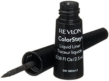
Now I don’t have anything against liquid liners. I have quite a few of others. I don’t really have anything against the liquid liner itself (it was actually pretty good) BUT I hated this brush. It’s this stupid small ass weird felt tip applicator. I could never get the hang of it. Since I got other liquid liners, this just ended up on the back burner.
Taking it out again after like 2 years and trying to swatch it, it still works but it smells like formaldehyde so it’s probably time to go (though I don’t remember if it smelt like formaldehyde in the first place; it probably didn’t though).
Moving on to eyeshadows, I have 4 in this category.
First we have the Maybelline Color Tattoo in 05 Tool Cool

and the Maybelline Color Tattoo Metal in 60 Silver Strike.
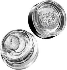
Now I had gotten these when I was in the white/silver eyeliner phase.
Side note: I should probably explain the look I was aiming for.
youtube
If you look at around 00:40, you’d see Hyunseung’s eyeliner. That was what I was so obsessed over.
Moving back, I know theyre shadows but I used them as eyeliner. It was alright. It was hard to build pigment when the brush is an angled brush picking up barely anything since it wasn’t dense enough. Anyhow, I got fed up with it and moved on. I didn’t really have use for these colors except maybe in the inner corners of the eyes but it was a pain to open these just for the inner corners when I’d probably already have a palette open (I love using eyeshadow palettes more than singles). It’s not like I hate them; theyre pigmented and creamy if you apply it right. I just haven’t been using them. Skill keeping them since I feel like maybe I’ll use them one day.
Now the next 2 eyeshadows are the Skinfood My Short Cake eyeshadows in SGR01 and SOR03

These are singles that legit come in a plastic packaging because you’re suppose to pop them into a pan. But I don’t have the pan. The only reason I got these 2 shades was at the time, I was really into mint and orange shadows but didn’t have any and found these on sale.
The orange is a bit more matte than the mint but both are silky/pearly.
They also both suck. Now I know that with these types of color, you don’t want a strong wash of color (maybe you do idk; I don’t) but these BARELY SHOW UP. After 5 swipes it’s still barely there. I had gotten both of these for a bit under a dollar but you’d expect they still work! Even swatching them gives horrible pigmentation. The only reason I still have these and haven’t thrown them out is because these 2 colors are unique in my collection. Once I found some to replace them, THEYRE OUT.
Lips
There’s pretty much only one in this category right now and that is the
Stila Lip Glaze in Kitten

I was actually into this for a while. I used it soo much I have about 1cm of product left and the lettering worn off. The reason I had gotten tired of it was because I had gotten tired of gloss. It just didn’t seem appealing to me anymore. It was sticky and got in food. It was a mess. It smelt like cotton candy and gave a bit of color to the lips but the glitter and gloss was getting annoying. I can’t throw away something I’ve used like everyday for nearly a whole semester in highschool but at the same time, I’m over it.
Looking through all of these again, I really don’t want to throw them away but I also want them gone since theyre taking up space and I don’t even use them. I’m very conflicted.
#hoarder edition#skincare#makeup#innisfree#highlighter#powder#the saem#e.l.f.#revlon#liquid eyeliner#eyeliner pencil#maybelline#skinfood#eyeshadow#stila#lips
1 note
·
View note
Photo
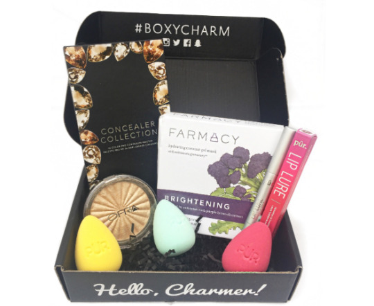
Yay! Another subscription unboxing!
I am a huge fan of monthly subscription services, therefore I plan to post a detailed review of each subscription that I receive throughout the month so you can see the products that I received and hopefully these posts will help you in choosing which subscription is right for you! This time around, I will be reviewing my April 2017 Boxycharm box!
Theme: Boho Glow
About BOXYCHARM:
Boxycharm is a beauty subscription service that sends you 5-6 beauty items each month that include nail care, skin care, makeup, hair care, fragrance and more!!! The best part is that at least 4 of those items will be full-sized!!! FULL SIZED!!! The cost is $21 per month, however when you figure in the fact that you will be receiving at least four full sized items, it is a complete steal and well worth the money you pay for it. I must say that even though I have only been subscribed to this service for two months, it has quickly become my favorite subscription. The products they send out are nothing short of amazing.
Every product I received this month was FULL SIZE, bringing this month's box to a value of $137!!!
Product 1: OFRA Cosmetics Highlighter in the shade 'Rodeo Drive'
This was the product that I was most excited about receiving. I have a highlighter by OFRA already and I am super obsessed with it so I knew that I was going to love this product as well. UNFORTUNATELY, mine came damaged. It was cracked around the outside and the pan wasn't glued in all the way, so that was a bummer. It was still somewhat usable despite the powder being everywhere. However, the Boxycharm support team was quick to respond to my email regarding the damaged item and they will be sending a replacement. Yay! Anyway back to the product, this highlighter is so creamy and so light for a powder highlighter. It almost glides on like cream and it is SO PIGMENTED. Let me tell you one thing, you do not need a lot of this product. A little goes a loooooong way and therefore it will most likely last you a while. It is a very pretty light/gold/shimmer shade that suits every skin tone. This was in fact a FULL SIZED product, so that is amazing.
You can purchase this full size item for $35 here --->
https://www.ofracosmetics.com/products/rodeo-drive-highlighter
From the OFRA website: DETAILS10 gram Soak up the summer sun day or night with OFRA's Rodeo Drive Highlighter!This radiant new product captures the luxury and glamour of the famous street in sunny California.Ofra herself worked at a top salon on Rodeo Drive at the start of her career after moving to the United States from South Africa.A versatile and universally flattering sun-kissed shade, it can be seamlessly integrated into any makeup look. Add to the high points of your face and any specific area the light may hit such as your brow bone, Cupid's bow, inner eye corners, chin and even across your lips. As if this highlighter couldn't get any more beautiful, the impressive design mimics beaming sun rays and reveals a light golden hue. The highlighter's extraordinary luminosity is the result of OFRA's liquid to baked technology, using the highest grade pearls that provide an unparalleled pigment payoff and rich sheen.
Product 2: Farmacy Brightening Hydrating Coconut Gel Mask
This next product I was also really excited about. Warmer weather is upon us and my skin just can't take the heat! Every year around this time my skin gets SO.DRY! Does anyone else have this problem? I normally have combination skin but as the weather changes, so does my skin. I have only tried this product once and I could immediately feel a difference in my skin. It felt so soft, hydrated and moisturized. I didn't think it was possible, but my face genuinely looked healthier after leaving on one mask for just 30 minutes. I went bare faced the rest of the day! I actually liked the smell of this mask too, which is oddly important to me when picking out masks. This Brightening Coconut Gel Mask is perfect for dull, sun-speckled or hyperpigmentated skin as well. It contains FARMACY's potent, patented complex Echinacea GreenEnvy (an antioxidant powerhouse), while purple broccoli extract works to reduce melanin production and in turn, prevent the development of dark spots while fading existing signs of discolouration. Another plus, it was a FULL SIZED product! You get three masks, which retail for $24 on the Farmacy website.
However, you can purchase these masks individually at Sephora. Get them here --->
THREE MASKS ($24):
https://www.farmacybeauty.com/product/brightening-coconut-gel-mask/?gclid=Cj0KEQjwldzHBRCfg_aImKrf7N4BEiQABJTPKDhMYC8jUWlmh718Cl_gpahqepweIWLgw9_7tAeGhV0aAoY88P8HAQ
SINGLE MASKS ($9):
http://www.sephora.com/hydrating-coconut-gel-mask-brightening-purple-broccoli-P399979?skuId=1840719&om_mmc=ppc-GG_378477159_27752557839_aud-290121270867:pla-56128534817_1840719_95787538359_9023658_c&country_switch=us&lang=en&gclid=Cj0KEQjwldzHBRCfg_aImKrf7N4BEiQABJTPKGSRyavEs8nfGygKZ5Ap2nnyn8mRIcBeC8UnDrg3BKwaApEz8P8HAQ&gclsrc=aw.ds
From the Farmacy website:
REAP THE BENEFITS
Helps even skin tone and improve overall clarity by normalizing melanin production. The most finely spun sheet mask available, this coconut gel mask retains active ingredients at maximum levels more effectively, delivering a targeted and first-of-its-kind skincare experience. First, the coconut gel provides intensive hydration and restores the skin’s balance. Next the bio-cellulose sheet releases its complex of components to provide the skin’s surface layers with a penetrating surge of active ingredients. After 20-25 minutes of treatment, the skin appears brighter, and its moisture level is dramatically improved.
Product 3: Measurable Difference Diamond Collection 16 Shade Pro Concealer Palette
If you love palettes, Boxycharm is definitely the beauty subscription for you! They send out palettes regularly in their box which i love! The palette that they sent out this month was a gorgeous concealer palette that included shades that will work for every skin tone. The formulas are fairly creamy and well pigmented. I think the darker shades are easier to use than the lighter shades, where the lighter shades seemed a bit harder to blend for me. However I think a drop of oil/elixer or some Fix + on the brush would make a world of difference for these concealers. Overall I thought this was a very nice palette and I will definitely get some use out of it. And guess what, another FULL SIZE item!!! Score!
You can pick up this palette for $20 here --->
https://www.measurabledifference.com/measurable-difference-16-color-pro-concealer-palette
From the Measurable Difference website:
What it is:
A 16-shade concealer palette that caters to a wide variety of skin tones.
What it does:
Not all of us are trained makeup professionals...but that doesn't mean we can't have a killer makeup stash that includes an all-inclusive concealer palette. Featuring 16 versatile shades, this makeup set works for any and all skin tones. Dark, medium, olive, or fair — we've got you covered. The creamy, blendable formula melts perfectly into the skin, making any blemish or skin flaw disappear into thin air. You'll literally become a makeup wizard in no time.
Product 4: PUR The Complexion Authority Lip Lure Hydrating Lip Lacquer in the shade 'Fiery'
Okay.... while I think this is a great product for people who wear red lipstick, I NEVER WEAR RED LIPSTICK. I feel like I mention this in every "beauty profile quiz" I take and subscription services just do not get it. They love to send out red lipsticks. So I guess I will just add this to the pile of red lipsticks I may, but probably never will wear some day. Either way, I was super impressed with this packaging. The lip lacquer itself was very heavy and it felt very luxurious and expensive. It is one of those lipsticks where you twist the bottom and the product comes up through the sponge which is pretty cool seeing as that I don't see those very often anymore. This shade was VERY and I mean VERY pigmented. It is a bright but deep red color, with a glossy finish. It is also a bit sticky for my taste, as are most lip gloss/lacquer type products. Also just a WARNING: this product does not come of easily!!! Like I said its very sticky and thick, so do not try it on with a full face of makeup like I did and then try to take it off because it is going to smear everywhere and stain your face. But overall, this is a great product for people who like this type of product. (not me). This was also yet another FULL SIZE product! Man, Boxycharm for the win this month!
This product is:
Paraben Free
BPA Free
Not tested on Animals/Cruelty Free
Vegan
Gluten Free
You can pick up this full size product for $22 right here --->
http://www.purcosmetics.com/lip-lure
From the PUR website:
Bold Liquid Lips
Let your lips speak for you with beautifully bold color and brilliant shine! PÜR’s richly pigmented lip lacquers saturate your lips in true colour and pout-perfecting hydration. Using a unique, flocked showerhead applicator, this creamy, full-coverage liquid formula creates a showstopping look in just one stroke! Encapsulated mineral water from the Swiss Alps gives the skin deep, nourishing, lasting hydration.
Product 5: PUR 3-Piece Contour Blending Sponges (Blend Squad)
I really really really really really wanted to like these. But what can I say, I have been blessed by the Beauty Blender. I honestly do not think anything will ever match up to the Original Beauty Blender and the Real Techniques Miracle Complexion sponge for me. These are SO much more dense and I feel like they soak up so much product. I prefer a sponge that is super bouncy so that I do not feel as though I am literally bashing something into my face. These just felt hard to me. If you aren’t familiar with beauty sponges, you wet them, and squeeze out any excess water before using them to apply foundation. I applied my foundation and concealer with them this morning and while they got the job done eventually, it took twice the amount of time and twice the amount of product. I used them with a full coverage foundation whereas with the Beauty Blender and Real Techniques sponges I would have gotten a nice, airbrushed and full coverage look, but with these my foundation turned out patchy and it looked like a light coverage foundation. I just was not feeling these guys, but I have heard many good reviews about them as well so I guess it is just your sponge preference. However, I am loving the bright colors and the flat sides made it very easy to get up under the eyes. I think I am going to use these for baking. I feel they will be better used for applying translucent powder than for applying liquid foundation. Once again, another FULL SIZE product! Bless you, Boxycharm!
This product is:
cruelty free
paraben free
You can get this cute little trio for $36 here --->
http://www.purcosmetics.com/blend-squad
From the PUR website:
When applying liquid or cream foundations, dampen the beauty sponge and squeeze out the excess water. Add a drop of foundation to the beauty sponge and bounce into the skin for a flawless finish!
#boxycharm#subscriptionbox#subscription#beauty#makeup#PUR#Farmacy#OFRA#MeasurableDifference#Review#makeupreview#beautyreview#beautyblog#beautyblender#subscriptionaddiction#monthlysubscription
1 note
·
View note
Text
Jikook #1
Just a random oneshot about Jikook
Genre: Fluff
Word count: 1600
Author: chimswings
A/N: biggest apologies if there are spelling mistakes, english isnt my first language, but i hope you enjoy the story!
Jeon Jungkook was walking around in a store. He had been running out of milk which was the reason he had gotten out of his house today.
It was early in the morning and Jungkook needed his morning cereal WITH milk. Not without - as his friends had suggested. The brunette walked along the empty hallway - almost no one was in the store at 8 am. Just some old ladies.
On his way to the milk section he walked past the make-up shelves. He didn't need to think twice when he turned around to take a better look at the products.
He really loved make-up very much, but at the same time it was kind of one of his biggest secrets. Men can't wear make-up. He was a man so he couldn't. Or well, yes he could, but his friends would make fun of him if he did. And he didn't want that.
On his free time, at home, he just loved to try on different looks. It was like drawing - which he really liked too - on his own face and he thought it was great.
But of course he couldn't use make-up in public. Males didn't use make-up.
He picked up an eye shadow -palette full of pretty natural colors but they had a slight shade of red in them. The colors were very beautiful.
Jungkook had always thought that red suited him so these colors would fit with his eye color and hair...
"What am I seeing?" he heard a familiar voice say. Kwang-Min.
Jungkook started to panic. What would he explain to his friend who had a very strong grip on stereotypes?
"Are you going on a date with someone? Woooow hyung, you should've told us! Buy her flowers too!" his other friend appeared behind Kwang-Min looking very surprised.
"Ehh.. What are you guys doing here?" Jungkook asked and quickly put the make-up palette back to the shelf trying to act normal.
"Hey, don't change the subject! What's her name?" his friend asked and walked closer.
"Remember that girls like red roses, they're lame but girls find them pretty romantic."
"This isn't even for a girl", Jungkook declared and a second after that he realized what he had done. How was he supposed to escape from this situation now? He couldn't just walk away - even if he really badly wanted to do so. His friends were silent for a moment.
"So what you're saying is... Is it for a boy?"
"Are you... Gay?"
Oh there he goes.
"No, I'm not", Jungkook said and frowned. His friends were so annoying sometimes. They thought that gays were disgusting and men should be manly men. And if you weren't that kind of a man, you were assumed right away to be gay.
"You just said it wasn't for a girl so you're gay", Kwang-Min spoke out with slightly disgusted tone of voice.
"No! It's not for a boy either", Jungkook tried to defend himself but it didn't look like it was working. The situation went even worse.
"It's for you? YOU? The manliest man ever YOU? You use make-up?”
”Ewww, that's gross!"
He knew that that was coming. He really liked his friends – they were nice company and trust worthy people - but he hated when he had to hide things he liked from them.
”Does it bother you?” the youngest asked. He wasn't that type of a person who would give up and go home and cry in a corner. Of course it hurt that his friends didn't accept him as he was but at least they knew who they were friends with.
The two other males didn't answer anything, just showed a disgusted face and walked away.
Jungkook wasn't sure if he had pissed his friends off. He didn't know if they were even friends anymore. Oh great, he always messed everything up. Just with this tiny little thing ruined everything: he liked something only girls were allowed to like.
He left the make-up section – just because he didn't want to be seen there anymore ever again – and headed to get what he came here for: milk. It took less than a minute to grab a milk carton.
As he was approaching the make-up section again, he was thinking if he should buy the eye shadow -palette or not. He had really liked it right from the first sight but now he was doubting. His friends – or maybe ex-friends now – probably hated him because of his interests. But why did it matter? They hated him anyways, he had nothing to loose.
Jungkook turned to the make-up shelves again and… Oh, he wasn't alone. There was some guy with gray hair looking at the products. To be specific, he was holding the exact same eye shadow Jungkook had held earlier. It seemed to be the last one. Jungkook couldn't see the face of the other male because he was standing about five meters behind him.
So now Jungkook would not be able to buy it. Unless he was going to walk to that man and take the palette from his hands and run away. No, that was just the stupidest idea ever.
That gray-haired male was probably buying it for someone, for someone who would be able to use make-up in public. Unlike him.
Suddenly Jungkook realized that the other male had turned around and was now looking straight at him. That was the moment Jungkook realized that he had probably been staring at him way too long.
”Seems like I wasn't wrong when I thought someone was looking at me”, a soft voice spoke out and a smile was formed to the lips.
Jungkook was really really embarrassed and felt how his ears got warmer. For gods sake, he always managed to embarras himself.
”Oh I'm sorry, I just… I just...”
Yeah, he just what? What exactly? He was just watching?
He tried to mutter something as an answer while awkwardly lifted his eyes from the floor up to the male.
A gentle laughter escaped the shorter one's mouth.
”No no, don't be sorry. I know I look fancy today”, he winked at Jungkook.
The younger one's eyes widened a bit. Not in the way that he was in a shock, just slightly. First of all, that boy just winked at him. Second of all, he really did look very damn fancy. He was wearing dark-shaded eye shadow – mostly grey, black and dark brown - he had used eyeliner to bring out more effect. He had even painted his lips with dark red lip gloss. One word to describe him was beautiful.
He had a fancy coat: it was long, black and looked expensive. Under his coat he was wearing a white dress shirt and black tight jeans. He was so cool, it made Jungkook almost loose his breath.
”I umm… Uh..”, Jungkook didn't know how to respond. ”Yeah.”
Holy shit, he just admitted that he looked very good? To a total stranger? What was he even doing here anymore? He had his milk and he was ready to leave but no, here he was talking to a total stranger – a very handsome stranger – in make-up section.
Again the other one formed a warm smile, as if he noticed how awkward Jungkook was at the moment.
”You don't look so bad yourself either”, the gray-haired smiled and caused Jungkook to repeat his words in his mind a few times. He just complimented him? Was this normal human interacting or what?
Before Jungkook was able to answer anything – actually he didn't even know what to answer so this was his rescue – the fancy male lifted up the eye shadow -palette next to Jungkook's face.
”Ohhh, this would suit you so well”, he smiled and walked closer to Jungkook.
”R-really?” the younger one said and now it happened: he blushed.
”Yeah, totally.”
He felt something inside him. Maybe because he had been complimented today. Maybe because he met another male who liked make-up as much as he did. Maybe because he had thought that those colors would suit him and that boy agreed with him.
”Actually I was going to buy it”, Jungkook said and surprised his own self.
”Hm? What made you change your mind?”
”Ahh.. Just some of my friends. They don't like… you know, make-up.”
”But you do?”
Jungkook shyly nodded.
”Well, congratulations. You have found the most perfect colored palette for yourself”, the one with red lips smiled as put the palette to Jungkook's hand.
”I gotta go now, have a good day”, was said and Jungkook just stayed there and stared at the black coated figure go further and further.
He had encouraged Jungkook to express himself the way he wanted. He had encouraged him to use make-up whether other people liked it or not. All that mattered was that Jungkook himself liked it.
He realized that he had been staring into emptiness for a while since his hands felt suddenly cold. Right, he was still holding the milk in his hands.
He paid the milk and the eye shadow and headed home. On the whole way to home he was just thinking about the male with gray hair, red lips and beautifully blended eye make-up. The way he talked, the way he smiled. The way he had caused Jungkook to feel. Even though the conversation lasted only for two minutes, so many things had happened.
1. He got to know that he wasn't the only male who liked to use make-up.
2. The other one had told him that the colors he loved suited him.
3. He had encouraged him to be himself, no matter what.
4. The way he had smiled was something so mesmerizing. It messed up Jungkook's mind.
But the most annoying thing was that he didn't even know his name.
#jikook#kookmin#jikook fanfic#kookmin fanfic#jikook ff#fanfiction#fanfic#ff#jikook fluff#fluff#kookmin fluff#bts
49 notes
·
View notes
Last Seen Blogs

ajru123
Untitled

evilvvithin
villain apologist

palmball73
The Life of Kenny 574

aweather09
A.Weather