
flufou-kittu
Flufou Art™️
one day i picked up a pencil and now im here - OC doodles - they/them
29 posts
Don't wanna be here? Send us removal request.
Last Seen Blogs

rachel0147-blog
Untitled

piscean-dreaming-of-a-unicorn
Piscean Unicorn


callsignlucky
don’t think, just do
Photo

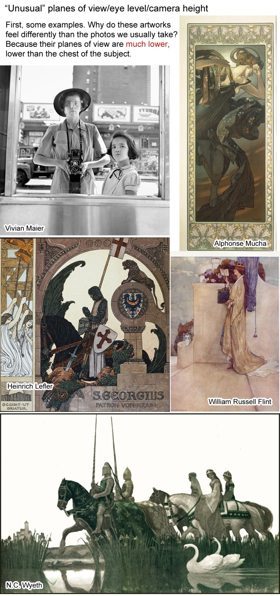
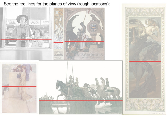
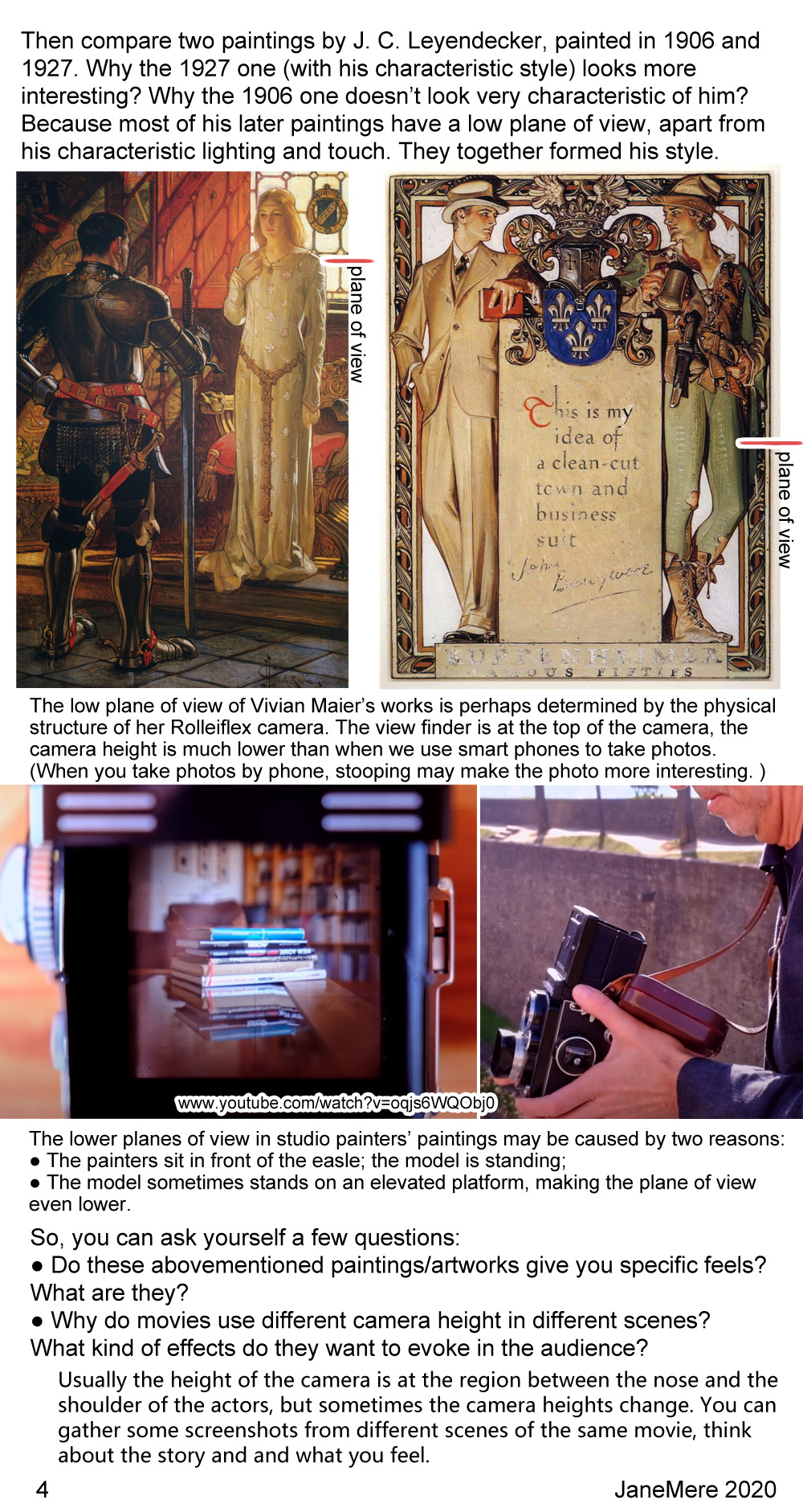


Portraying characters with different planes of view/eye levels/camera heights
203 notes
·
View notes
Note
do you have any tips on like backgrounds/environments? every time i try to do a detailed background i get really overwhelmed, but i really want to do detailed backgrounds with lots of objects, i just can never seem to know how to fill the space and how to make it look varied and interesting.
Struggling with backgrounds are a very typical problem amongst growing artists ( and established artists too even ). We have a tendency to gravitate towards drawing characters, animals or objects when we start out - then as we progress we want to branch out and tell stories with our pieces, which is where the presence of a background can become an invaluable tool.
Though knowing how to construct backgrounds is a very timeconsuming endeavour. Especially due to how different each environment, scene and atmosphere can be, and what matter of fundamentals the likes of drawing scenery requires to look convincing. Because of this freedom and variety in what backgrounds can and cannot consists of - it’s possible that you’re looking to improve your skills on drawing anything that you haven’t practiced before.
So let’s take a look at it.
Backgrounds as a scene, not an afterthought
First and foremost, considering which background to incorporate into a piece is, for many who have predominantly been drawing characters or objects with no background, secondary.
We tend to consider our character the star of the illustration. That’s why we tend to give that character the majority of space in our illustration. This can work for illustrations that should feature the character in a context where their presence is the most important part. But if we put our character slap-dab in the middle of the composition, taking up the classic 2/3rds of the canvas every time - we miss out on the incredibly powerful ways a fleshed out backgrounds can tell the story of the image. Sometimes, an environment needs to take center stage to tell the story most effectively.
For inspiration on this, we look to comics. Comics and graphic novels have long been contending with the masterful craft of compositioning characters and backgrounds into meaningful images, that through the background and the character(s) placements conveys a comprehensive scene.

https://www.pinterest.dk/pin/695735842416817035/
Especially eastern comics have perfected this particular way of compositioning through some of the genre’s great works.
But like comic artists, we illustrators ( and aspiring comic artists ) must start considering the use of the environment as a key part of our planning progress.
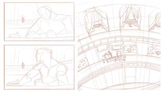
This conscious design process can be explored through the use of thumbnails. Small experimentative drafts that shifts our character(s) and environments around to find the most optimal placement for each, in order to tell the story of our illustration the best.

More on how to thumbnail here: https://theredlinestation.tumblr.com/post/179392771897/how-do-we-draw-thumbnails-before-drawing-i-dont
Considering composition
Naturally, knnowing how to composition an image properly is going to help you find out how to layout your background the best. I remember at first ‘knowing’ that good composition was ‘good’ for your art. But the moment i realized how much the layout of an image can change the way viewers percieve it, i was immediately hooked on exploring the matter, and make it one of my predominant studies for the better of two years. This is still very much a craft i’m only getting started with, but after having studied composition somewhat consistently, the discipline completely re-ignited my interest in visual storytelling as a static medium.
Learning the basic grips of composition, such as rule of thirds, fibonacci, the way contrasts frames focal points, and how to create flow in your illustrations - is going to elevate your pieces before you even start planning out the fineprint of your backgrounds.

https://keithhornblower.wordpress.com/tag/composition/

https://www.pinterest.dk/pin/430586414367069135/
Another appealing thing about knowing your way around composition, if the promise of stronger pieces isn’t enough for you, is that putting down a solid layout for your background, means that you have a lot more freedom to be as simple or complex as you want, and the piece will still look compelling due to the strengths of it’s composition alone.

https://www.behance.net/gallery/28573195/Sketch-Series-Light-Composition-Illustration
More on composition here: https://theredlinestation.tumblr.com/post/623115556175888384/can-you-explain-the-rule-of-thirdsthe-golden
Get your grips on perspective
Just like the basics of composition, i highly recommend you start looking into the fundamentals of perspective. The use of perspective makes for very dynamic compositions, and in backgrounds - it is a cornerstone to conveying environments ( unless you do more abstract backgrounds for your pieces ).
And if you master the skill of seeing, planning and executing things in perspective, you will have immense and incredible freedom to do almost whatever you want with your environments. From basic street layouts, to fish-eyelens shots or warped, distorted dreamlike landscapes, you’ll be able to make almost anything look interesting.
I personally think it’s worth trying your hand with as many perspective types as possible, but for starters - i recommend looking into the basics of 1-point and 2-points perspectives. These are typically the ones we encounter in real life, and thusly will be the more common kinds of perspective used in illustration for storytelling.

https://artdepartmental.com/blog/perspective-drawing-lessons-thomas-romain/
More on perspective:
Background and perspectivehttps://theredlinestation.tumblr.com/post/182875714745/i-have-a-bunch-of-tutorials-on-buildingobject
Drawing in 3Dhttps://theredlinestation.tumblr.com/post/182344072564/hai-im-sorry-if-this-sounds-stupid-but-do-you
Character interacts with background

https://www.boredpanda.com/may-the-mermaid-of-lily-lake-illustrated-story-andy-ivanov-part-two/?utm_source=google&utm_medium=organic&utm_campaign=organic
When planning out your composition, there are little tricks you can deploy to make the character integrate more with the environment, and more effectively convey the story of your image. Having your character interact with the environment in some kind of way is a very effective method for this kind of intergration. Above^ - the mermaid and her companion cause ripples in the water, and part the algae on the water mirror as they move through the lake. This indication of motion and interaction is not that complex, but it still relays plenty of information about direction, speed and movement to our viewers, which makes us merge the characters with the background itself.
Subcontextual symbolism and metastorytelling

In addition ( and yet not really ) to the point above: you can relay subcontextual storytelling to your viewers by having characters react to objects ( or other characters ) in the environment. A hungry child staring at a cake through the baker’s window. A scared girl hiding away from a grandfather clock. A man glaring at his reflection in a mirror. Or as in the example above, a character staring at a ring on his sill from his bathtub.
All of these setups tells us that the character is in some state of mind, prompted by the environment they’re in. This makes our characters, not just “ additions” to an environment, or an environment a “prop” to the character.It makes them co-dependent and working symbiotically, as the story would’ve never have been conveyed at all, had one of the two been missing.
Interaction across the planes

Usually, we divide our compositions into layers depending on which plane is closer to the “camera” and which isn’t. Something like this: ForegoundMiddlegroundBackgroundThere’s nothing wrong with doing this, it can help you in the early stages of planning, and also help you decide on colours and lightsetting ( say if, for an example - you want to work in the LMD (or DML ) spectrum for that cinematic light ). However, incorporating objects, characters or other elements that travel through multiple layers of this 3-part division ( like the snake-creature above, which stretches from the middleground to the background ) conveys depth and gives flow to the piece. Now for this - you are going to rely heavily on your perspective skills, so make sure you have those at the ready when trying for something like this.
Referencing the specifics
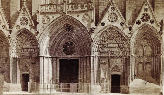
https://www.normandythenandnow.com/gothic-architecture-in-normandy-photos-from-1865/
A common pitfal for the likes of us who aren’t used to putting much thought into backgrounds is that we forget to research the design for the worldbuilding we want to do for the illustration we’re making.
This can result in us falling into stale, overdone or plain shapes and sizes, that never really takes us out of our comfortzone, and fails to interest our audience.
This can be especially damning if you’re working with environments with lots of architecture involved. We all know how to draw a house, a birch tree or a field of grass - but do we really know how to draw it well and interestingly?
Never skimp on your research. Let yourself be inspired by any specific type of foilage, building or layout, so that your background will spice up and live up to your characters.
More on referencing here:
What is a reference?https://theredlinestation.tumblr.com/post/177721492973/im-sorry-but-what-exactly-do-you-mean-by-a
Finding referenceshttps://theredlinestation.tumblr.com/post/184999456720/so-i-know-of-multiple-reference-sources-that-i
Using a reference without tracinghttps://theredlinestation.tumblr.com/post/189480282011/not-really-a-dumb-question-at-all-simply-put-in
Build from the ground up
So you planned it all out, you’re ready to start drawing your background. Nice!
Remember to go slow. Construct everything from the ground up, so that you don’t miss out on crucial perspective flaws, or errors in the consistency between shapes.
It’s okay to spend a long time on backgrounds. Especially if they make for a significant part of your image. So take as much time as you need, and don’t let yourself be stressed out if you have to go over certain parts again and again, for it to look right.
If you work digital like me, i can recommend “building” up your background in layers. Use a new layer everytime a new layer of “depth” is added to your background. Like this you can always toggle layers on and off for the perfect overview of your environment. Plus, you have all the freedom to go back and erase, change or alter something in the base shapes wihout having to disrupt the more detailed layers.
I don’t typically add the final lines until i’m completely satisfied with the background. Everythings constructed and very little is left for later-me to fill in. This helps a lot, as i am also new to backgrounds, and need things to be pretty cut out for me the moment i start laying down the final linework, otherwise i might misinterpret part of my sketch and get something wrong in the lineart.


More on linearthttps://theredlinestation.tumblr.com/post/187696646782/do-you-guys-have-any-tips-on-making-the-lineart
Detail and rendering
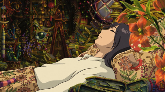
Howl’s moving castle
When drawing backgrounds it’s worth asking yourself how much detail you want to add in. Usually, this can come naturally as part of your style. Though sometimes the likes of clutter, detailed textures or a busy background can forego the confinements of style and relay information about the story. The clutter in Howl’s room for an example, tells us of an eccentric character who has been far and wide collecting all these marvelous items. This walks hand in hand with Gibli’s use of highly detailed environments in this ( and many of their other movies ) flick. Though, it is not always that the presence of many “objects” is the solution to a naked looking environment. In fact, sometimes this kind of clutter can, in worst case become too chaotic looking to fit the scene, and at best- a lot of work that could’ve achieve the same as something half as cluttered.
To know just how much detail you should put into your illustrations, it is worth diving into how many other artists have done backgrounds, take inspiration from them, and tweak it to fit your style and to your illustration.

https://www.themarysue.com/comics-to-read-for-new-hellboy-movie/
Opposite Ghibli, comics like Hellboy and Vagabond frequently show environments with “few” objects in them, or at least very simple objects.
Hellboy treats its backgrounds with a level of roughnes derrived from its use of pitch black shading to carve out blocky textures in the objects in the environment. Giving us just about enough information to be able to decipher the feel of the environment, but not much more. It has a simple grade of rendering
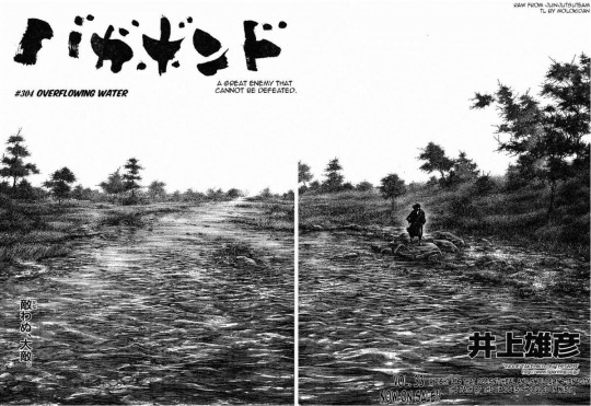
https://qmanga.com/mangareader/vagabond/reader?page=304
Vagabond on the other hand, makes use of pen and ink and a painter-esque approach to its backgrounds, which results in the objects in the backgrund often boasting thousands upon thousands of penstrokes that conveys depth and value. This comic has a complex grade of rendering.
Both of these comic book’s styles are highly artistic and effective in compliance with their own styles. Though they all invoke very different feeling for their environment and their respective story.
You should delve into your own use of detail and rendering when you set out to draw backgrounds consistently. Find out what level of detail you’re willing and able to default to, and what benefits your style most. Keep in mind that just because a background has many things in it - doesn’t necesarily make it a good background. It just makes it a busy one.
Consider your pallette

https://www.artstation.com/artwork/Yqob
Naturally, you might want to try and integrate the pallette of your characters with the lightsources and pallette of your environment. At least unless you’re working with some more abstract techniques to frame your character in the environment.
Seamlessly blending your characters into the environment consists of mastering ( editing ) your colours so that their values correspond with the hues in the scene. Like above ^The characters, despite wearing blueish outfits are all topped off with a red overlay, that mimicks that of the firey light source in the room. Some people can plan for this kind of mastering in the pre-stages, but for me, i mostly always get around it at the later stages of my process.
Light it right

https://www.digitalartsonline.co.uk/features/illustration/the-best-illustration-stories-of-2018/
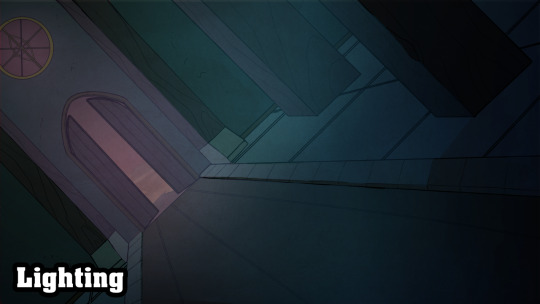
A good, directional light can set the mood and lay down the atmosphere for a illustration perfectly. The use of light is easily one of the most effective ways to establish the tone of your piece. So make sure to pour some much needed attention into it. No matter if your environment is simple or complex, splashing it with anything but ambient light will make the composition jump out at the viewer.
And remember to colour your light! The colour of your light and your ambient shadows will relay information about the temperature of your scene, or information about the general environment you’re in. Say for an example, how the golden light of the image above^ tells us of a warm sunset. Or how the picture below indicates a cool, mystical room.

More on lightinghttps://theredlinestation.tumblr.com/post/186754404056/do-you-have-a-tutorial-or-reference-for-making-the
Atmospheric detailing
Last but not least i want to give a quick nod to the use of special effects in art. ( predominantly digital art ). Where the use of a well placed gradient between your foreground and background, or a dab of fog, godrays and clouds can make anything look epic and grandscale. As well a help us distinguish the planes of the background from one another, by giving depth to the invisible space between the planes. Naturally, not all styles or scenes can make use of these kinds of effects. But i reckon you’d have fun experimenting with them nonetheless, and maybe you’d be able to develop your own little tricks for your backgrounds.

Whev, ok! I hope this was of some help. I know this one took forever to go through, but i needed a while to contemplate how to methodically go though something as broad as backgrounds.
There’s a lot to it as you can see. And i’ve only touched on some of the more meta-contextual things you can do with a background. So to actually go and study the likes of architecture, perspective, landscapes, etc - is next up for you to do.
Remember that it takes a long time to master something like backgrounds, because you are teaching yourself a completely different skillset from drawing characters or objects. But don’t give up! Slowly things will click into place, and you’ll start seeing your pieces get a lot more interesting to look at.
- Mod wackart ( ko-fi )
182 notes
·
View notes
Photo
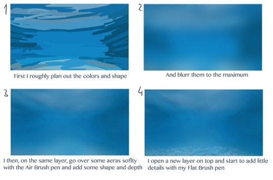
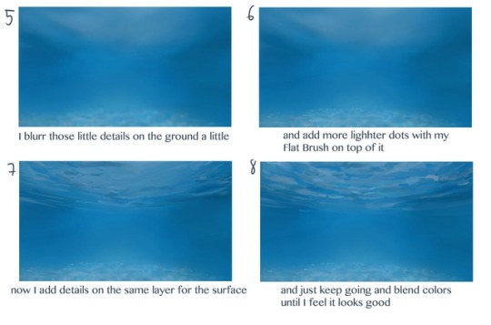
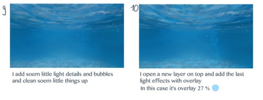


THANK YOU!! <3
I’m always very bad in explaining what I’m doing. Cause there is just a lot of trying and painting over it and mashing and mixing colors until I feel it’s good.
So I tried to show you.
I hope this helps!
50K notes
·
View notes
Text
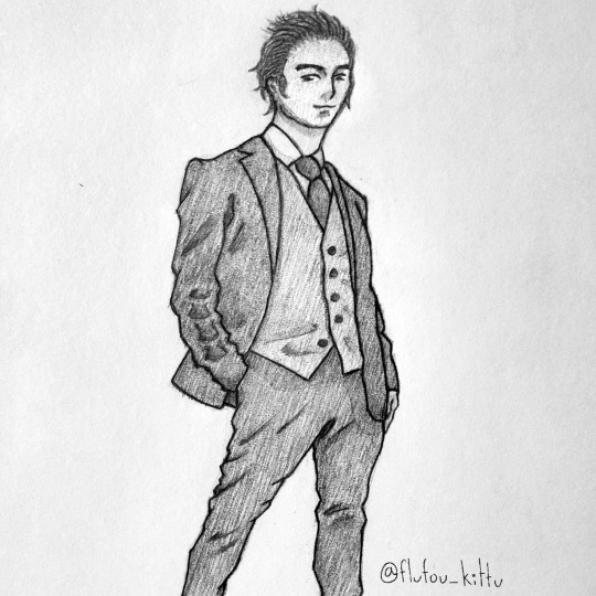
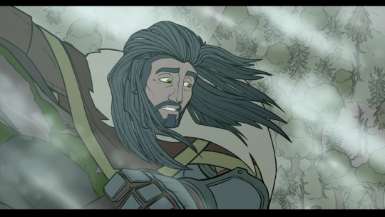
This is Michael and he's a spirit medium. :] For him, hanging out with the dead is no different than hanging out with his still living friends. He enjoys the inherent adventure that comes with dealing with the supernatural. He also tends to throw his shoes at people as a fighting strategy.
#traditional art#art#artists on tumblr#my art#oc art#original character#flufou ocs#oc#my ocs#flufou art#FOC Michael#asian artists#poc artist
1 note
·
View note
Text
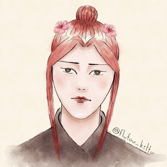
#art#artists on tumblr#my art#digital art#watercolor#digital watercolor#oc#original character#oc art#flufou ocs#flufou art#FOC Meii#rp character#roleplay character#asian artists#flowers
1 note
·
View note
Text

#art#artists on tumblr#original character#oc#my ocs#digital art#watercolor#clip studio paint#digital watercolor#flufou art#flufou ocs#FOC Donovan#oc art#rp character#roleplay character#asian artists
0 notes
Photo
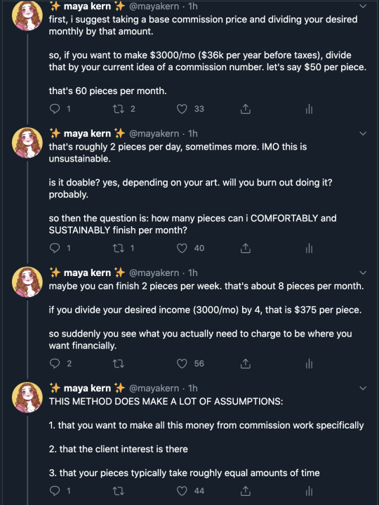
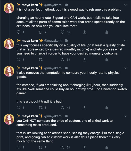

ok here is my alternative, non-hourly method of calculating commission prices.
transcript below the cut! original tweet here
Keep reading
1K notes
·
View notes
Note
Do you fellas perhaps have some tips for character outfits? I love writing characters and draw them but I cannot for the life of me give them unique clothing and it's driving me crazy
Me and Mod Future has written a bit on character design in lieu with costuming. Give it a look :)
https://theredlinestation.tumblr.com/post/186801813167/i-also-want-to-ask-how-should-one-go-about
https://theredlinestation.tumblr.com/post/180032297033/hello-um-may-i-ask-an-advice-on-character
If you’re looking for notes on the different pallette-styles or the significance of colours-choice in your designs, here’s a bit on colour theory: https://theredlinestation.tumblr.com/post/185826075569/one-thing-i-really-struggle-with-is-color-picking
Researching specific references from specific ears of fashionhttps://theredlinestation.tumblr.com/post/186919051957/hello-i-wantend-to-know-do-you-happen-to-know
And if you’re working with armoured designshttps://theredlinestation.tumblr.com/post/187807458156/do-any-of-yall-have-any-tips-for-knight-armor
Or with designs that features prints on shirts
https://theredlinestation.tumblr.com/post/188179219424/okay-im-the-shirt-anon-how-do-u-do
- Mod wackart
127 notes
·
View notes
Text
Straightforward Solutions to Common, Art Related Frustrations
What up? Just wrote an article that I hope you guys like. It’s still in progress because I didn’t go through the whole discussion thread yet, but I think this is a decent start.
Got a frustration?
Join the convo at https://art-res.tumblr.com/post/189312922268/a-question-for-you-homies
Table of Contents
Problem: Just starting out and do not know where to begin
Problem: Issues with foreshortening and creating form
Problem: Art Block / Have no idea what to draw
Problem: Distraction and lack of focus when drawing
Problem: Stuck on creating a character
Problem: I lack a style and do not know what direction I want to take my art in
Problem: Can’t draw accurately/ what is really there/ looking to make my art more realistic
Problem: How do I improve my social media presence/market my art?
Problem: Lack of artist networking
Problem: shaky and messy lines
Problem: Can’t find time to create
Thanks for looking homies! Hope this helps you!
More useful articles and resources / support Art-Res | my art tumblr | Idea Generator
Check out the Art-Res Anatomy Ebook! → 50% off until Jan 2nd!
6K notes
·
View notes
Photo

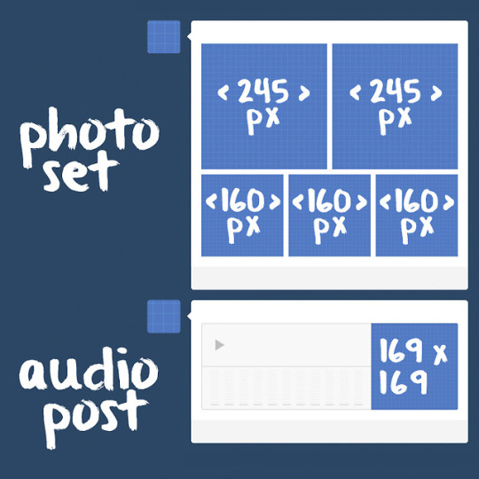
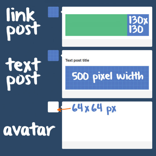
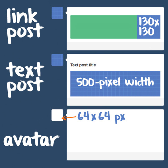
Tumblr Dashboard Image Sizes:
Photo post: 500 by 750 pixels for dashboard view; 1280 by 1920 pixels for high-res version (except for superwide panoramas).
Photoset: 500-pixel width for one image in a photoset row. 245-pixel width for two images in a photoset row. 160-pixel width for three images in a photoset row. Gutters are 10 pixels.
Audio Post: 169 by 169 pixels for album art.
Link Post: 130 by 130 pixels for the thumbnail image grabbed by Tumblr from web link (if available).
Text Post: 125-pixel width for images added to a text post, which expand when clicked. As of July 2014, inline images appear as 500 by 750 pixels for dashboard view.
Avatar: 64-by-64-pixel icon next to posts.
239K notes
·
View notes
Text

11 notes
·
View notes
Note
do you guys think you could showcase how you do different body types? (like buff skinny fat etc)
First of all, we should always practice life drawing! Your skill in drawing the figure will always be your basis to how you modify and stylize it. Creating this foundation of proportion and gesture will give you a better understanding of how to create figures of different proportions than the “average” figure.

Past this, we’re going to need to learn some anatomy. We need to know the basic, large muscle groups to create believable muscled characters. And, we need to know how fat is distributed (commonly) on the body to create believable fat characters. We need to know the skeletal structure to understand all of this, and particularly how some bones might show in super skinny people (like ribs and hip bones for example.)
I recommend checking out Sycra for anatomy tips.
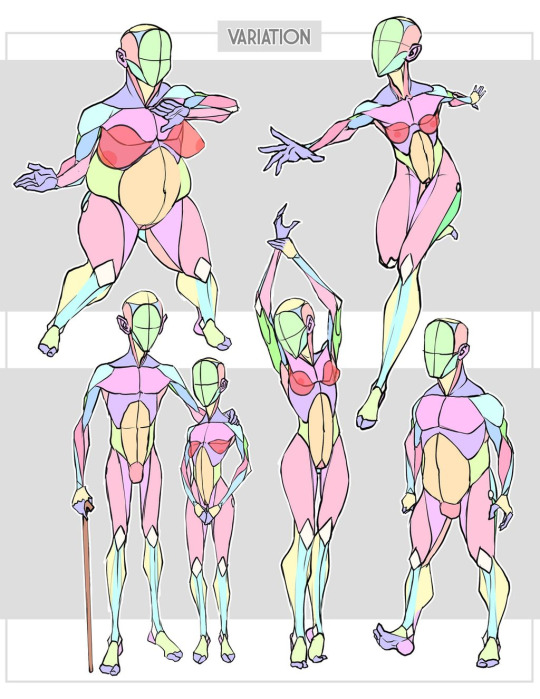
https://www.deviantart.com/sycra/art/Simplified-Anatomy-Variations-618238908
Here’s some examples of common traits I’ve seen. By no means is this a comprehensive guide, but it’s a starting point. The best thing to do is to keep searching up guides and learning from real photos - as well as cross referencing!

Post on life drawing and practice: https://theredlinestation.tumblr.com/post/181026027751/yo-i-got-a-question-if-ya-dont-mind-i-see-lot-of
Previous tutorial on buff bodies: https://theredlinestation.tumblr.com/post/185528871950/do-you-guys-think-you-could-give-me-a-tutorial-on
Previous tutorial on fat bodies: https://theredlinestation.tumblr.com/post/181905216201/hello-redline-i-was-wondering-if-you-guys-have
-Mod Future (ko-fi)
665 notes
·
View notes
Text

0 notes
Text

#flufou ocs#flufou art#FOC Katalina#flapper#roaring twenties#art#traditional art#oc art#artists on tumblr
0 notes
Text
ProfessorFAF Masterpost
Hello! Welcome to the ProfessorFAF. I’m an artist who has been working in Clip Studio Paint for years now. I think it’s one of the best and most accessible tools on the market for comics and illustrations, and I want to see it take off more. The thing is, CSP has a lot of features for illustration and comics above and beyond Photoshop, but it’s hard to understand some of them because of the interface. I’ve noticed a lot of people don’t even know some features are there. So I decided to take all my knowledge about CSP and pour it into this blog so that others can learn from it or reference it.
Now, I don’t claim to know absolutely everything about CSP. There are new things I learn all the time, and some features I never really use. But I plan to take this series from the basics to more advanced features. I am a freelance artist, so my free time is limited, but I hope to regularly come out with new posts to help out. And if you were helped by my posts, please consider giving me a ko-fi!
P.S. I own Clip Studio Paint EX, which is the advanced (and more expensive) version that handles book layouts on top of everything else. It’s hard for me to tell what options are available in EX but not in the less-powerful version, PRO. I hope you keep this in mind if my guidelines ever cover or show something you can’t find in your interface - it may be an EX option.
Thanks, now let’s get started!
Keep reading
209 notes
·
View notes
Photo

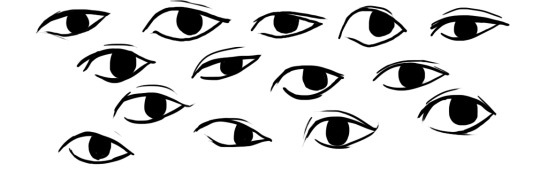
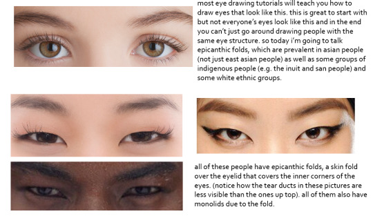


this was gonna be a tutorial and i guess it still is but if anything it’s just a really long and drawn out “essay” on drawing people with epicanthic folds. one of my biggest pet peeves is people drawing asian people exclusively with the same type of eye they’d give white people or anyone else who typically doesn’t have the fold! however i know that most people are taught with the standard white person eye (google image search for “eye” and it’ll all be pictures of white people’s eyes) so learning to draw epicanthic folds is a consciously learned thing.
therefore i bring you this, which attempts to break the mechanics of epicanthic folds down into something that’s a bit easier to digest and implement in your own art!
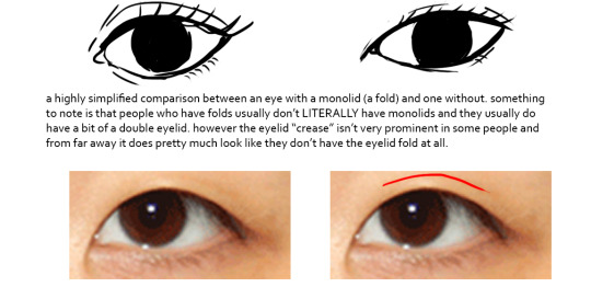
style can be argued i guess but it’s not that hard to stylize eyes with folds if you do proper observation and research. eyes with epicanthic folds are as diverse as eyes without so it’s not like you have to adhere to a strict model for them (although many people think that you have to) and all it takes to distinguish the two in stylized art (and even in semi/realism once you think about it) is a few lines! like i said this is a learned process but it’ll make your asian characters (and characters of other races even) a bit more interesting and believable.
57K notes
·
View notes