mollybeagleyfpi
molly beagley
Showing the journey of my Final Major Project for UALAB LEVEL 4 Art Foundation at UCA Epsom
51 posts
Don't wanna be here? Send us removal request.
Last Seen Blogs
newcoolture258
NewCoolture.com

top-form-fitness
Top Form Fitness
usmkdllbz1177
lgu+소액결제현금화
kiv-p
KiV
bandittown
...bandit town...
Text
Digital Magazine
For my digital magazine I will be making on Flipsnack, I would like to tie together my initial idea for the final major project which is 2000s fashion and style. This is for the digital exhibition in which I will be able to showcase some new and old work from this year. I would like to tie this into the Stay At Home project and potentially create a digital magazine with a twist; 2000s Fashion and Style; Quarantine Edition. I will be editing photoshoots that I have already done and also do some more if I need to.
1 note
·
View note
Photo

La Mode Sur La Mode
This is a magazine double page spread that I made using my photographs from the Stay At Home photoshoot. I titled it “La Mode Sur La Mode” which translates from French as “Fashion on Fashion” because it features fashion magazines in the photographs.
1 note
·
View note
Photo
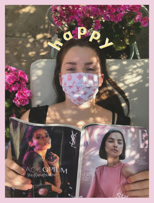
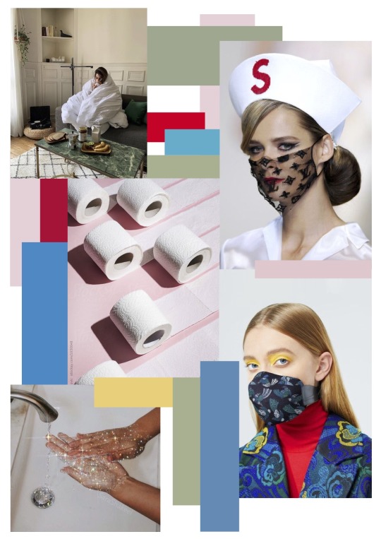
#StayAtHome
I created this photoshoot for the Stay At Home project and the concept behind it was to create a sense of peace and self love. It focuses on taking time to yourself to do things you enjoy, in this case I wanted to exhibit how I enjoy reading magazines especially on a hot day in the garden. I also included a face mask that I made which symbolises the current Covid-19 pandemic. I linked this to designer fashion by printing the Louis Vuitton monogram print onto the face mask.
2 notes
·
View notes
Photo
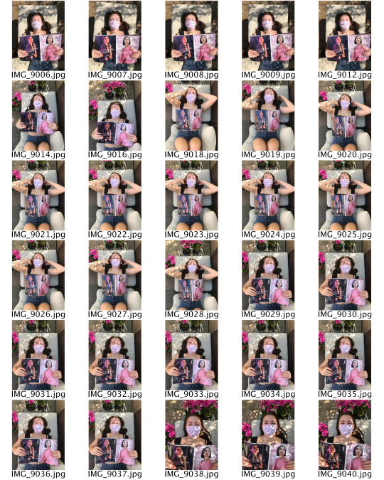

#StayAtHome Photoshoot
I created this photoshoot for the Stay At Home project and the concept behind it was to create a sense of peace and self love. It focuses on taking time to yourself to do things you enjoy, in this case I wanted to exhibit how I enjoy reading magazines especially on a hot day in the garden.
2 notes
·
View notes
Photo
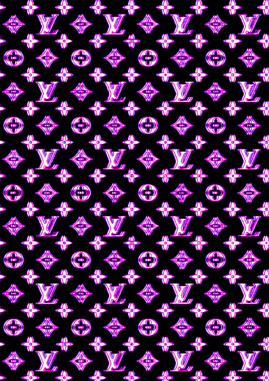
Louis Vuitton: Computer Glitch
I made this Louis Vuitton monogram print with a twist; it looks blurred and almost like a computer glitch. I made it using Adobe Photoshop and layering 3 of the same Louis Vuitton prints on top of each other. I made the backgrounds transparent so each layer would be visible. I altered the contrast, colour balance and colour filter on each layer so that it would resemble a glitch on a computer.
This has got a 2000s effect to it because of the colours I have used which tie into my research, as well as the popularity of this monogram being popular in early-2000s fashion.
2 notes
·
View notes
Photo

Branded Tote Bag Design
I made this design for a branded tote bag on Adobe Photoshop. It includes my rose logo for the brand ‘rose kiss’ as well as the written logo. The background of the bag is a repeat Digital pattern of the rose motif. The main colour used for the bag is pink as this is the colour that is most symbolic of the brand.
The bag would be made of a durable cotton fabric so that it is strong and easily printed onto because it is an absorbent fabric which is also sustainable.
1 note
·
View note
Photo
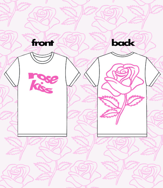
Brand Merchandise Design 1
This is my first design for a t-shirt with my brand logo on it. The t-shirt does have a front and back element to it; the written logo is on the front in the centre of the t-shirt and it has been twisted so that is slightly different to the original logo. On the back of the t-shirt is a large rose which is the symbol of my brand. the colour I have used is pink as this is also symbolic of my brand.
I think that the t-shirt fabric would also be effective in different colours such as lilac, pale pink and even baby blue. All of these colours will contrast the darker pink logo effectively, as well as the white which I designed above.
0 notes
Photo
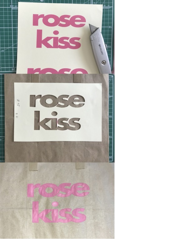
This is the process of creating branded paper bags with my logo on. I began by printing my logo onto a piece of card and I used a craft knife to cut out the logo. Once I had done this, I placed the cut out card in the centre of a brown paper bag and temporarily stuck it down using some blue tack. I then mixed some pink acrylic paint and used the stencil logo to apply the paint carefully. Once the paint was dry and I had done two coats, I removed the stencil to reveal the logo. I am pleased with the overall look of this and the contrast between the brown paper bag and the pink paint is very effective. However, to further improve this, I would use a lighter pink paint as the contrast would be more exaggerated the appearance of the logo would be more defined.
1 note
·
View note
Photo

Rose Wallpaper
I made this rose repeat pattern wallpaper for iPhone on Adobe Photoshop by copying and pasting the same layer over and over again to create the pattern. I used the paint bucket tool to make the background a lighter pink than the rose logos to create an effective contrast so that both colours stand out and work together to show a clear pattern.
1 note
·
View note
Photo
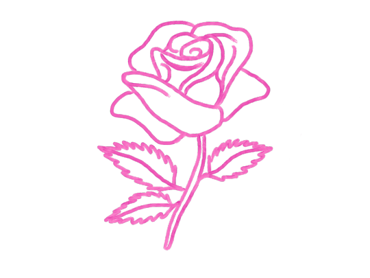
Rose Motif
I made this rose motif symbol on Adobe Sketch for iPad using an Apple Pencil which allowed me to draw freely and with the correct intention of movement. I used a paint brush tool that mimics the real life effect of painting onto paper. I used a pink colour as this is the predominant colour of my brand ‘Rose Kiss’. It is very fitting to have a rose symbol for the brand as it is in the name.
I have the intention of developing this into a logo for the brand and tying it into the ‘rose kiss’ written logo and combining them together in photoshop. I would use two different colours for this so that the rose kiss text stands out more. I will do this by using a more dominant colour for the text and then using a less dominant colour for the rose motif.
0 notes
Photo

Rose Kiss Logo Variation
I experimented with oil and water to create an emulsified background. The original colours were blue and pink but in photoshop, I inverted the colours and intensified the colour balance to be more pink in colour. I combined 4 different images and used the eraser tool and I used the smudge tool to blend the boundaries between each image. To finish this variation, I added a pale pink version of my logo font to the oil mixture background as a bold contrast.
1 note
·
View note
Photo
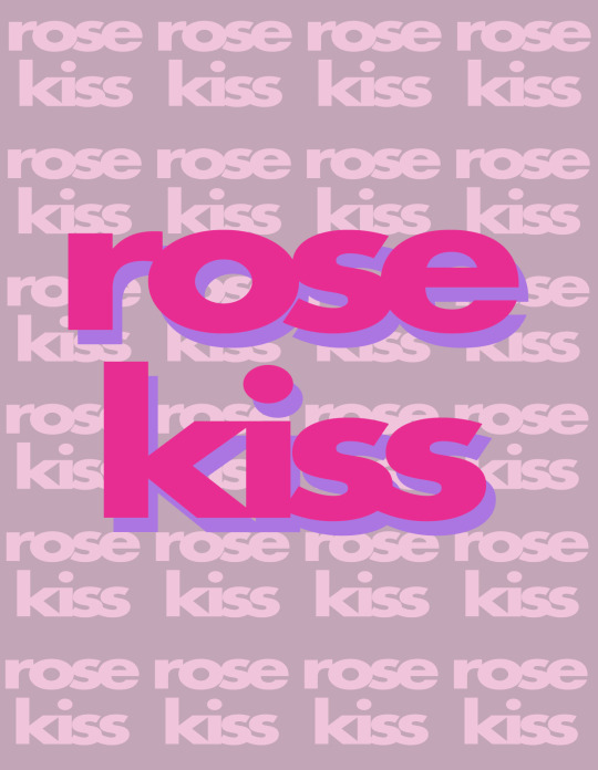
This is the final logo for my brand “rose kiss” which is a 2000s/y2k themed brand which will be centred around branding merchandise such as t-shirts, bags, makeup bags, stickers and other similar promotional products. I decided to choose the name ‘rose kiss’ because the primary colour I will be focusing the brand on will be pink and ‘rose’ is a synonym of pink. Moreover, ‘kiss’ is a cheeky and girly word that also sounds very young and fun.
2 notes
·
View notes
Text
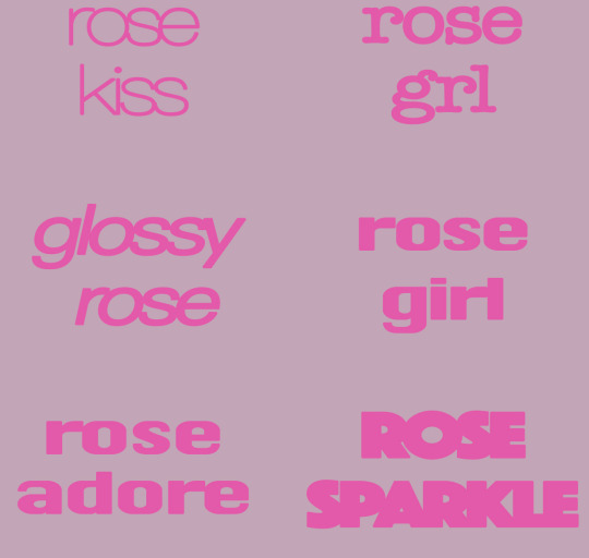
Exploring Potential Brand Names
Key Words:
Babe, cute, fun, quirky, y2k, 2000s, pink, blush, rose, bloom, adorable, adore, j’adore, pretty, butterfly, beauty, petal, flower, girly, girl, love, pretty, lovely, clear, crystal, diamond, sexy, kiss, gloss, glossy, glimmer, shimmer, star, heart,
Abbreviations:
bb, qt, pnk, blsh, bttrfly, flwr, grl, luv, clr, sxy, glymmer,
Experimental Combinations:
glimmer girl, glimmer grl, glmmr grl, rose girl, rose adore, butterfly girl, diamond rose, rose kiss, rose sparkle, rose shimmer, rose shine, rose fantasy, rose gloss, glossy rose, rose cherry, crystal rose, rose beauty, diamond rose, rose grl, rose girl,
My favourite brand names are the ones highlighted in pink. I will create some experimental brand logos with each name to see which one fits the best.
1 note
·
View note