#“if changing a single pixel has a noticeable effect on the piece... it's pixel art if it doesn't? then it's simply close to being pixel art
Text
if anyone says pixel art is easy, and you should do it if your making a game and don't want to put much effort into it, I will actually smite thee with the powers of the concept of art. fuck you, do not act like a medium so deep in nuance and style is just a simple thing you can mess around with.
you can mess around with it of course, and should, it's very fun, but it's as simple or as complex as you want it to be, and acting like it's easy is like saying just cause you can draw a stick figure, means drawing is a simple, easy to learn medium.
everything has it's difficulties and skill ceilings, and that's what makes art fun, but acting like just cause it has only a few hundred pixels makes it easy is fucking horrendous, and I will not listen to anything else you have to say.
#art#pixel art#discussion#you can still say it though#just like#come the fuck on?#don't lie to people like that#if your saying shit like “oh if your having trouble with making art for your game use a simpler style like pixel art”#you should stop making videos#and think about what you actually just said#people say how good pixel art looks#and then act like it's easy to make that kinda thing#it isn't#it CAN be#but like#that doesn't mean it IS#or WILL be once you get to actually making it#or polishing it#also if your wondering what I count as pixel art#I go by the rule of#“if changing a single pixel has a noticeable effect on the piece... it's pixel art if it doesn't? then it's simply close to being pixel art#I think that's a decent way to look at it#not perfect#but like it's a definition that's lenient but still rigid enough to mean anything#unlike whenever someone tries to define what the hell a rougelike is#well this post is another in the long long line of “half of it's in the tags”#whatevs as they say#whatevs
6 notes
·
View notes
Text
COMMS ARE OPEN!
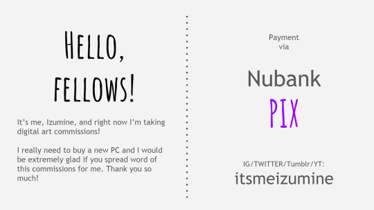
[ID: a 6 panels presentation explaining how OP’s commissions are going to pan out. First panel has scripts divided in two columns. The first column says “Hello, fellows! It’s me, Izumine, and right now I’m taking digital art commissions! I really need to buy new PC and I would be extremely glad if you spread word of this commissions for me. Thank you so much!”. The second column says that payment is to happen via Nubank Pix system and OP’s other social medias’ handle; “itsmeizumine” on Instagram, Twitter, Tumblr and YouTube. From the second panel onward, OP’s gonna showcase the types of commission they are willing to take.]

[ID: Second panel is titled “Silly Doodles”. There are three drawings on the panel, all of them very simple and cartoonish. The first drawing is of a kid reenacting “Will Smith Showing Off His Wife” meme, with a speech bubble that says “Bitch, I love and appreciate you” stylized to add comedic effect. The second is of someone grimacing, with “OUCH...” written behind them. The third drawing is of a surprised person, with a speech bubble that says “*GASP* what- NO WAY!!”. There’s a script at the bottom right that says “Silly doodles are fun to draw and use, specially as stickers! They are the quickest to make, and cost 5 USD*.”. The asteristiks are going to be addressed on the 6th panel.]
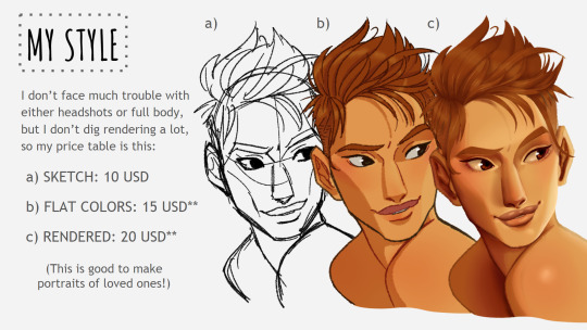
[ID: Third panel is titled “My Style” and has a column of script right under it that says “I don’t face much trouble with either headshots or full body, but I don’t dig rendering a lot, so my price table is this: a) SKETCH: 10 USD. b) FLAT COLORS: 15 USD**. c) RENDERED: 20 USD**.”. By the side of this column, there are three versions of the portrait of a boy, showing the different finalizations the price table announced going from the simplest (option a) to the most difficult (option c), left-right. At the bottom left of the panel, there’s a script in parentheses that says “This is good to make portraits of loved ones!”.]
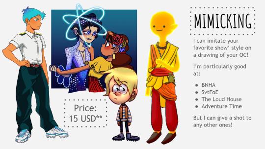
[ID: Forth panel is titled “Mimicking”. Under the title, a column of script says “I can imitate your favorite show’ style on a drawing of your OC! I’m particularly good at: BNHA, SvtFoE, The Loud House and Adventure Time. But I can give a shot to any other ones!”. There are four drawings of original characters to the left of the column, each into the styles of the shows OP mentioned. A serious girl using Yuuei’s uniform and sneakers; a boy dressed as a prince from other dimension dancing with a girl in a poncho blouse and pleated skirt, both seemingly in love with each other; a kid wearing a vest, a long-sleeved blouse, pants and boots, expectantly looking to the forth wall; and a fire monk in their casual garb, content; respectfully. In the midst of the drawings there’s a box that says the price is 15 USD**.]

[ID: Fifth panel is titled “Landscapes”. There are two big drawings. The one at the left shows a empty main avenue prepared to start a community fair. The day is sunny and there are little flags and lace tinsels hanging from building to building as there are flower garlands and wreaths decorating the shopfronts. The floor is made up from packed dirt and cobblestone and there has a kiss booth and a roasted chicken stand at the edge of the street. The drawing on the right is the WIP of a staffroom from a mechanic workshop. There are two different levels at the same room. In the lowest there’s a small kitchenette with lights hanging from a support beam made out of steel and a sofa with a remote control atop of it. In the highest, the ground has the same metal texture of a bus’ floor; there’s a ladder, four tires piled together with plants around them and a shelving unit attached to the entryway. There’s a box that says the price for the art pieces is 25 USD**.]

[ID: Sixth panel is titled "Yes, can do/ No, can't do". The text that follows right after is divided in two columns, each column under one segment of the title. The column under the first segment lists Lettering, NSFW art (though, OP says it's debatable) and Mecha/Armor as things they can also do. The column under the last segment lists Gore (OP clarifying that they can work with blood, but nothing more explicit than that), Hate Material and Animals (and by extension, Furries) as things they can't do. Under these columns there's a box that explains the asterisks. It says "Single asterisk: In case USD is not your currency, we'll follow the procedure of converting the values using it as reference. Double asterisks: This is a minimum price. Might be upped depending on the complexity of your commission, but don't worry! We'll discuss it before settling on anything. And! We'll only start negotiations if you read and agree with my Terms of Service, so that's that as well.". This is all there is to the last panel, and with that the presentation ends.]
(TERMS OF SERVICE BELOW, READ IT ATTENTIVELY)
if DM me about any commission you're interested to do i'll assume you've read everything and are 100% okay with it, so don't even try if you're aren't. this is not up to debate.
.
there's stuff worthy of taking notice before asking a commission from me:
.
i need my commissioner to be somewhat available for communication. i'm gonna share my process with you and i need your feedback during it to go on. any sort of adjustment gotta happen there, as i'm not returning to the finished piece to retouch it on any way or form nor do i allow anyone to make any changes to my artwork.
.
i'm not delivering the finished piece until you fully pay me. no debate on that. and i reserve the right to cancel and refund any commissions at any time for any reason.
.
unless you oppose to it during the process, there's a chance that i might use the commissioned artwork on my social medias as a way to promote me and my services. if that bothers you or makes you uncomfortable, you gotta tell me.
.
you retain all rights over the intellectual property of the commissioned piece and i assure you i won't make any claims over it, but the artwork is mine nonetheless. it's for personal use ONLY until stated otherwise, and you CANNOT profit from it or use it commercially unless we discuss it beforehand.
.
i won't make you NSFW art if you're under age, for obvious reasons. any minors asking for commissions of any other kind need have permission from their legal guardian, unless they have their own bank account.
.
if you want to eventually print the artwork, please state this before we get started on the commission. my default set-up is made for small files that are going to pixelate once you size them up to make, say, a poster. it's going to reflect badly on the end result of my work and i can make it right from the start if only you warn me first.
.
and i won't lower the price of any commissions below where they are now. the prices are as accessible as they can be. i'll work hard on each and every piece ever commissioned and and i need money like any other person too, respect me and my work.
.
i’d like thank anyone commissioning, reblogging or sharing the link of this post with possible future commissioners right now. hopefully i’ll be able to buy a new computer and make even better art to share with you guys soon!!
#izumine#digital art#art comissions#digitalcommissions#digitalart#art commission info#art commission prices#art community#terms of service#commisions open#i feel like i'm flooding the tags uselessly but oh well#izumine talks#image description#it's the first time i've ever done one#is it helpful guys?#feedback is greatly appreciated#signal boost#artists on tumblr#small artist
42 notes
·
View notes
Text
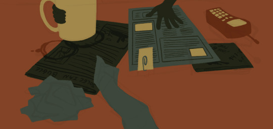
My approach to flat colors + limited palette drawings
This is a follow up to this post i made about how i go about figuring out a color palette for my limited palette drawings. an anon asked me about my actual technique of finishing them so this is gonna be an explanation of how I work in a limited palette with flat colors. I ended up with these thumbnails for a sketch last time so we’re gonna work from here and I’m gonna sort of walk through how i got to the finished version

first things first: every part of this process is just developed as a result of me messing around. take my advice with a grain of salt and if you think you know a way to do something better/that makes you more comfortable. go with that over what I say.
I’m honestly a little surprised when people express confusion about how i draw like this because it’s SUPER simple - literally all you’re doing is just stacking solid color blocks of shape. its very imprecise despite how sharp everything ends up looking.
First things first is that you want to decide how you will be handling your edges throughout the duration. Do you want your shapes to be ultra-sharp and precise, or do you want a little bit of a wobblier, grainier edge? Both can look good but it’s VERY much a matter of situational basis. i’ve been favoring looser and grainier shapes so that’s how i’m going to be working on this.
on the left here, you can see the shapes made with precise rectangular selections and an untextured pen, on the right, freehand drawn shapes and a grittier pen. There’s something immediately pretty different feeling about them. So play around with that first - its not something that’s fun to change halfway through! But lets step back a minute. It helps to work large to small. The two biggest shapes here are these orange chunks and everything gets stacked on top of them so i’m gonna do that first.
Now, a key feature of what i do: clipping masks. almost all digital art programs have them. What a clipping mask does is it constrains the pixels of a layer to the transparency of the layer below it. Here I have the light orange layer, and then on top of it the buildings and billboard are clipped to the orange. Most of you probably already know this and I’m overexplaining a bit, but there was a time when i didnt know how clipping layers worked and someone had to explain it to me.

now you’ll notice the shapes of the buildings are rough, and sloppy. here’s the fun part: since this is all about stacking shapes, only your exterior edges matter. this all gets filled in. be as sloppy as you want when you’re making your shapes. in fact, the outside edges get trimmed out a bunch to when i do this - i go in and erase them clean. Don’t be too finnicky about drawing perfect and precise! its a waste of time. As long as the silhouette is what you want, the interior can be a nightmare.
Working this way, it’s important to keep your layers stacked in a way you can make sense of. Right now there are four layers here: the background dark orange, the two main orange rectangle shapes, and then the buildings on one layer and a billboard on the other. I rack up a LOT of layers doing this and it makes it annoying in some aspects, but being able to freely recolor any one chunk without losing my detail is a key aspect of this.
So, I block those out
Next, I do the same for the smaller chunks that are still main shapes. There are once again, a lot of layers here. The top layer is the hair - you can see the head showing through it. The head and arm underneath the hair, same layer. Then the cup. Then the light green pieces of paper. Then the dark green ones.
The cup is technically farther forward than the head and arm so you would think it’d go on top, but the point isnt to recreate the foreground and background hierarchy with layers so much as it is to group things in a way i can work with. The cup goes underneath so it can be grouped with all the other objects on the table.
now, i just go and fill in all the shapes. i forgot to do the blinds but i get them later. you might notice a lot of these shapes are pretty rough, which was harder to notice before they were filled in. Now that I can see better, I go in with an eraser and clean up the edges until they’re the shape I want

sometimes erasing leaves little bits of ‘noise’ around objects like on this napkin here. i like to keep a little bit of this noise for texture, but if you dont like it make sure to get rid of it! if you’re working very crisp this will stand out a LOT
Next up is to add some detail onto the objects
I flipped the canvas here because the head shape was wrong - the ears were uneven and i wanted to fix it. I want to go about adding detail onto the billboard and buildings. i do all detail with clipping masks - but the objects are clipped to another layer and so nothing can be clipped to them. instead, i unclip them and just erase by selection for the same effect
all of the text on the papers is clipped to the papers below it. the buttons are clipped to the phone. the yellow photos and card are actually another independent layer on top, in case i want to recolor them separately. im indecisive and end up recoloring things a lot. For the most part these objects are starting to become recognizable as more than just shapes
i go in an add the details on the background and character now. theres some more stuff on the table. the lines of the face and ears are on one layer, and the flats of the eyes below that. Here’s what each group of layers is, and what they look like on their own

The background/bottom chunk. Just the table, window, and shirt.
The middle bit. All the stuff on the table and the blinds.

Finally, the top, which is just his head and arm.
now this stage is the bare bones of the drawing. you can more or less tell everything that’s happening. it reads. but its very much lacking in something - it doesnt have a ton of depth or interest. and adding that additional detailing, the dept and interest, is where stuff starts getting REALLY tricky and subjective.
im gonna take you to a much simpler scenario to show the sort of options i go through at this stage
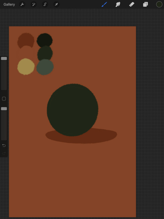
ahh its our dear friend, sphere casting shadow. this is, more or less, the kind of image we have. you can tell whats happening but it’s lackluster. there are TONSSS of ways frm here that you can go add interior detail to a shape once it has been established. here are some quick and SUPER rough examples
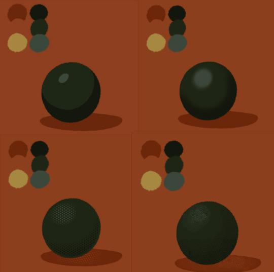
from top left to bottom right: flat cel shading, softer airbrushed/gradient shading, halftone, and a textured brush. Each of these has their strengths and weaknesses. They can also be combined.

for example, here’s the solid cel shading being used to contain a gradient/airbrushed detail. This image - probably the single oldest piece of my art i still willingly show people - is entirely colored with gradients being contained in cel-shaded chunks. It has a sort of soft, luminous quality but without losing its crispness.
here’s a super quick bust with some variations of stuff going on. obviously this is no masterpiece but you see how different types of detailing can interact with each other and be used to distinguish materials too.

With the mob psycho comic I did, the detailing that wasnt line was done using a variety of halftones of different shapes layered on top of each other


by contrast parts of my ace attorney comic use a textured brush and have a sort of blended, papery feel
any of them can work for pretty much anything as long as you are using it with intent. practice around. mix styles of finishing together. find a comfort zone. the more you do it the more intuitive it becomes and at the heart of it this process is a very intuitive way of drawing because of how far removed it is from realism.
Now here is the trick - light and shadow.
Everything up to this point has been very flat and adding detail helps but there’s only so much that can accomplish. To get HEAVY light and shadow you need to think about things differently. I think if there’s any part of this process that’s complicated, its this one.
To truly get the most out of your palette, you need to pick chunks of an image to be in higher/lower light and then either ‘step up’ or ‘step down’ the colors in that chunk. here’s what I mean.
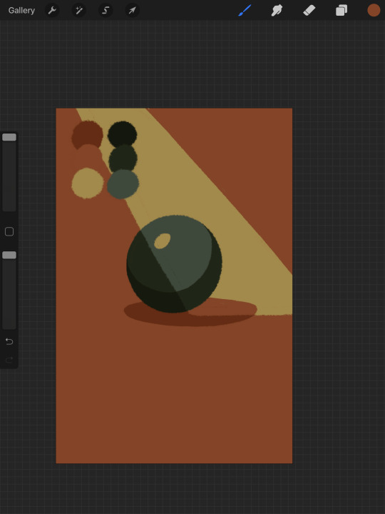
Here’s our ball with a beam of light on it. Everything Within the beam of light is one step in our limited palette lighter than anything outside of it. Here’s how I go about doing this: the shape of the beam of light is below everything else. Then, once I have the shape blocked out, i select it. With that selection in place, i go to EVERY SINGLE LAYER that’s effected, lock the opacity, and recolor that chunk. So what’s going on here is that there is only one more layer - the beam of light, below everything but the background, and the rest of this effect is just caused by every layer above it now being two-toned following the exact same silhouette. THIS is why it’s so important to keep your layers separate - if the shadow and highlight had been painted onto the base directly, i would not be able to do this without significant effort.
This works with all of the finishing techniques I talked about above
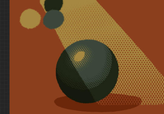
A combination of cel shading and half toning, all stepped up to give the appearance of heavier light on one area.This is also how I go about rendering transparency in this style. All of my layers are fully opaque and I allow the colors to do the work of conveying transparent material

Here’s our ball with the patterned/textured brush shading, being viewed partially through a window
it’s obviously not a very representational way of working, but as long as your audience UNDERSTANDS what you’re trying to convey, then you’re executing it successfully.
So with that, now we’re gonna go and finish this drawing.
For this one, I decide a big central shadow is necessary. In the original thumbnail, he was backlit, which I still plan on doing, and that wouldn’t make sense without casting a shadow.

I’ve had to change the colors of some objects entirely in order to get this to work right. This is what I mean when I call this an intuitive process - some stuff felt weird, so I changed it. This also involves a bit of problem solving. The newspaper is now unable to be separated from his hand. Sometimes changing the color of an object makes that object look better, but ruins its relationship with the objects around it. It’s up to you to learn how to adjust and finagle things until you get it where you want.The paper he has and the napkin underneath it also all blend together now.
The next few parts of this process are REALLY just trial and error, where I toss a bunch of spaghetti at it until it works. It’s hard to decide what to screenshot, because I don’t know what will or will not be part of the finished drawing. To that end, you can watch the recording of this drawing here. This video isn’t edited at all so it contains a couple of minutes of really shitty sketching, and then all of the color thumbnailing work i did in the last post. Actually getting started on these final colors begins around the two minute mark. It is also sideways, I am sorry I don’t know why.
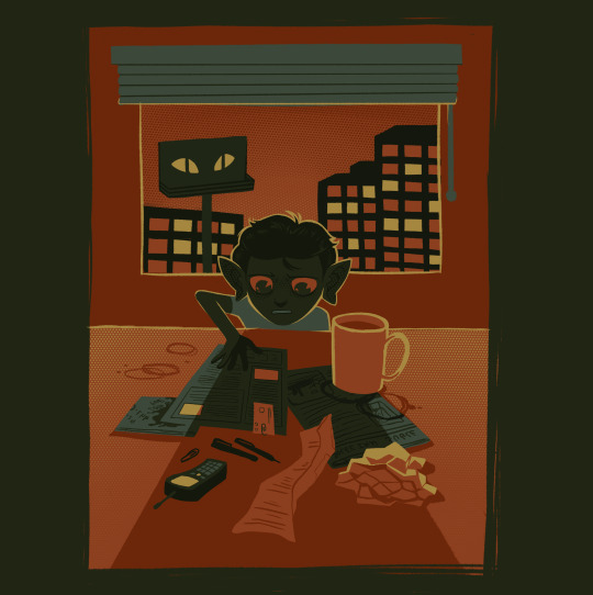
Now, here you can see where I’ve more or less worked things out. His hand’s not on the cup anymore because my friend pointed out it didnt have an arm attached to it. I added some halftoning to make a gradiating effect in the sky and on the table to give the impression of a sunrise. His eyes are different but as of posting this, I don’t like them and am probably about to go back and change them again. The Cup now has a shadow and some rim lighting. His hand is in shadow. The stain on the napkin is big enough to define the edge of the paper on top of it.
Little things like that.
The more you draw like this the more the way you need to think about your space becomes natural. I hope this helps and I wish you all the best of luck!
117 notes
·
View notes
Text
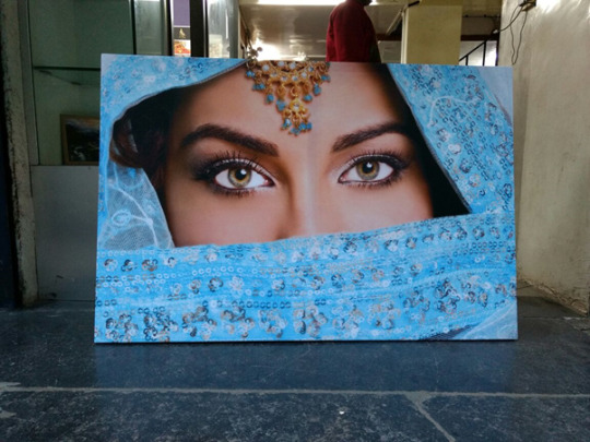
Which type of prints should I choose for my home? How it will look on my wall?
Top questions we get asked often while purchasing Canvas Printing — Which type of prints should I choose for my home? How it will look on my wall?
It appears many of the buyers are confused about this so in this section will explain you all of your queries. We will address the pros and cons of canvas prints and hopefully, after reading this, you’ll be able to decide for yourselves why to choose printposters.in to print your canvas.
You know, there are mainly 2 types of prints. The basic one printed on roll canvas and the second is gallery wrap canvas which is mounted on a pine wood frame, both are printed on archival type Canvas with using branded machine-like Epson and Canon.
Here is why…
Canvas prints are classy and give depth to photo
Would you like a classic look on your wall? Then you will definitely love the textured finish of canvas prints which enhances your walls. The canvas prints are based on advanced inkjet printing technology and they look almost like original paintings as printing can produce 98% of the colour gamut. You could even feel the clean brush strokes when you print paintings onto a canvas as the textured finish will give 3d effects for brush strokes. Originally all canvas print has a textured look. This textured look on matte finish reflects less light and as a result, you will enjoy a glare-free view similar to that of an original painting. So always go with a matte finish.
See above canvas print which actually looks like the original painting
Canvas prints available with printposters.in are the highest quality of art reproductions as they work with lots of artist across the globe. They use pigment-based inks to reproduce Canvas prints. The color absorption in canvas is much better than that of paper so as life. Canvas Prints can last lifelong with fading colours on it. By using archival ink and high-quality canvases, these types of art prints offer an accurate reproduction of original art. So always check with the supplier about this.
And guess what, if you keep an original painting and canvas print side by side, you won’t quickly recognise the difference between canvas prints. Perfect reproduction of any Canvas art print.
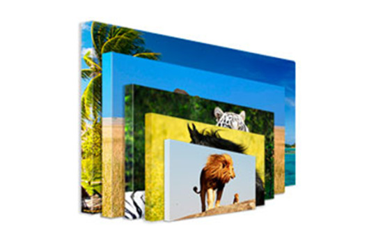
You can make larger prints on canvas up to 5 X 8 feet with framing
You can make large canvas prints check the above example
To print maximum size print? If you are thinking to prints large size on canvas the image should be of at least 300 PPI (Pixels Per Inch) resolution. Otherwise, your print will look pixelated. The maximum hi-resolution image you provide the higher will be the print quality
The colour absorption on canvas is higher, even you can print larger sizes of canvas prints at a lower resolution but it is not recommended as printers print with the maximum resolution.
So, if you are thinking about hanging a large fine art canvas prints, then canvas prints are the ones you should buy for its advantage!
Canvas prints reproduce better colours with a higher colour printer. Almost 98% colour gamut …
Canvas prints produce better colours with increased in numbers of cartridges

Do you know why artist prefer canvas prints over other kinds of prints due to its colour vibrancy?
That’s because canvases produce colours more accurately than other types of prints. Even the printer, which prints on canvas have higher colour gamut.
Printing on to canvas requires specialized printers and only professionals and branded printers produce the highest quality print. As a result, you get a carefully produced, higher quality, rich in colours print which last for generations.
On top of that, this canvas print does not require any specialised coating as its inks are water resistance that protects the print from dust and moisture. Even you can wash canvas under running water. This resulting in vivid and bright art reproductions with better colours without any reflection on matte canvas.
Canvas prints are easy matches with the wall of the colour…
Canvas prints easily match with existing wall colour

Canvas prints are an easy and affordable way to change the look of your walls without any hazel. You can decorate your home with canvas art prints mainly in two ways. Either by framing it as you normally do but it is not recommended or by stretching it on to a pine wooden frame.
The gallery wrapped canvas frames weigh less than conventional frames as they don’t need glass or any kind of protection to keep them safe also the frame which is manufactured from pine wood is also light weighted. Because of this, these canvas art pieces are easy to hang on the wall and are also easier to clean. Even you can hang the canvas frame on the wall using two-way tape.
This frame-less presentation of the canvas is wrapped on a pine wood frame creates a window into the scene and easily matches with almost all types of interior design. Since there are no mats or borders to these art pieces, the entire size fills with artwork giving a unique visual appearance on your walls
Large multi-panel canvas art prints for large covering of wall area
You can also decorate your wall with multi panel canvases made by splitting a single panoramic artwork or any photo to a multiple parts. The size and number of these panels depends on the size of your wall and can be customised as per your design also. They can be a great focal point art pieces on the walls above a living room sofa or in the dining area.
It’s super easy to clean canvas prints
Canvas prints are easy to maintain as it’s a water resistance print
No matter how well you have maintained your home, dust will settle and spiders would make a mess on these prints. Then, you need to clean you are fine art collection using water. Use of water go ahead and clean using running water no problem
The canvas prints come with water resistance ink printing. This water-resistant ink protects the art from harmful UV rays and to a certain extent from dust and other atmospheric particles. This inks also keeps your art free from fingerprint smudges.
When you clean a canvas art print, you can simply use a lightly damp cloth or running water or an artist brush to remove the dirt from the surface. Once cleaned, you can even dry the canvas in sunlight.
Canvas prints are a lot more durable than other types of prints due to the use of archival inks with media
Canvas prints last long as printposters.in use archival inks with media.

When you buy something for your home, you want it to last long, so always go for archival ink printing on canvas? The canvas prints are a perfect match for this purpose as its last lifetime.
There are two types of canvas used for printing. One based on 100% cotton (similar to original canvas paintings) and a new type based on plastic compounds that are similarly durable.
Both of these are better at fighting the elements of nature and therefore last longer than normal prints.
That’s not the only advantage of using canvas prints. They don’t fade like normal paper print. Have you noticed regular paper turning yellow when they are long exposed to nature but canvas doesn’t fade or turn yellow in colour. Well, that takes longer with regular canvas prints and don’t happen at all with plastic-based canvas prints.
Canvas prints are a lot more durable than paper-based prints. And interestingly, just about printposters.in has come to the same conclusion – that canvas prints have a life of 100+ years.
After reading this, you may be of the notion that canvas prints are a better choice with printposters.in. That can be true always. It depends on your choice can be affected by many factors — the type of artwork you want to print, your budget, your tastes, and preferences, wall size, and the location where you want to keep this artwork and finally the interior design of your home.
Texture on canvas prints which enhance quality
Some of these reasons should be obvious. For others, let me explain. Let’s say, you want to print photographs on canvas — this is usually recommended. Because of the textured matte finish, photographs printed on canvas can be the best look for wedding photos. So, if you are the one who likes the glossy smooth finishes, then go with glossy canvas print. On the other hand, if you want your art reproduction to look almost like the original, you should go with a matte canvas print.
1 note
·
View note
Text
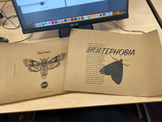
My Don’t Panic Envelope
For my Don’t Panic project I have created an envelope too hold all of my outcomes, but just like Don’t Panic I have made the packaging into an outcome itself rather than just a plain envelope. I used Don’t Panic’s original envelopes as inspiration completely, in terms of the brown and black colours, envelope’s shape and type of illustration on the front and back. However I didn’t copy anything from the illustrations themselves, and instead used techniques that I previously learnt to create my own art.
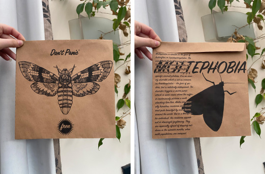
Overall I think the outcome looks simple but because of the details it remains interesting, which in my opinion is what works best for the envelope as it’s not too complicated. I also think that the black on brown looks really unique, which is a nice difference to simple black on white. It also adds a slight rustic quality which links with Don't Panic’s differentiating style, concept and audience.
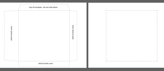
Front Page
To begin with I opened the envelope template on illustrator, which showed the size and dimensions of the font page, back page and flaps. This step is obviously fundamental because it will allow me to create the envelope physically, when I print it onto paper, cut it out and stick together.
Adding to the template I first scanned in the line drawing into photoshop, and changed the brightness/contrast so it was clear black lines against white. I then removed all of the white background so only the lines were left, with which I overlaid a black colour just to make those lines extra clear.
Next I copied and pasted this into the illustrator template, with which I used the ‘image trace’ option to make and expand the object. What this does is make all the lines completely smooth as they become no longer pixels, not only does this look cleaner but it also allows illustrator to then separate the lines and spaces from each other, as it is picking up clear and sharp shapes. So I ungrouped the object and removed the background, which I then grouped back together in order to move as one.
However I later realised that the last two steps of the process were pointless, and that I had wasted my time trying to solve a problem that's not even a problem. I thought because wer’e printing only black onto brown paper I had to make sure only black was being added to the template, therefore I was looking for ways to delete every single piece of white in and around the moth without doing it one by one, otherwise it would be filled with white. I then realised that by using the right settings you can only allow black ink to even print through, this means any white added to the already white template will not be picked up at white rather empty brown space. Nevertheless I do think removing the outer white was somewhat useful, as I didn’t have to make sure anything surrounding the drawing was in front of the image.

To place this onto the template I decided to display a simple and clear composition, as much of the art inside is more complex and busy. I also wanted to show all of the drawing illustration, so I cropped it to just fit the area allocated. But this still left space above and beneath the moth, which was useful as I had other features to add to the front cover.
Next I had to include the ‘Don’t Panic’ logo which I took from a website of theirs, however this meant it was slightly pixelated. Therefore I repeated the same process of make and expand, ungroup, delete background and group.
Here you can see the difference this step makes, displaying the clear version on top and the original underneath. The writing made of pixels is much more unclear compared to the vector object, however the writing will be so small you would barely even notice. Besides this I still think it’s better to clarify the object’s appearance than not, specifically in terms of sharp and clear edges.
To size this I drew a rectangle with the dimensions of 75mm width and 15mm height, this would work as a guide for the logo to make sure it’s sized correctly. Having removed the rectangle I then incorporated this into the design by placing it above the moth, assuring it was central from all edges including the drawing.

The final aspect for the front cover is a ‘free’ sign, which is another thing that can be seen on all of the Don't Panic envelopes. For this I used the star tool to create a pointed shape that holds the writing, however stars are usually 5 pointed which wasn’t what I wanted. So to change this I clicked on the page rather than dragged out the shape, as this allowed me to change the number of points as well as the radius sizes.
At first I compared a 5 pointed star to a 50 pointed star, so I could get some kind idea of how many points I wanted. The 5 points didn’t look enough and the 50 points looked too much, however I also compared the length of the radii to display short/thick and long/thin points.

The shape I decided to go for was an overall middle of everything, I chose to have 30 points on the star as it wasn’t too much or too little. And as for the size of these points I made sure it wasn’t too short nor long, displayed through 12mm and 8mm measurements. This also allowed me to still have enough space to fit in the text, whilst still showing clear spikes.

Next I used the type tool to write the word ‘free’ in the sign painter font, this typeface has a hand-writing likeliness which is similar to the logo’s font, and therefore suits the design perfectly.

I then selected its colour as white so that it can be seen against the black star shape, making sure it was sized so just fits in the shape. For the final step of composing the front page, I selected the star and type together so I could move them both around the template. I placed this similarly to the Don’t Panic logo, central to all the edges but underneath the moth drawing.

The last thing I did was remove the top flaps writing, where it says ‘top of envelope - do not stick down’. This is precisely the reason why I removed the text otherwise it would be seen on the flap, whereas the other flaps will be stuck inside the envelope and therefore doesn't matter.

Back Page
The back page is less about illustrations/drawings and more focused on information/writing, because this is how the original Don’t Panic packs are designed. However I didn’t have anything to promote, so rather than displaying advertisement I included information on the phobia.
To begin with I used the type tool again to write the word ‘mottephobia’ and all the information, having one going across horizontally and the other vertically. I went with the same typeface as the ‘free’ word because this connected both font and back together, and even though the moth related aspects will associate them with each other it just adds another similarity which is even more effective.

After placing them within the template’s shape and size, I duplicated and dragged the objects off the template so that any editing wouldn’t effect it. The way I played the types out however was overlapping, and because I could only print black ink I couldn’t select another colour for the small writing. The only other colour I could select would be white, but that would leave 99% simply unseen. Therefore my idea was to only change the colour of the writing where it overlaps the ‘mottephobia’ word, and to to this I started by creating an outline of the word so it could later be detected as one.

Next I made this a compound path which allows me to use an object for cutting a hole in another, and in this situation I am using the large ‘mottephobia’ word as a shape to cut into the group of writing. However before doing this I had to change its colour to white as it’s to overlay the black, and the reason why the large word invisible is similar in that it will be overlaid onto the original.
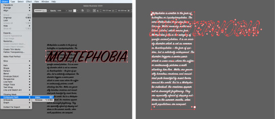
Afterwards I selected all the objects as one and made it into a clipping mask, this is then an object whose shape masks the writing so only areas that lie within the shape are visible. With this I moved it so it was right on top of the original black writing, and successfully displaying all of the words in this simple but really effective way.


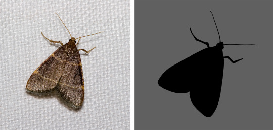
My final aspect of the whole design is a silhouette of a close winged moth, this was to not just fill more space but variety as well in regards to looks of moths. I created this shape by first removing the background in photoshop and overlaying a black colour, then in illustrator again turned the pixel object into a vector for clean and sharp edges.
Finally I moved this onto the template and repeated the whole process for any other objects that overlapped, so not only is the mass amount of writing being shown through but also the ‘mottephobia’ word. However I realised when it was too late that some of the words were split in half, this happens through loner words reaching over the edge of the line. So if I could do this again I would somehow sort these words to begin on a new line, which would display them as whole and undivided.

Assembling the Envelope
To create the actual envelope itself I first had to cut out brown paper into two A3 size sheets, this is because the illustrator template is A3 sized so must fit on the paper that it prints on. To get the size accurately I used an A3 book to trace around, making sure its edges and corners are precise otherwise the printer could have trouble identifying and printing it. To add to the certainty I used a guillotine rather than scissors, because this makes sure perfectly straight lines and correct angles are produced.

Once I had printed with the settings set as black ink only, I cut out the template’s outlines with scissors. This didn't need to have perfectly straight edges because it will all be stuck together and most of it actually hidden, the only edges that are exposed is the top opening flap. Finally I used a glue stick to affix the two sides, making sure all the folds are crisp and sharp.
0 notes
Text
Pick a Card
2019 Brighton Illustration Fair overview
I got on a train early in the morning and went to the BIF, one of the illustration fairs I always wanted to attend hosted by the University of Brighton. I went with the curiosity for the overall market and the kind of illustration style the participants had so I could gain more knowledge. So many booths and so little time to see it all and Brighton School of Art was full in every square meter you could find with not only beautiful art pieces, their artists and editorial companies but also with a big crowd of art lovers.
The urge to augment my visual culture made me spend 5 hours on my feet that seemed like only 30 minutes had passed since its beginning. The way time is perceived when we are enjoying ourselves seems unfair to me especially since I am a forgetful person and wanted to take it all in. This lack of memory made me collect mementos everywhere I go since I was a young girl. So at BIF I was set on collecting business cards.
These, in the business of illustration world, are most effective for elevator pitching and events like art markets, when illustrators want those who pass by to notice their work and to reach them with potential commissions. For the client, fairs are just like window shopping, they will pass by the booth and if interested in what the illustrator has done they will stop, ask stuff, maybe buy stuff too but, in the end, no one wants to lose these clients so making sure they get a business card is incredibly important for the art business to prosper since it’s the fastest way to give your contact and social media just by handing out a simple card.
Being a designer I found these mementos quite interesting since I have a different perspective on illustration business cards and I emphasize the importance of a good card design specially to the illustration field.
Most books underline that the “perfect postcard” or the promotional piece is the right way to get your work seen by Art directors (Rees, 2014 and Heller & Arisman, 2004) but nowadays it is my belief that the social media is way more effective and a business card does the same trick as the postcard since nowadays people value one on one elevator pitching more than the mail loads they receive each week.
To my disappointment, some illustrators didn’t bring enough or just didn’t make those. Two mistakes I learnt myself through experience: always make 100 or more for an illustration event, never less and the illustrator should always have at least 5 of these in its wallet wherever he goes because you never know who you might bump into (Graham, 2012). This exemplary network starter called business cards runs out quicker than we think.
Social media is the most important thing illustrators should write on the cards and I thought actually that this was common knowledge but there were a lot of illustrators without their Instagram or Facebook on the cards they had on display. Social media nowadays is the portfolio of the illustrator’s journey first hand and people who are interested on our work will always follow us because it is as simple as clicking on a button.
Others made the big mistake of printing cards on 70g paper which to the future client just looks like we don’t care at all about our work. It is that kind if disregard to the business that clients avoid. An illustrator does not print in shitty paper. We print in high quality. Every detail of a business card design portraits the work quality of the holder if he takes himself seriously. Or at least it should!
Talking about the graphics and typography, overall I have no big comment on it. There was an obvious lack of knowledge in some cases where the typography had too much of an impact and took the attention from the work itself due to exuberance or inadequacy which is something an illustrator should avoid. Others just had a lot of fonts on it instead of settling for one or two at most when they lacked the typographical skills of a professional designer. Another aspect I found worrying in terms of graphics and typography was that there were some illustrators who had only the name and a colour on the background. Even though a freelance illustrator can actually give those away and be effective, in these events there are more than a hundred illustrators so if the artist doesn’t brand himself with imagery or a good logo he will easily be lost and forgotten in the middle of the other cards. This is always worse than having a card that is badly cut or a little pixelated.
Looking back on the cards I collected, I can remember most of the artists’ works as if it was yesterday. Some better than others, some displayed their work in a modular way, others in a more random way. Some artists’ work matched well with their cards and others didn’t. But I can easily say that I feel that their care for their business was as good as their cards. It mirrors them not only in their work quality but also in their attention to details, time and organization.
Every person will know that carrying around 100 different business miniature cards is complicated since no one has enough storage space for them in their wallets. Viewing all the artists as a whole, I decided on making a digital collage using their business cards graphics in order to portray my visual memorabilia in one single image: the BIF’s business crowd.
For such, I started by displaying the cards with paper tape in three A3 sheets of paper so I could scan them. With the scan done, I made the collage in photoshop. No changes were made to the originals other than cutting and pasting.
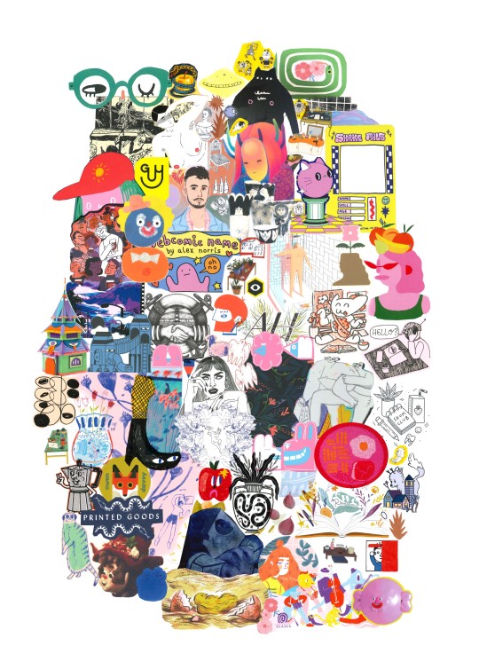
After doing this piece out of the mementos I accidentally shaped it like a head in profile. I found it very intriguing since most memories are kept in our brains and the feeling I got after the event was of a massive amount of information that filled up all my head with colourful imagery. A perfect protrait of my overall experience.
Illustration’s credits
Lizzie Lomax - Anna Soba - Dommy Sullivan - Bárbara Malagoli - Catherine do art - Alice Monvaillier - Shake Bristol - George Manson - Kissi Ussuki - Flying Eye Books - Nobrow - Angela Hadrill - Mia Minerva - Monosodium - Ewe Rynkiewicz - Ella Willson-Smith - Lloyd Stratton - Jo Dertili - Olivia waller - Aysha Tengiz - Illwookie - Meneer Heirman - Robert Sae-Heng - Honey Parast - Maya Doyle - Printed Goods - Hannah Peck - Hayley Wells - Wingki But - Arabella Simpson - Kate Lorton - Yuk Fun - Evie May Adams - Jessica Smith - Owen Davey - Beya Rebai - Pencil Bandit - Sundance Goods - Michael Vankehem - Alex Norris - Hazel McCoubrey - Aga Giecko - Laura Girling - Jayde Perkin - Lauren Morsley - Marie-Yaé - Fern Eleanor - Family Store - Amber Timm - Guy Field - Ellie Fryer - Playtime - Jack Snelling - Shanti Rai - Nikoo Bafti - Stacey Thomas - Hiffy Ulrich - Leanne Rule - Lineette - Brandon Seager - Rachael Presky - Carlett Li
References
Graham, A. (2012) Chapter 47: Business Cards. In: From Business Cards to Business Relationships: Personal Branding and Profitable Networking Made Easy, New Jersey: Wiley.
Heller, S. & Arisman, M. (2004) Inside the Business of Illustration. New York: Allworth Press.
Rees, D. (2014) How to Be an Illustrator. London: Laurence King Publishing.
0 notes
Photo
Suuuper gaaaayyyyyy.
Anyways, I wanted to say more on why Erina is a festering sack-of-shit garbage person. Firstly, her opinions on food are just objectively wrong. She turns up her nose at ‘common, peasant food’ which is weird on multiple levels: not only can any cook with a modicum of food history be able to explain the extent to which haute cuisine draws upon and is nourished by common peasant traditions (I mean fancy French cuisine itself is nothing but this particular interplay) but there has been a significant trend over the last decade in high cuisine towards rusticism - the locavore movement being perhaps its most visible influence that has bled into the mainstream: the tendency over the last decade-and-change towards deconstructionism of high food culture - both in molecular gastronomy and its diametric opposite in rusticism - is something she seems utterly ignorant of, as though her only experience with food is overpriced French restaurants that cater to the gullible by overloading every plate with a plethora of nonsense. It often seems that she has contempt for simplicity - which seems ridiculous given that her birth culture gave us the elegance of sashimi, a venerable culinary tradition whose masters attempt to perfect the art of serving a single ingredient. Her snobbery towards ‘common’ chefs becomes even more inexplicable given that we are to presume she has some kind of knowledge of great chefs who, as a body, living or dead, come as often from nowhere as from schools if not more so. Redzepi trained as an in-kitchen apprentice. Adrià started as a dishwasher. Keller never went to a school. Massimo trained as a lawyer. Blumenthal worked as a repo man and taught himself cooking at night. THESE ARE SOME OF THE TOP GODDAMN CHEFS IN THE WORLD AND ERINA SHOULD KNOW THIS.
Erina’s snobbery is nauseatingly silly - the show needs a Tsundere ice princess because this is fucking anime so Erina is what we get, but contextually it makes no sense. ‘Oh, you cook in a small restaurant?’ SO DID MOST OF THE PEOPLE WITH MICHELIN STARS. I mean her whole goddamn deal is to deny reality based on the fact that this boy from this little kitchen can’t possible cook good food - but the best sushi restaurant in the world, the only one with three Michelin stars, seats ten people and is practically inside a goddamn subway station.
If Erina’s argument is that 90s-style haute cuisine was the ne plus ultra of cooking - that any deviation from this was an anathema - then I could accept that as an element of her character, but instead we are given a so-called food ‘expert’ whose mastery is trapped in the 90s and no one else seems to realize this.
SECOND: As a writer her otiose critiques make my blood boil. If she was attempting to be the Erik Satie of the culinary world I could give her a pass, but she’s not, so I won’t. We see a couple times that she is more than capable of giving a critique that is actually understandable, but most of the time she would rather speak in pseudo-koans that we’re supposed to take as a really deep understanding of food.
But they’re not, because they’re nonsense. Criticism that cannot be comprehended is useless criticism. All Erina does is be cryptically insulting and then act like it’s a public service.
Third: Perhaps to a greater degree than any other art form, food is subjective to the consumer. Erina passes judgement as though her word is law - and to be fair, to a certain extent this is true of food critics generally - but Erina’s nonsense of a ‘god tongue’ brings-in a whole new level of absolutism and absurdity. Take salt, for example - there is no way to perfectly salt a meal because everyone’s sodium levels are different. Someone who has spent all day swimming in an ocean is going to have a much higher need of sodium in their food than someone who hasn’t - the body will instinctively respond to the mild sodium deficiency (which is why beach cooks who spent the morning surfing before their shift need to be damn careful while seasoning their dish.) Somewhere around 10% of people find cilantro to taste like soap - always. There is no ‘correct’ amount of cilantro in a dish that won’t taste off to them - they have a fundamentally different palette than other people. Familiarity in youth can breed an appreciation for flavours that might be impossible to learn in adulthood - which is why North American doesn’t do a roaring trade in salmiakki and haute cuisine still hasn’t latched-on to lutefisk (man, what is it with Scandinavia?) That doesn’t even begin to get into shit like allergies - the God Tongue decrees that this is the right amount of peanuts in this dish, enjoy that anaphylactic shock.
My point is that, unlike my opinions, there is nothing objectively right with flavours - more-or-less. The whole model of haute cuisine is predicated on certainly truths - quality ingredients, dedication to craft - that I don’t deny, but the idea of a ‘god tongue’ stretches my suspension of disbelief to the breaking point because it doesn’t mean anything. Why would any restaurant give a shit what this haughty supertaster thinks about anything - her gross mutant palette is so hilariously oversensitive it’s pointless to try and satisfy itand- besides: none of their customers will notice the alleged ‘flaws’ because they’re not garbage mutants like her. If she had a ‘God Eye’ and complained that your 100000x100000 pixel image had a single mis-aligned pixel, you probably wouldn’t give a shit because none of your customers are humanly capable of noticing the discrepancy so there’s zero point wasting time and money fixing it.
Seeking Erina’s approval would be a waste of any company’s resources: just get a likeable celebrity to sing your praises.
Fourth: Erina has fans in the school, which is weird because she’s such a relentless horrible person who is rude and nasty to essentially everyone she meets, and holds shokugeki solely for her own personal enrichment. I would get it is people cheered her as a villain because hey - everyone loves a heel - but instead they hold her in awe... I guess because of her cooking prowess, but prowess didn’t stop people from hating Subaru, another nasty piece of work. People cheer Erina because the narrative needs her to have cachet, but she doesn’t even have ‘mean girl’ charm - the catty queen bee who rules the school even though she’s nasty. She’s not funny, has no sense of humour, no ability to talk to other people - absolutely nothing going for her other than her skills as a chef which, again, didn’t do much for Subaru.
Everyone should be showing up to boo Erina - god, it would make her so much more effective if she fed off their hatred and negativity, her ego swelling as she ‘proved’ herself right again and again, spitting in the face of all the haters. Instead we get the super-popular charmless asshat who everyone is gaga for for no discernible reason.
In conclusion, Erina Nakiri doesn’t know anything about food and lacks self-awareness of the echo-chamber of her own unjustified snobbery.
She’s literal garbage.
#shokugeki no soma#food wars#food wars: shokugeki no souma#erina nakiri#subaru mimasaka#supertaster#cilantro#feran adria#erik satie#massimo bisotti#thomas keller#noma#french laundry#haute cuisine#jiro ono
4 notes
·
View notes
Text
‘Fawkes’ tool protects you from facial recognition online
Software called Fawkes “cloaks” photos to trick the deep learning computer models that power facial recognition, researchers say.
The software doesn’t make noticeable changes visible to the human eye.
The rapid rise of facial recognition systems has placed the technology into many facets of our daily lives, whether we know it or not.
What might seem innocuous when Facebook identifies a friend in an uploaded photo grows more ominous in enterprises such as Clearview AI, a private company that trained its facial recognition system on billions of images scraped without consent from social media and the internet.
Original and cloaked headshots of the study authors demonstrate how the modifications Fawkes introduces are invisible to human viewers while disrupting facial recognition software. (Credit: U. Chicago)
But thus far, people have had few protections against this use of their images—apart from not sharing photos publicly at all.
The Fawkes project provides a powerful new protection mechanism.
Cloaked from facial recognition
With enough cloaked photos in circulation, a computer observer will be unable to identify a person from even an unaltered image, protecting individual privacy from unauthorized and malicious intrusions. The tool targets unauthorized use of personal images, and has no effect on models built using legitimately obtained images, such as those used by law enforcement.
“It’s about giving individuals agency,” says Emily Wenger, a third-year PhD student at the University of Chicago and co-leader of the project with first-year PhD student Shawn Shan. “We’re not under any delusions that this will solve all privacy violations, and there are probably both technical and legal solutions to help push back on the abuse of this technology. But the purpose of Fawkes is to provide individuals with some power to fight back themselves, because right now, nothing like that exists.”
The technique builds on the fact that machines “see” images differently than humans. To a machine learning model, images are simply numbers representing each pixel, which systems known as neural networks mathematically organize into features that they use to distinguish between objects or individuals. When fed with enough different photos of a person, these models can use these unique features to identify the person in new photos, a technique used for security systems, smartphones, and—increasingly—law enforcement, advertising, and other controversial applications.
With Fawkes—named for the Guy Fawkes mask used by revolutionaries in the graphic novel V for Vendetta—the researchers exploit this difference between human and computer perception to protect privacy.
By changing a small percentage of the pixels to dramatically alter how the person is perceived by the computer’s “eye,” the approach taints the facial recognition model, such that it labels real photos of the user with someone else’s identity. But for a human observer, the image appears unchanged.
In a paper that the researchers will present at the USENIX Security symposium next month, the researchers found that the method was nearly 100% effective at blocking recognition by state-of-the-art models from Amazon, Microsoft, and other companies.
While it can’t disrupt existing models already trained on unaltered images downloaded from the internet, publishing cloaked images can eventually erase a person’s online “footprint,” the authors say, rendering future models incapable of recognizing that individual.
“In many cases, we do not control all the images of ourselves online; some could be posted from a public source or posted by our friends,” Shan says.
“In this scenario, Fawkes remains successful when the number of cloaked images outnumber that of uncloaked images. So for users who already have a lot of images online, one way to improve their protection is to release even more images of themselves, all cloaked, to balance out the ratio.”
Resetting mass surveillance
In early August, Fawkes was featured in the New York Times. However, the researchers clarified a few points from the piece. As of August 3, the tool had accumulated nearly 100,000 downloads, and the team had updated the software to prevent the significant distortions described by the article, which were in part due to some outlier samples in a public dataset.
Ben Zhao, professor of computer science and an expert on machine learning security, also responded to Clearview CEO Hoan Ton-That’s assertion that it was too late for such a technology to be effective given the billions of images the company already gathered, and that the company could use Fawkes to improve its model’s ability to decipher altered images.
“Fawkes is based on a poisoning attack,” Zhao says. “What the Clearview CEO suggested is akin to adversarial training, which does not work against a poisoning attack. Training his model on cloaked images will corrupt the model, because his model will not know which photos are cloaked for any single user, much less the hundreds of millions they are targeting.
“As for the billions of images already online, these photos are spread across many millions of users. Other people’s pics do not affect the efficacy of your cloak, so the total number of pictures is irrelevant. Over time, your cloaked images will outnumber older images and cloaking will have its intended effect.”
To use Fawkes, users simply apply the cloaking software to photos before posting them to a public site. Currently, the tool is free and available on the project website for users familiar with using the command line interface on their computer. The team has also made it available as software for Mac and PC operating systems, and hopes that photo-sharing or social media platforms might offer it as an option to their users.
“It basically resets the bar for mass surveillance back to the pre-deep learning facial recognition model days. It evens the playing field just a little bit, to prevent resource-rich companies like Clearview from really disrupting things,” says Zhao.
“If this becomes integrated into the broader social media or internet ecosystem, it could really be an effective tool to start to push back against these kinds of intrusive algorithms.”
Given the large market for facial recognition software, the team expects that model developers will try to adapt to the cloaking protections Fawkes provides. But in the long run, the strategy offers promise as a technical hurdle to make facial recognition more difficult and expensive for companies to effectively execute without user consent, putting the choice to participate back in the hands of the public.
“I think there could be short-term countermeasures, where people come up with little things to break this approach,” says Zhao. “But in the long run, I believe image-modification tools like Fawkes will continue to have a significant role in protecting us from increasingly powerful machine learning systems.”
Source: University of Chicago
The post ‘Fawkes’ tool protects you from facial recognition online appeared first on Futurity.
‘Fawkes’ tool protects you from facial recognition online published first on https://triviaqaweb.weebly.com/
0 notes
Text
Facebook upgrades its AI to better tackle COVID-19 misinformation and hate speech
Facebook’s AI tools are the only thing standing between its users and the growing onslaught of hate and misinformation the platform is experiencing. The company’s researchers have cooked up a few new capabilities for the systems that keep the adversary at bay, identifying COVID-19-related misinformation and hateful speech disguised as memes.
Detecting and removing misinformation relating to the virus is obviously a priority right now, as Facebook and other social media become breeding grounds not just for ordinary speculation and discussion, but malicious interference by organized campaigns aiming to sow discord and spread pseudoscience.
“We have seen a huge change in behavior across the site because of COVID-19, a huge increase in misinformation that we consider dangerous,” said Facebook CTO Mike Schroepfer in a call with press earlier today.
The company contracts with dozens of fact-checking organizations around the world, but — leaving aside the question of how effective the collaborations really are — misinformation has a way of quickly mutating, making taking down even a single image or link a complex affair.
Take a look at the three example images below, for instance:In some ways they’re nearly identical, with the same background image, colors, typeface, and so on. But the second one is slightly different — it’s the kind of thing you might see when someone takes a screenshot and shares that instead of the original. The third is visually the same but the words have the opposite meaning.
An unsophisticated computer vision algorithm would either rate these as completely different images due to those small changes (they result in different hashes) or all the same due to overwhelming visual similarity. Of course we see the differences right away, but training an algorithm to do that reliably is very difficult. And the way things spread on Facebook, you might end up with thousands of variations rather than a handful.
“What we want to be able to do is detect those things as being identical because they are, to a person, the same thing,” said Schroepfer. “Our previous systems were very accurate, but they were very fragile and brittle to even very small changes. If you change a small number of pixels, we were too nervous that it was different, and so we would mark it as different and not take it down. What we did here over the last two and a half years is build a neural net based similarity detector that allowed us to better catch a wider variety of these variants again at very high accuracy.”
Fortunately analyzing images at those scales is a specialty of Facebook’s. The infrastructure is there for comparing photos and searching for features like faces and less desirable things; It just needed to be taught what to look for. The result — from years of work, it should be said — is SimSearchNet, a system dedicated to finding and analyzing near-duplicates of a given image by close inspection of their most salient features (which may not be at all what you or I would notice).
SimSearchNet is currently inspecting every image uploaded to Instagram and Facebook — billions a day.
The system is also monitoring Facebook Marketplace, where people trying to skirt the rules will upload the same image of an item for sale (say, an N95 face mask) but slightly edited to avoid being flagged by the system as not allowed. With the new system, the similarities between recolored or otherwise edited photos are noted and the sale stopped.
Hateful memes and ambiguous skunks
Another issue Facebook has been dealing with is hate speech — and its more loosely defined sibling hateful speech. One area that has proven especially difficult for automated systems, however, is memes.
The problem is that the meaning of these posts often results from an interplay between the image and the text. Words that would be perfectly appropriate or ambiguous on their own have their meaning clarified by the image on which they appear. Not only that, but there’s an endless number of variations in images or phrasings that can subtly change (or not change) the resulting meaning. See below:
To be clear, these are toned down “mean memes,” not the kind of truly hateful ones often found on Facebook.
Each individual piece of the puzzle is fine in some contexts, insulting in others. How can a machine learning system learn to tell what’s good and what’s bad? This “multimodal hate speech” is a non-trivial problem because of the way AI works. We’ve built systems to understand language, and to classify images, but how those two things relate is not so simple a problem.
The Facebook researchers note that there is “surprisingly little” research on the topic, so theirs is more an exploratory mission than a solution. The technique they arrived at had several steps. First, they had humans annotate a large collection of meme-type images as hateful or not, creating the Hateful Memes dataset. Next, a machine learning system was trained on this data, but with a crucial difference from existing ones.
Almost all such image analysis algorithms, when presented with text and an image at the same time, will classify the one, then the other, then attempt to relate the two together. But that has the aforementioned weakness that, independent of context, the text and images of hateful memes may be totally benign.
Facebook’s system combines the information from text and image earlier in the pipeline, in what it calls “early fusion” to differentiate it from the traditional “late fusion” approach. This is more akin to how people do it — looking at all the components of a piece of media before evaluating its meaning or tone.
Facebook speeds up AI training by culling the weak
Right now the resultant algorithms aren’t ready for deployment at large — at around 65-70 percent overall accuracy, though Schroepfer cautioned that the team uses “the hardest of the hard problems” to evaluate efficacy. Some multimodal hate speech will be trivial to flag as such, while some is difficult even for humans to gauge.
To help advance the art, Facebook is running a “Hateful Memes Challenge” as part of the NeurIPS AI conference later this year; this is commonly done with difficult machine learning tasks, as new problems like this one are like catnip for researchers.
AI’s changing role in Facebook policy
Facebook announced its plans to rely on AI more heavily for moderation in the early days of the COVID-19 crisis. In a press call in March, Mark Zuckerberg said that the company expected more “false positives”—instances of content flagged when it shouldn’t be—with the company’s fleet of 15,000 moderation contractors at home with paid leave.
The pandemic is already reshaping tech’s misinformation crisis
YouTube and Twitter also shifted more of their content moderation to AI around the same time, issuing similar warnings about how an increased reliance on automated moderation might lead to content that doesn’t actually break any platform rules being flagged mistakenly.
In spite of its AI efforts, Facebook has been eager to get its human content reviewers back in the office. In mid-April, Zuckerberg gave a timeline for when employees could be expected to get back to the office, noting that content reviewers were high on Facebook’s list of “critical employees” marked for the earliest return.
While Facebook warned that its AI systems might remove content too aggressively, hate speech, violent threats and misinformation continue to proliferate on the platform as the coronavirus crisis stretches on. Facebook most recently came under fire for disseminating a viral video discouraging people from wearing face masks or seeking vaccines once they are available— a clear violation of the platform’s rules against health misinformation.
The video, an excerpt from a forthcoming pseudo-documentary called “Plandemic,” initially took off on YouTube, but researchers found that Facebook’s thriving ecosystem of conspiracist groups shared it far and wide on the platform, injecting it into mainstream online discourse. The 26-minute-long video, peppered with conspiracies, is also a perfect example of the kind of content an algorithm would have a difficult time making sense of.
On Tuesday, Facebook also released a community standards enforcement report detailing its moderation efforts across categories like terrorism, harassment and hate speech. While the results only include one a one month span during the pandemic, we can expect to see more of the impact of Facebook’s shift to AI moderation next time around.
In a call about the company’s moderation efforts, Zuckerberg noted that the pandemic has made “the human review part” of its moderation much harder, as concerns around protecting user privacy and worker mental health make remote work a challenge for reviewers, but one the company is navigating now. Facebook confirmed to TechCrunch that the company is now allowing a small portion of full-time content reviewers back into the office on a volunteer basis and according to Facebook Vice President of Integrity Guy Rosen, “the majority” of its contract content reviewers can now work from home. “The humans are going to continue to be a really important part of the equation,” Rosen said.
from iraidajzsmmwtv https://ift.tt/2yP6pJK
via IFTTT
0 notes
Link
Facebook’s AI tools are the only thing standing between its users and the growing onslaught of hate and misinformation the platform is experiencing. The company’s researchers have cooked up a few new capabilities for the systems that keep the adversary at bay, identifying COVID-19-related misinformation and hateful speech disguised as memes.
Detecting and removing misinformation relating to the virus is obviously a priority right now, as Facebook and other social media become breeding grounds not just for ordinary speculation and discussion, but malicious interference by organized campaigns aiming to sow discord and spread pseudoscience.
“We have seen a huge change in behavior across the site because of COVID-19, a huge increase in misinformation that we consider dangerous,” said Facebook CTO Mike Schroepfer in a call with press earlier today.
The company contracts with dozens of fact-checking organizations around the world, but — leaving aside the question of how effective the collaborations really are — misinformation has a way of quickly mutating, making taking down even a single image or link a complex affair.
Take a look at the three example images below, for instance:In some ways they’re nearly identical, with the same background image, colors, typeface, and so on. But the second one is slightly different — it’s the kind of thing you might see when someone takes a screenshot and shares that instead of the original. The third is visually the same but the words have the opposite meaning.
An unsophisticated computer vision algorithm would either rate these as completely different images due to those small changes (they result in different hashes) or all the same due to overwhelming visual similarity. Of course we see the differences right away, but training an algorithm to do that reliably is very difficult. And the way things spread on Facebook, you might end up with thousands of variations rather than a handful.
“What we want to be able to do is detect those things as being identical because they are, to a person, the same thing,” said Schroepfer. “Our previous systems were very accurate, but they were very fragile and brittle to even very small changes. If you change a small number of pixels, we were too nervous that it was different, and so we would mark it as different and not take it down. What we did here over the last two and a half years is build a neural net based similarity detector that allowed us to better catch a wider variety of these variants again at very high accuracy.”
Fortunately analyzing images at those scales is a specialty of Facebook’s. The infrastructure is there for comparing photos and searching for features like faces and less desirable things; It just needed to be taught what to look for. The result — from years of work, it should be said — is SimSearchNet, a system dedicated to finding and analyzing near-duplicates of a given image by close inspection of their most salient features (which may not be at all what you or I would notice).
SimSearchNet is currently inspecting every image uploaded to Instagram and Facebook — billions a day.
The system is also monitoring Facebook Marketplace, where people trying to skirt the rules will upload the same image of an item for sale (say, an N95 face mask) but slightly edited to avoid being flagged by the system as not allowed. With the new system, the similarities between recolored or otherwise edited photos are noted and the sale stopped.
Hateful memes and ambiguous skunks
Another issue Facebook has been dealing with is hate speech — and its more loosely defined sibling hateful speech. One area that has proven especially difficult for automated systems, however, is memes.
The problem is that the meaning of these posts often results from an interplay between the image and the text. Words that would be perfectly appropriate or ambiguous on their own have their meaning clarified by the image on which they appear. Not only that, but there’s an endless number of variations in images or phrasings that can subtly change (or not change) the resulting meaning. See below:
To be clear, these are toned down “mean memes,” not the kind of truly hateful ones often found on Facebook.
Each individual piece of the puzzle is fine in some contexts, insulting in others. How can a machine learning system learn to tell what’s good and what’s bad? This “multimodal hate speech” is a non-trivial problem because of the way AI works. We’ve built systems to understand language, and to classify images, but how those two things relate is not so simple a problem.
The Facebook researchers note that there is “surprisingly little” research on the topic, so theirs is more an exploratory mission than a solution. The technique they arrived at had several steps. First, they had humans annotate a large collection of meme-type images as hateful or not, creating the Hateful Memes dataset. Next, a machine learning system was trained on this data, but with a crucial difference from existing ones.
Almost all such image analysis algorithms, when presented with text and an image at the same time, will classify the one, then the other, then attempt to relate the two together. But that has the aforementioned weakness that, independent of context, the text and images of hateful memes may be totally benign.
Facebook’s system combines the information from text and image earlier in the pipeline, in what it calls “early fusion” to differentiate it from the traditional “late fusion” approach. This is more akin to how people do it — looking at all the components of a piece of media before evaluating its meaning or tone.
Facebook speeds up AI training by culling the weak
Right now the resultant algorithms aren’t ready for deployment at large — at around 65-70 percent overall accuracy, though Schroepfer cautioned that the team uses “the hardest of the hard problems” to evaluate efficacy. Some multimodal hate speech will be trivial to flag as such, while some is difficult even for humans to gauge.
To help advance the art, Facebook is running a “Hateful Memes Challenge” as part of the NeurIPS AI conference later this year; this is commonly done with difficult machine learning tasks, as new problems like this one are like catnip for researchers.
AI’s changing role in Facebook policy
Facebook announced its plans to rely on AI more heavily for moderation in the early days of the COVID-19 crisis. In a press call in March, Mark Zuckerberg said that the company expected more “false positives”—instances of content flagged when it shouldn’t be—with the company’s fleet of 15,000 moderation contractors at home with paid leave.
The pandemic is already reshaping tech’s misinformation crisis
YouTube and Twitter also shifted more of their content moderation to AI around the same time, issuing similar warnings about how an increased reliance on automated moderation might lead to content that doesn’t actually break any platform rules being flagged mistakenly.
In spite of its AI efforts, Facebook has been eager to get its human content reviewers back in the office. In mid-April, Zuckerberg gave a timeline for when employees could be expected to get back to the office, noting that content reviewers were high on Facebook’s list of “critical employees” marked for the earliest return.
While Facebook warned that its AI systems might remove content too aggressively, hate speech, violent threats and misinformation continue to proliferate on the platform as the coronavirus crisis stretches on. Facebook most recently came under fire for disseminating a viral video discouraging people from wearing face masks or seeking vaccines once they are available— a clear violation of the platform’s rules against health misinformation.
The video, an excerpt from a forthcoming pseudo-documentary called “Plandemic,” initially took off on YouTube, but researchers found that Facebook’s thriving ecosystem of conspiracist groups shared it far and wide on the platform, injecting it into mainstream online discourse. The 26-minute-long video, peppered with conspiracies, is also a perfect example of the kind of content an algorithm would have a difficult time making sense of.
On Tuesday, Facebook also released a community standards enforcement report detailing its moderation efforts across categories like terrorism, harassment and hate speech. While the results only include one a one month span during the pandemic, we can expect to see more of the impact of Facebook’s shift to AI moderation next time around.
In a call about the company’s moderation efforts, Zuckerberg noted that the pandemic has made “the human review part” of its moderation much harder, as concerns around protecting user privacy and worker mental health make remote work a challenge for reviewers, but one the company is navigating now. Facebook confirmed to TechCrunch that the company is now allowing a small portion of full-time content reviewers back into the office on a volunteer basis and according to Facebook Vice President of Integrity Guy Rosen, “the majority” of its contract content reviewers can now work from home. “The humans are going to continue to be a really important part of the equation,” Rosen said.
from Social – TechCrunch https://ift.tt/3cq1cXq
Original Content From: https://techcrunch.com
0 notes
Text
Halo: Reach’s remaster is OK
This week’s arrival of Halo: Reach on Xbox One, Windows Store and Steam is a highly significant release. Nine years after its Xbox 360 debut, it has finally been added to the Master Chief Collection with all last-gen Bungie and 343 titles now available to Xbox One users. It’s also available on PC as part of a scheduled, episodic roll-out of Halo titles – and it’s the first full franchise release to hit the platform since 2004. It’s a big deal then, but how does it improve on the original and are there any problems with the conversion?
I’ve been really looking forward to this, simply because as the final Bungie release in the series, Reach is simply an incredible game that’s just as brilliant to play today. Its single-player component is deeply evocative of everything that made Halo: Combat Evolved a milestone achievement. There’s that sense of ambience and enchantment from its beautifully designed alien structures and the sheer scale of its outdoor environments. Then there’s its incredible soundtrack, of course – and all before we consider the actual gameplay mechanics, which still feel superb. It’s Bungie at the top of its game and it’s frankly unmissable.
So how can we improve on such a wonderful piece of work? Well, the increased processing power of today’s hardware gives us plenty of avenues for an even better Reach experience. The first and most immediate difference in the remaster is the frame-rate. The inconsistent and often chugging performance level of the Xbox 360 release was eventually cleaned up to a nigh-on locked 30fps via its back-compat release but this new port goes the extra mile, targeting 60fps instead. On PC, you can technically go higher, but the situation is somewhat complex there – and I’m not sure going beyond 60 is actually a good idea.
Thankfully, at 60fps at least, animation works beautifully – perfectly synchronised with the target frame-rate – but there are some caveats. The first would be the camera movement in cutscenes: more often than not it is 60fps, but sometimes it can stutter. Motion seems to be running out of step with the refresh rate in some scenarios – so while the renderer updates (as registered by our frame-rate analysis tools), actual movement can lag behind. It looks odd and hints at further issues to come for PC users.
youtube
An extended video deep dive into The Master Chief Collection remaster of Halo: Reach.
Beyond frame-rate, the next big upgrade is resolution. Reach originally operated at a sub-HD 1152×720, using a very early form of temporal super-sampling anti-ailasing that gave 2x SSAA in static scenes but exhibited egregious ghosting in motion. Pixel-counts are boosted to 1080p on Xbox One and full 4K on Xbox One X, backed up by a simple post-process AA solution that seems to have issues on edge-smoothing anything other than static detail. Of course, PC lets you run at any resolution you desire, though 21:9 resolutions see more limited support in cutscenes (don’t worry too much though – gameplay is fine).
The added clarity allows us to finally appreciate so many of the details in Halo: Reach’s texture work – some of which are of a surprisingly high resolution. There is a little inconsistency here as some of the art is very definitely of its era, but that is the nature of the beast of playing an older game at a higher resolution than originally intended. Overall, you get to see so much more and combined with the quality of the design, Reach looks fantastic. That said, the way that detail is resolved into the distance depends on the version of the game you are playing. For example, texture filtering is low by default and can only be resolved on PC via forcing higher levels of anisotropic filtering in the GPU control panel.
PC users also have access to an enhanced graphics mode, which dramatically increases the distance at which models load in and pushes out LODs significantly. This really changes up so many areas of the game: some of the more aggressive LODs designed to maintain performance on Xbox 360 are irrelevant on today’s PC hardware and the Reach port removes this compromise from the equation. It’s just a shame that the Xbox One versions do not follow suit. Textures and models are not the only things that look better in the new versions of Reach: other aspects like water deformation physics also get a boost.
However, there are some differences that perhaps shouldn’t be there – especially in the post-process pipeline. Effects like ambient occlusion, bloom, depth of field, film grain and motion blur seem to adjust based on resolution. So, for example, the depth of field effect meant to blur with a width of, say, 10 pixels at sub-720p now blurs with the same width of 10 pixels at 4K instead, inherently lessening and compromising the intended effect. In short, the higher the resolution of the remaster, the less impactful the post-process effects are – and I really hope that this is addressed. Additionally, motion blur wasn’t particularly well implemented in Reach on Xbox 360, but I’m a little disappointed to see that rather than fix it for the Master Chief Collection, it’s seemingly been removed altogether.
I do have some other concerns about the Reach port – the most obvious being that some of the changes to audio result in a game that doesn’t sound as good as it should. I noticed it rather quickly with something not feeling right with how guns sound when firing and how they are mixed into the game. Gunshots are muffled and seem to have a different amount of reverb compared to the original game – and the overall sense is that Reach simply doesn’t sound like the original release. And if you watch the video embedded on this page, maybe you’ll agree with me that it actually sounds worse.
Performance-wise, things aren’t quite as they should be either. We put Xbox One S and Xbox One X side-by-side by using online co-op, where the six teraflop GPU in the enhanced machine does a pretty good job of maintaining 60fps, with most of the drops coming from streaming in new areas. Hitches and stutters manifest, which are fairly infrequent and not really a big deal. You get drops into the mid-50s that seem to clear up fairly quickly, but it’s interesting to note that in big firefights, the X can still drop frames.
In these exact scenes the Xbox One S is doing much worse, dropping into the middle 40s and maintaining sub-60fps frame-rates long into these sequences – performance here just isn’t hitting the target, something that occurs often on the S. In some scenes, I noted a like-for-like increase of around 20 per cent in X performance compared to the vanilla unit, which sits on top of the 4x increase to resolution. I suspect that the 31 per cent increase to CPU clocks on the X may be a crucial factor in ironing out many of the S’s performance problems.
PC-wise, I’d say that achieving a near-flawless 60fps is eminently achievable on just about any gaming PC – as you might imagine when recommended specs for 4K gameplay are nothing more than an Nvidia GTX 770. The only really bumps in the frame-time you see on most PCs will be a one frame drop when the game hits a checkpoint and saves – that is it, otherwise it’s pretty much perfect.
This performance analysis screenshot is taken from one of the more taxing areas. Even with 4x the pixel count, the Xbox One X is significantly smoother – though still far from perfect.
Moving beyond 60fps is problematic, however, and doesn’t really work as it should. As far as I can tell, all game animations max out at 60fps, so if you’re running at 120fps, for example, animation only updates every other frame. Mouse movement and LOD culling seem to be the only aspects of the game that do actually operate above 60fps and even then, these aspects don’t seem to update in sync with the rendering, creating an uneven pacing of movement and looking jittery in motion. You will get better input latency, but it will not be linear or correct – and in my opinion this non-linear motion looks worse than properly paced motion at 60fps. This is a bit of an issue when the game runs so well on so many different rigs and is capable of so much more – yes, you can technically run the game unlocked but in reality, only 60fps actually looks decent.
In summary, I’d say that there’s a solid base here but Reach requires a fair amount of work to get the remaster into a really good place. First of all, the post-process pipeline should scale correctly with resolution as opposed to diminishing in effectiveness the higher you push the pixel count. I’d also like to see motion blur restored and improved in quality, along with an in-game toggle for players that would prefer not to use it. Next up, audio doesn’t sound correct – I was really surprised to hear effects that are more muffled than the original Xbox 360 release.
Then there’s performance, which also needs a push. In prior Master Chief Collection releases on Xbox One, we’ve seen improvements to frame-rate arrive over time with a tighter lock to 60 frames per second – and I really hope that the developers can revisit Reach to iron out the stutters and skips, and generally improve the turnout on both X and especially S consoles. PC runs beautifully at 60fps but I’d describe the experience on anything above that as completely broken. It needs a rethink.
In summary, as a PC gamer primarily, I do appreciate this release. The quality of the game itself is – and has always been – absolutely fantastic, and the chance to experience it at 60fps with a high resolution is a real treat. But it really needs to be better – the legacy of Halo, the quality of Reach itself and the potential from a remaster practically demands it. Preserving games for the future – especially on PC – means replicating them as they were in all the places where it matters, while improving them at the same time based on the scalability of today’s hardware and beyond. Perhaps this may sound overly harsh in some respects, but this is the Halo remaster that will persist for years or even decades to come – and while the foundation is solid overall, there are clearly issues here that need attention.
from EnterGamingXP https://entergamingxp.com/2019/12/halo-reachs-remaster-is-ok/?utm_source=rss&utm_medium=rss&utm_campaign=halo-reachs-remaster-is-ok
0 notes
Photo
🌺🌺 COMMISSIONS 🌺🌺
SHORT-TERM COMMISSIONS ARE OPEN
FALL 2018 COMMISSIONS ARE OPEN
Short-term work is work that is due to completed under 2 months. Long-term commissions are ordered at least a month prior to commission work being completed. I offer long-term commissions for seasonal periods. Currently, I'm accepting orders for Fall 2018 completion and short-term work. Work is due to begin October 1st, and my queue for long-term orders (marked specially in the queue) are due to be completed by December 31st. Short-term begin depending on queue.
If you'd like to place a order for Fall 2018 or short-term work, please contact me with the details of your order. From there we will discuss price, any payment plans, go over details, and get a invoice sent on your way!
I offer a range of options, including but not limited to; feral work, anthro work, SFW, NSFW, gore, and candy gore. With my range of options, I'm sure I can bring almost any vision to life!!
If you'd like to learn more about the artist, or find more places to follow me, please visit my website!
http://rosarioredart.wixsite.com/rosario-red-art
Short-Term Work: OPEN
Summer 2018 Queue: CLOSED
Fall 2018 Queue: OPEN
Winter 2018-2019 Queue: CLOSED
Spring 2019 Queue: CLOSED
🌺🌺 QUEUE 🌺🌺
You can view my queue through my trello, I update it whenever I take a break from drawing rather than at each stage. Sometimes you'll notice a commission jump from paid to finished, and some you'll see a commission jump from stage to stage.
View my queue below!
Commission Queue: https://trello.com/b/uC1iPIvU/commission-queue
🌺🌺 PRICES 🌺🌺
I accept USD and Point currency purchases!
Colored Sketches:
Head Shot: $5.50 or 550 points
Half Body: $8.00 or 800 points
Full Body: $11.00 or 1100 points
Pixel Icons:
Head Shot: $14.00 or 1400 points
Half Body: $15.50 or 1550 points
Full Body: $17.00 or 1700 points
Flat Color:
Head Shot: $17.00 or 1170 points
Half Body: $20.50 ot 2050 points
Full Body: $23.00 or 2300 points
Cell Shade:
Head Shot: $23.00 or 2300 points
Half Body: $29.50 or 2950 points
Full Body: $35.00 or 3500 points
Full Shade:
Head Shot: $29.00 or 2900 points
Half Body: $32.50 or 3250 points
Full Body: $35.00 or 3500 points
Painted:
Headshot: $20.00 or 2000 points
Half Body: $24.00 or 2400 points
Full Body: $29.00 or 2900 points
Extra's
Die-Cut + Splash Color Backgrounds: No additional charge.
Pattern/Gradient Backgrounds: Starts at $2 or 200 points
Scene Backgrounds: Starts at $15 or 1500 points
Extra Characters: Same prices as shown above, please ask for a quote with a description of the pose you'd like so that I may provide the most accurate quote possible.
Physical Products
Badge: +$5 or 500 points to original price
Sticker: +$3 or 300 points to original price
Valentines Day Card: +$1.80 or 180 points to original price
Ref Sheets & Custom Character Designs
Reference sheets and custom character designs are determined following flat color prices. Determine how many views you'd like and either ask for a quote or calculate it using the flat color prices listed! Close ups are default a additional $5. For a single view ref or character design, it's only $23!
🌺🌺 TERMS OF SERVICE 🌺🌺
Clear and concise visual references and/or description of a commission idea must be provided by the Client. After which a preliminary quote will be provided by the Artist. Quotes will be emailed to the client.
All payments are to be made in USD. All payments must be made up front in full before preliminary work begins. Payment plans are available for commissions above $50 USD. Work on the commission will not commence until full payment is received.
The artist reserves the right to charge for shipment of physical products when they are being mailed outside the U.S.A. Customs charges, if any, will be billed to the Client.
The Client must discuss any deadline expectations the Client has with the Artist before payment. The Artist reserves the right to turn down work with deadlines the Artist can not reasonably accommodate. The Artist ensures that work is done in a reasonable and timely manner. If the client wishes to receive their commission quicker then discussed, there will be added a "rush" fee. This fee will start at $10 and may go up depending on the deadline.
In the event that the Artist cannot yet accept new work, the Client will be given the option of being placed on a waiting list, to be contacted by the Artist when commissions are available again. The Client does not need to pay to be placed on the waiting list, the waiting list is a service provided as a courtesy to the Client. Being on the waiting list does not constitute an agreement separate from the Terms of Service, the waiting list only constitutes a promise to contact when the artist is available for work. It is the responsibility of the Client to give correct and up to date contact information to the Artist to allow the Artist to contact them.
Clients will have the opportunity to direct alterations of their commissions at multiple key stages. First the rough sketch will be done and alterations can be requested then. No more than two full revisions of the sketch (or equal in terms of small alterations) will be made, and no complete changes to the pose after the pose is approved in the rough sketch unless the Client wishes to pay for extra sketch revisions (at $13 USD per full sketch).
There will also be a chance for two corrections during the lineart and underpainting (flat color) stage, to insure the colors are accurate. Any more changes will be charged out at $13 USD each. Changes to the completed image will be charged out at an additional $26USD each. The editing fee will be paid in full prior to any correction or alteration commencement
Critique and redline corrections for commissions above $50USD are welcome to ensure the best result. Commissions under said price are considered as small works, and thus time revising sketches is not factored into the price.
The Artist reserves the right to reject critique and redline pertaining to artistic skill or style preference (i.e. anatomy, coloring style, etc.) if said critique reduces the artistic quality of the piece.
If the Client wishes to cancel their commission during the sketch stage they will be refunded 40% of what they paid.
If the Client wishes to cancel their commission during or after the coloring stage they will not be issued a refund.
If the client wishes to change their commission, they must do so before the sketching process begins. The Client is welcome to choose either a equal or higher value commission, however the difference must be paid. Changes to a lower valued commission is not permitted if the refund is greater than 40% of the original paid value.
The Artist reserves the right to issue a refund and cancel a commission due to poor communication, rude or inappropriate behavior, and/or inability to communicate in effective English.
The Artist reserves the right to refuse taking on a Client if they have been black-listed.
The Artist ensures the Client will receive updates on commission when necessary. Clients are encouraged to check in when they feel it’s necessary for updates, assurance or reminders. Excessive badgering and messaging is counted as harassment and will result in a cancellation of the commission, with a 30% refund of paid amount.
The Artist will not handle hateful images. Fetish, artistic nudity, explicit content (NSFW), violence, gore, and humorously offensive work will be considered on a case-by-case basis. The Artist reserves the right to reject any commission for any reason.
The Artist retains the right to display all commissioned work on any personal website, gallery, blog, or journal. If the commissioned work is a time-sensitive the Artist may delay public showcase at the request of the Client.
The Artist retains ALL the rights to the commissioned artwork, including the right to make prints and merchandise. Rights can be negotiated for an added fee.
If the client requires the art piece be kept private and not released to the public under any circumstance the Artist will require an additional “no release fee”this is to cover the loss of traffic and advertising at $10 USD.
The client will be forwarded one file type at the completion of the commission. These will be linked to the client directly. They will include a .PNG file for printing and personal use.
The Client MAY NOT make prints of the artwork, except for single prints for personal use and display. Images are not to be resold or used commercially. If this is required it may be discussed with the Artist and commercial release fee and/or royalties will be negotiated.
The Client may not profit from the artwork. The Client may resize or crop the artwork to create icons, wallpapers, or other graphics to be used in non-commercial digital format, but the Client cannot alter the artwork itself.
The Client may upload the artwork to their personal website or gallery, but credit is required, and it must not be any high resolution of the artwork.
The Client MAY NOT under any circumstance remove the Artists signature or watermark. The Artist agrees that the signature and/or watermark will not detract from the visual presentation of the piece which includes large, bold or marring images. The artist agrees that they will be tasteful in nature and will not detract from the overall piece.
The Artist may recycle sketches and preparatory works that were rejected by the Commissioner for other commissions or personal works.
The Client must read, understand and agree to all the above terms before entering into an agreement with the Artist. By sending payment, be it by Goods and Services, or invoice, The Client agrees to the above terms and conditions.
🌺🌺 CONTACT 🌺🌺
In order to properly submit for a quote, please submit a filled out form to any of the following:
Email: [email protected]
Facebook: https://www.facebook.com/RosarioRedArt/
Deviantart: https://rosario-red.deviantart.com
Furaffinity: http://www.furaffinity.net/user/rosario-red/
Discord: Rosario-Red#8270
Form
Amount of Characters:
Character(s) Image or Description:
Head Shot, Half Body or Full Body:
Sketch, Icon, Flat Color, Cell Shade, Full Shade, or Painting:
Background:
Expression(s):
Pose(s):
Other:
#commission#Point Commission#point commissions#mlp commission#commission open#paypal commissions#paypal commission#paypal#digital#digital art#mlp digital art#horse digital art#anthro#furry#furry art#anthro art#anthro commission#furry commission
0 notes
Text
Recommended Free WordPress Themes
WordPress permits you to make a shocking website, with no previous technical information. Once you have got set up a WordPress website, the primary issue you must do is choose a ‘theme’. This text explains what a WordPress theme is, a way to opt for a decent one and the way to feature this on your website.
What a WordPress theme?
A theme is very sort of a ‘skin’ that are ordered over the highest of your website and controls the looks, style, and show of the location, while not fixing the practicality or content to a lower place. you'll be able to switch quickly between themes, whereas the articles and pictures that you just have uploaded stay constant. dynamical a topic might alter font designs, heading sizes, column layouts, border designs, background colors, page layouts then on, however it'll not amendment the content of the posts or pages that you just have printed.
When you initial produce a WordPress website, it comes with a straightforward default theme. the majority choose a brand new theme that suits their web site purpose. a decent theme changes way more than simply color and layout; it improves engagement and helps to speak your complete during a positive lightweight.
How to amendment your WordPress theme:
Changing a topic is extremely simple:
Log into your WordPress dashboard/admin panel (the usual login URL is in this format: http://www.yourwebsitename.com/wp-login.php, ensuring to sort in your actual website name)
Click ‘Appearance’ so ‘Themes’ from the left-hand menu
Click ‘Add New’
You will then hit the WordPress.org theme directory – a set of thousands of free WordPress themes that are rigorously vetted, reviewed and tested by the WordPress community. (It is additionally potential to transfer directly a .zip file from a topic that you just have purchased elsewhere, however, these price cash and area unit of variable quality. for many new WordPress users, a free theme is all you need).
Each theme within the WordPress directory will be ‘previewed‘ or ‘installed‘. Once put in, you will then ‘live preview’ this to check what it'll seem like together with your existing content, and/or ‘activate’ the theme, to create it seem on your live website.
Important: it's price noting that once you preview a topic, it typically appearance nothing just like the wonderful screenshot secure. this is often as a result of you have got to feature content and change the settings before several of the options seem. If you have got not more abundant content on your website and haven't found out menus, text, and images, the new theme might at the start seem bland and empty. this is often why we have a tendency to advocate that you just add some sample content to your website (for example, Associate in Nursing regarding page and a sample journal post) before experimenting with totally different themes.
How to opt for a WordPress theme for your website
Once you have got reached the WordPress theme directory, it's potential to look the themes exploitation the filter choices. you will want to conjointly read the ‘popular’ and ‘favorites’ menu tabs, as themes that area unit used oft could also be higher quality, have higher reviews and be updated frequently.
We advocate that you just opt for a topic with:
Responsive layout. A responsive layout adjusts and adapts to suit totally different screen sizes, guaranteeing that the theme appearance nice on mobile devices, tablets, and desktop. Some websites receive over five hundredth mobile traffic. As most WordPress themes area unit responsive, there's no excuse for selecting one that's not. take a look at out however responsive a topic is by resizing your browser screen, to ascertain however the preview adjusts because of the screen size changes.
Lots of positive reviews and a developer WHO updates the theme frequently. once you click on a fingernail to preview a topic, you see a star rating out of five, range as reviews, still as version range, indicating what percentage times a topic has been updated. a topic that's common and is well maintained is a lot of possibilities to work swimmingly.
Clean, least style. a website will be thought of as a blank slate – a transparent gallery wall upon that to show your work. Your theme has got to look nice with multiple pictures, pages and different types of content. choosing a topic with the least combination and easy backgrounds is probably going to be harmonious with a bigger variety of content. you must conjointly think about the requirements of color-blind users and make sure that text is definitely legible, exploitation dark gray or black text on white.
Simple options. It will be tempting to need a website with all the bells and whistles, like fancy sliders, flashy animations, and computer graphics. more skillfulness typically bloats a topic behind the scenes and makes it load slowly – one thing that's annoying for your guests and fewer possible to rank extremely in Google.
Easy customization choices. generally, you're lucky to encounter a topic that's specifically as you would like it. Usually, however, you wish to tweak a topic to fit your own preferences. the most effective free WordPress themes for beginners area unit those who area unit intuitive and simple to use.
SEO friendly. computer program optimizations are some things that we have a tendency to cowl in different articles on this website and a vital topic to be told regarding if you're serious regarding having your website rank extremely on Google. For now, it's ideal to make sure that the theme you select mentions that it's ‘SEO optimized’ or ‘SEO ready’ within the description (this isn't a guarantee that it's, however, it's a decent sign).
Special concerns for photographers and artists
Many of the those who hit this web site come back from the scholar Art Guide. we've got thus enclosed this section that relates to creator websites particularly.
The best free WordPress themes for photographers and artists area unit those who, additionally to the necessities listed on top of, enable pictures to be displayed in Associate in Nursing esthetically pleasing and easy manner. several photography WordPress themes have a gallery or online portfolio inbuilt, typically with pictures displayed in a grid format, with fingernail pictures that open into another page or pop-up box, displaying the life-sized image. it's vital to notice that due, to the high use of smartphones, pictures gap in pop-up type, or one-by-one, is not any longer the counseled means for displaying pictures digitally. As ancient ‘galleries’ are not any longer ideal, you are doing not essentially want a specialized ‘artist WordPress theme’; you just want one that's aesthetically pleasing and meets all of the opposite needs on top of. it's price noting, also, that if a gallery is made into a topic, any work uploaded to the present gallery could also be lost later if you choose to maneuver to a brand new theme.
I recommend either putting similar pictures along among a typical online page or journal post, with incidental to text…or having every single design on its own page, amid enlarged details and different supporting data (for example videos showing, however, the work was made; photos of labor in progress; maybe the finished piece hanging during a gallery or home). this manner Google has a lot of incidental to data regarding a picture so that they area unit a lot of possibilities to indicate it to people who build relevant search queries in Google. Displaying several pictures on one page is comparable to however leading websites within the business, like Behance, currently, show work. instead of gap page, once the page to look at every new work, as you are doing in sites like DeviantArt, users in Behance scroll down one page, sanctioning pictures to be viewed simply and quickly, even once exploitation mobile devices.
Our high four counseled free WordPress themes
Having thousands of free WordPress themes will cause you to feel weak and unsure wherever to start. to create your job easier, I even have narrowed these all the way down to my favorite four themes. Note that these will all be bespoken with a private header, graphic pictures, and totally different layout choices, therefore 2 sites exploitation constant theme might find yourself trying dramatically totally different. This area unit all nice themes for beginner WordPress users and may be accustomed produce lovely, skilled websites.
illdy by colorlib
The illdy theme has been utilized in our video tutorial, wherever I show to line up your initial WordPress website. It comes with a decent variety of customization choices. to assist you with the initial found out, colorlib have provided a plugin that installs the default setup choices. there's conjointly an excellent forum if you wish to facilitate. The illdy theme is responsive (mobile friendly), with a recent homepage that permits you to showcase an oversized image.
I found the subsequent extra CSS useful (this will be cut and glued into the extra CSS window within the customization screen):
#header .top-header .header-logo one.2 !important;
color: #AB9F7C;
margin-top: 20px;
margin-bottom: 100px;
}
The on top of code changes the color and positioning of brand text at the highest of the page. you wish to vary the values to fit your own style. for instance, if you would like the font size larger, you modify twenty-five to a bigger range (px = pixels). If you would like the road spacing bigger, you modify the one.2 to a bigger range. If you would like a distinct color, you modify the hex code. Margin-top and margin-bottom have an effect on the spacing on top of and below your brand text. If you take away a line of code fully, the default settings are used.
h1{
font-size: 50px !important;
line-height: one.2 !important;
}
This code changes the scale and line spacing of the most headings. As before, you change the numbers till the specified size has been achieved.
Decode by butch Themes
Decode could be a deceivingly nice theme. The least, center-aligned layout works well on all devices. A sidebar will be more if desired. like all different WordPress themes, the front page will be set as one page, or to indicate the most recent posts. Featured pictures will be manually more to the homepage – maybe even in gallery format, to showcase Associate in Nursing creator portfolio. this is often conjointly one amongst the most effective free WordPress themes for writers, with clear, straightforward to browse font. Social icons area unit positioned conspicuously, top center. this is often an awfully straightforward, easy theme to start with.
Zerif fatless by Themeisle
Zerif fatless is one amongst the foremost common WordPress themes for the great reason. it's Associate in Nursing extended ‘one page’ WordPress theme, permitting contact details, featured content to seem on one scrolling homepage. like each WordPress website, different journal posts and pages area unit simply more. Zerif fatless includes a massive, distinguished image on the homepage, creating it an ideal artist or creator WordPress theme. it's responsive, clean and pleasing to the attention, still as SEO friendly. Zerif fatless is well maintained, with nice reviews. there's just one issue with the free theme; you're unable to customize colors unless you get the premium version. it's an extremely counseled free WordPress theme.
MH Magazine fatless by MH Themes
Artists might dismiss magazine WordPress themes out of hand, however, there will be an excellent thanks to showcasing work or for Art lecturers to share lessons and resources used among their categories. once esthetically pleasing pictures area unit more, the location will rework from a rather business look to a shocking, vivacious aesthetic. employing a magazine theme may build it easier to get advertising revenue from your website within the future, as these area units typically designed with ad placement in mind. MH Magazine fatless could be a solid theme, with superb reviews (and the choice to upgrade to a premium version later if you wish).
Premium WordPress Themes
At some stage, you will decide you would like to require your website to the following level. though I like to recommend that every one new WordPress users use free themes (so that you just get the droop of WordPress first), their area unit generally benefits to buying a decent premium theme, notably if you hope to show your web site into a business or skilled venture not necessary – several monumental websites operate exploitation free themes; a paid theme can merely enable you to realize a style specifically as you wished for a shorter amount of time). Premium themes usually accompany plenty a lot of practicality inbuilt. they need bigger flexibility and a lot of choices for personalization, still as dedicated support groups obtainable to answer queries. Recommendations for paid themes visit this ThemeIt website.
Selected a theme?
Once you have got hand-picked a topic, the following step is to feature personalized header styles, tweak the layout, color, sidebar graphics than on. we'll cowl this in Associate in a Nursing approaching article, at the side of our recommendation for the most effective free WordPress plugins.
0 notes
Last Seen Blogs
loveplayers
Loveplayers

stuffbangtanb
bangtanb

dokuba-nope
moved the arts

good-morning-punjabi
Good Morning Punjabi