#Mike Hazlewood
Photo

1 note
·
View note
Photo


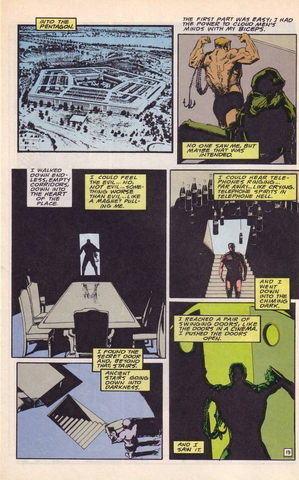
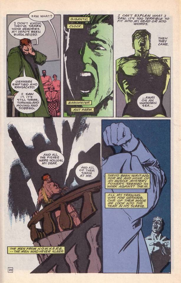
Doom Patrol 42 #
2 notes
·
View notes
Text

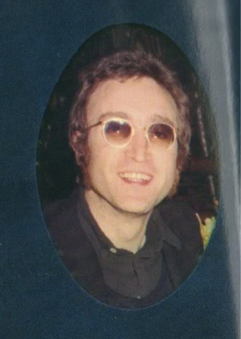
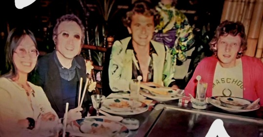
I always wanted to see the whole photo and now I saw it: John Lennon and May Pang (with Tony King and Mike Hazlewood) at Caesars Palace, Las Vegas, on October 6, 1973. From Dusty Sound Programme.
151 notes
·
View notes
Text
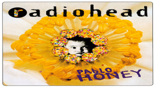
CREEP-RADIOHEAD
"Creep" is a song by the English rock band Radiohead that was released as their debut single in 1992. It later appeared on their debut album, "Pablo Honey," which was released in 1993. The song was written by all the members of the band, including Thom Yorke (vocals), Jonny Greenwood (guitar), Colin Greenwood (bass), Ed O'Brien (guitar), and Phil Selway (drums).
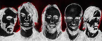
The famous guitar riff in "Creep" was inspired by the chord progression from the song "The Air That I Breathe" by The Hollies. Radiohead acknowledged the influence and eventually credited the writers of that song, Albert Hammond and Mike Hazlewood.
Despite its eventual success, Radiohead grew to dislike "Creep" over time and often resisted performing it during their live shows. It became a source of tension between the band and their fans who wanted to hear it.

Lyrically, "Creep" explores themes of self-doubt, isolation, and unrequited love. Thom Yorke's introspective and emotionally charged vocals convey a sense of vulnerability and frustration. The lyrics struck a chord with listeners who identified with the feelings of alienation and longing expressed in the song.
In the music video for "Creep," the band members perform in a dark room surrounded by flashing lights. The video's moody atmosphere and close-up shots of Thom Yorke contributed to its impact and visual style.


In my opinion, this song must be listened to by people who have criteria formed given that in this song we could find feelings such as self-doubt, isolation, and unrequited love, some teenagers could interpret this song in another way and it could bring bas results.
If you have criteria formed you would really feel and enjoy it.
Sometimes I think I can be creep and I can be a weirdo, too. But I don't lose hope of finding a girl who loves me and I will be so fucking special for her.
22 notes
·
View notes
Text
Lyrics for, Creep By Radiohead
When you were here before
Couldn't look you in the eye
You're just like an angel
Your skin makes me cry
You float like a feather
In a beautiful world
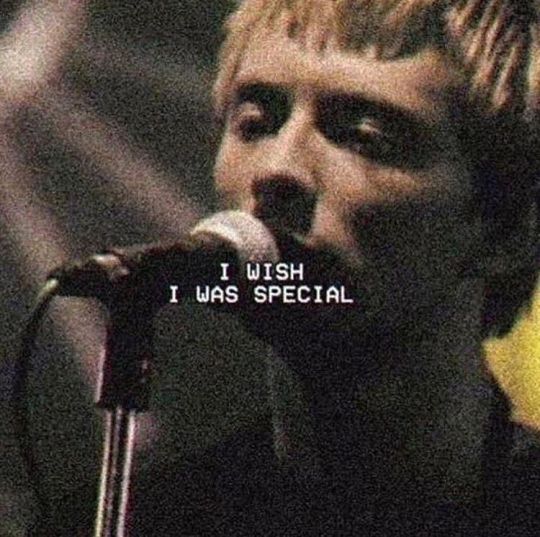
I wish I was special
You're so fuckin' special
But I'm a creep
I'm a weirdo
What the hell am I doin' here?
I don't belong here
I don't care if it hurts
I wanna have control
I want a perfect body
I want a perfect soul
I want you to notice
When I'm not around
So fuckin' special
I wish I was special
But I'm a creep
I'm a weirdo
What the hell am I doin' here?
I don't belong here
She's running out the door (run)
She's running out
She run, run, run, run
Run
Whatever makes you happy
Whatever you want
You're so fuckin' special
I wish I was special
But I'm a creep
I'm a weirdo
What the hell am I doin' here?
I don't belong here
I don't belong here
Source: Musixmatch
Songwriters: Mike Hazlewood / Albert Louis Hammond / Edward John O'brien / Thomas Edward Yorke / Philip Selway / Jonathan Greenwood / Colin Greenwood
Creep lyrics © Emi April Music Inc., Imagem Songs Ltd., Imagem Songs Limited, Warner/chappell Music Ltd
#just jenn#jenna kat's cave#jenna kat's#jenna kats#i sell art#motivation#jenna kat's cave creations#music#lyrics#lyric posting#i love this song#music is therapy#music is art#music is medicine#music is life
2 notes
·
View notes
Photo
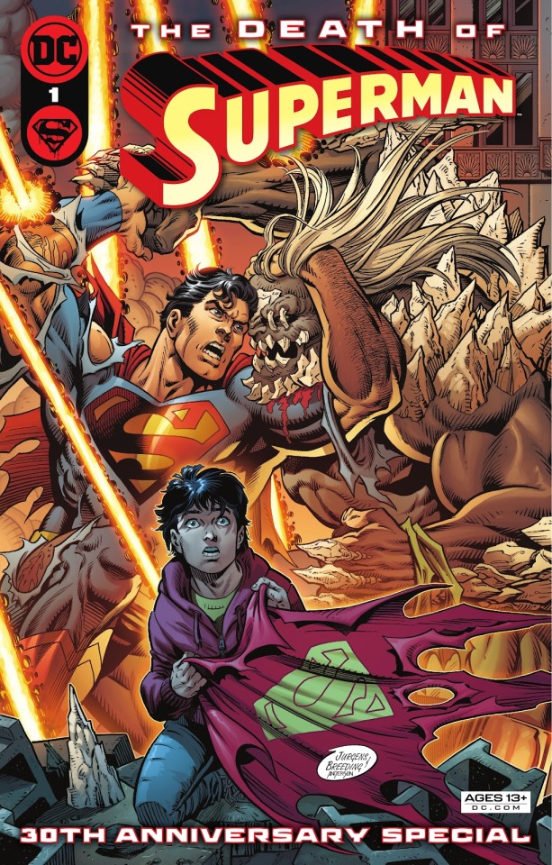
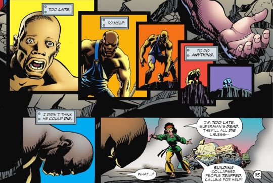
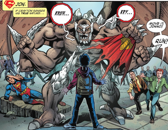
The Death of Superman 30th Anniversary Special (November 2022)
We take another chronal jump to the future because we CAN'T not talk about this special, which reads like it was specifically made for us. This 80-page book is made out of four stories by each of the creative teams who worked in the original "Death of Superman" saga back in '92 (minus editor Mike Carlin, inkers Denis Rodier and Dennis Janke, letterer John Costanza, and uhhh whoever did the lettercol back then). The stories are:
"The Life of Superman" (by Dan Jurgens and Brett Breeding)
The first official Jurgens/Breeding joint since... 1999, I think? I didn't realize how much I missed seeing their combined signature in that little circle; you know the one. This is by far the longest story in the book and, while I enjoyed it a lot, I kinda wish they'd made it shorter so that the others could have more breathing space (especially since the plot will continue in an upcoming miniseries written by Jurgens).
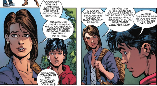
This one is set during the ??th anniversary of Superman's death, when a now adult Mitch Anderson (you know, the asshole teen who thought Superman was lame until a monster came crashing into his house and he needed someone to save him) visits little Jon Kent's school to talk about that historic day. This is a cool starting point because it parallels Mitch's first appearance being forced to sit through a televised Superman interview during class at the start of the "Death" storyline. The main differences are that these kids are much more polite than he was and TVs are way bigger now.
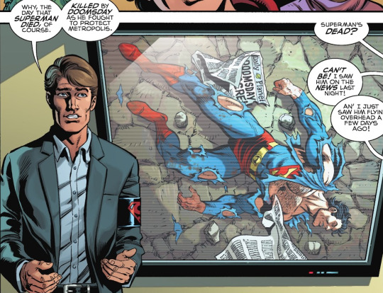
Anyway, Mitch's story is a huge shock to Jon, since the fact that his dad died and came back to life just never came up at home. Jon is upset with Lois for not telling him, so she spends a few pages recapping the entire "Death" storyline while walking Jon through Centennial Park, where Superman's empty (or is it????) (yes it is) tomb still stands.
Meanwhile, a mysterious creature has managed to demolish a whole building in Metropolis without anyone seeing it clearly, but reports indicate that it kinda looked like Doomsday. The Kents eventually come face to face with the creature right in front of the Daily Planet building, and it does look a whole lot like Doomsday, only with four arms... and, later on, wings. Jon names it "dOOmbreaker" (that's how they keep spelling it) but I kinda like his earlier suggestion of "Doomerang" better.
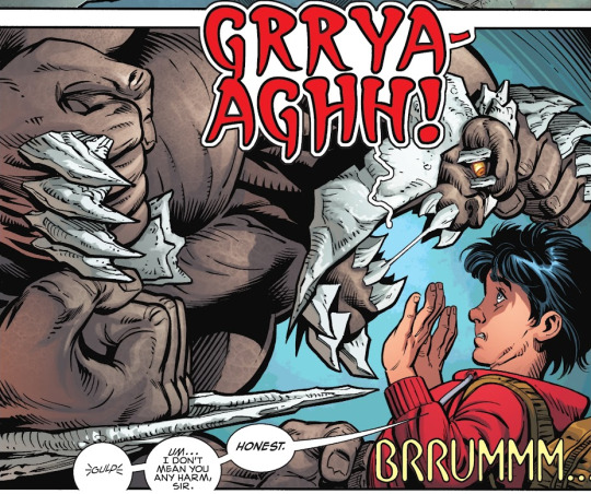
Superman is having a pretty tough time facing Doomerang, since not only is it as strong as Doomsday but it can also evolve and adapt while fighting, instead of having to die first like the original. While Superman fights the monster in front of a crowd of people who are standing way too close (do they want to get good phone pics if he dies again?), Lois goes off to use her journalism powers to find out where the hell it came from. She finds out Doomerang is actually a city worker who helped clean the debris left by the original Doomsday and then took one of his broken spiky bones home as a souvenir. Somehow, the bone has been mutating the guy into another Doomsday for years and conveniently finished the job on the day of Superman's deathiversary.
Lois brings the bone over to Superman, who decides to destroy it to prevent Doomerang from mutating even further. Blasting the bone with heat vision doesn't destroy it, but it does turn Doomerang back into a regular person, meaning that Superman manages to end this particular fight without killing the monster OR dying himself. The end! Until that mini I mentioned comes out, I guess, since it'll probably involve the magic Doomsday-duplicating bone wreaking even more havoc.
"Above and Beyond" (by Jerry Ordway, Tom Grummett, and Doug Hazlewood)
The sweetest story in the bunch, which is no surprise given that Ordway was always the best at pulling on our heartstrings. This is about Ma and Pa Kent having an understandably tough time watching their son getting pummeled to death on live TV. In order to take Ma's mind off the Doomsday fight, Pa pulls out her old scrapbook of Clark's exploits (which dates back to John Byrne's Man of Steel #1 in 1986) and they go over some other tough fights Superman has managed to survive. These include his tussle with Metallo in Superman #1...
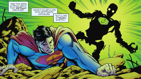
...and the time he brought down Mongul in Warworld during his exile in space. Yes, THE BEARD IS BACK (along with the skimpy space gladiator outfit).

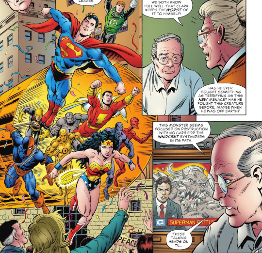
Superman leading a bunch of DC heroes to fight off Brainiac's invasion in "Panic in the Sky" also warrants a mention, which leads to has to be the first Agent Liberty cameo in decades. Side note: all due respect to Brad Anderson, who did a great job coloring the first story, but seeing Glenn Whitmore's colors in this one immediately makes it "feel" more like an authentic '86-'99 comic. (Note: see Don’s section below for a different take on Anderson vs. Whitmore.)
Back to the story, Ma reveals that she had a second, secret stash of Superman-related news clippings where she keeps track of the hundreds lives Clark has saved by quietly transporting donated organs across the country (without even charging for it! Hear that, Flash?). The point is that they reflect on how life can come out of death, unaware that that's literally what's going to happen to their son pretty soon. A beautiful observation illustrated via pictures of Superman punching villains. What more we possibly could ask for in a Superman story? (Other than it lasting more than 10 pages.)
"Standing Guard" (by Roger Stern and Butch Guice)
The Superman/Doomsday fight retold from the perspective of Project Cadmus' Guardian, filling in some of the gaps in the story and answering some questions only a massive Superman nerd could have, like "How long did it take Guardian to drop off Maxima at the hospital?" or "When exactly did he pick up Dubbilex?" Luckily, I am a massive Superman nerd, so I loved it.
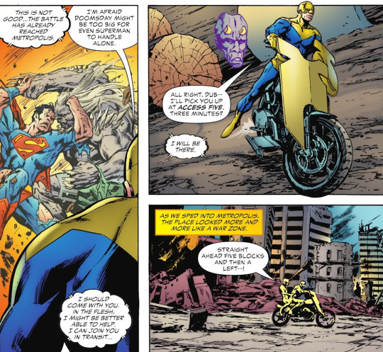
So, we see Guardian learning about Doomsday's cross-country rampage and helping Superman in that small town that gets blown up, then in the tree city of Habitat, and then being too late to help him in Metropolis (not that he would have made that much of a difference). The story ends at the morgue where Superman is pronounced dead, when Dubbilex alerts Maggie Sawyer and Dan Turpin that Cadmus' Director Westfield is coming in to take the body for his experiments and Guardian says he's not letting that happen.

It didn't "end there," as you know (or Superboy wouldn't exist), but it's a nice moment. It's cool that, despite how much Guice's artwork has changed, this still feels like an Action issue from back in the day. Part of that is that Stern reuses a lot of old dialogue, but it's also due to his careful attention to detail when it comes to continuity and his knack for keeping characterization consistent -- Guardian, Dubbilex, Maggie, and Turpin are straight out of the '90s. Again: I wish this was longer.
"Time" (by Louise Simonson and Jon Bogdanove)
Finally, this story shows us what John Henry Irons was doing right before and right after Superman's death. This one takes the opposite approach as the previous story: if Stern and Guice made sure to meticulously dovetail their scenes into existing continuity, Simonson and Bog play fast and loose with it to tell the story they wanna tell. In the old comics, we were told that John was buried under a building while trying to help Superman against Doomsday. This one retcons his origin so that John actually gets to see Superman's corpse.

This contradicts John's first appearance in Adventures #500, when he comes out of the rubble days later still thinking he can help Superman stop Doomsday (though he could be excused for being a little confused under the circumstances). However, this retcon provides a pretty strong ending for the story, which is mostly about John trying to reach Doomsday in his single-minded obsession with helping Superman, only to get sidetracked helping people trapped by the destruction in Metropolis. By the time he reaches the front of the Planet building, Superman and Doomsday are already dead. John is devastated, but then he gets up to continue "making a difference" and helping people, setting up the moment when he gets trapped under that rubble.
Yep, that's the psychic lady who later comes up with the whole "Superman's spirit possessed John" story; haven't seen HER in a while. This issue features other long-neglected characters like Keith the unlucky orphan, Myra the orphanage lady, and even Zoid, the kid with the glasses and the camo jacket who gets smoked by a Toastmaster™ in Steel's debut issue.
Overall, this special is like hanging out with old friends, and I love that it doesn't shy away from some aspects of the "Death of Superman" saga that usually get retconned away in all the retellings and adaptations. For instance, when Lois tells little Jon that Doomsday defeated the Justice League, we see the actual 1993 JLA including Bloodwynd, Booster Gold, and yellow ring era Guy Gardner, as opposed to Batman and Wonder Woman or something. One of the pinups even shows up long-haired Aussie Lex Luthor Jr., who is not a character DC seems eager to revisit (just because of how confusing he would be to casual readers, I guess).
This is a great labor of love by all involved and I'm glad it exists. However, I do have one major complaint: no Bibbo. 0/10.
And now, WAY more commentary from the great Don Sparrow after the jump!
Art-Watch (by @donsparrow):
We start with the cover, and while I grabbed a few different covers, I think the most standard cover was the one with Jonathan Kent gripping Superman’s old cape with an image of Superman grappling with Doomsday set behind him (with further callback scenes on the foldout image). This centre image is a callback to a couple of famous images—of course, this scene is the very first image in the original Superman #75, but also reminded me of the (excessively airbrushed) cover of the Wizard Magazine Tribute Edition. Speaking of colouring, the colour throughout this issue is absolutely stunning, and the combination of the 90s style of art with the three-dimensionality of Brent Anderson’s colour is really really appealing.
THE LIFE OF SUPERMAN:
As we move into the story itself, I’m struck with how well the Jurgens/Breeding team can draw these kids looking like actual kids. We’ve covered it quite a bit in the Byrne era that comic artists can drawn young people as tiny adults, but here, all the students’ dimensions and faces seem accurate. There’s also a quiet effort at greater diversity among the Metropolis classmates, which is nice to see.

A few pages on, we see the modern Superman for the first time, and it’s wild seeing the Super-team of the 90s drawing the costume of the present age. Granted, the changes are small, just the movie-style cuffs, the three-dimensional s-shield, and slightly more angular belt-loops, but it’s interesting how familiar and new it feels. I also think Jurgens is drawing Superman to look a little bit older now that he’s a father.
A few pages after that, we see Lois for the first time, and unsurprisingly, Dan and Brett draw a great looking Lois Lane. Her outfit in particular says “urban working mom” in a stylish way, and I dig it. I’ve already mentioned Anderson’s colouring, but I can’t praise it enough—he treads a fine line, by ameliorating the underlying inks, without over-rendering. He uses largely flat planes of colour, rather than airbrushing every curve, and it’s a really nice marriage, the panel of Lois’ stray hairs leaving a shadow on her cheek is a great example.
As we intercut between Lois’ retelling of the Doomsday storyline, and Superman investigating the new “monster”, the fear in Superman’s eyes as he recognizes his assailant is really well done. So too is the emotion on Lois’ face as she retells the iconic “cape at half-mast” moment.
It’s a small thing, but I also like the sartorial choices they make for Clark, when he meets up with his family after Doomsday (somehow) scampers away off camera. Our first glimpse at Doombreaker is a very close recall of a drawing from this same team in the Superman/Doomsday mini (that we should be getting to soon on this very blog!). Superman taking flight to battle Doombreaker is a poster-worthy image (hurt a little bit in my opinion by the random Superman logo dropped in behind him for no reason). There’s not a wrong note in this entire portion of the story, so it’s hard—I want to highlight all the art! But the final panel of Superman flying away is an all-time great.

And to analyze the story a bit—it’s everything I was hoping for. I was surprised to see the young Jonathan in this book, as the near-adult Jonathan has been so front and centre in the modern stories. I’ll admit, I missed the dynamic between he and his parents that was done so well by Jurgens, and later Patrick Gleason, so to show this story as a flashback to when Jon learned about what happened to his dad was a really smart way to go. It also seemed like an antidote to the 1990s that brought us the Death storyline. This wasn’t a mindless slugfest, and despite the 90s-ness of the name “Doombreaker”, Superman didn’t solve this fight with brute strength. It took compassion, and investigative reporting on the part of Lois to solve that day’s dilemma. Right down to the title, it was an uplifting and hopeful story.
ABOVE AND BEYOND:
We are instantly transported back to the original 1993 story as we see the Kents holding each other in front of the television set. Grummett and Hazlewood certainly have not lost a step, as their art looks as crisp and detailed as all those decades ago. Glenn Whitmore’s colours are a bit of a comedown after the Brent Anderson chapter, but not distractingly so. It’s fascinating to see Tom’s interpretation of so many iconic moments of Superman’s career (the Gladiator costume is always a particular highlight because it was such a departure at the time!).
It’s a testament to both Jerry Ordway’s writing, and Tom Grummett’s rendering that this story featuring an elderly couple, and very little non-flashback action threatens to steal the whole book. The performances on the Kents faces tell a story as compelling as any action-adventure yarn, and it’s wonderful to read, and a very nice little PSA for organ donation, which is a legitimate way we can save lives through our own death, as Superman did.
STANDING GUARD:
Jackson “Butch” Guice inking himself here, and it’s a little scratchier and more textured than we’re used to seeing. Still has the long limbed, leanly muscled figures we know from his work, but it’s perhaps not as sharp as the work he did on Action Comics, or more recently when he teamed up with Bryan Hitch on a Captain American mini-series, which was some of the best work I’ve ever seen of his. The faces in particular seem under-drawn a bit, apart from the clearly-based-on-Tommy-Lee-Jones drawing of Dan Turpin.
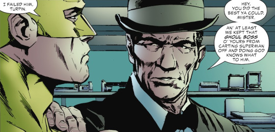
And as Max pointed out, it seems like an odd choice to leave Bibbo out of a story in which he originally appeared.
TIME:
In a way, this was one of the most essential stories of the book, chronicling the exact first moments after Steel burst out of the ground in the wake of Doomsday’s rampage. I had always thought he was under the rubble for days, and only emerged after Superman was already dead, but this new story reveals his full actions that day.
The art is a bit inconsistent, but very Bogdanove. He copies older panels directly, which is effective, but sometimes jarring when they come before and after panels which are inked very differently than Dennis Janke’s hatching would have done.

The linework here reminded me of Kyle Baker, with its thin, precise minimalist line. As usual with Simonson and Bogdanove, it’s a more ethnically diverse corner of Metropolis, and Bogdanove excels at drawing a variety of facial types. At times the hulking John Henry looks a little wan, which again can be jarring with what we know of Bog’s version of the character.
STRAY OBSERVATIONS:
Jurgens’ story is just about perfect, in the way that it calls back almost every element of the original Doomsday storyline, starting—as it did in the 90s—with a classroom setting, and students arguing about who’s the greatest hero. And how much do you love that Jon isn’t embarrassed of his dad, but rather argues he’s the greatest? What a kid.
I love Jurgens’ writing of Superman and Lois as parents. It’s a great moment when Jon voices his displeasure of having to learn about his own father’s death, even temporarily, in a classroom. To her credit, Lois immediately cops to the fact that they didn’t handle that properly, and apologizes. It’s the right move, and it’s great to see.
If I have one quibble about the art in the Jurgens’ story, it would be the lettering. I found the clearly-computerized font for the word “Doombreaker” to not look great in the panel, especially how often it was repeated, and some sound effects are handled better than others. The “Brakka-chak!” when Doombreaker shoves Superman into a building looks ok, but the “swit swit swit” earlier in the story where Doombreaker spins Superman by his cape just looks so computer-y and tacked on (besides being an odd transliteration—I kinda want to believe that it’s an excited USO show awaiting MASH star Loretta, chanting in anticipation). But seriously, I do miss the feel of hand-lettered sound effects.

My personal favourite moment is perhaps a weird one, but I’ll explain! My son’s name is Donovan, and since he was a little tyke, we have always called him “Dono” for short. So it was very cool to see Jimmy Olsen calling Jonathan Kent “Jonno” for short.
Not to nerd out, but honestly, what do you expect at this point?—there are a couple factual errors within this issue. One is in the first story, where Superman says it’s new for Doomsday to “speed-evolve” as Doombreaker does. But Doomsday did the exact same thing in 1994’s Hunter/Prey mini-series, as he speed-grew new bones to cover his ear canals, and also his knuckle bone spurs became weird ropes at one point. What gives, man? Also, in the John Henry Irons story, they erroneously have John giving Lois credit for naming Doomsday. But the first person to call him Doomsday was Booster Gold. Maybe John means she first used it in print? [Max: I took it as John simply not knowing Booster used the name first... though, if Lois used it in print and didn’t specifically credit its creator, knowing Booster, she’s got a lawsuit in her hands.]
GODWATCH: Been a while since I’ve focused on the faith elements in these stories, but this issue has plenty. First, when Lois tries to warn Superman, she invokes prayer. Then in the story with the Kents, their mention of sacrificial love read to me like a Christian concept, and Lee Weeks pinup literally references the cross.
CLAY MANN PINUP:
Anyone who reads this blog even semi-regularly knows I’m something of a connoisseur of “Lois-looking-great” art. As he showed in the Tom King Batman run, when Superman and Lois went on a double date with Catwoman and Batman (one of the best comics of the last ten years, if you haven’t read it!), Clay Mann draws a stunning, but realistically proportioned, Lois Lane. Clark’s tailoring is decidedly 90s, but it’s a corker of an image, and my second favourite of the bunch.

LEE WEEKS PINUP:
An absolute stunner from one of my favourite artists and comic people. The big red cape reminds me of a Bill Sienkiewicz piece, but it has that naturalistic, brushy feel of all of Lee Weeks work. Great concept, great layout and great drawing. My favourite of the bunch, actually.
WALT SIMONSON PINUP:
Unmistakably Simonson’s linework, with Laura Martin’s colours just lending a little bit of extra texture. While Simonson’s looking a bit looser than other days, it’s still a strong piece, even if I’ve never liked the ram-horned look on Doomsday.
FABIO MOON PINUP:
Naturally, Moon’s quirky style is going to be a departure from the dynamic realism we expect from Superman comics, but the style matches the mood very well, here. The concept of Jimmy using his signal watch for a Superman who will never come is a great and sad idea. I do find the unidentified extra Planet staffers a bit distracting, though. That might be Ron Troupe with his blazer over his shoulder (I guess his ”JAM” sweatshirt was in the laundry), and the mustachioed fellow could be Steve Lombard, as drawn in Superman stories from much later than the death storyline. The other two ladies? Not sure. Maybe Alice and Cat Grant? Or is it Daphne and Velma. But the fact that I’m debating about it shows that maybe they could have been left out. [Max: That’s definitely Alice for me, and therefore Cat next to hear because it’s just be weird to have an extra random person.]

BILL SEINKIWEICZ PINUP:
There’s Bill himself! He is such a master of energetic and photorealistic artwork that I have to wonder if he had someone dress up as Doomsday for this shot. Another interesting artistic take.
GABRIEL RODRIGUEZ PINUP:
A great circular layout, bringing the eye into the centre (and Superman’s face) both with the framing of Doomsday, and also the muted colours at the edges. Managing to include Jimmy and Lois is just the icing on the cake. Great.
JAMAL CAMPBELL PINUP:
Another powerful, if simple image, with Lois’ grief front and centre, and the “Reign” storyline that followed behind her. My only quibble is I prefer drawn lettering rather than computer fonts, but that’s a minor one.

CARMINE DI GIANDOMENICO PINUP:
I quite like the Superman movie inspired crystals as a motif, and the layout is well designed. Doomsday looks frightening, which is a strange contrast from the placid expression on Superman’s face. Buuuuuut, I have a few issues here. Generally, I think computer artwork can make an artist a bit lazier, and we see that here. The arms are literal mirrors of each other, which just feels a bit unnecessarily hurried. And one of my major pet peeves of the modern era is artists refusing to draw the actual Superman logo onto the figure. Here it is slapped on (with at least some colouring to denote his chest muscles) in my opinion too high onto the uniform. Lastly the planet Earth behind him (another thing modern artists often skip drawing) is not even a high-resolution image, and you can see the jagginess even in print.
CULLY HAMNER PINUP:
In my top three of these pinups easily, it’s exactly what I want from a pinup—seeing familiar and beloved characters from the story, looking as they did in the original story, but interpreted in the signature style of the artist. Terrific sense of motion here with unique, blocky colours in that Hamner style. Love it.
On the whole, I was surprised and pleased with how worthwhile the issue was.
#superman#dan jurgens#brett breeding#jerry ordway#tom grummett#doug hazlewood#roger stern#jackson guice#louise simonson#jon bogdanove#doomsday#mitch#ma kent#pa kent#guardian#dubbilex#maggie sawyer#dan turpin#steel#keith#myra#psychic lady whose name is given but i can't remember and i'm not even sure if she shows up again#doomerang
27 notes
·
View notes
Text
Special

"I don't care if it hurts
I wanna have control
I want a perfect body
I want a perfect soul
I want you to notice
When I'm not around
So fuckin' special
I wish I was special" -- Radiohead*
I have this song, Creep, rolling around my head this morning.
And even though it's arguable we're the worst thing to ever have arrived or been created on Mother Earth, we're also extraordinarily gifted.
But I just wish we could apply that zestful exuberance for life et al. in a more beautiful, qua the earth, way.
What then?
Could we clean up our shit?
Could we undo some of the damage we've wrought all these past centuries?
Could we embrace and love each other and every living thing?
Could we stop killing each other?
Could we become avowed animists and not greedy consumerists?
Being a pessimistic sort of fella, I very much doubt it.
I very much doubt it.
Take care.
Blessings, Ju
*Songwriters: Mike Hazlewood / Albert Hammond / Philip Selway / Thomas Yorke / Edward O'brien / Jonathan Greenwood / Colin Greenwood
Creep lyrics © Emi April Music Inc., Imagem Songs Ltd., Imagem Songs Limited, Warner/chappell Music Ltd
Photo by Piotr Szajewski on Unsplash
3 notes
·
View notes
Photo
Play ▶ Bet No One Ever Hurt This Bad
Tracks (Various Artists)
If You Don't Leave Me Alone (I'm Gonna Find Somebody That Will) - Delbert & Glen
The Feeling Is Right - Bobby Hatfield
Catfish Mud Dance - The Ventures
Charlie The Fer De Lance - The First Edition (Kenny Rodgers)
Potatoes - Bones
Drunk And Dirty - Rick Roberts
Harley Street - The Cornbread
Everything's Leaving - Wanda Jackson
Mail Order Mystics - Chris Smither
Long Road Ahead - Jim Ford
The Joke - Howl The Good
Working Man Blues - Charlie McCoy
Apocalypse 1969 - John Buck Wilkin
Ghost Riders - Dennis Linde
Home - Browning Bryant
It Can't Be Turned Around - Bobby Lance
Asphalt Outlaw Hero - Lonnie Mack
Scarlett Revisited - Mike Hurst
Roll On - Jessi Colter
Living On The Run - David Allan Coe
It's Been A Good Day - Tom Fogerty
I Wonder - Ron Davies
Empty White Houses - Redeye
Puppet Man - Tom Jones
Nobody Knows - Cymbal And Clinger
Sweet Thing - Lee Hazlewood & Ann-Margret
Tailpipe - Vernon Wray
Sandman - Jim Sullivan
#Music Compilation#Country Rock#Blues#Soul#The Ventures#The First Edition#Jessi Colter#Tom Jones#Lee Hazlewood#Ann-Margret#Jim Sullivan#David Allan Coe#Wanda Jackson#Chris Smither
3 notes
·
View notes
Photo
In the early 1990s, Radiohead were close to breaking up as a band. The song ‘Creep’, which was later released on their debut album Pablo Honey, was credited as the track which kept them together. As the band saw it as a hit which would help them gain popularity.
Thom Yorke brought the bandmates a chord progression and the lyrics for it, and they decided to remain a group. Yorke, however, didn’t actually write the song: the chord progression was lifted from a 1972 ballad called ‘The Air That I Breathe’ written by Albert Hammond and Mike Hazlewood, and which became a success for the Hollies in 1974. (You can hear the song on YouTube if you want.)
Hammond and Hazlewood later took legal action against Radiohead, and won the case: and their names come up, now, as songwriters where mandatorily mentioned.
I suppose it’s not cool that ‘Creep’ is partial plagiarism. But, I think we can forgive Radiohead, considering how good they became after Pablo Honey: all of their subsequent albums don’t sound like the same band. Plus, it’s not like Yorke nicked the melody. Meh. Doesn’t matter so much. Just a piece of trivia.
4 notes
·
View notes
Text
youtube
Music History Today: August 7, 2022
August 7, 1993: Radiohead broke into Billboard's Top 40 section with "Creep." The band's front-man Tham Yorke says he wrote this about being in love with someone, but not feeling good enough. He describes the feeling as, "There's the beautiful people and then there's the rest of us."
Yorke based this on a song called "The Air That I Breathe," which was written by Albert Hammond and Mike Hazlewood in 1972. After "Creep" was released, Radiohead agreed to share the songwriting royalties, so this is credited to Yorke, Hammond and Hazlewood.
3 notes
·
View notes
Video
youtube
Josh Hazlewood Will Join Rcb Squad on Today Match Coach Mike Hesson Conf...
0 notes
Photo


Doom Patrol 42 #
1 note
·
View note
Text
Creep Lyrics - Radiohead
Creep Lyrics – Radiohead
Creep Lyrics by Radiohead is the latest English song lyrics written by Paul Q. Kolderie, Sean Slade, Radiohead, Mike Hazlewood, Albert Hammond, Ed O’Brien, Colin Greenwood, Jonny Greenwood, Thom Yorke, Philip Selway and produed by Paul Q. Kolderie, Sean Slade.
Creep Song Details
Song:
Creep
Singer:
Radiohead
Written:
Paul Q. Kolderie, Sean Slade, Radiohead, Mike Hazlewood, Albert Hammond, Ed…
View On WordPress
0 notes
Text
Catching A Wave 05-16-22
Lots of great tunes and good vibes on this Catching A Wave! We've got a trio of tunes with the word "without" in the title from Cayucas, The Hondells and McKinley James. The Wheel Of Fun, Fun, Fun returns with covers of The Beach Boys by Papa Doo Run Run, The Challengers and The Weeklings. Beth Riley also has a deep track from The Beach Boys that will make you flip a coin...and we drop that coin in the Jammin' James Jukebox to hear our selection of the week! Speaking of The Beach Boys earlier, we hear a newly remastered mix of "Good Vibrations" plus rockin' tunes from The Delstroyers, Secret Agent, Lee Hazlewood's Woodchucks, Garner Firebird, Shorty's Swingin' Coconuts, Webb Wilder, Toro Jones, Stories From Shamehill as well as Evan Foster and Wave Electric from the new Surf You Next Tuesday 2 The Revenge compilation!
Intro music bed: "Catch A Wave"- The Beach Boys
The Delstroyers- "Zomb Zomb"
Stories From Shamehill- "Flatten The Curb"
Secret Agent- "Honeytrap"
Webb Wilder- "Rocket To Nowhere"
Toro Jones- "Low Tide"
Trio of "Without" tunes:
Cayucas- "Lonely Without You"
The Hondells- "The Rebel (Without A Cause)"
McKinley James- "I Can't Live Without You"
Surf's Up: Beth's Beach Boys Break:
The Beach Boys- "Heads You Win, Tails I Lose"
Follow "Surf's Up: Beth's Beach Boys Break" HERE
Lee Hazlewood's Woodchucks- "The Man"
Wave Electric- "Moon Surfing"
Evan Foster- "Surfer's Anthem"
Wheel Of Fun, Fun, Fun:
Papa Doo Run Run- "Wouldn't It Be Nice" (with Mike Love and Jeffrey Foskett)
The Challengers- "Surfin' Safari"
The Weeklings- "Help Me Rhonda"
Jammin' James Jukebox selection of the week:
The Ventures- "Pedal Pusher"
Garner Firebird- "Zero To Sixty"
The Beach Boys- "Good Vibrations" (2022 stereo mix & master)
Shorty's Swingin' Coconuts- "Raunchy Twist"
Outro music bed: The Ventures- "(I Can't Get No) Satisfaction"
Check out this episode of Rockabilly N Blues Radio Hour!
0 notes
Video
youtube
The fact that many musicians who achieved great successes in the 60's had several issues during the 70's might not be something out of the ordinary, since this is one of the way the music industry operates, i.e. the scenes change. However, most of them wanted to persevere, though the results were mixed. For instance, The Hollies' work in the period tended to be hit and miss, which you can hear on their eponymous album from that time. However, they did do one of the greatest tunes in their oeuvre that you can hear in the link. The song, which is a cover, remains a fascinating example of a composition that just skyrockets into the atmosphere. While The Hollies showed they could still reach the heights of their past, they rarely achieved them afterwards.
#the hollies#the hollies album#the air that i breathe#allan clarke#tony hicks#bobby elliott#bernie calvert#terry sylvester#mike hazlewood#albert hammond#ron richards#70's music#rock
2 notes
·
View notes
Text
REVISIT: RADIOHEAD DEBUTED WITH THE PABLO HONEY ALBUM THIS DAY IN 1993
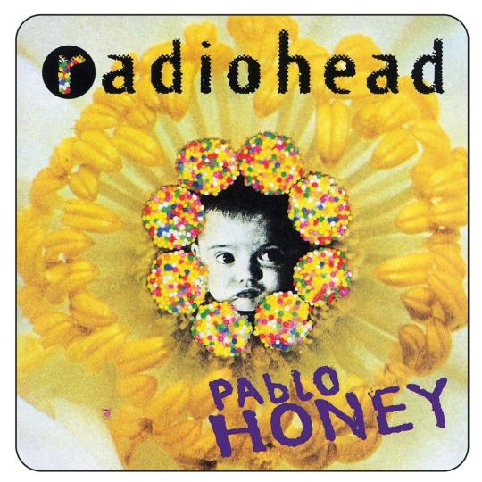
Radiohead released their first album, Pablo Honey, which first came out today (February 22) in 1993, released via labels, Parlophone/Capitol.
In late 1991, after a chance meeting between bassist, Colin Greenwood, and EMI A&R representative, Keith Wozencroft, at Colin's work, On A Friday signed a six-album recording contract with EMI. At the label's behest, the band changed their name to Radiohead. This was taken from the song, “Radio Head”, on True Stories (1986) by Talking Heads.
Fast forward to the Radiohead guys releasing their debut EP next year in 1992. Three of the four songs, “Prove Yourself”, “You” and “Thinking About You”, on Drill made their way as reworked versions onto their debut album, Pablo Honey.
The latter, of course, synonymous with 1992 debut single, “Creep”. Even then, it wasn’t a commercial success until rereleased the following year, in 1993. It incorporates “The Air That I Breathe” (1972), by The Hollies, with members, Albert Hammond and Mike Hazlewood, credited accordingly. In later years, the band got fed up with the song and eschewed performing it live for some time.
Rumour states that lead guitarist and keyboardist, Jonny Greenwood (elder brother is Colin Greenwood), and his famous guitar crunches in the chorus were supposedly an attempt to ruin the song, as he did not like it. Producer, Paul Kolderie, also stated that, “Jonny played the piano at the end of the song and it was gorgeous”. The piano was mixed in at the wrong time, the band decided to keep the take regardless.
“Creep” had been played frequently on Israeli radio by influential DJ, Yoav Kutner, and, after the song became a hit in Isreal, Radiohead were invited to Tel Aviv for their first gig overseas. San Francisco alternative radio station, KITS, added “Creep” to its playlist, along with other West Coast stations of the United States. By the time of their first North American tour in June 1993, the music video for “Creep” was heavily rotated on MTV.
The album's title comes from a prank call skit by American comedy act, The Jerky Boys, in which the prank caller says to his victim, “Pablo, honey? Please come to Florida!”
Singles for this album were “Creep”, “Anyone Can Play Guitar” and “Stop Whispering”.
Listeners really get a sense of their sound in “You”. This chimes in with melancholy, then driving guitar strides with purpose. Awesome. It then broods with sparse guitar with striving bass and moody drum. Clattering chords threaten the relative peace. “It’s like the world is gonna end so soon” capturing this tumultuous feeling; knowing you’re neither here nor there, kind of thing. The guitar chords crunch, fighting with the more delicate, dainty playing.
“Creep” is simply sadness and the atmosphere of that sadness. “You float like a feather, in a beautiful world” befitting of such instrumentation. Then chord cuts swathes through this dwelling in one’s own sadness. “I want you to notice when I’m not around” like a self-destructive tendency if you don’t catch her eye, in some way. Lead vocalist and main songwriter, Thom Yorke, really wails in a kind of musical way, a beautiful cry for attention. “I don’t belong here” the closing realisation.
“How Do You?” has an almost bratty punk feel to it; but quite likeable and charming, too. The guitar melody gives it a musicality, almost to polish it up a bit. It then ends in disgrace, piano defiled.
The librarian gets pedantic in “Stop Whispering”. This sounds as it should, pensive in seeming deep thought. “There’s nothing to say, and there’s nothing to do” at odds with the persistence of the drums, ticking like the sands of time. Like someone clockwatching you. Halfway and layers build as thought processes seemingly complicate. Earnest guitar exploratory like coming upon new ground. At least in the mind, anyway. The escape of imagination? Things get frenetic, like these thoughts gathering pace, racing thoughts. Guitar barely pausing for breath, ending in punky shambles.
“Thinking About You” is immediate yet acoustic. The vocals pleasant and clean. “Been thinking about you, and there’s no rest” like pouring over someone’s minutiae. “I’ve been thinking about you, so how can you sleep?/These people aren’t your friends, they’re paid to kiss your feet” another example of thinking about you and declaring he knows you best. It ends almost as quickly as it began.
The punk aesthetic of “Anyone Can Play Guitar” has noodling that definitely showcases that anyone can play guitar. The song proper is a bit dumb of guitar, too, but with quite a sophisticated bassline underlying all. The chorus is surprisingly rousing, given what precedes. “I wanna, wanna be Jim Morrison” like having musical ambition, wanting fortune and fame, but kind of outstripping your abilities. Hence the song title, you could say.
“Ripcord” veers from quiet pondering and triumphant volume, quite quickly and expertly. Halfway is some searing guitar, nothing on a technical level but full of power and intensity. It’s a ripping piece of rock music, immediate yet memorable.
“Vegetable” is deceptive, the calm laid to waste with satisfying electric guitar. The solo’s as much emotive as it’s primal and incorrect.
You’re urged to “Prove Yourself”, which’s wistful with, “Can’t afford to breathe in this town” like a real inferiority complex. The thick guitar slides ebullient, a real joy despite all that besets. Hammering drum and thoughtful bass gives way to Yorke with guitar at the top of his voice.
The downbeat in places “I Can’t” is quite anthemic, the perfect mix of dynamics ranging from introspective and quiet to extroverted and with much verve. “Even though I might, even though I try I can't” is then followed by bass laying the framework for introverted to extroverted.
“Lurgee” has a down in the dumps feel, “I feel better, now you’re gone”. This, perhaps, some sort of comfort in sadness. Certainly the instrumentation doesn’t seem as thankful as Yorke does in said lyric. Maybe the wounds take time to heal, and he won’t truly be thankful until it all sinks in.
The album closes in a melodramatic respect in “Blow Out”. This one’s quite atmospheric, a romantic kind of lilt to it. This gives way to a wall of guitar chord that just washes over you. “Everything I touch, turns to stone” is greeted with relative silence, then a cacophony of guitar hitting in sync with drum offers drama, a loud kind of grandeur. This races like a heart thumping almost out the chest. It comes to a screeching end, buzz saw guitar ringing out into the ethereal.
All the tracks on Pablo Honey worthy highlights are “You”, “Creep”, “Anyone Can Play Guitar”, “Ripcord”, “Vegetable”, “Prove Yourself”, “I Can’t”, “Lurgee” and “Blow Out”. Personally, the fact this is three quarters of the twelve track total is something special. Furthermore, this is far from the most highly regarded album they’ve done so the fact this’s a classic speaks volumes of their subsequent material.
Radiohead, at this point, had really not messed about with this, their debut album. Yes, the success this album brought was a protracted process but they hardly needed subsequent releases to get the formula right. Next, 1995’s The Bends, was arguably better but the fact this’s a classic’s no mean feat. Nine brilliant tracks out of a twelve total isn’t much to rail against. Radiohead’s Pablo Honey can be bought on iTunes, here.
#Radiohead#Pablo Honey#The Bends#Colin Greenwood#Keith Wozencroft#On A Friday#Radio Head#True Stories#Talking Heads#Drill#Creep#The Air That I Breathe#The Hollies#Albert Hammond#Mike Hazlewood#Jonny Greenwood#Paul Kolderie#Yoav Kutner#The Jerky Boys#Thom Yorke
1 note
·
View note
Last Seen Blogs

hilljacksworld
Untitled

akmanlicks
Guy in Alaska

dreamsofburritos
hey there

ir0ntiger00
Untitled

hwsevents
HWS Events