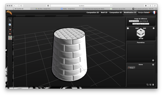
#also created this little scene just to test my shader out....
Text


10:40 AM - Windenburg
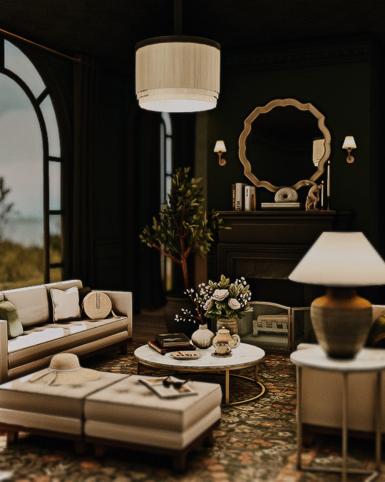
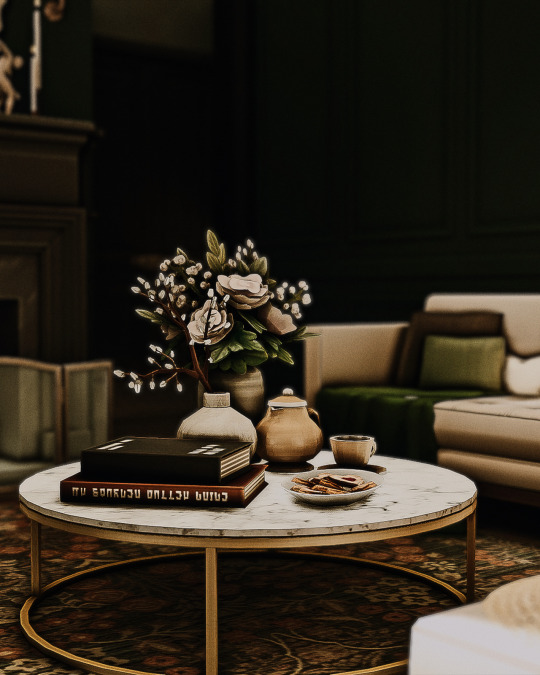
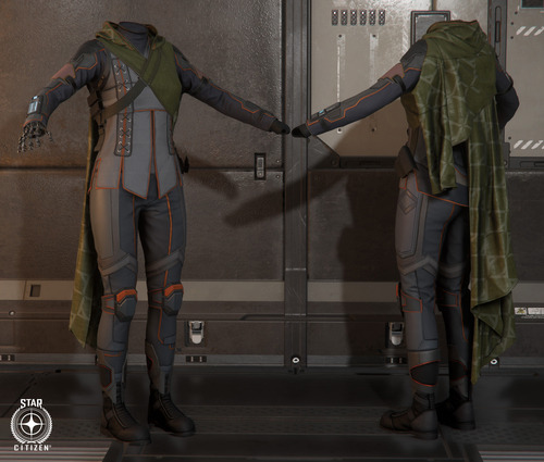
#thesims4#ts4#sims 4#sims#thesims#showusyourbuilds#sims 4 builds#sims 4 cc#sims 4 screenshots#ts4 screenshots#ts4 cc#simblr#rhyinteriors#still playing around with my personal preset...im so indecisive...#a part of me wants it clean ...no grain...no overlays...#and theres another part of me that wants that vintage look to it...with dust#scratches .grains#and all that jazzz#also created this little scene just to test my shader out....#interior
215 notes
·
View notes
Text
Developing the Experience
Blog Post # 4
Angelique Shelley (MA Concept Art)
I was a little concerned with the running time of our group’s production, so I pitched an idea of some 2D animations to buffer out the total time. The idea would expand the concept and add some more shape to the narrative. There would be three different scenes from different times after judgment day, we would be seeing the world years and years in the future and then moving back in time to the judgment day. The statues will also show the progress of time by slowly rising out of the ground after falling, and being overgrown. The degrading statue would be a repeating focal point, his true identity would slowly be revealed as the creature that destroyed the world, which would add a fun twist. While not very clear in this story board, frame 6 would visually allude to this more by having some cracking and flaking of stone revealing patches of its grotesque skin.
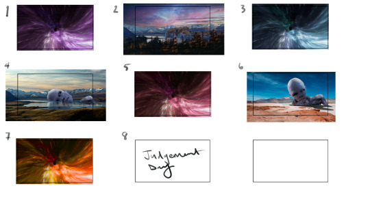
Fig. 1 The storyboard for the 2D additions pitch.
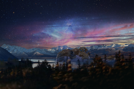
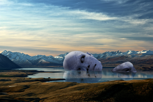
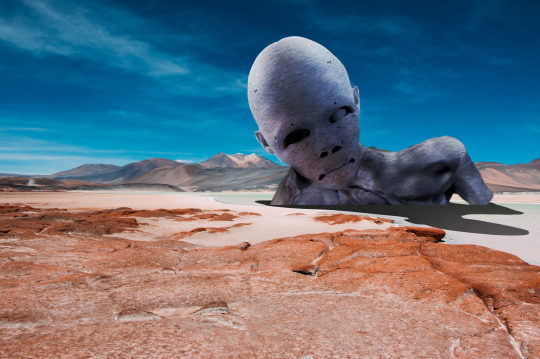
Fig. 2 The keyshot images I created for the storyboard using Liang's statue and creature
To create a 180 degree environment quickly, I decided to look at mirroring the image and creating a spherical image (see fig. 3). For the animation, I created a cylinder in Maya and learnt how to do camera-based projection. I also learned how to render out a playblast to test it. The render would be just a surface shader, meaning that I could use the animation of the image without the lighting information from the scene affecting the geometry.
Fig. 3 The playblast showing the animation idea.
In the end, Liang suggested she and Sai could render out their scenes at 0.5 speed, and I could make my portal animation longer without the above landscapes, Ana expressed concerns about whether it would be cohesive with the aesthetic of the piece. There was discussion around including this at the end if there was time, but it was ultimately decided against.
References:
Ibañez, A. (2018). The Orion Nebula, Castillo de Villamelefa, Barcelona, Spain. [Photograph]. Available at: https://c02.purpledshub.com/uploads/sites/48/2019/12/08-Alberto-Ibanez-Orion-Nebula-d32cbed.jpg?webp=1&w=1200 [Accessed 07 February 2024]
Jimenez, D. (2017). person walking in distance of mountain. [Photograph]. Unsplash. CC BY-SA. Available at: https://unsplash.com/photos/person-walking-in-distance-of-mountain-HNOaMthcq0w [Accessed 07 February 2024]
Jor4gea (2023). Purple and blue galaxy wallpaper. [Online]. Available at: https://wallpapercave.com/w/wp4247401 [Accessed 07 February 2024]
Keller, T. (2016). Landscape photography of lake and mountain. [Photograph]. Unsplash. CC BY-SA. Available at: https://unsplash.com/photos/landscape-photography-of-lake-and-mountain-73F4pKoUkM0 [Accessed 07 February 2024]
Wallpaperwolf (2024). Space-Dust … [Online]. Available at: https://www.chromethemer.com/wallpapers/8k-wallpapers/space-dust-wallpaper-8k.html [Accessed 07 February 2024]
0 notes
Text
A Grand Tour of the Julian 3D Model, Part 5: The Devil is in the Details
(Part1) (Part 2) (Part 3) (Part 4)
OK, so I’ve spent a bunch of time re-simulating Julian’s clothing, and I’ll finish posing his fuccboi expression once I set up the final lighting, because it will have a huge effect (which you will see later). So now what?

The textures on this outfit are a bit exaggerated in some places. I don’t care for the way the boots have these wrinkles (1) and the baked-in wrinkles of the shirt now make no sense because I have altered the shape of the shirt (2). (I’m test rendering in bright light so you can see all of this!)
Time for a crash course in textures...

A 3D model on its own is just a blank eggshell. Texture maps, slotted into shaders, are what make them look like fabric, skin, metal, glass, or whatever.
To vastly oversimplify, a shader is a bit of software that figures out how light affects the model. Texture maps are plugged into the shader so they can be taken into account during this process. Here you can see a small sample of the many, many shader and texture settings on Julian’s ‘Face’ surface:

Fun Fact: Julian has over 50 individual shader settings on his skin surfaces!
Texture maps may be a seamless repeating tile, or they may be a single hi-res image that is created for a specific part of the geometry, like Julian’s face above. These textures are often ‘painted’ directly on the model in a texturing program, and then ‘unwrapped’ like an orange peel and flattened into a 2D image. (The 2D image can then be modded fairly easily for things like makeup, freckles, etc.)
Most 3D models have, at minimum, a Diffuse or Albedo map (the base color/texture), a Bump or Normal map (helps ‘fake’ fine detail), and some kind of Glossiness or Specular map (controls shine and reflectivity). But there are lots and lots more kinds of maps for various functions. Different shaders will make use of different additional maps - and some shaders use no maps at all, just color values and math!
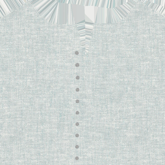
This is part of the shirt’s diffuse map - texture maps are copyrighted by the artist, so I’m not putting them here in full, just a small sample to illustrate what I’m talking about.
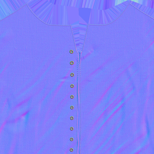
And this is part of the normal map - see how it shows fine details like topstitching? But overall, it’s too coarse of a weave for my tastes, and I want to apply a different texture. Since the vest is being worn over it, losing the fake bump effect on the buttons won’t matter very much.
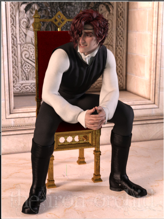
Here I’ve applied new shaders to several surfaces. These are all shader presets - just a little bundle of tiling texture maps and appropriate shader settings. I used a cotton shader preset on the shirt, a slightly creased leather preset on the boots, a velvet preset on the chair cushion, and an aged gold preset on the chair body. I added depth-of-field on the camera to push the background into, well, the background. This slightly blurs everything behind him, and helps make Julian the focus of the image.
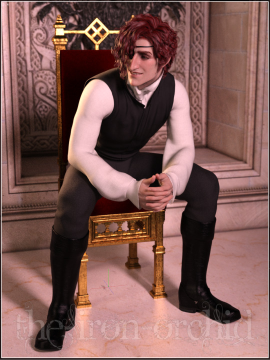
Now it’s time for lighting! This, too, is a huge subject, but it is almost exactly like lighting for IRL photography. Here is the ‘studio’ view of the scene, including the camera and the spotlight:

There is also another source of ambient light, not visible outside of a render, that adds an even lighting to the whole scene. The spotlight on the right was placed so that details were more visible - it’s a bit too bright and neutral for the final render, and it casts some odd shadows on Julian’s face.
Literally the only thing I have changed in the image below is the lighting - because of the cast shadows, you can see that it even changes the composition of the image, making it less top-heavy!
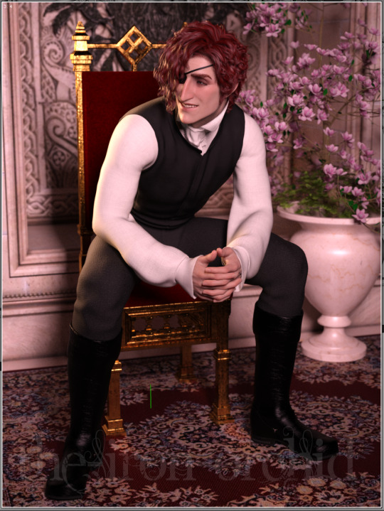
I wanted to accomplish three things here: 1) bring focus to his face, 2) warm the scene slightly, and 3) bring up highlights on his hair and skin. So I placed an orange light on his right slightly behind him, and a pinkish light from the opposite side. Then I turned off the ambient lighting. It makes a tremendous difference.
If I zoom out, the studio scene looks like this:

You can just barely see the rim light on the left side of the image as a blue line; it’s partly intersecting with the wall geometry.
...And then I took Julian back into Zbrush to fix a bunch of small things that were bugging me, like his eyepatch. And then I added a little more scene clutter. And then I spent entirely too long trying to get a catchlight in his eye - difficult, because it has to be a reflection from something that is actually present in the scene. His eyes have layers of geometry that represent the moisture of the eye, causing it to reflect light just like the real thing. And then I moved the lights some more to fix weird shadows...
This kind of fiddling often takes up the lion’s share of my time! Truly, the devil is in the details.
But at long last... we are (probably) ready to do the full render! Here’s the latest preview:
I’ve been rendering at about 1500px wide by 2000px high for most of my stuff - big enough to get some good detail, not so monstrous that it won’t fit on people’s monitors. When there’s a metallic prop like this, I will sometimes use a bloom filter to bring up those fun glowing highlights (I also use it for renders with light-emitting effects like magic sparkles, or renders with a setting/dawning sun to mimic the glare).
Not going to lie, I will usually stop and restart my ‘final’ render several times because I notice things that only show in the full-resolution render (not these little low-res Viewport snapshots). And even then, I may have to go into GIMP afterward to fix ‘fireflies’ (overly bright pixels that often appear on hair and shiny items), adjust contrast, and of course apply my watermark (I’ve experienced art theft in the past and it’s... not fun).
Next time: the finished render!
24 notes
·
View notes
Photo
Péguy
Hi everybody!
In this news feed I've told you a few times about a project I named Péguy. Well today I dedicate a complete article to it to present it to you in more detail but also to show you the new features I brought to it at the beginning of the winter.
It's not the priority project (right now it's TGCM Comics) but I needed a little break during the holidays and coding vector graphics and 3D, it's a little bit addictive like playing Lego. x)
Let's go then!
Péguy, what is it?
It is a procedural generator of patterns, graphic effects and other scenery elements to speed up the realization of my drawings for my comics.
Basically, I enter a few parameters, click on a button, and my program generates a more or less regular pattern on its own.
The first lines of code were written in 2018 and since then, this tool has been constantly being enriched and helping me to work faster on my comics. :D
This project is coded with web languages and generates vector patterns in the format SVG.
In the beginning it was just small scripts that had to be modified directly to change the parameters and run individually for each effect or pattern generated.

Not very user friendly, is it? :’D
This first version was used on episode 2 of Dragon Cat's Galaxia 1/2.
During 2019 I thought it would be more practical to gather all these scripts and integrate them into a graphical user interface. Since then, I have enriched it with new features and improved its ergonomics to save more and more time.
Here is a small sample of what can be produced with Péguy currently.
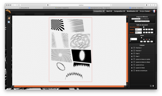
Graphic effects typical of manga and paving patterns in perspective or plated on a cylinder.
All these features were used on Tarkhan and Gonakin.
I plan to put this project online, but in order for it to be usable by others than me, I still need to fix a few ergonomy issues.
For the moment, to recover the rendering, you still need to open the browser debugger to find and copy the HTML node that contains the SVG.
In other words, if you don't know the HTML structure by heart, it's not practical. 8D
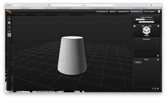
A 3D module!
The 2020 new feature is that I started to develop a 3D module. The idea, in the long run, is to be able to build my comics backgrounds, at least the architectural ones, a bit like a Lego game.
The interface is really still under development, a lot of things are missing, but basically it's going to look like this.
So there's no shortage of 3D modeling software, so why am I making one? What will make my project stand out from what already exists?
First, navigation around the 3D workspace. In short, the movement of the camera.
Well please excuse me, but in Blender, Maya, Sketchup and so on, to be able to frame according to your needs to get a rendering, it's just a pain in the ass!
So I developed a more practical camera navigation system depending on whether you're modeling an object or placing it in a map. The idea is to take inspiration from the map editors in some video games (like Age of Empire).
Secondly, I'm going to propose a small innovation. When you model an object in Blender or something else, it will always be frozen and if you use it several times in an environment, it will be strictly identical, which can be annoying for natural elements like trees for example. So I'm going to develop a kind of little "language" that will allow you to make an object customizable and incorporate random components. Thus, with a single definition for an object, we can obtain an infinite number of different instances, with random components for natural elements and variables such as the number of floors for a building.
I had already developed a prototype of this system many years ago in Java. I'm going to retrieve it and adapt it to Javascript.
And the last peculiarity will be in the proposed renderings. As this is about making comics (especially in black and white in my case), I'm developing a whole bunch of shaders to generate lines, screentones and other hatchings automatically with the possibility to use patterns generated in the existing vector module as textures! :D

What are shaders?
Well, you see the principle of post-production in cinema... (Editing, sound effects, various corrections, special effects... all the finishing work after shooting).
Well, shaders are about the same principle. They are programs executed just after the calculation of the 3D object as it should appear on the screen. They allow to apply patches, deformations, effects, filters... As long as you are not angry with mathematics, there is only limit to your imagination! :D
When you enter a normal vector in a color variable it gives funny results.
Yes! It's really with math that you can display all these things. :D
Now when you hear a smart guy tell you that math is cold, it's the opposite of art or incompatible with art... it's dry toast, you'll know it's ignorance. :p
Math is a tool just like the brush, it's all about knowing how to use it. :D
In truth, science is a representation of reality in the same way as a painting. It is photorealistic in the extreme, but it is nevertheless a human construction used to describe nature.
It remains an approximation of reality that continually escapes us and we try to fill in the margins of error over the centuries... Just like classical painting did.
But by the way? Aren't there a bunch of great painters who were also scholars, mathematicians? Yes, there are! Look hard! The Renaissance is a good breeding ground. x)
In short! Physics is a painting and mathematics is its brush.
But in painting, we don't only do figurative, not only realism, we can give free rein to our inspiration to stylize our representation of the world or make it abstract.
Well like any good brush, mathematics allows the same fantasy! All it takes is a little imagination for that.
Hold, for example, the good old Spirograph from our childhood. We all had one! Well, these pretty patterns drawn with the bic are nothing else than... parametric equations that make the students of math sup/math spe suffer. 8D
Even the famous celtic triskelion can be calculated from parametric equations.
Well, I digress, I digress, but let's get back to our shaders.
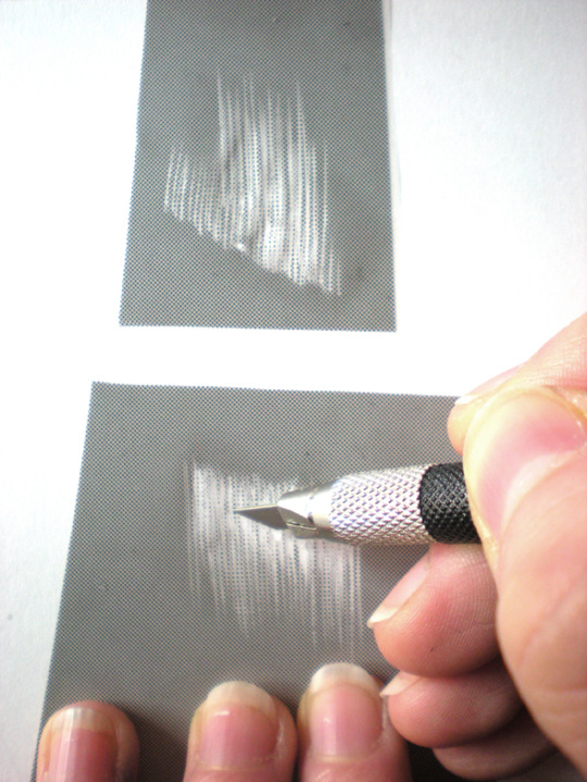
Since you can do whatever you want with it, I worked on typical manga effects. By combining the Dot Pattern Generator and the Hatch Generator but display them in white, I was able to simulate a scratch effect on screentones.

In the traditional way it is an effect that is obtained by scraping the screentones with a cutter or similar tool.
Péguy will therefore be able to calculate this effect alone on a 3D scene. :D
I extended this effect with a pattern calculated in SVG. So it will be possible to use the patterns created in the vector module as textures for the 3D module!
Here it is a pattern of dots distributed according to a Fibonacci spiral (I used a similar pattern in Tarkhan to make stone textures, very commonly used in manga).
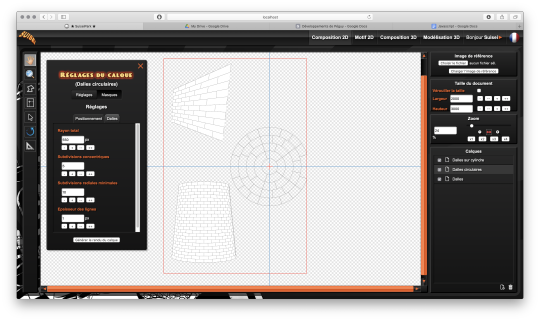
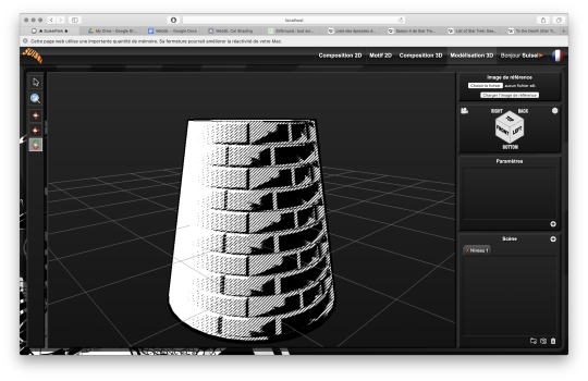
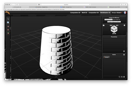
Bump mapping
So this is where things get really interesting. We stay in the shaders but we're going to give an extra dimension to our rendering.
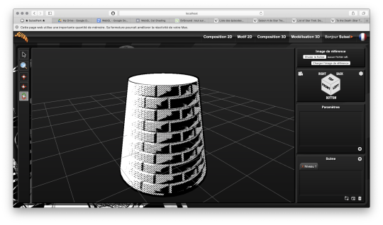
Basically, bump mapping consists in creating a bas-relief effect from a high map. And it gives this kind of result.
The defined object is always a simple cylinder (with 2 radii). It is the shaders that apply the pixel shift and recalculate the lighting thanks to the high map that looks like this.

This texture has also been calculated automatically in SVG. Thus we can dynamically set the number of bricks.
Well, this bas-relief story is very nice, but here we have a relatively realistic lighting, and we would like it to look like a drawing.
So by applying a threshold to have an area lit in white, a second threshold to have shadow areas in black, by applying the screentone pattern to the rest and by adding the hatching that simulates the scraped screentone, here is the result!
It's like a manga from the 80's! :D
I tested this rendering with other screentone patterns: Fibonnacci spiral dots, parallel lines or lines that follow the shape of the object.

Now we know what Péguy can do.
I think I can enrich this rendering a bit more with the shaders but the next time I work on this project the biggest part of the job will be to create what we call primitives, basic geometric objects.
After that I can start assembling them.
The concept of drawing while coding is so much fun that I'm starting to think about trying to make complete illustrations like this or making the backgrounds for some comic book projects only with Péguy just for the artistic process.
Finding tricks to generate organic objects, especially plants should be fun too.
That's all for today.
Next time we'll talk about drawing!
Have a nice week-end and see you soon! :D
Suisei
P.S. If you want miss no news and if you haven't already done so, you can subscribe to the newsletter here : https://www.suiseipark.com/User/SubscribeNewsletter/language/english/
Source : https://www.suiseipark.com/News/Entry/id/302/
1 note
·
View note
Text
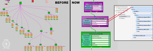
A breakdown of the Revision 2020 Threeway Battle shader
Those of you who have been following this year's edition of Revision probably remember the unexpected twist in Sunday's timeline, where I was pitted in a coding "battle" against two of the best shader-coders in the world to fend for myself. Admittedly the buzz it caused caught me by surprise, but not as much as the feedback on the final shader I produced, so I hope to shed some light on how the shader works, in a way that's hopefully understandable to beginners and at least entertaining to experts, as well as providing some glimpses into my thought process along the way.
youtube
Recorded video of the event
But before we dive into the math and code, however, I think it's important to get some context by recounting the story of how we got here.
A brief history of demoscene live-coding
Visual coding has been massively opened up when graphics APIs began to introduce programmable fragment rendering, perhaps best known to most people as "pixel shaders"; this allowed programmers to run entire programmable functions on each pixel of a triangle, and none was more adamant to do that than a fellow named Iñigo Quilez (IQ), an understated genius who early on recognized the opportunity in covering the entire screen with a single polygon, and just doing the heavy lifting of creating geometry in the shader itself. His vision eventually spiraled into not only the modern 4k scene, but also the website ShaderToy, which almost every graphics programmer uses to test prototypes or just play around with algorithms. IQ, an old friend of mine since the mid-00s, eventually moved to the US, worked at Pixar and Oculus, and became something of a world-revered guru of computer graphics, but that (and life) has unfortunately caused him to shift away from the scene.
His vision of single-shader-single-quad-single-pass shader coding, in the meantime, created a very spectacular kind of live coding competition in the scene where two coders get only 25 minutes and the attention of an entire party hall, and they have to improvise their way out of the duel - this has been wildly successful at parties for the sheer showmanship and spectacle akin to rap battles, and none emerged from this little sport more remarkably than Flopine, a bubbly French girl who routinely shuffled up on stage wearing round spectacles and cat ears (actually they might be pony ears on second thought), and mopped the floor up with the competition. Her and a handful of other live-coders regularly stream on Twitch as practice, and have honed their live-coding craft for a few years at this point, garnering a considerable following.
youtube
Just a sample of insanity these people can do.
My contribution to this little sub-scene was coming up with a fancy name for it ("Shader Showdown"), as well as providing a little tool I called Bonzomatic (named after Bonzaj / Plastic, a mutual friend of IQ and myself, and the first person to create a live coding environment for demoparties) that I still maintain, but even though I feel a degree of involvement through the architectural side, I myself haven't been interested in participating: I know I can do okay under time pressure, but I don't really enjoy it, and while there's a certain overlap in what they do and what I do, I was always more interested in things like visual detail and representative geometry aided by editing and direction rather than looping abstract, fractal-like things. It just wasn't my thing.
Mistakes were made
But if I'm not attracted to this type of competition, how did I end up in the crossfire anyway? What I can't say is that it wasn't, to a considerable degree, my fault: as Revision 2020 was entirely online, most of the scene took it to themselves to sit in the demoscene Discord to get an experience closest to on-site socializing, given the somber circumstances of physical distancing. This also allowed a number of people who hasn't been around for a while to pop in to chat - like IQ, who, given his past, was mostly interested in the showdowns (during which Flopine crushed the competition) and the 4k compo.
As I haven't seen him around for a while, and as my mind is always looking for an angle, I somehow put two and two together, and asked him if he would consider taking part in a showdown at some point; he replied that he was up for it - this was around Saturday 10PM. I quickly pinged the rest of the showdown participants and organizers, as I spotted that Bullet was doing a DJ set the next day (which would've been in a relatively convenient timezone for IQ in California as well), and assumed that he didn't really have visuals for it - as there was already a "coding jam" over Ronny's set the day before, I figured there's a chance for squeezing an "extra round" of coding. Flopine was, of course, beyond excited by just the prospect of going against IQ, and by midnight we essentially got everything planned out (Bullet's consent notwithstanding, as he was completely out of the loop on this), and I was excited to watch...
...that is, until Havoc, the head honcho for the showdowns, off-handedly asked me about an at that point entirely hypothetical scenario: what would happen if IQ would, for some reason, challenge me instead of Flopine? Now, as said, I wasn't really into this, but being one to not let a good plan go to waste (especially if it was mine), I told Havoc I'd take one for the team and do it, although it probably wouldn't be very fun to watch. I then proceeded to quickly brief IQ in private and run him through the technicalities of the setup, the tool, the traditions and so on, and all is swell...
...that is, until IQ (this is at around 2AM) offhandedly mentions that "Havoc suggested we do a three-way with me, Flopine... and you." I quickly try to backpedal, but IQ seems to be into the idea, and worst of all, I've already essentially agreed to it, and to me, the only thing worse than being whipped in front of a few thousand people would be going back on your word. The only way out was through.
Weeks of coding can spare you hours of thinking
So now that I've got myself into this jar of pickles, I needed some ideas, and quick. (I didn't sleep much that night.) First off, I didn't want to do anything obviously 3D - both IQ and Flopine are masters of this, and I find it exhausting and frustrating, and it would've failed on every level possible. Fractals I'm awful at and while they do provide a decent amount of visual detail, they need a lot of practice and routine to get right. I also didn't want something very basic 2D, like a byte-beat, because those have a very limited degree of variation available, and the end result always looks a bit crude.
Luckily a few months ago an article I saw do rounds was a write-up by Sasha Martinsen on how to do "FUI"-s, or Fictional User Interfaces; overly complicated and abstract user interfaces that are prominent in sci-fi, with Gmunk being the Michael Jordan of the genre.
Image courtesy of Sasha Martinsen.
Sasha's idea is simple: make a few basic decent looking elements, and then just pile them on top of each other until it looks nice, maybe choose some careful colors, move them around a bit, place them around tastefully in 3D, et voilà, you're hacking the Gibson. It's something I attempted before, if somewhat unsuccessfully, in "Reboot", but I came back to it a few more times in my little private motion graphics experiments with much better results, and my prediction was that it would be doable in the given timeframe - or at least I hoped that my hazy 3AM brain was on the right track.
A bit of math
How to make this whole thing work? First, let's think about our rendering: We have a single rectangle and a single-pass shader that runs on it: this means no meshes, no geometry, no custom textures, no postprocessing, no particle systems and no fonts, which isn't a good place to start from. However, looking at some of Sasha's 3D GIFs, some of them look like they're variations of the same render put on planes one after the other - and as long as we can do one, we can do multiple of that.
Rough sketch of what we want to do; the planes would obviously be infinite in size but this representation is good enough for now.
Can we render multiple planes via a single shader? Sure, but we want them to look nice, and that requires a bit of thinking: The most common technique to render a "2D" shader and get a "3D" look is raymarching, specifically with signed distance fields - starting on a ray, and continually testing distances until a hit is found. This is a good method for "solid-ish" looking objects and scenes, but the idea for us is to have many infinite planes that also have some sort of alpha channel, so we'd have a big problem with 1) inaccuracy, as we'd never find a hit, just something "reasonably close", and even that would take us a few dozen steps, which is costly even for a single plane and 2) the handling of an alpha map can be really annoying, since we'd only find out our alpha value after our initial march, after which if our alpha is transparent we'd need to march again.
But wait - it's just infinite planes and a ray, right? So why don't we just assume that our ray is always hitting the plane (which it is, since we're looking at it), and just calculate an intersection the analytical way?
Note: I would normally refer to this method as "raytracing", but after some consultation with people smarter than I am, we concluded that the terms are used somewhat ambiguously, so let's just stick to "analytical ray solving" or something equally pedantic.
We know the mathematical equation for a ray is position = origin + direction * t (where t is a scalar that represents the distance/progress from the ray origin), and we know that the formula for a plane is A * x + B * y + C * z + D = 0, where (A, B, C) is the normal vector of the plane, and D is the distance from the origin. First, since the intersection will be the point in space that satisfies both equations, we substitute the ray (the above o + d * t for each axis) into the plane:
A * (ox + dx * t) + B * (oy + dy * t) + C * (oz + dz * t) + D = 0
To find out where this point is in space, we need to solve this for t, but it's currently mighty complicated. Luckily, since we assume that our planes are parallel to the X-Y plane, we know our (A, B, C) normal is (0, 0, 1), so we can simplify it down to:
oz + dz * t + D = 0
Which we can easily solve to t:
t = (D - oz) / dz
That's right: analytically finding a ray hit of a plane is literally a single subtraction and a division! Our frame rate (on this part) should be safe, and we're always guaranteed a hit as long as we're not looking completely perpendicular to the planes; we should have everything to start setting up our code.
Full disclosure: Given my (and in a way IQ's) lack of "live coding" experience, we agreed that there would be no voting for the round, and it'd be for glory only, but also that I'd be allowed to use a small cheat sheet of math like the equations for 2D rotation or e.g. the above final equation since I don't do this often enough to remember these things by heart, and I only had a few hours notice before the whole thing.
Setting up the rendering
Time to start coding then. First, let's calculate our texture coordinates in the 0..1 domain using the screen coordinates and the known backbuffer resolution (which is provided to us in Bonzomatic):
vec2 uv = vec2(gl_FragCoord.x / v2Resolution.x, gl_FragCoord.y / v2Resolution.y);
Then, let's create a ray from that:
vec3 rayDir = vec3( uv * 2 - 1, -1.0 ); rayDir.x *= v2Resolution.x / v2Resolution.y; // adjust for aspect ratio vec3 rayOrigin = vec3( 0, 0, 0 );
This creates a 3D vector for our direction that is -1,-1,-1 in the top left corner and 1,1,-1 in the bottom right (i.e. we're looking so that Z is decreasing into the screen), then we adjust the X coordinate since our screen isn't square, but our coordinates currently are - no need to even bother with normalizing, it'll be fine. Our origin is currently just sitting in the center.
Then, let's define (loosely) our plane, which is parallel to the XY plane:
float planeDist = 1.0f; // distance between each plane float planeZ = -5.0f; // Z position of the first plane
And solve our equation to t, as math'd out above:
float t = (planeZ - rayOrigin.z) / rayDir.z;
Then, calculate WHERE the hit is by taking that t by inserting it back to the original ray equation using our current direction and origin:
vec3 hitPos = rayOrigin + t * rayDir;
And now we have our intersection; since we already know the Z value, we can texture our plane by using the X and Y components to get a color value:
vec4 color = fui( hitPos.xy ); // XY plane our_color = color;
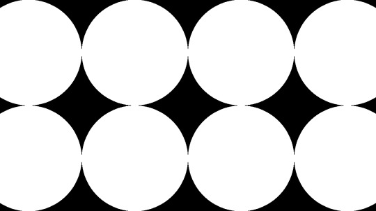
Of course we're gonna need the actual FUI function, which will be our procedural animated FUI texture, but let's just put something dummy there now, like a simple circle:
vec4 fui ( vec2 uv ) { return length(uv - 0.5) < 0.5 ? vec4(1) : vec(0); }
And here we go:

Very good, we have a single circle and if we animate the camera we can indeed tell that it is on a plane.
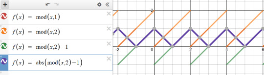
So first, let's tile it by using a modulo function; the modulo (or modulus) function simply wraps a number around another number (kinda like the remainder after a division, but for floating point numbers) and thus becomes extremely useful for tiling or repeating things:
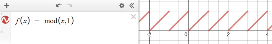
We'll be using the modulo function rather extensively in this little exercise, so strap in. (Illustration via the Desmos calculator.)
vec4 layer = fui( mod( hitPos.xy, 1.0 ) );
This will wrap the texture coordinates of -inf..inf between 0..1:
We also need multiple planes, but how do we combine them? We could just blend them additively, but with the amount of content we have, we'd just burn them in to white and it'd look like a mess (and not the good kind of mess). We could instead just use normal "crossfade" / "lerp" blending based on the alpha value; the only trick here is to make sure we're rendering them from back to front since the front renders will blend over the back renders:
int steps = 10; float planeDist = 1.0f; for (int i=steps; i>=0; i--) { float planeZ = -1.0f * i * planeDist; float t = (planeZ - rayOrigin.z) / rayDir.z; if (t > 0.0f) // check if "t" is in front of us { vec3 hitPos = rayOrigin + t * rayDir; vec4 layer = fui( hitPos.xy, 2.0 ); // blend layers based on alpha output colour = mix( colour, layer, layer.a ); } }
And here we go:

We decreased the circles a bit in size to see the effect more.
Not bad! First thing we can do is just fade off the back layers, as if they were in a fog:
layer *= (steps - i) / float(steps);
We have a problem though: we should probably increase the sci-fi effect by moving the camera continually forward, but if we do, we're gonna run into a problem: Currently, since our planeZ is fixed to the 0.0 origin, they won't move with the camera. We could just add our camera Z to them, but then they would be fixed with the camera and wouldn't appear moving. What we instead want is to just render them AS IF they would be the closest 10 planes in front of the camera; the way we could do that is that if e.g. our planes' distance from each other is 5, then round the camera Z down to the nearest multiple of 5 (e.g. if the Z is at 13, we round down to 10), and start drawing from there; rounding up would be more accurate, but rounding down is easier, since we can just subtract the division remainder from Z like so:
float planeZ = (rayOrigin.z - mod(rayOrigin.z, planeDist)) - i * planeDist;
And now we have movement! Our basic rendering path is done.
Our little fictional UI
So now that we have the basic pipeline in place, let's see which elements can we adapt from Sasha's design pieces.
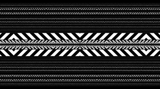
The first one I decided to go with wasn't strictly speaking in the set, but it was something that I saw used as design elements over the last two decades, and that's a thick hatch pattern element; I think it's often used because it has a nice industrial feel with it. Doing it in 2D is easy: We just add X and Y together, which will result in a diagonal gradient, and then we just turn that into an alternating pattern using, again, the modulo. All we need to do is limit it between two strips, and we have a perfectly functional "Police Line Do Not Cross" simulation.
return mod( uv.x + uv.y, 1 ) < 0.5 ? vec4(1) : vec4(0);

So let's stop here for a few moments; this isn't bad, but we're gonna need a few things. First, the repetition doesn't give us the nice symmetric look that Sasha recommends us to do, and secondly, we want them to look alive, to animate a bit.
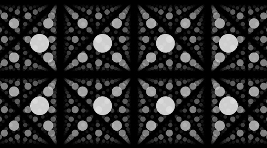
Solving symmetry can be done just by modifying our repetition code a bit: instead of a straight up modulo with 1.0 that gives us a 0..1 range, let's use 2.0 to get a 0..2 range, then subtract 1.0 to get a -1..1 range, and then take the absolute value.
vec4 layer = fui( abs( mod( hitPos.xy, 2.0 ) - 1 ) );
This will give us a triangle-wave-like function, that goes from 0 to 1, then back to 0, then back to 1; in terms of texture coordinates, it will go back and forth between mirroring the texture in both directions, which, let's face it, looks Totally Sweet.
For animation, first I needed some sort of random value, but one that stayed deterministic based on a seed - in other words, I needed a function that took in a value, and returned a mangled version of it, but in a way that if I sent that value in twice, it would return the same mangled value twice. The most common way of doing it is taking the incoming "seed" value, and then driving it into some sort of function with a very large value that causes the function to alias, and then just returning the fraction portion of the number:
float rand(float x) { return fract(sin(x) * 430147.8193); }
Does it make any sense? No. Is it secure? No. Will it serve our purpose perfectly? Oh yes.
So how do we animate our layers? The obvious choice is animating both the hatch "gradient" value to make it crawl, and the start and end of our hatch pattern which causes the hatched strip to move up and down: simply take a random - seeded by our time value - of somewhere sensible (like between 0.2 and 0.8 so that it doesn't touch the edges) and add another random to it, seasoned to taste - we can even take a binary random to pick between horizontal and vertical strips:
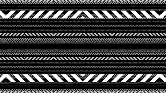
The problems here are, of course, that currently they're moving 1) way too fast and 2) in unison. The fast motion obviously happens because the time value changes every frame, so it seeds our random differently every frame - this is easy to solve by just rounding our time value down to the nearest integer: this will result in some lovely jittery "digital" motion. The unison is also easy to solve: simply take the number of the layer, and add it to our time, thus shifting the time value for each layer; I also chose to multiply the layer ID with a random-ish number so that the layers actually animate independently, and the stutter doesn't happen in unison either:
vec4 fui( vec2 uv, float t ) { t = int(t); float start = rand(t) * 0.8 + 0.1; float end = start + 0.1; [...] } vec4 layer = fui( abs(mod(hitPos.xy, 2.0)-1), fGlobalTime + i * 4.7 );

Lovely!
Note: In hindsight using the Z coordinate of the plane would've given a more consistent result, but the way it animates, it doesn't really matter.
So let's think of more elements: the best looking one that seems to get the best mileage out in Sasha's blog is what I can best describe as the "slant" or "hockey stick" - a simple line, with a 45-degree turn in it. What I love about it is that the symmetry allows it to create little tunnels, gates, corridors, which will work great for our motion.
Creating it is easy: We just take a thin horizontal rectangle, and attach another rectangle to the end, but shift the coordinate of the second rectangle vertically, so that it gives us the 45-degree angle:
float p1 = 0.2; float p2 = 0.5; float p3 = 0.7; float y = 0.5; float thicc = 0.0025; if (p1 < uv.x && uv.x < p2 && y - thicc < uv.y && uv.y < y + thicc ) { return vec4(1); } if (p2 < uv.x && uv.x < p3 && y - thicc < uv.y - (uv.x - p2) && uv.y - (uv.x - p2) < y + thicc ) { return vec4(1); }
Note: In the final code, I had a rect() call which I originally intended to use as baking glow around my rectangle using a little routine I prototyped out earlier that morning, but I was ultimately too stressed to properly pull that off. Also, it's amazing how juvenile your variable names turn when people are watching.
Looks nice, but since this is such a thin sparse element, let's just... add more of it!
So what more can we add? Well, no sci-fi FUI is complete without random text and numbers, but we don't really have a font at hand. Or do we? For years, Bonzomatic has been "shipping" with this really gross checkerboard texture ostensibly for UV map testing:

What if we just desaturate and invert it?
We can then "slice" it up and render little sprites all over our texture: we already know how to draw a rectangle, so all we need is just 1) calculate which sprite we want to show 2) calculate the texture coordinate WITHIN that sprite and 3) sample the texture:
float sx = 0.3; float sy = 0.3; float size = 0.1; if (sx < uv.x && uv.x < sx + size && sy < uv.y &&uv.y < sy + size) { float spx = 2.0 / 8.0; // we have 8 tiles in the texture float spy = 3.0 / 8.0; vec2 spriteUV = (uv - vec2(sx,sy)) / size; vec4 sam = texture( texChecker, vec2(spx,spy) + spriteUV / 8.0 ); return dot( sam.rgb, vec3(0.33) ); }
Note: In the final code, I was only using the red component instead of desaturation because I forgot the texture doesn't always have red content - I stared at it for waaaay too long during the round trying to figure out why some sprites weren't working.
And again, let's just have more of it:
Getting there!
At this point the last thing I added was just circles and dots, because I was running out of ideas; but I also felt my visual content amount was getting to where I wanted them to be; it was also time to make it look a bit prettier.
Post-production / compositing
So we have our layers, they move, they might even have colors, but I'm still not happy with the visual result, since they are too single-colored, there's not enough tone in the picture.
The first thing I try nowadays when I'm on a black background is to just add either a single color, or a gradient:
vec4 colour = renderPlanes(uv); vec4 gradient = mix( vec4(0,0,0.2,1), vec4(0,0,0,1), uv.y); vec4 finalRender = mix( gradient, vec4(colour.xyz,1), colour.a);

This added a good chunk of depth considerably to the image, but I was still not happy with the too much separation between colors.
A very common method used in compositing in digital graphics is to just add bloom / glow; when used right, this helps us add us more luminance content to areas that would otherwise be solid color, and it helps the colors to blend a bit by providing some middle ground; unfortunately if we only have a single pass, the only way to get blur (and by extension, bloom) is repeatedly rendering the picture, and that'd tank our frame rate quickly.
Instead, I went back to one of the classics: the Variform "pixelize" overlay:
This is almost the same as a bloom effect, except instead of blurring the image, all you do is turn it into a lower resolution nearest point sampled version of itself, and blend that over the original image - since this doesn't need more than one sample per pixel (as we can reproduce pixelation by just messing with the texture coordinates), we can get away by rendering the scene only twice:
vec4 colour = renderPlanes(uv); colour += renderPlanes(uv - mod( uv, 0.1 ) ) * 0.4;
Much better tonal content!
So what else can we do? Well, most of the colors I chose are in the blue/orange/red range, and we don't get a lot of the green content; one of the things that I learned that it can look quite pretty if one takes a two-tone picture, and uses color-grading to push the midrange of a third tone - that way, the dominant colors will stay in the highlights, and the third tone will cover the mid-tones. (Naturally you have to be careful with this.)
"Boosting" a color in the mids is easy: lucky for us, if we consider the 0..1 range, exponential functions suit our purpose perfectly, because they start at 0, end at 1, but we can change how they get here:
So let's just push the green channel a tiny bit:
finalRender.g = pow(finalRender.g, 0.7);
Now all we need is to roll our camera for maximum cyberspace effect and we're done!
Best laid plans of OBS
As you can see from the code I posted the above, I wrote the final shader in GLSL; those who know me know that I'm a lot more comfortable with DirectX / HLSL, and may wonder why I switched, but of course there's another story here:
Given the remote nature of the event, all of the shader coding competition was performed online as well: since transmitting video from the coder's computer to a mixer, and then to another mixer, and then to a streaming provider, and then to the end user would've probably turned the image to mush, Alkama and Nusan came up with the idea of skipping a step and rigging up a version of Bonzo that ran on the coder's computer, but instead of streaming video, it sent the shader down to another instance of Bonzo, running on Diffty's computer, who then captured that instance and streamed it to the main Revision streaming hub. This, of course, meant that in a three-way, Diffty had to run three separate instances of Bonzo - but it worked fine with GLSL earlier, so why worry?
What we didn't necessarily realize at the time, is that the DirectX 11 shader compiler takes no hostages, and as soon as the shader reached un-unrollable level of complexity, it thoroughly locked down Diffty's machine, to the point that even the video of the DJ set he was playing started to drop out. I, on the other hand, didn't notice any of this, since my single local instance was doing fine, so I spent the first 15 minutes casually nuking Diffty's PC to shreds remotely, until I noticed Diffty and Havoc pleading on Discord to switch to GLSL because I'm setting things on fire unknowingly.
This is fine.
I was reluctant to do so, simply because of the muscle memory, but I was also aware that I should keep the show going if I can because if I bow out without a result, that would be a colossal embarrassment to everyone involved, and I only can take one of those once every week, and I was already above my quota - so, I quickly closed the DX11 version of Bonzo, loaded the shader up in a text editor, replaced "floatX" with "vecX" (fun drinking game: take a shot every time I messed it up during the live event), commented the whole thing out, loaded it into a GLSL bonzo, and quickly fixed all the other syntax differences (of which there were luckily not many, stuff like "mix" instead of "lerp", constructors, etc.), and within a few minutes I was back up and running.
This, weirdly, helped my morale a bit, because it was the kind of clutch move that for some reason appealed to me, and made me quite happy - although at that point I locked in so bad that not only did I pay absolutely not attention to the stream to see what the other two are doing, but that the drinks and snacks I prepared for the hour of battling went completely untouched.
In the end, when the hour clocked off, the shader itself turned out more or less how I wanted it, it worked really well with Bullet's techno-/psy-/hardtrance mix (not necessarily my jam, as everyone knows I'm more a broken beat guy, but pounding monotony can go well with coding focus), and I came away satisfied, although the perhaps saddest point of the adventure was yet to come: the lack of cathartic real-life ending that was taken from us due to the physical distance, when after all the excitement, all the cheers and hugs were merely lines of text on a screen - but you gotta deal with what you gotta deal with.
A small sampling of the Twitch reaction.
Conclusion
In the end, what was my takeaway from the experience?
First off, scoping is everything: Always aim to get an idea where you can maximize the outcome of the time invested with the highest amount of confidence of pulling it off. In this case, even though I was on short notice and in an environment I was unfamiliar with, I relied on something I knew, something I've done before, but no one else really has.
Secondly, broaden your influence: You never know when you can take something that seems initially unrelated, and bend it into something that you're doing with good results.
Thirdly, and perhaps most importantly, step out of your comfort zone every so often; you'll never know what you'll find.
(And don't agree to everything willy-nilly, you absolute moron.)
10 notes
·
View notes
Text
Star Citizen Monthly Report: February 2019
February saw Cloud Imperium devs around the world working hard to deliver the incredible content for the soon-to-be-released Alpha 3.5 patch. Progress was made everywhere, from locations like ArcCorp to the gameplay developments afforded by the New Flight Model. Read on for the full lowdown from February’s global workload.
Star Citizen Monthly Report: February 2019

AI – Character
February’s roundup starts with the AI Team, who made improvements to the existing character collision avoidance system. The changes began with adjustments to the smooth locomotion path, with the data now coming from the collision avoidance calculation to make sure the character has enough free space.
Time was spent generalizing the options a vendor can use so that designers no longer have to write them into the behaviors. Instead, the correct options are automatically selected based on the environment and (eventually) from the shop services.
They’re also restricting combat behavior to allow better scalability when adding new tactics and are investigating some of the bugs found in the Alpha 3.4 release.
AI – Ships
Throughout February, the AI Team improved various aspects of dogfighting gameplay, including evasive maneuvers. Now, when an AI pilot has an enemy on its tail, it will try to utilize different break-aways with increasing and varied angles. It will also try to keep momentum and chain together attack maneuvers. To achieve this, the team exposed new ‘SmoothTurning’ subsumption tasks to the behavior logic.
When detecting enemy fire, AI pilots will utilize evasive maneuvers to create a diversion.
They also implemented automatic incoming/outgoing ship traffic over planetary landing areas. They are currently generalizing ship behaviors to enable the designers to easily set up traffic on multiple cities, capital ships, and so on.

Animation
Last month, Animation provided the remaining animation sets for previous characters already found in the Persistent Universe (PU), including Hurston, Battaglia, and Pacheco. They also finished off a new batch of animations for the ship dealer. Work continues on animations for future yet-to-be-announced characters too, which includes getting approval for the initial poses and animations before going forward with the final clean-up.
American Sign Language (ASL) emotes are being added to the game and are currently being improved with the addition of facial animations.
Finally, Animation is currently syncing with Cinematics for a few interesting segments that backers will get to enjoy soon…
Art – Tech
Tech Art invested significant effort into optimizing rig assets so that they work better with the facial runtime rig logic and the ‘look at’ and ‘mocap’ re-direction components. Since eye contact is one of the fundamental means of human communication, any error or tiny deviation can cause the ‘uncanny valley’ effect and immediately break immersion.
“If the eyes of an actor converge just slightly too much, they appear cross-eyed. However, if they don’t converge enough, they appear to look through you, as if distracted. If the eyelids occlude the character’s iris just a little too much, which, depending on the distance, could amount to just 2-3 pixels vertically, they look sleepy or bored. Conversely, if they expose too much of the cornea, they appear more alert, surprised, or outright creepy.”
So, the alignment of the virtual skeleton’s eye joints with respect to the eyeball and eyelid geometry is of utmost importance. Likewise, the ‘look-at’ system needs to control all relevant rig parameters and corrective blendshapes (not just the rotation of the eyeballs themselves) to create truly-believable runtime re-directions of the mocap animations.
Alongside facial work, the team completed several weapons-related tasks, such as fixing offsets during reload animations and locomotion issues for the pistol set. They also completed R&D related to playing animations in sync with character usables within cinematic scenes and helped Design to unify the character tags in Mannequin.
Art – Environment
Predictably, the Environment Team is racing towards the completion of ArcCorp and Area 18 – they’re currently working with and implementing the custom advertising provided by the UI department. The planet itself is in the final art stage and now includes skyscrapers rising above the no-fly zone to provide the player with landing opportunities and interesting buildings to fly around.
Concurrently, the ‘Hi-Tech’ common elements are steadily progressing, with the transit, habitation, and security areas all moving to the art pass stage. Players will see these common elements (alongside garages and hangars) when they’re added to microTech’s landing zone, New Babbage.
The new transit connection between Lorville’s Teasa spaceport and the Central Business District (CBD) is almost ready for travellers. This route will allow players to move directly between the two locations and bypass L19, cutting travel time for high-end shoppers.
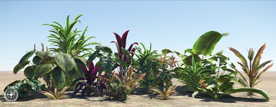
Work on organics is ongoing, as are improvements to planet tech, with the artists hard at work creating a library of exotic-looking flora to fill the biomes of New Babbage with. Players can see it for themselves towards the end of the year.
The community can also look forward to upcoming information on the early work the team has done on procedural caves.

Audio
Both the Audio Code Team and the sound designers finished their work on the new camera-shake and ship-vibration systems. Now, when an engine kicks in, the ship shakes and hums. This also extends to the player, with events like a ship powering up causing minor camera shake.
The sound designers also added new sound samples to a range of ships as part of the rollout of the New Flight Model. By adding ‘one-shot’ samples to each of the various thrusters, they brought out more complexity in the sounds heard during flight.
The Audio Team spent the majority of the month creating the sounds of Area 18. Due to the melting pot of ideas and themes present in the new area, the sound designers tested new methods to bring out the unique atmosphere. Additionally, they created the sound profiles and samples for the Gemini S71 assault rifle and Kastak Arms CODA pistol, both of which will appear in the PU and SQ42.
Currently, the Audio Code Team is working towards an updated tool that better allows the sound designers to implement created assets in-engine whilst simultaneously testing how they sound.
Backend Services
Backend Services continued to lay the foundation for the new diffusion network to help scalability for the backend structure of the game. Emphasis is on ensuring the Dedicated Game Servers (DGS) correctly connect to the new diffusion services, particularly the variable, leaderboard, and account services.
February marked the near-end of work on the new Item Cache Service (a massive portion of the backend has now turned micro-service) and began the end-point between DGS and this service, too. As work is completed on the new diffusion services, testing will ensure a smooth transition to the new network.
Support was also added for subsumption services to read directly into the DataCore P4k system for increased efficiency and unification.
With the approaching publish of Alpha 3.5, Backend Services began work on logistics, syncing closely with DevOps to ensure that new services are up and running correctly while maintaining legacy services where necessary.
Community
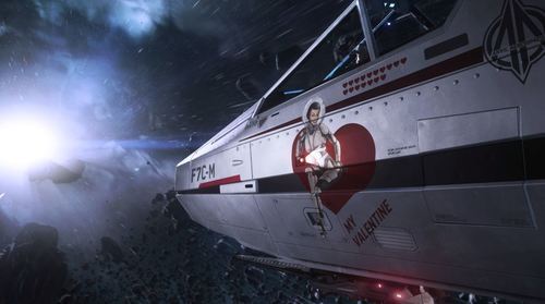
The team celebrated Valentine’s Day with community-made cards and limited-time ship offers, including Anvil’s F7C-M Heartseeker – a special version of the Super Hornet shooting straight for the heart. During the Be my Valentine greeting card contest, most Citizens got creative with their favorite image editing software, though some went old-school with scissors and crayons to create fantastic crafts to share their love across the galaxy.
Also this month, Argo Astronautics released their latest addition to the ‘verse, the SRV. The ‘Standard Recovery Vehicle’ is built for tugging ships, ground vehicles, and massive cargo containers through the stars using its integrated tractor tech. If you’re looking for more information about this rough and rugged ship, head to the Q&A that answers questions voted-on by the community. As a bonus, Shipmaster General John Crewe stopped by Reverse the Verse LIVE for some in-depth tug-talk.
In the February issue of Jump Point (our subscriber-exclusive magazine), Ben Lesnick took a detailed dive into the ARGO SRV’s design process and went on a worker’s tour of Hurston. The Narrative Team also introduced us to the Human holiday Stella Fortuna and shed light on the history of the revered Rust Society.
A major update to the Star Citizen roadmap gave a look at what’s coming to the Persistent Universe in 2019 and what can be expected in upcoming releases.
Released in January, but worthy of another mention, is the official Star Citizen Fankit, which was put together to help all of you share your enthusiasm and engagement. Star Citizen lives by the support it receives from the community, so take a look at this treasure trove of assets and get creating!
The team is also excited to announce that our physical merchandise will soon be receiving a well-deserved face-lift. Having received a lot of feedback over the years, it’s clear that Citizens are passionate about merch and to make the store experience the best it can be, your input was needed. Thanks to everyone who contributed feedback to our thread on Spectrum!

Content – Characters
The Character Team revisited the hair development pipeline in February. With the help of the Graphics Team, they developed new tools and shader tech to improve the realism of hair while maintaining quality and performance. More work went into mission-giver Pacheco, including textures and rigging, with her hairstyle being used to trial the new hair pipeline. Work continues on the assets required for DNA implementation and the female player character, while refinement of the Xi’an concept is making great progress.
Design
Throughout February, Design focused on implementing Area 18’s shops, NPCs, and usables. Last month marked the end of implementation, with March being used for polish to ensure a believable and immersive experience upon release. The team also gained a new member to help with mission implementation and improvement, who is currently setting their sights on the Emergency Communication Network (ECN) mission set.
Regarding the economy, the US Design Team worked with their UK counterparts on the objective criteria and value of objects in-game, laying down the track for acquiring item properties and their values. A system was built to help create an abstract representation, which is both robust and modular enough to allow easy adjustment in the future when the details are finalized.
DevOps
DevOps had a busy month working on the build system and pipeline that supports feature stream development. After several long nights, they rolled out the upgrades and have been happy with the results so far – internal systems are running smoothly without errors and each evolution improves efficiency and storage consumption.
They’re now attempting to further compress existing data which, when multiplied by hundreds of thousands of individual files, will make a real impact to the dev’s daily development efforts.
Engineering
February saw the Engine Team spend time on general Alpha 3.5 support, such as profiling, optimization, and bug fixing. They also improved the instance system used in compute skinning and refactored it on the CPU and shader for better maintainability, created a budget-based output-buffer system for skinning results (so they only have to skin once per frame), made more tangent reconstruction optimizations, and worked on wrap-deformation using the color stream.
Basic HDR display support was added to the editor, as was a new hue-preserving display mapping curve suitable for HDR display output. The team provided material layer support for planet tech v4 and continued to improve character hair, which included initial hair mask, support for edge masking, and pixel depth offset. Game physics is progressing with Projectile Manager 2.0, as well as optimizations to wrapped grids and state updates. Support was added for ocean Fast Fourier Transform (FFT) wave generation to physics buoyancy calculations, as well as exposed optimized terrain meshes.
A major system initialization clean-up was completed as part of an initiative to share core engine functionality with PU services, work began on the lockless job manager (a complete overhaul for faster response in high-load scenarios), and a new load time profiler was created. The team are currently wrapping up the ‘ImGUI’ integration and introducing a temporary allocator for more efficiency when containers are used on stack.
They made the switch to the Clang 6 compiler to build Linux targets (including compilation cleanup of the entire code base) and plan to switch to the latest stable release (Clang 8.x) in the near future.
Finally, they finished a ‘create compile time’ analysis tool (utilizing new Visual C++ front and backend profiler flags) to gather, condense, and visualize reasons for slow compile and link times. As a result, various improvements have already been submitted and further action-items defined.
Features – Gameplay
A large portion of Gameplay Feature’s month was dedicated to implementing the new DNA feature into the character customizer. In addition, the team was responsible for creating and setting up the user interface (UI) and accommodating the female playable character, both of which are scheduled for Alpha 3.5.
Another major focus was on video streaming for comms calls, which consisted of a refactor of the comms component to utilize the voice service call mechanism. Research was made into the VP9 streaming format and video streaming improvements were completed that will be rolled out in the upcoming release.
Lastly, support was given to the US-based Vehicle Features Team, with updates to the turret sensitivity HUD, gimbal assist UI, and the shopping service entity registration.
Features – Vehicles
Gimbal Assist and its related HUD improvements were finalized and polished, allowing for better balancing of this new weapon control scheme. Turrets were also improved, as the team added a HUD and keybinds for input sensitivity, implemented adjustable speeds for gimbal target movement based on proximity to center aim, and fixed bugs with snapping and erratic movement.
A lot of work went into scanning improvements, which included adjusting the area for navpoint scanning, enabling use of the navpoint hierarchy, and adding a Boolean to opt into the scanning data. This endeavor also covered adjustments to make scanning more involving by setting up AI turrets to generate signatures and be scannable and adding specific icons for scanned/unscanned targets. Ping and blob were implemented to display on the radar too, including focus angle and ping fire.
To round out the month, they continuing to make item port tech optimizations, developed tech for utilizing geometry component tags in the paint system, and fixed a handful of crash bugs.
Graphics
Last month, the Graphics Team’s work on the PU was spread between several smaller tasks. There were many shader requests from the artists, such as adding new features to the hard surface shader and ISO support for decals in the forward rendering pipeline.
The team also continued with the CPU optimizations from last month. This included a 3x performance saving on the cost of building per-instance data buffers for the GPU and better support for the depth pre-pass to help occlude hidden parts of the frame with less CPU overheads.
To help the artists optimize their content, the team worked on an improved render-debugging tool that reports how many draw instructions (draw-call) a particular object requires along with a breakdown of why each instruction was needed. Once complete, this will allow the artists to dig into their material and mesh setups to save valuable CPU time.
Level Design
The Level Design Team soldiered on with ArcCorp’s Area 18, bringing the designer whitebox up to greybox. They began planning the modular space stations that will be built this year too, including looking at the libraries, rooms, and content that goes into them. The procedural tool is also now at a stage where they can slowly start ramping up the modular station production.
Live Design
The Live Team refactored existing missions to make them scalable to make more content available in the planetary system (other than Crusader). Significant progress was made on a new drug-stealing mission for Twitch Pacheco, as well as a BlackJack Security counter-mission that tasks less morally-corrupt players with destroying the stash.
Another focus was on implementing a variety of encounters with security forces and bounty hunters when the player holds a high crime stat.
As well as practical work, time was taken to define the next tier of many aspects of the law system, such as punishment, paying fines, bounty hunting, and so on.
Lighting
Last month, the Lighting Team focused on developing the look of Area 18. Lighting Area 18 is a mixture of clean-up work from the previous versions to match new standards and lighting the new exterior layout to a series of targets set by the Art Director. The team is working closely with the Environment Art and VFX teams to ensure that new advertising assets and visual effects ‘pop’ from the environment and provide interesting and varied visuals.

Narrative
Working closely with the Environment Art and Mission Design teams, February saw the Narrative Team further fleshing out of lore relating to ArcCorp and its moons. From new mission giver contract text to the catchy slogans gracing Area 18’s numerous billboards, a lot of additional lore was created to bring these locations to life.
Additionally, expanded wildline sets for security pilots, bounty hunters, and combat assist pilots were scripted and recorded. The AI and Mission teams will use these sets to begin prototyping and testing out new gameplay for inclusion in future builds.
Also, the Narrative Team made progress on generating the specific text needed for on-screen mission objectives. Currently, this is placeholder text from the designers who worked on levels, but moving forward, the hope is to begin using the proper in-lore objectives.
Player Relations
The Player Relations Team was busy preparing for Alpha 3.5 (including getting ready to test the New Flight Model) as well as boxing off the work created over the holiday period.
“As always, we’d like to point all players to our growing Knowledge Base, which now has 120+ articles and saw almost 450,000 visitors this month! We will continue to grow this by adding more ‘How To’ articles, patch notes, and live service notifications there as well as on Spectrum.”
Props
February saw headway into Area 18’s props: the core street furniture is now in and the team has moved onto the dressing pass, adding in new assets to give life to the streets, alleyways, and landing zone.
As the month closed out, the team jumped into release mode to get a head start squashing bugs and generally tightening up the upcoming release.
QA
Things ramped up on the publishing side in February as the team prepared Alpha 3.5 for the Evocati and PTU. Testing continues on the New Flight Model and other systems as they come online, such as the new weapons, ships, and locations. QA leadership continues to train the newer testers and improve the overall testing process.
The AI Feature Team kept the Frankfurt-based QA testers busy with new features, such as the improved avoidance system and new break-away maneuvers. Testing mainly consists of making sure they’re working as intended, as well as noting visible improvements to what was already in place (in the case of the avoidance system). Combat AI received perception updates which were tested by QA to address issues where the FPS AI would not recognize the player being present in their vicinity.
On the backend, changes to the subsumption visualizer are being tested to ensure no new issues have been introduced in preparation for their full integration into the editor. Testing for ArcCorp and Area 18 is currently underway too.
The Universe Team discovered that mining entities were not appearing in the client due to discrepancies in how they were spawned in the server. This was tracked down and fixed, though testing will continue to make sure it’s working as intended.
Ships
The Vehicle Content Team wrapped up the MISC Reliant Mako, Tana, and Sen variants for Alpha 3.5. They’re now in testing with QA who are addressing bugs before the vehicles go live. The designers and tech artists have been busy with the Origin 300i, which will reach QA for testing in the near future.
Back in the UK, the team continued production on the 890 Jump, bringing more rooms into the final art stage from greybox (including the hangar area). The Carrack is heading towards a greybox-complete state and select areas are being polished for review.
Development continues on the Banu Defender which is utilizing a new style of production that caters to its organic art style. ZBrush is being used to sculpt the interior before transferring the high-density model to 3ds Max, where it is then rebuilt (low-poly) for the game engine. A large portion of the exterior greybox is complete and looking fantastic.
Last but by no means least, the interior updates to the Vanguard wrapped up with essentially the entire area from the cockpit seat backwards being completely redone. This is more than was initially anticipated, but the team feels that it’s worth it. Now that the interior rework has been finalized and the framework for the variants agreed upon, the Ship Team can start on the exterior changes to accommodate them and continue with the variant-specific items.


System Design
The System Design Team is working on improving and upgrading the no-fly zones used across ArcCorp. Since the existing system now needs to support an entire planet, it has proven quite a challenge.
For social AI, the team’s working on unifying vendor behaviors and making sure they’re built in a modular fashion. For example, the team can easily graft new actions onto the base behavior of a shop keeper to allow them to pick up objects, give them to the player, and interact with things on the counter without having to build new ones from scratch.
As with social AI, the team focused on restructuring FPS AI behaviors to make them more modular, with the goal to make it easier to implement specific chunks of logic. For mining, they added new mineable rocks on ArcCorp’s moons. Wala in particular will have a new type of rock that fits better with the crystalline formations available on the moon.
Finally for System Design, AI traffic over Area 18 is currently being developed. The team’s starting small, with a few ships landing and taking off around the spaceport, but they’re also investigating ways to expand it while being mindful of performance.
Turbulent
RSI Platform: On February 14th, Turbulent supported the announcement of a new flyable variant of the Super Hornet, the F7C-M Heartseeker. They also made major updates to the CMS backend which required all hands on deck.
Services: This month’s game service work was focused around developing support for transporting video streams over the comms channels. This will allow the streaming of a user’s face/in-game texture to another player outside of the bind culling bubble, enabling in-game video calls over wider distances. This method also enables the transmission of in-game video streams to web clients.
Turbulent spent considerable time standardizing services to enable them to run within a new local development environment. This will allow the entire Star Citizen universe’s services to run locally on dev systems to develop and iterate with the entire stack.
The Turbulent Services Team also began work on an administration interface for game designers and game operators to display real-time information about the state of the universe. This application can display information about groups, lobbies, and voice channels along with details of online players, quantum routes, and probability volumes.
UI
As in January, UI supported the Environment Team with in-fiction advertising and branding for Area 18, including animation and hologram textures. They also made headway on the 3D area map using the concepts shown last month as visual targets. Finally, they began working out how to bring the rental functionality from the Arena Commander frontend to in-game consoles in Area 18.
VFX
The VFX Team updated the existing particle lighting system to a more modern system. The previous version was based on tessellation, which increased the rendering cost and had limitations on shadow resolution. The new one is a global change that will remove the need for tessellation and improve shadow receiving for crisper, smoother shadows. ArcCorp’s Lyria and Wala will be the first moons to use this new particle lighting system when it’s ready for deployment. It will help the particles integrate into the moons more realistically and address issues when the particles have long shadows going through them, such as during sunrise and sunset.
They also continued to iterate on thruster damage effects and began rolling it out to all ships.
Several new weapon effects were worked on, including a new ballistic hand cannon and ballistic assault rifle. They also carried out extensive visual exploration for the new Tachyon energy weapon class.
Finally, significant time was invested in improving the VFX editor’s UI layout and functionality. Although not as glamorous as planet dressing and effects, improving the quality-of-life for artists is important and helps them to work faster too.

Weapons
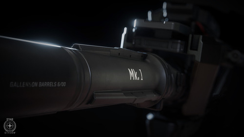
The Weapon Art Team completed the Gemini S71, Kastak Arms Coda, Banu Singe Tachyon cannons, Gallenson Tactical ballistic cannon reworks, and five variants of the Aegis Vanguard nose guns.
Conclusion
WE’LL SEE YOU NEXT MONTH…
$(function() { Page.init(); window.Page = new RSI.Game.About(); });
4 notes
·
View notes
Text
5 Game Design Tips to Help You.
Game design is hard. It takes a lot of time, planning and is, essentially, the core of a game. I mean, within game design you have visuals, graphics, level design, soundtrack, the objectives. There’s really a lot into it.
1 - Making a Game Feel Alive
To make a game feel alive is kinda easy, but people seem to keep forgetting about it. There are a lot of ways to make a scene feel alive, and I’ll cover some of them.
Make Nature Feel Natural
That should be an obvious one, but if you didn’t think of that, here it goes. You could make trees bend to the wind, grass shake when the player steps on it, birds that fly away when the player gets close to them, and much more. There’s really no limits to creativity.
Air Particles
Look around. Look at a window, where there’s light coming in. There’s a chance that you’ll notice some dust or something like that floating around. Your game should have that too. It doesn’t need to be crazy, it’s just a subtle effect.
Interaction
Don’t you love to blow those old crates to pieces? And to cut that grass and get a bit of XP? Or to get a hidden item by interacting with a tree? Or even to walk by and see that grass waving at your touch? So, if those things are in other games, why aren’t them in yours?
An Example in a Video
Blackthornprod explains everything I told really well. I recommend you to watch his video.
youtube
2 - Mechanics and Challenges
A level should be fun to play. It doesn’t matter if your game is based on cubes. Visuals don’t make great games, at least not all alone, even if it helps to sell a game. Always remember that.
Now, what makes a game great? Well, a lot of things can help, that’s for sure. Two of them are Mechanics and Challenges. If a game has great Mechanics, but poorly designed challenges, making it too easy or too boring for the player to surpass the game, the game will fail to entertain and, most importantly, to sell.
But that doesn’t mean that both of them need to be perfect. That’s because, by having poor mechanics and great challenges, challenges that make a great use of those mechanics, a player can and will get entertained.
Creativity and patience are the masters here. If you don’t feel creative enough to create a complex and fun mechanic, that’s no problem. You just need the creativity and patience to figure out how to make a simple mechanic fun to use, in interesting and unique ways.
An Example:
Let’s take a look at Super Mario Odyssey. It’s a great game, no doubts about that. But, let’s take a look at the core mechanic of the game; the mechanic that is the center, the root where the game’s tree grew around: the hat throw. Yes, you beat the game throwing hats. Mario’s hat. Doesn’t that sound silly? But what if I told you that you can control enemies when you throw your hat at them and that you can use their abilities? Now it sounds a lot more interesting, right?
3 - Polishing
Polishing is a damn important thing. The more you polish, the better your game will get. The better the game, more players will get entertained and hooked at it. Simple math, ain’t it? But, how does one polish a game? What is polishing after all?
Well, polishing is nothing more than tracking and solving problems. To find something that can be improved and improve it to its greatest level.
Example:
As an example, I’ll use my game, Land Of Enchantments. I’ve made a lot of trees for it, but that’s when I first started the project. I didn’t have a clue on which would be the visual style of my game, so I kept experimenting. Recently I’ve realized how ugly they are and I made an upgrade to them:

I found something that could be improved and I did it. If I were to examine every bit and pit of Land Of Enchantments, I’m really sure that, with time, the game would look like an AAA title. And that’s something that anyone can do.
Now, of course, experience counts, but if you never try you’ll never improve your skills, right? How long do you think I spent polishing this post you’re reading?
4 - Designing a Great Level
Well, there’s no secret formula to it. All I can say for sure is that you need to experiment and put people to play your game and test it out.
But I’ll try to help by giving some steps to follow and maybe improve or worsen the results. Be careful.
Choose the Mechanics
First of all, pick all of the mechanics that you want the player to learn and/or use. You’ll develop the level around those. Also, pick some already used ones for consistency’s sake.
Plan
Always plan everything you are putting in your game. Never add something just because you feel it is cool, you can end up with hours thrown away. Level designing is no exception.
Grab a piece of paper and make a sketch, even if a rough one, just to idealize what you want to do. Design the level around those mechanics you’ve chosen. Make them the foundation of your building. Then, weight the pros and cons of everything you’ve added in.
By doing that you’ll find things that probably wouldn’t have worked out so well, and you’ll be aware of things that may harm your game. You’ll also know what works and learn some things that may be used somewhere else. Who knows?
Sketch and Test
Make a simplified version of the level, with little to no detailing. You’ll want people to test that. Think of it as an Alpha version of the level. By putting people to test it you’ll learn what’s way too hard to accomplish, what’s too easy, things that should be more obvious for the player, etc.
Finally, Make it Awesome
Once you’ve made all of the adjustments and the sketch is already working, then go for it. Now you have nothing to lose but time making sure that every bit of that level feels like it’s got some bit of life to it.
Music
The music is one of the most important things when it comes to games. A song can drive the player’s emotions to everywhere you want to. A note off and you can bet that the overall feeling changes. Analyze the level once more, and then think of what do you want the player to feel. Make a theme for that level. Make a more intense version of the same for when the player faces an enemy. No song or long pauses can lead to tension in a really dark game.
But pay attention to the music, and please, be careful. The wrong soundtrack can ruin a game.
5 - Story
Stories don’t really sell games when the game is not good. If you’re making a bad game, I’m sorry bro, but no great story will sell it. Well, maybe it will, but the odds are that it won’t work.
With that said, I believe that Story is the second major part of a game, with the first being the Mechanics and Challenges. A game doesn’t need a good story to sell and be fun, but a game can’t sell only telling stories.
I can’t tell you how to write a good story. That depends on your ideas. I can give you a few tips, of course, but you should adapt those to your game.
Make a core concept, make sure to add a few climax moments, and an evil villain always supports a good story.
Conclusion
These were my five tips to help you with Game Design. I may say that I had no clue whatsoever on what I would write when I first started this post. Just like with any other human, I may be wrong. I can really be wrong. So, don’t take my words for granted. You’ve listened to what I think, and you should listen to what other developers have to say too.
Do you want a pro tip? Ask. Ask how did Notch come up with the idea for Minecraft. Ask to Rare how did they make those grass shaders they use on Kameo: Elements of Power. But, more important than asking, you should listen, because people always have something to teach.
Here’s another really good YouTube channel: Game Dev Underground. He really knows what he’s talking about.
That’s it guys, I really do hope you found something useful here and that you’ve learned something new. Follow me on Twitter so that you can vote on what I’ll write in my next post. Bye!
11 notes
·
View notes
Text
Banality Wars Updates
I have a game I'm working on called Banality Wars Carridin. It's a turn based strategy game similar to Advance Wars. I have been posting updates to my patreon here. I have beeen meaning to cross post them for some time now but I finally decided to do it. And because I'm quite behind I decided to post the past 2 updates.
Update For May 29
So I didn't get much work done this month. I got sidetracked by this Code With Friends Event. But I did do a lot still. Most notably I completely changed how the AI decides to build things. It's not perfect but hopefully it won't build so many recons now.
Also I fixed this bug:
That is there are four buttons appearing on one tile when there should be only one button with 3 buttons around it.
It was quite a pain. It was actually an issue with the buttons not being repooled properly. Repooling is a process where instead of destroying the old button and making a new button we keep the old button in a suspended state and use it again later. This can improve performance because the process of creating and destroying a button can be a little costly. Repooling is a pretty simple solution, but you have to reinitialize things correctly, as I learned. I have no idea why it was even working before. These two variables were randomly flipped and... Well, it's fixed now.
Also fixed another bug where units weren't being loaded if they got interrupted on the way to the unit they were being loaded to. That was another nasty one.
I also tweaked 2x05 (Capital Offence) and 2x06 (Reclaiming Hope) with 2x06 being completely redesigned to make it more interesting. Oh, and units can start on Landers to get the lore of that map working.
I also added the trial map 'Like Shooting Fish In A Barrel'. It's not the best map in the world. It's mostly to check if the AI unit generation (that I completely redid) is working correctly but it's there.
Also the UnitActions camera tricks have been significantly improved.
As always to play all the maps open up the console (` or double tap where the second tap is a long press) and enter the command 'unlockall' to play all the maps.
Some other improvements.
Added the 'We Have Been Spotted' check for dialog.
Building a submerged sub now only makes noise if we built it
Rockets have slightly more defense
Improved toast animations
Fix one frame error in confirm dialog
Significantly improved UnitActions focusing on click
Fixed long pressing on maps
Fixed wrong order of actions playing at the end and end game things in general
Update For April 30 (I try to post an update every 2-3 weeks but got side tracked)
youtube
The above video shows off my new testing system. I was originally thinking of including it as a GIF but the GIF was 18 megabytes. So I decided to put it on YouTube instead.
Anyways testing is the big thing I added these 3 weeks. Testing is the big thing in software development but not so much in gaming. Like, how would you even start? Unity, and presumably most game engines don't offer some easy way to test things. So instead the only way to test a game is to hire a QA team.
So I guess I was always a little scared of tests. But recently I made a contribution to Google's Flutter project and part of my contribution was I had to write a test. I tried to weasel out of it. I said, "This small change doesn't need a test." But the person reviewing my pull request got me to cave and write a test.
And it really wasn't that hard. I mean, writing a test for Flutter was hard because the entire system is just terrible. But the whole concept of writing a test and checking if the system worked properly wasn't that bad.
So I eventually thought, "Could I write tests in my game?". So I tried Unity's native testing framework. And it sucks. Tons of errors about not finding assemblies and it closed all my scenes when I ran it. But not perturbed I wondered if I could use some other method of writing tests.
And I remembered back to an asset I used: the In-game Debug Console. It's actually MIT licensed and I submitted a pull request a while back. And my pull request got it working pretty well. Maybe I could use it to run tests. So that's what I did.
The entire system is at my: ModularUI repo. I combined it with ModularUI because the testing framework relies on it to insert mock inputs and rather than maintain two separate repos with some stuff disabled in both I decided to merge them.
So when you run it it runs all the tests like in the video and outputs a report of what tests passed:
So you may be wondering, "Does it work"? Because it actually takes quite a while to write the tests. In some cases it takes longer to write the test than it does to implement the feature.
And I'd say yes, it does help. I already found two major issues: the first was UnitActions wasn't disappearing after selecting an option from a multi menu and the second was that long touches weren't being removed.
So onto the actual features.
First off there is a new trial map: Budding In.
As you can see there are three islands. The two that are connected are occupied by the AI. That leaves the player to have to bud in (hence the name) to the current battle. I actually had the idea for the map a while back but I didn't have Landers working. Now that Landers are working I can make it and it's actually pretty good.
You know it's funny, when I was playtesting this map I got that voice in my head, "You're supposed to be doing work, not playing games." Well, sometimes they are one in the same.
Similarly 2x04 (Reason In Madness) has been improved. The original plan of allowing the player to go up to the third island directly is now done. Except due to the AI being terrible it may not be the optimal solution. Like what is happening here?
I definitely have to create some tools to diagnose what the AI is doing.
There's also a new toast animation
Other things:
Fixed That Problem With The Greyscale Shader
Updated To Unity 2019.3.10
Refactored buttons: https://andrewzuo.com/post/616675484059713536/notes-on-refactoring
So that's where I am with Banality Wars Carridin. If you want to play the latest build be sure to visit my patreon.
0 notes
Photo

Immersive Visualisation II - Part Three
October 18th, 2019.
I’ve not really updated myself in a while as I’m feeling quite overwhelmed at the moment – I’m kind of finding it hard to keep up with my ideas and my development, but I’d like to get better at this – so I came in early in the morning to get this post finished.
For ZBrush, I downloaded a brush pack from online in order to help me achieve the stylised textures that I wanted to achieve. When I started using this, it created the results that I wanted a lot faster and allowed me to practise ZBrush a lot more without becoming frustrated, and because of that it’s allowed me to become a lot more used to the interface. I’ve also found that I actual really enjoy creating textures and I’ve been really motivated to create lots of textures for the project. I started by creating a wood texture and then developed a brick one too – from this I also created a few subtler textures like concrete for things like pavement and road.
I’ve also started throwing a bit more into 3DSMax. I also started playing about with the lighting in order to give me a better idea of how my textures are turning out and what I want to achieve. I’m actually really happy with the result. It’s really allowed me to see my potential and de-stress a little bit.

I think one thing that was particularly stressful is not really knowing how to apply my colour scheme for this project. I initially attempted to directly colourise the textures, but I found them to look a little bit gaudy. When I started putting in lights, it gently reflected some of the colour and took away the stress of having to go over the textures. Now, I want to use colour in a way that’s sparing but impactful – things like signage and posters. I would love things like decals and stuff the add “pops” across the scene and create an aesthetical unity that creates a bit more than just a greyscale city. I also wanted to create elements like this that were relatively repeatable in line with the modular aspect – things like bollards, traffic cones, posters, etc. I think this really helped build my own confidence in the scene and a good basis for furnishing it.
I also used pipes as a method of using the edit normal feature. These have been cut into quarters. One thing I would like to do is add half pipes in as gutters and three quarter pipes in so that I can furnish them with plant-life. Now, it’s really just beefing up the scene, expanding it and adding the final changes.
In terms of Unity, I began to mess around with shaders and currently have one. I would like to create some more this week. My current goal is to finish my model entirely this week – potentially over the weekend – and work only on Unity implementation from here on out. My first shader is a water running down materials texture – as I want this to be a rain scene. I still need to refine it, but it has the basic nodes to do the job. I also have the basis for a water shader, but I still need to work on refining that too. It’s a lot more incomplete compared to my first one. I would also like to work on creating a shader for swaying plants and laundry – which I’m going to try referencing form some of our examples we’ve been given.
Also, this may be a long shot – but I would like to try my hand at using the HDRP rather than the LWRP. This is because I am really in love with the idea of using volumetrics in this scene as it’s a rainy, night-time, neon cityscape and I feel it would benefit from it a lot. I’m going to run it as a test early on and if not save the thought for another time. I would like to update at some point next week to check my progress on this.
0 notes
Text
Blender VR Rendering Tutorial
I originally planned to make VR content using SFM with the SFMVR Stitch tool. Mostly, I’m still planning to, but life happened and I haven’t had as much time as I’d like to spend animating. I’m also crap at it. It would help if I could restrain myself to doing short loops - but it seems the smallest thing morphs into a multi-minute project. More on that later.
(My WIP project, wherein Miranda becomes Mordin’s test subject. For the sake of science, of course)
It is fortunate for me that other animators more skilled than I are willing to share their scenes for me to render. Thank you Likkezg! He had the great idea to share his blender scenes with his patrons, and not only did that let me learn a lot about Blender, this also let me render some pretty amazing scenes. (See my previous post).
There are a lot more skilled blender creators out there, so I’m making this tutorial in the hope it will inspire them to create VR content. If you have any artist you like and would like to see his works in VR, and you have a good graphics card, you can also offer them your help rendering!
EDIT: 13/06/07 - Fixed a pretty big omission in part 1 about camera settings. Be sure to read the update and enable Spherical Stereo.
0. Why VR?
Isn’t it just a fad? Who the hell can afford a VR headset anyway? Turns out, practically anyone with a smartphone. Although the best viewing experiences will be with Vive and Oculus, with Playstation VR close behing, smarphone platforms offer a very respectable viewing experience for VR videos, from the high end GearVR, to the humble cardboard. Newer phones actually have higher pixel counts than the big commercial headsests!
Scroll down to chapter 6 for some advice on viewing VR content on the different platforms. Once you’ve watched any form of VR porn, it’s not hard to figure out the attraction. The presence, the feeling of being there!
For many users, what stands out particularly is eye contact in VR. Even with vary basic experiences, or with CGI characters, there’s a part of your brain than can’t help but chirp in and tell you: “Hey look, there’s another human being, right there in front of us, and she’s doing what?”
Having experienced that, it’s no wonder that porn viewers are the biggest early adopters of VR, with Pornhub reporting 500 000 daily views on their VR sections, and VR studios hiring some of the biggest names in the industry for their productions. The CGI VR niche is left relatively untapped however, and that’s a shame because it has so much potential, and it’s so easy to convert all the great work the community does into VR-friendly content.
You think your favorite video game characters look almost lifelike, wait until you’ve seen them through VR glasses and looked into their eyes - or other parts for that matter.
(Credit: Zalivstok and SFMPOV)
Not only VR lets us give life to these characters like never before, they can also be put in situations that would be exceedingly tricky with real actors, or mate with creatures that don’t even exist! The latter will be a particular focus of this blog.
1. Setting up Blender for VR
I’ll assume you’re already familiar with the basics of Blender. At least as familiar as I am, which is not a whole lot. The great thing about Blender however, is that it’s got the native capacity (as of 2.76) to render content for VR without the need for any additional tools, so this is going to be pretty simple. This tutorial is made with 2.78
The first thing you’ll need to do is activate VR rendering:

Go to render layers, then tick Views and choose Stereo 3D.
Now select the camera you want to work with and let’s set it up for VR.
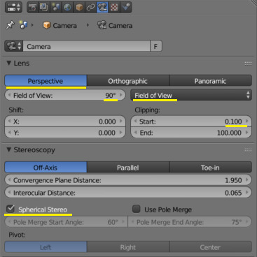
First, go to Perspective and set the field of view first to Field of View (by default it’s in millimeters) then something between 90 to 110 degrees. This is the field of view of your target device. They all have different fields of view, with the high-end devices being generally higher.
But in reality, 90 is fine and works for me both on my Vive and smartphone headsets.
Next, clipping. We’ll talk about that later as part of setting cameras, but you generally don’t want to get closer than 20cm to any objects - it’ll get harder for your eyes to focus. However, there will be occasions when it’s nice to do so anyway, so you want to set the clipping distance to be very short, or even 0.
Stereoscopy settings don’t seem to have a huge effect on the video I rendered, but the theory is that the convergence plane should be set near the center of action - it will make it easier to focus the eyes on what’s going on. Interocular distance should be that of the viewer. Unfortunately that’s impossible to anticipate, but leaving it at the default 65mm is fine.
EDIT: Important - enable “Spherical Stereo”. This is a new feature in Blender 2.78 to correctly render panoramic video for VR goggles. For 180 video it’s not too big a deal but will make the image cross-eyed as you turn your head around towards the edges.
Now switch the lens to Panoramic. There are some more settings for us there.
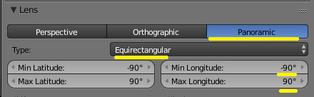
Set the type to Equirectangular, that displays best on most players. Fisheye will work too (It’s what SFMVR Stitch uses), but most smartphone players don’t support it well.
The next bit depends on what exactly you’re trying to render, but I like to do 180 degrees video rather than full 360. Unless there’s some stuff happening in the back of the camera, that should be fine.
For 180, change the longitude min to -90 and max to 90 as above. If you want to go for full 360 VR, leave it at the default: +-180.
Now go to your render settings.

The most important parameter here is the resolution. The resolution is now per eye, so the above is a good setting for 180 video: roughly 2K per eye, so your full video will be equivalent to 4K. For 360 video the X resolution should be 2 times higher than Y.
Frame rate is also important, and for best VR experience you want 60fps, no matter how painful it is to render. Here my original scene was keyframed at 24fps so I used time remapping to change that to 60. It causes weird behaviors if you try to work on your keyframes with this setting so leave it to default til just before you render.
4K, 60FPS seem like a lot and certainly it will take ages to render. But VR rewards you generosly for going overkill on theses things.
Scroll down some, to Output settings.
You want to render as IMAGES absolutely. Rendering an animation will take forever, so you really want to be able to stop and resume from the last frame if you need to, or if your computer crashes. For best quality, choose PNG with little to no compression. We’ll see later how to use the sequence to make a movie out of the images.
Below that is the views format. You want to choose Stereo 3D with either side-by-side or Top-bottom layout. If you’re doing 360 video, you should go for top-bottom, for 180 degrees, side-by-side is most common.
Now you could in theory hit Ctrl-F12 and start rendering, but I’ll advise you don’t waste your time doing that. You shot will be boring at best or unusable at worst. VR content isn’t shot like normal content, and you need to adjust your scene for that.
2. Setting the scene
I’ll flesh out this part of the tutorial soon, but for the basics.
After switching to stereoscopic rendering, your camera viewport may show a red and blue anaglyph picture. That’s not the most comfortable way to work, so press N to bring up the side menu, and under Stereoscopy, choose either Left or Right. You might want to change from time to time to make sure the field of view is unobstructed for both eyes.
You need to move the camera a lot closer to the subject matter. In the last step you’ve probably doubled your camera’s field of view. Without further adjustment, your subject will appear tiny and distant. Instead, you want to make the best use of your 180 degrees vision and make sure there’s something happening in most parts of the field.


Our varren buddy was at the right distance from a normal camera, but after we change to a panoramic one, he looks tiny! He will look bigger with the goggles on, but we still need to move the camera closer. We can also see things that we didn’t expect or want to be in the field of view - here my light planes are in, so I’m switching back to more conventional lights.

That’s better. I’ve moved the camera to about 1 meter from the varren. I could get even closer for more details, but he’s just snacked on a pyjack, so this is close enough. He’ll appear pretty close with the goggles on.
Don’t get closer than 20-30 cm from any object, or the eyes will have trouble focusing. Still worth doing sometimes however, see below.
It’s safer to just use a static camera to avoid causing VR sickness, especially if you’re doing an interior scene with lots of things in the background.
But with a uniform background you can move your camera around a bit without too much trouble, just do it slow and steady and minimize rotations. Remember the viewer can turn his head around if he wants to see a particular detail.
Try and get, maintain eye contact with your subject if possible, it’s one of your best tricks. You can even close in for a kissing scene for example, but do it slowly. If you’re into that you can also move objects just below the camera - it will look like they’re going in the viewer’s mouth - it’s surprisingly effective.
Some cozy time with Ciri (credit: dudefree) . Great use of lighting and eye contact there.
Be careful with glossy or transparency shaders. They look great but they can introduce an unpleasant sensation or make it hard for the eyes to focus in VR, especially when applied to close objects. Some times though they can look pretty good, so try and test for yourself what works or not.
Unfortunately, VR will make little details stand out so you may find problems with your scene that you never did before. Do plenty of test renders before you commit to rendering the whole animation.
Really, do some more test renders to check everything is good. Rendering at 4K takes a long time in Cycles, I’ve lost weeks of rendering because I didn’t check my scene well enough. You can render at half resolution (lower will make it uncomfortable to watch with 3d goggles), and with a frame step value. Still renders are useful but if you have a lot of motion you really want to do a preview of the full scene to be sure.
3. Optimizing
Now this is the painful part. If you thought rendering in Cycles was long, this is going to be many times worse, because we’re basically rendering at 4K with 60fps. The 9-second Jack scene I rendered for Likkezg took me about 80 hours to render, and I consider that to be extremely fast. Other scenes render much slower. This is where it really pays to know what causes long render times in Blender and to work on it.
This video does a great job of covering the basics, but I’m going to try and go a little bit further and show you what worked for me.
Turn on GPU rendering: If you can and haven’t already, this is a must for rendering moderately fast in Cycyles. This is found under User Preferences / System: Choose CUDA and your GPU as your Cycles compute device if available.
Sampling: These settings alone will have the most influence on your render time and quality.

Clamping will greatly reduce noise and “fireflies” at the expense of some highlights. I usually work with 5 direct and 2 indirect. It’s usually the first setting I adjust.
Note the clock icon next to Seed - it will ensure that your noise patterns are randomized for each individual frame. So even if each frame is a bit noisy, your 60fps video will look great!
The number of samples you need for a noise-free image can vary greatly depending on your scene. Some scenes will look good with a value of just 10 (Squared = 100 AA samples), whereas for others you’ll need much more. Try and experiment until you find a good value.
Light Paths: For me these settings have a fairly small impact on performance but you can try and adjust them anyway. Be warned that too low a setting can cause very visible issues with your scene.

You generally want to go with as low values as possible without altering your scene too visibly. If you’ve got a very noisy scene with many glossy shaders, you can try and set Filter Glossy at 1 or 2 to reduce noise. Some tutorials advise disabling caustics, reflective or refractive but I don’t like to: It makes the scene a lot duller for little performance gain.
Lighting: so, those 20 lights you added in to make sure every piece of your scene was subtly enhanced... great artistic work, but it’s going to kill your render times. Keep your lights to a minimum, a classic 3-point setup is good enough, with large and bright lights to minimize noise.
Lighting is often used to bring forward the geometry of a scene, and give the illusion of 3D. But here, you’ve got the real thing, or almost! You don’t necessarily need all the subtle shadows.
On the other hand, setting the atmosphere is just as important in VR, and clever use of lighting can do just that.

An intimate moment with Cassandra (Zalivstok / KDE)
Shaders: Cycles lets you easily build fantastic shader systems with a lot of complex effects, but more than anything else shaders can make the difference between rendering a frame in 4 minutes, or in an hour. You may need to rework your whole shader system both for performance, and for avoiding issues in VR.
Reflective, glossy and and transparent shaders can add a lot to a scene, but they can also confuse the eye in VR, and add a lot of noise. Use them sparingly, and do some hi-res test renders to check that they are performing as they should and don’t cause issues in VR.
Cutting: It goes without saying, but rendering just a couple seconds is easier than rendering a minute. If your animation has some relatively short loops, render just one and copy/paste it in the video editor. One cheap trick to manufacture a loop is to render an animation, then copy paste it in reverse in the video editor. This looks OK for some animations, terrible for others.
Previewing, and more previewing. Really, a scene looks different in the goggles than it does on screen. Check out your test renders in your VR system as much as possible, it’s the only way to be sure you’re not going to waste weeks rendering unusable crap.
4. Rendering
Well with all that setup done, it’s time to hit that big tempting render button, right?

SAVE your scene first. Not kidding. Then you can go and hit Ctrl-F12. See you in several days.
As I mentioned earlier it’s much better to render as separate images. You can stop rendering anytime and resume from the last frame. You can then use the blender movie editor to stitch them together and do some post-processing. More on that here.
Personally I like to encode my videos in H264, with a bitrate of 25000 to 30000, that should be readable by most systems whilst keeping the best possible quality.
Note that once you’re in Video Editor mode, if you’ve used the same settings as I’ve outlined above, you actually need to disable stereoscopy (The first step we did in part 1 - uncheck the Views box), and set your video resolution to 3840 x 1920. Otherwise it’ll take each frame you’ve rendered (Already with both eyes), and put these on each eye! There’s probably a better way to do it, but this works for me.
Encoding the video should be mercifully short compared to the render.
5. Viewing
First of all, the most important consideration: You’re going to put on a VR headset to watch porn, likely with headphones. Lock the fucking door!
With this said, how do you actually watch this? Virtualrealporn has a pretty comprehensive guide on how to watch VR movies on every existing platform. That’s a good starting place and I’ve got just a couple things to add from experience.
Personally I use a Vive with Simple VR Player, and I think it’s quite possibly the best way to consume VR available right now - although the latest Gear VR might be even better.
Simple VR Player is a paid app on Steam, but well worth the money. It uses the Vive controllers with a simple interface and lots of options under the hood. You should use 180 degrees SBS mode to view our videos from Blender. For videos from SFM, you will need to activate the fisheye option on top of that.
For Oculus or those who don’t want to shell out for a player, the free version of Whirligig will play almost every VR format - but again the pay version is much better. I find the interface a bit confusing in the free version.
On my Android smartphone, I use a no-brand VR mount that I got for free from a phone shop, and it’s pretty decent. Of all the VR players available, the three that seem to do the job best for me are AAA VR Cinema, VaR’s VR Player, and VR Player Free. Neither is perfect but they get the job done and play smoothly.
That’s it! I’m still pretty noob with Blender so if I missed something or got it horribly wrong, please tell me!
93 notes
·
View notes
Video
Rendering
This is my final animation, I came across several issues when rendering. I originally started rendering with 128 max samples, but I realised that it wouldn't render on time as it was taking 12 minutes a frame. So, to reach the original deadline I lowered it to 60 max samples, which took 2-3 minutes a frame. However, with the extension I decided to up it to 80 max samples. I found that the frames tended to vary depending on which section it was rendering. The first 100 frames would take 2 minutes to render, but on the whole most frames took 8 minutes to render however some did take 13 minutes. To make the deadline I decided to use several macs to render my frames. However, I had to keep monitoring the frames otherwise it would go to sleep; but I later realised that I could leave a YouTube video playing in full screen it wouldn't go to sleep. Another issue I had was that whenever I tried to render I got an immediate error. It took a while to find a solution, but I did eventually find one online. To fix the error I went to windows, settings/ preferences/ Renderman/ environment key/ reset. That fixed the issue however whenever I logged on to a new mac I had to do this. Additionally, to cut back on rendering times I deleted what couldn't be seen in frame; but if I were to do this again I would've just used multiple scenes.
Texturing
When creating the water surrounding the pagoda I considered using ocean shaders. I watched several videos on how to use shaders and even how to animate waves. However, I found it a bit too complex and I was starting to run out of time, so in the end I decided to use Renderman water textures. After texturing a circular plane, I realised that the water was clear and therefore didn't show up very well. So, to fix this I placed another circular plane underneath which I textured green using Renderman materials which allowed the water to reflect it. I installed Renderman on my laptop, but I couldn't use the textures as they had a lock sign next to the materials. I tried to find a solution online, but I didn't get anywhere, so I did all of my texturing at uni which was a little inconvenient, but it didn't ruin my project, so it wasn't a massive problem. I'm very pleased with how the colour scheme turned out. I started by using red as a base since it's very common for Chinese pagodas to be red, and then I used green as a secondary colour as it compliments red. I then added gold accents as gold is also very common in pagodas.
Modelling
To make the other floors I copied and pasted the second floor, but to add variance I rotated it, so the doorways didn't line up. I had trouble modelling the holes in the floors for the stairs as it was difficult to estimate where the stairs would be. So, it took some trial and error but I got a rough idea of where to make the hole with the multi-cut tool by repeatedly redoing in until I got it right. To make the lanterns I started with a sphere polygon and then I used the multi-cut tool to make a circle at the top and bottom. I then extruded the top face downwards so that it made a hole, I then deleted the bottom circular face. I then made another circular face around the existing faces at the top and bottom. I then extruded them to make a brim. Finally, I made other circular faces around the lantern by using the multi-cut tool and holding shift so that it connected around the lantern. I then extruded the faces to make ridges around the lanterns. If I were to redo the lanterns I would make them glow. Furthermore, for the plant at the top of the tower I used the significant object I modelled earlier. I also included golden statues of the plants on the ground floor. Originally, I wasn't going to put anything between the stairs, but I thought it looked too empty. So, I modelled a long rectangular plant pot using the multi-cut and extrude tool. I then copied and pasted the plant four times, but I adjusted each statue using the rotate and size tool so that there was more variance between the statues. I thought that a lot of the floors seemed very empty, so I decided to place lanterns inside as well.
Animation
For the grandfather clock I originally had the clocks key framed to move every 12 frames, but I found that it moved too quickly, so I changed it to move every 25 frames. Also, I had a lot of trouble animating the rope and bucket. At first, I thought it would be very simple to animate but it took a few tries because the rope and bucket kept moving at different times, so the rope would go through the bucket. I'm not entirely sure why this happened so I tried animating them separately and together. In the end I managed to get it to work by key-framing the rope and bucket together. I didn't have much trouble animating the camera, but I did use the timeline graph editor to adjust the frames. However, after receiving some feedback if I were to do this again I would slow it down and use multiple cameras so that it wouldn't seem too erratic.
Water
To animate the water, I used Bifrost. It took a few experiments, but I did manage to get the results I wanted. I started by creating a sphere polygon which I turned into a liquid. I then created a cube polygon which I elongated into a cuboid. I then extruded into the cuboid with offset on so that it left an edge. From there I deleted one of the faces, and then rotated the whole shape downwards at an angle. I then selected all of the liquid shapes/ properties in the outliner and then selected the cuboid; then I selected collider which means that the water now interacts with the cuboid. At first, I had some issues with this because I didn't realise I had to select all of the water elements, and I was just selecting the mesh. I then changed the water point size to 4 to make the particles larger, and then I changed the voxel size to 1.5 to increase the number of particles. At first, I couldn't figure out how to make it so the water started animating at a certain frame so to overcome this I decided to start a new scene for the water animation segment, which are frames 1375-1425. I later realised that there's an option under liquid properties called "start frame" which would've probably fixed this issue for me.
When I started rendering the frames with water I used Renderman but whenever I rendered what I at first thought was the collider kept showing up. To hide the collider and water mesh I had lowered the opacity to 0 so that it couldn't be seen. So, I tried hiding the collider and water mesh instead to try and fix this, but the same issue persisted. After doing some research I realised that Bifrost isn't supported by Renderman (either this or I didn't understand how to incorporate them together). From this I learnt that I should test absolutely everything before proceeding. To try and fix this I tried using Arnold to render the water animating separately. However, I couldn't figure out how to use Arnold lights and I was starting to run out of time. I watched several videos about how to use Arnold but I couldn't get it to work. Luckily, I tested out other renders and I realised that I could use Maya Hardware 2.0 to render the water. So, I rendered it separately which took 4 minutes. However, the issue with this was that the water would be on top of the bucket and plant pot when I wanted it to be behind it. So, to fix this once all of the frames were rendered I edited the water frames on top of the existing frames using Photoshop, and then I erased the water particles so that it appeared to be behind certain areas such as the bucket and plant pot. This wasn't a very elegant solution and I'm certain there's a better way of doing it but it got the job done and to me that's what's important.
Audio
Several weeks ago I asked about what kind of sounds we should include, whether diegetic or non-diegetic sounds are expected and I was told to focus mainly on sound effects. So, I decided to not include music and just have sound effects. I wanted to go for an eerie atmosphere, so I included some howling wind. I collected all my sound effects from https://freesound.org/
Compiling animation
When all my frames were rendered I used Photoshop to turn the frames into videos. To do this I opened Photoshop, opened the timeline window and uploaded the frames using stack scripts. By doing this it uploaded the rendered frames into layers. I tried to do all of the rendered frames in one go but this was too much, and Photoshop crashed, so I decided to do it in 100 frame segments. In the timeline window I then selected "create frame animation" and I then selected turn layers into frames which created the timeline. However, it turned out backwards, so I had to reverse the frames. From there I exported the videos. I originally intended to export them with transparent backgrounds which I thought it would do automatically as the rendered frames had transparent backgrounds. But I realised I needed to change the alpha channel to do this. I'm annoyed at myself for not realising this sooner because I had intended to use Aftereffects to create a star like background using CC particle effects, but as the backgrounds weren't transparent I had to settle for black backgrounds.
Errors
There are a few graphical errors in my final animation. For instance, within the first 200 frames there are some black patches on the first floor. These patches are modelling errors which I think happened because some polygons overlapped, or some surfaces are reversed. There were some errors I fixed before the final animation. For instance, there was one shape which I forgot to texture, so I retextured it and re-rendered the 64 frames it appeared in. Another error that's still in the animation is that the fences on the outside on the first and second floor flicker. This happened because when I was modelling I copied and pasted the fences for the other floors, however I must've accidentally copied the fences and left it on top of the existing fences. Which meant that when I textured the fence I didn't texture the existing copy on top of it; causing the textured to flicker against the untextured. I'm annoyed I didn't notice this until I was compiling my frames together. especially when I was texturing my assets as it could've been so easy to fix since I would've just deleted the untextured mesh. Another error occurred when I tried to fix another one. Originally, I noticed that the plant pot went through the floor and could be seen, meaning that there was a very noticeable red patch. To fix this I moved the plant pot upwards and re-rendered the 32 frames the error appeared in. The good thing is that this worked, however I'm not sure how it happened but I must've re-rendered some other frames later on in the animation. This was an issue because towards the end of the animation the plant sinks for a few frames and then returns to normal. On a side note, towards the beginning of the animation there is a black flash, and I suspect this happened when I was joining the videos together and I must’ve left a small gap between them.
When I was presenting my animation, I was very anxious to show this part because to me this was such a blatant mistake that could've been easily avoided if I had just kept a better track of my re-rendered frames. However, most people thought that it was just part of the animation which was a relief to hear. I would still prefer it to stay the same size, but I think it could've had a worse outcome. I did have another error relating to the plant pot, but I was able to fix this. When I was animating the water falling out of the bucket I had already animated the hook, rope and bucket moving which became an issue when I added the water and I realised it didn’t reach the plant pot. However, the solution to this was really simple as I just made the plant pot and soil wide enough until the water reached it.
Conclusion
Overall, I’m happy with my animation despite all of the mistakes I made. I am glad that I know the errors I made and how I would fix it because it’s given me insight into how to do better next time; however, it is a little annoying because some of the errors could’ve been so easy to fix if I had noticed them sooner or had better time management. Nonetheless I think I’ve come very far considering I hadn’t used Maya before this semester. At the start I found modelling incredibly difficult, so I am proud of how much modelling I included in my final animation. Furthermore, I do believe I’ve made a stylistic and atmospheric animation which I am satisfied with.
0 notes
Text
Devlog - 24.02.17
(Cross posted from https://triple.aye.net)
Oops, I missed a week and the devlog is late. Sorry! Game Dev and all that. Shipping late’s what we do…
I put off posting as I was hopeful that I’d have something nice to show, but things haven’t quite worked out as planned:
Next Game
I added a damage effect – the “damage beans” – on the screen edges to indicate that the player’s been hurt. It’s a simple post-process overlay, but with a normal map added you get a nice distortion of the screen as it fades in and out. Standard stuff for the most part. Except I have two versions, one that’s a blood-splat, and one that’s a nice high-res picture of actual baked beans. :D
I’ve also had a quick play with the audio system in UE4. My natural inclination is to integrate FMOD, but I’m hearing from fellow developers on Mastodon that UE4’s system is pretty good, and from the quick tests it might well be. Audio attenuation and geometry occlusion definite seem to work, which could be enough for what I need.
But for the last 10 days or so I’ve been playing around with look and feel tests.
This skybox got me into a lot of trouble.
My intention with Next Game is to do everything quite low-poly and avoid as much texturing as possible. One reason for that is to look different, but texturing and modelling take time, and time/money aren’t something that I have a lot of. If I have to get into texturing then I’d probably go for something old-school, like Gibhard or Strafe, but for obvious reasons I’d like to avoid that. I think every man and his dog will be doing that style in a year or two…
Unfortunately having a super realistic skybox lead me down a path where geometry got a bit too complex, and things rapidly looked incongruous when flat-shaded with high quality lighting. Basically, I couldn’t get it to look good unless it was extremely high-contrast. Which was unplayable. Although, I did spend a day flirting with an entirely black-and-white grading that I might go back to for some levels.
Anyway, I’ve thrown away all that work. All the geometry modelled so far, the test level, the greybox, all the materials and all the textures. That stung a bit.
This week I started again, but from a better footing: I chose a nice, harmonious, palette, and put a simple gradient in the sky-box. The palette is very limited: four base colours, four shades of each colour, and a gradient from top to bottom of each colour. I will most likely add to that over time, but for now this is working well.
UV-unwrapping can be done extremely quickly. Anything single colour can just be atlas unwrapped and pushed over the appropriate shade in the texture, while things with gradients just need a little more attention to align them properly over the gradient. Because the palette is fixed, everything sits in the scene, and with some lightmass settings tweaked I’m getting really rich colour gradients, colour bounces being picked up and deep shadows. It looks better, basically. It’s also super colourful, to the point of being cartoony – far too much for this game – but I find it easier to turn everything up to 11 and then slowly dial it in over time. (Early screenshots of Lumo are practically black because I was shooting for a Scooby-Doo vibe. The final game looks nothing like it…)
What needs sorting out now is the correct scale for things. My character moves extremely quickly, and rocket jumps go for miles. This will take a bit of two-and-fro, but that’s next week’s mission. At the minute everything’s a little too big but I find it quite endearing.
Iterate, iterate.
Neutrino
Still train-coding my way through this and the big news is, the tile map editor that I said I’d never write is basically done. It’s missing the ability to create re-usable brushes from placed tiles, so I might go back and add that at some point, but bar some tidying up and deciding on the save format it’s doing what I’ll need. This throw up a couple of interesting things.
I was about to delve into the murk of C’s directory and file-handling, which is annoyingly different depending on the platform, but decided to have a quick search through Github to see what was already out there, and came across this little gem: Tinydir, works brilliantly.
While testing the tilemap editor I thought I’d throw in some massive numbers to see how it performed. Turns out things started crawling pretty quickly, which was er, a shock. After pushing it through Richard Mitton’s Very Sleepy the hot spot seemed to be in how I’m populating the VBOs, which again, was a bit of a surprise. This was supposed to be an optimised version of what I’d written a few years back on iOS…
For some reason I was only getting ~8k sprites per frame. I was expecting quite a few more. The culprit was this line:
mTransform = mTranslate * mRotation * mScale;
Pretty standard stuff, this is just creating the translation matrix which I’m pushing all my vertices through before copying the result into the VBO. (Yes, at some point I should just do all that into the shader…) I’ve done this before and had much better performance, except then I was using my own math class, and this time I’m using OpenGL Math. I figured it’d be better to pass off the optimisation and maintenance of my maths stuff to, well, people that know some maths.
So I dug into the operator * overload:
GLM_FUNC_QUALIFIER tmat4x4<T, P> operator*(tmat4x4<T, P> const & m1, tmat4x4<T, P> const & m2) { typename tmat4x4<T, P>::col_type const SrcA0 = m1[0]; typename tmat4x4<T, P>::col_type const SrcA1 = m1[1]; typename tmat4x4<T, P>::col_type const SrcA2 = m1[2]; typename tmat4x4<T, P>::col_type const SrcA3 = m1[3]; typename tmat4x4<T, P>::col_type const SrcB0 = m2[0]; typename tmat4x4<T, P>::col_type const SrcB1 = m2[1]; typename tmat4x4<T, P>::col_type const SrcB2 = m2[2]; typename tmat4x4<T, P>::col_type const SrcB3 = m2[3]; tmat4x4<T, P> Result(uninitialize); Result[0] = SrcA0 * SrcB0[0] + SrcA1 * SrcB0[1] + SrcA2 * SrcB0[2] + SrcA3 * SrcB0[3]; Result[1] = SrcA0 * SrcB1[0] + SrcA1 * SrcB1[1] + SrcA2 * SrcB1[2] + SrcA3 * SrcB1[3]; Result[2] = SrcA0 * SrcB2[0] + SrcA1 * SrcB2[1] + SrcA2 * SrcB2[2] + SrcA3 * SrcB2[3]; Result[3] = SrcA0 * SrcB3[0] + SrcA1 * SrcB3[1] + SrcA2 * SrcB3[2] + SrcA3 * SrcB3[3]; return Result; }
Ow. That’s creating a lot of vec4 variables over the course of a few thousand sprites.
I admit, I’m learning GLM as I go, and maybe there’re some functions to do mat4 multiplications in place but the docs make my nose bleed, and to be honest I couldn’t be arsed to trawl through it all.
So instead of using a glm::mat4, my matrix is now a simple array, allocated at the start of the function, that only contains the scale and rotation. I can push the sprite corners through this and add the translation, and remove a lot of obviously zero multiplications from the process.
vBL.x = (vBL_Pos->x * s_mTransMat[0]) + (vBL_Pos->y * s_mTransMat[1]) + vPos->x; vBL.y = (vBL_Pos->y * s_mTransMat[3]) + (vBL_Pos->y * s_mTransMat[4]) + vPos->y; vBL.z = vPos->z; etc. etc.
This is fine for 2D stuff, which is all I intend to use this engine for.
And the result? About a 15x speed-up. In fact, I get exactly the same number of sprites out of a single thread on my X1 laptop, as I do on my big fat devrig: ~150k @ 60fps.
I’ll probably look to multi-thread this once the physics engine and fmod have been integrated, but for now it’s more than good enough for a little shoot-em-up.
The moral of the story: Future Gareth, you should probably look into how to use GLM properly.
2 notes
·
View notes
Text
Module Reflection
Over the course of the module I worked in two groups, the first, ‘My Adventure,’ for which I was just the modeller, and the second, ‘ROOMS,’ where I was far more involved, both conceptually and technically, and will thus be the focus of this reflection. Though officially filling the roles of Art Director and Lead 3D Artist, I was heavily involved in almost all parts of production.
Unlike my other group, this one started out with only an idea of what was to be made: a piece focusing on the weirdness of self-isolation, and how it made people feel. The presented idea was isometric rooms, with small contained scenes based on how people felt being cooped up inside. From this I developed the art style we would use, using simple, polygonal models with a hybrid material to give a pixelated, security-camera look, as interior security cameras are usually in the corner of a room. The set style did not stick, later changed to depict a cross-section of a more complete building, which I designed, but the core art style remained. I proposed and designed a more theatrical look to the environment, styling the individual rooms more like stages, where each could support the narrative told whilst also providing potential for environmental storytelling, and context for the animated characters. In order to differentiate between the ‘real’ and the ‘imagined,’ 2D animation would be used, but placed in the 3D scenes, rather than composited in over the top, as this would allow it to better interact with the characters and setting, and remain consistent with the theatrical look. The overall aesthetic was to be a pastel, cardboard-looking ‘doll house’ effect, to help emphasise both the feeling of being placed by a situation beyond your control, reflecting the theme of the piece, and to show how people construct their own worlds by way of imagination.
I had no part in the initial story development, and was simply given a list of scene ideas based on a range of people’s responses to an anonymous online questionnaire. From these concepts I was responsible for creating the script, starting with developing the ideas into multi-part stories taking place in and across multiple rooms, and laying the required rooms out in space, from which I developed the building plan, and then how these stories would be timed and spaced across it. This took multiple revisions, and collaborations from other team members, finally resulting in a single consistent story. After testing various camera movements, we decided on having near-continuous steady motion, but only directly horizontally or vertically, without zoom or rotation. The camera slowly tracks across the rooms on one floor, before stopping, then ascending or descending to the next. I also came up with the ideas to make the animation loop, in order to show the repetitive nature of life in lockdown, but later developed this to also have the camera movement partially loop once within the animation, creating a sense of déjà vu, where the viewer would believe the animation to have looped, but as it progresses the differences start to become more noticeable, causing the viewer to question what they previously saw. This would help to connect the viewer to the characters, challenging their perception of the passage of time.
Whilst developing the overall look and how the animation would play out, I was also responsible for the majority of the technical development. The project was initially planned to have a low-poly, stylised look, but nothing more specific than that. From playing around with settings for vertex normals and edge hardness I found a modelling style that looked effective, using a moderate level of faces, more than ‘low-poly’ would typically consist of, but making each face individually visible, rather than blending them together. Using ramp shaders highlights this further, but only along the colour borders, and also removes a lot of detail, and the option for textures. I tested colour blending to make a hybrid material setup, where I could still use textures and realistic lighting, but with exaggerated transitions between light and shadow, and, after a little experimentation, I found that a 3:1 ratio between textures and ramps gave the best effect, with an almost pixelated look as the model moves. The model I tested this on was an unfinished character for another project, and didn’t have any features, but this was decided to be incorporated into the look. Keeping the faces blank made them appear as representations of characters, keeping the focus on their actions, rather than personality, and better for an audience to identity with. Putting this into motion, in order to test a scene out, I had to construct a set, and work out how to best utilise the lighting and environment. I decided to use a cylindrical background, painted with the look of the sky over the course of a day, so that as the main directional light rotated and changed colour to represent the passage of time, the environment would match. Simple textured planes placed behind the scene, visible though the windows, appear to parallax as the camera moves and give a sense of depth. I did some basic character animation, testing out the use of dynamic clothing, as well as making sure the hybrid materials worked on the environment as well as they did on the character. I also tested the use of animated 2D planes in the scene for things the characters were imagining.
Once the tests and planning had been signed off, I began on making the actual assets, which would be used in a short, three room test render to accompany the treatment document, depicting the scenes of yoga, sailing in a cardboard box, and camping under a duvet. A single character base was made and UV’d, with individuals made by adjusting this with some minor scaling and sculpting. Though sharing the same base UVs, each model’s were optimised to better match the adjusted geometry. These models were given a basic rig and sent to the animators to animate whilst I modelled the clothes, in order to save time. With the building layout still not finalised at this time, I modified the same set from my tests to house the characters, and updated the lighting setup to better represent the scenes we were depicting. As not all the furniture assets were to be modelled by me, the other modellers each sent me a small batch of assets which I modified to match the style of the characters, then sent back to be used as reference for future assets to keep the aesthetic consistent. Finished models were UV’d by me, then moved to the asset library on the Google Drive, along with the UV exports to be textured. Once the animation was completed I placed the characters in the scene, with some slight adjustments to the timing of the keys, as well as the poses, to make sure the limbs didn’t clip through each other, which would mess up the dynamic clothing. For the camping character I had to export the animated model as an alembic so I could delete some of the faces around the joints, and use this modified mesh as the collider for the clothes. Once the main assets were done I could arrange and populate the rooms, applying the textures and setting up all the materials. Some assets, such as the beds, the fan, the tent, the clutter, and anything dynamic, like the curtains, were modelled be me, to best use the time we had. Anything I modelled I also textured, the set included, as our texture artist was also busy on another project. Though used very little in the rooms we had chosen to demonstrate, I also did the 2D animation for the scenes. The grass and shark fin were still planes with deformers and key frames, though the fire was animated frame-by-frame. Once all the scenes were fully built I did a second lighting pass, making sure the mood and ambience was correct, with a bright, shiny yoga scene, a slightly harsher and more desaturated sailing scene, and the dark, flickery firelight of the camping scene, complete with shadows from invisible trees. I then rendered the frames, and handed them over to receive the post-production.
Whilst my other group was very rigid, with everyone having specific roles, the lack of interaction and contribution from the group in the more conceptual aspects lead to a very stiff project that changed very little from conception to production, this group was the opposite. With everyone providing development suggestions, the project changed and evolved over the course of Research and Development, and ended up a far stronger piece than originally conceived. This open, flexible nature provided more opportunities for me to contribute to the group, collaborating on and assisting with parts of development that my roles did not cover, and, especially at the end, filling in for absent or work-laden team members. Overall, this project was more engaging, and thus more enjoyable to be a part of.
0 notes
Text
The Touryst is stunning – and one of the best Switch games of 2019 • Eurogamer.net
Quietly revealed in August, The Touryst from Shin’en Multimedia recently arrived on Nintendo Switch and quickly left a strong impression. With its voxelised design, smooth frame-rate and unique gameplay, it’s unlike anything the team has worked on to date – and I think it’s one of my favourite Switch releases of 2019. Beneath its stylised but relatively simplistic visual design lies one of the Switch’s most capable graphics engines – a game that basically never deviates from its target 60fps and never makes you wait more than a second. It’s fast, it’s beautiful and it’s worth checking out.
It’s the latest in a long line of technical showcases from Munich-based Shin’en Multimedia – ex-demo scene coders who’ve managed to extract phenomenal results from all Nintendo platforms, from Game Boy Color and Game Boy Advance to Switch. Users of Nintendo’s latest machine may be familiar with Fast RMX – an updated version of Fast Racing Neo originally released for Wii U. Fast RMX offers a whole slew of modern effects and techniques at an unwavering 60 frames per second and despite being a launch title, it’s still gorgeous – and one of the best-looking games on Switch. The Touryst heads in a completely different direction, but it’s equally as impressive – if not more so.
So, what is the Touryst? At its core, this is an exploration-driven adventure game. It’s a game that has you traveling across various islands solving the mysteries below the surface. The concept is simple yet the execution is simply perfect. It’s never explicitly spelled out what you should do in each area but it’s so satisfying when everything clicks. Each island is a beautiful chunk with its own themes and concepts. Leysure Island is one of my favorites – it includes a range of shops to mess around with including a theatre, a music store selling songs from previous Shin’en games and an arcade with three original games.
At its core, all of this is driven by the team’s in-house engine. According to Shin’en’s Manfred Linzner, The Touryst uses a deferred renderer building on the work done for Fast RMX. In order to maintain a smooth frame-rate, the team has once again opted to use a dynamic resolution system. In docked mode, resolution can vary from a maximum of 1080p to slightly less than 50 per cent on both axes. Typically, outdoor areas average around 810p to around 900p while indoor areas stick closer to full 1080p in most cases. Portable mode uses the same technique, with a maximum resolution of 720p and 50 per cent of that on each axis for the lower bounds. It typically jumps between 612p and 720p in this mode.
youtube
The Touryst is beautiful in motion – as you can see in this full-blown DF analysis video.
The team has opted to avoid anti-aliasing as pixelated edges fit directly into the visual style. Because everything is presented as voxel shapes, hard edges wind up looking perfectly acceptable in this specific game. It’s clear that these choices were made as a result of the art direction. The engine is mostly deferred but certain effects are forward rendered – that was a choice made that allows for a range of optimisations and increased artistic freedom during development.
Perhaps the most unusual visual element centres on the voxelized nature of the world. The Touryst still uses triangles as its primitive of choice but the way in which the models are created is fascinating. Essentially, the team uses a program known as MagicaVoxel – an 8-bit voxel editor and renderer. I took at a look at the tool myself and it’s possible to rapidly carve out and create unique designs. It’s a fun tool to use and Shin’ens designs are often beautiful to behold – enhanced via Maya and converted into a format compatible with the game engine.
While the overall look is relatively simple, environments still look rich and detailed. Elements like grass, flowers, rocks and animals are placed into the game world. To save on space, these are generated procedurally saving time and space. This ties directly into both loading and file size. The Touryst occupies just 231MB of storage, and almost completely free of loading screens. Traveling between islands and screens is nearly instantaneous. Even the bootup sequence is ridiculously fast. Compared to many of today’s releases, it’s a revelation!
Another key feature of The Touryst is its lighting. Everything is rendered internally in high dynamic range allowing improved contrast between bright and darker regions. Sub-surface scattering is also used on characters despite the abstract design. This is all combined with a strong depth of field effect which lends the action something similar to a tilt-shift appearance. Basically, Shin’en has managed to create a hybrid of stylised designs, as viewed through a more realistic lens, and embellished with a wealth of dynamic light sources.
Over 650,000 measured frames, The Touryst dropped just three. It’s as close to a fully locked 60fps as you get in video games.
Beyond this, I’m a big fan of the material choices. The Touryst omits any sort surface filtering, lending the game a pixelated aesthetic which I think suits the voxelised design. It’s especially effective on the often complex scenery – where a rocky wall can be made up of many different voxel points. It’s quite striking.
I also wanted to emphasise the brilliant mini arcade games included in The Touryst. Firstly, outside the arcade is a character who offers you money if you can beat his high score on all three games. This gives these mini-games a purpose beyond simply toying around – and beating those scores requires mastery of each game.
The most impressive of the three is Fast – an homage to Fast RMX and its prequels – and designed to simulate the look of classic Super Scaler arcade games. The mechanics are surprisingly solid and it’s addictive trying to beat the high score. The machine also uses a shader designed to simulate an old arcade monitor though, for my money, it goes a bit too far – a good CRT appears much sharper and cleaner than this. There’s always the sense the Shin’en go the extra mile. Here, the developer used a music program designed to simulate the sound of older retro hardware – so even the music on these mini-games sounds highly authentic.
The next game involves collecting sticks of dynamite in order while avoiding enemies or gobbling them up with a power pellet. It’s basically Pac-Man meets Jetpac and it’s pretty good fun. Lastly there’s an Arkanoid style block breaker game with a few interesting twists. Outside of the arcade games, however, the general sound design is also wonderful. The Touryst features proper surround sound, unlike many Switch games, and delivers a strong soundtrack with a mix of atmospheric music and more upbeat tracks. I love it.
And mobile performance is just as silky-smooth as it is in docked mode.
To re-cap then: the Touryst looks unique and wonderful, requires very little space on your Switch and loads-up almost instantly and features little to no additional loading screens. There’s a real sense of polish here that extends into game performance – one of Shin’en’s specialities. 60 frames per second locked has long been a focus for the studio with nearly every game it has deeloped running at this frame-rate. The Touryst follows suit: it aims to deliver 60 frames per second and it rarely falters. It’s one of the most stable games of the generation and it’s absolutely on par with the best that Nintendo itself has to offer.
This remains the case whether you play the game docked or in mobile mode – and it’s safe to say that situations like this are rare and interesting. We’ve recently upgraded our frame-rate test workflow to carry out the analysis as we capture the footage (as opposed to capturing, importing, and exporting). It improves the quality and quantity of our data and in the case of the Touryst, we have over three hours of capture analysted. Over 650,000 frames rendered and just three isolated frame-drops over the entire duration.
Shin’en has always been a studio that gets the best out of the target hardware but The Touryst pushes this ethos further than before – I genuinely think this is the best game the studio has made to date and the first to really deliver its own memorable, unique atmosphere. As you visit each island, it’s never immediately clear how you will achieve your goal or what the goals even are but due to the small scale of each island, it’s very satisfying to poke at the game until you start to understand what you must do. It’s nowhere near as abstract as something like Fez but it taps into that same sense of wonder and exploration.
For me then, The Touryst has become quite the surprise – it’s weirdly engaging and fun to play in a way that I didn’t fully expect. Even if you don’t think it’ll appeal to you, I’d urge you to find some way of checking it out. For me, this really is one of the best Switch releases of the year.
from EnterGamingXP https://entergamingxp.com/2019/12/the-touryst-is-stunning-and-one-of-the-best-switch-games-of-2019-%e2%80%a2-eurogamer-net/?utm_source=rss&utm_medium=rss&utm_campaign=the-touryst-is-stunning-and-one-of-the-best-switch-games-of-2019-%25e2%2580%25a2-eurogamer-net
0 notes
Last Seen Blogs

takimelbiselikosucu-blog
İsimsiz


justinstebbing22-blog
Justin Stebbing

softsan
m o n i 🍓

basbosa1998
Untitled