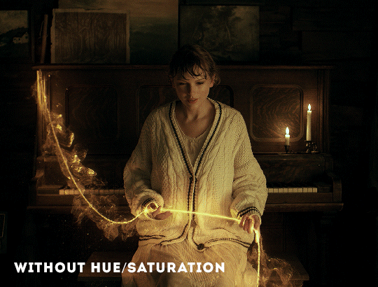
#but mine is set at 7% brightness hue and saturation if you use it too :)
Text

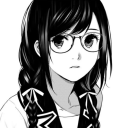
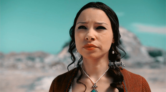
kylar with the teeth
#im on a ROLL guys.#my art#dol#kylar the loner#ill be honest. hes growing on me. but i still need to finish drawing everyone else#i need to learn how to draw them consistently.#also just want to update their designs a lil. just a bit#ALSO thank you SO much for all the compliments im going to SOB and CRY actually#i was reading the tags and SQUEALING like a FREAK#my brush is made with like a hue/saturation shift setting btw!!! i use sai2 with scatter brush but i think csp def has it too#but mine is set at 7% brightness hue and saturation if you use it too :)#oh also the statue in the thing is one of those art like. dolls? what are they called#anyways pretty funny right. right. laugh.
150 notes
·
View notes
Note
How do you color your gifs? They look so natural!
thank you! honestly, i've been making gifs for years and i look at a bunch of tutorials. i don't really use set psds for gifs because all sets are different. even in the same gifset i'm altering something depending on the colouring, lighting, etc. you just have to find what works for you! 💙
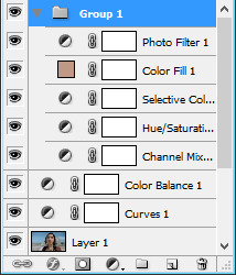
my typical colouring format once i have the gif made and sharpened is:
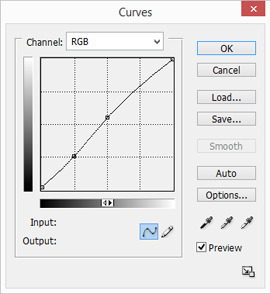
curves layer (use the lightest dropper and select the lightest point on your gif and the darkest dropper to select darkest point on your gif or even just an auto curves layer and adjust from there if need be)
levels layer
exposure layer
if i'm going to use a channel mixer layer this is absolutely where i put it every time so i can see what it looks like before i do anything else that's really going to touch the colouring process of a gif
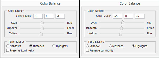
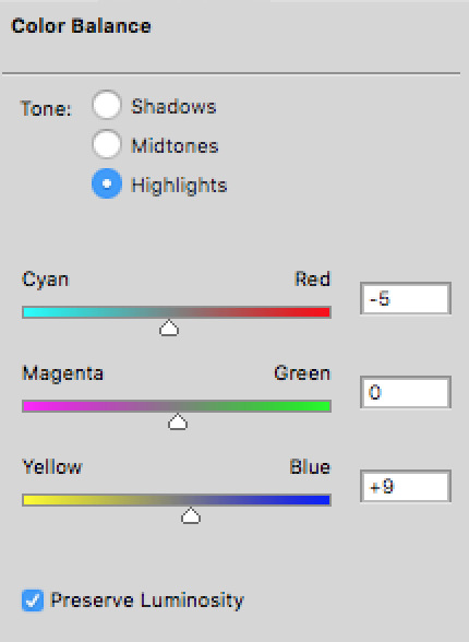
colour balance layer (this is another one where you really just have to play around with it and hope something works out to your liking. you don't want to mess around with this too much unless you're hoping for a more colourful gif but it does work to even out skin tones before you add selective colour layer. at least, that's what i use it for. and to balance the actual full scenes colouring since warmer scenes need some coolness to really make them work and cooler scenes need some warmth. this is a great tool to bring that back in where it's lacking)
sometimes i go in with a brightness and contrast layer here if there's anything i want to fix up before i start dealing with the actual colouring but i usually like to save that until later on which is just a preference of mine because if i can avoid using the brightness i will but at some point i always add some contrast at least. i only usually put a brightness and contrast layer in this spot if the scene is particularly dark so i can see what i'm working with.
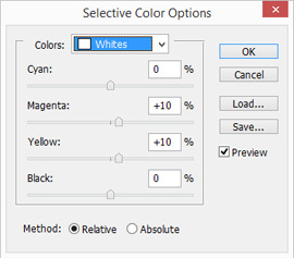
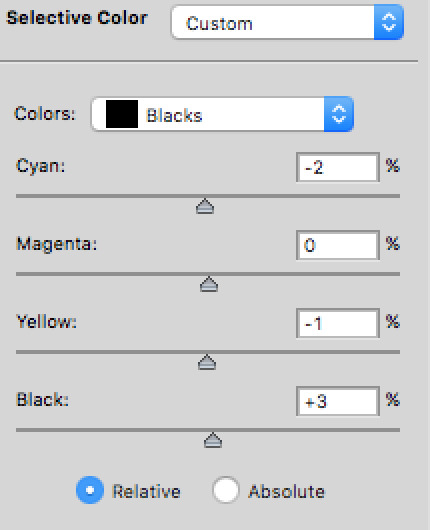
selective colour layer (very specifically the whites and blacks which i usually turn the whites to anywhere from -75 to -92 but it depends on the scene and the blacks are usually no higher than +7)
selective colour layer (here i mess around with the yellows and reds mostly for the skin tone purposes and play around with it until it looks the way i want which is usually more on the natural side or at least as natural as i can get it)
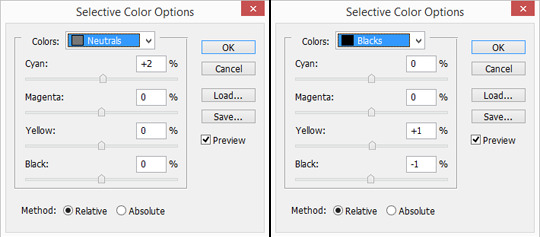
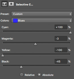
now i may go in with another selective colour layer here for all the other shades depending on the scene and/or if i want certain colours in the background or on the clothing to pop which i usually do and it's mostly blues and greens i play around with. i never, ever touch the neutrals option except on very rare occasions if i want to change the entire colour of the gif.
hue/saturation layer (i use this about 50% of the time and mainly just turn the saturation up but usually i don't go above like... +5)
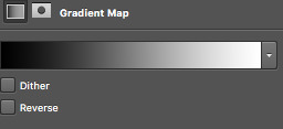
sometimes i'll add a gradient map layer here of some aqua/blue shade, set it to soft light, and turn the opacity down to about 10-20%) OR i'll add a black and white layer and do the same. mostly, it's the latter of these two.
lastly (well, kinda) this is 95% of the time where i'll put my brightness and contrast layer if the scene isn't particularly dark. if it is, i'll usually add another here as well as the one listed above. regardless - i usually end up with one in this position. never too much but again just to whatever your personal preference is.
other options: another curves layer (if i add one here it's typically an auto curves) or you can add a vibrance layer (which is my personal preference)
i actually have no idea what i'm doing so please don't take my word as holy grail! i appreciate the compliment, but i promise you - there are so many people who have made so many beautiful tutorials and i highly recommend sifting through the colouring tutorial tags for more comprehensible, in depth versions. this is just what works for me 💙💙💙💙💙💙💙💙
0 notes
Photo
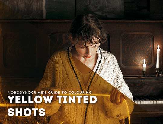
a couple of people have asked how i colour shots that have an awful yellow tint, and it was requested by an anon that i make a tutorial today, so... here we are.
this tutorial will detail on how i remove the yellow tint and touch on my basic colouring, and i’ve tried to make it as concise as possible. it’s aimed towards heavily tinted shots, though you’re welcome to also follow along with shots that are more subtle (you might not find step 3 necessary though).
please keep in mind that the more in-depth explanations are only applicable to the example shot i used, and when colouring your own, the settings will be different.
tutorial under the cut, please reblog if you can!
first, let’s start off with our shot. i’m using this one from the beginning of the willow music video:

as you can tell, the entire shot has a pretty heavy filter on it, and looks like an absolute pain to gif. but fear not, because we’re going to tackle that soon.
1. basic colouring
to start off, i like to do a very basic colouring, which includes using layers like curves, levels, and brightness/contrast. it’s more of a stylistic choice though most gifmakers would say that they’re pretty essential, and i find that using these helps create more definition and contrast:

we haven’t adjusted much except increased the intensity of the blacks, and you might be wondering, “ace, isn’t this bit a little pointless?” well, even though it doesn’t really adjust the colours or remove the tint, i think the gif wouldn’t look as nice without these layers (i’m also just a sucker for contrast).
2. channel mixer
immediately after this, i use channel mixer to help reduce the intensity of the yellow tint (note that i am reducing, not removing).
if you’re not sure how to use channel mixer, i highly recommend looking at kate’s tutorial here; it’s not something i’d want to skip learning, because it’s pretty essential for shots that involve heavy tints. nonetheless, i’ll try to explain what i’m doing throughout.
firstly, i went to the blue channel (as yellow and blue are contrast) and increased the green (+37) and blue (+118). i however decreased the red (-12) to try balance it out a little.

it was now a little too red for me, so i went to the red channel and decreased the red (+91).

and finally, i went to the green channel. i knew i wanted to increase the yellow in anticipation of the next step (which will make things less difficult), and similar to what i did with the blue channel, i increased the green (+115) and blue (+15), balancing this by decreasing the red (-7).

as you can tell, the yellow tint is a lot softer, but still pretty obvious. but don’t worry, in the next step, we’ll remove the yellow tint altogether.
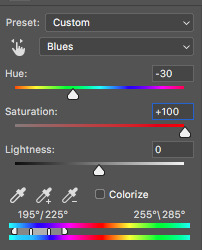
3. hue/saturation
this has to be my favourite step of the entire process, simply because the result is so satisfying.
without adjusting any of the other colours, go straight to the yellows and remove all the saturation (-100). it may look a little funny or the brightness may not be as you want it, so adjust the lightness accordingly (i adjusted mine to +64). just look at the difference:
after this, you can adjust the other colours. i increased the saturation in master, and adjusted the reds to help with taylor’s skin tone as it was now too pale.

4. finishing touches
now that the yellow tint has been removed, you can continue your colouring (if you need to). the adjustment layers i used were brightness/contrast, selective colour, another hue/saturation layer, and exposure; this created a more vibrant and brighter final product.

and voilà!
i hope that this tutorial will help you. if you have any questions, please feel free to send me an ask.
#gif tutorial#allresources#completeresources#userbecca#userfleur#userhella#userk8#userpavi#usernums#usersrina#usertreena#uservalentina#*tutorial#not me doing this in a couple of hours um akljsdghalskdg
2K notes
·
View notes
Photo

an updated psd faq/tutorial!
i’ve decided to create a masterpost of psd questions and tips based on messages and requests that get sent in! feel free to keep sending in questions or shoot me some messages. first i’ll start with what is a psd?
a psd:
this is a photoshop document. it’s commonly used in the editing world for icons or in the digital editing world to store any adjustment made on photos itself. i’ll be explaining further some tips on how i create my psds for my editing blogs!
how do you create a (soft) psd?
just a fair warning, my style of psds may not be the same as other psds. over the past few years, i’ve been inspired through soft blogs such as velvestuff & another popular editing blog who went by silkedits.
i’ve had a psd blog since 2017 and over the years i’ve gone through multiple editing epiphanies. i use the word epiphany due to the fact that if you were to take an icon i made back in 2017 and compare it to now, it’s incomparable. HAHA.
so basically, i’ve gone through multiple.. many.. MANY psd formulas and i’ve gone through trial an error and am finally satisfied with my product: so just know it doesn’t take overnight to perfect your craft.
for starters, i often had the issue of creating really dark and vibrant psds with a shit ton of hue. as of now how i start my psd with a negative brightness layer. normally for darker soft psds i go -30 and below, for my lighter soft psds i start off with about -20 to -15. this will save your psd from whitewash and will balance the tones. then i follow it with a saturation, normally i set my settings to -5 or -10. then i add a brightness layer again to around +7 or +10 (for lighter psds). i’m going to name this formula the balancing base (or foundation, if you will) for starting the psd off.
then, at this point on think about what vibe you want to give off with your icons or layouts. do you want a psd that’ll show red tones? purple tones? and start building from there. i normally follow up with a color balance layer.
lets say you want a purple psd, i.e. what you want to do is build the purple while also balancing the other colors. you can’t have a vibrant purple psd that’ll be too overruling, right? for purple psds, you can use the color balance formula -13, -14, and -14. this’ll even out the psd enough that it’ll still emphasize those purple tones, whilst not being too POW.
sometimes, i skip the color balance especially for icons (i normally use it for moodboards or layouts) since if used with a lot of icons and come when you do post your 9 icons, it’ll look too colorful. but that’s another topic.
another thing i focus on is gradients. i feel like gradients is like an upgraded version of color balance. you have more room to bring in stronger colors that you want. when i use this, i normally use 2 opposite colors. so if i wanted a purple psd, i’ll take the first color marker and put it on a dark brown, and then i’ll take the 2nd color marker and put it to a semi-dark violet/blue color. this’ll again: balance out the 2 colors. i’ll then set this to 70%, occasionally. after that i’ll apply a solid color to and orange/red color and set it to ‘hue’. then change the opacity to 20% (sometimes 30% depending on the picture used.) after gradients, i use a lot of photo filters!! they’re your bestfriend!! whenever you use it, stay on the high left side and it gives a touch of the photo filter, but nothing too heavy. this is also something i’ve learned myself.
it’s important to note that if you do find yourself with a vibrant photo, lets say your undertones or neutrals (in selective colors) are too red for some reason, which will 100000% happen often as it does to me, or your vibrance is high but you’re scared of lowering it because you’re satisfied with the results: just adjust the cyan to where it lowers that vibrance without ruining the result as much. this was such a struggle for me before and i found a way to fix it so now i’m sharing it!
lastly, another thing is you’ll ALWAYS have to adjust a psd. no psd will look good on any photo. for me it varies so i can’t really give specifics because i’m a perfectionist occasionally so every little thing bothers me. but just keep that in mind. the psd that you made could look good on one photo then look bad on others. so try to edit with tones on photos that your psd compliments.
also please remember guys!! creating a psd that you’ll be satisfied with won’t happen overnight. there’s been times i’ve quit because i just wasn’t satisfied enough because people don’t compliment my edits or it doesnt get enough likes. at this point, i dont even edit because of that. i do it because this is a passion of mine and i love to help people and i love to see my edits being used everywhere. it makes me happy to know that i inspire people too, so that motivates me even more. just keep working at it!
i’ll keep updating this masterpost whenever i get a question or get asked for help. until then i hope this helped you or whoever out! <3 you can bookmark this post or search it on my blog under #petitpsds help
#psd help#petitpsds faq#petitpsds help#photoshop#learn photoshop#Photoshop resources#photoshop help#photoshop coloring#soft#soft icons#soft psd#petitpsds#learning photoshop#psd#psds#colorings#coloring
96 notes
·
View notes
Text
✨jayshalstead’s icon tutorial✨
ok so if y’all are poor like me and are too cheap to buy photoshop, i made a little tutorial on how i make my icons using this site :)
in honor of my new url, i’ll show you the basics of how to make an icon like this

Step 1 - Base: first things first, start with an image. i usually get mine from hq-screencaps or any other capping site, or if i have something specific in mind and access to the episode, i’ll screen record and then cap it myself. also when in doubt, just google “character name screencaps” and sometimes i’ll use promo pictures and just general stuff from google lol
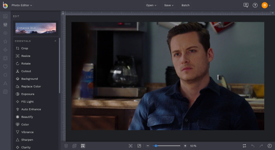
Step 2 - Cutout: this tool is how you remove the background of a photo to isolate the person. they just added this nifty little ‘remove background’ tool which almost always does a good job of cutting out the subject, but you caan always use the different paintbrush tools to edit
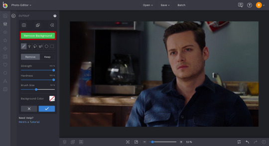
make sure that you select ‘trim transparency’ to make the image cutout as close as possible

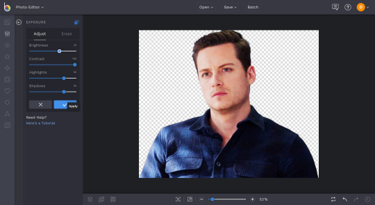
Step 3 - Exposure: adjusting the exposure is basically lightening or darkening an image. these are my typical brightness, contrast, highlight, and shadow settings -- depending on how dark/light the base image is, i adjust it accordingly
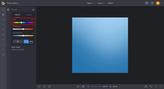
Step 4 - Saturation: depending on the image at this point and what i want it to look like, i adjust the saturation. if i want to make the colors brighter or if it’s too pale...

...or if i want to make the image pale/black and white
Step 5 - Beautify: this feature basically evens out the shadows to make the image look smoother, like its all on one ‘level’
Step 6 - Vibrance: this feature basically separates the colors to make the image more ~vibrant~. if the image looks too orange or too white, this is how you can adjust that. the lower the percentage, the whiter the vibrance; the higher the percentage, the more orange-ish tones come through
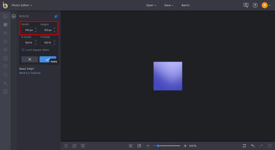
Step 7 - Resize: unless the starting image quality isn’t very good, i usually use a base height of 200px. since i make my icons 150x150, this size ensures that it doesn’t come out too blurry

Step 8 - Sharpen: after resizing the image is when i sharpen it, just making sure it looks crisp and clean

Step 9 - Export: that’s the basics! now you can save your image to your computer to use in just a hot minute
Step 10 - Background: so i have a bunch of backgrounds saved that i choose from but when in doubt, you can always use a simple gradient. there’s dozens of sites out there that are really easy to use and make gradients, just google it
i make my icons 150x150 px, so i always double check that and resize accordingly
Step 11 - Add Layer: this is when you can upload your saved image from your computer and add it as a layer

Step 12 - Resize: you can resize your layer however you want, trim the edges, etc. my go to height is 120px, but it all depends on the look you want

Step 13 - Recolor: even though i like the background i chose, i want to change the color just a bit. go to coloring and adjust the hue, which changes the color of the background image without affecting the layer
Step 14 - Flatten: once your background is the color you want and the layer is sized perfectly, flatten the layer onto the image

Step 15 - Save: you’re done! you can now save your icon. under ‘jpeg’, adjust the quality until it’s the highest it’ll go
then select ‘png’, title, and save!

22 notes
·
View notes
Text
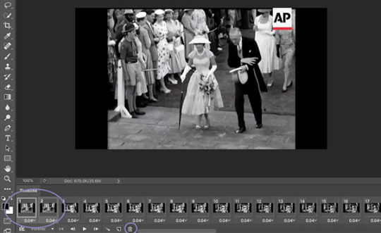
Gif Tutorial
I was recently asked for some tips for making gifs, so I thought I’d make a tutorial show how I make mine. I’m using Photoshop CC 2017 for this, but I think the steps should work for most versions of Photoshop. I previously used CS6 Extended but this version has disappeared from my laptop and left me with basic CS6 which I wasn’t able to gif with.
I download my video clips from Youtube or screen record from documentaries/other sources online.
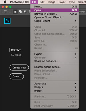
1. First open your Photoshop program and go to File > Open and open the video clip that you have saved.
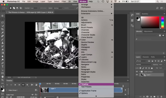
2. Once you’ve opened your video, you need to make sure the timeline window is open, to do this go to Window > Timeline. If you want to use the clip you’re using to make a single gif, rather than taking clips from a full video, then skip to step 5.
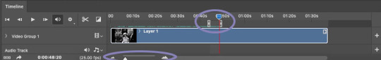
3. To save separate clips from a long video you need to adjust the dials below the time markers. To avoid having a gif that’s too large to upload to tumblr and also too long, I suggest keeping your clips to no more than 6 seconds (this may depend on your clip). You can zoom in closer to the time markers to see a more accurate time including seconds by using the slider tool at the bottom of the timeline window. Sliding towards the smaller mountain zooms out (showing the full clip length as in the screenshot), the bigger mountain zoom in, allowing you to see the seconds and create a more accurate clipping. Use the play button to the left of the window to play through your clip and adjust the dials as you wish.
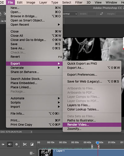
4. Once you’ve selected the clip you want to use, it’s time to save them. Go to File > Export > Render Video. A new window will open, where you can rename the clip and select a folder to save them to. You can ignore the other options.
You can go back and repeat step 3 and 4 as many times as you like to save the clips you want to gif. Tumblr has a limit of 10 images/gifs per post, but some tutorial and resource pages will show you how to put two gifs on to one canvas so you can upload more than 10 at a time.
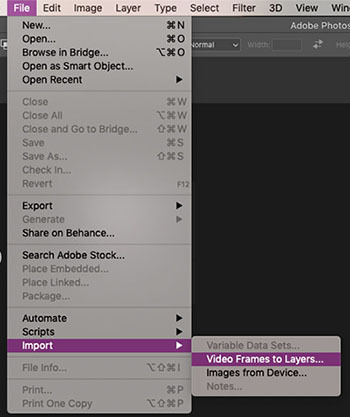
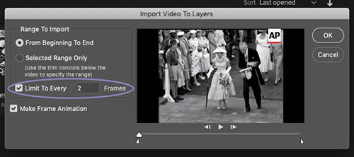
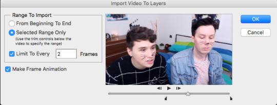
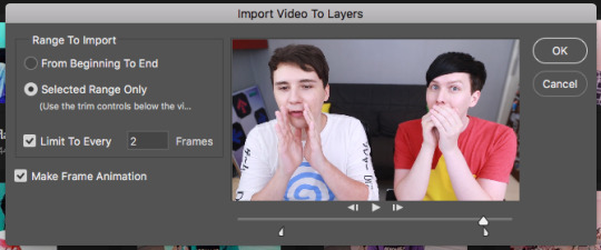
5. To start giffing, you need to import those clips you just saved. File > Import > Video Frames to Layers. As mentioned in step 2, if your video clip is short already then you don’t need to go through steps 3-4. Once the next window opens, you need to make sure that ‘Limit to Every 2 frames’ is ticked.
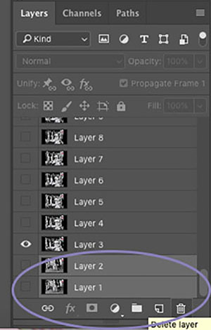
6. When I created my clip using step 3, there were some frames left over from the previous shot which I don’t want in my gif. To get rid of these, just select the frames you don’t want and you can either press the delete/backspace button on your keyboard, or click on the little bin icon. Now that you’ve deleted these frames from the timeline, you need to do the same in the layers window. Be sure not to delete the frame with the eye icon as this is now the first frame of your gif. You may need to have a scroll to the last frames in your clip, to check there aren’t any other excess frames you don’t want. If so, just follow these same steps.
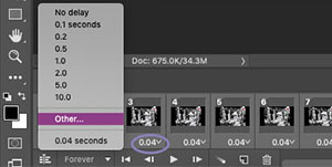
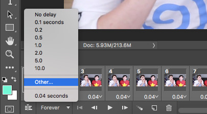
7. Next up we’re going to set the time delay between frames. This will determine how fast or slow your finished gif loops. To do this, you need to select all of the frames on your timeline, and click on the arrow next to the number shown (typically defaults at 0.04). The seconds shown in the list will make your gif run super slow - this is the delay between each frame, so if you select 5.0 there will be a five second delay between one frame and another. So, to choose your own time, select ‘Other’. For me, unless my chosen clip is super short where I might want it to loop a lot more slowly, I try to have my gifs play in as close to ‘real time’ as I can. I set my delay at 0.06 seconds and adjust it later on if needed. You can always press the play button and see how your gif runs, but this isn’t usually an accurate playback speed.
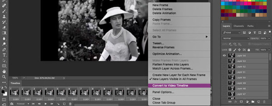
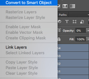
8. Once you’ve done this, you need to highlight all of the frames in the timeline window and all of the layers in the layer window. Next, click on the button that looks like three lines, on the right side of the timeline window and select ‘Convert to Video Timeline’. Then, in the layers window, right click one of the layers and select ‘Convert to Smart Object’. This will compress all of the layers into one, but will still be playable.
9. Now we’re going to crop your gif. First, you might want an idea of how what kind of layout you want for your gifs - this will depend on how many gifs per set you want. If you’re just making one gif, then set your crop with to 500px and your height to whatever works best (250, 300, 500 etc). Two gifs per set (if you want them side by side) need a width of 245px, three gifs side by side need a width of 160px. Before you crop, you should make sure that on the top bar ‘Delete Cropped Pixels’ is unticked. This will allow you to move your frame and re-crop the area.
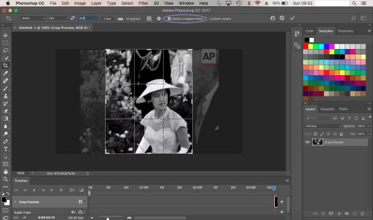
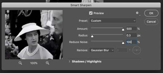
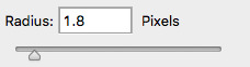
10. Once you’re happy with your cropped area, it’s time to make some adjustments. For my gif, I want it to have a width of 245px and a height of 300px. To change the size of your image you need to go to the top menu bar and select Image > Image Size. Make sure the measurements are set to pixels. Next we need to sharpen the image, so we go to Filter > Sharpen > Smart Sharpen. I always have mine set to 500% for the Amount, 0.3px for the Radius. In CS6, Smart Sharpen didn’t have an option to reduce noise, so I just set this to 100% as this seemed to work best for the quality. It helps if you have Preview ticked, so you can see how the adjustments affect your image.
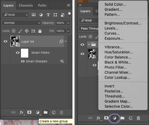
11. Now it’s time to start applying filters! To keep everything together in one place, you’ll want to create a new group so click on the little folder icon at the bottom of the layers window. Then click on the round icon to the left of it - here are your adjustment options. Have a play around with these and see which ones work best for you. Click on the eye symbol next to the adjustment layer will turn the layer visibility off, so you can see the effect it has on your image and see if you need to make any changes.
I tend to edit all of my gifs in the same style, the only difference being the options I use for black and white gifs, and those for colour. My basic go-to adjustments are Brightness/Contrast, Levels, Selective Colour (W/N/B for B&W, all colours for coloured gifs). To create a level tone for my B&W gifs, I apply a Gradient Map, fading from black into a very light grey. Colour gifs - I play around with Vibrance, Hue/Saturation and Colour Balance. It doesn’t hurt to play through your gif while you’re editing, to see if the settings your using work for all frames and not just the cover.
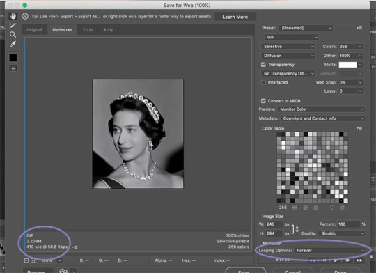
12. Once you’re happy with your gif, we need to save that masterpiece. Go to File > Export > Save for Web (Legacy). Some version of PS might just say ‘Save for Web’. In the next window, the only thing you need to do is select ‘Forever’ in the Looping Options drop down menu. Here, you can also check the size of your gif and make sure it’s below the 3MB limit. If it’s over, then you may need to go back and cut the length of your clip a little by adjusting the sliders in the same way as in step 3. If it’s a tiny bit over the limit, shaving a second or two off of your clip should be enough. If it’s over by a lot then you may need to split your gif into two. Again, following step 3, you can simply adjust the sliders to split the timeline into two sections. Once you’ve done this try saving again and check the size. When you’re happy, all you need to do is click Save and you’re done! You’ll need to do this for every clip you want to gif. The more you gif, the easier it’ll become and you’ll find your own rhythm where it may take only a few minutes to make one gif.
As mentioned earlier, if your final gif playback is too fast/slow all you need to do is drag and drop the finished gif back into PS and adjust the time delay as per step 7. You can change this and save it again as many times as you like until it’s right for you.
** TIP ** Never close your tab window until you’re 100% happy with your gif, to the point that you’ve uploaded it. If you’ve noticed a mistake or a problem with your gif this allows you to go back and edit it without having to start over again. Also you can save your work in progress as a PDF at anytime. Trust me, there’s been many a time where I’ve closed my window and had to start again if there’s been a mistake.
21 notes
·
View notes
Photo


Orange and Teal Coloring Tutorial
Difficulty Level: Intermediate to Advanced
I'm using Photoshop CS2, but this will work in any version 5.0 or later. Your adjustment layer panels may look a bit different from mine but they do the same thing.
This effect works best on images with a variety of colors and few grays, and without a strong color cast. It looks really great on images of people alongside blue sky or bodies of water. It also helps if the image can be brightened easily.
First off, I want to say I didn't come up with this method. There's tons of tutorials online for how to do it, this is just my version geared towards coloring screencaps. I learned this from this video by Denny's Tips.
I'm going to be using this screencap of Max from Black Sails.

Step 1
Brighten and add contrast however you prefer when starting. If you feel your image needs color correcting, hold off for now.
This screencap is already very bright so I made some very minor adjustments with a curves layer and set it to 80%.
Step 2
Here's where the magic happens. Add a channel mixer adjustment level and go into the blue output channel. Change green to +100 and blue to 0. This dumps all the information on the blue channel onto the green channel. Now you have a red and cyan duotone.

If it looks all red/pink or all cyan, or there’s a ton of gray or taupe, the image doesn't have enough variety in color for the effect to work well. If you think you can fix that with color correction (for example if the original image has a strong blue or cyan cast on skintones), turn off the channel mixer layer and add your color correcting layers below it. Then turn the layer back on.
Step 3
Now we need to change the red into orange. You can do this with a hue/saturation layer and a selective color layer, or just a selective color layer. I'm going to do the former.
In the hue/saturation panel, go into reds and increase the saturation to around +40. Then move the hue slider to the right to make an orange color. Stop wherever looks good to you.
Keep in mind that in most cases, skintones will appear to lighten as the slider gets closer to yellow. The saturation balances this out a bit, but we'll need the help of selective color and other layers to make sure POC aren't whitewashed and the undertones don't look off. Max has a golden skintone, so I'm moving the slider closer to yellow.
Go into cyans and increase the saturation. Usually I use the same number as the reds, but if there’s a lot more cyan than red in your image you might want to add less saturation to the cyans to help the red stand out. In most tutorials I've seen, this effect is actually an orange and cyan duotone despite the name, but I prefer how it looks with teal, which is greener than cyan. If you also want a teal color, an optional step is moving the hue slider to around -3.


Step 4
Add a selective color adjustment layer. We're going to make more adjustments to the orange color and enhance both the orange and cyan. This is also where you can make the cyan more teal if you prefer.
Select reds. Cyan -100, Magenta +100, Yellow +100 will push red as far as it can go. But we want orange, so put a lower number for magenta than yellow. If you want a more muted color, use a higher number for cyan. I'm adding some black as well to make sure Max's skin isn't too light.
Select cyans. Cyan +100, Magenta -100, Yellow -100 will push it as far as it can go. Use a higher number for yellow if you want a teal color.

Even though we added yellow to the red, and may have added yellow to the cyan, there's still not enough data in the yellows and greens for adjustments to really make a difference.
I like to add some yellow and sometimes also magenta into the whites to put some color back into the highlights of the skin.
You may also want to adjust the neutrals and blacks, but be careful not to ruin the duotone effect.

Step 5
This is looking pretty good, but we can still improve it. Now is the time to do color correction on the original image if you want. I had you hold off until now because it's not always necessary for this effect, and while it can improve the results, it doesn't always depending on what color the cast is and what you're correcting it to.
Combine your channel mixer, hue/saturation, and selective color layers into a group (CTRL + G) and turn the group off. Add your color correcting layers below this group - it's best if the adjustments are minor. Then turn the group back on and see if you like how it looks.
For this image, I wanted to see if I could add some color into the sand behind Max. Correcting the slight blue cast on the sand in the original image achieved this, but it also made her skin more saturated than I wanted once I turned the group back on. I balanced this out by going back into the selective color layer and adding more black to the reds.
Step 6
Now I like to add oranges and browns to the whole image to ensure the skintones aren't too unnaturally orange, bring the cyans closer to teal, and correct skintones on POC if necessary.
I went back to my original image and selected a midtone on Max's face, then made a solid color fill layer at the top of the group. Usually I choose multiply or soft light for the blend mode. Set at a low opacity. My settings here are #c09886 set to multiply at 8%.
The photo filter adjustment can also be helpful here. Use one of the warming filters, an orange or yellow, or sepia. For this image I picked sepia and set the layer to 50%.

It’s subtle but I promise there’s a difference.
Step 7
And you're done! The group you've created should work on most other images, but obviously to get the best results you'll need to tweak it for each image.
Please like or reblog if you found this helpful.
229 notes
·
View notes
Text
GIF TUTORIAL
i’m finally getting around to giving the people what they want!! i hit 2.5k like 3 weeks ago and asked you guys what you would like me to do in honour of that...the resounding answer was ‘gif tutorial’ !!!!
so!! in true dnp fashion i’m merely here to give the people what they want and the people have demanded a gif tutorial, so here it is!
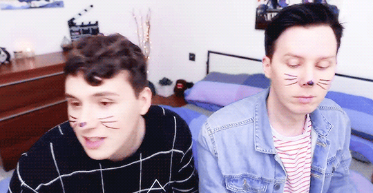
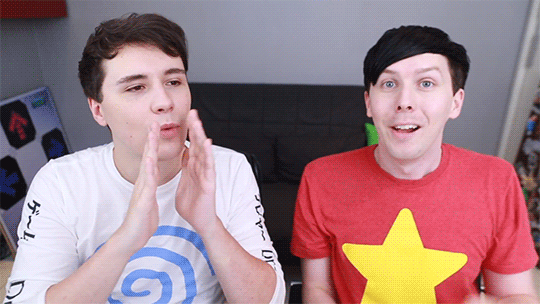
we’ll be learning to how to create this gif right here!

please keep in mind that this is how i make gifs!! everyone does things slightly differently and what i say and do may not match up with other people or your own personal style and that’s okay! editing is all about creative freedoms and you may use this as a basic starter so that you can branch into your own thing or you might really like how i do things and use the same methods. point is, it’s perfectly okay either way!!
right so!! let’s get the basic bullshit out of the way! i use ps cs6 but it’s basically all the same, so this should work perfectly fine no matter what ps you use.
1. we’re firstly going to choose our video to gif. for this tutorial, i’ve chosen pinof 10! pick a moment you like and get the timestamps from when the moment starts and finishes. i usually get a second before and a second after to make sure i’ve got it all!!


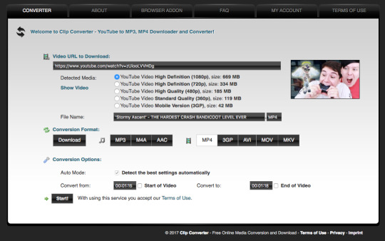
2. we’re now going to copy the url of the video and go to clip converter. clip converter basically is going to give us an mp4 version of our little timestamps so that we can put them into photoshop and make gifs from them! paste the url of the vid into clip converter and press enter once. once you’ve done that follow my settings and press start
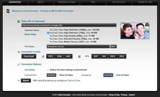
(of course you can name it whatever you want and put whatever timestamps you want in!!)
once it’s done converting, it’ll give you a download of your mp4 clip, which you’ll click!
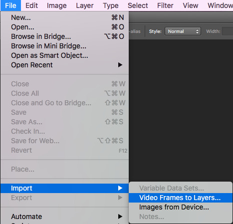
3. now open your photoshop. go to file, import, video frames to layers, like shown and select your video
once you’ve done that, put these settings in and trim the clip to your liking (the little black place holder things trim the clip!)
4. okay so!! we now have our gif imported and open on photoshop! we have to make it much smaller because right now it’s like...huge (that’s what she said hehehe)
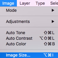
simply click on image at the top of your computer and press ‘image size’, like shown
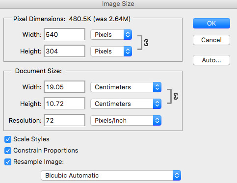
then make your settings like shown
5. so that’s done!! now, we have to change the pace of our gif to be a bit slower. i make my gifs real slow apparently but,,,,,personal preference man. click on the first frame of your gif and then scroll to the end of the frames of your gif. hold the shift button and click the last frame. this will select all your frames. press the little arrow thingy near the time of the frames. this will allow you to change the pace of your gif. press other and change the timing of the gif to whatever you want! i make my gifs like 0.07 normally but for this gif, i made it 0.09 because they’re moving so fast and it was giving me whiplash. anything under 0.1 is great!!
6. cropping time! you don’t have to crop your gif if you’d like, but mine is a little big for me, so i’m going to and show you how to do that! so basically press the cropping tool and put in the measurements you’d like, as i’ve done.

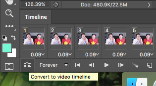
7. now we’re ready to convert our gif to the timeline method! select all your frames again, like before, as well as your layers. selecting your layers is the same as selecting your frames, so nothing new there, don’t worry! once everything is selected, press this lil guy.

once our gif is in the timeline method, right click your layers that should all be selected and turn them into a smart object, as shown!
8. righty-o! we’ve done all the boring, dumb shit! time to use an action to make our gif look a little nicer and sharper! i really can’t be assed showing you how to use an action in here because i suck and this is long as fuck as it is but!! i am nice enough to link you to a basic tutorial on how to use actions and how to download them! you can find that here! right so, i use a certain action on all my gifs and then edit it slightly, which i’ll show you! you can find a download for the action i use here !!!
i play that action and now my gif looks much nicer! however, it’s not quite the way i like it, so i push the gaussian blur layer to the bottom and i adjust the strength of it to this!
9. i lied. now we’re up to the fun part!! colouring!! colouring is my best friend and i love her dearly!! technically you could stop now and save your gif and be done but....that’s boring as fuck!
right so, colouring really, truly is your own preference, loves. you can do whatever you like, you do NOT have to follow what i put here. this is simply the colouring i chose for this gif. i do literally whatever i feel like every time i make a gif, so it’s forever changing!
i gave a bit of thought to what kind of colouring i’d do in this tutorial. did i want to do something extra basic and like...no colour changing? did i want to do something wildly vibrant? and then i decided not to do either of those things! so today, i’m going to teach you how to create a soft, almost pastel blue/purple colouring for the ap room *cough* set *cough*!!
firstly, here is the adjustment panel where all the tools you need for colouring reside !!

we’re firstly going to start with the boring crap,,,,,so i lied again....oops. firstly, we’re going to adjust the brightness, the levels and the curves. here are my setting for each, if you’d like to copy them!


here’s how the gif looks without all our colour layers!

10. and now all that crap is done, i promise it’s actually the fun stuff!! selective colour is where all the magic happens! i sometimes do two, three or even four selective colour layers, depending on just how heavy the colour changing is going to be in my gifs, as well as using hue/saturation, colour balance and gradient maps!!
firstly, we’ll start off with our first selective colour layer! here are my settings for it (sorry for all the pics rip)


once you’ve got all those sorted, onto a hue/saturation layer! this basically drastically changes the colours, if you’d like it to but it’s not quite as accurate or smooth as a selective colour layer, so i only really use it for small things or if the colour i’d like can be acchieved nicely with it. i didn’t change anything in the master setting, but here are my settings for the things i did change!

aaaaaaaand now we do another selective colour layer! i’ll just show you the layers i did change...everything else, leave as is!!
11. next is a few gradient maps and a layer of vibrance!! i promise, we’re almost done!! i add a bunch of probably unnecessary bullshit to my gifs but i like how it looks with all the extra stuff so!!! yeah!! make your first gradient map black and white, as shown and set the opacity to 10%
next step is to create a vibrance layer! when making a bright, colourful gif, i use about two or three vibrancy layers. i never EVER adjust the saturation, only the vibrancy. adjusting the saturation makes everything too heavy and it just looks kinda icky to me. the first layer, i normaly adjust the vibrancy to 100% and the rest being between like 20-50%, depending. i just thought i’d tell you guys because that’s vital if you’re making bright gifs!
we however are not, so i only adjusted the vibrancy to +14%, leaving the saturation alone....nasty saturation !!!
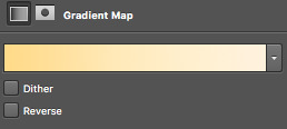
aaaaaaaaaaaaand finally, we are up to our last adjustment layer!! it is yet another gradient map oops. this gradient map is a light golden colour and i downloaded it in a pack somewhere ages ago. i do not remember where and i know that photoshop’s default gradient maps don’t have something like it so if you’d like, you can definitely just skip this last layer!! it’s not vital, i just think it gives the gif a nice touch!
for reference, the gradient map looks like this and i set it to 6% opacity!
12. that’s it!! the gif is complete! go to file, save for web and press on that! you might have to wait a little bit for it to load...photoshop is a really shit program sometimes, guys. once it loads you’ll see all these confusing settings. simply copy what i have here!

this is also the moment i realise my gif is over 3mb and go to fucking smack my head against a desk. tumblr basically has a thing against gif makers and will NOT allow gifs over 3mb to play once posted. this can be fixed though! i’ll show you how to shorten a gif right now because well...if you followed this tutorial, you’re stuck in the same boat as me and need to know how to fix it!!
so basically save your gif as is right now! now, we’re going to open the gif we just saved into photoshop. go to file, open and select your gif. it’ll open as a frame animation which is perfect! now, delete whatever frames from the start and end that you think you can live without. never delete frames from the middle because that’ll just disrupt the gif altogether. the less frames, the better!!
i got my gif down to 40 frames by deleting the first 15 frames of the gif and the last like 6 or so. now go back to ‘save for web’ and save this shorter gif as a whole new gif! this should be under 3mb. if it is not, go cancel the save and delete some more frames!
once that’s done....you’re done!!! congratulations!! you’ve made your very first gif, my dear!!!! here’s the finished labour of your hard work!!
i hope i wasn’t too confusing and i hope you now have a sound understanding of how to make a gif! if you’d like me to make another tutorial on something specific related to gifmaking or even to do with edits and edit-making, just send me an ask and i’ll see what i can do for you! happy giffing, loves!!
#i spent my entire day on this holy fuck#making tutorials takes fucking TIME !!!#but i've finally done it and i hope you guys get something out of it!!#i love you all !!#thank you for 2.5k <3#photoshop#yeahps#gifs#gifmaking#gif tutorial#completeresources#itsphotoshop#i have no idea how to tag this can u tell??#my gifs#my tutorials#hi im posting this now because there are people#gbfhbdfbghgthjdfbh
125 notes
·
View notes
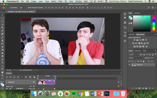
Photo

(unofficially titled: how to change the grey wall)
As a thank you for reaching 2.5k followers, I thought it was about time to stop being lazy and do a gif tutorial as it has been frequently requested. Hopefully, this will help anyone who wants to start making gifs as well as anyone who wants to understand how to create colourings!
What You Will Need:
- Photoshop (I use CC)
- A source video
What Will Be Covered:
- How to get the video
- Timing, Resizing & Cropping
- Sharpening
- Colouring (and how to achieve extra af colours)
- Subtitles
- Saving your gif
This is going to be very thorough and informative (to the best of my ability) so all the information on how to make gifs is below the cut! As a disclaimer, you can use any version of photoshop for this.
1. Getting the Video.
For this tutorial, I’ll be using a random clip from Dan & Phil’s crash bandicoot video. There are a lot of different methods to download a youtube video but I prefer using clipconverter. When downloading a video, you want to get the highest quality available (always try to get at least 720p). I used the download settings shown below:
Once it’s downloaded, open up photoshop and import the video. To do this, go to File > Import > Video frames to layers. I use the settings shown below. (I had to trim the video slightly to only include the part I wanted)
Now that your video is imported, make sure your workspace looks similar to mine (the timeline section is the most important thing for gif making. you can add it from the window menu).

2. Timing, Resizing & Cropping.
Timing is super important in making sure your gifs aren’t too fast or too slow. To alter the frame rate, select all your frames (shown at the bottom of your workspace) and then click on where it says 0.04 change the speed to 0.09.
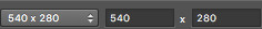
After that, we have to change the image size since it’s currently way too big for tumblr. To do this, go to Image > Image size and change it to the settings shown below. 540px is the current optimised sizing for tumblr although 268px is used when making gifs that will be displayed in two columns like this.

Cropping is an optional step that I sometimes do as a way to make the file size smaller/for the aesthetic. Youtube videos have a default ratio of 16:9 and to alter the ratio you just use the crop tool and change it to what you desire. side note: I often use the cinematic ratio of 2.35:1 (i used it in this tutorial’s header).
3. Sharpening.
Sharpening your gifs is essential to making them look clean and crisp. Below is the difference between what our current gif looks like with and without it:
Without:
With:

As you can see, the second gif is way more crisp and defined. I use this action to sharpen my gifs (Full details on how to use it can be found in the link.) Once the action is finished, I then convert the frames into a video timeline by pressing the button in the bottom left:
I then select all the layers, right click, and convert to smart object. Now your workspace should look like this:
4. Colouring.
Colouring is by far my favourite part about gifmaking and the reason why I made this tute (questions about colour have always filled up my inbox so I hope this answers some of them). I’m going to show you how to make the same bright blue colouring that I used for the header!
I’d like to start by saying that I never took art or design classes so my knowledge on why adjustment layers do what they do is very minimal. I pretty much learnt how to colour by playing around in Photoshop so this is just a disclaimer about how there is probably an easier/proper/more informative way to do this.
I didn’t particularly know how to explain half the settings so some will be accompanied by screenshots while others will just have descriptions (I really hope it makes sense because heck, my colouring method is chaotic).
Firstly, we want to make a new group to put the adjustments in so to do this you go to Layers > New Group... and make sure the mode is set to pass through.
To create colourings, I use the following adjustments:
- Vibrance
- Curve
- Levels
- Brightness/Contrast
- Selective Colour
- Hue/Saturation
- Colour Balance (occasionally)
Vibrance: I almost always make the vibrance +100 (I don’t alter saturation)
Curves: how you make a curve will differ with every video but for this gif I set my curves to this

Levels: it does a similar job to curves tbh
Brightness/Contrast: I chose not to alter it for this tute.
Selective Colour: now this is where A LOT of adjustment is going to happen. I found this section the hardest to explain so I apologise in advance. I tend to heavily alter cyan and blue.
Since we have the ability to alter red, yellow, green, cyan, blue, magenta, white, neutral, and black, I’ll write the specific adjustments I used instead of adding a lot of pictures to this already massive post. But this is what selective colour looks like:
Reds: Cyan -34, Magenta +5, Yellow +8, Black - 7
Yellows: Cyan - 37, Magenta -31, Yellow +35, Black +14
Cyans: Cyan +100, Magenta +100, Yellow -100, Black -36
Blues: Cyan +100, Magenta -65, Yellow -100, Black -26
Now this is what it should look like after adding all those adjustments:
Yes, it is slightly blue but not THAT blue. We then have to add a second selective colour layer with these settings:
Cyans: Cyan +100, Magenta +15, Yellow -100, Black - 8
Blues: Cyan +100, Magenta -21, Yellow -100, Black +15
Blacks: Cyan 0, Magenta 0, Yellow 0, Black +20
(more selective colours will be added later because I’m extra)
Hue/Saturation: This a neat adjustment where you can turn one colour into a completely different colour. For this gif, I chose only to adjust the colour blue with these settings:
Now you’re probably confused at why it looks so noisy but don’t worry! We’re going to fix that (this is where it gets kinda tedious. Feel free not to use the hue/sat adjustment if you want to make your gifs quickly. I wanted to make this tutorial super in depth hence why it’s about to get problematic)
Selective Colour (Again): You now have to create a 3rd selective colour layer and place it under the hue/sat layer before using these settings:
Magentas: Cyan +100, Magenta -100, Yellow +100, Black +79
Cyans: Cyan +100, Magenta +100, Yellow +5, Black 0
Blues: Cyan +100, Magenta -16, Yellow +100, Black -47
Your gif should now look like this:

Some noise will still remain and we’re going to fix that by erasing some of the adjustment layers! You may notice that the far right behind Phil looks messy so, with the erasure tool, erase that area on the hue/sat layer.
There is also some noise/unwanted colour on the lounge and Phil’s hair so I did the following:
I erased the area of the lounge on selective colour 1, 3 and hue/sat and I erased Phil’s hair on selective colour 1,2,3 and hue/saturation.
Now your layers should look something like this:

And that’s it for the colouring! Erasing the messy bits isn’t always necessary although in this particular case I had to. Protip: If you don’t want to make a colouring from scratch you could always use a pre-made psd!
5. Subtitles.
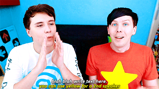
This gif doesn’t require subtitles but for the purpose of this tutorial, I’ll teach you how to do them since they’re an essential aspect of gifmaking! Every gifmaker has an individual preference on how to make their subtitles so this will be just an insight on how I do mine.
To make subs, select the text tool and create a textbox in the bottom part of the gif. I use the font Calibri (download it here if you’re a mac user) in bold italic size 18pt. If text takes up two lines use the settings shown below:
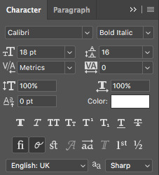
The main colour used for subtitles is pure white and the alternative/2nd speaker colour is yellow (I use the hex code #ffff00).
Now that we have the text you may notice how it doesn’t stand out. To fix this, right click on the text layer, select Blending options... and use these settings for stroke and drop shadow:


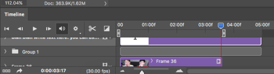
Now your gif should look like this:

You may notice that your text layer lasts longer in the video timeline than the actual frames. To fix this, make sure you drag the text layer to the start of the timeline and adjust the grey things above the text layer (I’m stumped at the proper word for them) so that the video ends at the last frame (shown below):
6. Saving your Gif.
Now that we are done with making a gif, it’s time to save!
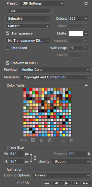
To do so I use the shortcut command + option + shift + s (for mac) or you can go File > Export > Save for Web (Legacy) (for CC) or File > Save for Web (other versions)
My #1 tip for saving a gif is to make sure it’s under 3mb! Tumblr only supports gifs under 3mb so as long as it’s 2.999mb or less you’re fine. Fortunately, our gif ends up at 2.721mb but if you ever do go over, I suggest deleting a few frames or cropping it to a smaller ratio.
Copy my settings when saving:
And we’re done! You should now have a gif that looks like this:
Final Notes:
I hope this tutorial has made some kind of sense and helped you understand the basics of gifmaking and colouring. If you did find this useful and made some hella bright dnp gifs, feel free to tag me in them. I track #scifiphan and will be delighted to reblog them! If you have any questions feel free to send me an ask or a private message (I’ll always respond).
Please like/reblog this tutorial if you found this helpful!
#i actually really like this colouring heck#i created it as i was making it and now i wanna make gifs using this psd#i hope this makes sense#i suck sm at explaining things#this is super long#and the colouring part probs confuses u all#but enjoy#teddii's discourse#gif tutorial#phandom#gifmaking#photoshop#photoshop tutorials#chaoticresources#itsphotoshop#this took me ages to write rip#idk what else to tag it as#validate me lmao
380 notes
·
View notes
Text
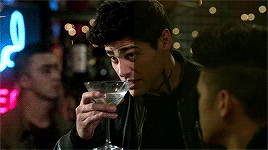
Coloring Tutorial for Shadowhunters S2
Hello pals, I’m gonna show you how to achieve a quality coloring for Shadowhunters Season 2 despite the horrid lighting of the show this season.

Please like/reblog if you find this tutorial useful.
This will not magically work for every scene, adjustments need to be made. This is just here to help you learn and gain some tips.
If you have any questions just let me know.
Please keep in mind that this isn’t how I color every single show/movie/etc. This is for Shadowhunters Season 2 and it might work out for other stuff that are yellow/green based and dark. Who knows...
Okay, you’re gonna have to know how to gif already.
If not, here are two in depth gif tutorials: Windows / Mac.
Below is the original scene sharpened. As you can see it’s not very pretty. Maybe they’re getting lighting tips from the makers of Teen Wolf?

1) CURVES
Play around with curves! I!Cannot!Make!That!More!Clear!
These curves settings will look different for different scenes so you need to adjust it to suit the particular scene you’re working with. Mine looked like this however this might look too bright for a scene that has more light. I use the RGB to lighten but sometimes I’ll adjust the individual colors as seen bellow.

Now our gif looks like this:

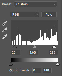
2) LEVELS
These are my Levels setting. I’m gonna use another Levels layer later so I’m not going to overdo this one.

As you can see, it’s not a big difference. But sometimes subtle changes go a long way.

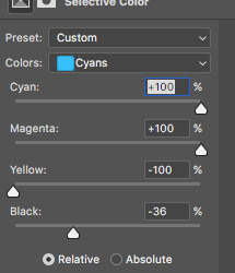
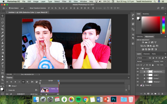
3) SELECTIVE COLOUR
For this layer, I only adjusted the Reds and Yellows.


As you can clearly see, it’s a very veryyy small change. That’s okay, we’ll work on the actual color adjustments with other layers. Don’t try and do it all at once, it’ll look unnatural/pixelated/over the top. It’s a process. (I usually work more with Selective Colour but for this scene this works best.)

4) GRADIENT MAP
For the next step, I used a Gradient Map. I used this B+W one.

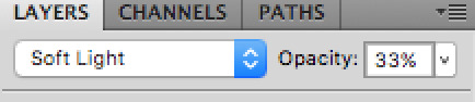
I set it as Soft Light and Opacity 33%
The opacity will be a key part to adjust if a scene has more shadows, etc.
So, now our gif looks like this:

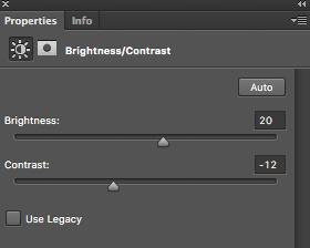
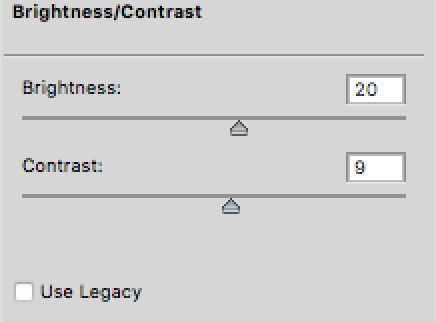
5) BRIGHTNESS/CONTRAST
This adjustment layer is usually one of the first 3 I use when colouring but I guess we’re gonna use it in this order for this tutorial. Here are some tips on Adjustment layers and the order to consider.
Below are the settings I used:
So far so good.

6) PHOTO FILTER
The Photo Filter layer is going to be your best friend when it’s a struggle to gain some cooler tones. The Blue or Deep Blue settings are great for scenes that are far too yellow and green.
Below are my settings. I usually take down the opacity because it can add too much blue or I remove the blue with Hue/Saturation etc. However, because this scene is so yellow/green, It’s not necessary.
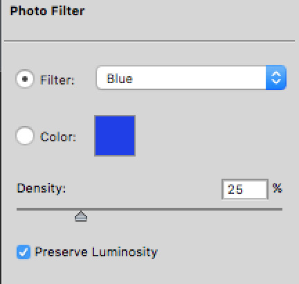
Looking good, however not quite there.
7) LEVELS
We’re back to Levels. Here are my settings:

I used Levels to brighten it up a bit more. I didn’t do it all at once with the previous Levels layer because breaking it down into different layers helps you avoid noise. This is a helpful tip for anything you use to brighten your gif.

8) COLOR BALANCE
I used the Shadows for this layer:

As you can see, the shadows in the scene are now a bit darker.

9) COLOR BALANCE
Color Balance again. This is a second Color Balance. It’s a new layer.
For this one, I adjusted the Midtones and Highlights.

We’re pretty much done, just one more thing!
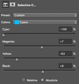
10) SELECTIVE COLOUR
For the last step, I just used Selective Colour to make the blacks more black.
We’re done!

Here is an example of how it can and can’t work for different scenes.
I used the same process to colour the scene below, however, I added an extra Photo Filter layer.
But I had to really readjust and change the process for the scene below because it was way too different.

So, there you go. Keep in mind these tips when coloring Shadowhunters Season 2 but if it doesn’t work, don’t give up, mess around with the layers and see what is the best settings for the scene you’re coloring.
Cya!
811 notes
·
View notes
Text
Loupedeck for Adobe Lightroom 6 & CC
Loupedeck is awesome, Loupedeck is great, Loupedeck makes me a better retoucher simply because its rekindled my love of RAW processing and as sad as it sounds I do actually love what I do which is mostly retouching photos.
Now that's a pretty open and shut statement to start an article with but it's important to not waste your time thinking you're about to read (or not) anything other than a positive look at what I think is a positive step forward in the photo manipulation world.
Why Lightroom? (warning: sob story coming up)
Here's something that's important to understand about why I use Lightroom. I use Lightroom for retouching at speed! I've been a dedicated user since it was in beta, what must have been 10 years ago, which is about the same time I started shooting property and weddings. Disciplines which both require retouching a high volume of images in a very short time.
Over the years after sitting up all night after a busy day shooting retouching hundreds of images into the early hours knowing I had to get them finished and send off before doing the same thing all over again in just a few hours I looked for ANY way to get through pictures quicker. I used actions, presets, tried other software, tried outsourcing, tried enlisting help from other photographers. My own wife (who's a doctor and nothing to do with photography) even at one point after seeing me constantly working and not sleeping more than a few hours every night asked if I could teach her how to retouch so she could help. So I come from a place of "Please for the love of all that is good someone design something to make my life easier!"
AND SO ALONG COMES LOUPEDECK......
Loupedeck was orginally a 'indiegogo' project (and how I wish I'd known about it back then just look at the backer perks! I would've loved that trip to try it out with the hotel)
I'd read about several other editing console products for Lightroom in the past and they all looked... ok. I think it was a facebook post featuring an article about Loupedeck's first finished units being shipped that caught my attention. I was getting very bored with Lightroom, sounds odd yes, but truly I was. Day in, day out, I would use the same trusty presets, do the same things, with the same sliders on my Wacom Tablet. I even took to using Apps like 'be focused pro' to try to challenge myself by improving my productivity. I had overlays for my keyboard from amazon, shortcuts assigned to the wacom tablet, but I still wondered if I could work faster - yet maintain the same quality.
Whilst on holiday I started watching youtube videos of people using Loupedeck. They were all very simple reviews that didn't really show me the actual unit properly. I wanted to see all the knobs and know if it was possible to use two or more at once. I started writing to loupedeck and Felix a very kind and helpful rep started writing back. A week into my holiday I thought 'Ah to hell with it! I spent the money and ordered 'my' Loupedeck.
5 - 7 days later....
It's here! It came in two boxes. The first is white with Loupedeck printed on it and inside that a black embossed box again with the words Loupedeck. I'm not going to go into anymore details here, whilst like it's design it's a box... many others on youtube will do far better justice to it in unboxing sessions.
Straight away I download the firmware for my mac and plug the unit into a usb port. A light came on, I opened Lightroom to be greeted with a message
'Loupedeck thinks you look great today' Well thank you Loupedeck that's very kind. A window pops up presenting me with options to customise Loupedeck.
I assign the top P buttons to presets, C1 dial to perspective correction, C2 button to gradient, and C3 to Radial gradient. That should do me for the moment. That's about it from there you can leap straight into things.
One pretty cool function I didn't know it did - If you press any of the dial it resets that value, for example if I spin a colour wheel and don't like what I've done rather than spin it back again I just press down on it it makes a satisfying 'click' and the value returns to 0.
All dials and wheels spin and turn 360 degrees which is good. Whilst I'm on this subject the turning mechanism and indeed dials are really well made. It doesn't feel loose or that they are going to come off anytime soon. Some of the buttons are a little stiff on rare occasions, my right arrow key for example tends to get slightly stuck but I think this is isolated to my unit and is the type of thing that would happen to any product you buy it's really not a big deal but it's the only negative I can find to the mechanical function of the unit.
The main unit is made of plastic, it's light and means when I'm working with the unit and my hands are resting on it it is not cold like aluminium might be. A few things at this point I would have liked. The first is a detachable USB cable like my wacom tablet, just incase the usb wire fails I would normally just replace it but when it's attached to the device I'd have to send it back to repairs. Better yet bluetooth. My only other criticism of the construction is the groove with holds the wire might be better if it let the wire sit a little deeper, mine tends to pop out ever so slightly.
So down to it , I started retouching some images. Within ten minutes I work out this isn't something you can just start twiddling the knobs and dials of and expect it to make you infinitely quicker than you were before. You have to learn where everything on the device is just like typing on a keyboard, at first you have to keep looking down looking at the letters you're typing then back up at the screen to check you've put them in the right order, but the more you practice the more you learn where those letters are and before you know it you're just staring at the screen typing and moving your fingers by instinct. It took me just over a month to get to that place with Loupedeck but when I did... 'wow'.. yes I was able to work much quicker than before.
I found I was working dials in groups of two, I'd be pulling the blacks down and the whites up simultaneously The same with the shadows and highlights, contrast and clarity, in fact at one point I realised I started using the edge of my palm pulling down the blacks whilst my little finger pulled up the shadows and my other hand the highlights!
Using the colour wheels is also incredibly quick! In my job at certain times of the year or after certain weather like rain the camera has a tendency to capture grass as a very bright yellow. When this happens I typically pull the luminance of the yellow down then the hue of the yellow up (to make it more green), then the saturation to the yellow down slightly to bring it back to the green colour that it should be, in the past that would involve a lot of clicking and sliding the panels with the graphics tablet, now i press the appropriate button to select 'lum', 'hue', or 'sat', and just to the right of them are all my colour wheels perfect! The led light to the side of lum, hue, and sat is incredibly useful. I do wish the colour wheels had some of these faint led's or something to illuminate them in the dark. I tend to dim all lights and cut out external light sources when retouching so that external light and colours don't influence the light and colours I'm seeing on the screen.
Now I know I said I can use the dials without looking, but that's also partly because they are well spread out. I love the set up of the colour wheels and I wouldn't want it changed but it is more difficult to know which wheel goes with which colour without looking. I have slight issues with the darker blue. I kept getting it mixed up with the colour to the right of it in dim lighting, I manipulate the colour blue a lot so in the end I put a tiny glow in the dark dot on my unit so a very quick glance down confirms where that colour is.
All the other buttons on the unit work really well. I particularly like the way you can swap between rating images by colour or numbers and by clicking between the two options you get an on screen message.
There are two Zoom buttons, I kind of wish one of these had been replaced with something else like 'select WB point' or even better another custom dial! The custom dial is a really strong point of the unit and by pressing the Fn key you can assign this custom dial another function which can be set up in the Loupedeck options menu.
Performance...
You can customise how fast Loupesdeck reacts based on how fast or slow you spin dials (I'm not sure what I've just typed makes sense??) basically... you can change the settings so that a small turn makes a BIG change on the slider or the other way around - dial sensitivity.. I can't think of another way to describe it. I've not played around with it too much as I'm used to how the dials work by default. One thing I do find is the more confident I get the more I start trying to spin dials and wheels really fast. It backfires on me in that the particular dial or wheel will adjust the slider up and then it'll 'rubber band' back down again. That's my bad 'bull in a china shop' mentality. Whats better practice is to work quickly but to not go too nutts on the unit.
Changes you make on Loupedeck adjust incredibly quickly on screen no real lag at all (unless its Lightroom lag which you'd get whether you were using the unit of not). One thing that does happen is as you make adjustments don't expect the visual sliders on the right to show up if they're not currently on your screen. So if my colour sliders menu is closed and I adjust the colour wheels on Loupedeck the panel doesn't open up on the screen, you'd have to actually click it open to see this (or press a key board short cut should one exist for that panel). If this happens and you're working quickly not wanting to click open panels you can't see then you can adjust be sight.
slightly off topic RANT WARNING!..
Any sort of performance issues I experienced are based more on Adobe's relationship with Apple which I think has plagued Lightroom for a good few years now. I remember back in 2014 when we bought new imacs with the new screens only to find Lightroom was';t compatible with the high resolution screens meaning we had to either reduce the resolution of the screen or make the windows substantially smaller to get a smooth Lightroom working environment. The same thing has happened again. I'm currently on a mid 2017 imac and as soon as Lightroom cc Classic dropped I noticed a huge increase in Lag I won't go into that now, only that the issue became so incredibly frustrating it actually made me revert back to Lightroom 6 as a stand alone copy and eventually move my RAW workflow mostly to Capture One Pro.
Rant over and back to Loupedeck.
There's a nifty little export button on the unit, all it does is open the export window, again I think it could've been used for something else, however as it's there I do use it, and I challenge anyone not to get the weirdest sense of joy pressing it when you're done, it's the strangest thing.
PRESETS
Loupedeck comes with some Lightroom presets, I've not used them. I tend to make my own presets rather than use other peoples, for no other reason than I just don't. So using them I've no idea if they're good or not since I've not any experience of using others in that regard it's wrong for me to judge them, but just to say they're there if you want to have a look once you buy the unit.
BUYING AND PRICE
Several places sell Loupedeck now a google search would show you UK stockists. I got mine directly from the website and it arrived in a week, I'm sure I remember paying close to 329 euros but currently on their site it's 249 euros, so in my opinion that's really very good value.
Loupedeck with other RAW editing software.
So when I was completely fed up with Lightroom Classic cola CC or whatever they're calling it at the moment. I wrote to the guys and gals at Loupedeck to ask if they had any plans to expand to other software. I'll be honest my love of this unit is the only thing still keeping me hanging on to Adobe's raw processing software at this point. They wrote back to say they are currently in talks with some other companies.
Then last month a very clever person posted on a facebook group I'm a member of they had got Loupedeck working with Capture One. Incredibly excited I got all the info and gave it a go myself.
Now basically what this clever person did was to program Loupedeck as a midi device with some purchaseable software called 'Bome'. You then just reassign the dials and buttons to Capture one functions. And 'by golly gosh' it actually works!... Ok so the colour wheels don't actually do what they're meant to do but are just assignable as buttons, and YES I accept you could just get any midi device for far cheaper and do the same but I have Loupedeck so thought I'd try it, it's just a fun thing.
Something pretty cool I was able to do was to assign brush size adjusting to a dial, it's incredible smooth and easy to use. This made me think, if Loupedeck 2 should ever appear how about a brush size dial?!
Using Bome in no way gets rid of Loupedecks proper software you just need to remember to close bome before opening Lightroom. It's a bit of fun but no substitute for the real thing of using Loupedeck with it's proper dedicated software with Lightroom.
Loupedeck alternatives
Loupedeck is awesome why on earth would you want to use anything else?! :) Incase you do or like me you're slowly watching Adobe doing weird and wonderful things with Lightroom, and change your RAW editing software here are some others you can look at (sources and prices are correct as of December 2017) Please note: I've not used any of these I'm just putting them out there for anyone to research further should they desire, it's actually this research that lead to me end up buying Loupedeck.
PALETTE
These look pretty nifty you kind of build you'r own kit, however quite pricey to me!
TANGENT
I found out about these whilst researching control devices for Capture One, lots of variety. Prices range from £300 - a lot of money :)
BEHRINGER MINI X-TOUCH (OR OTHER MIDI DEVICES)
The cheapest option but also the most manual set up needed, you basically plug these 'bad boys' in and assign controls from lightroom to the buttons and dials. I did order one in July from Amazon for £50 but after a month of waiting I gave up and bought Loupedeck instead. There are lots of guides about how to set these up on youtube, but obviously you run the risk of it stopping working after Lightroom updates. People seem to like the model to the left because like Loupedeck the dials are unobstructed.
So there you have it
There are other options out there but despite this I'd still buy Loupedeck in a heartbeat. I think it's incredibly well priced, it just works (unlike apple and adobes relationship these days it seems) it is constantly being worked on with positive updates and it is most definitely becoming more and more popular, appearing in more shops and online outlets all the time.
As I am quite passionate about this device I will keep my eyes peeled for any new developments in the Loupedeck camp with updates and new products so do check back here for any new news. Or lets be honest you could just check on their site.. Check here or there it makes no difference, they're worth your attention and keeping your photographic eyes on in the future.
NOTE: THIS IS A COMPLETELY INDEPENDENT REVIEW I HAVE NO CURRENT ASSOCIATION WITH LOUPEDECK (However if they would like to reach out and form one based on this review they can hit my contacts section... I'm just saying...)
I'll be doing some live sessions using Loupedeck soon so another thing if you are interseted to stop by for.
#Loupedeck#should-I-buy#Property-photographer-surrey#Mark-Hardy#Blog-farnham#Adobe-Lightroom#Lightroom-controller#review#indiegogo#project#Surrey-property#wacom#Bome#is-any-good
0 notes
Last Seen Blogs